Train the Pharmaceutical Trainer - Handy Guide to Visual Aids - Innovara
←
→
Page content transcription
If your browser does not render page correctly, please read the page content below
Train the Pharmaceutical Trainer

     Handy Guide to Visual Aids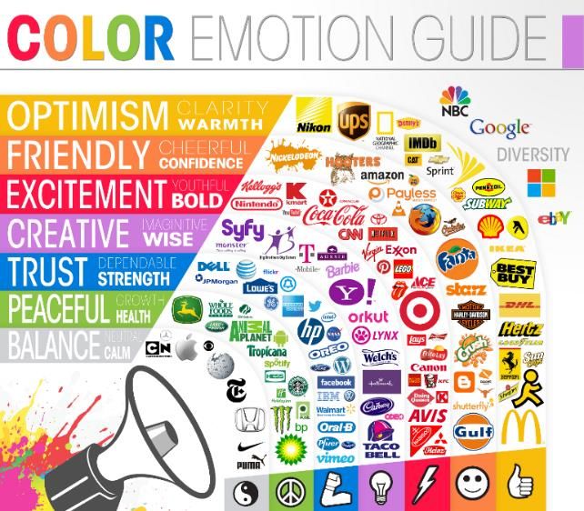
Train the Pharmaceutical Trainer
Handy Guide to Visual Aids: Overview
Visual aids are not necessarily elaborate or expensive. In the hands of a skilled
trainer, visual aids focus the attention of the learner on essential elements of the
training. Visual aids should be simple, relevant, and pleasing to the eye.
Some Examples of Visual Aids
(other than your slide deck)
Whiteboards Objects/Models Pictures Videos Flipcharts
Maps Charts & Diagrams Tech Demos Costumes Handouts
A good visual aid will: Some visual aid problems:
✓ Present one idea at a time Too small
✓ Use color to emphasize important Too crowded
points Inappropriate
✓ Be flexible Don’t just use technology for
✓ Be used appropriately technology’s sake
Visual aids must relate directly to the
✓ Visible to your entire audience point being emphasized
✓ Stimulate the learner’s thoughts and Rushed
actions Inadequately explained
Many visual aid problems can be
solved by using a grid. A grid
organizes your content on a page
using a combination of horizontal
and vertical guides. This gives your
content a professional, consistent
look and feel. www.thegridsystem.org
has a number of tools and tutorials to
help you get started.
2 ©2021 Innovara, Inc. All rights reserved.
Train the Pharmaceutical Trainer
Handy Guide to Visual Aids: Typography
Clear, legible, and well-organized typography keeps your audience focused on the
content. Choose a font that matches audience expectations. An unprofessional
font may cause the audience to doubt your credibility. A complicated font will
create confusion as the audience struggles to read your content.
Standard Fonts Decorative Fonts
(use liberally) (use sparingly, if at all)
✓
Brush Script MT
Open Sans Papyrus
Tahoma Comic Sans
Juice ITC
French Script MT
Rule of Three
Bold Headers are Best
Presentations should include no
more than 3 fonts: The body font can either be from the
same family or a contrasting family.
• Heading font
Just make sure both are legible and
• Body font establish a clear hierarchy.
• Decorative font
Any more fonts than that will
overcomplicate your design. Use
https://www.typetester.org to try
different fonts together.
Serif vs. Sans-serif Serif
Serif fonts are considered most professional, but with decorative flourishes
sans serif typefaces are easier for those with
visual impairments. Many designers recommend
combining serif and sans serif fonts for contrast.
Sans Serif
without flourishes
3 ©2021 Innovara, Inc. All rights reserved.
Train the Pharmaceutical Trainer
                                             Handy Guide to Visual Aids: Typography

                            Header Text: 36pt+
        Body text should be between 20–28pt to
        assure that your text is easy to read* from
        the back of the room. This will also assist you
        in limiting the amount of text per slide. It
        should absolutely never be below 18pt.
                                                             *footnotes can be as small as 12-14pt

                                Spacing                                                       Final typography tips:
Thisisanexampleof textthatisspacedtootightly.Your                                             ✓ To keep your written content
audiencemaystruggletoscanit,causingthemtoreadslowlyor                                           visually engaging, avoid writing
becomefrustrated.Thosewhoarevisuallyimpairedmaynotbe
abletoreaditatall.                                                                              long paragraphs (commonly referred
                                                                                                   to as walls of text)
This is an example of well-spaced text. Your
audience can scan it quickly and easily.                                                      ✓ Use lists, icons, and figures to
                                                                                                break up walls of text
T   h   i   s       t       e    x   t               i       s               t   o   o
l   o   o   s   e       ,        m       a       k       i       n       g                    ✓ Limit the text per slide: no more
i   t       h   a   r       d        t       o               r       e       a   d   .          than 5 bullet points, using 5
                                                                                                words per bullet
Beware - Presentation software often                                                          ✓ Avoid long stretches of boldface,
changes text spacing automatically                                                              capslock, or smallcaps—if
when the amount of text spills over                                                             everything is bold, nothing is bold
the boundaries of the placeholder. To
avoid this, use less text or set the
character spacing to “normal.”

4                                                                    ©2021 Innovara, Inc. All rights reserved.
Train the Pharmaceutical Trainer
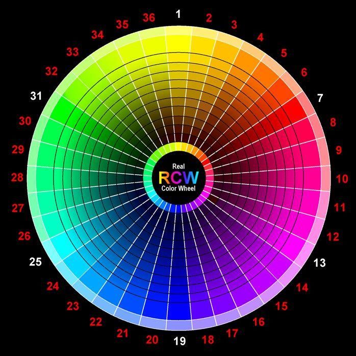
Handy Guide to Visual Aids: Color
Use a color wheel to visualize color combinations.
There are 3 types of hues (pure colors) on the color
wheel:
• Primary (P): Cannot be formed by mixing other
colors (red, yellow, blue)
• Secondary (S): Formed by mixing primary
colors (green, orange, purple)
• Tertiary (T): Formed by mixing primary and
secondary (red-orange, yellow-orange, yellow-green,
blue-green, blue-purple, red-purple)
Warm Cool → Cool
P T S T P T S T P T S T
Red- Yellow- Yellow- Blue- Blue- Red-
Red Orange Yellow Green Blue Purple
Orange Orange Green Green Purple Purple
Analogous Complementary
Experiment with various color combinations,
especially:
• Warm tones: reds, oranges, yellows
• Cool tones: greens, blues, purples
• Analogous: secondary and tertiary colors that
are close together on the color wheel
• Complementary: those opposite one another
Which red square looks on the color wheel
bigger? Brighter? Pay attention to the way colors behave in relation
to one another—certain colors look different
when paired.
5 ©2021 Innovara, Inc. All rights reserved.Train the Pharmaceutical Trainer
Handy Guide to Visual Aids: Color
To add depth to the color palette for your
+ = presentation without making it too complex,
you may want to saturate some of the hues
you have selected from the color wheel.
There are three main types of saturation:
+ = • Tint: adding white to a hue makes it
appear brighter or lighter
• Tone: adding grey to a hue makes it
appear less vibrant or “washed out”
• Shade: adding black to a hue makes it
+ = appear darker
Hue
Tint
Tone
Shade
When creating the color palette for
your next presentation, keep in mind
that certain colors evoke emotions in
people. This may vary from culture to
culture. The Logo Company
(https://thelogocompany.net) devised
a generalized color emotion guide to
follow, along with a list of popular
brands that use color to their
advantage. (pictured right).
6 ©2021 Innovara, Inc. All rights reserved.Train the Pharmaceutical Trainer
Handy Guide to Visual Aids: Color
It is important to consider accessibility when choosing your palette. WHO
estimates that 1.3 billion people globally live with a visual impairment
(http://www.who.int/news-room/fact-sheets/detail/blindness-and-visual-
impairment). It is also estimated that 7-10% of men globally experience some
color blindness (https://www.colour-blindness.com/general/prevalence/).
All visual elements, especially text,
must stand out sufficiently against
your background. If you are
unsure, use this free, open-source
accessible color matrix builder
(example at right):
https://toolness.github.io/
accessible-color-matrix/
This tool by David Nichols (https://davidmathlogic.com/
colorblind/) will display what various color palettes
will look like for those who have the most
common types of color blindness: protanopia
(red-green weakness), deuteranopia (green weakness), or
tritanopia (blue-yellow weakness).
Note in the example that what looks gold to a
person with normal vision looks pink to someone
with tritanopia. What looks magenta to someone
with normal vision appears brown or grey to a
person with deuteranopia or protanopia.
Remember that the contrast will be slightly lower on a projector than it is on the
device you use to work on your presentation. Take this into consideration when
choosing your palette. If you have access to a projector, project your entire
presentation and try to read it from the back of the room. Do the colors blend
together, or do they contrast well?
7 ©2021 Innovara, Inc. All rights reserved.Train the Pharmaceutical Trainer
Handy Guide to Visual Aids: Presentations in Graphs
Do this ✓
Clear Title Avoid 3d graphs
Different shades of same color
are best for distinguishing Minimum
between categories gridlines
Labeled axis
Clear label 3
Clear label 2
Clear label 1
Maximum information in 0 1 2 3 4 5
least writing and figures Labeled Axis For displaying categorical
data, clustered bar charts are
Clear label A Clear label B Clear label C preferable to pie charts
Don’t do this
This is some information from a study someone else did but we only read the abstract
and are using this graph for shock value
Unclear title
30
Percentage
25
20 3D
15 Series 3
10 chart
5
0 Series 2
Using a Group 1
poor scale Group 2
Group 3 Series 1
Group 4
Groups 1 - 10 Unlabeled axis
0-5 5-10 10-15 15-20 20-25 25-30
Incomplete
information
Too many colors
8 ©2021 Innovara, Inc. All rights reserved.THANK YOU
René Meade
Manager, Learning & Development
Innovara, Inc.
105 Middle Street
Hadley, MA USA 01035
+1 (413) 387-6188
Rene.meade@Innovara.com
www.Innovara.comYou can also read