Understanding and Evaluating the User Data Exploration Experience with Lux
←
→
Page content transcription
If your browser does not render page correctly, please read the page content below
Understanding and Evaluating the User Data
     Exploration Experience with Lux

           Jerry Song

           Electrical Engineering and Computer Sciences
           University of California, Berkeley

           Technical Report No. UCB/EECS-2021-114
           http://www2.eecs.berkeley.edu/Pubs/TechRpts/2021/EECS-2021-114.html

           May 14, 2021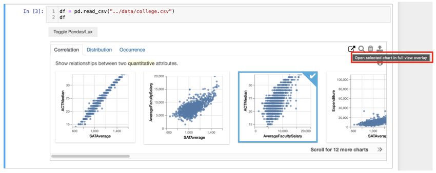
Copyright © 2021, by the author(s).
                            All rights reserved.

Permission to make digital or hard copies of all or part of this work for
personal or classroom use is granted without fee provided that copies are
not made or distributed for profit or commercial advantage and that copies
bear this notice and the full citation on the first page. To copy otherwise, to
republish, to post on servers or to redistribute to lists, requires prior specific
permission.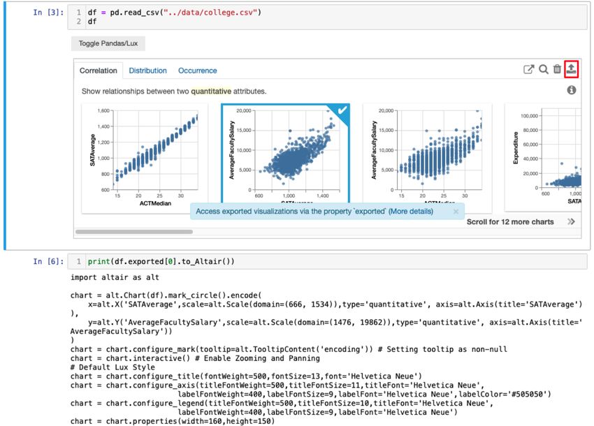
Understanding and Evaluating the User Data Exploration Experience with Lux

                                      by Jerry Song

                                   Research Project

Submitted to the Department of Electrical Engineering and Computer Sciences,
University of California at Berkeley, in partial satisfaction of the requirements for the
degree of Master of Science, Plan II.

Approval for the Report and Comprehensive Examination: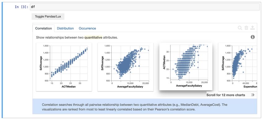
Understanding and Evaluating the User Data Exploration Experience with Lux

                                     by

                                Jerry Song

              A thesis submitted in partial satisfaction of the

                       requirements for the degree of

                            Masters of Science

                                     in

               Electrical Engineering and Computer Science

                                   in the

                             Graduate Division

                                   of the

                     University of California, Berkeley

                           Committee in charge:

                  Professor Aditya Parameswaran, Chair

                                Spring 2021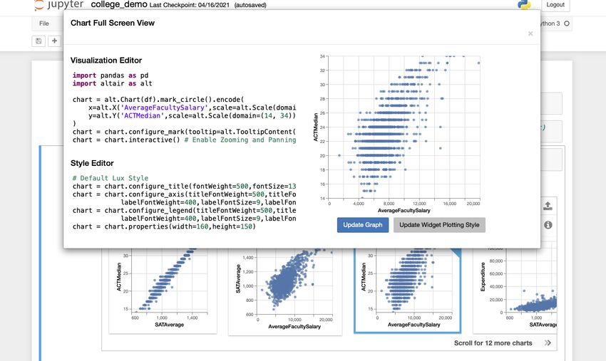
Understanding and Evaluating the User Data Exploration Experience with Lux

                             Copyright 2021
                                   by
                               Jerry Song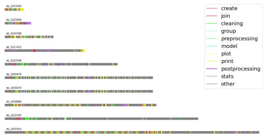
1

                                          Abstract

      Understanding and Evaluating the User Data Exploration Experience with Lux

                                             by

                                         Jerry Song

            Masters of Science in Electrical Engineering and Computer Science

                             University of California, Berkeley

                          Professor Aditya Parameswaran, Chair

Exploratory Data Analysis (EDA) largely takes place in computational notebooks and in-
cludes the use of common packages such as matplotlib, pandas, and scikit learn. Though
every user EDA process is unique, there exist some common patterns among di↵erent anal-
ysis sessions that are difficult to describe and quantify. To study these patterns, we propose
categorization for functions from common data science packages and parse through a sample
of notebooks to examine the frequency and sequencing of function calls. On observing the
challenges users have with visualization, we turned to work on lux, a framework to accel-
erate the visualization of pandas dataframes which are widely used by individuals across a
spectrum of industries. We built a system to send and receive logs of user interactions before
conducting user studies with lux to examine how new users incorporate the visualization
assistant into their workflow. Through our study of notebook and Lux user logs, we help
uncover typical patterns of data exploration, both with and without visualization tools like
lux.
i
To Mom, Dad, and my sister, Jessie
Thanks for putting up with me for over a year in the midst of this pandemic.ii Contents Contents ii List of Figures iii List of Tables iv 1 Introduction 1 2 Jupyter Notebook Corpus Study 5 2.1 Corpus Background Info annd Filtering Criteria . . . . . . . . . . . . . . . . 5 2.2 Categorizing Functions of Interest . . . . . . . . . . . . . . . . . . . . . . . . 6 2.3 Function Frequency Analysis . . . . . . . . . . . . . . . . . . . . . . . . . . . 7 2.4 Construction of Time Series Visualizations . . . . . . . . . . . . . . . . . . . 9 3 Lux Widget User Interaction Logging 11 3.1 Logger Capabilities . . . . . . . . . . . . . . . . . . . . . . . . . . . . . . . . 11 3.2 Lux Widget Log Analysis . . . . . . . . . . . . . . . . . . . . . . . . . . . . 12 4 Evaluative User Studies 16 4.1 Survey Results . . . . . . . . . . . . . . . . . . . . . . . . . . . . . . . . . . 16 4.2 Evaluative Study Design . . . . . . . . . . . . . . . . . . . . . . . . . . . . . 18 4.3 Evaluative Study Results and Analysis . . . . . . . . . . . . . . . . . . . . . 19 5 Lux Widget Feature Development 21 5.1 Improving Widget Description . . . . . . . . . . . . . . . . . . . . . . . . . . 21 5.2 Full Screen Visualization Editor . . . . . . . . . . . . . . . . . . . . . . . . . 22 6 Conclusion 26 Bibliography 27
iii

List of Figures

1.1   Lux widget view after toggled with correlation tab displayed . . . . . . . . . . .         2
1.2   Sample export workflow using to altair to retrieve code for exported visualization         3

2.1   Distribution of function frequency across di↵erent quartiles of the notebook (n=123830
      lines) . . . . . . . . . . . . . . . . . . . . . . . . . . . . . . . . . . . . . . . . . . 8
2.2   Function Frequency within the print category (n=123830 lines) . . . . . . . . .            9
2.3   Time series plots for sample notebooks . . . . . . . . . . . . . . . . . . . . . . . 10

3.1   Lux User Interactions Logged (n=1489 sessions) . . . . . . . . . . . . . . . . .          13
3.2   Lux Lux widget after additional buttons were added. Intent button is hovered
      to display tooltip (highlighted). . . . . . . . . . . . . . . . . . . . . . . . . . . .   14

4.1   Background information on survey responders (n=16) . . . . . . . . . . . . . . .          16
4.2   Survey responses (n=16) for future features desired in Lux . . . . . . . . . . .          17

5.1   Widget with long description panel (blue background) open describing how the
      visualizations on the correlation tab are displayed . . . . . . . . . . . . . . . . .     22
5.2   Full screen editor with code and visualization side by side . . . . . . . . . . . .       23
5.3   Using the visualization editor to edit current visualisation or update plotting style
      for entire widget . . . . . . . . . . . . . . . . . . . . . . . . . . . . . . . . . . .   24
iv List of Tables 3.1 Lux Widget button click counts (n=1489 sessions) . . . . . . . . . . . . . . . . 14 4.1 User Study Completion Times . . . . . . . . . . . . . . . . . . . . . . . . . . . . 19
v

                                Acknowledgments
Without the help of the following people, this work would not have been possible. Thank
you all!

   • To Doris Lee, thank you for leading me through every step of the research process
     from formulating questions to analyzing study results. Thank you for being my go-to
     person for any questions and for your availability even while across the Pacific Ocean
     in Taiwan!

   • To Aditya Parameswaran, thank you for your guidance on steering the projects in the
     right direction and pushing me to search for ways to help users. I really enjoyed our
     time teaching CS186 as well!

   • To Andrew Head and Stephen Macke, thanks for teaching me more about computa-
     tional notebooks and giving me suggestions on how to conduct the corpus study.

   • To the Lux team, thank you for answering my questions about existing features and
     helping me contribute to additional ones as well.

   • To Allen Shen and Qutub Khan Vajihi, thanks for helping conduct and analyze eval-
     uative studies on how to improve the visualization export and customization process.

   • To the user study participants, thank you all for your valuable insight on how to
     improve the Lux system.

   • To all my friends both new and old, thanks for being a part of a memorable final year
     at Berkeley. Even with the pandemic, you make it hard to say good-bye!
1 Chapter 1 Introduction Exploratory data analysis (EDA) is a complicated process involving many di↵erent stages and steps. Most data analysts use computational notebooks such as Jupyter [8] in combi- nation with common data science libraries such as matplotlib, pandas, and scikit learn [15, 6, 3]. While functions from these packages are frequently used, it is difficult to system- atically discover exactly for what purpose they are used and in what manner they are used. A common step in EDA is data visualization; unfortunately, users are frustrated with cur- rent data visualization tools in computational notebook environments [4]. In the iterative data science process, users often need to change small bits of code to tailor visualizations to their needs, and data scientists frequently need to export code or visualizations to share with teammates. The need to consult documentation for visualization packages greatly disrupts the already complex process of data analysis. One system that tries to address these user concerns is lux [10], an intelligent dataframe visualization assistant. Lux Widget Overview Lux is a lightweight wrapper around pandas dataframes that intelligently evaluates meta- data in order to recommend visualizations for those dataframes. We will briefly introduce some features of Lux to provide context for our contributions. In the Lux system, when a user prints or displays a pandas dataframe, they see the option to toggle to the Lux widget view. The widget contains tabs filled with di↵erent univariate and multivariate visualizations including scatter plots, bar charts, histograms, time series, and geographic heat maps. The visualizations are categorized into sets called actions, each of which is displayed in a tab of the widget. An appropriate visualization is used to visualize each action; for example, the correlation action tab displays bivariate relationships in scatter plots (or heat maps when there are a large number of data points). A user can click through di↵erent tabs and scroll through the visualizations displayed in order to explore their dataset and find visualizations that are of interest to them. Figure 1.1 shows a sample Lux widget
CHAPTER 1. INTRODUCTION                                                                      2

         Figure 1.1: Lux widget view after toggled with correlation tab displayed

view with the correlation tab displayed.

Lux also provides functionality that allows users to export and further customize visu-
alizations that are of interest to them. A user can select the visualization that they are
intersted in and click an export button to store the visualization in a Vis object. Using
the df.exported property, users can access all visualizations they exported in a VisList
and from there, display the corresponding code for the visualizations with functions such as
to Altair or to matplotlib. Figure 1.2 demonstrates the steps a user can take after they
have exported their desired visualizations. Here, the second visualization of the correlation
tab is selected then exported by clicking the button on the top right. Because it is the first
entry of the VisList, it can be accessed with df.exported[0]. Printing the result of the
call to to Altair then displays the code needed to generate that visualization.

To make style adjustments to all visualizations in the graph, users can update the plotting
 style attribute for lux.config with a function that applies their choice of style modifica-
tions. Once the plotting style is modified, the Lux widget will use the adjustments made
when displaying all visualizations.

Research Questions and Contributions
Here, we have the opportunity to learn more about how users conduct data science and help
contribute to systems like lux, which aid users with EDA. Specifically, we try to answer the
following questions.

How can we characterize and describe the data science process? How can we systemati-
cally identify what stage of data science users are presently at in a given block of code? Data
science is an extremely iterative process, and users often move back and forth between var-
CHAPTER 1. INTRODUCTION 3 Figure 1.2: Sample export workflow using to altair to retrieve code for exported visual- ization ious stages and objectives. How can we describe what users are trying to accomplish with a segment of code? Although it is not easy to immediately identify a user’s objective for a particular code cell, we can use heuristics and prior knowledge about common data science packages to help label what users are doing and when they are doing it. What difficulties are new users facing with lux? We turn to look at lux, a system de- signed to aid with the process of EDA and examine what features of Lux users seem to grasp quickly and which features they struggle with. We try a number of di↵erent methods in order to accurately grasp what users are experiencing, including logging user interactions with the widget, analyzing survey results, and conducting user studies. How can we add features to help address existing user issues with lux? How can we use what we learned from our Jupyter notebook corpus analysis, logged user interaction infor-
CHAPTER 1. INTRODUCTION                                                                   4

mation, and evaluative studies to best augment the capability of the Lux system? Instead
of making minor fixes, we also think about how we can design modular solutions upon which
further features can be built.

Our contributions are as follows:

   • We developed a nomenclature to describe and study user data science workflows and
     put this to practice in a sample set of notebooks (Chapter 2).

   • We built the client and server system to send and receive user log information for Lux
     and analyzed the information we obtained (Chapter 3)

   • We examined survey responses and further conducted user studies to learn about user
     desires and difficulties surrounding the Lux widget, paying particular attention to the
     visualization export process (Chapter 4)

   • We developed additional features to address concerns regarding recommendation clarity
     and visualization exporting (Chapter 5).
5 Chapter 2 Jupyter Notebook Corpus Study In this chapter, we will describe our process and insights from studying a corpus of Jupyter notebooks. During this study, we examine patterns with existing data science workflows and search for ways tooling can be introduced to assist with the process of exploratory data analysis. 2.1 Corpus Background Info annd Filtering Criteria To study how users conduct data science, we examined notebooks collected from various Github repositories as part of Rule et al’s study of Jupyter notebooks [12]. We worked with the corpus sample size of 6529 notebooks from 1000 di↵erent repositories. Even this sample set was noisy with incomplete notebooks and notebooks using other programming languages, so we filtered the sample set in the following manner. We ensured that the programming language of the notebook was Python and that there were at least 10 code cells. We also filtered out notebooks containing terms such as “homework,” “lecture,” “assignment,” and “introduction to”. Notebooks containing these words are often tutorials or intended for in- struction and are therefore, less likely to capture real-world data analysis workflows. Finally, we enforced that each notebook must import pandas and matplotlib, because these were two packages we discovered most data science notebooks used. To filter the notebooks, we searched for the appropriate strings in the code cells of the notebook. Typically, iPython notebooks files are stored in a JSON format with a cells entry, and of the 6529 notebooks we examined, this is true of 5442 notebooks, which we deemed ana- lyzable. After applying the rest of the filtering criteria, we were left with 584 notebooks. Out of curiosity, we also looked at the number of notebooks which were executed with a strictly increasing execution count, and we discovered there to be only 91 of the 584 notebooks that follow these criteria. The out of order execution presents the opportunity for tools like nb- safety [11] to ensure users evaluate what they intend to evaluate.
CHAPTER 2. JUPYTER NOTEBOOK CORPUS STUDY                                                  6

2.2     Categorizing Functions of Interest
To understand the semantic functions of the code in the notebooks, we devised a mechanism
to classify data science tasks. We examined the most common functions for pandas, scikit
learn, and matplotlib and grouped them into categories.

Pandas Categories
From examining pandas documentation and a manual inspection of the notebooks, we de-
termined which pandas functions were frequently used. Subsequently, based on what we
believed the user was generally trying to achieve by calling a function, we classified these
functions into the following categories:

   • createFns = [read csv, DataFrame, Series, copy]

   • cleaningFns = [isnull, drop, fill, replace, rename, astype, set index, loc, iloc,
     index, reset index, astype, query]

   • printFns = [head, tail, shape, info, describe, value, columns, print]

   • plotFns=[plot, plotting]

   • groupFns = [group, apply, sort, pivot]

   • joinFns= [append, concat, join]

   • statsFns = [describe, mean, corr, max, min, median, std, sum]

Scikit Learn Categories
We looked through the scikit learn documentation on their subpackages and categorized
them as follows:

   • preprocessingFns = [preprocessing, impute, feature, decomposition, discriminant
      analysis, random projection, sampling, compose]

   • modelFns = [classifier, cluster, clf, estimator, naive bayes, svm, neural network,
     ensemble, dummy, gaussian process, kernel, manifold, mixture, multiclass, multi
     output, neighbors, semi supervised, tree]

   • postprocessingFns = [covariance, metrics, inspection, model selection]
CHAPTER 2. JUPYTER NOTEBOOK CORPUS STUDY 7 Matplotlib Categories We also parsed the matplotlib import and used the import alias to search for instances of matplotlib functions used. We categorized all matplotlib functions as plotting functions. For example, if matplotlib.pyplot is imported as plt, we labeled all lines containing plt functions as plotfns. Parsing Method The process of parsing the code for the presence of these functions involved searching the text of a line of code for “.” prepending the function name or “(” appended after the function name. If a line had more than one occurrence of the functions we were searching for, the raw count would be increased for each function that appeared, but the overall line would only be categorized by the last category function that appeared. For example, a line reading df.loc[:,:].head() contains both loc which is part of the cleaning category and head which is part of the printing category. The counts for both those categories would increase by one, but the overall line would be classified as printing. Key Takeaway By developing nomenclature for di↵erent stages of exploratory data science and classifying functions into the developed categories, we can parse through notebooks for the presence of functions and infer what users aim to do with various code blocks. 2.3 Function Frequency Analysis Next, we examined the frequency of functions within each category, separating them by quartiles in order learn at which stages users typically performed various tasks in the data science process (Figure 2.1). Across the 123830 lines, we see that printing, cleaning, plotting, and stats have relatively high frequencies. The distribution of lines across the various quartiles helped confirm some natural hypotheses. First, both the create and cleaning categories seemed to have more functions used in earlier quartiles and, in particular, the first quartile. This confirms the reasonable assumption that creating the dataframe (or other data structure) and cleaning the data are typically done in the early stages of the exploratory data analysis workflow. On the other hand, plotting, stats, model, and postprocessing have higher frequencies in later quartiles. This trend is reasonable as well since users typically model, visualize, and summarize only after the data is ingested and wrangled. While these observations might not be particularly revolutionary, they serve to confirm original suspicions and validate the function parsing and classification. Printing is especially of interest; because many of the pandas functions for viewing dataframes such as head fall into this category, high counts within the print category demonstrate that users spend a lot of lines of code visualizing their dataframes. Upon closer analysis of the
CHAPTER 2. JUPYTER NOTEBOOK CORPUS STUDY                                                    8

Figure 2.1: Distribution of function frequency across di↵erent quartiles of the notebook
(n=123830 lines)

distribution within the print category (Figure 2.2), we find this hypothesis to be confirmed.
While 25% of lines in the category were categorized due to the presence of the function print
where users may be printing something other than a dataframe, the remaining three quarters
of classifications were triggered by calls to pandas functions that help view dataframes or
other similar data structures.

Furthermore, this category is more likely to be undercounted rather than overcounted, as
users can print out a dataframe in computational notebooks by leaving only the variable as
the last line of a cell. The parsing methodology does not search for these instances, and from
a manual inspection of notebooks, this printing convention is quite popular amongst users.
Thus, it is highly likely that the print category overall frequency is higher than displayed
in Figure 2.1. It is also worth noting that unlike some other categories, printing frequencies
remain constantly high across all quartiles, demonstrating that users are visualizing their
data by printing during all stages of data science.

Key Takeaway The high frequency of functions in the print, stats, and plot categories
demonstrate that users spend a lot of code in these stages of EDA, revealing an opportunity
to develop tooling in order to assist users with this part of the process.
CHAPTER 2. JUPYTER NOTEBOOK CORPUS STUDY                                                   9

        Figure 2.2: Function Frequency within the print category (n=123830 lines)

2.4     Construction of Time Series Visualizations
In order to closely view the locations of the various functions, we plotted fine-grained time
series of the notebooks as shown in Figure 2.3. The notebook time series plots are scaled
according to the notebook length; if a particular bar is twice as long as another, that means
that the corresponding notebook is twice as long as the other. The plots give a clearer
representation of where certain classes of functions occur and also present some interesting
patterns that the coarse quartile plots did not reveal.

In particular, we noticed several occurrences of repeated patterns that seem to occur over
and over again within a single notebook. Notebook nb 1005910 in Figure 2.3 most clearly
demonstrates this pattern, and upon a closer manual examination of the notebook, we dis-
covered that this pattern was created by repeated blocks of cells that were almost nearly
identical. The content was copied and pasted with only minor changes to the exact dataset
the analysis was conducted on.

This repeating pattern occurs within a number of other notebooks as well; in the 100 dif-
ferent time series we inspected, there were 17 instances of some sort of repeated pattern.
Upon investigating these corresponding notebooks closely, we would find copy and pasted
cells each time with slight changes to perform tasks such as visualizing di↵erent columns of
CHAPTER 2. JUPYTER NOTEBOOK CORPUS STUDY 10
Figure 2.3: Time series plots for sample notebooks
a dataframe or training a model with di↵erent hyperparameters / data. While the iterative
model training tactics are addressed through other systems for machine learning [17], the
iterative data exploration and visualization creation processes are what tools like Lux aim
to address.
Key Takeaway Time series plots of the notebooks show repeated patterns where users
copy and paste code cells and make slight changes. Often, this iterative process is used
to explore or visualize data, demonstrating the need for systems like Lux to simplify and
expedite EDA.11 Chapter 3 Lux Widget User Interaction Logging In this chapter, we describe how we began to use our findings from the notebook corpus study in order to help improve the Lux system (see Chapter 1.2 for an introduction to some key features of lux). With growing interest in Lux and the opportunity to present at a couple of di↵erent boot- camps and workshops, there was a need for a systematic way to collect user interactions with the widget in order to know what the development team could improve upon. We addressed this need by building a logger to capture and send user interactions with the Lux widget to a central server for analysis. 3.1 Logger Capabilities Logged Information A preliminary version of the Lux logger was based o↵ of Yifan Wu’s notetaker [16] which logged Jupyter notebook interactions such as editing and execution of cells. This version also logged events dispatched from the Lux widget frontend, including initializing the wid- get, scrolling through the visualizations, switching tabs, clicking visualizations, and clicking buttons. Log Transport System Development With just a few interactions from the user, the logs can get extremely lengthy; they easily reach the order of thousands of lines within a short 5 minute session. In order to ensure that the information captured was both easily viewable and saved, there existed a need to receive all logs in a central location. While re-designing how the logs were captured, sent and stored, we attempted to capture high-level user interactions and provenance of all events in standardized logs, in order to follow recommendations on how to construct log analysis systems [1].
CHAPTER 3. LUX WIDGET USER INTERACTION LOGGING                                               12

We moved away from the notetaker method of storing the log information inside the Jupyter
notebook JSON representation as a field in the metadata and instead, built a logging client
and server system to send and receive collected log information from the user. If the logger
is enabled by a user, it sends all new events logged to a central server every 5 seconds. The
server listens constantly for new logs sent from any client and appends the new logs to the
appropriate file based on a user and session hash. The resulting JSON files can be parsed to
learn about user trends and patterns. We also added new log events for every new feature
the development team released. In fact, new features discussed in Chapter 5 were among
the additional events captured by the logger.

One problem encountered was the inability to visualize the interactions: though the en-
tries were logged as a list, it was difficult to see exactly what users were doing or struggling
with. In order to visualize the user actions, we used papermill [14] to rebuild the notebooks
based on the log. This allowed the notebooks to be replayed just as users would have exe-
cuted them the first time through. The limitation here was that we could not simulate the
interactions with the widget including the clicks and scrolls; we had to look at the log en-
tries themselves for that. Nevertheless, the ability to replay the notebooks supplemented the
logged metrics in determining what users were struggling with while learning how to use lux.

Key Takeaway We augmented existing logger capabilities to capture more Lux widget
interactions as well as store the logged information in a central server for analysis. We
followed best practices for how to build log analysis systems.

3.2      Lux Widget Log Analysis
As of April 2021, over 1400 logged sessions were received on the central server from over 900
di↵erent users. Through parsing the logs, we learned about how new users were interacting
with the various features of the Lux widget. When coupled with the Jupyter notebook
logged information such as when cells are selected, edited, and run, we had almost enough
information to understand exactly what users were doing with their notebooks at any point
in time.

Figure 3.1 shows the counts of Lux events that were logged across over 1400 sessions.
Because we observe a high frequency of scrolls and tab switches, we can infer that users
mostly are using Lux to look through and explore the various visualizations the widget
generates. They seem to be comfortable scrolling through the various displays, but there
might be some need for a larger gallery based view in order to reduce the time spent scrolling.

The median time between the pandas display and the toggle to the Lux widget view was 6.8
seconds. In a regular data science workflow, this low number would demonstrate that users
CHAPTER 3. LUX WIDGET USER INTERACTION LOGGING                                              13

               Figure 3.1: Lux User Interactions Logged (n=1489 sessions)

are finding Lux useful enough to no longer extensively investigate the traditional pandas
dataframe view. However, given that many logs were collected from tutorial and demo note-
books which were designed to introduce lux, the times are likely lower than what we would
observe if the logs were collected from traditional data science workflows. Users also seem
to recognize that di↵erent tabs will contain di↵erent visualizations, and they are curious
enough to frequently examine di↵erent tabs as well. For the 3385 tab switches, the median
time until the first switch occurred was 20 seconds. The times between the toggles and the
tab switches demonstrate the opportunity to scale Lux up for larger datasets by using lazy
evaluation techniques. As users are observing the pandas view or visualizations of a certain
tab, other visualizations could be computed and generated by the system in the background.

One observation from the button click counts (Table 3.1) is that users are interacting with
the buttons to perform exports and set intent rather than delete visualizations. Furthermore,
users frequently click and unclick di↵erent visualizations but do not click buttons to execute
actions with the selected visualizations every time. While it is possible that the clicks were
made by accident as users were trying to scroll or explore di↵erent visualizations, the smaller
than expected use of the buttons meant users were perhaps unsure about the functionality
or did not notice their presence.

Nevertheless, the amount of interactions with the various buttons was still satisfactory, and
CHAPTER 3. LUX WIDGET USER INTERACTION LOGGING 14
Click Type Number of Clicks
clickVis 1833
unclickVis 840
exportBtnClick 301
intentBtnClick 403
deleteBtnClick 41
Table 3.1: Lux Widget button click counts (n=1489 sessions)
Figure 3.2: Lux Lux widget after additional buttons were added. Intent button is hovered
to display tooltip (highlighted).
given that the buttons were built in part to respond to user feedback about the difficulties
of learning Lux syntax, we decided to not only keep the export, delete, and intent buttons
but also increase the number of buttons to draw more attention to that area of the widget.
Both the long description panel (Chapter 5.1) and the full screen editor (Chapter 5.2) are
triggered through additional buttons that were added. We also added tooltips that are dis-
played upon hovering over the button in order to help users learn what the purpose of each
button is (Figure 3.2).
Key Takeaway Through analysis of the logged data, we find opportunities to improve
how Lux displays its visualizations, how Lux can scale to larger dataset, and how to make
greater use of the buttons in the widget.CHAPTER 3. LUX WIDGET USER INTERACTION LOGGING 15 Limitations and Next Steps Logging of user interactions is an essential part of determining what features are most useful for data scientist [2]. Although the logged information currently provides some insight as to how new users learn lux, there exist a few issues that limit the usefulness of the logs. Most prominently, the data collected is almost exclusively from our tutorial notebooks and demos. These notebooks guide users through various features of the Lux widget, so users are led through the same steps during their logged sessions. In order to truly discover issues with the widget and find what features are most useful, we need to see logged sessions of users utilizing Lux in their normal, everyday data science workflows. There is also room to improve for user privacy which may lead to more widespread will- ingness to incorporate the logger into existing workflows. Instead of sending the Jupyter notebook execution info which contains the code text, the logger can be reduced to only send Lux related events containing only timestamps and other simple parameters. Finally, backend logging can be introduced as well so that certain features not included in the fron- tend widget are also logged. This would include features such as the to code functions and VisList functionality.
16

Chapter 4

Evaluative User Studies

In addition to collecting logged data about users, we surveyed participants about their expe-
riences using the Lux widget before conducting user studies to learn more about difficulties
users face with the visualization export and customization process.

4.1     Survey Results
We had the opportunity to present a workshop on Lux during RISE Camp (a research boot
camp organized by UC Berkeley) and to a class at the University of San Francisco. The
procedure for both groups was similar: we started with a brief presentation that gave an
overview of Lux before the groups were led through a series of tutorial Jupyter notebooks.
After a 90 minute session, participants were asked to fill out a survey detailing their prior
experience with data science and whether they found Lux useful when compared to other
visualization tools.

             Figure 4.1: Background information on survey responders (n=16)
CHAPTER 4. EVALUATIVE USER STUDIES 17
Figure 4.2: Survey responses (n=16) for future features desired in Lux
12 of the 16 responses came from students while 4 were from data scientists. Figure 4.1 shows
that the participants frequently explore and visualize data, and many tend to use plotting
libraries including matplotlib and altair. When asked about the challenges surrounding
exploring and visualizing data, participants mentioned that it is often hard to figure out
which type of visualization is the right one to plot. In particular, it is often difficult for users
to know where to start in the data visualization process. There were also many responses
describing the challenges with iterating or fine-tuning the visualizations.
Most users agreed that Lux helped resolve many of these typical issues with data explo-
ration. In particular, there was positive feedback on the recommendations and the ability
to steer the recommendations using intent. Users appreciated the ability to seamlessly tran-
sition from exploring to fine-tuning with the help of the Vis object that Lux uses.
For future iterations of lux, users were most concerned with the scalability and speed of
Lux for larger datasets (Figure 4.2). However, the next few major concerns were all related
to the process of generating a wider set of visualizations. Users desired more customizability
over the visualization generation process as well a simplification of the process to export and
share visualizations. The features discussed in Chapter 5 were developed to help address the
above concerns, excluding scalability.
Key Takeaway New users agree that Lux helps improves their data exploration workflow
but are concerned with customizing the generated visualizations.CHAPTER 4. EVALUATIVE USER STUDIES 18 4.2 Evaluative Study Design We wished to focus in particular on the visualization exporting process, so we designed an evaluative study to see how users generated visualizations with and without a demonstration of how to use to Altair functionality that Lux provides. In late November of 2020, We found four participants who were undergraduate student instructors for data science courses at UC Berkeley and had prior experience manipulating data in dataframes. Our participants had no significant prior exposure to Lux and to the altair visualization package, but they were familiar with pandas and matplotlib. To in- troduce our participants to lux, we worked through a short tutorial notebook that went over some of the features of lux. Our evaluative study contained a set of two tasks that we asked users to complete after the short tutorial. The first task was to change the figure size of a plot, and the second task was to change the y-axis label of the same plot. In between the two tasks, we would intervene and demonstrate exactly how to use the to Altair function to display code corresponding to exported visualizations (See Figure 1.2 for detailed example). We used a MyBinder [7] environment to control for package versions and other system factors. Users were given one task to complete before our intervention and one task to complete after our intervention. We alternated between which task was given first among the partic- ipants in our user study, and users were allowed to use whatever resources they wanted for both tasks including official documentation and Stack Overflow. We opted for this design to counterbalance learning e↵ects in our within-subjects experiment [9]. Based on the tasks specified above, we used the time of completion as a metric for eval- uation. We timed how long users took to complete each of the two tasks, and we gave users a maximum of 5 minutes per task. Using the principles of contextual inquiry, we asked users to share their screen and to explain their thought process as they went through the tutorial and completed these tasks [5]. After the two tasks, we told users how to solve any tasks they were unable to complete. Then, we asked participants to complete a short survey regarding their experience with the tool. This survey contained Likert-style (1-4 range) questions designed to assess the read- ability and trustworthiness of the generated code. Furthermore, the survey asked the user about how our tool would fit into their current data visualization workflow and whether they found our tool useful. Finally, we asked users if they had specific feedback that they might want to be incorporated into the current Lux workflow and/or our tool. Collectively, these data allowed us to better understand what parts of the tool were useful to users.
CHAPTER 4. EVALUATIVE USER STUDIES                                                         19

      First Task Time (before intervention)    Second Task Time (after intervention)
                  did not finish                           1 min 20 sec
                  did not finish                            1 min 1 sec
                  did not finish                            2 min 6 sec
                  did not finish                           2 min 25 sec

                         Table 4.1: User Study Completion Times

4.3     Evaluative Study Results and Analysis
We found that none of the participants were able to completely finish the first task in the
allotted 5 minutes prior to our intervention. Although 2 out of the 4 participants noticed the
export button, none of the users were able to figure out how to use the to Altair function,
so they turned to documentation for altair and matplotlib through Google and Stack
Overflow in order to complete the tasks. Although the provided visualization was given
through altair (the default plotting library for lux), two of our users tried to recreate the
plot in matplotlib, demonstrating that users indeed want to find commonalities among the
APIs of di↵erent data visualization libraries [18]. This helped discover the need to extend
Lux to other plotting libraries as well.

After our intervention demonstrating the current export process, users were able to com-
plete the second task in around 1 to 2 minutes, with an average of 1 minute and 43 seconds.
Users found that the generated code was both reliable and trustworthy. On a scale of 1
(low) to 4 (high), participants in our study gave an average score of 3.5 for reliability and
3.75 for trustworthiness. However, some users did comment that they were overwhelmed by
the large amount of unfamiliar code. While Lux provided many benefits as we expected,
there was room for improvement in order to make the process of exporting and customizing
visualizations easier.

After our participants finished the tasks, we gave them time to reflect on their experience
and to give feedback on the visualization export functionality and the entire Lux widget
extension. Here are some paraphrased quotes we received from users.

   • “This tool would be useful for creating graphs for research papers since it takes a long
     time to recreate a figure from a paper.”

   • “It is nice that I can use Ctrl/Cmd+F to find relevant pieces of the generated code.”

   • “I was confused on whether the generated code has already been run and what the
     outputted code represents.”
CHAPTER 4. EVALUATIVE USER STUDIES 20 One common piece of feedback was that our participants wanted more guidance on exactly which lines of code would need to be changed to produce a desired e↵ect. For example, they thought that comments describing how certain lines of code would change the font size or axis scale would be useful to see. Furthermore, they were not satisfied with the location of the import statements. They felt that these imports should be collected at the top of the generated code to follow most conventions instead of presented in the body of the code in the order in which the line was traced. We worked to address these concerns while designing the full screen editor (Chapter 5.2). Key Takeaway Our participants felt that the existing export and customization features of Lux greatly accelerate the process of modifying visualizations, but they found that the demonstrated export process had too many steps that were not particularly intuitive.
21

Chapter 5

Lux Widget Feature Development

Based on the patterns we discovered in the corpus study as well as the findings from our
logging and user studies, we set out to address user confusion with the Lux widget recom-
mendation process by incorporating clarifying descriptions. We then addressed user struggles
with the visualization export process by introducing a full view editor displaying code and
visualization side by side.

5.1     Improving Widget Description
From the evaluative studies, we found that users were confused as to how the widget generates
and displays recommendations, so we included a long description panel (Figure 5.1) which
is toggled on clicking the info button in the upper right hand corner of the widget.

The description dynamically explains why certain columns were chosen to be presented in
each tab. Each long description discusses what types of attributes are visualized (qualitative,
quantitative, temporal, or geographic) and gives some examples of those types of attributes
selected from the dataframe. The long descriptions also explain the ranking methodology,
if any, to justify why visualizations were displayed in a particular order. For example, in
the long description panel for Figure 5.1, a user can learn that two quantitative attributes
such as “MedianDebt” and “AverageCost” are compared by plots inside the correlation tab.
They learn that the multivariate relationship is ranked by Pearson correlation score with the
highest scores displayed first.

Long Description Panel Next Steps
The long description panel can be a launching point from which additional features can be
added to give users even greater control over the widget ranking process. To start, there is
opportunity to add dropdowns or other UI components that allow users to reverse or even
change the ranking methodology.
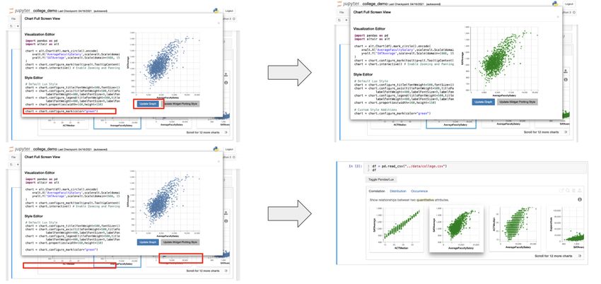
CHAPTER 5. LUX WIDGET FEATURE DEVELOPMENT                                                   22

Figure 5.1: Widget with long description panel (blue background) open describing how the
visualizations on the correlation tab are displayed

Take the distribution tab for example: features could be included to allow users to choose
to reverse the ranking so that the least skewed histograms are displayed first. Alliteratively,
users may desire to rank based on number of outliers instead of how skewed a particular
distribution is. As the Lux system improves in its ability to intelligently generate recom-
mendations, the long description panel is a natural entry point through which users can
manipulate or access these new features that grant them greater control over how the visu-
alizations are displayed.

Key Takeaway The long description panel provides greater clarity for how the widget
generates and organizes displayed visualizations; it can be used as a launching point to give
users greater control in how visualizations are ranked.

5.2     Full Screen Visualization Editor
Turning our attention to the visualization export process, we found from the evaluative stud-
ies that users both wanted greater control over making slight changes to the visualizations
and were confused by the current export process with the export button and the to Altair
method. In addition, the current visualization display in the widget is fairly small, some-
times truncating axis labels or legends. To resolve these problems, we built a full screen
editor displaying the visualization and code needed to construct the visualization side by
side.

The widget features two blocks of linted code cells: the upper cell includes code that cor-
CHAPTER 5. LUX WIDGET FEATURE DEVELOPMENT                                                  23

           Figure 5.2: Full screen editor with code and visualization side by side

responds to the specific expanded visualization while the lower cell includes styling code
(color, font, etc.) that is applied to all visualizations generated by the widget. With the
corresponding “Update Chart” and “Update Widget Plotting Style” buttons, the user can
choose to change either the current plot or the style of all plots.

In order to display the code segments to users, the editor leverages the to Altair method;
the method was restructured to incorporate lux.config.plotting style, a configuration
that can be set by users to universally change the style of the plots generated by the widget.
The result is an independent set of code lines that require only a dataframe to be defined,
the same dataframe that the Lux Widget is visualizing.

Figure 5.3 demonstrates how to use the visualization editor to modify the current visu-
alization or to change the plotting style for all visualizaitons. On modifications to the code
and a click of the “Update Chart” button, the code is passed to the Lux backend as text to
be executed and a Vega-Lite spec [13] formatted as a JSON is returned to be displayed on
the right hand side. This scenario is displayed in the upper part of Figure 5.3. If users wish
to make universal style changes, they can click the “Update Widget Plotting Style” button
to apply style changes to all generated visualizations. In this case, on receiving the new
CHAPTER 5. LUX WIDGET FEATURE DEVELOPMENT 24 Figure 5.3: Using the visualization editor to edit current visualisation or update plotting style for entire widget plotting style, the Lux configuration is changed, and the widget is re-rendered to reflect the new style changes in all displayed visualizations as seen in the lower half of Figure 5.3. This design allows users to easily iterate on customizing individual visualizations. Upon finding a set of style changes they prefer, the editor also grants them the ability to change how the widget displays all visualizations. This drastically decreases the number of steps compared to the previous method of editing visualizations with the export button and the to code functions. More importantly, the side by side display of code and visualization provides users with immediate feedback and mirrors other designs for visualization editing such as the Vega-Lite editor. Full Screen Editor Next Steps The new full screen editor provides opportunities for users to have greater control over cus- tomizing their plots. Although it already helps simplify the process of exporting and editing plots, there is room to give users greater flexibility and convenience. While users currently need to look inline at comments in order to help guide them on how to edit the code, adjust- ments to the plots can instead be done through GUI components such as buttons or sliders. These GUI components would perhaps better address a lot of the feedback received from the evaluative studies that the code blocks generated by to altair were difficult to parse.
CHAPTER 5. LUX WIDGET FEATURE DEVELOPMENT                                                   25

Nonetheless, even with the introduction of buttons and sliders to customize the plot, it
still may be worthwhile to display the code needed to display the plots. This could be useful
either as an educational resource or as a launching point for graphing experts to work with.
A new tab in the editor can be created for every plotting library that Lux supports. As of
now, the editor only displays whatever the default plotting package is set to, but in future
iterations, there can be one tab for altair, one tab for matplotlib, and perhaps even one
tab for directly editing the Vega-Lite specification. As Lux grows to support more plotting
libraries (eg. seaborn), addtional tabs would be added as well.

Key Takeaway The full screen visualization editor o↵ers users the ability to customize
one particular visualization or change the style for all visualizations, significantly reducing
the number of steps for either task when compared to the previous visualization export
process.
26

Chapter 6

Conclusion

To understand and assist with the exploratory data analysis user process, we studied a corpus
of notebooks, analyzed user interactions with lux, and augmented the system’s capabilities
by adding new features. We propose a set of categorizations for common functions from the
pandas, scikitlearn, and matplotlib packages and parse through a sample of notebooks
to observe frequency and time of calls. Thus, we are able to systematically infer what users
are attempting to do with a block of code. We noticed both from the frequencies of calls as
well as patterns in plotted time series that users spend a lot of time printing, visualizing,
and computing statistics for their data, so we turned to work on lux, a framework to accel-
erate visualization of pandas dataframes. We built a system to send and receive logs of user
interactions and analyzed the results from our logs to discover that Lux could improve on
scaling to larger datasets, visualization display, and button usage. We conducted evaluative
user studies to find the difficulties users had with the convoluted and unintuitive visualiza-
tion exporting process of lux. To address our findings, we improved upon describing the
visualization generation method to users as well as added the ability to open visualizations
in full view with editable code side by side.
27

Bibliography

[1] S. Alspaugh et al. “Analyzing Log Analysis: An Empirical Study of User Log Min-
    ing”. In: Proceedings of the 28th USENIX Conference on Large Installation System
    Administration. LISA’14. Seattle, WA: USENIX Association, 2014, pp. 53–68. isbn:
    9781931971171.
[2] Sara Alspaugh et al. Better Logging to Improve Interactive Data Analysis Tools. NY,
    NY, 2014.
[3] Lars Buitinck et al. “API design for machine learning software: experiences from the
    scikit-learn project”. In: ECML PKDD Workshop: Languages for Data Mining and
    Machine Learning. 2013, pp. 108–122.
[4] Souti Chattopadhyay et al. “What’s Wrong with Computational Notebooks? Pain
    Points, Needs, and Design Opportunities”. In: Proceedings of the 2020 CHI Conference
    on Human Factors in Computing Systems. CHI ’20. Honolulu, HI, USA: Association for
    Computing Machinery, 2020, pp. 1–12. isbn: 9781450367080. doi: 10.1145/3313831.
    3376729. url: https://doi.org/10.1145/3313831.3376729.
[5] Karen Holtzblatt and Hugh Beyer. Contextual Design, Second Edition: Design for
    Life. 2nd. San Francisco, CA, USA: Morgan Kaufmann Publishers Inc., 2016. isbn:
    0128008946.
[6] J. D. Hunter. “Matplotlib: A 2D graphics environment”. In: Computing in Science &
    Engineering 9.3 (2007), pp. 90–95. doi: 10.1109/MCSE.2007.55.
[7] Project Jupyter et al. “Binder 2.0 - Reproducible, interactive, sharable environments
    for science at scale”. In: Proceedings of the 17th Python in Science Conference. Ed. by
    Fatih Akici et al. 2018, pp. 113–120. doi: 10.25080/Majora-4af1f417-011.
[8] Thomas Kluyver et al. “Jupyter Notebooks – a publishing format for reproducible
    computational workflows”. In: Positioning and Power in Academic Publishing: Players,
    Agents and Agendas. Ed. by F. Loizides and B. Schmidt. IOS Press. 2016, pp. 87–90.
[9] Andrew J. Ko, Thomas D. Latoza, and Margaret M. Burnett. “A Practical Guide to
    Controlled Experiments of Software Engineering Tools with Human Participants”. In:
    Empirical Softw. Engg. 20.1 (Feb. 2015), pp. 110–141. issn: 1382-3256. doi: 10.1007/
    s10664-013-9279-3. url: https://doi.org/10.1007/s10664-013-9279-3.
BIBLIOGRAPHY 28
[10] Doris Jung-Lin Lee et al. Lux: Always-on Visualization Recommendations for Ex-
ploratory Data Science. 2021. arXiv: 2105.00121 [cs.DB].
[11] Stephen Macke et al. Fine-Grained Lineage for Safer Notebook Interactions. 2020.
arXiv: 2012.06981 [cs.SE].
[12] Adam Rule, Aurélien Tabard, and James D. Hollan. “Exploration and Explanation
in Computational Notebooks”. In: Proceedings of the 2018 CHI Conference on Hu-
man Factors in Computing Systems. CHI ’18. Montreal QC, Canada: Association for
Computing Machinery, 2018, pp. 1–12. isbn: 9781450356206. doi: 10.1145/3173574.
3173606. url: https://doi.org/10.1145/3173574.3173606.
[13] Arvind Satyanarayan et al. “Vega-Lite: A Grammar of Interactive Graphics”. In: IEEE
Transactions on Visualization and Computer Graphics 23.1 (Jan. 2017), pp. 341–350.
issn: 1077-2626. doi: 10.1109/TVCG.2016.2599030. url: https://doi.org/10.
1109/TVCG.2016.2599030.
[14] The nteract team. nteract/papermill: Papermill. Version latest. url: https://github.
com/nteract/papermill.
[15] The pandas development team. pandas-dev/pandas: Pandas. Version latest. Feb. 2020.
doi: 10.5281/zenodo.3509134. url: https://doi.org/10.5281/zenodo.3509134.
[16] Yifan Wu. yifanwu/notetaker: Notetaker. Version latest. url: https://github.com/
yifanwu/notetaker.
[17] Doris Xin et al. “Helix: Holistic Optimization for Accelerating Iterative Machine Learn-
ing”. In: CoRR abs/1812.05762 (2018). arXiv: 1812.05762. url: http://arxiv.org/
abs/1812.05762.
[18] Tianyi Zhang et al. “Enabling Data-Driven API Design with Community Usage Data:
A Need-Finding Study”. In: Proceedings of the 2020 CHI Conference on Human Fac-
tors in Computing Systems. CHI ’20. Honolulu, HI, USA: Association for Computing
Machinery, 2020, pp. 1–13. isbn: 9781450367080. doi: 10.1145/3313831.3376382.
url: https://doi.org/10.1145/3313831.3376382.You can also read