Using the Absolute Advantage Coecient(AAC) to Measure the Strength of Damage Hit by COVID-19 in India on a Growth-Share Matrix
←
→
Page content transcription
If your browser does not render page correctly, please read the page content below
Using the Absolute Advantage Coefficient(AAC) to
Measure the Strength of Damage Hit by COVID-19 in
India on a Growth-Share Matrix
Daw-Hsin Yang
Chi Mei Foundation Hospital: Chi Mei Medical Center
Tsair-Wei Chien ( rasch.smile@gmail.com )
Chi Mei Medical Center https://orcid.org/0000-0003-1329-0679
Yu-Tsen Yeh
St George's University of London
Ting-Ya Yang
Chi Mei Medical Center
Willy Chou
Chi Mei Medical Center
Ju-Kuo Lin
Chi Mei Medical Center
Research
Keywords: Four-quadrant diagram, COVID-19, multiply infection rate, dashboard, Google Maps
Posted Date: May 26th, 2021
DOI: https://doi.org/10.21203/rs.3.rs-541061/v1
License: This work is licensed under a Creative Commons Attribution 4.0 International License.
Read Full License
Page 1/22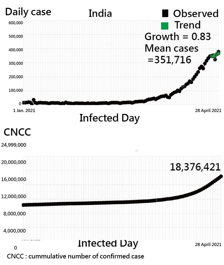
Abstract
Background: The COVID-19 pandemic occurred and rapidly spread around the world. Some online
dashboards have included essential features on a world map. However, only transforming data into
visualizations for countries/regions is insufficient for the public need. This study aims to (1) develop an
algorithm for classifying countries/regions into four quadrants inn GSM and (2) design an app for a
better understanding of the COVID-19 situation.

Methods: We downloaded COVID-19 outbreak numbers daily from the Github website, including 189
countries/regions. A four-quadrant diagram was applied to present the classification of each
country/region using Google Maps run on dashboards. A novel presentation scheme was used to identify
the most struck entities by observing (1) the multiply infection rate(MIR) and (2) the growth trend in the
recent seven days. Four clusters of the COVID-19 outbreak were dynamically classified. An app based on
a dashboard aimed at public understanding of the outbreak types and visualizing of the COVID-19
pandemic with Google Maps run on dashboards. The absolute advantage coefficient(AAC) was used to
measure the damage hit by COVID-19 referred to the next two countries severely hit by COVID-19.

Results: We found that the two hypotheses were supported: India (i) is in the increasing status as of April
28, 2021, (ii) has a substantially higher ACC(=0.81>0.70), and (iii) has a substantially higher
ACC(=0.66
COIVD-19 when compared to the next two countries/regions(e.g., what are the situations in India using
the GSM and the AAC when the deadly second wave of Covid-19 spreads from cities to small towns[23].

1.1. Literature Review

1.1.1. The GSM coined by the Boston Consulting Group (BCG)

The GSM is the most famous and simple portfolio planning matrix suggested to organizations to achieve
a balance between the four categories of products a company produces[24,25], and was established
in1970 by Bruce Doolin Henderson (1915–1992) for the BCG in Boston, Massachusetts, the USA.
Henderson was the President and Chief Executive Officer (CEO) until 1980. He was also Chairman until
1985. The matrix helps the business corporations for the improvement of the skills to run their business
efficiently and profitably[26].

To help businesses further analyze their assets, the GSM divides the business products into four
categories[17]:

(i) “Question Marks‟ indicates the products in high growth markets and with low market share(shown in
Quadrant II).

(ii) “Stars‟ shows that both the growth markets and market share are in the highest position(shown in
Quadrant I).

(iii) “Cash Cows‟ predicts that the products are in low growth markets, and market share is high(shown in
Quadrant IV).

(iv) “Dogs‟ displays that both growth and market share are in a low position(shown in Quadrant III).

We image that all countries/regions hit by COVID-19 are similar to products in GSM. The multiple
infection rates (MIR, which is similar to the growth rate of the gross domestic product (GDP) or the
multiple interest rate in banking that we are familiar with to denote the growth trend of daily confirmed
cases of COVID-19 in the recent one week[27]. The market share in GSM can be represented by the mean
MIR of a country/region in COVID-19. As such, we are motivated to apply the GSM to understand the
COVID-19 situations for each country/region in the recent seven days. The first hypothesis is whether
India is in an increasing quadrant of GSM as of 28 April 2020 when the deadly second wave of Covid-19
spreads from cities to small towns[23].

1.1.2. The ACC applied to measure the strength of damage hit by COVID-19

The ACC[18–22] is defined by Eqs. (1) and (2):

                  (1)

                                                 Page 3/22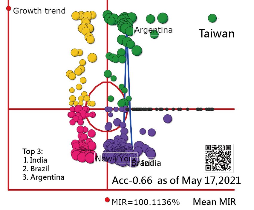
(2)

where Ratio is determined by the three consecutive numbers of daily confirmed cases(e.g., total cases in
the recent seven days) of countries/regions(i.e., the top three have the most number of confirmed cases)
(denoted by γ1, γ2,and γ3 in Eq. (1)). The ACC ranged from 0 to 1.0 stands for the strength of total
confirmed cases when compared to the next two countries/regions.

Through the computation of AAC, the strength of damage hit by COVID-19 in India can be measured
when compared to the next two following countries/regions.

1.2. The need to display the GSM on a dashboard

Websites targeted toward the public were found to have a various extent of poor to mediocre quality on
educational material [28]. As mobile technology continues to expand, assessing health information is
common and worthy of continuously improved applications and development for use in epidemic[14,
29–32]. Although numerous COVID-19 related websites [6–13] were globally developed to report the
public health risks of the COVID-19, its application and use in displaying the two features of GSM and
AAC are lacking. We were motivated to design an app that can provide unique information about COVID-
19 situations to the public, particularly using the GSM and AAC to verify whether India has a large effect
size of AAC due to the deadly second wave of Covid-19 spreads from cities to small towns[23] as of 28
April 2021.

1.3. Main Goals

Based on the two proposed schemes of GSM and AAC, we made two hypotheses that India (i)is in an
increasing quadrant of GSM(i.e., continuously increasing), and (ii) has a large effect size of AAC(i.e.,
greater than 0.70 [20, 33,34])

The aims of the current study are to (1) develop an algorithm for classifying countries/regions into four
quadrants inn GSM and (2) design an app for a better understanding of the COVID-19 situation.

Methods
2.1 Data source

We downloaded COVID-19 outbreak numbers for countries/regions on 28 April 2021 from the Github
websites [8], which contains confirmed cases in all 189 infected countries/regions, see Appendices A and
B. All downloaded data were made available to the public on the websites [8]. Ethical approval is not
necessary for this study because all the data were obtained from the websites.

2.2 An algorithm for displaying the growth trend and the mean MIR

                                                  Page 4/22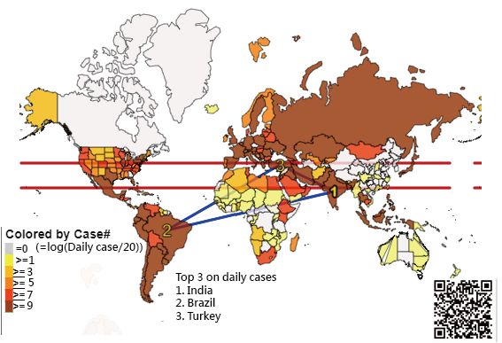
2.2.1 The MIR Definition in Growth Trend on Axil Y

The MIR is based on the geometric mean (=                                        , where x denotes the
cumulative count at the last(Xn) and the first(X1) time point, and n stands for the sequentially observed
days). In the current study, we calculated the MIR for each country/region on a weekly (= 7 days) basis.
For instance, the data string {1,1,1,1,2,4,4,4} of daily confirmed cases for a country yields a MIR of 0.26(=
(4/1)^(1/6)-1, where 6=7-1).

The growth trend in the spread of COVID-19 is defined as the angle between the two numbers of daily
confirmed cases in the period of observed days(i.e., in the recent seven days). The angle was then
computed by Eq. (3):

Angle index =                                ,   (3)

where Degrees() and Atan() are derived from the functions in Microsoft Excel, and CNCC is the cumulative
numbrer of confirmed cases for a county k. For instance, ∆IP = 7 days, ∆CNCC = 1,000–600 = 400, ratio =
400/(7 − 1) = 66.6, θ = DEGREES(ATAN(66.6)) = 89.14. The angle index ranges from 0 to 90, wherein a
higher θ value means a greater increase of damage hit by COVID-19 in a given country or region.

The explanations of MIR (interpreted by the geometric mean) and trend(denoted by angle) are shown in
Fig. 1. We can see that the MIR equals zero when the stationarity is present owing to the two points(e.g..,
A and B in Fig. 1) being identical(e.g., 210 and 210 in CNCC). The trend is denoted by the angle using the
formula of Degrees (Atan((P-Q)/6) in MS Excel, ranging between − 90 to 90.

2.2.2 The Mean Infection Rate(MIR) as the Share on Axil X

The X-axis (trend magnitude) is based on the geometric mean MIR in the recent seven days. The Y-axis
(trend growth) is derived from the angle from − 90 to 90 mentioned above. As such, the four-quadrant
diagram in GSM was applied to classify countries/regions into four clusters (i.e., ready to increase,
increasing, slowing down, and ready to decrease)[17].

The absolute cutting points on Y-axis are determined at 0 degrees, and the relative cutting point on X-axis
is determined at the median of all Mean MIRs computed from the 189 study countries/regions. The first
hypothesis that India is in Quadrant I of GSM would be verified. The flowchart and the abstract video of
this study are provided in Fig. 2 and Appendix C.

2.3 AAC to Measure the Strength of Damage Hit by Covid-19 related to the Next Two Countries

The AAC is defiened in Eq. (2). India was demonstrated to compute the AAC when compared to the
following two countries severely hit by COVID-19 based on the CNCC than India as of 28 April. 2021. The
second hypothesis that India has a large effect size of AAC(> 0.70) would be verified in this study.
                                                   Page 5/22
Notably, If all those total daily cases are equal in the recent 7 days, the AAC is 0.5(=[(1/1)/(1/1)]/(1+
[(1/1)/(1/1)]) = 1/2 = 0.5.
2.4 App classifying growth trends and MIRs for Countries/Regions
Based on the daily reports from the Github website[8], we built an updated online dashboard for tracking
the worldwide spread of the COVID-19 outbreak with data collected as of 28 April 2021.
2.5 Creating Dashboards on Google Maps
The classifications for each country/region were shown by author-made online modules. We created
HTML pages for Google Maps. All the relevant COVID-19 information on the countries/regions can be
linked to dashboards on Google Maps. Bubbles were sized and colored by (1) the cumulative daily
number of confirmed cases in the recent seven days and (2) the cluster feature in GSM, respectively.
When a specific bubble is clicked, further information and hyperlinks to the trend chart appear on the
dashboard.
Results
3.1. An Overall View on A Choropleth Map
Comparisons in daily confirmed cases of Covid-19 were made using the choropleth map in Fig. 3. The top
three countries are India(= 379,308 per day), followed by Brazil(= 79,726) and Turkey(= 40,444). The AAC
based on the daily confirmed cased on 28 April 2021 is 0.71(=(379308/79726)/(79726/40444)/[1+
(379308/79726)/(79726/40444)].
Readers are invited to practice the visual representation on Google Map via the link[35] or the QR-code in
Fig. 3.
If the colorful region is clicked, two-line plots immediately appear on a dashboard. The example of India
is demonstrated as of 28 April 2021 in Fig. 4. The trend was observed via the daily and the CNCC cases
since 1 January 2021.
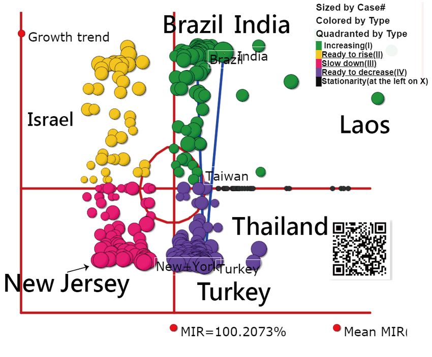
3.2. The GSM is shown on a dashboard
The COVID-19 GSM is shown on a dashboard. Bubbles are sized by the mean daily cases in the recent
seven days and colored by the features of growth and share in GSM. That is, yellow bubbles in Quadrant
II represent the pandemic situation ready to increase(e.g., Israel), green bubbles in Quadrant I stand for
the situation increasing(e.g., India), red bubbles in Quadrant III mean the situation slowing down(e.g., New
Jersey in US), and purple bubbles are ready to decrease in Quadrant IV(e.g., Turkey and Thailand). .It is
worth noting that the growth and share are denoted on Axil Y and Axil X, respectively.
As expected, top three countries of India, Brazil, and Turkey are highlighted by three blue lines linked
together in Fig. 5. The first hypothesis that India is in the increasing quadrant of GSM has been supported
Page 6/22in Fig. 5.
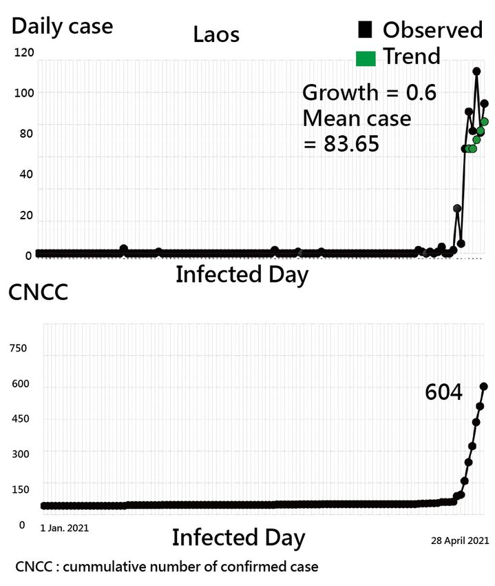
Surprisingly, Laos was neglected by the public when observing the GSM in Fig. 5. If the line plots are
drawn as shown in Fig. 6, the higher growth and share(denoted by MIR) in Laos can be easily seen.
Accordingly, the outliners are easily examined through the GSM, as we demonstrated in Figs. 5.
Readers are invited to practice the visual representation on Google Map via the link[36] or the QR-code in
Fig. 5.
3.3. The AAC of India
The AAC of India is 0.81(=(2112726/353316)/(353316/249644)/(1 + 2112726/353316)/
(353316/249644)) because the total daily cases in the recent seven days for the top three countries of
India, Brazil, and Turkey are 2112726, 353316, and 249644, respectively. The second hypothesis that
India has a large effect size of AAC (i.e., greater than 0.7 [20, 33,34]) was supported(i.e., 0.81 > 0.7). If the
day is extended to 1 May 2021, the AAC of India is 0.79.
If AAC(= 0.54) for Laos followed by Guangxi(China) and Shanxi(China) is computed, the formula can be
composed of (2374/1890)/(1890/1744)/[1+(2374/1890)/(1890/1744)].
3.4. Online Dashboards Shown on Google Maps
All of those QR codes in the figures are linked to the dashboards[35,36]. Readers are recommended to
examine the displayed dashboards on Google Maps. The 4-Q diagram as of May 17, 2021, is present in
Fig. 8. We can see that Taiwan was severely hit by COIVD-19. The top 3 countries with most number of
confirmed cases in recent seven days were India, Brazil, and Argentina. The ACC has down to 0.66
Discussion
4.1. Principal Findings
Based on the data of COV ID-19 as of 28 April 2021, the two hypotheses were supported: (i) India is in the
increasing quadrant of GSM in Fig. 5, and (ii) India has a substantially larger effect size of AAC(= 0.81 >
0.7) shown in Fig. 7.
The two goals were also achieved by (1) developing an algorithm for classifying countries/regions into
four quadrants in GSM and (2) designing an app for a better understanding of the outbreak situation of
COVID-19.
4.2. Contributions of the Study
4.2.1. The GSM
Page 7/22This study extends the Boston Consulting Group four-cell growth/share product portfolio matrix[24,25].
The BCG matrix was originally applied to products; however, in this case, the BCG concept is applied to
countries/regions hit by COVDI-19, which were classified into four quadrants based on the
growth(denoted by the angle of CNCC in the recent seven days) on the Y-axis and the share(denoted by
the mean MIR) on the X-axis. In this study, we verified that the COVID-19 situation in India is increasing
and has a substantially higher AAC(= 0.81) when compared to the two next following countries with the
most number of CNCC, indicating India is most severely hit by COVID-19.
The GSM is based on the CNCC growth and share represented by the angle in Eq. (3) and the magnitude
of mean MIR. If a country/region has a steeper trend and a bigger magnitude in MIR, there will be more
infections from the disease outbreak than other countries/regions. The BCG matrix was thus applied to
measure the ongoing outbreaks in this study, the type of hospitals in therapeutic duplication for patients
with high blood lipids[17], the relative importance of each customer to the company's total profit by
segmenting customers into portfolios[37], the smart farms classified in the Supply Chain to supplement
the revenues of their underlying product sales[38], and the export competitiveness of Malaysia processed
food in the middle east market[39].
The classification has been used by humans for thousands of years. It is also important to our everyday
life and applies to almost everything we do, allowing us to find and recognize things more easily [40,41].
Imagine if we went to a library without classification—where would we start looking for a particular book?
Similarly, if we encountered the COIVD-19 spreads around the world without classification—where would
we start looking for mitigating the impact of the COVID-19 pandemic on progress towards ending the
COIVD-19 spreads.
4.2.2. The AAC
Except for the GSM, AAC was applied to measure the strength of damage in a country/region hit by
COVID-19 when compared to the next following two countries. Under the influence of a pandemic like
COVID-19, we hoped to develop an index that can determine the dominant roles in countries/regions[19],
which is similar to that used in determining the strength of the leading company in an industry using the
separation index[42] and the Herfindahl index (HI) proposed by economists Orris C. Herfindahl and Albert
O. Hirschman[43] to investigate the competition in the industry[44].
The same applied to what we investigated one questionnaire(or test) as a unidimensional construct is
using Eigenvalues[20] to determine the dimension coefficient with the cutting point at 0.70 as we did in
Eq. (2). Furthermore, the most cited article (PMID = 23563266 with 2604 citations in PMC) [45] with a
higher AAC(= 0.77) in article citations in the fields of dengue fever[46].
4.2.3. The Mobile APP
Additionally, numerous websites have built online dashboards for regularly updated data for tracking the
worldwide spread of the COVID-19 outbreak[6–13]. Almost all of them merely provided common COVID-
Page 8/2219-related information to the public[14]; see the snapshot from JHC in Appendices B and C. A dashboard-
type interface with useful information is required to provide the public with an interpretation of COVID-
19(or other pandemic diseases) with the four classifications in color, particularly for mobile apps in our
modern technological age, as we did in this study.
4.3 Strengths and implications in this study
The first feature is to demonstrate the four-quadrant diagram of GSM and its relevant line charts with
MP4 video in Appendices B and C. The dashboard-type GSM can be further applied to other disease
outbreaks in the future, not limited to COVID-19.
The two topics of (i) GSM and (ii) AAC for India were demonstrated in this study. We can see that the
outliers in GSM are easily examined (e.g., Loas found in Figs. 5 and 6). The four-quadrant diagram of
GSM displayed on the dashboard is innovative. We have not seen a similar dashboard combined with the
growth and the share(denoted by the mean MIR) to show the COVID-19 situation in the literature.
As with all forms of Web-based technology, advances in health communication technology are occurring
every moment [47]. The real-time mobile online dashboard for COVID-19 provided to the public is the
fourth feature. Dashboards with four quadrants are practical and worth replicating for other disease
outbreaks. The mobile online dashboard is informative and has value in keeping the public up-to-date,
especially during a disease outbreak, much such as the one we are facing now. Readers are
recommended to scan the QR codes on the figures and see the details about the outbreak trends using
the line charts[35,36].
4.4 Limitations and suggestions
Our study has some limitations. First, although the data were downloaded from Google Sheets daily, the
online near real-time dashboard could be improved and polished by connecting to Google Sheets
instantly. Other dashboard features, such as the color selections, the app layout design, and employed
predictive analytics [48–52], should be improved in the future.
Second, although the novel visual representations (Figs. 4 and 5) were proposed in this study, the bubble
of interest can be linked to more information about the details of the countries/regions with the improved
app on performance and features in the future.
Third, many innovations have been introduced with advances in science and technology, such as the
visual dashboard on Google Maps using the coordinates to display and line plots on cloud computation,
as shown in Figs. 3 to 5. However, these achievements are not free of charge. For example, the Google
Maps API requires a paid project key for use on the cloud platform, and the line plot also requires
payment (to JPowered) for the template used on the website. Thus, the second limitation of the module is
that it is not publicly accessible and is difficult to mimic by other authors or programmers for use in a
short period of time.
Page 9/22Fourth, the mascots were applied to the traditional GSM in BOG24,25], such as stars, problem children,
cash cows, and dogs, that might be inappropriate in health care settings(e.g., the entries are now
countries hit by COVID-19 rather than products in the original GSM[24,25]). Appropriate mascots, such as
platinum, gold, silver, bronze, and iron denoted by colors of black, green, yellow, purple, and red in GSM,
respectively, might be applied to the feature of quadrants in GSM in this regard of COVID-19.
Finally, the GSM is constructed by growth and share. The latter is formed by the mean MIR(i.e., the
infection rate in the recent seven days) instead of the CNCC traditionally used in the epidemic. Although
the CNCC is sized by the bubble in GSM, the CNCC on the X-axis could be attempted in the future. If so,
India would be on the far right side and Loas on the left side. The infection rate would not be highlighted
in GSM.
Conclusion
We included subtle algorithms in an app that makes the COVID-19 information more useful and
meaningful to the general public. Readers who are interested in the four-quadrant diagram of GSM are
invited to link the website with the QR-codes in Figures. More useful messages provided to the public are
required to develop particular algorithms on an app in the future. The app with GSM and AAC is
recommended for researchers in use in other disease outbreaks, not just limited to COVID-19.
Abbreviations
BCG= Boston Consulting Group; GDP= gross domestic product; MIR= Multiple Infection rate; PMC=
Pubmed Central; JHC= The Johns Hopkins
Declarations
Ethics approval and consent to participate
Not applicable.
All data were downloaded from the website database at Github
Consent to publish
Not applicable.
Availability of data and materials
All data used in this study are available in Supplemental Digital Contents.
Competing interests
The authors declare that they have no competing interests.
Page 10/22Funding
There are no sources of funding to be declared.
Authors’ contributions
TWC conceived and designed the study. DH and TY performed the statistical analyses and was in charge
of recruiting study participants. JK and WC contributed the idea. YT helped design the study, collected
information, and JK interpreted the data. TWC monitored the research. All authors read and approved the
final article.
Acknowledgments
We thank AJE (American Journal Experts at https://www.aje.com/) for the English language review of
this manuscript. All authors declare no conflicts of interest.
References
1. Nishiura H, Kobayashi T, Yang Y, Hayashi K, Miyama T, Kinoshita R, Linton NM, Jung SM, Yuan B,
Suzuki A, Akhmetzhanov AR. The Rate of Unde ascertainment of Novel Coronavirus (2019-nCoV)
Infection: Estimation Using Japanese Passengers Data on Evacuation Flights. J Clin Med. 2020 Feb
4;9(2). PII: E419.
2. Zhao S, Lin Q, Ran J, Musa SS, Yang G, Wang W, Lou Y, Gao D, Yang L, He D, Wang MH. Preliminary
estimation of the basic reproduction number of novel coronavirus (2019-nCoV) in China, from 2019
to 2020: A data-driven analysis in the early phase of the outbreak. Int J Infect Dis. 2020 Jan 30. PII:
S1201-9712(20)30053-9.
3. Jin YH, Cai L, Cheng ZS, Cheng H, Deng T, Fan YP, Fang C, Huang D, Huang LQ, Huang Q, Han Y, Hu B,
Hu F, Li BH, Li YR, Liang K, Lin LK, Luo LS, Ma J, Ma LL, Peng ZY, Pan YB, Pan ZY, Ren XQ, Sun HM,
Wang Y, Wang YY, Weng H, Wei CJ, Wu DF, Xia J, Xiong Y, Xu HB, Yao XM, Yuan YF, Ye TS, Zhang XC,
Zhang YW, Zhang YG, Zhang HM, Zhao Y, Zhao MJ, Zi H, Zeng XT, Wang YY, Wang XHA. A rapid
advice guideline for the diagnosis and treatment of 2019 novel coronavirus (2019-nCoV) infected
pneumonia (standard version).Mil Med Res. 2020 Feb 6;7(1):4
4. NBC news. Are coronavirus diseases equally deadly? Comparing the latest coronavirus to MERS and
SARS.. 2020/3/5 available at https://www.nbcnews.com/health/health-news/coronavirus-diseases-
comparing-covid-19-sars-mers-numbers-n1150321.
5. Pubmed Central. Articles related to 2019-nCoV in Pubmed. 2020/2/9 available at
http://www.healthup.org.tw/html100/searchpubmed.asp
6. Dong E, Du H, Gardner L. An interactive web-based dashboard to track COVID-19 in real time
[published online ahead of print, 2020 Feb 19]. Lancet Infect Dis. 2020;S1473-3099(20)30120-1.
doi:10.1016/S1473-3099(20)30120-1
Page 11/227. Worldometers. Wuhan Coronavirus Outbreak. 2020/2/9 available at
https://www.worldometers.info/coronavirus/CoV) has now surpassed MERS (final toll of 858 deaths
in 2012).
8. Google Team. 2021 Novel Coronavirus (nCoV) Data Repository. . 2021/4/29 available at
https://github.com/CSSEGISandData/2019-nCoV
9. World Health Organization(WHO). Novel coronavirus (2019-nCoV) outbreak. . 2020/2/9 available at
https://www.who.int/emergencies/diseases/novel-coronavirus-2019/situation-reports
10. Centers for Disease Control and Prevention (CDC).CDC tests for 2019-nCoV. . 2020/2/9 available at
https://www.cdc.gov/
11. European Centre for Disease Prevention and Control (ECDC).Novel coronavirus. 2020/2/9 available
at https://www.ecdc.europa.eu/en/home
12. DXY. Novel coronavirus (2019-Nov). 2020/2/9 available at
https://ncov.dxy.cn/ncovh5/view/pneumonia
13. National Health Commission of the People's Republic of China (NHC). News and preventions for
2019-now. 2020/2/9 available at http://www.nhc.gov.cn/wjw/index.shtml
14. Ivanković D, Barbazza E, Bos V, Brito Fernandes Ó, Jamieson Gilmore K, Jansen T, Kara P, Larrain N,
Lu S, Meza-Torres B, Mulyanto J, Poldrugovac M, Rotar A, Wang S, Willmington C, Yang Y,
Yelgezekova Z, Allin S, Klazinga N, Kringos D. Features Constituting Actionable COVID-19
Dashboards: Descriptive Assessment and Expert Appraisal of 158 Public Web-Based COVID-19
Dashboards. J Med Internet Res. 2021 Feb 24;23(2):e25682. doi: 10.2196/25682. PMID: 33577467;
PMCID: PMC7906125.
15. MacMillan IC, Hambrick DC, Day DL. The Product Portfolio and Profitability--A PIMS-Based Analysis
of Industrial-Product Businesses. Acad Manage J. 1982 Dec 01;25(4):733–755. doi:
10.2307/256096.
16. Spee AP, Jarzabkowski P. Strategy tools as boundary objects. Strateg Organ. 2009 Apr 15;7(2):223–
232. doi: 10.1177/1476127009102674.
17. Kan WC, Kuo SC, Chien TW, Lin JJ, Yeh YT, Chou W, Chou PH. Therapeutic Duplication in Taiwan
Hospitals for Patients With High Blood Pressure, Sugar, and Lipids: Evaluation With a Mobile Health
Mapping Tool. JMIR Med Inform. 2020 Jul 27;8(7):e11627. doi: 10.2196/11627.
18. Lee C.J., Chou W., Chien T.W., Yeh Y.T., Jen T.H. Using the separation index for identifying the
dominant role in an organization: A case of publications in organization innovation. Int. J. Organ.
Innov. 2020;12:135–145.
19. Chang C.S., Yeh Y.T., Chien T.W., Lin J.C.J., Cheng B.W., Lai F.J. Using the separation index to identify
the most dominant role: A case of application on COVID-19 outbreak. Int. J. Organ. Innov.
2020;12:10–20.
20. Chien T.W. Cronbach’s Alpha with the Dimension Coefficient to Jointly Assess a Scale’s Quality.
Rasch Meas. Trans. 2012;26:1379.
Page 12/2221. Wang LY, Chien TW, Chou W. Using the IPcase Index with Inflection Points and the Corresponding
Case Numbers to Identify the Impact Hit by COVID-19 in China: An Observation Study. Int J Environ
Res Public Health. 2021 Feb 18;18(4):1994. doi: 10.3390/ijerph18041994. PMID: 33670825; PMCID:
PMC7923186.
22. Lee KW, Chien TW, Yeh YT, Chou W, Wang HY. An online time-to-event dashboard comparing the
effective control of COVID-19 among continents using the inflection point on an ogive curve:
Observational study. Medicine (Baltimore). 2021 Mar 12;100(10):e24749. doi:
10.1097/MD.0000000000024749. PMID: 33725830; PMCID: PMC7969250.
23. BBC News.India Covid-19: Deadly second wave spreads from cities to small towns/2021/4/28
available at https://www.bbc.com/news/world-asia-india-56913047
24. Ansoff IH. Corporate Strategy. London: Penguin Books, 1987.
25. Ansoff IH, McDonnell EJ. Implanting Strategic Management (2nd Ed.). Prentice Hall, International
(UK) Ltd: Cambridge, Great Britain, 1990.
26. Mohajan HK.An Analysis on BCG Growth Sharing Matrix. Noble International Journal of Business
and Management Research 2018;2(1):1-6.
27. Chang CS, Yeh YT, Chien TW, Lin JJ, Cheng BW, Kuo SC. The computation of case fatality rate for
novel coronavirus (COVID-19) based on Bayes theorem: An observational study. Medicine
(Baltimore). 2020 May 22;99(21):e19925. doi: 10.1097/MD.0000000000019925. PMID: 32481256;
PMCID: PMC7249957.
28. Zhao, S.; Chen, H. Modeling the epidemic dynamics and control of COVID-19 outbreak in China.
Quant. Biol. 2020, 8, 11–19, doi:10.1007/s40484-020-0199-0.
29. Rong, X.; Yang, L.; Chu, H.; Fan, M. Effect of delay in diagnosis on transmission of COVID-19. Math.
Biosci. Eng. 2020, 17, 2725–2740, doi:10.3934/mbe.2020149.
30. Mandal, M.; Jana, S.; Nandi, S.K.; Khatua, A.; Adak, S.; Kar, T. A model based study on the dynamics
of COVID-19: Prediction and control. Chaos Solitons Fractals 2020, 136, 109889,
doi:10.1016/j.chaos.2020.109889.
31. Huang, J.; Qi, G. Effects of control measures on the dynamics of COVID-19 and double-peak behavior
in Spain. Nonlinear Dyn. 2020, 101, 1889–1899, doi:10.1007/s11071-020-05901-2.
32. Shang, C.; Yang, Y.; Chen, G.-Y.; Shang, X.-D. A simple transmission dynamics model for predicting the
evolution of COVID-19 under control measures in China. Epidemiol. Infect. 2021, 149, 1–10,
doi:10.1017/s0950268821000339.33.
33. Lord FM. Applications of item response theory to practical testing problems. Hillside, NJ: Erlbaum,
1980.
34. Divgi DR. Dimensionality of binary items: Use of a mixed model. Paper presented at the annual
meeting of the National Council on Measurement in Education. Boston, MA, 1980.
35. Chien TW. Figure 3 demonstrated in this study. 2021/4/29 available at
http://www.healthup.org.tw/kpiall/ncovworld.asp?mtypeabc=4&week=1
Page 13/2236. Chien TW. Figure 5 demonstrated in this study. 2021/4/29 available at
http://www.healthup.org.tw/kpiall/wihenclassify2.asp
37. Thakur R, Workman L. Customer portfolio management (CPM) for improved customer relationship
management (CRM): Are your customers platinum, gold, silver, or bronze? Journal of Business
Research 2016; 69(10): 4095-4102
38. Chang TFM, Droli M, Iseppi L. Dose smart agriculture go downstream in the supply chain?Italian
Journal of Food Science 2014; XXVI(4):451
39. Selamat J, Misran AF, Shamsudin MN, Bojei J, Salleh R. Export competitiveness of the Malaysia
processed food in the middle east market. Journal of Agribusiiness Marketing 2010; Special Edition:
106-120
40. Jeong, G.H.; Lee, H.J.; Lee, J.; Lee, J.Y.; Lee, K.H.; Han, Y.J.; Yoon, S.; Ryu, S.; Kim, D.K.; Park, M.B.; et al.
Effective Control of COVID-19 in South Korea: Cross-Sectional Study of Epidemiological Data. J.
Med. Internet Res. 2020, 22, e22103, doi:10.2196/22103.
41. Yie KY, Chien TW, Yeh YT, Chou W, Su SB. Using Social Network Analysis to Identify Spatiotemporal
Spread Patterns of COVID-19 around the World: Online Dashboard Development. Int J Environ Res
Public Health. 2021 Mar 3;18(5):2461. doi: 10.3390/ijerph18052461. PMID: 33802247; PMCID:
PMC7967593.
42. Lee CJ, Chou W, Chien TW, Yeh YT, Jen TH. Using the Separation Index for Identifying the Dominant
Role in an Organization: A case of Publications in Organizational Innovation, Journal of
Organizational Innovation 2020; 12(4):135-145.
43. Hirschman AO. The Strategy of Economic Development. Yale University Press, 1958.
44. Catherine LH., Alan P. Inventive Concentration: An Analysis of Fuel Cell Patents. Science and Public
Policy 2004; 31(1): 15-25.
45. Bhatt S., Gething P.W., Brady O.J., Messina J.P., Farlow A.W., Moyes C.L., Drake J.M., Brownstein J.S.,
Hoen A.G., Sankoh O., et al. The global distribution and burden of dengue. Nature. 2013;496:504–
507. doi: 10.1038/nature12060.
46. Liu SY, Chien TW, Yang TY, Yeh YT, Chou W, Chow JC. A Bibliometric Analysis on Dengue Outbreaks
in Tropical and Sub-Tropical Climates Worldwide Since 1950. Int J Environ Res Public Health. 2021
Mar 19;18(6):3197. doi: 10.3390/ijerph18063197. PMID: 33808795; PMCID: PMC8003706.
47. Gallacher, D.; Kimani, P.; Stallard, N. Extrapolating Parametric Survival Models in Health Technology
Assessment: A Si-mu-lation Study. Med. Decis Making. 2021, 41, 37–50.
48. NBSP; Johns Hopkins University Coronavirus Resource Center. COVID-19 Dashboard by the Center
for Systems Science and Engineering (CSSE) at Johns Hopkins University (JHU). Available online:
https://coronavirus.jhu.edu/map.html (accessed on 29 October 2020).
49. Leszkiewicz, A. Dashboard Online for COVID-19 in Near Real Time. Available online:
https://avatorl.org/covid-19/ (accessed on 20 February 2021).
50. World Health Organization. WHO Coronavirus Disease (COVID-19) Dashboard. 2020. Available
online: https://covid19.who.int/ (accessed on 3 March 2021).
Page 14/2251. HealthMap. Novel Coronavirus 2019-nCoV (Interactive Map). Available online:
https://healthmap.org/wuhan/ (accessed on 20 February 2021).
52. Schiffmann, A. A Creator of One COVID-19 Dashboard. Available online: https://ncov2019.live/data
(accessed on 20 February 2021)
Figures
Figure 1
How to compute the MIR and trend (denoted by angle) with visualizations.
Page 15/22Figure 2
The study design is composed of two scenarios and two axes to classify entities into four clusters.
Page 16/22Figure 3
The recent daily confirmed cases shown on the choropleth map as of 28 April 2021 Note: The
designations employed and the presentation of the material on this map do not imply the expression of
any opinion whatsoever on the part of Research Square concerning the legal status of any country,
territory, city or area or of its authorities, or concerning the delimitation of its frontiers or boundaries. This
map has been provided by the authors.
Page 17/22Figure 4
Line plots for India as of 28 April 2021 to present the trend when observing daily and CNCC cases since 1
January 2021 (Note. the trend is determined by the green dots connected by the first and the end dots in
the recent seven days)
Page 18/22Figure 5
The GSM of COVID-19 based on bubbles sized by the mean daily cases and colored by the features of
growth and share shown on a dashboard
Page 19/22Figure 6
Line plots for Loas as of 28 April 2021 to present the trend when observing daily and CNCC cases since 1
January 2021 (Note. the trend is determined by the green dots connected by the first and the end dots in
the recent seven days)
Page 20/22Figure 7
The calculation of AAC for India as of April 28, 2021
Page 21/22Figure 8
The 4-Q diagram as of May 17, 2021 from 0.81 on April 28, 2021
Supplementary Files
This is a list of supplementary files associated with this preprint. Click to download.
append1.txt
append2.txt
append3.txt
Page 22/22You can also read