Visualizing models and observations of the thermosphere-ionosphere - EGU2020
←
→
Page content transcription
If your browser does not render page correctly, please read the page content below
Visualizing models and observations
    of the thermosphere-ionosphere
     in support of the ESA EE10 candidate mission Daedalus

                                            Eelco Doornbos
                                   (eelco.doornbos@knmi.nl)

                                            Theodoros Sarris
                                         Stylianos Tourgaidis
                                           Panagiotis Pirnaris
                                            Stephan Buchert
                                                    Hanli Liu
                                                     Gang Lu
                                          Federico Gasperini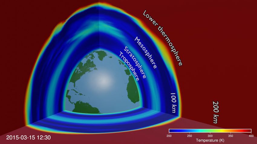
Presentation contents

• The Daedalus mission and the need for high quality visualisations
• Visualisation examples:
 • WACCM-X model slices
 • Sampling of the thermosphere-ionosphere along the Daedalus orbit
 • Visualising the magnetosphere
• Lessons learned and outlook
• Overview of tools and code repositories
The Daedalus mission
               An Earth Explorer 10 candidate mission

• The ESA Earth Explorers are cutting-edge satellite missions to advance
  scientific understanding of our planet and to show how new
  technologies can be used in space. Previously realised missions in this
  programme include GOCE, Swarm, Aeolus, Cryosat and SMOS.
• Currently three missions (Daedalus, HydroTerra and Harmony) are
  undergoing definition and feasibility studies (phase 0). At the end of
  2020, two out of three can be selected to go into more detailed studies
  (phase A), after which a decision on which mission will be selected for
  implementation as Earth Explorer 10 will be made in 2022.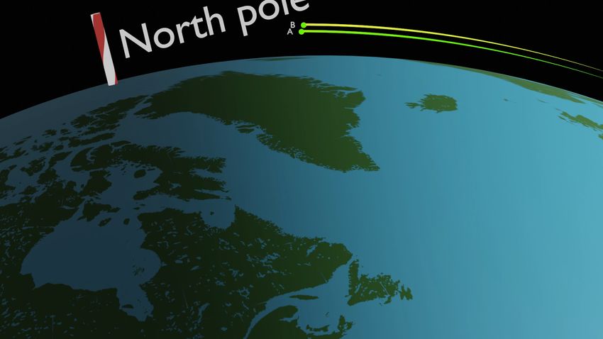
Daedalus
low flying spacecraft for the exploration
of the thermosphere-ionosphere
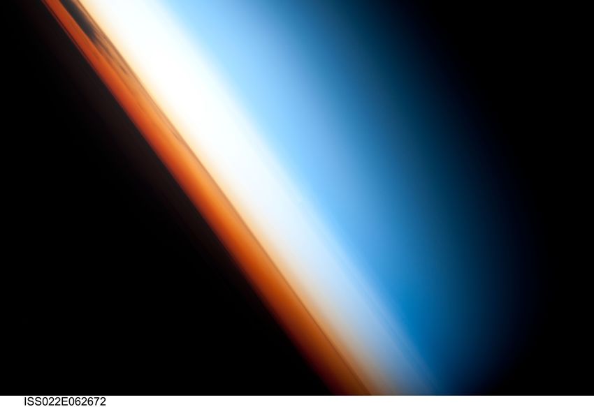
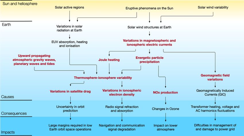
• The lower thermosphere-ionosphere is an under-explored region of the Earth’s atmosphere,
important for space weather effects on technological systems on Earth as well as for space
operations.
• This region of the Earth’s atmosphere is of high scientific interest, because it is strongly
affected by, and interacts with the lower atmosphere, as well as with solar EUV irradiation, and
coupling with the solar wind via the Earth’s magnetosphere.
• Daedalus will make in-situ measurements of the neutral and charged particles, as well as
electric and magnetic fields in this environment, from an elliptical orbit with a very low perigee
(140 km and lower).
• The Daedalus measurements will put important constraints on physics-based models, provide
much needed data for empirical models, and support new types of detailed investigations into
the energetics, dynamics and chemistry of the lower thermosphere-ionosphere.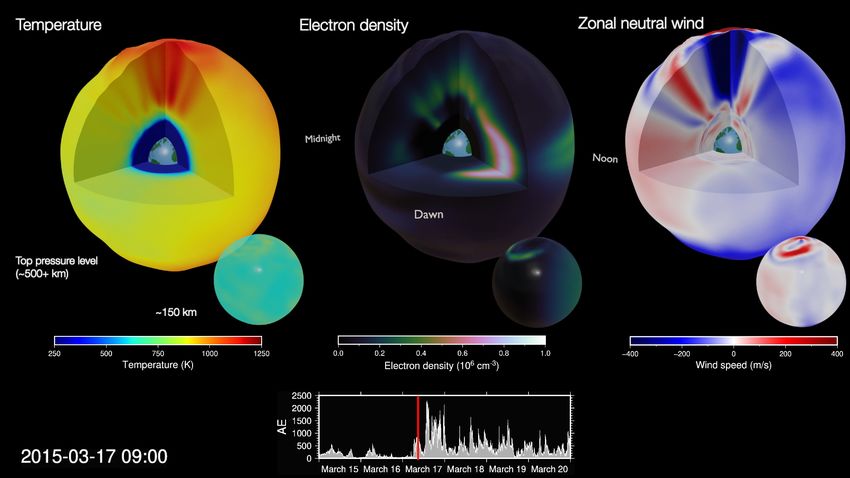
The Daedalus mission
   will provide direct
measurements on the
         red elements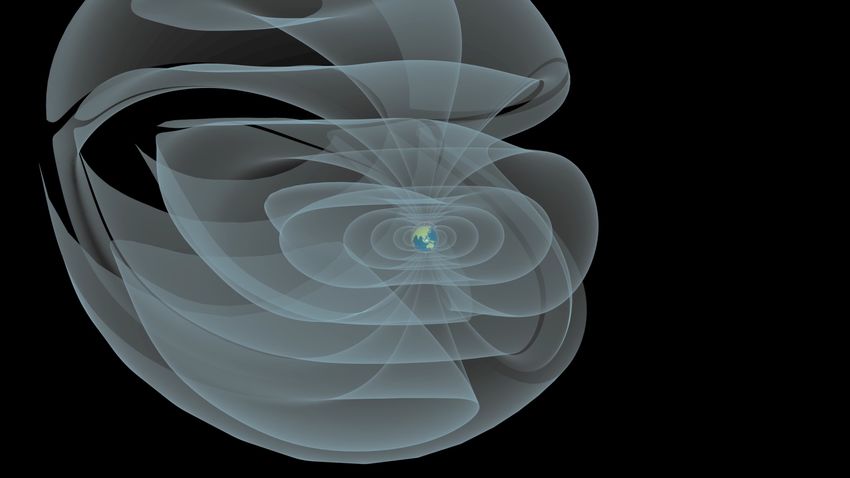
More information on Daedalus

For more detailed information on the mission definition and science, visit:
 • The Daedalus website at https://daedalus.earth/
 • Our presentation in EGU2020 Session 3.1, scheduled for chat on
   Thursday, May 7, 08:30–12:30
 • Our virtual conference (originally planned as a splinter during EGU2020)
   with several presentations and discussions by scientists (agenda here).
   Registration is possible via: https://tinyurl.com/vkvumuq.
The role of visualisations

The scientific domain covered by Daedalus is not as well known as many other Earth science disciplines.
It is characterised by very dynamic processes, for example during geomagnetic storms, densities and
winds can exhibit order of magnitude variations that take place on time scales of just minutes (local) to
hours (global).
High quality visualisations, in particular making use of 3D graphics to convey spatial variability, as well as
animation to convey time variation, are extremely helpful tools to communicate our understanding of
this region obtained through modeling, and the role that the mission will play in improving this
understanding.
In this work, the output of current state-of-the-art models of the thermosphere-ionosphere are coupled
with 3D animation software.
The WACCM-X model is especially useful for this purpose, since it can be used to show the connection
with lower atmospheric layers, with which many people are more familiar.
How to view the animations

The format restrictions of this EGU 2020 presentation do not allow the
embedding of many large video files.
The next slides will therefore only slow still frames from some of the
videos in the PDF version of this presentation.
The full animations will be uploaded to the Daedalus YouTube channel:
https://www.youtube.com/channel/UCDJNwxvy736RR4pkbVV7u5g.
Several videos are already available there, and others will be uploaded
and updated once they approach a finished state. Direct links will be
provided in the PDF, where available, making use of this symbol:
Examples part 1:
WACCM-X model slices
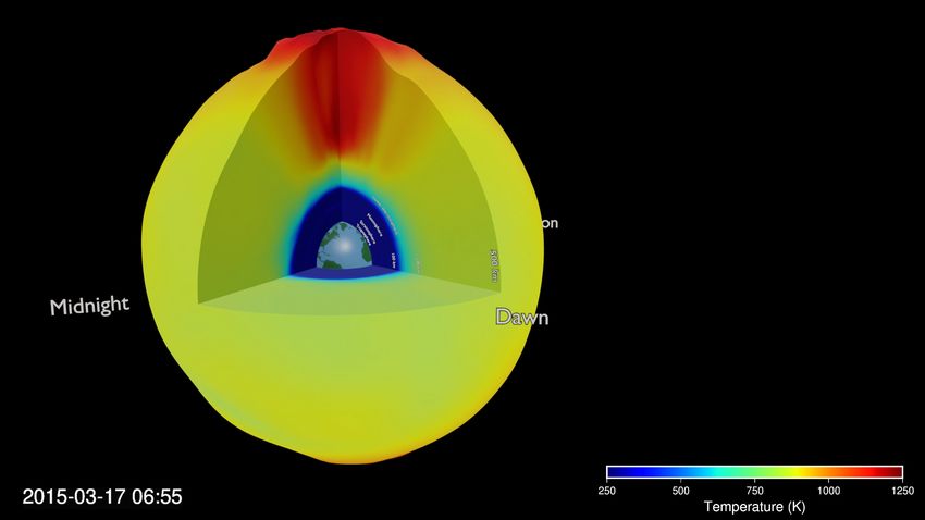
These animations show four slices
through the output of the WACCM-X
model. Heights above the surface are
exaggerated up to 50 times.

The outer shell is the topmost pressure
level of the model, at >500 km altitude.
Two vertical slices at 0 and 90 deg
longitude, and a vertical slice close to
the equator, offer a look at the vertical
variations in the model.

The varying heights of the pressure
levels are converted into a so-called
mesh-cache or point cache file for
animation. The temperature data can
then just be provided in the form of
rectangular image maps that are
projected onto this constantly
changing geometry by the 3D
software.
The large range of values of
some parameters can be a
problem in visualisation.

The maximum electron
density during this simulation
reaches twice the maximum in
the colour scale used here.

Because of this, the F-region
peaks are saturated in white.
But this choice enables us to
still see some detail in the E-
region.
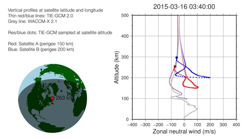
Examples part 2:
  Sampling of the thermosphere-
ionosphere along the Daedalus orbit
Precession in local time and latitude of the perigee of a conceptual Daedalus orbit
Relative motion and sampling in a conceptual dual-satellite Daedalus constellation
This video will need to be finalised before it will be published on our YouTube channel.
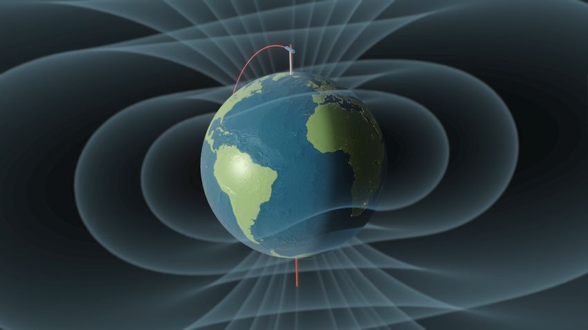
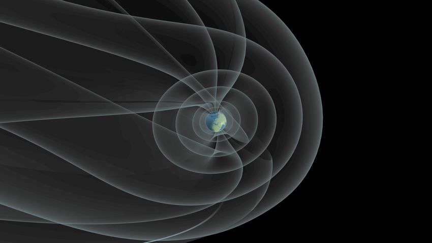
Examples part 3:
Visualising the Magnetosphere
Shells of magnetic field lines, traced using the Tsyganenko geopack08 code

The shells were traced from starting points at fixed geomagnetic latitude.

Correctly connecting the geometry at the boundary of open- and closed field lines till needs to be implemented.
The Earth material is kept simple, with just two colours for continents and oceans, since the focus
should not be on the Earth’s surface here. Still, adding a bit of bathymetry and topography information,
as well as night lights, adds to the feeling of looking at a physical object and a sense of orientation.
Overview of tools and code
    repositories used
Software tools used • 3D animations were made using the free and open source Blender software (www.blender.org). Blender has excellent possibilities for integration with Python scripts. • Unless otherwise noted, 2D animations and static graphics were made using the free and open source Generic Mapping Tools (https://www.generic-mapping-tools.org). • Apple Motion software was used to combine animation elements. It is also possible to do this using free software, including Blender. • Conversion of model output files to graphics software input was done using Python, the NetCDF4, numpy and pandas packages, and the Jupyter Notebook development environment. • The astropy and apexpy packages were used for coordinate transformations.
Code repositories

• We are working on making the code that was developed to create the animations available
  as open source. It would be great if this would be helpful for others to also start using
  these powerful tools for creating visuals and animations.
• A simple set of Python functions for the creation of satellite orbits is available here: https://
  gitlab.com/eelcodoornbos/kepler_orbit
• A first version of the Python package that is used to interpolate within TIE-GCM and
  WACCM-X NetCDF output is available here: https://gitlab.com/eelcodoornbos/
  gcm_interpolation
• Jupyter Notebooks, further Python scripts and .blend files will be put on gitlab at a later
  stage. In the meantime, they are available on request.
• The TIE-GCM and WACCM-X models and GEOPACK-2008 are also open source projects.
Lessons learned and outlook
Lessons learned

• While the goal of this ongoing work is to help explain Daedalus and its science domain to
  those new to it, the graphics and animations have also already been great teaching,
  learning and discussion tools for the experts working on the mission, including the authors.
• There are excellent professional-level software tools available for creating high quality
  visuals, that are low cost and free.
• Powerful tools, such as Blender and Generic Mapping Tools, historically have had steep
  learning curves, but their developers are making great progress in making their software
  more user friendly. Especially for Blender, there are excellent free video tutorials online.
• The most difficult aspect of the work has been to glue together model outputs with these
  graphics and animations tools. Python and Jupyter Notebooks have been invaluable for that.
Outlook

• Work on the visuals will continue throughout most of 2020, at least until the
  presentation to ESA’s Advisory Committee on Earth Observation in late fall 2020 for
  EE-10 mission downselection.
• Steps in the next months will be:
  • To further integrate various existing graphical elements, such as the satellite orbits,
    WACCM-X model interpolation, and magnetosphere morphology into single
    animations.
  • To further integrate with the work on the Daedalus end-to-end simulator and
    performance demonstration development, including visualisation of derived data
    types such as Joule heating, visualisation of the defined areas of interest,
    investigation of data usage scenarios, etc.
More information on Daedalus (reprise) For more detailed information on the mission definition and science, visit: • The Daedalus website at https://daedalus.earth/ • Our presentation in EGU2020 Session 3.1, scheduled for chat on Thursday, May 7, 08:30–12:30 • Our virtual conference (originally planned as a splinter during EGU2020) with several presentations and discussions by scientists (agenda here). Registration is possible via: https://tinyurl.com/vkvumuq.
You can also read