Which Parts determine the Impression of the Font?
←
→
Page content transcription
If your browser does not render page correctly, please read the page content below
Which Parts determine
                                                            the Impression of the Font?

                                              Masaya Ueda1 , Akisato Kimura2 , and Seiichi Uchida1[0000−0001−8592−7566]
                                          1
                                              Kyushu University, Fukuoka, Japan {masaya.ueda}@human.ait.kyushu-u.ac.jp
                                                2
arXiv:2103.14216v2 [cs.CV] 20 May 2021

                                                  NTT Communication Science Laboratories, NTT Corporation, Japan
                                                 Abstract. Various fonts give different impressions, such as legible, rough,
                                                 and comic-text.This paper aims to analyze the correlation between the
                                                 local shapes, or parts, and the impression of fonts. By focusing on lo-
                                                 cal shapes instead of the whole letter shape, we can realize letter-shape
                                                 independent and more general analysis. The analysis is performed by
                                                 newly combining SIFT and DeepSets, to extract an arbitrary number of
                                                 essential parts from a particular font and aggregate them to infer the
                                                 font impressions by nonlinear regression. Our qualitative and quantita-
                                                 tive analyses prove that (1) fonts with similar parts have similar impres-
                                                 sions, (2) many impressions, such as legible and rough, largely depend
                                                 on specific parts, (3) several impressions are very irrelevant to parts.

                                                 Keywords: Font shape · Impression analysis · Part-based analysis.

                                         1     Introduction

                                         Different font shapes (, or typeface) will give different impressions. Fig. 1 shows
                                         several font examples and their impressions attached by human annotators [5].
                                         A font (Garamond) gives a traditional impression and another font (Ruthie) an
                                         elegant impression. Fig. 1 also shows that multiple impressions are given to a
                                         single font. Note that the meaning of the term “impression” is broader than
                                         usual in this paper; it refers to not only (more subjective) actual impressions,
                                         such as elegant, but also (less subjective) words of font shape description, such
                                         as sans-serif.
                                             The relationship between fonts and their impressions is not well explained
                                         yet, despite many attempts from 100 years ago (e.g., [16] in 1923). This is because
                                         the past attempts were subjective and small-scale. Moreover, we need to deal
                                         with the strongly nonlinear relationship between fonts and impressions and find
                                         image features that are useful for explaining the relationship.
                                             Fortunately, recent image analysis and machine learning techniques provide
                                         a reliable and objective analysis of complex nonlinear relationships. In addition,
                                         a large font image dataset with impression annotations is available now by Chen
                                         et al. [5]; their dataset contains 18,815 fonts, and several impression words (from
                                         1,824 vocabularies) are attached to each font. The examples of Fig. 1 are taken
                                         from this dataset.
                                             The purpose of this paper is to analyze the relationship between fonts and
                                         their impressions as objectively as possible by using the large font image dataset [5]
2       M. Ueda et al.

                 Garamond                                        Lucida-sans

         garalde, swash, transitional                    legible, old-style, sans-serif,
                                                         1980s, american, humanist

                   Ruthie                                      Copa-sharp-btn

         fashionable, elegant, script             decorative, funny, energetic, point, script,
                                                  dynamic, sharp, clean, lively, handwrite
                      Fig. 1. Fonts and their impressions (from [5]).

with a machine learning-based approach. The relationship revealed by our anal-
ysis will help design a new font with a specific impression and judge the font
appropriateness in a specific situation. Moreover, it will give hints to understand
the psychological correlation between shape and impression.

    We focus on local shapes, or parts, formed by character strokes for the rela-
tionship analysis. Typical examples of parts are the endpoints, corners, curves,
loops (i.e., holes) and intersections. These parts will explain the relationship
more clearly and appropriately than the whole character shape because of the
following three reasons. First, the whole character shape is strongly affected by
the character class, such as ‘A’ and ‘Z,’ whereas the parts are far less. Second, the
decorations and stylizations are often attached to parts, such as serif, rounded
corners, and uneven stroke thickness. Third, we can expect more explainability
because we can localize the part that causes the impression. Although it is also
true that the parts cannot represent some font properties, such as the whole
character width and the aspect ratio, they are still suitable for analyzing the
relationship between shape and impression, as proved by this paper.

    Computer vision research in the early 2000s often uses parts of an image,
called keypoints, for generic object recognition. Using some operators, such as
the Difference of Gaussian (DoG) operator, the L informative parts (e.g., corners)
are first detected in the input image. Then, each detected part is described as
a feature vector that represents the local shape around the part. Finally, the
image is represented as a set of L feature vectors. As we will see in Section 2,
many methods, such as SIFT [13] and SURF [2], have been proposed to detect
and describe the parts.

     This paper proposes a new approach where this well-known local descriptor
is integrated into a recent deep learning-based framework, called DeepSets [22].
DeepSets can accept an arbitrary number of D-dimensional input vectors. Let
x1 , . . . , xL denote the input vectors (where L is variable). In DeepSets, the input
vectors are converted into another vector representation, y1 , . . . , yL by a certain
neural network g, that is, yl = g(xl ). Then, they are summarized as a single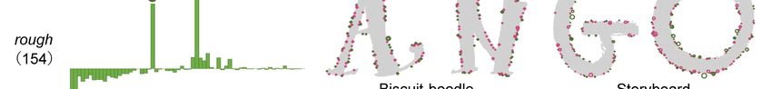
Which Parts Determine the Impression of the Font?           3

                                                                          DeepSets

                                                                           elegant,
                                                                           serif,
                                                                           italic
      th font          SIFT vectors

        Fig. 2. Overview of the part-based impression estimation by DeepSets.

vector by taking their sum3 , i.e., ỹ =
                                            P
                                              l yl . Finally, the vector ỹ is fed to
another neural network f that gives the final output f (ỹ).
     As shown in Fig 2, we use DeepSets to estimate a font’s impressions by a set
of its parts. Precisely, each input vector xil of DeepSets corresponds to the D-
dimensional SIFT vector representing a part detected in the ith font. The output
f (ỹi ) is the vector showing the K-dimensional impression vector, where K is the
vocabulary size of the impression words. The entire network of DeepSets, i.e., f
and g, is trained to output the K-dimensional m-hot vector for the font with m
impression words in an end-to-end manner.
     The above simple framework of DeepSets is very suitable for our relation
analysis task due to the following two properties. First, DeepSets is invariant to
the order of the L input vectors. Since there is no essential order of the parts
detected in a font image, this property allows us to feed the input vectors to
DeepSets without any special consideration.
     The second and more important property of DeepSets is that it can learn the
importance of the individual parts in the impression estimation task. If a part
xil is not important for giving an appropriate estimation result, its effect will be
weakened by minimizing the norm of yli . Ultimately, if kyli k becomes zero by the
representation network g, the part xil is totally ignored in the estimation process.
Therefore, we can understand which part is important for a specific impression
by observing the norm kyli k. This will give a far more explicit explanation of the
relationship between shape and impression than, for example, the style feature
that is extracted from the whole character shape by disentanglement (e.g., [12]).
     The main contributions of this paper are summarized as follows:

 – This paper proves that a specific impression of a font largely correlates to its
   local shapes, such as corners and endpoints of strokes. This is the first proof
   of this correlation by an objective and statistical analysis with a large-scale
   dataset to the authors’ best knowledge.
 – The well-known local descriptor called SIFT is integrated into a recent
   deep learning-based framework called DeepSets for the part-based impres-
   sion analysis. DeepSets has appropriate properties for the task; especially, it
   allows us to evaluate the importance of each part for a specific impression.
 – The analysis results provide various findings of the correlation between lo-
   cal shapes and impressions. For example, we could give an answer to the
3
    As noted in [22], it is also possible to use another operation than the summation,
    such as element-wise max operation.
4        M. Ueda et al.

      well-known open-problem; what is the legibility? Our analysis results show
      that constant stroke width, round corners, and wide (partially or entirely)
      enclosed areas are important elements (parts) for gaining legibility.

2     Related Work

2.1     Font shape and impression

As noted in Section 1, the relationship between font shape and impression has
been a topic in psychology research since the 1920’s [7,16]. In those studies, a
limited number of people provide their impression about fonts. A similar sub-
jective analysis approach is still used even in the recent psychological stud-
ies [1,3,8,9,10,14,15,20]. For an example of the recent trials, Shaikh and Cha-
parro [17] measured the impression of 40 fonts (10 for each of serif, sans-serif,
script/handwriting, and display) by collecting the answers from 379 subjects for
16 semantic differential scales (SDS), where each SDS is a pair of antonyms,
such as calm-exciting, old-young, and soft-hard. Their results clearly show the
dependency of the impressions on font shape variations but do not detail what
shapes are really relevant to raise an impression.
    Computer science research has tried to realize a large-scale collection of font-
impression pairs. O’Donovan et al. [15] use crowd-sourcing service for evaluating
the grades of 37 attributes (∼ impressions), such as friendly, of 200 different
fonts. Based on this dataset, Wang et al. [21] realize a font generator called At-
tribute2Font and Choi et al. [6] realize a font recommendation system a called
FontMatcher. Shinahara et al. [18] use about 200,000 book cover images to un-
derstand the relationship between the genre and each book’s title font.
    More recently, Chen et al. [5] realize a dataset that contains 18,815 fonts and
1,824 impression words, which are collected from MyFonts.com with a cleansing
process by crowd-sourcing. Since our experiment uses this dataset, we will detail
it in Section 3. Note that the primary purpose of [5] is font image retrieval
by an impression query and not analyze the relationship between shape and
impression.
    Disentanglement is a technique to decompose the sample into several factors
and has been applied to font images [4,12,19] to decompose each font image to
style information and global structure information (showing the shape of each
letter ‘A’). Although their results are promising and useful for few-shot font
generation and font style transfer, their style feature has no apparent relationship
neither font shape nor impression.
    All of the above trials use the whole character shape to understand the rela-
tionship between shape and impression. Compared to parts, the whole character
shape can only give a rough relationship between the shape and the impres-
sion. The whole character shape is a complex composition of strokes with local
variations. We, instead, focus on parts and analyze their relationship to specific
impressions more directly.
Which Parts Determine the Impression of the Font?        5

2.2   Local descriptors

Parts of an image sample have been utilized via local descriptors, such as SIFT [13]
and SURF [2], to realize generic object recognition, image retrieval, and image
matching. Local descriptors are derived through two steps: the keypoint detec-
tion step and the description step. In the former step, parts with more geometric
information, such as corner and intersection, is detected. In the later step, ge-
ometric information of each part is represented as a fixed-dimensional feature
vector, which is the so-called local descriptor. In the context of generic object
recognition, a set of N local descriptors from an image is summarized as Bag-
of-Visual Words (BoVW), where each feature vector is quantized into one of Q
representative feature vectors, called visual words. Then all the L feature vectors
are summarized as a histogram with Q-bins.
    There are many attempts to combine local descriptors and CNNs as surveyed
in [23]. However, (as shown in Table 5 of [23],) they still use BoVW summariza-
tion of the local descriptors. To the authors’ best knowledge, this is the first
attempt to combine the local descriptors (SIFT vectors) and DeepSets [22] and
learn the appropriate representation for the estimation task in an end-to-end
manner.

3     Font-Impression Dataset

As shown in Fig. 1, we use the font-impression dataset by Chen et al. [5]. The
dataset is comprised of 18,815 fonts collected from Myfonts.com. From each font,
we use 52 letter binary images of ‘A’ to ‘z.’ Their image size varies from 50 ×
12 to 2,185 × 720.
    For each font, 0 ∼ 184 impression words are attached. The average number
of impression words per font is 15.5. The vocabulary size of the impression words
is 1,824. Some of them are frequently attached to multiple fonts. For example,
decorative, display, and headline are the most frequent words and attached to
6,387, 5,325, and 5,170 fonts, respectively. In contrast, some of them are rarely
attached. The least frequent words (web-design, harmony, jolly, and other 13
words) are attached to only 10 fonts.
     In the following experiment, we discarded minor impression words; specifi-
cally, if an impression word is attached to less than 100 fonts, it is discarded
because it is a minor impression word with less worth for the analysis and insuf-
ficient to train our system. As a result, we consider K = 483 impressions words.
The number of fonts was slightly decreased to 18,579 because 236 fonts have only
minor impression words. The dataset was then divided into the train, validation,
and test sets while following the same random and disjoint division of [5]. The
numbers of fonts in these sets are 14,876, 1,856, and 1,847, respectively.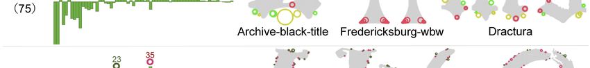
6        M. Ueda et al.

4     Part-Based Impression Estimation with DeepSets

4.1     Extracting local shapes by SIFT

From each image, we extract local descriptors using SIFT [13]. Consequently,
we have a set of Li local descriptors, Xi = {xi1 , . . . , xiLi }, from the 52 images
of the ith font, where xil is a D-dimensional SIFT vector. The number of SIFT
descriptors Li is different for each font. The average number of L over all the
18,579 fonts is about 2, 505 (i.e., about 48 descriptors per letter on average)4 .
Note that all SIFT vector is normalized as a unit vector, i.e., kxil k = 1.
    SIFT is well-known for its invariance against rotations and scales. This prop-
erty might affect our analysis positively and negatively. A positive example of
the rotation invariance is that it can deal with the horizontal and the vertical
serifs as the same serif; a negative example is that it cannot distinguish the
oblique and the upright strokes. Fortunately, our experimental results show that
the negative effect is not large and the positive effect is much larger.

4.2     Impression Estimation with DeepSets

To understand the relationship between parts and impressions of fonts, we con-
sider a task of estimating the impression from the set of local descriptors Xi .
The ground truth of the estimation result is represented as a K-dimensional
m-hot vector ti , where K = 483 is the vocabulary size of the impression words
and m is the number of impression words attached to the ith font.
     As shown in Fig. 2, we solve this estimation task by DeepSets [22]. DeepSets
first converts each xil into another vector representation P  yli by a neural network
              i       i                                 i
g; that is, yl = g(xl ). Then, a single sum vector ỹ = l yli is fed to another
neural network f to have the K-dimensional impression vector f (ỹi ). By the
permutation-free property of the summation operation, DeepSets can deal with
the set Xi as its input. In addition, it can deal with different L, without changing
the network structure.
     The networks f and g are trained in an end-to-end manner. The loss function
is the binary cross-entropy between the output f (ỹi ) and the m-hot ground-truth
ti . We use a fixed-sized minibatch during training DeepSets just for computa-
tional efficiency. Each minibatch contains 64 SIFT vectors which are randomly
selected from Li . Multi-Layer Perceptrons (MLPs) are used as the first and the
second neural networks in the later experiment. More specifically, g: (128)-FC-
R-(128)-FC-R-(128)-FC-(128) and f : (128)-FC-R-(256)-FC-R-(256)-FC-S(483),
where FC, R, and S stand for fully-connected, ReLU, and sigmoid, respectively,
and the parenthesized number is the dimension.
4
    Fonts whose stroke is filled with textures such as “cross-hatching” give a huge num-
    ber of SIFT descriptors because they have many corners. They inflate the average
    number of L; in fact, the median of L is 1, 223. In the later histogram-based analy-
    sis, we try to reduce the effect of such an extreme case by using the median-based
    aggregation instead of the average.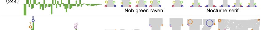
Which Parts Determine the Impression of the Font?         7

                 elegant, script, …                                italic, elegant, …

         font                                               font
                            VQ                                                    VQ

                                                elegant
                                                          median at each bin
                                      elegant

Fig. 3. Understanding the important parts for a specific impression by quantization
and accumulation. VQ is a quantization module where xil is quantized to the closest
one among Q representative vectors. If xil is quantized to qth vector, kyli k is added to
the q-th bin of the histogram H i .

4.3     Which Parts Determine a Specific Impression?

An important property of DeepSets for our impression estimation task is that
we can obtain the importance of individual parts by observing the intermediate
outputs {yli }. If the l-th part of the i-th font is significant for giving the impres-
sion of the font, we can expect that the norm kyli k will become relatively larger
than the norm of unimportant parts.5 In an extreme case where the l-th part
does not affect the impression at all, the norm kyli k will become zero.
    Fig. 3 illustrates its process to understand which parts are important for a
specific impression k ∈ [1, K], by using the above property. First, for each font i,
we create a weighted histogram H i of its SIFT feature vectors Xi . The histogram
has Q bins, and each bin corresponds to aSrepresentative SIFT vector derived
by k-means clustering of all SIFT vectors i Xi . This is similar to the classical
BoVW representation but different in the use of weighted votes. If a SIFT vector
xil is quantized to the q-th representative vector, the norm kyli k = kg(xil )k is
added to the q-th bin. This is because different parts have different importance
as indicated by the norm, which is determined automatically by DeepSets.
    Second, for each impression k, we create a histogram Hk by aggregating
the histograms {H i } for i ∈ Ωk , where Ωk denote the set of fonts annotated
with the k-th impression. More specifically, the histogram Hk is given by Hk =
Medi∈Ωk H i , where Med is the bin-wise median operation. The median-based
aggregation is employed because we sometimes have a histogram H i with an
5
    Recall that the original SIFT vector is a unit vector, i.e., kxil k = 1.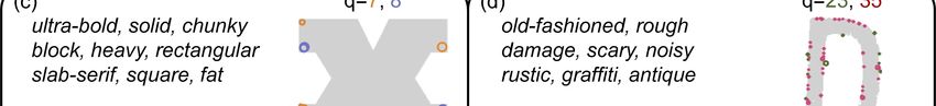
8       M. Ueda et al.

12

                          lTC-goudy-sans   ITC-galliard   Leo-slab     Swissa-piccola

Fig. 4. The average histogram H̄. The Q representative vectors are arranged in de-
scending order of frequency. The four example images show the parts that correspond
to the two most frequent representative vectors.

impulsive peak at the q-th bin, and thus the effect of the single i-th font is
overestimated in Hk .
    The representative SIFT vectors with larger weighted votes in Hk are evalu-
ated as important for the k-th impression. This is because (1) such SIFT vectors
are evaluated as important ones with larger norms and/or (2) such SIFT vectors
frequently appear in the fonts with the impression k. In the later experiment,
we will observe the weighted histogram Hk to understand the important parts.

5     Experimental Results

5.1    Important parts for a specific impression
                                              PK
Fig. 4 shows the average histogram H̄ = κ=1 Hκ /K, which is equivalent           to
the frequency of Q representative vectors for all local descriptors i Xi . The
                                                                        S
representative vectors are arranged in the descending order of frequency.
    This histogram shows that there two very frequent local shapes; the two
example images in the figure show the parts that correspond to them. Those
parts represented by q = 1 and 2 often appear near the end of straight strokes
with parallel contours (i.e., strokes with a constant width), which are very com-
mon for sans-serif fonts, such as ITC-goundy-sans, and even serif fonts, such as
ITC-galliard. In contrast, they appear neither around extremely thick stokes
even though they have a constant width, such as Leo-slab nor the font whose
stroke width varies, like Swissa-piccola.
    Fig. 5 visualizes the important parts for eight impressions, such as serif and
legible. The parenthesized number below the impression word (such as 244 for
serif) is the number of fonts with the impression, i.e., kΩk k. The font name, such
as Noh-green-raven, is shown below each font image.
    The left-side of Fig. 5 shows a “delta”-histogram ∆Hk = Hk − H̄, which
indicates the difference from the average histogram. The positive peaks of ∆Hk
are marked by tiny circles and their number (i.e., q). Each peak corresponds to
an important representative vector for the k-th impression because the vectors
have far larger weights than the average for k. The delta-histogram can have
a negative value at the q-th bin when parts that give the q-th representative
vector are less important than the average. The delta histograms ∆Hk suggests
the different local shapes (i.e., parts) are important for different impressions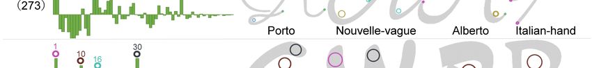
Which Parts Determine the Impression of the Font? 9
3
31
6
37
serif
(244)
Noh-green-raven Nocturne-serif
8
7 43
slab-serif
(92)
At-move-specx-stncl Galactic Wickenburg
2
1
15
16
script
(273)
Porto Nouvelle-vague Alberto Italian-hand
1 30
10
16
comic-text
(16)
Dave-gibbons Astronauts-in-trouble Danger-girl Ccdreamland
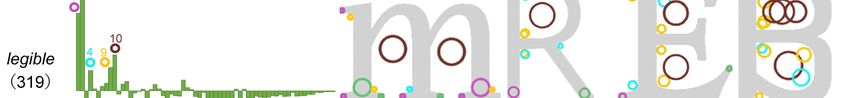
31
3 37
ancient
(75)
Archive-black-title Fredericksburg-wbw Dractura
35
23
rough
(154)
Biscuit-boodle Storyboard
2
15
1
5
girly
(23)
Catsy Blend Rosarian
2
1
10
4 9
legible
(319)
Nosta Asterisk-sans-pro Tribute-ot Kautiva-pro
Fig. 5. Which parts determine the impression of a font? — Left: The delta-histogram
∆Hk and its peaks (marked by circles). Right: Several font images with the impression
k and the location of the important parts that correspond to the peaks. The same color
is used for the peak (i.e., a representative local vector) and the corresponding parts.
10              M. Ueda et al.

                                                 Impression

          Representative vector   (c)
                                         (a) Original 2-d heatmap
                                                                       (d)

                                          (b) Biclustering result
 (c)                                    q=7, 8         (d)                           q=23, 35
   ultra-bold, solid, chunky                             old-fashioned, rough
   block, heavy, rectangular                             damage, scary, noisy
   slab-serif, square, fat                               rustic, graffiti, antique

     and more 22 impressions                             and more 14 impressions

Fig. 6. Biclustering result to understand the strongly-correlated pairs between parts
and impressions.

because the locations of their peaks are often different. We will see later that
similar impression words have similar peaks.
    The right-side of Fig. 5 shows the parts corresponding to the peaks of the
delta histogram on several font images — in other words, they indicate the
important parts for the impression. The top four rows are the results of less
subjective impressions:

 – Serif has peaks at q = 3, 6, 31, 37 that shape serifs. Precisely, the pair of
   q = 3 and 6 form the serif tips, and the other pair of q = 31 and 37 form the
   neck of the serif. It should be noted that serif has less strokes with “parallel
   ending parts” represented by q = 1 and 2.
 – slab-serif has extremely thick rectangular serifs and has peaks at q = 7, 8,
   which cannot find for serif.
 – Script has four peaks; q = 1 and 2 correspond ∪-shaped round and parallel
   stroke ends. The part of q = 15 forms an ‘`’-shaped curve, unique to the
   pen-drawn styles. q = 16 forms an oblique stroke intersection, which can
   also be found in ‘`’-shaped stroke.
 – Comic-text has peaks at q = 10, 16, and 30. The part of q = 10 corresponds
   to a large partially (or entirely) enclosed area (called “counter” by font-
   designers) formed by a circular stroke. q = 16 is also found in script and
   suggests that comic-text also has an atmosphere of some handwriting styles.

    The four bottom rows of Fig. 5 show the results of more subjective impres-
sions:

 – Ancient is has a similar ∆Hk to Serif; however, ancient does not have a peak
   at q = 6, which often appears at a tip of a serif. This suggests the serif in
   ancient fonts are different from standard serifs.
 – Rough has two clear peaks that indicate fine jaggies of stroke contours.
Which Parts Determine the Impression of the Font? 11
Fig. 7. tSNE visualization of the impression distributions by the similarity of the
weighted histograms {Hk }. Only top-150 frequent impressions words are plotted for
better visibility.
– Girly is similar to script; however, Girly has an extra peak at q = 5. Com-
paring the parts corresponding to q = 5 and 15, the parts of q = 5 show a
wider curve than 15. The parts of q = 5 also appear at counters.
– Legible shows its peaks at q = 1 and 2 and thus has parallel stroke ends. Other
peaks at q = 4 and 9 are rounded corners. As noted at comic-text, the peak
of q = 10 shows a wider “counter” (i.e., enclosed area). These peaks prove
the common elements in more legible fonts; strokes with constant widths,
rounded corners, and wider counters.
The highlight of the above observation is that it shows that we can explain the
font impressions using local shapes (i.e., parts) with DeepSets and local descrip-
tors. This fact is confirmed in the later sections where we show that similarity
between two histograms Hk and Hk0 reflects the similarity between the corre-
sponding impressions. Note that we have also confirmed that scale invariance
and rotation invariance brought by SIFT greatly contributed to the analysis;
the scale invariance allows us to catch the detailed and tiny local shapes. The
rotation invariance allows us to identify the local shapes that are horizontally or
vertically symmetrical, such as both tips of a serif.
5.2 Parts and impressions pairs with a strong correlation
A biclustering analysis is conducted to understand the correlation between parts
and impressions more comprehensively. Fig. 6 shows its process and results. As
shown in (a), we first prepare a matrix each of which column corresponds to ∆Hk ,12 M. Ueda et al.
8 display headline
7
headline
display
Rustic-stencil Roncial
1
2 feminine delicate
feminine
1516
delicate
Calligraffiti-pro Aphrodite-pro
12 soft round
10
soft
round
Storybook Delicate
Fig. 8. The delta-histograms ∆Hk for similar impression words.
and thus each of which row corresponds to the representative vector q. Then,
the column (and the row ) are re-ordered so that similar column (row) vectors
come closer. Consequently, as shown in (b), the original matrix is converted as a
block-like matrix, and some blocks will have larger values than the others. These
blocks correspond to a strongly-correlated pair of an impression word subset and
a representative vector (i.e., local shape) subset. We used the scikit-learn
implementation of spectral biclustering [11].
Among several highly correlating blocks in Fig. 6 (b), two very prominent
blocks are presented as (c) and (d). The block (c) suggests that the impressions
showing solid and square atmospheres strongly correlate to the local shapes
represented by q = 7 and 8. The block (d) suggests that the impressions showing
jaggy and old-fashioned atmospheres strongly correlate to q = 23 and 35. This
analysis result shows that our strategy using parts has a very high explainability
for understanding the correlations between the part and impressions.
5.3 Similarity among impression words by parts
Fig. 7 shows the tSNE visualization of the distributions of the weighted his-
tograms {Hk } (or, equivalently, {∆Hk }). For better visibility and higher relia-
bility, the top 150 frequent impression words are selected and plotted. This plot
clearly shows that similar impression words are often close to each other. For ex-
ample, calligraphic, script and cursive are neighboring because they imply a font
with curvy strokes. (bold, heavy) and (soft, round) are also neighboring. In fact,
by looking only less subjective words (i.e., words of typography), this distribu-
tion are roughly divided into four regions: bold sans-serif fonts (top-left), regular
sans-serif fonts (bottom-left), script and handwriting font (bottom-right), and
serif fonts (top-right).Which Parts Determine the Impression of the Font? 13
Table 1. The top 20 impression words in average precision (AP).. For each impression
word, 5 font examples are shown.
Rank Impression AP(%) font examples Rank Impression AP(%) font examples
1 sans-serif 68.66 11 bitmap 50.70
2 handwrite 68.55 12 stencil 49.90
3 script 67.80 13 comic-text 49.10
4 black-letter 66.71 14 elegant 48.91
5 slab-serif 63.95 15 magazine 48.79
6 serif 60.00 16 decorative 48.78
7 text 57.30 17 legible 48.78
8 round 55.62 18 headline 47.68
9 grunge 54.16 19 didone 46.80
10 rough 52.82 20 brush 45.54
Table 2. The bottom 20 impression words in average precision (AP).
Rank Impression AP(%) font examples Rank Impression AP(%) font examples
464 2000s 2.04 474 graphic 1.71
465 heart 2.03 475 sassy 1.64
466 random 2.01 476 distinctive 1.58
467 curve 1.95 477 style 1.57
468 fantasy 1.92 478 magic 1.45
469 arrow 1.91 479 chic 1.44
470 girl 1.90 480 revival 1.34
471 new 1.86 481 oblique 1.18
472 circle 1.81 482 thick 1.13
473 package 1.76 483 travel 0.64
More subjective impression words also form a cluster. For example, delicate,
elegant, french, and feminine are close to each other, and belong to the “script
and handwriting font” region. Legible, modern, and brand are also very close
and belong to the “regular sans-serif” region. Cute, kid, and fun belong to an
intermediate region. Note that we can also observe the history of font trends by
watching the transition from 1800s to 1970s. According to those observations,
Fig. 7 is confirmed as the first large evidence-based proof that local shapes and
impressions clearly correlate.
Fig. 8 shows Hk s of a pair of similar words for confirming the above observa-
tion. Each pair has very similar histograms by sharing the same peak locations.
5.4 Evaluating impression stability by estimation accuracy
As we see in Fig. 2, DeepSets is trained to estimate the impression words for a
given set of SIFT vectors. By using the estimation accuracy on the test set, we14 M. Ueda et al.
can understand the stability of the impressions. When an impression word k is
estimated accurately, the impression k is stably correlating to the parts of the
fonts with the impression k. For the quantitative evaluation of the estimation
accuracy, we use average precision (AP) for each impression k. AP for k is given
P|Ωk |
as ( h=1 h/rh )/|Ωk |, where rh is the rank of the font h ∈ Ωk in the list of the
likelihoods of the impression of k; AP for k becomes larger when the fonts with
the impression k gets higher likelihoods of k by DeepSets.
Table 1 shows the impression words with the 20 highest AP values and five
font images with the impressions. This table indicates that the impression words
for describing font shapes less subjectively are more stable. Especially, top-6
words (from sans-serif to serif) are technical terms for font designs and corre-
sponding to specific font shapes. This fact proves that our analysis with DeepSets
is reasonable.
Table 1 also shows that more subjective impressions can have a stable cor-
respondence with parts. For example, grunge (9th), rough (10th), elegant (14th)
and legible (17th) have a high AP and thus those impressions are clearly de-
termined by the set of parts of a font image. The high AP of legible indicates
that better legibility is common for many people. We also share similar elegant
impressions from fonts with specific parts. It is also shown that parts can specify
certain styles. For example, comic-text (13th), magazine (15th) , and headline
(18th) are styles that are determined by parts. This means that we can imagine
similar fonts that are suitable for comics and headlines.
Table 2 shows 20 impression words with the lowest AP values. Those impres-
sion words are least stable in their local parts. In other words, it is not easy to
estimate the impression from parts. Instability of several impression words in the
table is intuitively understandable; for example, it is difficult to imagine some
valid font shapes from vague impressions, such as random (466th), new (471th),
graphic (474th), and style (477th). It should be noted that the words relating
to some specific shapes, such as curve, circle, oblique, and thick, are also listed
in this table. This means that those shapes have large variations and are not
stable, at least, in their parts. In other words, these shape-related impression
words are not suitable as a query for searching fonts because the search results
show too large diversities.
6 Conclusion
This paper analyzed the correlation between the parts (local shapes) and the
impressions of fonts by newly combining SIFT and DeepSets. SIFT is used to
extract an arbitrary number of essential parts from a particular font. DeepSets
are used to summarize the parts into a single impression vector with appropriate
weights. The weights are used for an index for the importance of the part for an
impression. Various correlation analyses with 18,579 fonts and 483 impression
words from the dataset [5] prove that our part-based analysis strategy gives clear
explanations about the correlations, even though it still utilizes representation
learning in DeepSets for dealing with the nonlinear correlations. Our resultsWhich Parts Determine the Impression of the Font? 15
will be useful to generate new fonts with specific impressions and solve open
problems, such as what legibility is and what elegance is in fonts.
Acknowledgment
Not shown by the double-blind policy.
References
1. Azadi, S., Fisher, M., Kim, V.G., Wang, Z., Shechtman, E., Darrell, T.: Multi-
content GAN for few-shot font style transfer. In: CVPR. pp. 7564–7573 (2018)
2. Bay, H., Tuytelaars, T., Van Gool, L.: SURF: Speeded up robust features. In:
ECCV. pp. 404–417 (2006)
3. Brumberger, E.R.: The rhetoric of typography: The awareness and impact of type-
face appropriateness. Technical Communication 50(2), 224–231 (2003)
4. Cha, J., Chun, S., Lee, G., Lee, B., Kim, S., Lee, H.: Few-shot compositional font
generation with dual memory. In: ECCV (2020)
5. Chen, T., Wang, Z., Xu, N., Jin, H., Luo, J.: Large-scale tag-based font retrieval
with generative feature learning. In: ICCV (2019)
6. Choi, S., Aizawa, K., Sebe, N.: FontMatcher: Font image paring for harmonious
digital graphic design. In: ACM IUI (2018)
7. Davis, R.C., Smith, H.J.: Determinants of feeling tone in type faces. J. Applied
Psychology 17(6), 742–764 (1933)
8. Doyle, J.R., Bottomley, P.A.: Dressed for the occasion: Font-product congruity in
the perception of logotype. J. Consumer Psychology 16(2), 112–123 (2006)
9. Grohmann, B., Giese, J.L., Parkman, I.D.: Using type font characteristics to com-
municate brand personality of new brands. J. Brand Management 20(5), 389–403
(2013)
10. Henderson, P.W., Giese, J.L., Cote, J.A.: Impression management using typeface
design. J. Marketing 68(4), 60–72 (2004)
11. Kluger, Y., Basri, R., Chang, J.T., Gerstein, M.: Spectral biclustering of microarray
data: Coclustering genes and conditions. Genome Res. 13(4), 703–716 (2003)
12. Liu, Y., Wang, Z., Jin, H., Wassell, I.: Multi-task adversarial network for disen-
tangled feature learning. In: CVPR (2018)
13. Lowe, D.G.: Distinctive image features from scale-invariant keypoints. Int. J.
Comp. Vis. 60(2), 91–110 (2004)
14. Mackiewicz, J.: Audience perceptions of fonts in projected PowerPoint text slides.
Technical Communication 54(3), 295–307 (2007)
15. O’Donovan, P., Lı̄beks, J., Agarwala, A., Hertzmann, A.: Exploratory font selection
using crowdsourced attributes. ACM Trans. Graphics 33(4), 92 (2014)
16. Poffenberger, A.T., Franken, R.: A study of the appropriateness of type faces. J.
Applied Psychology 7(4), 312–329 (1923)
17. Shaikh, D., Chaparro, B.: Perception of fonts: Perceived personality traits and
appropriate uses. In: Digital Fonts and Reading, chap. 13. World Scientific (2016)
18. Shinahara, Y., Karamatsu, T., Harada, D., Yamaguchi, K., Uchida, S.: Serif or
Sans: Visual font analytics on book covers and online advertisements. In: ICDAR
(2019)
19. Srivatsan, A., Barron, J., Klein, D., Berg-Kirkpatrick, T.: A deep factorization of
style and structure in fonts. In: EMNLP-IJCNLP (2019)16 M. Ueda et al.
20. Velasco, C., Woods, A.T., Hyndman, S., Spence, C.: The taste of typeface. i-
Perception 6(4), 1–10 (2015)
21. Wang, Y., Gao, Y., Lian, Z.: Attribute2Font. ACM Trans. Graphics 39(4) (2020)
22. Zaheer, M., Kottur, S., Ravanbhakhsh, S., Póczos, B., Salakhutdinov, R., Smola,
A.J.: Deep sets. NIPS (2017)
23. Zheng, L., Yang, Y., Tian, Q.: SIFT meets CNN: A decade survey of instance
retrieval. IEEE Trans. Patt. Anal. Mach. Intell. 40(5), 1224–1244 (2018)You can also read