WikiLeaks Party VISUAL STYLE GUIDE - JULY 2013

Page created by Duane Cooper
 
CONTINUE READING
WikiLeaks Party VISUAL STYLE GUIDE - JULY 2013
WikiLeaks Party
                                                    VISUAL STYLE GUIDE
                                                    JULY 2013

This document is intended for online reading. Please consider double-sIded, low-ink & one colour before printing
WikiLeaks Party VISUAL STYLE GUIDE - JULY 2013
01: Legal
The WikiLeaks Party logo and logotypes are registered                          WikiLeaks Party TITLE AND TRADEMARKS
trademarks and may only be used in the original format represented             The name ‘WikiLeaks Party’ is the unique title of the organisation
here and downloadable from wikileaksparty.org.au/resources/ .                  established in 2013. No other organisation may legally represent
                                                                               itself under the title WikiLeaks Party.
CO-BRANDING
                                                                               The WikiLeaks Party logo and logotypes are registered trademarks of
Co-branding occurs when the WikiLeaks Party logo is used in
                                                                               WikiLeaks Party.
conjunction or association with the logo, emblem or trademark of
other companies, associations, agencies or groups. Please use this             If you are uncertain about how to use the WikiLeaks Party branding,
guide to ensure the logo reproduces clearly and don’t hesitate to              do not hesitate to contact us.
contact the WikiLeaks Party if you are unsure.

                   CONTACT DETAILS:
                   John Shipton, Secretary, 9/288 Brunswick Street,
                   Fitzroy 3065 Victoria, Australia
                   T 0429 077 533
                   www.wikileaksparty.org.au | contact@wikileaksparty.org.au

                                                                                                              © WIKILEAKS PARTY | VISUAL STYLE GUIDE | JULY 2013   2
WikiLeaks Party VISUAL STYLE GUIDE - JULY 2013
02: Introduction
The WikiLeaks Party brand was launched in July 2013. It built upon the        This Visual Style Guide outlines the conditions governing the use of the
existing brand of WikiLeaks.                                                  WikiLeaks Party and family logos and the required graphic standards.
                                                                              Careful attention to these conditions and standards will ensure the
Why have a Visual Style Guide?                                                integrity of each reproduction. The Visual Style Guide is also intended to
The visual identity - an expression of an organisation - is built on who we   avoid logo misrepresentation or exploitation.
are, how we do things, where we came from and where we are going.
This identity seeks to give expression to our mission, and to the values      Suggested applications
on which it is based. It reflects the WikiLeaks Party’s standards and          The following are examples of contexts in which the WikiLeaks Party set
aspirations. The success of the WikiLeaks Party brand derives from the        of logos may be used:
discipline and consistency with which it is applied.                          Publications - brochures, reports, product sheets, media releases
In a time of visual overload, it is more important than ever that WikiLeaks   Advertising - print, television, radio, billboards
Party maintains a recognisable brand in the marketplace and that this
                                                                              Internet - websites, newsletters
brand is reinforced as often as possible.
                                                                              Multimedia - videos, CD-ROMs, proposals, presentations
Whenever the public encounters a reference to the organisation,
whether it is via advertising, promotional publications, websites or          Displays - exhibition stands, lecterns, posters, banners
stationery, a consistent visual image should be portrayed. The best way       Corporate identity - letterheads, envelopes, compliment slips, business
for this to be achieved is by publishing and distributing a Visual Identity   cards, fax cover sheets
Guide that clearly outlines acceptable standards for the production of        Promotional items - ie Badges, T-shirts
such materials. Maintaining a strong visual identity will help to ensure
that WikiLeaks Party develop an impressive and robust brand identity          Obtaining the WikiLeaks Party Logos
with a strong platform from which to launch initiatives. The use of           Full logo sets can be downloaded here: wikileaksparty.org.au/resources/.
the Visual Identity Guide plays a key role in developing an immediate
recognition of WikiLeaks Party by the public and assist in protecting the     Before going to print…
brand.                                                                        The organisation/person proposing to use the WikiLeaks Party logo must:
Every time WikiLeaks Party comes in contact with someone from the             > observe
                                                                                        the standards in this Visual Style Guide for the preparation of
wider community, we are presented with an opportunity to enhance our             all reproductions of the logo.
reputation.                                                                   If unsure, forward your material to the WikiLeaks Party - we would be
The Visual Style Guide sets out a number of basic elements to bring           more than happy to offer advice.
consistency to the WikiLeaks Party brand. These include the use of logos,
fonts and colours.

                                                                                                                  © WIKILEAKS PARTY | VISUAL STYLE GUIDE | JULY 2013   3
03: Graphics guide                                                                                                          LE
                                                                                                                              A KS P
                                                                                                                                                        LE
                                                                                                                                                          A KS P

                                                                                                                                      AR

                                                                                                                                                                  AR
                                                                                                                       WIKI

                                                                                                                                                    WIKI
                                                                                                                                        TY

                                                                                                                                                                    TY
The Logo
The ideal representation of the WikiLeaks Party logo is the color version.                   Primary logo
It is strongly recommended for use on printed communications and web pages.
The grayscale version is available for black-and-white printing.
                                                                                                 A KS P                       A KS P
Always use the version that best suits the design and medium of your                           LE                           LE

                                                                                                         AR

                                                                                                                                      AR
                                                                                           WIKI
communication.

                                                                                                                       WIKI
                                                                                                           TY

                                                                                                                                        TY
When the word WikiLeaks Party is used in text (such as this paragraph),
use the same typeface, style and color as the rest of the text.
Use sentence case (a capital W, L and P followed by lower case letters).
                                                                                              One colour
The TAGLINE                                                                                    version

There are two taglines - for use in different contexts:
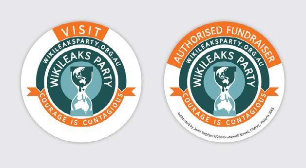
Courage is contagious (T-shirts, caps, badges etc)                        A KS P                 A KS P
                                                                        LE                     LE

                                                                                    AR

                                                                                                         AR
Transparency Accountability Justice (for banners at press conferences, on

                                                                        WIKI

                                                                                           WIKI
                                                                                      TY

                                                                                                           TY
media releases etc).
Please refer to the example templates for clear direction on tagline use.
The Logo Mark                                                                                  Greyscale
The ‘hourglass’ icon is intended to be used to give energy to pages and designs,                version                       Hourglass icon
but always subtly, never in overwhelming transparency or weights.
It can be used very large and with only parts visible, only when the transparency
is set at 7-20%. It must always be easy to read copy that has been placed over
the hourglass. As a graphic device it can be used as a mask over images, as a
bullet point in copy, as a border to draw attention to pull-out information, or a
                                                                                                A KS P                     PART                   AKS P
water mark.                                                                                   LE                        KS                      LE

                                                                                                       AR

                                                                                                                                                           AR
                                                                                                                                  Y

                                                                                                                                             WIKI
Do not alter the logo in any way.

                                                                                           WIKI

                                                                                                                  IKILEA
                                                                                                         TY

                                                                                                                                                             TY
Do not rotate the logo.
Do not separate the elements and do not alter or remove the hourglass.                                                  W
Do not add trademark symbols.
Do not change, translate, or localize the text and do not add version numbers.
Never attempt to set the logotype yourself, change the font, or alter the size,            Incorrect use of the logo
proportions, or space between letters.
                                                                                                                       © WIKILEAKS PARTY | VISUAL STYLE GUIDE | JULY 2013   4
03: Graphics guide                                                                  16mm                                           Less than 16mm
                                                                                                         A KS P                    A KS P
                                                                                                       LE                        LE

                                                                                                                AR

                                                                                                                                          AR
                                                                                                                                                          A KS P

                                                                                                 WIKI
                                                                                                                                                                               A KS P

                                                                                                                           WIKI
                                                                                                                                                        LE                   LE
Size

                                                                                                                  TY

                                                                                                                                            TY

                                                                                                                                                               AR

                                                                                                                                                                                    AR
                                                                                                                                                    WIKI

                                                                                                                                                                          WIKI
                                                                                                                                                                 TY

                                                                                                                                                                                      TY
The WikiLeaks Party logo (without tagline) should never be used smaller
than 16mm in width (print applications), or 50 pixels width at 72 dpi (for      Minimum size for readability               Incorrect for readability
online applications), to ensure readability of the Party name.
There may be special exceptions when the logo might need to be visible           42mm WIDE x 30 mm HIGH                                                 54mm WIDE x 39mm HIGH
at a smaller size. In these cases, use the one colour version of the logo and
take special care that the logo can be clearly read.
The WikiLeaks Party logo WITH tagline has it’s own minimum sizes. When
using the logo with “Courage is contagious” tagline, minimum size is set
to 54mm WIDE x 39mm HIGH (117px X 85px @72dpi) - otherwise the
tagline font is less than 7 point. When using the logo with “Transparency
Accountability Justice” tagline, minimum size is set to 48mm WIDE x 35mm
HIGH (153px X 111px @72dpi) - otherwise the tagline font is less than 7
point. 7 point becomes unreadable in grainy publications like newspapers,
so please consider how the logo will be reproduced and adjust the size.         Absolute minimum size for readability                             Absolute minimum size for readability

The logos should never be resized to dimensions disproportionate to
its original proportions. The spacing and design of the logo is set and                                 AKS P                     AKS P
                                                                                                   LE                        LE                                         A KS P                         A KS PLEA KS P
                                                                                                                                                                      LE                             LE

                                                                                                            AR
therefore should not be re-drawn or modified.

                                                                                                                                      AR
                                                                                                WIKI

                                                                                                                          WIKI

                                                                                                                                                                                        AR

                                                                                                                                                                                                                    AR
                                                                                                                                                                                                            AR
                                                                                                                                                                   WIKI

                                                                                                                                                                                                         WIKI
                                                                                                                TY

                                                                                                                                                                                                  WIKI
                                                                                                                                          TY

                                                                                                                                                                                          TY

                                                                                                                                                                                                                      TY
                                                                                                                                                                                                              TY
Placement
The placement of the logo will vary depending on the marketing collateral
being used. The logos should not be placed on a pattern, image or colour
                                                                                Please do not stretch                  Correct background       Incorrect background
that compromises readability and clarity. When the logo is used on dark         the logo dimensions                    strength for readability strength for readability
or busy images, it is advisable to use the reverse logo and ensure the
background is dark enough to ensure readable contrast with the logo.
MINIMUM CLEAR SPACE                                                             X height
                                                                                                                                      XS P
                                                                                                                                     AK                                     A KS P LEA KS P                       A KS P
                                                                                 & width                                           LE                                     LE                                    LE
No other art or text, including typography, photography, design elements

                                                                                                                                                 AR

                                                                                                                                                                                                  AR
                                                                                                                                                                                           AR

                                                                                                                                                                                                                        AR
                                                                                                                            WIKI

                                                                                                                                                                                        WIKI
                                                                                                                                                                    WIKI

                                                                                                                                                                                                            WIKI
                                                                                                                                                   TY

                                                                                                                                                                                                    TY
and page trim, graphic or strong colour must encroach on the minimum

                                                                                                                                                                                             TY

                                                                                                                                                                                                                          TY
clear space area around the logo block. The clear space required for the
logo block is defined by a unit on all sides equal to the width of the house
                                                                                                                                                                             X
within the logo. This is the absolute minimum space required and the
logo standout will always benefit from more negative space around it.
Exceptions to this rule can be seen in the template section.                                                                                   © WIKILEAKS PARTY | VISUAL STYLE GUIDE | JULY 2013                  5
03: Graphics guide
THE LOGO MARK / “hourglass”
The WikiLeaks Party logo mark or “Hourglass” is a useful branding and                                                                                                           The hourglass is the only graphic element that can be used in this way.
design element. It can be used subtly, ie at 7% transparency behind copy                                                                                                        Do not adorn the page with decoration or put graphic elements behind
on a letterhead, as a strong white design element to block out parts                                                                                                            text, unless text is used over photographs.
of an image/hold an image/divide sections in a design or as a corner                                                                                                            Bar charts, pie graphs, tables and diagrams should be clear, uncluttered,
element to create an interesting positive/negative space. Here are some                                                                                                         use the palette as specified in Section 6: Colour, and always look
examples of the correct use. The hourglass is always larger than the                                                                                                            professional - using diagrams that have been grabbed from the internet
page, runs off the right hand side, top or bottom and sits near or under                                                                                                        end up looking pixelated and are usually jarring in colour.
the WikiLeaks Party logo.

                                                                                                                                                In the WikiLeaks Party          Example of stickers
                                                                                                                                                letterhead the hourglass is a
                                                                                                                                                watermark to accommodate
                                                                                                                                                copy over the top.

                                                                Letterhead

                                                         www.wikileaksparty.org.au
 9/288 Brunswick St, Fitzroy 3065 VIC, Australia | +61 (0)3 5567 4587 | +61 (0)433 567 789 | info@wikileaksparty.org.au | ABN 333 444 555 666

                                                                                                                                                                                                                   © WIKILEAKS PARTY | VISUAL STYLE GUIDE | JULY 2013   6
04: Typefaces & text
WikiLeaks Party’s strong and contemporary visual identity should be         For general uses outside of graphic design software (such as letters,
reflected in all the Party’s printed and online materials. The following     faxes and minutes) the typeface Helvetica is recommended for its
design guidelines will help you to produce materials that are not only      excellent legibility. Helvetica is a standard issue font with all PC and
visually appealing in their own right, but also meet the design standards   Macintosh systems.
set by the organisation.
TYPEFACES                                                                   Helvetica Regular
The typeface used is the Ubuntu family. It can be downloaded from:          AaBbCcDdEeFfGgHhIiJjKkLlMmNnOoPpQqRrSsTtUuVvWwXxYyZz
http://www.google.com/fonts/specimen/Ubuntu                                 1234567890
                                                                            Helvetica Bold
                                                                            AaBbCcDdEeFfGgHhIiJjKkLlMmNnOoPpQqRrSsTtUuVvW
Ubuntu Light                                                                1234567890
AaBbCcDdEeFfGgHhIiJjKkLlMmNnOoPpQuVvWwXxYyZz 1234567890
Ubuntu Regular
AaBbCcDdEeFfGgHhIiJjKkLlMmNnOoPptUuVvWwXxYyZz 1234567890                    Helvetica is also preferred when preparing online applications where
Ubuntu Bold                                                                 ubuntu is NOT available, such as websites, email and newsletters.
AaBbCcDdEeFfGgHhIiJjKkLlMmNnOoPuVvWwXxYyZz 1234567890

Ubuntu Light Italic
AaBbCcDdEeFfGgHhIiJjKkLlMmNnOoPpQqRrSWwXxYyZz 1234567890                    NOTE:
Ubuntu Italic
                                                                            When Ubuntu is available, please do not use other fonts or combine
AaBbCcDdEeFfGgHhIiJjKkLlMmNnOoPpQqRrVvWXxYyZz 1234567890
                                                                            Ubuntu with Helvetica/Verdana.Ubuntu Light is the preferred body
Ubuntu Bold Italic
                                                                            copy typeface.
AaBbCcDdEeFfGgHhIiJjKkLlMmNnOoPVvWwXxYyZz 1234567890

                                                                                                                 © WIKILEAKS PARTY | VISUAL STYLE GUIDE | JULY 2013   7
04: Typefaces & text
TEXT
All text should be in the appropriate upper and lower-case letters. The       logo and logotypes; large amounts of text should be broken up with
exception to this is the WikiLeaks Party logotype, which should only          headings, sub-headings, paragraphs or bullet points; allow for 10mm or
be reproduced from original artwork. Headings and sub-headings may            more space between columns.
appear in all caps and in a colour that complements the design layout.
Body text should always appear in dark tones like black, dark blue or
                                                                              Body Copy
charcoal. It is important to consider the means of publishing to decide
on the colour of large blocks of text. Body text may appear in reverse        Ubuntu Light: 8-12 points
(white) on a coloured or black background. When reversing text out of a       Ubuntu Light italic: 8-12 points
photograph, ensure that it is from an area of little image detail so as not   Ubuntu Regular: 8-12 points
to compete with the copy. Readability should always govern this decision.     Ubuntu Italic: 8-12 points
The space before a heading should always be larger than after a heading
                                                                              Ubuntu Bold: 8-12 points
to increase readability. Typography should be inviting, highly legible and
with an enduring style.                                                       Ubuntu Bold Italic: 8-12 points

TYPESETTING
                                                                              Sub headings
Text should be formatted flush left, ragged right. This also applies
to headings and sub-headings in most cases. Blocks of body copy               Ubuntu Medium - 12-16 point in colour
should not be justified. Headings and text can be centred in more              For coloured headings use Medium or Bold
distinctive and unique materials like direct marketing pieces or display
advertisements. Headings and sub-headings should relate to the body
text. This can be achieved by varying the leading between the heading         Major headings (for example in an A4 application)
and body text. Do not track bodycopy more than -20 or 20 thousands
of an em.
TEXT LAYOUT
                                                                              Ubuntu Light - 30+ points
                                                                              or
When producing more distinctive or unique materials, please keep the
following layout principles in mind: the text (and any graphics) should
look uncluttered on the page; there should be ample space around the          Ubuntu Bold - 30+ points

                                                                                                                 © WIKILEAKS PARTY | VISUAL STYLE GUIDE | JULY 2013   8
05: Colours
The colours referred to in this Visual Style Guide are intended to provide a guide only to
the Pantone® Matching System (PMS) colours. What you see on screen and from digital

                                                                                             orange
reproductions are never an exact match for PMS. Please refer to the current edition of
the Pantone® colour formula guide for an accurate representation of these colours. On

                                                                                              blue
the logo these two colours are used in a gradient and each piece of the logomark knocked
back to 70% transparency to create a layered effect. Use the colours at transparency for
large areas and solid for small areas, ie bullet points.

                                                                                             blue
WikiLeaks Party blue 1:
PMS 5493
CMYK: 57,21,25,0
RGB: 114,168,181
                               WikiLeaks Party blue 2:
                               PMS 5477
                               CMYK: 77,51,48,22
                               RBG: 65,96,104
                                                              WikiLeaks Party orange:
                                                              PMS 1665
                                                              CMYK: 0, 68,100,0
                                                              RBG: 243,115, 33
                                                                                             white
                                                                                             black
                                                                                                 dark grey
HEX#: 72a8b5                   HEX# 416068                    HEX# f37321

                                                                                             medium grey
Cold Grey 1 PMS 432            Cold Grey 2 PMS 431             Cold Grey 3 PMS 429
                                                                                                 light grey
CMYK: 23,2,0,77                CMYK: 11,1,0,64                 CMYK: 3,0,0,32
RGB: 69,85,96                  RGB: 106,115,123                RGB: 176,183,187

                                                                                                © WIKILEAKS PARTY | VISUAL STYLE GUIDE | JULY 2013   9
You can also read