50 ways to please your customers: A guide to mobile web design best practices - PQS
←
→
Page content transcription
If your browser does not render page correctly, please read the page content below

50
ways to please
your customers:
A guide to mobile web
design best practices

mobify.com   twitter.com/mobify   hello@mobify.com
Copyright © 2012 by Mobify Research and Development

All rights reserved.

Authors: James Sherrett and Ben Terrill

ISBN: 978-0-9880246-1-8

NowMakeItMobile.com

2   mobify.com | twitter.com/mobify | hello@mobify.com
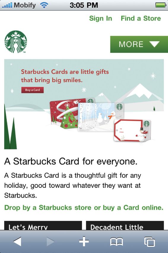
table of contents

01   Introduction
     This e-book is a guide for the builders of the web to

     navigate our complex mobile and multi-screen world.

04   2 Major Problems
     Defining and describing the 2 major problems causing a

     shift to a multi-screen world.

06   5 Strategic Approaches
     Proven ways to deal with the 2 major problems for long-

     term strategic success.

12   50 Mobile Web Design
     Best Practices
     Tactical tips to help web designers and developers build

     for a mobile and multi-screen web.

29   About Mobify
     An open platform to make any website adaptive to any

     device: mobile, tablets and more.

30   About the authors
     James Sherrett, Ben Terrill and key contributors from

     the Mobify team.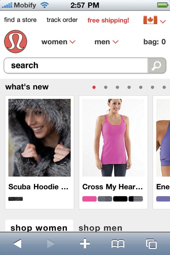
introduction
Today web designers and
developers – the builders of the
web – are in a pinch. We recently
witnessed the activation of the one-
billionth smartphone.

We find ourselves responsible for websites that are increasingly important –
more valuable all the time in how they communicate and contribute to business
goals. Yet with that increased responsibility has also come increased complexity.
Building websites is harder than ever because we now need to build for a multi-
screen world.

This e-book is a guide for the builders of the web to navigate our complex world.

The e-book outlines the big-picture trends affecting us as builders including the:

    >> 2 major problems we face in a multi-screen world,
    >> 5 strategic approaches to deal with these big-picture trends, and
    >> 50 mobile web design best practices that dig deep into the details of
       execution.
Our goal with this e-book is to arm you with both the big-picture perspective as
well as the fine tactics to succeed in the multi-screen world, because, as Google
reports, “90% of people move between devices to accomplish a goal, whether
that’s on smartphones, PCs, tablets or TV.”

Of these multiple screens people use, mobile phones have been the fastest
growing devices and most widely distributed. Of all the screens, mobile presents
the biggest global change and the biggest opportunity.

1   mobify.com | twitter.com/mobify | hello@mobify.com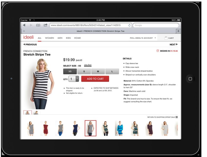
From Google the report The New Multi-screen World: Understanding Cross-platform
Consumer Behavior, August, 2012

Who are we to talk like this?
We’re Mobify, the team that built the platform that powers some of the world’s
most popular adaptive websites: Starbucks, Bosch, Beyond the Rack, ideeli,
British Telecom and Threadless, to name a few of the 20,000 mobile websites
powered by the Mobify platform.

We call Mobify an open platform to make any website adaptive to any device:
mobile, tablets and more. We work with enterprises and developers to mobify
the web – to make it amazing on any device. We power over $100-million in
mobile commerce and over 75,000 designers and developers use our products.

Our goal with this e-book is to share lessons from our experience. We want to
provide a guide for mobile designers and developers to make amazing websites
that adapt to any device and are future proof for any new devices.

2   mobify.com | twitter.com/mobify | hello@mobify.com
The best practices you’ll find here are general rules, proven by our experience,
but that need to be applied to your specific context and design problems. It’s free
because we want more awesome mobile websites in the world.

Our products are also free to try. Please check them out:

    >> Mobify Studio
       For designers and developers, the fastest way to build adaptive websites
       for any device: mobile, tablets and more.
    >> Mobify Cloud
       Fast, reliable, global infrastructure to deliver the best adaptive website
       performance.
    >> Mobify.js
       For developers, our free, open-source, client-side adaptation framework.

And please get in contact with us. We’re easy to reach at Mobify.com.

3   mobify.com | twitter.com/mobify | hello@mobify.com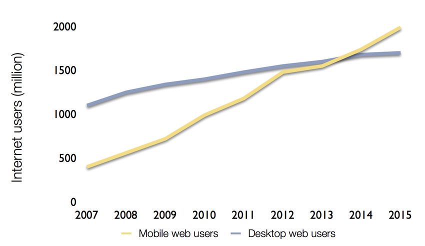
major problems
Problem #1: “Mobile” Web Growth
People are using more devices all the time to visit your website. To anyone paying
attention, this isn’t news. The macro shift to mobile web browsing patterns has
been predicted for years and mobile web usage is on track to surpass fixed web
usage by 2014.

From the Morgan Stanley presentation by Mary Meeker called Internet Trends, April 2012

This is the mobile growth problem. To put the growth in context, mobile web
adoption has been growing 8-times faster than web adoption grew at its peak in
the late 1990s and early 2000s. Web adoption saw major winners and losers and
mobile web adoption will as well.

But the mobile growth problem isn’t the only problem facing the people who build
and manage websites.

4   mobify.com | twitter.com/mobify | hello@mobify.com
Problem #2: Device Diversity Growth
The second problem in our steady march towards a multi-screen world is the
device diversity problem. A lot more different devices, with different screen
sizes, screen resolutions, interaction patterns, input / output interfaces and other
factors are visiting your website all the time.

For example, the iPad Mini may use the same touch-screen interface as the
iPhone, the iPad and dozens of other touch-screen devices now available around
the world. But its screen is a new size that fits midway between a mobile screen
like the iPhone and a full tablet screen like the iPad, but yet with a different screen
resolution than new full-sized iPads.

Like mobile web growth, device diversity growth shows no sign of slowing
or stopping. The future will bring even great device diversity: SmartTVs, web
browsers in cars, refrigerators and cameras and video game consoles that all
connect to the web with their own specific requirements, constraints, biases and
considerations.

5   mobify.com | twitter.com/mobify | hello@mobify.com
5 strategic approaches
1. Kill The M-Dot Websites

Mobile-specific websites can be part of an overall adaptive strategy. They can
work very well to serve smartphone traffic today. But running a separate m-dot
website for mobile-only traffic is a dead end.

Don’t believe it? Here are 6 reasons m-dot websites are a dead end:

    1   Hurts your search engine optimization (SEO)
    2 Slows your website performance with DNS lookups and redirects
    3 Results in subdomain spaghetti and heightens the device diversity problem
    4 Erodes social media sharing because of misdirection
    5 Undermines email sharing between devices
    6 Clashes with the philosophy of the web

The bottom line: m-dot websites were a good first attempt to solve the first major
problem – mobile web growth – but they don’t solve the second problem – device
diversity growth. They make it worse because they create a mess of domains,
links, redirects and user experiences on top of a weak foundation.

To play out the m-dot website approach, will you have a t-dot website for full-
sized tablets, a mi-dot website for mini-sized tablets and a tv-dot website for
smart TVs?

2. Build For Your Users

A commonly recurring piece of advice for web builders is to ensure your website
always provides the same content to all visitors. This seems like sound advice.

Except in practice it can be a hindrance to providing the best user experience for
people. It’s worth questioning and it’s worth putting to the test for each specific
website.

6   mobify.com | twitter.com/mobify | hello@mobify.com
We always recommend to start with the 3 modes of mobile user experience:

    >> Repetitive Now users are seeking recurring real-time information, such as
       stock quotes, sports scores and auction listings.
    >> Bored Now users are seeking distraction, entertainment or connection
       through a mobile device on services like Facebook, Instagram and
       Twitter, or in their email.
    >> Urgent Now users are seeking urgent information on their mobile device
       that is often related to location or activity, mostly through search engines
       and recommendation sites like Yelp or Foursquare.

Then review your analytics in-depth. Talk to your users and understand what
they want to do on the website.

We’re in a time of very fast change. Many people are seeking external guidance
to help them make decisions. They think they should design “mobile first.” They
think they need to have the exact same website available to every users on
every device.

These are provocative and interesting ideas that deserve to be considered as
influences. But they are not complete solutions to the problems of mobile web
growth and device diversity growth.

Web designers and developers need to survey the available options, analyze
their specific context, take responsibility for the experience they build and make
choices to deliver what the situation demands.

As David Ogilvy said back in the middle of the 20th century, “The essence of
strategy is sacrifice.”

7   mobify.com | twitter.com/mobify | hello@mobify.com
3. Performance: Not Optional
Whether your website is served to mobile visitors by wifi or by cellular networks,
its performance needs to be a foundational consideration.
To succeed in designing and developing for mobile, web builders will need to
respect performance constraints, both in delivering content and in running
content on the device.
Here are some best practices to ensure your customers get a snappy and
satisfying experience.
>> Cut down on HTTP requests. While a mobile user may try to do the same
things as a desktop user, they have constraints. Their processing power is
limited. Their bandwidth is unreliable. Additional on-page elements – like
Facebook Connect and Google +1 – impact real-world performance and
user experience can quickly suffer.
>> Optimize your images. Different devices boast different display quality and
size. It’s tempting to serve the largest possible image to the device and
then let it take care of downsizing the image. Don’t be tempted! Not taking
responsibility for your images is digitally wasteful and makes for a poor
user experience. Serve the right images to the right device, full stop.
>> Manage scripts and styles. You know all those JavaScript snippets in your
web page and CSS styles, or stylesheets, that load for desktop visitors?
Yeah, your mobile visitors don’t want them slowing down the page and
sucking up device resources. Use a service like Jazzcat to concatenate
JavaScript and CSS.
>> Choose CSS transitions. For animation effects on the device, use CSS
transitions rather than JavaScript animations. They’re faster.
>> Bonus tip: Use 3D transforms to trigger hardware acceleration. Your users
will thank you with increased usage.
8 mobify.com | twitter.com/mobify | hello@mobify.comHow you can follow these practices is explained in greater detail in the body of the e-book. The last word in mobile performance is this common refrain – you can’t simply deliver your desktop website and expect everything to be dandy. 4. Go Beyond Responsive and Get Adaptive Responsive design techniques are almost certainly going to be part of your approach to building for a multi-screen world of devices. They are part of our approach, too. But responsive design is just one element of an overall adaptive approach that incorporates more than just front-end CSS. From Brad Frost’s presentation Beyond Media Queries: Anatomy of Adaptive Web Design, July, 2012 9 mobify.com | twitter.com/mobify | hello@mobify.com
As Brad Frost puts it in his excellent presentation, Beyond media queries:
anatomy of an adaptive web design:

             Responsive web design by definition is defined
             as fluid grids, flexible media and media queries.
             However, it’s part of a much broader adaptive
             philosophy/strategy. Because the term has grown
             in popularity, it should come to define all that
             goes into crafting multi-device web experiences.

So call it responsive or adaptive, the critical idea is to maintain a One Web
approach. That is, to use open web standards like HTML, CSS and JavaScript,
and to deliver an amazing experience to your users through the same URLs.

If your website is not too complex, the simple tactics of responsive design may
provide a full-enough solution – fluid grids, flexible media and media queries.

But, as soon as you get any complexity, big responsive design pain points arise,
such as:

     >> Image management and optimization – Images for different devices
        and displays need to be available, but it’s hard to manage images with
        responsive design. Here’s a good overview of responsive design image
        optimization issues.
     >> Resource management and optimization – Beyond image management,
        overall resource management – images, scripts and CSS primarily –
        is not part of responsive design but has a huge impact on a website
        experience.
     >> Content reflowing – Responsive design uses the property display:none
        and is very limited in how it can manage content display.
     >> User Interface (UI) elements – Many devices work best with specific UI
        elements tailored to that device. Form inputs, menus, image sliders all are
        examples of UI elements that work best when they’re specific to a device type.

10   mobify.com | twitter.com/mobify | hello@mobify.com
>> Tables of data – Combine the pain of images and content reflowing and
you have the problem of dealing with tables in a responsive design. Some
partial solutions exist but they’re very challenging to implement.
Responsive web design is a great series of techniques for front-end layout. What
it needs now is better tooling and advanced functionality to address some of the
gaps and pain points that remain.
The reason that 86% of responsive website simply deliver the same HTML
pages – with all associated image, script and code resources – to all devices – is
because it’s hard to do otherwise. Instead of doing the hard work, most responsive
website spray their data to every device and pray it will work out in the browser.
5. Build your Tooling and Capabilities
Technologies like PhoneGap, Sencha, jQuery Mobile and Mobify.js can all
contribute to a complete solution for mobile in a multi-screen world. But it’s
essential that anyone building for the multi-screen world stays current with the
latest tools and technologies.
Pretty much every platform now has a mobile facet to its product mix – CMSs,
e-commerce platforms, CRMs, sales automation engines. Yet many of these
deserve some suspicion. They have been quickly built and deployed to meet a
market need. They are not stable, scalable, long-term solutions.
At the other end of the spectrum, many organizations are opting to build bespoke
responsive design systems with in-house teams or consultants. These projects
require long timeframes, broad changes to many website systems and large
investments in time and materials.
Choosing the right approach for your organization is challenging. Mobile is a key
piece but it’s not the only piece. The bigger picture beyond mobile is a full-fledged
adaptive website system. The promise is a website that is excellent on every
device, yet doesn’t handcuff your web team. Building your tooling and capabilities
ensures you have a chance to fulfill that promise. Getting there is the challenge.
Let us know if Mobify can help.
11 mobify.com | twitter.com/mobify | hello@mobify.com50 mobile web design
best practices
Hint and reveal (AKA:
progressive disclosure)
Mobile devices are small and most
websites present a lot of information.
Use progressive disclosure to show
users which actions they can take
to discover the content they’re after.
Don’t overload them with mountains
of information at all once. Instead, let
them expand or reveal content as they
need it. Read more: mobify.com/blog/
mobile-design-tip-hint-reveal
Think outside the screen
The device screen is a frame to pull
content into, not as the boundaries of
what can be designed. Users will swipe
both horizontally and vertically and
happily scroll vertically. Give them the
hints that more content is available and
they’ll find it.
Users can pull images into the screen from
the side and from the bottom on lululemon’s
mobile website.
12 mobify.com | twitter.com/mobify | hello@mobify.comLong pages almost always
beat lots of clicks, except
when they don’t
Momentum scrolling makes navigating
long pages, lists and well-constructed
pages with a visual hierarchy of
information a lot easier than we’re used
to on desktop PCs. Pair momentum
scrolling with hint and reveal
(progressive disclosure) for an even
better effect.
Use anchors in content to
jump down pages
Use anchor links throughout pages
to to make jumping from section-to-
section easy within the same page.
Visual hierarchy is
essential for context and
comfort
With anchor content and long pages
that scroll horizontally and can be
swiped both horizontally and vertically,
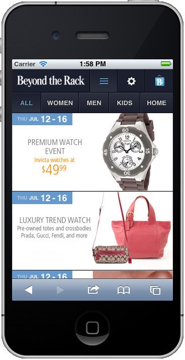
Beyond the Rack uses momentum scrolling
and hint and reveal to show users lots of providing people with a structured,
items without crowding any individual item. consistent and clear visual hierarchy is
essential. Make differences between
levels of text and document hiearchy
distinct. The classic reference point
here is Robert Bringhurst’s Elements of
Typographical Style.
13 mobify.com | twitter.com/mobify | hello@mobify.comMobify.com uses accordions that expand to Mobify.com accordion expanded has an added give users control over how much content is on element – a carousel that pulls in even more the page. content when users want it. Accordions can play sweet music Accordions (user interface elements that show more content when a user taps to expand and reveal it) can prove to be an effective tactic to show content without stretching the page to infinity and beyond. Use them in the right context. Maintain that context. Make sure you provide a consistent expand / collapse cue. 14 mobify.com | twitter.com/mobify | hello@mobify.com
Carousels make users
                                                     happy
                                                     Carousels (user interface elements
                                                     that show more content when a user
                                                     swipes horizontally to pull in more
                                                     content) can prove to be perfect for
                                                     image showcases, hero images and
                                                     related content. Be sure to show
                                                     your users how many items are in the
                                                     carousel and their current place in
                                                     those items. If you are auto-advancing
                                                     your slider, make sure you stop auto-
                                                     advancing when the user starts
                                                     interacting.

                                                     Go to full site – the mobile
                                                     website escape
                                                     Always include a link to the full site for
                                                     your users. No matter how good your
                                                     design, some people just want the
                                                     experience they’re used to. The only
                                                     thing that likes change is a wet baby.

Laithwaites Wine uses swipe-enabled                  Keep copy short
carousels to showcase the latest product
specials.                                            Be brief. Be brilliant. Be gone.

                                                     Keep headings shorter
                                                     than short
                                                     Headings that wrap over more than 2
                                                     lines push your content down the page
                                                     and often out of frame for users. Keep
                                                     them short, focused and descriptive
                                                     without telling the whole story.

15   mobify.com | twitter.com/mobify | hello@mobify.com
Use placeholder text on Don’t invent new wheels
small, common form inputs
Avoid creating new user interface (UI)
On small forms where context is elements when designing for mobile.
obvious, use placeholder text instead Excellent UI elements already exist
of labels (eg. login forms, search boxes on the device and your user is used to
or address forms). them. Each time you present a non-
standard element, there’s a chance you
Use label text on larger
will confuse them.
fields or unusual form
inputs
If the user needs a label to understand
what the context of the input is, don’t
rely on placeholder text. Make sure
the label is always present, even after Use the excellent UI elements already on the
they’ve inserted content. device, like the drop-down arrow.
Place labels above form Popups suck on mobile
inputs
Window management on mobile still
When you use labels they should be sucks. YouTube, Maps, anything that
placed above form elements. Using opens native applications takes the user
top-aligned labels makes sure that if outside the website’s flow and out of
the mobile browser zooms in on the context. Do your best to integrate these
input, the user doesn’t lose the context elements on the page so that users can
of the input. stay with the website they’re viewing.
Select to use select boxes, Don’t get modal happy
Mobile screen real estate is precious. Modals are primarily meant for
That’s why when it comes to notices and alerts and most of those
pagination blocks and long navigation are triggered by the phone, not
lists, select boxes are your best friend. your website. Limit the number of
interactions forced by modals to keep
your users happy.
16 mobify.com | twitter.com/mobify | hello@mobify.comUse visual cues and icons
as helping hands
Icons go a long way in helping visitors
understand how to make their way
around your mobile site. Swap text
navigation with illustrative icons, or just
lend users a helping hand with visual
cues.
Images need love too
Images tell a story and should be
carefully resized to ensure that their
story translates seamlessly onto a new
screen size. Avoid simply sizing down
images. Their context has changed and
they should too if you expect to them
to properly tell their story.
Make sure that text is
always text
No image-based text. Nope, none.
Learn to use CSS as it’s meant to
be used because different screen
Beyond the Rack uses their branded shopping dimensions and display densities
bag as a visual cue to their checkout.
will wreak havoc with your text if
you flatten it into an image. Added
benefits to using text for text include
accessibility, performance, graceful
degradation and general usability.
Services like TypeKit, FontSquirrel and
Google Web Fonts make is easy to
design beautiful text.
17 mobify.com | twitter.com/mobify | hello@mobify.comTreat your content like it’s
a king
Think long and hard about the job of
each page. Then make sure that all the
content on that page helps your users
accomplish that job. Simple beats
pretty. Simple also tends to be pretty.
Go easy on the images
Drop your gradient images and buttons
and make them lovely with CSS.
Mobile devices support some of the
most advanced CSS functions of any
browsers so pretty much anything
you want to do in imagery you can do
with styling. Additional benefits: better
scaling, better load times, happier
users. Yays! all around.
Save time with font-based
icons
We love icons! They spice up your
designs. To avoid managing a sprite
Techvibes uses a simple layout and design sheet with both retina assets and
because their content is the focus of their
site. smaller icons, opt for a font-based
icon set like: Font Awesome; glyphish;
iconsweets; or symbolset. Or, make
your own. Here’s how.
18 mobify.com | twitter.com/mobify | hello@mobify.comMake it smaller and
keep it smart
Mobile users expect to be able to do
the same stuff on their smartphones
as they do on their desktop PC. If your
desktop site includes a critical piece of
functionality, you need to include it on
your mobile website. That may be hard
because of constraints and a lack of
examples to follow. But don’t dumb it
down on mobile – make it smarter! For
example, rethink your maps and use
the location-awareness of the device.
Give your mobile website a
mobile-first makeover
Going mobile is about more than just
squeezing an existing website into
a one-column format. Examine your
analytics and your user feedback.
Tackle the opportunity to re-imagine
your website for mobile and to focus
on the important elements. Reorganize
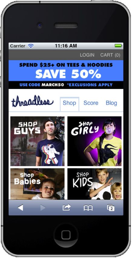
Threadless adapts all the main elements of its
much-loved social shopping presentation. content so that it makes sense to the
user. Drop extra content blocks. Move
elements up or down the page. Add
new elements for mobile devices. It’s
your site to make amazing.
19 mobify.com | twitter.com/mobify | hello@mobify.comAvoid playing hide and seek
Navigation that can be toggled open
and closed can be awesome. But it
should avoid covering up content
when it’s open. Instead, push content
down the page. Then, if your user
wants to refer to that content, they
can pull it into view without closing the
navigation and losing their context.
Web fonts, use ‘em
Most mobile web text looks pretty
much the same right now. That’s
because most folks feel the only
good looking font on Apple’s iOS is
Helvetica. So Helvetica is everywhere!
If you need to go beyond Helvetica,
check out services like Google
Webfonts or Typekit.
Use some asset management
magic
Generate retina icons and use the CSS
With its long pages accessed through background-size attribute to size them
momentum scrolling, Beyond the Rack is a
perfect place to ‘lazy load’ images as they’re down for non-retina devices. They’ll
requested for maximized performance. still look great and won’t take up that
much more space than the smaller
versions.
20 mobify.com | twitter.com/mobify | hello@mobify.comFacebook uses a horizontal slide to its Even with the full functionality revealed
navigation to reveal its full functionality. Facebook still hints at the homepage for its
users to return to.
Let Facebook share its design idea with your design
Facebook provides a great design pattern with their “left nav flyout.” A billion
people use Facebook so it seems wise to Like this pattern as a good guide to your
own design. A user taps to navigation and the web page reveals both navigation
and important page content while maintaining a visible section of the page on the
right side of the screen.
21 mobify.com | twitter.com/mobify | hello@mobify.comChoose the right elements
for the mobile context
Some actions in a mobile design need a
completely different interface for mobile
than they do on desktop. For example,
date pickers. Free yourself from the
desktop and make sure your mobile
user gets the best experience for them.
Respect the fat fingers and
tipsy taps of your users
None of us are as dexterous as we’d
like to be on our mobile devices. We
can all have a touch of “fat fingers”
symptoms. So design your actions
accordingly. Make the touch targets
big. We recommend 40px by 40px.
Give targets lots of margin too. We
recommend at least 10px margins
around the targets. Primary actions
should always be big and tappable.
Show don’t tell
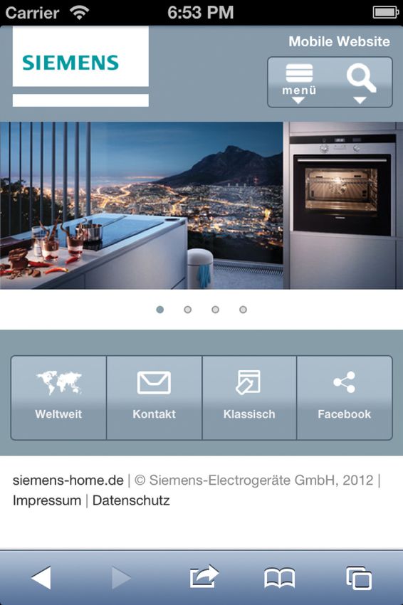
Siemens users a simple and element menu for Don’t make users guess how your site
quick access and familiarity.
works, show them. For example, if the
menu is typically hidden, make sure it’s
open on the first page or first visit so
users know it exists. Then, show them
how to open or close it in the future.
If you present a carousel or slider, set
it to auto-rotate until the user’s first
interaction with it.
22 mobify.com | twitter.com/mobify | hello@mobify.comBreak the rules
Rules (especially design rules) are
meant to be broken. When typical
design patterns don’t work for your
users, make your own!
Use common mobile design
patterns for common
mobile design problems
The simple truth of mobile design is
many of the complex design problems
have yet to be solved. So there’s lots
of room to get creative. At the same
time, many of the common design
problems have already been sorted out
by your esteemed colleagues. Follow
their lead and use common design
patterns. For instance, a three-line icon
in the top of a page is visual shorthand
for navigation. A plus ( + ) icon means
more content exists in an expandable
accordion.
Starbucks uses common design patterns Deep thoughts and
while also breaking the rules to create new contentment
ones.
If you’ve removed content for your
mobile site, you might not really need it
on desktop either.
23 mobify.com | twitter.com/mobify | hello@mobify.comMake your default font size
at least 14 px
Even if that seems really big, it’s the
right thing to do. The only time to go
smaller (and just to a minimum of 12
px) is on very precise labels for forms.
Feedback is the breakfast
of champions
When site elements require complex
user interactions – swiping, sliding,
dragging – give your users lots of
feedback. If they pull a drawer open
past a certain point and lets go, set
the drawer to its open state. If they
touch while it’s rotating, turn off auto
rotation. Let users choose how they
want to interact with your mobile site.
Declare your font size in
pixels for perfect control
We recommend you use pixels (px) for
font-size because it offers absolute
Lululemon keeps their fonts big, clear and control over the text. In addition, we
readable at a glance. recommend using a unit-less line-
height because it doesn’t inherit a
percentage value of its parent element.
Instead, it’s based on a multiplier of the
font-size.
24 mobify.com | twitter.com/mobify | hello@mobify.comKnow your usable Rank your autocomplete
viewport size then keep it suggestions by popularity
fluid
When a user is typing in a search
Sure the screen size on an iPhone 4 field, rank the autocomplete results
may be 320px by 480px (or 960px by popularity. It turns out that more
by 640px of pixel density in Apple’s people are searching for “Jelly Belly”
marketing) but what’s the real screen than “Jelly Bean 4.1 for Android.” Your
size with the browser chrome? That’s users will thank you with greater
actually what your user will experience. usage, deeper sessions and better
(Answer: 320px by 414px.) Know conversions.
your usable screen size and keep
your design fluid to take advantage Make your Search box
of it in both portrait and landscape bigger
orientations. Use it and make your Make it big and make it prominent
users happy. for people to find. Nothing frustrates
people more than hunting around a
Jump past the address bar mobile website for something specific
straight to the content
and not finding it – even though
Use a little JavaScript magic to load they know it exists. Additionally,
your mobile web pages at the top of the magnifying glass has become a
the pages, below the browser chrome, standard icon for search.
for some bonus real estate. Just make
sure you don’t hijack scrolling. Make all your buttons
bigger
Use your good friend It’s hard to make your buttons too wide
autocomplete
on the screen. Full width is excellent.
Form inputs on mobile are hard At a minimum, we recommend 40px by
and fussy. Whenever possible, use 40px. Give targets lots of space too.
autocomplete to help your users find We recommend at least 10px margins
what they’re looking for much faster around the targets.
by presenting possible results before
they’ve finished typing.
25 mobify.com | twitter.com/mobify | hello@mobify.comIdeeli’s tablet web experience shows related searches on each product page in a swipeable image carousel so users can easily see related products. Embrace the wild and wonderful world of device APIs When making a desktop site mobile we sometimes forget that smartphones and other mobile devices access user location, can make phone calls, take pictures and much more. Don’t confine your creativity to what’s on your desktop site. Suggest related searches and refinements with search results Showing your users related searches makes it easier for them to find what they’re seeking without requiring them to do additional input. Show related searches on your search results page, preferably below the search results. 26 mobify.com | twitter.com/mobify | hello@mobify.com
Show advanced search                                 Less is more
options with search
                                                     Entering information into forms is much
results
                                                     harder on a mobile device, right? So,
Make it easy for your users to scroll
                                                     ratchet down required fields to a bare
through search results at the same
                                                     minimum. Or, better yet, don’t include
time as they see that advanced search
                                                     form inputs you don’t require. Ask your
options are available for them to use.
                                                     users to enter the information later or
Accordions and sections that expand
                                                     omit it.
when your user taps them work well to
reveal your advanced search options.                 Make sharing a call to
                                                     action
Be transparent with your
                                                     Make social sharing tools easy to find
purpose
                                                     and use when people ask for them, but
If you must ask for a user’s information,
                                                     not by default. That’s because loading
be transparent and tell them why you
                                                     sharing tools – Like buttons, Tweet
need it. Then, be kind and save their
                                                     buttons and Pin This links – can impact
information for later (with an opt-out
                                                     page load time and work unevenly on
option) so they don’t have to fumble
                                                     mobile devices. Instead of loading them
with logins the next time they’re on
                                                     by default, ask your users to share.
your website.
                                                     When they tap your call to action, then
                                                     load the share functions.
Don’t make passwords
more tedious than they
have to be                                           Make sign-in simple, stupid
If you require a password for an                     Stop asking for all those details.
account login, show some mercy and                   Seriously. Do you desperately need
make the password login process as                   to have both a user’s email address
easy as possible. That means giving                  and password? Must they create a
users the option to show or unmask                   password when they sign up? How
the password so the most recent                      about asking only for the email address
character entered shows to them.                     and assigning them a password
                                                     instead? Think outside the box!

27   mobify.com | twitter.com/mobify | hello@mobify.com
Make marketing mobile Landing pages are old school for desktop sites, but they should work on mobile too. When sending email campaigns or running online ads make sure your landing pages with matching messages display gracefully on mobile devices. The result is happier customers and more sales. Have the need for speed A slow website—especially on mobile—can kill conversion rates and is bad news for your brand. Optimize images; optimize web resource pre- loading; optimize everything for speed. 28 mobify.com | twitter.com/mobify | hello@mobify.com
about mobify
Mobify is a technology company
focused on building an open platform
to make any website adaptive to any
device: mobile, tablets and more.

We work with enterprises and developers to mobify the web – to make it adaptive
and amazing on any device. We power over $100-million in mobile commerce and
over 75,000 designers and developers use our products.

We believe in a vision of “One Web” and we build products to deliver on that vision.

Visit mobify.com to learn more.

29   mobify.com | twitter.com/mobify | hello@mobify.com
about the authors

James Sherrett, VP of                                 Ben Terrill, Director of
Marketing                                             Customer Success
James has been working in software                    Ben Terrill is the Director of Customer
and e-commerce for 15 years and                       success for Mobify, an open mobile
has led digital marketing in travel and               platform. Ben has been working with
tourism, telecommunications, software                 digital agencies for over 10 years creating
and consumer packaged goods. He’s                     award-winning campaigns for brands like
the VP Marketing at Mobify, an open                   Nike, Electronic Arts and Palm. At Mobify
platform for building websites that                   Ben leads the professional services team
work on any mobile device. Today, that                that helps Mobify’s customers including
means adapting desktop sites for any                  British Telecom, Starbucks and Expedia
smartphone or tablet, like the iPad.                  achieve adaptive web success on mobile
Tomorrow, that will mean adapting                     and tablets.
websites for TVs, cameras and devices
we haven’t even imagined yet! James                   In addition, the following Mobify team
delights in sharing the mobile marketing              members provided invaluable expertise,
lessons he’s learned at Mobify with other             council, corrections and contributions to
digital marketers.                                    this e-book.
                                                          >>   Nick Foster, Creative Director
                                                          >>   Kyle Peatt, Mobile Designer
                                                          >>   Jacky Gilbertson, Mobile Designer
                                                          >>   Dave Shea, VP of User Experience

30   mobify.com | twitter.com/mobify | hello@mobify.com
mobify.com twitter.com/mobify hello@mobify.com
You can also read


