A Guide to Creating Dashboards People Love to Use - To get a Designing Dashboards Poster, go to
←
→
Page content transcription
If your browser does not render page correctly, please read the page content below
A Guide to Creating Dashboards
People Love to Use

                        To get a Designing Dashboards Poster, go to:
                        http://www/juiceanalytics.com/poster/

November 2009                           © 2009-2010 Juice, Inc. All rights reserved.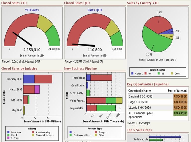
Dashboard Design Matters
Dashboards have become a standard business tool over the last decade. Dozens of
dashboard building solutions have sprung up to meet the demand. Yet in the flurry of
technology and enthusiasm, little attention has been paid to how to design focused,
thoughtful, and user-friendly dashboards. Our three-part guide will show you the concepts
and give you the best practices to create a high-impact dashboard that people love to use.

Traditional dashboard design focuses almost exclusively on defining the right success
metrics, then piecing together a bunch of charts and gauges on a single page. These
techniques yield dashboards with a hodgepodge appearance and confusing information.

Traditional dashboard design                                         This guide will help you design more
techniques result in confused solutions                              intuitive and effective dashboards

In the early days of the world wide web, it was good enough to simply have the right
information on the web page. The current industry-standard dashboards are no more
ambitious. However, modern web design has moved on to seek a union of utility, usability
and beauty. We must find a similar union when displaying data in business.

This document approaches dashboard design in a holistic way, beginning with general
goals and evolving to specific data presentation. Part 1: Foundation helps you identify your
target audience, understand what type of dashboard you want to create and why it is
valuable to your organization. It concludes guidance regarding how to focus your message

Juice Analytics creates dashboards that business people love to use. Check out some of our work at
www.juiceanalytics.com/solutions/case_studies/. Contact us at info@juiceanalytics.com.                                               2

October 2009                                                                                         © 2009 Juice, Inc. All rights reserved.
on the information and metrics that matter. Part 2: Structure helps you start on designing
your dashboard, including what form it should take, how to design for audience
understanding, and what navigation, interactions, and capabilities will make your
dashboard useful and engaging. Finally, Part 3: Information Design dives into the details of
interface and information design. You will learn how to lay out your dashboard and best
practices for charting and data presentation.

Juice Analytics creates dashboards that business people love to use. Check out some of our work at
www.juiceanalytics.com/solutions/case_studies/. Contact us at info@juiceanalytics.com.                                               3

October 2009                                                                                         © 2009 Juice, Inc. All rights reserved.
Part 1: Foundation
A Purpose-Filled Dashboard
We’ve all heard reasons why business dashboards are useful: that which we measure we
improve, and the importance of a shared understanding of the state of your business.

You need to find the specific reasons why your dashboard will be useful to your
organization. This section offers exercises to define and refine the purpose for your
dashboard. With this purpose in mind, the real work of creating a dashboard will come
more easily. Better yet, you will have a standard against which you can evaluate success.
There are three key questions:

     1. Who is my audience?
     2. What value will the dashboard add?
     3. What type of dashboard am I creating?

Who is my audience?

Dashboards need to start with an audience in mind. Who is the consumer of the
dashboard? What are their information needs? What do they already know? What are their
experiences and prejudices? As we design the dashboard, understanding the consumers of
the dashboard will help us craft a product that they love to use.

A complicating factor is that most dashboards have multiple audiences. In fact, delivering
the same dashboard across an entire organization has the potential benefit of getting
everyone on the same page. However, a diverse audience is hard to serve well. Therefore,
try to prioritize the audiences so conflicts can be more easily handled.

Here are a few of the factors to consider about your audience, and the implications for a
dashboard design:

Juice Analytics creates dashboards that business people love to use. Check out some of our work at
www.juiceanalytics.com/solutions/case_studies/. Contact us at info@juiceanalytics.com.                                               4

October 2009                                                                                         © 2009 Juice, Inc. All rights reserved.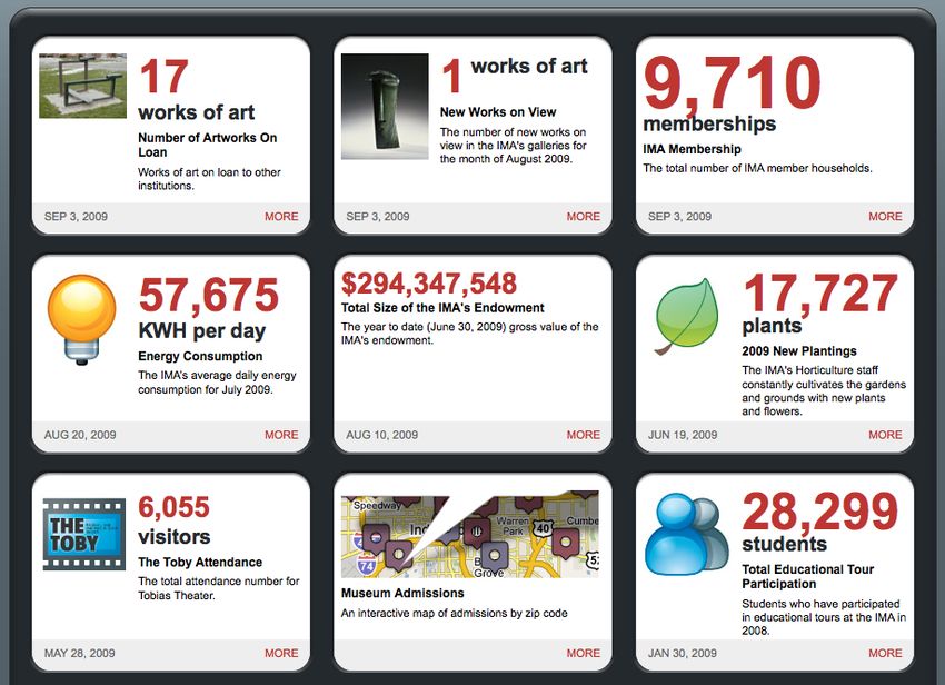
Questions                                                Implication

 Role                    What decisions do they make?                           Structure the information to make it
                                                                                super easy to answer high priority
                         What questions do they need                            questions.
                         answered?

 Work flow               In what context will they be reviewing                 The form and information display
                         the dashboard?                                         needs to fit into an existing work flow.
                                                                                For example, an on-the-road sales
                         What information are they using on a                   person may need information delivered
                         daily basis?                                           to her BlackBerry, not designed for an
                                                                                online wide-screen monitor.
                         How much time do they have to review
                         the numbers?

 Data comfort            How sophisticated are they with using                  The dashboard’s level of detail and
 and skills              data?                                                  analytical capabilities should match
                                                                                the audiences’ comfort zone.
                         Are they proficient in Excel?

                         Do they enjoy digging into the
                         numbers?

 Business and            How familiar are they with the key                     This determines the need for
 data expertise          performance metrics?                                   embedded explanations and use of
                                                                                natural language.
                         Do they understand where the data
                         comes from?

                         Are they familiar with internal company
                         or industry terminology?

Juice Analytics creates dashboards that business people love to use. Check out some of our work at
www.juiceanalytics.com/solutions/case_studies/. Contact us at info@juiceanalytics.com.                                                 5

October 2009                                                                                           © 2009 Juice, Inc. All rights reserved.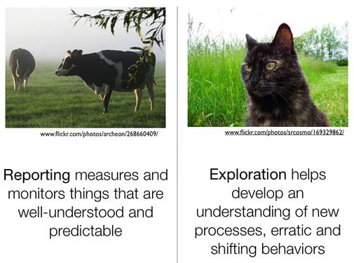
What value will the dashboard bring?

Dashboards can serve many purposes. Take a moment to consider what you want to get
out of your dashboard. Check the top three reasons below.

      ☐    Help management define what is important
      ☐    Educate people in the organization about the things that matter
      ☐    Set goals and expectations for specific individuals or groups
      ☐    Help executives sleep at night because they know what’s going on
      ☐    Encourage specific actions in a timely manner
      ☐    Highlight exceptions and provide alerts when problems occur
      ☐    Communicate progress and success
      ☐    Provide a common interface for interacting with and analyzing important business
           data

What type of dashboard am I creating?

We’ve seen a lot of discussion about the definition of a “dashboard.” Some people argue
that something only qualifies if it fits on one-page or shows real-time information or offers
a comprehensive view of a business. We find those requirements too constraining.
Dashboards can come in many flavors. What never changes is good dashboards focus on
the most important information and communicate this information clearly and concisely.
The delivery channel, level of interactivity, timeliness of data, and analytical capabilities
will vary based on the situation.

Below is a list of options for your perfect dashboard. Check the boxes that best fit your
situation.

Juice Analytics creates dashboards that business people love to use. Check out some of our work at
www.juiceanalytics.com/solutions/case_studies/. Contact us at info@juiceanalytics.com.                                               6

October 2009                                                                                         © 2009 Juice, Inc. All rights reserved.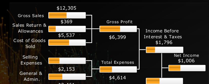
Scope                   ☐ Broad: Displaying information about                  ☐ Specific: Focusing on a specific
                         the entire organization                                function, process, product, etc.

 Business role           ☐ Strategic: Provides a high-level,                    ☐ Operational: Provides a focused,
                         broad, and long-term view of                           near-term, and tactical view of
                         performance                                            performance

 Time horizon            ☐ Historical:               ☐ Snapshot:                ☐ Real-time:                ☐ Predictive:
                         Looking                     Showing                    Monitoring activity         Using past
                         backwards to track          performance at a           as it happens               performance to
                         trends                      single point in time                                   predict future
                                                                                                            performance

 Customization           ☐ One-size-fits-all: Presented as a                    ☐ Customizable: Functionality to let
                         single view for all users                              users create a view that reflects their
                                                                                needs

 Level of detail         ☐ High: Presenting only the most                       ☐ Drill-able: Providing the ability to drill
                         critical top-level numbers                             drill down to detailed numbers to gain
                                                                                more context

 Point of view           ☐ Prescriptive: The dashboard                          ☐ Exploratory: User has latitude to
                         explicitly tells the user what the data                interpret the results as they see fit
                         means and what to do about it

Information Discrimination
The single most common mistake we see in dashboard design is treating all information as
if it is equally important. Amanda Cox of the New York Times design group said it
perfectly: “Data isn’t like your kids, you don’t have to pretend to love them equally.”

Juice Analytics creates dashboards that business people love to use. Check out some of our work at
www.juiceanalytics.com/solutions/case_studies/. Contact us at info@juiceanalytics.com.                                               7

October 2009                                                                                         © 2009 Juice, Inc. All rights reserved.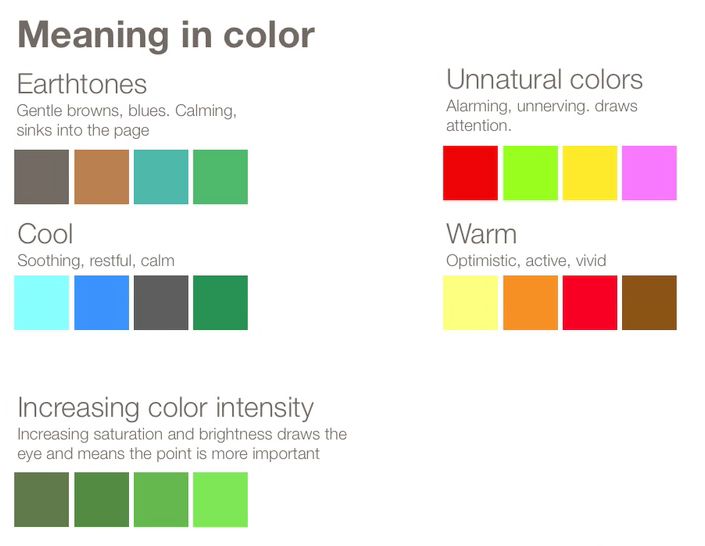
Too often the criteria for including
information in a dashboard is whether
someone influential thought it might be                             “Data isn’t like your kids,
interesting. We propose a more stringent
                                                                    you don’t have to pretend
requirement: Will the information drive
productive action? Here are a few                                   to love them equally.”
strategies to help narrow down to the                                                           Amanda Cox, NY Times
information that really matters:

     ‣         Find the core. Your dashboard should be more than a lot of data on a screen. It
               should have a core theme based on the essence of the problem. A sales dashboard
               may be about “How can we more effectively move leads through our pipeline?” A
               marketing dashboard may strive to answer: “How can we optimize our marketing
               investments?” Finding this core will give you the logic and argument for
               discarding extraneous information.
     ‣         Ask a better question. Dashboard requirements can quickly turn into a laundry
               list of unrelated metrics, dimensions, and half-baked analyses. The root of this
               problem stems from only asking “what would you like to know?” Here’s the one
               follow-up question you need to narrow down the list: “What would you do if you
               knew this information?” This question separates the novel and whimsical desires
               from the important and actionable information.
     ‣         Push to the appendix. Sometimes it is impossible to ignore the requests for certain
               information to be included in the dashboard. In these cases, one option is to
               create an appendix report that includes the “interesting” information but keeps the
               focus on the most critical data. In other words, keep truly critical information on
               the front page and suppress ancillary information.
     ‣         Reporting vs. exploration. For all the things that a dashboard can be, it cannot be
               a generic analysis tool. It cannot be designed to slice and dice data to explore and
               answer a new question every time. This is a dynamic we refer to as the difference
               between herding cows and herding cats. When people ask for information
               focusing on uncharted territory, this is the domain of analysis, not your dashboard.

Juice Analytics creates dashboards that business people love to use. Check out some of our work at
www.juiceanalytics.com/solutions/case_studies/. Contact us at info@juiceanalytics.com.                                               8

October 2009                                                                                         © 2009 Juice, Inc. All rights reserved.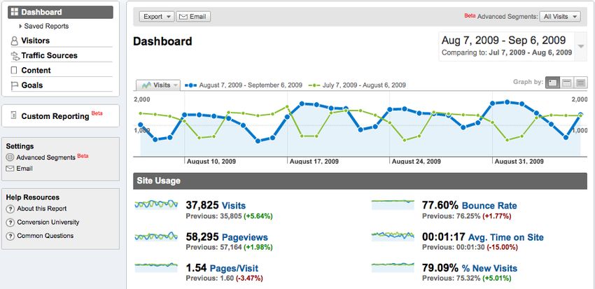
We cannot emphasize it enough—the success of your dashboard will come down to your
ability to distinguish between useful, productive information and interesting but
extraneous information.

                 “Perfection is achieved, not when there is
                 nothing more to add, but when there is
                 nothing left to take away.”
                                                                               Antoine de Saint-Exuper

Juice Analytics creates dashboards that business people love to use. Check out some of our work at
www.juiceanalytics.com/solutions/case_studies/. Contact us at info@juiceanalytics.com.                                               9

October 2009                                                                                         © 2009 Juice, Inc. All rights reserved.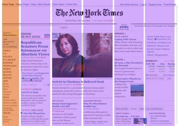
Choosing the perfect metric
Your organization may know the exact metrics that aligned behaviors, drive strategy, and
track success. For the rest of us, defining the right metrics for your dashboard is a tricky,
ever-evolving task. Below is a simple framework to help hone in on the right performance
metrics.

Juice Analytics creates dashboards that business people love to use. Check out some of our work at
www.juiceanalytics.com/solutions/case_studies/. Contact us at info@juiceanalytics.com.                                               10

October 2009                                                                                         © 2009 Juice, Inc. All rights reserved.
Description                                       Common mistakes

 Actionable              It is clear the source of the problem or               It is too broad for specific groups to
                         necessary actions when the metric goes                 impact (e.g. customer satisfaction).
                         up, down, flat or off-target
                                                                                Focus on absolute measures rather than
                                                                                changes (e.g. total sales vs. change in
                                                                                sales)

 Common                  People in the organization recognize                   It uses data definitions that aren’t well
 interpretation          what the metric means                                  understood (e.g. leads vs. prospects).

 Transparent,            How the metric is generated is shared                  Attempting to create a compound
 simple                  and easy to understand                                 metric that combines a bunch of factors
 calculation

 Accessible,             The data can be acquired with modest                   Pursuing the perfect metric that is hard
 credible data           effort from a source that people trust.                to gather rather than using a close
                                                                                proxy.

A note on goals: Metrics without goals can be a waste. Unfortunately, getting people to
agree to specific targets can be painful. After all, goals start us down a slippery slope
toward clear accountability. Don’t give up. We’ve found that the first step is to simply get
people to buy-in to the success metrics by creating clarity on definitions, showing trends,
and incorporate them into the organization's vernacular. Eventually, people start to
question why there isn’t a goal set. Pretend to act surprised by the cleverness of this
suggestion.

Juice Analytics creates dashboards that business people love to use. Check out some of our work at
www.juiceanalytics.com/solutions/case_studies/. Contact us at info@juiceanalytics.com.                                               11

October 2009                                                                                         © 2009 Juice, Inc. All rights reserved.
Creating a Solid Foundation
Part 1 of our guide should help you map where you are going before you start throwing
charts on a page. In this paper we’ve addressed these topics:
• How is the dashboard going to add value to my organization?
• What type of dashboard am I creating?
• Who is the audience of the dashboard and what are their needs?
• What is the central thought-line of my dashboard story?
• What are the key metrics that will focus users on actionable information?
If you can answer with confidence the questions we’ve discussed here, you will have a
solid foundation before you get into the details of your dashboard design.
In Part 2, we will discuss the form and structure of your dashboard. We will help you
create a frame for your dashboard that makes it easy for users to understand what they are
looking at and navigate and interact with information.
Juice Analytics creates dashboards that business people love to use. Check out some of our work at
www.juiceanalytics.com/solutions/case_studies/. Contact us at info@juiceanalytics.com. 12
October 2009 © 2009 Juice, Inc. All rights reserved.Part 2: Structure
Framing the Dashboard
Now that we’ve defined in Part 1 what the dashboard should accomplish for your
audience, it is time to start the thinking about how your dashboard actually looks and how
it works. This section offers ideas about the big-picture elements of your dashboard–the
building blocks that you will use to construct the dashboard. The building blocks can be
broken into four categories:
1. Form: In what format is the dashboard delivered?
2. Structure: How is the dashboard laid out to help users understand the big picture?
3. Design principles: What are the fundamental objectives that will guide your design
decisions?
4. Functionality: What capabilities will the dashboard include to help users understand
and interact with the information?
Form
The conventional view has been that dashboards need to be constrained to a single page;
we believe dashboards can come in many forms. A short e-mail can serve as a dashboard
if it works for the recipients. Likewise, a wall-mounted 55” plasma TV showing an
animated presentation has the potential to be an effective dashboard.
What’s important is selecting a form that fits the need of the situation–form follows
function. The function of a dashboard is to communicate critical information to your
audience in a way they can understand, delivered when and where they need the
information.
Before you decide how you want to deliver your dashboard, think about a few factors that
may influence the dashboard form:
Juice Analytics creates dashboards that business people love to use. Check out some of our work at
www.juiceanalytics.com/solutions/case_studies/. Contact us at info@juiceanalytics.com. 13
October 2009 © 2009 Juice, Inc. All rights reserved.1. Timeliness: How frequently is the
data in the dashboard updated? The function of a dashboard
is to communicate critical
2. Aesthetic value: How important is it
that the dashboard look attractive, or information to your
can it be purely utilitarian? audience in a way they can
3. Mobility: Does the audience need to understand, delivered when
access the information on-the-go? and where they need the
4. Connectivity: Does the dashboard
information.
need to connect to live data
sources?
5. Data detail: Will the dashboard offer an ability to drill down to see more context?
6. Data density: How information-rich will views of the data be?
7. Interactivity: Will the user benefit from interacting with the dashboard?
8. Collaboration: Is it important that your audience be able to easily share and
collaborate on the dashboard?
In the following table, we assess six forms of dashboards by their effectiveness in
addressing the factors above (“+” means the form can work well for the specific factor; “-”
means the form is not effective). Which forms perform well for the factors your audience
cares about?
Juice Analytics creates dashboards that business people love to use. Check out some of our work at
www.juiceanalytics.com/solutions/case_studies/. Contact us at info@juiceanalytics.com. 14
October 2009 © 2009 Juice, Inc. All rights reserved.Paper One- Paper Excel Online app E-mail / text Large screen
pager Presentation message
Timeliness - - + + + +
Aesthetic + + + - +
Mobility + + -
Connectivity - - + + +
Data detail - + + + -
Data density + + -
Interactivity - - + - -
Collaboration + -
Structure
The standard practice for laying out a dashboard, unfortunately, has been to slot charts into
a grid. Take this dashboard for example (with our grid overlay):
Juice Analytics creates dashboards that business people love to use. Check out some of our work at
www.juiceanalytics.com/solutions/case_studies/. Contact us at info@juiceanalytics.com. 15
October 2009 © 2009 Juice, Inc. All rights reserved.This rigid structure tells us nothing about how different charts relate to each other; offers
no clue as to where to begin understanding the data; and nothing about what information
is most important.
Creating a layout that helps frame the content of your dashboard may be the most under-
valued area of dashboard design.
Why structure matters?
Stephen Few, author of Information Dashboard Design, calls structure one of the greatest
challenges of dashboard design:
"Dashboard content must be organized in a way that reflects the nature of the information
and that supports efficient and meaningful monitoring. Information cannot be placed just
anywhere on the dashboard, nor can sections of the display be sized simply to fit the
available space. Items that relate to one another should usually be positioned close to one
another. Important items should often appear larger, thus more visually prominent, than
less important items. Items that ought to be scanned in a particular order ought to be
arranged in a manner that supports that sequence of visual attention.” (Pervasive Hurdles
to Effective Dashboard Design, Visual Business Intelligence Newsletter, January 2007)
The structure of your dashboard is also an opportunity to define the “right” way to look at
a problem or the business. How you choose to lay out the information shapes how your
audience understands the big picture and how the smaller pieces fit together. At a more
practical level, structure can serve as a navigational mechanism for the user. It shows
where to start, and where to go next.
Structure options
A good dashboard structure requires a deep understanding of how the system you are
measuring works. There are many ways to break something down into manageable parts.
For example, the performance of a (American) football game can be deconstructed in
many ways: 1) by offense,defense, and special teams; 2) by down and distance; 3) by time
period; 4) by drive; 5) by running vs. passing plays. A dashboard built around each of
these organizing principles would tell a different story.
Choosing the right model is a dashboard-specific problem. In our experience, dashboards
fall into three categories: flow, relationships, and grouping.
Juice Analytics creates dashboards that business people love to use. Check out some of our work at
www.juiceanalytics.com/solutions/case_studies/. Contact us at info@juiceanalytics.com. 16
October 2009 © 2009 Juice, Inc. All rights reserved.Flow A flow-based structure emphasizes a sequence of events or actions across time. Systems that fit this model include leads moving through a sales pipeline, stages of customers support, and operational processes. Notice how the sales dashboard below is built around the flow of customers from leads through the pipeline, and ultimately to won or lost orders. The commitment to the vertical flow structure makes it clear to users how to think about the sales process. On2biz Juice Analytics creates dashboards that business people love to use. Check out some of our work at www.juiceanalytics.com/solutions/case_studies/. Contact us at info@juiceanalytics.com. 17 October 2009 © 2009 Juice, Inc. All rights reserved.
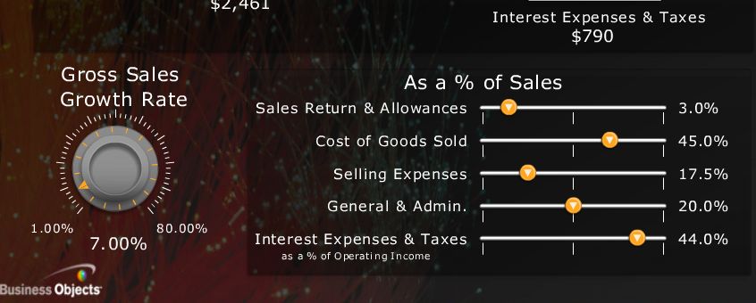
Relationships

The structure of a dashboard can also emphasize the relationships between entities or
measures. These relationships or connections may be mathematical, geographical,
organizational, or functional. Below is a dashboard that explicitly shows the relationships
between financial metrics to give users a model for understanding the factors driving net
income.

Business Objects

Juice Analytics creates dashboards that business people love to use. Check out some of our work at
www.juiceanalytics.com/solutions/case_studies/. Contact us at info@juiceanalytics.com.                                               18

October 2009                                                                                         © 2009 Juice, Inc. All rights reserved.
Grouping

The structure of last resort is to group related information into categories or a hierarchy.
The simple act of putting similar things together can bring some logic and accessibility to
an otherwise haphazard dashboard. The following dashboard from the New York Times
financial section brings related metrics together into three categories. Based on their
needs, different users will know where to start in reviewing the performance data.

Design principles
As you get closer to putting pencil on paper to design your dashboard, we’d like to lay out
a few core design goals to use as reminders of what is important. We call these goals
design principles. Below are a few key design principles that we use when we design

Juice Analytics creates dashboards that business people love to use. Check out some of our work at
www.juiceanalytics.com/solutions/case_studies/. Contact us at info@juiceanalytics.com.                                               19

October 2009                                                                                         © 2009 Juice, Inc. All rights reserved.
dashboards. By no means should you feel compelled to follow all of these principles; in
fact, it is better to pick a one or two high priority principles to help stay focused.
Compactness / Modularity
Some dashboards become large and unwieldy in an effort to create a single
comprehensive view of an entire business or process. Eric Steven Raymond, writing about
good software design (http://catb.org/~esr/writings/taoup/html/ch04s02.html), offers this
guidance:
“Compactness is the property that a design can fit inside a human being's head...Compact
software tools have all the virtues of physical tools that fit well in the hand. They feel
pleasant to use, they don't obtrude themselves between your mind and your work, they
make you more productive.”
A dashboard can be broken into bite-sized pieces, each built around a key question. The
GE Health Visualizer (http://www.ge.com/visualization/health_visualizer/) by information
visualization guru Ben Fry offers a great example of a compact design.
Juice Analytics creates dashboards that business people love to use. Check out some of our work at
www.juiceanalytics.com/solutions/case_studies/. Contact us at info@juiceanalytics.com. 20
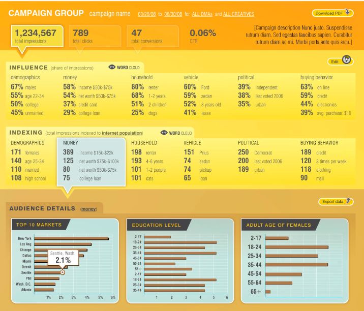
October 2009 © 2009 Juice, Inc. All rights reserved.Gradual reveal
Reveal information as the user expresses interest. In other words, don’t bombard the user
with all the information at once. We frequently use levels of increasing detail from (a) key
metric to (b) context around the metric to (c) full breakout detail for the metric. Here’s the
interface of Datran Media’s Aperture online advertising dashboard that shows this model:
Key metrics
Context
Detail
Guide attention
It isn’t good enough to make the information available; you need to use visual cues and
functionality to draw the user to the things that matter most. A few mechanisms that can
help are alerts, positioning on the page, and careful use of color and fonts. Trendly.com, a
site that pulls information from Google Analytics, is specifically designed to highlight the
most interesting changes in web analytics data.
Juice Analytics creates dashboards that business people love to use. Check out some of our work at
www.juiceanalytics.com/solutions/case_studies/. Contact us at info@juiceanalytics.com. 21
October 2009 © 2009 Juice, Inc. All rights reserved.Support casual use Minimize the barrier to entry for new users by avoiding feature overload, minimizing clicks for each task, and providing clear, concise descriptions of what things mean. The Indianapolis Museum of Art dashboard below has kept the interface simple, inviting and attractive for the visitors to their site who want to know what’s going on. There is still plentiful detail behind each panel for people who want to know more. Juice Analytics creates dashboards that business people love to use. Check out some of our work at www.juiceanalytics.com/solutions/case_studies/. Contact us at info@juiceanalytics.com. 22 October 2009 © 2009 Juice, Inc. All rights reserved.
Lead to action
Empower the user to finish their task quickly and/or understand the action that should be
taken based on the results. You can build in explicit guidance about what a change in a
metric means, or who to contact to address an issues that is highlighted in the dashboard.

Customizable
Build in flexibility to allow the dashboard to become relevant for different users. The most
common way to allow users to customize the dashboard is by defining the scope of the
data using filters. There is more that can be done: Does the dashboard let the user save a
view of the data that they’ve configured? Does it offer easy ways to tag or highlight things
that are important to them?

Explanation before information
We need context and explanation to understand new and unfamiliar events. Providing
data without this higher-level analysis is the difference between a chef presenting a fine
dinner and fish monger throwing a fish at your head.

For many dashboards, there is time to interpret the results and provide a summary before
presenting to your audience. Letting the data speak for itself can be a recipe for mis-
interpretation and confusion. The following quote about journalism offers broader
perspective on how to present complex information:

     The most “basic” [journalistic] acts are reporting today’s news and providing current
     information, as with prices, weather reports and ball scores. We think of “analysis,”
     “interpretation,” and also “explanation” as higher order acts. They come after the news has
     been reported, building upon a base of factual information laid down by prior reports...

     [However, there are some stories] where until I grasp the whole, I am unable to make
     sense of any part. Not only am I not a customer for news reports prior to that moment, but
     the very frequency of the updates alienates me from the providers of those updates
     because the news stream is adding daily to my feeling of being ill-informed, overwhelmed,
     out of the loop.
          - Jay Rosen, NYU Journalism Institute (journalism.nyu.edu/pubzone/weblogs/pressthink/
          2008/08/13/national_explain.html)

Juice Analytics creates dashboards that business people love to use. Check out some of our work at
www.juiceanalytics.com/solutions/case_studies/. Contact us at info@juiceanalytics.com.                                               23

October 2009                                                                                         © 2009 Juice, Inc. All rights reserved.
Functionality As we work our way from the big picture to the nuts and bolts of your dashboard design, we want to outline common features that can make your dashboard more useful (Part 3 will offer more detail on the best ways to implement some of these features). Depending on the form that you’ve chosen, the dashboard can be much more than simply charts on a page. Interactive elements highlight key information; user configuration let users customize their view of the data; advanced visualizations make complex data easy to understand and navigate. The first group of features are the basics that should be considered for any dashboard. A second category of advanced features can differentiate your dashboard and provide exceptional user control and value. Basics • Drill down: Ability to go from a summary metric or view to additional detail that provides more context and/or breakout of the information. • Filters: Allow users to define the scope of the data in the dashboard to reflect their needs. Filters can either be global (refining scope for the entire dashboard) or local (refining scope for a specific chart or metric or view). • Comparison: Ability to see two or more subsets of the data side-by-side. A line chart, for example, may let the user view two geographic regions as separate lines. • Alerts: Highlight information based on pre-defined criteria. The alert may be activated when a metric goes outside of a particular threshold. For more detail on best practices in dashboard alerts, read this article www.juiceanalytics.com/writing/dashboard-alerts- checklist/ • Export / print: Give users the ability to pull information out of a dashboard. Export to formats that let users do more with the data like Excel and CSV rather than PDF. The Google Analytics dashboard offers elegant implementations of many of these features: Juice Analytics creates dashboards that business people love to use. Check out some of our work at www.juiceanalytics.com/solutions/case_studies/. Contact us at info@juiceanalytics.com. 24 October 2009 © 2009 Juice, Inc. All rights reserved.
Export
                                                              Comparison

        Drill-down

Advanced
• Text-based summary: Automatically generated textual description of the key
  information in the dashboard. This can be as simple as a sentence that includes a
  couple important data points. A more sophisticated example is shown below in a web
  analytics solution by WebTrends:

• Starring/tagging: Ability for users to identify things in the dashboard that are important
  to them. The virtual equivalent of circling a number with a red pen.

• Annotation: Allow users to add commentary to specific numbers or charts. The virtual
  equivalent of writing notes in the margin. WebTrends also offers an annotation feature:

Juice Analytics creates dashboards that business people love to use. Check out some of our work at
www.juiceanalytics.com/solutions/case_studies/. Contact us at info@juiceanalytics.com.                                               25

October 2009                                                                                         © 2009 Juice, Inc. All rights reserved.
• Save / track changes: The more a user configures a dashboard to their unique needs, the more important it becomes to allow them to save what they have created. For an exquisite example of saving changes as you go along, see the tee-shirt customization site Click Shirt (http://www.click-shirt.com/). • Advanced visualizations: If it is useful to show more complex data in the dashboard, a variety of advanced visualizations can help make it digestible. A few visualization types to consider include geographic map, treemap, network diagram, tag cloud, scatterplots and bubble charts. But be careful, using complex visualizations incorrectly can leave your audience feeling lost and confused. A good place to explore some of these more innovative visualizations is IBM’s Many Eyes site (http://manyeyes.alphaworks.ibm.com/ manyeyes/): Juice Analytics creates dashboards that business people love to use. Check out some of our work at www.juiceanalytics.com/solutions/case_studies/. Contact us at info@juiceanalytics.com. 26 October 2009 © 2009 Juice, Inc. All rights reserved.
Building Blocks
Part 2 of our guide gives you the building blocks for constructing your dashboard. Like
constructing a house, we wanted to focus on framing the structure before worrying about
painting the walls and installing the kitchen appliances. In this paper we’ve addressed
these topics:
    1. Form: In what format is the dashboard delivered?
    2. Structure: How is the dashboard laid out to help users understand the big picture?
    3. Design principles: What are the fundamental objectives that will guide your design
       decisions?
    4. Functionality: What capabilities will the dashboard include to help users understand
       and interact with the information?

In Part 3, we will focus on information design -- presenting information in clear and
concise ways. In addition, we will offer our perspective on designing an interface that is
user-friendly and attractive.

Juice Analytics creates dashboards that business people love to use. Check out some of our work at
www.juiceanalytics.com/solutions/case_studies/. Contact us at info@juiceanalytics.com.                                               27

October 2009                                                                                         © 2009 Juice, Inc. All rights reserved.
Part 3: Information Design Clear presentation of information The third part of our dashboard design guide provides practical tips for putting information on the page in a way that communicates effectively to your audience. We stand on the shoulders of giants in the area of information design, including visualization guru Edward Tufte, visual business intelligence critic and teacher Stephen Few, and numerous leaders in the field of web design. This paper is our attempt to synthesize some of the most important best practices while adding a few extra wrinkles. Information presentation is a balancing act—How do you convey a lot of information without making it feel overwhelming? How do you capture attention without distracting your audience? How do you make information feel simple yet profound? As we’ve done throughout this series, we will tackle the problem from the outside in. First we share best practices for designing a clear, aesthetically-pleasing page. Next we concentrate on the charts, table and visualizations that communicate the information. Here’s what you can look forward to: Section 1: Interface design 1. Organize the dashboard page like a web design expert 2. Choose the appropriate use of color to enhance your dashboard 3. Make the right typography decisions to ensure attractive, readable text Section 2: Information display 1. Pick the chart type that best fits your data 2. Style charts to be attractive and effective 3. Learn about advanced visualization and features for your dashboard Juice Analytics creates dashboards that business people love to use. Check out some of our work at www.juiceanalytics.com/solutions/case_studies/. Contact us at info@juiceanalytics.com. 28 October 2009 © 2009 Juice, Inc. All rights reserved.
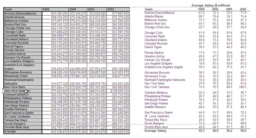
Section 1: Interface design
Simplicity is a primary goal of many well-designed websites—limiting visual clutter to
help users easily navigate and understand the content. Dashboards share the same goal. It
is no surprise then that we can learn a lot from the rules and tools of web design to help
guide our thinking on creating dashboard interfaces. We can learn about:

Organizing the page. Where should you place the most important content? How do you
lay out charts and text to enable visual rhythm? How can white space help your audience
absorb information?

Color. What meaning does color bring to the dashboard? How do you pick the
appropriate color palette and scheme for your situation?

Typography. Why does it matter what fonts are used? How do you consistently use fonts to
enhance the interface?

Organizing the page
The little things in a dashboard can make a big difference—like where you place the key
metrics, where you place charts, and how much information you try to fit into a page.
Dashboards like the award-winning International Bank Dashboard (below) succeed at
information design. However, its page layout leaves something to be desired. The data is
compressed to fit the page and readers can’t easily determine what is the most critical
information.

Juice Analytics creates dashboards that business people love to use. Check out some of our work at
www.juiceanalytics.com/solutions/case_studies/. Contact us at info@juiceanalytics.com.                                               29

October 2009                                                                                         © 2009 Juice, Inc. All rights reserved.
www.bonavistasystems.com/MicroChartsCompetitionDashboards01.html

A few things to keep in mind when laying out your dashboard:

Pay attention to attention
You’ll want to position the most important
information where people look first. But how to
know where someone will look on the page?
Fortunately, studies show that people tend to scan a
page in a similar manner. Imagine the image to the
right is overlaid on your dashboard page. The
research indicates that users look first for information
on the top and left. Users also focus their attention
down the left side. The center gets a fair bit of
attention as well. But the bottom and right may not
be noticed by your user at all.

Juice Analytics creates dashboards that business people love to use. Check out some of our work at
www.juiceanalytics.com/solutions/case_studies/. Contact us at info@juiceanalytics.com.                                               30

October 2009                                                                                         © 2009 Juice, Inc. All rights reserved.
Grids
Many web designers use something called a grid system—a series of columns and
“gutters” of certain widths—to ensure that key lines in their designs align. This approach
brings a coherence and order to the page that puts users at ease.

We can overlay a grid on a well-designed site like the New York Times to see how this
system gets applied in practice.

Not everything fits into one column, but it is obvious that this site has a pre-defined grid
and sticks faithfully to it. The result is a clean, effective page layout. Here are two
reference articles to learn more about grid layouts:
     • www.subtraction.com/pics/0703/grids_are_good.pdf
     • www.smashingmagazine.com/2007/04/14/designing-with-grid-based-approach/

Juice Analytics creates dashboards that business people love to use. Check out some of our work at
www.juiceanalytics.com/solutions/case_studies/. Contact us at info@juiceanalytics.com.                                               31

October 2009                                                                                         © 2009 Juice, Inc. All rights reserved.
White space
We don't just see objects themselves; we also see the space that is not there. White space
in interface design is very important and too often overlooked. Maximizing dashboard real
estate must also mean creating places for the eye to "rest" so that the non-white space has
more impact. When we don't have sufficient spacing, everything runs together and we
can't see what is most important.
White space can be used to delineate
sections or help users see groupings of
content in a dashboard. Using white space
may mean sacrificing one extra chart or
metric, but it can make a huge difference in
user comprehension.
Color
More often than not, dashboards get lit up with color like an over-dressed Christmas tree.
The color is applied indiscriminately and adds little to the meaning of the dashboard.
Appropriate use of color requires restraint. In our dashboard designs, we typically start by
using only grey, then we gradually add color where it conveys useful information.
Color brings meaning
Color can draw your eye to what is important and tie together similar things. For example,
if we increase color brightness, it will attract attention and make a point seem more
important. Similarly, use of the same color hue can be used to connect things that are
related.
At a more subtle level, the color scheme we choose can evoke an emotion or feeling
about the dashboard. Colors can be broken into high-level dichotomies such as
“earthtones” versus “unnatural” colors. We perceive earthtones as calming (Edward Tufte
Juice Analytics creates dashboards that business people love to use. Check out some of our work at
www.juiceanalytics.com/solutions/case_studies/. Contact us at info@juiceanalytics.com. 32
October 2009 © 2009 Juice, Inc. All rights reserved.has said that these are the kinds of colors you want to use if you just want to use color very
gently on your page). In contrast, unnatural colors jump out at your audience, making
them ideal for showing an alert.
Color to display data
When you are using color in your graphs to represent data, there are three types of color
schemes to consider:
• Sequential when you are ordering values from low to high.
• Divergent when the values are ordered and there is a critical mid-point (e.g. an
average or zero).
• Categorical when data falls into distinct groups (e.g. countries) and therefore
requires contrast between adjacent colors.
Juice Analytics creates dashboards that business people love to use. Check out some of our work at
www.juiceanalytics.com/solutions/case_studies/. Contact us at info@juiceanalytics.com. 33
October 2009 © 2009 Juice, Inc. All rights reserved.Typography Typography is an obsession for some; it can include everything from choosing a typeface (i.e. font) to picking the right point size, kerning, tracking, and leading. In the meantime, you’ve got a dashboard to make. We conclude this section with a unique framework for making decisions that ensure quality typography in your dashboard. Fonts are like wine In the world of wine, we have reds and whites. The world of fonts is similarly bisected into serif and sans-serif fonts. Serif is the name for the little decorative feet that come off the end of serif letters. Sans is french for “without” so sans-serif fonts don’t have the feet. Serif fonts are like red wines. Sans-serifs are like whites. Juice Analytics creates dashboards that business people love to use. Check out some of our work at www.juiceanalytics.com/solutions/case_studies/. Contact us at info@juiceanalytics.com. 34 October 2009 © 2009 Juice, Inc. All rights reserved.
Among serif fonts, Georgia,
Times New Roman, and
Palatino are generally available.
Think of these as the Merlot,
Cabernet Sauvignon and Pinot
Noir of fonts. Georgia is a
lovely font that works well on
the screen, at different sizes and
in bold and italics. It’s our
editor’s choice. Palatino can be
quite elegant, while Times New
Roman is workmanlike.

On the sans-serif side, some
common fonts are Arial, Helvetica, Trebuchet, Verdana, and Tahoma. Trebuchet is a sassy
font. Verdana and Tahoma are cousins; Tahoma is a just a horizontally compressed
Verdana. Helvetica had a movie made about it, so that gives you an indication its
popularity.

How we read
According to research at Cambridge University...well, you can read the details below:

http://blogs.msdn.com/fontblog/default.aspx?p=2

Juice Analytics creates dashboards that business people love to use. Check out some of our work at
www.juiceanalytics.com/solutions/case_studies/. Contact us at info@juiceanalytics.com.                                               35

October 2009                                                                                         © 2009 Juice, Inc. All rights reserved.
It’s amazing how quickly we can read this paragraph, given that very few letters are in the
right shape. We recognize words through a combination of letter recognition and word
shape recognition. The words in this paragraph all have the right starting and ending letters
and they have approximately the correct word shape. This leads to an interesting
conclusion: with capital letters, we do not have a distinctive word shape. All caps is less
legible than regular text and generally should be avoided.

Fortunately there are lots of other ways to emphasize text. Look at the following text
treatment:

     “If we don’t get out of the woods soon, we’ll be eaten by a bear,” whispered Timmy.

     “If we don’t get out of the woods soon, we’ll be eaten by a bear,” whispered Timmy.

What is the effect when you bold or italicize text? Italics add a sense of emphasis and
urgency. Italics can also look classy. Bold text, in contrast, is urgent and loud. When bold
text is part of a sentence, you’ll tend to look at it first. Here are your options for text
emphasis:

Juice Analytics creates dashboards that business people love to use. Check out some of our work at
www.juiceanalytics.com/solutions/case_studies/. Contact us at info@juiceanalytics.com.                                               36

October 2009                                                                                         © 2009 Juice, Inc. All rights reserved.
A simple font framework
With that background, we’d like to offer a simple framework for effective use of fonts in
your dashboard. With just few simple decisions, you can ensure that the text on the
dashboard will both look good and communicate effectively. The majority of text on the
page falls into four categories:
• Body text is clean, readable content
• Headers separate and name major sections of your work
• Notes describe additional things the reader should be aware of. These should fade
into the background unless we call attention to them.
• Emphasis text is what we want our reader to pay particular attention to.
The following table describes an approach for deciding how to display each of these text
types. The yellow highlights indicate where you need to make decisions.
Juice Analytics creates dashboards that business people love to use. Check out some of our work at
www.juiceanalytics.com/solutions/case_studies/. Contact us at info@juiceanalytics.com. 37
October 2009 © 2009 Juice, Inc. All rights reserved.Juice’s Simple Font Framework
You need to make three basic decisions:
1. Choose size and font of the body text
2. Decide if the header is going to flip to serif or sans-serif—and whether it is going to
have any style
3. Decide what to do about emphasis—color or (bold or italic)
A few things things don't fit neatly into one of the four text categories listed above, such as
table headers and graph titles. We tend to use a combination of styles to handle these
exceptions. Stick to this framework and we guarantee your dashboard will look better.
Juice Analytics creates dashboards that business people love to use. Check out some of our work at
www.juiceanalytics.com/solutions/case_studies/. Contact us at info@juiceanalytics.com. 38
October 2009 © 2009 Juice, Inc. All rights reserved.Section 2: Information display Your dashboard needs to tell a story with data. To do so, you’ll need to create charts and tables that highlight the right information and are easy to read. Your audience is probably distracted and doesn’t love looking at data (as much as you do), but with the right choices about information display you can still reach them. This section starts by addressing the age-old question: What is the right chart to show my data? Next we provide tips and tricks for better chart and table design. Finally, we have compiled a set of best-in-class resources and hints for advanced data visualization techniques. Choosing the right chart We are often asked “what is the right chart for my data?” Unfortunately there is no secret decoder ring to point at data and see what kind of chart would work best. While we wait on that invention, let’s use an understanding of data types and chart types to uncover some of the mystery. Types of data There are two major types of data: categorical (i.e. dimensions) and quantitative (i.e. measures or metrics). If you were analyzing a zoo, categorical data would be the different species, gender, and grouping by furry, feathery, or scaly. Quantitative data would include the number of animals, animal weight, number of teeth, etc. The following table describes the different data types: Juice Analytics creates dashboards that business people love to use. Check out some of our work at www.juiceanalytics.com/solutions/case_studies/. Contact us at info@juiceanalytics.com. 39 October 2009 © 2009 Juice, Inc. All rights reserved.
Data types gives us the first piece of the puzzle for choosing the right chart. Let’s add a
couple additional pieces:

     • Use charts that maximize user comprehension. There are things that people can
       judge very accurately—the length of a line and position in 2D space. Then there are
       things that people can judge only semi-accurately—width, area, color intensity,
       radial distance. You want to use charts that support quick comprehension of values
       (e.g. line, bar) and avoid charts that are hard to interpret (i.e. pie, 3D scatterplots).

     • Don’t lie with data. A couple simple rules for accurate representation of data: 1)
       lines connect things that are related; 2) the length of bars is directly proportional to
       the values behind graphed (if a number is 2x bigger, the bar should be 2x bigger).
       The same goes for the proportionality of areas.

Juice Analytics creates dashboards that business people love to use. Check out some of our work at
www.juiceanalytics.com/solutions/case_studies/. Contact us at info@juiceanalytics.com.                                               40

October 2009                                                                                         © 2009 Juice, Inc. All rights reserved.
Choosing the right chart type Now we can combine these rules and our understanding of data types to show how to choose the right chart for your data. In the following table, the rows are your quantitative data type and the columns are your categorical (or quantitative) data type. For another perspective on this problem, see Andrew Abela’s “Chart Suggestions” diagram (extremepresentation.typepad.com/blog/2006/09/choosing_a_good.html). Juice Analytics creates dashboards that business people love to use. Check out some of our work at www.juiceanalytics.com/solutions/case_studies/. Contact us at info@juiceanalytics.com. 41 October 2009 © 2009 Juice, Inc. All rights reserved.
Fundamentals of chart and table design
Out of the box, most charting programs break the rules for good chart design. We’ve used
examples from one of the chief offenders, Microsoft Excel, to show how you can get to
clean, readable charts.

1. Reduce chart-junk and increase data-to-ink ratio. These are the first two
commandments of Edward Tufte. Reduce chart junk by removing elements that are
decorative or ornamental. Three dimensional chart effects, for example, add nothing of
value to your chart. Increase data-to-ink ratio by making every pixel tell a story about your
data.

Juice Analytics creates dashboards that business people love to use. Check out some of our work at
www.juiceanalytics.com/solutions/case_studies/. Contact us at info@juiceanalytics.com.                                               42

October 2009                                                                                         © 2009 Juice, Inc. All rights reserved.
2. Maximize contrast. Maximize the contrast between your data and the background. The
standard Excel default chart, for example, makes it more difficult than necessary to
distinguish the line from the background. A white background and de-emphasized
gridlines can help.

Juice Analytics creates dashboards that business people love to use. Check out some of our work at
www.juiceanalytics.com/solutions/case_studies/. Contact us at info@juiceanalytics.com.                                               43

October 2009                                                                                         © 2009 Juice, Inc. All rights reserved.
3. Readable labels. Whenever possible, avoid rotated labels; they are hard for people to
read and distract from focusing on the numbers.

4. Don’t repeat yourself; repetition is bad. It’s not necessary to have both a legend and a
title for single series graphs. Likewise, the title of a chart may suffice to explain what the
reader is looking at.

A useful alternative to a legend is to label the individual data series directly.

Juice Analytics creates dashboards that business people love to use. Check out some of our work at
www.juiceanalytics.com/solutions/case_studies/. Contact us at info@juiceanalytics.com.                                               44

October 2009                                                                                         © 2009 Juice, Inc. All rights reserved.
5. Avoid smoothing and 3D. Avoid adding a smoothing feature to your line; it gives the
impression of data points that are not there. Similarly, glossy 3D effects are a visual that
was impressive in 1999 but contributes no value to your chart.

6. Careful use of gradients. Use flat colors or a bare minimum gradient. Ensure that the
bar endpoint is visible. When the gradient fades toward the endpoint, it reduces the ability
to clearly see the length of the bar.

7. Sort for comprehension. Add structure and clarity to the chart by sorting by a metric of
interest.

Juice Analytics creates dashboards that business people love to use. Check out some of our work at
www.juiceanalytics.com/solutions/case_studies/. Contact us at info@juiceanalytics.com.                                               45

October 2009                                                                                         © 2009 Juice, Inc. All rights reserved.
8. Use color variants. If you are displaying multicolumn or stacked charts, use variants on
a hue or grey to show different data series.

Also, don’t vary the colors by point. This creates a lot of unnecessary visual noise and
makes similar colors seem related. In addition, bright colors get more perceived emphasis.

Juice Analytics creates dashboards that business people love to use. Check out some of our work at
www.juiceanalytics.com/solutions/case_studies/. Contact us at info@juiceanalytics.com.                                               46

October 2009                                                                                         © 2009 Juice, Inc. All rights reserved.
Tables
While graphs allow us to see the shape of data, tables allow us to perform precise lookups
and comparison between small numbers of values. Here are a few addition design tips to
consider when creating tables:

     • Remove gridlines

     • Use lines or whitespace to separate areas that are conceptually different

     • Display the smallest amount of numbers that you can to support the needs of the
       table

     • Use consistent column and row spacing to create horizontal and vertical rhythm

Table design: before and after

Juice Analytics creates dashboards that business people love to use. Check out some of our work at
www.juiceanalytics.com/solutions/case_studies/. Contact us at info@juiceanalytics.com.                                               47

October 2009                                                                                         © 2009 Juice, Inc. All rights reserved.
Resources for advanced dashboard features
There is so much more we could cover in the area of information visualization, but your
printer is short on paper. With the remaining page, we have compiled some of the best
resources and best practices for more advanced visualizations and dashboard features.
Type What is it? Two tips Where to find out more
Sparklines Small word-sized Sparklines can be embedded in Sparklines: Theory and Practice
graphics tables to help spot trends and from Edward Tufte’s discussion
values in the data boards
www.edwardtufte.com/bboard/q-
Avoid trying to display too much
and-a-fetch-msg?msg_id=0001OR
information in each tiny graphic
Treemaps Visualization of Use measures that add-up for box 10 Lessons in Treemap Design
hierarchical data size (e.g. sales); use rates or www.juiceanalytics.com/writing/
percentages for box color (e.g. 10-lessons-treemap-design/
change in sales) Treemaps for space-constrained
visualization of hierarchies by Ben
The data layers need to have a
Shneiderman
hierarchical structure (e.g.
continents->countries->cities) www.cs.umd.edu/hcil/treemap-
history/
Geographic Heatmaps or point/ Include only as much detail in the Introduction to Geographic Data
maps bubble overlay on a map itself as is useful for the Visualization
map audience (e.g. road-level detail www.perceptualedge.com/articles/
may be distracting) visual_business_intelligence/
geographical_data_visualization.pd
Before using a map, make sure
f
location is critical to the users
understanding; sometimes a
simple chart or table can be just as
effective
Alerts Dashboard Avoid “over alerting”—too many A Dashboard Alerts Checklist
indicators displayed flashing lights will quickly numb the www.juiceanalytics.com/writing/
when a measure users dashboard-alerts-checklist/
exceeds a threshold
Create actionable alerts where
there is a clear next step
Juice Analytics creates dashboards that business people love to use. Check out some of our work at
www.juiceanalytics.com/solutions/case_studies/. Contact us at info@juiceanalytics.com. 48
October 2009 © 2009 Juice, Inc. All rights reserved.You can also read