Algonquin College Visual Identity Standards - January 2020
←
→
Page content transcription
If your browser does not render page correctly, please read the page content below
Algonquin College
Visual Identity Standards
                                              L
                                           VA
                                         RO
                                     APP
                                 R
                               FO

January 2020   SU
                 BM
                    IS
                      SI
                        O
                           N
A lgonquin College Visual Identity Standards                                 W elcome to the Algonquin College visual identity                 2

Welcome to the
Algonquin College
visual identity
These standards provide the Algonquin College Marketing Department
and affiliates, as well as external contractors, with technical information           WORDMARK                    MONOGRAM            ICON
and guidance to visually implement the brand.

However, the entire Algonquin College community has a role to play in
encouraging consistent brand application to help tell our story.

                                                                                       COLOUR                    TYPOGRAPHY          SWOOSH

                                                                                       FOOTER                    ILLUSTRATION      PHOTOGRAPHY

ALGONQUIN COLLEGE VISUAL IDENTITY STANDARDS
VERSION 2.1, MARCH 2018
A lgonquin College Visual Identity Standards                            Table of Contents                                   3

Table of Contents

LOGOTYPES & MARKS			                      4     COLOURS				38                                 BRINGING IT TOGETHER			    73

•   The Wordmark			5                            •   Colour Palette				39                      •   Acceptable Layout			74

•   The Monogram			10

•   The Icon				13                              TYPOGRAPHY				44                              STATIONERY & TEMPLATES		   82

•   The Coat of Arms			                   17    •   Primary Typeface			45                     •   Stationery				83

                                                •   Secondary Typeface			46                   •   Slide Deck				84
SUB-BRANDS 				18                               •   Alternative Typefaces			47                •   Email Signature			85

•   Sub-Brand Logotypes			19                    •   Typefaces in Use			                48

                                                •   Colour in Typography			            50

GRAPHIC ELEMENTS			24                           •   General Typographic Rules		        55

•   The Swoosh				25

•   The Curtain				29                           IMAGERY				57

•   The Footer				33                            •   Photography				58

•   The Grid				36                              •   Illustration				65

•   White Space				37                           •   Icons					72

ALGONQUIN COLLEGE VISUAL IDENTITY STANDARDS
VERSION 2.1, MARCH 2018
1.0 | Logotypes & Marks
                                              24

1.0
Logotypes
& Marks

ALGONQUIN COLLEGE VISUAL IDENTITY STANDARDS
VERSION 2.1, MARCH 2018
1.0 | Logotypes & Marks                                                1.1 | The Wordmark   5

1.1
The Wordmark
The wordmark is our primary logo and the cornerstone of our visual
identity. It should always be given a place of importance, away from
other visual elements, including text. It should never appear small,
crowded or boxed in.

ALGONQUIN COLLEGE VISUAL IDENTITY STANDARDS
VERSION 2.1, MARCH 2018
1.0 | Logotypes & Marks                                                  1.1 | The Wordmark             6

ACCEPTABLE COLOUR USE

The following standards for colour of the wordmark apply to the entire
family of logotypes and marks.

    DO…

•   1-7: use these preferred colour combinations
                                                                                               1   2    3
•   8: use in tones of light grey if absolutely necessary

•   9: use Algonquin Green on light-coloured field

•   10-11: use white when the background is textured or when not using
    colours from the primary palette

                                                                                              4    5    6

                                                                                              7    8    9

                                                                                              10   11

ALGONQUIN COLLEGE VISUAL IDENTITY STANDARDS
VERSION 2.1, MARCH 2018
1.0 | Logotypes & Marks                                               1.1 | The Wordmark             7

UNACCEPTABLE LOGO USE

The following standards for use of the wordmark apply to the entire
family of logotypes and marks.

    DO NOT…

•   1: create or recreate new or modified versions
                                                                                            1   2    3
•   2: use New Growth Green or more than one colour

•   3: distort the shape or resize disproportionately

•   4: change the angle of orientation

•   5: fill with images or patterns

•   6: obstruct

•   7: apply any gradients
                                                                                           4    5    6
•   8-9: add effects, such as bevel, emboss or drop shadows

•   10: create a repeated pattern or wallpaper effect

•   11: use outlines or strokes to improve visibility

•   12: overlay over patterns or busy areas of a photo

                                                                                           7    8    9

                                                                                           10   11   12

ALGONQUIN COLLEGE VISUAL IDENTITY STANDARDS
VERSION 2.1, MARCH 2018
1.0 | Logotypes & Marks                                                           1.1 | The Wordmark                                                               8

EXCLUSION ZONE                                                                    SIZING

The wordmark exclusion zone is based on the height of its letter "A"              The wordmark holds up well at small sizes. In spite of this, it's never
to ensure it's not overwhelmed by other elements. Use the following               reduced below this minimum size to maintain legibility. Always use
diagram to calculate the minimum amount of space that should                      caution when scaling down the logo.
surround the logo at all times.

                                                                                                                  MIN. 1" / 72PT

                             MINIMUM SPACE                                                                       MINIMUM WIDTH

                             The clear space surrounding the wordmark should                                     The wordmark should never appear at less than 1
                             be at least the height of the "A" at whatever size                                  inch in print and 72 pixels on screen.
                             it's displayed.

ALGONQUIN COLLEGE VISUAL IDENTITY STANDARDS
VERSION 2.1, MARCH 2018
1.0 | Logotypes & Marks                                                 1.1 | The Wordmark                    9

EXAMPLES OF PLACEMENT

The placement of the wordmark on material is flexible,
depending on the size and function of the marketing
collateral.

The wordmark should always be aligned with the
artboard margins unless being used in the middle
of an artboard.

                                                          PROFILE PICTURE
PLEASE NOTE:

•   Consider visibility when choosing placement of the
    wordmark. If a banner needs to be seen from across
    a room, for example, top right corner placement is
    advantageous.

•   Unless in use as a profile picture or the like, the
    wordmark should never be the most prominent
    item of a design.

                                                                                      BROCHURE     BROCHURE

                                                          STAND-UP BANNER             DIGITAL AD

ALGONQUIN COLLEGE VISUAL IDENTITY STANDARDS
VERSION 2.1, MARCH 2018
1.0 | Logotypes & Marks                                                      1.2 | The Monogram   10

1.2
The Monogram
The monogram is a unique and simple signifier for the College. Because
of its simplicity, it's more versatile than the wordmark, making it useful
in small or limited-space applications or as a graphic ornament for
various designs.

PLEASE NOTE:

•   The monogram follows all colour and use specifications assigned to
    the wordmark. See pages 6 and 7 for more details.

ALGONQUIN COLLEGE VISUAL IDENTITY STANDARDS
VERSION 2.1, MARCH 2018
1.0 | Logotypes & Marks 1.2 | The Monogram 11
EXCLUSION ZONE SIZING
The monogram exclusion zone is based on half its size and ensures The wordmark holds up well at small sizes. In spite of this, it's never
it's not overwhelmed by any other elements. Use the following diagram reduced below this minimum size to maintain legibility. Always use
to calculate the minimum amount of space that should surround the caution when scaling down the logo.
monogram at all times.
MIN. 0.25" (PRINT) MIN. 9PX (DIGITAL)
MINIMUM SPACE MINIMUM WIDTH
The clear space around the monogram should be at The monogram should never appear at less than
least 50% of its own height at whatever size 0.25 inches in print and 9 pixels on screen.
it's being displayed.
ALGONQUIN COLLEGE VISUAL IDENTITY STANDARDS
VERSION 2.1, MARCH 20181.0 | Logotypes & Marks 1.2 | The Monogram 12
COMBINING THE WORDMARK AND THE MONOGRAM
X
The monogram is a graphic reinforcement of the Algonquin College
brand. With the exception of merchandise and internal environmental
branding, it should never be used on a design without the presence of
the wordmark.
However, the monogram should never be used alongside the wordmark
to create a new logo.
DO…
• 1: aim to keep the size of the icon and wordmark similar. One should
not be more prominent than the other
• 1-4: make use of the logo as a supporting graphic element in a
design where the wordmark is also present
X
• 3: use a sizable gap distance when using the icon and wordmark in
the same design (use discretion)
1 2
• 4: use the icon on a different side of the wordmark in a single piece
DO NOT…
• 5-7: lock up the icon with the wordmark in any way, even if meeting
MIN. DISTANCE
minimum space requirements for the individual items
3 4
5 6 7
ALGONQUIN COLLEGE VISUAL IDENTITY STANDARDS
VERSION 2.1, MARCH 20181.0 | Logotypes & Marks 1.3 | The Icon 13
1.3
The Icon
The icon is a graphic element developed from the monogram as a
signature piece for use primarily in the digital realm.
PLEASE NOTE:
• The icon should never be (re)created. Use the available artwork in
every case.
• A reverse version of the icon exists for use on dark backgrounds
where legibility is compromised.
ALGONQUIN COLLEGE VISUAL IDENTITY STANDARDS
VERSION 2.1, MARCH 20181.0 | Logotypes & Marks 1.3 | The Icon 14
CONSTRUCTION REVERSE VERSION
The icon is built by placing the monogram inside a square, adhering to The squared icon isn't "punched out". The monogram inside the square
the below parameters. The icon should never be recreated. Prepared should always remain fully opaque, either in white or in green in the
files are available for download. case of the reverse version.
X
Y Z
X
CENTRING THE MONOGRAM SIZING THE MONOGRAM
While the monogram is mathematically centred The monogram is sized at 56% of
on its vertical axis (distance X), it uses a different the width of the square in which
distance from the left (Y) than the right (Z). This it's placed.
is to compensate for the slant of the A, visually
centring the monogram in the square.
ALGONQUIN COLLEGE VISUAL IDENTITY STANDARDS
VERSION 2.1, MARCH 20181.0 | Logotypes & Marks 1.3 | The Icon 15
EXCLUSION ZONE SIZING
The icon exclusion zone is based on the right-side padding of the The wordmark holds up well at small sizes. In spite of this, it's never
square. The space ensures that the icon isn't overwhelmed by any other reduced below this minimum size to maintain legibility. Always use
elements. Use the following diagram to calculate the minimum amount caution when scaling down the logo.
of space that should surround the icon at all times.
X X
MIN. 0.2" / 16PX
MINIMUM WIDTH
MINIMUM SPACE The icon should never appear at less than 0.2
inches in print and 16 pixels on screen.
The clear space around the icon should always
match the distance between the right edge of the
monogram and the right edge of the square.
ALGONQUIN COLLEGE VISUAL IDENTITY STANDARDS
VERSION 2.1, MARCH 20181.0 | Logotypes & Marks 1.3 | The Icon 16
ICON PLACEMENT
Use the icon as a signature on digital material such as photography or
social media posts.
DO…
• 1: use the icon as an app home button
• 2, 3: position the icon at the bottom right corner of an image if using
as a signature
• 3: position the icon in the middle of the screen if using as a bumper
at the end of a video
1 2 3
DO NOT…
• 4: place the icon on the edge of an image without any padding
• 5: use the icon as the most prominent item in a design
• 6: replace the wordmark for the icon
4
5 6
ALGONQUIN COLLEGE VISUAL IDENTITY STANDARDS
VERSION 2.1, MARCH 20181.0 | Logotypes & Marks 1.4 | The Coat of Arms 17
1.4
THUNDERBIRD
(WISDOM)
The Coat of Arms TWIN WOLVES
(POWER AND
LIGHTNING BOLTS
LEADERSHIP)
(INSPIRATION,
Algonquin College applied to the Canadian Heraldic Authority for a
INNOVATION AND
grant for a coat of arms, flags and a badge to mark the College's 50th
TRANSFORMATION)
anniversary in 2017.
Our armorial bearings are steeped in symbolism, reflecting Indigenous
and Canadian cultures. The creation process for the emblems, led
by the Canadian Heraldic Authority’s Saguenay Herald, was done in
consultation with the College's Aboriginal Education Council and
its Mamidosewin Centre, as well as the Kitigan Zibi Anishinabeg and
Algonquins of Pikwàkanagàn First Nations.
The coat of arms has limited application. Most instances are ceremonial,
such as official documents (e.g., diplomas, degrees, certificates,
commencement programs), presidential documents (e.g., inaugurations,
event invitations) and select merchandise. The coat of arms should not
be altered in any way and should be used only with the express consent
of the Marketing Department.
MOTTO (CORE VALUES: EVERGREEN TREE
CARING, LEARNING, (RESILIENCE AND
INTEGRITY AND RESPECT) LONGEVITY)
ALGONQUIN COLLEGE VISUAL IDENTITY STANDARDS
VERSION 2.1, MARCH 20182.0 | Sub-Brands
2
18
2.0
Sub-Brands
ALGONQUIN COLLEGE VISUAL IDENTITY STANDARDS
VERSION 2.1, MARCH 20182.0 | Sub-Brands 2.1 | Sub-Brand Logotypes 19
2.1
Sub-Brand Logotypes
Sub-brand logotypes identify the individual units, while demonstrating a
connection to the College.
Please see the following page for a preview of all available formats and
categories.
PLEASE NOTE:
• Sub-brand logotypes and signatures follow all rules regarding sizing
and colouring as set out in the previous chapter.
• All sub-brand logotypes have been pre-created. Do not create or
recreate your own sub-brand logotype.
• If you need a new logotype, please visit
algonquincolllege.com/identity
• All sub-brand logotypes and signatures should adhere to their
appropriate font weight as prescribed on the following page.
DO NOT
• All sub-brand logotypes adhere to a hierarchy. Do not use for
products, services, projects, initiatives or events.
ALGONQUIN COLLEGE VISUAL IDENTITY STANDARDS
VERSION 2.1, MARCH 20182.0 | Sub-Brands 2.1 | Sub-Brand Logotypes 20
SUB-BRAND LOGOTYPE ARRANGEMENTS A. CAMPUSES (INT'L) C. ACADEMIC SCHOOLS AND FACULTIES E. ACADEMIC PROGRAMS
GOTHAM BOLD GOTHAM MEDIUM GOTHAM BOOK
B. CAMPUSES (DOMESTIC) D. ADMINISTRATIVE DEPARTMENTS AND OFFICES
GOTHAM BOLD GOTHAM BOOK
UNLOCKED LOCKED WITH WORDMARK - VERTICAL LOCKED WITH WORDMARK - HORIZONTAL LOCKED WITH AC ICON
A.
B.
C.
D.
E.
ALGONQUIN COLLEGE VISUAL IDENTITY STANDARDS
VERSION 2.1, MARCH 20182.0 | Sub-Brands 2.1 | Sub-Brand Logotypes 21
USE OF UNLOCKED LOGOTYPES
Stand-alone logotypes offer additional flexibility and prominence
relative to the Algonquin College wordmark.
DO…
• 1: use stand-alone sub-brand logotypes as signage on campus if the
wordmark is in close proximity
• 2: give the sub-brand logotypes prominence in marketing material
relative to the wordmark when placed independently
• 3-4: leave a sizable gap between an unlocked logotype and the
wordmark to avoid a mis-represented lockup
1 2
• 4: use the unlocked logotypes in the footer when sponsoring an
event with multiple other units
3 4
ALGONQUIN COLLEGE VISUAL IDENTITY STANDARDS
VERSION 2.1, MARCH 20182.0 | Sub-Brands 2.1 | Sub-Brand Logotypes 22
USE OF LOGOTYPES LOCKED WITH AC MONOGRAM
Logotypes locked up with the AC Monogram are useful for use in areas
where limited space is available.
DO…
• 1: use the AC Monogram lockup as signage on campus
• 2: use the AC Monogram lockup as a signature on merchandise
DO NOT…
• 3-4: use the lock up with monogram for external marketing, way-
1 2
finding or in combination with another Algonquin College logotype
3 4
ALGONQUIN COLLEGE VISUAL IDENTITY STANDARDS
VERSION 2.1, MARCH 20182.0 | Sub-Brands 2.1 | Sub-Brand Logotypes 23
USE OF LOGOTYPES LOCKED WITH AC WORDMARK
Logotypes locked up with the wordmark are available in both vertical
and horizontal formats. The following rules apply to both arrangements:
DO…
• 1: use logotypes locked with the wordmark, alone, in the footer in
place of the stand-alone wordmark
DO NOT…
• 3-5: use the lock up with wordmark for way-finding or in
combination with another Algonquin College logotype 1 2 3
4 5
ALGONQUIN COLLEGE VISUAL IDENTITY STANDARDS
VERSION 2.1, MARCH 20183.0 | Graphic Elements
2
24
3.0
Graphic
Elements
ALGONQUIN COLLEGE VISUAL IDENTITY STANDARDS
VERSION 2.1, MARCH 20183.0 | Graphic Elements 3.1 | The Swoosh 25 3.1 The Swoosh The swoosh is one of our primary graphic elements. It draws both inspiration and precise dimension from the wordmark. Its consistent application adds recognizability and helps thread our marketing material together. The following pages illustrate its proper application. The swoosh should never be (re)created. Use the available artwork in every case. ALGONQUIN COLLEGE VISUAL IDENTITY STANDARDS VERSION 2.1, MARCH 2018
3.0 | Graphic Elements                                                      3.1 | The Swoosh                                 26

SWOOSH SECTIONS & RESIZING                                                  ACCEPTABLE SWOOSH SECTIONS

The swoosh can be used in its entirety or split into halves or thirds for
additional flexibility in design.

The swoosh or its sections should never be distorted. They should
always be resized proportionately.

    DO…

                                                                                               1/2               1/2
•   use the swoosh in its entirety when appropriate

•   use sections of the swoosh to create dynamic designs

•   resize the swoosh or its sections proportionately

    DO NOT…

•   use arbitrarily selected sections of the swoosh

•   stretch or distort the swoosh or its sections
                                                                                         1/3               1/3         1/3

                                                                            UNACCEPTABLE SWOOSH SECTIONS

ALGONQUIN COLLEGE VISUAL IDENTITY STANDARDS
VERSION 2.1, MARCH 2018
3.0 | Graphic Elements 3.1 | The Swoosh 27
ACCEPTABLE SWOOSH COLOUR USE
The swoosh should be used only in tints of Algonquin Green. The
following standards apply:
DO…
• 1-3: favoured colour combinations
1 2 3
• 4-5: combine tints of Algonquin Green
• 5-6: use the swoosh over photography in solid tints
• 7-8: use a low-opacity swoosh over photography
• 8: allow the swoosh to interact with photography elements
• 9: use the swoosh in tones of light grey if printing black and white
4 5 6
DO NOT…
• 10: use the solid swoosh over non-brand colours
• 11-12: use the swoosh in solid white or black
7 8 9
10 11 12
ALGONQUIN COLLEGE VISUAL IDENTITY STANDARDS
VERSION 2.1, MARCH 20183.0 | Graphic Elements 3.1 | The Swoosh 28
APPLICATION OF THE SWOOSH
INNOVATION
ENTREPRENEURSHIP
LEARNING
When choosing between the swoosh and its sections, take into
account available space. The full swoosh is best suited to wide
horizontal layouts. Conversely, swoosh sections are better suited
to narrow vertical layouts.
The swoosh should never be used in conjunction with the curtain.
2
DO USE THE SWOOSH…
• 1: as a decorative element in environmental branding
• 2: as part of a series
• 3: over photography or web material for added recognition 1 3
• 3: as a decorative element on print or digital publications, separate
from the footer
• 1-4: spanning the full width of its artboard, including when the
medium is folded (e.g., a book cover)
DO NOT USE THE SWOOSH…
• 5: on the same page or area as the curtain
• 5: without spanning the full width of the artboard
4 5
ALGONQUIN COLLEGE VISUAL IDENTITY STANDARDS
VERSION 2.1, MARCH 20183.0 | Graphic Elements 3.2 | The Curtain 29 3.2 The Curtain A secondary graphic element, the curtain is used as an ornamental graphic. It can be used as a stand-alone item or contain text. The top of the curtain follows the precise shape of the swoosh and wordmark. Thus, it should never be distorted when resizing. It should always appear at 100% width of whatever unit it's being used on. The following pages illustrate its proper application. PLEASE NOTE: • Never (re)create the curtain. • The curtain should always appear in 100% Algonquin Green ALGONQUIN COLLEGE VISUAL IDENTITY STANDARDS VERSION 2.1, MARCH 2018
3.0 | Graphic Elements                                                         3.2 | The Curtain                                    30

CURTAIN STRUCTURE & RESIZING                                                   ACCEPTABLE CURTAIN RESIZING

The top curve of the footer matches the swoosh precisely. It should
always be kept intact when resizing the footer for different needs. To
ensure this is the case, adhere to the following standards:

    DO…

•   resize the curtain by lengthening the bottom using the two lowest
    anchor points, maintaining the integrity of the top curve

                                                                               UNACCEPTABLE CURTAIN RESIZING
    DO NOT…

•   resize the curtain vertically by stretching it, as this will distort the
    top curve disproportionately

                                                                               UNACCEPTABLE CURTAIN SIZING

                                                                               The right curve of the curtain, marked above with
                                                                               a red circle, should never touch the bottom of the
                                                                               artboard nor come closer than 0.5 cm from it.

ALGONQUIN COLLEGE VISUAL IDENTITY STANDARDS
VERSION 2.1, MARCH 2018
3.0 | Graphic Elements 3.2 | The Curtain 31
ACCEPTABLE CURTAIN COLOUR USE
The curtain must be used only in 100% Algonquin Green. The following
standards apply:
DO…
• 1-6: use the curtain in 100% Algonquin Green
1 2 3
• 4: use the curtain in Algonquin Green over non-brand colours
• 5-6: use the curtain in Algonquin Green over photography
• 8: use the curtain in tones of grey if printing in black and white
DO NOT…
• 8: use the curtain in white
4 5 6
• 9: use the curtain in black
• 10: use the curtain in lighter tints of Algonquin Green
• 11: use the curtain with opacity below 100%
7 8 9
10 11
ALGONQUIN COLLEGE VISUAL IDENTITY STANDARDS
VERSION 2.1, MARCH 20183.0 | Graphic Elements 3.2 | The Curtain 32
APPLICATION OF THE CURTAIN
At the discretion of the Marketing Department, where space and
medium permit, the curtain can be used in an ornamental capacity.
DO USE THE CURTAIN…
• 1: as a decorative element in environmental branding
• 2: as a decorative element on print material
• 3: as a decorative element on stationery
• 1-3: spanning the full width of its artboard
1 2
DO NOT USE THE CURTAIN…
• 4: without spanning the full width of the artboard
• 5: on the same page or area as the swoosh or any of its parts
3 4 5
ALGONQUIN COLLEGE VISUAL IDENTITY STANDARDS
VERSION 2.1, MARCH 20183.0 | Graphic Elements 3.3 | The Footer 33
3.3
The Footer
Created as a signature for branded material, the footer is a key
element present in most internal and external advertising material.
On marketing material, the full wordmark should always be present
in the footer. In this example, the wordmark is left-aligned. The
wordmark may also be right-aligned, and rarely, but occasionally
centre-aligned when working within a narrow medium.
PLEASE NOTE:
• The footer should always be laid out on top of other design
elements (such as photos).
ALGONQUIN COLLEGE VISUAL IDENTITY STANDARDS
VERSION 2.1, MARCH 20183.0 | Graphic Elements 3.3 | The Footer 34
FOOTER POSITIONING & SIZING DO NOT…
The footer must always stretch across the full width or height of its • allow the footer to take up more than 25% of the
artboard, depending on its orientation. As a general rule of thumb, artboard width/height
vertical layouts should use a bottom-aligned footer, while horizontal
layouts should use a right-aligned footer.
The footer can grow or shrink to best suit the content within but should
never be larger than 25% of the height or width of its artboard. It's a
supporting element and should not distract from the main message.
EXAMPLES ON VERTICAL EXAMPLES ON HORIZONTAL
MAX 25%
OF TOTAL
WIDTH
MAX 25%
OF TOTAL
HEIGHT MAX 25%
OF TOTAL
HEIGHT
ALGONQUIN COLLEGE VISUAL IDENTITY STANDARDS
VERSION 2.1, MARCH 20183.0 | Graphic Elements 3.3 | The Footer 35
CONTENT IN THE FOOTER EXAMPLES OR APPROPRIATE FOOTER USE
The footer can be used to feature key information, such as event
sponsors or date/time and URLs. Content should be kept minimal, tidy
and uncluttered.
School of Business -
Business Marketing
DO…
• centre the wordmark vertically on the footer when possible
• align the wordmark to the left- or right- page margin
• align any content to the top of the wordmark
• match scale of the content to the size of the wordmark Saturday, June 23 @ 4:00pm
Student Commons
• keep a minimum distance equal to the width of five "A"s between
the wordmark and any other information
• ensure partner logos don't overshadow the wordmark
DO NOT…
• clutter the footer with excessive information Saturday, June 23 @ 4:00pm
Student Commons
School of Business -
Business Marketing
ALGONQUIN COLLEGE VISUAL IDENTITY STANDARDS
VERSION 2.1, MARCH 20183.0 | Graphic Elements 3.4 | The Grid 36 3.4 The Grid A grid is a series of columns used to structure content. Aligning all the elements of a design to the grid helps create proper alignment and adequate spacing. We use a 12-column grid that can be split it to two-, three-, four-, and six-column layouts. While specific measurements of margins and gutters will vary based on the dimension of the area you're working within, a good rule of thumb is to leave at least 0.125 to 0.25 inches of space between elements. ALGONQUIN COLLEGE VISUAL IDENTITY STANDARDS VERSION 2.1, MARCH 2018
3.0 | Graphic Elements                                                                                                     3.5 | White Space                                             37

3.5
                                                                                                                                                                           AMPLE WHITE
                                                                                                                                                                           SPACE

White Space
                                                                                                                                               Algonquin College
We refer to the unprinted areas of a layout that have been intentionally                                                                       algonquincollege.com

left blank as "white space". This white space is an integral part of our                                                                       Ottawa, ON K2G 1V8 Canada

visual language. It increases clarity and legibility and helps differentiate
us from competitors.

White space isn't necessarily white in colour. It simply refers to the area
of a design with no elements of text and image present.

`

              02.                                                                                                                              We hope you’re
                                                                                                                                               sitting down.
              OUR ENVIRONMENT

              We are ready                              In 2017 Algonquin College will
                                                        be 50 years old.
              for five years
              of change
              _                                                    Now one of Ontario’s largest colleges and one of just
                                                               11 polytechnics in Canada, we serve tens of thousands
                                                               of students, apprentices and lifelong learners and our
                                                               programs range from apprenticeships to baccalaureate
                                                               degrees all with the goal of creating job-ready grad-
                                                               uates. Our reach is increasingly global — in the digital
                                                               space, where we are an international leader — and on the
                                                               ground, with campuses and partnerships in China, India,
                                                               Montenegro, Kuwait and Saudi Arabia.

                                                                                                                                               Life is about
                                                                                                                                               to change.

    16   2017—2022 STRATEGIC PLAN   OUR ENVIRONMENT                                                                        17

ALGONQUIN COLLEGE VISUAL IDENTITY STANDARDS
VERSION 2.1, MARCH 2018
4.0 | Colours
2
38
4.0
Colours
ALGONQUIN COLLEGE VISUAL IDENTITY STANDARDS
VERSION 2.1, MARCH 20184.0 | Colours 4.1 | Colour Palette 39 4.1 Colour Palette Algonquin College is, first and foremost, green. It’s a colour that's strongly associated with the College and a powerful element in the way we express our visual identity. ALGONQUIN COLLEGE VISUAL IDENTITY STANDARDS VERSION 2.1, MARCH 2018
4.0 | Colours                                                                            4.1 | Colour Palette                                                            40

VALUES AND TINTS

While a full range of primary colour tints is available, the following are suggested and most commonly used.

                             ALGONQUIN GREEN
                                                                                         CHARCOAL                                                 WHITE
                             PMS      3425 C
                                                                                         PMS         BLACK 3 C                                    RGB     255,255,255
                             RGB      0,99,65
                                                                                         RGB         33,39,33                                     CMYK    0,0,0,0
                             CMYK     93,13,85,44
                                                                                         CMYK        67,44,67,95*                                 HEX     #FFFFFF
                             HEX      #006341
                                                                                         HEX         #212721

                                                                                         IMPORTANT NOTE
                             @ 80% TINT
                                                                                         On print files, for body copy, one
                             RGB      51,130,103
                                                                                         should use 90% black (0,0,0,90)
                             CMYK     74,10,68,35
                                                                                         instead of the Charcoal Rich
                             HEX      #338267
                                                                                         Black mixture.

                             @ 60% TINT                                                  @ 50% TINT
                             RGB      102,161,141                                        RGB         144,147,144
                             CMYK     56,8,51,26                                         CMYK        34,22,34,48
                             HEX      #66A18D                                            HEX         #909390

                             @ 35% TINT                                                  @ 10% TINT
                             RGB      166,200,188                                        RGB         233,233,233
                             CMYK     33,5,30,15                                         CMYK        7,4,7,10
                             HEX      #A6C8BC                                            HEX         #E9E9E9

                             @ 10% TINT                                                  @ 2% TINT                            NEW GROWTH GREEN    DARK ALGONQUIN GREEN
                             RGB      229,239,236                                        RGB         248,249,248              PMS    361 C        RGB     0,51,40
                             CMYK     9,1,9,4                                            CMYK        1,0,1,2                  RGB    67,176,42    CMYK    89,54,74,64
                             HEX      #E5EFEC                                            HEX         #F8F9F8                  CMYK   77,0,100,0   HEX     #003328
                                                                                                                              HEX    #43B02A

ALGONQUIN COLLEGE VISUAL IDENTITY STANDARDS
VERSION 2.1, MARCH 2018
4.0 | Colours 4.1 | Colour Palette 41
COLOUR DISTRIBUTION
To maintain a consistent aesthetic, it's important to distribute colours
according to a spectrum that corresponds to our brand. Use the colour
wheel below to determine colour prominence in design.
USE ALGONQUIN GREEN PRIMARILY
For headlines, flat background areas, image gradient
maps and as a main colour in graphics and illustrations.
USE DARK ALGONQUIN GREEN SPARINGLY
For flat backgrounds areas, image gradient maps and
heavily dark accents on illustrations.
USE LIGHT TINTS OF CHARCOAL SPARINGLY
AMPLE For separation, lines and other subtle elements of the
WHITE design.
SPACE
USE CHARCOAL SPARINGLY
For text and heavily dark accents on illustrations.
USE NEW GROWTH GREEN SPARINGLY
For buttons and key calls to action.
USE MID-RANGE TINTS OF ALGONQUIN GREEN
For added contrast and separation in all design elements:
text, graphics or illustrations.
ALGONQUIN COLLEGE VISUAL IDENTITY STANDARDS
VERSION 2.1, MARCH 20184.0 | Colours 4.1 | Colour Palette 42
COMBINING COLOURS
Adhere to the following standards to achieve consistent and pleasant
colour combinations on all our marketing material.
DO USE…
1 2 3 4
• 1: white on 100% Algonquin Green
• 2: 100% Algonquin Green on white
• 3: white on charcoal
• 4: charcoal on white
• 5: tints of Algonquin Green on white
• 6: tints of Algonquin Green on 100% Algonquin Green
5 6 7 8
• 7: New Growth Green on white
• 8: white on New Growth Green
DO NOT USE…
• 9: New Growth Green on 100% Algonquin Green
• 10: 100% Algonquin Green on New Growth Green
9 10 11 12
• 11: New Growth Green on charcoal
• 12: tints of Algonquin Green on New Growth Green
• 13: grey on New Growth Green
• 14: grey on charcoal
• 15: grey on New Growth Green
13 14 15
PLEASE NOTE: When used in typography, combinations marked
require special attention. Refer to Colours in Typography on page 52.
ALGONQUIN COLLEGE VISUAL IDENTITY STANDARDS
VERSION 2.1, MARCH 20184.0 | Colours 4.1 | Colour Palette 43
EXAMPLES OF CORRECT USE OF COLOUR WHITE TEXT ON 100%
GREEN BACKGROUND
The following are examples of correct use of colour combinations in
type and graphics for our brand.
HEADING ONE HEADING ONE HEADING ONE
Headline Goes Headline Goes Headline Goes
Right Here Right Here Right Here
Heading Two Heading Two Heading Two
Body copy. Lorem ipsum dolor sit amet Body copy. Lorem ipsum dolor sit amet Body copy. Lorem ipsum dolor sit amet
consecteteur adipiscing elit. consecteteur adipiscing elit. consecteteur adipiscing elit.
Call to action ipsum Call to action ipsum
MINIMAL USE OF LIGHT MINIMAL USE OF NEW GROWTH MINIMAL USE OF LIGHT CONTRAST BETWEEN MINIMAL USE OF LIGHT MINIMAL USE OF NEW GROWTH
ALGONQUIN GREEN FOR GREEN AS A CALL TO ACTION ALGONQUIN GREEN AS A CHARCOAL TEXT AND GREEN ALGONQUIN GREEN FOR GREEN AS A CALL TO ACTION
HEADLINE CONTRAST HIGHLIGHT GRAPHIC HIGHLIGHT HEADLINE HEADLINE CONTRAST HIGHLIGHT
ALGONQUIN COLLEGE VISUAL IDENTITY STANDARDS
VERSION 2.1, MARCH 20185.0 | Typography
2
44
5.0
Typography
ALGONQUIN COLLEGE VISUAL IDENTITY STANDARDS
VERSION 2.1, MARCH 20185.0 | Typography 5.1 | Primary Typeface 45
5.1
Primary Typeface
Our primary typeface, Gotham, has a clean, contemporary style that
complements our optimistic, confident and engaging character. It's an
important element of our visual identity and must be used on all of our
marketing and communications.
AaBbCcDdEeFfGgHhIiJjKkLl
DO…
• use Gotham as the primary and most abundant font in a design
•
•
use Gotham Medium primarily when using large point sizes
use Gotham Book for body copy
MmNnOoPpQqRrSsTtUuVv
• use Gotham Bold for small highlighted areas of text or subtitles WwXxYyZz 1234567890!?$%
• use italics to highlight statements or for non-English words
Aa Aa Aa
Book Medium Bold
Aa Aa Aa
Book Italic Medium Italic Bold Italic
ALGONQUIN COLLEGE VISUAL IDENTITY STANDARDS
VERSION 2.1, MARCH 20185.0 | Typography 5.2 | Secondary Typeface 46
5.2 Freight Display Pro
Secondary Typeface AaBbCcDdEeFfGgHhIiJjKkLl
Freight is a modern take on classic typefaces that adds an extra layer
of sophistication and helps break monotony. As it demands attention, MmNnOoPpQqRrSsTtUuVv
it can be used as an alternative to Gotham for headers and headlines. It
should never be used without Gotham.
WwXxYyZz 1234567890!?$%
PLEASE NOTE: Freight should be used only for high-level marketing
and corporate material and for formal recognitions. Examples range
from annual reports, strategic plans and corporate proposals to Aa Aa
diplomas, degrees and certificates. Medium Medium Italic
DO…
• use Freight Display or Big for headers, headings, titles and lead
paragraphs; maintain the visual prominence of Gotham as the
•
primary font
use Freight Big where very large font sizes are needed. Freight Big is
the most delicate branch of the Freight family and thus is best suited
Freight Big Pro
for large uses.
• use italics to highlight statements or for non-English words
AaBbCcDdEeFfGgHhIiJjKkLl
DO NOT… MmNnOoPpQqRrSsTtUuVv
WwXxYyZz 1234567890!?$%
• use Freight without Gotham
*The use of Freight in italics
• use Freight for body copy
is reserved for ceremonial
recognitions and invitations,
such as diplomas or presidential
documents.
Aa Aa Aa
Medium Medium Italic Black Italic*
ALGONQUIN COLLEGE VISUAL IDENTITY STANDARDS
VERSION 2.1, MARCH 20185.0 | Typography 5.3 | Alternative Typefaces 47
5.3
Alternative
Typefaces
Gotham and Freight aren't commonly available on all desktop
computers. An alternative option for Gotham has been outlined.
However, there's no acceptable alternative to our secondary typeface,
Freight. Its use is regulated by the Marketing Department.
Arial
As a replacement for Gotham, use Arial. This typeface comes with
the Mac and Microsoft Office suite of applications, which includes AaBbCcDdEeFfGgHhIiJjKkLl
PowerPoint and Word.
PLEASE NOTE: In every situation, it's better to use our brand typefaces MmNnOoPpQqRrSsTtUuVv
when available; this substitution should be used as a last resort.
WwXxYyZz 1234567890!?$%
Aa Aa Aa Aa
Regular Italic Bold Bold Italic
ALGONQUIN COLLEGE VISUAL IDENTITY STANDARDS
VERSION 2.1, MARCH 20185.0 | Typography 5.4 | Typefaces in Use 48
5.4 Lorem Ipsum
HEADER
4.5x (31.5pt)
Gotham Book
Typefaces in Use Lorem ipsum dolor sit amet, consectetur adipiscing elit.
SUB-HEAD
1.333x (9.3pt)
Gotham Bold
Cras nec tellus nec massa egestas placerat.
Outlined here are examples that put Algonquin College's typographic
rules to use. Application of these standards creates layouts that are easy Lorem ipsum dolor sit amet, consectetur adipiscing elit. Cras nec tellus nec massa
BODY COPY
to read, visually appealing and adhere to Algonquin College's brand in egestas placerat. Cras consectetur euismod nibh, et pretium sem placerat in.
1.0x (7pt)
any situation. Morbi porta mi diam, id sollicitudin massa condimentum in. Nulla facilisi. Duis
Gotham Book
quis placerat odio. Nam ullamcorper viverra lacus a pharetra. Praesent et tristique
PLEASE NOTE: These are simply examples. The typography parameters libero, vel porttitor quam. Duis efficitur orci hendrerit, suscipit metus eget, congue
are flexible enough that there's room for exploration based on your justo.
EMPHASIS
medium and message.
US EGET, CONGUE JUSTO. 1.0x (7pt)
Gotham Bold
HEADER 1
US EGET, CONGUE JUSTO. 1.0x (7pt)
Gotham Bold
Lorem ipsum dolor sit amet, HEADER 2
consectetur adipiscing elit. Cras 3.0x (21pt)
Freight Display
consectetur euismod nibh. Medium
Lorem ipsum dolor sit amet, consectetur adipiscing elit. Cras nec tellus nec massa
BODY COPY
egestas placerat. Cras consectetur euismod nibh, et pretium sem placerat in.
1.0x (7pt)
Morbi porta mi diam, id sollicitudin massa condimentum in. Nulla facilisi. Duis
Gotham Book
quis placerat odio. Nam ullamcorper viverra lacus a pharetra. Praesent et tristique
libero, vel porttitor quam. Duis efficitur orci hendrerit, suscipit metus eget, congue
justo.
ALGONQUIN COLLEGE VISUAL IDENTITY STANDARDS
VERSION 2.1, MARCH 20185.0 | Typography 5.4 | Typefaces in Use 49
COMBINING GOTHAM AND FREIGHT WITHOUT ADJUSTMENT
Gotham and Freight can be combined to create interesting texture and
reinforce parts of a message.
However, Gotham and Freight are fonts with different x-heights (the
height of the letter x). As a result, when typeset side by side at the
Lorem Ipsum FREIGHT
28pt
same point size, Freight will always look smaller than Gotham.
For this reason, it's important that the font size of Freight is always
Dolor Sit Amet
adjusted when being used in a header context where Gotham is
combined with Freight so that the capital letters of both fonts match
in height.
Consecteteur. GOTHAM
28pt
To achieve this, simply multiply Gotham's font size by 1.14. The result
will be the correct size for Freight in any specific case.
WITH ADJUSTMENT
Lorem Ipsum FREIGHT
32pt
Dolor Sit Amet
Consecteteur. GOTHAM
28pt
Lorem Ipsum FREIGHT
18.4pt
Dolor Sit Amet
Consecteteur. GOTHAM
16pt
ALGONQUIN COLLEGE VISUAL IDENTITY STANDARDS
VERSION 2.1, MARCH 20185.0 | Typography 5.5 | Colour in Typography 50 5.5 Colour in Typography When setting text, we must comply with the Accessibility for Ontarians with Disabilities Act (AODA) standards. These stipulate the minimum amount of contrast between colours used in text for optimum legibility. To meet AODA standards, adhere to the following colour combination values. PLEASE NOTE: If you have any doubts about the contrast of the values you're about to use in a design, use webaim.org/resources/ contrastchecker to check whether your combination is compliant. ALGONQUIN COLLEGE VISUAL IDENTITY STANDARDS VERSION 2.1, MARCH 2018
5.0 | Typography                                                             5.5 | Colour in Typography             51

COLOURS IN TYPOGRAPHY

The following colour standards apply to all type set in any piece of
College material; whether in print or on screen.

    DO USE…
                                                                                              1           2    3     4
•   1: white on 100% Algonquin Green at any size

•   2: 100% Algonquin Green on white at any size

•   3: white on charcoal/90% black at any size

•   4: charcoal/90% black on white (see next page)

•   5: tints of Algonquin Green on white (see next page)

•   6: tints of Algonquin Green on 100% Algonquin Green (see next
    page)                                                                                     5           6    7     8

•   7: New Growth Green on white (see next page)

•   8: white on New Growth Green (see next page)

    DO NOT USE…

•   9: New Growth Green on 100% Algonquin Green

•   10: 100% Algonquin Green on New Growth Green                                              9           10   11   12

•   11: New Growth Green on Charcoal

•   12: tints of Algonquin Green on New Growth Green

•   13: grey on New Growth Green

•   14: grey on charcoal/90% black

•   15: grey on New Growth Green

                                                                                             13           14   15

PLEASE NOTE: Combinations marked          require special attention. Refer
to the next page and the notes above.

ALGONQUIN COLLEGE VISUAL IDENTITY STANDARDS
VERSION 2.1, MARCH 2018
5.0 | Typography 5.5 | Colour in Typography 52
SPECIAL CONSIDERATIONS IN TYPOGRAPHY
To meet AODA standards, we must adhere to the following colouring
rules for typography:
When using tints of Algonquin Green in text: When using black in typography on print: When using New Growth Green in typography:
• Use only the combinations set out below • Use the Algonquin Charcoal CMYK mixture for titles • Use it only in Bold in text set at 12pt or above
and large typography
• Use these combinations only in text set at • Use it in Regular in text set at 19pt or above
19pt or above • Use 90% Black (0, 0, 0, 90) for body copy
WHITE LARGE TEXT: WHITE
ALGONQUIN CHARCOAL
ALGONQUIN GREEN @ 60% NEW GROWTH GREEN
CMYK (67, 44, 67, 95)
CMYK (56, 8, 51, 26)
RGB (102, 161, 141)
HEX (66A18D)
ALGONQUIN GREEN @ 100% BODY COPY: NEW GROWTH GREEN
90% BLACK
ALGONQUIN GREEN @ 35% WHITE
CMYK (0,0,0,90)
CMYK (33,5,30,15)
RGB (166, 200, 188)
HEX (A6C8BC)
ALGONQUIN COLLEGE VISUAL IDENTITY STANDARDS
VERSION 2.1, MARCH 20185.0 | Typography 5.5 | Colour in Typography 53
SPECIAL CONSIDERATIONS IN TYPOGRAPHY
We use tints of Algonquin Green in text to highlight or create contrast. When using black in typography on print, we use:
To meet AODA standards, we must adhere to the following rules:
• Algonquin Charcoal CMYK mixture for titles and large typography
• Use only the combinations set out below
• 90% Black (0, 0, 0, 90) for body copy
• Use these combinations only in text set at 19pt or above
WHITE
LARGE TEXT:
ALGONQUIN CHARCOAL
ALGONQUIN GREEN @ 60%
CMYK (67, 44, 67, 95)
CMYK (56, 8, 51, 26)
RGB (102, 161, 141)
HEX (66A18D)
ALGONQUIN GREEN @ 100%
BODY COPY:
90% BLACK
ALGONQUIN GREEN @ 35%
CMYK (0,0,0,90)
CMYK (33,5,30,15)
RGB (166, 200, 188)
HEX (A6C8BC)
ALGONQUIN COLLEGE VISUAL IDENTITY STANDARDS
VERSION 2.1, MARCH 20185.0 | Typography 5.5 | Colour in Typography 54
EXAMPLES OF CORRECT USE OF COLOUR 100% ALGONQUIN GREEN WHITE TEXT ON 100%
ON SMALL BODY COPY GREEN BACKGROUND
The following are examples of correct use of colour combinations in
type and graphics for our brand.
HEADING ONE HEADING ONE HEADING ONE
Headline Goes Headline Goes Headline Goes
Right Here Right Here Right Here
Heading Two Heading Two Heading Two
Body copy. Lorem ipsum dolor sit amet Body copy. Lorem ipsum dolor sit amet Body copy. Lorem ipsum dolor sit amet
consecteteur adipiscing elit. consecteteur adipiscing elit. consecteteur adipiscing elit.
Call to action ipsum Call to action ipsum
ALGONQUIN GREEN @ 60% WHITE ON NEW GROWTH CHARCOAL ON HEADLINES IN 100% ALGONQUIN GREEN @ 35% AT NEW GROWTH GREEN ON
AT FONT SIZE ABOVE 19PT GREEN, BOLD AND AT FONT SMALL BODY COPY ALGONQUIN GREEN FONT SIZE ABOVE 19PT ON WHITE, BOLD AND AT FONT
ON WHITE SIZE ABOVE 14PT 100% ALGONQUIN GREEN SIZE ABOVE 14PT
ALGONQUIN COLLEGE VISUAL IDENTITY STANDARDS
VERSION 2.1, MARCH 20185.0 | Typography 5.6 | General Typographic Rules 55
5.6 LEADING
Too much leading can cause the text to look
8PT FONT
General
16PT LEADING disconnected and hard to read.
8PT FONT Too little leading can cause the text to look squished
Typographic Rules
6PT LEADING and extremely difficult to read.
8PT FONT Proper leading allows clear text and legibility and
10.5PT LEADING ensures that your documents have proper flow.
• Always use an appropriate level of leading (space between lines of
text)
• Always use an appropriate level of tracking (space between letters)
• Larger fonts can use tighter tracking, and smaller fonts benefit from TRACKING
slightly looser tracking
To o m u c h t r a c k i n g c a n c a u s e a
• Be sure to kern individual letters when needed +300 TRACKING
strain on the reader's eyes.
• Always ensure proper hierarchy between different levels of text by
Too little tracking can cause text to melt together and reduce in
utilizing a type scale (see next page) -120 TRACKING
legibility and clarity.
Proper tracking allows clear text and legibility and
0 TRACKING
ensures that your documents have proper flow.
ALGONQUIN COLLEGE VISUAL IDENTITY STANDARDS
VERSION 2.1, MARCH 20185.0 | Typography 5.6 | General Typographic Rules 56
TYPE SCALE 6.4PT | 0.8X
The five boxing wizards jump quickly.
A type scale defines the sizes of text to be used when creating
hierarchy in layouts and designs. We use multipliers to relate steps in
the scale back to each other. Step One of the scale is referred to as 1.0X.
• You can skip steps in the type scale if needed 8PT | 1.0X
The five boxing wizards jump quickly.
• You can start with a large font size and calculate smaller sizes
accordingly, or vice versa
• You should never need more than eight font sizes in a single
design—a maximum of five is encouraged 10.5PT | 1.333X
The five boxing wizards jump quickly.
• A base 1.0X size of 8pt is recommended for print
• A base 1.0X size of 16pt is recommended for web
16PT | 2.0X
The five boxing wizards jump quickly.
24PT | 3.0X
The five boxing wizards...
36PT | 4.5X
The five boxing...
56PT | 7X
The five b...
ALGONQUIN COLLEGE VISUAL IDENTITY STANDARDS
VERSION 2.1, MARCH 20186.0 | Imagery
2
57
6.0
Imagery
ALGONQUIN COLLEGE VISUAL IDENTITY STANDARDS
VERSION 2.1, MARCH 20186.0 | Imagery 6.1 | Photography 58
6.1
REPORTAGE LIFESTYLE PHOTOGRAPHY
Photography
Our brand imagery focuses primarily on our people, especially our
students. It should reflect the modern, dynamic, multicultural and
multidisciplinary nature of our campus. Our photography should
reflect the following styles:
• REPORTAGE LIFESTYLE PHOTOGRAPHY that documents the
diversity of the Algonquin College student experience.
• ARCHITECTURAL PHOTOGRAPHY that communicates a dynamic
Algonquin College identity.
ABSTRACT ARCHITECTURAL IMAGERY
ALGONQUIN COLLEGE VISUAL IDENTITY STANDARDS
VERSION 2.1, MARCH 20186.0 | Imagery 6.1 | Photography 59
REPORTAGE LIFESTYLE PHOTOGRAPHY
We use lifestyle photography that's authentic, meaningful
and immersive. Follow these standards to pick appropriate
photography for our brand.
DO…
• use a single subject or point of focus
• use a shallow depth of field
• use natural lighting whenever possible 1 2
• use interesting cropping to focus the subject of the image
• leave extra space around the subject to offer flexibility when
cropping the image
• left- or right- align subjects to leave space for text when needed
• shoot spontaneous, candid campus activity
• use simple or out of focus background for portraits
• capture the environment when possible
• use visibly staged poses or lighting only when required for portraits
3 4
• use black and white when appropriate (see Gradient Map details on
page 64)
Lifestyle photography can be personalized (1-5) or de-personalized/
detail oriented (6)
5 6
ALGONQUIN COLLEGE VISUAL IDENTITY STANDARDS
VERSION 2.1, MARCH 20186.0 | Imagery 6.1 | Photography 60
DO NOT…
• 1-2: use photography that does not have a single point of focus
• 3-4: use stock or staged photography that appears forced
• 5: use obvious or overused visual metaphors
• 6: use heavy filters or effects other than approved gradient maps
(see page 64)
1 2
3 4
5 6
ALGONQUIN COLLEGE VISUAL IDENTITY STANDARDS
VERSION 2.1, MARCH 20186.0 | Imagery 6.1 | Photography 61
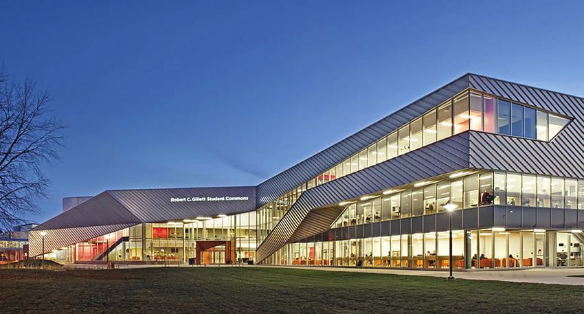
ARCHITECTURAL PHOTOGRAPHY
Architectural imagery is a sharp and evocative way to display the core
identity of the campus experience. Follow these standards to pick
appropriate photography for our brand.
DO…
• use a single subject or point of focus
• use a deep depth of field to bring the whole image into focus
• use natural lighting whenever possible
• shoot at times of day when natural light adds drama 1 2 3
• use interesting cropping to focus the subject of the image
• leave extra space around the subject to offer flexibility when
cropping the image
• left- or right- align subjects to leave space for text when needed
• take advantage of sharp angles and lengthy curves to create
interesting lines in the shot
• use black and white or the brand gradient maps when appropriate
• involve people to create a sense of movement 4 5
Architectural photography can be all-encompassing (2, 3, 5) or detail-
oriented (1, 4, 6, 7)
6 7
ALGONQUIN COLLEGE VISUAL IDENTITY STANDARDS
VERSION 2.1, MARCH 20186.0 | Imagery 6.1 | Photography 62
DO NOT…
• 1: use architecture photos where students appear posed
• 2: use crooked or tilted photos (keep the horizon straight)
• 3: use lenses or effects that overly distort building structure
• 4: use heavy filters or effects other than approved gradient maps
(see page 64)
1 2
3 4
ALGONQUIN COLLEGE VISUAL IDENTITY STANDARDS
VERSION 2.1, MARCH 20186.0 | Imagery 6.1 | Photography 63
COMBINING PHOTOGRAPHY
When using several photos within one design piece, create versatility by
combining categories and styles of photography.
DO…
• combine different styles of shot (personalized with depersonalized,
atmospheric, detail-oriented or architectural)
DO NOT…
• use the same type of shot multiple times in a single design
1 2
ALGONQUIN COLLEGE VISUAL IDENTITY STANDARDS
VERSION 2.1, MARCH 20186.0 | Imagery 6.1 | Photography 64
USING GRADIENT MAPS IN PHOTOGRAPHY WHY USE GRADIENT MAPS?
Gradient maps replace the lightest values in a photo with a chosen • Create brand recognition
colour, and the darkest values in a photo with another. Mid-tones are
gradually replaced with values that lie somewhere between the two • A great way to establish a uniform look for photography, in particular in ad
chosen colours, or can be chosen manually. campaigns or across social media channels
• Useful for creating a flat look that allows for easy and legible text overlay
We use three gradient map ranges. While the colour values should
remain the same, one can tweak the position of the values and their • When in doubt about gradient map use, it's best to stick to either full-colour
midpoints to better suit the tones of the photo being used. photography or black-and-white photography.
BLACK TO GREEN GRADIENT MAP GREEN TO GREEN GRADIENT MAP BLACK TO WHITE GRADIENT MAP
40% 50% 50% 55%
5% 35% 100% 0% 100% 10% 100%
90% ALGONQUIN DARK ALGONQUIN 100% ALGONQUIN DARK ALGONQUIN 100% ALGONQUIN ALGONQUIN WHITE
CHARCOAL GREEN GREEN GREEN GREEN CHARCOAL
RGB (55,61,55) RGB (0,51,40) RGB (0,99,65) RGB (0,51,40) RGB (0,99,65) RGB (33,39,33)
CMYK (60,40,60,86) CMYK (89,54,74,64) CMYK (93,13,85,44) CMYK (89,54,74,64) CMYK (93,13,85,44) CMYK (67,44,67,95)
HEX (#373D37) HEX (#003228) HEX (#006341) HEX (#003328) HEX (#006341) HEX (#212721)
ALGONQUIN COLLEGE VISUAL IDENTITY STANDARDS
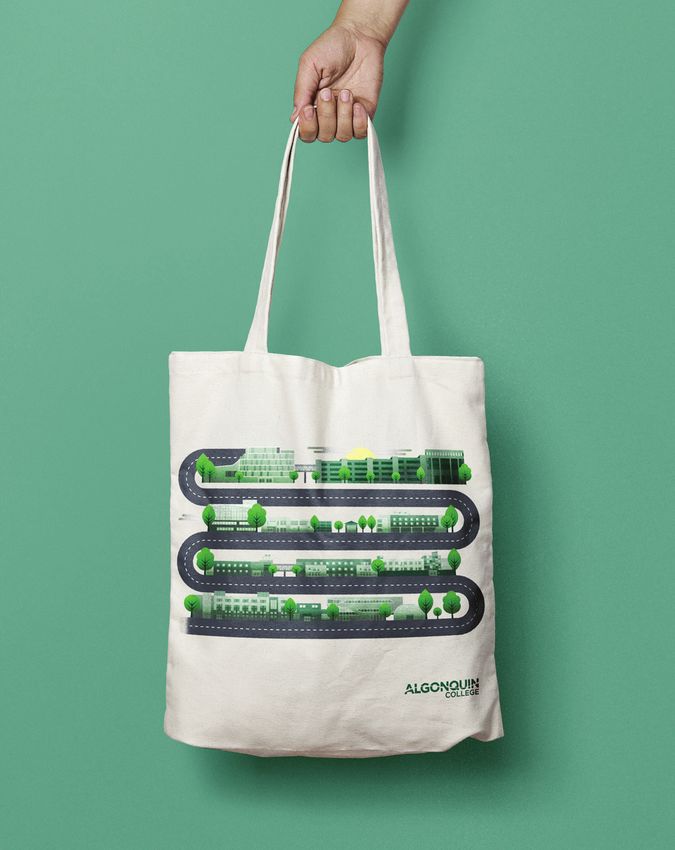
VERSION 2.1, MARCH 20186.0 | Imagery 6.2 | Illustration 65 6.2 Illustration We use illustration as a primary visual tool because it's both interpretive and subjective. The following standards should be provided to any artists commissioned to create new illustrations. ALGONQUIN COLLEGE VISUAL IDENTITY STANDARDS VERSION 2.1, MARCH 2018
6.0 | Imagery                                                               6.2 | Illustration                                                       66

CREATING ILLUSTRATIONS                                                          DO NOT…

Follow these general rules to create illustrations within our brand.        •   1: use off-brand lettering as an illustration

                                                                            •   2: use arbitrary curves to create shapes

    DO…                                                                     •   3: use different-coloured gradients, drop shadows or other effects

•   use only geometric shapes to create your objects

•   keep your objects simple

•   work in Illustrator or other vector software to allow for rescaling

•   use Illustrator's Pathfinder, Shape Builder and Live Corners tools to
    combine shapes to make new ones

•   use Algonquin Green as often as the illustration allows

•   use only tints of Algonquin Green and New Growth Green for any
    instance of the colour green                                                                                         1                      2     3

•   use Algonquin Charcoal or a tint of it as your black

•   follow the guidelines of the Illustration Palette when picking
    additional colours (see next page)

•   use flat colours primarily

•   use very subtle gradients with tints and shades of the same colour to
    create depth when absolutely needed

•   work and align to a square grid

•   allow space for text when needed

ALGONQUIN COLLEGE VISUAL IDENTITY STANDARDS
VERSION 2.1, MARCH 2018
6.0 | Imagery 6.2 | Illustration 67
ILLUSTRATION COLOUR PALETTE DO… DO NOT…
Illustrations often require the use of • Choose colours that are mid-tones, as well as shades (darker values) • Choose neon colours, or colours
colours other than those in our brand and tints (lighter values) of these colours. that are exceedingly vibrant.
palette to communicate their purpose.
In these cases, it's important that the
designer chooses colours that will not
clash with Algonquin Green. RED LIGHT BLUE
CMYK 0, 84, 75, 0 CMYK 48, 11, 0, 0
The following are just a few colours that HEX #F05045 HEX #7BBDE8
can be used in illustrations. To create more
colours, follow the recommendations laid
out on this page.
BEIGE PINK
Algonquin Green must always be used at
CMYK 1, 1, 5, 0 CMYK 10, 71, 32, 0
least once in an illustration.
HEX #FBF8ED HEX #DC6C82
ORANGE YELLOW
CMYK 6, 29, 61, 0 CMYK 2, 4, 45, 0
HEX #EDB875 HEX #FBEBA0
BLUE TEAL
CMYK 68, 40, 29, 0 CMYK 46, 0, 24, 0
HEX #5F879F HEX #85CFC9
PURPLE BROWN
CMYK 65, 80, 20, 4 CMYK 44, 58, 74, 31
HEX #A084AB HEX #745840
ALGONQUIN COLLEGE VISUAL IDENTITY STANDARDS
VERSION 2.1, MARCH 20186.0 | Imagery 6.2 | Illustration 68
ILLUSTRATION EXAMPLE 1: CAMERA
ALGONQUIN GREEN ALGONQUIN GREEN
@ 100% @ 30%
ALGONQUIN GREEN ALGONQUIN GREEN
@ 80% @ 20%
ALGONQUIN COLLEGE VISUAL IDENTITY STANDARDS
VERSION 2.1, MARCH 20186.0 | Imagery 6.2 | Illustration 69
SUBTLE GRADIENT IN
ILLUSTRATION EXAMPLE 2: POPPY FLOWER SHADE OF RED
ALGONQUIN GREEN WHITE MIDTONE RED
@ 80%
ALGONQUIN COLLEGE VISUAL IDENTITY STANDARDS
VERSION 2.1, MARCH 20186.0 | Imagery 6.2 | Illustration 70
ILLUSTRATION EXAMPLE 3: CHARACTER
GENERAL USE
OF MIDTONE
COMPLEMENTARY
COLOURS
CHARCOAL ALGONQUIN GREEN
@ 100% & NEW
GROWTH GREEN
ALGONQUIN COLLEGE VISUAL IDENTITY STANDARDS
VERSION 2.1, MARCH 20186.0 | Imagery 6.2 | Illustration 71
USING TINTS IN ILLUSTRATION
While the use of any tint of Algonquin Green is permitted when creating
illustrations, it's recommended one use multiples of 10 or 5. Values of
the tints of Algonquin Green are as follows. Using the precise CMYK
values, as opposed to the tint slider, is suggested.
@ 100% TINT @ 75% TINT @ 50% TINT @ 25% TINT
CMYK 93,13,85,44 CMYK 70,10,64,33 CMYK 47,7,43,22 CMYK 23,3,21,11
HEX #006341 HEX #408A70 HEX #80B1A0 HEX #BFD8CF
@ 95% TINT @ 70% TINT @ 45% TINT @ 20% TINT
CMYK 88,12,81,42 CMYK 65,9,60,31 CMYK 42,6,38,20 CMYK 19,3,17,9
HEX #0D6B4A HEX #4C927A HEX #8CB9A9 HEX #CCE0D9
@ 90% TINT @ 65% TINT @ 40% TINT @ 15% TINT
CMYK 84,12,77,40 CMYK 61,9,55,29 CMYK 37,5,34,18 CMYK 14,2,13,7
HEX #197354 HEX #599A83 HEX #99C1B3 HEX #D9E8E2
@ 85% TINT @ 60% TINT @ 35% TINT @ 10% TINT
CMYK 79,11,72,37 CMYK 56,8,51,26 CMYK 33,5,30,15 CMYK 9,1,9,4
HEX #267A5D HEX #66A18D HEX #A6C8BC HEX #E5EFEC
@ 80% TINT @ 55% TINT @ 30% TINT @ 5% TINT
CMYK 74,10,68,35 CMYK 51,7,47,24 CMYK 30,4,26,13 CMYK 5,1,4,2
HEX #338267 HEX #73A996 HEX #B2D0C6 HEX #F2F7F5
ALGONQUIN COLLEGE VISUAL IDENTITY STANDARDS
VERSION 2.1, MARCH 20186.0 | Imagery 7.2 | Icons 72 7.2 Icons Icons are a form of visual shorthand. They help categorize, identify and highlight information. They should be simple in both style and content, giving clear, concise messages in a highly economical way. We make use of designs in the iconmonstr.com icon library. Some examples from the image library are shown here. They indicate the intended style for any new icons. PLEASE NOTE: Download existing icons from iconmonstr.com in PNG or SVG formats. Choose the solid versions when available. ALGONQUIN COLLEGE VISUAL IDENTITY STANDARDS VERSION 2.1, MARCH 2018
7.0 | Bringing it together
                                              2
                                              73

7.0
Bringing it
together

ALGONQUIN COLLEGE VISUAL IDENTITY STANDARDS
VERSION 2.1, MARCH 2018
7.0 | Bringing it together 7.1 | Acceptable Layout 74
7.1
Acceptable Layout
The following examples follow standards illustrated in this document. Technology’s
Please review for reference and inspiration.
new frontier is
at Algonquin.
Join us.
School of
Hospitality & Tourism
AC Frontiers 2017
Saturday, January 22
ACCE Building
ALGONQUIN COLLEGE VISUAL IDENTITY STANDARDS
VERSION 2.1, MARCH 20187.0 | Bringing it together 7.1 | Acceptable Layout 75
EXAMPLE 1: SCHOOL BROCHURE CONCEPT
APPROPRIATE
USE OF SCHOOL
LOGOTYPE AND x3 POINT SIZE
WORDMARK (24PT) MEDIUM
School of FONT WEIGHT
Hospitality & Tourism
x1 POINT SIZE
x2 POINT SIZE
(8PT), BOOK
(16PT), MEDIUM
FONT WEIGHT
FONT WEIGHT
AMPLE WHITE
CORRECT USE OF SPACE
FULL SWOOSH
VARIED
PHOTOGRAPHY
STYLES
FULL SWOOSH
IN LIGHT TINT
OF GREEN
AND 20%
OPACITY
ALGONQUIN COLLEGE VISUAL IDENTITY STANDARDS
VERSION 2.1, MARCH 20187.0 | Bringing it together 7.1 | Acceptable Layout 76
EXAMPLE 3: STAND-UP BANNER CONCEPT
LOGO LINED
UP TO MARGIN
225 POINT,
MEDIUM FONT Turn passion into Impact your Make the
WEIGHT
profession community future happen
Discover your future. Make a difference. Be an agent for change.
110 POINT, BOOK
FONT WEIGHT.
USE ALGONQUIN
GREEN 80% TINT
USE OF
RANGE OF
SWOOSH
SECTIONS
COMPELLING
PHOTOGRAPHY
ALGONQUIN COLLEGE VISUAL IDENTITY STANDARDS
VERSION 2.1, MARCH 20187.0 | Bringing it together 7.1 | Acceptable Layout 77
EXAMPLE 4: STRATEGIC REPORT SPREAD ALGONQUIN GREEN AT 35% FOR CONTRAST OVER GREEN AT
FONT SIZE LARGER THAN 19PT
02.
x4 POINT
x0.8 POINT
SIZE (36PT),
SIZE (7.2PT),
USE OF
BOLD FONT
FREIGHT FOR
WEIGHT OUR ENVIRONMENT
CONTRAST
We are ready In 2017 Algonquin College will
be 50 years old.
for five years
FREIGHT
MULTIPLIED
BY 1.14 TO
of change
MATCH SIZE
(71 PT)
_ Now one of Ontario’s largest colleges and one of just
x7 POINT SIZE
11 polytechnics in Canada, we serve tens of thousands x1 OR BASE
(63PT), BOOK of students, apprentices and lifelong learners and our
programs range from apprenticeships to baccalaureate POINT SIZE
FONT WEIGHT degrees all with the goal of creating job-ready grad-
uates. Our reach is increasingly global — in the digital
(9PT), BOOK
space, where we are an international leader — and on the FONT WEIGHT
ground, with campuses and partnerships in China, India,
Montenegro and Kuwait.
USE OF
GRADIENT
MAP FOR
TEXTURE
x0.8 POINT
2 2017—2022 STRATEGIC PLAN OUR ENVIRONMENT 3
SIZE (7.2PT),
BOOK FONT
WEIGHT
ARCHITECTURE AMPLE WHITE
PHOTOGRAPHY USING SPACE
AMPLE
GRADIENT MAP 3
MARGINS
ALGONQUIN COLLEGE VISUAL IDENTITY STANDARDS
VERSION 2.1, MARCH 2018You can also read


