BUILDING APPLICATIONS USING C# AND .NET FRAMEWORK (OBJECT-ORIENTED PROGRAMMING, X428.6) - Class 9 Professional Program: Data Administration and ...
←
→
Page content transcription
If your browser does not render page correctly, please read the page content below
Technology & Information Management             Instructor: Michael Kremer, Ph.D.

                                      Class 9

 Professional Program: Data Administration and Management
 BUILDING APPLICATIONS USING C# AND .NET
 FRAMEWORK
 (OBJECT-ORIENTED PROGRAMMING, X428.6)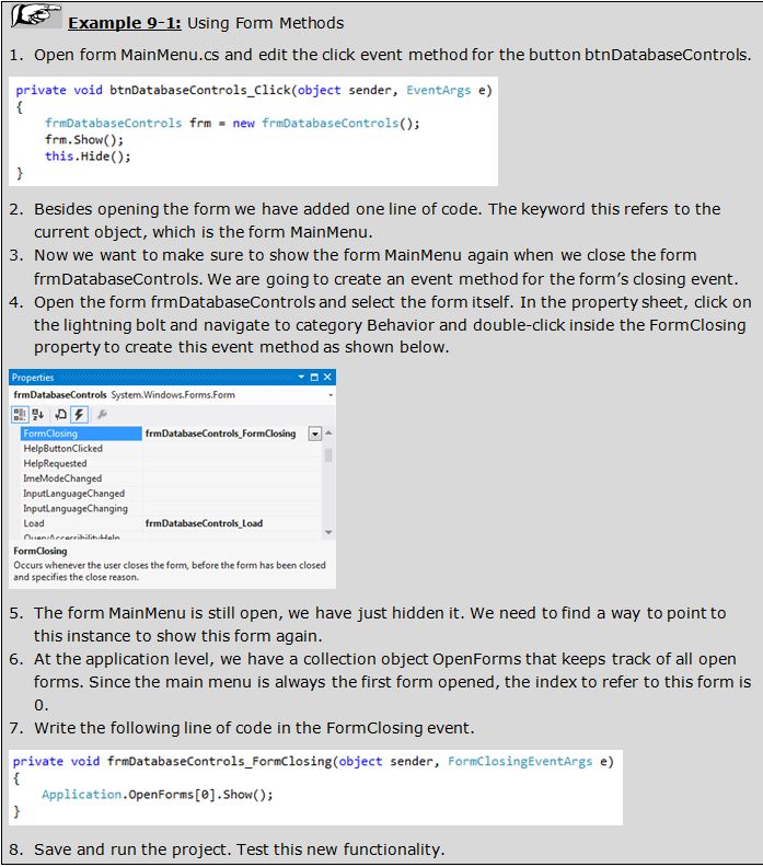
AGENDA

22. Windows Forms
23. Basics of Form Controls
24. Introduction to Specific Controls
Windows Forms

        22.
266
22.1 WINDOWS FORMS ARCHITECTURE
Create Windows Forms using the designer interface in Visual
Studio.
When setting properties for the form and adding controls to the
form, Visual Studio automatically writes C# Code that creates
this form when the application is run.
A Windows Form is comprised of
three files:
form_name.Designer.cs
form_name.cs
form_name.resx
Form.Designer.cs: Contains auto-generated code that stores
visual representation of the form.
When double-clicking on form.cs, you see graphical
representation of form.designer.cs.267
22.1 WINDOWS FORMS ARCHITECTURE
Forms.cs: Complimentary C# code file where customer code is
stored.
Both .cs form files are merged at compile time into one .cs form
class file.
Partial class directive
instructs C# compiler to
merge these two classes
into one class.
Separation of user code
and system generated
code.268
22.1 WINDOWS FORMS ARCHITECTURE
Form.resx: Mostly stores globalization and localization
information (for multi-language support). It further stores
additional properties of the form, such as icon files, for example.
Visual Studio automatically maintains this file.
Toggle between two interfaces:
Designer interface
Code Editor for custom code269
22.2 FORMS PROPERTIES AND METHODS
Property Sheet in designer view
is divided into categories.
Many of the properties are self-explanatory, and a short
description is displayed at the bottom of
the property sheet when the property is
selected.
Most common properties are the Text and
the Name property.
Name property is the unique identifier within your project, you
use the name property to refer to this form in C# code.
Some of the most commonly used methods of a form are Show()
and Hide().270 22.2 FORMS PROPERTIES AND METHODS
271
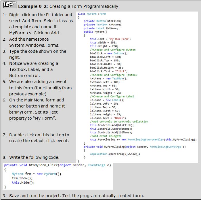
22.3 CREATING FORMS DYNAMICALLY USING C#
Creating a form in a
declarative manner is
the most common
way.
However, you can also
create a form
programmatically.Basics of Form Controls
23.272
23.1 OVERVIEW OF CONTROLS
Some controls are unbound controls whereas others are bound
controls.
Bound controls
can be linked to or bound to data, from a database for example.
Use Toolbox to create controls on your form. There are three
different ways to add a control:
Double-click on the control in the toolbox. This will place the control in top
left corner.
Select a control in the toolbox, hold the mouse button and drag it onto the
form.
Select a control in the toolbox, then on the design surface drag a
rectangle to size the control.
Once a control is placed on the form, you can use the property
sheet to set its properties.273
23.1 OVERVIEW OF CONTROLS
When Microsoft Visual Studio is set up, it installs in the Toolbox
the most regularly used controls.
Besides the objects in the Common Controls section, other
controls are left out but are still available.
Some of the left out controls were created with the .NET
Framework but are not installed by default because they are
judged hardly used.
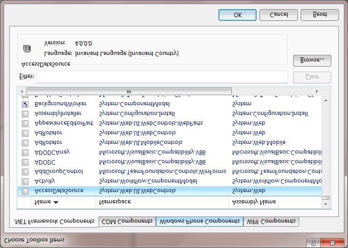
To add one or more of these left
out controls, right-click
anywhere in the Toolbox and
click Choose Items...274
23.1 OVERVIEW OF CONTROLS
If the available list of categories is not enough, you can add a
new section of your choice.
By default, Visual Studio hides some categories because they
are judged hardly used.
To display these additional sections, you can right-click anywhere
in the Toolbox and
click Show All.
System.Windows.Forms
namespace, all controls
derive from the Control class.
Control class is not normally
instantiated but rather forms
the basis for further refining
the user interface hierarchy.275
23.2 COMMON PROPERTIES AND METHODS
Properties Description
Control class implements Anchor
AutoSize
Specifies how the control relocates and resizes whenever the form is resized.
If set to true, the control will automatically size itself to fit the contents.
the basic functionality of BackColor The background color of the control.
CausesValidation Specifies whether the control will raise validation events.
controls and, where Controls A collection of child controls within this control.
appropriate, provides for Enabled Tells whether the user can interact with the control. Set to false to disable the
control.
members to be
ForeColor The foreground color of the control (Also the font color of the text inside the
control).
Height The height of the control in pixels.
overridden. Location The location of the control relative to its container.
MaximumSize Specifies the maximum size of the control.
Name property is not MinimumSize
Name
Specifies the minimum size of the control.
The name of the control. This is used to reference the control in code.
declared “virtual” as it is Parent
Right
The parent of the control.
The distance between the right edge of the control and the left edge of its
the same for all controls. Size
container.
The size of the control. Composed of Width and Height subproperties.
Text property is declared TabIndex
TabStop
Specifies the number of the control in the tab order of its container.
Specifies whether the control can be accessed by the tab key.
“virtual” as it is slightly Tag
Text
Used to assign special or useful values about the control.
The text shown inside the control.
different implemented. TextAlign
Top
Specifies the alignment of text of the control.
The distance between the top edge of the control and the top edge of its container.
Visible Sets the visibility of the control.
Width The width of the control in pixels.276
23.2 COMMON PROPERTIES AND METHODS
Method Description
Focus Sets focus to the control.
Hide, Show Hide and show the control by setting visible property.
PointToScreen Computes the location of the client point p in screen coordinates.
PreProcessMessage Called by the application’s message loop to preprocess input messages before they are dispatched.
RectangleToClient, Location of the screen rectangle in client coordinates or screen coordinates.
RectangleToScreen
Refresh Forces the control to invalidate and immediately repaint itself and any children.
SetClientSizeCore Sets the height and width of the client area of the control.
Update Forces the control to paint any currently invalid areas.
Event Description
Click, DoubleClick Occur when the control is clicked or double-clicked.
Enter Occurs when the control is entered.
GotFocus, LostFocus Occur when the control receives or loses focus.
KeyDown, KeyPress, KeyUp Occur when a key is down, pressed, or up, accordingly.
MouseDown, MouseEnter, Different mouse events that occur when the mouse button is down, the mouse
MouseHover, MouseLeave, enters the control, mouse is moved, mouse button is up, etc.
MosueMove, MouseUp,
MouseWheel
Move Occurs when a control is moved.
Resize Occurs when a control is resized.277
23.3 CONTROL TAB ORDER
Each control has an ordinal position within the tab order.
This position is initially set in the chronological order the control
was added to the form.
When you are done developing the form, you should review the
tab order for the form.
Rather than setting tab
index for each control,
use Tab Order interface.
Select form or any
control, then VIEW
Tab Order.Introduction to Specific Controls
24.278
24.1 LABEL AND TEXTBOX
Label control is mostly used in conjunction with other data
controls displaying metadata about the data controls.
Other uses for labels are to display dynamic data that is
evaluated and processed in event handlers and/or methods and
subsequently displayed on a form.
Furthermore, labels are used to display headers for forms or
form instructions and help information.
TextBox control can be set up to function as a multi-line control.
In that mode, you can set scrollbars (horizontal and vertical).
Vertical scrollbars property is only in effect for MultiLine controls.
Horizontal scrollbars when WordWrap is set to False.
Default event for the textbox control is the TextChanged event.279 24.1 LABEL AND TEXTBOX
280
24.1 LABEL AND TEXTBOX
MaskedTextBox
Contains an input mask feature to validate data.
Property Description
Most useful for PromptChar The character used as a placeholder (default is the underscore).
fixed-width data. AllowPromptAsInput Whether the placeholder character is allowed as input. Ideally, you want to set up
your input mask in such a way that the placeholder character is not allowed as
input.
Define mask and CutCopyMaskFormat Include Literals, ExcludePromptAndLiterals, IncludePrompt,
IncludePromptAndLiterals: Specifies when selecting and copying data from this
kinds of allowable control, whether literals and prompt characters are pasted into the target
environment.
characters in each HidePromptOnLeave True/False: Whether placeholder characters are displayed or not when control
does not have focus (leaving the control).
character position. Mask The actual input mask, click on the build button to the right to access the Input
Mask Builder (very similar to Microsoft Access).
Define literal PasswordChar The character that is displayed when typing characters, this effectively hides the
input.
characters for RejectInputOnFirstFailure When entering several characters in a single operation (usually copy and paste)
and RejectInputOnFirstFailure is set to True, then processing stops at the first
formatting. invalid character. If set to false, the invalid character is reject but parsing
continues.
TextMaskFormat Include Literals, ExcludePromptAndLiterals, IncludePrompt,
IncludePromptAndLiterals: Whether Text property includes or excludes placeholder
characters and literals.
UseSystemPasswordChar Gets or sets a value indicating whether the operating system-supplied password
character should be used.281 24.1 LABEL AND TEXTBOX
282
24.2 COMBOBOX AND LISTBOX
Combobox and listbox controls are controls that can display data
from either a data source or a preset list of data in code, such as
an array. Property Description
DisplayMember The display value in the control
Selected value can be ValueMember The stored value in the control
used on your form or
SelectedIndex The index of the selected item. Items are numbered from 0. If no item is selected, this
property is set to -1.
stored back into a SelectedItem
SelectedValue
The object of the selected item.
The currently selected value
database. Text The value that is stored in the control. For a simple list, it is the selected item. For a two-
column list, it is the value member (the hidden column).
Combobox and Sorted If set to true, the items in the list are sorted alphabetically in ascending order.
Listbox controls Items Provides access to the collection of items.
handle data either as
DropDownStyle This property applies only to Combobox controls:
Values: DropDownList, DropDown
If set to DropDown, the user can either enter text in the text box at the top of the
a simple list (one combobox control or select a value from the list.
If set to DropDownList, the user can only select a value from the list.
column) or in a SelectionMode This property applies only to ListBox controls:
Values: One, MultiSimple, MultiExtended
two-column format. If set to one, the user can only select one item from the list.
If set to MultiSimple, the user simply can click multiple items to select those items.
If set to MultiExtended, the user can simply click to select only one item or hold down the
control key to select multiple items.283
24.2 COMBOBOX AND LISTBOX
The most common event for combobox and listbox controls is
the SelectedIndexChanged event, which is the default event.
This event is triggered when the user selects an item from the
list.
When working with combo or list box controls, the items
collection is an important object.
You can programmatically add, change, or delete values from a
list or combo box control using the items collection.
Indexer Description
[index] Gets or sets the item at the specified index in the list.
Property Description
Count Gets the number of items in the list.
Method Description
Add(object) Adds the specified item to the list.
Insert(index,object) Inserts an item into the list at the specified index.
Remove(object) Removes the specified item from the list.
RemoveAt(index) Removes an item at the specified index from the list.
Clear() Removes all items from the list.284 24.2 COMBOBOX AND LISTBOX
285
24.2 COMBOBOX AND LISTBOX
286
24.3 DATETIMEPICKER AND MONTHCALENDAR
DateTimePicker control is a powerful, yet easy to use control to
select date and time values.
This control is displayed like a drop-down
list.
However, when you click on the drop-down arrow, an interactive
calendar is displayed.
Customize this control by using the property sheet. Further
customization is possible using C# code.
One common functionality is to limit the range of dates that the
user can select from this control based on the current date.
(MinDate, MaxDate properties).
The default event is the ValueChanged event.287
24.3 DATETIMEPICKER AND MONTHCALENDAR
Property Description
Checked The ShowCheckBox property should be set to false to work with this property. When this value is true,
the selected date can be changed/updated. When this is false, the selected date cannot be changed.
CustomFormat Accepts a custom format string the will format the date displayed.
Format Determines the format of the date displayed by the control.
MaxDate Gets or sets the maximum date and time that can be selected in the control.
MinDate Gets or sets the minimum date and time that can be selected in the control.
ShowCheckBox If true, shows a text box to the left part of the DateTimePicker control. When checked, the selected
date can be changed. When unchecked, the selected date cannot be changed.
ShowUpDown When set to true, shows an up-down button in place of the drop down button. You cannot access the
calendar when this is shown. Instead, you need to select a date component and use the up-down
arrows to adjust the date.
Value The currently selected date.288
24.3 DATETIMEPICKER AND MONTHCALENDAR
Default View Year View Decade View Century View
MonthCalendar
control resembles
a calendar and
shows a month and all its dates.
Clicking the month Property Description
header shows all the FirstDayOfWeek Specifies what day the calendar will consider as the first day of
the week.
months of current year. MaxDate Specifies the maximum allowable date.
Clicking further shows MaxSelectionCount Specifies the maximum dates that the user can simultaneously
select.
all the years of the MinDate Specifies the minimum allowable date.
SelectionEnd If the user selects a range of date, this property indicates the
current decade. last date in the range of dates.
SelectionRange If the user selects a range of date, this property contains all the
dates whithin the range of dates.
SelectionStart If the user selects a range of date, this property indicates the
first date in the range of dates.
ShowToday Specifies whether to show the date today at the bottom of the
control.
TodayDate The date used by the MonthCalendar as today's date.289 24.3 DATETIMEPICKER AND MONTHCALENDAR
290
24.4 RADIOBUTTON, CHECKBOX, AND GROUPBOX
RadioButton and CheckBox controls are Boolean controls, they
are either checked (true) or not checked (false).
The main difference is that RadioButtons are mutually exclusive
and check boxes operate independently.
RadioButton
controls on a
form are all
together
mutually
exclusive.
Use GroupBox
to group
RadioButtons.291
24.4 RADIOBUTTON, CHECKBOX, AND GROUPBOX
Default event of CheckBox and RadioButton controls is the
CheckedChanged event.
CheckBox and RadioButton controls are not only used to bind it
to data, but for user interface functionality.
CheckChanged event is triggered when the state of the button is
changed.
Click event can actually change this default behavior of the radio
button.
There is a property for the radio button control called AutoCheck
which if set to false, clicking the radio button will not change its
state, but will sent a Click event and through code, you can
manually set the radio button's Checked property to true.292 24.4 RADIOBUTTON, CHECKBOX, AND GROUPBOX
293
24.5 DATAGRIDVIEW
Display and edit tabular data from many different kinds of data
sources.
Cell is the
fundamental unit
of interaction for
the
DataGridView.294
24.6 MESSAGEBOX CLASS
System.Windows.Forms.MessageBox is a static class that is
used to show message boxes for prompting, confirmation and
warning users. Parameter
Prompt
Description
The actual text inside the message dialog box that is presented to the user.
Title The title of the message dialog box
Use Show() Buttons Accepts values from the enumeration MessageBoxButton
method to The combination of buttons to place on a message dialog
box. Note that any combination besides the OK allows
display the user to read which button the user pressed.
messagebox.
Icons Accepts values from enumeration MessageBoxIcon
Displays an icon to the left of the prompt indicating
the category of the message, such as Information,
Warning, or Critical (using Stop or Error).
DefaultButton Accepts values from the enumeration MessageBoxDefaultButton295
24.6 MESSAGEBOX CLASS
Show() method returns a value from the
System.Windows.Forms.DialogResult enumeration. This is useful
to determine what button you pressed in the message box.
If you click the "Yes"
button in the message
box, then the Show()
method will return the
value DialogResult.Yes.You can also read


