BYU ScholarsArchive Brigham Young University
←
→
Page content transcription
If your browser does not render page correctly, please read the page content below
Brigham Young University
 BYU ScholarsArchive

Undergraduate Honors Theses

2021-03-18

Effects of Actual and Perceived Air Pollution on U.S. Twitter
Sentiment
George R. Garcia III
Brigham Young University

Follow this and additional works at: https://scholarsarchive.byu.edu/studentpub_uht

BYU ScholarsArchive Citation
Garcia, George R. III, "Effects of Actual and Perceived Air Pollution on U.S. Twitter Sentiment" (2021).
Undergraduate Honors Theses. 184.
https://scholarsarchive.byu.edu/studentpub_uht/184

This Honors Thesis is brought to you for free and open access by BYU ScholarsArchive. It has been accepted for
inclusion in Undergraduate Honors Theses by an authorized administrator of BYU ScholarsArchive. For more
information, please contact scholarsarchive@byu.edu, ellen_amatangelo@byu.edu.

Honors Thesis

 EFFECTS OF ACTUAL AND PERCEIVED AIR
 POLLUTION ON U.S. TWITTER SENTIMENT

 by
 George R. Garcia III

Submitted to Brigham Young University in partial fulfillment
 of graduation requirements for University Honors

 Economics Department
 Brigham Young University
 April 2021

 Advisor: C. Arden Pope III

 Honors Coordinator: John E. Stovall
ii
iii

 ABSTRACT

 EFFECTS OF ACTUAL AND PERCEIVED AIR
 POLLUTION ON U.S. TWITTER SENTIMENT

 George R. Garcia III

 Economics Department

 Bachelor of Science

Objective

This study examines the associations between actual and perceived air pollution (PM2.5,

AQI, and ground visibility), weather information, and expressed sentiment via US

Twitter. Heterogeneity in the associations across date and county characteristics are

also explored.

Methods

A sentiment index was constructed using 27,827,828 geotagged U.S. tweets posted

between May 31 and November 30, 2015. Associations between AQI category changes

and the sentiment index were estimated using multi-cutoff regression discontinuity

models. Associations between same-day and lagged PM2.5, ground visibility, and the

sentiment index were estimated using weighted linear regression models. Models include

weather variables and county and date fixed effects. Stratified analyses by county type

(MSA, urban, rural) and date characteristics (holiday or non-holiday, weekday or

weekend) were performed.
iv

Results

Being in the AQI category of Moderate rather than Good is estimated to predict a 1.5

percentage point decrease in the sentiment index. A 1-mile increase in ground visibility is

estimated to predict roughly a 0.34 percentage point increase in the sentiment index,

while increasing PM2.5 is found to predict a very small increase of about 0.02 percentage

points per 1 µg/m3. Temperature, pressure, wind speed, and precipitation were all found

to significantly affect sentiment. Heterogeneous results were observed across both date

and county characteristics.

Conclusion

The findings suggest that air pollution has a short-term psychological effect on expressed

sentiment via U.S. Twitter but not a physiological effect. Weather variables are also

found to be significantly associated with expressed sentiment.
v
vi

 ACKNOWLEDGEMENTS

 I am especially grateful for Dr. Arden Pope III, who has allowed me to be his

research assistant and collaborator over the last year and a half. He has helped me

understand not only how to be a better researcher but a better person in general. I would

like to thank Dr. Rob Reynolds for advising me on the twitter sentiment analysis and for

his patience with me as I struggled to understand the difference between CPU and GPU. I

would also like to thank Dr. John Stovall for the time he has dedicated as my honors

coordinator.

 Dr. Darren Hawkins deserves acknowledgement for instilling in me a love for

social science research. Zac Pond—my friend, co-worker, collaborator, and classmate—

must be acknowledged for the many hours he spent discussing this thesis with me. Lastly,

I wish to acknowledge and thank my wife Helen Barton, whose love and support have

made the world a brighter place.
vii
viii

 TABLE OF CONTENTS

Title...................................................................................................................................... i
Abstract.............................................................................................................................. iii
Acknowledgments............................................................................................................. vi
Table of Contents............................................................................................................. viii
List of Tables...................................................................................................................... x
List of Figures.................................................................................................................... xi

Introduction ........................................................................................................................ 1

Data .................................................................................................................................... 6

Models .............................................................................................................................. 13

Results .............................................................................................................................. 16

Discussion ........................................................................................................................ 26

Conclusion ....................................................................................................................... 32

References ........................................................................................................................ 34

Supplementary Material ................................................................................................... 38

ix
x

 LIST OF TABLES

Table 1: Subsamples for multi-cutoff regression discontinuity models .......................... 14

Table 2: Summary Statistics by county and date characteristics ..................................... 17

Table 3: Estimated coefficients from multi-cutoff regression discontinuity ................... 19

Table 4: Estimated WLS coefficients of air pollution and weather variables ................. 22

Table 5: Estimated WLS coefficients for lagged PM2.5 .................................................... 23

Table 6: Estimated WLS coefficients for lagged visibility .............................................. 24
xi

 LIST OF FIGURES

Figure 1: Diagram depicting tweet sentiment prediction model ........................................ 7

Figure 2: Heat maps of average number of tweeters, sentiment index,
PM2.5, and AQI per county................................................................................................ 11

Figure 3: Time series plots depicting average sentiment index, PM2.5,
and AQI per day, May 31 to November 30, 2015 ........................................................... 18

Figure 4: Scatter plots of relationship between AQI and sentiment index
residuals............................................................................................................................ 19

Figure 5: Estimated coefficients from multi-cutoff regression
discontinuity at the Good to Moderate AQI threshold across date and
county stratifications ........................................................................................................ 20

Figure 6: Estimated WLS coefficients of PM2.5 and weather variables
across date and county stratifications .............................................................................. 25
1

Introduction

 Over the past five decades, an ongoing body of research has documented the

adverse effects of air pollution on human health outcomes such as cardiopulmonary and

cardiovascular morbidity, asthma attacks, and infant mortality (1). This research has been

vital in shaping our understanding of the societal costs of air pollution and in establishing

public health policies throughout the United States and the world.

 Without disputing the immense importance of this line of research, studies on the

health effects of pollution make up only one part of a larger whole. A relatively younger

strand of research suggests that air pollution’s effects on individual and societal life

extends beyond health factors to other factors such as cognition, wellbeing, and behavior.

Specifically, pollution has been shown to predict decreases in happiness, productivity,

and rational decision-making; increases in suicide rates, crime rates and avoidance

behavior (individuals changing their behavior to avoid the pollution, for example, by

staying indoors and purchasing air masks); and more negative perceptions of the

government (2). These non-health related findings are important because they allow for a

more complete understanding of the societal costs of pollution, and, accordingly, are vital

for the creation of more effective public policy.

 As noted by Jackson Lu, one key limitation currently marks this strand of

research: a lack of theory as to how pollutants affect non-health outcomes (2). Air

pollutants differ in considerable ways such as size, odor, and toxicity. For example, while

fine particulate matter (PM2.5, fine particulate matter of size less than 2.5 micrometers)

can enter indoor spaces, Ozone (O3) breaks down rapidly indoors (3-4). Thus, the effects

of PM2.5 and O3 on non-health outcomes may differ widely both in terms of magnitude
2

and mechanistic pathway. Furthermore, it is largely unknown whether it is perceived air

pollution, rather than actual air pollution, that is affecting these non-health outcomes (2).

Might decreases in happiness be due to the appearance of smog rather than actual

exposure to air pollutants? On the other hand, might increases in avoidance behavior be

caused by upticks in pollution-related illness rather than advisory warnings to remain

indoors?

 Disentangling the psychological effects from the physiological effects is difficult

as they tend to occur simultaneously. The sensory cues (such as the appearance of smog,

the issuance of air pollution reports and warnings, and the enforcement of air pollution

related restrictions) that affect us psychologically coincide, albeit imperfectly, with actual

levels of air pollution that can enter our bodies and affect us physiologically. Moreover,

parsing out the differential effects via experiment (for example, by issuing warnings

despite low air pollution levels or, conversely, not issuing warnings despite high air

pollution levels) is both practically infeasible and unethical. Accordingly, we must rely

on quasi-experimental methods.

 As of writing, there exist relatively few studies that have used quasi-experimental

methods to parse out the actual and perceived effects of air pollution on non-health

outcomes (2). To consider two examples, Fehr et al. had participants in Wuhan, China

write down appraisals of air pollution each day (5). The authors then estimated the effects

of actual and perceived air pollution on rates of unethical work behavior by including

both the appraisals and objective measurements of air pollution in their models (5). It was

found that the appraisals, but not the objective measurements, significantly predicted

upticks in unethical behavior (5). Neidall regressed Los Angeles Zoo and Griffith Park
3

Observatory attendance on an indicator for whether a smog alert was issued while

controlling for local ozone levels and found that the issuance of a smog alert predicted a

decrease of roughly 13 and 6 percentage point decrease in attendance, respectively (6).

 These two studies, along with others, offer some evidence that perceived air

pollution might matter more than actual air pollution in affecting human and social

behavior (see also 7-9). But does this carry over to human happiness? This question has

remained largely unanswered. Past studies have found evidence for a variety of pollutants

as well as self-reported pollution having a negative effect on life satisfaction and

happiness levels but have not attempted to parse out the psychological from the

physiological (see 10-11 for examples).

 Accordingly, this study is intended to build on past research by considering both

actual and perceived effects of air pollution on happiness via the expressed sentiment of

U.S. Twitter users. Using Twitter posts allows for a live, real-time update on individuals’

thoughts and mood, thus mitigating ambiguity and bias that may arise from self-reported

measures (12). This study is similar to the work of Zheng et al. who consider the effects

of air pollution on happiness by constructing a sentiment metric based on posts from the

Chinese social media platform Sina Weibo (13). They find that PM2.5 concentration and

Air Quality Index (AQI) have a comparably negative effects on same-day sentiment, with

heightened suffering on holidays and weekends (13). One goal of this study is to

determine whether these effects can be observed in the United States. This study will also

attempt to parse out whether the effects are more physiological or psychological.

 To do this, I consider a variety of models including AQI, PM2.5, ground visibility,

and the predicted polar sentiment (positive or negative) of 27,827,828 U.S. Tweets. AQI
4

is chosen primarily for its salience as a measure of air quality in the United States. It is an

index ranging from 0 to 500 constructed using the measurements of six air pollutants: O3,

Carbon Monoxide (CO), Sulfur Dioxide (SO2), Nitrogen Dioxide (NO2), PM10, and PM2.5

(14). In the U.S., the range of AQI is divided into six levels, each associated with a

particular color: Good (0-50; Green), Moderate (51-100; Yellow), Unhealthy for

Sensitive Groups (101-150; Orange), Unhealthy (151-200; Red), Very Unhealthy (201-

300; Purple), and Hazardous (301-500; Maroon; 14). The Environmental Protection

Agency (EPA) has required that metropolitan statistical areas (MSAs) with a population

of at least 350,000 report the most current AQI level at least five days of the week, with

the AQI level, category, and associated color (14). Moreover, non-MSA regions, as well

as weather and map apps, often report the AQI level as a voluntary service (14-15).

 According to AirNow, color is included because it “makes it easy for people to

quickly determine whether air quality is reaching unhealthy levels in their communities”

(16). Thus, it is reasonable to assume that when people view an AQI report, they pay

more attention to the color, and accordingly the AQI category, than to the actual AQI

value. Finding differences in tweet sentiment at the AQI category thresholds would

suggest that the AQI category, rather than the air pollution level itself, has an effect on

sentiment. This would offer some evidence for a psychological or perceived effect over a

physiological or actual effect. As air quality worsens, I would expect the sentiment to

decrease. Hence, my first hypothesis is that:

 H1: Expressed sentiment will be more positive just below an AQI cutoff

 point than just above it.
5

 PM2.5 was chosen due primarily to its ability to enter indoor spaces and deeply

penetrate the lungs, potentially leading to decreases of oxygen flow to the brain and other

physiological problems (3). It is widely considered to be one of the most dangerous

pollutants. Thus, there is reason to believe that increases in PM2.5 exposure may have a

negative physiological effect on individuals’ expressed sentiment.

 Of course, finding a negative effect for PM2.5 does not necessarily imply that the

effect is physiological, as high PM2.5 might affect sentiment via non-physiological

channels such as the appearance of smog. Any attempt to parse out these non-

physiological effects will likely be imperfect; nevertheless, including information on

ground visibility does offer a partial solution. Ground visibility (henceforth just visibility)

is the distance one can see into the horizon at ground level (17). It is affected by the

presence of air pollutants that scatter and absorb light, as well as by weather variables

such precipitation and fog (17).

 Thus, considering PM2.5 in models alongside visibility might allow for an

imperfect estimation of air pollution’s physiological effect while controlling for its visual

effect. If PM2.5 has a short-term physiological effect on sentiment, it is expected that

higher PM2.5 would predict lower sentiment even after controlling for visibility and other

weather variables. Accordingly, my second hypothesis is that:

 H2: PM2.5 will have an inverse relationship with expressed sentiment

 even after controlling for weather information.
6

 Moreover, considering visibility in a model while controlling for key weather

information might offer an imperfect estimation of air pollution’s psychological effects

via the appearance of smog. As visibility increases (i.e., smog decreases), I would expect

sentiment to increase. Hence, my third hypothesis:

 H3: Visibility will have a direct relationship with expressed sentiment

 even after controlling for other weather information.

 In the following sections, I consider the data and analytical methods used to test

these hypotheses. I then report and discuss the results.

Data

 Twitter Sentiment Data

 For this study, IDs of geotagged tweets were taken with permission from the

collection “Geotagged Twitter posts from the United States: A tweet collection to

investigate representativeness” (18). The collection includes the IDs of tweets posted

between May 31 and November 30, 2015, with around 160,000 tweets per day. The tweet

IDs represent a random sample of all geotagged tweets posted (i.e., tweets posted with

public data on the posting location) in the U.S. for each day in the sampling period.

 To acquire the text of each tweet, as well as information on each tweet and the

tweet’s poster, the IDs were “rehydrated” using the Twython package in Python (19).

Tweet and user information includes the language of the tweet, date and time of when the

tweet was posted, the county wherein the tweet was posted, and the ID of the poster. For
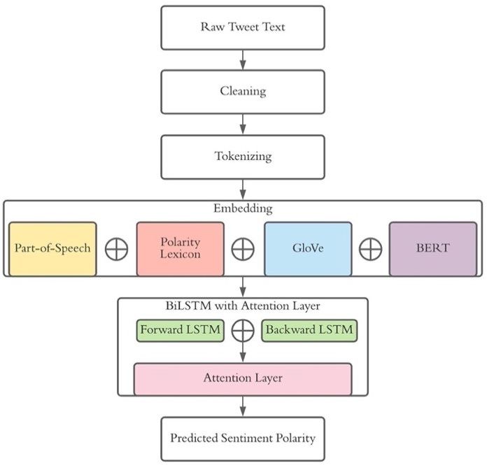
7

the purpose of this study, the tweet collection was limited to only tweets written in

English that were not posted by users affiliated with a news outlet. A user was considered

to be affiliated with a news outlet if its ID was found in the “News Outlet Tweet Ids”

dataset (20). After exclusions, 27,827,828 Tweets remained. See Figure 3 below for the

distribution of tweeters by county.

 To predict the expressed sentiment of each tweet, this study incorporates a

machine learning model similar to that proposed by Naseem et al. (21). The model begins

with text preprocessing (cleaning and tokenizing), followed by text embedding, and ends

with a Bidirectional Long-term Short-term Memory model with Attention Layer

(BiLSTM) to obtain the predicted probability of a given tweet being categorized as either

positive or negative. A graphical representation of this model can be seen in Figure 1.

 Tweet text often contains a
 Figure 1: Diagram depicting tweet sentiment
considerable amount of noise as well prediction model

as a lack of structure, which can

drastically decrease the accuracy of

tweet sentiment classification.

Accordingly, tweets were

preprocessed by removing URLs,

user tags, special characters, and

punctuation; correcting spelling

mistakes; expanding contractions

(eg, “couldn’t” to “could not”); GloVe stands for the Global Vectors for Word Representation
 model. BERT stands for the Bidirectional Encoder
segmenting hashtags (eg, Representation from Transformers model. LSTM stands for
 the Long Short-Term Memory model.
8 “#GOODJOB” to “good job”); replacing emojis and emoticons with descriptions (eg, “” to “smile”); and lowercasing all text. Finally, tweets were tokenized using the auto- tokenizer from the pretrained BERTweeet model discussed below (22). Text cleaning was conducted using the ekphrasis and emoji packages in Python (23-24). Emoticon descriptions used to replace emoticons were adopted from Wikipedia’s List of Emoticons (25). Preprocessed tweet text was then embedded into numerical matrices each of dimension × 978, where represents the number of words (or tokens) in a given tweet, with each of the 978 columns representing a distinct piece of information about word . The first 4 columns represent the part-of-speech of a word (noun, verb, adjective, adverb, or neither). Part-of-speech tagging was conducted using the Stanford parser in the nltk package in Python (26). The next 6 columns represent the sentiment polarity of a word according to six sentiment lexicons (SenticNet 6.0, VADER, Bing Liu Opinion Lexicon, SemEval Twitter English Lexicon, NRC Sentiment140 Lexicon, and TS-LEX; 27-32). In each of these lexicons, words and phrases are assigned sentiment values ranging from -1 to 1, with negative values and positive values representing negative and positive words, respectively. As each lexicon contains a different set of words/phrases and was created using a distinct method, combining the lexicons allows for a more complex understanding of a word’s sentiment polarity. The remaining 968 columns represent the contextual information of a word as generated by Global Vector (GloVe) and Bidirectional Encoder Representations from Transformers (BERT) models (33-34). GloVe is an unsupervised machine learning model designed by Pennington, Socher, and Manning that offers a quantitative depiction of how
9

often a given word appears in context with other words (33). The GloVe model used in

this study was pretrained on 2 billion tweets and generates a vector of 200 dimensions to

represent the global context of a word. BERT, designed by Devlin, Chang, Lee, and

Toutanova is also an unsupervised machine learning model that offers contextual

information for a word (34). But unlike GloVe, which generates only a single embedding

per word, BERT generates an embedding for each iterance of a word, including

contextual information both to the left and right (34). For example, GloVe represents the

word “punch” as used in the phrase “I drank punch” and “he will punch me” using the

same 200-dimensional vector. BERT, on the other hand, produces two distinct 768-

dimensional vectors for the word “punch” as it is used in each of the distinct phrases. The

BERT model used in this study, titled BERTweet, was pretrained on 850 million English

tweets (22).

 To predict the sentiment polarity, the embedded tweets were then input to a

trained Bidirectional Long Short-term Memory model with an Attention layer (BiLSTM).

A description of the BiLSTM model can be found elsewhere (21). The model was built

and trained using the Keras API via the Tensorflow package in Python (35). See Table S1

in the supplementary material for a description of the model build.

 To train the BiLSTM model, a set of labeled tweets (i.e., tweets labeled as either

positive or negative) were constructed by aggregating tweets from the Stanford Twitter

Sentiment Test Set, the Stanford Twitter Sentiment-Gold set , the SemEval 2013 Task 2

Training Set, and the Twitter US Airline Sentiment set (36-39). Combining these four

sets allowed the model to consider a rich collection of tweets (41,984 in total) as well as

many unique words (19,842 in total) in varying contexts, and to consider different
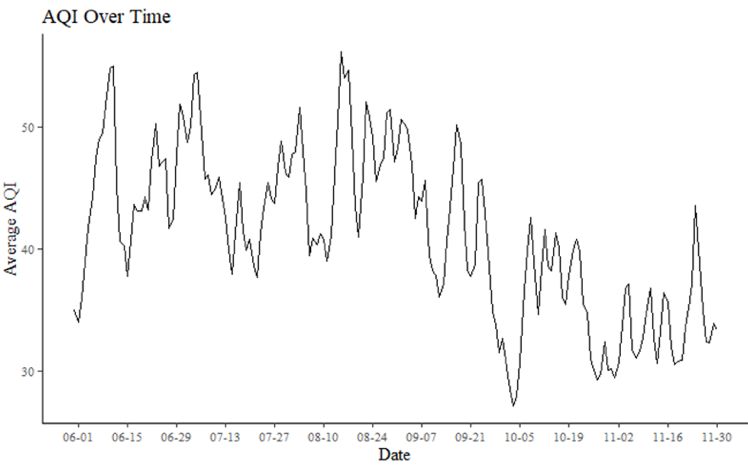
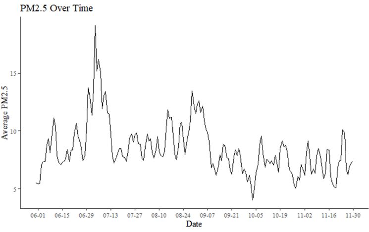
10

approaches to categorizing tweet sentiment polarity (the first two sets were labeled by

researchers, while the latter two were labeled through the crowdsource platforms such as

MTurk; 36-39). 5-fold cross validation was used to determine regularization parameters

for the BiLSTM model. The model achieved a validation accuracy of 88.03%, which is

comparable with accuracy achieved by state-of-the-art twitter sentiment classification

models (21). See Table S1 in the supplementary material for the model build and a list of

the hyperparameters selected through the cross validation.

 For this study, rather than classifying tweets as either positive or negative, the

probability of a tweet being classified as positive is used as a continuous sentiment index,

where values near 1 represent tweets more likely to be classified as positive and values

near 0 represent tweets more likely to be classified as negative by the trained BiLSTM

model. The sentiment index was then aggregated to the county-day level by first taking

the average sentiment of each tweet per user-day, then taking the median of each user’s

average sentiment score per county-day. Thus, throughout this paper, the sentiment index

for each county-day can be defined as the probability that a tweet posted by the median

tweeter is positive. See Figures 2 and 3 below for the sentiment index by county and over

time, respectively.

 Pollution Data

 For this study, I consider AQI and PM2.5 estimates at the county-day level. AQI

estimates were produced by the EPA and were calculated each day for each monitor for

the criteria gases of O3, CO, SO2, NO2, as well as PM10 and PM2.5 (40). More information

on AQI can be found elsewhere (14). Daily PM2.5 estimates were retrieved from the
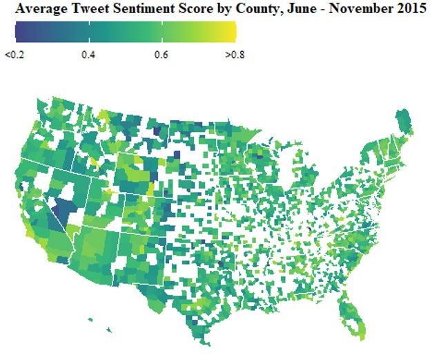
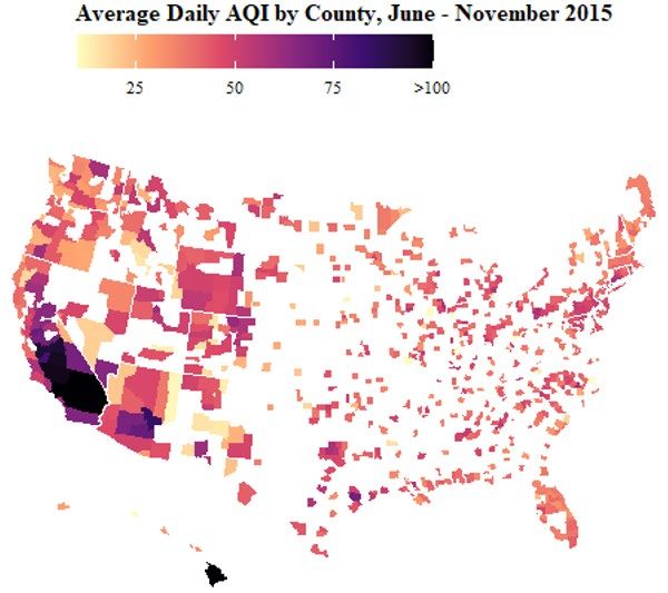
11

Centers for Disease Control and Prevention website and were produced by the EPA’s

Downscaler model, which combines estimates from the Community Multi-scale Air

Quality Model (CMAQ) with measurements from station monitors (41-42). Estimates

within a county’s borders were aggregated to the county level by taking the population-

weighted average (42). See Figures 2 and 3 below for AQI and PM2.5 measurements by

county and over time, respectively.

 Figure 2: Heat maps of average number of tweeters, sentiment index, PM2.5, and AQI per
 county

 The sentiment index, at the county-day level, refers to the probability that a tweet posted by the median tweeter is
 positive. AQI stands for Air Quality Index. PM2.5 refers to fine particulate matter of size less than 2.5 micrometers
 and is measured in micrograms per cubic meter.
12

 Weather Data

 Daily weather data used in this study was produced by the Integrated Surface

Database (ISD) and was collected through the National Oceanic and Atmospheric

Administration website (17). Variables include the average temperature in degrees

Fahrenheit (the arithmetic mean of the maximum and minimum daily temperature),

station pressure in millibars, average maintained wind speeds in miles per hour,

precipitation and snow depth in inches, and visibility in miles (censored at 10 miles; 17).

 The data was originally reported at the station-day level. To produce county-level

estimates, an approach similar to that of Menne et al was used (43). ISD stations tend to

be placed in the most heavily populated areas of the U.S.; hence, averaging the

measurements of stations within or near a county should produce estimates similar to a

population-weighted county average (17). To determine which stations are located within

a given county, Menne et al. suggest taking the county centroid latitude and longitude

and, supposing for a moment that each county is circular, determining the “radius” r of

the county using its area (in square kilometers). But because most counties tend to be

more rectangular-shaped than circular, in this study, I extend the radius by multiplying r

by � , which essentially extends the radius to include the corners of a square with the
 2

same area and centroid of the supposed circle. The information from all ISD stations

within this extended radius of a county centroid are then averaged to produce county-day

level estimates. ISDs within the bounds of a county’s extended radius were found to have

similar measurements across all weather variables (see Table S2). Information on county
13

centroids and areas were produced by the Census Bureau and collected through the

countyweather package in R (44).

 County and Date Characteristics

 County characteristics, used for providing summary statistics and for stratified

analyses, were produced by the Department of Agriculture’s Economic Research Service

through information from the 2010 Census (45). Variables include racial and ethnic

makeup (White non-Hispanic, Black non-Hispanic, and Hispanic), median household

income, and county classification (MSA: Metropolitan Statistical Area, Urban, and

Rural).

 Date characteristics include whether a given date is a holiday or non-holiday,

weekend or weekday. For this study, holidays include all federal holidays as well as

Halloween. Weekends include Saturday and Sunday.

Models

 The purpose of this study is to consider the short-term effects of perceived and

actual air pollution on expressed sentiment via U.S. Twitter. To do this, I consider two

distinct modeling approaches: a multi-cutoff regression discontinuity and a weighted least

squares (WLS) regression.

 Multi-Cutoff Regression Discontinuity

 To test the hypothesis that expressed sentiment will be more positive just below

an AQI cutoff point compared to just above it, I consider the multi-cutoff regression
14

discontinuity model proposed by Cattaneo et al. (46). A multi-cutoff regression

discontinuity model is, in all practical senses, similar to a standard regression

discontinuity model but applied to j subpopulations of the data, where each subpopulation

is limited to observations with an AQI at or near a given cutoff point cj. Following

Cattaneo et al., I split the dataset into 3 subpopulations such that observation of county i

at date t is in subpopulation j if −1 + −1 < , < +1 − +1 , where 0 = 0, 1 =

51, 2 = 101 and 3 = 151; and 0 = 0 and 1 = 2 = 3 = 25 (i.e., I split the dataset

at the AQI middle point between the cutoff values; See Table 1; 46). I do not consider

 the Unhealthy to Very Unhealthy
Table 1: Subsamples for multi-cutoff regression
discontinuity models and Very Unhealthy to
 AQI Category AQI Lower AQI AQI Upper
 Threshold Bound Cutoff Bound Hazardous AQI categories due
Good to Moderate 0 51 75

Moderate to Unhealthy 76 101 125 to small n-size (only 82 county-
for Sensitive Groups
 days in this dataset have an AQI
Unhealthy for Sensitive 126 151 175
Groups to Unhealthy
 above 175).

 For each subpopulation j, I then consider the standard local polynomial model:

 SR j,i,t = αj + τj Dj,i,t + βj,1 �AQIj,i,t − cj � + βj,2 Dj,i,t �AQIj,i,t − cj �

 2 2
 + βj,1 �AQIj,i,t − cj � + βj,2 Dj,i,t �AQIj,i,t − cj � + εj,i,t

where cj is the cutoff, Dj,i,t is an indicator variable for whether , , ≥ , and , , is

the error term for county i, date t. The term , , is the residual of the sentiment index

regressed on weather variables and county and date fixed effects, which effectively allow

the models to control for weather, time-invariant, and geographically invariant

information (47). Weights for each observation are assigned using the triangle kernel, and
15

only observations within a bandwidth hj are considered, where hj is chosen to minimize

the mean squared error. A polynomial of order 2 was chosen to consider non-linearity of

the association without accounting for excess noise, though models with polynomials of

order 1 and of order 3 are also employed to check for robustness. Throughout all models,

robust standard errors are clustered at the county level. Coefficients with p-values below

0.1 are considered statistically significant.

 Because the EPA only require MSAs with populations of at least 350,000 to

report AQI, models are restricted to only consider observations from counties within

such MSAs (14). I also consider replacing , , with a one-day lag , , −1 in the

model, as some areas reports AQI information from the previous day rather than, or along

with, the current day (14). Lastly, to consider heterogeneous effects, stratified analyses

are conducted by weekend or weekday, holiday or non-holiday, as well as whether the

county resides in an MSA with a population of at least 350,000 or not.

 Weighted Least Squares

 To test hypotheses 2 and 3, WLS models are conducted with sentiment index as

the dependent variable. WLS models are considered over ordinary least squares (OLS)

models to account for the fact that the county-day observations have an unequal number

of underlying tweeters that make up the sentiment index (see Figure 2). Weighting

observations according to the number of tweeters thus allows county-days with more

tweeters—and hence more precise sentiment index calculations—to have more influence

on the model. In this study, the weight , for county i date t is equal to � , , where n is
16

the number of unique tweeters. Unweighted OLS models are also performed to check for

robustness.

To test hypothesis H2—that PM2.5 has an inverse relationship with sentiment— the

sentiment index is regressed on PM2.5 with and without county and date fixed effects,

with and without visibility, and with and without all other weather variables. These

models are also conducted using AQI rather than PM2.5 to check for consistency. To

consider short-term latent effects, one- and two-day lags of PM2.5 are considered

independently as well as jointly in a distributed lag model with a 2-degree polynomial.

The difference between PM2.5 and PM2.5 lagged by one day is also considered. A similar

approach is taken to test H3—that visibility has a direct relationship with sentiment—but

replacing PM2.5 with visibility. Stratified analyses are performed to test for heterogeneous

effects across date type (nonholiday, holiday, weekday, and weekend) and county type

(MSA, urban, or rural). For all models, robust standard errors are clustered at the county

level. Coefficients with p-values below 0.1 are considered statistically significant.

Results

 In total, the sentiment information of 27,827,828 tweets posted in the United

States from May 31 to November 30, 2015 were aggregated to form a sentiment index

across 3,339 counties and 422,467 county-days. Excluding observations without weather

information left 1,699 counties and 254,862 county-days. Of the remaining counties, 748

are contained in MSAs (all of which have populations greater 350,000), 773 are classified

as urban, and 161 as rural.
17

Table 2: Summary Statistics by county and Sentiment is found to vary
date characteristics
 Mean Mean Mean systematically with both county and
 Sentiment AQI PM2.5
 Characteristic N (SD) (SD) (SD) date characteristics. Counties
All 254,862 0.56 41.44 8.52
 (0.22) (22.29) (5.07)
County Type
 contained in MSAs have a higher
MSA 132,527 0.57 43.33 8.82
 (0.18) (21.48) (4.82) mean sentiment than urban
Urban 111,980 0.54 35.81 8.30
 (0.26) (23.92) (5.18) counties, and urban counties have a
Rural 14,605 0.52 36.40 7.53
 (0.30) (20.87) (6.24)
 higher mean sentiment than rural
Majority
Race/Ethnicity
White 224,898 0.56 40.17 8.54 counties (Table 2). Sentiment also
 (0.23) (21.04) (5.13)
Black 8,281 0.52 43.75 9.50 tends to be lower in Hispanic-
 (0.23) (16.72) (3.89)
Hispanic 10,417 0.51 48.83 7.55
 majority and Black-majority
 (0.23) (28.90) (4.00)
No Majority 17,641 0.56 50.33 8.52
 (0.19) (28.93) (4.98) counties than in White-majority
Median
Household counties and increase with median
Income
≤$40,000 23,216 0.53 37.06 8.52
 household income (Table 2).
 (0.27) (17.73) (4.68)
$40,001 to $60,000 156,766 0.55 40.71 8.60
 (0.24) (22.41) (5.15) Holidays and weekends tend to
$60,001 to $80,000 60,200 0.57 42.79 8.38
 (0.19) (22.96) (5.08) experience higher sentiment than
>$80,000 18,930 0.59 42.89 8.43
 (0.14) (21.19) (4.79)
 nonholidays and weekdays,
Date Type
Weekend 74,779 0.59 40.80 8.55
 (0.22) (21.88) (5.62) respectively (Table 2; Figure 3).
Weekday 180,083 0.54 41.70 8.51
 (0.23) (22.44) (4.82) Both AQI and PM2.5 tend to be
Holiday 8,349 0.62 40.47 9.82
 (0.23) (20.38) (7.16) higher in summer than in autumn,
Non-holiday 246,513 0.55 41.47 8.48
 (0.22) (22.35) (4.98)
Observations are at the county/day level. Sentiment refers to with PM2.5 peaking on July 4 (Figure
the median tweeters’ probability of posting a positive tweet
given that they post a tweet. AQI refers to air quality index. 3).
PM2.5 refers to fine particulate matter of size less than 2.5
micrometers and is measured in micrograms per cubic meter.
MSA stands for Metropolitan Statistical Area. All county Table 3 shows the results of
information is from 2010. Weekends include Saturday and
Sunday. Holidays include all federal holidays in the given time
period as well as Halloween the multi-cutoff regression
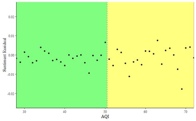
18

discontinuity model for both Figure 3: Time series plots depicting average sentiment
 index, average PM2.5, and average AQI per day, May
 31 to November 11, 2015
AQI and AQI lagged by one

day, considering only counties

that reside in MSAs with a

population of at least 350,000.

A coefficient of -0.015 is

estimated for the same-day

AQI threshold of Good to

Moderate (cutoff value of 51)

and is significant with a p-value

less than 0.01. This would

suggest that being in the AQI

category of Moderate rather

than Good predicts a 1.5

percentage point decrease in the

sentiment index after controlling

for weather and county and date

fixed effects. See Figure 4 for a

scatter plot depicting this
 The sentiment index, at the county-day level, refers to the
relationship. This result is probability that a tweet posted by the median tweeter is positive.
 AQI stands for Air Quality Index. PM2.5 refers to fine particulate
similar when considering a matter of size less than 2.5 micrometers and is measured in
 micrograms per cubic meter.

polynomial of order 3 with a
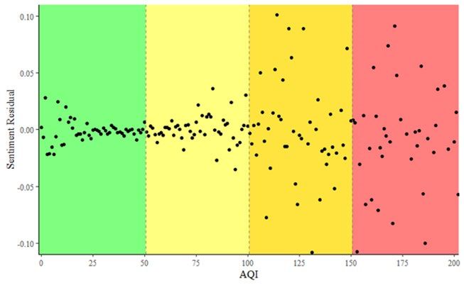
19

coefficient of -0.016 and smaller when considering a polynomial of order 1, with a

statistically insignificant coefficient of -0.05 (Table S3 Column 1).

 The estimates for the same-day AQI Moderate to Unhealthy for Sensitive Groups

threshold (cutoff value of 101) and the Unhealthy for Sensitive Groups to Unhealthy

Table 3: Results from multi-cutoff regression discontinuity
 Same day Lagged one day
AQI Category Coefficient N Estimated Coefficient N Estimated
Threshold (SE) Bandwidth (SE) Bandwidth
Good to Moderate -0.015 82,965 7.156 -0.003 81,685 17.819
 (0.006)** (0.004)
Moderate to 0.032 5,135 4.505 0.005 5,118 38.107
Unhealthy for (0.043) (0.013)
Sensitive Groups
Unhealthy for 0.256 782 4.47 -0.032 782 28.492
Sensitive Groups to (0.179) (0.179)
Unhealthy
* p-value < 0.1
** p-value < 0.05
*** p-value < 0.01
AQI stands for air quality index. AQI values between 0 and 50 are categorized as Good, between 51 and 100 as
Moderate, between 101 and 150 as Unhealthy for Sensitive Groups, and between 151 and 200 as Unhealthy.
Dependent variable is residual of sentiment index regressed on weather variables, county fixed effects, and date fixed
effects, population-weighted by the square root of the number of unique tweeters per county/day. The models include
only information from counties that reside in MSAs with populations of at least 350,000. The coefficients were
estimated using a local polynomial of degree 2. Robust standard errors are clustered at the county level. Bandwidths
were estimated so as to optimize the common mean-squared error on both sides of the given cutoff point.

 Figure 4: Scatter plots depicting relationship between AQI and sentiment index residuals

 The sentiment index, at the county-day level, refers to the probability that a tweet posted by the median tweeter is
 positive. AQI stands for Air Quality Index. AQI values between 0 and 50 are categorized as Good (green), between
 51 and 100 as Moderate (yellow), between 101 and 150 as Unhealthy for Sensitive Groups (orange), and between
 151 and 200 as Unhealthy (red). Sentiment residual is the residual of sentiment index regressed on weather
 variables, county fixed effects, and date fixed effects, population-weighted by the square root of the number of
 unique tweeters per county/day. The plot include only information from counties that reside in MSAs with
 populations of at least 350,000.
20

threshold (cutoff value of 151) are both found to be positive but insignificant, with p-

values larger than 0.1. Table S4 shows results for same-day AQI with the sentiment

residuals predicted from slightly different models—with and without visibility, and with

and without population weighting. The results are similar across each of these model

specifications. The estimated Figure 5: Estimated coefficients from multi-cutoff
 regression discontinuity at the Good to Moderate
coefficients for AQI lagged by one AQI threshold across date and county stratifications

day are generally insignificant,

with a negative coefficient at the

Good to Moderate threshold and

the Unhealthy for Sensitive Groups

to Unhealthy threshold, and a

positive coefficient at the Moderate

to Unhealthy for Sensitive Groups
 AQI values between 0 and 50 are categorized as Good and
 between 51 and 100 as Moderate. The coefficients were
threshold (Tables 3, S3). estimated using a local polynomial of degree 2. Robust standard
 errors are clustered at the county level. Bandwidths for the
 Figure 5 shows regression regression discontinuity were estimated so as to optimize the
 common mean-squared error on both sides of the given cutoff
 point. The dependent variable is the residual of sentiment index
discontinuity results stratified by regressed on weather variables, county fixed effects, and date
 fixed effects, population-weighted by the square root of the
 number of unique tweeters per county/day. Weekends include
date type (holiday, non-holiday, Saturday and Sunday. Holidays include all federal holidays in
 the given time period as well as Halloween. Stratified models by
weekday, and weekend) and by date characteristics include only information from counties that
 reside in MSAs with populations of at least 350,000.

whether the given county resides in

an MSA with a population of at least 350,000 and so is required to report daily AQI. As

can be seen, the estimated effect of being above the 51 AQI threshold (Good to

Moderate) is similar for weekdays, weekends, and nonholidays but is considerably larger
21

 on holidays with a coefficient of -0.043 (Table S5). A positive coefficient of

0.032 was estimated for counties outside large MSAs with a p-value less than 0.1 (Table

S5).

 Table 4 shows the results of WLS models with sentiment regressed on PM2.5,

AQI, and/or visibility while controlling for weather variables and county and date fixed

 Table 4: Estimated WLS coefficients of air pollution and weather variables
 Variable 1 2 3 4 5
 PM2.5 0.00007 0.00022 -- -- --
 (0.00008) (0.00008)***

 AQI -- -- 0.00004 0.00005 --
 (0.00002)* (0.00002)***

 Visibility -- 0.00353 -- 0.00294 0.00338
 (0.00035)*** (0.00042)*** (0.00035)***

 Temperature 0.00226 0.00235 0.00190 0.00196 0.00230
 (0.00029)*** (0.00029)*** (0.00035)*** (0.00035)*** (0.00028)***

 Temperature2 -0.00002 -0.00002 -0.00002 -0.00002 -0.00002
 (0.00000)*** (0.00000)*** (0.00000)*** (0.00000)*** (0.00000)***

 Pressure 0.00050 0.00039 0.00034 0.00025 0.00039
 (0.00009)*** (0.00009)*** (0.00012)*** (0.00011)*** (0.00009)***

 Wind Speed -0.00084 -0.00090 -0.00057 -0.00065 -0.00099
 (0.00015)*** (0.00015)*** (0.00018)*** (0.00018)*** (0.00014)***

 Precipitation -0.01123 -0.00809 -0.00876 -0.00620 -0.00850
 (0.00108)*** (0.00109)*** (0.00121)*** (0.00121)*** (0.00107)***

 Snow Depth 0.00157 0.00299 0.00109 0.00230 0.00291
 (0.00222) (0.00218) (0.00230) (0.00224) (0.00218)

 County FE Yes Yes Yes Yes Yes
 Date FE Yes Yes Yes Yes Yes
 Pop Weighted Yes Yes Yes Yes Yes
 N 254,850 254,850 119,907 119,907 254,850
 R2 0.23024 0.23061 0.32206 0.32244 0.23060
 * p-value < 0.1
 ** p-value < 0.05
 *** p-value < 0.01
 AQI stands for air quality index. FE stands for fixed effects. Pop stands for population. The dependent variable is
 the sentiment index, which can be described as the median tweeters’ probability of posting a positive tweet given
 that they post a tweet. All models include county fixed effects and date fixed effects and are population-weighted
 by the square root of the number of unique tweeters per county/day. Robust standard errors are clustered at the
 county level. Observations are at the county-day level.
22

effects. PM2.5 is estimated to have a statistically insignificant coefficient of 0.00007 when

visibility is not included in the model (Table 4 Column 1), and a significant coefficient of

0.00022 when controlling for visibility (p-value less than 0.01; Table 4 Column 2).

Similarly, AQI is estimated to have a positive coefficient that is amplified when including

visibility (Table 4 Columns 3-4). Across all models, visibility has an estimated

coefficient hovering around 0.0035, with a p-value well below 0.01 (Table 4 Columns 2,

4, 5). All other weather variables excluding snow depth are observed to have robust

significant estimates across all models, with average temperature being positive, the

square of average temperature being negative, station pressure being positive, and wind

speed and precipitation being negative.

 Table S6 in the supplementary material includes the results from other model

specifications and shows the estimated coefficients for PM2.5 and all weather variables,

including visibility. When not controlling for date fixed effects nor weather variables,

PM2.5 is estimated to have a significantly negative coefficient (Table S6 Columns 1-2).

Regressions with population weighting tend to have slightly smaller but similar estimates

for all variables compared to regressions without population weighting. No evidence was

found for PM2.5 having a quadratic effect. Table S7 shows that the estimated coefficient

of visibility remains largely consistent across all model specifications, with a coefficient

generally between 0.003 and 0.004. Figure S1 in the supplementary material shows that

the association between visibility and sentiment is highly linear despite the censoring of

the visibility variable at 10 miles.

 Table 5 reports the results of WLS models considering PM2.5 lagged by one to two

days. In all models, weather variables and county and date fixed effects are included as
23

Table 5: Estimated WLS coefficients for lagged PM2.5
Variable 1 2 3 4 5 6
PM2.5 0.0022 -- -- 0.00030 -- 0.00016
 (0.00008)*** (0.00009)*** (0.00009)*

PM2.5, t-1 -- 0.00002 -- -0.00015 -- --
 (0.00008) (0.00009)

PM2.5, t-2 -- -- 0.00001 0.00000 -- --
 (0.00008) (0.00001)

(PM2.5 – PM2.5, t-1) -- -- -- -- 0.00022 0.00014
 (0.00007)*** (0.00009)*

County FE Yes Yes Yes Yes Yes Yes
Date FE Yes Yes Yes Yes Yes Yes
Pop Weighted Yes Yes Yes Yes Yes Yes
N 254,850 254,850 254,850 254,850 254,850 254,850
R2 0.23061 0.23059 0.23059 0.23062 0.23061 0.23062
* p-value < 0.1
** p-value < 0.05
*** p-value < 0.01
FE stands for fixed effects. Pop stands for population. The dependent variable is the sentiment index, which can be
described as the median tweeters’ probability of posting a positive tweet given that they post a tweet. All models
include weather variables, county fixed effects ,and date fixed effects and are population-weighted by the square root of
the number of unique tweeters per county/day. Robust standard errors are clustered at the county level. Observations
are at the county-day level. Column 4 repots the results of a distributed lag model. Standard errors were solved for
using the delta method.

controls. No significant coefficient is estimated for either the one-day or two-day lag

(Table 5 Columns 2-4). This is seen both in the models that include the one-day and two-

day lags separately (Columns 2 and 3) and in the quadratic distributed lag model

(Column 4). Columns 5 and 6 suggest that an increase in the current day’s PM2.5 level

compared to the previous day’s PM2.5 level predicts higher sentiment, with a statistically

significant coefficient of 0.00022 (p-value less than 0.05). This holds even after

controlling for the current day’s PM2.5 level, although the coefficient is slightly smaller

(0.00014).

 Table 6 reports the results for lagged visibility. Significant positive coefficients

are observed in models where the one-day lag and two-day lags are considered separately

(0.00066 and 0.00059, respectively; Columns 2-3). However, in the distributed lag
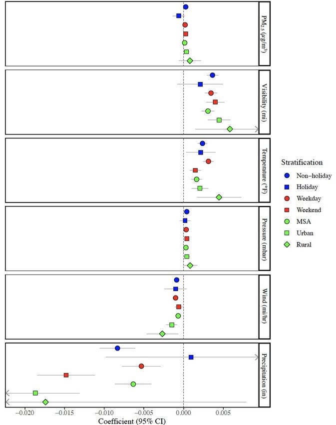
24

Table 6: Estimated WLS coefficients for lagged visibility
Variable 1 2 3 4 5 6
Visibility 0.00338 -- -- 0.00345 -- 0.00298
 (0.00035)*** (0.00031)*** (0.00043)***

Visibilityt-1 -- 0.00066 -- -0.00063 -- --
 (0.00030)** (0.00031)**

Visibility t-2 -- -- 0.00059 0.00078 -- --
 (0.00032)* (0.00025)***

(Visibility – Visibilityt-1) -- -- -- -- 0.00196 0.00046
 (0.00025)*** (0.00030)*

County FE Yes Yes Yes Yes Yes Yes
Date FE Yes Yes Yes Yes Yes Yes
Pop Weighted Yes Yes Yes Yes Yes Yes
N 254,850 233,780 220,749 220,749 233,780 233,780
R2 0.23060 0.24258 0.24931 0.24967 0.24274 0.2493
* p-value < 0.1
** p-value < 0.05
*** p-value < 0.01
FE stands for fixed effects. Pop stands for population. The dependent variable is the sentiment index, which can be
described as the median tweeters’ probability of posting a positive tweet given that they post a tweet. All models
include weather variables, county fixed effects, and date fixed effects and are population-weighted by the square root of
the number of unique tweeters per county/day. Robust standard errors are clustered at the county level. Observations
are at the county-day level. Column 4 repots the results of a distributed lag model. Standard errors were solved for
using the delta method.

model, the one-day lag has a significant negative coefficient of -0.00063 (p-value less

than 0.1) while the two-day lag remains positive with a coefficient of 0.00078 (p-value

less than 0.01; Column 4). Columns 5 and 6 suggest that an increase in the current day’s

visibility compared to the previous day’s visibility level predicts higher sentiment, with a

statistically significant coefficient of 0.00196 (p-value less than 0.01). This holds even

after controlling for the current day’s visibility, although the coefficient is considerably

smaller (0.00046).

 Figure 6 and Table S8 show the results of stratified analyses for PM2.5 and all

weather variables excluding snow depth. Across all stratifications (holidays, non-

holidays, weekends, and weekdays, and MSA, urban, and rural counties), visibility,

temperature, and barometric pressure are found to have a direct relationship with the
25

Figure 6: Estimated WLS coefficients of PM2.5 and weather variables across date and county
stratifications

The dependent variable is the sentiment index, which can be described as the median tweeters’ probability of
posting a positive tweet given that they post a tweet. Estimates are from weighted least squared models that
include county fixed effects and date fixed effects and are population-weighted by the square root of the number
of unique tweeters per county/day. Robust standard errors are clustered at the county level. MSA stands for
Metropolitan Statistical Area. Weekends include Saturday and Sunday. Holidays include all federal holidays in
the given time period as well as Halloween
26

sentiment index, with slightly amplified effects in rural counties compared to MSA and

urban counties. Similarly, wind is estimated to have a consistent inverse relationship with

the sentiment index with amplified effects in rural counties. PM2.5 is estimated to have a

positive effect across all county types and across nonholidays, weekdays, and weekends.

However, a statistically insignificant negative coefficient was estimated for PM2.5 on

holidays (-0.000627). Precipitation is found to be negatively associated with sentiment

except on holidays, with an amplified effect on weekends (0.00184 compared to 0.00124

on weekdays).

Discussion

 Perceived air pollution

 In this study, evidence was found to suggest that perceived air pollution is

negatively associated with expressed sentiment via U.S. Twitter. It was estimated that

going from the Good AQI category to the Moderate category leads to a 1.5 percentage

point decrease in the sentiment index; however, positive coefficients—all insignificant—

were found at the other AQI category thresholds (Table 3). Thus, the first hypothesis that

expressed sentiment will be more positive just below an AQI cutoff point than just above

it is only partially confirmed. Moreover, viewing the relationship between AQI and the

sentiment index after controlling for weather variables and county and date fixed effects

does not reveal any drastic differences in the relationship around the cutoff value of 51

(the threshold between the Good and Moderate categories) apart from a relatively high

average sentiment at the AQI value of 50 (Figure 4). Is this simply noise? It is difficult to

say.
27

 On the one hand, there are reasons to believe that the results are revealing an

important effect of air quality on sentiment. The estimate at the Good to Moderate cutoff

was found to be amplified on holidays compared to non-holidays, which would be

expected if the AQI category affects expressed sentiment by influencing recreational

behavior choices (see 8). Moreover, the negative effect is found only in counties

contained in MSAs that have populations of at least 350,000 and thus are required to

report the AQI (Figure 5, Table S5). In contrast, a positive effect is found in all other

counties, which matches the general trend seen that higher air quality predicts higher

sentiment (discussed more below). This would be expected if the AQI category affects

sentiment, as those in counties with more consistent access to AQI information are more

likely to be primed to be affected by the AQI category.

 On the other hand, it should be noted that the population of Twitter users,

particularly Twitter users with activated geotagged settings, tend to be younger than the

general population with 18-29-year-olds overrepresented (48). As has been documented

by both Pew and The Media Insight Project, adults aged 18-29 are less likely than older

adults to follow the news (49-50). Specifically, The Media Insight Project’s 2014 survey

of 1,492 adults found that an estimated 69% of 18-29-year-olds follow news on the

environment and natural disasters and 71% to traffic and weather, compared to 78% and

93% of 30-39-year-olds and 74% and 81% of 40-49-year-olds, respectively (50). This

would suggest that the tweeters who make up the sentiment index may be relatively likely

less to be aware of their area’s AQI category, hence diminishing any effect that the AQI

category may have on sentiment.
28

 Robust evidence was found to support the hypothesis that visibility has a direct

relationship with expressed sentiment. Overall, a coefficient roughly between 0.003 and

0.004 was estimated, suggesting that one mile of increased visibility leads to a 0.3 to 0.4

percentage point increase in the probability that a tweet posted by a county-day’s median

tweeter is positive (Tables 4,6, S6-S8). The association is observed to be linear despite

the censoring of the visibility variable at 10 miles. That being said, the censoring requires

that caution be exercised when interpreting this estimate.

 The results found in Table 6 Columns 4-6 suggest that the association between

visibility and sentiment is dependent on the visibility from previous days. Specifically, it

would appear that when today’s visibility is higher than yesterday’s visibility, sentiment

will tend to be higher. Conversely, higher visibility yesterday compared to today predicts

a decrease in today’s sentiment. Put in other words, the importance of visibility appears

to be relative: opaque skies are worse when yesterday’s skies were clear.

 While keeping in mind that visibility is an imperfect proxy for smog or haze,

these results do offer evidence that air pollution has a psychological or perceived effect

on U.S. Twitter sentiment. They suggest that the appearance of air pollution can decrease

human happiness. This should come as no surprise to those who have lived in areas prone

to hazy days. However, to the best of my knowledge, this study is the first to document a

link between visibility and expressed sentiment (see 2).

 A number of other studies have shown that measurements of perceived air

pollution, as well as objective measurements of air pollutants, are negatively associated

with happiness (10, 51-52). It is quite plausible that the results of these other studies are

picking up the visible component of air pollution observed in this study. For
You can also read