COLORPICKER FOR WPF COMPONENTONE
←
→
Page content transcription
If your browser does not render page correctly, please read the page content below
ComponentOne

ColorPicker for WPF
Copyright 1987-2012 GrapeCity, Inc. All rights reserved. ComponentOne, a division of GrapeCity 201 South Highland Avenue, Third Floor Pittsburgh, PA 15206 • USA Internet: info@ComponentOne.com Web site: http://www.componentone.com Sales E-mail: sales@componentone.com Telephone: 1.800.858.2739 or 1.412.681.4343 (Pittsburgh, PA USA Office) Trademarks The ComponentOne product name is a trademark and ComponentOne is a registered trademark of GrapeCity, Inc. All other trademarks used herein are the properties of their respective owners. Warranty ComponentOne warrants that the original CD (or diskettes) are free from defects in material and workmanship, assuming normal use, for a period of 90 days from the date of purchase. If a defect occurs during this time, you may return the defective CD (or disk) to ComponentOne, along with a dated proof of purchase, and ComponentOne will replace it at no charge. After 90 days, you can obtain a replacement for a defective CD (or disk) by sending it and a check for $25 (to cover postage and handling) to ComponentOne. Except for the express warranty of the original CD (or disks) set forth here, ComponentOne makes no other warranties, express or implied. Every attempt has been made to ensure that the information contained in this manual is correct as of the time it was written. We are not responsible for any errors or omissions. ComponentOne’s liability is limited to the amount you paid for the product. ComponentOne is not liable for any special, consequential, or other damages for any reason. Copying and Distribution While you are welcome to make backup copies of the software for your own use and protection, you are not permitted to make copies for the use of anyone else. We put a lot of time and effort into creating this product, and we appreciate your support in seeing that it is used by licensed users only. This manual was produced using ComponentOne Doc-To-Help™.
Table of Contents
ComponentOne ColorPicker for WPF Overview ............................................................................................1
        Help with ComponentOne Studio for WPF .................................................................................................. 1

Key Features ................................................................................................................................................1

ColorPicker for WPF Quick Start ..................................................................................................................5
        Step 1 of 4: Setting up the Application........................................................................................................... 5
        Step 2 of 4: Adding C1ColorPicker Controls ................................................................................................. 6
        Step 3 of 4: Adding Code to the Application ................................................................................................. 7
        Step 4 of 4: Running the Application ............................................................................................................. 8

Working with ColorPicker for WPF ............................................................................................................ 11
        Basic Properties ............................................................................................................................................ 11
        Basic Events ................................................................................................................................................. 12
        ColorPicker Mode ........................................................................................................................................ 12
                    Basic ColorPicker Mode ................................................................................................................. 12
                    Advanced ColorPicker Mode ......................................................................................................... 13
        Additional Controls ..................................................................................................................................... 14
                    C1SpectrumColorPicker ................................................................................................................. 14
                    C1HexColorBox ............................................................................................................................. 15
                    C1CheckeredBorder ....................................................................................................................... 16
        Available ColorPicker Palettes ..................................................................................................................... 16
        Recent Colors ............................................................................................................................................... 18
        Drop-Down Direction.................................................................................................................................. 18

ColorPicker Layout and Appearance ........................................................................................................... 18
        Layout in a Panel ......................................................................................................................................... 19
        ColorPicker Appearance Properties ............................................................................................................. 19
                    Color Properties.............................................................................................................................. 19
                    Alignment Properties ...................................................................................................................... 19
                    Border Properties ............................................................................................................................ 20
                    Size Properties ................................................................................................................................ 20
        ComponentOne ClearStyle Technology ...................................................................................................... 20
                    How ClearStyle Works ................................................................................................................... 21

                                                                                                                                                                      iii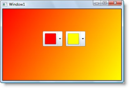
ClearStyle Properties ...................................................................................................................... 21
             ColorPicker Templates ................................................................................................................................. 21
             ColorPicker Styles ........................................................................................................................................ 22
             ColorPicker Template Parts ......................................................................................................................... 22
             ColorPicker Visual States ............................................................................................................................. 24
             XAML Elements .......................................................................................................................................... 25

     ColorPicker for WPF Samples ..................................................................................................................... 27

     ColorPicker for WPF Task-Based Help ........................................................................................................ 27
             Setting the Palette......................................................................................................................................... 27
             Creating a Custom Palette ........................................................................................................................... 28
             Changing the Background Color.................................................................................................................. 30
             Changing the Drop-Down Window Direction ............................................................................................ 31
             Hiding Recent Colors................................................................................................................................... 32

iv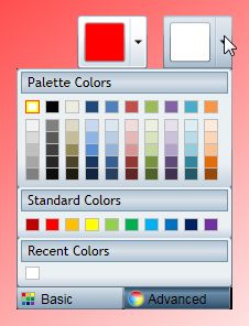
ComponentOne ColorPicker for WPF
Overview
ComponentOne ColorPicker™ for WPF is a color input editor that Getting Started
provides a rich, interactive color selection interface. Users can select
colors from professionally designed palettes or custom colors that you Get started with the
have chosen. following topics:
You can choose to include a basic color palette with preselected and - Key Features (page 1)
standard colors, an advanced palette that users can use to completely - Quick Start (page 5)
customize their color selection, or both! ColorPicker for WPF even
includes transparency, hexadecimal color, and RGB and HLS color - Task-Based Help (page
model support to provide a rich visual color input interface. 27)
For a list of the latest features added to ComponentOne Studio for
WPF, visit What's New in Studio for WPF.
Help with ComponentOne Studio for WPF
Getting Started
For information on installing ComponentOne Studio for WPF, licensing, technical support, namespaces and
creating a project with the control, please visit Getting Started with Studio for WPF.
What's New
For a list of the latest features added to ComponentOne Studio for WPF, visit What's New in Studio for WPF.
Key Features
ComponentOne ColorPicker for WPF allows you to create customized, rich applications. Make the most of
ColorPicker for WPF by taking advantage of the following key features:
Select from 20+ Predefined Professionally Designed Palettes
ColorPicker contains over 20 predefined color palettes that match the themes used in Microsoft Office.
The colors in each palette go well together and can be used to create applications with a polished,
professional appearance.
1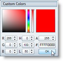
Built-in Color Editor for Custom Colors
ColorPicker includes a color editor. This editor allows end-users to create colors that are not on the
current palette using the RGB or HLS color models and including support for transparency.
Different Views
C1ColorPicker supports both simple and advanced views for color selection.
Composable Parts
Each of the parts of the control can be used independently of the C1ColorPicker to create your custom
controls. The C1SpectrumColorPicker control allows access to just the advanced color picking
functionality of the C1ColorPicker control, the C1HexColorBox control provides data validation for
hexadecimal code entries, and the C1CheckeredBorder provides a simple way to display colors with
transparencies.
2 Create Your Own Custom Palette
If the available color palettes do not work for your application, you can create your own custom color
palette. At run time, users can even be limited to selecting colors only from your chosen color palette.
3ColorPicker for WPF Quick Start
The following quick start guide is intended to get you up and running with ColorPicker for WPF. In this quick
start you'll start in Visual Studio and create a new project, add ColorPicker for WPF controls to your application,
and customize the appearance and behavior of the controls.
You will create a simple project using two C1ColorPicker controls and a standard Rectangle control. The
C1ColorPicker controls will control a gradient that is applied to the Rectangle, so that choosing colors at run time
will change the colors of the gradient – letting you explore the possibilities of using ColorPicker for WPF.
Step 1 of 4: Setting up the Application
In this step you'll begin in Visual Studio to create a WPF application using ColorPicker for WPF. When you add
a C1ColorPicker control to your application, you'll have a complete, functional color input selector.
To set up your project and add a C1ColorPicker control to your application, complete the following steps:
1. Create a new WPF project in Visual Studio.
2. Navigate to the Toolbox and double-click the Rectangle icon to add the standard control to the Grid.
3. Resize the window, and resize the rectangle to fill the window.
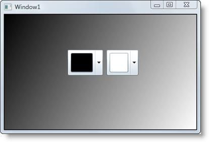
4. Switch to XAML view and add a Fill to the tag so it appears similar to the following:
This will add a black and while linear gradient fill to the rectangle. The design view of the page should
now look similar to the following image:
5You've successfully created a WPF application and customized the Rectangle control. In the next step you'll add
and customize C1ColorPicker controls.
Step 2 of 4: Adding C1ColorPicker Controls
In the previous step you created a new project and added a Rectangle control with a gradient to the application. In
this step you'll continue by adding C1ColorPicker controls that will control the gradient fill in the Rectangle.
Complete the following steps:
1. In Design view, click on the Rectangle to select it and navigate to the Visual Studio Toolbox.
2. In the Toolbox, locate and double-click the C1ColorPicker icon twice add two controls to the form.
3. Resize and position the two C1ColorPicker controls, so that they appear in the middle of the rectangle.
4. Click once on the first C1ColorPicker control, C1ColorPicker1, in Design view, navigate to the
Properties window, and set the following properties:
Set DropDownDirection to AboveOrBelow to control how the control opens.
Set the Mode to Advanced so only the advanced color picker appears.
Set the SelectedColor to Black (or "#FF000000").
The XAML will appear similar to the following:
You'll leave the second C1ColorPicker control set to the default values.
The page's Design view should now look similar to the following image:
6You've successfully set up your application's user interface, but if you run your application right now the color
pickers will do nothing if you select a color. In the next step you'll add code to your application to add
functionality to the controls.
Step 3 of 4: Adding Code to the Application
In the previous steps you set up the application's user interface and added controls to your application. In this step
you'll add code to your application to finalize it.
Complete the following steps:
1. Click once on the first C1ColorPicker control (C1ColorPicker1) to select it.
2. In the Properties window, click the lightning bolt Events icon to view control events.
3. Double-click in the text box next to the SelectedColorChanged event to switch to Code view and create
the event handler.
4. In Code view, add the following import statements to the top of the page:
Visual Basic
Imports C1.WPF
Imports C1.WPF.Extended
C#
using C1.WPF;
using C1.WPF.Extended;
5. Add the following code just after the page's constructor to update the gradient values:
Visual Basic
Private Sub UpdateGradient()
If C1ColorPicker1 IsNot Nothing And C1ColorPicker2 IsNot Nothing
Then
Me.col1.Color = Me.C1ColorPicker1.SelectedColor
Me.col2.Color = Me.C1ColorPicker2.SelectedColor
End If
End Sub
C#
7void UpdateGradient()
{
if (c1ColorPicker1 != null & c1ColorPicker2 != null)
{
this.col1.Color = this.c1ColorPicker1.SelectedColor;
this.col2.Color = this.c1ColorPicker2.SelectedColor;
}
}
6. Add code to the C1ColorPicker1_SelectedColorChanged event handler so that it appears like the
following:
Visual Basic
Private Sub C1ColorPicker1_SelectedColorChanged(ByVal sender As
System.Object, ByVal e As System.EventArgs) Handles
C1ColorPicker1.SelectedColorChanged
UpdateGradient()
End Sub
C#
private void c1ColorPicker1_SelectedColorChanged(object sender,
C1.WPF.PropertyChangedEventArgs e)
{
UpdateGradient();
}
7. Return to Design view.
8. Click once on the second C1ColorPicker control (C1ColorPicker2) to select it.
9. In the Properties window, double-click in the text box next to the SelectedColorChanged event to switch
to Code view and create the event handler (you may need to click the lightning bolt Events icon to view
control events if events are not listed).
10. Add code to the C1ColorPicker_SelectedColorChanged event handler so that it appears like the
following:
Visual Basic
Private Sub C1ColorPicker2_SelectedColorChanged(ByVal sender As
System.Object, ByVal e As System.EventArgs) Handles
c1cp1.SelectedColorChanged
UpdateGradient()
End Sub
C#
private void c1ColorPicker2_SelectedColorChanged(object sender,
C1.WPF.PropertyChangedEventArgs e)
{
UpdateGradient();
}
In this step you completed adding code to your application. In the next step you'll run the application and observe
run-time interactions.
Step 4 of 4: Running the Application
Now that you've created a WPF application and customized the application's appearance and behavior, the only
thing left to do is run your application. To run your application and observe ColorPicker for WPF's run-time
behavior, complete the following steps:
1. From the Debug menu, select Start Debugging to view how your application will appear at run time.
8The application will appear similar to the following:
2. Click the drop-down arrow in the left color picker. Notice that the window opens above the drop-down
box and that only the advanced mode is visible – this reflects the changes you made to the control. In
advanced mode, users can specify any color and can use multiple methods of selecting a color.
3. Choose a color, for example Red, and click OK:
Notice that the control's selected color and the rectangle's gradient changes to reflect your color choice.
4. Click the drop-down arrow in the right color picker.
9Notice that the Basic tab is visible (default). This tab displays Palette Colors, Standard Colors, and
Recent Colors. You can pick any color and can also switch to the Advanced tab to pick a custom color.
Note that the currently selected color is highlighted with a red border.
5. Pick a color, for example Yellow. The selected color will change and the background gradient of the
rectangle will change to match your selection:
Congratulations! You've completed the ColorPicker for WPF quick start and created a simple WPF application,
added and customized ColorPicker for WPF controls, and viewed some of the run-time capabilities of the
controls.
10Working with ColorPicker for WPF
ComponentOne ColorPicker for WPF includes the C1ColorPicker control, a simple color selection control that
lets users select colors from professionally designed palettes or your own custom colors. When you add the
C1ColorPicker control to a XAML window, it exists as a complete color selection control that you can further
customize.
The control's default interface looks similar to the following image:
For a description of the parts of the C1ColorPicker control, see the Basic ColorPicker Mode (page 12) and
Advanced ColorPicker Mode (page 13) topics.
Basic Properties
ComponentOne ColorPicker for WPF includes several properties that allow you to set the functionality of the
control. Some of the more important properties are listed below. Note that you can see ColorPicker Appearance
Properties (page 19) for more information about properties that control appearance.
The following properties let you customize the C1ColorPicker control:
Property Description
DropDownDirection Specifies the expand direction of the control drop-down arrow.
IsDropDownOpen Opens or closes the control drop-down box.
Mode Indicates the mode of the color picker. Options include Basic,
Advanced, and Both (default).
Palette Gets/sets the palette to be used.
SelectedBrush Gets the currently selected color as a Brush.
SelectedColor Gets/sets the currently selected color.
ShowAlphaChannel Gets/sets whether the user can change the alpha channel
(transparency value).
11ShowRecentColors Indicates if recently picked colors should be shown.
Basic Events
ComponentOne ColorPicker for WPF includes several events that allow you to set interaction and customize the
control. Some of the more important events are listed below.
The following events let you customize the C1ColorPicker control:
Event Description
IsDropDownOpenChan Event raised when the IsDropDownOpen property has
ged changed.
IsMouseOverChanged Event raised when the IsMouseOver property has changed.
SelectedColorChanged Event raised when the SelectedColor property has changed.
ColorPicker Mode
The Mode property indicates if users should choose from a preselected palette of colors and/or if they can pick
their own. Options include Basic, Advanced, and Both. By default, Mode is set to Both and both the Basic and
Advanced tabs are visible. The following topics describe the two available tabs.
Basic ColorPicker Mode
By default, the C1ColorPicker control will open with the Basic tab open when the control's drop-down arrow is
clicked. The Basic tab appears similar to the following image:
The Basic tab includes the following options/sections:
Drop-Down Arrow: Click the drop-down arrow to open the C1ColorPicker control's window. See Drop-
Down Direction (page 18) for information about setting where the drop-down window appears.
Basic Tab: Click the Basic tab to access pre-selected colors at run time. Click the Advanced tab to choose
a custom color. The Mode property must be set to Basic or Both for the Basic tab to be visible.
12 Selected Color: The currently selected color will appear in the color picker's window.
Picked Color: The currently picked color will appear with a red border in the list of colors.
Palette Colors: Palette colors reflect the currently selected color palette. You can choose a palette by
setting the Palette property.
Header Palette: These colors are the basic colors of the palette – the expanded list of palette colors are
typically variations of these basic colors.
Standard Colors: Lists ten standard colors. These colors include a dark brick red, red, orange, yellow,
light green, green, sky blue, blue, navy blue, and purple.
Recent Colors: Lists up to ten recently selected colors. By default this section is visible, but you can
choose to hide recent colors by setting the ShowRecentColors property to False. See Recent Colors (page
18) for more information.
Advanced ColorPicker Mode
By default, the C1ColorPicker control will open with the Advanced tab available when the control's drop-down
arrow is clicked. The Basic tab appears by default, but the Advanced view can be selected by clicking the
Advanced at the bottom of the control. The Advanced view appears similar to the following image:
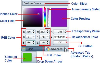
The Advanced tab includes the following options/sections:
Color Field/Picked Color: The Color Field lets you choose a tone in a color's range. The Picked Color
indicates the currently selected color. Move the Color Slider to pick a general color family and then fine
tune the color selection in the Color Field.
Color Slider: This slider lets you choose from the color spectrum. Move the Color Slider to pick a general
color and then fine tune the color selection in the Color Field.
Transparency Slider: This slider lets you lets you set the color's transparency. You can choose to make the
color opaque or partially or completely transparent. Move the Transparency Slider to pick a transparency
and note that the number in the Transparency Value box changes as well. This slider is only visible when
the ShowAlphaChannel property is set to True (default)
Color Preview: Preview the color you are currently choosing. Once you are satisfied with the color
choice, click the OK button to close the drop-down box and set the color as the Selected Color.
13 Transparency Value: This box lets you set the color's transparency. You can set the Transparency to a
number between 0, which is completely transparent, and 255, which is completely opaque (default). When
the ShowAlphaChannel property is set to False this box appears grayed out.
RGB Color: These three numeric boxes let you choose a color using the Red Green Blue (RGB) color
model.
HSL Color: These three numeric boxes let you choose a color using the Hue Saturation Lightness (HSL)
color model.
Hexadecimal Color: If eight digits are visible, the first two digits represent the color's transparency
ranging from FF (opaque) to 00 (transparent) and the last six digits represent standard hexadecimal color
selection. Note that if the ShowAlphaChannel property is set to False, only the last six digits will be visible
(no transparency value). For more information about hexadecimal color selection, see w3schools.
OK Button: Once you are satisfied with the color choice, click the OK button to close the drop-down box
and set the color as the Selected Color.
Selected Color: The currently selected color will appear in the color picker's window.
Drop-Down Arrow: Click the drop-down arrow to open the C1ColorPicker control's window. See Drop-
Down Direction (page 18) for information about setting where the drop-down window appears.
Advanced Tab: Click the Advanced tab to choose a custom color at run time. Click the Basic tab to view
pre-selected colors. The Mode property must be set to Advanced or Both for the Advanced tab to be
visible.
Additional Controls
In addition to the full-featured C1ColorPicker control, ColorPicker for WPF includes parts of the C1ColorPicker
control, that allow you to customize color picking in your application:
The C1SpectrumColorPicker control allows access to just the advanced color picking functionality of the
C1ColorPicker control, the C1HexColorBox control provides data validation for hexadecimal code entries, and the
C1CheckeredBorder provides a simple way to display colors with transparencies. The following topics describe
these parts.
C1SpectrumColorPicker
The C1SpectrumColorPicker control allows access to just the advanced color picking functionality of the
C1ColorPicker control. The C1SpectrumColorPicker control appears similar to the following image:
14The C1SpectrumColorPicker control includes the following options/sections:
Color Field/Picked Color: The Color Field lets you choose a tone in a color's range. The Picked Color
indicates the currently selected color. Move the Color Slider to pick a general color family and then fine
tune the color selection in the Color Field.
Color Slider: This slider lets you choose from the color spectrum. Move the Color Slider to pick a general
color and then fine tune the color selection in the Color Field.
Transparency Slider: This slider lets you lets you set the color's transparency. You can choose to make the
color opaque or partially or completely transparent. Move the Transparency Slider to pick a transparency.
This slider is only visible when the ShowAlphaChannel property is set to True (default)
C1HexColorBox
The C1HexColorBox control provides data validation for hexadecimal code entries. For example the basic
C1HexColorBox control appears similar to the following image:
The C1HexColorBox control appears similar to a regular text box. By default, the C1HexColorBox control appears
with eight digits. If eight digits are visible, the first two digits represent the color's transparency ranging from FF
(opaque) to 00 (transparent) and the last six digits represent standard hexadecimal color selection. For more
information about hexadecimal color selection, see w3schools.
Note that if the ShowAlphaChannel property is set to False, only the last six digits will be visible (no transparency
value will be included):
You can also, if you choose, choose to display a '#' symbol to the start of the C1HexColorBox control by setting
the ShowSharpPrefix property to True:
15C1CheckeredBorder
The C1CheckeredBorder control provides a simple way to display colors with set alpha values so you can display
colors with varying transparencies. By default, the control appears similar to the following image:
The C1CheckeredBorder control supports both transparent and opaque color values:
Transparent Opaque
Available ColorPicker Palettes
ColorPicker for WPF includes over 20 predefined color palettes that match the themes used in Microsoft Office.
The colors in each palette go well together and can be used to create applications with a polished, professional
appearance. To change the color palette, you can set the Palette property. For more information, see Setting the
Palette (page 27).
The following built-in palettes are available:
Name Palette Name Palette
Apex Office
Aspect Opulent
16Civic Oriel
Concourse Origin
Default Paper
Equity Solstice
Flow Standard
Foundry Technic
GrayScale Trek
Median Urban
Metro Verve
Module
17Recent Colors
By default, when the user views the C1ColorPicker control's Basic tab at run time, along with the selected color
palette and the standard color palette, the tab includes a section that lists recently picked colors:
If you choose, you can turn the display of recent colors off. The ShowRecentColors property sets whether or not
these colors are displayed. For more information and an example, see Hiding Recent Colors (page 32).
Drop-Down Direction
By default, when the user clicks the C1ColorPicker control's drop-down arrow at run-time the color picker will
appear below the control, and, if that is not possible, above the control. However, you can customize where you
would like the color picker to appear by setting the DropDownDirection property.
You can set the DropDownDirection property to one of the following options:
Event Description
BelowOrAbove Tries to open the drop-down C1ComboBox below the header.
(default) If it is not possible tries to open above it.
AboveOrBelow Tries to open the drop-down C1ComboBox above the header.
If it is not possible tries to open below it.
ForceBelow Forces the drop-down C1ComboBox to open below the header.
ForceAbove Forces the C1ComboBox content to open above the header.
For more information and an example, see Changing the Drop-Down Window Direction (page 31).
ColorPicker Layout and Appearance
The following topics detail how to customize the C1ColorPicker control's layout and appearance. You can use
built-in layout options to lay your controls out in panels such as Grids or Canvases. Themes allow you to
18customize the appearance of the grid and take advantage of WPF's XAML-based styling. You can also use
templates to format and lay out the control and to customize the control's actions.
Layout in a Panel
You can easily lay out the C1ColorPicker and other controls in your WPF application, using the attached layout
properties. For example, you can lay out your control in a Grid panel with its Row, ColumnSpan, and RowSpan
properties and in a Canvas panel with its Left and Top properties. For example, the C1ColorPicker control
includes the following Layout properties when located within a Grid panel:
You can change the sizing, alignment, and location of the C1ColorPicker control within the Grid panel.
ColorPicker Appearance Properties
ComponentOne ColorPicker for WPF includes several properties that allow you to customize the appearance of
the control. You can change the color, border, and height of the control. The following topics describe some of
these appearance properties.
Color Properties
The following properties let you customize the colors used in the control itself:
Property Description
Background Gets or sets a brush that describes the
background of a control. This is a dependency
property.
Foreground Gets or sets a brush that describes the
foreground color. This is a dependency
property.
Alignment Properties
The following properties let you customize the control's alignment:
19Property Description
HorizontalAlignment Gets or sets the horizontal alignment
characteristics applied to this element when it
is composed within a parent element, such as
a panel or items control. This is a dependency
property.
VerticalAlignment Gets or sets the vertical alignment
characteristics applied to this element when it
is composed within a parent element such as a
panel or items control. This is a dependency
property.
Border Properties
The following properties let you customize the control's border:
Property Description
BorderBrush Gets or sets a brush that describes the border
background of a control. This is a dependency
property.
BorderThickness Gets or sets the border thickness of a control.
This is a dependency property.
Size Properties
The following properties let you customize the size of the C1ColorPicker control:
Property Description
Height Gets or sets the suggested height of the
element. This is a dependency property.
MaxHeight Gets or sets the maximum height constraint of
the element. This is a dependency property.
MaxWidth Gets or sets the maximum width constraint of
the element. This is a dependency property.
MinHeight Gets or sets the minimum height constraint of
the element. This is a dependency property.
MinWidth Gets or sets the minimum width constraint of
the element. This is a dependency property.
Width Gets or sets the width of the element. This is a
dependency property.
ComponentOne ClearStyle Technology
ComponentOne ClearStyle™ technology is a new, quick and easy approach to providing Silverlight and WPF
control styling. ClearStyle allows you to create a custom style for a control without having to deal with the hassle
of XAML templates and style resources.
Currently, to add a theme to all standard WPF controls, you must create a style resource template. In Microsoft
Visual Studio this process can be difficult; this is why Microsoft introduced Expression Blend to make the task a bit
easier. Having to jump between two environments can be a bit challenging to developers who are not familiar with
Blend or do not have the time to learn it. You could hire a designer, but that can complicate things when your
designer and your developers are sharing XAML files.
20That's where ClearStyle comes in. With ClearStyle the styling capabilities are brought to you in Visual Studio in
the most intuitive manner possible. In most situations you just want to make simple styling changes to the controls
in your application so this process should be simple. For example, if you just want to change the row color of your
data grid this should be as simple as setting one property. You shouldn't have to create a full and complicated-
looking template just to simply change a few colors.
How ClearStyle Works
Each key piece of the control's style is surfaced as a simple color property. This leads to a unique set of style
properties for each control. For example, a Gauge has PointerFill and PointerStroke properties, whereas a
DataGrid has SelectedBrush and MouseOverBrush for rows.
Let's say you have a control on your form that does not support ClearStyle. You can take the XAML resource
created by ClearStyle and use it to help mold other controls on your form to match (such as grabbing exact colors).
Or let's say you'd like to override part of a style set with ClearStyle (such as your own custom scrollbar). This is
also possible because ClearStyle can be extended and you can override the style where desired.
ClearStyle is intended to be a solution to quick and easy style modification but you're still free to do it the old
fashioned way with ComponentOne's controls to get the exact style needed. ClearStyle does not interfere with
those less common situations where a full custom design is required.
ClearStyle Properties
The following table lists all of the ClearStyle-supported properties in the C1ColorPicker control as well as a
description of the property:
Property Description
Background Gets or sets a brush that describes the background of a control.
The default Background color is LightBlue.
FocusBrush A brush used to define the appearance of the control, when the
control is in focus.
MouseOverBrush A brush used to define the appearance of the control, when the
control is in moused over.
PressedBrush A brush used to define the appearance of the control, when the
control is selected.
ColorPicker Templates
One of the main advantages to using a WPF control is that controls are "lookless" with a fully customizable user
interface. Just as you design your own user interface (UI), or look and feel, for WPF applications, you can provide
your own UI for data managed by ComponentOne ColorPicker for WPF. Extensible Application Markup
Language (XAML; pronounced "Zammel"), an XML-based declarative language, offers a simple approach to
designing your UI without having to write code.
Accessing Templates
You can access templates in Microsoft Expression Blend by selecting the C1ColorPicker control and, in the menu,
selecting Edit Control Parts (Templates). Select Edit a Copy to create an editable copy of the current template or
Create Empty, to create a new blank template.
21Note: If you create a new template through the menu, the template will automatically be linked to that template's
property. If you manually create a template in XAML you will have to link the appropriate template property to the
template you've created.
Note that you can use the Template property to customize the template.
ColorPicker Styles
ComponentOne ColorPicker for WPF's C1ColorPicker control provides several style properties that you can use
to change the appearance of the control. Some of the included styles are described in the table below:
Style Description
ColorContainerStyle Sets/gets the style of the ItemsControl used to show a
section of colors (that is recent colors).
FontStyle Gets or sets the font style. This is a dependency
property.
Style Gets or sets the style used by this element when it is
rendered. This is a dependency property.
ColorPicker Template Parts
In Microsoft Expression Blend, you can view and edit template parts by creating a new template (for example,
click the C1ColorPicker control to select it and choose Object | Edit Template | Edit a Copy). Once you've
created a new template, the parts of the template will appear in the Parts window:
22Note that you may have to select the ControlTemplate for its parts to be visible in the Parts window.
In the Parts window, you can double-click any element to create that part in the template. Once you have done so,
the part will appear in the template and the element's icon in the Parts window will change to indicate selection:
Template parts available in the C1ColorPicker control include:
Name Type Description
Advanced FrameworkElement Provides a framework of common APIs for objects
that participate in WPF layout. Also defines APIs
related to data binding, object tree, and object
lifetime feature areas in WPF.
Basic FrameworkElement Provides a framework of common APIs for objects
that participate in WPF layout. Also defines APIs
related to data binding, object tree, and object
lifetime feature areas in WPF.
ButtonAdvanced ToggleButton Base class for controls that can switch states, such
as CheckBox and RadioButton.
ButtonBasic ToggleButton Base class for controls that can switch states, such
as CheckBox and RadioButton.
DropDown Grid Defines a flexible grid area that consists of columns
and rows.
InputAlpha C1NumericBox The C1NumericBox control is a numeric editor that
allows you to display and edit numeric values in
many formats.
InputBlue C1NumericBox The C1NumericBox control is a numeric editor that
allows you to display and edit numeric values in
many formats.
InputGreen C1NumericBox The C1NumericBox control is a numeric editor that
allows you to display and edit numeric values in
many formats.
InputHue C1NumericBox The C1NumericBox control is a numeric editor that
allows you to display and edit numeric values in
many formats.
InputLuminance C1NumericBox The C1NumericBox control is a numeric editor that
allows you to display and edit numeric values in
many formats.
InputRed C1NumericBox The C1NumericBox control is a numeric editor that
allows you to display and edit numeric values in
many formats.
InputSaturation C1NumericBox The C1NumericBox control is a numeric editor that
allows you to display and edit numeric values in
many formats.
InputWeb TextBox Represents a control that can be used to display
single-format, multi-line text.
OkButton Button Represents a button control.
Preview Rectangle Draws a rectangle shape, which can have a stroke
23and a fill.
RecentColors Grid Defines a flexible grid area that consists of columns
and rows.
RecentColorsHeader FrameworkElement Provides a framework of common APIs for objects
that participate in WPF layout. Also defines APIs
related to data binding, object tree, and object
lifetime feature areas in WPF.
Root FrameworkElement Provides a framework of common APIs for objects
that participate in WPF layout. Also defines APIs
related to data binding, object tree, and object
lifetime feature areas in WPF.
Spectrum C1SpectrumColorPicker Represents a sliding color picker.
StandardColors Grid Defines a flexible grid area that consists of columns
and rows.
ThemeColorsHeader Grid Defines a flexible grid area that consists of columns
and rows.
ThemeColorsValues Grid Defines a flexible grid area that consists of columns
and rows.
ColorPicker Visual States
In Microsoft Expression Blend, you can add custom states and state groups to define a different appearance for
each state of your user control – for example, the visual state of the control could change on mouse over. You can
view and edit visual states by creating a new template and adding a new template part (page 22). Once you've done
so the available visual states for that part will be visible in the Visual States window:
Common states include Normal for the normal appearance of the item, MouseOver for the item on mouse over,
and Disabled for when the item is not enabled. Focus states include Unfocused for when the item is not in focus
and Focused when the item is in focus.
24XAML Elements
Several auxiliary XAML elements are installed with ComponentOne ColorPicker for WPF. These elements
include templates and themes and are located in the ColorPicker for WPF installation directory. You can
incorporate these elements into your project, for example, to create your own theme based on the default theme.
Included Auxiliary XAML Elements
The following auxiliary XAML element is included with ColorPicker for WPF:
Element Folder Description
generic.xaml XAML Specifies the templates for different styles and the initial style
of the control.
25ColorPicker for WPF Samples
Please be advised that this ComponentOne software tool is accompanied by various sample projects and/or
demos, which may make use of other ComponentOne development tools included with the ComponentOne
Studios. Samples can be accessed from the ComponentOne Studio for WPF ControlExplorer. To view samples,
on your desktop, click the Start button and then click All Programs | ComponentOne | Studio for WPF |
Samples | WPF ControlExplorer.
C# Samples
The following C# sample is included:
Sample Description
ControlExplorer The ColorPicker page in the ControlExplorer sample demonstrates how to
customize the C1ColorPicker control.
ColorPicker for WPF Task-Based Help
The task-based help assumes that you are familiar with programming in Visual Studio .NET and know how to use
the C1ColorPicker control in general. If you are unfamiliar with the ComponentOne ColorPicker for WPF
product, please see the ColorPicker for WPF Quick Start (page 5) first.
Each topic in this section provides a solution for specific tasks using the ComponentOne ColorPicker for WPF
product.
Each task-based help topic also assumes that you have created a new WPF project.
Setting the Palette
ColorPicker for WPF includes over 20 predefined color palettes that match the themes used in Microsoft Office.
For more information about palette choices, see Available ColorPicker Palettes (page 16). To change the color
palette, you can set the Palette property.
To set the Palette property, complete the following steps:
1. Navigate to the Toolbox and double-click the Button icon to add the control to the project.
2. Resize and reposition the Button on the form.
3. Navigate to the Properties window and set the button’s Content property to "Change Palette".
4. Double-click the button to switch to Code view and create the Button_Click event handler.
5. Add code for the Button_Click event handler, so it appears like the following:
Visual Basic
Private Sub Button1_Click(ByVal sender as Object, ByVal e as
System.Windows.RoutedEventArgs)
' Set the color palette.
Me.C1ColorPicker.Palette =
ColorPalette.GetColorPalette(Office2007ColorTheme.GrayScale)
End Sub
C#
27private void button1_Click(object sender,
System.Windows.RoutedEventArgs e)
{
// Change color palette.
this.c1ColorPicker.Palette =
ColorPalette.GetColorPalette(Office2007ColorTheme.GrayScale);
}
The C1ColorPicker's color palette will now change to grayscale when the button is clicked.
Run the application and observe:
Observe the following:
1. Click the C1ColorPicker control's drop-down arrow and notice that the default palette appears.
2. Click the Change Palette button and click the C1ColorPicker control's drop-down arrow once again.
Notice that a grayscale palette appears:
Creating a Custom Palette
ColorPicker for WPF includes over 20 predefined color palettes that match the themes used in Microsoft Office,
but if you choose you can create your own custom color palette rather than using a predefined one. In the
following steps you'll create a custom palette, and when a button is pressed, apply that palette to the
C1ColorPicker control.
To create a custom palette, complete the following steps:
1. Navigate to the Toolbox and double-click the Button icon to add the control to the project.
2. Resize and reposition the Button on the form.
3. Navigate to the Properties window and set the button’s Content property to "Change Palette".
4. Double-click the button to switch to Code view and create the Button_Click event handler.
5. Add code for the Button_Click event handler, so it appears like the following:
Visual Basic
28Private Sub Button1_Click(ByVal sender as Object, ByVal e as
System.Windows.RoutedEventArgs)
' Set the color palette.
Dim cp1 as New ColorPalette("Pittsburgh")
cp1.Clear()
cp1.Add(Color.FromArgb(255, 0, 0, 0))
cp1.Add(Color.FromArgb(255, 99, 107, 112))
cp1.Add(Color.FromArgb(255, 255, 255, 255))
cp1.Add(Color.FromArgb(255, 247, 181, 18))
cp1.Add(Color.FromArgb(255, 253, 200, 47))
cp1.Add(Color.FromArgb(255, 43, 41, 38))
cp1.Add(Color.FromArgb(255, 149, 123, 77))
cp1.Add(Color.FromArgb(255, 209, 201, 157))
cp1.Add(Color.FromArgb(255, 0, 33, 71))
cp1.Add(Color.FromArgb(255, 99, 177, 229))
c1ColorPicker1.Palette = cp1
End Sub
C#
private void button1_Click(object sender,
System.Windows.RoutedEventArgs e)
{
// Set the color palette.
ColorPalette cp1 = new ColorPalette("Pittsburgh");
cp1.Clear();
cp1.Add(Color.FromArgb(255, 0, 0, 0));
cp1.Add(Color.FromArgb(255, 99, 107, 112));
cp1.Add(Color.FromArgb(255, 255, 255, 255));
cp1.Add(Color.FromArgb(255, 247, 181, 18));
cp1.Add(Color.FromArgb(255, 253, 200, 47));
cp1.Add(Color.FromArgb(255, 43, 41, 38));
cp1.Add(Color.FromArgb(255, 149, 123, 77));
cp1.Add(Color.FromArgb(255, 209, 201, 157));
cp1.Add(Color.FromArgb(255, 0, 33, 71));
cp1.Add(Color.FromArgb(255, 99, 177, 229));
c1ColorPicker1.Palette = cp1;
}
The ColorPicker's color palette will now change to a custom palette when the button is clicked.
Run the application and observe:
Observe the following:
1. Click the C1ColorPicker control's drop-down arrow, and notice that the default palette appears.
2. Click the Change Palette button and click the C1ColorPicker control's drop-down arrow once again.
Notice that the custom palette appears:
29Changing the Background Color
The Background property gets or sets the value of the C1ColorPicker control's background color. By default the
C1ColorPicker control starts with the Background property unset, but you can customize this at design time, in
XAML, and in code.
At Design Time in Blend
To set the Background property at run time, complete the following steps:
1. Click the C1ColorPicker control once to select it.
2. Navigate to the Properties window, and click the Background drop-down arrow, and choose Red or
another color in the color picker.
In XAML
For example, to set the Background property to Red add Background="Red" to the
tag so that it appears similar to the following:
In Code
For example, to set the Background property to Red, add the following code to your project:
Visual Basic
Me.C1ColorPicker1.Background = System.Windows.Media.Brushes.Red
C#
this.c1ColorPicker1.Background = System.Windows.Media.Brushes.Red;
Run the application and observe:
The background of the C1ColorPicker control will appear red:
30Changing the Drop-Down Window Direction
By default, when the user clicks the C1ColorPicker control's drop-down arrow at run-time the color picker will
appear below the control, and if that is not possible, above the control. However, you can customize where you
would like the color picker to appear. For more information about the drop-down arrow direction, see Drop-Down
Direction (page 18).
At Design Time in Blend
To change the drop-down window direction at run time, complete the following steps:
1. Click the C1ColorPicker control once to select it.
2. Navigate to the Properties window and click the DropDownDirection drop-down arrow.
3. Choose an option, for example ForceAbove.
This will set the DropDownDirection property to the option you chose.
In XAML
For example, change the drop-down window direction add DropDownDirection="ForceAbove" to the
tag so that it appears similar to the following:
In Code
For example, to change the drop-down window direction, add the following code to your project:
Visual Basic
Me.C1ColorPicker1.DropDownDirection = DropDownDirection.ForceAbove
C#
this.c1ColorPicker1.DropDownDirection =
DropDownDirection.ForceAbove;
This will set the DropDownDirection property to ForceAbove.
Run the application and observe:
When you click the C1ColorPicker control's drop-down arrow, the drop down window will appear above the
control:
31Hiding Recent Colors
By default the C1ColorPicker control displays recent colors in the Basic tab of the color picker window. For more
information, see Recent Colors (page 18). If you choose, you prevent recent colors from being displayed at design
time, in XAML, and in code.
At Design Time in Blend
To prevent recent colors from being displayed at run time, complete the following steps:
1. Click the C1ColorPicker control once to select it.
2. Navigate to the Properties window.
3. Locate the ShowRecentColors property and set it to False.
In XAML
To prevent recent colors from being displayed add ShowRecentColors="False" to the tag so that it appears similar to the following:
In Code
To prevent recent colors from being displayed, add the following code to your project:
Visual Basic
Me.C1ColorPicker1.ShowRecentColors = False
C#
this.c1ColorPicker1.ShowRecentColors = false;
Run the application and observe:
When you click the C1ColorPicker control's drop-down arrow, observe that recent colors are not displayed on the
Basic tab:
32You can also read


