COLOURFUTURESTM 2019 INTERNATIONAL COLOUR TRENDS - Dulux Trade
←
→
Page content transcription
If your browser does not render page correctly, please read the page content below
COLOURFUTURES 2019
                      TM

INTERNATIONAL COLOUR TRENDS

                              Next Architetcs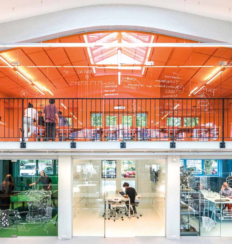
SPICED
COLOUR OF THE YEAR 2019
THE EVOLUTION
OF COLOUR
HONEY
TRENDS
Each year, AkzoNobel gathers
international design experts for three
days of intensive analysis of global
trends. This group – senior designers,
trend analysts, architects, editors and
creative directors – share knowledge
from across the world and the cultural
landscape to identify the design
trend that best captures the times.
Spiced Honey™ captures the
optimism and confidence of
LAST YEAR a deep ochre: a colour that is
2018 was tumultuous: people felt
overwhelmed by the deluge of news
stimulating and known to lift
and demands upon their time. They mood. It is balanced by the
saw divisions across society and
lost faith in their usual sources of warmth and earthiness of
reassurance. In this unpredictable
time, many chose to turn away,
mid-brown and burgundy:
looking for sanctuary in the spaces soft but serious colours that
where they live, work and play.
can feel quietly supportive.
THE WORLD It is a tone that our trend
TODAY analysis identified as a
Our trend analysis has identified a
shift in attitudes. Our experts noted contemporary yet timeless
that people were becoming more
aware of the world around them: the
classic, and one that is
impact of their built environment and currently being seen in new
architecture and interior
their role within a community. Around
the globe there is a fizz of growing
energy. If the unpredictability of last
year forced people to retreat and
design all around the world.
regroup in familiar spaces,
PALETTES
this is their awakening.
WHAT DOES
THIS MEAN FOR No colour lives in isolation.
COLOUR?
This year, people want to feel quiet To support our colour of the
optimism to contrast with the tumult
of the previous 12 months. In public
year, we have created four
and private spaces, they are looking interior palettes that help to
for their world to feel energising and
warm, natural and true. This leads emphasise the energy and
us to the classic, comforting
tones of Spiced Honey™… warmth of Spiced Honey™.
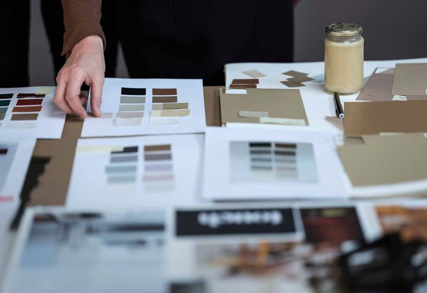
Images above: our experts consider the trends that will influence colour in 2019
2 3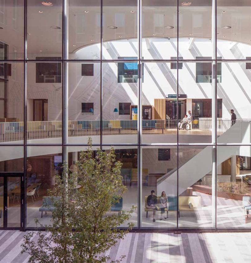
“WE ARE NOTICING A
SENSE OF AWAKENING.
THERE’S A FRESH NEW
MOOD AND WE NEED
SPACES THAT REFLECT
AND SUPPORT THAT”
JIM
BIDDULPH
Editor-at-large,
Material Lab Heleen van Gent
Heleen joined the Global Aesthetic Center in 2009,
ZUZANNA following 20 years of working in the magazine industry
SKALSKA, as an interior stylist and design editor. After graduating
EASTERN EUROPE
Founding Partner,
from The Royal Academy of Art in The Hague, she went
360°Inspiration on to teach at the Artemis Design Academy in
Amsterdam and has edited many books on interior and
HELEEN VAN GENT, colour design. She travels the world offering guidance
NETHERLANDS on colour and design to the AkzoNobel markets.
Creative Director,
Global Aesthetic Center,
AkzoNobel
SAM DEVILLART,
AMERICAS
Professor
for Cultural Analysis,
School of Visual
Art NYC
LEON SUN
Editor Director,
ELLE DECORATION
China
MEET THE EXPERTS
As part of our industry-leading colour research, we invite a dozen independent
experts to join us at our Global Aesthetic Center in Amsterdam, where they forecast BARBARA
MARSHALL,
the emerging design trends for the next 12 months. The expertise of this group ASIA
is extensive, ranging from architecture to cultural analysis, technology and innovation. Marshall Design
By immersing ourselves in these detailed global insights, our team develops a powerful
understanding of where our consumers are heading, allowing us to devise MARIJN SCHENK
colour palettes that will perfectly match their needs. EUROPE/CHINA
Architect,
Next Architects
CARLOTA ADRIANA
GASPARIAN, PEDROSA,
LATIN AMERICA LATIN AMERICA
Surface and color Surface and color
designer, designer,
Atelier de Pinturas Atelier de Pinturas
“THERE’S A NEW SENSE OF “PEOPLE NEED
POSITIVE ENERGY, SMALL A PLACE WHERE THEY’RE
ACTS CAN MAKE A BIG AT ONE WITH THEMSELVES,
DIFFERENCE, IT’S ABOUT CLAUDIA LIESHOUT, CAMERON WOO, TO RECONNECT AND TO
DOING SOMETHING THAT STEPHIE SIJSSENS, EUROPE
Color Design Manager,
WILLEKE
JONGEJAN
GLOBAL
Creative Director
SOUTH EAST ASIA
Principal,
GIVE THOUGHT TO WHAT’S
COMES FROM WITHIN” Akzonobel Automotive &
Speciality Coatings
Designer, Global
Aesthetic Centre
Trend Research,
Philips
Cameron Woo
Design
IMPORTANT TO THEM”
Adriana Pedrosa Cameron Woo
4 5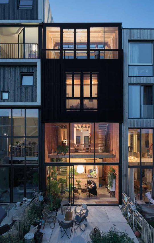
INTERIOR PALETTES
                                                                                             THINK                                                       DREAM                                                        LOVE                                                         ACT
Guararema house. Project: vão arquitetura (anna juni, enk te winkel e gustavo delonero)

                                                                                             SPACES FOR CALM                                             SPACES FOR SUCCEEDING                                        SPACES FOR SHARING                                           SPACES FOR ACTION

                                                                                          The Think colour scheme creates spaces that encourage       This palette helps to create spaces that are more             Use the Love palette to create spaces that subliminally     This palette can help to create spaces that encourage
                                                                                          careful consideration for those within them. The warm       soothing. It works anywhere that you need to encourage        bring people together. The deep reds are stimulating and    dynamism. The colours pop and are loaded with energy to
                                                                                          neutrals and honey tones are positive but calm, soft but    imagination and relaxation due to the restful properties of   lively, and overall the rich hues give a sense of warmth    encourage movement around the built environment. The
                                                                                          serious. This is a palette for any space where people may   pale blues and violet. Consider it for healthcare and         without feeling heavy or overbearing. Consider it for       ‘Act’ collection of colours is ideal for spaces that need to
                                                                                          need to relax, focus and take the time to contemplate.      anywhere you want to encourage relaxation and wellness.       anywhere that people live or come together to socialise.    energise their occupants and encourage them to have a
                                                                                                                                                                                                                                                                                positive, creative attitude.

                                                                                                        Feather Pillow                 Just Walnut™                   Gentle Moon              Calming Camomile                     Love Letter                  Waxed Wood                  White Cotton™                      Narrow Lane
                                                                                                         90GG 83/011                    90YR 73/029                   30YY 68/024                   70YY 65/090                    30YY 78/018                   10YY 64/048                  30GY 88/014                       40YY 41/054

                                                                                                         Golden Light                  Soft Stone™                   Floating Petal                  Garden Grey              Colour of the Year                Fragrant Herb                  Sweet Citrus                       Open Sky
                                                                                                         20YY 63/149                   80YR 59/089                    10YR 57/080                   10GG 53/030                Spiced Honey™                     10GY 39/136                   60YY 55/504                     50BG 62/133
                                                                                                                                                                                                                                  00YY 26/220

                                                                                                    Colour of the Year                Smooth Maple                   Violet Dream                 Restful Slumber                 Auburn Flame                     Storm Day                  Dynamite Red                 Colour of the Year
                                                                                                     Spiced Honey™                     00YY 48/171                   70RB 50/062                    30BB 45/049                    50YR 23/365                   10GG 26/046                   29YR 19/621                  Spiced Honey™
                                                                                                        00YY 26/220                                                                                                                                                                                                            00YY 26/220

                                                                                                        Leather Case                 Angora Blanket                 Heart Wood™                    Concrete Grey                  Spicy Paprika                      Teal Lux                    Pink Prose                   Forest Festival
                                                                                                        70YR 20/239                    20YY 43/083                   10YR 28/072                    00NN 37/000                    30YR 13/471                   50BG 11/123                   70RR 40/168                     30GG 11/281

                                                                                                      Finest Burgundy                  Cobalt Night              Colour of the Year                Vintage Smoke                    Velvet Cake                  Writers Desk                 Active Orange                      Pen Friend
                                                                                                         78RR 06/137                   30BB 05/022                Spiced Honey™                      50YR 13/032                   11YR 07/229                   70YY 06/088                   80YR 28/650                     62BB 08/369
                                                                                                                                                                     00YY 26/220

                                 6                                                                                                                                                                                                                                                                                                              7
MVRDV Maxima Medial Center Veldhoven (c) Rob’t Hart
THINK
SPACES FOR CALM
USING
SPICED HONEY DREAM
AND ITS
SPACES FOR SUCCEEDING
PALETTES,
BY SECTOR
Spiced Honey and its supporting
™ LOVE
palettes can be adapted across
SPACES FOR SHARING
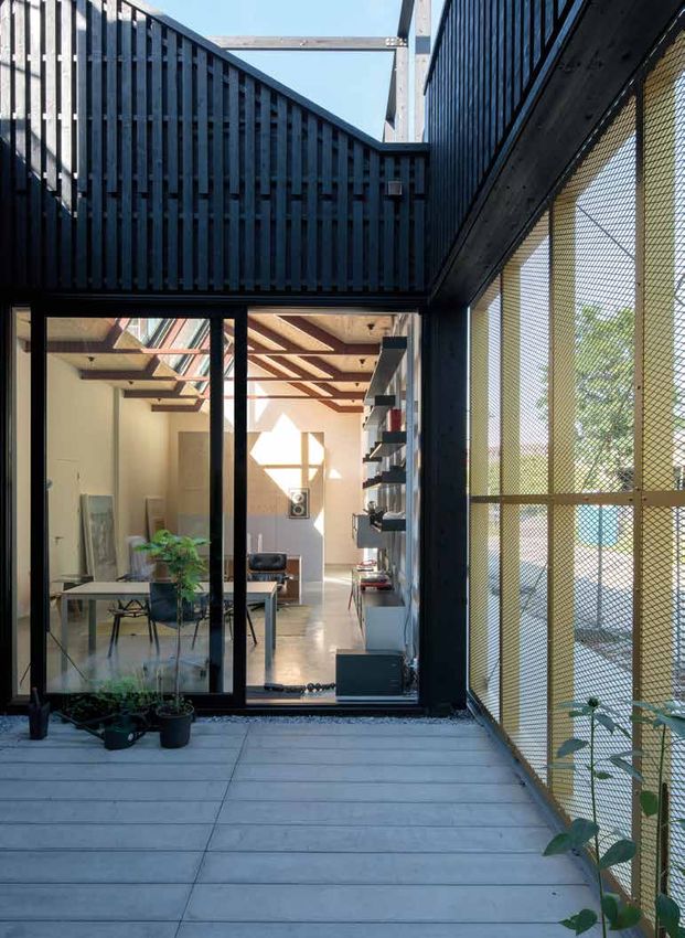
One Space Design Studio
many sectors, creating environments
suited to everything from quiet
contemplation to dynamic productivity.
Chengdu ZhiMiao Decoration and Project Design Co., Ltd.
ACT
SPACES FOR ACTION
8 9
THINK
  The earthy yet intense colour palette creates environments
  that offer a haven of calm and clarity of thought.

  Angora Blanket               Just Walnut™           COLOUR OF THE YEAR
10 20YY 43/083                 90YR 73/029            Spiced Honey™        11
                                                      00YY 26/220
12 13
THINK
     SPACES FOR CALM
     This palette of muted, warm
     neutrals quietly nourishes the mind
     and allows thoughts to breathe.
     The calm honey tones have a
     simple elegance that suggests the
     warm leather and polished wood of
     a well-stocked library.

     THE RESULT: a feeling that home
     is where you go for your mind to
     grow. A sense of safety, comfort
     and wellbeing for all who live there.

14                                           15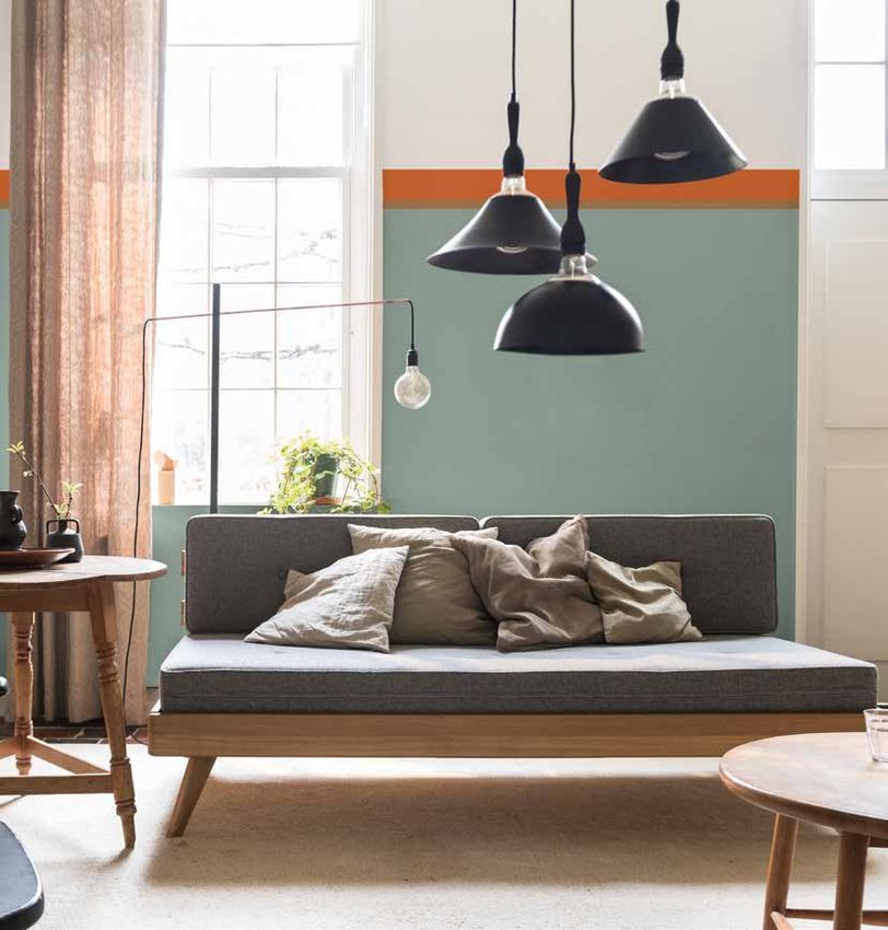
Mecanoo   Mecanoo

 DREAM
  Powdery pastels and soft neutrals create a soothing space,
  with accents of honey for depth and definition.

   Concrete Grey        Vintage Smoke   Gentle Moon
16 00NN 37/000          50YR 13/032     30YY 68/024                                17

DREAM
     SPACES FOR
     SUCCEEDING
     This palette of soft pastels
     supports a feeling of considered
     focus, working on the relaxing
     properties of pale blues, which
     soothe the mind and encourage
     deeper thinking. These shades are
     modern and clean and hint at
     natural fibres like linen and cotton.

     THE RESULT: a sense that things
     will be taken care of for patients
     and for carers. A feeling that
     everything has been carefully
     considered well in advance.

18                                           19
LOVE
For intensely welcoming spaces, where richly coloured walls
create an inviting atmosphere and a sense of belonging.
Storm Day Auburn Flame COLOUR OF THE YEAR Love Letter
2010GG 26/046 50YR 23/365 Spiced Honey™ 30YY 78/018 21
00YY 26/220LOVE
SPACES FOR SHARING
The Love palette has full, rich tones
for homes that are waiting to be
filled with stories. We use darker
colours that suggest warmth and
permanence and draw influence
from nature in the form of
earthenware solidity, but also with
the promise and playfulness of
dark-fruit shades.
THE RESULT: a sense of belonging
– colours that bring people in,
whether in their homes or
communal areas – a feeling of
hygge and togetherness.
22 23ACT
The mood in the ACT space is lively and uncomplicated,
with bursts of vivid colour grounded by golden honey tones.
Narrow Lane Dynamite Red White Cotton™ COLOUR OF THE YEAR
24 40YY 41/054 29YR 19/621 30GY 88/014 Spiced Honey™ 25
00YY 26/22026 27
ACT
     SPACES FOR ACTION
     These colours pop and are loaded
     with energy, to encourage
     movement around the built
     environment. The primary shades
     offer a dynamism that is young,
     playful and spontaneous.
     It is a palette that revitalises,
     encouraging a thirst for knowledge
     and a need to challenge
     established thinking.

     The result: a space that excites
     and empowers and encourages us
     to ask, first and foremost, not
     ‘why?’, but ‘why not?’

28                                        29
30 31
AkzoNobel Decorative Paints
Wexham Road, Slough, Berkshire SL2 5DS

AkzoNobel, the AkzoNobel logo, the flourish, Dulux Trade, and ColourFutures
are the trade marks of the AkzoNobel group©. AkzoNobel 2018

This ColourFuturesTM reference manual is and remains the property of AkzoNobel N.V. and is loaned
on condition that it is used solely to specify products manufactured/or supplied by AkzoNobel N.V.
(and other companies in the AkzoNobel Group) and on condition that it shall be returned to
AkzoNobel N.V. on demand. The contents of this reference manual are for information only.
No representation or warranty is given, nor liability accepted, regarding the information given.
We have reproduced paint colours as faithfully as printing will allow. However, the shape, size
and lighting of a surface can influence the appearance of the final colour.
You can also read