Continental Industry Website Styleguide - Status: 2021 August Digital Communications
←
→
Page content transcription
If your browser does not render page correctly, please read the page content below
Continental Industry Website Styleguide
Status: 2021 August

Digital Communications                    ContiTech Business Area
Continental Industry Website Styleguide

› Introduction                  03   › Table                17         › Login Area                               36
› Layout Principles             04   › Page Elements        18         › Contact                                  38
      › Basic Layout            05        › Header          19
      › Desktop                 06        › Footer          20
      › Responsive Design       07   › Navigation           21
› Design Elements               08        › Desktop         22
      › Logo                    09        › Mobile          24
      › Colors                  10        › Onpage          25
      › Typography              11   › Campaign Sites       26
      › Images                  12        › Types           27
      › Icons & Buttons         14        › Samples         28
      › Fields of Interaction   16        › Page Elements   29

                                                            2021 August | com&on Medienagentur I © ContiTech AG        2
Introduction

This styleguide for the ContiTech Business Area Internet pages was developed to ensure the appropriate use and consistency of
design elements, page structures and interactions for technical implementation. The content presented is binding for all websites of the
ContiTech Business Area under the Continental brand.

This styleguide describes the elements and functions of the user interface. It serves as a central point of contact for all questions
regarding the implementation of design elements on the page templates.

The ContiTech Business Area website uses the content management system Kentico. In this system, all design elements shown are
preset.

All screens and wording shown do not represent real content and therefore are without any claim to correctness.

2021 August | com&on Medienagentur I © ContiTech AG   3
Continental Industry Website Styleguide

› Layout Principles
     › Basic Layout
     › Desktop
     › Responsive Design

                                   2021 August | com&on Medienagentur I © ContiTech AG   4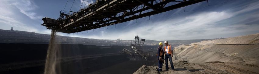
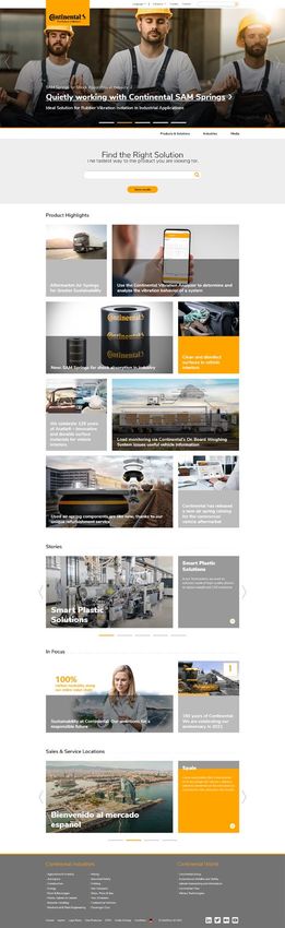
Layout Principles
Basic Layout
The quality seal is always positioned at the top-left of the page and is
always flush-left with the first column of the grid and content area. It always
overlaps the header image. The 47px tall top navigation is followed by the        Quality
stage image. There is a 5px strong yellow separator line below the stage           Seal
image and the 62px tall main navigation below that. The content area below
the navigation is always centered horizontally and has a max. width of
1140px. Top navigation, stage image, separator line and main navigation
always stretch across the whole width of the monitor.

Device breakpoints
› Mobile: 0 - 599px
› Small Tablet: 600 - 767px
› Tablet: 768 - 1023px
› Desktop: from 1024px

2021 August | com&on Medienagentur I © ContiTech AG   5
Layout Principles                                                                                     Examples of splitting

Desktop                                                                            Content Area
                                                                                                     6-6

Both the stage and footer area are displayed unboxed until a width of Full   4-8

HD 1920px is surpassed.                                                                              8-4

The content area has a maximum width of 1140px and consists of 12
„units“ that can be split up in the following combinations:                                         4-4-4

12 | 6-6 | 4-8 | 8-4 | 4-4-4 | 3-3-3-3

                                                                                                     12

                                                                                                  3-3-3-3

                                                                             8-4

2021 August | com&on Medienagentur I © ContiTech AG   6
15 px
Layout Principles
Responsive Design
Mobile

The content area is always centered horizontally between 15px wide
distance containers on both sides. There is no separator line or main
navigation bar below the image. The navigation can be accessed via the
burger menu in the top right. Instead of a quality seal, the Continental
logo appears in the top bar.

                                                                           60 px
Tablet
The content area is always centered horizontally between 60px wide
distance containers on both sides. The stage image stretches across the
whole width of the screen. There is no separator line or main navigation
bar below the image. The navigation can be accessed via the burger
menu in the top right.

2021 August | com&on Medienagentur I © ContiTech AG   7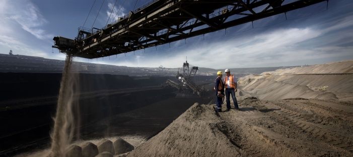
Continental Industry Website Styleguide

› Design Elements
     › Logo
     › Colors
     › Typography
     › Images
     › Icons & Buttons
     › Fields of Interaction
     › Table

                                   2021 August | com&on Medienagentur I © ContiTech AG   8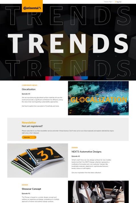
Design Elements
                                                                                                         Desktop

Logo
The Continental logo or quality seal must be visible at all times and must
appear on every page of the website. Its state may change on different
viewport sizes and devices. The given Continental Corporate Design
Guidelines must be upheld.                                                                                 Tablet

                                                      Download Corporate Design Basic Elements
Sticky navigation
When scrolling further down the page, the sticky navigation will fade in
which replaces the quality seal with the Continental logo. On desktop, the
logo sits flush with the left edge of the content area. On tablet, the logo is
positioned at the top left with a 60px wide distance container to the left outer
display border.                                                                                  Sticky Navigation

                                                                        Download Logo and Seal
Mobile
The logo is always positioned at the top-left of the page with a minimum
distance of 10px to the left outer display border.                                                         Mobile

2021 August | com&on Medienagentur I © ContiTech AG   9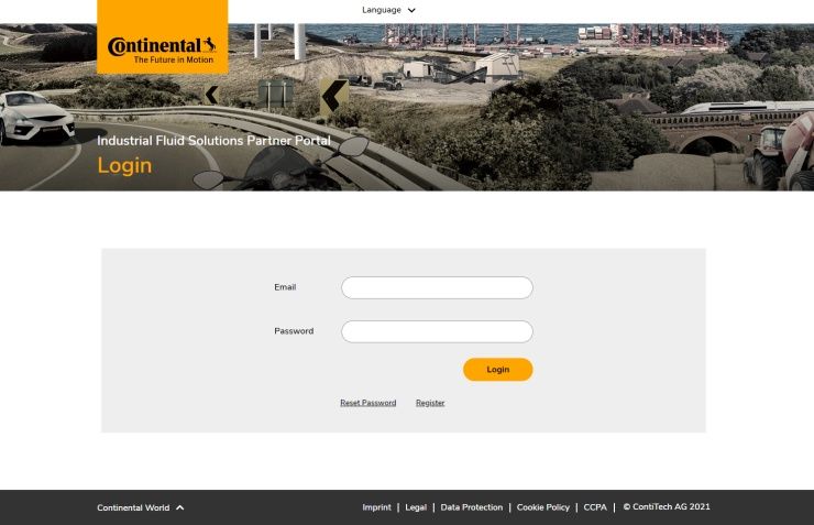
Yellow
Design Elements                                                          Hex: #FFA500
                                                                         Use e.g.: Accent, buttons, lines

Continental Color System                                                 Light Yellow
                                                                         Hex: #FEBB40
                                                                         Use e.g.: Hover color

                                                                         Black
The Continental colors give the company’s communication its              Hex: #000000
                                                                         Use e.g.: Font
characteristic appearance. Continental Yellow represents the brand’s
                                                                         White
dynamism, superiority, and active prowess. The basic color Continental   Hex: #FFFFFF
Yellow is supplemented by black, white and intermediate shades.          Use: Background

                                                                         Gray 01
                                                                         Hex: #333333
                                                                         Use e.g.: Select country bar background

                                                                         Gray 02
                                                                         Hex: #737373
                                                                         Use e.g.: Footer

                                                                         Gray 03
                                                                         Hex: #969696
                                                                         Use e.g.: Buttons, teaser, backgrounds, dots

                                                                         Gray 04
                                                                         Hex: #cdcdcd
                                                                         Use e.g.: Buttons,, borders, backgrounds,
                                                                         start page, table head, font

                                                                         Gray 05
                                                                         Hex: #f0f0f0
2021 August | com&on Medienagentur I © ContiTech AG 10                   Use e.g.: Mobile menu, mouseover effect,,
                                                                         background & table content
Design Elements
Typography
The Nunito Sans webfont is used throughout the websites and cannot be
substituted under any circumstances. All fonts are preset in the Kentico
CMS.
The line-height is by default the respective font size times 1,2
(e. g. 48px * 1,2 = 57,6; approx. 58px)
Download Font
CSS-Tags
› , , , , , , (body text)
› can only be used once per page
› Due to SEO the tags can be used multiple ways
2021 August | com&on Medienagentur I © ContiTech AG 11Design Elements
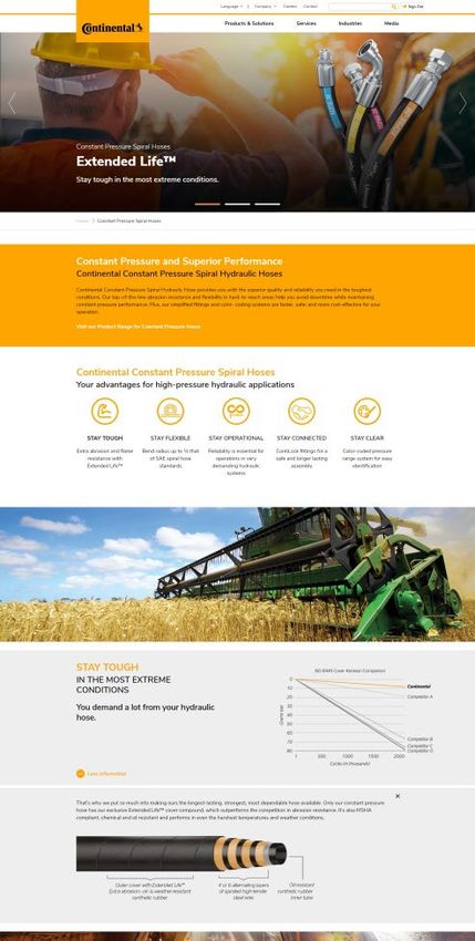
Stage Images Download .psd Template
All pages have a stage image in the header area which is partially
Big Stage Desktop
covered by the logo (seal) on the left side on desktop and tablet.
The point of interest of this picture should be to the right, because
logo and text are on the left side.
The Big Stage format is only used for the home page. All image
formats must be created in triplicate for the appropriate devices.
› Desktop: Width 1680px, Height 750px, 96 dpi
› Tablet: Output format 991 x 500px [create: 1982 x 1000px], 96 dpi Big Stage Tablet Mobile
› Mobile: Output format 575 x 950px [create: 1150 x 1900px], 96 dpi
The Overview Stage has a lower height and is used for overview
pages, industry pages and location profiles. All image formats must
be created in triplicate for the appropriate devices.
› Desktop: Width 1680px, Height 480px, 96 dpi Overview Stage Desktop
› Tablet: Output format 991 x 480px [create: 1982 x 960px], 96 dpi
› Mobile: Output format 575 x 575px [create: 1150 x 1150px], 96 dpi
The Small Stage format is used for all other subpages.
Mobile
› Width
2021 August1680px, Height 264px,
| com&on Medienagentur 96 dpi AG 12
I © ContiTech
Overview Stage TabletDesign Elements
Content Images 1,76
Each image in the content area of the website has the same aspect ratio. 1 ~16:9
All other image dimensions are a multiple of this aspect ratio and are
automatically converted to the correct format in the CMS.
› Width 749px, Height 424px, 96 dpi
Aspect Ratio
Product pure images always have a gray background. The gradient is
preset as a layer in the downloadable Master Template.
Download .psd Master Template
Product Image Example
2021 August | com&on Medienagentur I © ContiTech AG 13Download
Design Elements
Favicon
Icons & Buttons Breadcrump
Read more External
link
Internal
List link
Icons and buttons refer to services and further information on the website.
Scroll
Next level navigation to top
The following colors are used for icons:
#FFA500 Yellow 43px
Search
#000000 Black
#FFFFFF White
#969696 Grey 03 40px
Close navigation Button
32px
The icons not covered by the continental-icons font (see next slide) are taken
from Font Awesome. Scroll left/right
Video
Get Font Awesome
Button Sizes Accordeon/More Info
open/close
› The width is determined by the button text
Social
› With arrow: Text left-aligned and arrow right-aligned; padding right/left 10px Drop down
Media
› Without arrow: Text centered 32
px Close
pop-up
Load more
2021 August | com&on Medienagentur I © ContiTech AG 14
Sign outDesign Elements
Icons & Buttons
ct-icon-link-1 ct-icon-logo ct-icon-chevron-light-left ct-icon-location
ct-icon-youtube
ct-icon-download ct-icon-minus ct-icon-arrow-slider-right ct-icon-email ct-icon-3d
ct-icon-calendar-plus ct-icon-play ct-icon-chevron-light-right ct-icon-facebook ct-icon-audio
ct-icon-check ct-icon-plus ct-icon-left ct-icon-google- ct-icon-chevron-
bookmarks down
ct-icon-close ct-icon-print ct-icon-tagline-zh ct-icon-linkedin-box ct-icon-link-
external
ct-icon-dot ct-icon- ct-icon-text ct-icon-reddit ⊃ ct-icon-menu
qualityseal
ct-icon-expand ct-icon-chevron- ct-icon-chevron-up ct-icon-tumblr ⟨ ct-icon-linkedin-1
right
ct-icon-folder ct-icon-search ct-icon-trash ct-icon-twitter ct-icon-doc-text
ct-icon-home ct-icon-settings ct-icon-triangle ct-icon-wechat ct-icon-desktop
ct-icon-hotspot ct-icon-share ct-icon-warning ct-icon-weibo ct-icon-mobile
ct-icon-info ct-icon-arrow- ct-icon-zoom ct-icon-xing ct-icon-youtube-1
slider-left
ct-icon-tagline
Download Icons – Font
2021 August | com&on Medienagentur I © ContiTech AG 15General search field
Design Elements
Fields of Interaction
The following input fields are available to facilitate the search for content or
specific products. Input fields always have rounded edges, similar to the
call-to-action buttons.
Input field
› Input fields: The category of the input field can be placed outside the field
as well as directly in the field to save space.
The search command is executed by pressing the enter key. A separate
search button is possible.
› Option fields: The option fields are round. A yellow marker appears
inside them when they are selected.
› Selection fields: Parameters can be chosen from a dropdown list that
appears after selecting the field.
Option fields
An autofill function should be offered for the full text search of the website.
2021 August | com&on Medienagentur I © ContiTech AG 16
Selection fieldsDesign Elements
Table Colors
#DDDDDD
Table #EEEEEE
Lines:
#FFFFFF
Tabular displays should be avoided as far as possible, › List Icon:
#FFA500
as their clarity is lost on mobile devices.
The lineweight is 2px.
Examples
2021 August | com&on Medienagentur I © ContiTech AG 17Continental Industry Website Styleguide
› Page Elements
› Header
› Footer
2021 August | com&on Medienagentur I © ContiTech AG 18Page Elements
Header
There are three types of headers. All types are terminated with a 5px wide yellow
separator line. The stage title always begins left-alligned with the seal. There is a
20px (entry page) or 10px (overview and subpage) tall padding below the title. If
there are multiple lines of text (overline and subline), the overline ist followed by a
10px padding, the headline is followed by 20px padding.
Entry Page Header Desktop
The entry page header (home or campaign page) has an image in Big Stage
format with title in white. Overline, subline and link to subpages are optional.
Headline: max. 50 characters, Subline: max. 90 characters. Multiple topics can be
integrated as a slider.
The overview page header has a white title and can be found on the Products &
Solutions, Industries and Media pages as well as the Sales & Service Locations.
Overview Page Header Desktop
All other pages have a subpage header in small stage format with title in white.
› For header sizes see Design Elements
Subpage Header Desktop
2021 August | com&on Medienagentur I © ContiTech AG 19Page Elements
Footer
The footer element is visible on every page of the website and borders on a yellow Desktop
separator line at the top. Gray 02 (#737373) is used as the background color. Its
height is variable and determined by the content. The footer contains two areas:
Links to other websites/areas of the Continental Corporation
The area on the right always contains the Continental webs under the title „Continental
World“. The area on the left contains related links within Continental. These links may
differ depending on the topic of the website.
Service navigation with social media links
The service navigation always contains a link to a general contact form, as well as all
legally required information, conditions etc. These may vary from country to country.
Special Case: Small Footer
Tools such as catalogues, shops or dealer portals, which serve as working tools for Tablet
the customer, can also choose a small footer. The small footer is an element that is
positioned fixed at the bottom of the page without yellow separator line and displayed
unboxed until a width of 1920px is surpassed and it is 80px high.
Small Footer Mobile Mobile
2021 August | com&on Medienagentur I © ContiTech AG 20
Small FooterContinental Industry Website Styleguide
› Navigation
› Desktop
› Mobile
› Onpage
2021 August | com&on Medienagentur I © ContiTech AG 21Navigation
Desktop
The navigation concept for all of the Continental Corporation’s websites
consists of three sections: top navigation, main navigation and footer
navigation (› see: Page elements/Footer). Onpage navigation elements
supplement the user guidance.
Top Navigation
The top navigation contains a search field that is flush right with the
content area. In addition, important topics can be linked here to the left of
the search field for special target groups (e.g. corporate topics). The
company area and tools, the shopping cart function and login information
are placed here as well. The language menu is positioned as the left-most
option. When hovering over a topic with the cursor, a yellow line appears
under it. A fly out menu for the integration of two further levels is possible.
Fly Out Menu
2021 August | com&on Medienagentur I © ContiTech AG 22Navigation
Desktop
The main navigation is positioned below the stage. The active state is
shown with yellow. Each category can expand to up to four levels. When
scrolling down the page, the main navigation bar remain at the top of the
website as a sticky navigation. Main Navigation Desktop
Special Case Sticky Navigation Desktop
For small websites with fewer levels, the small main navigation can be
used. Here, the navigation area is smaller and has only two levels. All
layout specifications of the main navigation apply.
2021 August | com&on Medienagentur I © ContiTech AG 23
Special CaseNavigation
Mobile
There is only one type of navigation on the mobile version without any
distinction between top and main navigation. This navigation can be
accessed by tapping on the burger menu icon on the right of the navigation
bar. Lower levels always have a back button to return to the previous level.
First level and sublevel with back button
2021 August | com&on Medienagentur I © ContiTech AG 24Navigation
Onpage
Breadcrumb Navigation
Each page has a breadcrumb navigation above the content. The
breadcrumb navigation is a link path that offers the user orientation. It
shows the user where they are within the hierarchy of the website. The
active page is always black.
There is a tab navigation on each product group page. The tab navigation
is visible when opening the page. Ideally, three tabs explain the
Tab Navigation Desktop
characteristics and advantages of the product.
A maximum of four tabs plus contact button are possible.
For further navigation elements see also
› Design Elements/Icons & Buttons.
Tab Navigation Mobile
2021 August | com&on Medienagentur I © ContiTech AG 25Continental Industry Campaign Sites Styleguide
› Types 27
› Samples 28
› Page Elements 29
› Header/Stage 30
› Full Row Modules 31
› Half Row Modules 32
› Hidden Content 33
› Teaser Area Module 34
› Optional Features 35
2021 August | com&on Medienagentur I © ContiTech AG 26Campaign Sites
Types
Campaign sites offer the promotional arrangement of special topics.
Large-format multimedia elements and textboxes can be combined on
a page to prominently present a topic and link to further information
elsewhere on the Continental Industry page. Campaign sites can be
accessed via their own URL.
There are two types of campaign sites:
Integrated Campaign Site
Integrated campaign sites are embedded into the navigational concept Integrated Campaign Site
of the Continental Industry page.
Separated Campaign Site Separated Campaign Site
Separated campaign sites are not integreated into the Continental Choose a Topic
Industry page. This kind can be outfitted with a skiplink in the Top Topic 1
Navigation area. Topic 2
Topic 3
Topic 4
2021 August | com&on Medienagentur I © ContiTech AG 27 Topic 5Integrated Campaign Site Integrated Campaign Site
Campaign Sites
Samples
Separated Campaign Site
Content Content
Optional feature
Optional feature
Image & Text
Big image/video
Text & Video
Text & Video
Content
Text & Image
Image & Text Content
Hidden content
Image & Text
2021 August | com&on Medienagentur I © ContiTech AG 28Continental Industry Campaign Styleguide
› Page Elements 29
› Header/Stage 30
› Full Row Modules 31
› Half Row Modules 32
› Hidden Content 33
› Teaser Area Module 34
› Optional Features 35
2021 August | com&on Medienagentur I © ContiTech AG 29Campaign Page Elements
Header/Stage
The page header consists of an image in Big Stage format
and a headline. Overline and subline are optional. Multiple
1
topics can be integrated as a slider. Links to further
information can be integrated.
2
(1) Image(s) or Video 3
4
(2) Overline (optional)
(3) Headline
(4) Subline (optional)
Stage Image Dimensions:
› Desktop: 1680x750px, 96 dpi Download .psd Template
› Tablet: Output format 991 x 500px [create: 1982 x 1000px],
96 dpi
› Mobile: Output format 575 x 950px [create: 1150 x 1900px],
96 dpi
2021 August | com&on Medienagentur I © ContiTech AG 30Campaign Page Elements
Full Row Modules
Module Content
This element stretches across the whole width of the content area. Text can be 1
placed on various background colors. Optional links to further information can 2
5
3
be added via buttons.
(1) Headline (5) Background color
(2) Subheadline › White
› Gray 05
(3) Content 5
› Black
(4) Link button for internal link / 4
› Yellow
external link / downloads with
Module Content
button; target options _self or _blank
Module Big Image/Video
This element stretches across the whole width of the content area and is used Module Big Image/Video
to place images or videos.
Dimensions:
› Create 1680x476px, 96dpi; output differs depending on device
Videos:
› Embedded via Azure Cloud preferably, via Admiral Cloud alternatively
2021 August | com&on Medienagentur I © ContiTech AG 31Campaigns Page Elements Module Image/Video & Text
Half Row Modules
1
2
3
Module Image/Video & Text
The Module Image/Video & Text stretches across the whole width of 4
the content area. It is split in half with the image/video either on the left
or right side.
Module Mediaslider & Text
This module stretches across the whole width of the content area. Multiple
6
pieces of media can be uploaded via this module to be displayed in a slider.
The module is split in half with the mediaslider either on the left or right side. 5
Image dimensions: 749x424px, 96dpi Download .psd Master Template
Videos: Embedded via Azure Cloud preferably, via Admiral Cloud alternatively Module Mediaslider & Text
(1) Headline (5) Link button
(2) Subheadline (6) Background color
(3) Content › White › Black
(4) Hidden content option › Gray 05 › Yellow
2021 August | com&on Medienagentur I © ContiTech AG 32Hidden Content Buttons
Campaign Page Elements
Hidden Content
The hidden content is displayed in collapsable boxes that can be
opened via a button in the following modules: content, image/video &
text and mediaslider & text. The hidden content opens right below its
parent module and offers the following design options:
Examples of use
(1) Headline, possibility of subheadline
1 6
(2) Content
2
(3) Image/graphics
(4) List
(5) Grid
(6) Background color
3
› White › Black
› Gray 05 › Yellow
5
4
2021 August | com&on Medienagentur I © ContiTech AG 33Campaign Page Elements
Teaser Area Module
1
The teaser area displays and links to further content. Three teaser tiles
are visible at a time and further ones can be added through the slider
option.
(1) Headline
(2) Teaser image (dimensions:749x424px, 96dpi)
(3) Teaser title Download .psd Master Template
(4) Teaser text 2
3
4
2021 August | com&on Medienagentur I © ContiTech AG 341
Campaign Page Elements
Optional Features
2
Special requirements can be realized in compliance with the design
guidelines, e.g.
(1) Fairs & events (integration via database possible)
(2) Icons with skip links
3 3
(3) Animated GIFs
(4) Special graphics with link option
(5) Database based searches
4 5
2021 August | com&on Medienagentur I © ContiTech AG 35Continental Industry Login Area Styleguide
› Page Elements 36
› Header/Stage 37
› Footer 37
› Personalization Area 37
36
2021 August | com&on Medienagentur I © ContiTech AGLogin Area Page Elements Password-protected member areas can be used to offer a certain group access to exclusive information. All guidelines of the Continental Industry Styleguide as well as the following guidelines apply: Overview stage and small stage format are used as stage images. › See Design Elements/ Stage Images The Small Footer is used. › See Page Elements/ Footer The personalization area contains the username as well as links to settings and logout. On desktop, the area is positioned flush with the top edge of the stage image and flush right with the content area. On mobile and tablet, these links can be found in the burger menu. Max Mustermann › For icons, see Design Elements/ Buttons & Icons 2021 August | com&on Medienagentur I © ContiTech AG 37
Contact

Mareike Elena Wiemann
ContiTech Communications
Head of Digital Communications

ContiTech AG
Vahrenwalder Straße 9, 30165 Hannover, Germany

Mobile: +49 (0)151 73 044 295
E-Mail: mareike-elena.wiemann@continental.com

2021 August | com&on Medienagentur I © ContiTech AG 38
You can also read


