CREATING AN INTERACTIVE DASHBOARD TO SUPPORT MIDDLE SCHOOL TEACHER'S IMPLEMENTATION OF A TECHNOLOGY-SUPPORTED PROBLEM-BASED LEARNING PROGRAM
←
→
Page content transcription
If your browser does not render page correctly, please read the page content below
1        2022 | Volume 13, Issue 1 | Pages 1-18

    CREATING AN INTERACTIVE DASHBOARD TO SUPPORT MIDDLE
    SCHOOL TEACHER’S IMPLEMENTATION OF A TECHNOLOGY-
    SUPPORTED PROBLEM-BASED LEARNING PROGRAM
    Min Liu1, Chenglu Li2, & Zilong Pan1
    1
     The University of Texas at Austin; 1The University of Florida

    In this design case, we describe our experience of designing           INTRODUCTION
    and creating a teacher’s dashboard as an accompanying
                                                                           The purpose of this paper is to describe our experience
    tool to support sixth-grade teachers who implement a
                                                                           of designing and creating a teacher’s dashboard as an
    technology-supported problem-based learning program on
                                                                           accompanying tool to support sixth-grade teachers who
    sixth-grade space science in their classrooms. We describe
                                                                           implement a technology-supported problem-based learning
    in detail the background of this design case, our motivation
                                                                           program on sixth-grade space science in their classrooms. A
    to create this teacher’s dashboard, and our iterative design
                                                                           design case is “a description of a real artifact or experience
    process over a period of five years. Our design process con-
                                                                           that has been intentionally designed” (Boling, 2010, p. 2).
    sists of three phases from the idea generation phase to both
                                                                           The stakeholders of this design case are sixth-grade teachers
    low- and high- fidelity versions of the prototyping phase to
                                                                           for whom this dashboard is designed for, the designers and
    three iterations of the implementation phase. We present
                                                                           developers (a group of graduate students and the supervis-
    our rationales for making various design decisions over
                                                                           ing faculty) who created this dashboard, and sixth graders
    the process and our reflections on this design experience
                                                                           who may benefit from their teachers’ use of the dashboard
    including the challenges we have encountered.
                                                                           in that the teachers can monitor students’ learning progress
    Min Liu is Professor of Learning Technologies at the University of     more effectively using the dashboard.
    Texas at Austin. Her research interests center on educational uses
    of new media and other emerging technologies and designing             In this design case (Boling, 2010; Howard et al., 2012), we
    interactive learning environments for learners at all age levels.      document our iterative design efforts over five years. We
    Her current R&D projects include studying the effectiveness of         describe in detail the background of this design case and
    immersive rich media environments on learning and motivation;          our motivation to create this teacher’s dashboard in the
    and learning analytics in online environments.                         design context, three phases of design, and three iterations
                                                                           of implementation. We present our rationales for making
    Chenglu Li is a doctoral student in educational technology at          various design decisions over the process, the issues we have
    the University of Florida. His research interests are using learning   encountered that added complexity to our designs, and
    analytics with Bayesian methods and big data to support online
                                                                           finally our reflections on this design experience.
    learning environments as well as game-based learning.

    Zilong Pan is a doctoral candidate in the Learning Technologies
    program at the University of Texas at Austin. His research focus
    includes learning analytics, problem-based learning in STEM,
    and educational data visualization. His goal is to discover how to
    empower educators and learners by incorporating educational
    technologies.                                                          Copyright © 2022 by the International Journal of Designs for Learning,
                                                                           a publication of the Association of Educational Communications and
                                                                           Technology. (AECT). Permission to make digital or hard copies of portions of
                                                                           this work for personal or classroom use is granted without fee provided that
                                                                           the copies are not made or distributed for profit or commercial advantage
                                                                           and that copies bear this notice and the full citation on the first page in print
                                                                           or the first screen in digital media. Copyrights for components of this work
                                                                           owned by others than IJDL or AECT must be honored. Abstracting with
                                                                           credit is permitted.

                                                                           https://doi.org/10.14434/ijdl.v13i1.31243

                                                                                                                                                          1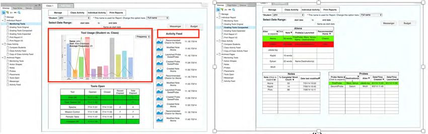
THE DESIGN CONTEXT                                                    once a year. Yet, before the implementation of this teacher’s
                                                                      dashboard, the AR program lacked a way for teachers to
Background                                                            know, just-in-time, what features their students were access-
The context of this design case is situated in a larger project       ing and the information (e.g., notes) their students entered
called Alien Rescue (AR, https://alienrescue.education.               in the program. Without such information at their fingertips,
utexas.edu). AR is an immersive multimedia enriched                   it was difficult for teachers to know how their students’ use
problem-based learning environment designed for sixth-                of the program contributed to the overall problem-solving
grade space science. The goal of Alien Rescue is to engage            process. This challenge presented a new opportunity for the
sixth-grade students in solving a complex problem that                AR team. Therefore, we were motivated to create a dash-
requires them to use the tools, procedures and knowledge of           board as an accompanying tool for teachers within the larger
space science and apply processes of scientific inquiry while         context of Alien Rescue project. This dashboard served as a
learning about our solar system. Students, acting as young            separate and yet connected tool allowing teachers to view,
scientists are asked to participate in a rescue operation to          just-in-time, how their students were using the program.
find suitable relocation sites within our solar system for six
                                                                      A sub-team was formed to tackle this challenge, which
different species of aliens who have been displaced from
                                                                      consisted of five members of the AR team (four graduate
their home planets. To support students’ inquiry process,
                                                                      students and the supervising faculty member). All these four
a set of different features are built in the program. AR is
                                                                      graduate students had background in instructional design,
designed as a curriculum unit on sixth-grade space science
                                                                      one of them was a former middle school science teacher,
for about fifteen 45-minute class sessions and is delivered
                                                                      and three had their research interests in learning analytics.
completely online. Up to this point, it has been used by
                                                                      The design of the teachers’ dashboard took multiple years
thousands of middle school students and their teachers in
                                                                      and comprised multiple phases from the inception of
30 states.
                                                                      ideas to the implementation. In the following sections, we
The Alien Rescue design and development team consists of              describe our design process.
a group of graduate students (pursuing masters and doctoral
degrees) in the Learning Technologies Program at the                  OUR DESIGN PROCESS
University of Texas at Austin. These students work collabo-
                                                                      Our design consisted of three phases: Idea generation,
ratively under the supervision and guidance of the faculty.
                                                                      prototyping (two static prototypes and three interactive
Students’ engagement in the project is largely driven by their
                                                                      prototypes), and implementation (three iterations).
interests in acquiring and applying instructional design and
technical skills while creating a quality technology program.
                                                                      Phase 1: Idea Generation
The design and development process of this larger project,
Alien Rescue, is documented in the publication by Liu et al.          The inspiration of how the dashboard should be designed
(2014).                                                               came from two sources: What teachers (i.e. stakeholder)
                                                                      needed and what we (i.e. designer) wanted based on our
Motivation                                                            experiences in working with teachers and our judgement on
                                                                      what Alien Rescue could be improved. We asked ourselves
The underlining pedagogy for AR is problem-based learning
                                                                      such questions: (1) what information from Alien Rescue
(PBL). PBL is “an instructional (and curricular) learner-centered
                                                                      program should be displayed? (2) how are dashboards
approach that empowers learners to conduct research,
                                                                      designed in general? And (3) what information do teachers
integrate theory and practice, and apply knowledge and
                                                                      (a key stakeholder) want to have displayed?
skills to develop a viable solution to a defined problem”
(Savery, 2006, p. 12). In PBL, the role of the teacher is that of a   Because this teacher’s dashboard is designed to be a tool
facilitator of instruction (Belland et al., 2008; Ge & Land, 2004).   accompanying the larger Alien Rescue project, what is to be
While sixth graders are interacting with AR as a self-con-            displayed will be related to the features built in AR program.
tained curriculum unit to learn space science knowledge               A set of features are provided in AR to assist students’
and practice problem-solving skills, teachers, as facilitators,       problem solving (Liu et al., 2013). Although each feature
are expected to monitor students’ progress, provide feed-             performs a specific function, three features are of most
back, and intervene as needed.                                        relevance to this design case as they are most interactive
                                                                      allowing students to enter information: Probe Design Center
Our classroom observations revealed that teachers needed
                                                                      (a key feature to assist students’ inquiry process), Notebook
to know how their students used Alien Rescue so that they
                                                                      (for students to take notes while doing research), and
could apply appropriate facilitation strategies at appropriate
                                                                      Solution Form (for entering a solution to solve the problem
times. We typically observed teachers in the local schools
                                                                      as presented in AR) (see Figure 1 (a), (b), (c)). Notebook and
during their implementation of Alien Rescue project in the
                                                                      Probe Design Center are interactive in that students not only
spring semester. Such observations were usually conducted
                                                                      enter information, but also depending on students’ input,

IJDL | 2022 | Volume 13, Issue 1 | Pages 1-18                                                                                      2
a. Probe Design Center                                                b. Notebook

                          c. Solution Form                                          d. Notebook Comparison Feature
FIGURE 1. Screenshot of three interactive features in Alien Rescue to support scientific inquiry.

the tools display different types of information. Notebook          sixth-grade teachers who used AR in the previous year and
not only provides a notebook for students to type notes             were using AR at the time when we sent the survey to get an
about their research findings, it also has a notes-comparison       idea about what information would be useful to them. We
feature (see Figure 1 (d)) so students can drag their notes         asked these 12 teachers their feedback because we believed
about an alien needs and a planet requirements side-by-side         their experience in using Alien Rescue would shed light
for comparison. Students can see the information they have          on what worked well or not so well for them. Each teacher
already collected from using other features and figure out          taught about 100 to 120 6th graders. The feedback from this
what is missing for further research. Once students have            purposeful sample of 12 teachers would reflect the use of
gathered sufficient information, they can design and launch         Alien Rescue by over 1000 6th graders. We asked teachers
probes in Probe Design Center where they research various           such questions in both Likert scale and open-ended forms:
scientific equipment instruments used in both past and              (1) what kind of data/information from the AR program
present NASA probe missions, construct probes by selecting          would you like to know in order to help you assess students’
appropriate probe type, communication, power source,                performance? (2) what data would you be interested in
and instruments. Solution Form is a place for students to           viewing on students’ probe design? (3) what data would you
enter their final alien placement and rationale (i.e. which         be interested in viewing on students’ alien placements? (4)
planet they choose as a new home for an alien species and           what data would you be interested in viewing on students’
why). These three features become a focus of our discussion         notebooks? The survey data were analyzed descriptively.
on what information the dashboard should display. The               Figure 2 shows teachers’ desire of displaying the three
description of these three features here will help connect to       features.
the design decisions and screenshots presented in Figure 1.
                                                                    Teachers’ feedback from the survey helped us decide what
To get a sense of how dashboards were designed in general,          we wanted to prioritize and include in the dashboard. We,
we evaluated several websites that used dashboards (e.g.,           the design team, had many rounds of weekly discussions
Khan Academy, Hapara, econsultancy). Two team mem-                  over an extended period of time. Given the evaluation of
bers reviewed each and compiled notes for discussions               other dashboards and teachers’ feedback, we brainstormed
among the team (see Appendix A for sample notes). At the            and came up with an outline of all possible and desired
same time, we sent out a survey, distributed online, to 12          features to consider in the dashboard while paying close

IJDL | 2022 | Volume 13, Issue 1 | Pages 1-18                                                                                   3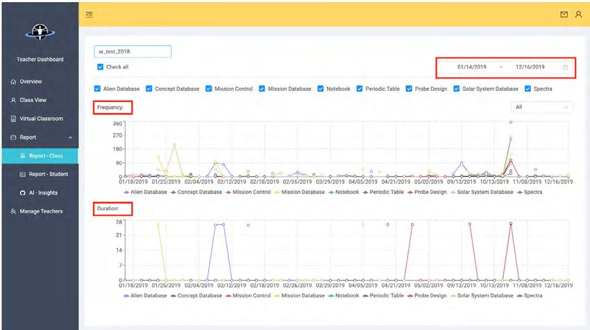
FIGURE 2. Screenshot of teachers’ desire of displaying Probe Design Center, Alien Placements, and Notebook which are the focus of this
design case.

attention to the three features: probe design, alien place-             and displaying an overall snapshot of an individual student’s
ment, and notebook. A typical meeting went like this:                   activities in terms of tool use, notes created, probes created,
Team members gave updates on what they were working                     and alien placed. The following shows an example of the
on. The whole team provided feedback/suggestions and                    list of features we came up through our brainstorming.
asked questions. Discussing the design of dashboard was                 Appendix B provides the full outline.
one of many discussion topics at the weekly meetings in
addition to discussions on other topics relating to the larger          •   Tabs
Alien Rescue project. We discussed teachers’ feedback in                     -   My Classes (multiple classes as a teacher typically
detail and what solution we could provide. Sample features                       teaches 5-6 classes)
included displaying information through tabs, management                     -   My Class (one single class)
capabilities (e.g., add/delete a student), displaying an overall             -   Manage Students–add/delete students, place into
snapshot of the whole class activities in terms of tool use,                     groups, send a message, take screenshot, adjust

IJDL | 2022 | Volume 13, Issue 1 | Pages 1-18                                                                                            4

budget (a budget is provided in designing probes),
sort to find a student
- Student Name
- Can have multiple classes open at a time
• Overall snapshot of class activity
- Map of space station that shows where students are
- Aggregate Action Shape, plus capability to separate
into groups
- Topics most visited in Databases
› Alien
› Solar System
› Concepts
› Missions
- Total notes created
› Leaderboard with top 10 (based on character/
word count?)
› Word cloud for notes–general one automat-
ically generated on homepage, but teachers
can create new ones for specific note titles
- Total probes created
› Leaderboard with top 10 (based on % new
information)
› Word cloud for probe justifications
› Breakdown of probe destinations by associated
alien (or none)
› Probe errors
» % of instruments FIGURE 3. Paper sketch prototype illustrating the ideas
» Broken down by cause discussed in Phase 1 to be displayed in the dashboard.
- Total aliens placed
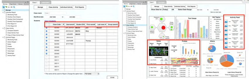
› Leaderboard with top 10 (taking accuracy into 1 created a structure of the dashboard as shown in Table 1
account) and visual representations of the ideas (Figures 5 and 6).
› Word cloud for justifications
- Activity feed that shows notes created, probes Figure 5 shows various features in these sections. For
designed, and recommendations submitted in real example, under Class Activity, it first shows an overview of
time (with timestamp) the class including students’ username when they register for
the program, ID, their first and last name (Figure 5 (a)). Figure
Phase 2: Prototyping 5 (b) shows overall class activity in using the various features
In Phase 1, we addressed the question “What information built in AR such as frequency of tool usage along with the
needs to be displayed on this dashboard?” Here in Phase class average, topics students visited, number of notes taken,
2, we aimed to address “How should such information be number of probes designed, alien placements, and class ac-
displayed on this dashboard (i.e. structure, aesthetics, and tivity feed. An interest for the team was to visualize the data
usability)?” We made multiple prototypes from static to so teachers could quickly get an idea of how her students
interactive ones. First, we made a paper sketch and another were doing. We also thought having a leaderboard would
one using Google Slides (see Figures 3 and 4). be interesting and gamifying. The possible leaderboard
ideas were also illustrated (e.g., who created the most notes,
These static versions were limited in terms of playing around launched most probes in Figure 5 (b)).
our design ideas visually, especially in showing how each
section related to another. We decided to move from low Figure 6 shows individual student activity–frequency of each
fidelity prototypes to higher fidelity ones. We chose Axure feature as well as how much time a student uses a feature,
RP (https://www.axure.com), a wireframing and rapid the notes a student has taken and word count for each
prototyping tool. It allowed planning and prototyping with note. This information tells a teacher how a student uses the
interactive features without writing codes. Using Axure RP, features provided in AR so the teacher can monitor the stu-
we created three interactive prototype versions, each built dent’s progress. It shows the destination of each probe this
upon the previous one, to further refine our ideas. Prototype student sent and which planet for which alien species the
student has chosen as a solution (the final step in using the
IJDL | 2022 | Volume 13, Issue 1 | Pages 1-18 5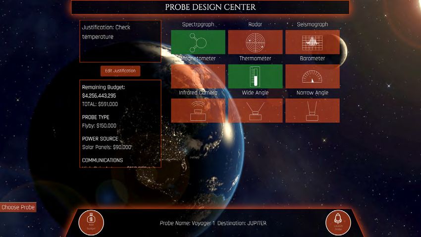
FIGURE 4. Prototype using Google Slides providing more detailed illustrations of the ideas discussed in Phase 1 to be displayed in the
dashboard.

 NAME OF PAGE                PURPOSE OF PAGE
 Class Activity              Displays aggregate data on a class that teachers can use to monitor activity
 Individual Report           Displays data on individual students that teachers can use to monitor activity
 Grading Tools               Displays data on individual students that teachers can use to grade. Expanded and Compacted are
                             re-formatted so that all tools function the same way
 Print Report                Interface for teachers to select and create their own reports for printing, incorporating teacher’s
                             feedback

TABLE 1. Ideas of overall structure of the dashboard representing what a main menu may look like.

program). Such information is important to assist grading so             This prototype allowed the team to see how various ideas
the teacher can know if the student has solved the problem               we came up during many brainstorming sessions in Phase
correctly.                                                               1 could be possibly realized. It was also a concrete way to
                                                                         think about the usability which prompted new questions for
                                                                         further discussions (see Appendix C for more information).

IJDL | 2022 | Volume 13, Issue 1 | Pages 1-18                                                                                            6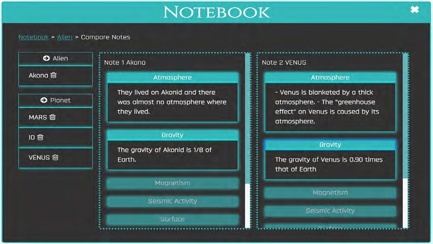
A.                                                                      B.

FIGURE 5. Prototype showing class activities (i.e. how students use various features in AR as a class) in tabular and graphic forms.

FIGURE 6. Prototype showing individual student activities (i.e. how each student is using various features in AR) in tabular and graphic
forms such as tool usage and activity feed and choices a student selected.

Seeking teachers’ feedback was a critical step in our design              Google Docs for students to enter notes and their solutions
process. We sought feedback from the teachers through                     or asked students to write down the information on paper in
classroom observations and informal interviews each year                  addition to entering in AR. This added additional work for the
as they implemented Alien Rescue in their classrooms.                     students as they had to enter information twice (once in the
In this design case, once we had a prototype in Phase 1,                  program and then on paper or via Google Docs). Although
we showed this interactive prototype to the sixth-grade                   the ideas of various visuals we proposed (e.g., leaderboard,
teachers in the classrooms who used AR previously and                     class feed, word cloud, bar graphs and pie charts, see Figures
were using AR at the time. The teachers really liked the                  5 and 6) were interesting to teachers, it was apparent that
idea of having a dashboard as an accompanying tool, so                    the information from this prototype was overwhelming, and
they were able to see the notes their students created and                the design was hard for teachers to figure out what each
especially the probes their students sent. For example, one               piece of information meant and how to make sense of the
teacher said, “Some of the kids are struggling with probes.               information.
We don’t like that as we cannot see how the kids designed
the probe after a failure of data returned. It would be easier            Building upon Prototype 1 and given teachers’ feedback, we
to teach if we had evidence.” Another teacher commented:                  made several major changes in Prototype 2: (1) Eliminated
“That all sounds great. I would love to have the students                 class feed, word cloud, leaderboard ideas; (2) kept four
submit in the program, but as a project grade I need to see               sections on Class Activity: Tool Usage, Alien Placement,
their results. In the future a way to get things to us that they          Probes, Notebook Access to make the screen less cluttered
submit in the program would definitely help.” Up to this                  (see Figure 7).
point, teachers could not view such information their stu-
                                                                          In addition, Notebook displayed the actual notes a student
dents entered in the program. Some teachers started to use
                                                                          created. Solution form (alien placement) not only showed

IJDL | 2022 | Volume 13, Issue 1 | Pages 1-18                                                                                              7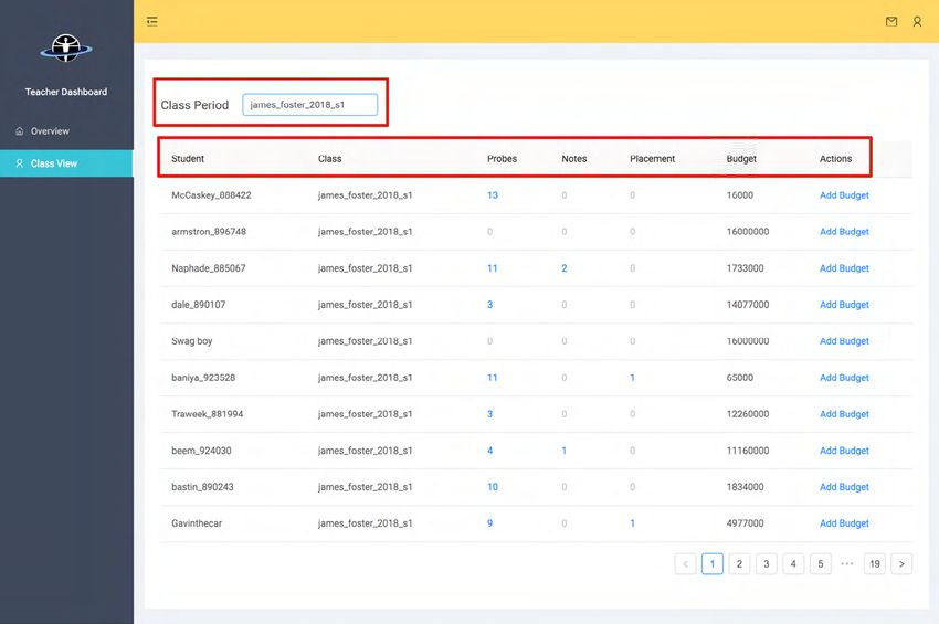
FIGURE 7. Revised prototype showing a simplified version of displaying student activities.

each recommendation for each alien species a student                    focus to create a useful dashboard for teachers who were
made, but also the justification by the student. Knowing                interested in using AR in their curriculum. In Prototype 3, we
justification could help a teacher understand a student’s               made additional minor adjustments, including adjustments
rationale behind the solution. For probe design, in addition            in navigation and layout of information on each page.
to the destination a probe was sent, it showed the power
source, communication, and instruments selected. Using a                Phase 3: Implementation
button format, red color indicated an incorrect placement
                                                                        Three interactive prototype versions as discussed in Phase 2
and green color indicated a correct placement. These
                                                                        moved our goal of designing a dashboard for teachers closer
features were important to assist teachers’ grading in a more
                                                                        to implementation. The next step was to consider what
efficient way (see Figure 8).
                                                                        technologies to use to bring our ideas to realization. Because
Prototype 2 was better received by the teachers. Teachers               our team consisted of graduate students in the Learning
liked the idea of having an overview for the class (i.e. Class          Technologies Program, we needed to consider what
Activity) and then individual student activity view. It was also        technical skills the team members had and could learn to be
clear that the teachers were most interested in viewing the             able to create the dashboard. We identified the requirements
information students entered in the three features: probes,             into “must,” “can do,” and “desired” features and focused on
notebook, and alien placement. This reinforced our design               those “must” and “can do” features. We further separated into
                                                                        “high priority” which included “must have” features and the

IJDL | 2022 | Volume 13, Issue 1 | Pages 1-18                                                                                        8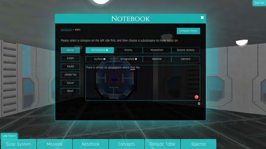
A.                                                                   B.
FIGURE 8. Revised prototype allowing teachers to view the details of a probe designed by a student (a) and an alien placement (b).

FIGURE 9. Implementation–Overview page with a tiled structure.

skills we had to implement vs “low priority” features which             We decided to use open-source platforms to develop the
included desired features and/or we currently did not have              teachers’ dashboard so that our development would not be
the skills to implement. As team members continued to                   constrained by potential and inevitable changes in propri-
learn technical skills, more features were added, and existing          etary software. React.JS (https://reactjs.org/) was selected
features were improved.                                                 as the core infrastructure for user interface (UI). React.
                                                                        JS is one of the most popular UI frameworks in the web
                                                                        development field due to its readable syntax as well as ease

IJDL | 2022 | Volume 13, Issue 1 | Pages 1-18                                                                                          9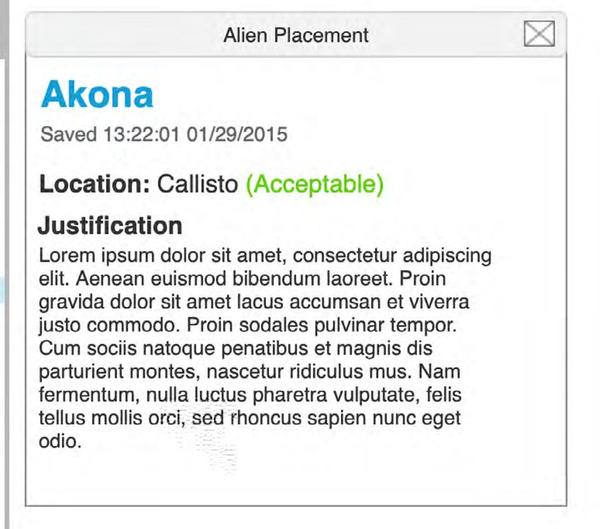
of reusing existing codes. Alien Rescue
program itself also used React.JS for UI
development, and using React.JS for the
dashboard allowed us to easily recycle
the data structure and UI components
used in AR. Given the choice of React.JS,
we then chose a React-based UI library
Ant Design (https://ant.design/) which is
natively written with React.JS and offers
various ready-to-use UI widgets that
we can customize. Since the main goal
of the dashboard was to serve as the
reporting platform of students’ activities
within AR, instead of having a separate
server we decided to extend the existing
AR server built with Express.JS (https://
expressjs.com/) and MySQL (https://
www.mysql.com/) by implementing new
application programming interfaces for
the dashboard. Express.JS is a popular         FIGURE 10. Implementation—Class View page giving a teacher an overall picture of
                                               her class activities.
framework to build a serving application
to communicate between web apps
and remote servers. MySQL dominates
the market of relational database that
offers fast and scalable data storage and
retrieval. An important component of the
extensions of the AR server is the use of
the websocket technology. The web-
socket technology allows users to sustain
a connection with a remote server and
thus conduct a two-way communica-
tion (users->server and server->users),
which lays the foundation for real-time
communication. Once we decided on
the technical tools, we began to learn the
tools to develop the dashboard. While
the design prototypes provided a basic
blueprint for implementation, we made
adjustment along the way (e.g., labels,
layouts of screens, structure) as we got
familiar with the technical tools and what     FIGURE 11. Implementation–Probe View page.
the selected technologies allowed us to
do. As we improved our technical skills,                             page: “User,” “Probe,” “Note,” “Solution,” and “Class.” Each tile
we also improved the functionalities of the dashboard.               had a name and number presented. The number in each
                                                                     tile showed the total number of a certain attribute a teacher
                                                                     had in her class(es). For example, the “User” tile in Figure 9
First Iteration of Implementation
                                                                     had a number of 3744 meaning there were 3744 students
The first iteration of the dashboard implementation focused          that had used the group code(s) of the teacher to register in
providing a “Class Overview” feature as it was determined a          AR. Similarly, the “Probe” tile’s 14192 meant there were 14192
“must have” feature from our team discussion. Because one            probes submitted in the teacher’s classes.
teacher could have multiple classes, showing all classes avail-
able before a class was selected in the landing page would           “Class View” page at the same navigation level of “Overview”
cause crowded or empty screen. We decided to use a tiled             showed the overview of activities by a class. A search bar in
screen that showed descriptive statistics on a teacher’ classes      the “Class View” allowed a teacher to search a specific class.
as the landing page (see Figure 9). This landing page was            Similar to the Google search bar, the search bar in “Class
named as “Overview.” There were five tiles in this “Overview”        View” provided auto-complete suggestions based on the

IJDL | 2022 | Volume 13, Issue 1 | Pages 1-18                                                                                       10
search terms, while search suggestions were limited only to The interface and functions of the “Notes” and “Placement”
the classes that teacher taught. Once a class was selected, sections were similar to the “Probes” section. A teacher could
descriptive statistics on students’ overall activities would view the notes a student took and solutions a student sub-
be displayed, showing in a paginated tabular format of mitted (see Figure 12 (a) and (b)). Such consistency in design
seven sections: “Student,” “Class,” “Probes,” “Notes,” “Placement,” and user experience would ensure consistent navigation for
“Budget,” and “Actions” (see Figure 10). a user, and also allowed the developers to reuse codes.
“Student” section displayed students’ usernames in AR. “Class” We emailed the teachers who planned to use AR to provide
section denoted which group code (each class was iden- a summary of our rationale of designing this teacher’s dash-
tified by a group code) the student belonged to. “Probes,” board and explained the progress we made. We then took
“Notes,” and “Placement” sections showed the number of this first iteration of the dashboard to teachers as they were
probes, notes, and solutions a student created respectively. using AR in their classrooms for feedback. We demonstrated
The numbers in the blue color suggested these numbers the dashboard features and how to use it. One teacher said,
were clickable and numbers in grey indicated they were not. “Teachers’ dashboard was so helpful to see probes sent and
The “Budget” section presented the remaining budget of a teach students how to learn from mistakes,” and another
student had (creating probes costs money). The “Actions” commented, “I think this was the best year so far for Alien
section allowed teachers additional functionalities such as Rescue. I enjoyed the dashboard and those new features. I
increasing the budget for a student. appreciate you working with us to optimize the program.”
Being able to see the notes students took, the detailed
Clicking on blue numbers under the “Probes” section allowed information of probes they sent (e.g., probe types, instru-
a teacher to see detailed information on probes submitted ments), and solutions students entered were the features
by a specific student (see Figure 11). The “Probe View” teachers really liked. They indicated these features helped
showed the student’s name on the top left. Next to the them understand their students’ problem-solving process
student’s name, there was a search bar that allowed teachers and allowed them to provide additional support to students
to filter probes by destination (planets). Below the student’s who needed it. One teacher stated she could now “go back
name and search bar, on the left side, there was a list of and look at individual probes students sent and help them
probes sent by the current student. Once a destination was understand why errors happened and what to do next
searched, only probes sent to the destination showed up. time to get the data they want.” In AR, if a probe is properly
The probe list was scrollable in case a student sent a large designed, it will return useful data to further students’ prob-
number of probes. The probe list was sorted in a date-time lem-solving process. Yet, a poorly designed probe will return
descending order, so the latest sent probes would be shown errors. This first iteration of the implementation realized the
on the top. Each item in the probe list showed the name of three most important features the teachers wanted to have
a probe and time when the probe was created. Each item in as they expressed in Phase 2. Based on teachers’ feedback
the probe list was clickable to show detailed information of a as well as our classroom observations of teachers’ use of this
probe such as a probe’s name, destination, justification, and first iteration of implementation, we decided to make several
probe configurations (probe type, power source, communi- improvements during the second iteration as discussed in
cation tools, and data collection instruments). the next section.
a. A student's notes b. A student's placement
FIGURE 12. Implementation–Notes View and Placement View pages.
IJDL | 2022 | Volume 13, Issue 1 | Pages 1-18 11Second Iteration of Implementation
While keeping the features shown in
the first iteration, several new additions
were made in this second iteration.
First, several new features were added
in management functions for the “Class
View” page. We learned from teachers’
feedback that it would be useful if
teachers could search by students’
names. Since a class as identified by a
group code could have more than 40
students, it was hard for teachers to find
a specific student quickly in “Class View”
page. Moreover, at the time of the first
iteration, students were not required to
input their first and last names during
FIGURE 13. Second iteration of implementation showing improved display of information.
the registration. It was often difficult
for teachers to associate students’
usernames with their real names, as
students often made-up names for their
usernames. We addressed this challenge
by adding another search bar right next
to the class search bar that allowed a
teacher to associate students by names
(username, first name, and last name).
Meanwhile, we also made a change for
the registration process asking students
to enter their real names as well as
usernames. Students’ real names were
displayed under the “Student” section.
Another new feature we added was
to allow teachers to reset students’
passwords. Teachers reported that some
students forgot their passwords in the
FIGURE 14. Second iteration of implementation showing two new features: Report–
middle of using AR and asking students Class and Report–Student pages.
to re-register would lose all the saved
information. They requested a feature While “Report - Class” page showed visualization in the unit
to reset students’ passwords. A new action “Reset Password” of class, information on “Report - Student” page was in the
was added under the “Actions” section to allow teachers to unit of an individual student. For both pages, a search bar
change students’ passwords if needed (see Figure 13). Lastly, allowed teachers to search by class or student. Teachers
we added a feature to allow teachers to download all the could also use the calendar widget on the top right corner
data displayed in “Class View” as a comma separated value to filter activities by dates. By default, the calendar widget
(CSV) file if teachers hoped to analyze the data in external spanned from the date when the first activity was taken to
tools. the date when the last activity was taken. Two line-graphs
were displayed to show students’ tool use in frequency and
The second major change was to add a feature showing how duration, respectively. Teachers could use the checkboxes
students’ use of each feature in a visual way both as a class on the top to toggle the visualization of different features.
and individually. Teachers mentioned they would like to see The frequency graph (see Figure 14) had a Y-axis of counts
the number of minutes their students spent in Alien Rescue and X-axis of dates, and the duration graph had a Y-axis
so as to determine which students were rushing through of minutes, and X-axis of dates. By using the report pages,
and which were spending enough time on the problem. This teachers could easily understand the general patterns
new feature (“Report - Class” and “Report - Student” pages) of students’ feature use from day to day. A teacher could
showed how students as a class and individually used the intervene and help students if she saw a student used one
tools in detail. These two pages displayed the information feature too many times but did not use other features; or
visually in the same way.
IJDL | 2022 | Volume 13, Issue 1 | Pages 1-18 12spent too much time in some features but not enough time as training and testing sets, respectively. We then trained
in other features. a deep neural network model called Bidirectional Encoder
Representations from Transformers (BERT by Devlin et al.,
Third Iteration of Implementation 2018). BERT was benchmarked against several machine
learning models commonly used in learning analytics, such
In this third iteration, our focus was to utilize artificial
as Random Forest and Recurrent Neural Network (RNN).
intelligence (AI) techniques to enhance teachers’ facilitation.
The results showed that BERT greatly outperformed the
A key problem-solving activity in using AR is after students
benchmarks by approximately 6% on accuracy and 10%
have gathered data through their research, they will design
on F-measure. The superior performance of BERT (accuracy
probes to test their hypothesis. When sending a probe, a
of 90% and F-measure of 85%) allowed us to auto-classify
student is asked to construct a probe, select a destination,
text justifications into several theory-driven categories from
and also provide a justification why sending a probe to a
poorly justified arguments to well-justified arguments. Given
specific planet is needed. The justification is written in text
this result, we incorporated this auto-classification feature
and it is not easy for teachers to read many justifications
into the design of the teacher’s dashboard to enable teach-
quickly during the limited class time to intervene if the stu-
ers to see students’ justifications in a quick way to assist their
dent is on the wrong track (i.e. students do not have a reason
facilitation. Figure 15 shows an example of what teachers see
to send a probe). In our other research exploring various
on the dashboard. Different colors represent different types
artificial intelligence techniques (Pan et al., 2021), we tested
of scientific argumentation students have composed. There
various models to automatically process a large amount
are five types of scientific argumentations ranging from ran-
of textual data from the analytics in the previous AR use to
dom (poorly-justified arguments) to reasoning (well-justified
understand students’ scientific argumentation as shown in
arguments) based on a scientific argumentation framework
probe justifications. Specifically, two researchers coded 4,500
(Bogard et al., 2013; Liu et al., 2015, 2016). For example, Figure
text-based probe justifications with scientific argumenta-
15 shows students sent a relatively larger portion of random
tions to construct a training dataset for the AI model. During
justifications on Oct. 22 as shown in red color. Using this
the coding, the researchers reached high inter-rater reliability
information, a teacher can quickly see whether her students’
of 0.84 measured by Cohen’s Kappa on 500 samples. 70%
justifications are on the right track and what additional
(n = 3,150) and 30% (n = 1,350) of the dataset were used
support she needs to provide. At the point of this writing,
FIGURE 15. Third iteration of implementation showing an example of a visual representation of classified students’ probe justifications
using artificial intelligence techniques (Y-axis indicating number of justifications).
IJDL | 2022 | Volume 13, Issue 1 | Pages 1-18 13we have implemented this feature in the dashboard and (a) design and implementation is really a continuous iterative
have made it available to teachers. Teachers’ feedback will be process as outlined and emphasized in the design thinking
sought in the future. literature (Brown, 2009; https://dschool.stanford.edu/) and
(b) it is necessary to get feedback from the key stakeholders
REFLECTION AND CONCLUSION (sixth-grade teachers for whom this dashboard is designed
for) at every stage. Both formal (e.g., surveys in this case) and
Our design experience reflects the complexity of design. informal (e.g., talking to teachers while we were making
We have encountered multiple challenges over the entire classroom observations) are valuable to us. Although we
process. One challenge is the timeline of our design cycle. have started with a low fidelity medium for prototyping
Because designing the teacher’s dashboard is situated in using paper and Google Slides, higher fidelity prototypes
the larger project of Alien Rescue, the logistics of how and using Axure RP are more useful given its interactive nature.
when Alien Rescue is used in schools constrain when we Showing teachers prototypes, even if the prototypes are still
can test our design ideas in the classrooms. Alien Rescue is preliminary, helps us gain valuable insights as to what will or
used as part of space curriculum unit in a spring semester will not work for the end users. In our view, these two factors
by local school teachers once a year. We need to wait till are essential to the success of a project.
teachers to begin their AR implementation before we can
get feedback on our design ideas of the teacher’s dashboard. Apart from being designers, we are also researchers and
The design team usually came up with design ideas in a fall have research interests. In fact, the larger project Alien
semester and then tested the prototypes in the following Rescue that this design case is part of is our R&D project. We
spring semester. That is why our design process took five realize that our research interests may not necessarily align
years as each cycle from idea generation to implementation with what our end users’ desire. For example, displaying lea-
took about one year. Another major challenge is that our derboard, gamification ideas mentioned in the design phase
design and development team are made up of graduate are of less interest to teachers, but those are our research
students majoring in learning technologies and the majority interests. One takeaway is we need to focus on what our
of the members do not have the necessary technical skills. end users’ needs first. In addition, teachers are usually busy
Therefore, it takes time to develop adequate technical skills and will not have a lot of time to provide detailed feedback.
to translate the conceptual ideas to an actual product. While A lesson we have learned is that we, designers, need to ask
we came up with many ideas during the initial brainstorm- very specific questions (e.g., listing which feature(s) we think
ing phase, we had to prioritize what was important for the the teachers want or showing visually how specific screens
stakeholder and what we could accomplish technically. For of the dashboard may look like). Visual representations allow
example, we focused on displaying the three aspects of teachers to quickly tell us what they think will or will not
Alien Rescue program: probe design, alien placement, and work. We have also learned observing how teachers use
notebook and left other aspects (e.g., map of space station, the dashboard in the classrooms and then following that
topics most visited in databases, management functions up with questions can provide a lot of insights as to what is
such as filtering and sorting, deleting duplicate students, working, what is not, and the issues we need to address. We
rearranging displaying columns as listed in Appendix B) for used both online surveys and classroom observations to get
future consideration. However, this design and development feedback on our designs. We observed three to five teachers’
process presents an excellent learning opportunity for these use of Alien Rescue in their classrooms every year. We kept
graduate students who are motivated to learn and apply the continuous communications with teachers to seek their
design and technical skills in creating a real-world appli- feedback. Surveys provided some high-level information
cation and get better prepared to be future instructional and observing teachers’ actions in the classrooms and then
designers and technology developers (see more description asking them questions provided more insights. We also
in Liu et al., 2014). found sometimes end users might overlook a new feature
we implemented. For example, we added a new feature of
Although these challenges are unique to our case, our de- “Add budget” under Actions as shown in Figure 13 in the first
sign process reflects some important characteristics that can iteration of the implementation phase, and yet some teach-
be useful to other designers and developers. An important ers still requested this feature. In order to draw attention
aspect of design is that it is an iterative process aiming to un- to the new features especially for those who have used AR
derstand human problems and attempting to find creative previously and may overlook newly added features, having
solutions to address the problems (Brown, 2009). Our design an accompanying professional training module highlighting
case is such an example. The goal of our design is to tackle newly added features would be a good idea. At this point,
the problem of enabling teachers who use AR project to we have implemented this training module delivered online.
view information their students have entered easily and just-
in-time. Our design process from idea conceptualization to In summary, through this experience of designing the teach-
implementation of the teacher’s dashboard have highlighted er’s dashboard as an accompanying tool to Alien Rescue
two factors of importance: project, we, the designers, put our knowledge and skills of
IJDL | 2022 | Volume 13, Issue 1 | Pages 1-18 14instructional design and learning technologies into practice. Ge, X., & Land, S. M. (2004). A conceptual framework for scaffolding
Our experience highlights that design is a complicated ill-structured problem-solving processes using question prompts
endeavor and it is not linear but iterative, and revisions can and peer interactions. Educational Technology Research and
occur at every stage. Development, 52(2), 5–22. https://doi.org/10.1007/BF02504836
Liu, M., Horton, L., Lee, J., Kang, J., Rosenblum, J., O’Hair, M. & Lu,
C. W. (2014). Creating a Multimedia Enhanced Problem-Based
ACKNOWLEDGEMENT
Learning Environment for Middle School Science: Voices from the
We acknowledge the contributions by two former team members, Developers. Interdisciplinary Journal of Problem-Based Learning, 8(1).
Jina King and Elena Winzeler, for their efforts and time in the idea Available at: http://dx.doi.org/10.7771/1541-5015.1422
generation and prototyping phases of this dashboard.
Liu, M., Kang, J., Lee, J., Winzeler, E. & Liu, S. (2015). Examining
through visualization what tools learners access as they play a
REFERENCES serious game for middle school science. Serious Games Analytics:
Belland, B. R., Glazewski, K. D., & Richardson, J. C. (2008). A Methodologies for Performance Measurement, Assessment, and
scaffolding framework to support the construction of evidence- Improvement (pp. 181–208). Switzerland: Springer. https://doi.
based arguments among middle school students. Educational org/10.1007/978-3-319-05834-4
Technology Research and Development, 56(4), 401–422. https://doi.
Liu, M., Lee, J., Kang, J. & Liu, S. (2016). What we can learn from
org/10.1007/s11423-007-9074-1
the data: A multiple-case study examining behavior patterns by
Bogard, T., Liu, M., & Chiang, Y. H. (2013). Thresholds of knowledge students with different characteristics in using a serious game. The
development in complex problem solving: A multiple-case study Technology, Knowledge and Learning journal, 21(1), 33–57. http://
of advanced learners’ cognitive processes. Educational Technology link.springer.com/article/10.1007/s10758-015-9263-7. https://doi.
Research and Development, 61(3), 465–503. https://doi.org/10.1007/ org/10.1007/s10758-015-9263-7
s11423-013-9295-4
Liu, M., Yuen, T. T. Horton, L., Lee, J., Toprac, P. and Bogard. T. (2013).
Boling, E. (2010). The need for design cases: Disseminating design Designing technology-enriched cognitive tools to support young
knowledge. International Journal of Designs for Learning, 1(1). learners’ problem solving. The International Journal of Cognitive
Technology. 18(1), 14-21.
Brown, T. (2009). Change by Design: How Design Thinking Transforms
Organizations and Inspires Innovation. New York, NY: Harper Collins Pan, Z., Chenglu, L., Wenting, Z., Liu, M. (2021, April). The
Publishers Inc. development of an automatic text classifier enhanced dashboard in
supporting teacher’s facilitation of virtual problem-based learning
Devlin, J., Chang, M. W., Lee, K., & Toutanova, K. (2018). Bert:
activities. Paper presented at the annual conference of American
Pre-training of deep bidirectional transformers for language
Educational Research Association (AERA). Orlando, FL.
understanding. arXiv preprint arXiv:1810.04805.
Savery, J. S. (2006). Overview of PBL: Definitions and distinctions.
Howard, C. D., Boling, E., Rowland, G., & Smith, K. M. (2012).
Interdisciplinary Journal of Problem-Based Learning, 1(1), 9-20. https://
Instructional design cases and why we need them. Educational
doi.org/10.7771/1541-5015.1002
Technology, 34-38.
IJDL | 2022 | Volume 13, Issue 1 | Pages 1-18 15APPENDIX A
Notes on Evaluating Dashboards on the Market
From Khan Academy: a feel for how the whole class is doing, and whether students
Energy points for the class–seems to be a pointed line graph are taking the writing tasks seriously.
with zero in the middle and positive above and negative
below. It’s updated every minute, so a teacher could just Lancaster Bingo Company:
watch it. If we were doing something like this for AR, how The Order Summary format could be borrowed to create
would it work? You could take a stage that kids are in (one a student summary with things like notes written, probes
of the four problem-solving stages), designate tools that launched, recommendations submitted, budget, etc. You
they should and shouldn’t be using, and then the energy bar could even break things down further into notes according
reflects the average of where kids are spending their time in to category, planet notes vs. alien notes, for instance. You
the classroom. Is this helpful? could show the student against the class average.
One major difference is that our content isn’t linear, and we I still like the player shapes idea from that one article if we
don’t want it to be. We have identified certain positive pat- use a line graph to show activity.
terns of interaction with the environment based on previous
studies, but we don’t want to be too prescriptive. With just From Cranium:
log data of tool use patterns alone we could get a lot of false
positives and false negatives as far as kids who are doing fine We might also be able to do word clouds with the titles of
and needing help. Specific definitions of what a struggling the pages most frequently accessed in a given database.
and a thriving student look like are still lacking. Could this be Would be really good for Concepts, Solar System, and Alien
a future direction for LA? DB.
From Hapara.com: From Airbnb:
Teachers can see all students on a page and what docu- Progress bars are really salient visually. How can we incorpo-
ments they have in their folder (they can choose to see 3, rate them into the TsDB? Aliens placed would be the obvious
5, 10, 15, etc. at a time). We could do this with the probe one, but it won’t be very interesting for the first few days. The
justifications and rationales. Can sort students by first or last other ones don’t have a “complete” state, so it’s hard to do a
name, class group, ascending/descending order. You can progress bar.
also choose between viewing students in rows or columns.
You can assign students a color to make them stand out. You From Statisti.cs:
can search for keywords within the document (as well as for The multi-level pie chart is an interesting idea, but they’re
students if a big list). So, teachers could search for an Alien or not the most intuitive visually. Would have to think about
planet name to see which kids are working on it, etc. Show how best to use it, if at all.
timestamp for submitted text. Manual refresh button. Button
to message kids within the system (can use Message Tool) From Wave:
right there next to their name. Could have notes, justifica-
tions, and rationales in the same page, but differentiated Would we like teachers who are long-time users to be able
visually. to compare classrooms over time? Or actually, compare
different classrooms simultaneously would be even better.
The stacked line graphs (showing player shapes) would be
From econsultancy.com:
great for that.
Toutapp:
From Trendkite:
Could word clouds be a cool way to visually capture class
writing activity? You could do a whole class, all subjects one; A map that shows room activity by the size of circles = fun!
single student; single subject (notes titled Akona). With a
single student, it could tell you what they’ve learned. With a From Chartbeat: The vertical lines with the colored circles
single subject, you can see what facts are most commonly would actually be a good way to show where a student falls
learnt among the students. For the general one, you can get compared to the class as a whole on a certain measure.
IJDL | 2022 | Volume 13, Issue 1 | Pages 1-18 16APPENDIX B
Outline of Desired Features to Consider in the Dashboard
• Tabs › Probe errors
- My Classes (multiple classes as a teacher typically » % of instruments
teach 5-6 classes) » Broken down by cause
- My Class (one single class) - Total aliens placed
- Manage Students–add/delete students, place into › leaderboard with top 10 (taking accuracy into
groups, send a message, take screenshot, adjust account)
budget, sort to find a student › Word cloud for justifications
- Student Name - Activity feed that shows notes created, probes
- Can have multiple classes open at a time designed, and recommendations submitted in real
time (with timestamp)
• Management capabilities
- Message students • Overall snapshot of individual’s activity
- Give students badges - tools currently in use (like Hapara’s open tabs)
- Take a screenshot of students’ screen? › active
- Adjust budget › time opened
- Search for names and keywords within students’ - Action Shape of tool use
text - budget
- Sort students - number of notes
- Place students in groups - number of probes
- aliens placed
• Overall snapshot of class activity
• Notes created
- Map of space station that shows where students are
- Aggregate Action Shape, plus capability to separate - number of notes, broken down by category
into groups - full content of notes
- Topics most visited in Databases - date/time modified
› Alien - keyword analysis?/ word cloud
› Solar System - search feature
› Concepts • Probes created
› Missions - number of probes created and launched
- Total notes created - breakdown of probe destinations by associated
› leaderboard with top 10 (based on character/ alien (or none)
word count?) - full content of probes–all instruments, cost, destina-
› Word cloud for notes–general one automat- tion, timestamp
ically generated on homepage, but teachers - error messages–with explanations as to cause
can create new ones for specific note titles
• Aliens placed
- Total probes created
› leaderboard with top 10 (based on % new - correct/incorrect score
information) - full text, time stamp
› Word cloud for probe justifications - Time taken to write justification
› Breakdown of probe destinations by associated
alien (or none)
IJDL | 2022 | Volume 13, Issue 1 | Pages 1-18 17APPENDIX C
Discussion Points Based Upon Interactive Prototypes
Monitoring Tools • How would you divide the widgets into pages? What
• What additional functionality can you suggest for this names would you give the pages?
page? • How should we determine a student’s standing on the
• What additional visualization can you suggest for this leaderboard for notes?
page? • Conversely, how should we determine if a student is
• Other comments: exhibiting a red-flag behavior regarding notes?
• How should we determine a student’s standing on the
Grading Tools leaderboard for probes?
• Do you have a preference for the compacted or expand- • Conversely, how should we determine if a student is
ed versions? exhibiting a red-flag behavior regarding probes?
• Would you like to suggest an alternative way to present • How should we determine a student’s standing on the
the information? (Include mockups) leaderboard for alien placements?
• What additional functionality can you suggest for this • Conversely, how should we determine if a student is ex-
page? hibiting a red-flag behavior regarding alien placements?
• What additional visualization can you suggest for this • What additional functionality can you suggest for this
page? page?
• Other comments: • What additional visualization can you suggest for this
page?
Class Activity
• Other comments:
• Would you prefer to see the widgets on one page or
(two) separate pages? Print Report
• If you prefer to see the widgets on one page, would you • What additional functionality can you suggest for this
like to suggest an alternative way to present the widgets? page?
• Other comments:
IJDL | 2022 | Volume 13, Issue 1 | Pages 1-18 18You can also read