Decorating and colour trends - Resene
←
→
Page content transcription
If your browser does not render page correctly, please read the page content below
decorating
and colour trends   Colour your home with
Some products or services may not be offered in your area or country.
Please check with your local Resene ColorShop or reseller for availability.
Most Resene products can be ordered in on request though lead times
and minimum order quantities may apply.
Colours are as close as the printing process allows. Always try a Resene
testpot or view a physical colour sample before making your final choice.
The contents of habitat plus are copyright and may not be reproduced in
any form without the written permission of Resene. Opinions expressed in
habitat plus are not necessarily those of Resene or the publisher Tangible
Media. No responsibility is accepted for the authors’ suggestions or
conclusions, or for any errors or omissions. Copyright 2018 Resene Paints
Ltd. ISSN: 1176-8010.
Contributing stylists: Gem Adams, Kate Alexander, Amber Armitage,
Nikki Astwood, Greer Clayton, Megan Harrison-Turner, Sarah Herring,
Claudia Kozub, Vanessa Nouwens, Emily Somerville-Ryan, Leigh Stockton,
LeeAnn Yare.
Contributing photographers: Bryce Carleton, Wendy Fenwick, Melanie
Jenkins.

Left: Side wall in Resene Red Berry, upper back wall in Resene Vanilla Ice
and lower back wall in Resene Rice Cake. Get the look of the terrazzo-
style mural using Resene testpots in Resene Burnt Crimson (burgundy),
Resene Negroni (peach), Resene Glamour Puss (pink) and Resene
Longitude (blue/grey).

     Resene Quarter
     Spanish White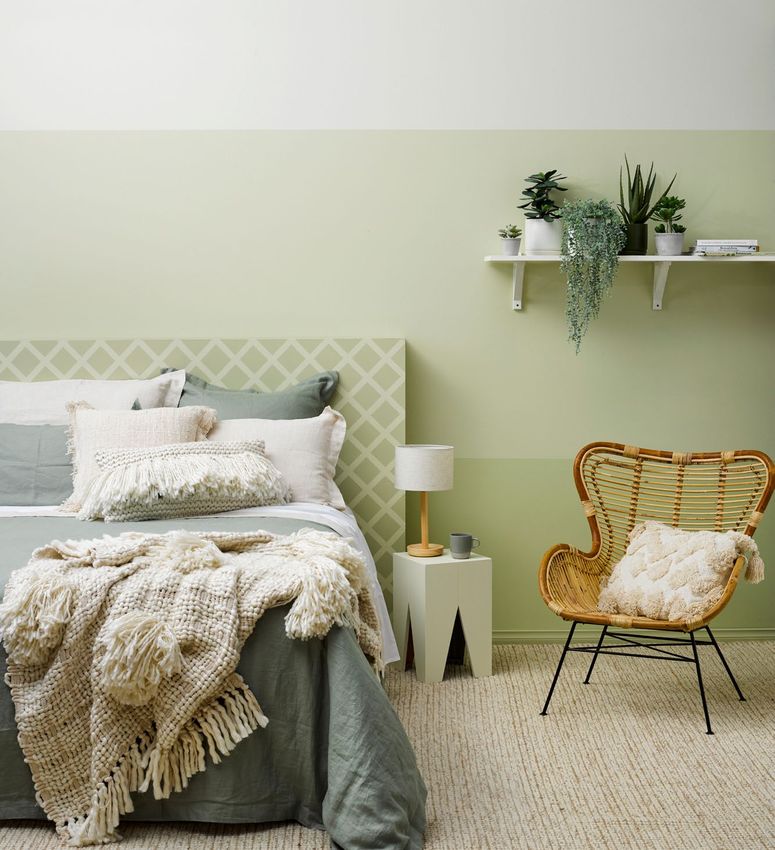
welcome
It's no surprise to social commentators that colour trends mirror
the moods of the moment. It's no wonder we are all falling for
                                                                          contents
                                                                           2
                                                                           4
                                                                           7
                                                                                The social DNA of interior trends

                                                                                The dark side

                                                                                Fade to grey and blue
green when eco-friendliness, wellbeing and biophilic design
continue to capture our consciences.                                      10    New ways to go green
   Likewise, rich earthy tones are coming to the fore as we seek to
ground ourselves. We are lapping up soft, soothing peachy pinks
                                                                          12    The return of red

when the world beyond our walls is full of digital chatter and often
lurid commercial messages.
                                                                          15    Pink's progress

   When it comes to decorating colour choices, we appear to be            18    Shaping up
entering a phase of careful consideration rather than one of bold
gestures. Colours are weathered and subtle; they whisper rather           20    Neutrals get earthy
than shout. We're looking for nuances, for example, taking dark
walls and giving them a brooding undercurrent of colour. It's
                                                                          22    More... or less

intriguing, not in-your-face.
   Reflecting all and more of these current trends, the Resene
                                                                          25    Tonal takes a twist

The Range fashion colours showcases colours to not only                   28    Seasonal switch-outs
enjoy today but to take us into the future. It's a rich resource of the
most current colours, and available at your local Resene ColorShop        32    Wallpaper keeps on rolling
or reseller.
   Happy decorating!
                                                                          34    Other trends to watch for

The Resene and habitat teams
                                                                          38    Stylists' colour loves

                                                                               Resene
                                                                               Red Herring
                                                                                                                    | 1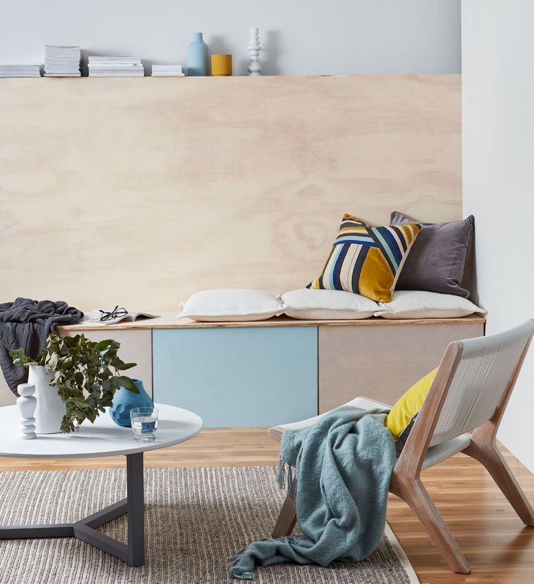
the social DNA of interior trends
      Where do trends come from? Who decides millennial pink will morph into shades of blush and peach?
      In fact, who decided millennial pink was a thing in the first place? The answer is ‘everybody’; the
      global collective influenced, consciously or unconsciously by what is going on around us in the world.
         The simplest example is in the rise of visual social media platforms such as Instagram. Modern life
      is viewed through a camera lens, framing our experiences for the world. The resulting influence on
      our design trends can be seen in the rise of fun, exciting and highly personalised choices that are pure
      self-expression, whether it’s in pops of bright colour or unexpected matches of colour and texture.
         The ever-present cameras in our lives has also encouraged the use of layers of similarly toned
      colours in our designs. They photograph beautifully, ensuring your space appears multi-dimensional
      and impressive. No longer are we tied to base neutrals in white or cream, instead we’re using layered
      shades of blue, green, grey and peach.
         Which brings us back to that millennial pink, a colour born out of the global movement toward
      gender fluidity. As the gender movement has become more nuanced and widespread, millennial pink
      has evolved into more interesting dusky shades of blush and peach. It’s an example of how a design
      trend evolves and becomes more sophisticated alongside the generation which embraced it.

      Slowly slowly
      Evolution is key in design trends. Most of us don’t suddenly flip from stark white minimalism to
      painting our living rooms in the new bold brick reds overnight. It’s an incremental process.
         Look at the trend for 'eco' styled spaces born out of our increasing concern for the environment.
      It has evolved beyond just simplifying designs against beige neutrals and adding plants. Our design
      choices involve more natural fibres, textures and natural finishes, against backdrops of soft neutral
      greens as we aim for a sense of wellness. We like to understand the story behind the objects and
      materials we use and in our revolt against single-use items, we are reinventing and upcycling furniture,
      accessories and second-hand finds.
         For others the sustainability movement steers them toward a de-cluttered, simplified look such as
      the perennial classic monochrome; almost an anti-trend. It’s a simple, uncontrived canvas which is
      easily adapted to season or mood with a few key changes of plants, textiles or art. The palette may be
      pared back but a shift away from stark whites to creamier tones keeps it soft and welcoming.

2 |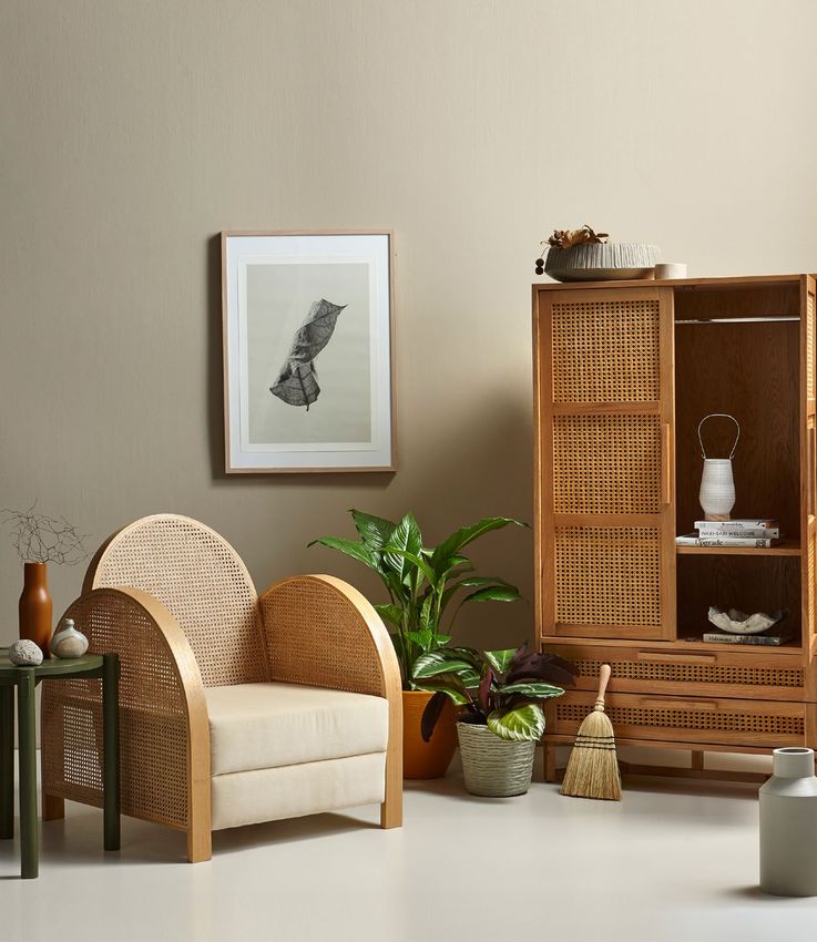
Left: Grey-greens are a new-season                                               Every two years Resene launches
neutral. This wall is painted in Resene                                          a new fashion fandeck of exciting
Peace with coffee tables in Resene Grey
Olive (large) and Resene Poured Milk.
                                                                                 on-trend colours. Check out the
The vase is in Resene Double Pravda,                                             latest fandeck, The Range fashion
the bowl in Resene Waiouru and the                                               colours, at your local Resene
small platter in Resene Charcoal.                                                ColorShop or reseller.
Right: Weathered blues comfort
us. The background is in Resene
Colorwood       Greywash,     Resene
Colorwood Whitewash and Resene
Raindance. The vases are Resene
Raindance (top) and Resene Lazy River
and the A4 drawdown paint swatches
are in (from top) Resene Poured Milk,
Resene Quarter Baltic Sea and Resene
Sea Fog.

Galvanised communities
The volatile political and social landscape we currently live in is also
impacting our design choices. As communities galvanise over social and
political movements you can see some design trends going bolder, with
true reds, or stormy blues and aubergines with a dark twist.
   The antithesis of this is the yearning for a calm haven from the chaos
out the front door, resulting in the trend for soothing mid-neutrals in grey-
greens or charcoal blues.
   In the end, though trends shift with the times and global mood, the point
is still personalisation. You will find the trend that speaks most to you when
you see a colour or a design – a bold geometric on the wall or a freeform
painterly pattern perhaps. It seems so obvious you wonder why you didn’t
think of it before. From there you take it and make it your own.                                            Resene
                                                                  Resene                                    Artemis
                                                                Alabaster                                             | 3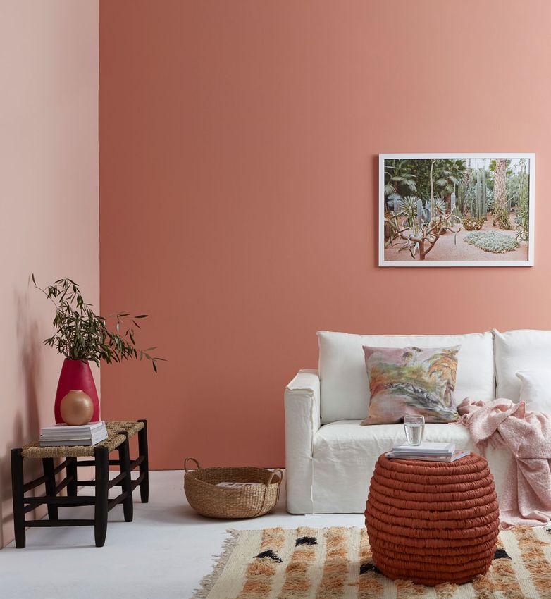
the

      dark
       side
              Brooding and powerful –
              today’s darks are packed
              with personality
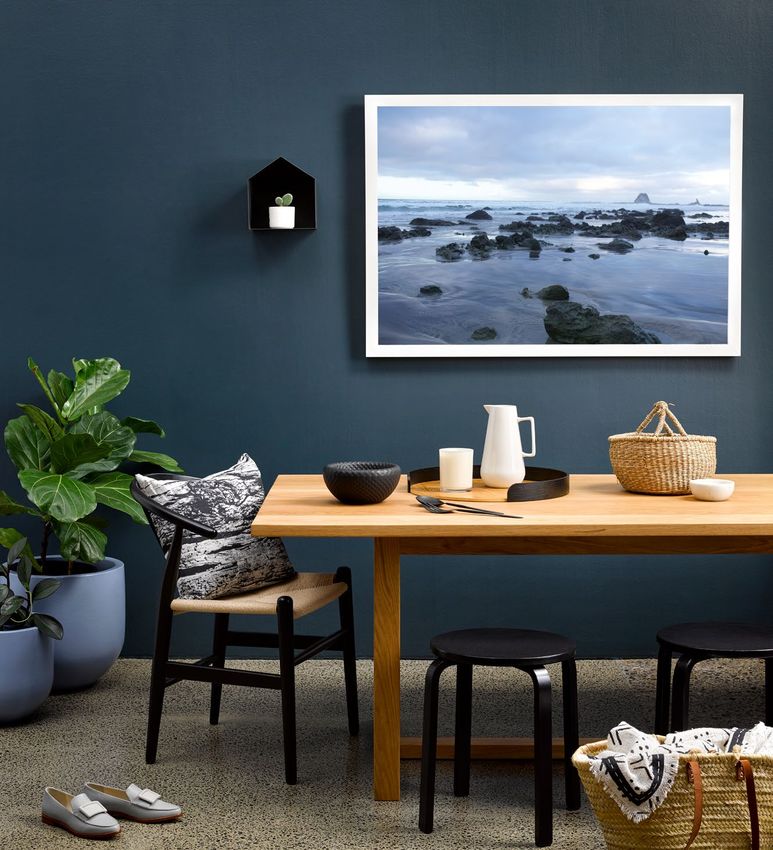
              There’s a certain wild beauty about today’s dark
              paint colours. We’ve moved away from plain
              blacks and charcoals to colours with more depth
              and interest. These are stormy, twisted colours
              that on the one hand can be brooding and
              torrid, but on the other hand can be comforting
              and enclosing. Think sooty faded black, brackish
              green, bruised grey, bitter brown and briny blue.
                 These evocative colours can be used for
              different effects. One way is to really commit
              to one shade. If you can match your couch
              and armchairs to the shade of your walls, and
              add tonal elements, you’ll create an intriguing,
              comforting space. You can even paint the
              ceiling dark.
                 The shadowy, bruised grey of these bedroom
              walls (right) anchor a tonal dusky purple scheme,
              enhanced by the relaxed shapes of rounded
              vases and wall hangings, and the crumpled linen
              bedding. Dark colours also work well with the
              trend for velvet furnishings.
                 Or use a dark colour as a robust backdrop to
              allow bolder and brighter accent colours to shine.
              These kinds of colours need stronger shades to

              Left: Wall in Resene Coast, floor protected with Resene
              Concrete Wax, plant pots in Resene Ship Cove and stools
              in Resene All Black

4 |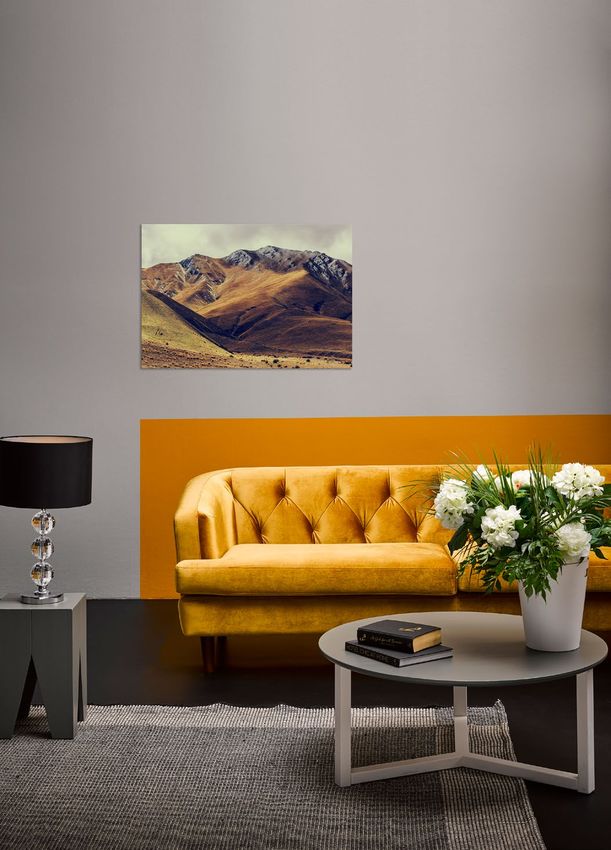
Resene Half
                                   Black White
                                                           other stormy darks to try:

                                                                  Resene                         Resene
match their power but if you want to go soft                     Aubergine                    Thunder Road
and dusky, just use a lot of it. Accessories
and furnishings can also be switched out for
seasonal effect.
   This dining space (left) matches the                   – deepest, darkest wine red   – a comforting burnt brown
strength of the teal blue walls with waxed
concrete floors and a sturdy timber table.

                                                                   Resene                         Resene
                                                                    Suits                         Karaka

Right: Dark tone-on-tone is elegant and intriguing. The
walls and floor here are Resene Quarter Bokara Grey.
Below: Bruised purple/grey wall in Resene Gun Powder.      – a buttoned-up charcoal     – an ancient rain forest green

                                                           no room is too small
                                                           The often-quoted ‘rule’ to be broken
                                                           is that you shouldn’t use dark colours
                                                           in small rooms or the space will feel
                                                           claustrophobic. Not true. Use colours
                                                           with a cool base rather than a warm one,
                                                           so that they visually recede and don’t
                                                           dominate the room, and pay attention
                                                           to your lighting. Keep bold or fussy
                                                           patterns to a minimum.
                                                                                                  Resene
                                                                                                 Virtuoso

                                                                                                                         | 5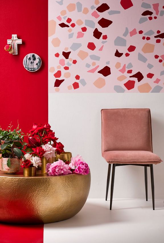
Dark coloured walls are supremely versatile
      and can be joined by many styles of
      furnishings and accessories to suit many
      tastes. We took one room, painted the walls
      in Resene Indian Ink and had it styled in three
      distinctive themes – contemporary, coastal
      and classic. The contemporary setting at
      the bottom mixes the Resene Indian Ink
      walls with aqua blues and silver. A mid-
      century sofa and glass-topped table painted
      in Resene Deep Teal lend an architectural
      feel. The picture frame is painted in Resene
      Silver Aluminium and the floor is in Resene
      Midwinter Mist.
         Watch what happens when you
      introduce plywood floors finished in Resene
      Colorwood Whitewash (far left). The look
      is coastal cool with light, slightly rustic
      furnishings. The peg stools are painted in
      Resene Wedgewood (darker) and Resene
      Eskimo and the magazine rack is in Resene
      Half Sea Fog.
         This more traditional, luxe setting goes
      classic and cosy (top right) with a Resene
      Persian Red painted coffee table and a small
      side table in Resene Negroni. The floor is
      painted in Resene Bastille.

                                        Resene
                                       Half Tea

6 |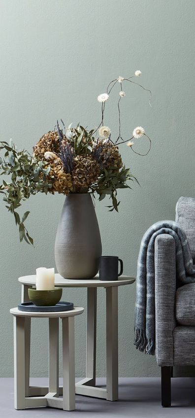
Blue and grey stay pale
              and interesting

grey & blue
              Washed, weathered, subtle, smoky and
fade to       shadowy. There’s a palette of pale blues and
              greys that seems to transcend the fashions.
              Calming and soothing, these are colours that
              speak softly rather than shout. They remind us
              of cloudy skies, refreshing waters, icy slopes and
              delicate shells.
                 Weathered blues and greys are timeless, but
              their popularity has peaked in recent times.
                 Offering an escape to solitude, they allow us to
              switch off from the ceaseless digital chatter and
              bombardment of bright advertising messages.
                 In a land where water is an ever-present
              natural feature and the sea is never far away,
              these colours hold an intrinsic nostalgic pull.
                 These soothing colours are easy to insert
              into most interior schemes and, in fact, work
              superbly as neutrals. Palest mist grey and watery
              blue work as replacements for icy white yet
              still allow stronger colours to come and go as
              accessories, or to marry with more grounded

              Left: Walls in Resene Sea Fog, bench seat wall and seat
              top in Resene Colorwood Whitewash, cupboard doors
              in Resene Colorwood Greywash and Resene Raindance,
              floor in Resene Colorwood Natural, coffee table in Resene
              Poured Milk (top) and Resene Quarter Baltic Sea (legs),
              honeycomb vase in Resene Lazy River, textured vase in
              Resene Raindance, candlesticks in Resene Poured Milk and
              diamond-patterned pot in Resene Influential.
                                                                   | 7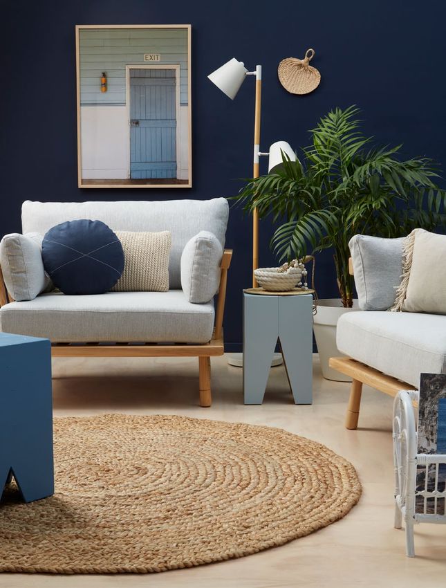
tones in warm brown and sandy taupes. They
also become a powerful message as part of a
tonal scheme, ranging from soft duck egg blue
through to deep stormy blue or graphite.
   Gently ethereal, these colours marry
beautifully with waxed and chalky finishes,
or matte paints such as Resene SpaceCote
Flat which enhances the subtle beauty of the
colours. Tactile accessories and texture are made
for these colours whether it’s translucent sheer
fabrics, rubbed metals, roughened basketry or
aged timbers.

                                                    Left: Soft stains enhance
                                                    the look. Background        other weathered blues and greys to try:
                                                    in Resene Colorwood
                                                    Whitewash,         Resene
                                                    Colorwood        Greywash
                                                    and Resene Raindance,
                                                    narrow vase in Resene              Resene              Resene            Resene
                                                    Raindance, wide vase             Slipstream         Duck Egg Blue     Remember Me
                                                    in Resene Lazy River,
                                                    A4 drawdown paint
                                                    swatches      in   Resene
                                                    Poured Milk, Resene
                                                                                                                              Resene
                                                    Quarter Baltic Sea and                                                    Mystery
                                                    Resene Sea Fog.

8 |
well washed
Check out the Resene Colorwood stains range for two finishes
that merge perfectly with weathered greys and blues. First there
was Resene Colorwood Whitewash, with its classic ephemeral
look, then came Resene Colorwood Greywash (above right),
with a more antiqued aged look. Both look surprisingly different
depending on the type of timber they are applied to, and both are
surprisingly versatile, suiting many interior styles from traditional
to contemporary.
Left: Weatherboards in Resene Half Periglacial Blue, deck in Resene Woodsman Driftwood
stain, chair and bench in Resene Coast, pots in Resene Grey Seal and Resene Slipstream.
Above left: Perfect for a beachy vibe. Background in Resene Poured Milk, weatherboards
in Resene Half Periglacial Blue and A4 drawdown paint swatches in Resene Coast and
Resene Slipstream.
Resene Above: Panelling and floor in Resene Half Dusted Blue, upper wall in Resene Quarter
Poured Milk Albescent White and dado rail in Resene Papier Mache.
| 9green
new ways to go Greens of all styles continue
to flourish
Going green – it’s a phrase with connotations
that go well beyond colour, yet as we focus on
environmental issues and seek connections with
nature via biophilic design, green is growing
strong within our interiors. The circle is complete.
Green started strong a few years ago as clean
and verdant with loads of personality. Then it
turned a bit khaki and swampy. Now, green has
softened to versatile dusky shades that can even
be used as a neutral for interiors.
Warm grey-greens seem pulled directly from
earthy landscapes. By contrast, fresh leafy greens
are a sweet, simple look perfect for a seasonal
change-out in spring and summer.
This living room (right), with its rear wall in
Resene Peace, becomes a sophisticated retreat
from the turbulent world. It’s given depth with
tonal accessories in sharper greens and greys. It
has a sense of structure and security, not least
of all because it has traditional echoes with the
oriental rug and warm red touches.
Breezy spring greens also work as neutrals,
and when layered in tonal shades make a room
feel sun-drenched and energising. This bedroom
(left) takes the trend to maximum effect with
graduated greens in broad stripes up the wall.
The painted lattice pattern on the headboard
echoes the rattan chair and the chunky natural
fibres of the throw, carpet and cushions.
10 |Above left: Add muted pink to make this summery scheme even fresher. Lattice pattern in Resene Fawn Green
and Resene Miso, A4 drawdown paint swatches in (from top) Resene Nirvana, Resene Just Right, Resene Coconut
Cream and Resene China Ivory.
Above right: Grey greens come alive with bold red and sharp green accents. Background in Resene Grey Chateau
with A4 drawdown paint swatches in (from left) Resene Untamed, Resene Suits and Resene Peace. The round
platter is Resene Charcoal and the small bowl in Resene Waiouru.
Above: Rear wall in Resene Peace, side wall in Resene Suits,
a green for all seasons: floor in Resene Grey Chateau, shelf in Resene Untamed, side
Resene tables in Resene Grey Olive and Resene Poured Milk, large vase
Resene Secrets in Resene Double Pravda, small vase on shelf in Resene Double
Untamed
Ash and candle stand in Resene Charcoal.
– soft and summery
– swampy and intriguing Opposite: Striped wall in (from top) Resene Travertine, Resene
Miso and Resene Nirvana with skirting board in Resene Fawn
Resene Green. Lattice headboard in Resene Fawn Green and Resene
Resene
Green Meets Blue
Away We Go Miso, shelf in Resene China Ivory, peg stool in Resene Coconut
Cream, small pot in Resene Eighth Tapa and small vase painted
– stormy, touched with blue
– fresh and energising in Resene Alpaca.
Resene
Helix | 11red
the return of Rich, deep red is a vintage
set to mature
One of the hippest colours of the decade,
millennial pink, has bought along a friend –
burgundy red. They are a perfect partnering, but
needn’t be consigned to the bedroom or she-
den. Suddenly, burgundy isn’t old-fashioned any
more, appearing on walls and on furnishings. It
goes hand-in-glove with the move towards rich,
cocooning interiors that make us sigh with the
decadence of it all.
Cool red with rice whites or with brooding
charcoals to stop it looking too overpowering.
Or try it in a related colour scheme with bruised
purples for a dramatic look.
A matte finish, such as Resene SpaceCote Flat,
adds to the rich depths of a colour like this. If
you want to go glossy, a truer cherry red would
be best.
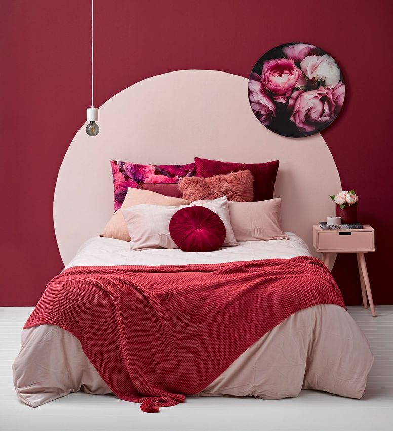
Some call it burgundy but in this room (left),
Resene Pohutukawa has the mood and look of
a mellow vintage wine. A part circle is painted
onto the wall in Resene Dust Storm to act as
a headboard; like the setting sun, or a rising
moon. The combination of wine red and soft
pink might be feminine but, in this case, it’s also
very sophisticated. A floor in the antique white
Resene Double Rice Cake balances the richness
of the wall colours. The circular motif of the
headboard is echoed in an off-set artwork, the
Edison-style light, and velvet cushion.
12 |Burgundy and pink cry out for floral
companions. Background in Resene
Double Rice Cake, vase and tealight
holder in Resene Sauvignon and A4
drawdown paint swatches, from top
Opposite: Walls in Resene Pohutukawa and Resene Dust Storm (circle), floor in Resene Double Rice Cake, bedside left, in Resene Pohutukawa, Resene
table in Resene Sakura, tealight candle in Resene Sauvignon and vase in Resene Pohutukawa. Sauvignon and Resene Sakura.
Above left: Desk in Resene Sakura, chair in Resene Sauvignon and pencil pot in Resene Pohutukawa.
Above right: Vase in Resene Pohutukawa and tealight holder in Resene Sauvignon.
burgundy reds to try:
colours to use with deep red:
Resene Resene
Aura Resene Resene
Bianca Smoulder Salsa
– white with a hint of cream – a soft sage green to earth it
Resene Resene
Bismark Purple Rain – a deep carmine red – soft and velvety
– a denim blue for a classic combo – a deep violet for added luxe
Resene Double
Rice Cake | 13Strong, true red goes casual with
a global vibe
Pick a theme and let red dominate the room. Here, the
boldness of the colour is balanced by natural textures
for an exotic Pasifika look... by way of Morocco.
No longer consigned to feature walls from the 1990s,
modern reds can be layered for a dramatic but inviting
and cosy look – this room has Resene Dynamite on the
lower wall and Resene Poppy on the upper wall.
Blue is used to cool the room with a stencilled floor
and side table. A stylish rattan chair adds lightness and
simplicity, without sacrificing style and elegance. The
lighter accessories such as the cotton stems, cream
flowers and cream bowl, as well as a wine box and other
wooden accessories, accentuate the natural elements.
With all of these factors combined, this is a perfect
look for the casual lifestyle of a bach or any home with
an easy flow to the outdoors.
Resene
Elderflower
other colours to try with bold, new reds: Above: Wall in Resene Dynamite (lower) and
Resene Poppy (upper), floor in Resene Wishing
Well with Resene Time After Time stencil,
Resene table in Resene Wishing Well, vases in Resene
Thumbs Up Moccasin (on shelf) and Resene Raging Bull (on
floor), wine box in Resene Colorwood Natural
– a spicy mustard yellow wood stain and bowl in Resene Elderflower.
Left: Stencil in Resene Wishing Well and
Resene Resene Time After Time, A4 drawdown
Family Tree paint swatches in (from left) Resene Poppy,
Resene Moccasin, Resene Wishing Well and
– a deep verdant green Resene Dynamite.
14 |pink's
progress
Pink continues to morph
and develop
It has been the darling of recent times –
millennial pink has appeared in all walks of life
from clothing (men’s and women’s), products,
accessories, hair and makeup and interiors.
It’s a colour that may not be going away any
time soon, but the sweeter truer shades of pink
we’ve seen in recent years are morphing in two
directions – to dusky peach/nudes and to soft
fresh lilacs.
The dusky peach interpretation marries
well with emerging earthy colours like
terracotta and leather browns. They are also
natural partners to creamier whites and deep
storm blues.
As with millennial pink, this newer colour is
not one specific colour but can be many. Think
salmon, wafer, biscuit, nude and pale coral.
In combination, these colours are like a pale,
glorious sunset.
The surge of smoky pink and peach into
our current culture has opened the door for
androgynous and adult pinks of so many
Left: Back wall in Resene Just Dance, side wall in Resene
Sorbet, distressed floor in Resene Poured Milk over
a basecoat of Resene Rebel. Ottoman legs in Resene
Colorwood Pitch Black wood stain, round table in Resene
Sunbaked, tall vase in Resene Irresistible and small vase in
Resene Rose Gold metallic.
| 15different shades. Peachy pinks are gentle, Below: A graphic feel
compassionate, composed, free-spirited, with a background in
Resene Alabaster and A4
nurturing and youthful. drawdown paint swatches
These colours can be used as an accent in Resene Escapade (light
or as a neutral depending on which version blue), Resene Soothe (pink)
you choose – the muddier versions work well and Resene Avalanche
(navy).
as neutrals. It’s not sickly sweet, but can be
sophisticated, glamorous and edgy.
Peach teamed with lighter neutrals will
achieve a soft, romantic vibe while darker
combinations can be more dramatic. It’s a
colour that lends itself to a variety of styles.
It is warm, elegant and soothing rather than Resene
sugary and showy. Ethereal
Above: Wall in Resene Soothe with Resene Avalanche arch detail, floor, small side table and
pendant light in Resene Alabaster, coffee table in Resene Escapade, vase in Resene Soothe.
16 |Lilac has a fresher vibe whether it’s as an icy pastel
or as a greyed silvery lavender. It’s a natural next
step in our love affair with complex pastels and
is surprisingly adaptable as an interior shade. If
you look to nature, you’ll see it mixed with soft
greens and grey foliage, and it goes well with
both cool and warm whites, as well as greys
and greige. This wall shape is Resene Mozart,
surrounded by Resene Alabaster.
Resene
Dreamtime
Above left: Background in Resene Poured Milk, mesh platter in Resene XOXO, vase in Resene Rose Gold metallic and
A4 drawdown paint swatches in Resene Just Dance (darker) and Resene Sorbet.
Above right: Walls and floor in Resene Blanched Pink.
peachy pinks to try:
Resene Resene
Shabby Chic Crowdpleaser
– a faded peach-edged pink – a mellow biscuit tone
Resene Resene
Despacito Soulful
– a delicate pinky beige – a gentle sunset apricot
| 17shaping up Stripes, triangles, colour blocks
– painted features keep going strong
It seems we’ve all been having fun of late – personalising our interiors
with bold shapes and strong splashes of colour. We’ve seen geo
shapes, chevrons and mountain profiles, as well as more freeform
feature walls in watercolour effects and tonal layers.
The trend shows no sign of abating as we seek individual expression.
Painting shapes onto any surface is a simple artistic way to inject
impact and character. It’s also a very photogenic trend perfectly timed
for our modern Instagram-centric times.
This living room (left) is a perfect example of how warm neutral
charcoals create the perfect backdrop for an eye-catching frame of
colour around a showpiece couch. Instead of blasting the room with
a whole feature wall in this warm whisky-toned gold, it’s used here
to show off the furniture and elevate the space. The subtle addition
of warm creams in the floral display and cushions, and the layers of
different shades of those greys, gives a cohesive space that is dramatic
without being overwhelming.
other shapes to try:
Circles – see page 12
for a stunning example
Stripes but in wide varying
bands – see page 10
Diamonds, a la your
grandad’s socks
– see page 25
Retro-style arch
– see page 16
Resene
18 | HiveFar left: Wall pattern in
top tip Resene Indian Ink (top),
The blue bench seat in Resene Athens Grey (centre)
this room (left) is painted and Resene Atmosphere
in Resene Enamacryl tinted to (bottom) with floor in
Resene Stack, side table in
Resene Blue Night. It’s a paint
Resene Indian Ink, bench
that not only gives a tough
seat cum coffee table in
surface for furniture but Resene Blue Night, and
has a higher gloss level, basket (with plant) in
so makes the bench Resene Atmosphere.
colour pop more.
Left: Rich blues and moody
greys with a background in
Resene Stack, A4 drawdown
paint swatches in (top to
bottom) Resene Athens
Grey, Resene Atmosphere,
Resene Blue Night and
Resene Indian Ink.
This blue and grey toned space is given instant drama and structure
with its tonal triangular shaped wall. The darker colour at the top
draws the room in for a cosy feel, while the greys and off-white keep
it fresh and modern. The rug shows that you can introduce a different
geometric shape as long as you keep the tones similar to the rest of
the room.
Or if you like a clean aesthetic, having an interesting effect on the
walls means you don’t need to hang artwork to avoid a bare wall look.
Far left: Wall in Resene Delta, rectangle feature in Resene Hot Toddy, floor in Resene Nero, The addition of warm, tactile fabrics in the velvet chair, linen cushion
coat stand in Resene Double Gravel, peg stool in Resene Half Gravel, table top in Resene
and woollen throw all accentuate the cosiness, while the clean, simple
Half Gravel and legs in Resene Double Merino.
lines of the furniture and accents of off-whites keep it light, uncluttered
Left: A dash of deep yellow pops against the greys and blacks. The background is in
and inviting.
Resene Nero, with A4 drawdown paint swatches in (top to bottom) Resene Half Gravel, Resene Quarter
Resene Delta and Resene Hot Toddy. Baltic Sea
| 19neutrals get Soft yet grounded, today’s
earthy neutrals are warmer
After years of bedecking our homes in palest
greys and hint-of-warmth greiges, the look for
neutrals is heading back to those with a warm or
brown base. Rather than the latte tones we saw
in the 2000s, however, these new neutrals have a
touch of earthiness and a slight yellow cast – the
colours of soft clay, wheat, brown rice, bamboo and
aged paper.
The neutral palette of colours has always served
us well. As the world goes mad around us we seek
to create restorative spaces that soothe the senses
and the mind. This colour palette also reinforces our
growing environmental values but also the desire to
be more carefree and less perfect.
Today, warmer, deeper neutrals find natural
partners in the texture and fibres found in jute
rugs, rattan furniture, aged timbers and organic
shaped and patterned accessories. It’s rough, but in
a nice way.
The textures in this living room (left) marry
superbly with its zen-like undertones and style.
Layers of warm tonal shades add depth and interest
without clutter. Where not long ago our love of
natural clean lines had us all embracing the Scandi
look, this too has softened into something more
comforting – a look dubbed Japandi as a mix of
Japanese and Scandi styles.
Resene
Rice Cake
20 |Opposite: Wall in Resene Double Sisal, floor in Resene
Parchment, jug in Resene Korma, wide bowl in Resene
Soya Bean, side table in Resene Scrub, plant pot in Resene
Mai Tai, basket planter in Resene Double Lemon Grass, tall
vase in Resene Triple Ash and wide bowl on top of the
cabinet in Resene Soya Bean.
Far left: For added texture try a wallpaper from the Resene
Wallpaper Anaglypta Collection. This is design RD171
painted in Resene Colins Wicket. Background in Resene
Parchment, tealight holder in Resene Pale Oyster, jug in
Resene Korma, fanned A4 drawdown paint swatches in
(left to right) Resene Double Sisal, Resene Soya Bean and
Resene Pale Oyster with Resene Triple Ash (under brush).
Left: Walls in Resene Colorwood Whitewash and Resene
Aquaclear, vanity in Resene Colins Wicket, plant pot in
Resene Influential, painted hooks in (top to bottom) Resene
Rococo and Resene Swiss Caramel, ladder in Resene Rice
Cake, floor in Resene Eighth Stonewashed and vase in
Resene Half Stone Age.
Below: A soft eco cool feel with a strong tie to natural
textures. Background in Resene Colorwood Whitewash
and Resene Aquaclear, hooks in Resene Rococo and
Resene Swiss Caramel, and A4 drawdown paint swatches
Note the use of Resene Colorwood Whitewash earthy neutrals to try: in (from left) Resene Rice Cake, Resene Colins Wicket and
in this bathroom (above right). It’s a warmer way Resene Influential.
Resene
to use white, giving a soft layered look where the Resene Grey Olive
Double Ash
grain of the plywood walls is allowed to shine,
yet the raw look of timber is tempered. Textured – a soft green-edged neutral
elements add interest with a jute mat, string bag
and raffia light shade, while earth tones are used Resene
Napa
on the vanity. The room is given a burst of warm
sunshine with an accent of bright saffron yellow. – a smoky grey beige
Warm neutrals work extremely well with leafy
green plants. Both these rooms use them to add Resene
Earthen
balance and create warm meditative spaces that
are both uplifting and cocooning. – a staunch olive brown
| 21more…
or less
Maximalism, or minimalism?
Today, it’s fine to be either
Old-style minimalism circa 1990s meant cool all-
white spaces with hard-edged furniture. Old-style
maximalism meant lots of everything and in many
people’s books, clutter.
Today, it’s more about the accessories and objects
you introduce into a space and how you place them
– a group of objects can look ‘minimalist’ as long
as they are similarly coloured and shaped so that
your eye ‘reads’ them as a single unit rather than
as individual pieces. You can use quite bold paint
colours, or even a variety of colours; as long as they
work together and clutter is kept at bay, that’s the
new evolved minimalism.
By adding yet more objects that adhere to the
underlying colour scheme and ‘rules’ you will be
heading happily down the road of maximalism
without even realising it, and without the room
crossing the line into visual overload.
Take this room, at left, for example. It’s a modern
take on an old favourite, terracotta, but using
rosier versions of the colour, in rich saturated tones,
and brings them together for a scheme that’s at
once eye-catching and luxe, but also soothing
and organic.
By using a tone-on-tone approach with three
similar colours, the room has character but stays
visually cohesive. The stunning velvet chair keeps
more
22 |did you know... round and around
that you don’t have to strip a room bare and start again to get it under control? Round is in, square is out. Organic
It’s often easier to edit accessories, than it is to build them up. Remove the clutter one shapes don’t come any purer than in
piece at a time, and take a photo on your phone after each subtraction. Keep going round furnishings – round mirrors,
without making judgements about how the room looks, then review your photos and round naked light bulbs, round
see which one appeals most. Re-assemble the room to reflect that preferred option. pendant lights, round coffee tables,
rounded chair arms, plump round
If you find your collection of treasures just keeps growing, set yourself a rule – one vases. Embrace the circle!
in, one out. Eventually you’ll find yourself adding less as you end up with a collection
of treasures you love much more. This is also a handy rule to use for children’s toy
collections.
Resene
or less Dapper
to the colour theme, showing that if you keep
larger decorative items in a similar palette to the
walls, this helps create a more minimalist look.
As soon as accent colours are introduced
in earthy and sharp greens, the room moves
away from its minimalist feel. The naturalness
of foraged objects like the twigs, the colour
and texture of the stool and the earthiness of
the little jug and bowl add ‘tension’ with the
plushness of the velvet and luxe-feeling rose-
terracotta colours.
If you yearn to be a bit of both, good storage
is the solution. Create spaces where accessories
Opposite and above: Resene Apple Blossom walls, can be easily stored when you want a clutter-
Resene Wax Flower floor and door in Resene Sebedee.
Floating shelf in Resene Quarter Tea, stool in Resene
free look. This can also work well seasonally so Above: Wall in Resene Triple Friar Grey, tabletop in Resene
Woodland, crate in Resene Gingko, bowl in Resene Yuma you can adjust accessories to warm a space in Friar Grey, candlesticks in Resene Cougar, vase in Resene
and tall thin vase in Resene Just Right. winter or cool it down in summer. Cloudy and corbel in Resene Eighth Truffle.
| 23In our second example, the colours are again tightly composed – this
time in soft, muted greens. Burnt terracotta is a natural accent partner
to greens, added here with painted pots and basketry. The space has a
contemporary vibe, yet the colours and textures add just enough of an
earthy edge to keep us grounded and reminded of nature.
For pared-back spaces, look for multi-use items like this peg stool –
it’s designed for seating but can also double as a side table.
While the edited-down version is simpler and somehow fresher, the
addition of an unexpected element – the shiny disco-ball style pendant
light on the left – gives it instant personality. Our third photo shows the
space stripped down to almost monastic sensibilities… but that might
just be your style. Resene
Sea Fog
...less ...even less
...more
Above: Walls in Resene Bud (at back) and Resene Siam (side), floor in Resene Cargo, bench
seat in Resene Innocence, peg stool in Resene Jurassic, stool at back in Resene Woodland,
straw wall hanging in Resene Rusty Nail, plant pot in Resene Mai Tai and basket planter in
Resene Double Lemon Grass.
24 |tonal
Tonal schemes go colourful
and moody
There was a time when a ‘tonal’ scheme was
all about pale dreamy schemes using variations
of light neutrals. It’s time to break out of the
takes a twist light neutrals zone. We’re seeing more and
more tonal schemes based on colour, or on
darker neutrals.
The beauty of any tonal scheme, whether it’s
colourful or has a more classic neutral palette,
is that it injects interest in the form of layered
colour without becoming too busy on the eye.
It’s also a great way of avoiding paint colour
paralysis. “Which green should I choose?” Well,
why not use all three?
Indulge a few favourite colours, like the
decorator who let loose with this stunning
diamond patterned wall, which uses three soft
pink and peach tones, rather than just one. Such
a dramatic, impactful shape can fall into the
trap of becoming a bit visually overwhelming.
However, painted in desert or sunset Resene
paint colours, this feature wall creates a beautiful
and modern backdrop.
Left: Side diamonds in Resene Tequila, large central
diamond in Resene Cashmere, smaller diamonds in Resene
Just Right. Floor in Resene Umber White, table in Resene
Bone, tall vase and large bowl in Resene Just Right, medium
vase in Resene Tequila and small vase in Resene Alpaca.
Resene
Smoothie | 25While shape trends are shifting from strict geometrics to more
organic forms, by using tonal colours, this diamond pattern avoids
being jarring and too contrasting. It’s also much easier to achieve
than more free-form shapes.
If multi-coloured isn’t your style, try a variation on a classic
monochromatic scheme by adding layers of complex greys, and
dramatic darks. Add sleek, bare timber or whitewashed accessories
with natural fibres in furniture and floorcoverings to create a clean
coastal style, or furnish in bold jewel-toned golds, blues and reds for
something more luxe and dramatic.
The aim is to create a calming and beautiful colour scheme to relax
into. Invest in a lush armchair and good literature and you’re good
to go.
Right: You can check your tonal scheme by viewing A4 drawdown paint swatches
in the colour library at Resene ColorShops and resellers. Or you can order some to
take home. Lay them out with some of the other elements you’re planning for the
room, like cushions or ornaments, to see how your look will come together.
Dare to go dark and moody, or bright
and sunshiny
The green tableau (far right) has a wall in Resene Cutty Sark, the
tall table is Resene Green Meets Blue, the lower table and vase are
Resene Juniper, the square corbel is Resene Breeze and the round
corbel is Resene Quarter Duck Egg Blue.
The yellow shelf unit is in Resene Pizza, the wall is in Resene
Galliano, the vase is in Resene Marzipan, the large truncated pyramid
shape is Resene Astra and the small one is Resene Sand.
Resene
Green Meets Blue
26 |Check out the Resene Multi-finish collection
The Resene Multi-finish collection is a handy decorating helpmate when
it comes to building colourful tonal schemes. Each palette card in the
collection follows a colour theme, whether it’s blues or greens or yellows.
It’s easy to choose, say, three or four colours from one card or neighbouring
palette cards that work well together.
top tip
The handiest tool to creating a tonal colour scheme is paint.
Instead of combing the shops for a vase that’s just the right
shade, you can simply paint one using a Resene testpot or
two. Op shops and $2 shops are the perfect place to pick
up an affordable knick-knack that you can finish in your
favourite colours.
Resene
White Island
Far Left: Walls in Resene Black
White, floor in Resene Nero, peg
stools in Resene Half Gravel and
Resene Delta, ladder in Resene
Double Merino, plant pots and
drawer fronts in Resene Double
Merino, Resene Atmosphere
and Resene Quarter Gravel.
Left: Use layers of classic
monochromatic tones with a
background in Resene Nero, and
A4 drawdown paint swatches in
(from top) Resene Half Gravel,
Resene Delta, Resene Double
Merino, Resene Black White
and Resene Atmosphere.
| 27seasonal
Take one colour and make it
work for all seasons
Some paint colours are just made for flexibility.
switch-outs White is one of them, and black and charcoal are
others. We took on-trend Resene Nocturnal, a
deep charcoal, and teamed it with other Resene
colours to show how it can be transformed for
four seasonal looks.
Of course, other elements in the room are
easy to change out for a fresh seasonal look.
Swap velvet cushions for linen or colourfully
patterned ones, or swap a plush-cut woollen
rug for a jute mat or leave the floorboards rug-
free for summer.
Spring
Soft, gelato shades suit the sweet country
style of this room where old crates are used
as coffee tables. Paint them in just one coat,
using Resene testpots, to give them a rustic
weathered look – these are in Resene Sazerac
and Resene Cut Glass. An old ladder is painted
in Resene Moonbeam and pressed into service
as a decorative object, and to act as a shelf. The
Resene Nocturnal wall is joined by a side wall
in Resene Poet, and vases are painted in Resene
Poet and Resene Cut Glass.
Resene
Meditation
28 |Above left: Background in Resene Poet, ladder in Resene Moonbeam and A4 drawdown paint swatches
in (from top) Resene Nocturnal, Resene Sazerac, Resene Moonbeam and Resene Cut Glass.
Above right: Background in Resene Ashanti, hook rack in Resene Gorse, and A4 drawdown paint
swatches in (from top) Resene Nocturnal, Resene Sakura and Resene Space Cadet.
Summer
The typical holiday bach was the inspiration for this room, using a mix of colours from
soft sea blue to bright primary colours like yellow and cobalt blue to represent the way
bach interiors are often an organic collection of clashing pieces and colour.
The Resene Nocturnal wall provides a quiet, neutral backdrop for the range of
colours, and is joined by a side wall in Resene Ashanti and a plywood floor finished in
Resene Colorwood Whitewash.
An old retro sideboard has been given an eye-catching overhaul in Resene Space
Cadet (blue) and Resene Gorse (yellow), while the second-hand coffee table is in the sea
shade of Resene Ashanti. The plant pots are in Resene Nocturnal and Resene Sakura.
| 29Autumn
A neutral and natural scheme using a
monochromatic backdrop and shots of warm
terracotta gives this room a welcoming autumnal
feel. Texture is a key element with a macramé
wall hanging with a pattern picked out in paint
using Resene Moroccan Spice.
A handy desk area sits to one side with a chair
also painted in Resene Moroccan Spice, while
the coat stand is in Resene Bounty, and the plant
pots are in Resene Felix and Resene Miso. The
rear wall is in Resene Nocturnal and the side wall
is in Resene Double Alabaster.
other seasonal colours to try:
Resene Resene
Shilo Twisted Sister
– a pretty spring pink – a burnt autumn orange
Resene Resene
Moana Dark Web
– a fun summer blue – a brooding winter black
30 |Above left: Background in Resene Alabaster, chair in Resene Moroccan Spice and A4 drawdown paint
swatches in (from top) Resene Bounty, Resene Moroccan Spice, Resene Felix and Resene Nocturnal.
Above right: Background in Resene Palm Green and A4 drawdown paint swatches in (from top) Resene
Popcorn, Resene Lonestar, Resene Marionette and Resene Nocturnal.
Winter
The rich traditional tones of jade green and red create a moody luxe room when teamed
with the charcoal wall and some early Hollywood-style accessories. An Art Deco style
drinks trolley is painted in lavender Resene Marionette to lighten the mood and add
a dash of fun. Pop a shutter against the wall as a decorative element, painted in
Resene Lonestar. The rear wall is painted in Resene Nocturnal and the side wall is in
Resene Palm Green.
| 31wallpaper
Wallpaper just keeps on…
keeps on well, hanging around
rolling Wallpaper returned to our homes recently in a flurry of
stylish designs and colour, and its presence shows no sign
of abating. The range of styles and colours seems endless,
from lush tropical leaf designs, oversized mural styles and
faux looks to whimsical botanicals, quirky graphics and
luxe metallic finishes. There is something for every taste
and every room.
New printing technologies and digital production have
made it all possible, adding depth and dimension and
the ability to add layers of interest through treatments
such as embossing, texture, sheen or added materials like
diamantes and grit.
Heavily faux styles that mimic brick or timber have
been replaced with more subtle styles with echoes of
roughened concrete, washed paint effects or tiles. Quirky
patterns are designed to delight, where lemurs peek out
from behind plants, parrots perch on palms, or the wall
looks like a page of an antique botanist’s scrapbook.
Arthouse styles include painterly scenes a la Monet,
or the finesse of an old Japanese master. Digital printing
turns stunning photographs into an all-wall mural.
Wallpapers with bold designs are being used as an all-
room treatment, not just as a feature wall. We’re taking
wallpaper off the wall and using it to decorate furniture
and smaller accessories and ornaments.
Today’s wallpapers are rich, colourful and interesting.
They are also easier to apply and easier to remove once
you want a new look. For the cost of a few rolls of
wallpaper you can transform a room.
32 |did you know...
that new wallpaper collections are regularly launched and older collections are
usually deleted after three years, sometimes sooner? If you need to patch or replace
any damaged paper, you may not be able to buy it any more, so it's a good idea to
order more wallpaper than required just in case you need more later.
Resene
Moonlight
Left: Quirky and fun with design 384605 from the Resene Wallpaper Collection. Below left: Lush tropical good
looks with Resene Wallpaper Collection design 384504. Below right: Subtle faux looks with a paint-effect style wall
in Resene Wallpaper Collection design FI72104. Right: A French Impressionist look with Resene Wallpaper Collection
design FI70814. All wallpapers available from Resene ColorShops.
top tip
For more wallpaper ideas see the habitat
plus – wallpaper booklet, available free
from Resene ColorShops or online at
www.resene.com/habitatplus.
Resene
Green Smoke | 33other trends
Other looks to watch out for
From the warming of whites to the reinvention of furniture and
accessories, today's decorating trends are diverse and exciting.
botanicals
Our love of nature has overtaken our walls in glorious wallpaper
patterns where palm leaves flourish, flowers bloom and vines
clamber. The tropical vibe that steamed its way through our interiors
is still strong but watch for more painterly and abstract styles as well
as a gentler Eastern look with Japanese style florals. These wallpapers
are Resene Wallpaper Collection designs 384502 (left) and FD23867,
from Resene ColorShops. Resene
Half Tea
34 |reinvention
As our desire to ditch single-use products grows and we turn our backs
on mass-produced disposable items, upcycling the old has come to the
fore. And what better way to bring new life to an old piece of furniture
or ornament than with paint? It may be a matter of simply painting
a second-hand piece, or giving it a two-tone drippy effect like these
vases. Or get even more clever by converting an old bedside cabinet
into a child’s play oven.
When painting furniture, ask for Resene Enamacryl, which is a tough
hard-wearing gloss waterborne enamel perfect for the job. Or for a
lower sheen finish, try Resene Lustacryl semi-gloss, Resene SpaceCote
Low Sheen or for a chalk style finish, use Resene SpaceCote Flat.
This play oven is painted in Resene Morning Glory, Resene Candy
Floss and Resene Blackboard Paint, while the vases are in Resene
Cosmos, Resene Tall Poppy, Resene Burnt Crimson and Resene Sunglo.
Resene Triple
freehand paint effects Duck Egg Blue
As our search for individuality continues, we want to create an environment
that’s a bit different, something unique. Not an artist? No problem. There
are many fool-proof and forgiving looks to be created using paint. The
easiest are by colour-blocking with shapes – see page 18. But a more
expressive approach like this (above) is created by layering and brushing a
variety of paint colours onto planks. Or try it straight onto the wall.
This effect was created by painting wide plywood planks with Resene
Inside Back and overbrushing with a range of sea-greens: Resene Gulf
Stream, Resene Stromboli and Resene Half Opal. The floor is painted in
Resene Inside Back, the coffee table top is Resene Bianca, the tall vase
is Resene St Kilda, the bowl is Resene Wishlist and the basket planter is
Resene Billabong.
| 35metallics
Gloss levels of all types are adding interest to interiors, whether it’s the
chalky character of matte paint surfaces, or the glossier depths of high-
gloss paint and metallics. Luxe these days isn’t blingy or in-your-face,
but more subtle and sophisticated. Look for aged and burnished rather
than shiny and bright. Also, opt for warm metallics like bronze, brass and
copper rather than chromes and silvers. See the Resene Metallics & Special
Effects colour range for more options.
texture
Organic, natural elements and tactile experiences help keep us anchored
and soothe our souls. Adding texture to interiors can come in many and
varied forms, from knobbly rubs and rough woven rattan lights, to chamois-
soft linens and silken timbers. Visual texture is also important, and where
Resene finishes like stains and polyurethanes come to the fore. Wood stains
enhance the beauty of timber and allow the grain to show through. See the
Resene Colorwood range for interior use, and Resene Woodsman range
for exteriors. The finishes here are Resene Colorwood Greywash, Resene
Colorwood Rock Salt and Resene Colorwood Pitch Black.
36 |creamy whites
We’re moving away from crisp, fresh whites to softer, creamier tones
– think fleece, oatmeal, noodles and full-cream milk. Steer clear of
heavy clotted yellow-whites, however; whites are still carrying a light
touch. Creamy whites are comforting and very versatile; they match
well with many current interior colours like muted pastels, dusky
darks, peaches, rich browns and soft greens.
When you’re looking for the right white, make sure you see the
Resene Whites & Neutrals collection, which is home to a host of
whites as well as darker neutral colours. Look for whites with a code
that starts with Y, which means yellow, therefore creamy.
This wall is in Resene Eighth Tea, the table in Resene Half Tea, wide
planter in Resene Spanish White, pointed post cap in Resene Pearl
Lusta and rounded post cap in Resene Half Bare There.
For more whites and neutrals inspiration see the habitat plus –
whites and neutrals booklet.
fun accents
In an earnest world full of concern, it’s easy to forget to have fun.
Grab a colourful Resene testpot or two and bring a smile to your
face. Whether it’s an unexpected flash of colour on a wall, a quirky
pattern or something even more frivolous like painting the blades of
a desk fan to create a whirring rainbow, when seriousness threatens
to overtake us, colour is our friend. The fan blades here are painted
in Resene Dizzy Lizzy, Resene Outrageous, Resene Paris Daisy, Resene
Poppy, Resene Pursuit, Resene Seeker and Resene Smitten.
The vine wall pattern is in Resene Summer Green, Resene Feijoa,
Resene Ottoman and Resene Surf Crest on a wall in Resene Deep
Sea. The floor is in Resene Aquamarine.
Resene
Peace
| 37stylists'
Resene
Greer Clayton
Grey Area I’ve drawn some inspiration from a recent
trip to California where I was particularly
Resene
impressed with the use of bold colour Artemis
on the bungalows and Victorian houses
colour loves Resene
in San Francisco and Sacramento. I also
found that the house interiors used
Sixth
Sense stronger colours throughout, making
Resene them more intimate and moody.
Crowdpleaser
My favourite exterior combo from
the new fandeck would include Resene Resene
Emily Somerville-Ryan Grey Area, Resene Shabby Chic and Half Dusted
Blue
At the moment, I'm in love with the moody Resene Moccasin.
strength of inky blues like Resene Indian Resene
Moccasin My favourite interior combo would
Ink and Resene King Tide as they create the include Resene Grey Olive, Resene Sixth
perfect contrasting backdrop for greenery Sense and Resene Artemis. I also like
and natural woods. Together with splashes Resene Stonewashed with Resene Grey
of soft pinks like Resene Crowdpleaser or Olive and Resene Half Dusted Blue.
Resene Despacito, and smoky greens like Resene Resene
Resene
Resene Green Smoke and Resene Nourish, Shabby Stonewashed Grey Olive
Chic
they produce a sense of depth and richness.
Resene Resene Resene Resene
Green Nourish Despacito Resene Colins
Smoke Swiss Caramel Wicket
Gem Adams
I'm a fan of neutrals from way back, but beige doesn’t have to be
boring. I am loving Resene Colins Wicket, Resene Napa, Resene Grey
Olive and Resene Swiss Caramel – an understated palette that's
Resene Resene Resene
Indian Ink King Tide muted and muddied, but refined and smooth. I am enjoying building Napa
texture that complements these tones, using elements like wood,
linen slub, paper shades, cork tiles and terracotta.
38 |Kate Alexander Megan Harrison-Turner
My current favourite colours for The first thing I noticed about the new The Range fashion colours is the saturation of the
laid-back yet sophisticated spaces colours. For a long while neutrals have been in vogue; the theory is that we are spending
Resene
are the pairing of crisp white with Indian Ink so much time in front of screens with their saturated colour so when we step away we are
almost-purple greys – the new looking for balance and no colour. But saturated colour may be the new normal.
colours Resene Whimsical and I’m loving the deep inky blues and teals like Resene Wishing Well, Resene Indian Ink and
Resene Slipstream are perfect for Resene Bewitched.
this look. Deep, dark blue-greens It’s great to see pale greyed blues like Resene Mystery, Resene Duck Egg Blue and Resene
continue to entice me and I can’t Half Duck Egg that sit so well with dark velvet greens, petrel blue and whites.
wait to try Resene Bewitched,
Resene
Resene Fast Forward or Resene Resene Duck Egg Blue
King Tide to define a space. For an Bewitched
unlikely combination, but one I love
having fun with, try pink and blue
Resene Resene
– Resene Submerge with Resene Resene
Half Duck Half Spanish
Mystery
Mozart or Resene Eye Candy with Egg Blue White
Resene Indian Ink.
Resene
Resene Resene Resene
Fast Forward King Tide
Quarter Tea Artemis
Leigh Stockton
Resene Resene I can’t help but be drawn to the beautiful grey-blues in the latest
Submerge Eye Candy fandeck, especially Resene Half Duck Egg Blue, Resene Mystery and
Resene Raindance. Use these dreamy, dusky blues on your walls in
the lounge or bedroom and complement with soft beiges such as Resene
Raindance
Resene Half Spanish White and Resene Quarter Tea. Add accents in
a deep green-blue such as Resene Artemis (my favourite colour from
the new fandeck). Decorate with on-trend cane or rattan furniture and
Resene Resene
Mozart King Tide light pendants, art prints with crashing waves, and charcoal and white
textured cushions and throws, for a chic look that will always remind
you of your favourite coastal holiday.
| 39Resene
Purple Rain
Resene Resene
Resene
Alaska
Resene
Raindance Amber Armitage Colorwood
Pitch Black
Poured
Milk
I am still a lover of the blush tones,
especially the mix of Resene Just Dance
with the more terracotta tones of Resene Resene
Virtuoso
Claudia Kozub
Sunbaked and a hint of Resene Virtuoso. I’m a monochrome lover, so when a new
Resene Secondly, I’m crushing on lilacs with
Resene Memory Resene fandeck comes out the first thing
Lazy River Lane grey undertones, so think the mix of I search for are the blacks, whites and
Resene Purple Rain, Resene Memory Lane greys. I’m loving Resene Poured Milk and
and Resene Alaska is a winner. Resene Colorwood Pitch Black.
Hazy green combos are also catching But as much as I like a monochrome
my eye – Resene Safehaven, Resene Resene palette, I have to admit I have a crush on
Raindance and Resene Lazy River. Just Dance
Resene Resene dusky pink tones, so I’m super excited
Sunbaked Safehaven there’s such a great selection to mix and
match. My top picks are Resene Just
Dance, Resene Sorbet, Resene Despacito
Resene
Influential and Resene Soulful. These beautiful
Vanessa Nouwens colours remind me of old worn plastered
Resene buildings in Morocco and the dusty
I like the combo of Resene Sorbet or Resene Despacito, Sorbet canyons in the American south west.
Resene Virtuoso and Resene Dreamtime and can't wait to
These colours have a very earthy natural
use them somewhere in my styling. It's a bit of an unexpected
feel to them, and beautifully melt into
colour combo but I love the two soft pastel colours teamed Resene one another, almost giving them a tactile
with a deep burgundy. It almost could be an amazing sunset Moonlight
feel. I love how Resene Poured Milk and
colour palette. Pale lilac, like Resene Dreamtime, is a very big
Resene Colorwood Pitch Black pair with
colour coming through both homewares and fashion. The
Resene these dusky shades as accent colours.
other combo I like is Resene Influential, Resene Elderflower
Despacito What I like about these colours the
and Resene Moonlight. The colour mustard has been strong
most is that they sit perfectly with all my
but it is now going slightly softer. I see this as a very soothing
Resene favourite elements such as fresh foliage,
scheme that would work in with neutrals and pale woods. Elderflower textured linens and organic baskets.
Resene Resene
40 | Dreamtime SoulfulResene Double
get decorating
Alabaster
Resene
Cleopatra Resene
Secrets
Try out your favourite colours Enjoy Resene cardholder discounts
Resene testpots are the best way to try out Sign up for a Resene
LeeAnn Yare your colour choices. Available at your Resene
ColorShop and reseller, or order online at
DIY Card and enjoy
discounts on a wide
As a big advocate for colour
www.resene.com/testpots. range of products.
what I love about the new
Thousands of Resene colours are also available You can sign up free
fandeck is that there really is
as A4 screenprinted swatches, known as in-store or online at
something for everyone!
drawdowns. You can order these from the Resene www.resene.com/diycard.
I’m currently drawn to more
website, www.resene.com/drawdowns, or browse
nature inspired colours, which Find your nearest Resene ColorShop
through the in-store library of swatches at Resene
means those with muddier, less or reseller
ColorShops and resellers.
intense bases, but leaving room
Simply visit www.resene.com/colorshops or call
for pops of vibrancy in accent Need more colour advice? 0800 737 363 (NZ) or 1800 738 383 (Australia).
areas, or in painted accessories
Try out the Resene Ask a Colour Expert service
such as a piece of furniture.
at www.resene.com/colourexpert. Get more inspiration
Shades of pink are still top
of my list – think inspiration For gorgeous home projects, themes and more
Need technical advice?
from pared-back blush blooms colour ideas, go to www.habitatbyresene.com.
Try out the Resene Ask a Technical Expert For more paint and decorating ideas, how to
through to deep pomegranate.
service at www.resene.com/technicalexpert. projects and videos, visit the Resene website
Greens are getting my attention,
and pops of mustardy tones www.resene.com.
Find the right paint for your project
too. I’m sure we will see more Remember you only get authentic Resene
See the Resene Recommended paint systems colours when you use Resene tinters in Resene
of these nature colours in the
brochure for the right paints to use on your paint bases. Resene decorative tinters with
near future.
home projects, inside and out. Pick up a free no added VOCs and the true Resene colour
Resene copy at your Resene ColorShop or reseller formulations are unique and only available from
Chorus Line
or view on the Resene website, Resene. So make sure you insist on genuine
www.resene.com/recommendedpaints. Resene products and tinters for your project.
| 41You can also read


