Designers' Favorite Colors - Valerie Grant Interiors
←
→
Page content transcription
If your browser does not render page correctly, please read the page content below
FEBRUARY 15, 2021 — BY REN MILLER

Designers’ Favorite Colors
It’s no secret that new paint is one of the easiest and fastest ways to freshen the look of a
room. Paint manufacturers stand ready with suggestions — some even identify a Color of the
Year for you to consider.

Pantone, the Carlstadt, New Jersey-based color expert on everything from printing
standards to fashion forecasting, has been choosing a Color of the Year since 2000. It’s still
the iconic leader in color, and thousands of stories are written when the Pantone Color
Institute announces its Color of the Year.

That kind of attention doesn’t go unnoticed. Virtually every major paint company has since
started to choose a Color of the Year — and many choose more than one. Pantone, which
doesn’t make paint but on occasion licenses its name for paint colors and fan decks, chose a
two-color combo this year: “Ultimate Gray” and “Illuminating” (yellow). Benjamin Moore
named “Aegean Teal,” Sherwin-Williams chose “Urbane Bronze” and Pratt and Lambert
highlighted “Contemplative” (deep green).

Many other companies chose a whole range of colors. In fact, for 2021 alone, nine of the top
paint companies chose 93 Colors of the Year. Too confusing when you simply want to know
what color to choose? The rst rule: Choose what you like. The second rule: Get some
professional advice.

DESIGN NJ asked ve designers to weigh in on their favorite color and share why they like it.

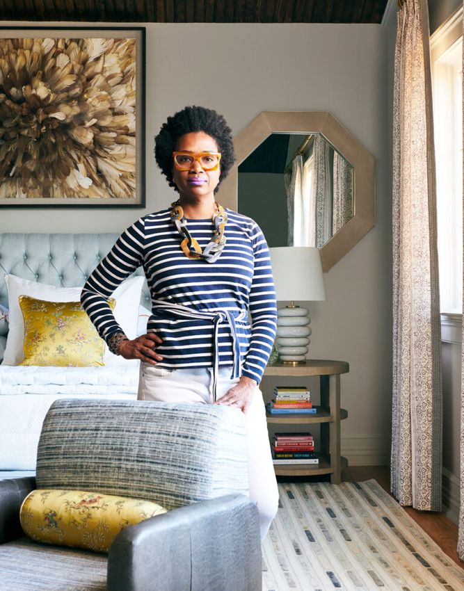
Valerie Grant

Graphite

“While I typically design in crisp, light colors, I also look for opportunities to create drama
with moody, dark gray colors. One of my go-to dark grays is ‘Graphite’ #1603 by Benjamin
Moore. It is deep and rich with an almost black appearance. I use this color in a wide range
of applications: creating a sleek look in sophisticated rooms like a lounge, adding a bold
contrast to lighter colored walls by using it as a trim color or in rooms where you want a more
durable nish such as a butler’s pantry or mudroom. You can distinguish the look of each room
by experimenting with color and various applications, adding interest and elevating the
overall aesthetic of a home.”

Valerie Grant | Valerie Grant Interiors | Summit, NJ | 917-921-1916 | valeriegrantinteriors.com

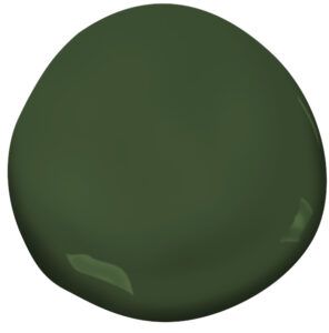
Jo Ann Alston, Allied ASID, CID

Colonial Verdigris

“We are now leaning into natural, earthy palettes and textures in 2021. Think the
continuation of plaster and travertines, camels in lieu of gray, deep neutralized hues like
olive green and burnt orange. This trend is a return to the love of nature and newfound
appreciation of Zen-like environments and the outdoors. My choice for a color is ‘Colonial
Verdigris’ CW-530 by Benjamin Moore. We would use this color on high-gloss cabinets for a
butler pantry. It could also be used as the trim color in almost any room. The color would
make a lovely cozy den. It’s also a wonderful backdrop for gilded mirrors and light textured
upholstery.”

Jo Ann Alston | J. Stephens Interiors | Morristown, NJ | 908-375-8288 | jstephensinteriors.com
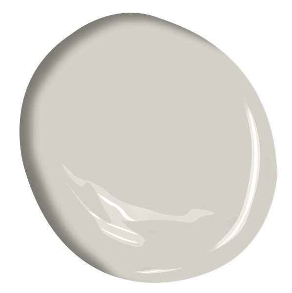
Diane Durocher. ASID, IIDA, CAPS, CID

Cumulus Cloud

“Although gray has waned in popularity from the cooler tones that have ruled the design
world for the past decade, it has been showing up in warmer tones — grège has emerged as
the reigning color of choice. Our favorite ‘grégie’ tone is Benjamin Moore’s ‘Cumulus Cloud’
#1550. It’s neutral warm tones are the perfect backdrop when introducing deeper neutral
colors such as steel and chocolate.”

 Diane Durocher | Diane Durocher Interiors | Ramsey, NJ | 201-825-3832

dianedurocherinteriors.com (http://dianedurocherinteriors.com/)

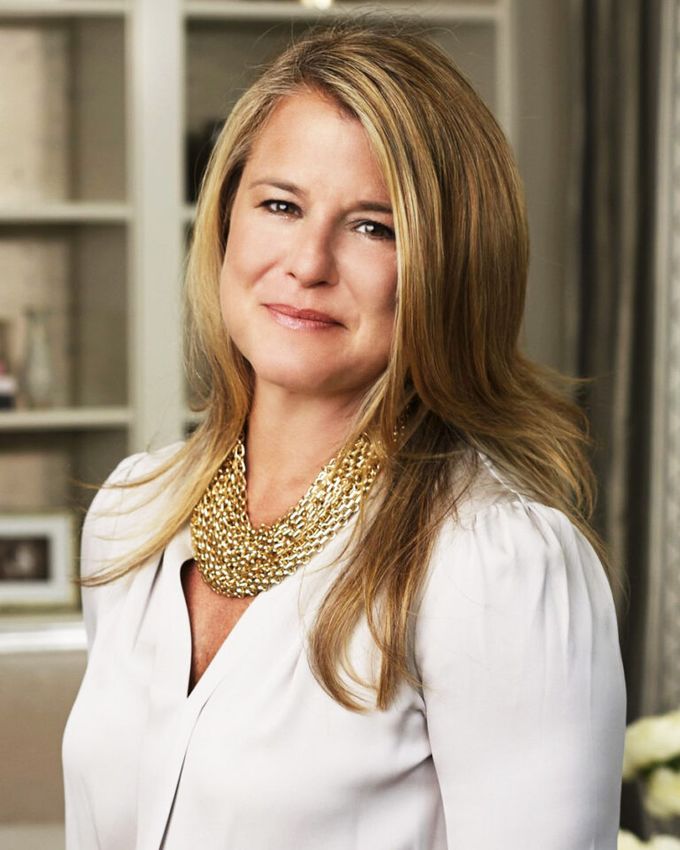
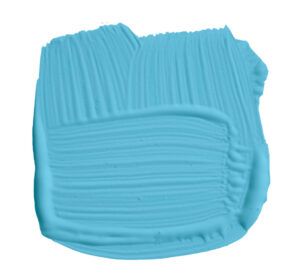
Gail M. Davis

                                     St. Giles Blue

Lisa Russman Photography

                                      “I would choose Farrow & Ball’s ‘St. Giles Blue’ No. 280. I
                                      love how the color envelops and grounds a room. It also
plays well with other colors working as a complement. You can have fun with furnishings and
artwork with this color. And at any time of day, it’s beautifully relaxing and invites you in. I
would use this color in a library or living room and would use it on the walls and the trim to
get the full e ect of happiness.”

Gail M. Davis | Gail Davis Designs LLC | South Orange, NJ | 973-761-6896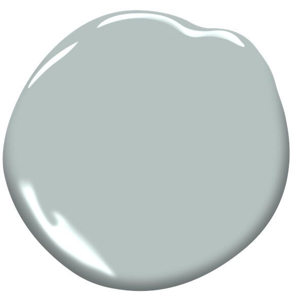
Cindy Dzurita, Principal Designer

Wales Gray

“When I was thinking about which color to choose for this question, I happened to be sitting
inside one of my favorite restaurants down along the Jersey Shore. Looking at one of the
interior walls, I noticed the paint color was one of my favorites, one that I’ve used many times
in the past, and immediately knew that’s the one I wanted to discuss. The color? Benjamin
Moore ‘Wales Gray’ #1585. It is more interesting than a white, beige or typical gray because it
has green and blue undertones, yet it is still quite neutral. I have used it in bedrooms,
bathrooms and hallways, where it pairs well with contemporary, as well as more traditional,
interiors.”

Cindy Dzurita | CD Interiors | Manalapan, NJ | 732-761-1097 | cdinterior.com
You can also read