DIARY OF A GRAPHIC SAILOR - Sea of Design and Strategy - Portfolio 2018 - juandiegonzalez
←
→
Page content transcription
If your browser does not render page correctly, please read the page content below
Sea of Design and Strategy

  DIARY OF A
GRAPHIC SAILOR

          Portfolio 2018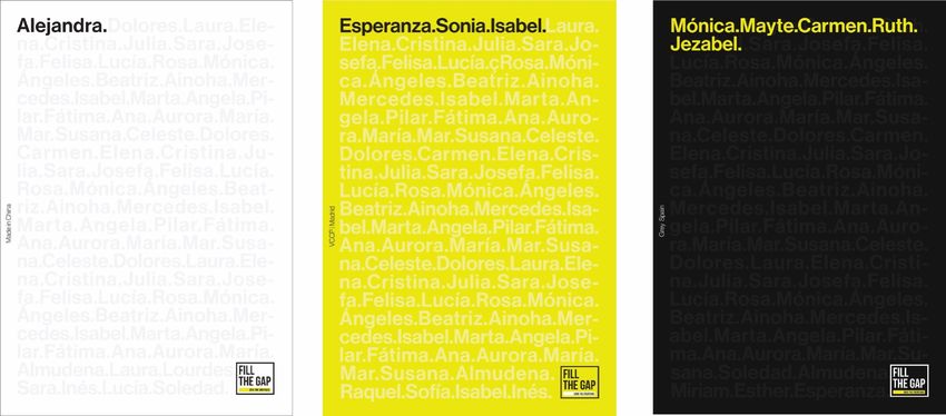
•

  “The anchor and the dolphin intertwined,
 under the claim "hurry up slowly" (Festina
Lente) as a symbol of those rigorously edited
   classic texts that sought to regenerate
  society through culture, through design.”

               Aldo Manuzio.1499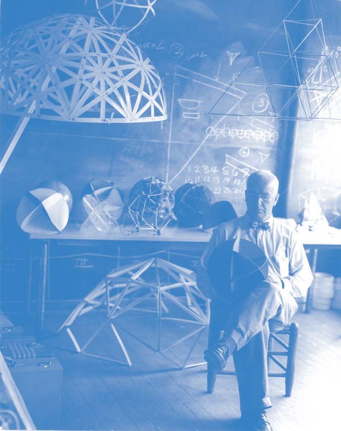
ABOUT ME

   Following Manuzio's philosophy, juandiegonzalez defends these
values through the analogy "to hurry slowly through the various seas
 of the creative industry", assuming the role of a graphic sailor who
          enters into an infinite sea of doubts to be solved.

“Graphic design is the direct analogy with the sea. A place where you
              embark and you can never disembark.”

              Portfolio 2018     Who am I?       nº–1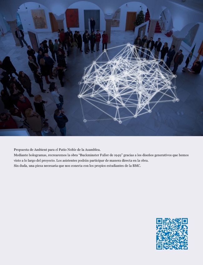
EDUCATION

        •                                                 •
 GRAPHIC DESIGN                                  ERASMUS EXCHANGE
 AND MULTIMEDIA                                  GRAPHIC DESIGN AND
UNIVERSITY DEGREE.                             MULTIMEDIA APPLICATIONS.
   ESNE (UCJC)                                 WATERFORD INSTITUTE OF
 With honnors in Editorial Design,              TECHNOLOGY (IRELAND)
TFG, Programming, Web Design and               With honnors in General Graphic, 3D Animation
           Packaging.                           with Unity, Marketing for Design and Motion
                                                                 Graphics.

          Portfolio 2018               Who am I?                          nº–2
EXPERIENCE

             •
  GRAPHIC DESIGNER AND
       INFOGRAPHIC.
  OBSERVATORIO ESPAÑOL
   DEL DISEÑO DE MADRID.
     JANUARY – AUGUST 2015.

              •                                             •
GRAPHIC AND WEB DESIGNER.                      INTERN GRAPHIC DESIGNER
    REINITIA (COACHING                            AND ART DIRECTOR.
   AND DEVELOPMENT).                                SR. Y SRA. MUTT.
    AUGUST – DECEMBER 2015.                        JANUARY – JUNE 2016.

               •
      GRAPHIC DESIGNER.
                                                         •                                 •
   PROJECT “CARTOGRAFÍAS                         ART DIRECTOR JR.                    ART DIRECTOR.
          DIGITALES”                               DDBº SPAIN.                   PROJECT FOR PROXIMITY
    AT ESPACIO TELEFÓNICA.                                                               CHILE.
              2016.
                                                 JUNE 2016 – CURRENTLY.               JANUARY 2017.

                              Portfolio 2018             Who am I?        nº–3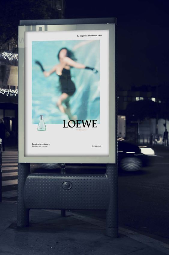
CLIENTS

UNIVERSIDAD COMPLUTENSE. ESNE. FEDERICO
  MORÁN. MARES DE BARITA Y PLATA. CÉSAR
LUCAS. REINITIA. TELEFÓNICA. JOANA BIARNÉS.
SIMPOSIO INTERNACIONAL DE COMUNICACIÓN.
CONGRESO DE DISEÑO DUAL. BBVA. TELEPIZZA.
  MOVISTAR. PELAYO. TWITTER. AUDI. SEAT.
    VOLKSWAGEN. PÁGINAS AMARILLAS.
  SOLEAR. ASICS. UNICEF. DUREX. CONASET.

    Portfolio 2018    Who am I?    nº–4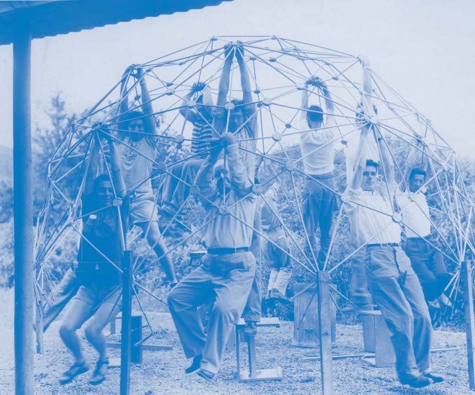
AWARDS

DRAC NOVELL INTERNACIONAL.                            EXCELLENCE
  4 AWARDS IN PRINTS, RADIO,                         SCHOLARSHIP.                    SHORTLIST CANNES
INTEGRATED ADVERTISING AND                               ESNE.                           AWARDS.
         24 HOURS.                                      2013 – 2017.                    DDB MADRID.
            2016.
                                                                                              2017.

     JCDECAUX AWARDS.                              FESTIVAL EXTREMEÑO                         EL SOL.
 SILVER AWARD AT “FESTIVAL                              DE PINTURA.                 SILVER AWARD IN INTEGRATED
    JÓVENES TALENTOS”.                          BEST YOUNG ARTIST CONTEST.               WITH DDB MADRID.
            2016.                                          2012.                               2017.

   BESTILL FESTIVALPASS HER
    YOUNG SPANISH TALENT IN
  DOCUMENTARY PHOTOGRAPHY.
            NORWAY.
             2016.

                               Portfolio 2018            Who am I?           nº–5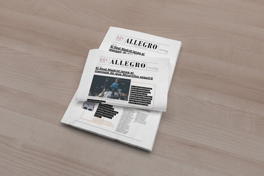
Sea of Design and Strategy

SOME BRANDING WAVES

             Portfolio 2018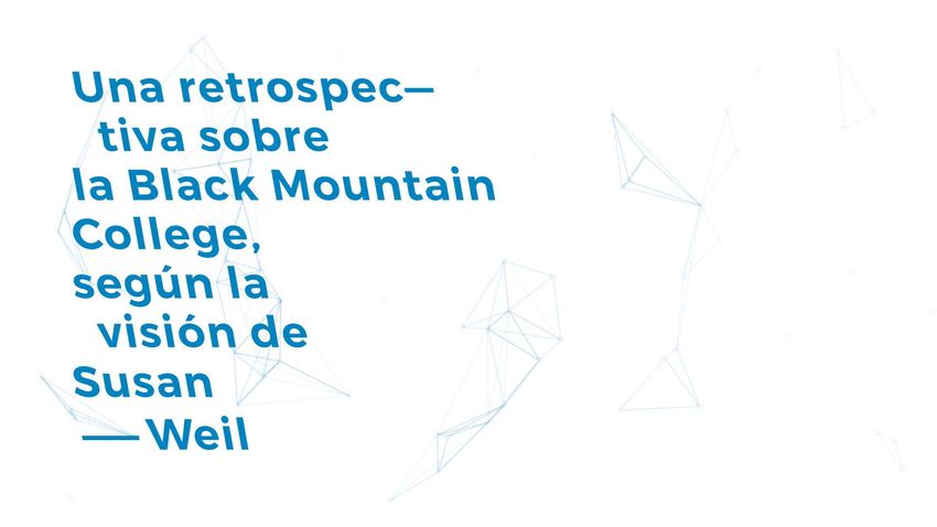
Sea of Design and Strategy

           1

      Portfolio 2018
Full Circle - A retrospective on the Black Mountain
                       College through the eyes of Susan Weil

Portfolio 2018                         My work                         nº–7
This graphic identity is the result of an
experimental process with creative programming
in Processing. The random shape used as a key
visual is inspired by the work “Buckminster Fuller
1949” and also coincides with the covers of
publications at BMC under a current look.
The project also delves into plastic reflection
about space and time to project it into the Digital
Edge aesthetic design transformations. The colour
blue refers to the technique of blueprint, so
characteristic of Susan Weil.
Portfolio 2018 My work nº–8Portfolio 2017 My work nº–8
PANTONE                           CMYK 0 | 0 | 0 | 0 |                     *PANTONE
        Process Blue C                      RGB 255 | 255 | 255                        7527 C

                                                   .
                    La utilización del color azul alude a la técnica del cianotipo
                       tan característica de Susan Weil, la artista en cuestión
                                                   .

                                                     .
Identidad gráfica como resultado de un proceso experimental con programación creativa en Processing.
  La forma aleatoria utilizada como visual key está inspirada en la obra “Buckminster Fuller de 1949”
     (una constelación que simbolizaba la unión entre estudiantes, artistas y disciplinas) y además,
      Portfolio 2018con las portadas de las publicaciones
           coincide                              My work en la escuela bajo una mirada actual
                                                                                         nº–9
                                                     .
Portfolio 2018 My work nº–10
Portfolio 2018 My work nº–11
The exhibition shows works by the artist Susan Weil and her generative graphic
reinterpretation. In addition, the recreation of the monument Buckminster Fuller
   of 1949 is proposed through generative holograms. Thus, the attendees can
     participate directly in the work. Without a doubt, an essential piece that
          connects us with the students of Black Mountain College itself.

     Portfolio 2018                 My work                      nº–12
The web allows the user to live an experimental experience
through the processing interface and a display box.
You can also buy a T-shirt with your own generative design!
Portfolio 2018 My work nº–13Sea of Design and Strategy
2
Portfolio 2018Fill the gap - Save the creativas
Manifiesto Ranking Acción Fill the Gap Adnonymus Súmate
ES
Portfolio 2018 My work nº–14Portfolio 2017 My work nº–15
Portfolio 2018 My work nº–15
x
ADNONYMUS
Link to display the web platform:
https://invis.io/PU7B9YQ2S#/158853448_Web_Prueba-pdf_1
Link to view the application:
https://app.conceptinbox.com/simulator/
5739a2ce0e80b1067af22da7
Portfolio 2018 My work nº–16Sea of Design and Strategy
3
Portfolio 2018ArteFactus - The gaze laboratory Portfolio 2017 My work nº–7
ArteFactus – The gaze laboratory
Design of a recreational-pedagogical app as a tourist tool
for the White City of Tel Aviv (Israel). Through augmented
reality and geolocation, we intend to explain the history
and development of this new city concept (closely linked to
the precepts of the Bauhaus) through graphic design,
specifically thanks to the grid.
Through this app, the visitor is oriented in a double sense:
in his itinerary for the White City and in his way of looking
and understanding the visible world through the reticulated
development of his architecture and urbanism.
Portfolio 2018 My work nº–18The ArteFactus brand graphic concept will be
developed, based on the simplification or purification
of the movement, according to the grid tradition.
Although the antecedents come from the artefacts of
the Renaissance, it will be the purity of the period of
the Bauhaus the issue we will use for the key visual.
The idea of a window as an artefact, as a grid, is
essential for this project, not forgetting that
characteristic window of the Dessau building that
means the ideal manifested by the Bauhaus students
at the White City of Tel Aviv. This praxis resulted from
the continuation of the International Style creating a
new model of the city.
Portfolio 2018 My work nº–19ArteFactus
ArteFactus 40
5 5 5 5 5 5 5 5 5
Portfolio 2018 My work nº–20Portfolio 2018 My work nº–21
Sea of Design and Strategy
4
Portfolio 2018Skycraper – Princeps pen
Redesign and new proposal for Staedtler pens.
It is the redesign of the packaging and the
naming for the pen Princeps.
Creating a visual corporate identity of the
product by taking inspiration from the old
building blueprints. All graphic approaches must
have the visual key of “architectural planes”,
concretely the first skyscrapers of New York.
”The Staedtler Princeps pen, as much as the
greatest buildings, not only stands erect, but is
made to be contemplated.”
Portfolio 2018 My work nº–21Didot Bold-Headlines & logo
Aa Bb Cc Dd Ee Ff Gg Hh Ii Jj Kk
Ll Mm Nn Oo Pp Qq Rr Ss Tt Uu
Vv Ww Xx Yy Zz
Didot Regular- Body
Aa Bb Cc Dd Ee Ff Gg Hh Ii Jj Kk
Ll Mm Nn Oo Pp Qq Rr Ss Tt Uu
Vv Ww Xx Yy Zz
Design of a vertical logo that
recreates a building’s elevation. A
pen’s graphic sign is included at the
top of the skyscraper.
Use of a modern serif typography,
which preserves a calligraphic
reminiscence while contributing an
architectural support thanks to its
straight serifs.
*Special finish, with embossing in black ink.
Portfolio 2017 My work nº–22Portfolio 2018 My work nº–23
Sea of Design and Strategy
SOME EDITORIAL WAVES
Portfolio 2018Sea of Design and Strategy
1
Portfolio 2018Allegro – Braking grid, breaking mind
Designing a newspaper, breaking the grid, with
augmented reality animation news inside. The
project includes a fanzine that explains how to
install the APP developed for watching the news in
augmented reality.
This design is inspired by the Art & Craft manifesto
in defence of traditional media. We all know that
the digital newspaper is replacing its original
version, but what if we could keep the paper press
legacy using augmented reality as a support?
Adobe Indesign | Adobe Photoshop | Unity 3D
Cinema 4D
Portfolio 2018 My work nº–24Portfolio 2018 My work nº–25
Sea of Design and Strategy

         2
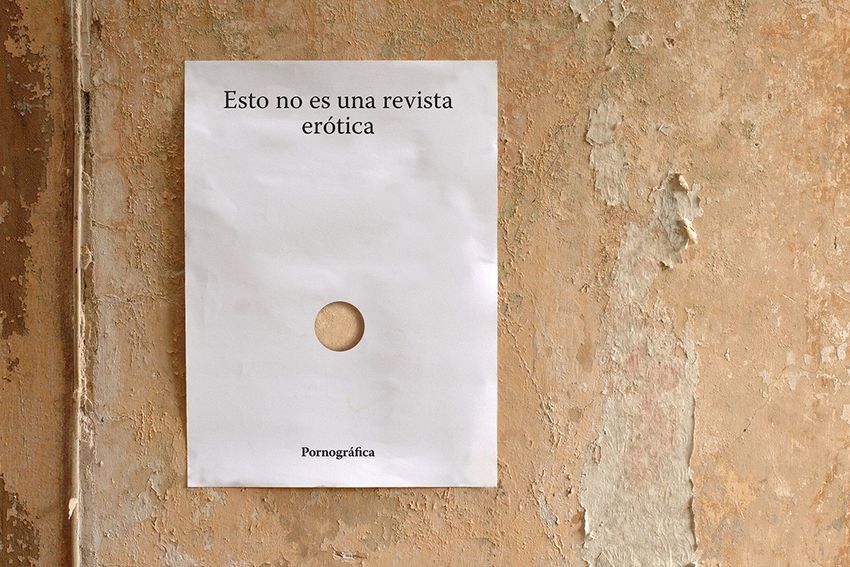
Portfolio 2018Pornográfica - Visual Pleasure
Pornographic is a fanzine where the
design exploits all its sexual potential
until ejaculating ink. The reader
assumes the role of voyeur and is
exposed scopophilically to a hidden
iconosphere of texts and images that
run on the scanner.
The fanzine is presented inside an XXL
condom and protected by a case that
hides the pornographic cover.
Portfolio 2018 My work nº–26Revision of the erotic imaginary
throughout the history of the visual
culture visibilizing the eroticism and the
inherent sexuality of the displayed
image, the typography and the graphic
and editorial design.
It contains invisible ink that fills the
typographic rivers of the flowing text and
which are only visible with special light.
Portfolio 2018 My work nº–27The project includes some graphic
communication pieces that use
pornographic resources such as:
flowing text, holes or blend paper
(due to visual ejaculation after the
enjoyment and pleasure of reading
the fanzine).
Portfolio 2018 My work nº–28Sea of Design and Strategy
SOME ADS WAVES
Portfolio 2018Sea of Design and Strategy
1
Portfolio 2018Find it on Loewe - The goldfish myth
The promotional project of Agua de Loewe
Mediterraneo for haed sell summer campaign 2016.
The project conceptually worked around an object that
is part of the SS 2016 collection, a golden fish that
appears as a necklace in the summer campaign. We
consider it to be a distinctive and charismatic element
of this campaign.
We therefore linked the creative concept to the myth
of a golden fish as an object of desire with the
Mediterranean Greek Hellas as a background.
Portfolio 2018 My work nº–29—Una historia: Embarcarse en Loewe
—Un comienzo: La Hélade
rtimos esta aventura aludiendo a la
lade como ese pueblo cargado de
—Retículas
nnotaciones etéreas como la magia,
mitos, seres fantásticos, animales
tológicos, brisas de verano...
eferenciando a España, tomamos
calizaciones como el puerto de
mporion o Carthago.
—Una mujer: La victoria
—Color
La mujer vivirá la experiencia como
una aventurera griega: con paños de
seda impregnados de la brisa y el aroma
del mediterráneo. Una clara alusión a
la Victoria de Samotracia, símbolo de
poder, esquisitez, sensualidad y magia. Color dorado combinado en diferentes #B9934D
materiales y soportes con Blanco y Negro. R: 185%
Además de ser un color relacionado con G: 147%
el lujo, está cercano a lo divino y lo etéreo B: 93%
del mito grecolatino.
—Tipografías
Titular:
Univers Bold
Aa Bb Cc Dd Ee Ff Gg Hh Ii Jj
Cuerpo:
Palatino regular
Aa Bb Cc Dd Ee Ff Gg Hh Ii Jj
Palatino italic
Aa Bb Cc Dd Ee Ff Gg Hh Ii Jj
Portfolio 2018 My work nº–30Encuéntralo en Loewe
Find it on Loewe
La campaña trata de articular un una
estrategia de comunicación para llegar
al target a través de un discurso con
coherencia conceptual.
El claim utilizado es “Encuéntralo en
Loewe”. The campaign is built around the idea of the
mythologized golden fish pursued by a young
woman looking for a new experience or story in
the waters of the Mediterranean.
Portfolio 2018 My work nº–31ENCUÉNTRALO EN LOEWE
El pez dorado
Agua de mediterráneo
Agua de mediterráneo
Diseño de mugets y su expositor
Inspiración en uno de los bolsos de la temporada con una etiqueta que acompaña en
todos los viajes.
Portfolio 2018 My work nº–32Contiene ventilador
Dispensador de la
fragancia en vapor
Portfolio 2018 My work nº–33Sea of Design and Strategy
SOME DIGITAL WAVES
Portfolio 2018Sea of Design and Strategy
1
Portfolio 2018Museo Vostell Malpatida
The Vostell Museum of Malpartida is a reference
for the contemporary world by the unique
collection that houses in its interior. The
museum's website, however, is far from being a
reference.
Solution. Redesign of the Vostell Museum under
the aesthetics and issues of the Fluxus
movement, especially the so-called Happening
De-coll / age. The user will have a fundamental
role, being an instrument that can intervene
and consciously modify this new space.
Portfolio 2018 My work nº–34Museo Vostell Malpatida
Usability
Chaos and chance as part of a user experience
and the artistic creation process Fluxus.
Methodology
To access the web, the user must attach his
fetish image* to the large collective canvas. This
canvas is the result of a pixelated network that
–-criticizing the commercial web of One Million
Page– poses an uncorrupted experience,
product of a non-salable experience.
* Wolf Vostell used in his works the fetishistic imagery of his time
(motorcycles, cars, televisions ...) to make a social criticism through age.
www.museovostell.es
Portfolio 2018 My work nº–35Sea of Design and Strategy
2
Portfolio 2018Sea of Design and Strategy
UNTAGGEABLE WAVES
Portfolio 2018Las Bistecs
Contribution and impact
Take the “Electro-Disgusting” and its importance in the
society to graphic designing, through 3D Ultrastrash.
Approach
Making digital pills with a Free Resource Ultratrash
visual, to communicate the new Las Bistecs album.
The use of predetermined presets and its subsequent
3D animation, generate content that doesn’t leave
anybody unmoved in a society overflowing with
information.
Idea
This project criticizes the intrusive digital creating
processes, because the only thing it does is create
content without really creating it. We generate this
content through small pills made from predetermined
presets and its subsequent 3D animation to convey Las
Bistecs “OFFER”. This way, we transfer the tendency of
“Electro-Disgusting” to an audiovisual format and we
manage to battle the shortage of quality that the
categorization of the real projects aims to receive.
Portfolio 2018 My work nº–38Sea of Design and Strategy
NOW YOU HAVE SEEN HOW THE “WAVES” WORK,
WOULD YOU LIKE TO LOOK FOR THE PERFECT ONE TOGETHER?
Portfolio 2018Sea of Design and Strategy THANK YOU SO MUCH JUAN DIEGO GONZÁLEZ – 625 050 194 juandigo@icloud.com – www.comandoe.com
You can also read