EAppendix 1: Lasagna plots: A saucy alternative to spaghetti plots
←
→
Page content transcription
If your browser does not render page correctly, please read the page content below
eAppendix 1:
        Lasagna plots: A saucy alternative to spaghetti plots

                         Bruce J. Swihart, Brian Caffo, Bryan D. James,
                      Matthew Strand, Brian S. Schwartz, Naresh M. Punjabi

                                                        Abstract

        Longitudinal repeated-measures data have often been visualized with spaghetti plots for continuous
     outcomes. For large datasets, the use of spaghetti plots often leads to the over-plotting and consequential
     obscuring of trends in the data. This obscuring of trends is primarily due to overlapping of trajectories. Here,
     we suggest a framework called lasagna plotting that constrains the subject-specific trajectories to prevent
     overlapping, and utilizes gradients of color to depict the outcome. Dynamic sorting and visualization is
     demonstrated as an exploratory data analysis tool.

   The following document serves as an online supplement to “Lasagna plots: A saucy
alternative to spaghetti plots.” The ordering is as follows: Additional Examples, Code
Snippets, and eFigures.

Additional Examples

We have used lasagna plots to aid the visualization of a number of unique disparate
datasets, each presenting their own challenges to data exploration. Three examples from
two epidemiologic studies are featured: the Sleep Heart Health Study (SHHS) and the
Former Lead Workers Study (FLWS). The SHHS is a multicenter study on sleep-disordered
breathing (SDB) and cardiovascular outcomes. 1 Subjects for the SHHS were recruited from
ongoing cohort studies on respiratory and cardiovascular disease. Several biosignals for
each of 6,414 subjects were collected in-home during sleep. Two biosignals are displayed
here-in: the δ-power in the electroencephalogram (EEG) during sleep and the hypnogram.
Both the δ-power and the hypnogram are stochastic processes. The former is a discrete-
time contiuous-outcome process representing the homeostatic drive for sleep and the latter
a discrete-time discrete-outcome process depicting a subject’s trajectory through the rapid
eye movement (REM), non-REM, and wake stages of sleep.
   The FLWS is a study of age, lead exposure, and other predictors of cognitive decline.
The study spans a decade, with up to seven study visits and three separate phases of data
collection. During each visit, subjects participated in a battery of cognitive tests, resulting
in a longitudinal dataset of repeated measures of test scores for each subject.

                                                            1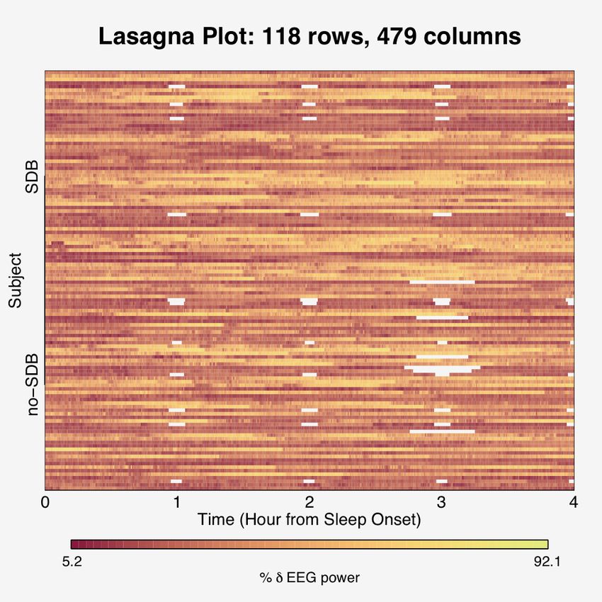
In the SHHS, we explore the data by disease status, looking for distinguishing patterns
within each disease group. The disease under consideration is sleep apnea (or sleep-
disordered breathing (SDB)), a condition characterized with repetitive breathing pauses
during sleep. Comparing groups requires carefully selected subsamples, and thus our focus
is on 59 SDB subjects and 59 subjects without SDB (no-SDB). In both the continuous
and discrete outcome examples, our data assume a wide format, where the number of
measurements far exceed the number of subjects. In the FLWS, all 1,110 subjects are
analyzed over a maximum of 7 visits. Cluster sorting will help evaluate the presence of two
common problems for longitudinal studies of cognitive function: informative censoring
and “practice effects.”
Continuous Longitudinal Data with Intermittent Missingness
For continuous electroencephalogram (EEG) signals derived from the sleep studies, four
distinct frequency powers are typically discerned via band-pass filters on the Fourier trans-
δ
form: α,β,δ, and θ. Percent δ-power is defined as α+β+δ+θ × 100. For every 30 seconds
during sleep, percent δ-power was calculated for 59 SDB subjects and 59 no-SDB. In this
introductory illustrative example, we look at only the first four hours of data for each sub-
ject, so that everyone has a common onset and stopping point. We also assume that the
same device was used to record sleep across different subjects and thus no two subjects
had sleep recorded on the same date. To showcase the capability of displaying intermit-
tent missing data of the lasagna plot, a pattern of missingness is artificially applied. Via
dynamic sorting, the pattern of missingness will be revealed, illustrating how patterns can
be uncovered with this exploratory data analysis technique of sorting and visualizing. To
showcase the process of entire-row sorting, the outcome values between disease groups
were artificially made more disparate.
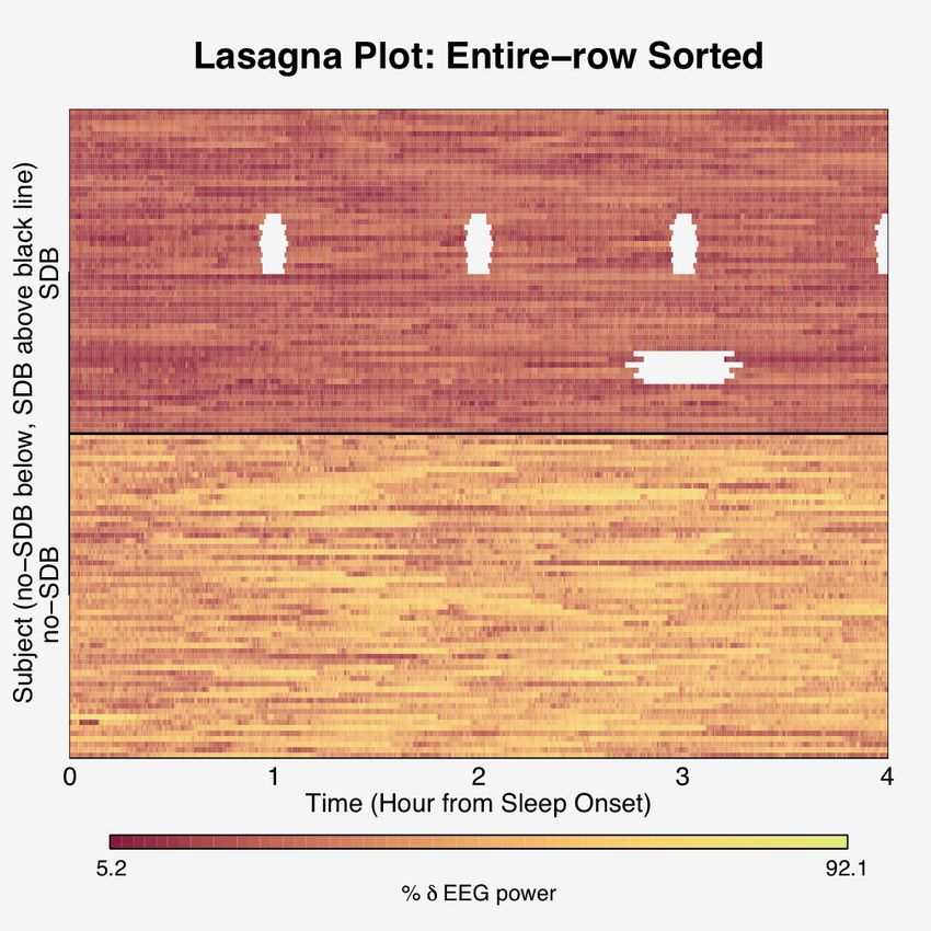
We see that a spaghetti plot is a salient display of data for one subject, but not for 118
(Figure 1). The corresponding lasagna plot for 118 subjects shows intermittent missing
data, and upon entire-row sorting on the external factors of disease status and date of EEG
recording reveals intiguing patterns of the missingness, as well as disease-group differences
in percent δ sleep (Figure 2). It appears that only subjects with SDB have missing data and
that for a period of recording dates measurements were dropped hourly. Possibly the
recording device was malfunctioning, subsequently fixed, and then enjoyed a period of
proper functionality only to succumb to dropping measurements 3 hours after sleep onset
before being repaired again. To explore the group-level characteristics of percent δ-power
during sleep evolution over the course of the night, an additional within-column sorting
is conducted within disease status (Figure 3). The resulting lasagna plot from the within-
column sorting highlights a temporal undulation to the signal of the no-SDB group, as well
as the no-SDB group having generally higher percent δ-power during sleep than the SDB
2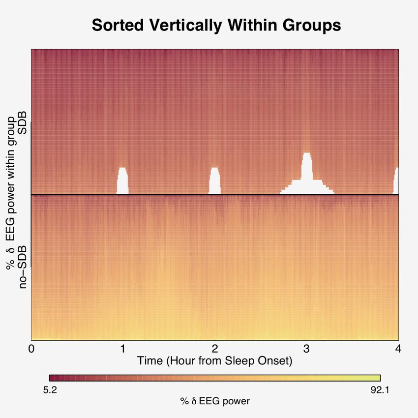
group. Delta power in the sleep EEG is thought to have an important positive association
with cognition and is a marker for homeostatic sleep drive. 2

Discrete State-Time Data with a Common Onset

The three classifications of sleep stages (Wake, REM, and Non-REM) are discretizations
of several continuous physiologic acquired during sleep. The EEG signals are binned into
epochs (often 30 seconds) from sleep onset and collectively used to determine the stage
of sleep. To accommodate the different lengths of sleep time, an absorbing state is utilized
to ensure each subject has an equal number of “measurements,” which aids visualization.
This example showcases data from the SHHS, where 59 diseased subjects were matched on
age, BMI, race and sex to 59 non-diseased subjects. Because the outcome is discrete (the
state of sleep), the spaghetti plot is a state-time plot specifically known as the hypnogram
to sleep physicians. As in the previous example, for one subject, the spaghetti plot shows
the durations in states and transitions among states clearly. The subsequent spaghetti plot
for all 118 subjects falls prey to over-plotting, limiting its informativeness (Figure 4). A
lasagna plot shows the 1,031 outcomes of each of the 118 subjects’ trajectories in random
order with respect to SDB status (Figure 5). Applying an entire-row sort on the external
characteristic of disease status and the internal characteristic of overall sleep time shows
that the groups are well matched on total sleep time (even though the two groups were
not explicitly matched on total sleep time). Note the degree of fragmentation and the
frequency of short and long-term bouts of WAKE of those with SDB compared to controls.
The difference between the two groups in the degree of fragmentation as visualized indi-
cates there might be a difference in sleep continuity between the two groups, supporting
the well-established link between SDB and fragmented sleep. It has been conjectured that
sleep continuity may be important in the recuperative effects of sleep, especially in the
study of sleep disordered breathing (SDB) and its impact on health outcomes. 3,4,5,6 Apply-
ing an additional within-column sorting within disease status shows the difference in REM
temporal evolutions among groups (Figure 6). The dynamic sorting of Figure 6 shows the
SDB group having an overall weaker REM signal, a bimodal first peak, an absence of a
peak at hour 3, the presence of a peak at ∼ 7.75 hours. In addition, the peaks widen as
time increases, which backs empirical findings of REM duration in state time lengthening
as the overall sleep progresses.

Discretized Longitudinal Data

Lasagna plots are also useful in visualizing and detecting many of the common challenges
to population-based longitudinal cohort studies in epidemiologic research. The FLWS is a
study of age, lead exposure, and other predictors of cognitive decline. The study spans a

                                             3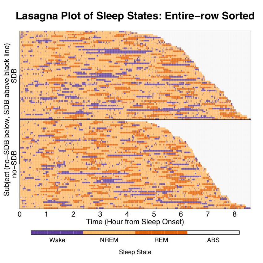
decade, with up to seven study visits and three separate phases (tours) of data collection.
The FLWS is a complex dataset beset with missing data, and both left and right censoring
of subjects. Because subjects were enrolled over time in multiple tours, subjects could
have as few as 2 or as many as 7 study visits. Study dropout is likely to be dependent upon
outcome status (declines in neurobehavioral function) resulting in informative censoring.
An additional challenge is the problem of a “practice effect”: scores on neurobehavioral
tests of cognitive function can become better through practice, masking real declines in
cognitive abilities. Lasagna plots provide an unique opportunity to visualize these complex
data and detect evidence of both informative censoring and a learning effect. In order to
do so, lasagna plots are made with visit as the unit of time as well as tour. Each reveal
temporal patterns.
    The spaghetti plot (Figure 7) for 1,110 subjects over seven visits is over-plotted, but
does show a “thinning” of subjects, suggesting many had three visits, distinctly fewer had
three to six, and fewer than that had all seven. In order to facilitate detection of potential
informative censoring or a learning effect, neurobehavioral scores were binned based on
quintiles of the first visit score distribution. The spaghetti plot of the binned quintile
data (Figure 8) is over-plotted and uninformative because the number of subjects for each
trajectory is not discernable. A classical spaghetti plot of discrete outcomes on the Y axis
can show possible trajectories, but no indication of how many subjects are in the study
due to the exact overlapping of trajectories. The lasagna plot shows the loss to follow up
for subjects over time even more clearly than the spaghetti plot (Figure 9) . A cluster sort
(sorting within the first column, then the second, etc.) allows us to move entire-rows so
that subjects with similar trajectories are closer to one another (Figure 10). Immediately,
we can identify a cluster that did not have a value reported for a first visit, but had values
for subsequent visits, indicating missing data. These findings highlight the utility of lasagna
plots for exploratory data analysis and data validation. The lasagna plot can also help in
examining data for informative dropout and practice effects. Here it appears that if one is
in the bottom (worst) quintile on the first visit, the loss to follow up is much worse than
if one was in the top (best) quintile at visit 1, indicating informative dropout. A practice
effect can be discerned crudely if the subjects have higher test scores on their second study
visit than their first, and then scores subsequently decline over time. Overall trends in
cognitive function over time are apparent as the amount of lighter colors decrease from
left to right and the amount of darker colors increase, empirically confirming the overall
decline in cognitive function observed with aging.
    Finally, if an additional within-column sort was conducted, we derive the classic stacked
bar chart (Figure 11). The classic stacked bar chart removes all subject-specific trajectories
and instead summarizes overall distributions of neurobehavioral test scores for each study
visit. The practice effect is most visible as scores (based on quintiles of the first visit
scores) appear to jump up between the first and second study visits, and then decline over

                                              4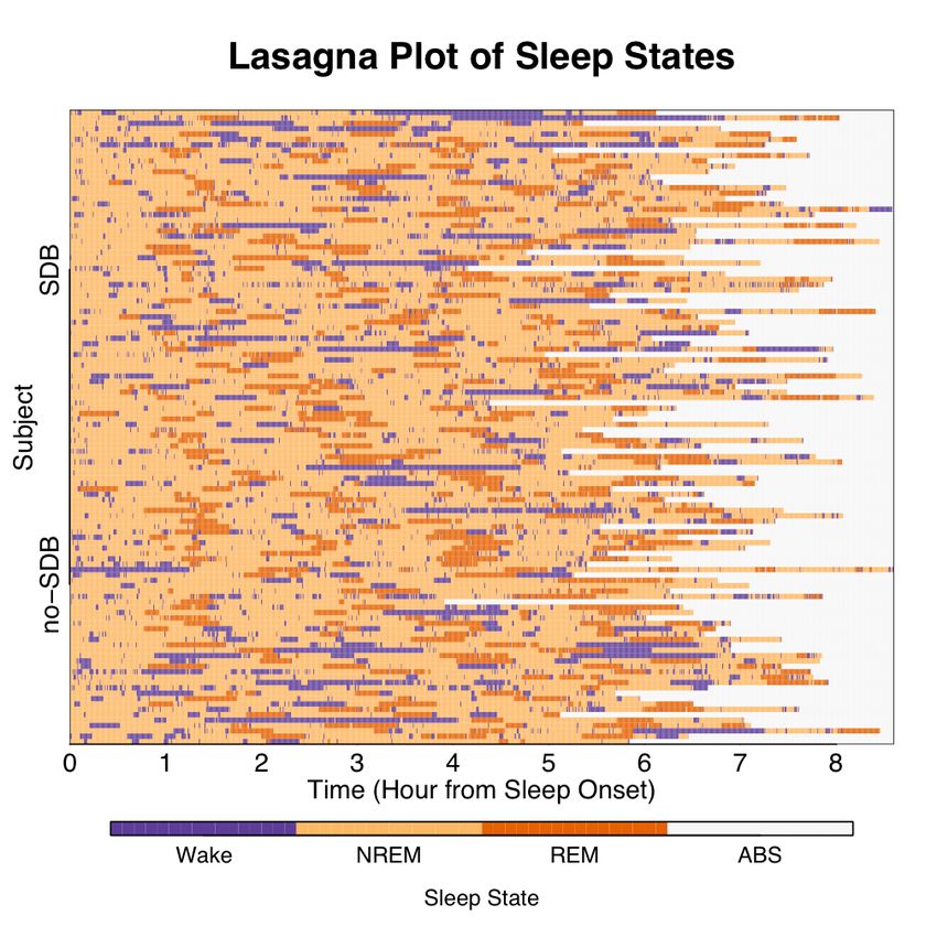
time. However, from Figure 11, we cannot ascertain that the subjects in the top quintile
on the first visit are in the top quintile on the second visit. Using stacked bar charts
prevents statements on typical pathways, whereas a cluster sorted lasagna plot displays
the trajectories for full viewing.
   The time structure is complex, for subjects’ visit 1 measurement may not have taken
place in the same tour. Also, the amount of time lapsed between one subject’s adjacent
visits may not be the same as another subject’s due to visit number being interlinked with
what tour they enrolled. Analyzing informative censoring and practice effects is further
facilitated by making a lasagna plot with tour as the time variable (Figure 12) and then
sorting within each tour the subject’s 1st visit quintile cognitive measure (Figure 13). Com-
paring those enrolled in Tour 1 of the worst and best quintile, we see that there is more
dropout for those starting out in the worst quintile, possibly indicating informative cen-
soring. The pattern of drop out being related to first visit quintile rank holds for the later
tours as well. Training effects can be seen when a subject’s color lightens when tracking
that subject across time. For instance, a fair portion of subjects in Tour 1 were in the 2nd
best quintile and advance to the best quintile in their second visit in Tour 2.

Result Tables and Covariate Selection

Simulations under different conditions often give rise to mulitple tables of output. Identi-
fying trends and comparing tables is often an arduous and obfuscating task. With lasagna
plots, a quick snapshot of the tables are rendered, allowing trends within tables to be
identified and compared across tables (Figure 14).
   In building regression models, it is important to know what variables have high degrees
of missingness. For large epidemiologic datasets modeling an outcome, a lasagna plot can
be used to show the proportion of the sample covariate missingness over time (Figure 15).
Here, the vertical axis is the variable, the horizontal axis is time, and the darker the plot
the greater the proportion of the sample that has a reported value for that layer’s variable.
The plot in Figure 15 helped guide the inclusion and exclusion of covariates in the model
building process.
   Lasagna plots work well for data tables that have many numbers and are essentially
an image of a matrix. Commonly, the layers are denoting an subject, the columns are
denoting times or locations largely in common to all the subjects being visualized, and
color to reflect the state occupied or magnitude/intensity of the trait. One exception to
this paradigm is diary data for a subject. In diary data, the layers are days, the columns are
hours, and the colors reflect activities partaken for a certain time on a particular day. The
approach just described for diary data has proven useful in mapping out infant and child
ideal sleep patterns. 7 Nutritionist colleagues are implementing lasagna plots to display
caloric intake and purge cycles amongst those with eating disorders.

                                              5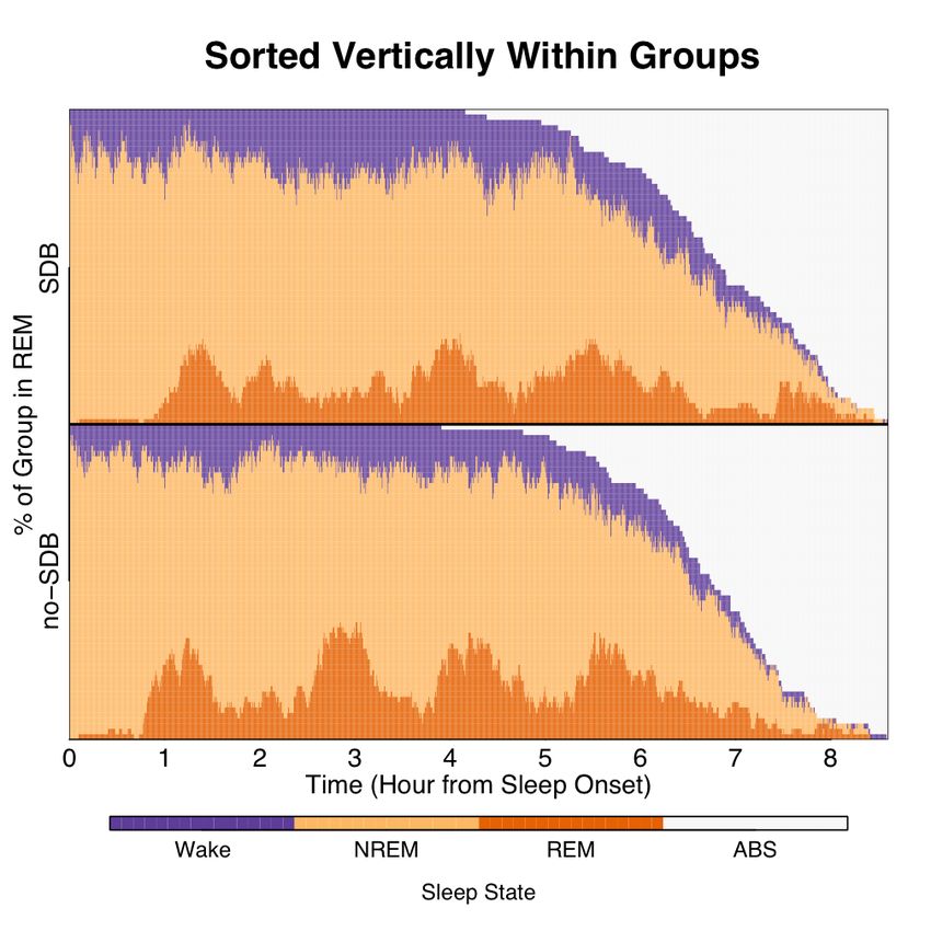
Discussion

Lasagna plots have been presented as an effective means to explore data that can be ar-
ranged into a matrix. The strengths of lasagna plotting are that it can incorporate a wide
platform of data structures, ranging from longitudinal repeated measures (i.e., dominos
and nonsimultaneous chains in kidney paired donation) to multidimensional temporal-
spatial (i.e., FMRI) to gene expression of genes by tissue type (i.e. Barcodes). 8,9,10 Lasagna
plots are visualizations that “above all else show the data” and are more akin to the raw
data than a modeling procedure. 11,12 Row and column sorting and clustering are intuitive
to a non-technical audience, and visualizations of sequential sortings and/or clustering
serve as a way to engage a collaborative analysis of data. Weaknesses include the color-
dependency, difficulties handling continuous time, and how growing size of the data make
seeing individual layers more difficult. The first is becoming less of an issue as digital pub-
lication overtakes traditional paper publishing. The second weakness can be ameliorated
by coarsening/binning time, and the third by doing sorts or making plots on subsets of the
population.
   Often, longitudinal data have been traditionally viewed as either a spaghetti plot or
stacked bar chart, which falls prey to over-plotting and aggressive summarization, re-
spectively. Multi-state survival (event history) data can be viewed through a longitudi-
nal repeated measures lens, and historically were viewed with eventcharts, corresponding
components of dynamic interaction and linked graphs, as well as event history graphs.
These were important steps in visualizing survival data simultaneously at the group level
and subject level. 13,14,15 Limitations of the eventchart included difficulty handling multi-
ple groups, large numbers of subjects, denoting multiple events, and the incorporation of
color. These limitations are not present with the lasagna plotting of survival data. Lasagna
plots work well in most trivariate and multiway data settings, conveying at least the same
information as superposed level regions in color plots and multiway dot plots. 16
   Genomics and pediatric sleep science are currently utilizing plots that are special cases
of what we call lasagna plots. Recent graphing techniques in the statistical program-
ming and analysis language R have come to show ingenuity in handling complex data,
as evinced by the non-exhaustive list of R packages lattice, ggplot2, seas, mvtplot, and
gplots (see functions heatmap.2() and hist2d() for plotting similar to that of lasagna
plotting). 17,18,19,20,21 Lasagna plotting and cluster sorting is implemented by heatmap.2(),
grouping similar genes (rows) and tissues (columns) together. The essence of lasagna plot-
ting, within-column and entire-row sorting is captured in mvtplot the best, in that it dis-
plays not only the data itself but simultaneously group level temporal trends in a smoothed
curve below and subject specific summary measures on the right sidebar. Lasagna plotting
encompasses mvtplot and implements dynamic sorting to further explore the data. Dis-
crete outcomes are not handled well by mvtplot because the element being visualized are

                                              6
not necessarily numeric, thus the summarizations on the bottom and right hand panel are
not useful when the data measures are nominal. Lasagna plotting and subsequent sorting
handles the nominal case.
7Code Snippets ## lasagnaFunctions.R ## December 2009 ## This is a source file for lasagna plotting, consisting of simple ## wrappers for other functions to facilitate lasagna plotting and ## dynamic sorting. ## Any improvements on the code are invited. ## Please do not hesitate to share such improvements with me. ## we require these packages library(colorspace) library(RColorBrewer) library(fields) library(MASS) library(cluster) ## lasagna() uses image(), but manipulates the matrix so the image ## rendered is that of just painting the elements of the matrix. palette
## entire column sort for continuous outcomes
ec
## a couple of helper functions used to make PDFs for some of the figures
## in the paper. See "lasagnaPlotsFigures.R" to see implementation.

spaghettiPDF
lasagnaPDF
## an example of usage
## 5 plot Figure 2

## Choose a palette
palette
## Within-row, use colorSeq to order categorical outcomes
## try colorSeq=c(300,100,200) for instance, compare.
lasagna(wr.disc(H.mat, colorSeq=c(100,200,300)),
        col=palette,
        axes=F,
        xlab = "",
        ylab = "", tck=0, mgp=c(0,.50,0))
box()
title("B) Within-row sorting of A)", adj=0)
axis(1,
     c(1/10,3/10,5/10,7/10,9/10),
     c("1/6","1/3","1/2","2/3","5/6"),
     cex.axis=1.75, tck=0, mgp=c(0,.50,0))
axis(2,
     seq(0,1,1/3),
     rev(c("P1",
           "T1",
           "P2",
           "T2")),
     las=1,
     cex.axis=1.75, tck=0, mgp=c(0,.2,0))
axis(1,
     c(1/10,3/10,5/10,7/10,9/10),
     lab=NA,
     tck=1,
     lty=1,
     col="black") # grid lines
axis(2,
     c(1/6,3/6,5/6),
     lab=NA,
     tck=1,
     lty=1,
     col="black") # grid lines

## Entire-row
## note the following two lines are equivalent:
## er(H.mat, orderVar=c(3,1,4,2))
## H.mat[c(2,4,1,3), ]
lasagna(H.mat[c(2,4,1,3), ],
        col=palette,
        axes=F,
        xlab = "",
        ylab = "", cex.lab=1.75, tck=0, mgp=c(0,.50,0))
box()
title("C) Entire-row sorting of A)", adj=0)
axis(1, seq(0,1,1/5), 1:6, cex.axis=1.75, tck=0, mgp=c(0,.50,0))

                                     13
axis(2,
seq(0,1,1/3),
rev(c("T1",
"T2",
"P1",
"P2")),
las=1,
cex.axis=1.75, tck=0, mgp=c(0,.2,0))
axis(1,
c(1/10,3/10,5/10,7/10,9/10),
lab=NA,
tck=1,
lty=1,
col="black") # grid lines
axis(2,
c(1/6,3/6,5/6),
lab=NA,
tck=1,
lty=1,
col="black") # grid lines
## Within-column
lasagna(wc.disc(H.mat, colorSeq=c(300,200,100)),
col=palette,
axes=F,
xlab = "",
ylab = "", cex.lab=1.75, tck=0, mgp=c(0,.50,0))
box()
title("D) Within-column sorting of C)", adj=0)
axis(1, seq(0,1,1/5), 1:6, cex.axis=1.75, tck=0, mgp=c(0,.50,0))
axis(2,
c(1/6,3/6,5/6), lab=c("1/4","1/2","3/4"),
las=1, cex.axis=1.75, tck=0, mgp=c(0,.2,0))
axis(1,
c(1/10,3/10,5/10,7/10,9/10),
lab=NA,
tck=1,
lty=1,
col="black") # grid lines
axis(2,
c(1/6,3/6,5/6),
lab=NA,
tck=1,
lty=1,
col="black",
las=1) # grid lines
14## Entire-column
lasagna(ec(wc.disc(H.mat, colorSeq=c(300,200,100)), orderVar=c(6,4,2,1,3,5)),
col=palette,
axes=F,
xlab = "",
ylab = "", cex.lab=1.75, tck=0, mgp=c(0,0,0))
box()
title("E) Entire-column sorting of D)", adj=0)
axis(1, seq(0,1,1/5), c(4,3,5,2,6,1),
cex.axis=1.75, tck=0, mgp=c(0,.50,0))
axis(2, c(1/6,3/6,5/6), lab=c("1/4","1/2","3/4"), las=1,
cex.axis=1.75, tck=0, mgp=c(0,.2,0))
axis(1,
c(1/10,3/10,5/10,7/10,9/10),
lab=NA,
tck=1,
lty=1,
col="black") # grid lines
axis(2,
c(1/6,3/6,5/6),
lab=NA,
tck=1,
lty=1,
col="black",
las=1) # grid lines
References
[1] SF Quan, BV Howard, C. Iber, JP Kiley, FJ Nieto, GT O’Connor, DM Rapoport, S. Red-
line, J. Robbins, JM Samet, et al. The Sleep Heart Health Study: design, rationale,
and methods. Sleep, 20(12):1077–85, 1997.
[2] L. Marshall, H. Helgad, M. Matthias, and J. Born. Boosting slow oscillations during
sleep potentiates memory. Nature, 444(7119):610–613, 2006.
[3] R.G. Norman, M.A. Scott, I. Ayappa, J.A. Walsleben, and D.M. Rapoport. Sleep con-
tinuity measured by survival curve analysis. Sleep, 29(12):1625–31, 2006.
[4] N.M. Punjabi, D.J. O’Hearn, D.N. Neubauer, F.J. Nieto, A.R. Schwartz, P.L. Smith,
and K. Bandeen-Roche. Modeling hypersomnolence in sleep-disordered breathing a
novel approach using survival analysis. American Journal of Respiratory and Critical
Care Medicine, 159(6):1703–1709, 1999.
15[5] M.H. Bonnet and D.L. Arand. Clinical effects of sleep fragmentation versus sleep
deprivation. Sleep Medicine Reviews, 7(4):297–310, 2003.
[6] B.J. Swihart, B. Caffo, K. Bandeen-Roche, and N.M. Punjabi. Characterizing Sleep
Structure Using the Hypnogram. Journal of Clinical Sleep Medicine: JCSM: official
publication of the American Academy of Sleep Medicine, 4(4):349, 2008.
[7] R. Ferber. Solve Your Child’s Sleep Problems: New, Revised, and Expanded Edition
(Paperback). Simon & Schuster, 2006.
[8] SE Gentry, RA Montgomery, BJ Swihart, and DL Segev. The Roles of Dominos and
Nonsimultaneous Chains in Kidney Paired Donation. American Journal of Transplan-
tation, 9(6):1330–1336, 2009.
[9] R. Baumgartner and R. Somorjai. Graphical display of fMRI data: visualizing multi-
dimensional space. Magnetic resonance imaging, 19(2):283–286, 2001.
[10] M.J. Zilliox and R.A. Irizarry. A gene expression bar code for microarray data. Nature
Methods, 4:911–913, 2007.
[11] E.R. Tufte. The Visual Display of Quantitative Information. Graphics Press, 2001.
[12] T. Lumley and P. Heagerty. Graphical exploratory analysis of survival data. Journal
of Computational and Graphical Statistics, pages 738–749, 2000.
[13] A.I. Goldman. Eventcharts: Visualizing survival and other timed-events data. Ameri-
can Statistician, pages 13–18, 1992.
[14] E.N. Atkinson. Interactive dynamic graphics for exploratory survival analysis. Ameri-
can Statistician, pages 77–84, 1995.
[15] J.A. Dubin, H.G. Muller, and J.L. Wang. Event history graphs for censored survival
data. Statistics in Medicine, 20(19):2951–2964, 2001.
[16] W.S. Cleveland. Visualizing data. Hobart Press, 1993.
[17] Deepayan Sarkar. lattice: Lattice Graphics, 2008. R package version 0.17-15.
[18] Hadley Wickham. ggplot2: An implementation of the Grammar of Graphics, 2009. R
package version 0.8.3.
[19] Michael W. Toews, Paul H. Whitfield, and Diana M. Allen. Seasonal statistics: the
’seas’ package for r. Computers & Geosciences, 33(7):1895, 2007.
[20] RD Peng. A method for visualizing multivariate time series data. Journal of Statistical
Software, 25(Code Snippet 1):687–713, 2008.
16[21] Gregory R. Warnes. Includes R source code and/or documentation contributed by
Ben Bolker and Thomas Lumley. gplots: Various R programming tools for plotting
data. R package version 2.6.0.
17eFigure 1: Top panel: Spaghetti plot for one subject. Bottom panel: Spaghetti plot for 118 subjects. The
overlapping of multiple trajectories leads to an obscuring of trends for a moderate number of subjects, and
consequently the conveyance of intermittent missing data fails.
18eFigure 2: Top panel: Lasagna plot for 118 subjects from the bottom panel of Figure 1. The subjects
(rows) appear in random order, but the intermittent missing data (white) is clearly conveyed. Bottom panel:
Lasagna plot of the top panel after an entire row sort on disease status and date of EEG recording within
disease status. The intermittent missing data is not only conveyed, but the sort allows the exploration of
possible trends. After the sort, the darker red region indicates that the disease have less percent δ sleep,
it is seen that only the diseased have missing data, and that the recorder successfully recorded the first 19
SDB subjects, then malfunctioned for the next 11 recording dates in a way where it dropped measurements
approximately every hour. The recorder was righted and operated with full functionality for the next 14 SDB
subjects, only to malfunction again by dropping measurements about three hours from sleep onset for the
next six SDB subjects. The issue was addressed, and the recorder successfully recorded the rest of the SDB
subjects. Compare the the bottom panel her to that of Figure 1. The same outcome information is contained
in them, but lasagna plots more effectively depict the data because the non-overlapping of trajectories keeps
the outcome information uncluttered and its sorting can incorporate more information.
19eFigure 3: Top panel: The entire row sorted lasagna plot of Figure 2. Bottom panel: A within-column sort
applied within disease status to the lasagna plot of the top panel. Note the waxing and waning of the yellow
in the no-SDB group, depicting the group-level temporal evolution of percent δ sleep in subjects without
SDB.
20eFigure 4: Top panel: a spaghetti plot for a discrete outcome for one subject. Bottom panel: a spaghetti plot
for a discrete outcome for 118 subjects. Due to the discrete nature of the outcome, trajectories do not run
the risk of merely crossing each other as in continuous outcome cases, but overlapping each other exactly.
The informativeness of the spaghetti plot for discrete data on a moderate number of subjects is limited.
21eFigure 5: Top panel: corresponding lasagna plot for the spaghetti plot in the bottom panel of Figure 4, with
subjects (rows) in random order. Bottom panel: the resulting lasagna plot after an entire row sort of disease
status and sleep time recorded. The above data organization allows easy comparison of the absorbing state
(ABS) areas showing that each group has similar distribution of sleep time recorded.
22eFigure 6: Top panel: same plot as the bottom panel of Figure 5. Bottom panel: the resulting lasagna plot
after a within column sort applied within disease status. The above data organization shows group-level
temporal evolution of REM sleep. The signal seems to be more pronounced in those without SDB.
23Spaghetti Plot of Former Lead Workers Study
2
1
0
Cognitive Function
−1
−2
−3
−4
−5
1 2 3 4 5 6 7
Visit #
eFigure 7: Spaghetti plot for a continuous cognitive measure of 1110 subjects over 7 visits.
245
4 Spaghetti Plot of Former Lead Workers Study −− Discretized
Discretized Cognitive Function
3
2
1
1 2 3 4 5 6 7
Visit #
eFigure 8: Spaghetti plot for the discretized cognitive measure of Figure 7 for 1110 subjects over 7 visits.
The discretization was based on quintiles of the 1st visit outcome measures. The only information this plot
can guarantee is that if a line exists between quintile nodes for adjacent visits, at least one subject made that
move - it does not show how many subjects took the path, and it cannot show specific paths over multiple
nodes for one subject. For instance, notice the absence of a line connecting the 1st visit 5th quintile node to
the 1st quintile node of visit 7 (there is no line going from the upper left of the graph to the lower right). The
absence of a line means no subject was recorded on only the first visit and the last visit with no visits between
with the measurements recorded having her start out in the top quintile and declining to the bottom quintile.
The absence of a line means the path was not taken. However, in a classical spaghetti plot of discretized
data, the presence of a line over multiple nodes does not indicate that the path was taken by a subject. For
instance, no subject only had two measurements taken on visit 1 and visit 5 and went from the top quintile to
the bottom quintile, yet there is a line between 1st visit 5th quintile node to the 5th visit 5th quintile node.
One cannot tell from the spaghetti plot alone if a path is made of one subject between two non-adjacent
nodes, or several subjects making the pairwise adjacent transitions. For instance, the line between 1st visit
5th quintile node to the 5th visit 5th quintile node could comprise four subjects: one going from the 5th
quintile to the 4th from visit 1 to visit 2, one going from the 4th quintile to the 3rd from visit 2 to visit 3, one
going from the 3rd quintile to the 2nd from visit 3 to visit 4, and one going from the 2nd quintile to the 1st
from visit 4 to visit 5.
25Lasagna Plot of Former Lead Workers Study −− Discretized
Worst
Subject
Best
1 2 3 4 5 6 7
Visit #
eFigure 9: Lasagna plot for 1110 subjects over 7 visits, from Figure 8. The above image depicts paths taken
by subjects more clearly than the discretized spaghetti plot.
26100
Lasagna Plot: Subject Specific Trajectory Clustering
Worst
90
Each row is a subject, numbers reflect percent of group
80
70
60
50
40
30
20
10
Best
0
1 2 3 4 5 6 7
Visit #
eFigure 10: Cluster sort of Figure 9. Similar trajectories are grouped together and subject-level information
is maintained and the association of cognitive ability by the metric of baseline quintiles across the visit
structure can be analyzed.
27100 Within column sorting: Stacked Bar Chart
Worst
90
80
Numbers reflect percent of group
70
60
50
40
30
20
10
Best
0
1 2 3 4 5 6 7
Visit #
eFigure 11: Within-column sorting of Figure 10, which shows the derivation of the classic stacked bar chart.
The within-column sorting severs the connection of repeated measures within subject completely and is a
strong summarization of the data in that it discards a lot of information. In the above graphic, we cannot
see the distributions of 2nd visit best qunitile score conditional on quintile of the score of visit 1. However,
we can see a bump of best scores from visit 1 to visit 2, indicating a possible training effect.
28Lasagna Plot of Former Lead Workers Study −− Discretized
Worst
Subject
Best
1 2 3 4 5 6 7
Tour #
eFigure 12: Lasagna plot for 1110 subjects over 7 tours, compare to the same data plotted by visit (Figure
9), with subjects in random order within their tour of enrollment.
29Lasagna Plot: Subject Specific Trajectory Clustering
100
Worst
90
Each row is a subject, numbers reflect percent of group
80
70
60
50
40
30
20
10
Best
0
1 2 3 4 5 6 7
Tour #
eFigure 13: Cluster sort of Figure 12. Similar trajectories are grouped together and subject-level information
is maintained and the association of cognitive ability by the metric of baseline quintiles over time can be
explored. Comparing those enrolled in Tour 1 of the worst and best quintile, we see that there is more
dropout for those starting out in the worst quintile, possibly indicating informative censoring. The above
pattern of drop out being related to first visit quintile rank holds for the later tours as well. Training effects
can be seen when a subject’s color lightens tracking that subject across time. For instance, a fair proportion
of subjects in Tour 1 were in the 2nd best quintile and advance to the best quintile in their second visit in
Tour 2.
30eFigure 14: Simulation tables often have outcomes as result of different permutations of parameters. Making
a lasagna plot of such a table gives a heatmapthat might convey trends more clearly than the numbers
themselves.
31BLSA sampling density by variable and year, sorted by clusters
rmr
TOTER
dx.pca
PTES95
RTSSQ
AV_KCAL
VO2MAX
MN_CNT
PSA
n.strength
CREAT_CL
CORCREAT
DATEDEAD
TIME.SIN
FEV1
WRLES
APTLE
ACTLO
glu120
CESD
DXA107
HEMOG
WBC
CHOL
BODYFAT
HEARTRAT
SBP
DEMOG
WEIGHT
GLUCOSE
WAIST_UP
1958
1965
1972
1979
1986
1993
2000
2007
Year
eFigure 15: A plot showing the presence of recorded measurements for subjects in an epidemiologic study.
The darker the cell, the more subjects that have a non-missing value for that covariate at that time point. This
lasagna plot is cluster sorted for similar trajectories and could be useful in model building in trying to limit
the inclusion of covariates with a lot of missing data in an effort to maximize number of subjects included in
the model. Here, analyzing across all years for the covariates between “HEMOG” and “WAIST UP” between
years 1990 and 1994 would maximize the proportion of subjects used in the model because missing data is
minimized.
32A B
1 2 3 4 5 6 7 8 9 10 1 2 3 4 5 6 7 8 9 10
C D
100% 66.7%
Subject − row
Subject − row
33.3%
0%
1 2 3 4 5 6 7 8 9 10 1 2 3 4 5 6 7 8 9 10
Visit Visit
eFigure 16: Panel A: A parallel coordinate plot with 10 measurements per subject, 1000 subjects. The color
(red, blue) corresponds to the cluster to which the subject belongs, with the density of the plotting reflecting
how many subjects trajectories are being plotted. Panel B: The discretized data of Panel A, where the
outcomes were binned by decile. Panel C: Lasagna plot of Panel B, with those of the blue cluster appearing
above the orange line, those of the red cluster below it, showing 2/3 the subjects are in cluster 1 (below
the orange line). The darker the plot the greater the outcome magnitude, showing that cluster 2 as a group
had greater values than cluster 1. White is missing, implying that cluster 2 alone and a decent proportion of
which missed visits 4, 5, and 6. Panel D: The lasagna plot of Panel C entire row sorted within cluster based
on the outcome value of visit 10. In either Panel A or Panel B, the substantial amount of missing data is
not conveyed, as well as it may be difficult to ascertain relative number of subjects among clusters. In Panel
B, the color density of the parallel coordinate plot of discretized data is constrained to exact segments of
trajectories, potentially not fully conveying data features. In Panel C and D, missingness and relative number
of subjects among clusters is more clearly conveyed, suggesting that in cases of discretized epidemologic
longitudinal data with missingness, lasagna plots may facilitate exploratory data analysis.
33You can also read