EFFECTIVE PRESENTATIONS TRAINING
←
→
Page content transcription
If your browser does not render page correctly, please read the page content below
Tips, tools and resources for making sure
                                             your presentations are effective, interesting
                                             and interactive.

                                             Created by:

    EFFECTIVE                                Angie Becker Kudelka
                                             Jenny Gieseke
                                             Barbara Radke

PRESENTATIONS
     TRAINING
     September/October, 2019

           Effective Presentations – BWSR 2019          page 1
Effective Presentations
As trainers, we need to make sure the information we present STICKS with the audience. Two approaches to
make information in presentations stick are engaging the audience and effective PowerPoints. These are
informed by your identified learning objectives and outcomes.
Training is:
“Systematic acquisition of knowledge, skills, or abilities that result in improved performance (outside the training
environment).”
Strategies to Increase RETENTION and LEARNING:
1) People remember most at the beginning and the end of the day.
Tip: Incorporate a memorable and meaningful opener to draw in your target audience.
NEED to KNOW first.
NICE to KNOW as time/schedule allows.
2) Studies show presentations that use seeing, hearing and doing result in better retention with
participants.
Tip: Use Visual Hooks
Examples: Using props, flip charts, interesting photos, handouts
3) Adults learn better with specific design parameters:
Every 90 minutes have a break
90:20:10 Every 20 minutes allow for learner retention
Rule Every 10 minutes include some type of audience engagement
Effective Presentations – BWSR 2019 page 2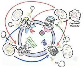
Objectives, Outcomes & Measurements
What are our objectives? Did we meet them? Here’s where we note the actual objectives for our training, and
how we did in reaching them.
OBJECTIVES
Write your specific objectives based on what CHANGE you want to see. Have your objectives address this
sentence: “As a result of this training, participants will be able to...”
OUTCOMES
Your outcomes should describe how you will know if your objectives were met, and how they will be measured.
Here’s an example from a Hydric Soils Indicator Session in 2010
OBJECTIVE: Participants will be able to identify the common hydric soil indicators in the field.
OUTCOME: All of the applicants will be able to associate the diagnostic horizons with actual hydric soil indicators
during the field training.
OBJECTIVE: Participants will be able to accurately determine soil color and textures in the field.
OUTCOME: Over 75 percent of the participants will be able to accurately determine soil color in the field and
accurately identify organic vs. mineral textures.
When to measure?
Some results may be measured during the training. Other results will need some sort of follow-up to measure.
EXAMPLES
90% of participants correctly identified the five types of wetland impacts. (training day quiz).
62% of participants described two scenarios where construction field visits are needed. (follow-up
survey).
100% of participants felt more prepared to assist landowners interested in using the Ag Wetland Bank
(evaluation survey after webinar)
89% of participants downloaded RUSLE II onto their computer. (email follow-up 1 week after training).
48% of participants calculated at least one RUSLE II equation and accurately recorded it in eLINK. (eLINK
record review).
Activity: First, let’s start with your objective. Stop and think about your session for a minute. You may have
more than one objective. The time you have for your training should determine how many objectives you can
realistically have and make the content stick.
Now, now take a couple minutes and answer the following question:
As a result of this training, participants will be able to
1) .
2) .
3) .
Once you have your objectives, you then identify the training outcomes to determine the focus of your content.
Effective Presentations – BWSR 2019 page 3
Engagement Activities
ENGAGE PARTICIPANTS TO EXTRACT RATHER THAN STUFFING INFORMATION
INFORMATION OUT OF THEM INTO THEM
For best retention and use, help participants be responsible for their own learning. Create and incorporate
engagement activities using the Learner Safety Scale.
Alone handouts, document reviews, action plans
Pairs sorting activities, case studies, discussion
Small Group discussion, case study, hands on activity
Large Group games, "stand up if..", "raise your hand if...", call outs
Online chat questions, polling, fill in the blank
Learner Safety Scale
Set your audience up to succeed.
Activities requiring participants to
work alone or in pairs carry the least
amount of risk, and are therefore
the most comfortable for
participants. Random, or mystery
call-on’s single out participants and
can make them uncomfortable. Try
to avoid high risk activities unless
there is a high degree of trust in the
room, and participants are
comfortable participating. Even
Perceived Risk then, use sparingly.
page 4
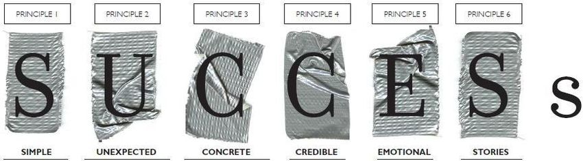
Effective Presentations – BWSR 2018Sticky Principles for Success
MADE to STICK: SUCCESs Model by Chip Heath and Dan Heath (2008) -- Link: Made to Stick SUCCESs Model by Chip
and Dan Heath (2008)
Tip: The more principles you incorporate, the more likely the information will stick.
Simplicity isn’t To get attention, To be concrete, Ideas can get People care Stories drive action
about dumbing violate a use sensory credibility from about people, through simulation
down, it’s about schema. (The language. outside not numbers. (what to do) and
prioritizing. Nordie who (Think Aesop’s (authorities (Remember inspiration (the
(Southwest will be ironed a fables.) Paint a or anti- Rokia.) Don’t motivation to do it).
THE low-fare shirt…) To hold mental picture. authorities) forget the Think Jared.
airline.) attention, use (“A man on or from within, WIIFY (What’s Springboard
What’s the core of curiosity gaps. the moon…”) using In It For You). stories (See
your message? (What are Remember the human-scale But identity Denning’s World
Can you Saturn’s rings Velcro theory of statistics appeals can Bank tale) help
communicate it made of?) memory—try or vivid details. often trump people see how an
with an analogy or Before your to hook into Let people “try self-interest. existing problem
high-concept message can multiple types of before they (“Don’t Mess might change.
pitch? stick, your memory. buy.” (Where’s With Texas”
audience has to the Beef?) spoke to
want it. Bubba’s
identity.)
Effective Presentations – BWSR 2018 page 5Developing your Session
Step 1: Create an outline
Step 2: Create your internal agenda (applying learning
retention ideas and sticky principles)
Step 3: Develop your visual aids (PPT, Flip Charts, etc.)
Step 1: Course Outline
Your first step when tasked with creating a presentation should be to create an outline.
Here’s where you map out a general outline of what you what the participant to learn, take from the training day.
It can be used later to craft the agendas – but is a space to make sure the outline for the day/event matches up
with your objectives.
Step 2: The internal Agenda
An internal agenda incorporates each of your major sections from your outline, and helps identify your core
message for that section, and develop an engagement activity to increase learner retention.
Internal Agenda –
Who’s Time
Agenda Topic 1:
leading: Allotted:
1a: What is the most critical for participants to know/apply back on the job – core message:
1b: How will I involve participants in this learning – retention call or engagement activity?
Effective Presentations – BWSR 2018 page 6Step 3: Visual Aids
Power Point Design Strategies:
1: Topic per slide
6: Six Bullets per slide
1-6- 6
6: Six words per bullet
What else should we consider about this rule?
A presentation following the 1-6-6 rule can still be boring and ineffective. Use bulleted slides SPARENGLY, and
consider images, activities and flip charts as alternatives.
Deadly Sins of PowerPoint Presentations
“PowerPoint has significantly degraded our ability to communicate effectively.” Ben West
Too much text on slides
Using slides as a Crutch
Spelling errors on slides
Too much/distracting animation
Technology errors (embedded links don’t work, projector doesn’t work etc.)
Reading text on slides to the audience
Small, or unreadable text
Confusing, hard to read charts/graphics
Unrelated and “bad” clip art
Too many bullet points
Too many words/bullet points
Activity: At BWSR Academy, we ask all participants to complete an action plan after each session. Now it’s
your turn – fill out the Action plan information below.
One important thing I learned from the session:
What I will DO or APPLY to my Academy Session:
1.
2.
Effective Presentations – BWSR 2018 page 7Presentation Zen
How to Design & Deliver Presentations Like a Pro
By Garr Reynolds
(info@garrreynolds.com)
Practical Implications for better PowerPoint Presentations
• Presentations must be both verbal & visual.
• Too much slide information overloads people’s cognitive systems.
• Can your visuals be understood in 3 seconds? If not, redesign them to support your talk.
• Slide design & delivery must help people organize, integrate information.
Organization & Preparation Tips
PowerPoint is not inherently a bad tool. In fact, if presenters just avoid a few of the most common PowerPoint
pitfalls, their presentations will greatly improve. Below, many of the items discussed in the presentation are
highlighted in brief.
(1) Start with the end in mind. Before you even open up PowerPoint, sit down and really think about the day
of your presentation. What is the real purpose of your talk? What does the audience expect? In your opinion,
what are the most important parts of your topic for the audience to take away from your, say, 50- minute
presentation? Remember, even if you've been asked to share information, rarely is the mere transfer of
information a satisfactory objective from the point of view of the audience. After all, the audience could always
just read your book (or article, handout, etc.) if information transfer were the only purpose of the meeting,
seminar, or formal presentation.
(2) Plan in “analog mode.” That is, rather than diving right into PowerPoint (or Keynote), the best presenters
often scratch out their ideas and objectives with a pen and paper. Personally, I use a large whiteboard in my
office to sketch out my ideas (when I was at Apple, I had one entire wall turned into a whiteboard!). The
whiteboard works for me as I feel uninhibited and free to be creative. I can also step back (literally) from what I
have sketched out and imagine how it might flow logically when PowerPoint is added later. Also, as I write
down key points and assemble an outline and structure, I can draw quick ideas for visuals such as charts or
photos that will later appear in the PowerPoint. Though you may be using digital technology when you deliver
your presentation, the act of speaking and connecting to an audience — to persuade, sell, or inform — is very
much analog.
(3) Good presentations include stories. The best presenters illustrate their points with the use of stories,
most often personal ones. The easiest way to explain complicated ideas is through examples or by sharing a
story that underscores the point. Stories are easy to remember for your audience. If you want your audience to
remember your content, then find a way to make it relevant and memorable to them. You should try to come
up with good, short, interesting stories or examples to support your major points.
(4) It’s all about our audience. There are three components involved in a presentation: the audience, you,
and the medium (in our case, PowerPoint). The goal is to create a kind of harmony among the three. But above
all, the presentation is for the benefit of the audience. However, boring an audience with bullet point after
bullet point is of little benefit to them. Which brings us to point number five, perhaps the most important of
all.
(5) Reduce the text on your slides to an absolute minimum. The best slides may have no text at all. This
may sound insane given the dependency of text slides today, but the best PowerPoint slides will be virtually
Effective Presentations – BWSR 2018 page 8meaningless without the narration (that is you). Remember, the slides are supposed to support/supplement
the narration of the speaker, not make the speaker superfluous. Yes, it is true that many people often say
something like this: “Sorry I missed your presentation, Steve. I hear it was great. Can you just send me your
PowerPoint slides?” Well, you could. But if they are good slides, they may be of little use without you.
(6) Do not read the text word for word off the slide. Audiences can read, so why do presenters insist on
reading long lines of text from slides? Also, it is very difficult — if not impossible — to read a slide and listen to
someone talk at the same time. So again, why all the text on slides these days? One reason may be that it is
convenient for the speaker when organizing the presentation to write out his/her thoughts one bullet point at
a time. But as Yale professor and visual communications specialist, Edward Tufte points out in a September
Wired Magazine article “…convenience for the speaker can be punishing to both content and audience.”
Speakers also may be thinking that their wordy slides will make for better handouts, a common “handout”
technique. However, the confining, horizontal orientation of a slide (one slide after another) makes for difficult
writing and reading. Which brings us to the next point below.
(7) Written documents (research papers, handouts, executive summaries, etc.) are for the
expanded details. Audiences will be much better served receiving a detailed, written handout as a takeaway
from the presentation, rather than a mere copy of your PowerPoint slides. If you have a detailed handout or
publication for the audience to be passed out after your talk, you need not feel compelled to fill your
PowerPoint slides with a great deal of text.
Remember: (1) your slides should contain only a minimum of information; (2) your slide notes, which only you
see, will contain far more data; and (3) your handout will have still far more data and detail.
Slide (PowerPoint) Tips
(1) Keep it simple. PowerPoint was designed as a convenient way to display graphical information that would
support the speaker and supplement the presentation. The slides themselves were never meant to be the “star
of the show.” People came to hear you and be moved or informed (or both) by you and your message. Don't let
your message and your ability to tell a story get derailed by slides that are unnecessarily complicated, busy, or
full of what Edward Tufte calls "chart junk." Nothing in your slide should be superfluous, ever. Your slides
should have plenty of "white space" or "negative space." Do not feel compelled to fill empty areas on your slide
with your logo or other unnecessary graphics or text boxes that do not contribute to better understanding. The
less clutter you have on your slide, the more powerful your visual message will become.
(2) Avoid using Microsoft templates. Most of the templates included in PowerPoint have already been
seen by your audience countless times (and besides, the templates are not all that great to begin with). You
can make your own background templates which will be more tailored to your needs or you can purchase
professional templates on-line (for example: www.powerpointtemplatespro.com).
(3) Avoid using PowerPoint Clip Art or other cartoonish line art. Again, if it is included in the software,
your audience has seen it a million times before. It may have been interesting in 1992, but today the inclusion
of such clip art often undermines the professionalism of the presenter. There are exceptions, of course, and
not all PowerPoint art is dreadful, but use carefully and judiciously.
(4) Use high-quality graphics including photographs. You can take your own high-quality photographs
with your digital camera, purchase professional stock photography, or use the plethora of high-quality images
available on line (be cautious of copyright issues, however). Never simply stretch a small, low resolution photo
to make it fit your layout — doing so will degrade the resolution even further.
Effective Presentations – BWSR 2018 page 9(5) Use animations and slide transitions judiciously. Animations, such as bullet points, should not be
animated on every slide. Some animation is a good thing, but stick to the most subtle and professional (similar
to what you might see on the evening TV news broadcast).
(6) Synchronize your speaking with the builds and transitions. In other words, show the next item (new
slide or new build) at the same time you begin talking about it. This requires practice, but it takes only a short
time to get the hang of it. Watch the evening news on TV and you’ll notice that bullet points and graphics
appear at the same time or just after the reporter speaks on the particular item.
(7) Use video and audio when appropriate. You can use video clips within PowerPoint without ever leaving
the application or turning on a VCR. Using a video clip not only will illustrate your point better, it will also serve
as a change of pace thereby increasing the interest of your audience. You can use audio clips (such as
interviews) as well. Something to avoid, however, is cheesy sound effects that are included in PowerPoint (such
as the sound of a horn or applause when transitioning slides). The use of superfluous sound effects attached to
animations is a sure way to lose credibility with your audience.
(8) Limit your ideas to one main idea per slide. If you have a complicated slide with lots of different data, it
may be better to break it up into 2-3 different slides (assuming no side-by-side comparisons are needed).
Delivery Tips
(1) Move away from the podium — connect with your audience. If at all possible get closer to your
audience by moving away from or in front of the podium.
(2) Remember the “B” key. If you press the “B” key while your PowerPoint slide is showing, the screen will
go blank. This is useful if you need to digress or move off the topic presented on the slide. By having the slide
blank, all the attention can now be placed back on you. When you are ready to move on, just press the “B” key
again and the image reappears. (The “.” key does the same thing).
(3) Use a remote-control device to advance your slides and builds. A handheld remote will allow you to
move away from the podium. This is an absolute must. (http://www.keyspan.com/products/).
(4) Make good eye contact. Try looking at individuals rather than scanning the group. Since you are using a
computer, you never need to look at the screen behind you — just glance down at the computer screen briefly.
One sure way to lose an audience is to turn your back on them.
(5) Take it slowly. When we are nervous we tend to talk too fast. Get a videotape of one of your
presentations to see how you did — you may be surprised at the pace of your talk.
(6) Keep the lights on. If you are speaking in a meeting room or a classroom, the temptation is to turn the
lights off so that the slides look better. But go for a compromise between a bright screen image and ambient
room lighting. Turning the lights off — besides inducing sleep — puts all the focus on the screen. The audience
should be looking at you more than the screen.
Contact Information for Garr Reynolds: Email: info@garrreynolds.com Web: www.garrreynolds.com
Effective Presentations – BWSR 2018 page 10You can also read