HOME DECOR - april 2021 - Ceramica Fioranese
←
→
Page content transcription
If your browser does not render page correctly, please read the page content below
april 2021

HOME
DECOR
2                                                                                                                                      3

                                                                         HOME DECOR

                                                                         Redesigning spaces
                                                                         in the home with colour
                                                                         Fioranese offers various collections by style and colour
                                                                         choice. This makes it possible to fully express our
                                                                         creativity, modelling spaces as we like best, thanks to
                                                                         really unique finishings. Intense or more subtle nuances,
                                                                         botanical or graphic decorations, numerous inspirations
                                                                         that Fioranese offers us so that we can begin to rethink
                                                                         our environments also in terms of colour.
                                                                         With FIO.Brick research continues into new colour
                                                                         trends to enrich our walls, becoming an authentic
                                                                         expression of design in individual shades, through the
                                                                         use of diamond-cut brick tiles, evocative of a reassuring,
                                                                         retro style, given a new look in contemporary tones.
                                                                         The scale of colours, composed of two neutral shades
                                                                         and three more striking nuances with a matt finish,
                                                                         evokes a rigorous, classic elegance that looks
                                                                         good with any collection.
                                                                         The Marmorea Intensa collection offers a decorative
                                                                         addition in 20×20 with vintage shades and intense
                                                                         patterns enhanced by colour.
                                                                         The decorations become touches of colour for an
                                                                         emphatic and uncompromising interior design: a
                                                                         distinctive style for internal wall coverings and floors.
                                                                         FIO.Clorofilla collection bringing to spaces designs
                                                                         full of intense and brilliant green, but also hints of grey
                                                                         and brown in a series of nuances that perfectly recall the
                                                                         Biophilic Design macro trend and the colours of nature.
                                                                         Finally, we want to refer to what is perhaps the most
                                                                         striking collection proposed for 2021, composed of an
EDITOR                                                                   ensemble of formidable colours: Kintsugi.
COEM S.p.A.                                                              Japanese culture, made up of timeless elegance, here
CONTACTS
Ceramica Fioranese - Ceramiche Coem                                      offers warm colours, some in geometric combinations,
Via Cameazzo, 25
41042 Fiorano Modenese - (Mo) - Italy
                                                                         truly original for a stoneware collection. It’s a line of tiles
Tel. +39 0536 993511                                                     where colour becomes truly precious, as far as taking on
info@fioranese.it
coem@coem.it                                                             the tones of gold, red and ochre, creating together an
                                                                         overall effect made of grace and harmony.
All rights reserved. No part of this work may be reproduced in any way
without the written authorisation of COEM S.p.A.
Copyright © of all the works lies with their respective owners.
To find out more about Ceramica Fioranese and Ceramiche Coem
collections visit:
coem.it
fioranese.it
coemfioranesevents.com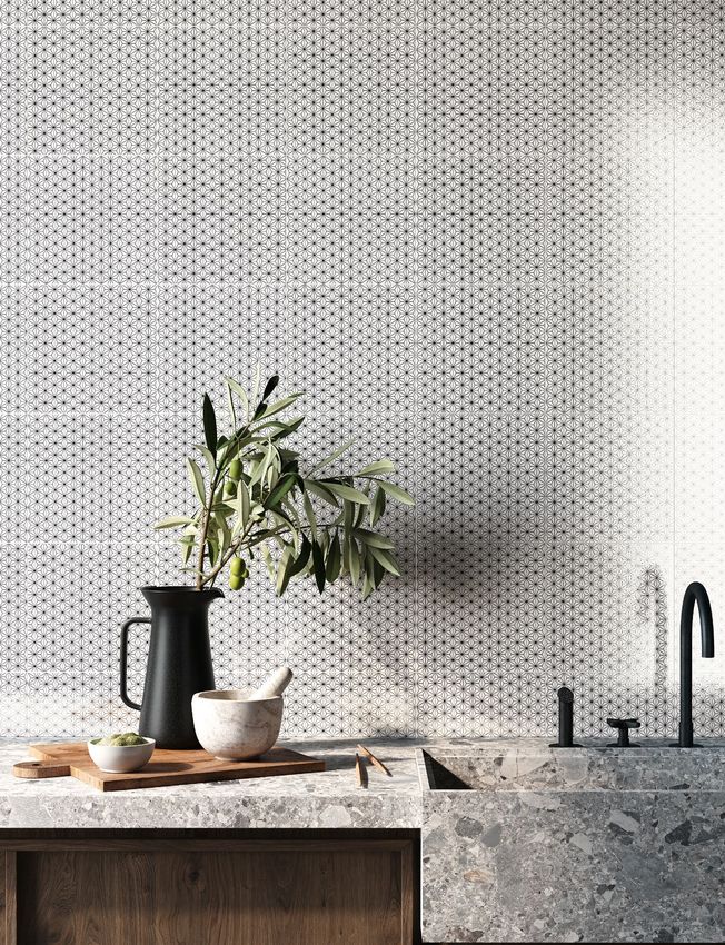
4                                                                                   5

                                                       CLICK
CLOROFILLA // 20
                                                     Each design has been crafted
Desire for colour,
desire for optimism
                                                     entirely by hand, and the
                                                     subtle brushstrokes of every
New trends for
projects that have a                                 colour are visible, bringing
spring feel                                          added value to this “art
Spring has finally arrived, together with the
desire to play with colours and surfaces, giving     collection” that gives an
a new look to our environments.
The key is renewal and positive thinking.
Let’s make way for colour and original
                                                     authentic, one-off touch to
combinations that lend character to everyday
spaces and create new settings for our daily         living spaces.
lives: the colours for the finishings of different
environments can be based on a wider colour
palette, and it’s important every now and again
to remember that there are other colours apart
from white.
                                                     Clorofilla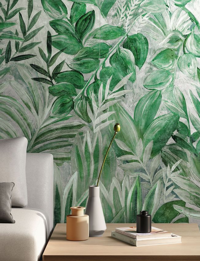
6

CLICK
        7
8                9

    CLICK

Embracing
nature in our
living spaces
has a positive
impact on our
mood and
well-being.

Clorofilla
Primavera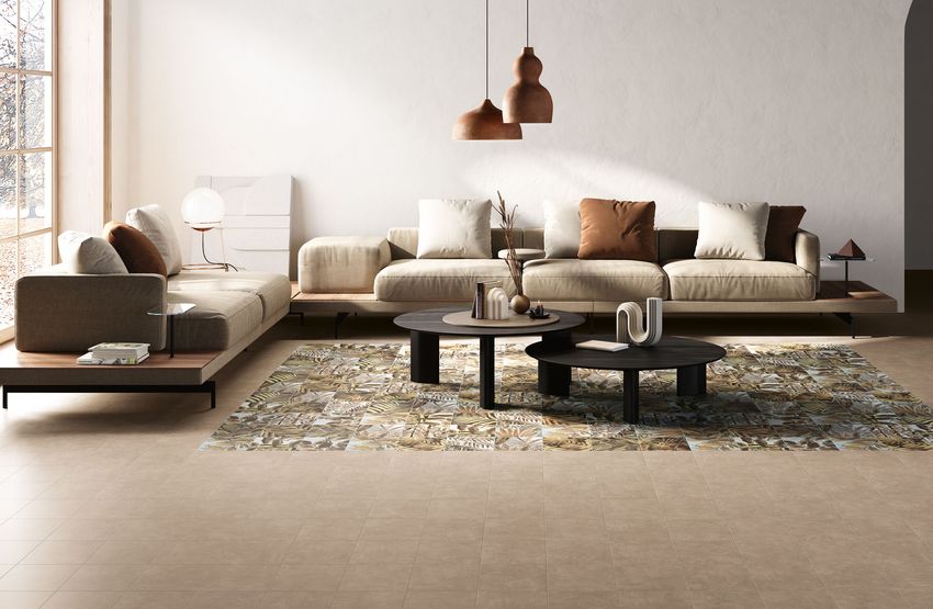
10                              11

     Hand-crafted botanical
     designs that bring the
     natural universe of the
     outdoors into interiors.

     Clorofilla

                                CLICK
     Autunno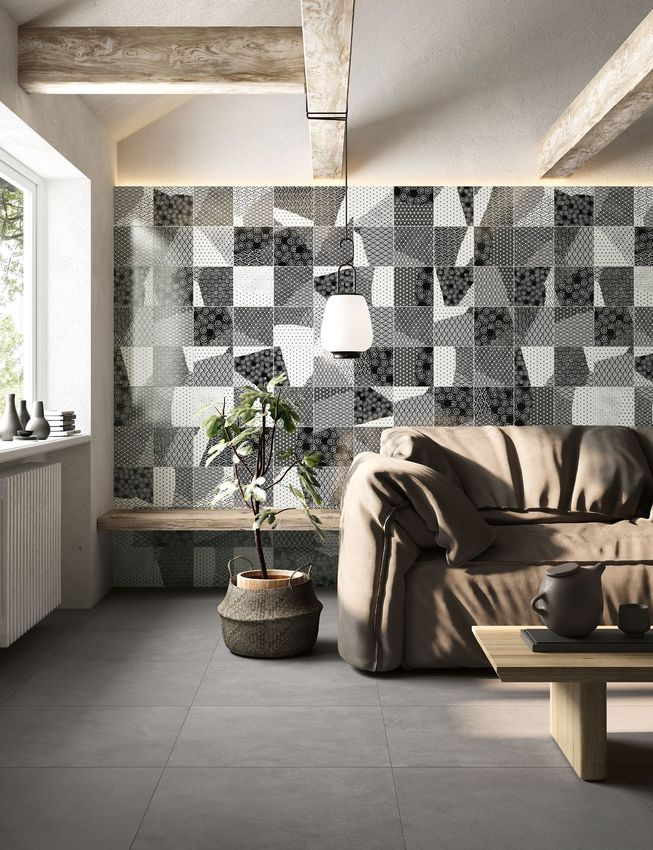
12

CLICK
        13
14 15
CLICK
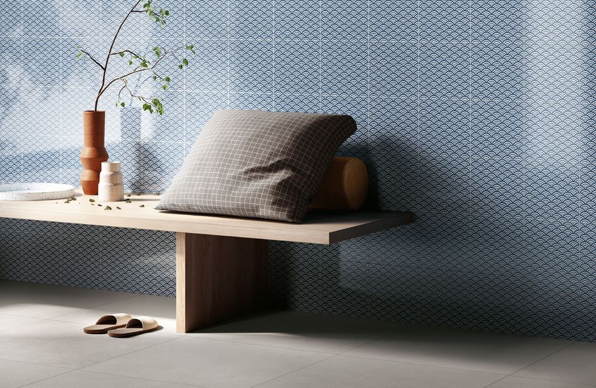
BRICK // 20
Diamond-cut brick tiles,
After so much white
for interiors, is
evocative of a reassuring, retro
colour making a style, given a new look in
comeback?
Since last year we have certainly been
contemporary tones.
experiencing a marked return to colours;
these true protagonists in our homes have been
As well as a means of
missing since the 1980’s, and here they are
again, updated. expressing design, colour has
Now we are able to appreciate many
more shades. Whites, however, are not
disappearing; they are becoming slightly more
the power to rebalance the style
coloured, pink and light blue, but more intense
and full colours such as red and dark blue can of a setting, with a bearing on
mood and well-being.
also be used today.
The important thing is that the colour reflects
our style and what we want to communicate to
others, thanks to our interior design choices.
Brick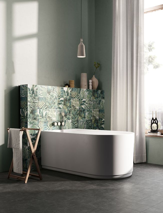
16                                            17

        CLICK
     Brick
     Vague Grey - Dusty Mauve - Greige Tale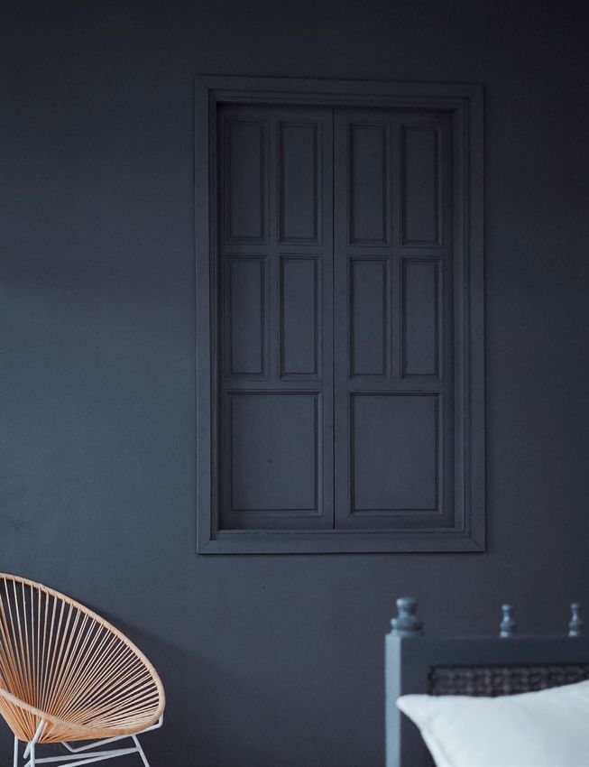
18              19

     CLICK

A rigorous,
classic
elegance that
looks good
with any
collection.

Brick
Sage Garden
20 21
CLICK
KINTSUGI // 20
The luminous sheen of
A multifaceted world
of material and
metal, and decorations
artistic influences that evoke Japanese-style
Changing and sophisticated influences, typical
of Japanese culture, open up new dialogues for
ceramics, for a collection
able to enrich flooring
contemporary living.
The art of putting pieces back together is the
delicate symbolic lesson inspired by the ancient
art of Kintsugi: piecing together fragments
along connecting lines, giving a new look to
and coverings with an
the work. A soft concrete material meets the
brilliance and shine of metal. unconventional design.
Grits and glazes overlap to create luminescent
patterns and inserts rich in texture and
consistency, giving greater depth to surfaces
and creating new forms that foster welcoming
and unconventional environments.
Kintsugi
Creativity, determination and confidence:
every experience can be valued and exhibited
in a positive way, giving it a unique,
precious allure.22
23
CLICK24 25
CLICK
Changing and
sophisticated
influences,
typical of
Japanese
culture.
Kintsugi
Japan 20x2026 27
CLICK
Greater depth
for brandnew
surfaces.
Kintsugi
Japan-Mix28
CLICK
2930 31
CLICK
MARMOREA INTENSA // 20
Decorations with intense
Creating atmospheres
with colour
textures and vintage details,
Atmosphere is created when colours mix well bringing dashes of colour for
an uncompromising, clear
together relating to shapes, sounds and light.
Harmonies change with the time; today it’s
important to place colours in harmony with
the lighting, whether natural or artificial. Lights
will be increasingly protagonists in the coming
approach to interior design.
years, together with design.
All colours are interesting; like ingredients in
cooking, the important aspect is to know how
to mix and use them in the right quantities,
respecting the architectural dimensions and
Marmorea Intensa
characteristics.
This is true for furnishings as well as for the
finishings in homes and retails spaces.32 33
CLICK
Intense
textures
enhanced by
colour.
Marmorea
Intensa
Dusty Mauve34 35
CLICK
Marmorea Intensa
Greige Tale - Sage Garden36 37
CLICK
Marmorea
Intensa
Blueberry38 39
CLICK
A distinctive style for
internal wall coverings
and floors.
Marmorea Intensa
Vague Grey© Ceramica Fioranese 04.2021
You can also read