Insights and Excellence: School success in New Zealand - APO
←
→
Page content transcription
If your browser does not render page correctly, please read the page content below
RESEARCH NOTE
 Insights and Excellence:
 School success in New Zealand
 Joel Hernandez*†

 In a healthy school culture, data is information, not condemnation.

 — Anthony Muhammad1

Summary
This research note is the third in a series of reports discussing the Initiative’s school performance
tool and school evaluation in New Zealand. We present three case studies showing how three
secondary schools performed before and after our tool separated the contribution of family
background from the contribution of each school.

The three case studies are presented as three individual school reports that provide a more accurate
and fairer picture of the schools’ performance over time and in relation to all other secondary
schools in New Zealand.

Importantly, across our three school reports, we show several examples of high performance in the
school system, some making it into the top 25% in both NCEA levels 1 and 2 and University Entrance
attainment. The tool shows schools improving significantly over time, in some cases jumping
significantly above the national average.

Along with providing an in-depth analysis of the results, we discuss how the reports can help
principals and boards of trustees keep their schools on track and achieve the best education outcomes
for students.

*
 Joel Hernandez is a Policy Analyst at The New Zealand Initiative and author of In Fairness to Our Schools:
Better measures for better outcomes (2019).
†
 The author acknowledges and thanks all those who have generously assisted with the preparation of this
research note. First, the author thanks the three school principals and their staff who generously allowed the
Initiative to use their school data for this project; without their support, this research note would not have
been possible. Second, the author thanks the brilliant team at The New Zealand Initiative, including the
supportive guidance from Mangai Pitchai, Oliver Hartwich, Eric Crampton, Chelsy Blair, Simone White, Linda
Heerink, Briar Lipson and Nathan Smith. Finally, the author thanks his expert reviewers from the Ministry of
Education, the Education Review Office, and the New Zealand School Trustees Association. The author alone is
responsible for the views expressed and any errors or omissions in the study.

 1

Introduction
The Ministry of Education and the Education Review Office (ERO) collect a tremendous amount of
information and data about New Zealand’s students beginning on their first day of primary school to
their graduation at secondary or tertiary. The information ranges from a student’s date of birth,
ethnicity, gender and home address to their attendance, subject choice and qualifications.

This information is essential for the Ministry and ERO in allocating funding, measuring school
performance, and evaluating the effectiveness of education policies. It also helps principals and
teachers learn what works best to improve student education.

Collection comes at a cost, however. In the most recent NZCER survey, principals and teachers cited
increased reporting and compliance as one of the many problems they face.2 Similarly, schools are
more reluctant to provide data to the Ministry.3 These are valid concerns. Yet, a balance must be
struck between the cost of collecting data and the benefit of data analysis. High compliance costs
add not only to bureaucracy but also to better education outcomes, which means policymakers must
ensure the data is used carefully to develop effective, evidence-based policy.

At present, the Ministry is making strides in improving school funding through more complex
statistical modelling. The Equity Index, set to be released in 2020/21, will replace the current decile
system with a more accurate and targeted funding model. Using data from the Ministry of Education
and from various government agencies, the Equity Index will address several weaknesses of the
decile system and create better targeted funding for schools with high numbers of out-of-zone
students, improved identification of high-risk students, and reduced school stigmatisation.

In the absence of better information, it is no surprise that parents rely on imperfect proxies for
school quality. Parents should have information that shows decile is not a proxy for school quality,
and that there are high-performing schools across all deciles so they can be confident their children
will receive a quality education at their local school.

Similarly, the Ministry needs more data-driven measures of school performance to objectively
evaluate the effectiveness of policy. Too often, education policies were set up without a rigorous
measurement framework.4 As a result, effective policies risk being scrapped while ineffective policies
may be continued or even expanded.

Equally, principals require better measures of school performance to help identify where a school
excels or falls behind relative to other schools. Principals will already have a good sense of how their
school is performing; however, knowing how other schools are doing can help foster collaboration.
Schools falling behind in certain areas can learn from schools excelling in those areas.

The Equity Index is only part of the solution for reducing school stigmatisation and the resulting
decile drift and socioeconomic segregation. To address the stigmatisation of low-decile schools,
we need a data-driven performance measure that adjusts for the unique communities each school
serves. Like the Equity Index, a more complex statistical model is required to separate the
contribution of family background from the contribution of each school. Without it, the Ministry,
principals and parents cannot identify a school’s true performance.

Current measures of school performance such as ERO reviews can be useful, but are often too
ambiguous for parents to decide the right school for their children. Similarly, principals argue that

 2
ERO reviews are too infrequent (between one and five years apart depending on the previous
performance of the school).5 Like school league tables, ERO reviews can easily conflate the
contribution of family background with the contribution of the school. As a result, low-decile schools
are disproportionately ranked as “poor-performing” compared with high-decile schools.

In a previous report (In Fairness to Our Schools), the New Zealand Initiative proposed an alternate
objective – a data-driven measure of school performance to complement existing methods. Using
the same data sources as the Equity Index, our school performance tool separates the contribution of
family background from the contribution of the school, showing empirically that decile is not a proxy
for school quality and that high-performing schools appear across all deciles.

In previous reports, we also showed that when evaluated on University Entrance (UE), 42 decile 1
and 2 schools outperformed 75% of every other secondary school in the New Zealand. In contrast,
9 decile 9 and 10 schools were in the bottom 25%.6

Crucially, previous reports showed a small sample of the tool’s capabilities. Tomorrow’s Schools:
Data and evidence focused on the results by decile, while In Fairness to Our Schools focused on the
results by school. This research note focuses on three out 480 secondary schools as case studies.
It shows how generating similar reports can evaluate education policy through the Ministry and help
principals, parents and boards of trustees in deciding the ideal school for their children or how to
keep schools on track so each student can reach their potential.

The three case studies are presented in the style of school reports. They highlight where each school
is succeeding or falling behind; their performance relative to other schools and to themselves
over time; and how they performed after our tool adjusted for the communities each school serves.
This means low-, middle- and high-decile schools are evaluated on an even playing field. The school
reports offer principals the information and power they need to support their students’ learning,
not to punish schools for their performance.

Importantly, these case studies and school reports depended on the support of the three secondary
schools who reached out to the New Zealand Initiative in the early stages of this project giving
permission to use and present their data in this research note. For more information on how these
schools gave us their permission, see Box 1 in the Appendix (page 19). To protect their identity, two
out of the three schools have not been named at their request. One school, Southern Cross Campus
(School B), has chosen to be named.

This research note is organised as follows: i) school case studies presented as school reports;
ii) additional in-depth interpretation of the school results; iii) discussion of how this type of reporting
can be useful for the Ministry, principals, boards of trustees and parents; and iv) conclusion.

Disclaimer
The results in this paper are not official statistics They have been created for research purposes from the Integrated Data
Infrastructure (IDI), managed by Statistics New Zealand.
The opinions, findings, recommendations, and conclusions expressed in this paper are those of the author(s), not Statistics NZ.
Access to the anonymised data used in this study was provided by Statistics NZ under the security and confidentiality
provisions of the Statistics Act 1975. Only people authorised by the Statistics Act 1975 are allowed to see data about a
particular person, household, business, or organisation, and the results in this paper have been confidentialised to protect
these groups from identification and to keep their data safe.
Careful consideration has been given to the privacy, security, and confidentiality issues associated with using
administrative and survey data in the IDI. Further detail can be found in the Privacy impact assessment for the Integrated
Data Infrastructure available from www.stats.govt.nz.

 3
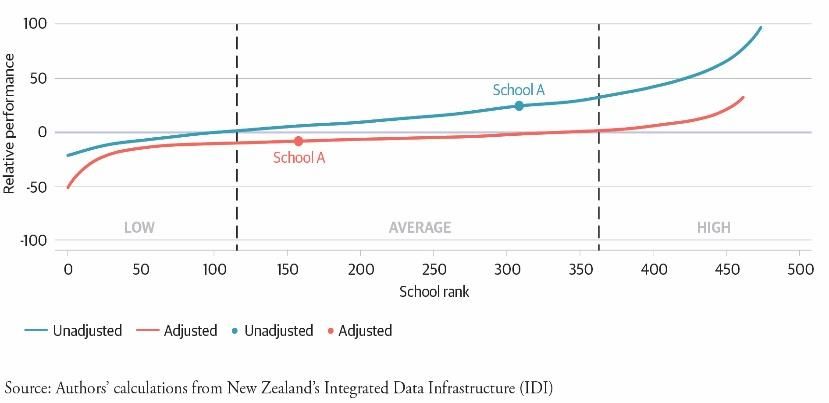
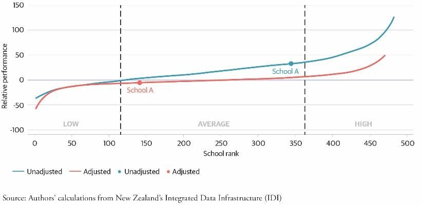
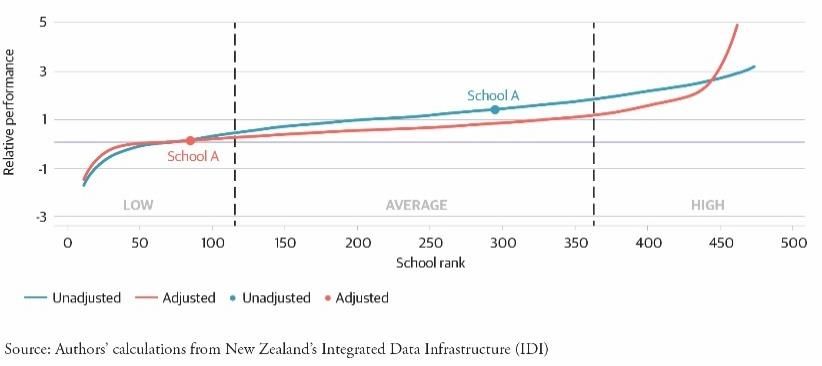
School Excellence Report: School A
 Summary: (Unnamed) School A is a state decile 8 co-ed school that performs well in NCEA levels 1, 2
 and 3 but falls short of expectations on UE. On raw NCEA performance, School A is in the top 30% of
 schools. However, after adjusting for the communities of students it serves, School A places firmly in
 the middle 50% of schools. Over time, School A’s stable performance has hovered close to the
 national average.

 Figures key
 The blue curve shows the distribution of secondary school performance based on raw NCEA achievement (unadjusted
 performance). School A’s unadjusted rank is represented by the blue dot along the blue curve. These results represent
 School A’s absolute performance in NCEA and are akin to league tables. These results do not indicate School A’s ‘true’
 performance.
 The red curve shows the distribution of secondary school performance based on NCEA achievement after adjusting for the
 family background characteristics of each student (adjusted performance). The family background characteristics that have
 been adjusted for include, but are not limited to, ethnicity, refugee status, parent’s education, and income and benefit
 history. The full list of background characteristics is included in the Appendix. School A’s adjusted rank is represented as
 the red dot along the red curve. These results better indicate School A’s ‘true’ contribution to students’ academic
 achievement. Both the unadjusted and adjusted results are calculated using NCEA data from 2008 to 2017.
 When interpreting these results, it should be considered that each school’s ‘contextualised value-added’ scores (each blue
 and red dot) are only estimates with some level of uncertainty for each school score. To account for this, each secondary
 school has been categorised into three performance categories representing the broad range of performances across the
 whole school distribution. Schools within the top 25% of the distribution are high-performing, the middle 50% are average
 performing and the bottom 25% are low-performing. Schools in the high-performing category perform above expectations,
 average performing as expected, and low-performing below expectations given the community of students in each school.
 Notably, for the approximately 240 schools falling in the middle 50% of the distribution (the average performance
 category), moving positions within this distribution (from 120 to 360) equates to little practical difference in NCEA
 achievement because of the closeness of results within this category. However, moving between categories does result in a
 practical difference in NCEA achievement – for example, from low to average or average to high-performing categories.
 Practical differences in NCEA achievement are much larger for schools performing in the top and bottom 10% of the
 distribution where small changes in school rank can have relatively larger effects on NCEA achievement.
 Importantly, the results shown in this school report are only estimates and represent relative performance among other
 secondary schools in New Zealand. Other measures such as overall attainment in NCEA are better representations of
 absolute achievement. Additionally, there are contextualised components of a school not captured in these reports.
 For further discussion of these qualitative aspects, see the following section.

Figure 1A: School A NCEA Level 1 WRPI Score Figure 2A: School A NCEA Level 2 WRPI Score

 4
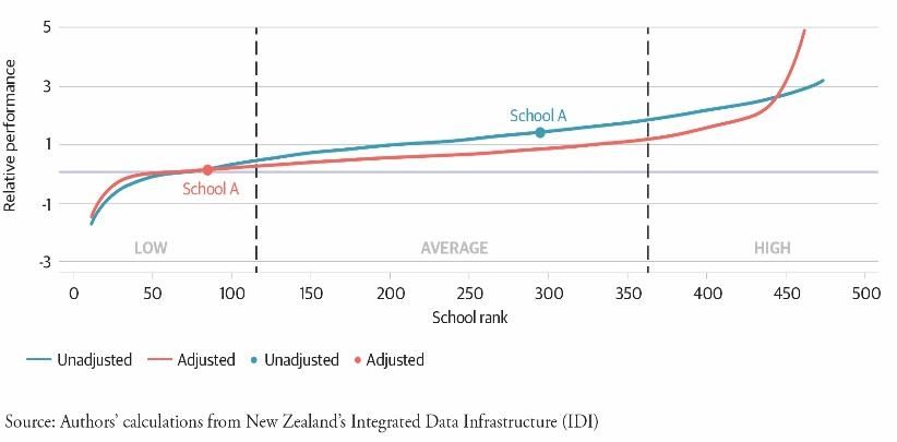
Figure 3A: School A NCEA Level 3 WRPI Score Figure 4A: School A NCEA University Entrance

 Figures 1A–3A show School A’s unadjusted and adjusted performance in NCEA levels 1, 2 and 3.
 Figure 4A is the equivalent for UE. Notably, the approximately 240 schools falling in the middle 50%
 of the distribution (the average category) perform broadly as expected given the students they
 serve. Moving positions within this category, i.e. from 120 to 360, equates to little practical
 difference in NCEA achievement. Across all NCEA levels, School A is an average performer on both
 the unadjusted and adjusted measures. In practice, School A performs as expected in NCEA levels 1,
 2 and 3 given its community of students.

 However, School A’s adjusted performance is poorer when evaluated on UE. Figure 4A shows School A
 slipping by more than 200 places from average- to low-performing. School A’s adjusted UE score
 puts it in the bottom 15% of New Zealand secondary schools, which means there is room for
 improvement in its UE attainment.

Figure 5A: School A NCEA Level 1 WRPI Score
Māori & Pasifika Figure 6A: School A NCEA Level 1 Time Series

 Figure 5A focuses on Māori and Pasifika student achievements in School A in NCEA level 1. Results for
 these students are comparable to the average performance across the whole-school roll in School A.

 Figure 6A shows School A’s performance in NCEA level 1 over time.7 On both the unadjusted and
 adjusted measures, School A’s performance is relatively stable. On the adjusted measure, School A
 performs near the national average. Minor fluctuations between years are not significant.

 5
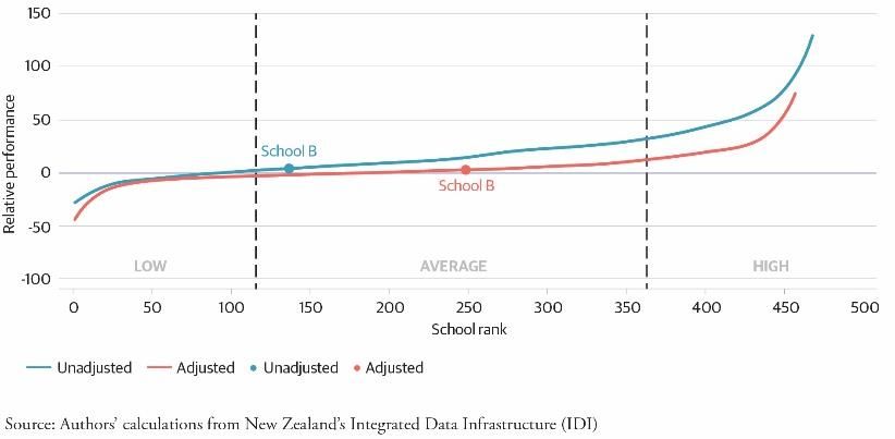
School Excellence Report: School B
 Summary: School B (Southern Cross Campus) is a state decile 1 co-ed school that performs well in
 NCEA levels 1, 2 and 3 and well above expectations on UE (in the top 25%). On many measures,
 School B progresses from low- to the average-performing category after adjusting for the community
 of students it serves. Over time, School B’s performance rose above the national average but in
 recent years dipped closer to the national average.

 Figures key
 The blue curve represents the distribution of secondary school performance based on raw NCEA achievement (unadjusted
 performance). School B’s unadjusted rank is shown by the blue dot along the blue curve. These results represent School B’s
 absolute performance in NCEA and are akin to current league tables. These results do not indicate School B’s ‘true’ performance.
 The red curve represents the distribution of secondary school performance based on NCEA achievement after adjusting for
 the family background characteristics of each student (adjusted performance). The family background characteristics that
 have been adjusted for include, but are not limited to, ethnicity, refugee status, parent’s education and income and benefit
 history. The full list of background characteristics is included in the Appendix. School B’s adjusted rank is shown by the red
 dot along the red curve. These results better indicate School B’s ‘true’ contribution to students’ academic achievement.
 Both the unadjusted and adjusted results are calculated using NCEA data from 2008 to 2017.
 When interpreting these results, it should be considered that each school’s ‘contextualised value-added’ scores (each blue
 and red dot) are only estimates with some level of uncertainty for each school score. To account for this, each secondary
 school is categorised into three performance categories representing the broad range of performances across the whole
 school distribution. Schools within the top 25% of the distribution are high-performing, the middle 50% are average
 performing and the bottom 25% are low-performing. Schools in the high-performing category perform above expectations,
 average performing as expected and low-performing below expectations given the community of students in each school.
 Notably, for the approximately 240 schools falling in the middle 50% of the distribution (the average performance
 category), moving positions within this distribution (from 120 to 360) equates to little practical difference in NCEA
 achievement because of the closeness of results within this category. However, moving between categories does result in a
 practical difference in NCEA achievement, – for example, from low to average or average to high-performing categories.
 Practical differences in NCEA achievement are much larger for schools performing in the top and bottom 10% of the
 distribution where small changes in school rank can have relatively larger effects on NCEA achievement.
 Importantly, the results shown in this school report are only estimates and represent relative performance among other
 secondary schools in New Zealand. Other measures such as overall attainment in NCEA are better representations of
 absolute achievement. Additionally, there are contextualised components of a school not captured in these reports.
 For further discussion of these qualitative aspects, see the following section.

Figure 1B: School B NCEA Level 1 WRPI Score Figure 2B: School B NCEA Level 2 WRPI Score

 6
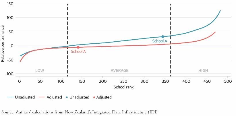
Figure 3B: School B NCEA Level 3 WRPI Score Figure 4B: School B NCEA University Entrance

 Figures 1B–3B show School B’s unadjusted and adjusted performance in NCEA levels 1, 2 and 3.
 Figure 4B is the equivalent for UE. Across NCEA levels 1 and 2, School B moves from the low- to
 average-performing category when adjusted for the community of students it serves. In practice,
 School B’s low unadjusted NCEA results (seen in current league tables) underestimates the school’s
 true contribution to its students. In NCEA level 3, School B performs slightly better on both the
 unadjusted and adjusted measures, placing it in the average category in both measures.

 School B performs best on UE, rising nearly 250 places from the threshold between low and average
 performance to just shy of high performance (see Figure 5B). This places School B in the top 25% of
 schools in the country for UE attainment.

Figure 5B: School B NCEA Level 1 WRPI Score
Māori & Pasifika Figure 6B: School B NCEA Level 1 Time Series

 Figure 5B focuses on Māori and Pasifika student achievements in School B in NCEA level 1.
 In contrast to Figure 1B, Māori and Pasifika students perform slightly better in the raw unadjusted
 NCEA results. In the adjusted measure, both cohorts place in the average-performing category.

 Figure 6A shows School B’s performance in NCEA level 1 over time. On the adjusted measure, School B
 improved over time to above the national average before slipping to just below average between
 2014 and 2017.

 7
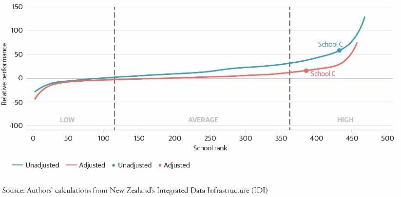
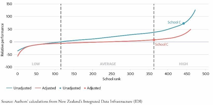
School Excellence Report: School C
 Summary: (Unnamed) School C is a state decile 9 girls only secondary school that performs
 exceptionally in NCEA levels 1 and 2, placing in the top 25% of all secondary schools in the country.
 In NCEA level 3 and UE, School C performs exceptionally in the raw unadjusted results; however, it is
 middling or average performing after adjusting for the community of students it serves. Over time,
 School C’s performance has increased significantly above the national average.

 Figures key

 The blue curve represents the distribution of secondary school performance based on raw NCEA achievement (unadjusted
 performance). School C’s unadjusted rank is shown by the blue dot along the blue curve. These results represent School C’s
 absolute performance in NCEA and are akin to current league tables. These results do not indicate School C’s ‘true’
 performance.

 The red curve represents the distribution of secondary school performance based on NCEA achievement after adjusting for
 the family background characteristics of each student (adjusted performance). The family background characteristics that
 have been adjusted for include but are not limited to ethnicity, refugee status, parent’s education, and income and benefit
 history. The full list of background characteristics is included in the Appendix. School C’s adjusted rank is shown by the red
 dot along the red curve. These results better indicate School C’s ‘true’ contribution to students’ academic achievement.
 Both the unadjusted and adjusted results are calculated using NCEA data from 2008 to 2017.

 When interpreting these results, it should be considered that each school’s ‘contextualised value-added’ scores (each blue
 and red dot) are only estimates and that there is some level of uncertainty for each school score. To account for this, each
 secondary school has been categorised into three performance categories which represent the broad range of
 performances across the whole school distribution. Schools within the top 25% of the distribution are high-performing, the
 middle 50% are average performing and the bottom 25% are low-performing. Schools in the high-performing category
 perform above expectations, average performing as expected and low-performing below expectations given the
 community of students in each school.

 Notably, for the approximately 240 schools falling in the middle 50% of the distribution (the average performance
 category), moving positions within this distribution (from 120 to 360) equates to little practical difference in NCEA
 achievement because of the closeness of results within this category. However, moving between categories does result in a
 practical difference in NCEA achievement, – for example, from low to average or average to high-performing categories.
 Practical differences in NCEA achievement are much larger for schools performing in the top and bottom 10% of the
 distribution where small changes in school rank can have relatively larger effects on NCEA achievement.

 Importantly, the results shown in this school report are only estimates and represent relative performance among other
 secondary schools in New Zealand. Other measures such as overall attainment in NCEA are better representations of
 absolute achievement. Additionally, there are contextualised components of a school not captured in these reports. For
 further discussion of these qualitative aspects, see the following section.

Figure 1C: School C NCEA Level 1 WRPI Score Figure 2C: School C NCEA Level 2 WRPI Score

 8
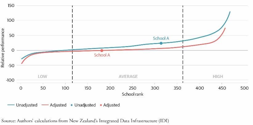
Figure 3C: School C NCEA Level 3 WRPI Score Figure 4C: School C NCEA University Entrance

 Figures 1C–3C show School C’s unadjusted and adjusted performance in NCEA levels 1, 2 and 3.
 Figure 4C is the equivalent for UE. Notably, schools in the top 25% of the distribution (high) perform
 broadly above expectations given the students they serve. Conversely, schools in the middle 50% of
 the distribution (average) perform broadly as expected. School C performs best in NCEA levels 1 and 2,
 placing it in the top 25% in both the unadjusted and adjusted measures.

 In contrast, School C falls from the high- to average-performing category when evaluated on NCEA
 level 3 and UE after adjusting for family background characteristics. In practice, this means School C
 performs as expected given the community of students it serves for both NCEA level 3 and UE.

Figure 5C: School C NCEA Level 1 WRPI Score
Māori & Pasifika Figure 6C: School C NCEA Level 1 Time Series

 Figure 5C focuses on Māori and Pasifika student achievements in School C in NCEA level 1. Results
 for these students compare with the average performance across the whole-school roll in School C.

 Figure 6C shows School C’s performance in NCEA level 1 over time. From 2008 to 2017, School C’s
 performance improved significantly to above the national average. And from 2010 to 2015, School C
 saw its largest performance increase, improving more than half a standard deviation in our measure
 of NCEA level 1. Since then, performance has fallen slightly but remains above the national average
 by a significant margin.

 9
Additional insights into results
School reports
This research note demonstrates the kind of information, analysis and reporting that could be
provided to every secondary school in the country using the data already collected by the Ministry of
Education and other government agencies.

Based on student report cards, the Initiative’s school reports aim to provide principals with
objective, data-driven information and insights so they can improve their students’ education.

Unlike existing measures of school performance, our reports show each school’s results after
adjusting for the different communities each school serves. This means any advantages or
disadvantages a student brings with them to school, including ethnicity, gender, and parent’s
education and income or benefits history can be separated from the contribution of their school.

This means the Ministry, principals, boards of trustees and parents get a more accurate picture of a
school’s true performance. It also means schools are evaluated on a more even playing field.

The three school reports shown here are a proof of concept for how our results and analysis could
be provided to schools. A myriad alternative formats are available, including longer reports with
more information, more frequent shorter reports, or combined reports with a mix of quantitative
information from our tool and qualitative information from ERO. The most effective format is yet to
be assessed and refined.

Because the school reports displayed here are of the shorter format, additional in-depth analysis not
included in the two-page reports is discussed in the following section.

Additional in-depth analysis
 1. Unadjusted to adjusted results: Rank change

The transition from unadjusted to adjusted measures resulted in some schools changing school rank8
by a significant number of positions, in some cases moving up or down by more than 200 places.
Interestingly, for some schools, there was no practical difference in school achievement, while for
others there was significant difference due to the large number of schools within each performance
category – in particular, the low-, average- and high-performing categories which contain 120, 240
and 120 secondary schools, respectively.

In our previous report, In Fairness to Our Schools, we categorised each school into three
performance categories because of the distribution of school performance and confidentiality rules
set by Statistics New Zealand (SNZ). Schools falling within the bottom 25% of the distribution were
categorised as low-performing, the middle 50% as average-performing, and the top 25% as high-
performing. In practice, schools in the low-performing category performed below expectations, the
average-performing category as expected and the high-performing category above expectations
given the community of students they serve.

As a result of the large number of schools performing as expected with similar results, schools could
move by more than 200 places when switching from the unadjusted to the adjusted results without

 10
leaving the average-performing category. Similarly, schools could shift by more than 100 places and
 remain low- or high-performing. However, caution is recommended when assessing changes within
 the top and bottom of the distribution due to the larger variations in performance within these
 categories. Schools A, B and C demonstrate these different outcomes in Figures 1A, 1B and 1C,
 respectively.

Figure 1A: School A NCEA Level 1 WRPI Score Figure 1B: School B NCEA Level 1 WRPI Score

Figure 1C: School C NCEA Level 1 WRPI Score
 When switching from the unadjusted to the
 adjusted results, School A drops 200 places.
 However, because School A performed in the
 top half of the unadjusted distribution,
 it remains within the average-performing
 category after our tool separated the
 contribution of family background from the
 contribution of the school (see Figure 1A).
 In practice, this means School A’s raw NCEA
 results represent School A’s real contribution to its students, and that School A performs as expected
 given the community of students it serves.

 Conversely, School B rises nearly 200 places while moving from the low- to average-performing
 category (see Figure 1B). This means School B’s raw NCEA results do not represent School B’s real
 contribution to its students. In practice, it also means School B performs as expected given the
 community of students it serves.

 By comparison, School C stays within the high-performing category despite dipping nearly 80 places
 from the unadjusted to the adjusted results (see Figure 1C). In practice, this means School C’s high
 raw NCEA results represent its true contribution to students and that it performs above expectations.

 Note: Any school in the low- or high-performing category would move into the average-performing
 category if it moved by more than 120 positions after shifting from the unadjusted to the
 adjusted results.

 The results are rather different when evaluating schools for UE, however. Figures 4A, 4B and 4C
 show School A, B and C’s results, respectively.

 11
Figure 4A: School A NCEA University Entrance Figure 4B: School B NCEA University Entrance

 In contrast to School A’s results in NCEA, School A falls from average- to the low-performing after
 moving down 215 positions from the unadjusted to the adjusted results (see Figure 4A). This means
 when evaluated on UE, School A performs below expectations given the community of students it
 serves and has room to improve.

 Conversely, School B moves from average- to the high-performing by shifting nearly 250 places from
 the unadjusted to the adjusted results (see Figure 4B). School B performs above expectations when
 evaluated on UE and is highly effective at getting its students to achieve the requirement.

 Figure 4C: School C NCEA University Entrance
 By comparison, School C moves from high-
 to the average-performing after dipping 233
 positions (see Figure 4C). The data shows
 School C performing as expected when
 evaluated on UE. However, its higher-than-
 average UE results are somewhat inflated by
 the community of students it serves.

 These findings demonstrate what is possible
 when analysing the data already collected by schools. Once our tool separates the contribution of
 family background, some schools’ performance looks markedly different. In some cases, our tool
 revealed hidden performance undetected by existing measurements of school performance;
 in others, the result mimics their raw performance in NCEA.

 2. Unadjusted to adjusted results: Strengths and weaknesses

 The purpose for the three school reports was not to condemn underperforming schools, nor was it
 to create new league tables – that is the last thing we want. Rather, our purpose was to identify and
 highlight areas where schools both excel and require support in the search for the most effective
 ways to improve student education in New Zealand. Without better measures of school
 performance, we are in the dark about what works and what does not.

 The three reports show large variations in school performance both across schools and within
 schools. We have demonstrated that many schools perform as expected given the community of
 students they serve, while some outperform expectations in both low and high socioeconomic

 12
communities. Without doubt, there is success worth celebrating but also areas needing much
improvement.

For example, School A largely performs as expected for NCEA levels 1, 2 and 3 but has room for
improvement in UE. Similarly, School B largely performs as expected in NCEA levels 1, 2 and 3 but
excels in UE. School C performs above expectations for NCEA levels 1 and 2 while meeting
expectations for NCEA level 3 and UE.

Individually, each school report offers many insights, and knowing which areas require further
improvement is key for whole-school success. However, the full potential of our tool can only be
leveraged when every school’s results are pooled together. By allowing schools to learn from each
other, efficient and effective collaboration can help improve education system-wide.

The Ministry should be looking at all the interventions implemented across schools so it can learn
which policies are the most effective at improving the education outcomes for students.

 3. Māori and Pasifika performance

In addition to evaluating each secondary school on their performance in NCEA and UE, our tool
assessed which schools perform best with Māori and Pasifika students compared to the whole-
school roll.

We found all three schools performing comparably with their Māori and Pasifika students. School A
remains in the average-performing category in both the whole-school roll evaluation and the Māori
and Pasifika specific evaluation for NCEA level 1 (see Figure 5A). In practice, this means School A
performs as expected for both its Māori and Pasifika students and its whole-school roll. Similarly,
School C remains in the high-performing category in both the whole-school roll and the Māori and
Pasifika evaluation (see Figure 5C). In practice, this means School C performs above expectations for
its whole-school roll in NCEA Level 1.

The only difference in our results is for School B, whose unadjusted results for its Māori and Pasifika
students are higher than the whole-school unadjusted results (see Figure 5B). This suggests that on
raw NCEA outcomes, Māori and Pasifika students perform relatively better than the whole-school
roll compared to every other secondary school. In practice, however, the unadjusted results suggest
School B performs as expected for its whole-school roll given the family background characteristics
of each student.

Importantly, these results demonstrate the ability to identify which schools have an advantage in
teaching different cohorts of students such as Māori and Pasifika. If implemented across other
secondary schools, the tool may show Māori medium schools doing a better job of teaching Māori
students, as purported by its supporters, or it may not. It may show schools that are most effective
at teaching its students are the most effective for all its students, rather than any specific cohort.
School C is good example of the latter as its performance in NCEA level 1 is comparable to both its
Māori and Pasifika students and its whole-school roll. This could be applied to other ethnicities,
students with disabilities, or any other specific cohort of students of interest. Again, the results in
the three school reports are just a small sample of our tool’s capabilities.

 13
4. Performance over time

Our school performance tool also shows how schools perform over time. The three case studies
show varied results. School A has the most stable performance: from 2008 to 2017, its performance
fluctuated around the national average. School B’s performance has improved, rising above the
national average before falling in 2016–17. And School C has seen a significant improvement,
only falling slightly in the past two years.

Interestingly, between 2014/15 and 2016/17, all three schools experienced a small dip in
performance. Following, conversations with each principal, we could not determine whether this
recent slip in performance was a result of any specific policy or just statistical noise. For one specific
school, the principal noted that there were two unforeseen traumatic incidents that deeply affected
staff and students during this time period; however, without any further evidence and research no
conclusions can or should be made.

 Figure 1D: School performance over time – NCEA level 1 WPRI adjusted score

Critically, the tool’s initial results do not demonstrate any causality – future work is required to
prove any causal relationship between NCEA outcomes and contextual factors affecting the schools
– but they do reveal school performance over time. In many cases, the results may be the first step
in determining whether a school must be further investigated. For example, if a school has markedly
improved its performance over time, further investigation may connect it with the implementation
of a new school policy. Alternatively, it could find that an external organisation helped improve
NCEA achievement through tutoring or mentoring.

Our tool cannot determine what makes an effective school effective. It can, however, guide us to the
most effective schools so that further examinations can reveal their methods and policies.

 5. Consistency with ERO

Finally, comparing our results with ERO’s school reviews, we can see all three schools are under the
four-to-five-year review cycle. Under ERO’s performance measure, schools in the four-to-five-year

 14
cycle can “consistently demonstrate sustained student engagement, progress and achievement”.9 As
of 2017, 21% of all schools (2,400 nationally) were under the four-to-five-year cycle, 70% in the
three-year cycle, 8% in the one-to-two-year cycle, and 1% in other.10

Who will find this useful?
At which level the school reports are most useful is a difficult question, but who should receive them
is beyond The New Zealand Initiative’s purview.

At the highest level, these school reports could stay within the Ministry if our tool is made
operational. They then go to the principal of every secondary school, followed by every board of
trustee member. Finally, at the widest level they can be released publicly. How much information is
included in these reports will depend on the level at which they are released. But tough decisions
must be made to ensure the reports reach the most effective people and avoid the risk of negatively
branding schools based on their results.

The next section briefly discusses what the different stakeholders in the three schools found useful
in the reports we prepared for them.

Ministry of Education and the Education Review Office

At the highest level, real-world school reports for New Zealand’s 480 secondary schools are best
produced by the Ministry of Education in combination with ERO. In practice, our tool could be built
on top of the Equity Index as it uses nearly identical databases as our tool. Like our tool, the Equity
Index uses a suite of socioeconomic variables from Statistics New Zealand’s Integrated Data
Infrastructure (IDI) to get a better socioeconomic picture of the students that attend each secondary
school.11 However, instead of estimating the risk profile of each student for school funding, the same
(or similar) variables could be used to make school evaluation more objective, data-driven and fair.
Given the similarities between the Equity Index and our tool, the Ministry could build new capacity
to internally produce the school reports shown in this research note. (The full technical details of our
school performance tool are discussed in the technical report, Separating School and Family:
Evaluating the effects of school and family background on student performance in NCEA).

As noted in the in-depth analysis section, our school performance tool cannot determine what
makes an effective school effective, further investigation by education professionals is needed.
For instance, because our school reports only address the quantitative aspects of school
performance, ERO is best placed to address the qualitative aspects. By combining our data-driven
school reports with qualitative ERO reviews, a more thorough report could capture the true
performance of New Zealand’s secondary schools.

Principals

Second to the Ministry of Education, principals are the logical next step to receive these reports as
they are responsible for keeping their school on targeting to get the most out of their students.
For this reason, we interviewed each principal/associate principal to ask why they found our
reports useful. The following section paraphrases each principal’s and associate principal’s feedback.

 15
For years, my staff has been telling me we are doing fantastic job, but in reality I didn’t really
 know. I never had the data to back up those claims. This tool finally gives me the answer.

 — Principal, School A

 In an ideal future world, it would be great to recommend schools which have above average
 results in the areas we were less effective so we could learn from each other.

 — Associate Principal, School A

 The main thing is that we actually think we’ve been doing a pretty good job and these
 reports confirm some anecdotal evidence our student engagement is going pretty well. They
 are quite important for us because on the raw NCEA data we’re always on the bottom of the
 heap as a decile one school. But in reality, we’re doing quite well for our students.

 — Principal, School B

 The school reports provided us with information we already knew, however the strength of
 the reports is in providing credibility to what we have identified ourselves. It is also really
 helpful for when trying to make changes and bringing [staff] along.

 — Principal, School C

The aim of our school reports was to provide principals with objective, data-driven and fair reporting
on how their school performs. The key is not that the reports provide principals with new insights on
their own school (although they may), but in giving them external objective feedback about
performance relative to every other school. Alternatively, the reports may challenge commonly held
beliefs about their school held by principals (and their staff). But no external report can replicate the
experience of working in the school environment.

Another major strength of the external reporting is to help schools more effectively collaborate and
learn from other schools in areas they are perhaps less effective.

Boards of Trustees

Boards of trustees should also receive a copy of the reports. While the job of the principal is to lead
a school, it is the responsibility of the board to govern the school as an organisation and to be held
accountable for its performance. This includes supporting the principal, setting the school’s vision,
and ensuring the school complies with legal and policy requirements that our school reports
can support.

Among Board of Trustee members who participated in the 2018 NZCER national secondary school
survey, 30% wanted to learn how their school operated, 25% wanted to improve achievement levels,
and 14% wanted to change processes.12 Additionally, 63% believed a key element of their role was to
scrutinising school performance, 60% to oversee the principal’s performance and 78% to support the
principal.13 Since our school reports support all of these elements, the first step is to identify where
their school stands relative to themselves over time and to every other secondary school.

 16
The following paragraph paraphrases School B’s Chairman’s feedback.

 As the chair of the board, accurate information about the performance of students is critical
 to continual improvement. Our community is highly aspirational and looks to our school to be
 the social and economic escalator for their children. But as administrators and educators, it’s
 hard to measure progress and success. The NZ Initiative’s way of looking at that will be useful
 for us to improve, to know what we are doing well, what areas to focus on and – hopefully in
 future – to share with other schools.

 — Chairman, School B

Public

Finally, at the broadest level, our school reports could go out to the public. By providing parents
more objective information on how our schools are performing. The reports show that high-
performing schools exist across all deciles and empower parents when deciding where best to send
their children to school.

The reports were not designed to create new league tables, nor is this even possible in their current
configuration. However, important decisions must be made about what information can be made
available so that schools are not detrimentally labelled, as they are under the decile system.
However, this is not an excuse for hiding school performance information from parents. We know
that in the absence of objective and fairer measures of school performance, imperfect proxies for
school quality will be used – discussed In Fairness to Our Schools – and contribute to socioeconomic
segregation and decile drift.

 17
Conclusion
This report presents three case studies of how New Zealand secondary schools performed before
and after our school performance tool separated the contribution of family background from the
contribution of each school.

It demonstrates the kind of information, analysis and reporting that could be provided to every
secondary school in the country using data already collected by the Ministry of Education and other
government agencies.

Unlike existing measures of school performance, our reports provide principals, boards of trustees
and the Ministry with a better, more objective and fairer measurement. The tool accounts for the
different communities served by each school and acknowledges that students begin school with an
array of advantages and disadvantages. The reports generated by the tool allow schools across all
deciles to be evaluated on an even playing field.

The three school reports highlight excellence across a wide spectrum of schools, from decile 1 to
decile 9 and from NCEA levels 1 and 2 to UE attainment. Moreover, we show schools improving over
time, some significantly above the national average, while underlining the areas where they can
improve. Promisingly, conversations with the three schools’ principals found that the same areas
were already identified as lacking and on which they are working to become more effective.

These three reports are just a small sample of what is possible if we use the rich datasets we already
have on our schools. A lot more can still be learned about how our schools are performing and many
more high-performing schools could be assessed. While the tool underscored that many schools
perform as expected, we believe more could be done to lift performance across the whole education
system. The first step is to get a real insight into how the current system works.

 18
Appendix
Box 1: Process of how individual schools gave permission to be identified in the IDI

Disclaimer: The New Zealand Initiative wanted to rule out any accusations of breaching
confidentiality rules resulting from reaching out to specific schools based on their performance in the
Initiative’s school performance tool. The Initiative did not reach out to any individual school in
conducting research for this report. Each school presented in this report contacted the Initiative first
based on our previous reports and related media releases.

Steps:
 1. Three schools contacted the Initiative on their own separately to discuss the process of
 getting an individual school’s data from the IDI (and the risks involved).
 2. We sent template letters to each school principal granting the Initiative access to their school
 information (Statistics New Zealand allows only authorised researchers to access its data).
 3. The letters were printed on each school’s letterhead and scanned, signed by the principal,
 and sent to the Initiative via email and post.
 4. The Initiative then sent the three letters to Statistics New Zealand’s microdata output team,
 who granted the release of the information to the Initiative.
 5. Following appropriate analysis, the Initiative produced each school’s results in the IDI data
 lab and submitted the results for output checking with a letter of approval (see below).

 < School letter head >

 Letter of Approval: Public Release of High School’s/College’s name identifiable administrative data from the
 Integrated Infrastructure (IDI)
 MAA2017-29: Evaluating school performance with contextualised attainment measures using linked administrative
 data
 To: The New Zealand Initiative and Statistics New Zealand (SNZ)
 From: High School/College name
 Subject: Letter of Approval – Public Release of High School/College name from the SNZ’s IDI
 Author: Principal’s name

 Dear

 The New Zealand Initiative

 I, Principal’s name, Principal of High School/College name, give The New Zealand Initiative permission to release High
 School’s/College’s name identifiable administrative data from Statistics New Zealand’s (SNZ) Integrated Data
 Infrastructure (IDI).

 The identifiable administrative data will be in the form of results from The New Zealand Initiatives contextualised value-
 added (VA) model created in SNZ’s IDI data lab. The results will include:
 - The school’s adjusted and unadjusted scores and ranks determined through the Initiative’s VA modelling;
 - The school’s performance over the time on those metrics;
 - And the school’s performance as applied to subsamples of students, both overall and overtime.

 We understand that while the school will not be named in the report without further consent, that there is a risk of the
 school’s re-identification; we understand and are comfortable with that risk.

 Start date of agreement: ______ 2019

 End date of agreement: ______2019

 Signed: _____________________

 Name: ______________________

 Date: _______________________
 19
School Performance Tool
As noted in the figure keys in each school report, our school performance tool adjusts for the
contribution to education of family socioeconomic background and from each school using a Fixed
Effects Least Squares Dummy Variable (LSDV) Ordinary Least Squares (OLS) model. The variables
included are listed in the tables below. For further details on our school performance tool, see
In Fairness to Our Schools (Chapter 2) and its corresponding full technical report, Separating School
and Family.

Table 1: Student socioeconomic background characteristics variables

 : Student background characteristic variables
1. Female (Y/N)
2. Ethnicity
 • Māori
 • Pasifika
 • Australian
 • Asian
 • European
 • Middle Eastern
 • Latin American
 • African
3. Number of abuse events by category identified by CYF
 • Sexual abuse
 • Physical abuse
 • Emotional abuse
 • Neglect abuse
 • Self-harm abuse
 • Behavioural abuse
4. Refugee (Y/N)
5. Disability (Y/N)
6. English as a second or other language (ESOL) (Y/N)
7. Reading recovery (Y/N)
8. Number of suspensions14
9. Number of stand downs
10. Expulsion (Y/N)
11. Number of secondary schools attended
12. Percentage of internal credits by NCEA year
 • NCEA level 1
 • NCEA level 2
 • NCEA level 3
13. Access to the internet at home (Y/N)
14. Access to heat at home (Y/N)

 20
Table 2: Parental background characteristics variables

 : Parents’ background characteristic variables
1. Parents’ home ownership (Y/N)
2. Parents divorced (Y/N)
3. Mother’s education
 • None
 • High school certificate
 • Diploma (level 4–6)
 • Bachelor’s degree (level 7)
 • Post-graduate degree (Master’s/PhD)
4. Father’s education
 • None
 • High school certificate
 • Diploma (level 4–6)
 • Bachelor’s degree (level 7)
 • Post-graduate degree (Master’s/PhD)
5. Mother’s log income
6. Father’s log income
7. Mother’s benefit spell (weeks)
8. Father’s benefit spell (weeks)
9. Number of mother’s offences
10. Number of father’s offences
11. Mother has interacted with New Zealand Corrections (Y/N)
12. Father has interacted with New Zealand Corrections (Y/N)

Table 3: School type variables

 : School type
1. Girls only school (Y/N)
2. Boys only school (Y/N)
3. State school (Y/N)
4. School isolation index

Weighted Relative Performance Index (WRPI) score
Our WRPI metric considers how a student performs in a standard, relative to all other students who
completed that standard.

To illustrate, a student might receive an Excellence in the ‘Perform a solo or duet dance’ standard.
This standard is taken by 1,000 students in the country and 800 receive an Excellence grade. On the
other hand, 1,000 students take ‘Apply the algebra of complex numbers in solving problems’ and
350 receive an Excellence grade. This means the second standard is likely of a higher difficulty.

An existing ‘percentile’ student achievement ranking helps solve this problem by taking an average
of students’ relative performance. A student earning an Excellence in the dance standard is in the

 21
top 80% of students in that class, while the algebra Excellence puts a student in the top 35%.
Averaging that percentile score across attempted standards builds a good measure of relative
student performance but can unduly penalise students who push themselves with more
difficult courses.

Our WRPI performs a similar calculation without penalising students for attempting more
challenging standards. Our index is then:

 = ∑ ∝ ln ,
 =1

where gives the WRPI index score for student ; ∝ gives the number of credits for standard
 ; and , denotes the relative performance on that standard as shown by the inverse proportion of
students who achieved the same result or better than student .

 ( . ℎ )
 , =
 ( . ℎ ℎ ℎ )

 22
Endnotes

1
 Anthony Muhammad, Transforming School Culture: How to Overcome Staff Division (Leading the Four Types
of Teachers and Creating a Positive School Culture) (Solution Tree, 2017).
2
 “BUT, what sucks the energy from my very core, is the enormous increase in analysing, reporting,
compliance, incessant meetings of spurious use, seemingly simply to tick an ERO box!” Linda Bonne and
Jo MacDonald, “Secondary schools in 2018 Findings from the NZCER National Survey” (Wellington:
New Zealand Council for Educational Research, 2019), 73.
3
 Cited in the Strengthening Curriculum, Progress, and Achievement Report is an ongoing mistrust between the
Ministry of Education and schools. Additionally, while there continues to be cooperation among secondary
schools reporting NCEA data, there have been previous issues between primary schools reporting National
Standards data. Strengthening Curriculum, Progress, and Achievement Ministerial Advisory Group,
“Strengthening Curriculum, Progress, and Achievement in a System that Learns” (Wellington: 2019). Also see
Jo Moir, “National Standards have officially ended in primary schools across the country,” Website
(12 December 2017) and Kirsten Warner, “Teachers celebrate the end of National Standards,” Website
(15 January 2018).
4
 While not every education policy requires school-level performance measures, many national policies and
interventions at the school-level could be evaluated using our tool. One example is the evaluation of Charter
schools. During the 2017 National election, the effectiveness of Charter schools was heavily debated, if our
school performance tool had been implemented operationally, it could have determined whether the Charter
school were more or less effective than the average secondary school. However, because no school-level
performance measures were available the Charter school program was cancelled without any evaluation of
their effectiveness. Derek Cheng, “Education Minister Chris Hipkins introduces bill to end National Standards
and charter schools,” Website (8 February 2018).
5
 Tomorrow’s Schools Independent Taskforce, “Our Schooling Futures: Stronger Together” (Wellington:
Ministry of Education, 2018).
6
 One speculation for the underperformance of some high decile schools is that our school performance tool
only evaluates schools based on NCEA results; therefore, some private schools that offer alternative
qualifications such as Cambridge or International Baccalaureate to the majority of their students will not be
evaluated effectively by our tool. Joel Hernandez, “In Fairness to Our Schools: Better measures for better
outcomes” (Wellington: The New Zealand Initiative, 2019).
7
 Note that the time series graphs (Figures 6A, 6B and 6C) have a slightly compressed y-axis because each
figure only covers the results of School A, B and C.
8
 The school rank is an individual schools relative rank compared to every other secondary school in
the country based on their performance in either NCEA levels 1, 2 or 3 measured by our WRPI score and
UE attainment.
9
 Education Review Office, “Measuring our performance,” Website.
10
 Education Review Office, “ERO’s evaluation status analysis for schools,” Website.
11
 Ministry of Education, “Equity Index Technical Report” (Wellington: New Zealand Government, 2020).
12
 Linda Bonne and Jo MacDonald, “Secondary schools in 2018 Findings from the NZCER National Survey,” op.
cit. Table 33: “Trustees’ reasons for joining their secondary school board,” 112.
13
 Ibid. Table 34: “Trustees’ and principals’ views on the key elements of the board of trustees’ role,” 114.
14
 Variables 8 to 12 are all influenced by the school a student attends – as a result, the same student with the
same behaviour may have different values for these variables depending on the school they attend. For this
reason, it is recommended that these variables not be included in a future version of our model as they could
introduce bias to our school estimates. It should be noted, however, that later robustness testing with models
excluding these variables do not significantly affect our results. All robustness test results are presented in our
technical report. Joel Hernandez, “Separating School and Family” (Wellington: The New Zealand Initiative,
2019).

 23
You can also read