JOURNEY TIME AND CONNECTIVITY MEASURES FOR LONDON - SIMON COOPER - TFL CITY PLANNING RGS/IBG JOURNEY TIMES FOR POLICY-MAKING, DELIVERY AND ...
←
→
Page content transcription
If your browser does not render page correctly, please read the page content below

Journey time and
connectivity measures
for London
Simon Cooper - TfL City Planning
RGS/IBG
Journey times for policy-making, delivery
and evaluation
28th January 2020

                                            1
Overview
•   TfL

•   TfL journey time datasets

•   Travel time analysis

•   WebCAT

•   Future developments

                                2
Transport for London – what we do
• One of the GLA’s ‘Functional Bodies’ and directly accountable to the elected Mayor
• Responsible for strategic planning for transport in London (Mayor’s Transport Strategy), and
  significant implementation and operation - London Underground, Buses, DLR, Tram, Overground
• City Planning is responsible for delivering an integrated, effective and efficient Strategy and Planning
  function across TfL

                ‘Keep London working and growing and make life better
Meet the rising expectations of our customers
and users

                                Plan ahead to meet the challenges of a growing
                                population

                                          Unlock economic development and growth
                                           3         3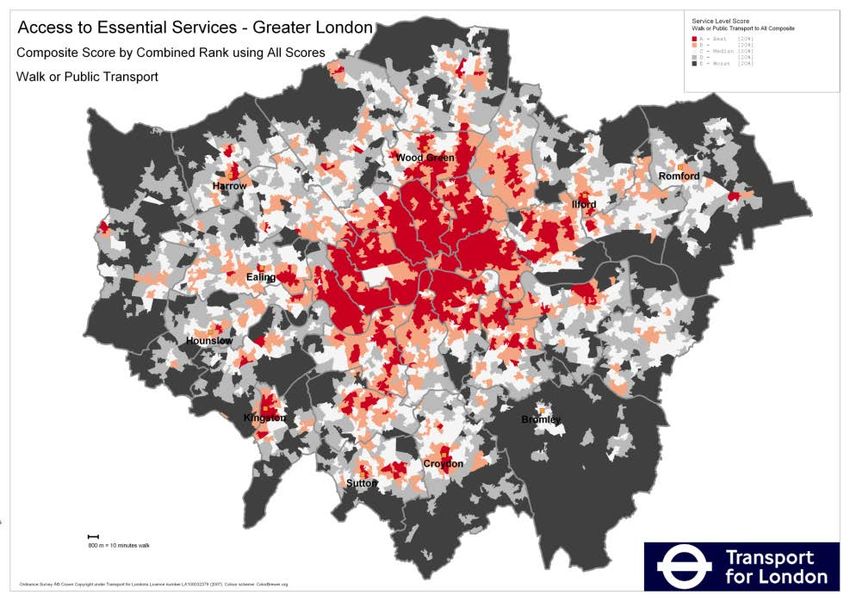
Journey time/connectivity analysis is central to TfL City Planning’s
work
 •   Mayor’s Transport Strategy
 •   London Plan
 •   Build the case for new transport schemes
 •   Regeneration schemes
 •   Encouraging modal shift

                                                4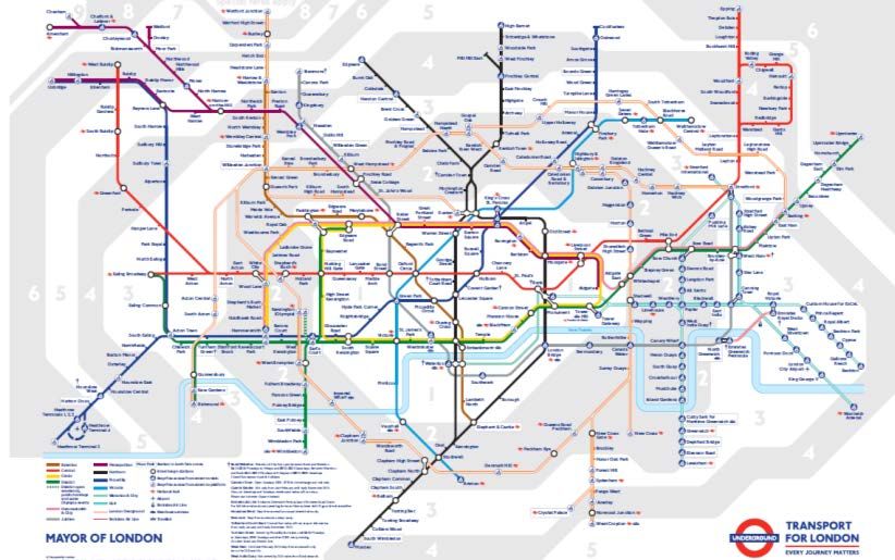
Journey time data is derived from our strategic transportation model
outputs
 •   Journey time matrices available for all modes:
          •   Public transport (Railplan) Rail, Tube, Bus, DLR, Tram
          •   Cycling (Cynemon)
          •   Highway LOHAM

 •   Current and Future networks – Crossrail - new schemes and projects
 •   Time periods – Peak, Inter-peak, Evening
 •   Congestion and crowding
 •   Population and employment forecasts for catchment analysis
 •   Zoning systems

                                                         5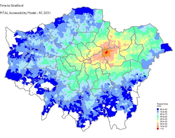
Data issues:
• Our strategic transport networks represent a snap shot of the network at a particular date, Temporary diversions
  and other incidents are not usually taken into account

• Future year networks include new schemes and projects such as Cross rail 1and 2, Bakerloo Line extension, line
  upgrades etc.

• Current and future networks can be compared on a consistent basis: highlighting the differences a new scheme
  will have on journey times.

• Providing consistent historic/time series datasets though can be more problematic

• The emphasis has been on the Morning Peak and the Journey to Work – but other time periods are significant –
  Weekends, Night time etc.

• Journey time data usually represents the shortest time between Origin & Destination. We assume customers use
  “perfect routing knowledge”. But this may involve additional interchange that the customer may not want to use.

• Zoning systems – 3,300 zones in London – strategic vs local level

                                                           6
Journey time
measures in TfL

                  7
Journey time mapping measures connectivity in terms of how far you
can get through the network for any combination of locations
                                         Travel times to Stratford

                                         Network:
                                         • Year: Current/Base
                                         • Mode: All PT modes
                                         • Time period: AM Peak
                                         • Direction: to the location
                                         • Zones: COAs

                                         Journey time:
                                         • Walk time
                                         • Wait time
                                         • In-vehicle time
                                         • Interchange time

                                8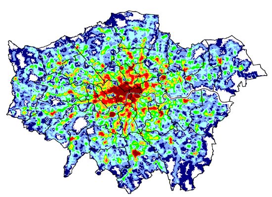
Journey time mapping – some more examples

Comparing travel
times (60 minute
catchments) to
North Greenwich
with/without the
Jubilee Line

                                            Travel times from Abbey
                                                Wood – with and
Combined 45                                     without Crossrail
minute travel
time catchments
to the nearest
large town
centre

                              9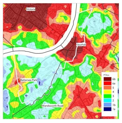
Travel time
mapping - step-
free analysis
For many public
transport users the
network is not fully
accessible: steps and
other barriers exist.
                           Full network – standard base     Step-free network –walk links
We have developed a        network using all modes (Rail,   removed that are not considered
series of transport        LU, DLR, Tram, Bus).             step-free .
networks that take
step-free access into
account, removing          Bus only network – times
those station walk links   derived from the full network
that are not considered    but using bus mode only
accessible/step-free.

                                                      10
London-wide catchment analysis – aggregates the catchment
attribute for each zone in London and maps the results
Now Future These examples show the
number of people within
45 minutes travel time of
each zone in 2011 (left)
and 2031 (right)
Changes are due to
population growth and/or
improvements in
connectivity by 2031
This example
compares travel
times from all zones
to FE colleges within
45 minutes travel
time using the
current network and
a future network
including Crossrail 2
11ATOS – measuring access to opportunities and services
• A response to the DfT’s work: ATOS was developed as a
measure to quantify access to a basket of essential
services including – schools, GP surgeries, food
shopping etc. by public transport and/or walking.
• The map above shows ATOS composite scores -
combing data for all service types
• Issues associated with defining essential services:
capacity, quality, service provision, public/private,
personal choice
• High service provision in London means that many
locations can be reached by walking, cycling or local bus
services alone
• This method is more useful for assessing access by
walking and cycling where proximity to services is more
significant
12Public Transport Accessibility Levels (PTALs)
• PTALs do not consider travel time through the network but
proximity (walk distance/walk time) to the public transport network.
• They are relevant to London where (in most cases) a dense and
integrated transport network means that a range of opportunities
can be reached within a reasonable amount of time
• Access to essential service research showed that there is a strong
correlation between PTALs and the time taken to reach key services
– i.e high PTAL areas generally have good access to services and low
PTAL areas have poor access to services
For any location in London PTALs combine walk times (to stations/bus stops) and service wait times (at those stops) to
give a measure of connectivity to the Public Transport network
They are relatively easy to use and calculate for single locations or an area
Mapped output provides a clear and intuitive representation of public transport provision across London – understandable
to both transport planners and the general public
13PTALs at the local - site specific level
The simplicity of PTAL means we can
A new housing calculate them using a grid of points at
development 100m intervals - 150,000+ across London
may be planned
here but it is Highlights variation in access to the
transport network within a development
beyond the
site or at a sub-zonal level
maximum walk
time to the We provide PTAL calculation results for
transport individual locations on our website
network – PTAL WebCAT
0
PTALs and the London Plan
• a key factor to determine housing densities across London
• helps defines parking provision in residential developments
• used to monitor the provision of business and commercial
activities in areas of good connectivity – PTAL 5 and above
14Bringing TfL’s
connectivity
work together
WebCAT
15WebCAT brings together our connectivity measures into one intuitive
web-based application
• Available on TfL’s public website - making our travel time/connectivity datasets available to a wider audience
• Select any location in London on the interactive map to view site specific data:
• Travel time mapping
• Catchment statistics
• PTALs
• Journey time comparison tool
1616WebCAT and journey time analysis
Users can select different travel time
datasets based on the following criterion:
• Year: 2011, 2021, 2031
• Mode: All PT, Bus, Step-free
• Time of Day: AM Peak, Inter-peak, PM
Peak
• Direction: To, From, Average
Further analysis:
• Catchment bar charts for each
location
• Compare and plot different travel
time variables
• Alter the travel time bands to suite
your analysis
17WebCAT and catchment analysis
Using cumulative bar charts:
• See how many people or jobs are there within each
mapped travel time band
• View the impact of a new scheme
• Population and jobs data based on the GLA forecasts
for: 2011, 2021 and 2031
• Data included for locations in and outside London
Population – London or London & SE: Town Centres: Educational establishments:
• Total • Metropolitan • Primary schools
• Households • Metropolitan + Major • Secondary schools
• Working age • Metropolitan + Major + District • Further educations
• Economically active
• Pensioners Health services:
• Jobs – in London or London & SE • A&E departments
• GP surgeries
• Pharmacies
18WebCAT and health service analysis
Travel time plots to health service locations
Catchment statistics – total population, age groups etc. within 30, 45, 60
minutes of a site
Compare the full network vs the step-free network
Local connectivity by bus or bicycle – health benefits
PTAL maps – prioritising health service locations with good transport links
19Current
developments –
walking as a
mode
20Connectivity analysis and the 2017 Mayor’s Transport Strategy
• By 2041 London will have a population of 10.5m,
accompanied by 6.8 million jobs
• For London to grow and thrive, it is essential “that
London’s residents, workers and visitors walk, cycle
and use public transport more to improve their
health and the environment, to make streets work
more efficiently and keep London moving”
• By 2041, 80 per cent of all Londoners’ trips (currently
64%) will be made on foot, by cycle or by public
transport
• Our connectivity measures will reflect these aims and
include all modes in our analysis
21Walking journey time analysis
• PTALs as a walking model – walk access
to public transport services
• Access to opportunities and services by
walking only – sustainable
neighbourhoods
• Combing PTAL and service access data
to highlight different categories e.g.
poor PT connectivity but good local
service provision.
• Combine new indicators into the PTAL
calculation sheet
o Walking time to nearest town
centres
o Local schools and GPs
o Walk catchment employment
22Further information
Visit us at: www.tfl.gov.uk/WebCAT
Contact us at: WebCAT@TfL.gov.uk
23You can also read