Key Graphs on Poverty in New Zealand: A compilation - Working Paper 2017/03 July 2017
←
→
Page content transcription
If your browser does not render page correctly, please read the page content below
July 2017
Working Paper 2017/03

Key Graphs
on Poverty in
New Zealand:
A compilation
Working Paper 2017/03

Key Graphs on
Poverty in New Zealand:
A compilation
July 2017
Title                     Working Paper 2017/03 – Key Graphs on Poverty in New Zealand: A compilation

Published                 Copyright © McGuinness Institute, July 2017

                          ISBN 978-1-98-851807-7 (Paperback)
                          ISBN 978-1-98-851808-4 (PDF)

                          This document is available at www.mcguinnessinstitute.org and may be reproduced or
                          cited provided the source is acknowledged.

Prepared by               The McGuinness Institute, as part of the TacklingPovertyNZ project

Author                    Callum Webb

About the author          Callum Webb has a BCom with a double major in Economics and Finance, undertaking
                          postgraduate study in Economics in 2017. In 2014 he worked at the New Zealand Institute
                          of Economic Research (NZIER) on How Ethnic Diversity Affects Auckland’s Economy and
                          from 2015–2017 he worked with the McGuinness Institute on the TacklingPovertyNZ
                          project and Submission on the New Models of Tertiary Education Draft Report (2016).

For further information   McGuinness Institute
                          Phone (04) 499 8888
                          Level 2, 5 Cable Street
                          PO Box 24222
                          Wellington 6142
                          New Zealand
                          www.mcguinnessinstitute.org

Disclaimer                The McGuinness Institute has taken reasonable care in collecting and presenting the
                          information provided in this publication. However, the Institute makes no representation
                          or endorsement that this resource will be relevant or appropriate for its readers’ purposes
                          and does not guarantee the accuracy of the information at any particular time for any
                          particular purpose. The Institute is not liable for any adverse consequences, whether
                          direct or indirect, arising from reliance on the content of this publication. Where this
                          publication contains links to any website or other source, such links are provided solely
                          for information purposes and the Institute is not liable for the content of any such website
                          or other source.

Publishing                This publication has been produced by companies applying sustainable practices within
                          their businesses. The body text and cover is printed on DNS paper, which is FSC certified.

                          The McGuinness Institute is grateful for the work of Creative Commons, which
                          inspired our approach to copyright. This work is available under a Creative Commons
                          Attribution-Noncommercial-Share Alike 3.0 New Zealand License.
                          To view a copy of this license visit:
                          www.creativecommons.org/licenses/by-nc-nd/3.0/nz
Contents
Introduction____________________________________________________________________________ 2
      Purpose__________________________________________________________________________ 2
      Limitations________________________________________________________________________ 2

PART 1: GENERAL
A: Socioeconomic mobility________________________________________________________________ 3
          1. Minimise Childhood Vulnerability: Comparing children identified at birth as
      .      high risk with all others__________________________________________________________ 4
          2. Family welfare history and adult outcomes__________________________________________ 5
          3. Subset of family welfare diagram – Children supported by benefit at birth_________________ 6
          4. Personal income mobility 2005–10_________________________________________________ 7
          5. Probability of household moving decile from year to year______________________________ 8
          6. Differences in outcomes between people at high risk and others_________________________ 9
          7. Percentage of children with current and persistent low incomes________________________ 10
          8. Characteristics of population with persistent deprivation______________________________ 11
          9. Characteristics of those who moved out of low income_______________________________ 12
          10. Characteristics of those moved into low income_____________________________________ 13
          11. Impact of low income on deprivation 2003–09_______________________________________ 14
      . 12. The proportion of the population expriencing low income at least once__________________ 15

B: Relative income/material hardship_____________________________________________________ 16
          13. Population living below the 60% income poverty threshold (fixed-line) after housing costs
      .       by selected age-group, New Zealand 1982–2015 NZHES years__________________________ 17
          14. Children and young people aged 0–17 years and selected sub-groups living in material
      .       hardship, New Zealand 2007–2015 NZHES years____________________________________ 18
          15. Recent changes in NZ Gini coefficients____________________________________________ 19
          16. Proportion of the population in low-income households (60 percent threshold) ___________ 20
          17. Proportion of households spending more than 30 percent of disposable income
      .       on housing___________________________________________________________________ 21
          18. Income inequality (P80/P20 ratio)________________________________________________ 22

PART 2: DEMOGRAPHIC
C: Education___________________________________________________________________________ 23
          19. Broader human capital investment: Comparing those who did not achieve NCEA Level 2
              with those who did_____________________________________________________________ 24
          20. Potential fiscal impacts of improved outcomes for the most vulnerable children___________ 25
          21. Proportion of school leavers progressing directly to tertiary education by school
              quintile and tertiary level (2015)__________________________________________________ 26
D: Ethnicity____________________________________________________________________________ 27

          22. Equitable Mäori Outcomes: Comparing Mäori and non-Mäori_________________________ 28
          23. Children at higher risk of poor outcomes are more likely to be Mäori___________________ 29
          24. Number children in hardship by ethnicity__________________________________________ 30

          25. Quarterly unemployment rates by ethnicity, New Zealand March 2008–2015_____________ 31
          26. Real equivalised median household incomes, by ethnic group, 1988–2014 ($2014)__________ 32
          27. Proportion of population aged 15 years and over by ratings of overall life satisfaction,
              by ethnic group, 2014___________________________________________________________ 33

E: Location____________________________________________________________________________ 34

          28. Regional convergence: Comparing the 3 main urban areas with the rest of New Zealand____ 35
          29. Regional well-being in New Zealand: Performance of New Zealand regions
              across selected well-being indicators relative to the other OECD regions_________________ 36
          30. NZDep2013 distribution in the North Island of New Zealand_________________________ 37
          31. NZDep2013 distribution in the South Island of New Zealand__________________________ 38
          32. A regional picture of children at higher risk________________________________________ 39

F: Age ________________________________________________________________________________ 40
          i) Child poverty (0–17 years)______________________________________________________ 40
          33. Number and percentage of dependent children aged 0–17 years living below
              various poverty thresholds, New Zealand 2001–2015 NZHES selected years______________ 41
          34. Dependent 0-17 year olds living below the 60% income poverty threshold
      .       (contemporary median) before and after housing costs, New Zealand 1982–2015
              NZHES years_________________________________________________________________ 42
          35. Children and young people aged 0–17 years in households living in hardship
      .       measured by 7+ and 9+ lacks on the DEP-17, New Zealand 2007–2015 NZHES years_____ 43
          36. Percentage of dependent children aged 0–17 years living below the 50% of
              median income poverty threshold, before and after housing costs New Zealand
              1982–2015 NZHES years________________________________________________________ 44
      . 37. Dependent 0–17 year olds in households living below the 60% income poverty
      .     threshold (contemporary median) after housing costs, extrapolated beyond 1982-2015
            NZHES years, New Zealand_____________________________________________________ 45
          38. Dependent 0–17 year olds in households living in material hardship by selected 7+
      .       and 9+, extrapolated beyond 1982–2015 NZHES years, New Zealand___________________ 46
          39. Four key indicators of higher risk – Children aged 0 to 14_____________________________ 47
          40. Key indicators are associated with higher risk of poor future outcomes in life_____________ 48
          41. Children with these indicators are more likely to face challenges in their lives
      .       than other children_____________________________________________________________ 49
          42. The risk and type of poor outcomes varies by gender and ethnicity_____________________ 50
          43. Risk indicators don’t always lead to poor outcomes__________________________________ 51
ii) Youth poverty (15–24 years)____________________________________________________ 52
       44. OECD average and New Zealand Y-NEET rate by age group, 2005–2013________________ 53
       45. Y-NEET rate by OECD country, 2013____________________________________________ 54
       46. New Zealand Y-NEET rate by age group 2004–2015_________________________________ 55
       47. New Zealand Y-NEETs by detailed age groups, 2015_________________________________ 56
       48. Y-NEETs by gender, 2004–2015__________________________________________________ 57
       49. Y-NEETs by type and gender, 2015_______________________________________________ 58
       50. Y-NEETs by highest qualification, 2015___________________________________________ 59
       51. Y-NEET rate by local government region, 2015_____________________________________ 60
       52. Y-NEET by ethnicity, 2015______________________________________________________ 61
       53. Y-NEET parental status by gender, 2015___________________________________________ 62
       54. Predictors of long-term Y-NEET_________________________________________________ 63
       55. Short-term costs for Y-NEETs___________________________________________________ 64

       iii) Elderly poverty (65+ years)____________________________________________________ 65
      . 56. Change in proportion below 60% of median (AHC) over time by age group______________ 66
       57. Material hardship measures, 2007–14______________________________________________ 67
      . 58. Hardship rates within New Zealand using EU-13 and DEP-17, 2008_____________________ 68
       59. Material deprivation for children and other age groups, 2007 to 2011, Economic Living
           Standards Index (ELSI)__________________________________________________________ 69
      . 60. Deprivation rates in 13 countries comparing children with older people and the total
            population in 2007 (Europe) and 2008 (New Zealand)________________________________ 70

PART 3: INTERNATIONAL

G: International________________________________________________________________________ 71

       61. 2016 Menino Survey of Mayors__________________________________________________ 72
       62. Top two ‘constituencies’ city government needs to do more to help_____________________ 73
       63. Mayors’ top economic concern___________________________________________________ 74
       64. International comparison of material deprivation among 0–17 year olds_________________ 75

Conclusion_____________________________________________________________________________ 76

Bibliography___________________________________________________________________________ 78
Introduction
This working paper aims to collate existing research on poverty in a clear and accessible format. The
paper is designed to contribute to the Institute’s TacklingPovertyNZ project but does not include
the results of the Institute’s 2016 TacklingPovertyNZ tour; these are discussed in Working Paper
2017/01 – TacklingPovertyNZ 2016 Tour: Methodology, results and observations. Instead, it collates a
diverse group of figures and tables from the research of others that the Institute considers to be both
informative and interesting. The focus of this paper is on New Zealand, although we have added
some comparative data and some uniquely international data. In the latter case, these are provided as
examples of the type of research that might be interesting going forward.
Poverty in New Zealand is a multi-faceted issue. To break this down into more manageable pieces
we have divided the tables and figures into three parts: the general, the demographics and the
international. Part 1 presents data on socioeconomic mobility, relative income and material hardship.
In Part 2, we have grouped the data under four specific demographic categories to convey the relevant
indicators of the causes and effects of poverty. The data in Part 2C illustrates the effects poverty can
have on education. In Part 2D, Mäori outcomes are compared with non-Mäori outcomes. Part 2E
reveals regional disparities. In 2F, the data is split across three age groups to indicate the risks and
outcomes that affect each. Part 3 has been included to provide an international perspective.
There is an inherent tension between what people mean when they describe their experiences of
poverty and the desire to define poverty for measurement purposes. Policy dealing with poverty is
based on the premise that poverty is something that can be measured and, when measuring poverty,
definitions are set by bright-line tests to produce consistent data through measurements such as 60
percent contemporary median income, or material hardship.
In contrast to this, Rayden Horton a participant from the original TacklingPovertyNZ workshop in
2015 defined poverty as the deprivation of opportunity and the inability to live a safe and healthy life.
He expanded upon his definition with other workshop participants to describe poverty as a series of
immeasurable feelings in the finale at Parliament.1

Purpose
The purpose of this working paper is twofold; to provide a compilation of all the informative data
that we have come across in our research on poverty, and to contribute to an informed discussion
about issues of setting goals and measuring performance in addressing poverty. Specifically, this paper
indicates, in graph form, which groups in society are affected by poverty and how.

Limitations
The data in this working paper reveals certain causes and effects of poverty in an aggregate statistical
sense but does not describe nuanced experiences of poverty.
This working paper relied on extractions from other reports, which in turn relied largely on data
collected through publicly available resources such as SoFIE, IDI, and the Census. As the information
collected throughout New Zealand is limited due to small data sets, the results may not always reflect
the true population. For example, while measurements may have less variance in very affluent or
very deprived neighbourhoods, in average areas, aggregate measures may be much less predictive of
individual socioeconomic status.
Interpretation of data sets were not included in this working paper, instead, only excerpts from
existing reports were used. As some areas of research on poverty have not been updated recently, data
occasionally does not represent the most up to date information.
We acknowledge that some data is less proportionate than others. An example of this are the
assumptions created by the unit of personal income mobility, which exaggerates income inequality.
The more accurate measure is the household as a unit of aggregation as the ‘household’ is the relevant
concept. However, data on household mobility is scarce hence this is what is available.

1   ‘The feeling of sympathy and judgement from the outside, when all you want is love from the inside. The feeling of raindrops on your skin when you
    can’t afford a jacket. The taste of blood from biting your cheek to stop the tears, while explaining to your child why they can’t have a birthday party. The
    feeling of not knowing what is going to happen next, whether you will be fed or sheltered. The loss of your childhood when as a 12-year-old you are
    faced with making the medial decision whether your father either walks or talks again. Feeling as if a rug has been pulled from beneath you, and you
    are left with a bare floor. Feeling as if you are responsible, at 12 years old, for something that is not your fault. The look on Mum’s face as she leaves
    WINZ knowing that there won’t be enough for lunchboxes and dinners. The look on your face as your child offers you toast while you insist no, you’re
    not hungry.’ See the TacklingPovertyNZ booklet for more details – www.tacklingpovertynz.org/tacklingpovertynz-booklet.

                                                         WORKING PAPER 2017/02 | 2
                                                          MCGUINNESS INSTITUTE
PART 1: GENERAL

A: Socioeconomic mobility
Socioeconomic mobility refers to the movement of individuals, families, households or other
categories of people within or between social strata in a society. Usually the term describes a change
in social status.
The availability and ease of socioeconomic mobility is particularly important in societies with high
social inequality because it provides opportunities for those currently in poverty to gain access to
a higher quality of life. In contrast, persistent deprivation is a symptom of a lack of socioeconomic
mobility, where people currently facing poverty remain in a similar situation in the long term,
restricting their ability to make the most of their life chances.

                                     WORKING PAPER 2017/02 | 3
                                      MCGUINNESS INSTITUTE
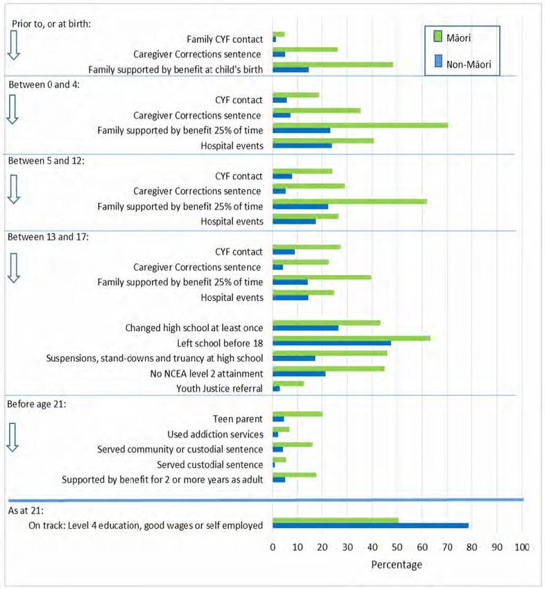
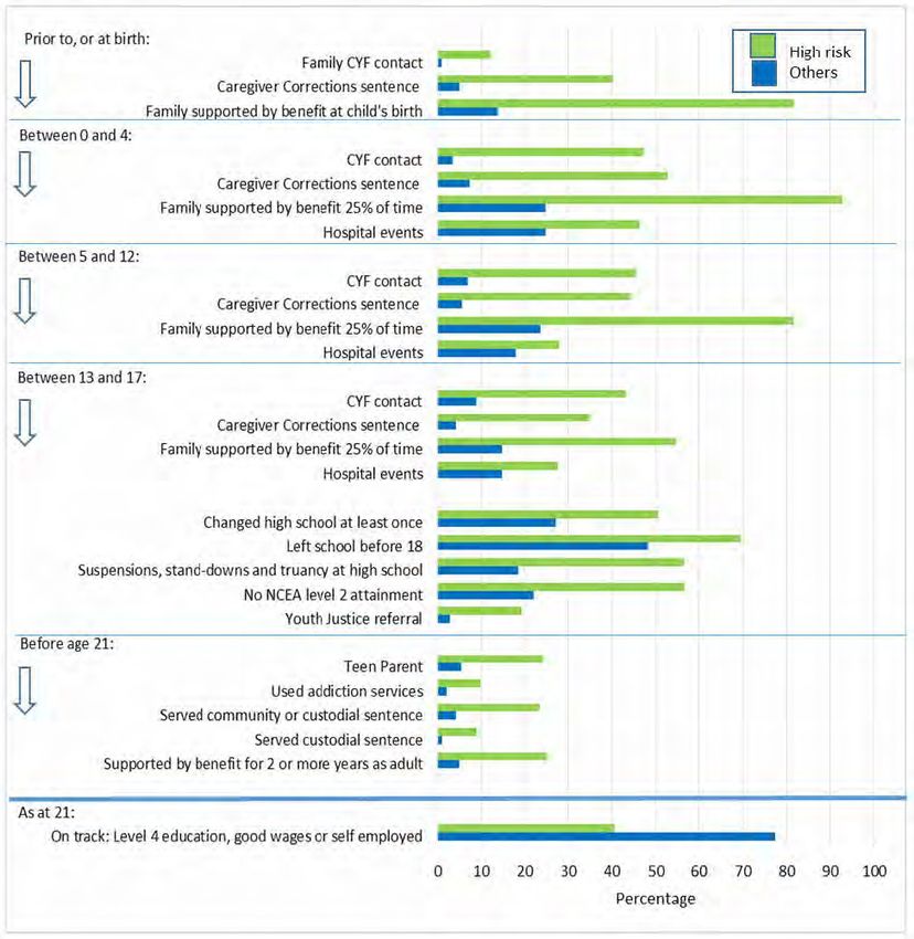
1. Minimise Childhood Vulnerability: Comparing children
identified at birth as high risk with all others
    EXCERPT FROM NEW ZEALAND TREASURY, USING IDI DATA TO ESTIMATE FISCAL IMPACTS OF BETTER
    SOCIAL SECTOR PERFORMANCE (2016)2

                                         ‘The chart illustrates that we can describe and monitor the prevalence of an
                                          array of life events throughout [the first 21 years of the 1993-born] cohort’s
                                          life. These include health, education, family welfare, child protection and
                                          justice-related events.
                                          Showing the contrast between those identified as at risk at birth and the
                                          others provides a sense of the improvements in non-fiscal outcomes that
                                          are the aspirational goals under the “minimise childhood vulnerability”
                                          scenario. The green bars are the levels for the target population and the
                                          blue bars represent the rest of the population (the aspirational benchmark).’

New Zealand Treasury,
Using IDI Data to Estimate
Fiscal Impacts of Better
Social Sector Performance
(2016)
           Figure 1: Minimise Childhood vulnerability: Comparing children identified at birth
           as high risk with all others
Figure 1: Minimise Childhood Vulnerability: Comparing children identified at birth as high risk with all others

2            TheTreasury.
    New Zealand    chart (2016).
                          illustrates
                                   Using that we tocan
                                         IDI Data        describe
                                                     Estimate         and monitor
                                                              Fiscal Impacts            the Sector
                                                                             of Better Social prevalence    of an
                                                                                                   Performance, p. 5.array   of 16
                                                                                                                      Retrieved lifeJanuary 2017 from
             events throughout this cohort’s life. These include health, education, family welfare, child
    www.treasury.govt.nz/publications/research-policy/ap/2016/16-04/ap16-04.pdf.
              protection and justice-related events.

              Showing the contrast between WORKING
                                             those identified as at2017/02
                                                           PAPER    risk at birth
                                                                               | 4 and the others provides a
              sense of the improvements in non-fiscal   outcomesINSTITUTE
                                               MCGUINNESS         that are the aspirational goals under
              the “minimise childhood vulnerability” scenario. The green bars are the levels for the
              target population and the blue bars represent the rest of the population (the aspirational
              benchmark).
2. Family welfare history and adult outcomes
EXCERPT FROM NEW ZEALAND TREASURY, USING IDI DATA TO ESTIMATE FISCAL IMPACTS OF BETTER
SOCIAL SECTOR PERFORMANCE (2016)3
‘Appendix Figure 2 shows:
∙∙ Higher “on track at 21” rates for those with no history of being
supported by welfare at birth or during their childhood and that this is
by far the largest sub-group.
∙∙ Relatively even negative slopes for those who experience welfare at all
ages from preschool to high school, regardless of the extent of welfare
in their lives up to that point (i.e. the slopes of the branches are
reasonably similar when comparing them with others above or below
them in the diagram).
∙∙ Smaller but (generally) consistent negative slopes for those with
periods of welfare later in childhood (i.e. the slopes of the branches get
New Zealand Treasury, progressively smaller when comparing them with others to the right
Using IDI Data to Estimate of them in the diagram).
Fiscal Impacts of Better
Social Sector Performance ∙∙ Those with two or more terms of welfare support have lower “on track”
(2016) rates compared to those without multiple terms of welfare support.
At this point it is important to emphasise that in using welfare support as a “risk factor” we are
pointing to its interpretation as a proxy for adverse events that may have led the family to need
welfare support from the state. However the intention of welfare support will have been to help
buffer the family from the worst impacts of these events and their consequent exposure to periods of
very low income. This (presumably) beneficial effect is also reflected in moderating the sizes of the
slopes of the branches in this graph from what they would have otherwise been.’
Appendix
AppendixFigure
Figure2 2- Family welfare
– Family history
welfare andand
history adult outcomes
adult outcomes
90% 90%
•Width of each • The end of each
•Green pathways are
KEY: spells not on welfare pathway indicates the pathway is located
vertically so that the mid-
Children number of people in
not •Blue pathways are 1993 cohort following point reflects the
supported spells on welfare that path proportion who end up
by benefit 80% ‘on track at 21’ 80%
at birth
Percentage “on track at 21”
Percentage “on track at 21”
N = 44,700
70% 70%
60% 60%
Children
supported
by benefit
at birth
50% N=11,600 50%
40% 40%
Birth Pre-school Primary High school Birth Pre-school Primary High school
school school
3 New Zealand Treasury. (2016). Using IDI Data to Estimate Fiscal Impacts of Better Social Sector Performance, pp. 25–26. Retrieved 16 January 2017 from
www.treasury.govt.nz/publications/research-policy/ap/2016/16-04/ap16-04.pdf.
AP 16/04 | WORKING
Using IDI Data to Estimate Fiscal Impacts of Better PAPER
Social Sector |5 2017/02
Performance 25
MCGUINNESS INSTITUTE3. Subset of family welfare diagram – Children supported by
benefit at birth
EXCERPT FROM NEW ZEALAND TREASURY, USING IDI DATA TO ESTIMATE FISCAL IMPACTS OF BETTER
SOCIAL SECTOR PERFORMANCE (2016)4
‘Appendix Figure 3 is an extract from Appendix Figure 2 which illustrates
family welfare pathways for the 1993 cohort. Focussing on the group of
children supported by benefit at birth, but whose families subsequently
have less time supported by benefit (green pathway), we see higher rates
of being “on track at 21” (76%), in fact quite close to the cohort’s overall
average of 77%. Those children whose families have significant time on
benefit consistently through the child’s life, have much lower “on track at
21” rates (43%).
Unpicking the data in this way can help us see the potential of policies that
target at different times in children’s lives. Always, of course, bearing mind
that we are not inferring that the spells on benefit caused poorer outcomes,
but rather highlighting the potential of identifying possible groups to target
New Zealand Treasury, (and when in their lives) for the provision of better social services.’
Using IDI Data to Estimate
Fiscal Impacts of Better
Social Sector Performance
(2016)
history and adult outcomes
Appendix Figure 3: Subset of family welfare diagram – Children supported by benefit at birth
90% 90%
•Width of each • The end of each
•Green pathways are
KEY: spells not on welfare pathway indicates the pathway is located
vertically so that the mid-
number of people in
•Blue pathways are 1993 cohort following point reflects the
spells on welfare that path proportion who end up
80% ‘on track at 21’ 80%
Percentage “on track at 21”
Percentage “on track at 21”
70% 70%
60% 60%
Children
supported
by benefit
at birth
50% N=11,600 50%
40% 40%
High school Birth Pre-school Primary High school
school
4 New Zealand Treasury. (2016). Using IDI Data to Estimate Fiscal Impacts of Better Social Sector Performance, p. 27. Retrieved 16 January 2017 from
www.treasury.govt.nz/publications/research-policy/ap/2016/16-04/ap16-04.pdf.
WORKING PAPER 2017/02 | 6
MCGUINNESS INSTITUTE
al Impacts of Better Social Sector Performance 254. Personal income mobility 2005–10
EXCERPT FROM NEW ZEALAND INSTITUTE OF ECONOMIC RESEARCH, UNDERSTANDING INEQUALITY (2013)5
‘A summary of income mobility from tax data is shown in Table 4. On
average, 1 in 10 people moved from one income decile to another between
2005 and 2010. More people moved out of the bottom half of incomes and
into the top half of incomes than fell from the top half.
Movements from the very bottom of the distribution to the very top are
reasonably rare; 1.5% of people (~2000 people) moved from the lowest
decile to the highest and 2.1% (~4000) moved from the top to
the bottom.’
New Zealand Institute
of Economic Research,
Understanding inequality
(2013)
Table
Table 4 Personal
4: Personal income
income mobility mobility
2005–10 2005-10
Percentage of people moving between annual income deciles. Dollars are 1000s.
From
To $2.20 $6.40 $12.30 $19.70 $26.80 $33.50 $40.20 $49.30 $64.00 $64+
$2.80 26.1% 13.5% 10.1% 7.7% 5.5% 4.1% 3.1% 2.6% 2.2% 2.1%
$8.10 15.0% 16.5% 11.9% 8.4% 6.2% 4.4% 3.3% 2.5% 2.0% 1.5%
$15.30 14.1% 15.1% 16.5% 12.5% 8.4% 6.0% 4.6% 3.4% 2.7% 2.0%
$24.20 12.0% 13.3% 15.6% 18.9% 13.2% 8.6% 6.4% 4.6% 3.6% 2.4%
$32.30 10.1% 11.9% 12.6% 16.4% 20.1% 13.1% 8.0% 5.3% 3.9% 2.5%
$39.90 8.0% 10.2% 10.8% 12.6% 18.3% 22.5% 14.0% 7.4% 4.6% 2.5%
$48.00 6.2% 8.3% 9.0% 9.8% 13.0% 19.6% 24.3% 14.6% 6.8% 3.4%
$59.30 4.3% 6.2% 7.2% 7.1% 8.6% 12.7% 21.0% 28.5% 14.6% 5.0%
$77.50 2.6% 3.4% 4.5% 4.4% 4.7% 6.5% 11.7% 23.6% 37.6% 13.9%
$77.5+ 1.5% 1.5% 1.9% 2.1% 2.1% 2.4% 3.7% 7.5% 21.9% 64.8%
Source: Statistics NZ LEED
Source: Statistics NZ LEED
A summary of income mobility from tax data is shown in Table 4. On average, 1 in 10
5 New Zealand Institute of Economic Research. (2013). Understanding inequality, p. 15. Retrieved 16 January 2017 from www.businessnz.org.nz/__data/
people moved from one income decile to another between 2005 and 2010. More
assets/pdf_file/0004/85927/NZIER-Understanding-Inequality.pdf.
people moved out of the bottom half of incomes and into the top half of incomes
than fell from the top half.
WORKING PAPER 2017/02 | 7
Movements from the very bottomMCGUINNESS
of the distribution to the very top are reasonably
INSTITUTE
rare; 1.5% of people (~2000 people) moved from the lowest decile to the highest and
2.1% (~4000) moved from the top to the bottom.5. Probability of household moving decile from year to year
EXCERPT FROM NEW ZEALAND INSTITUTE OF ECONOMIC RESEARCH, UNDERSTANDING INEQUALITY (2013)6
‘Families at the bottom end of the income distribution (decile 1) have
a high probability of remaining there over time – compared with the
rates at which others move between income deciles (see Table 5). This
observation at the family level differs significantly from the income
mobility picture painted earlier. This is because the statistics shown here
are adjusted for size of families including non-earners, which are
mostly children.
The study from which the data in Table 5 is taken also notes that:
Where cross-sctional low income (6. Differences in outcomes between people at high risk
and others
EXCERPT FROM NEW ZEALAND TREASURY, HE TIROHANGA MOKOPUNA 2016: STATEMENT ON THE LONG-
TERM FISCAL POSITION (2016)8
‘Some New Zealanders experience barriers to social and economic
participation that lead to lower living standards. For example, a lack
of skills, previous criminal convictions, and health issues, can make
finding employment difficult. Government has a range of services
designed to reduce these barriers. However, accessing some services
can itself be a barrier for participation, for example because of the time
required to gather supporting evidence and the challenge of complying
with paperwork.
The Treasury’s analysis shows most people experiencing persistent
disadvantage access government services repeatedly. Figure 4.1 uses
the Integrated Data Infrastructure (IDI), a data set that links routinely-
collected government data, including on children and their families. The
New Zealand Treasury, He figure shows the rates of uptake of services for two groups – the 10
Tirohanga Mokopuna 2016:
Statement on the Long-Term
percent of people now in their early 20s who at birth could be
Fiscal Position (2016) shown to be at high risk of poor welfare and corrections outcomes and
other people of the same age. The IDI information shows that high-risk
children have a significantly increased likelihood of engaging with social
services throughout their lifetimes.’
‘However, income inequality is only one input into life outcomes. Outcomes for people also depend
on a range of other factors including access to quality education, jobs, healthcare, stable home
environments, material hardship and persistent disadvantage. This highlights the importance of
THE TREASURY | HE TIROHANGA MOKOPUNA
providing all New Zealanders with the opportunities they need to participate and develop their
capabilities so that they can live independent and productive lives.’
Figure4.1
Figure 4.1––Differences
Differences in outcomes
in outcomes between
between people
people atrisk
at high high risk
and and others
others
100
High risk
80 Others
60
percent
40
20
0
Contact with child Referred to CYF Youth Family supported At least one night High school truancy,
protection services Justice services by welfare in hospital suspensions or standdowns
Source: SeeSee
Source: the background paper prepared
the background paperfor this Statement:for
prepared Thethis
benefits of improvedThe
Statement: socialbenefits
sector performance.
of improved social sector performance.
Disclaimer: Access to the data presented here was managed by Statistics New Zealand under strict micro-data access protocols and in accordance with
the security and confidentiality provisions of the Statistic Act 1975. These findings are not Official Statistics. The opinions, findings, recommendations,
and conclusions expressed are not those of Statistics New Zealand.
8 New Zealand Treasury. (2016). He Tirohanga Mokopuna 2016: Statement on the Long-Term Fiscal Position, pp. 43–44. Retrieved 16 January 2017 from
www.treasury.govt.nz/government/longterm/fiscalposition/2016/he-tirohangamokopuna/ltfs-16-htm.pdf.
including on children and their families.106 The on a range of other factors including access
figure shows the rates of uptake of services for to quality education, jobs, healthcare, stable
WORKING PAPER 2017/02 | 9
two groups – the 10 percent of people now in home environments, material hardship and
MCGUINNESS INSTITUTE
their early 20s who at birth could be shown to persistent disadvantage. This highlights the
be at high risk of poor welfare and corrections importance of providing all New Zealanders with
outcomes and other people of the same age. The the opportunities they need to participate and7. Percentage of children with current and persistent
low incomes
EXCERPT FROM SIMPSON, J., DUNCANSON, M., OBEN, G., WICKEN, A. & GALLAGHER, S., CHILD POVERTY
MONITOR 2016 TECHNICAL REPORT (2016)9
‘Poverty persistence was defined as being when a participant’s average
income over the seven years of the survey was below the average low
income poverty line over the same period.’
‘50% gross median threshold
When the threshold used was 50% of the gross median income, 16% of
children who were aged 0–11 years in the first year (2002–03) were deemed
to be in persistent poverty and 19% in current poverty over the seven years
(Figure 19). In any one year, three out of five (60%) 0–11 year olds living in
current poverty were also in persistent (also called chronic) poverty using
the 50% gross median threshold. There was also a further group of children
who, although not in poverty in the current year, were in persistent poverty
when their households’ incomes were averaged over the seven survey years.
Simpson, J., Duncanson,
M., Oben, G., Wicken, A. & 60% gross median threshold
Gallagher, S. Child Poverty Of those aged 0–17 years in the first year of SoFIE [Survey of Family,
Monitor 2016 Technical
Report (2016) Income and Employment] (2002–03), 24% lived in households experiencing
persistent poverty where the household income averaged across all seven
years was below 60% of the gross median. 29% were deemed to be in current poverty as their household
income was below 60% of the gross median in the year under review (Figure 19). This difference
reflected the mix of those in poverty comprising those who had transiently moved into poverty in any
given year, and those who were living in long term poverty. Mäori children and young people were
over represented in households living with current and persistent low incomes at the 60% gross median
threshold with 36% in current low income and 32% in persistent low income. The rate of persistent
poverty was around 81% of the current low income for the total population, 83% for 0–17 year olds and
88% for Mäori.’
Figure 19: Percentage of children with current and persistent low incomes, Statistics New Zealand’s Survey of Family,
Income and Employment (SoFIE) 2002–2009
Source: Perry 2016 derived from Statistics NZ’s Survey of Family, Income and Employment 2002–2009
9 Simpson, J., Duncanson, M., Oben, G., Wicken, A. & Gallagher, S. (2016). Child Poverty Monitor 2016 Technical Report, p. 25. Retrieved 16 January 2017
from www.ourarchive.otago.ac.nz/bitstream/handle/10523/7006/2016%20CPM.pdf?sequence=4&isAllowed=y.
WORKING PAPER 2017/02 | 10
MCGUINNESS INSTITUTE8. Characteristics of population with persistent deprivation
EXCERPT FROM NEW ZEALAND TREASURY, A DESCRIPTIVE ANALYSIS OF INCOME AND DEPRIVATION IN
NEW ZEALAND (REPORT NO. T2012/866) (2012)10
‘The blue bars in the figure below characterise the 6% of the population
with persistent deprivation by age, ethnicity, educational and family
status. The height of the blue bar shows the proportion of those with
persistent deprivation that have that characteristic. The red dashes show the
proportion with that characteristic in the population as a whole. Where the
red bar is higher than the blue bar, a person with that characteristic is less
likely to be in persistent deprivation than the population as a whole.
a What characterises people in persistent deprivation? The height of the
blue bars shows that most people in persistent deprivation are aged 25
to 64, New Zealand European, have vocational qualifications and are
sole parents.
b People with which characteristics are more likely to be in persistent
New Zealand Treasury, A
descriptive analysis of deprivation? The difference between the height of the blues [sic] bars
income and deprivation in and the red dashes shows under 18s and youths, Mäori, those with low
New Zealand (Report No. qualifications, and sole parents more likely to be in persistent deprivation.’
T2012/866) (2012)
b People with which characteristics are more likely to be in persistent deprivation?
The difference between the height of the blues bars and the red dashes shows under 18s
and youths, Maori, those with low qualifications, and sole parents more likely to be in
persistent deprivation. Deprivation is highly prevalent among sole parents.
Characteristics of population with persistent deprivation
Characteristics of population with persistent deprivation
80%
70%
60%
50%
40%
30%
20%
10%
0%
Couple parents
Vocational
Working age
None
School
Couple
NZ European
Māori
Sole parent
Under 18
Other
Degree
(18 to 24)
Over 65
Youth
(25 ‐64)
How closely aligned
10 New Zealand is(2012).
Treasury. deprivation with
A descriptive analysis lowand
of income income?
deprivation in New Zealand (Report No. T2012/866), pp. 2–3. Retrieved 17 January
2017 from www.treasury.govt.nz/publications/informationreleases/income-deprivation/t2012-866.pdf.
The scale of the alignment between deprivation and income is sensitive to the definitions of
deprivation and low income (a looser definition of deprivation and narrower definition of low
income lead to a closer link between the two). As in previous studies, longer periods of low
WORKING PAPER 2017/02 | 11
income are linked to higher deprivation, but the link between
MCGUINNESS them is modest. Only a third of
INSTITUTE
those who had seven years of low income had been in deprivation at any point
Impact of low income on deprivation 2003‐099. Characteristics of those who moved out of low income
EXCERPT FROM NEW ZEALAND TREASURY, A DESCRIPTIVE ANALYSIS OF INCOME AND DEPRIVATION IN
NEW ZEALAND (REPORT NO. T2012/866) (2012)11
b ‘People with which characteristics started with a low income and
then avoided low incomes? The difference between the height of the
blues [sic] bars and the red dashes shows youths and those aged 25 to 64,
New Zealand European, those with any qualification, and couples with
children were more likely to move on from having a low income.’
28. Of those who started with a low income in 2002 and then subsequently avoided a low
income, figure 9 below can be interpreted as follows:8
aNewWhat characterises people who started with a low income and then avoided low
Zealand Treasury, A
incomes?
descriptive analysis -ofThe height of the blue bars shows most people who moved away from
lowand
income income areinaged 25 to 64, New Zealand European, had a post school qualification
deprivation
New Zealand (Report No.
and were couple parents.
T2012/866) (2012)
b People with which characteristics started with a low income and then avoided
low incomes? The difference between the height of the blues bars and the red
dashes shows youths and those aged 25 to 64, New Zealand European, those with
any qualification, and couples with children were more likely to move on from having a
low income.
Figure 9: Characteristics of those who moved out of low income
Figure 9: Characteristics of those who moved out of low income
Those starting with low income who subsequently did not have a low income
80%
70%
60%
50%
40%
30%
20%
10%
0%
Qualifications
Working age
Qualification
Qualification
Couple
European
Māori
or Higher
Couple with
parent
Under 18
Other
Other
Over 65
(18 to 24)
Post school
Sole
Degree
only
Youth
children
(25 ‐64)
School
NZ
No
29. Of
11 those who
New Zealand did(2012).
Treasury. notAhave
descriptiveaanalysis
lowofincome in 2002
income and deprivation but
in New subsequently
Zealand hadp.a12.low
(Report No. T2012/866), income,
Retrieved 17 January
figure 10 www.treasury.govt.nz/publications/informationreleases/income-deprivation/t2012-866.pdf.
2017 from below can be interpreted as follows:
a What characterises people who did not have a low income and who
WORKING PAPER 2017/02 | 12
subsequently had low incomes? - The height
MCGUINNESS of the blue bars shows most people
INSTITUTE
who moved into having a low income were aged 25 to 64, New Zealand European,
had a post school qualification and were couple parents.10. Characteristics of those moved into low income
EXCERPT FROM NEW ZEALAND TREASURY, A DESCRIPTIVE ANALYSIS OF INCOME AND DEPRIVATION IN
NEW ZEALAND (REPORT NO. T2012/866) (2012)12
b ‘People with which characteristics did not have a low income and
then had low incomes? The difference between the height of the blues
[sic] bars and the red dashes shows those under 18 and over 65, those
who were not New Zealand European, those with no qualification,
and those not living in a couple were more likely to move into
low incomes.’
New Zealand Treasury, A
descriptive analysis of
income and deprivation in
New Zealand (Report No.
T2012/866) (2012)
Figure 10:
Figure 10: Characteristics
Characteristics of those
of those moved moved
into low into low income
income
Those who did not have a low income who subsequently had a low income
90%
80%
70%
60%
50%
40%
30%
20%
10%
0%
Working age
Qualifications
Qualification
Qualification
Couple
Māori
European
or Higher
Couple with
parent
Under 18
Other
Other
(18 to 24)
Over 65
Post school
Degree
Sole
only
Youth
children
(25 ‐64)
School
NZ
No
Is deprivation persistent?
12 New Zealand Treasury. (2012). A descriptive analysis of income and deprivation in New Zealand (Report No. T2012/866), pp. 12–13. Retrieved
17 January 2017 from www.treasury.govt.nz/publications/informationreleases/income-deprivation/t2012-866.pdf.
31. Measures of deprivation indicate whether or not people achieve a basic level of
consumption. For all population groups, those suffering deprivation were in the minority,
WORKING
with just over 12% of the population PAPER 2017/02
experiencing some| 13
deprivation over the survey
MCGUINNESS INSTITUTE
period. Of those in deprivation in the first survey (in 2005), 44% were in deprivation when
this was again measured (in 2007 and 2009).b People with which characteristics are more likely to be in persistent deprivation?
The difference between the height of the blues bars and the red dashes shows under 18s
and youths, Maori, those with low qualifications, and sole parents more likely to be in
persistent deprivation. Deprivation is highly prevalent among sole parents.
Characteristics of population with persistent deprivation
11.
80%Impact of low income on deprivation 2003–09
70%
EXCERPT FROM NEW ZEALAND TREASURY, A DESCRIPTIVE ANALYSIS OF INCOME AND DEPRIVATION IN
NEW ZEALAND (REPORT NO. T2012/866) (2012)13
60%
50% ‘The scale of the alignment between deprivation and income is sensitive
to the definitions of deprivation and low income (a looser definition of
40% deprivation and narrower definition of low income lead to a closer link
between the two). As in previous studies, longer periods of low income are
30% linked to higher deprivation, but the link between them is modest. Only a
third of those who had seven years of low income had been in deprivation
at any point.’
20%
10%
0%
Couple parents
Vocational
Working age
None
School
Couple
NZ European
Māori
Sole parent
Under 18
Degree
Other
(18 to 24)
Over 65
New Zealand Treasury, A
Youth
(25 ‐64)
descriptive analysis of
income and deprivation in
New Zealand (Report No.
T2012/866) (2012)
How closely aligned is deprivation with low income?
The scale of the alignment between deprivation and income is sensitive to the definitions of
deprivation and low income (a looser definition of deprivation and narrower definition of low
income lead to a closer link between the two). As in previous studies, longer periods of low
income are linked to higher deprivation, but the link between them is modest. Only a third of
those who had seven years of low income had been in deprivation at any point
Impact of low income on deprivation 2003‐09
Impact of low income on deprivation 2003–09
Seven years
of low income
Six years
of low income
Five years
of low income
Four years
of low income
Three years
of low income
Two years
of low income
One year
of low income
Never has a
low income
0 10 20 30 40 50 60 70 80 90 100
Always in deprivation Sometimes in deprivation No deprivation
Treasury Report T2012/866: A descriptive analysis of income and deprivation in New Zealand Page 3
13 New Zealand Treasury. (2012). A descriptive analysis of income and deprivation in New Zealand (Report No. T2012/866), p. 3. Retrieved 17 January
2017 from www.treasury.govt.nz/publications/informationreleases/income-deprivation/t2012-866.pdf.
WORKING PAPER 2017/02 | 14
MCGUINNESS INSTITUTE12. The proportion of the population experiencing low income
at least once
EXCERPT FROM NEW ZEALAND TREASURY, A DESCRIPTIVE ANALYSIS OF INCOME AND DEPRIVATION IN
NEW ZEALAND (REPORT NO. T2012/866) (2012)14
‘The level of income mobility suggests a large proportion of the population
. In interpreting these results, it isexperiences
worth noting:
low income levels at some point in time. On the definition used
in this paper, around 25% of the population has a low income in any single
year, but Figure 7 shows that over the seven years covered here 50% of the
population experienced low income at least once.’
The period 2002 to 2009 was primarily one of economic growth. Thus we would
expect overall incomes to rise.
Longitudinal analysis will include individual life cycle changes that include both
increases and decreases in income. For example, ‘young adults’ may have lower
incomes, but a 20 year old full time student in 2002 would be 27 and probably in full
time work by 2009.
New Zealand Treasury, A
descriptive analysis of
income and deprivation in
New Zealand (Report No.
T2012/866) (2012)
ow common is it to have periods with a low income?
. The level of income mobility suggests a large proportion of the population experiences low
income levels at some point in time. On the definition used in this paper, around 25% of
the population has a low income in any single year, but Figure 7 shows that over the
seven years covered here 50% of the population experienced low income at least once.
Figure 7: The proportion of the population experiencing low income at least once
Figure 7: The proportion of the population experiencing low income at least once
80
All
70
65+
60 Maori
0-9 yrs
Proportion (%)
50
40
30
20
10
0
1+ 2+ 3+ 4+ 5+ 6+ 7
Number of waves in low income
. Conversely, 1443% ofwww.treasury.govt.nz/publications/informationreleases/income-deprivation/t2012-866.pdf.
those who experienced low income, experienced it for only one or two
New Zealand Treasury. (2012). A descriptive analysis of income and deprivation in New Zealand (Report No. T2012/866), p. 10. Retrieved 17 January
2017 from
of the seven years covered by the survey. As the graphs in figure 2 show, a substantial
proportion of those who had some experience WORKING PAPER of2017/02
low income| 15 soon moved to relatively high
incomes. Figure 10 suggests that such short periods of low income are highly unlikely to
MCGUINNESS INSTITUTE
be linked to deprivation.PART 1: GENERAL
B: Relative income/material hardship
Relative income is measured using two thresholds relative to the median income of New Zealand:
before housing costs (BHC) and after housing costs (AHC). These measures are usually benchmarked
at 60% of the median income representing income poverty and 50%, representing severe income
poverty. While relative income does not necessary translate directly to poverty,
Low incomes can limit people’s abilities to take part in their community and society, and may lower
their quality of life. Long-lasting low family income in childhood is associated with negative outcomes,
such as lower levels of education and poorer health.15
Material hardship can be measured using a variety of methods. For part 1B of this working paper we
chose to focus on the frequently used DEP-1716 measure of material hardship.
The DEP-17 is an index of material hardship or deprivation, particularly suited to capturing the living
standards of those at the low end of the material living standards. The DEP-17 items reflect enforced
lack of essentials, enforced economising, cutting back or delaying purchases “a lot” because money
was needed for other essentials, being in arrears more than once in last 12 months because of
shortage of cash at the time (not through forgetting), and/or being in financial stress
and vulnerability.17
15 Statistics New Zealand. (2015). Population with low incomes. Retrieved 16 January 2017 from www.stats.govt.nz/browse_for_stats/snapshots-of-nz/nz-so
cial-indicators/Home/Standard%20of%20living/pop-low-incomes.aspx.
16 See www.msd.govt.nz/documents/about-msd-and-our-work/publications-resources/monitoring/child-material-hardship-2015.docx for DEP-17
index table.
17 Simpson, J., Duncanson, M., Oben, G., Wicken, A. & Gallagher, S. (2016). Child Poverty Monitor 2016 Technical Report. Retrieved 16 January 2017 from
www.ourarchive.otago.ac.nz/bitstream/handle/10523/7006/2016%20CPM.pdf?sequence=4&isAllowed=y.
WORKING PAPER 2017/02 | 16
MCGUINNESS INSTITUTE13. Population living below the 60% income poverty threshold
(fixed-line) after housing costs by selected age-group,
New Zealand 1982–2015 NZHES years
EXCERPT FROM SIMPSON, J., DUNCANSON, M., OBEN, G., WICKEN, A. & GALLAGHER, S., CHILD POVERTY
MONITOR 2016 TECHNICAL REPORT (2016)18
‘Children and young people aged 0–17 years are much more likely to be
in poverty than adults aged 65+ years. In 2015, they were 2.6 times more
Figure 2. Dependent 0–17 year olds living below the 60% income poverty threshold (contemporary median)
likely (21% for 0–17 year olds compared to 8% for 65+ years). During
before and after housing costs, New Zealand 1982–2015 NZHES years
the whole period 1982 to 2015, poverty rates were also consistently
50 higher for children aged 0–17 years than for adults aged 25–44 years. The
45 lowest poverty rates were seen amongst those agedBefore housing costs
65+ years.’
Per cent of children below threshold
After housing costs
40
35
30
25
20 J., Duncanson,
Simpson,
M., Oben, G., Wicken, A. &
15
Gallagher, S. Child Poverty
Monitor
10 2016 Technical
Report (2016)
5
0
1986
1988
1990
1992
1994
1996
2009
2010
2011
2012
2013
2014
2015
1982
1984
1998
2001
2004
2007
HES year
Source: New Zealand Household Economic Survey (NZHES) via Perry 2016 5
Figure 3: Population living below the 60% income poverty threshold (fixed-line) after housing costs by selected age-
Figure
group,3.
NewPopulation living below
Zealand 1982–2015 the 60%
NZHES yearsincome poverty threshold (fixed-line) after housing costs by selected
age-group, New Zealand 1982–2015 NZHES years
50
0–17 yrs: 60% 1998 median 0–17 yrs: 60% 2007 median
25–44 yrs: 60% 1998 median 25–44 yrs: 60% 2007 median
40 65+ yrs: 60% 1998 median 65+ yrs: 60% 2007 median
Per cent below threshold
30
20
10
0
1994
1996
1998
2004
2009
2011
2013
2015
1982
1984
1986
1988
1990
1992
2001
2007
2010
2012
2014
HES year
Source: New Zealand Household Economic Survey (NZHES) via Perry 2016 5
Source: New Zealand Household Economic Survey (NZHES) via Perry 2016
18 Simpson, J., Duncanson, M., Oben, G., Wicken, A. & Gallagher, S. (2016). Child Poverty Monitor 2016 Technical Report, pp. 10–11. Retrieved 16 January
2017 from www.ourarchive.otago.ac.nz/bitstream/handle/10523/7006/2016%20CPM.pdf?sequence=4&isAllowed=y.
WORKING PAPER 2017/02 | 17
MCGUINNESS INSTITUTE14. Children and young people aged 0–17 years and selected
sub-groups living in material hardship, New Zealand 2007–
2015 NZHES years
EXCERPT FROM SIMPSON, J., DUNCANSON, M., OBEN, G., WICKEN, A. & GALLAGHER, S., CHILD POVERTY
MONITOR 2016 TECHNICAL REPORT (2016)19
‘The following data are from the NZHES survey data from 2007–2015. At
a MWI [Material Wellbeing Index] ≤9 severity threshold, the percentage
of material hardship was consistently higher for children aged 0–17 years
than for all ages or for older groups. The proportion of 0–17 year olds
in material hardship at this level of severity rose from 16% in 2009 to
21% in 2011, before falling to 17% in 2012. In 2015, 14% of 0–17 year
Material hardship by olds agewereandatincome
this level (NZHES
of hardship.data)
The lowest hardship rates were among
those aged 65+ years (Figure 9).
The severity threshold of MWI ≤9 is used in the following section as an indicative measure. It relates to
measures used previously in New Zealand
Children canand is comparable
experience to those
material used in
hardship other countries.
whether The following
their families
data are from the NZHES survey are data
above from 2007–2015.
or below At a MWI ≤9 orthreshold,
the income-poverty 7+/17 on DEP-17
however, severity
a lower threshold,
the percentage of material hardship was consistently
proportion of childrenhigher
fromfor
nonchildren aged 0–17
income-poor years (those
families than forwith
all ages or for
older groups. The proportion of 0–17 year
a family olds in
income material
above hardship
the 60% at thisthreshold)
poverty level of severity
lived inrose from 16% in
material
2009 to 21%
Simpson, in 2011, before falling
J., Duncanson, to 17% in 2012. In 2015, 14% of 0-17 year olds were
deprivation than did New Zealand children overall. The percentage at this level rose
of
hardship.
M., Oben, The lowest A.
G., Wicken, hardship
& rates were among those aged 65+ years (Figure 9).
slightly for children in non income-poor families between 2014 and 2015
Gallagher, S. Child Poverty
Children can Technical
Monitor 2016 withhardship
experience material 8% of children
whetherfrom non income-poor
their families are above families
or belowbeing under the
the income-poverty
threshold, however, a lower proportion of children from non income-poor families (those withwith
Report (2016) hardship threshold compared to 14% of all children. Families a family income
incomes
above the 60% poverty threshold) livedabove the 60%
in material threshold
deprivation may
than didbeNew
in relatively precarious
Zealand children financial
overall (Figure
10). circumstances,
The percentage rose slightly for childrenand small
in non drops in income
income-poor familiesorbetween
unexpected
2014bills
and potentially
2015 with 8% of
children
from non income-poor families
make being under
a significant the hardship
difference threshold
to day-to-day compared
living to 14% of all children.
standards.’
Families with incomes above the 60% threshold may be in relatively precarious financial circumstances, and
small drops in income or unexpected bills potentially make a significant difference to day-to-day living
standards.8
Figure 9:
Figure 9. Children
Childrenand
andyoung
youngpeople
peopleaged 0–17
aged years
0–17 andand
years selected sub-groups
selected livingliving
sub-groups in material hardship,
in material hardship, New
New Zealand 2007–2015 NZHES years
Zealand 2007–2015 NZHES years
30
0–17 years
25 All
Per cent under hardship threshold
65+ years
20
15
10
5
0
2007 2009 2010 2011 2012 2013 2014 2015
HES year
Source: New Zealand Household Economic Survey (NZHES) via Perry 20168 Hardship defined using Economic Living Standards
Source:
Index New
(ELSI) Zealand
and Household
Material WellbeingEconomic Survey
Index, MWI (NZHES)
≤9 which viaon
is ≡ 7+ Perry 2016See
DEP-17; Hardship defined
Methods box forusing Economic
further detail
Living Standards Index (ELSI) and Material Wellbeing Index, MWI ≤9 which is ≡ 7+ on DEP-17
19 Simpson, J., Duncanson, M., Oben, G., Wicken, A. & Gallagher, S. (2016). Child Poverty Monitor 2016 Technical Report, p. 16. Retrieved 16 January 2017
from www.ourarchive.otago.ac.nz/bitstream/handle/10523/7006/2016%20CPM.pdf?sequence=4&isAllowed=y.
WORKING PAPER 2017/02 | 18
MCGUINNESS INSTITUTE15. Recent changes in NZ Gini coefficients
EXCERPT FROM NEW ZEALAND INSTITUTE OF ECONOMIC RESEARCH, UNDERSTANDING INEQUALITY (2013)20
‘Over the past decade New Zealand’s income distribution has become
more equal. Gini coefficients have trended down on all income measures.
There have been years when inequality worsened but the overall trend
is downwards.
The gradually reducing inequality of the past decade is a reversal of a 30
year trend in increasing inequality which has been observed across all of
the OECD.’
2. Negotiating measures of
New Zealand Institute
inequality
of Economic Research,
Understanding inequality
(2013)
2.1. Inequality has trended down
The context-dependence of inequality measures means that changes in measured
inequality over time is more meaningful than a particular number at a particular
Note: point incoefficient
The Gini time. Even then there
is a measure is no meaningful
that compares or scientific
income distribution against a benchmark for
standard of perfect
equality where 1 is perfect
interpreting when aequality
changeand 0 is a case where one person holds all the income in the country.
is bad.
Figure Figure 1 Recent
1: Recent changes in NZ changes in
Gini coefficients NZ Gini coefficients
0.475
Gini coefficient - individual post tax
0.470
0.465
incomes
0.460
0.455
0.450
2002 2003 2004 2005 2006 2007 2008 2009 2010 2011
Gini coefficient 0.468 0.465 0.466 0.471 0.470 0.464 0.461 0.460 0.462 0.459
Source: NZIER, LEED
Source: NZIER, LEED
Over the past decade New Zealand’s income distribution has become more equal.
20 NewGini coefficients
Zealand have
Institute of Economic trended
Research. down oninequality,
(2013). Understanding all income measures.
p. 5. Retrieved There
16 January 2017 from have been years
www.businessnz.org.nz/__data/
when inequality worsened but the overall trend is downwards.
assets/pdf_file/0004/85927/NZIER-Understanding-Inequality.pdf.
The gradually reducing inequality of the past decade is a reversal of a 30 year trend in
increasing inequality which has been observed
WORKING across| 19
PAPER 2017/02 all of the OECD.
MCGUINNESS INSTITUTE
2.2. A fairly average experience byYou can also read