MICHELANGELO MERISI DA CARAVAGGIO AND MULTIMEDIA PRESENTATIONS - A MARRIAGE OF BEAUTY OF ART AND THE ART OF PRESENTATION
←
→
Page content transcription
If your browser does not render page correctly, please read the page content below
DOI: 10.1515/cdem-2014-0004          CHEM DIDACT ECOL METROL. 2014;19(1-2):47-57

Mirosław SZYŁAK-SZYDŁOWSKI1

            MICHELANGELO MERISI DA CARAVAGGIO
        AND MULTIMEDIA PRESENTATIONS - A MARRIAGE
       OF BEAUTY OF ART AND THE ART OF PRESENTATION

       MICHELANGELO MERISI DA CARAVAGGIO I PREZENTACJE
    MULTIMEDIALNE - MARIAŻ PIĘKNA SZTUKI I SZTUKI PREZENTACJI

Abstract: In this paper, the evolution of the style of Caravaggio had been traced and, focusing on the selected
images it had been proved that the methods used by that eminent painter can successfully be applied during the
creation of modern, effective multimedia presentations. The strength of Caravaggio was in its simplicity and
mundane. For indicated formal measures may be included, inter alia: the elimination of tonally extended second
plan and replace it with a dark, uniform background. Caravaggio calmed down composition painting almost
monochromatic paintings, which emphasizes the foreground, as well as the keynote message. In the paper it was
emphasized that exactly the same objectives should be guided in the creation of multimedia presentations,
extracted from unnecessary embellishments that irrupt to the fore dispersing attention. Based on the analysis of
selected paintings, in the article, review of procedures associated with the colors of multimedia presentations,
extremely important in creating multimedia presentations and highlighting media had been proposed. Several
theories related to the psychology of color had been also presented, and also sought to answer the question of why
we should not trust psychologists boundlessly.
Keywords: art, background, Caravaggio, color, multimedia, paintings, presentations

One who knocked off saints from the heavens
     Bożena Fabiani asked in her book [1]: „...I have to see Rome”, what is extraordinary in
Caravaggio's paintings that makes him so popular among researchers and art lovers. I think,
the power of outstanding painter is, primarily, in simplicity and mundanity - in this
simplicity that pushed him to avoid searching a Renaissance idealization or beauty in
religious paintings. His realism escalated with every drawing and religious scenes were
almost secular. When the other artists pretended that they see the afterlife almost as
medieval mystics - after all the paintings are full of levitating saints surrounded by clouds or
supported on the shoulders of angels that during the break in flying they receive stigmata -
Caravaggio cut this type of emotions. As Fabiani stresses, saints who have been recently
elevated above the ground by Rafael and Titian, he knocked from highlands, clouds and

1
  Faculty of Environmental Engineering, Warsaw University of Technology, ul. Nowowiejska 20,
00-653, Warsaw, Poland, phone +48 22 234 54 17, email: miroslaw.szydlowski@is.pw.edu.pl

                                           Brought to you by | Gdansk University of Technology
                                                               Authenticated
                                                    Download Date | 5/18/16 9:01 AM
48                                            Mirosław Szyłak-Szydłowski

heavens. He told them to avoid exaltation, tread firmly on the ground and die there - even
during the holy martyrdom, the heaven on Caravaggio's paintings is silent. We will find
angels only then when principal wished for it. Even then they are physical and sensual and
have very little of angelicism in themselves (vide image Rest during an escape to Egypt).
Mundanity, ordinariness and commonness prevail.
      Saint Mary Magdalene is lost in reverie and she is similarly as other saints on the
visible and material side that the artist knows well and is able to splendidly reflect. They are
ordinary people who treading barefoot, dirty, covered with dust and tired. They have
features of common peasants! Mother Mary is stripped from all external majesty by the
artist who - having for nothing assignments of the Council of Trent2 - gave her a face of
Lena, woman commonly known in Rome, known as a model and a neighbor from Piazza
Navona. It is she, who is portrayed on the painting of Mother Mary with a child and Saint
Ann. She has a low-cut and tucked dress that is ligated at the hip as a common laundress.
She leads naked Jesus. Next to her, we see Saint Ann - ugly, old simpleton who is very
skinny, dried on a chip (her features are similar to Mother Lena). The darkness of history
hides the secrets why Caravaggio did not stand in front of inquisition tribunal, especially
that he completely did not worry about an iconographic holy tradition according to which
Madonna had blue coat. Please, look at Loretto Madonna - the painter finding that the blue
color is a poison of painting imposed on Mother Mary arms (again of Lena's face) a worn
dress. Let's look on The sleep of Mother Mary - here poor woman with naked feet and
swollen belly is dying on the bed. She is surrounded by a group of aging simpletons who
wipe their eyes. Where is decorum and dignity of the Queen of the World and seriousness of
the holy image? Where are the angels choirs and divine intervention? The trend of
Caravaggio was the one proposed by Saint Phillip, trend of plebeian's piety. Fabiani
presumed that he was looking for the truth stubbornly and obsessively [2]. That means he
asked a question how did it really happen? How did it have to look? He did not care how
the scene has been shown by his predecessor for centuries. He turned from the iconographic
tradition, hated fabrications and imitation. He did not like mythology and recognized only
life itself, cared for true event and how to show it through what props and realities. Giotto,
first master of narrative, discovered how to paint the story through gestures and webs of
looks. Caravaggio did not behave differently when he was painting the drawing from which
the previous situation can be read as well as the one that is coming [2].
      Caravaggio, far from glorifying beauty, did not make his models prettier and he did not
look for especially beautiful ones. He painted barefoot, dirty and casual and repulsive. What
is even worse he was fond of setting the characters on the foreground from the back release
to the spectator. It showed dirty feet to everyone who wanted to kneel in front of Loretto
Madonna or Crucifixion of Saint Peter. Next to the painting that shows punishment of the
first Pope in Santa Maria Del Popolo, hangs Assumption of the Virgin by Carracci (Fig. 1).
As for this artist it is full of pathos, swelling of and glow. It is a work of strange and
artificial dynamic composition.
      When we track evolution of Caravaggio style we will notice that besides perfect deepen
the shadows and elimination of expanded in tones second plan and replacing it by the dark,
homogeneous background. Composition became calm and the painting almost monochrome
with depth psychic of the character (Beheading of Saint John Baptist, The Resurrection of

2
    Nihil profanum nihilque inhonestum-cleanse form the secularism and indecency the sacrum art

                                            Brought to you by | Gdansk University of Technology
                                                                Authenticated
                                                     Download Date | 5/18/16 9:01 AM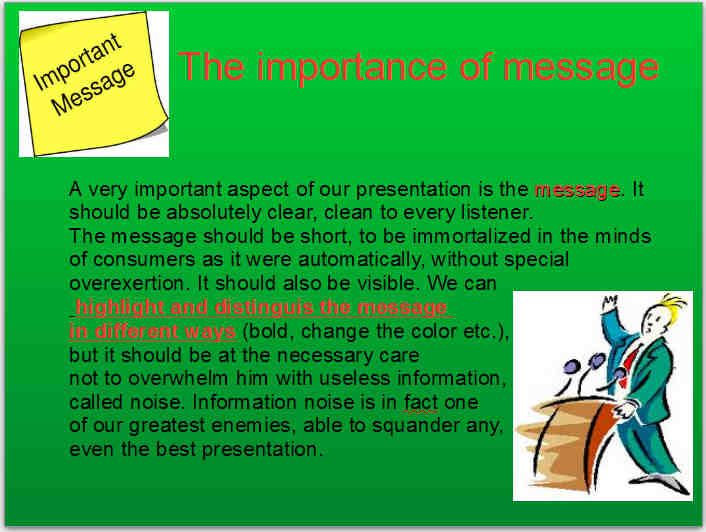
Michelangelo Merisi da Caravaggio and multimedia presentations - a marriage of beauty of art …   49

Lazarus) [3]. I came across an opinion Galiński, that the goal of this solution was to
strengthen clarity of the main motive [4]. Please, compare two paintings of the same title
Supper in Emaus painted in 1601 (National Gallery, London) and 1606 (Pinacoteca di
Brera, Milan). Five years of difference - not much especially if comes to art, but the works
are completely different. The second one is opening new, mature period in Caravaggio's
life. Christ is shrouded in darkness and at the same time dazzling simplicity, balance and
casualness. The spectator is concentrated on the most important. His attention is not
disturbed by unimportant details that take his attention away from the main message. In
painting from 1601 Christ is nothing almost like Bacchus who lean on the richly prepared
table. I will repeat. There is five years of difference between the paintings. Five years
during which the painter started his journey going with the difficulty through next topics for
the drawings dedicated for the church. The unfaithful painter together with the characters of
the paintings, unfaithful Thomas and unfaithful Matthew were breaking their heads over the
mystery of God [2].

   Fig 1. Two Virgins - Loretto Madonna by Caravaggio and Assumption of the Virgin by Carracci

The light and the shadows
     Fabiani in her essay „Bully Caravaggio” writes that the painter used some formal
sources that strengthen significance of the paintings [2]. Primarily he brought different light.
First paintings were light later his paintings are getting darker. The light is not equally
distributed according to the rules of the Renaissance generation. Caravaggio needs this light
that will reveal something making the action, busy light bringing the things and people from
the dark. The lab walls he covers with black paint. He liquidates a plain window and puts it

                                       Brought to you by | Gdansk University of Technology
                                                           Authenticated
                                                Download Date | 5/18/16 9:01 AM
50                                   Mirosław Szyłak-Szydłowski

at the top. He receives the beam and he puts it on the canvas. He understands that revelation
can happen in one minute and he is trying to find this minute on every of his canvases. He is
not distracted. He paints only a second of an event subordinating everything to it - the
gestures, looks, and attributes. His paintings are overtalked and overload. They have
everything what is necessary. The paintings are beautiful. They attract the eye. They are not
boring, they fascinate and inspire. Furthermore, looking at the arts of Gentileshi, Manfredi,
Caracciolo, de Boulogne, van Baburen or Georges de La Tour - “caravaggionism” in
a simple form! Let's stop at the last painting. In essay „Georges de La Tour - in a candle
light” Bożena Fabiani wrote, that we can read that the painter stayed under a strong
influence of Caravaggio, what was expressed primarily by looking for the light effects:
darkness, deep shadow, light contrasts. In religious topics this influence was visible
particularly in investigating the mystery, perception of the supernatural by the simpleton and
transferring them directly without any complications [2]. He was called the painter of
peasants because the action of his paintings he put among ordinary people, poverty and
everyday life. His works show calmness and are not overloaded and overtalked. His
characters are calm peasants as the first peasants and as he was himself first. De La Tour
was fond of nocturnes, candlelight that smoothed the faces and eases colors of the clothes.
Reverie and silence are the ones that make the sacrum? Do you need anything else? It has to
be added that Caravaggio's paintings besides that they fascinate they also transmit great
peoples' emotions: amazement, anxiety, fear, delight, despair... . At the same time the works
are full of hidden dramaturgy that is shown in excellent way on the paintings that were
painted for the church chapels. An unique language of the eyes and gestures and the
moment that is stopped by the movie frame. I have to quote the words of Bożena Fabiani
who noticed something else. Caravaggio builds his painting in a way that the spectator may
participate in the event that is shown on the painting. The group of people painted on the
work leaves empty spaces from the spectator side. The painting is open from our side. The
best it is shown on Entombment where the pyramid of people stands behind the grave and
the spectator see the front of the grave. If we would like to seat next to the sitting in the
Supper in Emaus, no problem, the painter left for us empty sits by the table. Please, look at
the Sacrifice of Isaac Caravaggio grouped people and the animal in a way that it looks like
modern camera's shoot. Everything can be caught by the picture. Kind of like a classic
example of condensation paint where the artist resigns from the full narration and we do not
know where the event takes place. However, the intriguing composition is very memorable.
I mentioned before Annibale Carracci, the author of Assumption of the Virgin; I think that it
is worth to remind the reaction of his cousin Lodovic when he saw one of the Caravaggio's
paintings. So the founder of the Bologna painting school „Simply was petrified when he saw
that there is nothing besides huge light contrast and shadows, no excuses for what is proper,
no charm or understanding, a real crash of the good drawing.” [1]. The time showed that
Caravaggio not only bury the good drawing but also and despite of that prophets have
generally harder in life he was a real pioneer. That is him who restored for the human his
corporeality and at the same time plunged him in the darkness [3]. He dared his followers to
start looking for light effects and shadows game and the light of candlelight and the torch
light.

                                   Brought to you by | Gdansk University of Technology
                                                       Authenticated
                                            Download Date | 5/18/16 9:01 AM
Michelangelo Merisi da Caravaggio and multimedia presentations - a marriage of beauty of art … 51
Backgrounds colors as carriers of emotions
What does it have in common with Power Point? Against guise, not a few. Anna
Marciniak noticed in her essay that the color is important during multimedia presentation
creations and featured in transmission [5]. The colors should not be used in a huge amount
including white and black limiting them to three colors on one screen in graphic and text
(of course avoiding pictures). The author advices that information important for the
transmission should be marked with warm colors: red, orange, yellow, because in the nature
they are warning colors. Moreover, they give effect of convexity and zoom on the screen.
The content that is less important may be presented in cold colors. In order to pay attention
on particular information we may use dissonances and color inversions (reverse of colors).
The background cannot be interrupted with elements that are in it. Therefore, the
background as pictures should be very carefully chosen and slides should be neatly chosen
as well both from the color side as from the ornament of the scheme [5].
Specialists of color psychology turn our attention to show that blue color is mostly
chosen for multimedia presentations [6]. Tests proved that blue color makes our breath and
pulse slower. It is calming and preservative. It found its popularity in business presentations
and trainers presentations. Precisely the dark blue background and light letters (the set is
associated with professionalism) in excellent way they are the best for serious, corporative
presentations and light blue in the ones that are designed to making an effect of peace,
reliability, partnership, trust and [7], in one word: warmer feelings on the speaker - audience
line.
Green color stimulates interaction between speaker and listeners. Blue color interacts
on positive emotions. It is often used by lecturers, trainers and all who would like the
discussion. According to mentioned psychologists [7], the color is excellent for
presentations that treats about ecological and environmental issues. In my opinion using
green color in this context is obvious and trivial. Red color is one of the strongest colors in
the color palette. If comes to affecting the emotions - also the negative ones so please be
careful using it. This color is excellent as a carrier that stresses passion. Please, remember
that it is also warning color that goes well with the slides in which we want to show threat or
dangerous situation. Interesting and desired effect we will achieve when we will be talking
about competition displaying slides on the red background, but as I mentioned it is not
worth to exaggerate. Often I read that the presentations on the red background stimulate to
take action especially when we want to show to the team that the deadline to deliver the
project was the day before yesterday. Unfortunately, the willingness to act is connected only
with the desire to come to the speaker and pull the cable from the projector. Purple or violet
are associated with nimbus of the power and wealth. What is interesting violet means also
wisdom and spirituality. This color infrequent in nature is perceived as something unusual
and artificial. The feminine color most often is used in calm emotional and spiritual
presentations. Contrary to appearances, yellow color may give feelings of frustration and
anger. In spite of that it is a happy color and favors good mood. It has been proven that little
children cry more often in yellow rooms [6]. It is color that is the most transparent and at
the same time color that strongly point out. It may be used - in a small scale - for marking
out or exposing some content, key words but it is avoid in the backgrounds. If there is
a need the most often the sober shades as gold or orange are chosen. Orange is a color that
is associated with light, sunny day, sweetness of honey, joy and positive emotions [7]. Very
Brought to you by | Gdansk University of Technology
Authenticated
Download Date | 5/18/16 9:01 AM52 Mirosław Szyłak-Szydłowski
popular trick is also applying a delicate texture for the background or putting on picture
with a transparency - then it makes the yellow effect more mild.
Black color is very often skipped in multimedia presentations, because of its neutral
character it is excellent for financial presentations. Black color is associated with the
finality. Moreover, it is good as a transition color - disappearance, fading to the black color
gives a strong effect for the listeners to pay their attention.
White color similarly as black is a calm and neutral color for presentations.
Unfortunately, white is often not appreciated as a color. Transition to the white color is
indicating a new opening, beginning, cleanness and innocence. This color is ideal if we
want to pay attention on the message, information from the slides in contrary to creation of
the brand image. It symbolizes openness, it encourages and not overwhelms. It creates an
open space impression. Psychologists [6] say that it can be perceived also as a „cheap”,
boring because it is a default color in Power Point presentations. Moreover, it can make
eyes tired.
Grey is often perceived as a negative color that testifies lack of engagement ”passing
by” the presentation. It may be a sign of independence, but as I mentioned the risk of label
„boring and not engaged” is huge here. On the other hand, colors as grey or silver are
slowly in favor as less strict and severe, sterile and sharper than white [6]. In one word, in
light grey background with the dark text or dark grey background with light text there is a
great potential. Based on psychologists' research there might be a combination of colors
together with the emotions that they play (Table 1).
Table 1
Background colors and emotions caused by them [6, 8]
Color Emotions and connotations associated with color
Black sadness, seriousness, finality, formality
Brown earth, open space, simplicity
Blue peace, silence, trust, security, professionalism
Violet power, knowledge, mystery, spirituality
Green nature, environment, health, reptiles, insects
Grey conservatism, practicality, reliability, safety, stability
Red passion, intensity, excitement, warmth, love, aggression
Orange warmth, expansiveness, flamboyance
Yellow optimism, happiness, idealism, unreality
White purity, sterility, respect, simplicity
It is worth to pay attention to one more aspect - contrast. Backgrounds and text colors
have to be contrasted against each other to make an impression of text convexity. In order to
check if chosen by us colors are compatible it is worth to take contrast calculator that is put
on the website: http://www.thinkoutsidetheslide.com/color-contrast-calculator/
Independently from the achieved score in the above test, some colors do not match with
each other - they make the reading harder. There are [8]:
- red and green - apart from that healthy people have problem with this set of colors on
slides, people that suffer from daltonism do not recognize the tones;
- orange and blue - next set makes discomfort in the receiver. The text seems to shake
and vibrate and is hard to read;
Brought to you by | Gdansk University of Technology
Authenticated
Download Date | 5/18/16 9:01 AMMichelangelo Merisi da Caravaggio and multimedia presentations - a marriage of beauty of art … 53
- red and blue - these colors will not pass the above test. Put next to each other they are
not of much contrast. Worse, the combination seems less of contrast if it will be
displayed on the screen.
So what color pairs look the best on the screen? One of the authors recommend the
following set [8]:
- dark background with light text:
background: dark blue (hue "navy") or dark purple;
text: white or yellow;
colors of distinction: green, orange, light blue;
- bright background with dark text:
background: dark beige;
text: dark blue, black, dark purple;
colors of distinction: dark green, burgundy.
Why we should not trust psychologists boundlessly?
Giving the voice to psychologists I will allow myself to quote the words of those who
warn before the contemporary, sometimes fanatic and fideic faith in this field. William Kirk
Kilpatrick, the author of Psychological seduction [9], stated that if someone wants to
discover new worlds it is the best to look for them outside of psychology. It gives an illusion
of depth. The same illusion can be put on the opposite sides mirrors. It would like to be said
following Lec that the mud sometimes gives you impression of depth. I will use another
quote of psychology professor Tomasz Witkowski: Psychology is primarily the science of
scientific method - it does not know anything for sure and it should not decide about
anything. It may only suggest in what ways it will be the easiest to achieve the goal, but will
not tell us to what aims to aim for [10]. In one word, the below paragraphs about colors may
have its scientific proof and we could find many articles to support that and in which there
is a discouragement from the faith for all who dared to use the background that is not
enough to be pigeonhole. The question remains what do we loose? If the answer is yes then
is this a goal and sense of our presentation and reaching the recipient? Of course we can
change backgrounds in order to move emotions. We can dazzle of red to make the listener
nervous. We can use the green and give him hope. We can also enchant the audience with
a deep purple in order to show our spirituality and power... . We can do everything, but the
question is what stays? What will stay in the heads of the listeners after they will leave the
room? Emotions? Great, we wanted that. What about knowledge? What about the values we
wanted to show?
When the slides are overwhelmed, the spectators try to understand instead of paying
attention on the speaker; when they will pay attention to the speaker then they will look at
the slide and will synchronize the two sources of information. It is an effect of not paying
attention that brings cognitive overload and reduces effectiveness to lear. People better
understand the multimedia presentation if they do not need to share attention between
numerous sources of information and link them together [11]. We can't assume that the
listeners have such a great working memory that they will read the whole material as a hard
copy document and additionally will listen to the speech. Slides filled with text do not have
an effective possibility to transfer the information in visual channel in synchronization of
verbal channel. Atkinson wrote that the research shows that people better learn the words
Brought to you by | Gdansk University of Technology
Authenticated
Download Date | 5/18/16 9:01 AM54 Mirosław Szyłak-Szydłowski
and pictures than the goals. It refers to the situation where pictures are presented in order to
illustrate the words and not as a decoration [11]. Logo is an ornament that is permanently
used for presentations and comes back as a mantra slide after slide. I have nothing against to
put it on the opening and closing slides, but repeating it every time is to the slides we put
additional, not necessary information that are not connected with a concrete topic
mentioned in the title. Let's look on Caravaggio's paintings, particularly on the background.
Do we have something redundant and oversized here? No - the blackness is a usual beam of
light. The beam that reflects the most important person on the canvas. The most important
detail. Nothing takes our attention. We can concentrate on the details and transfer on that
what the artist wanted to show us. Let's recall The kiss of Judas (Fig. 2) - the light that
comes from a lamp handled by Caravaggio reflects the face of Christ in pain. We see the
face. The soldiers painted by chiaroscuro technique hide in the shadow not only shadows
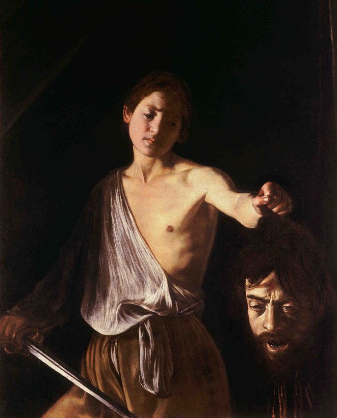
dancing in the armor that show some details of the kit. Let's look at David with the head of
Goliath - it is David reflected diagonally.
Fig. 2. The kiss of Judas and David with the head of Goliath
The painter exposes David’s left arm and the head of the defeated (again we see the
face of Caravaggio, possessed by the death through decapitation). The lack of details on the
background even if we would like to put Israelities crowds there that cheer to the victory
over The Philistines eventually king Saul who is thoughtful how to mock from the promise
of giving his own daughter to the winner. On the picture we see only the youngest son of
Jesse - yesterday a shepherd tomorrow a king. He is sad and thoughtful far from happiness.
He is starring in the Goliath's-Caravaggio’s head, that express the failure. And that is
probably why this picture strongly influences on the next generation of recipients.
What is the most important suffering, fear and sadness and two of people's drama that
soon will be the drama of the whole nations. Let's not to beautify the background with the
nice (according to us) landscapes. Let's the message speaks. If it is deliberated then it will
not need the decoration. If it is not then any of the ornaments will rescue it (Fig. 3).
Nicholas Oulton in his important work "Killer presentations" writes that spending time on
Brought to you by | Gdansk University of Technology
Authenticated
Download Date | 5/18/16 9:01 AMMichelangelo Merisi da Caravaggio and multimedia presentations - a marriage of beauty of art … 55
worrying about the choice of the picture on the background instead of spending it on
worrying about the content of the presentation, it is almost like a crime [12].
Fig. 3. Overloaded (above) and clean (below) slide. The above one is full of text, which overwhelms the
main idea. There are a “deadly” set of colors red-green, unnecessary underline and irritating
cliparts (according to N. Oulton, it is an abbreviation of: Crass Little Inserted Pictures Always
Rubbish and Trite [12])
C. Atkinson suggests that the important slides should be distinguished by different
background - when the dominating presentation background is for example white, the slides
might be on the dark grey background. It can give the listeners a signal that these are the
most important slides of the presentation [11]. The change will make the audience to pay
attention what is significant, because after 15 minutes less than 35% of the public is not
interested in what we say [13]. You should be very careful with this solution. Especially
when we have the tendency to recognize that everything is significantly important - in this
case the white background will be aberration for the all present greyness.
Brought to you by | Gdansk University of Technology
Authenticated
Download Date | 5/18/16 9:01 AM56 Mirosław Szyłak-Szydłowski
Very strong effect is in making the screen black ("B" button on the keyboard). Visual
elements are display on the screen and may enchant, but when we break the miracle by
making it dark in the same moment we will transfer the attention on ourselves and on the
presentation content. Sometimes we have a situation that the full attention is concentrated
on the speaker. It is especially when we notice that the listeners instead of listening look at
the slides. Pressing the "B" button makes a strong dramatic effect which all eyes in one
second are on the presenter. If we have a black background of our slides then the similar
effect we will have pressing "W" - then the screen will become white. Atkinson says you
have to fully agree that the choice of a plain style may be a good strategy [11]. If all people
use the same elegant, detailed and mistakeless style then all presentations will look the
same. When we choose something simple that is in contrast with a norm, we may break
visual boredom and make a lasting impression.
Let's go back to the Caravaggio's genius. I will allow myself to remind that he almost
invited the recipient to come to his paintings, to sit next to Matthew and listen in his words
after which the custom official from Cafarnaum, man who represents the profession as
controversial as prostitutes, unfaithful and pagans just stood up and left with Him (Mt, 9,9).
There is a rule that should be honored during the proclamation of the presentation.
As a popular Confucious motto say: “tell me and I will forget; show me and I will
remember; engage me and you will wake up my desire”. Atkinson that I mentioned already
many times says that „the basic rule number 1 is: enter the screen - the audience has to delve
in the presentation as in a metaphor [11]. It should be taken and enchanted. We can do it by
going in to the screen. Do not stand next to the screen and treat it only as a visual support.
Let's stand in front of the big screen and make hybride transfer source and our presence will
be engaging. It gives a sound effect that stresses all as a whole. Thanks to us the
presentation is set in reality and the voice drives the whole process and information [11].
As it is seen the sources used by Caravaggio are universal and they are also useful in
multimedia presentations. What impressed us, and shocked admirers of the XVII century art
may pleased us who use electronics in XXI century. Please, pay your attention to the two of
the first chapters of this text while making your presentation. You will be convinced that the
chapters treat also about the Power Point. They say about what you need to know while
preparing the presentation that you should concentrate on the detail and transfer and avoid
the ornaments. In one word during all the centuries we forgot about the colors of
presentations.
Gustaw Herling-Grudziński wrote about Caravaggio's works that the light and the
shadow express invisible world [14]. I will repeat: light and shadow nothing more. I wish
you that your presentations will be based on this motive where the light is the transfer that
you want to attract the audience and the shadow is the background where all the ornaments
are hidden.
References
[1] Fabiani B. ...Muszę i Rzym zobaczyć. Warszawa: Oficyna Wydawnicza "Vocatio"; 1999.
[2] Fabiani B. Dalsze gawędy o sztuce. XVII wiek. Warszawa: Polskie Wydawnictwo Naukowe; 2013.
[3] http://www.mojeobrazy.com.pl/malarz.php?id=95 (access: 09.06.2014).
[4] Galiński PT. Caravaggio i caravaggioniści. Source: http://pawtadgal.blogspot.com/2014/01/uzupenienia-ii-
caravaggio-i.html (access: 09.06.2014).
[5] Marciniak A. Sztuka tworzenia prezentacji multimedialnych. Source: http://www.marciniak.edu.pl/
resources/articles/Sztuka_tworzenia_prezentacji_multimedialnych.pdf (access: 25.06.2014).
Brought to you by | Gdansk University of Technology
Authenticated
Download Date | 5/18/16 9:01 AMMichelangelo Merisi da Caravaggio and multimedia presentations - a marriage of beauty of art … 57
[6] http://www.presentationteam.com/presentation-tips/powerpoint-tips/psychology-of-color-in-powerpoint-
presentations (access: 26.06.2014).
[7] http://www.presentation-process.com/colors-in-powerpoint.html#axzz35eKHHdGZ (access: 26.06.2014).
[8] http://www.thinkoutsidetheslide.com/choosing-colors-for-your-presentation-slides/ (access: 26.06.2014).
[9] Kirkpatrick W. Psychological Seduction. Nashville: Thomas Nelson Inc.; 1983.
[10] Giedrys G. Pełnia obecności. Wysokie Obcasy. 2014; 90-92.
[11] Atkinson C. Beyond Bullet Points. Gliwice: Helion; 2011.
[12] Oulton N. Killer Presentations. London: How to Books Ltd; 2007.
[13] Szyłak-Szydłowski M. Sztuka prezentacji, czyli zastosowanie multimediów w dydaktyce. Chem Dydakt
Ekol Metrol. 2010;15(2):197-199. http://tchie.uni.opole.pl/freeCDEM/CDEM_15%282%29/
CDEM_15%282%29.pdf
[14] Herling-Grudziński G. Sześć medalionów i srebrna szkatułka. Warszawa: Czytelnik; 1994.
MICHEL ANGELO MERISI DA CARAVAGGIO I PREZENTACJE
MULTIMEDIALNE - MARIAŻ PIĘKNA SZTUKI I SZTUKI PREZENTACJI
Wydział Inżynierii Środowiska, Politechnika Warszawska
Abstrakt: W artykule, prześledziwszy ewolucję stylu Caravaggio i skupiwszy się na wybranych obrazach,
dowiedziono, że metody stosowane przez tego wybitnego malarza z powodzeniem mogą zostać wykorzystane
podczas tworzenia współczesnych, efektywnych prezentacji multimedialnych. Napisano, że siła tego wybitnego
malarza tkwiła w prostocie i przyziemności. Do wspomnianych środków formalnych zaliczone mogą być między
innymi: eliminacja rozbudowanego tonalnie drugiego planu i zastąpienie go ciemnym, jednolitym tłem.
Caravaggio „uspokoił” kompozycję, malując niemal monochromatyczne obrazy uwypuklające plan pierwszy,
przekaz i myśl przewodnią. W artykule podkreślono, że dokładnie te same cele przyświecać powinny
w tworzeniu prezentacji multimedialnych, wyekstrahowanych z ozdobników wdzierających się niepotrzebnie na
pierwszy plan, rozpraszając uwagę odbiorcy. Na podstawie analizy wybranych obrazów zaproponowano przegląd
zabiegów związanych z kolorystyką w prezentacjach multimedialnych, niezmiernie istotną przy tworzeniu
prezentacji multimedialnych i uwypuklaniu przekazu. Przedstawiono tu kilka teorii związanych z psychologią
barw, a zarazem starano się odpowiedzieć na pytanie, dlaczego nie należy bezgranicznie ufać psychologom.
Słowa kluczowe: barwa, Caravaggio, multimedia, obrazy, prezentacje, sztuka, tło
Brought to you by | Gdansk University of Technology
Authenticated
Download Date | 5/18/16 9:01 AMYou can also read