Pitch Perfect Marketi ng - Responsive Web Design White Paper O
←
→
Page content transcription
If your browser does not render page correctly, please read the page content below
Pitch Perfect Marketi ng

  Responsive Web Design White Paper

                                               O
                                           EM
                                           D
                                      EW
                                      VI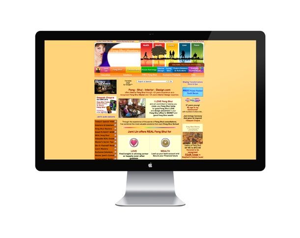
3 Introduction                                  12 Summary
5W
  hat is Responsive Web Design?                13 Sources
6 Why is Responsive Web Design so important?   14 Glossary
8 Impact on Business                            15 Contact
9 Examples of Responsive Web Design
   & Non-Responsive Web Design

                                                                       O
                                                                   EM
                                                                   D
                                                              EW
                                                              VI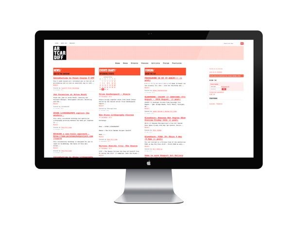
3

Introduction

The explosion of Internet browsing on mobile devices over
recent years has created a new problem for businesses with
existing websites created in a non-responsive format.
Many businesses looking to create new sites are also
uncertain of the best solution to ensure their site is fully
responsive on all devices and all viewing dimensions.

Despite mobile Internet access being a major      crowd would see and hear you clearly
part of our society since the launch of the       and understand exactly the message you
i-Phone back in 2007, many businesses are         were trying to deliver.
still playing catch up when it comes to their
website being fully functional, with no loss of   Those stood half way back may catch the
fidelity or user experience across the raft of    odd word or sentence and could possibly
desktop and mobile devices now available.         get a rough idea of what you were trying to
                                                  convey, but would certainly not enjoy the
Imagine you were to host an event and invite      experience and would be less likely to attend
all your customers and potential customers.       any future events.
At this event you wanted to convey a message
to the hundreds or thousands of people in the     The entire event however would be wasted
audience. You could choose to hire a beautiful    on those stood at the back, unable to see
venue, stand at the front of the room and         or hear you, leaving the venue completely
speak your message, delivering it concisely       disgruntled and likely to tell others about
and eloquently. Those stood at the front of the   their poor experience.

                                                                                                           O
                                                                                                       EM
                                                                                                       D
                                                                                                  EW
                                                                                                  VI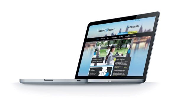
4

                     Desktop                                         Laptop                                 Tablet
                                                                                                                                        Phone

Introduction continued
We appreciate that this isn’t something a business   Apply that train of thought to your website and you   loses viewers before they’ve even laid eyes on
would choose to do. You would utilise the relevant   will see exactly why responsive web design is so      its home page because your download time is
tools available to you to ensure that your message   crucial to businesses today. Why would you promote    too long?
was clearly received by every single one of your     a website that only some people can see clearly,
customers, and anyone else who happened to turn      some of the time, dependent on their                  In this White Paper we aim to explain the
up. Using a stage, an audiovisual system, handouts   chosen device?                                        importance, the problems surrounding and the
or whatever tools enabled you to get your message                                                          solutions to effective responsive web design,
across to each and every person who took the time    Why promote a website that not only looks distorted   providing businesses with the knowledge they need
to turn up and listen to what you had to say.        but that doesn’t function properly on a mobile        to adapt to the rapidly increasing trend in mobile
                                                     device? Why would you promote a website that          Internet access and e-commerce.

                                                                                                                                                                     O
                                                                                                                                                                 EM
                                                                                                                                                                 D
                                                                                                                                                            EW
                                                                                                                                                            VI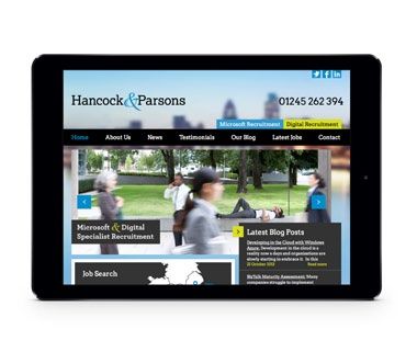
5

What is Responsive Web Design?
Responsive Web Design (RWD) is the approach        The flexible grid layout provides
                                                   containers in which the web content
                                                                                              Whist responsive images ensure
                                                                                              that the viewer only downloads the
taken to designing and creating a website that     can be controlled, providing essential     appropriately sized image for their
                                                   fluid positioning, regardless of screen    device. These too, are sized in relative
adapts to its viewing dimensions using a variety   size. It means that page elements          units, preventing them from displaying
of tools, enabling optimum viewing experience      are in relative units, as opposed to       outside of their grid area or container.
                                                   absolute units, allowing units to
and full functionality regardless of the desktop   increase and decrease in size as a         These three elements eradicate loss
                                                                                              of fidelity and functionality when
or mobile device used. RWD aims to enhance         percentage of the viewable area,
                                                   rather than pixels or points.              accessing a site on any chosen
the viewing experience regardless of device or                                                screen size.
                                                   CSS3 media queries allow different
screen size.                                       display rules for the content, by asking
                                                   what capabilities the viewing device
                                                   has, and deploying rules that control
                                                   the layout and view of the web pages
RWD consists of three main areas of focus:         suited specifically to the device
                                                   and browser.
• Flexible Grid Layouts
• CSS3 Media Queries
• Responsive Images

                                                                                                                                             O
                                                                                                                                         EM
                                                                                                                                     D
                                                                                                                                 EW
                                                                                                                               VI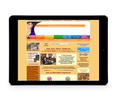
6

   Why is RW D so important?
                                                                                                                  [4]

I t was reported in 2012 that Britons are the biggest online
 shoppers in the developed world.
                                                                                         Between

         2012            [1]
                                   2013            [2]
                                                               2013                [3]   2010 & 2013
                                                                                         Access to the Internet
                                                                                         using a mobile device
                                                                                         more than doubled

      60%                       72%                        73%                           from a staggering

      of the UK
      bought goods or
                               of all adults
                                bought goods or
                                                            Britons
                                                             (23 million adults)         24% to
                                                                                         53%
                                                         accessed the Internet
       services online           services online
                                                              every day

     Beating the average         A rise from 53%            20 million more
    percentage by double!             in 2008                than in 2006

                                                                                                                                 O
                                                                                                                             EM
                                                                                                                             D
                                                                                                                        EW
                                                                                                                        VI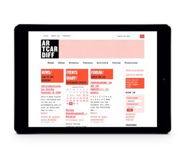
7
Up
[5] These statistics demonstrate the
wa
exponential growth in Internet usage,
rdl
particularly mobile Internet usage over
ym
recent years and looking ahead to the
huge spikes predicted in coming years.
Des
obi With 2013 being the year that mobile
le
Not ktop P
Sm ebook Cs devices are predicted to overtake desktop
a In 2
Tab rtpho PCs and notebook hardware (previously
lets nes pre 013, In
d
wit icted ternet believed not to take place until 2014
hp
hen to ove conn or 2015), then can you afford
om r e
ena take d cted m for your website not to
l jum esk ob
ps f top d ile de be fully responsive,
ore evic vice
cas
t in es and s are
right now?
201 n
4 an otebo In the UK and across the
d2 o
015 ks, globe, expectations are
.
changing and we expect
information instantly.
200 3.0
9 We have become an upwardly
2.7 mobile society – a trend, which
201
0 2.4 UK and Global data shows, is
2.1 without doubt set to continue.
201
1 With more and more information
1.8
201
available within seconds at the touch
2* 1.5 of a button or swipe of a screen,
201 1.2 clients and consumers are becoming
3 increasingly impatient when it comes
0.9
201 to download times and ease of use of
4 0.6
websites, particularly when on the move.
201 0.3
5
0
O
EM
D
EW
VI8
Impact on Business
With mobile Internet access overtaking desktop
usage then can you risk the majority of viewers
accessing your website receiving a distorted view?
The time and money invested in the creation,
upkeep and promotion of your website could be
money down the drain if it doesn’t respond to todays
market place and customer expectations.
Every second counts! Your websites download time could directly impact your bottom
line! In a survey conducted in 2012, asking over 5000 participants a variety of questions
regarding their mobile usage habits and preferences, slow webpage download times
came out as the number one frustration. It also found that two thirds of smartphone
users (64%) wanted a site to load in less than 4 seconds. Whilst 60% of tablet users
wanted this load time to be less than 3 seconds. [6]
A RWD doesn’t just benefit those viewing the site. Using a RWD approach provides real
cost savings to the business too, ensuring that just one website is built and maintained.
Not to mention the revenue retained and additional revenue created by ensuring your
business doesn’t lose business just because a customer chose to visit your site using a
mobile device.
LOAD ING 5 6 %
O
EM
D
EW
VI9
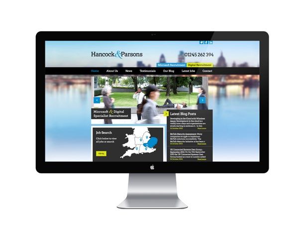
The good
Without triumphantly blowing one's golden trumpet; the below examples
demonstrate how a good responsive website should function.
The design is clear and striking, with attention to easy user navigation across
various screen sizes.
www.hancockandparsons.co.uk
Created with
O
EM
D
EW
VI10
The bad
Below are examples of how not to design a responsive website.
Not bad if you have a large shiny display, despite the lack of imagery and heavy
text content. But the smaller the display the harder the navigation becomes,
until eventually it implodes on itself as shown on the smart phone.
www.artcardiff.com
O
EM
D
EW
VI11
The ugly Oh dear. Need we say more.
www.feng-shui-interior-design.com
[7]
O
EM
D
EW
VI12
Summary
So it’s fair to say that one size definitely doesn’t
fit all and that square pegs won’t ever fit in round
holes. Therefore, responsive web design really
is the only way to ensure that your website
content is viewable and fully functional across
all mediums being used by your customers and
prospective customers.
You wouldn’t spend time and money creating an amazing high-street window
display and then cover half of it up with black paper, preventing those who stop
and look from seeing half of what you have to offer. So, don’t think that anything
other than a fully responsive website design in this day and age is acceptable.
With mobile device usage now tipping the balance to be more popular than
desktop viewing, RWD is no longer a luxury or something for the future. It is
essential to your business right here and now.
VIEW OUR LIVE RESPONSIVE DEMO
O
EM
D
EW
VI13
Sources
[1]
OECD, via The Telegraph – February 2012
www.telegraph.co.uk/news/uknews/9054400/Britons-are-biggest-online-shoppers-in-developed-world.html
[2] [3] [4]
Office for National Statistics (ONS) – August 2013
www.ons.gov.uk
[5]
KPBC Morgan Stanley Research, via The Economist
www.economist.com/news/21566417-2013-Internet-will-become-mostly-mobile-medium-who-will-be-winners-and-losers-live-and
[6]
Keynote - 2012
www.keynote.com/docs/reports/Keynote-2012-Mobile-User-Survey.pdf
[7]
Web Pages That Suck
www.webpagesthatsuck.com
O
EM
D
EW
VI14
Glossary
RWD
Responsive Web Design
CSS3
The latest specification of Cascading Style Sheets (as of Oct 2013)
ONS
Office for National Statistics
O
EM
D
EW
VILet us help you
01206 364674
www.thisisfever.co.uk
hello@thisifever.co.uk
Pitch Perfect Marketi ng
12a Chapel Street North
Colchester
Essex CO2 7ATYou can also read


