Responsive Web Design for Modern Devices - Olle Lundmark - Higher Education Diploma in Software Engineering with emphasis in Web Programming May ...
←
→
Page content transcription
If your browser does not render page correctly, please read the page content below
Higher Education Diploma in Software Engineering with emphasis
in Web Programming
May 2022

    Responsive Web Design for Modern
                Devices

                              Olle Lundmark

  Faculty of Computing, Blekinge Institute of Technology, 371 79 Karlskrona, Sweden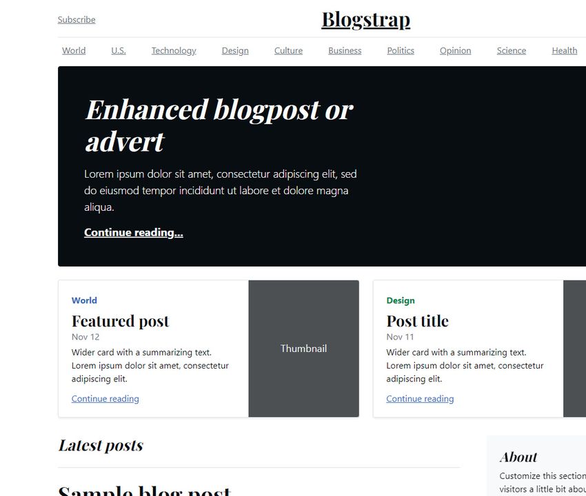
This thesis is submitted to the Faculty of Computing at Blekinge Institute of Technology in
partial fulfilment of the requirements for the degree of Higher Education Diploma in Software
Engineering with emphasis in Web Programming. The thesis is equivalent to 10 weeks of full
time studies.

The authors declare that they are the sole authors of this thesis and that they have not used
any sources other than those listed in the bibliography and identified as references. They further
declare that they have not submitted this thesis at any other institution to obtain a degree.

Contact Information:
Author:
Olle Lundmark
E-mail: ollu19@student.bth.se

University advisor:
Mr Bo Peterson
Department of Computer Science

Faculty of Computing                               Internet : www.bth.se
Blekinge Institute of Technology                   Phone    : +46 455 38 50 00
SE–371 79 Karlskrona, Sweden                       Fax      : +46 455 38 50 57
Abstract

A new device gets released almost bi-weekly, some offering a unique take on resolution
or aspect ratio. For a web developer, this means that they have to constantly adapt
and respond to how modern devices interact with the web, and create solutions that
work for the visitors. This puts a lot of pressure on the developer to create a good,
responsive webpage that is not expecting a certain device, but rather works fluently
no matter the exact size of device.
    In this study this development is researched and discussed, from the viewpoint of
what the differences are between established and future devices, what developments
that might arise tomorrow and how to react to these as a developer. The goal
is also to research what methods of responsive web development works best with
these devices, and what might become an issue when newer devices are released and
becoming widely used.
    The research is split up into two parts, one part comparing three popular frame-
works and their responsiveness-related functions and the second part reviewing earlier
work regarding responsiveness for modern devices.
    Modern, well developed frameworks offer a lineup of functions for responsive web
development, most which integrate well when met with non-standard resolutions or
devices with the tradeoff of being more heavyweight and less customizable. Research
concluded that modern frameworks are covering most aspects of responsive web de-
velopment, and offers a good base to implement responsive web development for
future devices.
    Developing from having two different webpages, one mobile and one for a home
PC, now almost every large webpage implements a responsive and adaptable interface
which fits many more devices without slotting them into a specific niche. After this
became standard, more and more unique devices could reliably browse the web.
What is left is a discussion regarding what the future might hold in the case of other
input devices such as voice input, small displays such as smart watch displays, and
how this technique can be adapted to handle these devices as well.

Keywords: Responsive Web Design, Modern Device Development, Mobile Appli-
cations
Contents
Abstract i
1 Introduction 1
1.1 Background . . . . . . . . . . . . . . . . . . . . . . . . . . . . . . . . 1
1.2 Scope of Research . . . . . . . . . . . . . . . . . . . . . . . . . . . . . 1
1.2.1 End goal . . . . . . . . . . . . . . . . . . . . . . . . . . . . . . 2
2 Related Work 3
2.1 Earlier works and discussions . . . . . . . . . . . . . . . . . . . . . . 3
3 Method 5
3.1 The Approach . . . . . . . . . . . . . . . . . . . . . . . . . . . . . . . 5
3.1.1 Q1: What are the noticeable differences regarding web respon-
siveness between established devices and newer devices? . . . . 5
3.1.2 Q2: How do already established frameworks for responsiveness
applications interact with unique or differing devices? . . . . . 5
3.1.3 Q3: What or which responsiveness techniques are well suited
for modern devices? . . . . . . . . . . . . . . . . . . . . . . . . 6
3.1.4 Q4: What advantages and disadvantages are there with mod-
ern devices, from the viewpoint of a web developer? . . . . . . 6
3.2 The Outline . . . . . . . . . . . . . . . . . . . . . . . . . . . . . . . . 7
4 Results and Analysis 9
4.1 Part One: The Framework Comparison . . . . . . . . . . . . . . . . . 9
4.1.1 Preface . . . . . . . . . . . . . . . . . . . . . . . . . . . . . . . 9
4.1.2 Framework One: Skeleton . . . . . . . . . . . . . . . . . . . . 9
4.1.3 Framework Two: Foundation . . . . . . . . . . . . . . . . . . . 11
4.1.4 Framework Three: Bootstrap . . . . . . . . . . . . . . . . . . 14
4.1.5 Similarities and Differences . . . . . . . . . . . . . . . . . . . . 16
4.2 Part Two: The Earlier Discussions . . . . . . . . . . . . . . . . . . . . 18
4.2.1 Historically . . . . . . . . . . . . . . . . . . . . . . . . . . . . 18
4.2.2 Early implementations . . . . . . . . . . . . . . . . . . . . . . 18
4.2.3 Further research . . . . . . . . . . . . . . . . . . . . . . . . . . 19
5 Discussion 21
5.1 Prefacing words - Discussion . . . . . . . . . . . . . . . . . . . . . . . 21
5.2 The Framework Comparison . . . . . . . . . . . . . . . . . . . . . . . 21
5.2.1 Navigation and Menus . . . . . . . . . . . . . . . . . . . . . . 21
iii5.2.2 Input and Interaction . . . . . . . . . . . . . . . . . . . . . . . 22
5.2.3 Ease of implementation . . . . . . . . . . . . . . . . . . . . . . 23
5.3 Earlier research . . . . . . . . . . . . . . . . . . . . . . . . . . . . . . 23
5.4 The Summarization . . . . . . . . . . . . . . . . . . . . . . . . . . . . 24
5.4.1 Modern Devices . . . . . . . . . . . . . . . . . . . . . . . . . . 24
5.4.2 Frameworks . . . . . . . . . . . . . . . . . . . . . . . . . . . . 24
6 Conclusions and Future Work 27
6.1 Questions & Responses . . . . . . . . . . . . . . . . . . . . . . . . . . 27
6.1.1 Q1: What are the noticeable differences regarding web respon-
siveness between established devices and newer devices? . . . . 27
6.1.2 Q2: How do already established frameworks for responsiveness
interact with unique or differing devices? . . . . . . . . . . . . 28
6.1.3 Q3: What or which responsiveness-techniques are well suited
for modern devices? . . . . . . . . . . . . . . . . . . . . . . . . 30
6.1.4 Q4: What advantages and disadvantages are there with mod-
ern devices, from the viewpoint of a web-developer? . . . . . . 31
6.2 Developing for modern devices . . . . . . . . . . . . . . . . . . . . . . 33
6.3 The Future . . . . . . . . . . . . . . . . . . . . . . . . . . . . . . . . 33
6.4 Future work and research . . . . . . . . . . . . . . . . . . . . . . . . . 33
ivList of Figures
4.1 Skeleton, Arrival view . . . . . . . . . . . . . . . . . . . . . . . . . . 10
4.2 Skeleton, Grid on larger viewport . . . . . . . . . . . . . . . . . . . . 10
4.3 Skeleton, Grid on smaller viewport . . . . . . . . . . . . . . . . . . . 10
4.4 Foundation, Arrival view . . . . . . . . . . . . . . . . . . . . . . . . . 12
4.5 Foundation, Article view . . . . . . . . . . . . . . . . . . . . . . . . . 12
4.6 Foundation, Larger viewport menu . . . . . . . . . . . . . . . . . . . 13
4.7 Foundation, Smaller viewport menu . . . . . . . . . . . . . . . . . . . 13
4.8 Foundation, Normal table . . . . . . . . . . . . . . . . . . . . . . . . 14
4.9 Foundation, Stacked table . . . . . . . . . . . . . . . . . . . . . . . . 14
4.10 Bootstrap, Arrival view . . . . . . . . . . . . . . . . . . . . . . . . . . 16
4.11 Comparison between framework functions . . . . . . . . . . . . . . . 17
6.1 Comparison between newer and older device functions . . . . . . . . . 27
6.2 Summarizing modern framework functions . . . . . . . . . . . . . . . 29
vChapter 1
Introduction
1.1 Background
The Internet is based on that the person in front of the web application is using a
monitor in front of them, together with a mouse and a keyboard. When the mobile
phones and other portable devices later took place as the leading web browsing
device, the development had to adjust accordingly.
Devices used for web browsing today are many. Other than the most popular
devices such as mobile phones, there are devices such as foldable phones and car
infotainment systems which helps us to navigate the world wide web. Today, only
about 42 percent of web visitors use a computer [39], pointing towards the decline of
computer-related web browsing together with the increase of other means of browsing.
This leads to web developers needing further adjustments to fit the ever-changing
array of devices.
This report is meant to reflect and research how the web application of the future
might need to be shaped in order to fit the demands, as well as what already existing
methods solves these issues.
A web application with good responsiveness adapts well towards different device
screen sizes and aspect ratios, displays the content well without removing or hiding
important information. Text should fit as much of the screen as possible while not
being too large to read, images should be easy to see and menus, lists or tables should
be easy to navigate.
This means that the developer needs to implement methods to change the layout
of the information displayed at certain moments, and in some cases even remove
information from the web application. As P. LePage [33] displays in his article
Responsive web design basics, this puts a lot of work in the hands of the web developer
in order to reach a good level of responsiveness in your applications.
1.2 Scope of Research
To aid and direct the purpose of this research paper, a scope is introduced.
This research paper is meant to add on to the continuously ongoing discussion
regarding web responsiveness. It is meant to compare what methods are best fitted
for development, and how to think when developing a webpage for multiple devices.
The research is aimed towards prospective or new web developers, and to give an
insight to how web responsiveness has evolved and how to adjust towards today’s de-
vices. Not all web responsiveness methods will be mentioned, nor will all frameworks
12 Chapter 1. Introduction or techniques. The frameworks and methods will be discussed from a most-popular viewpoint, and will not cover all edge cases. 1.2.1 End goal By performing and accomplishing this research, the idea is to reach a cross-section between methods that are already existing, and the devices that these methods are well-fitted towards. Further, also to contribute towards the discussion on what new methods and ideas need to be implemented or explored further, to better fit a growing market of devices.
Chapter 2
                                                           Related Work

2.1     Earlier works and discussions
This subject has long been in discussion, more or less since web browsing was nor-
malized on phones. This results in there being quite a few discussions, studies and
papers released referencing the subject responsiveness. Below I have summarized a
few works I deem relevant to this research paper. As mentioned the below sources
are summaries, which will be further discussed and compared in a later part of the
report.

   • Voutilainen, Salonen, Mikkonen is in their research paper [45] published 2015
     discussing a case study regarding the evolution of responsive web technologies
     within different frameworks. They also cover what methods might work more
     or less efficiently than others in the event of a new or differing device resolution.
     This article is written from the viewpoint of how a web developer can configure
     their web development projects to better fit different devices on the market
     today.
      Voutilainen, Salonen, Mikkonen also chose to cover a bit of the history regard-
      ing phone and device browsing, and how it has affected how a web developer
      is developing today. This research paper discusses the web responsiveness im-
      plementations in detail. We will be comparing a handful of CSS frameworks
      later on in this video discussing their possibilities, while Voutilainen, Salonen
      and Mikkonen’s research paper more closely displays how to implement them
      effectively.

   • In 2011, the author and developer Stephen Hay tweeted “There is no Mobile
     Web. There is only The Web, which we view in different ways. There is also no
     Desktop Web. Or Tablet Web. Thank you.” [40] Hay shared the point of view
     that a webpage should not be seen as different depending on the device it is
     aimed at, but rather just a restructure of the same page. His viewpoint is of a
     developer, constantly changing to be able to accommodate upcoming devices.
      Hay continues to press that a webpage should not be seen as "mobile web-
      site" only when the layout is changed, but rather just a "webpage". This is
      an interesting approach, but ties well into the web responsiveness discussion
      considering a method might be to simply develop a webpage that dynamically
      changes, and therefore should fit most if not all modern devices.

                                          3
4 Chapter 2. Related Work
• In 2014, Mikkonen (as mentioned earlier) together with Taivalsaari and Systä
wrote an essay regarding the device development over the years. [42] This re-
search paper is aiming more towards the development of multiple-device own-
ership, and what will happen with programs that are meant to seamlessly work
on multiple devices. It is not necessarily aimed towards web development, but
rather application development as a whole.
This could be put in relation to the development of web applications, since
there are a lot of similarities. This research paper also analyzes how many
devices an average person has, and how these interact with eachother.
These articles and research papers closely discusses this topic, and is relevant
in a few ways that will be more intricately discussed later on in this report. They
are all discussing the topic web responsiveness, but from different viewpoints. One
article is considering how many different devices a single person might have, while
another article discusses the viewpoint from the developer and how to tackle the
multiple-device development issues that might occur.Chapter 3
Method
3.1 The Approach
The area that this research project is aiming to explore is how changes in web appli-
cation responsiveness has evolved over time. Furthermore, to explore how you as a
developer can prepare and work against the upcoming challenges that emerge from
the development of web-accessing devices.
This analysis is meant to research the continuous web responsiveness development
that has proceeded since different types of devices has started to spread. Terms will
be used such as “established“ devices, which are referencing devices widespread and
used today, with a common resolution such as 1920x1080, or a device with the aspect
ratio around 16 by 9.
The term “newer“, “modern“ or “alternative“ devices will also be used, referencing
devices that break the traditional size, format or this traditional aspect ratio. Ex-
amples include the Galaxy Z Fold 3 that has an aspect ratio of 22.5:18 [35], or the
Huawei Mate Xs that has an aspect ratio of close to 1:1 when folded out fully. [24]
To tackle the comparison and research regarding the development of this funda-
mental pillar of web development, four research questions were established to easier
frame the results.
3.1.1 Q1: What are the noticeable differences regarding web
responsiveness between established devices and newer
devices?
The answer to this question is meant to frame what important differences there are
between different devices, and the challenges that differing or modern devices might
introduce.
To achieve an answer to this question,
3.1.2 Q2: How do already established frameworks for respon-
siveness applications interact with unique or differing
devices?
When further researching the methods that are currently used across the internet,
what responsiveness applications are best applied when introducing a non-standard
aspect ratio or screen size such as a foldable phone?
56 Chapter 3. Method
To give an answer to this question, three modern frameworks will be researched
and compared. The framework functions and support will then be compared with
factors that unique or differing devices might change, to achieve an insight to how
these frameworks might work together with a unique device.
3.1.3 Q3: What or which responsiveness techniques are well
suited for modern devices?
Since modern frameworks implement several features and approach angels, this ques-
tion is meant to frame what methods are better suited and what methods should be
left aside.
Using the result and discussion of the study from Q1 and Q2, a conclusion is
drawn to answer the question of whether there are any responsiveness techniques
that are going to reliably handle the upcoming challenges of future devices.
3.1.4 Q4: What advantages and disadvantages are there with
modern devices, from the viewpoint of a web developer?
This research question aims to loop the study back towards a future-proofing view-
point, and to add further to the conversation of how a web developer could prepare
best for the ever-growing collection of devices. What is the best approach, and what
has worked in the past?
To give a covering answer to this question, attained knowledge from the earlier
thesis results and discussions are used to list advantages and disadvantages from the
web developers viewpoint.3.2. The Outline 7
3.2 The Outline
During this research paper an approach has been taken to try to widen the view
of how web responsiveness works today, how it has been developing overtime and
how today’s and speculatively tomorrow’s devices perform with the already existing
techniques.
Aiming at covering these concepts as good as possible, the research was split up
into two parts which will be further explained below.
Part One - Framework comparisons
This part is comprised of three popular HTML frameworks, and a simple web page
implemented in each one. These frameworks have different viewpoints on web re-
sponsiveness, and the aim is to discuss and compare the results that are achieved
together with the approach each framework has towards device responsiveness.
The three frameworks used are Foundation[21], Skeleton[11] and Twitter’s own
Bootstrap[44]. All three frameworks claims to be intended for easy web development
while maintaining a simple approach towards device responsiveness.
These frameworks have been chosen because of their widespread popularity, top-
ping lists as the easiest and most used frameworks within HTML/CSS development.
[1, 36, 43] I also deemed the frameworks different in the case of sizes where Skeleton
is a bare-bones framework aiming towards complete control over the framework pa-
rameters, while a framework such as Bootstrap is a lot more covering and Foundation
covering most functions of the three. These web pages are compared from a critical
standpoint, and is put in relation to the historical development of web technologies.
Three separate webpages were constructed from the three frameworks, using doc-
umentation and in some cases other guides for ease of implementation. The aim was
to partly create three similar webpages supporting the same information, but also to
test the different features the frameworks offer to create a more responsive webpage.
The frameworks offer different responsiveness integrations, which were compared
and investigated.
These factors were then split up into different categories, upon which the frame-
works were compared. These chapters were:
• Introduction, information regarding the framework itself
• Webpage Information, information about the implemented webpage
• Grid System, if the framework offered one and what it supported
• Styling and Normalization, to unify different devices styles before applying the
developers own formatting
• Responsive Functions that the framework offers
• Other Functions that might be deemed relevant
The most important category, Responsive Functions, contains aspects that were
researched. These were8 Chapter 3. Method
• Table formatting, legibility and responsiveness
• Responsive navigation, or menu solutions
• Image responsiveness techniques
• Recommended approach towards web responsiveness
• Separate functions aimed specifically to improve responsiveness
The reason these were the chosen parameters was because of their importance in
a responsive web application. Some areas are also very wide, resulting in different
solutions to issues depending on the framework.
These factors are used when deciding what is beneficial for a framework in this
comparison, and what might be detrimental in the aspect of responsive web devel-
opment.
Part Two - The literature study
The literal study aims at discussing earlier research in similar topics, and achieving
a basic timeline of how this discussion has developed over the years. It also serves
a purpose of giving a broader view of web responsiveness, and whether or not this
discussion can be further developed or if it is already matured.
The literal study is meant to bring more substance to this research paper, com-
paring this widely discussed topic to a timeline and discusses what has changed over
time, and how this discussion has developed when the web browsing experience has
gone through changes as a whole.Chapter 4
Results and Analysis
4.1 Part One: The Framework Comparison
4.1.1 Preface
The three frameworks that are used, as mentioned before, are Foundation, Skeleton
and Bootstrap. [11, 21, 44]
Skeleton is representing itself as the most lightweight framework of the bunch,
with only around 400 lines of code in total. [21] The reason for this is because Skele-
ton aims more towards simplifying and making itself a "starting point", instead of
being a framework. Skeleton is, for example, not using any JavaScript to implement
their functions or features. Skeleton is purely implemented using a CSS file, making
implementation uncomplicated and quick. Thus, Skeleton is a lot more simpler than
both Bootstrap and Foundation.
All three frameworks aims at a "mobile-first" developing style, meaning that
smaller screens are prioritized. Bigger screens will then inherit this style, and changed
until it fits the bigger screens aswell. Another reason for this approach is for smaller
devices (such as phones) to not have to parse big CSS-files irrelevant to the device,
and instead when a viewport is bigger than a set threshold the device will parse
further CSS code implementing changes to the original, "small" style. [see 11, Media
queries]
All three frameworks are offering a 12-slot grid development-style, meaning the
webpage is split up into twelve parts. Information and objects can then be adapted
and set into this 12-slot grid and adjusted dynamically. This is opt-in for Bootstrap
and early in development, but the other two frameworks are nudging the developer
to use this style of responsive design.
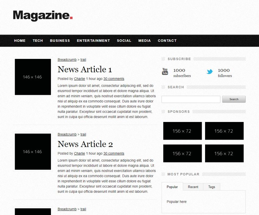
4.1.2 Framework One: Skeleton
Intro
The first implementation is Skeleto. Figure 4.1 contains a screenshot of the imple-
mented webpage and its design.
Skeleton is the most lightweight framework of the three, with around 400 lines
of code in total or about 12 kilobytes. It is meant as a starting pillar for CSS
implementations, and is based on a 12-slot grid system. The grid system is the
centerpiece of Skeleton, since it is a very slim framework with fewer extra features
or functions.
910 Chapter 4. Results and Analysis
Figure 4.1: Skeleton, Arrival view
The Website
The webpage that was implemented using Skeleton is a blog-style webpage containing
mainly news articles. The implementation also contains a header menu with links,
and a sidebar with ad-space and social media links.
Grid System
There are preset breakpoints in Skeleton that the developer can use to create a
responsive layout to their web page. This is all accomplished thanks to Skeletons
grid system. The grid system acts as columns where the developer easier can control
the layout, and shift the layout quickly when a specific viewport width is used.
Figure 4.2: Skeleton, Grid on Figure 4.3: Skeleton, Grid on
larger viewport smaller viewport
The grid can, for example, structure the blocks in a side by side manner when
a viewport is wide enough to accommodate content columns, but take up the entire
width of the viewport when viewed on a smaller device. This is shown in figure 4.2
and 4.3, where a comparison is shown between a large viewport and a small viewport.4.1. Part One: The Framework Comparison 11
The skeleton grid system has several breakpoints, although for simplicity in this
implementation three breakpoints are used. When passing the first breakpoint at
960 pixels, the margins are adjusted so the information is centered. A more critical
breakpoint is where a phone user might pass is when the viewport is under 768 pixels
in width. At this breakpoint the images for the articles are hidden, making place
for the article headers and article text for smaller devices. Furthermore the sidebar
with social links and sponsors is moved to the bottom of the page, and the footer is
stretched over the entirety of the viewport.
The grid resizes itself up to 960 pixels in width, where it will stop becoming
wider. This can be modified if the webpage is meant for larger displays, or for a
taste preference.
Styling and Normalization
Skeleton offers preset styling for buttons, forms, tables and lists meant to normalize
the styles across different devices, since some device browser implementations might
style certain elements differently.
Responsive Functions
Skeleton as a framework does not support many more functions, as it is meant as
a very lightweight styling framework helping with responsiveness on a basic level.
Therefore this framework does not contain any responsive functions other than a few
helper classes to aid in
• Image resizing following parent containers
• Making elements take up the entirety of the page
• Making elements float left or right
Other Functions or Features
Returning to the implemented web page, one final point to mention is the break point
for the menu. Currently a break point is set for 768 pixels where the menu bar simply
disappears. This is meant to be replaced by for example a click-down menu with a
hamburger icon (for smaller screens, such as a mobile phone) although the framework
does not support any dynamic menu creations.If this were to be implemented, a
custom solution has to be created (or an implementation of a dynamic menu solution
from another framework has to be used).
4.1.3 Framework Two: Foundation
Intro
Foundation offers a much more covering framework with several advanced features
such as webpage and email formatting, responsive menu creations and automatic im-
age resizing or replacement. It is a much more covering framework, with the downside
of course that it is being a lot larger and more time-consuming to implement.12 Chapter 4. Results and Analysis
The Website
The webpage that was implemented using foundation is another magazine-style web-
site containing articles, social media links and a header with a menu. See figures 4.4
and 4.5 for screenshots of the page.
At the top of the webpage there is what Foundation calls the "Title bar", which
can be used for implementing a menu on mobile devices. It contains a search bar, and
simple responsive implementations in the form of resizing depending on the viewport
size. It also contains a handful of links.
Figure 4.4: Foundation, Arrival Figure 4.5: Foundation, Article
view view
Grid System
Like Skeleton, Foundation also implements a grid system. This is a twelve-column
layout supporting a customizable sizing. Other features exists to further create
a responsive grid layout, including but not limited to customizable gutters (space
between grid columns), offsets to move grid blocks left or right, and the grid being
fully nest-able to create special layouts.
Foundation also supports several different grid types, one of them being the "XY
Grid" [20], which is a more advanced grid system supporting placing columns beside
each other, filling up available viewport space and their relation between such as the
above or below each other.
This grid also supports more advanced functions such as automatic responsive
resizing of grid elements or columns, horizontal and vertical alignment and vertical
orientation of the grid.
Styling and Normalization
Foundation has a lot of styling attributes where the developer can use pre-configured
packages to apply to their elements. This is prefaced by a style normalization, which
normalizes the style across different browsers. As mentioned earlier, this is used for
a consistent and reliable styling of web pages on different devices and browsers. [14]
Responsive Functions
The Foundation framework has wide and well-covering support of responsive im-
plementations, having CSS classes that help when implementing items like embed4.1. Part One: The Framework Comparison 13
videos, images, navigation-menus and table formatting.[17, 18]
Foundation also supports classes you can apply to elements which hides or dis-
plays the elements depending on the screen size and other factors. [19] Screen sizes
are not the only option to handle whether to show or hide an element using Founda-
tion; You can also use factors such as the orientation of the viewport (landscape or
horizontal), if the device has dark-mode enabled. Even technologies such as showing
or hiding specific elements to screen readers can be implemented using these classes.
The Menu System
Foundation supports a powerful responsive navigation system which makes it easy
for developers to implement responsive menus. The menus resize automatically de-
pending on viewport or device size, and supports changing functionality depending
on these factors. [18]
The implemented website takes advantage of this, and is currently supporting
two different menus depending on the viewport size. (See figure 4.6 and 4.7) The
larger menu is a simple drop-down menu which is displayed on viewports that are
larger than a specific viewport size. When the viewport is smaller (and the website
is assumed to be displayed on a mobile device), the drop-down menu is hidden. The
drop-down menu is then replaced by a hamburger-style menu button which displays
a drilldown-style menu [15] The drill-down menu takes better advantage of the small
screen size, while still displaying all menu options efficiently and comprehensible.
When this menu is replaced with a drill-down menu, the same breakpoint is used
for a few other factors aswell. The webpage logo is stretched across the entire view-
port, aswell as the articles together with their text. The titles and their descriptions
are resized thanks to Foundations breakpoint classes, and take up almost the entire
viewport to be able to be viewed on smaller devices.
Figure 4.6: Foundation, Larger Figure 4.7: Foundation, Smaller
viewport menu viewport menu
Other Functions or Features
Some other noteworthy functions that Foundation offers (from the responsiveness
viewpoint) are:14 Chapter 4. Results and Analysis
• Table formatting. Foundation offers "stacking" tables on smaller screens, mak-
ing the table data more legible in a scrolling environment. See figure 4.9 and
4.8.
• Foundation "Interchange", which is a plugin that helps a developer change an
image with a smaller sized one. This is meant to cut down on bandwidth for
smaller devices, not needing to load larger images than their device can display
anyways. [16]
• A "Responsive Embed" helper class, helping to make sure that information
wrapped in this class is maintaining its aspect ratio. An example would be to
make a video maintain an aspect ratio of 16 x 9 unrelated to viewport width
or size.
Figure 4.8: Foundation, Normal Figure 4.9: Foundation, Stacked
table table
4.1.4 Framework Three: Bootstrap
Intro
The Bootstrap framework is created by developers working under the umbrella of
the Twitter team, and is of a similar size to Foundation. It is a more advanced
framework, offering several smart functions and possibilities to create a responsive
and efficient web page.
The Website
The web page implemented using Bootstrap is a blog-style or news-magazine-style
web page, similar to the Skeleton and Foundation implementations. See figure 4.10.
The implementation contains a header with a title, some links to different sub-
jects, a search bar and sign up/subscribe buttons. There are postcard-style entries
where different articles together with images are shown, and some enhanced articles
that take up a larger portion of the viewport. Furthermore comes a list of posts,
together with a smaller sidebar containing links to archived posts and some text
blocks.4.1. Part One: The Framework Comparison 15
Grid System
In addition to the previously mentioned responsive functions, Bootstrap offers a grid
for easy implementation of responsive pages. The grid consists of twelve columns,
where the developer has full control over how elements take up space and interact
with each other.
To help, there are six different viewport sizes ranging from sm (small) to xxl.
These are used as preset breakpoints where the developer then can decide how the
content should act when displayed on a specific sized display.
By default the grid is meant to help the developer size elements (or entire columns)
in relation to each other, but other responsive functions are also helping to maintain
an intended layout of the content. The developer can make a certain group of grid
elements stack when at a specific break point, but let other content in the same
grid remain side-by-side at all viewport sizes. The developer can also play around
with the amount of space each grid element take up, and dynamically change a grid
element depending on the viewport size.
Styling and Normalization
Bootstrap builds upon a style normalization, or as they like to call it a "Reboot." [7]
As mentioned with the other frameworks, this style normalization helps the de-
veloper maintain an easy to work with, consistent styling throughout the web page.
This function results in the content being legible, consistent and well marginalized
for layout purposes. It also serves purpose as a kind of safety measure, preventing
some elements that might normally be resizable to instead be only a specific size to
prevent that element to break an intended layout.
There are also some improvements over default CSS rules other than some added
margins. One example is that important functions like elements that have the hidden-
property is made !important, preventing some cases where the hidden property is
de-prioritized.
Responsive Functions
The Bootstrap framework contains plenty different functions that help the developer
to create a responsive web page. For images, there are helper classes such as img-fluid
which makes the image respond according to its parent size, making the image play
well with resizing div s. There are also a few helper classes for aligning images both
vertically and horizontally. [6] Tables are also not left out, supporting helper classes
that makes any table that is larger than the viewport width to become scroll-able
sideways.
When adding other types of embed content to your web page such as an iframe,
there is a helper class meant to support the content maintaining a certain aspect
ratio and instead resize accordingly. For example, one could make sure that an
embed video maintains an aspect ratio of 16x9 when resizing the viewport.16 Chapter 4. Results and Analysis
Figure 4.10: Bootstrap, Arrival view
Other Functions or Features
4.1.5 Similarities and Differences
As can be seen in the figure 4.11, there are a few differences between the studied
frameworks. Worth noting is that, as mentioned earlier, the Skeleton framework is a
light framework not offering as many functions. It’s grid is not as developed as the
other two frameworks, although still recieves a “Great support“ since it is completely
written in CSS as opposed to Foundation and Bootstrap which acts more as complete
replacements of existing style.
Sizes
The strength and selling-point in the Skeleton framework is clearly its minimal size
and smooth approach to framework development. In comparison to Foundation and
Bootstrap, Skeleton is barely even a framework and more a basis for the developer
to, in a very light manner, get a solid foundation for their project. This can prove
to be more efficient and easier to work with, with the obvious drawback of missing
some very good features such as specific functions or preset breakpoints for easy
responsiveness management.4.1. Part One: The Framework Comparison 17
Figure 4.11: Comparison between framework functions
Responsive functions
More specifically, when implementing a web page intended to be easily usable on
unique or special devices, there are a few functions that help the developer achieve
this goal.
• A good developing practice comes first, preferably a mobile-first approach. This
is supported and even encouraged by all three frameworks, and provides a fast
and responsive web page that is easy to implement and fits well with most
device aspect ratios or sizes.
• A good way to implement figures and images. Foundation offers an efficient
plugin for swapping images out when reaching a certain threshold, saving data
for smaller devices and speeding up load times. Skeleton and Bootstrap does
not implement these functions, although the same result can be achieved with
an arguably better result using srcset, a built-in function of html. [10]
• Having a responsive information layout. No important information should be
lost when using a uniquely sized viewport and should instead be repurposed,
resized or repositioned to better fit the device. The grid implementation found
in all three frameworks helps achieve this, and to decide how much space certain
aspects of the page should take up depending on the device size.
Grid differences
When comparing grid implementations Skeleton comes in at a very light pace, while
Bootstrap and Foundation offers more functions. Bootstrap offers functions like
stacking a certain grid element at a certain display size (and making some other
elements only stack at a different display size), horizontal or vertical grid element
alignment, reordering grid elements depending on display size and fully customizable
grid layout and gutter (margin) size.
The Foundation grid by comparison also includes stacking at specific display sizes,
although only by row and not down to each grid element as Bootstrap. Foundation
also incorporates other functions such as offsets for customizing element placements,
removing the grid gutter at specific viewports aswell as inverting the stacking be-
haviour, stacking the elements by default then unstacking at a specific, larger view-
port.18 Chapter 4. Results and Analysis
Navigation
One large point differing these three frameworks is how they handle menu respon-
siveness. Skeleton for example does not offer any help when creating a responsive
header menu for a webpage, meaning that displaying different menus depending on
the size of the viewport and breakpoints has to be fully implemented manually. In
comparison, both the Foundation and Bootstrap frameworks already support fully
implementable solutions to this in the form of menus with specific CSS classes added
onto them, which then later can dynamically be called depending on the size of the
viewport. [5, 18]
Other points
When determining the size of the device used, the width of the viewport is mea-
sured. The horizontal size is not measured nor used in any of the three frameworks
when estimating the device size. This also means the aspect ratio is not used when
determining what methods to apply to display the application and its content.
4.2 Part Two: The Earlier Discussions
4.2.1 Historically
Responsiveness has always been an important subject for web developers. In 2013,
Forbes discussed in an article how the future of the web is going to pan out. The
article details an interview with Jody Resnick, then CEO of digital marketing agency
Trighton Interactive, who explained that “Responsive websites provide continuity be-
tween different viewing contexts, remaining completely agnostic to the type of device
used and the size of the screen it has. What this means is that the same website will
present an optimized layout regardless of which device it finds itself being loaded in.“
[22] Resnick then continued to predict that webpages not implementing a more fluid
or adapting responsiveness technology will lose visitors, and also saves the company
lots of costs down the line when only having to maintain a single responsive solution
as opposed to an implementation for every device.
This is further reinforced by Stephen Hay 2020, stating that "“There is no Mobile
Web. There is only The Web, which we view in different ways. There is also no
Desktop Web. Or Tablet Web.“ referencing the fact that a developer should not
create different pages for specific devices, but instead implement a dynamic solution.
[40].
4.2.2 Early implementations
An article from 2010 written by Ethan Marcotte displays the view on the topic of
responsiveness during that era of web development. Different device sizes were not
covered, but rather if a device had a landscape mode or portrait mode. The focus
on this article aimed more on the (back then) newly introduced media-tags, and how
they can be implemented. (Media tags were worked on as early as 2001 [46], although
it did not become a W3C standard until after browsers started supporting it around4.2. Part Two: The Earlier Discussions 19
2012. [13] ) During the article, Marcotte further discussed media-tag use-cases such
as changing a menu layout on a smaller device, or moving logos and images to fit a
smaller screen better. These are both ideas later implemented for easier use by the
example frameworks mentioned earlier in this report.
In 2014, during the User Interface Software and Technology conference, Gilbert
Louis Bernstein and Scott Klemmer proposed a solution to the responsiveness dis-
cussion. Their idea was a system that is interpreting current website content, and
tries to rearrange the content in a way to fit the device. It was intended to work
similarly to the grid systems found in earlier mentioned frameworks. A working
prototype was also developed for proof of concept using a small sample size of web-
pages, but the project was never actualized more than so. [28]. The programming
practices back in 2014 were noticably different regarding responsive web design as
opposed to today, which might be the result of webpages being visited more often on
phones now than ever before, up from 30 percent in 2015 to 55 percent at the end
of 2021. [8] According to StatCounter, this number is even up to 58 percent today
while the market share back in 2014 was only 32 percent mobile devices. Back in
2012, when browsers started supporting responsive implementations, the mobile web
visitors were measured to only 12 percent. [39]
4.2.3 Further research
As mentioned in the introduction of the report, Mikkonen together with Taivalsaari
and Systä wrote an essay regarding the device development over the years and how
this entails a software development which seamlessly integrates between all these
devices. [42]
Their viewpoint on modern development is not specifically tied to the difference
between two devices, but rather how these devices integrate seamlessly. As written by
themselves, “We argue that the transition to multiple device ownership will eventually
lead us to liquid software – an approach that will allow data and applications to
seamlessly move between multiple devices and screens.“. Their vision of the future
is the ecosystem in which people can seamlessly switch between all their different
devices during the day, and the software supporting this in an expected manner.Chapter 5
Discussion
5.1 Prefacing words - Discussion
There are a lot of different opinions and articles regarding web responsiveness. Some
argue it is always going to change and impossible to predict, while others maintain
a view where if you develop a good responsive website, modern and different devices
will follow.
The approach of this study is meant to investigate what the differences between
established and modern devices are, regarding their interaction with a webpage.
Furthermore an investigation of how the already applied methods now apply to the
new devices, and which are best-fitted for this scenario. Framing this result in one
single report will be difficult, since there are a lot of different devices paired with a
lot of different techniques.
5.2 The Framework Comparison
Starting with the framework comparison, there are a few interesting points worth
mentioning.
5.2.1 Navigation and Menus
The menu and navigation systems from the different frameworks are mostly conven-
tional, with Foundation being in the front of all three by a mile. [18]
Skeleton has no menu implementations at all [11], leaving the work to the devel-
oper to create and maintain a responsive navigation menu. Bootstrap has a basic
implementation of navigation bar responsiveness, helping the developer to hide the
entire navigation bar behind a button. [5] This might prove helpful and even cover
most cases for a regular responsive web page, although offers lacking customizability.
On the other hand, Foundation offers a very well implemented solution to respon-
sive navigation, with the possibility to switch seamlessly between different styles of
navigation bars depending on chosen factors such as screen resolution or orientation.
[18]
When trying to adapt a webpage to modern and future devices, versatility is key.
To be able to change aspects of your website depending on a multitude of factors
will prove very useful when and if unique or special devices will become a new norm,
which is why I deem Foundation’s navigation bar implementation to be the most
powerful of the three. It could also be argued that Skeletons view is the greatest for
2122 Chapter 5. Discussion
adaptability, considering Skeleton is more of a blank slate than the other frameworks.
This means implementations of other more specific menu or navigation systems could
be implemented, resulting in already existing navigation systems to add dead weight
to the web application.
5.2.2 Input and Interaction
Input devices
Modern devices offer different types of inputs. Stylus-style browsing modes were
popular during early smart-phone era, but has since faded away slowly. The main
input types of today is by touch and by mouse/keyboard combo, both which are
accommodated well within web development. But even though touch is one of the
mainly used input types, it is still difficult to detect if a device surely is a touch device
as Stu Cox explains in an article discussing detection of touch-screen device.[9] Cox
even ends this article by stating that “For layouts, assume everyone has a touch-
screen. Mouse users can use large UI controls much more easily than touch users
can use small (UI controls)“
One big difference between these two frequent input methods is hovering. Some-
times hovering an item or article gives more information about the link, or displays
information and sometimes even used as navigation. This behaviour makes it difficult
for touch devices to interact with the given element, with different actions depending
solely on the implementation and browser. [30]
This is an area that is probable to evolve in the future, and has space for maturity
in the relevance of more and more devices being touch-only.
Other Inputs
What input methods are used in future devices can only be speculated, and is very
hard to predict. An input method not used very often is voice-input or screen readers,
which is a very important aspect of web development that might be easy to pass on.
Both Foundation and Bootstrap offer implementations of hiding or showing content
specifically for screen-readers. This proves useful when implementing screen-reader-
support, but might also prove useful later on if people browse the web solely through
their voice and hearing. [4, 19]
There are a few other input methods that Stu Cox also mentions in his article[9],
for example
• Wii-remote browsing
• Smart-tv gesture control
• finger-tracking technology and VR
These are all input methods that might become standardized in the future, however
only speculations and in some cases preparation can be made at this time.5.3. Earlier research 23
5.2.3 Ease of implementation
All three frameworks offer good support for starting a project, and both Foundation
and Bootstrap maintains a very covering documentation. The strength in Skeleton
continues to be its weakness aswell, being the lightweight nature of the framework.
Skeleton barely has any documentation, but is only a simple CSS file containing
styling and classes for breakpoint and grid implementations. Skeleton is easy to
implement and build a base upon, but might need more work to approach a satisfying
result. It’s responsiveness capabilities are basic yet fulfilling, and builds a great base
to customize further. To reach a standard of responsiveness featured in the other
two frameworks some more work has to be poured in by the developer, although the
Skeleton framework is also not an “end-all“-framework to cover all scenarios.
When comparing the two heavier frameworks, Bootstrap and Foundation, both
offer a great toolbox of implementations not only related to responsiveness, but also
ease of development and styling. This results in a bigger implementation, somewhat
locking the developer to that respective framework. Bootstraps approach is a bit
more hand-holding, while Foundation offers a more custom approach to framework
implementation, allowing the developer to change aspects according to their own
taste.
It could also be argued that the other frameworks, Bootstrap and Foundation,
are more well-equipped to handle modern and future devices. Another point for
these frameworks being a safer choice is the community that exists behind both of
those frameworks offering help, discussions, special functions and implementations
that stretches beyond the normal use-cases in special situations.
5.3 Earlier research
When reviewing earlier published papers and researches, there are a lot of different
opinions regarding web development and more specifically responsiveness. Some
research papers like Blodgets “Mobile First Is A Dumb Strategy“ [23] claims that
mobile-first is a shortsighted way of implementing a web page since the developer
then de-prioritizes half the visitors devices. Some other research papers (together
with the three frameworks investigated in this paper) claims the opposite, being that
mobile-first design is the way forward and the easiest way to create a responsive
webpage. [11, 21, 44]
Discussions around responsiveness implementations have been held since the be-
ginning of mobile device browsing, and some standards can be traced back to as early
as 2001[46], proving that the consideration has always been there. The discussions
that were held when mobile-browsing became standard has evolved from specula-
tions regarding how a mobile webpage should be implemented to that it should be
the main focus, with larger stationary devices becoming secondary. The techniques
discussed has not deviated too far from today’s approach, but more-so cultivated to
an easy-to-follow and clear guide towards mobile responsiveness.
Today, mobile responsiveness has matured substantially. There are no extensive
developments going on, and most frameworks offer a covering and well-implemented
solution to all responsiveness issues. This is a result of all the discussions that have24 Chapter 5. Discussion
been held over the years, together with trial-and-error that resulted in a optimized
experience for most users.
5.4 The Summarization
5.4.1 Modern Devices
Having to develop a web page with a wider and wider target audience is difficult,
especially when trying to adapt to thousands of different types of devices. The de-
velopment of modern devices has both stagnated in some areas and accelerated in
other areas, making the developers struggling to adapt their responsiveness imple-
mentations.
By studying the responsiveness techniques available today and how they handle
unique devices, it is clear that they are well-fitting towards most devices. There
are no obvious pitfalls to future devices when it comes to today’s responsiveness
techniques, and if the coming devices do not deviate too far from mobile devices as
we see them today, the techniques might just work.
However, worth mentioning, there is some untapped potential when it comes to
responsiveness implementations. It might be worth looking into aspect ratio-specific
implementations, considering a web page on a watch display might be difficult to
browse. On the same subject, it might be worth to implement some kind of more
sophisticated user-agent decision algorithm, to make sure what kind of device the
visitor is using. Using this data the web page can adapt to consider if the user is
using a mouse and keyboard, a touch input or something else. As mentioned this
is not something that would be useful today, but might be deemed useful in a later
state when more modern devices are introduced.
5.4.2 Frameworks
As can be said with most popular frameworks, the three discussed frameworks in
this research paper alls fills their space well, and are all good choices for different
projects. What can be noticed is their limitations and strengths, resulting in better
or worse implementations depending on the end result.
From the viewpoint of website responsiveness, the comparison becomes a little
clearer. Skeleton is a lightweight implementation putting a lot of weight on the devel-
oper, but helps the developer with cases such as the grid system or preset breakpoints
for easy device size management. It is a great starting point for developers when
creating a web application with responsiveness in mind, but does not offer a lot of
helpful functions more than the starting point it creates.
On the other hand since the Skeleton “framework“ is only based on a CSS file with
a few variables, it also has an upside. There might be browsers in future devices that
doesn’t support JavaScript, for example a smart fridge or a watch. This results in
the Skeleton webpages working wonderfully on these devices, while web applications
taking advantage of more advanced futures from frameworks incorporating JavaScript
instead cannot display as intended.5.4. The Summarization 25
Between Foundation and Bootstrap, they both offer a multitude of more niche
techniques both for visual parts of the web application and methods to achieve a good
responsive result. Features such as Foundations automatically switching navigation-
bar [18] and Foundation Interchange automatically changing images to more appro-
priate sizes [16] are very helpful, while Bootstrap offers features such as figure caption
support that plays well with responsive reconstructions, a class to force an element
maintain a specific aspect ratio or tables becoming responsive at specific breakpoints.Chapter 6
Conclusions and Future Work
6.1 Questions & Responses
6.1.1 Q1: What are the noticeable differences regarding web
responsiveness between established devices and newer
devices?
One always-developing section of devices over time has been screen size and reso-
lution. According to a research paper written by three students of Simon Fraser
University in Canada, the expected standard resolution of 2030 is 10k and expo-
nentially rising further beyond. [3] This will blur the lines between what a regular
monitor is and what is a portable touch device, since the resolution between the two
might be more or less the same. Methods to solidify if the user is using a monitor or
a portable device is unreliable [31, 41], meaning a phone in landscape mode might
display the same web page layout as a desktop PC.
On the one hand this is not a crucial downside to modern devices, considering the
ability to zoom and navigate a website is well developed on most modern devices.
But on the other hand this might cause some web pages do make faulty assumptions
regarding the visitors device, displaying navigation-menus that might be hard or
even impossible to navigate using a touch screen. This phenomena can already be
experienced by tablet or large-phone users [2, 37, 38], and is prone to become a staple
issue when newer and even higher-resolution displays are released when paired with
the unreliable user-agent detection.
Figure 6.1: Comparison between newer and older device functions
When developing a webpage with lots of information, the developer takes for
granted that the user will scroll vertically. This is a point that will help future devices
by a margin, since the aspect ratio of the modern device then no longer is important.
If a newer device such as a fridge or a foldable smart-phone has a very long display,
the display will nicely and naturally display more information on the vertical axis
without any restructuring of content since the web page almost guaranteed already
2728 Chapter 6. Conclusions and Future Work
is prepared to be scrolled vertically. [32] The only point that might affect how these
devices interact is if the web application has a footer or header, which might then
be pushed further to the upper or lower sides of the device and become (marginally)
harder to interact with.
Touch devices today are almost always vertical. [26] They fit better in our hand,
are easier to hold and easier to navigate menus with. In the future, more orientations
might (and in some cases already have) arise. Examples of this includes circular
displays for smart watches, large square displays or even large “landscape“ displays
in cars or other large devices like refrigerators. This offers an interesting approach for
responsiveness where a display usually used together with a mouse and keyboard now
instead should accomodate a touch-input for example. It could also be argued that
this will not make a difference to the web responsiveness implementations currently
available, although is worth mentioning as a difference nonetheless.
6.1.2 Q2: How do already established frameworks for respon-
siveness interact with unique or differing devices?
The resolution of a modern device varies greatly, mostly dependant on the size of the
display and the use-case. Some smart watches use a resolution of 360 by 360, while
some phones are up to 2700 by 1200 which makes the scaling of webpage elements very
important. [25, 34] All three frameworks that were examined during this research had
solutions to this, mainly being the customizable grid environment. Granted Skeleton
might have issues handling images well if not manually implemented since they do not
include any helper classes to this, but the other two frameworks both offered great
ways to handle images responsively. This includes automatically making images take
up a larger percentage of the viewport, among other points such as making a grid
module take up the entire space when met with a smaller resolution.
Another great way to handle differing resolutions is Foundations implementation
of tables. It is a great idea to prevent sideways scrolling data, especially on devices
with smaller screens such as a smart watch. Foundation has solved this issue with a
helper class that stacks tables (Previously shown in figures 4.9 and 4.8), making them
easily navigated even on a small device. Bootstrap on the other hand implemented a
helper class making the table scrollable sideways, which can be great to maintain a
webpage structure but meanwhile is not very helpful in maintaining a legible website
on a small device.
When instead using a device with a higher resolution (horizontally measured,
since height is not taken into account) some frameworks are hindered by their design
or responsiveness choices. Skeleton and Bootstrap both decided to set the max-
width of their grid to 960 and 1160 pixels respectively on a larger display, adding
whitespace to any viewport larger than that size. This can in the long term be seen
as a negative measure, considering device resolution has historically always risen. A
better approach might be Foundations, which is instead of setting the grid margins
to a set width instead dynamically changes the width on smaller screens, always
taking up a measurable width even if the display is very high resolution. [11, 21, 44]You can also read


