The Role of Novel Coronavirus Pneumonia Outbreak Maps on the Internet in the Prediction and Early Warning of Infectious Diseases
←
→
Page content transcription
If your browser does not render page correctly, please read the page content below
The Role of Novel Coronavirus Pneumonia Outbreak
Maps on the Internet in the Prediction and Early
Warning of Infectious Diseases
yufang Cao
A liated Haikou Hospital of Xiangya Medical College, Central South University, Haikou, Hainan.
https://orcid.org/0000-0003-4467-7032
Rui Qiu
Beijing Credithc Investment Management Co. LTD
Chao Ji
A liated Haikou Hospital of Xiangya Medical College, Central South University, Haikou, Hainan,
Zhidian Wu
The Second A liated Hospital of Hainan Medical University Haikou, Hainan
Yijun Yang ( hksyy168@126.com )
Central South University https://orcid.org/0000-0001-5978-328X
Yingai Zhang
A liated Haikou Hospital of Xiangya Medical College, Central South University, Haikou, Hainan,
Research
Keywords: Geoinformatics, COVID-19, map, GIS
DOI: https://doi.org/10.21203/rs.3.rs-108782/v1
License: This work is licensed under a Creative Commons Attribution 4.0 International License.
Read Full License
Page 1/15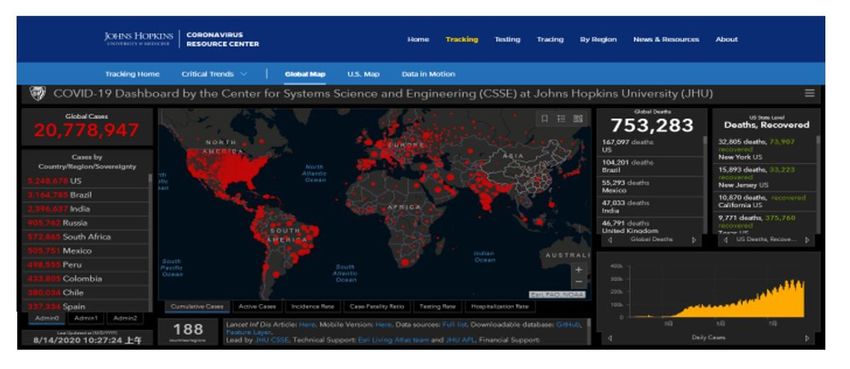
Abstract
Background

A novel coronavirus (2019-nCOV) has attracted worldwide attention since December 2019 when it
appeared in Wuhan, China. The coronavirus disease (COVID-19) can cause respiratory distress syndrome
or multiple organ dysfunction syndrome and be life-threatening. Covid-19 incidence can be reduced by
using an outbreak map based on Geoinformatics.

Methods

This article introduces geographic mapping on the Internet and uses epidemic maps such as rank circles,
choropleth rendering, overlay analysis and animation and other technologies to guide people’s behavior,
reduce entry into areas with severe epidemics, and prevent new crowd infections.

Results

By using various epidemic maps, households can reduce the access of people to the epidemic area
(especially travellers to potentially at-risk areas), reduce the possibility of COVID-19 infection, and
facilitate the timely diagnosis and treatment of fevered patients or suspected COVID-19.
In addition, public health managers can intuitively understand the dynamics of the epidemic and spatial
analysis of trends in outbreak dynamics and COVID-19 patterns helped to assist the public health sector
and to evaluate/revise current control measures.

Conclusion

The purpose of these online epidemic data collect and visualize is to notify travellers and assist the
public or to analyzing the spatial and current trends and patterns of COVID-19 for public health
authorities in assessing/revising current control measures.

Introduction
COVID-19 is caused by the coronavirus pathogen, and it is currently the main infectious disease
worldwide. A group of patients with unexplained pneumonia in Wuhan, Hubei Province, China, was
con rmed to be infected with a novel coronavirus in December 2019, namely, 2019-nCOV, that was not
found in humans or animals previously . The World Health Organization (WHO) recently named the
resulting disease, which has become a global problem, COVID–19. This is an atypical form of pneumonia
that is highly infectious and potentially lethal and which begins with deceptive common u-like
symptoms. People usually have symptoms like fever, cough, or both at the beginning of infection. If the
disease cannot be controlled in time, it will become further exacerbated, cause severe pulmonary
infection and even respiratory failure that may be life-threatening[1,2]. Similar to the case for other
coronavirus infections, the COVID-19 pneumonia has been con rmed of human-to-human transmission
in case reports[3]. Since then, the disease has quickly spread along international routes[4], and the
                                                   Page 2/15
exponential growth of COVID-19 cases prompted the WHO to issue a warning to the world in January
2020[5]. From the end of 2019 to the rst half of 2020, when the epidemic was at its worst, COVID-19
negatively affected all aspects of people's daily life, such as society, economy, transportation, work,
tourism, school and family[6,7]. In December 2019, the WHO announced that it was not calling for
restrictions on travel anywhere but would advise individuals to delay travel to dangerous areas until a
later date.
Perhaps there are few things more inherently "geographical" than the epidemic spread study and control
of a variety of appropriate scales. Geoinformatics is the science and technology of gathering, storing,
visualizing, analyzing, interpreting, modelling, distributing and using spatially referenced (geographically
referenced) information[8]. Geoinformatics plays an signi cant role in the research and e cient control
of epidemics, from geographic mapping to epidemiological modelling and location-based data visualized
alerting. This also applies equally to the global outbreak of COVID-19 in 2019. During the COVID-19
outbreak, the general public, travelers and public health decision-makers can use a carefully planned and
designed online epidemic map to understand the epidemic situation quickly, avoid entering severe
outbreak areas, and reduce the chance of infection. When designing and implementing epidemic control
strategies or issuing and updating travel advisories and advice to the general public, such type of support
is vital for making effective decisions.
Materials And Methods
First, users and health decision-makers can conveniently access the latest epidemic data as quickly as
possible by visiting the COVID-19 Dashboard by the Center for Systems Science and Engineering (CSSE)
at Johns Hopkins University (JHU) at https://coronavirus.jhu.edu/map.html. The data are based on the
World Health Organization (WHO), Centers for Disease Control (CDC) of the United States, and CDC of
China. Secondly, users can visit the WHO epidemic website online at https://covid19.who.int/ to
understand the epidemic situation in various countries and regions around the world and analyze the
trends of the epidemic. The data are reported by national health institutions and Centers for Disease
Control and Prevention in each country. The JHU's COVID-19 Dashboard and the WHO's epidemic map
include data on the number of con rmed, dead and cured cases in countries around the world as well as
data charts and bars. The global epidemic map is easy to use. Furthermore, people can also download
the Baidu Map app on their mobile phones in China and search for outbreaks using keywords of the
surrounding areas. To prevent or reduce the number of health personnel entering areas with severe
outbreaks, patients with a fever can also conveniently nd a fever clinic for timely diagnosis and
treatment as soon as possible.
Results
We can access the epidemic map to understand the global epidemic and control status to guide our work
and life. Here are the results of a dynamic online observation of COVID-19.
Page 3/15Web-based COVID-19 datasets and maps: availability and features
In this article, we review several cartographic charts of COVID-19 on the Internet. The Internet is the only
source of reliable and real-time information on COVID-19 offered by the WHO and other o cial health
bodies. It constitutes of the latest COVID-19 case counts and lists of affected areas etc. which reviewed in
this article (Table).
Table Examples of frequently updated COVID-19 datasets on the Internet (WHO, CDC, and China
Department of Health)*
URL Description
https://covid19.who.int/ Number of con rmed cases of COVID-19 globally
https://covid19.who.int/ Global death toll from COVID-19
https://coronavirus.jhu.edu/map.html Number of con rmed and death cases of COVID-
19 globally
https://covid19.who.int/region/amro/country/us Number of con rmed COVID-19 patients in the
United States
https://covid19.who.int/region/amro/country/us Deaths from COVID-19 in the United States
https://covid19.who.int/region/wpro/country/cn Number of con rmed COVID-19 patients in China
https://covid19.who.int/region/wpro/country/cn Deaths from COVID-19 in China
*The table contains websites with WHO and Johns Hopkins University epidemic map data. You can check
the website for information on the situation of the global epidemic.
Map of COVID-19 outbreaks
1. Examples of geographic mapping of COVID-19 by the WHO
Regarding an example of geographic mapping by the WHO for COVID-19, when COVID-19 emerged in
December 2019, the WHO began to publish a daily map of the world's outbreaks and total number of
reported possible cases on its world map (COVID-19 website). Examples of these epidemic maps are
available from https://covid19.who.int/. On these maps, areas and countries that have not been affected
by COVID-19 are marked in white, and countries and areas that have been affected by COVID-19 are
marked in blue (Fig.1). On these epidemic maps, the cumulative number of reported cases is re ected by
the size of the blue circles in the affected country/region (the larger the circles indicate more COVID-19
cases), and the number of infected cases can be displayed at the location selected by the cursor. The
number of deaths is represented in orange, and an epidemic map of the number of deaths is also drawn
(Fig.2) at https://covid19.who.int/. A larger circle indicates more cases, and a convenient toolbar provides
the functionalities of the standard Arc View GIS desktop interface (for example, pan out, mark, zoom in,
Page 4/15zoom out, measure, display the speci c number of infections or deaths, etc.) as well as histograms and
trend graphs of various countries for COVID-19 (Fig.3 and Fig.4).
2. Examples of geographic mapping of COVID-19 by Baidu, Inc.
In addition, in view of the novel pneumonia, Baidu, Inc. (Baidu), has an emergency online China outbreak
map and maps of fever clinics and community outbreaks based on the o cial data of the Chinese Health
Committee; users have the ability to click in the app "layer - medical map - fever clinics or epidemic
village" to enter and view all nearby fever outpatient services of medical institutions (Fig.5). This
information helps individuals avoid going to the wrong hospital and delaying treatment. Through the
Baidu heat map at http://i7q.cn/6pXt24, the real-time population ow density of the region can be seen,
and individuals can thus try to avoid going to business districts, transportation hubs and other crowded
places. The upgraded Baidu "epidemic area" thematic map (Fig.6), after waiting for the user to enter, can
be based on a user location intelligent popup "surrounding epidemic card" showing the number of
epidemic sites in the current city (http://i7q.cn/6xtFZv), the number of epidemic sites within 1 km, the
number of epidemic sites within 3 km, the name of the nearest epidemic site and the crowd gathering
places of the epidemic site as well as other multidimensional real-time information brie ngs to facilitate
users in quickly understanding the situation of the surrounding epidemic and performing epidemic
prevention work in a timely manner. As of February 12, 2020, Baidu has completed an online "epidemic
area" map of more than 200 cities. On the other hand, during the critical period of epidemic prevention
and control, knowing the detailed data sources of the communities with con rmed cases and the places
where people gather is also necessary.
3. Examples of geographic mapping of COVID-19 by Johns Hopkins University
Finally, one of the most famous outbreak maps is the COVID-19 dashboard developed by the Center for
Systems Science and Engineering (CSSE) at Johns Hopkins University (JHU)
https://coronavirus.jhu.edu/map.html. JHU is home to some of the world's top schools of medicine,
public health, bioengineering and space sciences. With the novel coronavirus becoming viral around the
world, transparent and real epidemic data are drawing much attention (Fig.7). JHU's real-time epidemic
map stands out among many real-time visualization data release platforms and has become the main
channel for countries to obtain epidemic data. Seeing the rising numbers on the map of the epidemic
may play a role in keeping people at home. This is the most effective way to stop the spread of infectious
diseases.
Discussion
The role of geoinformatics in epidemics
Since the rst maps were used by Dr. John Snow in 1854 to trace the origin of a cholera outbreak in
London's Soho district, carefully planned and designed maps have evidently been very powerful decision
support and spatiotemporal analysis tools[9]. Geoinformatics is the science and technology of collecting,
Page 5/15storing, analyzing, interpreting, visualizing, modeling, distributing and applying spatial reference
information (GIS)[10]. Geoinformatics plays an important role in epidemiological research and response
during epidemics, from geographic mapping to epidemiological modeling and location-based alert
services[11,12]. These aspects also apply to the global outbreak of COVID-19 in 2019 (Table). During the
global outbreak of COVID-19, WHO, JHU and Baidu used science and technology such as geoinformatics
and computers to comprehensively map the epidemic. Outbreak maps are useful to the general public,
travelers, and public health policy-makers and at-risk local residents as visual surveillance to monitor the
trend of COVID-19 and patterns over time so as to make the right judgments and avoid entering serious
epidemic areas, providing a dynamic basis for health policy makers to adjust schemes for controlling the
outbreak. This support is vital for publishing and updating travel restriction or designing and following
epidemic control strategies when making informed decisions .
The function, characteristics and role of the epidemic map during the COVID-19 outbreak
In the era of the Internet, COVID-19 is the world's leading infectious disease, and it takes full advantage of
international air travel to spread rapidly. Geoinformatics plays a signi cant role in the research and
control of global outbreaks, such as COVID-19, from geographic mapping to location-based alerting
services. Thus the carefully designed maps based on big data collection and visualization should be the
most powerful decision support and spatiotemporal analysis tools.
The epidemic map intuitively expresses the changes and current situation of the epidemic situation. It is
an interweaving and collision of database science and surveying and mapping science. By studying the
spatial distribution of patients, we can assess the epidemic situation, transmission mode and epidemic
process and determine the prevention and control measures of infectious diseases through policies. The
COVID-19 outbreak map website can be visited for global data on active cases, convalescence, morbidity,
mortality (%), and so on. The Johns Hopkins Coronavirus Resource Center allows experts to help advance
understanding of the virus, inform the public, and advise policymakers in order to implement effective
measure, improve care, and save lives. By visiting Baidu epidemic map in China, we can not only
understand the epidemic situation around us but also guide patients to the nearest fever clinic in a timely
manner so as not to delay treatment.
Compared with other publishing media, web-based online maps also allow for interactivity to be
incorporated into the maps (desktop-like GIS functionality, e.g., drilling down and zooming), and for more
wider and rapid dissemination of information, besides the well-known feature of frequent, real-time
updates based on the latest datasets. In this paper, we have reviewed several geographic mapping efforts
for COVID-19 on the Internet. A variety of techniques, such as graduated pie charts, graduated circles,
choropleth rendering, thematic mapping, buffering, overlay analysis and animation, were employed in the
maps described in this article, to visually monitor and pay attention to the patterns, trends and changes
with time hidden in large datasets (such as the COVID-19 dataset) for public health decision-makers,
travelers and local populations at risk.
Page 6/15In addition, the COVID-19 Dashboard developed by Johns Hopkins University has the characteristics of
truthful, transparent and timely updated data, thus becoming the main channel for countries to obtain
epidemic data. This article provides some detailed mapping information down to each subdivision of the
major cities by Baidu. Therefore, as described in this paper, web-based maps provide the following
informatization features absent in traditional paper-based maps: (1) interactivity (for example, map
querying, drilling down and scaling, measuring distances, and so on); (2) a map that can be updated
quickly and frequently according to the latest dataset; (3) a map that is real, transparent, intuitive and
convenient; and (4) wide dissemination to a large audience.
This study describes the mapping of COVID-19 outbreaks based on geographic information science
combined with multidisciplinary related technologies widely used in the global outbreak of COVID-19. The
widespread use of epidemic maps is critical to raising global awareness on an overall level and tracking
epidemic control strategies or issuing updates on future steps. Additionally, it also provides convenience
for the general public and enables better decisions to be made in preventing infection.
Conclusion
The purpose of these online epidemic mapping services is to educate travellers and assist the public or to
analyzing the spatial and current trends and patterns of COVID-19 for public health authorities in
assessing/revising current control measures.
Declarations
Acknowledgments
The authors would like to thank WHO, Johns Hopkins University, and Baidu for their contribution to
controlling the outbreak. This project was partly funded by the Natural Science Foundation of Hainan
Province of China (Contract No. 318MS133) thanks to the Department of Science and Technology of
Hainan Province.
Authors’ contributions
manuscript review and contribute (Yijun Yang,Yingai Zhang); Study design and original writing (Yufang
Cao); acquisition and apply of data and language processing and polishing (Rui Qiu); Information
collection ( Chao Ji, Zhidian Wu).
Ethics approval and consent to participate
Not applicable.
References
Page 7/151. Jianhui Wang, Hongbo Qi, Lei Bao, Fang Li, Yuan Shi. A contingency plan for the management of the
2019 novel coronavirus outbreak in neonatal intensive care units. Lancet Child Adolesc Health.
2020;4(4):258-259. https://doi.org/10.1016/
2. Jun Chen, Tangkai Qi, Li Liu, Yun Ling, Zhiping Qian, Tao Li, et al. Clinical Progression of Patients
With COVID-19 in Shanghai, China. J Infect. 2020;80(5):e1-e6. https://doi:10.1016/ jinf.2020.0 3.004.
3. Chan JF, Yuan S, Kok KH, To KK, Chu H, Yang J, et al. A familial cluster of pneumonia associated
with the 2019 novel coronavirus indicating person-to-person transmission: a study of a family
cluster. 2020;15;395(10223):514-523. https://doi:10.1016/S0140-6736(20)30154-9.
4. Lidia Morawskaa, JunjiCaob. Airborne transmission of SARS-CoV-2: The world should face the
reality. Environment International. 2020;10;139:105730. https://doi:10.1016/j.envint.2020.105730.
5. Shi Zhao, Qianyin Lin, Jinjun Ran, Salihu S Musa, Guangpu Yang,et al. Preliminary estimation of the
basic reproduction number of novel coronavirus (2019-nCoV) in China, from 2019 to 2020: A data-
driven analysis in the early phase of the outbreak.Int J Infect Dis. 2020;92:214-217.
https://doi:10.1016/j.ijid.2020.01.050.
6. Chih-Cheng Lai, Tzu-Ping Shih, Wen-Chien Ko, Hung-Jen Tang, Po-Ren Hsueh. Severe acute
respiratory syndrome coronavirus 2 (SARS-CoV-2) and coronavirus disease-2019 (COVID-19): The
epidemic and the challenges.Int J Antimicrob Agents. 2020;55(3):105924. https://doi:10.1016/
ijantimicag.2020.105924.
7. Huihui Wang, Xuemei Li, Tao Li, Shubing Zhang, Lianzi Wang, et al. The genetic sequence, origin, and
diagnosis of SARS-CoV-2. Eur J Clin Microbiol Infect Dis . 2020;39(9):1629-1635.https://doi:
10.1007/s10096-020-03899-4.
8. BoulosMN, Roudsari AV, Carson ER. Health Geomatics: An Enabling Suite of Technologies in Health
and Healthcare (Methodolical Review). J Biomed Inform. 2001;34:195-219. https://doi:10.1006/jb
2001.1015.
9. Gańczak John Snow and cholera--the bicentenary of birth. Przegl Epidemiol. 2014;68:89-92, 169-
71.https://pubmed.ncbi. nlm.nih.gov/25004638.
10. Shaw N, McGuire S. Understanding the Use of Geographical Information Systems (GIS) in Health
Informatics Research: A Review. J Innov Health Inform. 2017;24:940.https://doi:10.14236/jhi.v 940.
11. Boulos MN, Roudsari AV, Carson ER. Health Geomatics: An Enabling Suite of Technologies in Health
and Healthcare (Methodolical Review). J Biomed Inform. 2001;34:195-219.https://doi:
10.1006/jbin.2001.1015.
12. Norström M, Geographical Information System (GIS) as a Tool in Surveillance and Monitoring of
Animal Diseases. Acta Vet Scand Suppl. 2001;94:79-85.https://doi:10.1186/1751-0147-42-s1-s79.
Figures
Page 8/15Figure 1
WHO world map of COVID-19. Web browser screenshot of the WHO world map of COVID-19 displaying
data for each country affected by COVID-19 as of 16 April 2020. https://covid19. who.int/. As the cursor
is moved over a country, a tool tip appears with the cumulative number of reported cases. Note: The
designations employed and the presentation of the material on this map do not imply the expression of
any opinion whatsoever on the part of Research Square concerning the legal status of any country,
territory, city or area or of its authorities, or concerning the delimitation of its frontiers or boundaries. This
map has been provided by the authors.
Page 9/15Figure 2
WHO world map of COVID-19. A web browser screenshot of the WHO's COVID-19 outbreak map shows
the cumulative number of COVID-19 deaths in each country as of 16 April 2020. https://covid19.who.int/.
As the cursor is moved over a country, a tool tip appears with the cumulative number of deaths.Note: The
designations employed and the presentation of the material on this map do not imply the expression of
any opinion whatsoever on the part of Research Square concerning the legal status of any country,
territory, city or area or of its authorities, or concerning the delimitation of its frontiers or boundaries. This
map has been provided by the authors.
Page 10/15Figure 3
Based on the trend graphs divided by country or region, the number of con rmed cases on a certain day
can be displayed by cursor selection and further clicking to enter the country to view the detailed
epidemic situation. https://covid19.who.int/. Note: The designations employed and the presentation of
the material on this map do not imply the expression of any opinion whatsoever on the part of Research
Square concerning the legal status of any country, territory, city or area or of its authorities, or concerning
the delimitation of its frontiers or boundaries. This map has been provided by the authors.
Page 11/15Figure 4
WHO has drawn a bar chart of the epidemic situation divided by country or region, and it can be selected
by the cursor to display the number of con rmed cases and the number of deaths as well as the
cumulative number of con rmed cases and deaths.
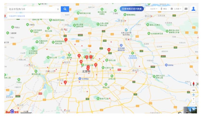
Page 12/15Figure 5
The graph shows the fever clinics in Beijing drawn by Baidu. The red data points indicate the locations of
the fever clinics. People can choose the nearest fever clinic to ensure that they are diagnosed and treated
as soon as possible. http://i7q.cn/6pXt24.
Page 13/15Figure 6
The picture shows a map drawn by Baidu of the "epidemic area" in Wuhan marked in red to warn the
public of isolation and facilitate government response. http://i7q.cn/6xtFZv.
Figure 7
The picture shows a map drawn by JHU of the global "epidemic area" marked in red to warn the public of
isolation and facilitate government response. https://coronavirus.jhu.edu/map.html. Note: The
Page 14/15designations employed and the presentation of the material on this map do not imply the expression of
any opinion whatsoever on the part of Research Square concerning the legal status of any country,
territory, city or area or of its authorities, or concerning the delimitation of its frontiers or boundaries. This
map has been provided by the authors.
Page 15/15You can also read