The Role of Visual Elements in Delivering a Message - Case Study: Sustainable Development Exercise Book, LiiKe - Bachelor's thesis Visamäki ...
←
→
Page content transcription
If your browser does not render page correctly, please read the page content below
The Role of Visual Elements in Delivering a Message
    Case Study: Sustainable Development Exercise Book, LiiKe

                       Bachelor’s thesis

            Visamäki, Degree programme in Design

                          Spring 2019

                      Anastasia Olkhovich
TIIVISTLMÄ

Muotoilun koulutusohjelma
Visamäki

Tekijä                      Anastasia Olkhovich                       Vuosi 2019

Työn nimi                   Visuaalisten elementtien rooli viestin perille saamisessa
                            painomediassa tapaustutkimuksessa: Kestävän Kehityksen
                            Liikuntakirja, LiiKe

Ohjaaja                     Pirjo Seddiki

TIIVISTELMÄ

              Opinnäytetyön aiheena on LiiKe ry:n Kestävän Kehityksen Liikuntakirjan
              taiton suunnittelu. Työn pääkysymys on visualisten elementtien rooli
              viestin perille saamisessa painomediassa tapaustutkimuksessa ja se, mitkä
              elementit edistävät sitä parhaiten. Kestävän Kehityksen Liikuntakirja on
              käytännöllinen ohje liikunta-alan opiskelijoille siitä, kuinka kestävä kehitys
              voi opettaa lapsille urheilun kautta.

              Työllä on kaksi päämäärää, toinen käytännöllinen ja toinen teoreettinen.
              Käytännöllinen päämäärä on taitto, joka vastaa asiakkaan ja kohderyhmän
              tarpeisiin. Teoreettinen päämäärä on visuaalisten elementtien ja niiden
              rooli viestinnässä tässä tapaustutkimuksessa osoittaminen, sekä oikeiden
              elementtien ja niiden muotonsa tähän taittoon löytäminen.

              Työn rakenne seuraa projektin prosessia, se alkaa tapaamisesta työryhmän
              ja asiakkaan kanssa, jossa määriteltiin aikataulut, asiakkaan toiveet ja
              kohderyhmä. Sen jälkeen käydään läpi luovan prosessin käytännöllisiä ja
              teoreettisia aspekteja ja perustellaan tehtyjä ratkaisuja (muun muassa
              kuvat ja typografia).

              Työn lopputuloksena on 64 sivua sisältävä valmis taitto ja teoreettinen
              tutkimus, joka vastaa kysymykseen visuaalisten elementtien roolista
              tämän kirjan viestinnässä.

Avainsanat Graafinen suunnittelu, viestintä, typografia, taitto, visuaaliset elementit

Sivut         29 sivua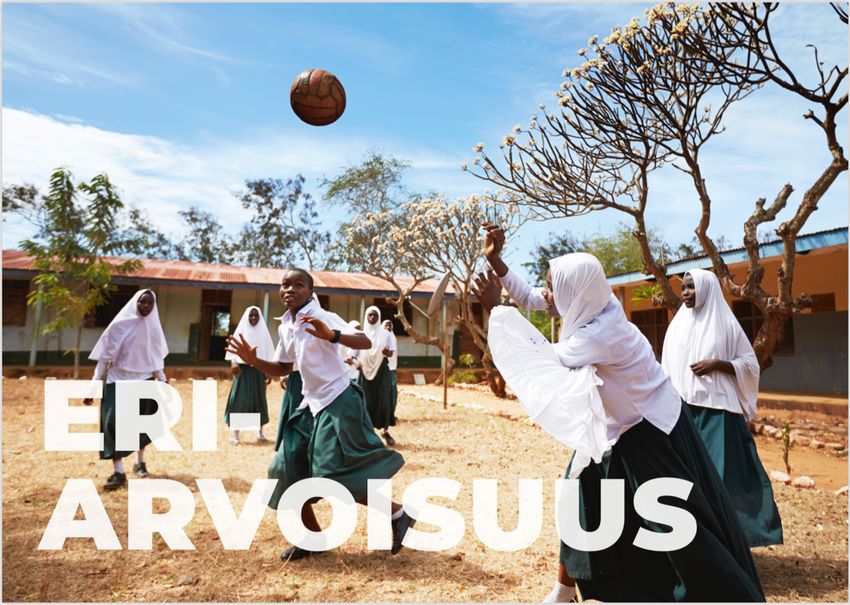
ABSTRACT

Degree programme in Design
Visamäki

Author                    Anastasia Olkhovich                       Year 2019

Subject                   The role of visual elements in delivering a message, case
                          study: Sustainable Development Exercise Book, LiiKe

Supervisor                Pirjo Seddiki

ABSTRACT

             This thesis examines the role of visual elements in delivering a message in
             print media in a case study. The aim is to produce a booklet layout. The
             client’s NGO Liike booklet is a practical guide for physical education
             students to introduce sustainable development to children by means of
             sports. The aim of the work is to identify the role visual elements play in
             delivering a message in the case study, as well as deciding which
             tools/elements would promote it best.

             The work has two goals, practical and theoretical. The practical goal is the
             actual product, the layout that would satisfy the client by addressing their
             needs. Since the product is an educational booklet or guide, it is crucial to
             first analyze the target group in order to create a design meeting their
             needs. The theoretical goal is to recognize the role of visual elements in
             delivering a message in the case study, identify the relationship between
             visual elements and text, and find the tools and elements that should be
             used in the booklet to promote a visually balanced layout.

             The structure of this thesis follows the design process, starting with the
             brief held in the beginning of the project, where the timetables were set,
             the customer’s goal discussed, and target group defined. After that the
             process of building the layout is discussed, its theory and practical aspects
             – including its structure, elements used (such as images and typography),
             as well as the anatomy of page and theory of message design.

             As an outcome there is a 64-pages booklet with a balanced layout and a
             theoretical research answering the question asked in the beginning about
             the role of visual elements and their efficient use in the end product.

Keywords     Graphic design, layout, visual elements, message design, typography

Pages        29 pages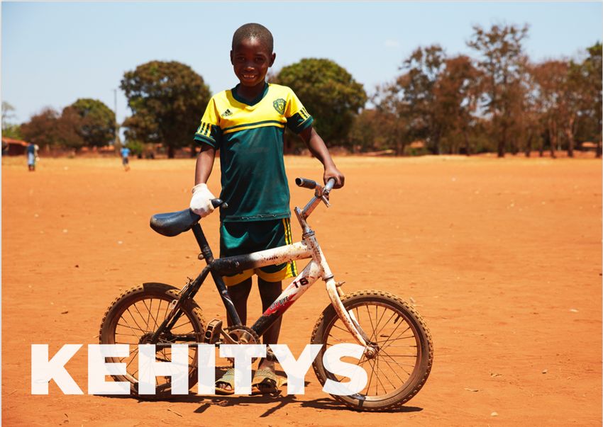
CONTENTS

1 INTRODUCTION........................................................................................................ 1
    1.1    Personal interest in the topic ........................................................................... 1
    1.2    Introducing the client ....................................................................................... 2
    1.3    Research problem ............................................................................................ 2
    1.4    Process flowchart............................................................................................. 3
    1.5    Terminology ..................................................................................................... 3

2 SUSTAINABLE DEVELOPMENT EXERCISE BOOK ......................................................... 4
    2.1 The case study ................................................................................................. 5
        2.1.1 Participating parties and their roles ...................................................... 5
        2.1.2 Brief: Sustainable Development Exercise Book ..................................... 5
    2.2 Target group .................................................................................................... 6
    2.3 Practical and theoretical goals ......................................................................... 7

3 BUILDING THE LAYOUT: THEORY AND PRACTICE ...................................................... 7
    3.1    Elements to work with ..................................................................................... 7
    3.2    Using photographs in message design.............................................................. 8
    3.3    Versions of the format and information cards ................................................ 10
    3.4    Type as a graphical element ........................................................................... 13
           3.4.1 Typography of Group 1 ....................................................................... 14
           3.4.2 Typography of Group 2 ....................................................................... 16
           3.4.3 Typography of Group 3 ....................................................................... 18
    3.5    Anatomy of the page ..................................................................................... 19
    3.6    Cover ............................................................................................................. 23
    3.7    Printing .......................................................................................................... 25
    3.8    Output of the project ..................................................................................... 26

4 CONCLUSIONS AND REFLECTION............................................................................ 26

REFERENCES ............................................................................................................... 28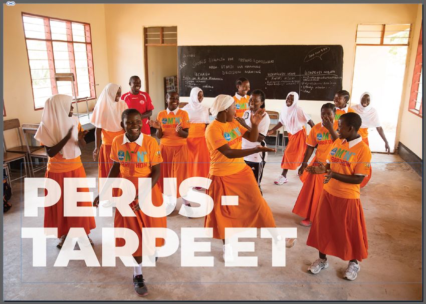
1

1     INTRODUCTION

             The theme of the thesis is a role of visual elements in delivering a message
             in print media in a case study, whose purpose is a booklet layout. The
             client’s NGO Liike booklet is a practical guide for physical education
             students to introduce sustainable development to children by means of
             sports.

             The thesis consists of four chapters. The first of them is introduction, in
             which the background of the project is observed, a frame of reference set
             as well as the process as a whole is viewed. The second part describes in
             detail the case study and sets practical and theoretical goals for the thesis.
             In the third chapter the process and the theory behind it is observed, as
             well as the final product. The last fourth chapter is dedicated to reflection
             and conclusions.

1.1   Personal interest in the topic

             There is a number of criteria behind choosing this particular theme: first of
             all, the author was interested in participating in a practical project with
             other participating parties (i.e. a client). Another objective was the
             project’s relation to graphic design – as a glass and ceramic design student
             with graphic design as minor studies, the author felt it important to add a
             research project to her graphic design portfolio. One more reason for
             choosing this particular project was its relation to the author’s second
             minor studies in development cooperation.

             There was, however, one more reason to choose this project. As a
             designer, the author has pondered in the past few years upon philosophy
             and the reasons behind the work in the field of design and arts. She
             questioned the “whats” and “whys” and even wondered if it would be
             better for the society to get yet another, different qualification and be of
             more use then. There are many aspects to these questions, but she came
             to the conclusion, that, first of all, we as humans, need aesthetics and
             beautiful things in our surroundings; second, the products designers create
             may very well be functional; third, every single person on Earth justifies
             somehow what they do, and designers can do even better by writing their
             public designers’ statements where they talk about their values and
             principles; and finally, and this is what she hopes this work is, designers
             can apply their skills in interdisciplinary fields that need a little help with
             visual representation of work or creating a nice “package” for a concept or
             a product .
2

1.2   Introducing the client

             As mentioned earlier, this project has several participating parties.
             Creative agency Måndag, the client – NGO LiiKe and a graphic designer.
             Måndag is a creative agency located in Helsinki, that specializes on social
             impact. It was leading the project. The client is Liikunnan Kehitysyhteistyö
             LiiKe ry, a Finnish NGO that does development cooperation in sports. This
             is one of the Måndag led projects the author has participated in during her
             internship at Måndag.

1.3   Research problem

             The project has two goals – practical and theoretical. The practical goal is
             delivering the client’s message to its target group in the most efficient way.
             This means, first of all, defining the target group and giving as precise
             description of a product they would like, as possible. Then, using existing
             tools, creating a visually balanced layout, in which graphical elements
             (such as photography, typography, icons and colors) deliver the
             information to its final receiver.

             This need for an actual product as an outcome presents us with a research
             problem: identifying the role visual elements play in delivering a message
             in the case study, as well as deciding which tools/elements would promote
             it best. In this work typography and anatomy of the page received the most
             attention.

             Methods used in the thesis are: the case study itself – the process of
             designing the layout for the booklet; constant dialog with the client and
             other parties involved in the project – the copywriter and the project
             manager; inevitable part played theoretical research, including articles on
             visual literacy and message design published by Professor Rune Pettersson
             of International Visual Literacy Association, and books “Kuvan ja sanan
             vuorovaikutus” by Kai Mikkonen, “Graphic Design Theory: Readings from
             the Field” edited by Helen Armstrong, “Baiscs Typography 02: Using Type”
             by Michael Harkins, as well as “Basics Design Layout. 2nd edition” by Gavin
             Ambrose and Paul Harris among others.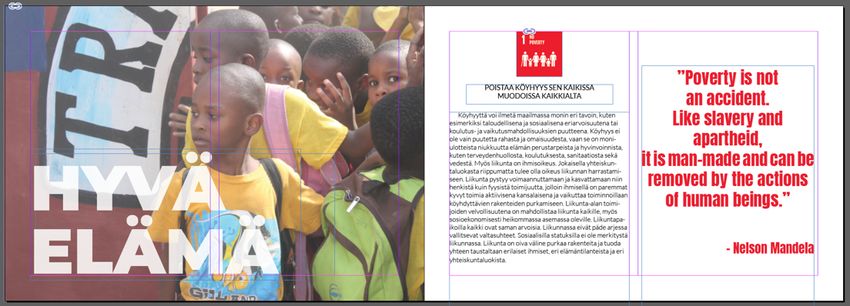
3

1.4   Process flowchart

            Below is the process flowchart that shows the main phases of work on the
            project with arrows showing their sequence and grey boxes containing
            some keywords of the respective phase.

                                            Defining:
                    Brief with the          • goals
                      customer              • desired product
                                            • target group

                                            •   target group
                      Research              •   theory                    Writing
                                            •   visual elements

                      Sketching                                         Print ready

                                                 Refining the          Final product
                      Feedback
                                                   design

                Figure 1.         Process flowchart

1.5   Terminology

            Visual literacy – according to Rune Pettersson (2001) a recent operational
            definition of visual literacy provided by Avgerinou (2000) is that “in the
            context of human, intentional visual communication, visual literacy refers
            to a group of largely acquired abilities, i.e. the abilities to understand
            (read), and use (write) images, as well as to think and learn in terms of
            images.”

            Message design – comprises analysis, planning, presentation and under-
            standing of a message — its content, language and form. Regardless of the
            selected medium, a well-designed message will satisfy aesthetic,
            economic, ergonomic, as well as the subject matter requirements.
            (Pettersson 2001)

            Narratology is a humanities discipline dedicated to the study of the logic,
            principles, and practices of narrative representation. Dominated by
            structuralist approaches at its beginning, narratology has developed into a
            variety of theories, concepts, and analytic procedures. Its concepts and
            models are widely used as heuristic tools, and narratological theorems play
4

          a central role in the exploration and modeling of our ability to produce and
          process narratives in a multitude of forms, media, contexts, and
          communicative practices. (Meister, 2011)

          Typeface family is a collection of typefaces (for example, regular, italic and
          bold versions of a typeface) designed to work together and usually sharing
          common attributes across related variants (Harkins, 2015, p. 172).

          Display font is a font that has been designed to work at large point sizes.
          These can often have decorative qualities or details that at small point sizes
          may not render well. (Harkins, 2015, p. 169)

          Layout is the arrangement of text and images according to a plan and to
          provide the appearance of the printed page (Ambrose & Harris,
          2012, p. 166).

          Grid is a guide or a template to help obtain design consistency (Ambrose
          & Harris, 2012, p. 166).

          The term em, or em space stands for a unit of relational measurement.
          Traditionally, the em is defined as the body width of the upper-case M in
          any given typeface and point size. It can be thought of simply as the current
          point size in use. (Harkins, 2015, p. 169) For example, in this thesis the body
          text is set to twelve points, which means that em is twelve points as well.

          Kerning is the adjustment of horizontal space between individual
          characters in typographic setting (Harkins, 2015, p. 170). It is measured in
          font units, in particular a thousand’s fraction on an em (1000 units/em).

2   SUSTAINABLE DEVELOPMENT EXERCISE BOOK

          Non-governmental organization LiiKe – Sports and Development was
          established in Finland in 2001. The main purpose of the organization is to
          develop the lives of children and youth living in developing countries
          through sport and health education. Sport is the main tool used in all the
          development cooperation projects that LiiKe establishes together with its
          counterparts. During the fifteen years of action in Tanzania LiiKe has
          among other things built and maintained hundreds of sports’ fields to
          governmental schools and equipped them with balls, nets, goalposts,
          books, rackets etc. (Liike n.d.)

          Sustainable Development Exercise Book is a project aimed at providing
          physical education students and professionals with a practical guide on
          United Nations’ 2030 Agenda for Sustainable Development and its
          seventeen Sustainable Development Goals, so that they can, by means of
          sports and game, teach it to children in Finland.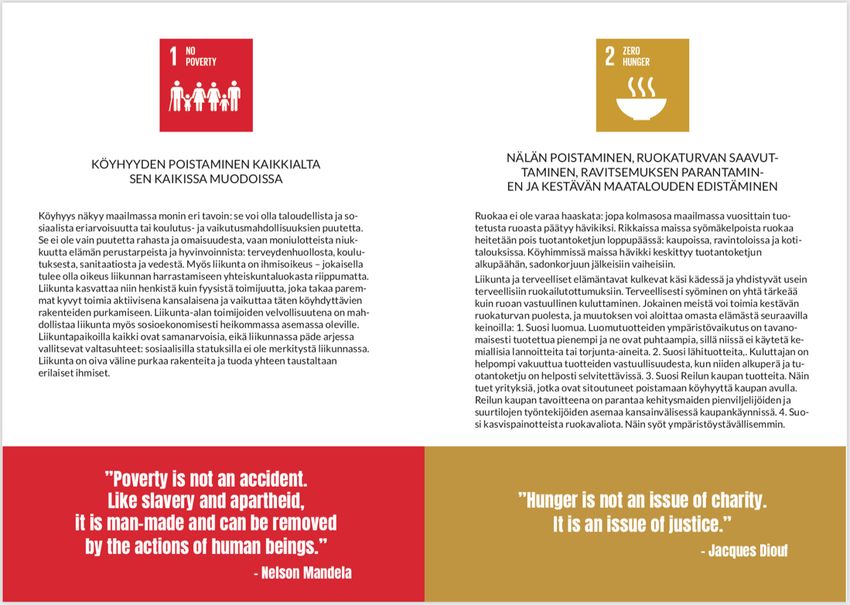
5

2.1   The case study

             The project started in January 2019 with a meeting of all the parties where
             major details and goals were defined, the timetable was set, and the
             implementation plan was made.

2.1.1 Participating parties and their roles

             There are several participants in the project:

                 •   Non-governmental organization LiiKe – Sports and Development,
                     the client who initiated the project, categorized the Agenda 2030
                     goals into six chapters and had created a set of physical games and
                     activities to be included in the booklet, matching the themes of the
                     chapters.
                 •   Måndag creative agency is coordinating the project from its first
                     drafts to the final stage where it is sent to print. Two Måndag
                     employees are fully involved in the process – a copywriter, who is
                     proofreading all the texts, as well proposing corrections to the
                     content; and Måndag’s CEO who is leading and coordinating the
                     project.
                 •   A graphic designer, whose role is to design a visual package for the
                     product (the booklet).

2.1.2 Brief: Sustainable Development Exercise Book

             During the first meeting the client introduced us to the kind of work the
             NGO has been doing and the reasons for creating this booklet. The
             project’s background and main goals were discussed, the target group was
             defined and the timeframe for the execution of the project was
             established.

             The book is built around Agenda 2030’s seventeen Sustainable
             Development Goals (Figure 2), they are thematically grouped into six
             chapters, two – three goals in each chapter. Every Goal is introduced in the
             form of an information card, which has a text and a quote from some of
             influential historical and political figures. Each chapter has a few active
             thematic games, that would teach children about the importance of
             particular aspects of sustainable development.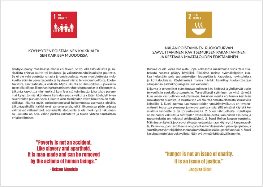
6

                Figure 2.    UN Agenda 2030 Sustainable Development Goals (n.d.)

            Some of potential problems of designing the layout for the booklet were
            discussed. One of such problems was the amount of text: the booklet has
            to be handy, easy to use, it has to be engaging, interesting and dynamic,
            and pages of bare text can be an obstacle. LiiKe had several documents
            ready to use in the project: the information cards with quotes, two
            documents with games and exercises and a folder with pictures taken in
            Tanzania during their development cooperation projects there. The job of
            the copywriter and the designer was to find a solution – edit the text and
            reduce its amount where needed and come up with a format that would
            keep the booklet informative, but vibrant, durable and appealing, but
            within a limited budget. The designer was given a free hand in creating the
            layout.

2.2   Target group

            Another problem, or a challenge, was a target group. The consumers of the
            product are mainly physical education students, which makes creating a
            profile of the target group the first task.

            They are young people of sixteen – twenty-eight years old, they are
            energetic and lead an active lifestyle. Most prefer company to solitude.
            Many do not spend much time reading and might have a rather short
            attention span.

            These qualities present us with a problem: how can someone, who does
            not enjoy reading very much, get engaged enough to read through all the
            important information the booklet has to deliver? Defining the kind of final
7
product that would work for the target group is the next step. It has to be
dynamic, captivating, visual – it cannot be plain text; it has to be colourful
and simple. Physical qualities for it to be successful are ease of use,
applicability, durability (since its main purpose is to be used in an active
setting) and size fit to carry around easily.
2.3 Practical and theoretical goals
As was mentioned before, the thesis has both practical and theoretical
goals. The practical goal is the actual product, the layout that would satisfy
the client by meeting their goals. One of the most important criteria of a
successful product is meeting the needs of the target group, the actual
consumer of the product. Which makes defining the target group, figuring
out the product that would work, and, finally, to creating it primary task of
the project.
This leads to the theoretical goal – to recognize the role of visual elements
in delivering a message in the case study, to identify the relationship
between visual elements and the text, and to find the tools and elements
that should be used in the project to promote a visually balanced layout.
3 BUILDING THE LAYOUT: THEORY AND PRACTICE
Considering the project being very practical, it is hard to separate theory
from practice without repeating ourselves, therefore this chapter is
dedicated to the process of creating the layout, as well as to presenting
arguments and ideas behind the decisions made.
3.1 Elements to work with
At the beginning of the project there was a list of contents and several
documents ready to work with: information cards on Sustainable
Development Goals and quotes that go with them, exercises and games
documents and photographs.
The first task was to decide on the structure of the booklet – each chapter
has a theme and includes several information cards, and each chapter is
assigned a few active games. The question was how to arrange them –
would it be better to include the games right after every chapter, or would
it rather be better to make a folder in the end of the booklet where all the
games would be put, printed on separate cards? Or maybe the whole book
should be made in the form of a card game – with information cards all
separate, but colour-coded to match the colour of the chapter they are in,
and games on separate cards as well?8
Figure 3. Double-page spread with an information card on the left
and the first page of the game section following the
chapter
The need to work inside a tight budget made us look for an economical and
efficient decision. It was decided to have the guide in a single booklet,
without extra cards and folders. Due to big amounts of text in the game
section (all games have a storyline and very precise instructions) and a lack
of illustrations or photographs to include in it, it was decided for games to
follow the chapter they are assigned to, but to use tinted paper instead of
white for games section (see Figure 3).
3.2 Using photographs in message design
It is said that visual communication goes back to the cave paintings 30000
years ago (Pettersson 2001). Over the centuries humanity developed other
ways to tell their stories, such as by the means of literature. But visual
literacy still plays an important role in the culture.
According to Pettersson (2001) combined verbo-visual messages should be
considered, not only text and not only visuals when communication and
communication related issues are studied. The aim of the booklet is to
educate and pass down a message about the importance of sustainable
development and, if there are means to fortify the verbal message with
some supporting visuals, it should be done.
The client provided us with a big amount of good quality photographs that
could be used in the booklet. Since there are six chapters in the booklet, it
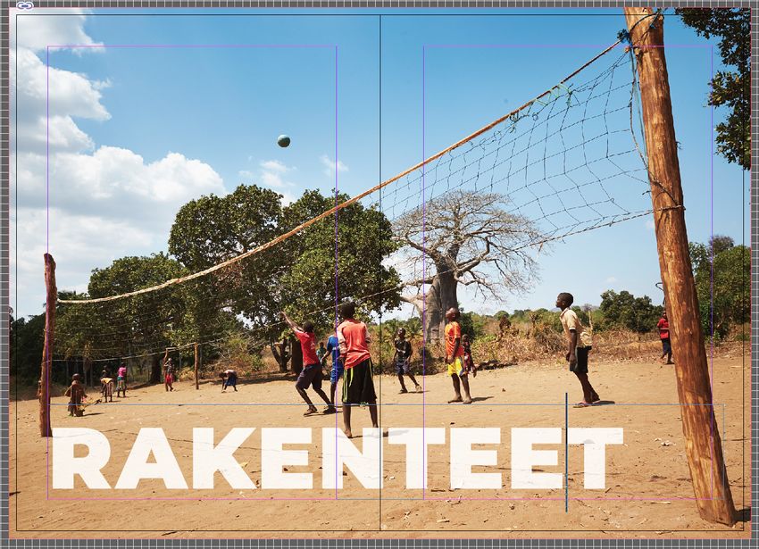
was decided to include a photograph best picturing the theme of every9 given chapter in the beginning of it. The chapters are: Good life, Development, Inequality, Basic needs, Infrastructure and Environment. Each has a story to tell. By using visual aid, it can be enhanced. Figure 4. The fourth chapter of the booklet, Basic Needs Figure 5. The third chapter of the booklet, Inequality
10

             Narratology is a humanities discipline dedicated to different aspects of
             narrative representation. Once thought to be exclusive to the literary
             genre, narratology is viewed more widely today, and considers multitude
             of forms, media and contexts. (Meister, 2011) A picture (painting,
             photograph) can tell, and does tell a story of its own, but as was mentioned
             above, it is best to consider both verbal and visual means of passing a
             message. Therefore, the relationship of words and pictures aimed at here
             is more of a combination and coexistence, if the classification made by
             Hans Lund (1982) and presented in Kai Mikkonen’s book “Picture and
             word”/ “Kuva ja sana” (2005, p. 21) is to be employed.

             According to Mikkonen, the viewer of a picture should take the role of a
             narrator: a picture’s ability to tell a story is largely relying on a viewer’s
             ability to interpret it (2005, p. 193-194). In this case the pictures are
             combined with keywords, that push the reader/viewer into the intended
             direction. For example, Figure 4 is showing the first spread of the fourth
             chapter, the name of which is Basic Needs. The photograph used for this
             chapter is of girls playing some active game during a class in school in
             Tanzania. When the reader (someone who grew up in a developed western
             society, namely in Finland) sees this picture and words BASIC NEEDS
             printed over it in large letters, his mind most certainly goes through
             thoughts like these: what are the basic needs of a human being? what
             needs do we have automatically covered in our society, so that we do not
             even think about them much, but are the same needs people in the
             developing world might be struggling to get access to? access to education,
             education for girls - only 39 percent of rural girls attend secondary school
             according to United Nations statistical reports (UN Women, n.d.)? maybe
             infrastructure and safety?

             The Agenda 2030 goals included in the chapter on basic needs are: Clean
             water and sanitation, Affordable and clean energy and Partners for the
             goals. Most likely, the topics covered by these goals will match and cover
             the reader’s questions and concerns.

3.3   Versions of the format and information cards

             The booklet has to be practical, because the goal for it is to serve as a
             guidebook available to use in an active setting as well, not only in the study
             room. This makes the format a very important criterion. A single
             information card fits neatly into one A5 page, so it was decided that a
             handy size of A5 format is small enough and would serve our purposes.
             Available pictures are best used in a landscape orientation, and several
             options of layout format were tried.
11 Figure 6. Horizontal format version The most logical and technically and economically preferable option was a vertical placement, where one spread constitutes an A4 equivalent of space, or two A5 pages (Figure 7). However, an option with horizontal placement was tried as well (Figure 6). Figure 7. Vertical placement format version A large part of the booklet consists of information cards, therefore it is important, that they are fitting harmoniously into the layout. There are several versions, the first two of which are presented in Figures 6 and 7. In these first versions one card takes space of a whole spread, or two A5 pages. Using that much space for a single information card did not seem appropriate though, therefore a version with all the elements of a card placed on one page was decided to be more preferable (Figure 8). Every card consists of these elements: an icon from UN’s Agenda 2030, a title, a text body and a quote. Since every goal has a different icon with a different colour code, it seemed logical to use this colour in the quote
12

accompanying the goal. There is a number of ways to employ the colour in
a quote. In Figure 6, for example, the quote’s font is the colour of the icon;
another option was to use paper-coloured (white) font on the background
of a solid colour matching that of the icon (Figures 7 and 8).

   Figure 8.      Information card layout version

   Figure 9.      Final design for the information card
13

             During the process of designing the layout constant communication was
             maintained – designer, project manager, copywriter and the client. The
             design was gradually progressing forward with adjustments according to
             the feedback from all the parties. For example, the colour block in which a
             quote is encased in Figure 8 seemed to take too much space visually,
             according to the project manager, and an overall more balanced design
             was preferable, therefore the final version of the information card is one
             where the quote goes in the lower part of the page in the colour of the
             respective icon (Figure 9).

3.4   Type as a graphical element

             As was discussed earlier about photographs, paintings and pictures being
             able to tell a story or emphasise the one told with text, fonts communicate
             with the audience as well. Even if the designers are trying to make their
             work appear as neutral as possible, the fonts they choose will still be
             communicating something, in this case neutrality. Although, it has to be
             noted that the way information is interpreted (especially visual) is very
             subjective and individual, depending on the audience and their personal
             history the same font may appear cool and modern to some, and to the
             others, say, precise and scientific. (Harkins, 2015, p. 146)

             This makes choosing types for the booklet and working with them very
             important, since the booklet is informational and educational – the better
             and the more appropriately this information is presented, the easier it will
             be to take it in and work with it.

             It is a general rule that fonts should be used sparingly to keep the design
             professional and not overcrowded – unnecessary visual noise and
             distractions are not needed in an educational publication. To decide which
             typefaces should be used, first the text should be divided into categories.
             It can be done from the top to the bottom of a chapter: first comes the
             title of a chapter, then there is an icon with a name of the goal typed on it,
             then comes the title of an information card followed by the main body of
             text, after that a quote; lastly, there is the game section with its titles and
             main text. This presents us with a task to differentiate between these
             categories of text but keep the overall appearance simple and unified.
14
Group 1
Group 2
Group 1
Group 2
Figure 10. Text groups
Now that the text is categorized, these categories can be divided into three
separate groups, each of which will have its own font. The first group
includes the main body of text in information cards and the game section,
as well as titles in both the information cards and the game section. The
second group is the text in the icons at the top of information cards and
the quotes at their bottom. (Figure 10). Finally, the third group includes
chapters’ titles.
3.4.1 Typography of Group 1
In the nest few pages each group in examined separately. The first group
contains the most text – it is all the big bodies of text in the information
cards and all of the game section, including the titles of both. It is worth
mentioning here, that the typeface used here is a text type, which might
sound like tautology, but in fact stands for a type intended for continuous
reading. There are some general rules for text typography, such as type
size, which should range between 8pt and 14pt for continuous reading,
depending on the typeface used. When type is bigger than 14pt, the text
appears very large, which makes reading big amounts of text far more
difficult for human eyes. (Harkins, 2015, p. 71) Then there is the issue of
the line length – usually a line length between 50 and 70 characters wide
is considered good. The length of a line affects the speed at which we read
– a shorter line can speed up our reading (this would be useful in
magazines and newspapers, for example, or anywhere a quicker pace of
information digestion is needed), and longer lines, on the other hand, slow
us down, which would be useful in book work, per say, since it may be15
necessary for the reader to take their time to digest the content (Harkins,
2015, p. 129).
When choosing a typeface, its purpose should be carefully thought
through, as well as what it should communicate and how much of a
character the type can have. Can it be strong and how much of an
individuality can be allowed for it to show? A twentieth century writer and
scholar of typography, Beatrice Warde, in her essay “The Crystal Goblet or
Printing Should be Invisible” argued that the main goal of any written text
is thought transference and that the type should not distract the readers
from the content it carries, while illuminating the thoughts and ideas
contained in the written word (Warde, 1930, p. 39). As of late, typographic
approaches tend to return to more formalized and structured approaches,
developing a more pragmatic and open view on typography. The objectives
in choosing typeface are appropriateness, ethical soundness and quality of
communication. (Harkins, 2015, p. 97) A parallel can be drawn between
typography and modern architecture and design – the common
denominator would be the idea of form following function, or minimalism.
Lato Regular, 12pt
all caps
Lato Regular
10pt all caps
Lato Light
10pt
Lato Regular
10pt
Lato Italic
10pt
Figure 11. Fonts of Group 1 of text
Due to a limited budget all of the types used in the project are free open
source Google fonts. Sans serif Lato typeface family is being used for the
Group 1. It has a wide variety of fonts to choose from that work well
together. It was designed in 2010 and is meant to be “transparent” when
used in body text, which is the aiming here, since the goal is for the readers
to concentrate on the content. All the main headings of the information16
cards and the game section are set in Lato Regular 12pt, all capitals. The
main body of text in cards is in Lato Regular 10pt, while the main body of
the game section is in Lato Light 10pt. Subheads of the game section are L.
Regular 10pt, all capitals, while in some games L. Italic is used sparingly in
10pt to differentiate between the game instructions and a storyline, or
questions (Figure 11).
3.4.2 Typography of Group 2
The second group of text is comprised of the quotes and the icon texts of
information cards. Since the colours of the icons’ background are used as
the quote texts colour, another link should be created between icons and
quotes by the use of a similar font. But it is hard to identify for sure what
font is used in icons, because they are ready made images provided by
United Nations and are downloadable form their internet pages. It can be
analysed though and a type baring close resemblance to the font used by
the UN can be found.
The first and the most obvious characteristic of the UN’s font for icon’s text
is that it is a sans serif font used in all capitals. It is a modern condensed
font with even thickness throughout the letters with no stresses – a
monoweight font (Figure 12). Monoweight fonts are inspired by industrial
and post-industrial urban aesthetics and used to create a simple and neat
look, sometimes even primitive (Sadko, 2017).
CLEAN WATER
AND SANITATION
Figure 12. Icon text’s font and Anton type
Now, knowing the main characteristics of the font used in Agenda 2030
icons, a quote font can be searched for. There are many modern fonts
bearing resemblance to that of the one used in icons texts, but the font’s
paring with typeface family used in Group 1 should be taken into
consideration. Google Fonts has a useful feature that shows the popular
parings for any given font available in their database (Figure 13). Typeface17
Anton meets the requirements relatively well. It is a reworking of many
traditional sans serif advertisement typefaces.
Figure 13. Google fonts specimen presentation, n.d.
Let us review the qualities of Anton typeface. For a comparison these two
fonts can be placed next to each other (Figure 12). Anton appears to have
same cap height and width, but is heavier in weight, as if it was a bold
version of the typeface used in the icon. Since Anton is used for quotes, it
will not be used it in all capitals as the font in the icons is used. Also, it will
be used at a larger point size, therefore the difference with the icon’s font
will not be that obvious (Figure 14).
Figure 14. Group 2 fonts18
Looking at individual characteristics of Anton typeface, it can be said that
it is an extra condensed font and has a large x-height, meaning that
lowercase letters are more than three quarters of capital letters, which
makes it an introverted font communicating a feeling of stability and
safety. These same qualities are communicated by its closed aperture
(openness of letters), as well as reliability and security. These kinds of fonts
are often used in politics by conservatives and protectionists and in
advertising for everything related to security and protection. (Sadko, 2017)
Group 2 typography should be considered display typography. It is meant
to draw attention and highlight the central idea of each information card
by emphasizing the statement in the quote. Harmony between the icon
and the quote on the same page is attained by using the same colour and
fonts that work well together.
3.4.3 Typography of Group 3
The third group consists of the chapters’ titles, six altogether. The title is
set upon a photograph that takes a space of a whole spread, or two A5
pages. This immediately translates into a display type, large enough to not
“get lost” on the page, at the same time allowing the image to be well
visible from beneath it.
Display types present us with far more opportunities and freedom to
experiment with the text, play with it, make it individual. Designers have
the power of the form on their hands, for form is charged with the
potential of meaning (Harkins, 2015, p. 102). Michael Harkins in his Basics
Typography 02: Using Type quotes G.W.Ovink: “The typographer …who did
not hit upon the specially appropriate type, will not have done actual harm
to the transmission of the meaning of the text, but missed an opportunity
to intensify the force of impression of the text…” (2015). In the case of this
project there is a combination of the three: text, type and the image they
are placed upon. Hence, there is an opportunity to enrich the meaning
they carry – the story the photographs tell, and the important themes
names of the chapters rise – with the type selection and the form the text
takes.
A typeface chosen for the chapters’ titles is meant to convey the weight
and importance of the themes raised in each chapter, the fact that they
need immediate attention from all of the humanity. The typeface used is
Montserrat. It is a big typeface family, just like Lato, and ranges from
Montserrat Thin to Black, which is the heaviest of the type weight range.
But unlike Lato, Montserrat is used as a display type and at a very large
point size, 100pt. The choice here is the heaviest font of the family –
Montserrat Black. Increased tracking (letter spacing) of twenty (1000/em)
is used additionally.19
Figure 15. The first spread of the second chapter
Montserrat was inspired by urban typography that emerged in the first half
of the twentieth century, its letters are straightforward and non-
negotiable. Using its Black version helps to create a feeling of heaviness
and power. Black font styles are very expressive and are used to provoke
a quick emotional response, and for this reason are often used in games,
advertisement and show business. (Sadko, 2017) This booklet is
educational and informational but is related to a field that often implores
emotional connection, and the problematic topics raised in it are very
emotional themselves.
3.5 Anatomy of the page
The key function of a layout is to let the elements perform the task that
they have been selected for. How well the elements communicate
therefore depends on how they are presented. (Ambrose & Harris, 2012,
p. 108)
Some of the elements incorporated in this work have already been
discussed at length but let us look in detail at a page anatomy. One of the
aspects that assist greatly in any kind of creative work is structure. It helps
to plan better and to see the work as a whole. In graphic design, especially
in book design, it is a grid. Joseph Müller-Brockmann in his essay on “Grid
and Design philosophy” says that using grid is “the expression of a
professional ethos: the designers work should have the clearly intelligible,20 objective, functional, and aesthetic quality of mathematical thinking” (Müller-Brockmann, 1981, p.63). Grids can help in creating a feeling of order, clarity and structure, they can assist in creating hierarchy, accuracy and identity as well. Grid is essentially a set of drawn lines that mark out the areas on a page where text and images can appear. They can be as simple as a set of margins marking out a single text area, or complex multi-column or modular grids – depending on their intended use. Grids normally include margins, columns and gutters. (Harkins, 2015, p. 59) The grid’s composition will differ depending on the effect the designer is trying to achieve. In this work a single column symmetrical grid is used (Figure 16). Symmetrical grids are helpful when there is a need to organize information and to provide a sense of balance across a double-page spread. Text placed into a single-column grid can be hard to read, if the character count becomes too great it is hard for human eye to find the next line. As a general recommendation text width in a single-column grid should not be more than sixty characters per line. (Ambrose & Harris, 2012, p. 27, 28) In this work, however, the count per line is greater – up to seventy-five characters, since there is a need to keep the unified page layout throughout the work, and some information cards have very long main text body which resulted in wider text area. Figure 16. Single column symmetrical grid This booklet’s grid constitutes head, foot, inner and outer margins. In addition to this the baseline grid is used, which allows for a greater level of
21

control within the layout. It is often used to help with alignment of the text
– most editing programs have a function “align with a baseline grid”, which
when activated does exactly that – “snaps” the text lines to the grid. In this
work however, text is aligned by hand, because baseline grid alignment
does not work for all of the text pages. But baseline grid helps with
alignment of other elements of the page, for instance quotes and
headlines (Figure 16).

Apart from alignment of different elements of the page to each other and
the grid, text alignment in both the vertical and horizontal planes greatly
affects the appearance of the page. The main body of text is top aligned
vertically and justified horizontally (text is extended across the measure
aligning on both the left and the right margins); the last line is ranged left.
It is important to consider hyphenation when using text justification
horizontally, since justified lines of text can have big gaps between the
words, which in turn creates visual gaps and “rivers” in the text body.
Automatic hyphenation can help with the issue, but it should be controlled
because it can end up in words being broken in irregular places. If the
amount of text is not very big, it is easier to do hyphenation by hand, it
gives more control over the text appearance.

Another way to affect the text body is by altering word and letter spacing.
Default settings for the both is used in most of the work, except for
chapters’ titles. There increased letter spacing (tracking) is used. Letter
spacing is essentially increasing or decreasing distance between letters in
a word, which affects the appearance of the word, as it controls the extent
to which one letter is allowed to occupy the space of another letter
(Ambrose & Harris, 2012, p. 74). The default letter spacing (tracking) for
titles is increased by twenty (or two percent of an em), with the type size
set at a hundred points this equals two points between each letter.
Additionally, kerning is used – horizontal space between letters is being
adjusted manually. In Figure 17 there is an example of kerning, where the
distance between letters E and N is increased by three, which translates
into 0.3 % of an em or 0.3 points; and distance between N and T, and T and
E is -17, which means that the distance between them is decreased by 1.7
% of an em, or 1.7 points. One of the reasons for using kerning in chapter
titles is to arrange the position of letters so they do not end up half-hidden
by the crease (the title in most of the chapters spreads across both pages
of the spread, as in the example in Figure 17). The other reason is visually
balancing the distance between certain letters.
22

                                                             Bleed

                                                            Trim

                        3   -17   -17

                            Kerning

   Figure 17.    Example of kerning in a chapter’s title

                            B head

                              C head

   Figure 18.    Text hierarchy

Another aspect playing an important role in the page anatomy is the text
hierarchy – a logical, organized and visual guide for the headings
accompanying the main body of text. It helps to differentiate between the
varying levels of importance through the point size and/or the style. It is
given a letter classification, where the A head usually stands for the
heading used for the title of a piece, and the chapter names. To indicate
its predominance A head is generally set in the largest point size or the
greatest weight. In this case A head is used in the booklet’s title and the
23
chapter names, though the point size for the title is not as large as in the
chapter names, since it is positioned on one page only, unlike chapter
names which are taking the space of a whole spread. The second in this
classification is B head, which is still larger and/or heavier than the main
body of text but is not as large and heavy as the A head. In this booklet it
is used for the titles in the information cards and the game section. The
lowest of the three standard heading categories is the C head, which can
be set in the same point size as the main body of text, but would be, for
example, an italic version of the type. In this project C heads are used in
the game section in a slightly heavier font than the body copy, but of the
same type family. (Ambrose & Harris, 2012, p. 75) In Figure 18 there is an
example of using the headings hierarchy, with B and C heading categories
present.
3.6 Cover
There is a saying “don’t judge the book by its cover”, and although it is
true, and the content of any book should be more valuable than its cover,
the first thing we see when picking up a book is its cover and its importance
should not be underestimated, because the cover gives the first
impression about the book. And first impressions are extremely hard to
“undo”.
What should a good cover be like? It depends on the kind of a book at
hand, but it should communicate the content, the character and the
problematic raised in the book.
This book is a guide on incorporating ideas of sustainable development
into education by means of sport. From this sentence alone, the main
characteristics the cover should possess can be drawn: it should be clear
that it is a guide, “sport” means there has to be dynamism to it, and there
should be a link to sustainable development as well – words such as growth
and positive change should be coming to mind if the right choices are made
in designing the cover.24 Figure 19. Cover spread (back to front) with centrefold marked The cover consists of multiple elements: a photograph positioned on the front cover but extending partially to the back cover as well; the front cover has the booklet’s title and the client’s logotype, both are positioned on the top of a tinted rectangle to create sufficient contrast with the bright background of the photograph. The back cover has an introduction/summary part, the logotypes of the client and of UN’s Sustainable Development Goals, as well the social media accounts and the web page of the client. All the elements of the back cover are placed over a solid colour block (close to the colour of the pages of the games section of the booklet). The photograph used for the front cover is one of the pictures taken in Tanzania by LiiKe during one of their development cooperation projects. It shows barefoot girls in school uniform running in the sun sending white sand flying with their feet. The image radiates energy and happiness, it correlates with the title – Sustainable Development Exercise book, picturing movement and exercise in a rural school of a developing country. The type used for the title is the same used in chapters’ titles – Montserrat Black. The title is four lines of text aligned to the left, the last two accentuated with a larger point size – fifty-one, while the first two lines are set at forty points. This helps to emphasise part of the text by making an accent on it being an Exercise Book, at the same time helping to align the width of the lines – the second and the third lines this way are the same width.
25

3.7   Printing

             The booklet constitutes sixty-four pages in thirty-three spreads, which
             makes it a rather thin book or a quite thick booklet. Since it is not very
             thick, the most logical binding method would be saddle-stitching. It is
             normally used for booklets, programmes and small catalogues – the
             signatures are nested and wire stitches are applied through the spine along
             the centerfold; when saddle-stitched books are opened, they lay flat with
             ease (Ambrose & Harris, 2012, p. 33).

                 Crop marks

                     Bleed

                 Figure 20.   Print ready PDF

             Some of the issues need to be considered before sending a work to print –
             such as making sure that all the important information on the pages is
             within the safe area. Also, if there are any elements (usually images) that
             have to be extended to the very edge of the page, they should extend into
             the “bleed” area of the page, beyond the point at which the page is going
             to be trimmed. The PDF file sent to the printer has to contain bleeds and
             crop marks.
26
3.8 Output of the project
This project produced two outcomes: practical and theoretical.
The practical result is the layout for the booklet, which was printed in the
end of March and is sixty-four pages long. The theoretical output is this
text, which is based on the research done on different aspects of graphic
design and typography during this project.
Figure 21. Thumbnails of the final design. Top, left to right: cover,
first spread with the table of contents and the
introduction; spreads of the three first chapters out of
six, left to right
4 CONCLUSIONS AND REFLECTION
The goal set in the beginning of this thesis was to recognize the role the
visual elements play in delivering a message in the case study and to find
the tools and elements that would both deliver the message and create a
visually balanced layout.
Common practices in graphic design concerning layout were researched:
such as the use of typography, images and the anatomy of the layout; the
decisions about elements used in the layout were based on theoretical
knowledge, this way meeting the goals of recognizing the role of visual
elements in the booklet and finding the elements that would work best for
the purposes of this project.27 In order to deliver a message efficiently, the target group or audience was first analyzed – it helped to define the goals the layout had to meet and to set clear criteria about the form the message should take to maximize its output. The project had a very tight timetable, it was started in late January of 2019 and by the end of March the booklet was printed. Looking back, it seems that the development of the product could have been taken further, had there been more time allotted to the design process. It moved quite smoothly though, the team work was rewarding and communication between participating parties smooth. Unfortunately, the booklet has not yet been used by the target group, hence it is difficult to say with certainty how well their needs were met, but as a project team we are satisfied. The client is satisfied with the outcome and gave a positive feedback on the designer’s work: Anastasia toteutti taiton ”Kestävän kehityksen liikuntakirjaan” järjestöllemme Liikunnan Kehitysyhteistyö LiiKelle. Olimme todella tyytyväisiä Anastasian luomaan visuun materiaalille. Heti ensimmäisen tapaamisen jälkeen Anastasia sai ideastamme kiinni ja loi selkeä rakenteisen sekä ulkonäöltään raikkaan sekä innostavan tuotteen. Yhteistyö Anastasian kanssa oli jouhevaa sekä helppoa. Korjauspyyntöihin vastattiin nopeasti. Anastasia onnistui vastaamaan erinomaisesti tarpeisiimme. Abstraktista ideasta tuli hänen käsissään konkreettinen tuote, joka ei ole vain hyvännäköinen vaan onnistui kuvastamaan hyvin myös järjestöämme. (Hautakangas, 2019) The whole process, both practical and theoretical sides of it, was very fruitful, the author has learned a great deal about working in a multidisciplinary creative group as a graphic designer and gained a lot of valuable experience overall. Thesis process contained a lot of research of both practical and theoretical aspects of graphic design. Some of the essays in “Graphic Design Theory: Readings from the Field” resonated with authors questions and ideas about design and social responsibility. The development of graphic design through its different phases from avant-gardists of the beginning of the twentieth century, who wanted to change the world with their design, to social responsibility movement emerging in 1990s and 2000s. Design has a power to influence, whichever branch of it we are talking about – graphic or product, service or user experience. Therefore, designers should take responsibility for their creation, for what they put out into today’s world of consumerism. They should promote “the reflexive mentality” which raises questions among the public that stimulate a more active way of dealing with reality (Van Toorn, 1994, p. 103). One of the ways for designers to be more conscious and purposeful about their work is to participate in the projects that are aimed at making the world a better place, such as the one the author had a chance to take part in.
28

REFERENCES

        Ambrose, G. Harris, P. (2013). Basics Design Layout. 2nd edition. Retrieved
        26 January 2019 from
        https://issuu.com/ibeda7/docs/basics_design_layout__second_editio

        Google Fonts. (n.d.). Retrieved 5 February 2019 from
        https://fonts.google.com

        Harkins, M. (2015). Basics Typography 02: Using Type. Retrieved 26
        January 2019 from
        https://issuu.com/cristianolivares42/docs/basics_typography_02___usin
        g_type_-

        Hautakangas, M. (2019). Ketsävän kehityksen liikuntakirja: palaute. Email
        to the author 27 May 2019.

        LiiKe ry. (n.d.). LiiKe – sports & development Retrieved 18 March 2019
        from https://liike.fi/en/

        Meister, J.C. (2011). The living handbook of narratology. Revised 19
        January 2014. Retrieved 25 March 2019 from https://www.lhn.uni-
        hamburg.de/node/48.html

        Mikkonen, K. (2011). Kuva ja sana. Helsinki: Gaudeamus.

        Müller-Brockmann, J. (1981). Grid and design philosophy. In H. Armstrong
        (ed.) Graphic design theory: readings from the field. Retrieved 11 May
        2019 from
        https://issuu.com/byronsin9/docs/graphicdesigntheory_helenarmstrong

        Måndag. (n.d.). Retrieved 20 February 2019 from
        https://www.mandag.fi/

        Pettersson, R. (2001). Visual Literacy in Message Design. Retrieved 25
        March 2019 from
        https://www.researchgate.net/publication/281838511_Visual_Literacy_i
        n_Message_Design

        Pettersson, R. (2009). Visual Literacy and Message Design. Retrieved 25
        March 2019 from
        https://www.researchgate.net/publication/281816191_Visual_Literacy_a
        nd _Message_Design

        Sadko, E. (2017). Guide to 10 font characteristics and their use in design.
        Blog publication 30 April 2017. Retrieved 15 May 2019 from
29 https://medium.com/@eugenesadko/guide-to-10-font-characteristics- and-their-use-in-design-b0a07cc66f7 United Nations. (n.d.). The sustainable development agenda. Retrieved 1 February 2019 from https://www.un.org/sustainabledevelopment/development-agenda/ UN Women. (n.d.). Facts & figures. Retrieved 15 May 2019 from http://www.unwomen.org/en/news/in-focus/commission-on-the-status- of-women-2012/facts-and-figures Van Toorn, J. (1994). Design and reflexivity. In H. Armstrong (ed.) Graphic design theory: readings from the field. Retrieved 11 May 2019 from https://issuu.com/byronsin9/docs/graphicdesigntheory_helenarmstrong Warde, B. (1930). The crystal goblet, or why printing should be invisible. In H. Armstrong (ed.) Graphic design theory: readings from the field. Retrieved 11 May 2019 from https://issuu.com/byronsin9/docs/graphicdesigntheory_helenarmstrong
You can also read