TransForm Adapting the power of nature, to transform challenge into change - Stationery S/S 21 - Make it in Design
←
→
Page content transcription
If your browser does not render page correctly, please read the page content below
Stationery S/S 21

TransForm
   Adapting the power of
   nature, to transform
   challenge into change

Embrace aquatic effects and mystical themes to
create stationery inspired by the sea and the sky

                                                    The Souvenir Society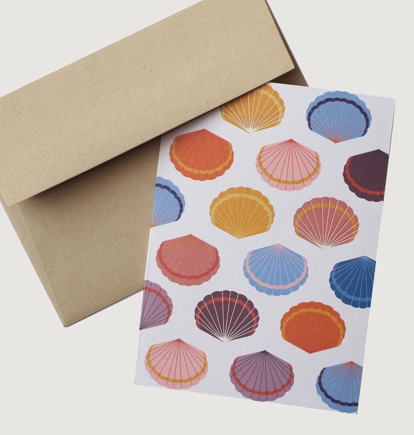
TransForm
Adapting the power of nature, to transform
          challenge into change
                        In a world where our environment is under threat,
                        TransForm explores how adaptable and forward-
                        thinking designs, materials and systems could turn
                        nature into our salvation.

                        According to the World Economic Forum, at least eight
                        million tonnes of plastic end up in oceans each year –
                        the equivalent of one garbage truck per minute – but
                        amid these cataclysmic numbers, design is pointing
                        towards the light with products, materials and systems
                        that can transform waste into beauty, use fewer
                        natural resources, or find new uses for existing ones.

                        This will inform a lighter aesthetic for S/S 21, as
                        adaptable designs, ‘living’ materials, and lighter
                        weights remain influential. Nature will be celebrated
                        with raw materials, and the ocean will become a key
                        reference, inspiring iridescent surfaces and fluid forms.

        Hirotoshi Ito
Action Points
TransForm explores the mystery of nature through arcane
symbols, as well as colours and finishes with a
technological edge. Mystical motifs, raw finishes, and
aquatic colours will be key for stationery.
1. Embrace the darker side of nature: take inspiration
from rough and raw elements of nature, from the deep
seas to astronomy and alchemy.
2. Focus on simplified designs and stand-out textures:
appeal to younger consumers with eyecatching icons
and stylised graphics, and focus on finishes and textures
for a more mature audience.
3. Elevate designs with material and finishes: give
designs a refined quality by using metallics, either as an
all-over material or as subtle foil details.
4. Bring tactility to designs: encourage touch with
engraved patterns and ribbed forms. For surfaces, take
inspiration from the contours of natural landscapes and
the moon.
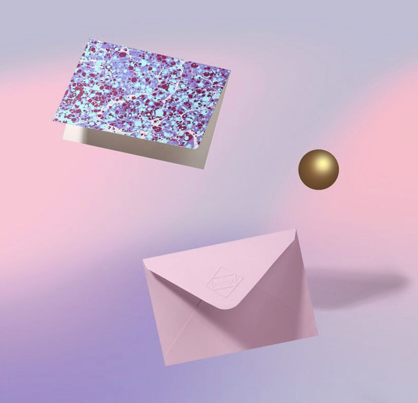
5. Explore colour-shifting effects: create iridescent
finishes with a softer colour palette, including
pearlescent whites and pastel ombré tones.
Gabriela Emil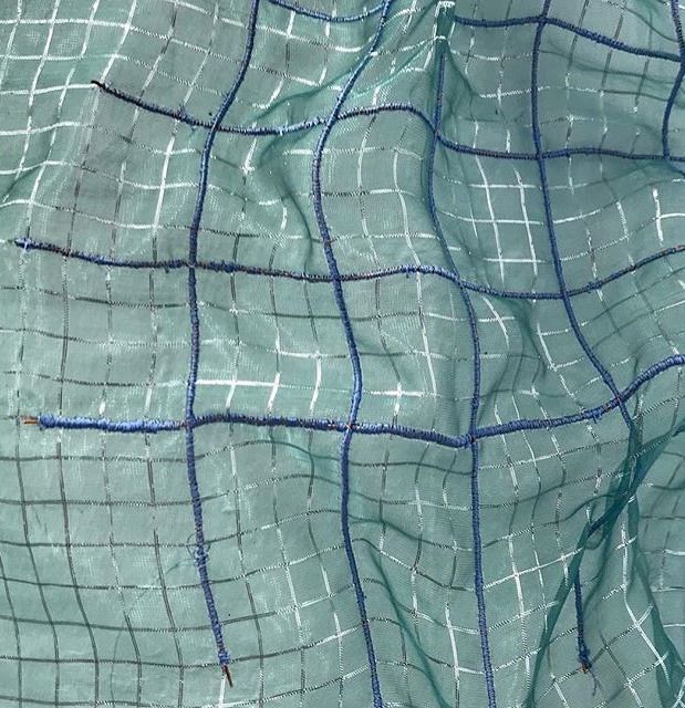
Mood & Colour                                   a. French Navy

                                                                                                                                                 Archie's Press
                                                b. Blue Beat

                                                c. Afterglow

                                                d. Purple Nitro

                                                                                                                                                Supplied By Lily

           100 Layer Cake

                                                                                                      The TransForm colour palette features a mix of
                                                e. Tranquillity Blue
                                                                                                      warm and cool tones – some of which feel
                                                                                                      authentically natural, and others with a
                                                                                                      digitally enhanced quality

                                                                                                      • Moonlit tones complement darker and
                                                f. Corten
                                                                                                      moodier colours. These hues can be used
                                                                                                      tonally or to create vivid contrasts

                                                                                                      • Use metallic finishes and muted pastels to
                                                g. Silver C
                                                                                                      give stationery designs a magical look

                            Urban Outfitters
                                               Coloro: a. 115-23-11 b. 107-38-27 c. 043-75-34 d. 141-43-17 e. 089-87-15
 The Fine Print Paperie                        Pantone: a. 19-4019 TCX b. 18-4434 TCX c. 13-0746 TCX d. 18-3418 TCX e. 13-4910 TCX f. 8024 C g. Silver C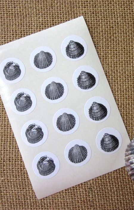
Key Directions
    Focus on cosmic motifs, aquatic colours, otherworldly finishes and nature-inspired prints for stationery designs

 Ocean Waves                                   Mystical Constellations                                 Moon Landscapes

               Knot & Bow                                          Terra Soleil                                         Pink Piggy Studio

Glowing Effects                                   Mineral Marbling                                      Simple Seashells

            Kawaii Pen Shop                                       Katie Leamon                                         Canned Ham Studio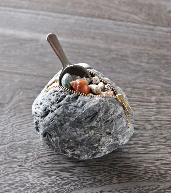
Ocean Waves

                                          Paperchase

                                                                                Super Fashion Store

                                                       Take inspiration from the ocean with
                                                       abstracted wave motifs across products

      Indie Crafts                                     • Use aquatic tones, and blend together in
                                                       ombré fades and marbled motifs

                                                       • Play with scale, whether through close-up
                                                       prints of large layered brush strokes, or with
                                                       smaller, more intricate patterns

                                                       • Use colour and wavy designs to give
                                                       designs a sense of movement

                                                       • Prints can be used all over, or as
                                                       eyecatching details on a product
                                   Noat

                     Cleverhands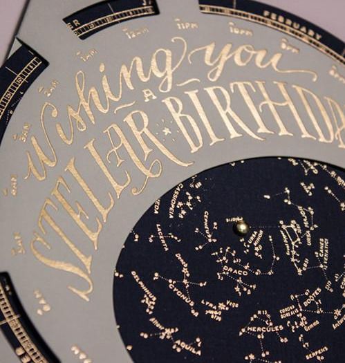
Mystical
Constellations

                                                                                                 Kikki K

                                                                            Explore mystical and magical themes, using
                                                                            motifs and words inspired by night skies,
                                       Ladyfingers Letterpress
                                                                            constellations, and astrology

                                                                            • Stylised moon phase icons will work best
                                                                            for commercial designs, and astrology-
                                                                            inspired motifs can be used to create refined
                                                                            linear designs

                                                                            • Use deep blue, black, and grey tones to
                                                                            evoke the night sky, and add metallic gold
                                                                            details that mimic the stars

                                                                            • Use mystical words and sentiments
                                                                            inspired by astrology and magic
        Anthropologie

                        Terra Soleil                             Bas Bleu
Moon Landscapes

                                                                Unior                            Massaa Studio

                             Pasinga
                                                       Take inspiration from lunar landscapes for
                                                       shape, material, and finish

                                                       • Use engraved and relief textures to create
                                                       motifs inspired by the cratered surface of
                                                       the moon

                                                       • Explore unexpectedly rough and tactile
                                                       material applications, from porous concrete
                                                       to speckled composites

                                                       • Use spherical silhouettes and rounded
                                                       edges, moonlit pastels and metallic
                                                       elements to highlight lunar themes

       Fancy

                  Hightide             Papierniczeni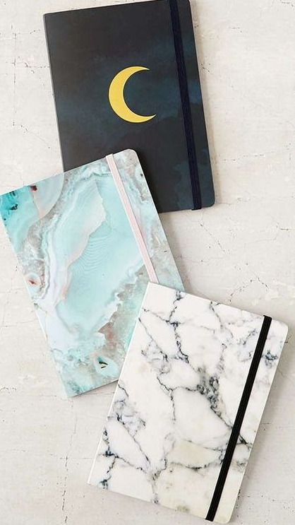
Glowing Effects

                                                                                          Pretty Space Shop

                                                                      Use mesmerising pearlescent finishes and
                  Mochi Things                                        colour gradients to give stationery a hi-tech
                                                 Noat                 look

                                                                      • Experiment with colour-shifting effects
                                                                      that entice the eye, including high-
                                                                      shine dichroic finishes in muted pastels

                                                                      • Use organic shapes and silhouettes for
                                                                      a surreal and otherworldly look

                                                                      • Focus on soft and subtle colours and
                                                                      effects, including luminous silvers, pastels
                                                                      and ombré tones. Contrast these with
                                                                      grounds that feature grainy textures and
                                                                      solid colours

    Knot & Bow

                                 Papierniczeni          Ticonderoga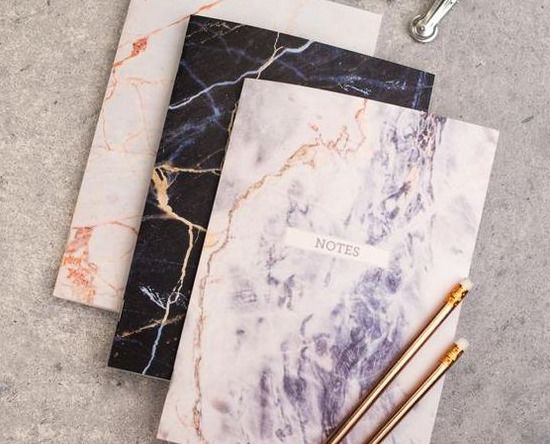
Mineral Marbling

                                                Nook Shop

                                                                                        Bread & Jam

                                                            Geological contours and stone veinings
                                                            will remain influential for surface and pattern,
                                                            but designs should be updated with
                                                            unnatural digital colours
         Hello Mart
                                                            • Replicate the veins of stones and
                                                            minerals, and use colour for emphasis,
                                                            giving natural lines a more dynamic look

                                                            • Use marbling techniques for a surreal
                                                            interpretation of geological contours, and
                                                            use photoreal versions for a more
                                                            commercial approach

                                                            • Explore bright hues for monochrome
                                                            designs, or try a mix of colours for a
                                          Mustard           psychedelic look. Create coordinate sets
                                                            that can be combined together

                      Snappy's Boutique
Simple Seashells
The Paragon
Tap into beachcomber themes by using
seashells as an all-over pattern or as a
Go Go Luna stylised silhouette
• Use realistic illustrations and forms for a
more literal take on the beachcomber theme,
or use stylised interpretations for a naive
look
• Warm metallics or monochrome colours
offer a more sophisticated approach to this
beach story
• Seashell contours will work well for
scalloped pins, cards, labels and stickers,
while stylised repeat motifs will work well for
Petite Paperie wrapping paper and cards
Moorea Seal AnthropologieLifestyle & Interiors Critical Path S/S 21
Macro Forecast Colour Lifestyle & Interiors Colour Trend Materials Trend Concepts
Concepts
A comprehensive round-up of the key
Future Drivers 2021 Global Colour
Colour palettes and usage direction to solid materials trends for S/S 21.
NEW REPORT - The global macro- WGSN's Global Colour report provides your first assist design development for S/S 21
economic drivers that will have a major view of what S/S 21 will look like. This season, we collections, presented as three trended Packaging Trend Concepts
impact in 2021, and strategies for success. present two palettes that reflect the duality of life themes. Essential direction on the key colours,
lived online as much as offline – one with surface patterns, structures, materials and
enhanced natural tones, and the other Trend Concepts finishes for food, drink and product design.
Future Innovations 2021 with artificial colours.
WGSN’s Trend Concepts reports
What used to be known as The Vision will
now be published once a year, with
(formerly called Forecasts) present Holiday & Gifting
Colour by Region seasonal design directions, two years
strategies for a 12-month period. Future
The five colours you need to know for the S/S ahead of market. The materials report A series of reports covering future trends
Innovations will outline the 12 areas that will
21 markets in Europe, China, North America and will not be thematically trended, while for key seasonal events and holidays,
lead transformation across industries in
South America, edited from WGSN's Global interiors will be trended into three offering direction on mood and colour;
2021. These will feed into our Big Ideas and
Colour palette. themes per season. food and drink; decor; styling; and prints
Trend Concepts reports, but these reports
and graphics.
will no longer be thematically linked. Colour Evolution
Lifestyle and Interiors Design & Product
Explore how colours are evolving with tonal Trend Concepts
Future Consumer 2021 comparisons from WGSN's three seasonal Development
Seasonal direction to support the entire
An in-depth look at the consumer drivers, forecasts up to and including S/S 21.
development process for interiors and A comprehensive range of reports offering
priorities and profiles that will emerge in
industrial design, with analysis of direction for product development
2021, both globally and regionally.
Lifestyle & Interiors Colour lifestyle factors, materials, finishes, covering all categories, in line with our three
patterns and shapes. Reports will be thematic trends for S/S 21.
Big Ideas presented as three trended themes.
Lifestyle & Interiors Global Colour
A yearly report outlining five key ideas for Seasonal, core and metallic palettes tailored
lifestyle and interiors industries, distilled from for S/S 21 lifestyle and interiors collections,
our Future Drivers and Future Innovations plus our pick of the season's six must-have
reports. tones.Related Reports
Big Ideas 2021: Lifestyle & Interiors Lifestyle & Interiors Trend Concepts S/S 21: TransForm
Powered by TCPDF (www.tcpdf.org)You can also read