TRANSFORM - WINNERS BOOK - Transform magazine
←
→
Page content transcription
If your browser does not render page correctly, please read the page content below
TR ANSFORM

               2018

WINNERS BOOK
CONTENTS

WELCOME
                                                            04     Meet the judges
                                                            10     The winners

                                                            THE AWARDS
                                                            CONTENT
                                                            13     Best use of a visual property
                                                            14     Best brand architecture solution
                                                            15     Best use of copy style or tone of voice
                                                            16     Best brand experience
                                                            17     Best use of packaging
                                                            18     Best wayfinding or signage
                                                            19     Best use of audio branding
                                                            21     Best use of typography
                                                            22     Best place or nation brand
When I first saw the work Superunion carried out for
Level, I was both impressed with the fresh approach
and sceptical of its high-flying idealism. It couldn’t
                                                            PROCESS
possibly work, I thought, it’s trying to achieve too        24     Best external stakeholder relations during a brand development project
much. Now, months after the airline’s debut, it boasts      25     Best internal communications during a brand development project
one of the most successful launches of all time and         26     Best implementation of a brand development project
has the honour of receiving the ‘Grand prix’ award at       27     Best implementation of a brand development project across multiple markets
this year’s Transform Awards.
For each and every winner of the Transform Awards
there is a story of dedication, brilliant ideas, creative
                                                            STRATEGY
excellence and masterful strategic craft. But what I        29     Best creative strategy
always love about the Transform Awards is the fact          30     Best brand evolution
that some of the world’s biggest brands can rub             31     Best strategic or creative development of a new brand
shoulders with startups and upstarts from across            32     Best development of a new brand within an existing brand portfolio
Europe. Primal Roots, a startup charity, fitness and        33     Best naming strategy
social enterprise wins a gold in the visual identity
categories, as does Carlsberg, one of the world’s
most well-known beer brands.                                TYPE
The Transform Awards also allows the opportunity to         34     Best corporate rebrand following a merger or an acquisition
celebrate those stories of transformation like Nuffield     36     Best brand development project to reflect changed mission, values or positioning
Health, which rebranded with the aim of changing its        37     Best brand consolidation
positioning and the perception of its brand across                 Best rebrand of a digital property
Britain. Deliveroo, winner of this year’s ‘Best overall
visual identity’ award, did the same with a rebrand
that effectively erased all memory of the previous          SECTOR
brand, but also catapulted the ‘roo into one of the         39     Best visual identity by a charity, NGO or non-profit
major players in the food industry.                         40     Best visual identity from the education sector
I hope you enjoy reading about these amazing stories        41     Best visual identity from the energy and utilities sector
of transformation as much as I did. Congratulations         42     Best visual identity from the engineering and manufacturing sector
to all of this year’s nominees and winners!                 44     Best visual identity from the fast-moving consumer goods sector
                                                            45     Best visual identity from the financial services sector
Brittany Golob                                              46     Best visual identity from the food and beverage sector
Editor, Transform magazine                                  47     Best visual identity from the healthcare and pharmaceuticals sector
                                                            48     Best visual identity from the professional services sector
                                                            50     Best visual identity from the property sector
                                                            51     Best visual identity from the public sector
                                                            53     Best visual identity from the retail sector
                                                            54     Best visual identity from the technology, media and telecommunications sector
                                                            55     Best visual identity from the transport and logistics sector
                                                                   Best visual identity from the travel, leisure and tourism sector

                                                            57     Best overall visual identity

                                                            58     Grand prix

                                                                                                                                                      3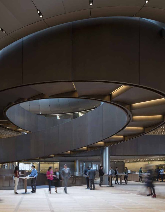
THE JUDGES

                 Alessandra Almeida Jones, head of marketing and communications, Baker McKenzie                                                         Kate Dale, head of brand and digital strategy, Sport England
                 Alessandra is a seasoned marketing and communications professional with a track record in building brands for professional             Feminist firebrand and former journalist Kate is responsible for delivering ‘This Girl Can,’ Sport England’s multi-award-winning
                 services firms. Particularly skilled in creating thought leadership campaigns that drive both brand awareness and profitable           campaign, which is changing the way millions of people think about exercise and physical activity, and has seen 2.8m more
                 client conversations, she has pioneered many award-winning first of a kind marketing initiatives. Alessandra is a regular              women get active as a direct result. Prior to this, Kate spent 10 years as a trade magazine editor before becoming a brand and
                 speaker at marketing forums and has a MBA from Cass Business School. Currently head of marketing and communications                    content specialist for major online banking institutions including Barclays.
                 at Baker McKenzie in London, she has held senior positions at Linklaters, KWM and ABN AMRO, among other organisations.

                 Matthew Ansell, brand marketing and digital communications specialist, Matrix Marketing Ltd                                            Rupert Daniels, global marketing director, Cambridge University Press
                 Matthew is a brand marketing and digital communications expert who specialises in helping entrepreneurial businesses build             Rupert is the global marketing director for Cambridge University Press where he’s leading the development of Cambridge’s
                 brands that stand out. During a 25 year career, he has worked agency and client side with leading brands in sports (Wimbledon          global marketing strategy and shaping the transformation of the world’s oldest publisher into a 21st century digital content
                 Tennis, Arsenal FC, Manchester United), hospitality and leisure (Liberty Living and Saga), financial services (Lloyds Banking          brand. Rupert has over 20 years of interdisciplinary global experience in general management, sales, media rights, digital,
                 Group, Westpac and RSA) and education (Study Group). A returning judge, he also picked up a silver award in 2016 for his work          production, branding and marketing. Prior to joining Cambridge, he held senior marketing and sales positions at Arsenal
                 with Liberty Living. Matthew holds an MBA with distinction from Ashridge Executive Education.                                          Football Club, FIFA and 1GOAL.

                 Alex Baker, chief commercial officer, ClickSys                                                                                         Martin Davies, head of communications, BDP
                 Alex is a retail nerd and is curious about how digitalisation and innovation can change our lives, both as consumers but also as       Martin is head of communications at BDP, an international architecture, engineering and design practice. He leads the
                 brands and companies. Alex is the founder and president of the executive retail network RIO (Retail+Innovation+Omnichannel)            communications team which promotes and publicises the work of the practice in line with its brand and design ethos,
                 at the Swedish Marketing Association in Stockholm where he also is a member of the executive board. Alex is the chief                  and provides strategic direction for all aspects of marketing and communications across all 11 studios,
                 commercial officer at ClickSys, a Swedish tech startup specialising in digital in-store. ClickSys mission is to redefine retail with   and all professions and sectors.
                 digital experiences by bridging the digital and physical worlds. Prior to ClickSys, Alex worked for the Swedish retail FMCG giant
                 ICA as head of concept for digital in-store and innovation.

                 Lorna Blackmore, director of communications, Flagship Group                                                                            Katy Donovan, brand manager, Cancer Research UK
                 Lorna has over 16 years of experience in communications and marketing and has been director of communication at Flagship               Katy is a brand manager for Cancer Research UK, one of the country’s best-loved charity brands. Along with her team she is
                 Group since August 2014. She leads a team responsible for market research, enterprise marketing, brand management,                     responsible for developing, refining and implementing brand strategy throughout the organisation. Across all of the charity’s
                 media relations, internal communication and corporate communication. As a member of the senior management board,                       activities, she drives brand coherence to increase attribution from their wide range of audiences including researchers,
                 Lorna provides counsel to leaders on company positioning and reputation, crisis management and thought leadership. She is              patients, government bodies and fundraisers. Before joining Cancer Research UK, she worked agency-side in Dublin and
                 passionate about brand culture – where both brand and culture are driven by the same purpose and values – brought together             London, with a range of brands from local to beloved national brands and global conglomerates. With a passion for brand,
                 into a single guiding force for the company.                                                                                           Katy believes in using it as an accelerator to help organisations achieve their purpose.

                 Louise Brierley-Ingham, communications and copywriting consultant, Patagonia                                                           Gale Foster, head of design and brand, Southbank Centre
                 Before joining Patagonia last year, Louise was the general manager of reputation management specialist FinchFactor, leading            Gale has been working in design and branding for over 15 years. She started her career agency-side for clients such as San
                 the communications teams in London and Amsterdam on a wealth of clients in the consumer, innovation and creative sphere.               Miguel, Virgin and Premier Inn before moving in-house to pursue a more cultured career path. She now heads up Southbank
                 Throughout her career, Louise has worked both client and agency side for international brands such as Uniqlo, La Senza, Argos,         Centre’s in-house design team and has spent the last year working closely with branding agency North to develop and
                 Homebase, DFS and Burger King and Hailo.                                                                                               implement an exciting new branding system for the organisation. The new brand turns the communications on their heads:
                                                                                                                                                        making Southbank Centre’s name the central voice in everything they do.

                 Liz Brown, communications specialist, brand and digital media, British Steel                                                           Shane Greeves, global executive creative director, FutureBrand
                 Liz led the creation and implementation of British Steel’s new brand, which was launched last year – although her work with            Shane is the global executive creative director, at FutureBrand. With experience working across large global brands such as:
                 B2B branding stretches back more than 20 years. Her most recent brand work included creating a visual identity, company                Vodafone, Lenovo, Motorola, Nokia, Barclays, RBS, Julius Baer, Nordea, Zurich, ABInBev, UEFA, FIFA, United States Postal
                 values and new ways of working for British Steel – an old name, but a fresh start. With 4,800 global employees and annual steel        Service, the US Army, and London 2012 Olympic and Paralympic Games. Shane has judged and won awards at many of the
                 production of circa 3m tonnes, the brand journey to engage stakeholders was challenging but extremely well received – and              industry’s most prestigious ceremonies and is also involved with the McCann Worldgroup Global Creative Council.
                 continues! Her work also involved developing new digital platforms, including the company’s intranet and website.

                 Federica Carlotto, senior lecturer and cultural strategist, Regent’s University London                                                 Lawrence Hall, head of communications, ZPG plc
                 Federica is a cultural strategist and academic in the field of luxury, fashion and beauty. Currently, Federica works at Regent’s       Lawrence is head of communications at ZPG Plc (formerly Zoopla Property Group Plc) which owns and operates some of the
                 University London as senior lecturer in luxury brand management, and collaborates on ad-hoc qualitative projects with                  UK’s most trusted property and household-related digital brands including Zoopla, uSwitch, PrimeLocation, Money, Hometrack
                 boutique consultancies and niche companies. Scholarship grantee of the Japanese Ministry of Education (MEXT) from                      and Property Software Group. Lawrence is responsible for communications, social and content across the group’s multiple
                 2005-2010, Federica received her PhD in fashion sociology from Bunka Gakuen University (Tokyo) and her MBA from Grenoble               brands and was an early team member of ZPG. He has played a key role in a business that has gone from start-up to stock
                 Graduate Business School (GGSB).                                                                                                       market, acquired 15 businesses, grown revenues from zero to over £200m, attracts over 50m visits a month to its platform,
                                                                                                                                                        works with 25,000 partners, floated on the London Stock Exchange and is currently valued at nearly £1.6bn.

4                                                                                                                                                                                                                                                                                          5
THE JUDGES

                 Clint Hayashi, director, marketing communications, Expedia
                 Clint has more than 16 years of experience working with global brands in the media, entertainment and technology sectors.
                 Currently marketing and communications director at Expedia Affiliate Network brand (EAN), the B2B arm of Expedia group,
                 Clint’s remit covers brand and digital, product and partner marketing. He served as head of communications at Expedia EMEA
                 leading corporate, consumer and internal communications across 14 markets. Prior to Expedia, Clint was director of corporate
                 communications & media relations at NBCUniversal International and has also managed EMEA communications at Yahoo! as
                 well as working with Disney for several years.

                 Jon Hunter, head of design, Transport for London
                 Jon has worked at Transport for London (TfL) for 10 years, previously working for agencies in the Midlands. He currently leads
                 a multidisciplinary team which manages the design of all things TfL – from the graphic world of branding strategy through to
                 the physical delivery of uniforms, trains and stations.

                 Jo McClintock, former global brand director, Lebara
                 Until recently, Jo led the brand for Lebara, the universal mobile provider for the world’s migrant community, helping people unite
                 across borders, generations and cultures. Jo was responsible for brand strategy and execution, creative, brand licensing and
                 integrated multichannel marketing campaigns. With over 10 years of experience in brand and marketing, she is a believer and
                 creator of purpose-led brands that have true relevance and disrupt the norm.

                 Martha McKenzie-Minifie, head of corporate communications, ING
                 Martha is ING’s head of corporate communications for the UK. Her experience in marketing and communications includes
                 almost 10 years as a journalist on daily, weekly and Sunday newspapers and magazines before joining ING in 2009. Martha has
                 been a spokesperson on consumer economics for several years and appeared on BBC News, Sky News and CNBC during that
                 time. Outside of ING, Martha was a board member of Women in Banking and Finance until September 2017 and oversaw a bold
                 rebrand of the membership organisation.

                 Mike McNeil, head of brand strategy, Sir Robert McAlpine
                 Mike is responsible for leading brand development at major UK construction and civil engineering company Sir Robert
                 McAlpine. Originally from an engineering background, Mike has 20 years of experience in marketing and communications.
                 Working in a highly competitive sector, Mike understands the importance of perception and reputation.

                 Sheona Michie, head of brand and marketing, Action for Children
                 With over 20 years of commercial experience as a brand specialist (Identica, WPP, Wham) working for international clients from
                 Diageo and Aeroflot to Nike and Vodafone, Sheona moved into the charity sector in 2011 to help rebrand Cancer Research UK.
                 Constantly curious about finding new ways for brands and people to connect, Sheona views branding as the strategic driver
                 to inspire, improve and deliver results; from big ideas and beautiful creativity, to real brand engagement and activation,
                 inside and out.

                 Sarah Miles, director of brand, marketing and communications, io oil & gas consulting
                 Sarah is a branding and marketing leader in the energy industry with rich and varied experience across global brands. As the
                 director of branding and marketing at io oil & gas consulting, a joint venture of GE Oil & Gas and McDermott, she leads the
                 company’s brand, marketing and communications activities and has led io to multiple award wins as well as high levels of
                 media and industry visibility. Prior to this, Sarah held a number of marketing directorial roles and spent more than
                 10 years at Shell, most latterly as global head of premium fuels brands.

6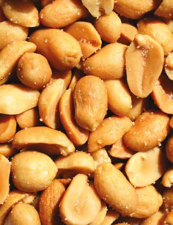
THE JUDGES

                 Yasmin Mukhida, brand strategy manager, Premier Inn
                 Yasmin is the brand strategy manager for Premier Inn, the UK’s largest hotel company. In her role, she helps define and deliver
                 the future vision for the brand, building meaningful communications throughout the guest journey. After graduating from
                 Bristol University, she started her career in creative agencies for large financial clients, including Lloyds Bank, Aviva and the
                 London Stock Exchange. She then specialised in hospitality brand management at GLH Hotels, where she launched Amba
                 Hotels and Thistle Express, and created an umbrella brand for the portfolio. For her, building a successful brand is all about
                 having empathy; for guests and employees alike.

                 Olivia O’Toole, head of leisure marketing and strategic partnerships, London & Partners
                 Olivia is head of leisure marketing and strategic partnerships at London & Partners, the mayor of London’s official promotional
                 agency, which is also the official tourist board for the city and runs visitlondon.com. Olivia’s role is to develop advertising
                 campaigns promoting London as a holiday destination and to partner with companies who share the same strategic goal;
                 driving inbound tourism to London and helping bring record numbers of international and domestic visitors to the city. Prior
                 to joining London & Partners, Olivia spent over 10 years in the media industry in London and Asia, working for companies
                 including CNN International and BBC Worldwide.

                 Jill Pearcy, head of strategic communications, Babcock International
                 Jill is a corporate communications and brand strategy professional, working for organisations at the interface between
                 the public and private sectors. She recently joined Babcock International to develop strategic communications in its land
                 defence sector, after several years running corporate communications for HS2 Ltd, the high speed rail project. Other roles
                 include leading media relations during the volcanic ash cloud crisis for NATS, the UK’s air traffic controller, and directing
                 communications for Unisys.

                 Tim Ruthven, head of marketing and communications, Imperial College Business School
                 Tim is currently head of marketing innovation at Imperial College Business School where he is responsible for brand
                 and developing innovative marketing and communications strategies for international audiences. He also teaches
                 brand management on Imperial’s executive MBA and summer school programmes, as well as short marketing courses.
                 Originally from New Zealand and having worked across the globe in higher education marketing and private sector
                 leadership roles, Tim is an award-winning marketer with a deep understanding of the value of brand and how marketing
                 drives business performance.

                 Rebecca Sinclair, communications director, Penguin Random House UK
                 Rebecca is group communications director of Penguin Random House UK, the world’s number one trade book publisher.
                 Before this, Rebecca was vice president of brand at Pearson where she led the launch of the new brand to reflect the
                 company’s transition from book publisher to global learning company. Prior to that, Rebecca led corporate affairs for Pearson
                 across Asia, based in Singapore, and ran communications for Penguin for seven years. Rebecca is trustee of the board at the
                 National Centre for Circus Arts, the UK’s leading provider of circus education.

                 Mari Stevens, director of marketing, Visit Wales
                 Mari is director of marketing for Wales as a destination for tourism, inward investment and business growth. Over the last three
                 years she has led the work of developing a new nation brand strategy for the country and delivered award-winning international
                 campaigns that have attracted record numbers of visitors, as well as high-quality investors to Wales. Mari has also worked
                 as head of marketing at Welsh Water and BBC Cymru Wales, where she had responsibility for promoting all output across TV,
                 radio and digital.

8                                                                                                                                                    9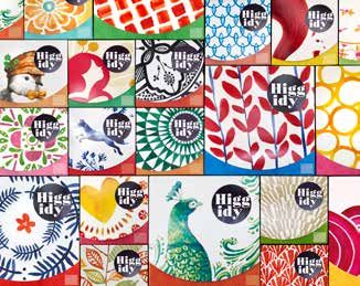
THE WINNERS
Content Type
Best visual identity from the food and beverage sector
Best use of a visual property Best internal communications during a brand Best corporate rebrand following a merger Gold – Deliveroo and DesignStudio
Gold – LEVEL and Superunion development project or an acquisition Silver – Tavern Snacks and the Chemistry Works
Silver – Addiko and Prophet Gold – Universitat Oberta de Catalunya Gold – Addiko and Prophet Bronze – Pukka and 1HQ
Silver – Reiss and GW+Co Silver – Cadent and Superunion Silver – RHI Magnesita and MerchantCantos Bronze – Yumchaa and Brandality
Bronze – Nuffield Health and Handsome Brands Silver – TechnipFMC and Lippincott Bronze – TP ICAP and Handsome Brands Highly commended – Naturya and FutureBrand
Highly commended – British Fencing and We Launch Bronze – Capgemini and BrandPie Highly commended – Cadent and Superunion Highly commended – The Snaffling Pig Co and We Launch
Highly commended – Clarity and Row-A Highly commended – World of Zing and Springetts
Best brand architecture solution Highly commended – University of Portsmouth Best brand development project to reflect changed
Gold – NEX and THINKFARM and Instinctif Partners mission, values or positioning Best visual identity from the healthcare
Bronze – Danone and Conran Design Group Gold – Addiko and Prophet and pharmaceuticals sector
Bronze – Universitat Oberta de Catalunya Best implementation of a brand development project Silver – Andertons Music Co. and the Pull Agency Gold – Nuffield Health and Handsome Brands
Gold – Andertons Music Co. and the Pull Agency Bronze – CaféX and Discover Brand Creation Silver – Lonza Pharma & Biotech and Coley Porter Bell
Best use of copy style or tone of voice Gold – London 2017 and SomeOne Highly commended – ABB Bronze – Evergreen Life and Studio North
Gold – Primephonic and Lantern Bronze – Caledonian Sleeper and WeberShandwick Highly commended – Arkadin/NTT Communications and Dusted Highly commended – LGC, Dr Ehrenstorfer and We Launch
Silver – acdc lighting and GW+Co Bronze – NEX and THINKFARM Highly commended – World Sailing and rbl Highly commended – Lifes2Good and Creative Leap
Bronze – Konica Minolta and Frank, Bright & Abel Highly commended – QinetiQ and Superunion
Highly commended – Innowatio and CBA Best brand consolidation Best visual identity from the professional services sector
Best implementation of a brand development project Gold – World Sailing and rbl Gold – Craft and Elmwood
Best brand experience across multiple markets Silver – BKL and Kimpton Creative
Gold – Hagkaup and M Worldwide Silver – European Flavour Association (EFFA) Best rebrand of a digital property Bronze – Gabriele and Nalla
Silver – Intel Corporation with 2LK Design and Moving Brands Bronze – Madame Tussauds and SomeOne Gold – Simply Business and Start Design Bronze – Threefold and Baxter and Bailey
Bronze – STUDIOCANAL and Conran Design Group Silver – Sonovate and Superunion Highly commended – Lichfields with GW+Co and JWDK
Highly commended – British American Tobacco’s Vype Store Bronze – Arkadin/NTT Communications and Dusted
and CBA Strategy Best visual identity from the property sector
Highly commended – Schroders Gold – Clockwise and Pollitt & Partners
Best creative strategy Sector Silver – Student Roost and SomeOne
Best use of packaging Gold – Addiko and Prophet Bronze – KX and SomeOne
Gold – Higgidy and B&B Studio Gold – THORNeco and GW+Co Best visual identity by a charity, NGO or non-profit
Silver – London Beer Lab and Elmwood Silver – Formula E and Prophet Gold – Primal Roots and Lantern Best visual identity from the public sector
Bronze – Bulwark and WPA Pinfold Bronze – Dublin Bus and RichardsDee Gold – The League Against Cruel Sports and ASHA Silver – Municipality of Cracow and Opus B Brand Design
Bronze – Hi Mark International and WPA Pinfold Highly commended – Primephonic and Lantern Silver – Jhpiego and Red Dog Design Consultants Bronze – TUC (Trades Union Congress) and Lloyd Northover
Bronze – PizzaExpress and Bulletproof Highly commended – TP ICAP and Handsome Brands Bronze – Bewley’s and RichardsDee
Highly commended – Reeves and Pearlfisher Highly commended – HOPE not hate and Blue State Digital Best visual identity from the retail sector
Highly commended – Robijn and 1HQ Best brand evolution Highly commended – Kiteka and Superunion Gold – Depop and DesignStudio
Highly commended – USP Zdrowie and Creative Leap Gold – Brighton Women’s Centre and Baxter and Bailey Highly commended – Milestones Trust and Clout Branding Silver – Andertons Music Co. and the Pull Agency
Gold – Harvey’s Brewery and WPA Pinfold Silver – Spyscape and SomeOne
Best wayfinding or signage Silver – Dublin Bus and RichardsDee Best visual identity from the education sector Bronze – Żabka Polska S.A. and BNA Sp. z o.o.
Gold – Clockwise and Pollitt & Partners Bronze – CaféX and Discover Brand Creation Gold – The Royal Institution and Supple Studio
Silver – The Paddington Partnership and Maynard Bronze – Formula E and Prophet Silver – University of Greenwich and rbl Best visual identity from the technology, media
Bronze – Camberwell College of Arts and Whybrow Highly commended – JLL and Superunion Bronze – Institut Paul Bocuse and CBA and telecommunications sector
Bronze – Harrods and Endpoint Highly commended – Procter & Gamble and Elmwood Highly commended – Universitat Oberta de Catalunya and Mucho Gold – Today FM and Dynamo
Highly commended – Bloomberg London and Whybrow Highly commended – University of Reading and Bell Silver – Akselos and WeberShandwick
Best strategic or creative development of a new brand Silver – NP6 and Brand Brothers
Best use of audio branding Gold – LEVEL and Superunion Best visual identity from the energy Bronze – Arkadin/NTT Communications and Dusted
Gold – Leroy Merlin and Chut! on vous écoute Silver – Primal Roots and Lantern and utilities sector Bronze – CaféX and Discover Brand Creation
Gold – Siemens and why do birds Bronze – Addiko and Prophet Silver – Cadent and Superunion Highly commended – Tata Consultancy Services
Silver – Universitat Oberta de Catalunya and Dadadada Bronze – Kibo and Greenspace Highly commended – The Phone Co-op and Blue Moon Creative
Highly commended – Capgemini and BrandPie & Start Rec Highly commended – Craft and Elmwood Best visual identity from the engineering
Highly commended – Evergreen Life and Studio North and manufacturing sector Best visual identity from the transport and logistics sector
Best use of typography Highly commended – TP ICAP and Handsome Brands Gold – Reiss and GW+Co Gold – Beat and DesignStudio
Gold – Printworks London and Only Silver – RHI Magnesita and MerchantCantos
Silver – Moonpig with Ian Styles and F37 Foundry Best development of a new brand within Bronze – ABB Best visual identity from the travel, leisure
Silver – Spyscape and SomeOne an existing brand portfolio Highly commended – TechnipFMC and Lippincott and tourism sector
Bronze – Clockwise and Pollitt & Partners Gold – Nuffield Health and Handsome Brands Gold – LEVEL and Superunion
Highly commended – ABB Silver – AMD Radeon and Brand & Deliver Best visual identity from the fast-moving Silver – Dublin Bus and RichardsDee
Bronze – BeeZero and Greenspace consumer goods sector Bronze – No.15 Great Pulteney and Mytton Williams
Best place or nation brand Highly commended – Doncaster Sheffield Airport Gold – Carlsberg and Taxi Studio Highly commended – Formula E and Prophet
Gold – Newington and Lantern and Moirae Creative Silver – Naturya and FutureBrand Highly commended – Global Adventure Challenge
Silver – Municipality of Cracow and Opus B Brand Design Highly commended – Konica Minolta and Frank, Bright & Abel and Truth Creative
Bronze – KX and SomeOne Best visual identity from the financial services sector
Best naming strategy Gold – Addiko and Prophet Best overall visual identity
Gold – LEVEL and Superunion Silver – NEX and THINKFARM Winner - Deliveroo and DesignStudio
Process Silver – Kiteka and Superunion Bronze – Lowell and Bisqit
Bronze – Student Roost and SomeOne Bronze – TP ICAP and Handsome Brands Grand prix
Best external stakeholder relations during a brand Bronze – Velon and Infront Sports with Designwerk Highly commended – The AA Winner - LEVEL and Superunion
development project Highly commended – LifeArc and BrandPie
Gold – Tata Consultancy Services Highly commended – Tamanoir and BrandSilver
10 11
CONTENT
BEST USE OF A VISUAL PROPERTY
HOW CAN WE
Gold – LEVEL and Superunion
With the ambitious goal of launching a new unbundled airline that could
compete in the growing, but increasingly crowded, long-haul, low-cost
HELP YOUR
sector, IAG knew that its brand would be the key differentiator when it
came to success.
IAG enlisted Superunion to come up with a brand identity that was radical
yet immediately recognisable to the Ikea generation; one that married
good design with great value. From the minimalist brand mark – blue over
BUSINESS
green, the sky over land, the story of flight – to the design style – global
not focused on one country – Superunion crafted an identity custom-
designed for a new generation of fliers.
The result was nothing short of the most successful airline launch of all
time. On day one, 52,000 tickets were sold, the IAG share price jumped
3.5% following launch, and the Level fleet size is set to increase 150%
GROW BETTER?
by summer 2018.
Silver – Addiko and Prophet
Following its acquisition by the European Bank for Reconstruction
and Development, Addiko – formerly Austria’s Hypo Alpe Adria Bank –
transformed its brand and proposition with the help of Prophet. With a
simple, down-to-earth and trustworthy promise, ‘straightforward banking,’
the new identity has already set Addiko apart and has been named among
the most beautiful in banking by key influencer, the Financial Brand.
Silver – Reiss and GW+Co
Reiss shone the spotlight on its industrial lighting expertise with a visually
led, dynamic rebrand. Having defined its purpose as to “push limits” –
lighting some of the most hazardous and extreme working environments
around – Reiss and agency GW+Co delivered a striking new identity for
the brand to support.
Bronze – Nuffield Health and Handsome Brands
Nuffield Health, one of the leading not-for-profit healthcare organisations
From creating brand strategies and customer experiences to in the UK, partnered with Handsome Brands to build the most trusted and
driving cultural change and digital transformation, we help
well-known health and wellbeing brand, through its differentiated offer,
reputation, customer experience, people and outcomes.
our clients uncover deeper insights and build stronger brand
relevance in order to grow their business.
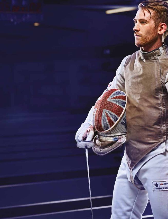
Highly commended – British Fencing and We Launch
Want to find out how you can unlock your growth
potential? Talk to us:
Adam Proops, Business Development Director
aproops@prophet.com
www.prophet.com
13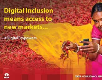
CONTENT                                                                                                                                                                                              CONTENT

     BEST BRAND ARCHITECTURE SOLUTION                                                                         BEST USE OF COPY STYLE OR TONE OF VOICE
     Gold – NEX and THINKFARM                                                                                                                 Gold – Primephonic and Lantern
     NEX provides electronic trade execution, risk control and market                                                                         Primephonic is a global classical music platform based in the Netherlands
     intelligence for the global capital markets. Before rebranding to NEX in                                                                 with an online store that offers over 100,000 high-quality recordings of
     January 2017, the business was known as ICAP plc. In 2015, the ICAP                                                                      classical music. To coincide with the launch of its new streaming service,
     brand and its hybrid voice broking and information business was sold                                                                     alongside a move into live events and experiences, Lantern strategically
     to a major competitor. As a result, there was a need for a new brand for                                                                 repositioned the brand and redefined its messaging.
     the remaining technology-based business. The goal of the rebrand was                                                                     Constrained by classical music’s reputation of being elitist, uncool and
     twofold: to energise customers by clearly identifying NEX’s proposition                                                                  inaccessible, alongside a history of positioning the brand around rational,
     and portfolio; and to ensure employee engagement by uniting the brand’s                                                                  tech-led messaging regarding file formats, bit rates and metadata, Lantern
     disparate businesses under one overarching identity.                                                                                     embarked on a mission to capture the emotional power of classical music.
     Thinkfarm developed a bold and impactful new name – NEX – as well                                                                        The agency redefined the brand vision as reinventing the classical music
     as a series of sub-brands which retained their distinct identity while also                                                              experience and reigniting a global passion for the genre, providing an
     adopting the NEX master brand. These sub-brands were then categorised                                                                    emotive strapline to support a new wave of casual classical lovers, while
     into four strategic business lines: NEX Markets, NEX Optimisation, NEX                                                                   embracing the brand’s existing audience of audiophiles.
     Opportunities and NEX Exchange.                                                                                                          Since the launch of the new identity, Primephonic has seen an incredible
     The new branding has already succeeded in its objectives, with both                                                                      46% increase in new subscribers. In addition, website visits are up 117%
     customers and internal stakeholders rallying around the business’s                                                                       and visitors are spending 32% more time on the site.
     bold new identity.

     Bronze – Danone and Conran Design Group                                                                                                  Silver – acdc lighting and GW+Co
     Danone partnered with Conran Design Group to develop a fresh identity                                                                    LED lighting expert acdc lighting enlisted GW+Co to craft a fresh tone
     and visible brand architecture which could more consistently express                                                                     of voice that could do justice to the brand’s edgy, honest and full-of-life
     the strong sense of optimism, purity and openness of the brand’s iconic                                                                  attitude. The result is a comprehensive tone of voice guideline, packed
     child star logo.                                                                                                                         with practical examples, equipping acdc with the tools to consistently
                                                                                   Best use of copy style/tone of voice - recommended crops   infuse the brand into copy.

     Bronze – Universitat Oberta de Catalunya                                                                                                 Bronze – Konica Minolta and Frank, Bright & Abel
     The world’s first online university, Universitat Oberta de Catalunya (UOC),                                                              To help launch Workplace Hub, Konica Minolta crafted a copy-led
     modernised and unified its brand architecture, arranging the UOC brands                                                                  communications approach, partnering with Frank, Bright & Abel to
     and sub-brands to project the value the UOC generates in society.                                                                        develop a punchy and impactful, yet warm and clear tone of voice.

                                                                                                                            55x31mm
                                                                                                                                              Highly commended – Innowatio and CBA

                                                                                   83x67mm

14                                                                                                                                                                                                                          15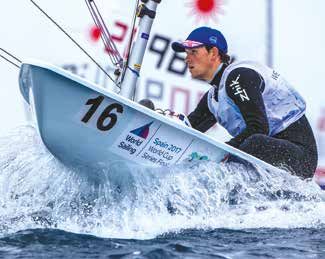
CONTENT                                                                                                                                                           CONTENT

     BEST BRAND EXPERIENCE                                                          BEST USE OF PACKAGING
     Gold – Hagkaup and M Worldwide                                                                         Gold – Higgidy and B&B Studio
     Huge supermarkets used to be all about weekly friction-free shopping –                                 B&B Studio was on hand to help pie and quiche purveyor Higgidy liberate
     going in, walking up and down the aisles, and getting out. Customers had                               itself from the traditional world of pastry and evolve into a contemporary
     to fit in with business imperatives that focused on streamlining, process                              food company with a diverse and health-focused portfolio. Higgidy’s new
     and logistics on an industrial scale. Now, that’s all changing. People now                             packaging is the ultimate expression of this story. Not only does it delight
     shop more frequently for fewer items, and want innovative experiences                                  the consumer and disrupt the category, but it also announces, loudly and
     and places in which to dwell. Engaging ideas, compelling content and                                   proudly, Higgidy’s newly articulated philosophy and values.
     shared space with other brands are the things that will keep customers                                 Inspired by the lifestyle aesthetic of the new positioning, the packaging
     coming back.                                                                                           design is based on an eclectic collection of mismatched plates. Each
     With this remarkable insight in mind, Icelandic supermarket retailer                                   unique design offers the opportunity to tell a story around each recipe,
     Hagkaup partnered with M Worldwide to transform its flagship store,                                    and B&B’s designers worked closely with founder Camilla Stephens
     focusing on developing the ‘theatre of retail’ to enhance customer                                     to appreciate each recipe, then with a handful of different illustrators,
     experience. The now transformed store is a true testament to the success                               including in-house, to ensure the stories came to life in the most
     of Hagkaup’s philosophy. Customers are offered an array of tantalising                                 appropriate way.
     sights, sounds and smells, from a Willy Wonka-esque Krispy Kreme                                       The rebranded packaging has reset the parameters of what’s possible
     factory observation window to a DIY peanut butter machine.                                             for the Higgidy brand, enabling the launch of a new range of pastry-free
     The store is now almost 50% smaller in footprint but has more customers                                frittatas that are just the first in a feast of new product development
     and more sales per square metre than when the store was double the size.                               designed to energise the entire category.

     Silver – Intel Corporation with 2LK Design and Moving Brands                                           Silver – London Beer Lab and Elmwood
     Intel made the most of its presence at the Mobile World Congress with ‘the                             Elmwood raised the branding bar for London Beer Lab, helping the brewing
     Wonderwall,’ the world’s largest ever generative video content installation.                           expert expand its business with an inspiring rebrand that put craft and
     The remarkable 1,250 sq ft display designed by Moving Brands was the                                   creativity at its heart. Since adopting the new packaging, which features
     centrepiece of Intel’s inspiring, integrated and immersive booth which                                 bold designs worthy of London Beer Lab’s ambition, the brand has seen a
     further established the brand as a leader in 5G connectivity.                                          133% increase in workshop attendees and a staggering 900% increase in
                                                                                                            monthly sales.

     Bronze – STUDIOCANAL and Conran Design Group                                                           Bronze – Bulwark and WPA Pinfold
     Studiocanal and Conran Design Group supported the eagerly anticipated                                  WPA Pinfold was on hand to help Bulwark Cider break into the UK,
     release of the Paddington 2 movie with an experiential campaign featuring                              redesigning the brand’s look to stand out on the shelf alongside more
     five pop-up book installations and life-sized Paddington Bear models                                   established competitors.
     positioned around London.

     Highly commended – British American Tobacco: Vype and CBA                                              Bronze – Hi Mark International and WPA Pinfold
     Highly commended – Schroders                                                                           WPA Pinfold helped Hi Mark International relaunch its flagship fitness
                                                                                                            range Body Sculpture, using strong on-shelf appeal and simple, clear
                                                                                                            communication to win over their audience of discerning fitness fanatics.

                                                                                                            Bronze – PizzaExpress and Bulletproof
                                                                                                            Bulletproof cooked up an unapologetic and powerful rebrand for
                                                                                                            PizzaExpress’ range of chilled pizzas, edging out the competition
                                                                                                            with bold colours and mouth-watering photography.

                                                                                                            Highly commended – Reeves and Pearlfisher
                                                                                                            Highly commended – Robijn and 1HQ
                                                                                                            Highly commended – USP Zdrowie and Creative Leap

16                                                                                                                                                                                         17
CONTENT                                                                                                                                                                CONTENT

     BEST WAYFINDING OR SIGNAGE                                                     BEST USE OF AUDIO BRANDING
     Gold – Clockwise and Pollitt & Partners                                                                     Gold – Leroy Merlin and Chut! on vous écoute
     Having already crafted a new, dynamic brand for Clockwise serviced                                          Leroy Merlin, leader in the French DIY store market, unveiled an inspiring
     offices, Pollitt & Partners further developed the branding, delivering a                                    new audio identity developed by Chut! on vous ecoute to herald its entry
     wayfinding system for the business’s first office space in Glasgow.                                         into the global market. Key to the agency’s approach was carving out an
     Using the brand’s bespoke font and icon set, Pollitt & Partners                                             audio territory that immediately spoke to Leroy Merlin’s identity and values
     developed a consistent wayfinding system that would complement the                                          – kindness, confidence, accomplishment, humbleness and gentleness –
     refurbished interior of the brutalist building and provide a template for                                   something that said, “You have time to choose.”
     future developments.                                                                                        With this in mind, Chut! emancipated the brand from the traditional rules
     The new wayfinding perfectly complements Clockwise’s updated                                                of DIY, eschewing whistling, agitation and frivolity to tap into the deeper
     ethos, ‘Work your way,’ effortlessly aligning with the brand’s bold new                                     essence of Leroy Merlin’s market appeal. A simple and slow signature
     visual assets. A particular highlight is the bespoke typeface, inspired                                     was selected, emphasising the simple, straightforward and unstressed
     by the many angles and shapes made by clock hands, which conveys                                            atmosphere within the stores themselves.
     Clockwise’s brand in an expressive and playful way, as well as making                                       The sonic rebrand’s high point proved to be a reworking of Rod Stewart’s
     signage distinct, engaging and easily replicable across future sites.                                       iconic hit ‘Sailing,’ featured in a television campaign which used the highs
     Following the launch of its first Glasgow workspace, Clockwise                                              and lows of the sea as a metaphor for the ups and downs of owning and
     successfully secured over 140 new members/tenants from 50 different                                         working on a house.
     companies, including copywriters, software designers, travel guides,
     utility services, Wi-Fi equipment and an energy drink manufacturer.

     Silver – The Paddington Partnership and Maynard                                                             Gold – Siemens and why do birds
     Recognising that Paddington’s local businesses needed additional                                            Siemens emphasised its shift from thinking ‘inside-out’ to ‘outside in’
     infrastructure to promote their wide-ranging events programme, the                                          with a new corporate sound; enlisting why do birds to develop an audio
     Paddington Partnership joined forces with local agency, Maynard.                                            identity that could capture Siemens’ new forward-looking, solution-finding
     Together, they explored the unique qualities of the area, devising a graphic                                positioning. For musical inspiration, why do birds dug deep into Siemens’
     identity and physical signage that was both unified and inspiring, as well                                  history and found the first ever Siemens product from 1847: the pointer
     as easy to manoeuvre and flexible to install.                                                               telegraph – a device for transmitting messages over long distances.
                                                                                                                 Restless piano themes, progressive sounds and driving rhythms were
                                                                                                                 selected to embody Siemens’ ingenuity, as well as the company’s constant
                                                                                                                 search for new solutions to match clients’ needs. This feeling of ingenuity
     Bronze – Camberwell College of Arts and Whybrow
                                                                                                                 was connected with everyday life through a blend of synthesised and
     Camberwell College of Arts' new wayfinding by Whybrow brings its five                                       organic sounds, and audial mirror of Siemens’ ‘dynamic petrol’ brand
     different buildings – and a maze of corridors, connecting bridges and                                       colour gradient.
     different levels – together in a cohesive, coherent and holistic way.
                                                                                                                 The new Siemens corporate sound has been received well within the
                                                                                                                 organisation, with departments adopting the new audio identity to
                                                                                                                 enhance fairs and events, adding cohesion to Siemens’ multisensory
                                                                                                                 brand within the market.

     Bronze – Harrods and Endpoint                                                                               Silver – Universitat Oberta de Catalunya and Dadadada
     Following an 18-month, root and branch review, Harrods unveiled a                                           To go with its transformative visual rebrand, online university Universitat
     new and more legible wayfinding system that has increased customer                                          Oberta de Catalunya enlisted Dadadada to develop an equally impressive
     satisfaction, improved sales floor efficiency and radically reduced                                         audio brand. The result includes an audio logo, which emphasises ideas
     overcrowding issues.                                                                                        of closeness, movement and innovation, and a brand theme, a melodic
                                                                                                                 journey of life and learning that represents the core values
                                                                                                                 of the university.

     Highly commended – Bloomberg London and Whybrow                                                             Highly commended – Capgemini and BrandPie & Start Rec

18                                                                                                                                                                                              19
CONTENT
BEST USE OF TYPOGRAPHY
Gold – Printworks London and Only
Printworks London is a groundbreaking experimental arts venue in Canada
Water. The venue was unveiled in January 2017 as part of British Land’s
TLCs apply
regeneration of the Docklands area into a ‘hub for culture and industry’.
The new venue plays host to a range of events spanning arts, culture,
fashion, music, film, food and dance. Only was commissioned to create
a bold and progressive visual identity for the new venue. The brand
referenced the history of the site and offered a flexible system for the
promotion of an eclectic programme of events.
As part of the new brand, Only developed a bespoke new typeface, drawing
inspiration from the constant movement, scale and industrial processes
of printing. The typography is trimmed, rotated, repeated and overlapped
creating a strong and unique aesthetic, mirroring the messy nature and
occasional mistakes of the printing press.
The identity has been met with near universal acclaim from staff and
audiences and the in-house team at Broadwick Live has consistently been
able to produce varied and engaging promotional materials for the 12
months since the brand’s inception.
Silver – Moonpig with Ian Styles and F37 Foundry
As part of its extensive rebrand, personalised card and gift retailer
Moonpig unveiled a fresh, bespoke typeface developed with British based
type company F37 Foundry. Thanks to random programming technology,
the font has a weightless quality, appearing to float, perfectly embodying
Moonpig’s new visual identity, ‘life on the moon.’
Silver – Spyscape and SomeOne
With its branding based around the idea of questioning everything,
Spyscape, an experiential museum dedicated to espionage, needed a font
that was equally secretive. Bespoke typography, developed by UK agency
SomeOne, proved just right for the mission, with ‘redacted’ cuts enhancing
the mystery without sacrificing legibility.
Bronze – Clockwise and Pollitt & Partners
Pollitt & Partners developed a striking typeface for Clockwise, the new
entry into the serviced office market from Castleforge Partners. Invoking
the modern and dynamic aesthetic of the brand name, the typeface acts as
Clockwise’s visual voice.
Lovingly crafted content from your expert copywriting team
Highly commended – ABB
The personal touch with friendly and flexible writers dedicated to your needs
Copywriters you can count on, trusted by major brands to deliver
Captivating content that connects with your audience, right down to the small print
www.rocksaltcopycreatives.com
21CONTENT
BEST PLACE OR NATION BRAND
Gold – Newington and Lantern
The estate of Newington, near Ramsgate, has driven change and defied
expectation for over half a century. Built in the 1950s, it has historically
suffered with high crime and antisocial behaviour alongside poor levels of
health and education.
Despite this, Newington has always had a strong sense of community
and local pride, with generations of families calling it home. Fuelled by the
S H APIN G
determination and resourcefulness of its residents, today it’s undergoing a
resurgence thanks to fresh investment of £1m from the Big Lottery Fund,
as part of the Big Local initiative, led by a neighbourhood of residents
empowered to make the estate a better place to live.
Lantern has helped spearhead this transformation, distilling the
TOMO RROW’S
neighbourhood’s essence into the tagline, ‘For a vibrant, thriving and
resilient Newington.’ Upbeat illustrations paired with bold typography and
a vibrant colour palette form the foundations of the visual style, with a new
logo depicting the letter ’N,’ modified into an iconic flag to symbolise the
LE ADIN G
unity, leadership and independence of Newington.
Silver – Municipality of Cracow and Opus B Brand Design
B RAN DS .
Opus B Brand Design boosted the fortunes of Krakow, the second largest
city in Poland, with a fresh visual identity. Including a host of universal
tools and graphical assets, the new visual identification system has
vitally enhanced Krakow’s accessibility to tourists, providing simple,
straightforward signage to signal events and locations.
Bronze – KX and SomeOne WE ’RE PROU D TO BE SHORTLI STED
London agency SomeOne put its local knowledge to good use, working I N THRE E CATEGORI E S AT THE
with Kings Cross to develop a striking new visual brand for the vibrant,
2018 TRAN SFORM AWARDS EU ROPE :
ever-changing area.
Best Use of Visual Propert y:
Br itish Fenc ing
Best Visual Identit y in the
Food & Beverage Sec tor:
The Snaffl ing Pig Co.
Best Visual Identit y in the
Healthcare & Pharmaceu tical Sec tor:
D r Ehrenstor fer
WE L AUNC H .CO.UK
22 23PROCESS PROCESS
BEST EXTERNAL STAKEHOLDER RELATIONS DURING BEST INTERNAL COMMUNICATIONS DURING
A BRAND DEVELOPMENT PROJECT A BRAND DEVELOPMENT PROJECT
Gold – Tata Consultancy Services Gold – Universitat Oberta de Catalunya
Tata Consultancy Services (TCS) once again demonstrated its The Universitat Oberta de Catalunya (UOC), founded in 1995, was the
commitment to technology as a force for empowerment, social justice world’s first online university. In that time, its student cohort has grown
and inclusivity, leveraging a presence at the World Economic Forum in from 206 to over 54,000, and it now employs more than 3300 teaching
Davos to promote TCS’ positive vision for the future. staff. Given such rapid and remarkable growth, the UOC determined
The core of the campaign was sharing authentic stories and ideas, that its now 20 year-old brand was no longer fit for purpose. With the
galvanising new solutions by highlighting how digital can impact lives help of branding consultant SUMMA and the internal leadership of UOC
for the better. A custom-built microsite, digitalempowers.com, curated Communications, work began on a programme that culminated in the
a wide range of content around five key themes: access, equality, planet, definition of a bold new brand strategy for the university.
youth and wellbeing. Under each theme, the website hosted a variety Key to the project’s success was an inspiring and engaging internal
of contributed articles from TCS executives, partners and leaders from communications campaign, uniting UOC employees behind the brand’s
the world of technology, health, planet, equality and youth education, updated direction. As well as appointing brand agents, UOC delivered a
building a store of resources to amplify the human side of technology. comprehensive communications campaign that both built expectation
The campaign has been tremendously successful thus far, with its broad and asked for input, ensuring all internal stakeholders felt like part
focus and inspiring themes hitting home far beyond the bounds of the process.
of Davos and generating support for a plethora of worthy initiatives UOC’s comprehensive and inclusive approach proved a textbook
across the globe. treatment of managing organisational change, quickly bringing both
staff and students together under the new brand.
Silver – Cadent and Superunion
Cadent is the result of National Grid’s sale of 61% of its gas distribution
arm, the largest network of its type in the UK, operated by 6,000 dedicated
engineers and serving 11m customers. Shaking off legacy issues such
as bureaucracy, slow decision making and blurred accountability, the
dynamic new brand by Superunion is a force for change in the market,
energising external and internal stakeholders alike.
Silver – TechnipFMC and Lippincott
Lippincott’s expertise paved the way for a smooth merger between energy
companies Technip and FMC Technologies, collaborating with executive
leadership to develop a bold vision for the new business, TechnipFMC.
The new brand’s optimism and enthusiasm energised internal
stakeholders with its engaging purpose and progressive identity.
Bronze – Capgemini and BrandPie
Leading consulting and information service company, Capgemini,
celebrated its 50th anniversary with a transformative rebrand by BrandPie
that was unveiled to the company’s top 500 executive leaders at the
company’s annual global meeting.
Highly commended – Clarity and Row-A
Highly commended – University of Portsmouth and Instinctif Partners
24 25PROCESS PROCESS
BEST IMPLEMENTATION OF A BRAND DEVELOPMENT
BEST IMPLEMENTATION OF A BRAND DEVELOPMENT PROJECT PROJECT ACROSS MULTIPLE MARKETS
Gold – Andertons Music Co. and the Pull Agency Silver – European Flavour Association (EFFA)
Andertons Music Co. began life in 1964 as a family-run guitar shop in The European Flavour Association united countries across the continent
Guildford, arriving at a unique time for British music. The business has by revealing a consistent yet customisable brand for different cities’
grown over the years and, along with the physical store in Guildford, is ‘FlavourDay’ events. The new umbrella brand has already proved a sweet
now the UK’s largest online musical instrument retailer. success, following a kick-off event in Brussels and a cross-country
Despite a loyal following, enthusiastic employees and a rich history, FlavourDay tour.
Andertons’ visual identity and website were letting the brand down.
The Pull Agency helped Andertons Music Co. recapture the magic of its
musical heritage with an inspiring rebrand that drew on the business’s
connection to the UK’s most iconic instruments. All-new visual assets,
Bronze – Madame Tussauds and SomeOne
echoing famous brands such as Fender, Gibson and Marshall, imbue
the brand with authenticity, reconnecting with and celebrating the brand, Madame Tussauds stepped up to its competition in the theme park sector,
and the UK’s passion for music. unveiling a characterful new brand and vision which offers an exciting
range of fresh, immersive and dynamic experiences.
The rebrand has already been a resounding success, energising staff
and customers alike, and delivering an identity more in tune with a
business built around making music happen.
Gold – London 2017 and SomeOne
The World Para Athletics Championships and the IAAF World
Championships made London the home of the biggest global athletics
sporting event of 2017, with swan song appearances from Usain Bolt and
Sir Mo Farah drawing crowds and breaking ticket sales records. It was the
last time many of the superstars of athletics would compete, but it was
also the first opportunity for the new generation to prove themselves on
an international level.
As the agency working to build buzz for the brand, SomeOne harnessed
the idea of transition, delivering a strategy themed around the tagline, ‘See
the Best, Be the Next.’ SomeOne crafted a visual identity as bright and
inspiring as the athletes themselves, with amplified colours operating as
a bold cue to the excitement experienced by spectators.
The brand was implemented with aplomb across London Stadium.
The flowing lines of neon reds, yellows, oranges and pinks drew the 6 David Mews 020 88533028
Greenwich South Street thechemistryworks.co.uk
event’s various aspects together and united the city behind the athletes London SE10 8NJ
themselves.
Bronze – Caledonian Sleeper and WeberShandwick
Caledonian Sleeper marked the introduction of its new fleet of
A brand
purpose-built, luxurious sleeper trains with an inspiring rebrand from
WeberShandwick. The launch also saw the creation of a bespoke
campaign website, offering a sneak peek at the new trains.
overhaul
for peanuts
Bronze – NEX and THINKFARM
The newly rebranded NEX found internal traction quickly, thanks to an
empowering campaign from Thinkfarm, featuring a fully integrated launch
campaign and an inspiring range of websites and online films.
Highly commended – QinetiQ and Superunion
CWX_Transform_Ad_210x275mm.indd 1 12/03/2018 13:50
26 27You can also read