"Typing in Tompkins: Origin of a Global Shift" - The Making of a Virtual Exhibit DEA 470 Spring 2005
←
→
Page content transcription
If your browser does not render page correctly, please read the page content below
1

“Typing in Tompkins: Origin of a Global Shift”
              The Making of a Virtual Exhibit

                        DEA 470 Spring 2005

                        Professor Alan Hedge

                            Project Team:
     Melissa Braun, Haldan Block, Hrönn Brynjarsdotir, Andrew Coren,
                  Kate Davidoff, Cory Emil, Etan Rand.

                               May 2005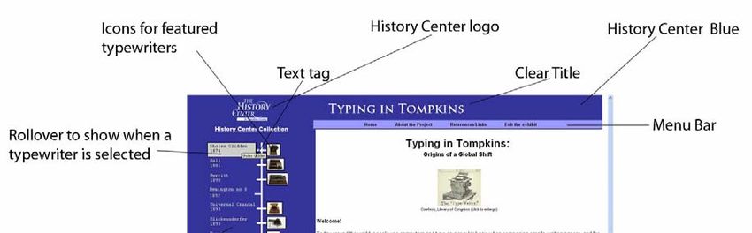
2

                                      Introduction
Overview
        Students in DEA 470 (Applied Ergonomic Methods) were presented with the
opportunity to work with The History Center in Tompkins County to prepare an online
exhibition for their typewriter collection. The objective was to give the students a chance
to create an ergonomic website design, while The History Center gained an online
exhibition, as well as a template for future exhibitions. The History Center in Tompkins
County is located in the Gateway Center Complex in downtown Ithaca. Formerly known
as the DeWitt Historical Society, they hold thousands of historic objects that are
significant to the history of Tompkins County. Most importantly for this project, The
History Center has a collection of typewriters dating back to as far as the 1870s. These
typewriters are not only significant to the Ithaca area and Tompkins County, but to the
development of the modern keyboard and computer. A select group of these typewriters
were chosen by the DEA 470 class to be featured. The selected typewriters were
researched, photographed, and presented in the online exhibit.

                                      Organization
Teamwork
        The team consisted of all members of the class, seven in total. It was decided that
everyone should be involved in all decision making, and while everyone’s opinions and
perspectives were equally valued, when final choices were made, majority ruled.
Meetings were held in class, out of class and via emails between group members. This
promoted a sense of ownership and investment for team members. However, this
approach might have delayed the process slightly due to other class obligations and
responsibilities. Another source of delay could also be that communication with the
client was sporadic, due to the nature of the client’s work hours and conflicts with class
members’ schedules.

Virtual workgroups and Remote Teleoperations
         The team of students met in class, as well as for meetings outside class. Most of
the communication was done via email. According to the literature on workplace design
and current trends in facility planning and management, this is an emerging trend that is
related to off-site work, or shared office space. There are positive and negative sides to
this strategy, and it does not fit every task. Since the majority of this project was done by
individuals who then reported back to the group, it was not necessary to have face-to-face
meetings as frequently. This was beneficial to the group because we were allowed to
work at our own convenience instead of trying to find a time when seven people could
3
meet. However, the disadvantage to this approach was that some of the benefits of direct
communication were lost, such as emotion, depth of dialogue, and deeper clarity of
communication amongst group members.
Group Dynamics
It was clear from the beginning that we had a few strong leaders in the team that
were capable of bringing the group together without the rest of the team members feeling
subservient or unequal. All in all, the group dynamics were positive. The division of
labor was designed to utilize each member’s strength, which enhanced our ability to
collaborate and work efficiently. An example of this is that one member of the team is a
very skilled website designer. As a result he was put in charge of the web site
programming. Another member has extensive experience in copy editing, and thus she
oversaw the general editing of the website text. Additionally, we have students who are
very talented with Photoshop and helped the group creating images for our website. With
more time, it would have been beneficial for all team members to get more exposure to
work or processes that they were not familiar with, in order to broaden their knowledge
bases. This is a limitation to the optimal learning process of the project, but certainly not
a detriment to the final product.
One of the largest challenges of this project was communication and information
sharing between members. When working remotely it is important to constantly be in
communication with other team members on what decisions are being made and what
tasks need to be completed. In spite of all members having access to the internet and
email, an initial protocol concerning communication was not established. As a result,
communication was somewhat difficult at times. The process became easier as the tasks
were more specific for each team member, and eventually did not pose a problem. It is
suspected that the team is not unique in this aspect. Communication in general was not a
problem and team members did not shy from providing honest feedback and input to each
other’s work, an essential component of a successful final product.
Development
Initial Research
Before creating the online exhibit, we decided to research other relevant online
exhibits. The group looked at common history websites including the Smithsonian. There
were also quite a few typewriter specific websites that we explored to see how other
institutions presented these machines. From this exploration we found both the positive
and problematic elements of these methods for presenting information. We used this
critique to aid in our own design and to begin brainstorming.
Approach
Our class discussed several different approaches toward developing the website.
We decided to use a “spiral design” approach, where throughout the development process
we continuously evaluated and altered the product. After each key piece of the project
was complete, our class met to review the addition.
Prototyping4
The design development process involved splitting the team into two groups.
Each group brainstormed ideas and came up with a prototype to present to the class. The
purpose of this was to come up with as many design features as possible in a given
amount of time. Each team met separately to develop prototypes which were later
combined into one, using the best ideas from each. Prototypes were hand-drawn
storyboards that featured ideas borrowed from other online exhibits.
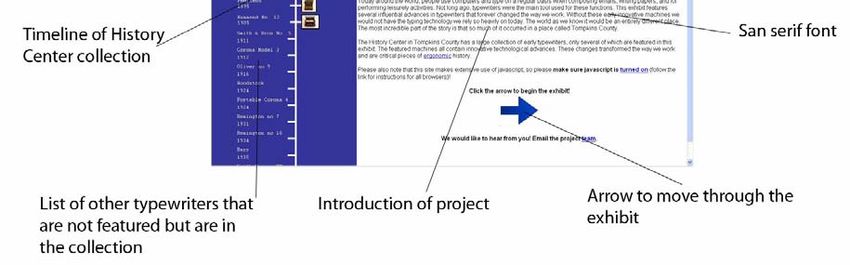
The combination of efforts from both groups resulted in a single prototype using
Microsoft Powerpoint, pictured here. This was the basis for our initial presentation
delivered to the History Center in March.
Ergonomic Evolution of the Typewriter
Home
Universal Crandall no. 3
Collection
The Universal Crandall Typewriter
Ergonomic Issues Model no. 3 received an award at
the 1893 World Columbian
Exposition in Chicago because of
1874 its innovative features, including
Universal Crandal 3 permanent alignment,
Remington St. 8
1893 interchangeable type, and unlike
Universal
other models, visible print, which
Crandall could be seen as it went onto the
Peerless no. 3 page. (see posture)
Oliver 5
Smith-Corona Enlarge Image View 3-D
Corona
Woodstock
L.C. Smith Bros. 5
Previous Next
1931
Barr
Remington 10
Some of the key issues discussed were:
• Modes of navigation
o Multi-mode navigation
Alphabetical listing by brand
Timeline
• Vertical vs. Horizontal
• Graphics
o Images
o Interactivity
Rollovers
3D visualization
• Color scheme
• Layout
o Placement of text and images
o Buttons
o Links5
Some of the key features of this prototype are:
• Dual-mode navigation
o The user can view the exhibit by brand or through a timeline
o The user can also scroll through using the “next” and “previous” buttons
o Due to the small selection of featured typewriters, the brand navigation
was later scrapped
• Ergonomic Issues
o A separate page discussed issues of posture, injury, and errors related to
physical and cognitive ergonomics
o We later decided to focus mainly on the historical aspect of these
typewriters
• Rollovers and 3D views
o These allowed the user to view the site actively.
• Navigation bar
o Drop-down menus allowed users to select pages and modes of navigation
o This was later changed to a horizontal toolbar with individual links to
eliminate confusion
Guidelines
We used the Section 508 standards as one of our guidelines. These standards,
published by the government, are parameters that one should follow in order to design an
accessible website. We tried to abide by these standards by making the website with
adjustable text, contrasting colors, and san-serif font. For the Section 508 standards we
used ‘Alt’ tags for images, thus programs designed for the visually impaired can let the
user know what the picture contains. This also allows the user to access the website as a
“text only” site.
In addition, we used common web design principles from a variety of sources,
including the CUergo website and those presented to us by Professor Hedge in class.
Selection of Typewriters
Early in the project our class needed to determine which typewriters to include in
the online exhibit. At our initial meeting with the History Center, our clients gave us a
list of all the typewriters in their collection. The list included twenty typewriters, two of
which did not contain identifying information. Within the collection, there was also a
duplicate of one of the machines. Of the remaining seventeen typewriters, we researched
each model in order to find which ones contained ergonomic innovations. Using the
History Center archives, along with additional research, we found that seven of the
typewriters contained at least one relevant ergonomic innovation. For example, if two
machines had the same mechanism, we clearly included the earlier model in the exhibit.
Therefore, the majority of the typewriters included in the exhibit are the earliest models.
We decided to use the Sholes Glidden (1874), Hall (1881), Merritt (1890), Universal
Crandal no. 3 (1893), Blickensderfer no. 5 (1893), Peerless (1895) and Hammond no. 12
(1905) typewriters.
Text6
Our group tried to keep in mind the user throughout the development of the
website. After deciding which typewriters to include in our online exhibition, we each
researched one of them and wrote about it. In doing so, we each were able to learn a little
about the complex history of typewriters in Tompkins County. Being that the audience
includes youth, the content describing the typewriters is succinct and tries to evoke a
playful tone while including pertinent information.
Title
Much time and thought was put into making a clear, witty title for the exhibit.
After much deliberation, we decided on the following: “Typing in Tompkins: Origins of a
Global Shift.” We felt that this illuminated the local aspect of the collection (Tompkins),
the fact that the much of the technology began in this area (Origins), and also cleverly
included a reference to the typewriters themselves (Shift).
Images: Photography
The darkroom in the back of The History Center is equipped with professional
lighting and developing equipment. The setup used for photographing the typewriters
allowed for full 360 degree image capture. Pictures were taken on a digital, high
resolution camera mounted on a tripod. The typewriters were placed one at a time on a
small rotating platform that moved in 10 degree increments on top of a table. A wall-
mounted roll of white paper was used as a backdrop during the photo shoot.
The process is best performed by two people: one to set the camera, and one to
rotate the object. We found that this is not only the most efficient method, it also reduces
the opportunities for mistakes. It should be noted that a small movement in the camera or
the platform when photographing a typewriter would result in a re-shoot. In addition,
typewriters must be handled using white gloves to prevent the transmission of finger oils.
The machines are very old and must be handled with care. The procedure is as follows:
• The machines were placed on a cart and rolled into the darkroom.
• A typewriter was removed from the cart and placed gently on the rotating
platform atop the covered table.
• The lighting was adjusted to illuminate the machine and diminish shadowing.
• The machine was rotated fully to ensure that it remained in the shot.
• The camera was set and locked in place while the typewriter was moved to a
forward starting position.
• The process consisted of 36 individual photographs taken at ten degree
increments. It is best to have a partner do the rotating.
• Additional still photos were later taken as desired.
• The machines were placed back on the cart and the procedure was repeated for the
remaining typewriters.
Images: Processing
Adobe Photoshop was used to touch up raw photographs if contrast needed to be
adjusted and to remove any shadowing. The photos were processed using a program
called 3D Home Studio. With this program, the sets of 36 photos were stitched together7
to create a seamless 360 degree view of each typewriter. The files were exported as JPEG
images and combined into a Java-based applet for the website.
Creating the Website
The site was coded by hand, using basic text editors. The language is all HTML
(following Transitional version 4 guidelines), javascript, and CSS (level 2). HTML was
used because the server does not support any extensions. Javascript had to be used
because the 3D imaging program only outputs javascript code, and to a lesser extent it
made the large amount of coding to be done much quicker. CSS level 2 is the current
stylistic standard.
In designing the coding aspects of the site, the layout was clearly labeled and
spaced to facilitate easy updating of both the content and the timeline. To the greatest
extent possible, all stylistic elements were consolidated into one file to allow for simple
and quick changes to the site as a whole. The site was tested in a variety of browsers,
including Mozilla, Firefox, and Internet Explorer. Collectively, these browers cover no
less than 95% of current users.
Solution
Final Website Design
Basic Design Guidelines
We considered several different fonts for the website. For consistency sake, we
used the Arial font on every page, except for The History Center logo. In order to provide
a sense of continuity for the user, we used the same logo as The History Center’s main
website.8
We followed website design guidelines, including an easily accessible layout.
Consistency was maintained by keeping the top bar and timeline the same throughout the
site. We used the same blue color as The History Center business card, per their request.
The color scheme was developed with only a few different colors in order to not
overwhelm the user. Contrast and legibility were crucial factors in deciding which colors
to use. The timeline was used as a means for navigating, as it is a logical progression of
events. After researching online timelines we decided that a vertical line with the oldest
information first was the most intuitive way to present the information.
Feedback as another guideline was a strong consideration. When a user holds the
mouse over a typewriter link on the timeline, it remains highlighted on the page. This is
to remind the user where they are at any point and to provide a level of interaction.
Finally, the structure of the site was maintained through maintaining a hierarchy
of information. The site information remains at the top of the page at all times. The user
is presented with a choice of how to get the information and the top bar always gives
them a chance to any other page.
How to Update the Online Exhibit
The homepage is index.html and is located in the root folder along with every
other major page. The pop-ups (the ones with the 3-D pictures) are the exception and are
located in the folder ‘3d’ and then in their respective folder.
Each page, with the exception of pop-up pages (i.e. the ad page), is laid out
identically, and divided through spacing and comments. Much of this becomes self
explanatory, but generally:
• The top of the page, up until the body tag, loads scripts and style elements.
• The body is divided into two primary parts: a left pane and a right pane.
o The left pane (CSS class ‘LeftPane’) contains solely the timeline and The
History Center logo. Each typewriter in the collection is clearly labeled
and separated. Typewriters with pictures have ‘pic’ in parentheses (the
ones featured in the exhibit) and those without have ‘nopic.’ Each
typewriter is divided with a ‘div’ tag – again, those with pictures are class
‘TypeWithPic’ and those without are ‘TypeNoPic.’
o The right pane (class ‘RightPane’) contains the rest of the elements on the
page. Again, each is plainly labeled. The section commented as “Content
Window” (class ‘ContentWindow’) is the white area of the page and is the
sole differing part of every page. Typically, there are two sub-classes:
‘text’ to standardize any writing that are not headers within the content,
and ‘picture’ for any pictures used in the content area. See below for how
to update these classes and other stylistic elements.
Updating any stylistic elements simply involves changing parameters in main.css,
a CSS level 2 style sheet linked to every page. The only exception is some unique,
minimal formatting done in the individual pages (and then only in the content window)
and the horizontal navigation bar. That navigation bar’s style elements are separate, and
located in nav.css.9
Updating the timeline is a more involved and time consuming process. Because
the site was limited to only basic html and some javascript (as opposed to asp, php or
other formats that are server dependent), each page is essentially a duplicate of every
other page with the exception of the content area. Accordingly, a change to the timeline
must be made to every page in the same spot for the sake of consistency.
To add an additional featured typewriter, the following things must be changed on
all the pages that have the timeline:
• The comment should be changed from ‘nopic’ to ‘pic’
• The div class should be changed to ‘typewithpic’
• The image names may have to be changed if a different image name is used (but
this should be avoided if possible.
• The ‘onclick’ java control should be changed to direct the user to the new
appropriate page (typically the name of the typewriter plus ‘.html’)
A new page needs to be created with the new featured typewriter. The easiest way
to do this is to copy an existing typewriter page and change the text and picture. The page
should be saved to the root location along with the other pages.
Finally, within the folder ‘3d,’ a new folder with a simplified typewriter name
should be created, and the 3d pop-up and related images should be stored there.You can also read