UCLA Department of Statistics Papers - eScholarship
←
→
Page content transcription
If your browser does not render page correctly, please read the page content below
UCLA
Department of Statistics Papers

Title
CGM and insulin pump data to introduce classical and machine learning time series analysis
concepts to students

Permalink
https://escholarship.org/uc/item/4qp1p4j9

Author
Sanchez, Juana

Publication Date
2021-08-10

 eScholarship.org                                 Powered by the California Digital Library
                                                                  University of California
8/9/2021
CGM and insulin
pump data to
introduce classical and
machine learning time
series analysis
concepts to students
Juana Sanchez
UCLA Department of Statistics
Joint Statistical Meetings, August 2021
github.com/juanasanchez
jsanchez@stat.ucla.edu
Time series data analysis: rarely taught to undergraduates in college.
Many students graduate with:
the i.i.d mindset,
without ever having corrected for autocorrelation in regression,
without ever using their regression models to predict out‐of‐
sample.
In the rare cases where an upper division elective time series course is
offered to juniors and seniors,
the iid mindset interferes with the learning of basic time series
concepts,
students have to invest a large amount of time learning concepts
that could have easily been taught at the intro stats level.
The volume, velocity and variety of timestamped data (smart cities,
medical devices, finance, economy, climate, water quality, energy…) is
making it increasingly necessary to include at least some basic time series
education in the intro stats course.
2
1
8/9/2021

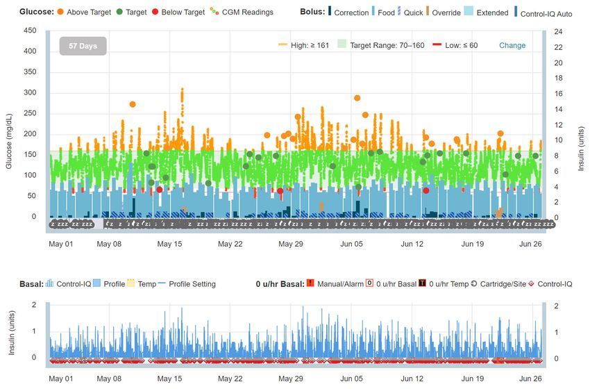
                                              For example, the red one could be the
                                              blood glucose sequence observed for
                                               DDD (Diabetic Data Donor) between
                                                   May 1st and June 26th 2021.

  A statistical time series is a random realization of
  one of the many possible sequences of values of a
      variable generated by a stochastic model.

 This talk is a case study involving data produced by closed‐loop
 technogy for the management of T1D of the DDD. Follows GAISE
 recommendations.

1. The context: Blood glucose regulation for a T1D (Type I Diabetic) person
2. The multivariate and real timestamped sensor data donated by a DDD is
   produced by the technology with a purpose: to help non‐statistician health
   care providers routinely guide DDD’s health care management.
3. Our objective is to use this context and data to engage students in the
   discovery of time series features by means of basic graphs and summary
   statistics that they learn in an introductory statistics course, by
   investigations and critical thinking.

                                                                                      4

                                                                                                2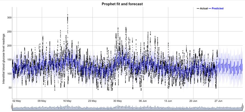
8/9/2021

          1. The context: blood glucose regulation

                             Low and high blood sugar are self‐regulated by the
                             pancreas. When the pancreas functions well:
                             • If high blood sugar level: Insulin released by the
                               Beta Cells of Pancreas makes sugar go to cells to
                               produce energy. This helps maintain normal sugar
                               levels in the blood.
                             • If low blood sugar level: Glucagon released by
                               Alpha Cells of Pancreas makes the liver release
                               glucose to the blood. This helps maintain normal
                               sugar levels in the blood. Not desirable even in
                               normal persons. Better eat that cookie.

                                                                                    5

For a T1D ( for 1.6 million people in the US of every age, race,
                        shape, and size)

                        • Normal blood glucose self regulation
                          does not work.
                        • All the blood sugar stays in the blood.
                        • Artificial insulin is needed.

                                                                                    6

                                                                                              3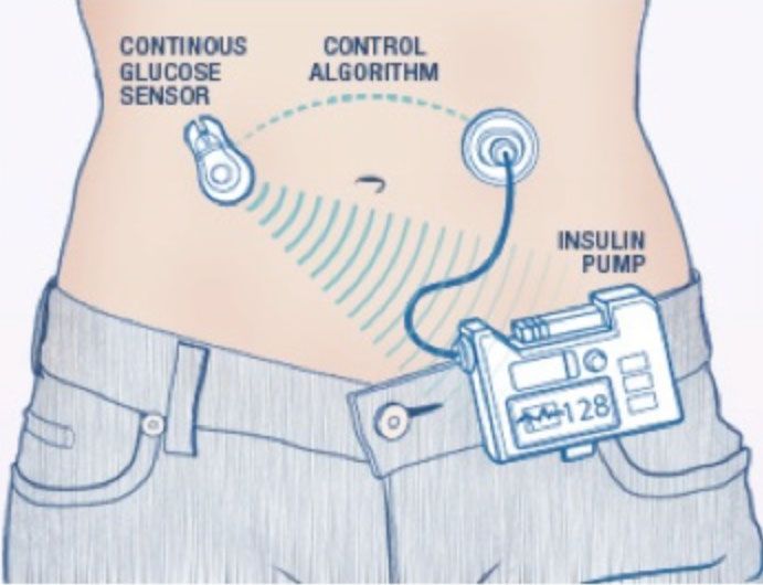
8/9/2021

   Since Jan 2020 close‐loop system technology adjusts insulin levels
   and provides readings of interstitial blood glucose. The DDD in this
                    case study uses the technology.

                                  Objective: mimic
                                  normal blood glucose
                                  control

                                                                      7

DDD’s view
of the data
produced
by the
technology

         DDD can view sensor glucose readings in the
            insulin pump display up to 24 hours

                             DDD can also view sensor glucose
                               readings in the smart phone
                                                                          8

                                                                                    4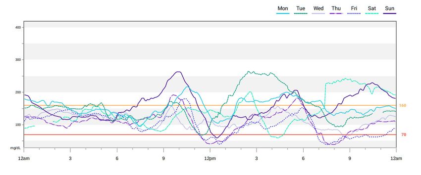
8/9/2021

DDD can see
more than
glucose
readings
                                                                DDD also validates cgm
                                                                readings by periodically
                                                                 checking “true” blood
                                                                  sugar manually and
                                                                periodically intervenes.

                                                                                            9

The
algorithm
is
unknown

              The pump seems to act based on predictions of blood glucose
              for the next half hour. When sleeping, that works very well.
              When awake, with unexpected events, body reactions, food,
              etc. it gets complicated. DDD would like to understand the
              secret algorithm inside the technology better.

                                                                                           10

                                                                                                      5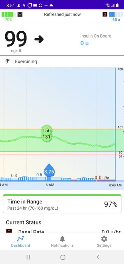
8/9/2021

2        The technology stores DDD’s
         timestamped data and plots.

                                            11

    The purpose of the data storage: to
    allow non‐statistician nurses and
    doctors inspect all the plots and
    summaries every three months to
    guide DDD’s adjustments to
    therapy.

                                       12

                                                       6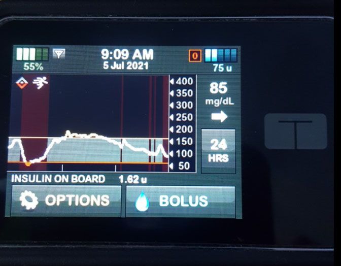
8/9/2021

   Graphs and summary statistics are
   not quite those taught at the intro
               stats level.
                                                                                                                   13

Lots of time series graphs and data stored in the technology’s server

Hourly average glucose        Some kind of trends             Spaghetti plots               Streaming data.
 readings summarized
  by hour of the day.
                              Something close to trends   Something close to spaghetti   Something like multivariate
Something close to seasonal       during the day                     plots               time plots, customized, but
        box plots                                                                               not line plots.

                                                                                                                   14

                                                                                                                              7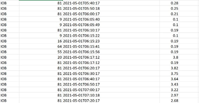
8/9/2021

  Not all weeks are the same, not all days are the same
    In some weeks, all days are roller‐coasters

                                                           There is a rich story to tell students with
                                                           just blood glucose built‐in graphs. We
                                                           analyze 16017 observations of blood
                                                           glucose of May 1st‐June 26, 2021 and 9055
                                                           observations of insulin interventions during
                                                           the same period.

                                                                                                          15

                                                     Time plot
                                                                                         3.
                                                                                         Teaching
                                                                                         basic time
                                                                                         series
                                                                                         concepts
                                                                                         in the intro
                                                                                         stats class
                                                                                         with R

Non‐linear trend             Q. What does this plot reveal about the
                             technology? About DDD? Would you expect this
according to a moving        trend in a time series of household electricity
average smoother             use recorded at 5 minute intervals?

                                                                                                                     8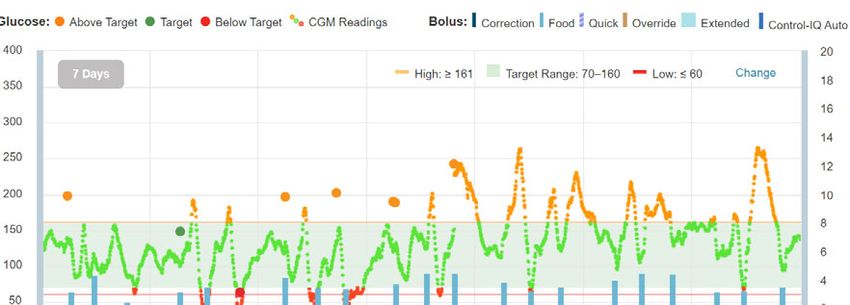
8/9/2021

                                                   Daily seasonality seen with seasonal box
                                                          plot of DDD’s blood glucose.

  Weekly seasonality. Median lower on
thursday‐Sat seen with a seasonal box plot
     Q. How does it differ from weekly       Q. How does it differ from daily
     seasonality of household electricity    seasonality of household electricity
     use?                                    use?
                                                                                              17

 Daily seasonality
 different each week
  • The daily seasonality pattern
    that we noticed in the
    seasonal box plot, when
    viewed week by week and
    day of the week by day of the
    week, does not appear so
    regular.

  • Some weeks show more
    variability than others.
   Q. What variables could help
   explain the differences in the
   weeks.

                                                                                         18

                                                                                                         9
8/9/2021
Forecasting like analysts
in the loop with Prophet
• Cannot expect intro stats
students to forecast with
sophisticated time series
models.
• But students without any
time series training work
sometimes as analysts in the
loo (use a proprietary
automated forecasting
routine). Facebooks’ prophet
is an example.
Q. What do you observe about the
forecasts out‐of‐sample as Glucose = trend + hour +day of week+holidays
compared with the training data?
19
Forecasting like analysts Another way to do time
in the loop with Prophet series decomposition.
• Prophet models the
components of the time
series that we analyzed with
our plots.
• Glucose = trend + hour +day
of week+holidays
Q. What is happening to our
uncertainty when we forecast
farther ahead?
20
108/9/2021
Machine learning: features engineering and clustering to be able to
combine insulin and glucose data
• We involve now the • Use summaries familiar
insulin interventions by to the intro stats student:
the pump and DDD, but interquartile range, min,
because the recording max, median, frequencies
time interval is different of different types of
than for glucose we use boluses.
features engineering : • By the hour.
21
Q. What explains the differences in the
Clustering of features clusters of the hours? Investigate using
data not used in clustering.
22
118/9/2021
Conclusion: the case study engages students and makes them use
the tools they know to investigate a complex process. At the same
time, they learn basic time series concepts using only their intro
stats tools.
The concept of The concept of long The concept of forecast The concept of
seasonality term trend decomposition of a
And with all of the above, an intuition for the concept of time series into its
autocorrelation is gained before introducing the ACF and PACF. components
Of course, having time series for more than one DDD would make
the study more interesting. After all, the technology designers are
inspired by time series like ours of thousands of individuals and
design to target the average individual. 23
Thank you for your attention
The paper (with references), simple R programs and data
for this talk can be found at github/juanasanchez shortly
after the JSM meetings.
jsanchez@stat.ucla.edu
I thank the DDD for the data and for all the information provided that
helped me understand the data. Without the DDD’s help I would not
have been able to complete this presentation.
24
12You can also read


