Visualizing Cosmetics Packaging Colour in the Republic of China
←
→
Page content transcription
If your browser does not render page correctly, please read the page content below
E3S Web of Conferences 179, 02045 (2020)                                                     https://doi.org/10.1051/e3sconf/202017902045
EWRE 2020

    Visualizing Cosmetics Packaging Colour in the Republic of
    China
    Xiangyang Bian1*, Wenli Lu1 and Yijin Chen1
    1College   of Fashion and Design, Donghua University, Shanghai, 200051, China

                  Abstract. During the period of the Republic of China, with the progress of printing technology, the
                  application of colour in all kinds of packaging gradually diversified. This paper takes cosmetics packaging in
                  the Republic of China as an example and sums up the common colours of cosmetics packaging. Based on the
                  visual psychology, the paper analyzes the psychological characteristics of cosmetics packaging colour in the
                  Republic of China. It can be seen that cosmetics packaging used colour to convey product information to
                  consumers. Meanwhile, it meets the request of consumers for product colorization.

  1 Introduction
                                                                        2.2 Branding
  Visual language is a way which is used to communicate
                                                                        Colour is one of the important signs of brand and
  with consumers to present the products by graphics,
                                                                        enterprise when consumers buy goods. It is a kind of
  colours and characters [1]. The Republic of China is a
                                                                        communication of enterprises’ colours, which helps to
  high-speed period for the development of local enterprises
                                                                        increase consumers’ brand awareness and remember the
  by cosmetics industry that is also growing vigorously.
                                                                        products because of colours.
  Local cosmetics use western decorative patterns which
  make the cosmetics packaging special and attractive so as
  to improve their own competitiveness. Characters, colours             2.3 Product identifying
  and patterns are mainly made up of the visual packaging
  elements. Color is the most visible visual symbol in                  Products’ information can be more accurately and
  packaging design. The most suitable application of                    effectively transferred by the combination of products’
  packaging colour can make the products obtain better                  packaging colours and colour characteristics.
  visual effect and leave visual impression to consumers
  intuitively. Meanwhile, it also can attract customers’                2.4 Boosting consumption
  attention to stimulate consumption. That makes a unique
  period of cosmetics packaging colour in the Republic of               Consumers’ attention can be attracted by suitable colour
  China.                                                                matching and its strong visual impact makes consumers
                                                                        feel curious and novel, which encourages them to buy
                                                                        products.
  2 Color functionality
  The function of colour in cosmetic packaging design                   3 Cosmetics packaging colour and
  includes four parts, which are beautifying, branding,                 expression methods
  product identifying and boosting consumption.
                                                                        Due to a limit to the printing conditions, there were not
  2.1 Beautifying                                                       many choices of colours which single colour or two-
                                                                        colour printing was often used on the trademarks at the
  A visual process of attracting beauty and enjoying beauty,            beginning of the Republic of China, that caused the
  which can enhance the visual appeal of products by using              content of the simple paintings like line drawing (figure1)
  appropriate colour matching combination, arouses the                  and freehand brushwork were often used to draw patterns.
  interest of consumers and gives consumers a pleasant                  The production was simple and crude as a result of limited
  experience.                                                           printing technology.

    *Corresponding   author’s e-mail: bianxy@dhu.edu.cn
© The Authors, published by EDP Sciences. This is an open access article distributed under the terms of the Creative Commons Attribution
License 4.0 (http://creativecommons.org/licenses/by/4.0/).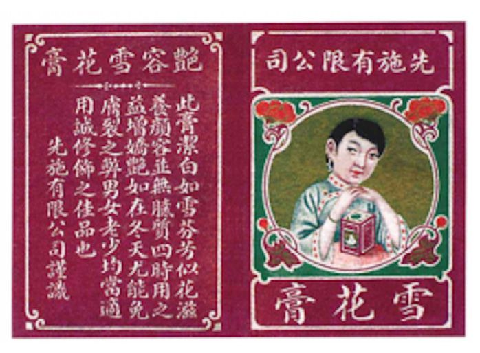
E3S Web of Conferences 179, 02045 (2020) https://doi.org/10.1051/e3sconf/202017902045
EWRE 2020
Figure 1. Line drawing used on the trademarks
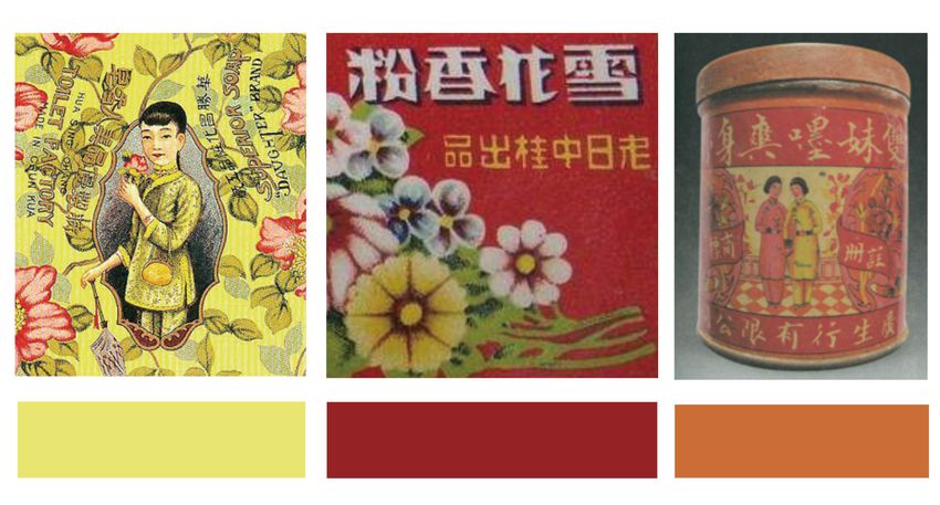
From ancient to now, Chinese people advocate red, celebration and bustle. Yellow is a commonly used colour
bright and warm colours (figure2) such as yellow and in ancient imperial costume accessories which symbolizes
orange. In the traditional colour concepts, red is the colour authority and brilliance. After that, yellow was
of fire and blood which symbolizes life, reunion, popularized and it can also be widely used by civilians.
Figure 2. The colours of cosmetics packaging
During the early Republic of China, the style of Spring were not limited by the natural light of the real scenery.
Festival pictures, a folk art in China is carried over into Cosmetics packaging was coloured by the colour of the
the use of cosmetics packaging colour. The colours were objects and the patterns were flat. For example, the bee
bright and gorgeous, mostly in black, white, red, yellow flower sandalwood soap produced by the Central Soap
and orange. The high saturation warm colour mainly in red Factory (figure3) is based on a large area of black and red,
was preferred to express the happy and warm atmosphere. giving people a magnificent feeling. The symmetrical
In the early days, the images of trademarks were compared combination of bees, flowers, and plant patterns looks
with large and accumulated colour blocks. The objects vivid, lively and festive.
Figure 3. The bee flower sandalwood soap produced by the Central Soap Factory.
During the late of the Republic of China, the trademark By the 1930s, the Republic of China had begun to use
was often matched with yellow, eosin, green, blue and the packaging paper for stamping and embossing printing
black, especially dark blue (figure4). As the main colour of watches as great progress has been made in printing
of patterns, flowers, plants, characters were filled with technology. In the 1930s and 1940s, trademark design was
blue on the packaging because the printing technology of influenced by the western realistic expression. The object
multicoloured ink was imported into the Republic of pursued the sense of photographic reality, and began to
China. use the principle of light, shadow and color gradual
change to create the sense of volume. Instead of using the
2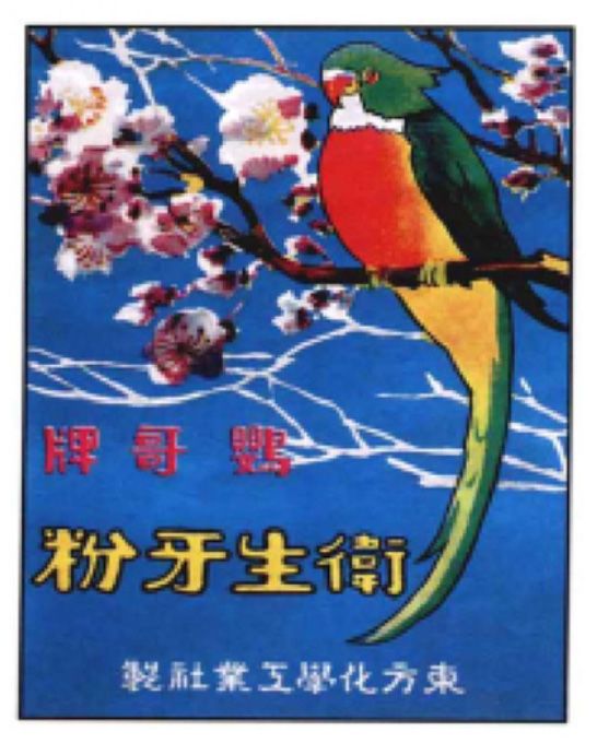
E3S Web of Conferences 179, 02045 (2020)                                              https://doi.org/10.1051/e3sconf/202017902045
EWRE 2020

  original color contrast of red and green, high purity and
  strong contrast present various and natural colors in
  Spring Festival pictures.

                                             Figure 4. Blue on cosmetics packaging

  4 Colours in psychology
                                                                    4.1 Color perception
  Rudolf Arnheim put forward in Art and Visual Perception
                                                                    There is no doubt that colour can convey feelings.
  that all visual images are produced by mountain colour
                                                                    Different colours contain different visual language
  and brightness [2]. Compared with characters and
                                                                    information, and people have certain associations with
  graphics, colour can simply express its visual emotion,
                                                                    colours. In the most intuitive way, consumers rely on the
  affect the audiences, and produce resonance. The colours
                                                                    inherent colour of the product to directly identify the
  of emotional experience can be interpreted in painting,
                                                                    product attributes within the package. For example, the
  sculpture, packaging design, architecture and other fields.
                                                                    packaging of orange juice will be yellow or orange, and
  It can deeply feel the power of colour from the artists’
                                                                    the colour of coffee will be revealed. This phenomenon is
  works [3]. Colour which can replace the artist himself
                                                                    especially obvious in food packaging.
  conveys the artists’ emotional changes behind the works
                                                                        Secondly, colour can also reflect gender
  to the audience in a unique way, arouse the audiences’
                                                                    characteristics. Especially in cosmetics packaging design,
  resonance and endless Association of the audience's mind.
                                                                    consumers are mainly women. Most of the skin care
  Colour is expressed in packaging design, and it also
                                                                    products are purple, pink, or white(figure5). Men’s skin
  conveys its unique visual language. This part takes the
                                                                    care products are mainly white, grey and black.
  cosmetics packaging of the Republic of China as a case,
                                                                    Psychological research shows that men shop more
  discusses the performance of colour in psychological
                                                                    rationally. While women are rich in emotions, are
  characteristics by citing colour psychology, and analyzes
                                                                    inherently sensitive to colour, and are susceptible to
  and studies the three aspects of colour perception, colour
                                                                    colour. Therefore, the selection of appropriate colours in
  association, and colour symbolization.
                                                                    female cosmetics packaging can have a stronger appeal to
                                                                    female consumers, have a preconceived interest in
                                                                    products, and stimulate their desire to buy.

                                                Figure 5. The skin care products

     Through the case summary, the following specific               night and cold. But from the weight of the colour, it is
  forms of colour reflect the visual psychological                  mainly determined by the lightness. The lighter colour has
  characteristics. In terms of warm and cold colours, red,          a lighter sense of quality, while the lower lightness and
  orange, yellow and other colours are reminiscent of               darker colour gives a sense of cohesion and weight. It
  sunlight and give a warm feeling, so they are warm                looks solemn and calm.
  colours. Green, cyan, and blue colours are reminiscent of

                                                                3
E3S Web of Conferences 179, 02045 (2020) https://doi.org/10.1051/e3sconf/202017902045
EWRE 2020
On the other hand, colours also express feelings.
Generally, warm colours such as yellow and red give
people a feeling of expanding forward, and cold colours
give a feeling of retreating. In terms of Colour expansion
and contraction, warm colours express the feeling of
expansion and expansion, and cold colours convey the
feeling of shrinking and gathering. Also, from brightness
and melancholy of colour, the psychological feeling is
mainly determined by brightness and purity. Warm tones
such as yellow and red give people a lively feeling, and
cold tones such as blue give people a sad and sad feeling.
4.2 Colour association
With seeing the colour, people often think of things related Figure 6. The perfume box imported from France
to the colour. For example, as green, we will think of grass,
plants or life. As blue, we will associate the sea, the sky
and so on. Even people hear the name of colour, they also 6 Conclusion
imagine some pictures about it. Their brains will begin to
Colour is the consumer’s first impression of a product.
associate colours. And the association is caused by
Cosmetic packaging can convey product information to
people's perception of colour, experience, memory or
consumers by colours. During the Republic of China, the
accumulation of knowledge.
packaging colours of cosmetics changed from single-color
and two-colour to colourful, and gradually singularized in
5 Color Symbols the later period. In the later period of the Republic of
China, the colour matching was mainly yellow, red, green,
Colours are rich and diverse, but each colour has different blue, and black. Most of the cosmetics packaging used
emotions and symbolic meanings, which will make people warm colours, mainly red and yellow, while imported
have completely different emotional reactions [4]. foreign cosmetics were mainly gold and purple. The
For example, Chinese people like to use red, yellow colour of product packaging is also an expression of
and blue. These colours have their historical origins, consumer emotions. Designers use colour as a bridge to
especially red, because people worshiped the sun, fire, and connect the relationship between consumers and products.
blood in ancient times. The natural life was expressed in It could be seen that cosmetics packaging not only
the worship of red, so red has the symbolic meaning of life conveyed product information but also took into account
and the sun. Zhou Dynasty introduced metal, wood, water, consumer emotions, which played an important role in
fire, and earth, the five elements of Chinese philosophy. product sales in the Republic of China.
Red, which was respected by Zhou Dynasty and used in
large quantities. During Ming Dynasty, red is the symbol
of marriage and childbearing, and was widely spread and Acknowledgments
used in folk factories. During the period of the Republic
The authors would like to express their gratitude to the
of China, folks believed that red is festive, auspicious, and
team of Prof. Bian for support. This work was supported
hopeful. Red has become a symbol of traditional national
by the National Academy of Social Sciences Fundamental
culture in China.
Art Project “Research on Design Aesthetics” (19ZD23).
During the Republic of China, most of the cosmetics
packaging colours used warm colours such as red and
yellow. Red and yellow have good visual highlights and References
eye-catching effects. Chinese always prefer red and
yellow because of their meanings. Secondly, these warm 1. Cohen D. (2006) A Visual Language: Elements of
colours are enthusiastic and festive. Influenced by the Design. A&C Black, London.
colour of western packaging, blue was often used in 2. Rudolf A. (2004) Art and Visual Perception.
packaging design in the middle of the Republic of China. University of California Press, Oakland.
It conveys a clean and tranquil feeling. On the packaging
3. Rudolf A. (2004) Visual Thinking. University of
of foreign cosmetics imported, gold and purple were used
California Press, Oakland.
in large quantities. Purple is a symbol of femininity, full
of noble and elegant temperament, mystery and femininity. 4. Faber B. (2006) Color Psychology and Color Therapy,
Gold symbolizes nobleness and authority. The packaging Martino Fine Books, Eastford.
allows for a sense of exquisiteness and high-end. For
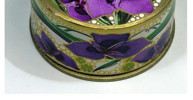
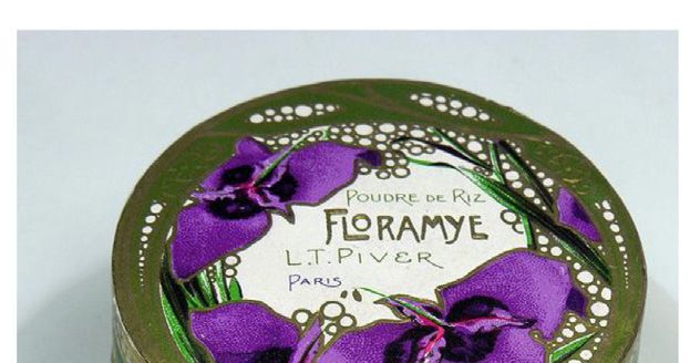
example, this perfume box (Figure 6) imported from
France, expresses women's mystery and elegance by
purple patterns. The bump-printed technology makes the
packaging exquisite and perfect.
4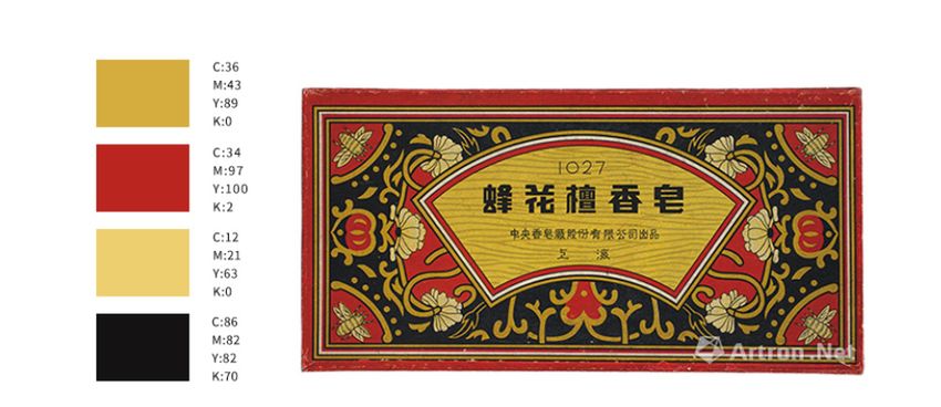
You can also read