WebCenter User Experience and Interaction From iPads to Xbox - JOHN SIM - @JRSIM_UIX FISHBOWL SOLUTIONS, INC.
←
→
Page content transcription
If your browser does not render page correctly, please read the page content below
WebCenter User Experience
 and Interaction From iPads
                    to Xbox
                   JOHN SIM - @JRSIM_UIX
               FISHBOWL SOLUTIONS, INC.

                                           i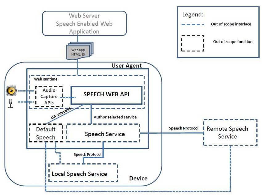
Fishbowl Solutions Notice
The information contained in this document represents the current view of
Fishbowl Solutions, Inc. on the issues discussed as of the date of
publication. Because Fishbowl Solutions must respond to changing market
conditions, it should not be interpreted to be a commitment on the part of
Fishbowl Solutions, and Fishbowl Solutions cannot guarantee the accuracy
of any information presented after the date of publication.

This Whitepaper is for informational purposes only. FISHBOWL
SOLUTIONS MAKES NO WARRANTIES, EXPRESS, IMPLIED OR
STATUTORY, AS TO THE INFORMATION IN THIS DOCUMENT.

Complying with all applicable copyright laws is the responsibility of the user.
Without limiting the rights under copyright, no part of this document may be
reproduced, stored in or introduced into a retrieval system, or transmitted in
any form or by any means (electronic, mechanical, photocopying, recording,
or otherwise), or for any purpose, without the express written permission of
Fishbowl Solutions Inc. Fishbowl Solutions Inc. may have patents, patent
applications, trademarks, copyrights, or other intellectual property rights
covering subject matter in this document. Except as expressly provided in
any written license agreement from Fishbowl Solutions, the furnishing of this
document does not give you any license to these patents, trademarks,
copyrights, or other intellectual property.

© 2014 Fishbowl Solutions Corporation. All rights reserved.

Fishbowl Solutions is a registered trademarks or trademarks of Fishbowl
Solutions Inc. in the United States and/or other countries. The names of
actual companies and products mentioned herein may be the trademarks of
their respective owners.

© 2014 Fishbowl Solutions Corporation. All rights reserved.

Contents
1     Introduction – Executive Overview                              1
2     Cross-Device Interface Support: Desktop to Tablet to Mobile    2
2.1             Fluid Grids/Liquid Layouts                          2
2.2             Flexible Images                                     3
2.3             Breakpoints                                         3
2.4             CSS3 Media Queries                                  4
2.5             Two Ways of Using CSS Media Queries                 4
3     Voice Enabled Integration (Microphone)                         5
4     Touch Events & Gestures: Integrating with Touch Screens       11
4.1             Current Oracle PS5 ADF Touch Enhancements           11
4.2             Developing With Other Frameworks                    13
5     Experimental Motion Activated Gestures (Kinect)               14
6     Conclusion                                                    17
1 Introduction – Executive Overview
In recent years User Experience (UX) has become increasingly important. Organizations can
no longer get away with ignoring the ways users interact with applications both inside and
outside the office. By investing time in prototyping and usability testing, organizations can help
their users be as productive as possible. As we look to the future the traditional mouse and
keyboard interaction model is simply not enough. Market innovators are developing new
methods to enhance applications with technology like Voice, Touch and Motion Gestures that
enable the user to interact with and locate the information they need quickly and easily in new
and interesting ways.
There has already been an explosion of new requirements and support for the latest touch
devices; we see evidence of this even in Oracle WebCenter PS5. Recognized standards are
coming into play more and more often as users become increasingly familiar with touch devices
and technologies like the Xbox Kinect. These technologies allow users to interact with
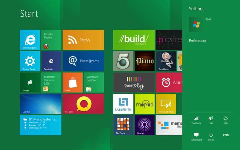
innovative UIs like the Windows Metro interface used within the Windows 8 operating system,
the Xbox gaming platform and Windows Mobile.
Figure 1: Metro UI
This whitepaper will showcase how we can now support multiple devices and use new input
methods to interact and enhance WebCenter’s capabilities. By using custom implemented
features to provide Touch, Motion, and voice interactions within a web browser, users can
escape from the keyboard while exploring new approaches to interacting with information.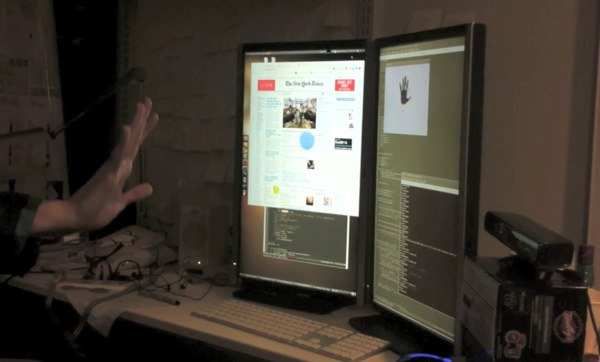
2 Cross-Device Interface Support: Desktop to
Tablet to Mobile
Whether you are designing for a desktop display, or a Blackberry, or the latest iPad3,
supporting multiple devices within one interface can be a challenge. This type of interface
design is now widely referred to as responsive or adaptive design—an interface design where
the user’s environment, screen resolution, platform and orientation are all supported by one
template. Clients have been asking for this support for years and, although it’s not easy, it has
been made easier with CSS3.
2.1 Fluid Grids/Liquid Layouts
Fluid grids (liquid layout), flexible images, breakpoints,
media queries and a touch of JavaScript are now the key
elements to getting started with responsive design.
Fluid Grids provide the ability for a web site or application to
scale its containing region elements based on the width of
the browser viewport. This allows for elements to be flexible
and reposition on the site to support multiple resolutions
ranging from desktops to mobile devices.
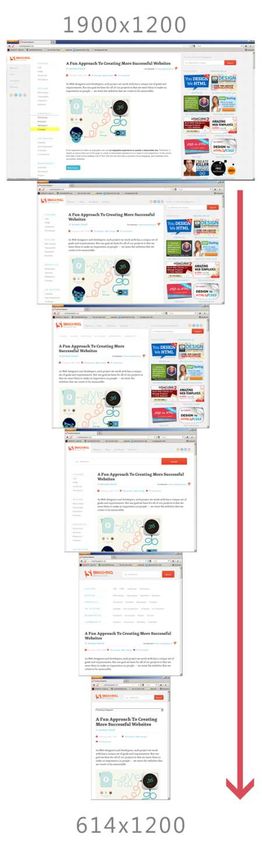
The new Smashing Magazine Website is a perfect example
of a responsive site – on the right you can see an example
of the site and it’s breakpoints as the browser is scaled down
from 1900px wide to 614px.
Figure 3 & 3: Fluid Grids
SmashingMagazine.com Working
Figure 2 & 3: Fluid Grids Example Res 2
SmashingMagazine.com Working
Example Res 1
Initially all the navigation is vertical, positioned left of the content region. This provides a nice
     flow from site sections to section navigation elements. As we reduce the size of the site you will
     notice that the navigation model transforms to position these items in the header above the
     content; providing a constant fixed proportional width for the content information area of the
     site.

     As we scale further down you will notice the right hand side of the site which previously
     contained Advertisements, Tags, and highlights is removed, and the header now contains a
     large search field allowing users to filter and find required content easier whilst still having
     access and providing an equal amount of real-estate for the main content portion of the site
     which users would find more relevant.

2.2 Flexible Images
                       Generally flexible image use involves setting the image width to 100% and
                       allowing the containing DOM element to manage the size of the image as it
                       scales down or up. Another option is to use JavaScript to define which image
                       to download based off the screen resolution. This is especially useful when
                       implementing support for mobile users in areas where mobile internet speed is
                    limited. This option means that users are not forced to download large
     bandwidth-heavy images. There are browsers like Amazon Silk and Opera Mini that will proxy
     and optimize the content delivered to the device. Some mobile providers even do this through
     their network, but do you want to risk having users who do not use those browsers or providers
     and thereby risk the responsiveness of your site appearing slow? WebCenter Content can
     provide this optimization functionality out of the box and can create multiple files optimized from
     a source image and at different resolutions for you to pull content into your website.

     A good example and source for Responsive-Images -
     https://github.com/filamentgroup/Responsive-Images

     For any img elements that offer a larger desktop-friendly size, reference the larger image's
     source via a ?full= query string on the image url. Note that the path after ?full= should be
     written so that it works directly as the src attribute as well (in other words, include the same
     path info you need for the small version).

2.3 Breakpoints
     As you work with your design in a fluid grid, you will find that your site just doesn’t look right in
     certain resolutions. A breakpoint is where you define how the template should be altered based
     on the resolution and orientation. This is generally done with CSS Media Queries although
     more complex designs will use JavaScript to handle this.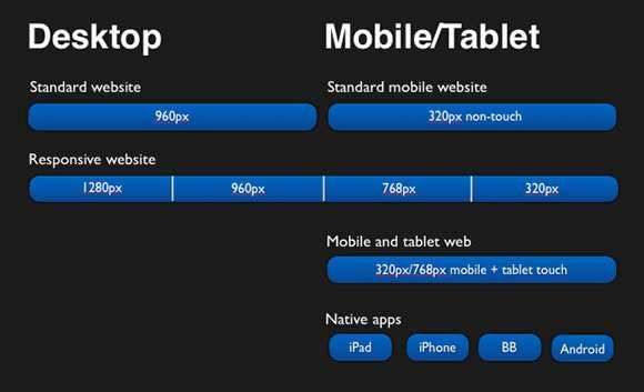
Figure 4: Example Breakpoints

     These breakpoints will usually reflect the resolutions you would want to support – 240px,
     320px, 480px, 640px, 800px, 960px, 1280px+. This is not definitive, but servers as a useful
     guide. As devices change, graphics cards improve, and manufactures compete to have the
     highest resolution displays, web developers must continue to evaluate the resolutions
     supported by their sites.

     If you’re not using the web developer toolbar plugin within Firefox then you can use
     http://responsivepx.com/ that allows you to define the dimensions and see how your site works
     within your predefined breakpoints.

2.4 CSS3 Media Queries
     CSS media queries have been around for some time now. CSS2.1 allows developers to define
     stylesheets to be used for printing a page, WebTV, projector display and daily device use, but
     now with CSS3 we can define the styles that are used based on the following additional
     queries: max-width, min-width, device-width, orientation and color.

     In the past web designers have either had a single global stylesheet or have broken them into
     multiple styles (layout, colors, fonts) to be reused and allow easy corporate brand management
     across their Website, Intranet, Extranet and Portal; but they have never really been widely used
     to support more complex multi-resolution capable devices.

     With CSS3 we can do this much more easily and can apply required transformations for
     breakpoints on the fly. For example, if I rotate the screen I can load in a style to reposition
     crucial site elements, and if I resize the screen I can load in another style to make the site
     adaptive.

2.5 Two Ways of Using CSS Media Queries
     1. Inline within the style sheet you can encapsulate the required css within the query –

         @media only screen and (max-device-width: 480px) {

              body {
background:red;
}
}
2. Within the Media attribute of the html tag
For browsers that do not support the CSS3 Media queries a javascript patch is available from
here http://code.google.com/p/css3-mediaqueries-js/or https://github.com/scottjehl/Respond
3 Voice Enabled Integration (Microphone)
Speech input is one of the latest innovative browser technologies to appear.
It’s easy to implement and there are several obvious uses:
• Assistive dictation for those with impaired mobility
• An alternative input option for mobile phones and tablets
• Provides support for an environment where a keyboard or mouse is impractical
• Enhance web site features like Search and Navigation.
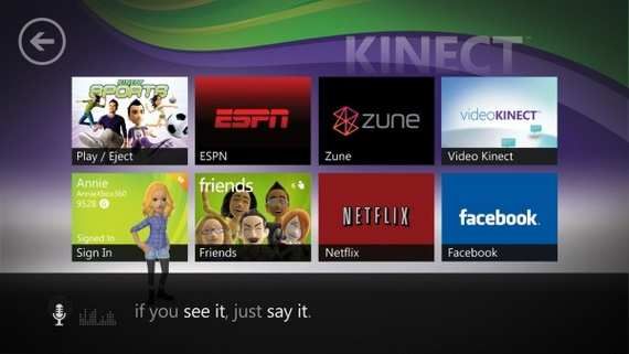
Figure 5: Example Xbox Metro UI with Voice Enable Kinect Integration
There are number of methods to enable browser voice integration.
- here are some I have used:1. Google Chrome Native Support
March of last year Google released the HTML speech input API within their Chrome browser
giving developers the ability to transcribe voice to text from a webpage—a prototype for the
HTML Speech Incubator Group.
Figure 6: Architecture Diagram
How does this work - Overview?
HTML Source
Speech test:
Figure 7: Example of Enabled Speech Integration
With the following attribute x-webkit-speech a microphone is displayed within the input field.
• The user selects the microphone and the “Speak now” model window is displayed; as
you speak you will see the sound range highlight.• After you stop speaking the sound wave is passed to Google’s servers where speech
recognition software is used to analyze your voice.
• An XML file is then passed back to the browser with the transcribed text and a few
additional parameters such as how close the recognition match was.
• This text is then inserted into the selected text field.
The problem with this approach is that is currently only supported by the latest webkit browsers.
2. Dragon Speak, Kinect Voice SDK
If you need cross-browser device support for voice integration, you can now develop your own
custom solution with a few limitations.
Both Nuance and Microsoft can supply a voice recognition engine (Dragon Speak or Kinect
Voice) that you can setup on your webserver. The challenge lies in getting the browser to
capture the voice input. Here are a few options here for talking this:
Flash
Currently the only easily supported method is to use a Flash plugin as this plugin has access to
the audio and video input device – an open source framework is available from
http://speechapi.com. It communicates with its own voice engine, although you can configure it
to point to your servers if desired.
function onLoaded() {
speechapi.setupRecognition(
"SIMPLE",
document.getElementById('words').value,
false,
false
);
}
var flashvars = {speechServer :
"http://www.speechapi.com:8000/speechcloud"},
params = {allowscriptaccess : "always"},
attributes = {};
attributes.id = "flashContent";
swfobject.embedSWF(
"http://www.speechapi.com/static/lib/speechapi-1.6.swf",
"myAlternativeContent",
"215", "138", "9.0.28",
false,
flashvars,
params,attributes
);
speechapi.setup(
"eli",
"password",
onResult,
onFinishTTS,
onLoaded,
"flashContent"
);
function onResult(result) {
document.getElementById('answer').innerHTML = result.text;
speechapi.speak(result.text,"male");
}
function onFinishTTS() {
//alert("finishTTS");
}
function ResetGrammar() {
speechapi.setupRecognition(
"SIMPLE",
document.getElementById('words').value,
false);
}recordCtlBut.value = "Stop";
recorder = audioStream.record();
// set the maximum audio clip length to 10 seconds
recordTimer = setTimeout(stopRecording, 10000);
} else
stopRecording();
};
function stopRecording() {
clearTimeout(recordTimer);
var audioFile = recorder.stop();
useAudioFile(audioFile);
// reset to allow new recording session
recorder = null;
recordCtlBut.value = "Record";
}
You can implement the above feature using the Web Real-Time Communication API that gives
you early access to Experimental Browser Features.
https://labs.ericsson.com/developer-community/blog/beyond-html5-audio-capture-
web-browsers
Mobile Web App Frameworks
Finally, if you are creating a mobile web application with a framework like PhoneGap-Callback
you have access to the capture method that will enable you to record and transmit audio or
video without the requirement of Flash.
The following is an example using phonegap 1.4.1 – The methods have changed since 1.0
which ADF Mobile currently resides on.
http://docs.phonegap.com/en/1.4.1/phonegap_media_capture_capture.md.html#Cap
ture
// Called when capture operation is finished
//
function captureSuccess(mediaFiles) {
var i, len;
for (i = 0, len = mediaFiles.length; i < len; i += 1) {
uploadFile(mediaFiles[i]);
}
}// Called if something bad happens.
//
function captureError(error) {
var msg = 'An error occurred during capture: ' + error.code;
navigator.notification.alert(msg, null, 'Uh oh!');
}
// A button will call this function
//
function captureAudio() {
// Launch device audio recording application,
// allowing user to capture up to 2 audio clips
navigator.device.capture.captureAudio(captureSuccess,
captureError, {limit: 2});
}
// Upload files to server
function uploadFile(mediaFile) {
var ft = new FileTransfer(),
path = mediaFile.fullPath,
name = mediaFile.name;
//AJAX Upload to be replaced with Socket implimentation
ft.upload(path,
"URLToVoiceServer",
function(result) {
console.log('Upload success: ' + result.responseCode);
console.log(result.bytesSent + ' bytes sent');
},
function(error) {
console.log('Error uploading file ' + path + ': ' +
error.code);
},
{ fileName: name });
}
Capture Audio4 Touch Events & Gestures: Integrating with
Touch Screens
Touch integrations with both websites and applications are now playing a major role in both the
mobile and tablet world with touch screen monitors and laptops just around the corner. We can
already see that Microsoft has put in a great amount of effort with Windows 8 allowing its next
generation OS to be fully touch interactive and incorporating Rich HTML5-driven applications.
More importantly Oracle also is also recognizing this with its latest WebCenter PatchSet5
released in February.
Figure 8: ADF DVT Touch Graph Solution
4.1 Current Oracle PS5 ADF Touch Enhancements
Data Visualization (DVT)
Graph and Gauge now support HTML5 output format, supporting touch gestures for all the
major interactivity features, such as selection, zoom and scroll, legend scrolling, time selector,
data cursor and magnify lens.
A new web.xml context parameter oracle.adf.view.rich.dvt.DEFAULT_IMAGE_FORMAT was
introduced to change the default output format to HTML5. In addition, a new value for the
imageFormat attribute imageFormat="HTML5" is now supported to allow for explicit usage.Redistributing Touch Events for Tablets
For tablet devices that support touch screens and do not have a mouse, the browser simulates
some mouse events, but not all. In order to achieve functional equivalency for these platforms,
client components need to be broadcast touch events. A new touch event object
AdfComponentTouchEvent has been made available to components when agents support
single or multiple "touchScreen" capabilities.
Component peers can conditionally register for touch event handling using the same
mechanism.
ADF Example:
AdfDhtmlPanelSplitterPeer.InitSubclass = function(){
// Register event handlers specific to touch devices
AdfRichUIPeer.addComponentEventHandlers(this,
AdfComponentTouchEvent.TOUCH_START_TYPE,
AdfComponentTouchEvent.TOUCH_END_TYPE,
AdfComponentTouchEvent.TOUCH_MOVE_TYPE);
};
AdfDhtmlPanelSplitterPeer.prototype.HandleComponentTouchMove
= function(componentEvent) {...}
AdfDhtmlPanelSplitterPeer.prototype.HandleComponentTouchStart
= function(componentEvent) {...}
AdfDhtmlPanelSplitterPeer.prototype.HandleComponentTouchEnd
= function(componentEvent) {...}
Simulating Context Menu and Tooltip Activation from Touch Gestures for
Tablets
Webkit on iOS and Android platforms does not raise contextMenu events. Under the desktop
platform the contextMenu event is derived from the right mouse click. The tooltip is also not
supported by these platforms. For desktop browsers the tooltip is shown on mouse over of
elements that have a title attribute. Since these tablet devices do not fire contextMenu events
or show tooltips, Oracle has added an enhancement to simulate this event from touch gestures.
The default gesture is tap+hold (500ms). However, this gesture is also used to active
component drag-and-drop. To resolve this conflict in the cases where drag-and-drop behaviors
exist for a component, the context menu and tooltip will be activated on tap+hold+finger-up.
Only single finger gestures can be used to active context menus and tooltips.
Drag and Drop on Touch Devices
On touch devices like tablets, the component drag-and-drop has a different gesture than with
the mouse. An item that can be dragged must be activated by a tap-and-hold gesture. The item
will change its appearance to indicate that it can be dragged once held long enough. The same
gesture applies to reordering table columns. Tap-and-hold the column header, then drag it to
reorder the columns.4.2 Developing With Other Frameworks
When developing with WebCenter Content, Sites or Portal you can incorporate your own touch
events if ADF Mobile does not provide the functionality out of the box, and you are looking for a
lightweight solution to be supported across devices.
jQuery & ZeptoJS
jQuery is a fast and concise JavaScript Library that simplifies HTML document traversing, event
handling, animating, and Ajax interactions for rapid web development and is one of the most
widely used Javascript Frameworks. Currently it does not have support for touch guestures
(although you can write your own and there are a wide variety of touch plugins available).
If you are planning to support mobile devices, I would recommend taking a look at ZeptoJS; it is
a minimalist JavaScript framework for modern web browsers, with a jQuery-compatible syntax
aimed to support mobile devices and also incorporates a number of Touch Guestures – [tap,
doubleTap, swipe, swipeLeft, swipeRight, swipeUp, swipeDown, pinch, PinchIn, PinchOut].
Other Libraries
There are other libraries available like SenchaTouch, jQueryMobile, jQTouch, etc., however
these provide a UI with the library for mobile devices and are not recommended for cross
platform interfaces such as desktop to Mobile.
Figure 9: Example of some of the standardized touch gesturesTouch points Device Support and Considerations
In iOS you can capture 11 points of simultaneous contact with the device (The eleventh is a
mystery to everyone…)
Other operating systems capture a lot less, although this is improving. Currently when
designing for touch interfaces I do not apply support for more than 2 simultaneous touch
interaction due to support across devices and the requirements. I have never come across a
requirement for more than this, and limiting to 2 touches also allows me to also reuse my
methods for Motion Events as I standardize using only 2 hands to interact with a screen.
The main JavaScript Touch Events are:
• Touchstart – fires once
• Touchmove – fires continuously
• Touchend – fires once
• Example:
element.addEventListener("touchstart", myTouchFunction, false);
Do not use iOS gesture events unless you are only developing for iOS. IMPORTANT gesture
events are not supported on any other OS device. [gesturestart, gesturechange, gestureend].
For information on available touch event use the Apple site is a great resource, just keep in
mind it’s designed for iOS and may not work in Android or other platforms.
https://developer.apple.com/library/IOs/#documentation/AppleApplications/Referenc
e/SafariWebContent/HandlingEvents/HandlingEvents.html
5 Experimental Motion Activated Gestures
(Kinect)
This is more for the innovators and hackers out there.
Browsers are now escaping the standard Mouse and keyboard conventions as we can see with
touch interactions and voice integrations. There are also new API specifications and
implementations using the latest custom browser builds (Chrome and Firefox) such as the
Gamepad API, Mouse Lock API, and Full Screen API - you can review the draft gamepad API
here – http://dvcs.w3.org/hg/webevents/raw-file/default/gamepad.html.
A fun preview of this can be seen here using a wireless Xbox controller to interact with a
browser – http://vimeo.com/31906995Figure 10: Minority Report 2002 Conceptual Touch Screen Innovation
For those of you that have seen Minority Report, Tom Cruise navigates through a set of
enormous screens of the future by gesturing his hands through the air.
The Kinect sensor within the latest Microsoft Xbox console works in a similar way.
A camera sensor plugs into the console or PC via a USB input enabling users to interact with
an interface via a motion gesture.
How does this Work
There are currently no browser APIs available for the Kinect; however, there are two ways I
have managed to integrate the Kinect with the browser.
1. WebSocket Push
1. Plug the Kinect into your PC or Mac.
2. Install the Kinect drivers OpenNI and NITE
3. From device manager you will see you Kinect is now recognized.
4. Setup a WebSocket server (I use nodeJS) (If you prefer, you can setup nodeJS to run
directly on the clients machine within a FireFox XUL Extension - a tutorial can be found here so
an external server is not required.) http://rawkes.com/blog/2011/12/05/running-node.js-from-
within-a-firefox-xul-extension
a. WebSocket Server plugin for WebLogic is soon to be released.
5. I wrote a small C++ app that passes the information from the Kinect to the socket server.
6. On the webpage I use the socket.io.client JS Lib that opens a connection to the WebSocket
server.
7. I pass an array X,Y,Z co-ordinates from my C++ app connected to the Kinect through the
WebSocket gateway that transfers the information to the browser in realtime allowing me to
create my own gestures and integrations with HTML5 elements like canvas.2. DepthJS
Figure 11: DepthJS in action interacting with The New York Times Website
Students at the Massachusetts Institute of Technology have gone further, inventing DepthJS, a
browser extension (currently Chrome & Safari) that allows the Microsoft Kinect to talk to any
web page. It provides the low-level raw access to the Kinect as well as high-level hand gesture
events to simplify development. These allow the Kinect to recognise hand and finger motions,
allowing users to surf the internet and ''handle'' computer files. And, unlike Tom Cruise's
character in Minority Report, no gloves are required.
1. Plug the Kinect into your PC or Mac.
2. Install the Kinect drivers OpenNI and NITE
3. Setup Browser
a.) Chrome, Firefox install the FireBreath plugin + DepthJS
b.) Safari install the DepthJS extension
c.) No support currently for IE
4. Include the depthjs lib on your page.
5. A demo can be seen here with a few sample events –
https://github.com/doug/depthjs/blob/master/developer-api/BasicDemo.html
Kinect for Windows
If you know C++, Windows provides a great resource for their open SDK allowing you to
integrate with the Kinect Voice Recognition engine and more – You can find information on this
here – http://www.microsoft.com/en-us/kinectforwindows/develop/6 Conclusion For the last 30 years the mouse and keyboard have been the main input devices for interacting with desktop interfaces. While other technology such as graphics cards, processors, and network infrastructures have significantly evolved during this period, it is only within the last couple of years that we have stepped out of the confinement of mouse-and-keyboard interactions and have begun to look at how other input devices can help improve our interaction with data. Touch integrations and spatially aware devices that were not even conceivable a decade ago will now let us push user experience to the next level.
You can also read


