What is it like to be colour-blind? A case study in experimental philosophy of experience
←
→
Page content transcription
If your browser does not render page correctly, please read the page content below
Received: 27 May 2020      Revised: 18 December 2020        Accepted: 22 March 2021

DOI: 10.1111/mila.12370

SUBMITTED ARTICLE

What is it like to be colour-blind? A case study
in experimental philosophy of experience

Keith Allen1                  |     Philip Quinlan2                     | James Andow3                           |
                          3
Eugen Fischer

1
 Department of Philosophy, University of
York, York, UK                                        What is the experience of someone who is “colour-
2
 Department of Psychology, University of              blind” like? This paper presents the results of a study
York, York, UK                                        that uses qualitative research methods to better under-
3
 School of Politics, Philosophy, Language
                                                      stand the lived experience of colour blindness. Partici-
and Communication Studies, University
of East Anglia, Norwich, UK                           pants were asked to describe their experiences of a
                                                      variety of coloured stimuli, both with and without
Correspondence
                                                      EnChroma glasses—glasses which, the manufacturers
Keith Allen, Department of Philosophy,
University of York, York, YO10 5DD, UK.               claim, enhance the experience of people with common
Email: keith.allen@york.ac.uk                         forms of colour blindness. More generally, the paper
                                                      provides a case study in the nascent field of experimen-
Funding information
University Research Priming Award                     tal philosophy of experience.
(University of York)
                                                      KEYWORDS
                                                      colour, colour blindness, EnChroma, experimental philosophy
                                                      (x-phi), perception, qualitative methods

1 | INTRODUCTION

1.1 | What is it like to be colour-blind?

What is the experience of someone who is colour-blind like? The standard view of colour
blindness, and the view that the colloquial name “colour blindness” suggests, is that some-
one who is (e.g.,) red/green colour-blind is unable to see reds and greens—they are blind to
these colours. As Palmer puts it in his authoritative textbook on vision science, these
perceivers:

This is an open access article under the terms of the Creative Commons Attribution License, which permits use, distribution and
reproduction in any medium, provided the original work is properly cited.
© 2021 The Authors. Mind & Language published by John Wiley & Sons Ltd.

Mind & Language. 2021;1–26.                                                             wileyonlinelibrary.com/journal/mila       1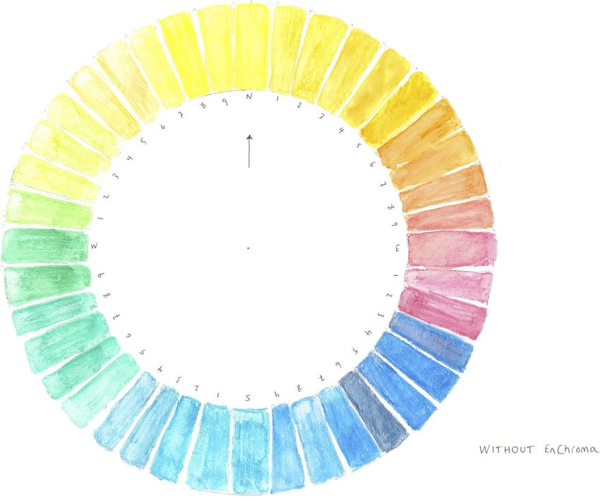
2 ALLEN ET AL.
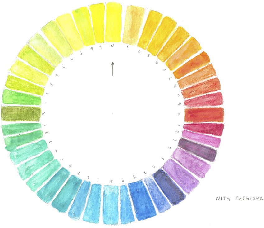
F I G U R E 1 Natural
Colour System (NCS) colour
circle. The circle shows a
progression from yellow (Y)
to red (R) to blue (B) to
green (G) and back to
yellow in 10% steps.
Elementary hues are
located at the cardinal
compass points, binary hues
are designated in terms of
their degree of visual
resemblance to elementary
hues. Reproduced by
permission of NCS Colour
AB, Stockholm 2021
fail to experience red and green hues, both of which are presumably seen as grays.
As a result, the world appears to them in various shades of blues, yellows, and
grays, as though the red/green dimension of the color solid has been eliminated
(Palmer, 1999, p. 104).
If you imagine someone who is red/green colour-blind looking at the natural colour system
(NCS) colour circle (Figure 1), the standard view predicts that the elementary hues at due east
(red) and due west (green) should look grey. There will, presumably, also be effects on the
“binary hues” that are “phenomenally composed” of red and green, represented on the NCS col-
our circle as lying between the cardinal compass points to reflect their binary nature: These
include orange (reddish-yellow), purple (reddish-blue), turquoise (bluish-greenish) and lime
green (greenish-yellow).1
This view of the experience of colour blindness, or “colour vision deficiency” (CVD), fits
well with textbook accounts of the opponent processing mechanisms underlying colour vision.
Red/green colour blindness, the most common form of colour blindness, comes in two varieties
depending on which of the retinal receptor types (L, M or S) are lacking: In protans it is L cones,
in deutans it is M cones. At the same time, perceivers who are red/green colour-blind also differ
in the “dimensionality” of their vision. Dichromats (protanopes and deutanopes) only have two
functioning retinal receptor types, and as such can match any given coloured light with a mix-
ture of two others. Like “normal” trichromatic perceivers, anomalous trichromats
1
The elementary/binary distinction is due to Hering (1920), whose work served as the basis for the NCS (Sivik, 1997).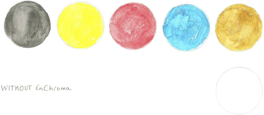
ALLEN ET AL.                                                                                                               3

(deuteranomalous or protanomalous perceivers) have three retinal receptor types, but tend to
make similar mistakes to corresponding forms of dichromat due to differences in the spectral
sensitivity of one of their receptor types.2
    According to opponent process theories of human colour vision, experience is determined by
the outputs of two opponent channels, red-green and blue-yellow, plus an achromatic white-black
channel. In “normal” trichromatic perceivers, the inputs to these channels in turn depend on dif-
ferences in the responses of their three types of retinal receptors. Assuming that someone who is
colour-blind lacks one of the relevant retinal receptor types, and as a result one of the opponent
channels, it might seem to follow that their colour experiences will be limited to those experiences
that can be generated by the remaining chromatic channel and the achromatic channel.
    However, does this standard view really capture what it is like to be colour-blind? Despite
its widespread acceptance, it has long been known that there are problems with the standard
view (e.g., Broackes, 2010, pp. 294–296; Byrne & Hilbert, 2010, pp. 270–274), and a number of
competing accounts of the phenomenology of colour blindness exist.
    At one extreme, there is the view that colour-blind perceivers in fact perceive none of the
same colours as normal trichromatic perceivers. Whereas the standard view asserts that people
who are colour-blind perceive a only a sub-region of the colour space of ordinary trichromatic
perceivers, the alien colour view denies that people who are colour-blind see even blue, yellow,
grey, white or black. On this view, the colours that colour-blind perceivers see cannot be located
in trichromatic human colour space at all.3
    Intermediate between the standard and alien colour views, Byrne and Hilbert's (2010)
revised reduction/revised alien view holds that there is both commonality, and radical difference
with the experience of normal trichromatic perceivers. According to Byrne and Hilbert, colour-
blind and normal trichromatic perceivers have the same experiences of achromatic colours
(white, black and grey) and unique yellow and unique blue. In this respect, they agree with the
standard view. However, like the alien colour view, they argue that people who are colour-blind
perceive colours that normal trichromatic perceivers never perceive. This is because they per-
ceive binary hues as being simply yellowish or bluish (to different degrees):

        [N]ormal trichromats never see this hue [yellowish or bluish] without seeing more
        determinate hues like orange and yellow. On the Revised Reduction View, a red-
        green dichromat sees yellowishness unaccompanied. (Byrne & Hilbert, 2010, p. 280).

    At the other extreme, the common colour view maintains that colour-blind perceivers do not
differ from normal trichromatic perceivers as radically as they are often thought to. On this view,
colour-blind perceivers are genuinely able to perceive the colours that they are supposedly “blind
to,” at least in favourable conditions. The ability of colour-blind perceivers to perceive these col-
ours depends in part on the type of stimulus and the way it is presented: Perception of reds and

2
  The received view is that anomalous trichromats have two varieties of one of the receptor types present in “normal”
trichromatic perceivers (either M or L), each with slightly different spectral sensitivities (see Bosten, 2019 for a review).
Colour blindness affects around 8% of the male population and around 0.5% of the female population in European
populations. Deuteranomaly is the most common form of colour blindness, affecting around 5% of the population, while
protanomaly, protanopia and deuteranopia each have incidence rates of around 1%. Less common still, with incidence
rates of less than 1%, are forms of yellow/blue colour blindness (tritan defects) and achromatopsia, which involves a
more complete form of (chromatic) colour blindness (Simonuvic, 2010).
3
  See Hacker (1987). Similar suggestions are made in the case of monochromats by Akins (2014) and other species by
Allen (2016).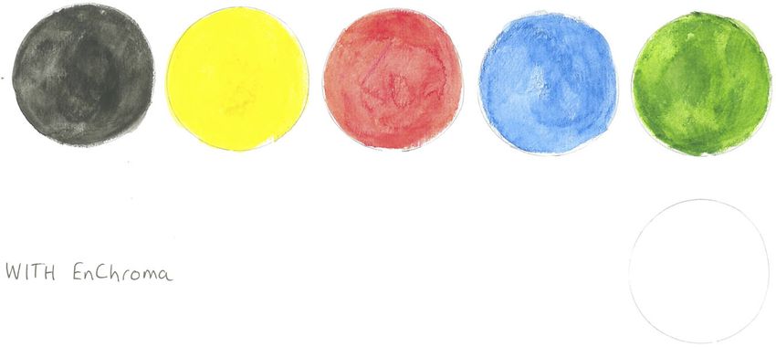
4                                                                                          ALLEN ET AL.

greens is improved if the stimulus is a material object rather than a spectral light, if the object is
well-illuminated, if the stimulus (object or light) occupies a sufficiently large area in the visual
field, or is presented for a sufficient length of time (e.g., Broackes, 2010; Merleau-Ponty, 1945,
p. 500n19, citing Stein, 1928; Scheibner & Boynton, 1968; Wachtler, Dohrmann, & Hertel, 2004).
For instance, Smith and Pokorny (1977) found that dichromats tend to perform more like some
form of trichromat when the stimulus occupies more than 8 of the visual field. Similarly, although
colour-blind perceivers are generally less accurate at naming colours than normal trichromatic per-
ceivers, they are nevertheless surprisingly proficient, and their performance improves if stimulus
presentation time is increased or if stimuli are relatively large (e.g., Cole, Lian, Sharpe, &
Lakkis, 2006; Jameson & Hurvich, 1978; Montag, 1994). While different explanations of this profi-
ciency are possible (see Section 4.1), a straightforward explanation is that colour-blind perceivers
are genuinely able to perceive the colours of things in a relevantly similar way to their normal tri-
chromatic counterparts, at least in favourable conditions.
     The common colour view comes in weaker or stronger forms, depending on whether the
experiences of colour-blind perceivers can, in favourable circumstances, match exactly those of
normal trichromatic perceivers, or whether their experiences are just relevantly similar: For
instance, reds and greens might appear to be elementary hues, instances of which are unique
(i.e., neither yellowish nor blueish), but appear to CVD perceivers to be darker or lighter and as
having a lower degree of “chromaticness,” which in the NCS refers to the strength or intensity
of a colour, and corresponds to the dimension of Chroma in the Munsell system (Sivik, 1997).
Indeed, there may be differences between individuals in this respect, depending on the nature
and the extent of their colour blindness. However, whether their experiences are the same or
just relevantly similar to normal trichromatic perceivers, the common colour view differs from
the standard view in maintaining that colour-blind perceivers can genuinely perceive instances
of the colours that are supposedly unavailable to them.
     When the conditions are less favourable, colour-blind perceivers will often be unable to discrim-
inate colours that would be discriminable to a normal trichromatic perceiver. It is tempting to think
that, in these circumstances, the indiscriminable colours will look to be determinately the same—
as on the standard view, for instance, according to which a red apple and a green apple might both
look to be an identical shade of grey. However, in his defence of the common colour view,
Broackes (2010), himself protanomalous, argues that when the circumstances are less favourable,
experiences of CVD perceivers sometimes involve a kind of indeterminacy in the way that colours
are presented, which can resolve upon further exposure to the stimulus. As Broackes puts it:

      Looking reddish yellow is different from looking greenish yellow: and both are also
      different from looking a dark but desaturated unique yellow—and the present inde-
      terminate experience is identical with none of them. (Broackes, 2010, p. 364).

1.2 | Aims of the present study

The current study has three aims. The primary aim is to use qualitative research methods to
better understand the lived experience of colour blindness, and to try to adjudicate between
these competing accounts of the phenomenology. Specifically, we seek to better understand
what it is like to be red/green colour-blind by interviewing colour-blind participants about their
experience of a variety of coloured stimuli, both with and without EnChroma glasses.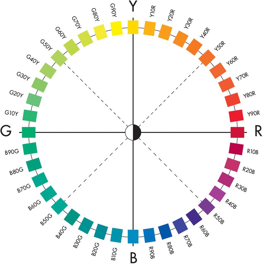
ALLEN ET AL.                                                                                                          5

    The manufacturers of EnChroma glasses claim that they are able to “improve the lives of peo-
ple with color deficiency around the world … [providing] … bright, vibrant color for all.”4 If these
glasses are effective at enhancing the experiences of colour-blind perceivers, then the expectation is
that participants will be able to describe before-after differences in their experience. In this respect,
the study provides an implementation of “the method of phenomenal contrast,” which seeks to bet-
ter understand one type of experience by comparing it with another (e.g., Siegel, 2010).5
    Since there is a question about whether EnChroma glasses are effective, one of the subsidi-
ary aims of the study is to use qualitative research methods to investigate EnChroma glasses
from a phenomenological perspective. Videos posted online show emotional reactions when
people try EnChroma glasses for the first time, and marketing materials on the EnChroma
website suggest that the glasses enable people who are colour-blind to perceive the full gamut
of colours: “I put on the glasses. Unbelievable! It was suddenly a complete rainbow … These
glasses really do work.”6 At the same time, a number of existing psychophysical studies raise
serious concerns about whether the glasses are, or indeed could be, effective (e.g., G           omez-
Robledo et al., 2018; Mastey et al., 2016).7
    A third aim is methodological: to assess the prospects of using qualitative research methods in
experimental philosophy (x-phi), and more specifically in the nascent field of “experimental philos-
ophy of experience.” Recent years have seen the sustained development of x-phi, a research pro-
gramme that employs methods from the behavioural and social sciences to investigate empirically
how we think about philosophically important concepts, with a view to addressing core philosoph-
ical questions. However, while there has been some experimental work considering issues in the
philosophy of perception (e.g., Fischer et al., 2020; Roberts et al., 2021), and the philosophy of con-
scious experience more generally (e.g., Reuter & Sytsma, 2020), these areas of philosophical inquiry
have been relatively neglected by experimental philosophers.
    Why is this? One explanation is that the methods often employed in x-phi cannot get the same
traction in this area as they do in other areas of philosophy. A large part of the existing work in x-
phi has focused on investigating intuitions about thought experiments, canonical examples of
which include Gettier cases and trolley problems. These thought experiments typically involve
making judgements about whether certain concepts apply in hypothetical cases. Although thought
experiments have a role in philosophical discussions of perception and experience, part of the
“data” for philosophical theorising about experience concerns the phenomenological character of
experience, or “what is it is like.” Methods that are well suited to investigate the types of

4
  https://enchroma.com/pages/about-us (accessed March 2, 2020). As G    omez-Robledo, Valero, Huertas, Domingo, and
Hernandez-Andrés (2018) note, the strength of the claims made on the EnChroma website have varied over time.
5
  A different way of implementing this method would be to study perceivers who are colour-blind in just one eye.
However, these cases are very rare, and existing reports raise significant interpretative challenges; there are also
methodological problems, given that the experiences these perceivers have with their dichromatic eye might be affected
by the presence of a normal eye. For discussion, see Broackes (2010, pp. 320–333).
6
  https://enchroma.com/ (accessed February 26, 2020).
7
  The present study uses EnChroma glasses to try to better understand the lived experience of colour experience, while
simultaneously evaluating the effectiveness of these glasses themselves. A concern might be raised that a single study
cannot do both these things: that to use the glasses to decide between competing accounts of colour blindness we need
to presuppose that the glasses are indeed effective. However, the approach employed here can be thought of as
comparable to that used to solve a simultaneous equation. The two aims of the study can be met if it is possible to
formulate a coherent account of the nature of this experience and their effects on it. Independent purchase on the
question can also be provided by evidence from previous studies, as well as parts of the present study that do not make
use of the glasses.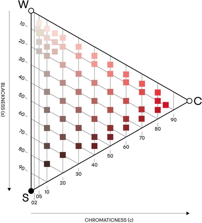
6                                                                                                              ALLEN ET AL.

conceptual judgements people are disposed to make about hypothetical cases may not be equally
effective when it comes to better understanding the phenomenological character of experience.8
    When investigating intuitions about thought experiments, experimental philosophers often
use questionnaire-based research methods (although contrast, e.g., Francis et al., 2017). How-
ever, questionnaires are not the only research method used in the behavioural and social sci-
ences. Qualitative research methods, such as semi-structured interviews, are also widely used,
and might seem better suited to investigate the phenomenological character of experience given
that they can provide a much richer, person-centred, source of data. The use of qualitative
methods in x-phi is not unprecedented, and similar methods are sometimes used for related
purposes in the phenomenological tradition. However, to date qualitative methods have not
been widely used by researchers working in x-phi (Andow, 2016). There are likely to be various
reasons for this, but in part, this may reflect a “resistance” to the use of qualitative methods
within some areas of psychology itself (Jackson, 2015). The third aim of the current paper is
therefore to investigate, through a detailed case study, the extent to which qualitative research
methods can help us to better understand the phenomenological character of experience.9

2 | METHODS

17 colour-blind participants were interviewed (16 males, 1 female, average age 38.5). This sam-
ple size was sufficient to reach “saturation,” the point at which additional participants repeated
responses or comments made by earlier participants and no new themes emerged in the analy-
sis.10 All participants were staff or students at the University of York.
     Each session lasted for approximately 1 hr. At the start of the session, participants were
screened for colour blindness using Ishihara plates. The 16 male participants all displayed some
form of red/green CVD; the female participant was a near achromat (she is referred to as #13*,
the asterisk marks the difference). The Ishihara test was used because it is an effective screening
test that is quick and easy to administer. It does not provide a reliable diagnosis of the precise
form and extent of an individual's colour blindness, which would require longer and more com-
plex tests, including the use of an anomaloscope to distinguish dichromats and anomalous tri-
chromats (National Research Council (US) Committee on Vision, 1981). However, since we
were interested in collecting qualitative data about a range of experiences that would allow us
to identify general features of CVD experience, we opted for the simpler and quicker test.11

8
  For similar reasons, experimental philosophers have used different methods to investigate other phenomena, such as
the semantics of colour adjectives (e.g., Hansen & Chemla, 2017) and non-linguistic inferences (e.g., Tieu, Schlenker, &
Chemla, 2019).
9
  For a pioneering example of the use of qualitative methods in philosophy, see Naess's (1938) work on truth. More
recent examples include Womack and Mulvaney-Day (2015), and Pohlhaus Jr (2015); and in the phenomenological
tradition, see for example, Ratcliffe (2014). The title of Pohlhaus's paper refers to encounter at an x-phi conference in
which she enquired about the use of qualitative methods and received the reply: “Are you serious? Do you really want
to ask Grandma what she thinks.” For an overview and defence of qualitative methods in x-phi, see Andow (2016).
10
   This combines what Saunders et al. (2018) identify as “inductive thematic saturation” and “data saturation.” Answers
to the question of how many participants are sufficient for a qualitative study vary widely, but the current sample size is
consistent with Guest, Bunce, and Johnson's (2006) suggestion that for most projects saturation is achieved within
12 interviews and Francis et al.'s (2010) slightly higher estimate of 17 interviews.
11
   The test provisionally suggested that the sample contained eight protans and three deutans; six participants were
unclassified.
ALLEN ET AL.                                                                                                            7

F I G U R E 2 Natural Colour System
(NCS) colour space. The NCS colour space
is a three-dimensional space defined by the
six elementary colours. Reproduced by
permission of NCS Colour AB,
Stockholm 2021

    Sessions consisted of a semi-structured interview. In the first part, participants were asked
about their experience of a variety of coloured stimuli. Participants then put on the EnChroma
glasses, and were given 10 min to acclimatise to them. During this period, they were encour-
aged to look at a variety of different objects, and if they were willing and able, to walk around
outside. During the second part of the session, they repeated the tasks from the first part of the
interview (with the exception of ELEMENTARIES) while wearing the glasses. They also answered
more general questions about their prior knowledge and expectations of the glasses, and their
experience of wearing them. Finally, participants retook the Ishihara test while wearing the
glasses.
    The tasks that participants were asked to perform included the following:
    ELEMENTARIES: Participants were presented with a representation of NCS colour space show-
ing the NCS elementary colours (the elementary hues plus black and white). For each colour,
participants were given 30 s to name as many things, either in the room or in the world, that
looked to be that colour. Once they had done this for all six colours, they were then asked to
name them. Colours were presented in the following order: green, blue, white, black, yellow
and red. The representation was printed on B2 paper (50  70 cm) and each colour was 6 cm
diameter. (The representation was similar to Figure 2, but without the red triangle representing
a cross-section through the space or labels on the elementary colours.)
    HUE CIRCLE: Participants were asked to describe what they saw as they scanned clockwise
around the NCS colour circle with the NCS notation obscured (Figure 1). They were also asked
to identify the colours at the cardinal and ordinal compass points in a set order: yellow, blue-
green, yellow-green, red, blue, orange, green and purple. The representation was on B2 paper
and individual patches were 3.8  2 cm.12

12
  This task is similar to a self-experiment Pole (1859) reports in which he describes Chevreul's colour circle of 1854.
Pole's description is suggestive of the standard view, although as Byrne and Hilbert note there are “only a handful of
published cases like Pole's” (Byrne and Hilbert 2010, p. 268). Chevreul's colour circle consists of more coloured patches
than the NCS colour circle (72 rather than 40) and is not structured around the four psychologically elementary hues
identified by Hering (yellow, red, blue and green). Rather, the three subtractive “primary” colours, red, blue and yellow
(pigments of which can be used to mix many other colours) are spaced 120 apart, with the “secondary” colours green,
violet and orange intermediate between them. For discussion of different senses of “primary” colour, see, for example,
Arnkil (2013, pp. 72–73). See also Broackes (2010, pp. 368–373) for discussion of a series of proposed experiments, some
of which are similar to those reported here.
8 ALLEN ET AL.
F I G U R E 3 Natural
Colour System (NCS) colour
triangle for the hue Y90R.
The colour triangle is a
cross-section through NCS
colour space. “W” stands for
white, “S” stands for black,
and “C” stands for
chromaticness.
Chromaticness decreases
from right to left and
blackness increases along
the lines parallel to WC.
Perceived resemblance to
whiteness (w) = 100 –
(chromaticness (c) +
blackness (s)). Reproduced
by permission of NCS
Colour AB, Stockholm 2021
RED TRIANGLE: Participants were asked to describe their experience of an NCS colour triangle
(also on B2 paper), the right-hand apex of which was Y90R, the red sample adjacent to due east on
the hue circle (Figure 3). First, they traced a horizontal line from the right-hand apex, across a line
where the samples differ in chromaticness. Second, they scanned around the perimeter of the tri-
angle, from the right-hand apex to the top (as chromaticness decreases and visual resemblance to
white increases), from the top left-hand corner to the bottom left-hand corner (as chromaticness is
constant and the visual resemblance to black increases) and from the bottom left-hand corner back
to the apex (as chromaticness increases and the visual resemblance to black decreases).
SORTING: Participants were asked to sort 12 coloured papers into “groups that seem natural” to
them; they could sort them into as many piles as they wanted, and take as long as they wanted.
Four of the papers were colours adjacent to the cardinal compass points of the NCS colour circle
(Y90R, R90B, G10Y Y10R). Four papers were lighter versions of these colours and four papers were
darker versions of these colours. The papers were 2.3 2.3 cm presented on a white background.
All sessions were conducted in the Department of Philosophy at the University of York. Ses-
sions took place during daylight hours, with overhead office lighting complementing natural
light from the windows. The EnChroma glasses were Receptor Fitovers with Cx3 Sun lenses,
which EnChroma describe as their most “versatile” lenses, and appropriate for mild, moderate
and strong deutans and mild and moderate protans.13
13
https://enchroma.com/pages/lens-guide (accessed February 26, 2020).ALLEN ET AL. 9
Sessions were audio-recorded and transcribed, and transcripts were thematically analysed
with NVivo12, a qualitative data analysis software package that can be used to code and
analyse text.
One of the participants (referred to as #5 and identified as protan) was an amateur painter,
and later reproduced the representations used in ELEMENTARIES and HUE CIRCLE both with and
without EnChroma glasses (Figures 4–7).
Ethics approval was granted by the Arts and Humanities Ethics Committee at the University
of York.
3 | THEMATIC ANALYSIS
Rather than describe responses to each task separately, the results are presented thematically.
Key themes included experiences of red (Section 3.1), green (Section 3.2), binary hues, partic-
ularly purple and orange (Section 3.3), pink (Section 3.4), general features of CVD experience
(Section 3.5) and experiences with the glasses (Section 3.6). Analysis revealed repeated men-
tion of particular objects in participants' reports. The most interesting of these—skin, leaves,
trees and bluebells—are discussed in relation to the central themes that they best illuminate.
3.1 | Red
Without glasses, the NCS elementary red at due east in HUE CIRCLE was variously described as
brown (#7), brown or red (#3, #5), “dull, washed out … maroon” (#12), brown-tinged red (#10),
“brown-green” or terracotta (#15) and deep red or crimson, with the immediately following col-
our in the hue circle looking “very dark grey” (#14). One participant (#6) initially identified it
as black, though changed this to red on closer inspection, and the participant who was a near
achromat (#13*) described it as looking black, but guessed it might be red.
While the majority of participants described reds as darker without the glasses, one par-
ticipant described due east as “pinky-red, that's like a faded car colour” (#4). This was con-
sistent with the depiction of the NCS colour circle by the artist (#5), who without the
glasses painted the eastern region of the circle lighter in colour than while wearing the
glasses (Figures 4 and 5). It is possible that these differences reflect between-participant dif-
ferences in forms of colour blindness. Viewing context, however, may also be an important
factor: Note, for instance, that the artist who depicted the eastern region of the colour circle
using lighter reds without glasses described due east (in HUE CIRCLE) as brown or red; he
also depicted the red in ELEMENTARIES using a vibrant red, in this case depicting green using
a light brown-orange (Figures 6 and 7).
Taking these descriptions at face value, what is common to all these experiences—whether
the samples appeared lighter, darker, brownish or washed out—is that reds appeared “less red.”
In some cases, this appears to be a matter of reds appearing to have a lower degree of
chromaticness (c) and a greater resemblance to black (s) or white (w) (Figure 3).14 The descrip-
tions of reds as looking brownish suggest a further way in which they may sometimes have
appeared “less red.” Browns are dark yellows and oranges (Quinn, Rosano, & Wooten, 1988).
Within the NCS, they are located in the central regions of the colour triangles for the hues that
14
In the NCS, visual resemblance to white, w = 100 – (c + s). See Sivik (1997).10 ALLEN ET AL.
F I G U R E 4 Participant #5’s representation of the Natural Colour System (NCS) colour circle without
EnChroma glasses. “N”, “E”, “S”, “W” designate the cardinal compass points corresponding to the NCS
elementary hues
lie in the yellow-orange sector of the hue circle; this is a sector of the hue circle in which col-
ours are defined in terms of their visual resemble to elementary yellow and elementary red. As
well as appearing darker, a red that appeared brownish would also appear “less red” in the
sense that it would be seen as having a lesser degree of resemblance to elementary red, and so a
greater degree of resemblance to elementary yellow.
It is worth emphasising, however, that performance on HUE CIRCLE was by no means uni-
formly poor. Some participants demonstrated no particular problems with reds, and a number
of those mentioned above still identified reds as red—albeit a different shade of red
(e.g., brownish-red), with some uncertainty, or on further investigation.
Only one participant identified NCS elementary red as green—specifically, as “brown-
green” or “terracotta”—although when prompted he clarified that it was “not at all” like the
green that he saw at due west. Rather, he reported that it looked the same colour as the red cir-
cle in ELEMENTARIES that he (correctly) identified as red, explaining:
I know it's red because to me it has more brown in it and sort of based upon my
understanding and experience I'm like that has to be red then. (#16).
Similarly, in SORTING, only one participant (#11) sorted the mid-red and mid-green samples
(the samples located on the colour circle) into a single pile.ALLEN ET AL. 11
F I G U R E 5 #5’s representation of the Natural Colour System (NCS) colour circle wearing EnChroma glasses.
“N”, “E”, “S”, “W” designate the cardinal compass points corresponding to the NCS elementary hues
F I G U R E 6 #5’s representation of the Natural Colour System (NCS) elementary colours without EnChroma glasses
In the ELEMENTARIES task, colour-blind participants could name on average fewer red objects
in 30 s (M = 3.8, SD = 2.2) than participants in a comparison group of 20 normal trichromatic
perceivers (M = 6.6, SD = 4.2, t(35) = 2.467, p < .05, two-tailed test).15 However, only two
15
All the means for the colour-blind group were numerically lower, but the only other significant difference was green
(Section 3.2).12 ALLEN ET AL.
F I G U R E 7 #5’s representation of the Natural Colour System (NCS) elementary colours wearing EnChroma
glasses
were unable to identify any objects that looked to be the colour of the red circle, and the error
rate was low (n = 2, 3.0%). In general, most participants in both groups employed a mixed strat-
egy in this task, naming both objects that they knew to be that colour (e.g., stop signs for red)
and also objects that they could currently see (e.g., books, office equipment, and furniture). It
was notable, however, that four (24%) colour-blind participants did not identify any red objects
by sight, relying instead entirely on prior knowledge.
Performance on RED TRIANGLE was also striking. Without glasses, all participants correctly
identified that the samples along the horizontal line from the right-hand apex, which differ in
chromaticness, appeared to change in colour. They also all identified that samples changed
in colour around the perimeter of the triangle, and all correctly identified the colour at the apex
as red. 13* struggled most with this task. However, she was still able to identify the apex as red.
She was also able to identify, albeit with some hesitation, that there was a colour change across
the horizontal line, and for the most part that the colours changed around the perimeter of the
triangle, although she misidentified the colours on the top side of the triangle as transitioning
from red, through blue or green, to yellow then white, and could not see the colour change on
the bottom side of the triangle, from black to red.
Four participants struggled with samples with low chromaticness at the left-hand side of the
triangle. Three (#3, #10 and #16) were unsure whether the sample at the far left was grey or
green, and one described the vertical left-hand side of triangle as moving (top to bottom) from
“a pinky green, down to a very, very dark green, dark red … it's a confused kind of red kind of
green, if that makes any sense?” (#9) Similarly, in SORTING four participants (#6, #10, #14 and
#15) placed the light-green and light-red samples into a single pile.
So, although many CVD perceivers exhibited difficulties with reds, particularly samples with low
chromaticness, the ability of participants to identify and describe reds was not altogether absent.
3.2 | Green
Difficulties with green were generally less pronounced than for red. All participants correctly
identified due west in the NCS hue circle as green. Sometimes there was evidence that due west
appeared a different shade of green than it would to a normal trichromatic perceiver:ALLEN ET AL. 13
How would I describe it? A lime-green, yes I think I'd describe that as a lime-
green. (#6).
Sometimes the identification of west as green was with a greater or lesser degree of uncer-
tainty, for instance:
Green. Yellow. Green. Green. (#13*).
One participant reported making an informed guess based on the structure of the hue circle:
I would not want to say that I see the green, it's just that I know those kind of
colour circles. And so, I know the green is going to be on there somewhere, and
my guess is it's there. (#14).
This participant was still able to correctly identify the green circle in ELEMENTARIES, despite
the lack of comparable contextual information on this task. However, as well as describing the
green circle as looking the same colour as army clothing, he also described it as looking
the same colour as the paperback Clarendon edition of Locke's Essay concerning human under-
standing (which was visible on a bookshelf and has a distinctive brown/terracotta cover) and a
brown part of a filing cabinet.
As for red, colour-blind participants named on average fewer green objects (M = 4.1,
SD = 2) than the comparison group (M = 7.7, SD = 3.1, t(35) = 4.121, p < .01, two-tailed
test), and the error rate for green was the highest (n = 9, 11.5%). Every colour-blind participant
was able to correctly identify at least one object that looked the same colour as the green circle;
however, there was also the greatest reliance on prior knowledge, with 11 (65%) participants
identifying no green objects by sight.
One of the most commonly remarked upon objects when wearing the glasses were leaves,
with seven participants reporting that they appeared differently (although one participant was
disappointed to see little difference). One notable difference was the greater differentiation in
the shades of green that could be seen:
I know when I had the glasses off it sort of looks green, the tree is just a green,
whereas I can pick out more dark greens and lighter greens and different shades in
the tree itself rather than it just being a one colour almost. (#8).
So again, although CVD perceivers exhibited difficulties with greens, they were nonetheless
often able to identify and describe green.
3.3 | Binary hues, including purple and orange
Samples that are intermediate between the cardinal compass points in the NCS colour circle are
“binary hues.” These hues are “psychologically composed” of the colours at the two adjacent
cardinal compass points.
Many participants exhibited no particular problems with many of the binary hues. In HUE
CIRCLE, many were able to identify and describe colour transitions around the hue circle, for
instance:14 ALLEN ET AL.
N[orth] is yellow, and as we move around them they become more orange so that
by four [Y40R] it's definitely an orange colour to me and then it's getting darker,
the orange is becoming red so that by the time it's the east, it's red (#10).
Similarly, most participants were able to correctly identify most of the ordinal compass
points.
A few participants described some of the binary hues as looking grey. The participant who best
exemplified this described the sample immediately following due east (red) as looking “very dark
grey.” He also described large sections of the southern hemisphere of the circle, including the quad-
rant from due south (blue) to due west (green) as looking either green, grey or brown:
At number seven [B70G] it's like sea green, I believe, and number eight [B80G],
again it's a green. However, if I was told that they were grey, I would not be able to
argue with someone. Or even if someone told me they were brown. (#14).
Similarly, #5 struggled to identify south-west (turquoise): “Grey, blue, grey. I'm not sure.”
He also described the next three samples (B60G–B80G) as looking grey—although on a differ-
ent occasion he was nevertheless able to fairly faithfully reproduce the left-hand side of the
NCS colour circle (Figure 4).
However, while a few participants described some binary hues as looking grey, where par-
ticipants had difficulties with binary hues they were more commonly either uncertain about the
colour of a sample, or else described samples as looking to be some other hue. The most striking
example of this was purple. Thirteen participants either reported difficulties with, or made mis-
takes involving, purple. #5's depiction of the hue circle without glasses (Figure 4) is representa-
tive of the kinds of mistakes participants tended to make, with southeast and adjacent samples
often being described as blue, or else with participants identifying these as purple but with
some uncertainty.
These difficulties were reflected in the strong reactions of three participants while wearing
the glasses to bluebells outside the Department that were flowering during the early stages of
testing. Two of these reported that the bluebells looked a kind of light or pale blue without the
glasses, but appeared strikingly different with them, for instance:
Bluebells looked almost purple but they just stood out massively compared to the
ground around them … the colour was so much brighter, almost blinding nearly
like, incredible … It was like a violet, when you get a UV light, it was that kind of …
like a neon purply-blue. (#4).
While purple was the most common locus of difficulties amongst the binary hues, a few par-
ticipants found it difficult to distinguish orange and green. For example:
So north is yellow and, it turns into … The colour is different now, but I still would
not know what it was. Maybe it is brown. Yellow, becoming, yellow turning into
brown, through shades of … green or orange. I think, those two and three [Y20R,
Y30R] might be green actually rather than orange. (#3).
Another described the north-west point of the compass as “orange, I don't know why, but
orangey, possibly green” (#14).ALLEN ET AL. 15
These difficulties with binary hues like purple (red-blue) and orange (yellow-red) are plausi-
bly related to difficulties with the elementary hues from which they are psychologically com-
posed. However, as in the case of the elementary hues, many participants nevertheless
exhibited an ability to identify and describe many of the binary hues.
3.4 | Pink
The colour category “pink” encompasses binary hues between red and purple in the NCS colour
circle (with up to around 30% visual resemblance to blue), as well as compound colours that
have a visual resemblance to red and white.
Like the adjacent purples, the binary pinks in the hue circle caused some participants some
difficulties, although for the most part it was lighter pinks that were the most interesting. When
wearing the glasses, skin conventionally labelled “white” was mentioned by eight participants;
five were particularly struck by the way that skin appeared.
Some participants described skin as looking “more colourful” (#12) or redder, almost as if
people have eczema (#2). Others reported that skin (possibly) appeared a different colour while
wearing the glasses:
The first thing I noticed was my skin colour … I always used to paint people green
actually, but just a very pale indescribable colour. (#5).
This is consistent with some of the difficulties described above in the RED TRIANGLE and SORTING
tasks, where some participants had difficulties distinguishing light reds from light greens.
Another participant described skin as normally looking beige. He also noted that the glasses
enhanced his awareness of chromatic detail in skin:
I could never really understand why people said skin is pink because it wasn't pink
to me, it was if anything like a very light beige, and I now look at my hands, in par-
ticular, my palms, and I can see that there's a lot more pinkness to them. It's a mot-
tling to it. (#10).
As with purple and orange, where participants exhibited problems with pink these are
plausibly related to difficulties with the elementary hue (red) from which it is psychologically
composed.
3.5 | General features
Abstracting from experiences of particular colours, a number of common themes about CVD
experience in general emerged.
There is some evidence that some perceivers were using strategies to categorise their experi-
ences: For instance, when #16 reports recognising reds on the basis of how brown they are
(Section 3.1), or #14 guesses that due west is green based on the structure of the hue circle
(Section 3.2). It is striking that in ELEMENTARIES participants tended to name objects on the basis
of prior knowledge, not sight. #14 explained:16 ALLEN ET AL.
[B]ecause I know that I'm colour-blind, that I'm naming things which other people
have told me are that particular colour, and then I just repeat back what I'm told.
However, some participants reported that under certain circumstances, even without
EnChroma Glasses, their experiences change, and they became able to perceive colours that they
were previously unable to. For instance:
PARTICIPANT: throughout my life from being young, I've been told something is a cer-
tain colour and I can't unlearn that, almost, whereas I think naturally I might have
seen it as another colour altogether.
INTERVIEWER: But does it genuinely look that way, once you've learned it …?
PARTICIPANT: Yes, once I've learned it, it genuinely does look that colour, yes … when you
told me that this is actually yellow, brown yellow, yeah but okay, I can see that, and
when you told me this is greenish, I think this is a green one, it's a lot easier to see. (#10).
Similarly, #6 reports a change in his experience when looking at due east (red) from differ-
ent distances: Having initially thought it might be black, it looks “claret,” and he “can only see
it as red now.” As the board is then moved further away again, he then says it is “probably …
very dark brown,” although he expresses some uncertainty when asked whether it looks to be
the same colour as the red office door:
The sample is too small to tell … The thing about the door is that I've got a very
large panel of red to observe there, a small chip like that is hard to make a judge-
ment about … I would say it looks darker actually but I don't know that it looks,
does it look browner? I don't know. Sorry there's an ambiguity in this. (#6).
In general, there was evidence from a number of participants that context makes an important
difference to how well colours can be perceived: Participants who expressed difficulties, or made
mistakes, in one context, were often able to easily and correctly identify the very same colour in a
different context. As in #6's report above, the viewing distance and size of the sample were often
key determinants of how easy it is to perceive the colour of the object. Other responses indicate
that illumination is an important factor. #12, for instance, used the flashlight on his phone to look
at the samples in the quadrant of the hue circle from east to south (pink, purple, blue).
Another general feature of CVD experience that emerged, and which is reflected in many of
the reports above, was that participants often expressed uncertainty about particular colour
judgments. In some cases, as in #6's uncertainty about whether the sample at a distance is the
same colour as the door, there is some suggestion that this uncertainty reflects an indetermi-
nacy in the experience itself.
3.6 | EnChroma glasses
Unsurprisingly, the glasses, and their effects on experience, emerged as a key theme in the
analysis.ALLEN ET AL. 17
All but one participant (#13*) made a comment to the effect that at least some colours
seemed “more colourful” while wearing the glasses: For instance, that certain colours seemed
brighter or less washed out. When asked whether the experiences they had while wearing the
glasses were similar to any other experiences, comparisons included films in HD or Techni-
color, neon colours, colours seen under UV lighting, and photos that had been manipulated by
turning up the contrast.
A number of participants reported that certain colours and certain objects were easier to dis-
criminate while wearing the glasses. For instance:
[S]tuff pops more. Like the red car outside, the reds seem to be the big one, like
there was a fire escape or emergency instruction sign in the stairwell and it had a
couple of red boxes on it and they just like blew up in my face really. (#4).
As in the case of leaves (Section 3.2) and the mottling of skin (Section 3.4), some partici-
pants found that the glasses enhanced their ability to perceive local colour differences in what
had previously been seen as an homogeneously coloured object. This was also something that
two participants reported when looking at tree trunks. For example:
[W]hen I got closer to it [the tree trunk], across the road, I saw little bits of colours
in there. It looked like, I don't know, red or brown, maybe it was brown. Just in
there with the trunk where previously it just all looked pretty much one colour, so
fairly pale. (#5).
This participant goes on to suggest that the increased detail may be contributing towards a
better sense of overall depth perception (something also suggested by #12):
I think that's maybe what's giving it more depth, there's lots of little bits now, com-
ponents and things that are contributing to the overall effect, picture. (#5).
Few participants (at most four) were inclined to agree that the glasses completely
corrected their colour vision—although many were sensitive to the difficulties in making
this kind of inter-personal comparison. Nevertheless, a majority (10, 59%) felt that the
changes to their colour experience were sufficiently significant that they would at least
consider buying a pair of the glasses. Among the positive responses, five said straightfor-
wardly that they would. One participant said that he would buy a pair, but not for nor-
mal use, explaining:
I wouldn't want my world to be like this, but I would buy it out of curiosity just to
see what more I'm missing out on if that makes sense. (#2).
The remaining four participants who gave a positive response said that the price of the
glasses would need to be reduced dramatically before they considered purchasing a pair.
One of the most interesting questions is whether the glasses enabled participants to see
new colours; this was also a difficult question to answer for some. The majority of partici-
pants (12, 71%) did not report seeing any colours that they had not seen before. Some of
those who fall into this group expressed surprise that the differences were not more
pronounced:18 ALLEN ET AL.
I suppose I thought my vision was like extremely different from what other people
see, whereas if this is what other people see, I suppose it's not that different, it's just
a few subtle changes. (#3).
The responses of the remaining five participants are more difficult to interpret, but can
either be understood as reporting seeing a new shade (or determinate) of a (determinable) col-
our that they have previously seen other instances of, or else as seeing a new (determinable)
colour entirely.16 The following were tentatively coded as expressing the first of these options:
[T]he skin thing was the biggest thing I've spotted … I've seen pink before but I'm
not sure I've seen this colour before … It's a sort of orangey-pink. (#10).
PARTICIPANT: the pinkie colour [in my skin] has really jumped out. … I don't remem-
ber seeing that colour before, no.
INTERVIEWER: … Does it look like it might be a mixture of any other colours?
PARTICIPANT: Well, reddish … it's hard to say. Not orangey, but almost yeah like, like
a tanned kind of, yeah pink. (#5).
The bluebells might be a bit of a new colour to me. I can't remember seeing that,
no … It looks like a type of purple that you just smacked the contrast up on like an
image editing programme … It looks like purple but with a bit of red to it
almost. (#2).
PARTICIPANT: suddenly with the glasses … the colour [of the bluebells] was so much
brighter, almost blinding nearly like, incredible … It was like a violet, when you get
a UV light, it was that kind of … like a neon purply-blue.
INTERVIEWER: So, before you put the glasses on did you know what the colour of the
bluebells looked like?
PARTICIPANT: Yes, I could picture it in my mind. (#4).
In these cases, the newly perceived colour is described as being a version of, or like, another
colour that the participant had previously perceived—or interestingly in the final case, imag-
ined. One response, however, more clearly seemed to suggest the view that the newly perceived
colour was a completely new kind of colour:
I don't think I've ever seen that colour, I don't think I've ever seen purple like that
… I will know now that the purple I see is not what it is. (#16).
Although a number of participants noticed differences in the way that reds and green
appeared, it is notable that when asked whether they had seen any new colours, no one claimed
16
These responses include participants provisionally identified as both protan and deutan.ALLEN ET AL. 19
to have seen reds or greens for the first time; all the examples of possible new colours were
pinks and purples.
4 | DISCUSSION
We have reported the results of a series of semi-structured interviews with colour-blind partici-
pants in order to understand more fully the phenomenological character of their experiences.
We found that although participants with forms of red/green colour blindness often struggled
to make the colour discriminations and identifications that “normal” trichromatic perceivers
make, their ability to discriminate and identify colours as red and green was not entirely lac-
king, and often varies depending on the context of viewing. We also found that it is not just reds
and greens that are affected, but binary and compound colours, in particular purple, orange
and pink.
While the vast majority of participants found that EnChroma glasses made at least some dif-
ference to their experience, only a few reported seeing new colours, and the most striking differ-
ences were with experiences of purples and pinks. This study provides some evidence that the
ability of colour-blind perceivers to discriminate and identify reds and greens depends on per-
ceptual experiences of these colours, while at the same time suggesting that these experiences
also often exhibit a certain degree of indeterminacy.
4.1 | What is it like to be colour-blind?
The results of this study militate against the standard view of colour blindness, according to
which someone who is red/green colour-blind is completely unable to see reds and greens, but
sees only yellows, blues, blacks, whites, and shades of grey (Section 1.1).
One response on behalf of the standard view is that none of the participants were “truly”
colour-blind, and that the standard view would at least adequately describe the experience of a
someone whose colour blindness was “complete.” The Ishihara test did not allow us to distin-
guish between dichromats and anomalous trichromats, and based on the relative prevalence of
these conditions we would expect a substantial proportion of the participants to be anomalous
trichromats. Even so, the sample clearly contained participants with relatively severe forms of
CVD, and the standard view does not fit easily with their experience. Besides, even if the stan-
dard view does correctly describe the experience of an “ideal” dichromat, this does not give us
any useful insights into the lived experience of the majority of CVD perceivers who do not fit
such a template.
A different response on the behalf of the standard view is that we cannot take at face value
the descriptions of their experiences that CVD perceivers give using ordinary colour terms. The
current study relies in part on descriptions of the experiences of CVD perceivers that employ
ordinary colour vocabulary, from general terms such as “red” or “green” to more specific terms
such as “lime green” or “maroon.” However, why should we suppose that CVD perceivers' use
of ordinary colours terms reflects experiences that are phenomenologically similar to those of
normal trichromatic perceivers? Perhaps, instead, colour-blind perceivers engage in some form
of inference from a limited palette of experiences, correlating the limited set of colours that they
see with the colour categories of normal trichromatic perceivers. This, for instance, is how
Jameson and Hurvich (1978) explain how a majority of perceivers who made characteristic20 ALLEN ET AL.
confusions in a diagnostic Farnsworth D-15 sorting task could nevertheless still correctly name
the red and green caps. Assuming that their experience is limited to yellows, blues and achro-
matic colours, they suggested that colour-blind perceivers can use a rule to correlate samples of
different lightness with “normal” colour terms.
The current study suggests that this response on behalf of the standard view is not convinc-
ing. First, in RED TRIANGLE all participants perceived the samples along the horizontal and
around the perimeter as differing in colour. Second, while there is evidence that some per-
ceivers seemed to be using strategies to categorise colours in something like the way Jameson
and Hurvich suggest, the type of experience from which the participant is inferring does not
appear to be achromatic, as on the standard view. For example, #16 describes reds and greens
as differing in their chromatic properties, namely reds look browner than greens, and it is this to
which his judgment using ordinary colour terms appears to be sensitive (Section 3.1). Third,
other participants report that under certain circumstances, even without EnChroma glasses,
their experiences themselves change, and they become able to perceive colours that they were
previously unable to (Section 3.5).
Indeed, it is striking that the best candidates for newly perceived colours while wearing the
glasses were not reds and greens, but pinks and purples. Why might this be? One plausible
explanation in light of the performance of CVD perceivers across the range of different tasks
reported here is that “red/green colour-blind” perceivers are actually already able to perceive
reds and greens, at least to some degree and in certain circumstances. However, the difficulties
they have with these colours are exacerbated where either the chromaticness of these colours is
reduced or where the colours are phenomenally mixed with other elementary hues
(e.g., purples). By enhancing the way that reds and greens appear in general, the glasses may
enable some CVD perceivers to perceive, or at least better perceive, colours that are phenome-
nally related to red and green.
On the more general question of the relationship between the phenomenology of the experi-
ences of CVD perceivers and their use of colour vocabulary, the results of the current study
may not enable us to rule out decisively the theoretical possibility that CVD perceivers use col-
our terms in a similar way to normal trichromatic perceivers despite having experiences that
differ radically in their phenomenology—just as it may not be possible to rule out decisively the
theoretical possibility that otherwise normal trichromatic perceivers differ radically in the phe-
nomenological character of their experiences (e.g., through inversions in colour space). Never-
theless, the hypothesis that the experiences of CVD perceivers do not differ substantially, at
least in favourable circumstances, provides a straightforward explanation of the fact that across
a range of tasks, and across many areas of colour space, many CVD perceivers are able to use
colour vocabulary in a way that is consistent with normal perceivers. It also provides a straight-
forward explanation of the effects of wearing the glasses, namely that they enhance existing
abilities to perceive reds and green.
The current results also militate against both the alien colour and revised reduction/revised
alien views. According to the alien colour view, the colours that colour-blind perceivers see
have no location in trichromatic humans colour space at all. However, when wearing the
glasses, none of the participants reported any differences in the way that blues or yellows
appeared. Moreover, when they reported new experiences of (shades of) pink and purple, they
seemed to suggest that these new colours were related to colours that they had previously expe-
rienced, as if these new colours could be located within an enlarged colour space that contained
the colours they had previously seen as a proper part.You can also read