A case study : to design a XL supermarket in the Netherlands and its consequences - Eindhoven University of Technology research ...
←
→
Page content transcription
If your browser does not render page correctly, please read the page content below
A case study : to design a XL supermarket in the Netherlands
and its consequences
Citation for published version (APA):
Veeger, T. T. (2013). A case study : to design a XL supermarket in the Netherlands and its consequences. In E.
S. Santos, L. S. Baptista, M. J. P. D. Matos, P. S. Pedrosa, & P. Figueiredo (Eds.), Proceedings of the
ShoppingScapes International Conference 2013, 27-30 May 2013, Lisbon, Portugal (pp. 655-672). (Revista
Lusófona de Arquitectura e Educação; No. 8/9). Universidade Lusófona de Humanidades e Tecnologias.

Document status and date:
Published: 01/01/2013

Document Version:
Accepted manuscript including changes made at the peer-review stage

Please check the document version of this publication:
• A submitted manuscript is the version of the article upon submission and before peer-review. There can be
important differences between the submitted version and the official published version of record. People
interested in the research are advised to contact the author for the final version of the publication, or visit the
DOI to the publisher's website.
• The final author version and the galley proof are versions of the publication after peer review.
• The final published version features the final layout of the paper including the volume, issue and page
numbers.
Link to publication

General rights
Copyright and moral rights for the publications made accessible in the public portal are retained by the authors and/or other copyright owners
and it is a condition of accessing publications that users recognise and abide by the legal requirements associated with these rights.

       • Users may download and print one copy of any publication from the public portal for the purpose of private study or research.
       • You may not further distribute the material or use it for any profit-making activity or commercial gain
       • You may freely distribute the URL identifying the publication in the public portal.

If the publication is distributed under the terms of Article 25fa of the Dutch Copyright Act, indicated by the “Taverne” license above, please
follow below link for the End User Agreement:
www.tue.nl/taverne

Take down policy
If you believe that this document breaches copyright please contact us at:
openaccess@tue.nl
providing details and we will investigate your claim.

Download date: 18. Jan. 2021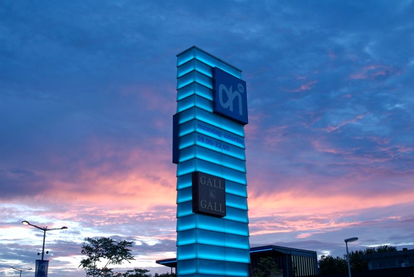
ShoppingScapes International Conference, May 27 to May 30 2013 Lisbon Portugal

                                       Theme: Architecture, spatiality and perception

      A case study: to design a XL supermarket in the Netherlands and its
                                 consequences.
         T.T. Veeger, Department of the Built Environment, Eindhoven University of Technology, the Netherlands

                                                      t.t.veeger@tue.nl

Abstract
On the outskirts of the centre of Eindhoven (a medium-sized town in the south of the Netherlands), an existing supermarket
located along the ring road, which forms part of a chain named “Albert Heijn,” was doubled in size in 2002, making it the
flagship of a new “extra large” formula, called “AH XL”. The existing establishment of the supermarket was completely
transformed, both the interior and exterior.

In this case study we will explain the thoughts and ideas behind the original concept from the perspective of the architect.
The original material, such as sketches, models and presentations has been used to construct a timeline of the design process.
This paper tries to make clear which stakeholders, references and external influences were important for the development of
the final design.

Keywords: supermarket; design; design process; sketches; flagship; Albert Heijn

                                                                                                                            1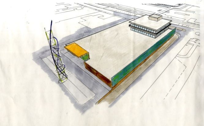
Introduction
This case study can contribute to the insights of the architectural design process in retail and
specifically the design of a supermarket of this scale. The project’s client only had a few boundary
conditions, just a short list of requests of the amount of square metres surface area and a concept for
the interior design. This gave the designer freedom for the architectural development of this new XL
supermarket. This XL supermarket was considered to be the flagship store of the new formula and an
example for new locations. Apart from the main description, a time line is constructed to explain the
architectural development during the design process. Sixty sheets with original sketches, two Power
Point presentations and several building plans are used as sources for this paper to explain the steps
and changes during the design process.

Project                 AH XL supermarket
Location                Limburglaan / Hastelweg Eindhoven, the Netherlands
Principal               Ahold Real Estate, Zaandam the Netherlands
Architect               van den Pauwert Architecten BNA, Eindhoven, the Netherlands
Senior architect        ir Tom Veeger
Total area              5100 m2
Building contractor     Huybregts Relou bv, Son, the Netherlands
Design period           2000/2001
Realization             October 2002

Background
Albert Heijn is part of the Ahold group, an international retailing group based in the Netherlands, with
strong local consumer brands in Europe and the United States. In 2000 Albert Heijn was the leading
supermarket chain in the Netherlands. The new XL formula was developed for a new type of
supermarket selling non-food products beside food such as kitchenware and other household products,
multimedia and pharmacy products. Its primary business activity remained retail grocery.

The new AH XL formula consisted of supermarkets with a surface area of 4500 square meters.
Usually a supermarket in the Netherlands is around 1500 to 2000 square meters. In contrast to France
of Germany, the concept of a superstore or hypermarket was not familiar in the Netherlands. Since the
1970s, the national policy on the periphery and large shopping centres on the outskirts of the city
aimed at slowing down this process or even forbidding it. The purpose of this policy is to maintain a
healthy retail sector and to promote spatially and economically healthy functioning inner cities.[VNG
2006] Just a few chains, like Maxis, were active as superstores, but were not very successful. The
establishment of the AH XL formula as a large-scale formula and the consequences for its rivals meant
that this policy had to be heavily discussed. This discussion still exists today. Nowadays its rivals have
followed Albert Heijn and more superstores have been built.

Ahold bought one of the existing superstores of Maxis in Arnhem in 2000. [Trouw 1996 ] This store
became the pilot store for the new XL formula. The English company Conran Design Group was
asked to develop the concept of the interior, a specialized studio in interior design with much
experience with concepts in retail. The pilot store was part of a shopping mall, so the outside, apart
from the signing, was not changed. The experience gained by the pilot project was used to improve the
new formula. The pilot store in Arnhem seemed to be too large so the amount of square meters was
decreased for the Eindhoven store. The original interior concept was changed to a more Dutch and

                                                                                                        2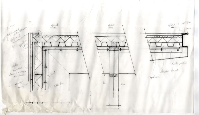
more sober version with less investment for the supermarket in Eindhoven. This was done by Albert
Heijn’s own interior design office, Store Design.

The original store in Eindhoven was too small for the new XL formula and needed to be substantially
modified. It had to increase the amount of surface area to fit the new XL formula; it almost had to
double its size and needed large architectural changes. The Eindhoven project was the first site that
also had to be architecturally designed.

In the period around 2000 Ahold was expanding. It bought supermarket chains in countries like
Poland, Portugal and the United States. The design of the XL supermarket in Eindhoven was seen as
an experiment to test new developments and eventually implement them to other European
supermarket chains owned by Ahold. New solutions and new designs were developed for the exterior
surroundings of the supermarket, the parking lot, the signpost, the street furniture, the advertisements,
the layout etc. For example, one of the design items was to find a way to build a wall around the
parking place that would stay free of graffiti and would hinder the sight through to the neighbours.
This resulted in the use of gabion walls and ivy-covered fences that are not inviting for graffiti. The
office of Cleassens Erdmann was responsible for the layout and design of the parking lot. The large
sign designed by van den Pauwert Architects was seen as an example to implement to other European
supermarket chains. Unfortunately this proposal was suddenly withdrawn in 2003, when Ahold got in
serious financial problems due to the cheating in the American subsidiary of Ahold and they had to
sell several international supermarket chains. These financial developments limited the unwinding of
the XL formula in the Netherlands. In 2009 many of the 30 XL supermarkets were built [Nan Yang
2012] and now there are a total of 41 stores in 2013.

Context
Eindhoven is the fifth largest city of the Netherlands, with approximately 220.000 inhabitants, situated
in the south of the Netherlands near the border of Belgium. The city grew at the end of the nineteenth
century, when Philips established its lamp factory in Eindhoven resulting in a stream of new workers.
Eindhoven rapidly grew from a predominantly farming area into an industrial region in which
technology played a central role. In 1920 the municipality of Eindhoven was created when the original
municipality of Eindhoven – the current city centre – merged with the surrounding five small
municipalities of Strijp, Woensel, Gestel, Tongelre and Stratum. Fast economic growth followed and
after the Second World War the DAF car manufacturer propelled the city’s economic growth even
more.

One of the characteristics of this town is the four-lane ring road. It is 12 km long with a teardrop
shape. The ring was part of the city plan even before the annexation of the villages around Eindhoven
in 1920. The purpose of this ring road was to connect the five small municipalities and to create room
for expansion of industrial and residential areas. The ring road was completed in 1966. [Beekman
1982] Nowadays it is still important for the traffic logistics in Eindhoven and heavily used. The AH
XL supermarket is located on the outer edge of the ring road, southwest of the centre of Eindhoven. It
is near a large industrial zone where, besides industry, offices and trade, larger and smaller retail trade
are allowed. Residential areas are located on the inner side of the rind road, originally the former
municipality of Strijp

The ring consists of 2x dual carriageways with service roads on each side, creating a wide road profile.
There is a difference in height of about 2 metres at the location of the supermarket, the ring is higher
compared to the service road but the car park and supermarket are at the same level as the ring road.

                                                                                                         3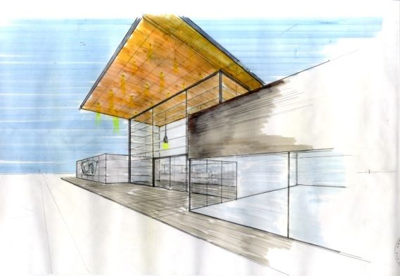
The Limburglaan (the Ring road) at the location of the Albert Heijn is characterized by a mixture of
offices, automobile showrooms, a restaurant, a gas station and a bowling alley with some large shops
and a school on the other side of the road. Most buildings are detached buildings parking lots in the
surrounding space. The area has much in common with the adjacent industrial zone “de Hurk” in
terms of image and allotment. The Albert Heijn’s parking lot is shared with the bowling alley and the
Blue Lotus, a Chinese specialty restaurant.
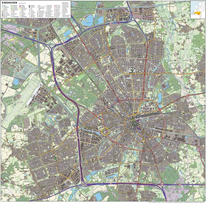
Eindhoven topography 2013, the yellow circle is the location of the AH XL, source: Wikimedia Commons
.
4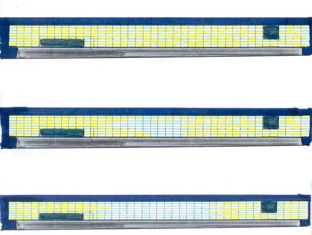
The existing supermarket
The already existing supermarket at the Limburglaan was with 2600 square meters, one of the largest
supermarkets of Albert Heijn in the south of the Netherlands. It was easily accessible by car with a
large parking area. There was a two-storey high office building beside the supermarket with an
entrance at the side of the Hastelweg. The supermarket was clearly visible form the ring road. The
customers came from a large area and not necessarily from the adjacent neighbourhood. The
inhabitants of the nearby residential areas went to a smaller Albert Heijn supermarket located in the
nearby centre of Strijp. The ring road was seen as a barrier to easily go to the large supermarket on the
Limburglaan.

The location had a few important advantages to select this supermarket as a pilot XL supermarket.
Albert Heijn owned the plot and the building. This is rather unique, because many of the supermarkets
of Albert Heijn are rented or have a franchise construction. (Albert Heijn has around 200 franchisees
among its 800 supermarkets.) Albert Heijn had complete freedom to develop a totally new building
without an external owner to take into account. It could expand without bothering the environment;
there was enough free space at the existing parking lot. In the neighbourhood of the supermarket there
were not many houses with inhabitants, who could complain about the expansion of the store, noise
pollution and extra traffic etc. The municipality agreed to construct a new entranceway from the ring
road to the new supermarket to avoid chaos and to create a safe traffic area. In 2002 this new
entranceway was completed.

Program

The design brief for this store: 3500 square meters shopping area, 625 square meters
storeroom, 160 square meters entrance zone, 250 square meters facility area such as offices,
canteen, a Gall and Gall shop of 250 square meters with wine and liquor. Gall and Gall is part
of the Ahold group. It is not allowed to sell spirits in a supermarket in the Netherlands.
Outside of the building, near the storeroom, an expedition area was located where two trucks
with trailers were able to park. A maximum amount of 325 parking places were realised given
the amount of space as well as places to park the customers’ bicycles. It was possible to move
the whole frontage six meters in the direction of the Ring road; there were no obstacles in
terms of property and building codes.

Design

The design process can be divided in several phases:

    1.   Design variations and research
    2.   Global design
    3.   Presentation for municipal (committee of spatial quality)
    4.   Adjustments (building regulation)
    5.   Definitive design
    6.   Details and materials

The duration of the design process was approximately two years. During this time the process was
delayed for 8 months waiting for the co-operation of the municipal. Looking at the sketches, different
moments can be seen, where the design is changed.

                                                                                                       5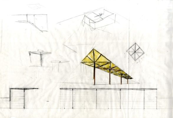
In the first phase an orientation study was made to see if the extension of the supermarket could be
combined with the construction of new offices. The client choose to focus only on the extension of the
supermarket. In the first 3D presentation a rectangular building was shown with the entrance at the
side of the parking lot and the goods handling at the back. The sketches made before this presentation
show a variation in the location of the entrance, the storeroom and the goods handling area. This phase
is mainly an orientation of the possibilities and the result is a sketch, a design to start the consultation
with the local authorities. The 3D presentation was shown during a meeting about the XL formula
with the board of directors of Ahold. After a delay of 8 months, Ahold decided to withdraw the XL
supermarket at Eindhoven if the local authorities would not come in action and threatened to move
their plan location to Tilburg. The municipal alderman intervened after this threat by Ahold. The local
authorities allowed the presentation of the design sketches to the committee of spatial quality. This is
an independent advisory committee within the municipal structure, who tests plans for new buildings
for their spatial quality. This committee decided to agree with the main lines of the design. They
advised to let the advertising sign be part of the total picture and not isolate it.

sketch of the façade of the Limburglaan

During consultation about the environmental aspects of the construction with the municipality, it
appeared that a gas station in the neighbourhood of the new supermarket had a LPG tank on the
parking area of the supermarket. This tank storage was not the main problem but the filling point of
this LPG tank was located at the centre of the parking area and that caused trouble. It meant that
within a circle of 80 meters around this point nothing new could be built. The existing building was
not affected by this building regulation. Implication for the design was that the extension plan should
be made so that it would fall outside this circle technically; the given shape of the existing part could
be maintained. (An independent hired expert in LPG experienced this as somewhat "absurd.") LPG
gas is highly explosive and most at risk of disaster at the moment of disconnecting the hose at the
filling point. A loose hose shooting off an LPG tanker could cause a large explosion and create a
blowtorch of more than 200 metres.

The layouts of a number of design variations were reinvestigated in which the environmental circle
was a leading factor. In this period, a rival that was illegally established at the Hastelweg, called the
Bassismarkt, was forced by legal proceedings with Ahold to close and the property was acquired. This
offered possibilities for an extension on the side of the Hastelweg in an L shape. Here the storeroom
and the expedition are placed. At the request of local residents living on the Hastelweg the expedition
is built indoors to reduce noise during loading and unloading. There is a drivable loading and
unloading bay for trucks with trailers in an enclosed indoor space, with a sectional door on both sides.
It was revealed in Arnhem at the pilot store that the presence of a loading dock yielded a large saving
in time. Distribution is a key element in a supermarket chain, one assumes a system of "just in time
delivery" from a central distribution centre with a limited storeroom at the supermarket with the
consequence that in a great formula as the AH XL loading and unloading activities happen more times
a day.

                                                                                                          6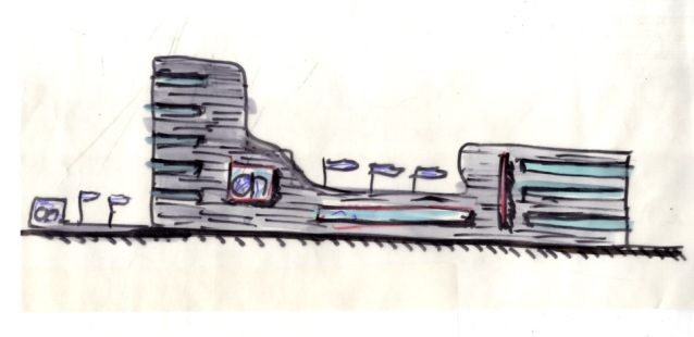
When the planning permission procedure was done and all technical issues had been completed
including the consultation and approval of the fire department and the building permit was given,
Store Design started with the interior design. The influence of Store Design on the architectural design
at this stage was minimal and limited to a number of issues surrounding the implementation and
completion of the entrance. Communication was also limited in this period and resulted in an
unfortunate placement of the information counter in the entrance area that largely disrupted the spatial
concept. The general concept of the developed formula had preference above the architectural quality
of the space.

Design aspects
The Ring

At the beginning of 2000, a workshop E+ was organised by the municipality of Eindhoven, the
technical university of Eindhoven and Philips design. The results of this workshop and specifically the
research of Alessandro Mendini, had a large impact on the design of the XL supermarket of Albert
Heijn. [van der Hulst W. 2000]

“In 2000, the city council of Eindhoven gave designer Alessandro Mendini an assignment to react on
the ring road. This assignment was part of a larger workshop where Alessandro Mendini, Peter
Eisenman and Andrea Branzi worked with a group of young Dutch architects, designers and artists
“thinking up the future of the city of Eindhoven”, ( Stefano Marzano Managing Director Philips
Design in E+ blz 10 ).

According to Mendini, the ring could offer a lot more than only providing for the infrastructure for the
car that it is today. One of the ideas was the suggestion of creating beacons for the original six villages
that together form Eindhoven. Every time you leave the Ring towards the direction of one of the old
villages, there should be a landmark; in his sketches he draws six towers that should be extremely
visible during day and night. The ring must be a binding factor, instead of the barrier that it is today, it
should be called “the Ring Promenade and Eindhoven the Linear City”.

“Alessandro Mendini shows, together with the members of the workshop, how the ring road can be
transformed in to an urban boulevard. Through beacons of light, refurbishments, height differences,
dramatizing the different landscapes the driver of the ring road confronts” (Karel van Dijk, Head of
Strategy at the department of Urban Development and Management at the municipality Eindhoven, in
E+ blz 14)

The concept of the design of the supermarket reacts to this idea and makes the building work like a
landmark, one of the many that should be located on the ring according to the ideas of Mendini.

Function and Form

The sketches show that from the start of design the supermarket is conceived as a closed box with a
strong utilitarian character, a simple rectangular shape where internally a free organisation of space is
possible. In particular, the entrance is a high, characteristic shape, inviting with an open character. A
second focus is the high advertising sign that works as a beacon and refers to the architecture of
highway service stations, McDonalds, German Raststätte, motels and the strip at Las Vegas. The
overall view is a combination of simple forms such as plate, bar, box and hook.

                                                                                                          7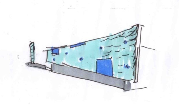
sketch of the first design

Visibility plays a major role in the design sketches. From the start of the process, three elements are
strongly present, the sign, the wall and the entrance. The design responds to the Ring road with these
three elements. The large scale appropriate to the scale of the environment allows a passing motorist to
perceive these elements in about five seconds. These elements come back in several studies from the
very first sketches; large size, simple shapes and sober materials characterize the elements. In one of
the flip charts for Ahold Real Estate, reference images were shown from: Ricola Storage Building in
Laufen, Switzerland (Herzog & de Meuron) as an example of a horizontal articulation of the façade
and simplicity in use of materials, Museum Valkenhof the Netherlands (UN studio) as an example of
an extreme glass facade, the entrance building of the Open Air Museum Arnhem, The Netherlands
(Mecanoo Architects) as an example of a combination of wood and glass and restraint in effect,
Europark shopping mall Salzburg Austria (Massimiliano Fuksas) as an example how light and glass
facades could be combined.

In the initial phase, the sign is an element that was separate from the building and there was no
architectural relationship. The advertisements in this sign are modest and subordinate to the overall
shape of the object. Eventually the sign would form part of the whole picture, and be executed in
materials and detailing in the same way as the glass facade. In a modest way, the logo of Albert Heijn
and Gall Gall are processed in the signpost.

sketch of the advertising sign

A reference to Las Vegas is obvious; the light wall works as a dynamic element that communicates
with the driver. Early in the design, a wall of light and glass was chosen. Initially there was room for
the advertising of products on the wall, this changed under the influence of the committee of spatial
quality and only the logo and name were applied in a subtle way. The argument of the architect that

                                                                                                      8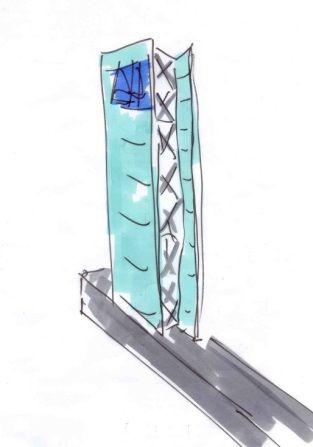
the brand Albert Heijn did not need extra attention, it does not need to shout with offers through the
use of advertisements, was shared by the client.

sketch of the entrance

The entrance is a distinctive element of the design with an open character. The shape of an inverted L
often recurred in the sketches. There is a series of studies of combinations for the function of roof, and
a closed interior space, which have to run into each other. The L shape is already mentioned in the
outline as a pure form but is also recognizable in a curling dynamic form. A significant part of the
entrance is the wood cladding on the underside of the roof that repeats itself in the rear wall. Not only
an L shaped entrance was drawn but also a series of concatenated wooden umbrellas that potentially
refers to a dramatic cantilevered wooden roof that was built for the Expo 2000 in Hanover, Germany.

sketch of the cantilevered wooden roof

Sober in materials and reduction in diversity is the basis for the building design. Stone, aluminium,
galvanized steel, glass and wood are the materials with which the building was constructed. It was
deliberately chosen to apply the material in its natural appearance. The choice of these materials can
be seen clearly in the early sketches.

Light

In 2000, the existing supermarket was one of the few in Eindhoven who had an allowance to stay open
until 22.00 o’clock. Light was always an important factor in the design because of this. In the evening
or night the choice for a good lighting plan is essential. Light offers the possibilities for accents and
gives clear directions. Examples include a well-lit entrance or a light beacon at the entrance of the
parking area as an attention grabber or the use of a light to create a route at the parking area. A well-
known example of this is the Strip in Las Vegas.

                                                                                                        9
The idea of designing a light wall and a lit advertising column was due to the awareness of the
customers visiting the supermarket mainly in the evening and the attention grabber idea for the ring
road. The development of the light wall at the Limburglaan had a few phases. The research of Mendini
was important during the first contacts with the municipality about the extension of the supermarket.
The idea that the Albert Heijn XL supermarket would be one of the beacons Mendini mentioned was
positively agreed upon. This reaction of the municipality convinced Ahold to continue with the light
objects. Besides the research of Mendini, it should be mentioned that Eindhoven identifies itself with
light. Due to Philips lighting and because of the various projects involving lighting city buildings,
Eindhoven has become known as the City of Light. This positively influenced the idea about the
lighting objects.
sketch of the light wall
The light wall has evolved from a metal wall with advertising banners to a glass wall with neon light
behind it. After consultation of Ahold Real Estate, the decision was made to light only 60% of the wall
due to financial implications and to make it dynamic. In 2002, the dynamic control of the light wall
was complex and expensive. Reducing the amount of neon light behind the glass wall, made it
possible to invest in the dynamic control. An additional advantage was that a failure of one of the neon
lights did not have an effect on the whole lighting concept. The pattern of lightning was already
irregular. The coarseness of the pixels of light was chosen on purpose to prevent using the light wall as
an advertising wall. During the final realisation, experiments were made with the type of light, colour
of light, colour of the reflecting rear and the matting of the glass. During a mock-up of a part of the
glass wall, it turned out that the particular choice for colour, the matting of the glass and the position
of the light had to be very precise.
sketch of the light wall
10Relation between interior and exterior
There is a tension between interior design and architectural design. Interior or concept design for a
supermarket is a specialized activity that was strictly separated from the engineering and architectural
design. Van den Pauwert Architects was responsible for the engineering and the architectural work and
worked on behalf of Ahold Real Estate. Store Design and Ahold Real Estate are two independently
operating departments within the Ahold group who are both stakeholder in this process. For Store
Design it is usual to start from an existing situation, a given space in which the interior is designed, the
new building was treated as a given situation and they made little demands on the exterior.
The interior design for a supermarket assumes a controlled environment in which light, temperature,
smell and sound are designed and form an integral part of the total design. A supermarket is a black
box with a limited number of openings to the outside world. Daylight is only at the entrance zone part
of the interior, other window openings are at the expense of shelf space and complicate the interior
design. Designing of the exterior shows that adding windows is "not done" and these have been
covered with large scale photo posters.
detail of the entrance
At Albert Heijn there was no tradition to use the exterior of the supermarket as part of the "branding".
But logos, company name and other forms of "signage" on the outside of the supermarket are strictly
defined. Underlying reason is that the branches are often part of a larger shopping centre with has its
own architecture or that existing retail space is rented and not owned. The external appearance is
limited to the signage and possibly the blue colour of the aluminium facade. An establishment of AH
is not comparable to a large "shop" as Ikea, which has a solitary position in the landscape and
remoteness that is recognizable by its use of colours.
Construction
The work during the construction period was strictly separated. Immediately after the completion the
building contractor was followed by a number of regular suppliers under the responsibility of Store
Development at Albert Heijn who were responsible for the interior construction. This work was done
under the responsibility of Store Development at Albert Heijn. In a very short time (about 2 weeks),
the interior was completely renovated in three shifts 24/7.
From financial and market technical reasons it was decided to keep the store open as long as possible
and some temporary facilities were taken in the period of the construction work. The entire operation
was completed before November because one third of the total turnover of a supermarket is earned in
11the period of November and December. The building contractor was bound by a deadline under
penalty of a heavy fine if he did not reach the deadline.
Conclusion
In this paper, an “explorative case study” [American Institute of Architects 2005] on the design
process from the perspective of the architect is described. The process description is based on
available material such as sketches, drawings and presentations. The way of describing the design
process has its limitations; a more thorough investigation in the form of a comprehensive case study
will be more detailed and will give an objective picture of the process from the viewpoint of various
stakeholders. For a continuation of this project more sources should be investigated to complete the
picture. This means interviews with those directly involved like the client, officials and advisers
should be done and an examination of written documents in the archives of the architect, the Real
Estate department of Ahold and relevant departments within the municipality. The digital drawings
available of the various phases of the project drawn by the various parties involved should also be
explored.
The project in terms of layout is not complex, there are only five functions that are connected in a
simple manner and all functions are arranged on the ground floor. The detached location and the
available space around the supermarket mean we only have minor contextual problems. This implies
that the selected project is well suited for describing the design process in a clear way.
What emerges from the material is that many things come together at an early stage in the process.
Things like the applied material, layout, the response to the context, the various elements such as the
entrance, the signpost and the light wall are already visible in the first stage of the drawings. The
choices made at the beginning of the design process are explored and examined as alternative
proposals but the elements that were designed at an early stage are determined. For this project the
start-up phase was crucial and the follow-up was a form of trial and error to arrive at the final design.
Many of the problems that arise around the development of a new formula are translated into the
drawings. This process could be described as thinking in an intuitive manner with a sketch pen. The
sketches are a record of the thought process that isn't really structured in a pre-set clear manner. There
are few milestones and many changes to the design are motivated by external influences coming from
the various parties involved in the process. The described process is an example of design in an
intuitive way and is often seen in the architectural practice. Could we call it "poetic engineering"
[Gieskes V. ] , a definition used by professor Jeanne Dekkers to describe the combination of ratio and
intuition used in architectural work? We could ask ourselves the question what are the advantages and
disadvantages of designing in this way. Would a more structured way of designing bring a better
design or would it kill creativity? Designing in an intuitive way is an underestimated way of designing
that give good final results. A continuation of this explorative case study would be to investigate the
design of a number of similar projects. Further study provides a better understanding and provides
more insight into the way of intuitive designing.
References
Ahold, corporate website www.ahold.com (accessed 15 May 2013)
American Institute of Architects: Case Study Work Group (2001–2005), Development Checklist and
Submission Guidelines. Available at: www.aia.org/education/AIAS075232 (accessed 4 May 2013)
Beekman P. (1982) Eindhoven Stadsontwikkeling/Urban Development 1900-1960, pp 209. Mierlo:
own edition. only in Dutch.
12Gieskes V. (2010), Poetic engineering Idea and Work by Jeanne Dekkers, Sun architecture.nl
Amsterdam
van der Hulst W. (2000), E+ de gedroomde toekomst van de metropool Eindhoven, dreamed future of
Eindhoven, Eindhoven: stichting Emmasingel.
Trouw (1996), “Drie-Maxis-filialen-naar-Vendex-Food” Available at:
www.trouw.nl/tr/nl/5009/Archief/archief/article/detail/2744705/1996/02/06/ (accessed 2 May 2013)
only in Dutch.
Nan Yang (2012), Creative Destruction Among Grocery Stores
VNG (2006), “Oog voor Detailhandel. Handreiking voor een detailhandelsstructuurvisie” report on
retail and it’s structure in the Netherlands. only in Dutch.
Appendices
o Timeline of the sketches
13You can also read