Understanding Responsive Web Design - A detailed look at the current state of mobile web site development options - Jar Creative
←
→
Page content transcription
If your browser does not render page correctly, please read the page content below

Understanding Responsive
Web Design
A detailed look at the current state of
mobile web site development options.

               Written By: Igor Nesmyanovich
               Edited By: Jeremy Robinson Illustrations By: Russell Holley
“Most people make the mistake of thinking design is what it looks
like. People think it’s this veneer – that the designers are handed this
box and told, ‘Make it look good!’ That’s not what we think design is.
It’s not just what it looks like and feels like. Design is how it works.”

– Steve Jobs

Summary
The consensus today is that organizations need a mobile web
marketing presence to appear credible. But how does one
provide the best mobile web experience that also functions
as an integral part of overall online customer experience?

One of the most common – yet widely misunderstood
- solutions is the Responsive Web Design approach. This
white paper discusses Responsive Web Design patterns and
frameworks, the pros and cons of Responsive Web Design
(RWD), alternatives to RWD and how to create your mobile
web strategy.

                                                                            www.jarcreative.com   416 504 8836
                                                                                                    www.jarcreative.com   416 504 8836
Do I Really Need a Mobile Web                                      have woken up to the concept and commonly request a
                                                                   responsive website redesign, it is usually without sufficient
Presence?                                                          understanding of the efforts or process involved.

Here are just a few headlines from blog posts and news in 2013

 •   “There Will Be More Smartphones Than Humans on the
     Planet by Year’s End”1                                                                Mobile vs. Desktop
                                                                                       From Dec 2008 to Oct 2013
 •   “Mobile to overtake fixed Internet access by 2014”2

 •   Web Traffic From Mobile Devices Up 78% Year Over Year       100%
 •   56% of American Adults are now Smartphone Owners
                                                                 80%
The chart below shows the monthly trend of mobile
Internet browsing statistics published by Stat Counter.3 Most    60%
projections now predict that by mid 2014, 50% of web traffic
will be from mobile devices.                                     40%

The Federal Trade Commission (FTC) has made a mobile
                                                                 20%
optimized website part of their core requirements. The
                                                    4

Canadian Government published Standards on Optimizing             0%
Websites and Applications for Mobile Devices in April 2013.5            Jan 2009      Jan 2010   Jan 2011        Jan 2011         Jan 2011

One increasingly common option for building mobile friendly                 Desktop     Mobile

web sites is the Responsive Web Design approach. At the end
of 2012 Mashable posted a story: “Why 2013 Is the Year of
Responsive Web Design”7 and in March 2013 Forbes’ web site
published an article by Susan Gunelius: “Why You Need to
Prioritize Responsive Design Right Now”6. But while clients

                                                                                                            www.jarcreative.com    416 504 8836
What is Responsive Web Design?
The main idea behind responsive web design is that the site
layout changes dynamically to adjust to the users screen
resolution and orientation.

The term Responsive Web Design is relatively new, having been
first introduced by Ethan Marcotte on May 25, 2010 in his
article entitled “Responsive Web Design.”10

Google Search Trends illustrate just how recent this
terminology is, and how rapid its adoption has been.

                                                                www.jarcreative.com   416 504 8836
                                                                                        www.jarcreative.com   416 504 8836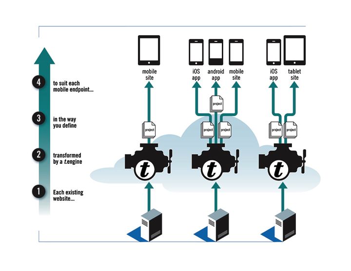
Why We Need New Approaches                                       As we see from this example, there are two major issues
                                                                 when displaying a regular website on a high-resolution
to Support Mobile Users                                          mobile screen: Readibility and Touch Friendliness.

Modern smartphones have Retina displays with a very high         Readability research8 shows that a font size of 3.5 mm (10 printer
screen resolution allowing them to display full desktop          points) is sufficient for the 20-49 age group, while older viewers
versions of a site. For example, the iPhone 5 has a 1136 X 640   require a font size of at least 4.2 mm (12 points). To provide a
display that is comparable with a default 1024x768 desktop       readable font size we need many more pixels on a retina display
computer’s resolution. Many web sites simply ignore the          for one character than on a desktop, and twice as many as the
difference and hope that users with modern phones will           iPhone’s previous generation. To make the translation to retina
access their website. Below is an example of how a regular       devices easier, Apple introduced a virtual (logical) screen to
desktop web site whose URL was accessed from a printed QR        scale content properly from virtual to physical pixels on retina
code is rendered on an iPhone 5 with a retina display.           devices. Apple also introduced a new virtual screen size unit –
                                                                 “point” to decouple physical pixels from virtual screen units.

                                                                 Touch Friendliness deals with the size of elements that
                                                                 support gesture-based navigation and form entry with
                                                                 a slide-in virtual keyboard. The key principle is that we
                                                                 require enough space between clickable elements to make
                                                                 touch and gesture navigation easy. The hit area should be at
                                                                 least 44 x 44 iOS points or about 9mm9. Many typical desktop
                                                                 web sites have navigation elements and menus that are
                                                                 not friendly for small multi-touch screens. So, if a web site
                                                                 has input forms even as simple as in the example above, it
                                                                 requires a completely different design to make it usable on
                                                                 mobile devices.

                                                                                                        www.jarcreative.com   416 504 8836
The Main Elements of the                                    Breakpoints

Responsive Web Design                                       Breakpoints use media queries with predefined values that
                                                            specify when to change the page layout to match the screen
                                                            size and aspect ratio. Because of the differences in pixel
Media Queries                                               density (number of pixels per inch) for different screens,
Web developers use media queries in order to match style    we cannot rely on a simple device pixel width to define
sheets to a particular screen resolution and form factor.   breakpoints. This is because a user’s distance from the
Media Queries allow the system to determine device Media    screen - and therefore the size of individual elements - will
features, such as:                                          also need to adjust between larger desktop screens, tablets
                                                            and smartphones. So, how do we define when the site layout
•    Page Width                •    Color                   should break? The best approach is to adapt breakpoints
                                                            using media queries in relative typographic EM units that
•    Page Height               •    Color-index
                                                            return results based on the browser’s default font size.
•    Device-width              •    Monochrome

•    Device-height             •    Resolution              Fluid Proportional Grids
•    Orientation               •    Scan
                                                            Fluid proportional grids form the underlying structure for
•    Aspect-ratio              •    Grid                    the page content, with sizing based on percentages vs. pixels
•    Device-aspect-ratio                                    (or points), that allow the system to scale the design within
                                                            certain limits or until it reaches a break point.
The World Wide Web Consortium (W3C) introduced media
queries as a Candidate Recommendation on 8 July 2002        Flexible Images
as part of HTML 4 and CSS2. W3C made media queries an
                                                            Flexible Images also are able to scale their size in relative units
official recommendation in June 2012.
                                                            using a CSS tag. Media Specific Cascading Style Sheets (CSS)12
                                                            use standard CSS3 that supports CSS selection based on media
                                                            queries.

                                                                                                   www.jarcreative.com   416 504 8836
Responsive Design Patterns                                       Column Drop
                                                                 Unlike the Mostly Fluid design pattern, the Column Drop
Luke Wroblewski provided an overview of the most popular
                                                                 pattern primarily uses fixed sized grid columns to support
Responsive Web Design patterns13.
                                                                 fixed sized content containers. When the browser width
                                                                 does not fit the layout, columns drop below each other. The
Mostly Fluid
                                                                 Column Drop pattern therefore requires more break points to
The most popular pattern of the first generation of              stack column containers.
responsive design, the Mostly Fluid pattern uses a percentage
width for screen elements. Content containers are flexible
and allow the layout to stretch or contract up to a predefined
break point, and then will stack columns once that
breakpoint is reached. The Mostly Fluid pattern requires a
limited number of breakpoints. It also defines the maximum
width that the layout’s whitespace may expand beyond the
boundaries after this maximum is reached.

                                                                                                     www.jarcreative.com   416 504 8836
Layout Shifter                                                    Off Canvas
The Layout Shifter pattern changes layouts completely to          The Off Canvas pattern uses space off the screen to hide
adapt to various screen dimensions. This pattern typically        content or navigational elements that will become visible on
provides a better user experience and control over design         larger screen sizes or when the user exposes it on a smaller
than the Mostly Fluid and Column Drop patterns. This              device. It is a popular pattern that has multiple variations in
approach is very flexible and allows for innovative patterns,     implementation. It is also a scalable pattern that can be used
but also requires more time and effort to develop.                for complex multilevel navigation with animated sliding
                                                                  menus.  It does, however, requires the use of Jscript/JQuery
                                                                  animation that can affect performance on mobile devices.

Tiny Tweaks
This pattern works for simple one-column layouts, when a
layout may be adjusted by just tweaking font and graphics
sizes. It is not applicable in most cases since the majority of
web sites have more complex layouts.

                                                                                                       www.jarcreative.com   416 504 8836
Responsive Web Design                                          limiting the amount of information presented in each view,
                                                               rather than filling every pixel on the screen with additional
Frameworks                                                     content choices simply because there is space available.

Mobile First vs. the First Generation of
Responsive Frameworks                                          Mobile Last
                                                               Graceful degradation of user experience
The still popular first generation of responsive frameworks
uses media queries to detect the device’s browser screen
resolution and follows breakpoint rules to change layouts.
The default is a three column desktop layout that can be
contracted until it reaches the defined breakpoints wherein
the layout changes from three columns to two and then from
two to one column, stacking the content blocks using one of
the patterns described above.

By contrast, a new generation of responsive web design         Mobile First
frameworks such as Twitter Bootstrap V.3 and Zurb
                                                               Progressive enhancement of user experience
Foundation V.4 are based on the Mobile First approach. With
a Mobile First approach, the starting point is a smartphone
screen, with design and content elements added sparingly
for tablet, medium desktop or large screen desktop. The
idea behind this approach is to deliver an optimal mobile
experience instead of a compromised version of the desktop
view. Proponents of mobile first argue that this in turn
provides an optimized experience for large screen devices by

                                                                                                   www.jarcreative.com   416 504 8836
Twitter Bootstrap15 Foundation16
Twitter Bootstrap is the most popular responsive framework Zurb released the Foundation 4.x framework at the beginning
with the largest user base. The first release of Twitter of 2013. Like Twitter Bootstrap 3, The Foundation version 4.x
Bootstrap arrived in August 2011. Bootstrap 3 was released has been rewritten using the Mobile First paradigm. The Zurb
in August 2013 and was completely redesigned to follow the Foundation framework has a smaller user base than Twitter
Mobile First principles described above. Bootstrap but the popularity of this framework has been
growing since the release of Foundation 4.
Bootstrap 3 uses one grid to support fluid and fix layouts. It
also supports nested containers within the grid. There are 4 Foundation 4 uses fluid grids with a customizable number
defined breakpoints: of columns from 1-16 and default grid with12 columns. The
Foundation framework includes HTML and CSS-based design
• phone < 768 px,
templates, an extensive library of user interface components
• tablet > 768 px, and JavaScript extensions.
• medium desktop > 992 px and
It uses a single breakpoint at 768 px and media queries for
• large desktop > 1200px. visibility classes that allow it to alter styles for screens at
The framework partially supports HTML5 and CSS3 and it is different sizes and orientation. The Foundation partially
compatible with all major browsers including Microsoft IE8. supports HTML5 and CSS3 and it is compatible with major
Twitter Bootstrap is a modular framework that includes browsers – though it does not support Microsoft IE8. The
a series of LESS (Dynamic Stylesheet Language) style download-archived size is 149.6 KB
sheets. Twitter Bootstrap includes an extensive library of
UI components for buttons, groups of buttons, horizontal
and vertical tabs, navigation, breadcrumb navigation,
pagination, progress bars and more. The compressed size
of the framework is 83.9 KB (archived), making it suitably
lightweight for mobile devices.
www.jarcreative.com 416 504 8836Other Mobile Web Frameworks HTML 5 KickStart19
HTML 5 KickStart is a lean library of HTML5, CSS and
Skeleton 17
JavaScript building blocks for rapid website production.
It includes optional responsive flexible grid, set of UI
The Skeleton framework is a lightweight framework that
components and extensive library of 249 icons.
is based on a 960 pixel 16 column grid and scales down for
mobile screens. It is a “mobile friendly” rather than Mobile
First framework. Skeleton does not provide an extensive
UI library and has a much smaller user base than Twitter
Bootstrap and Foundation.
HTML 5 Boilerplate18
HTML 5 Boilerplate is the first and the most popular library
for the development of web sites and web applications
using HTML5. It includes a mobile friendly HTML template,
placeholder touch-screen icons, normilze.css, Google
analytics mobile snippet and other mobile-focused tools.
The normilze.css file allows browsers to render all elements
more consistently. It is optimized for fast mobile site
performance. HTML 5 Boilerplate uses Zepto.js – minimalist
Java script library for modern browsers.
www.jarcreative.com 416 504 8836Responsive Web Design for Another key factor is speed. Responsive sites may be slower
to load and render than mobile optimized non-responsive
eCommerce Sites sites. Users today have high expectations around eCommerce
site performance, which in turn can have a direct impact on
Responsive design faces many more challenges with conversion rate and sales.
eCommerce sites and other transactional web applications
than with standard informational sites.
Recent statistics show very high bounce and drop off rates
during the mobile checkout process as users are challenged
with entering information on mobile devices using small
touch screens with intrusive virtual keyboards. Many of the
standard patterns found on eCommerce sites do not transfer
easily to smaller touch screens. In many cases organizations
have to develop a completely separate mobile eCommerce
site that shares backend functionality or implement a mobile
optimized UI level. While relatively simple eCommerce
sites can be handled with responsive frameworks, complex
eCommerce sites cannot practically be re-developed using
common responsive web design techniques. The exponential
complexity of providing different navigation patterns and
views on different screen sizes and orientations makes a
separate mobile experience more practical.
www.jarcreative.com 416 504 8836Implementing Responsive Design Cons
Setting up a web site with a responsive web design theme
with CMS without customization should, in theory, be a relatively
simple exercise. However any customization required - and
There is often confusion about whether an existing web
there is almost always some customization desired - can
content management system (CMS) can be used with a
quickly make the process significantly more challenging.
responsive design. Historically most of the major web CMS
Even simple customization can break the integrity of the
platforms do not have user-friendly tools for mapping
theme and produce unpredictable results that may not be
content elements to different device requirements in order to
immediately apparent. Therefore, it requires advanced CSS
build responsive, multi-device web sites.
and WordPress skills to convert even a moderately complex
To overcome the limitations of a non-mobile web CMS, WordPress site to a responsive site.
developers have created responsive themes, of which there
In addition, speed and performance are likely to be an issue.
are now many available. Let’s review some of popular CMS
Many responsive WordPress themes have no server side
platforms and their support for Responsive Web Design.
image optimization and require mobile devices to download
the same large images as non-mobile devices and then scale
WordPress 20
them down to fit the display, rendering the site slow and
Pros falling short of an acceptable user experience.
WordPress is a blog publishing platform that has evolved to
become the most popular web content management systems
(CMS) for personal and simple sites, now powering over 70
million websites. The huge WordPress user base has given
birth to an ecosystem of plugins and themes that allow one
to extend the platform to create highly specialized sites with
multiple features, including responsive design themes.
www.jarcreative.com 416 504 8836Drupal21 Adobe® Experience Manager Web Content
Pros Management (former CQ5)22
Drupal is one of the top three open source Content Pros
Management Systems together with WordPress, and Joomla. Adobe Experience Manager is an open, standards-based web
The Drupal community offers a number of modules that help content management platform for delivering multi-channel
to build responsive web sites. The AdaptiveTheme framework experience. With full separation of content and presentation
includes a pluggable layout system, SASS integration and logic, it enables marketers and developers to provide an
support for Mobile First and desktop first design methods. optimal, personalized experience on different devices. This
Other powerful Drupal modules are Adaptive Image, Retina is an enterprise level system that supports multi site and
and Picture, which optimize image sizes and resolution for multi device delivery, content workflow, and digital asset
different devices, allowing pages to load and render much management. It has a powerful user interface with in-place
faster than with CSS fluid image resizing. Drupal also has content editing and drag and drop page assembly.
responsive modules like FidVids to handle video on mobile
Adobe Experience Manager can also be integrated with the
devices.
Adobe PhoneGap development framework to create mobile
Cons web applications. Adobe’s platform is one of the most
The core Drupal architecture was not originally designed as a comprehensive platforms for multi device web design and
responsive CMS. Nevertheless, Drupal’s modular approach development and has been named a leader in web content
provides enough flexibility to deliver complex responsive management by Gartner.
web sites.
Cons
Adobe Experience Manager is designed for enterprise clients,
and therefore targets the high end of the CMS spectrum. It is
likely not a good fit for small and medium size business due
to the high licensing and implementation costs.
www.jarcreative.com 416 504 8836Responsive Web Site Analytics The specific tagging approach ultimately depends on
your chosen web analytics platform. However, in general
Responsive Web Design requires that we rethink traditional responsive sites require you to invest significantly more time
approaches to web analytics. With a responsive site, visitors in planning and tagging implementation to ensure accurate
on different devices, may see a dramatically different and meaningful data.
presentation of content and navigation links above the fold.
Below are examples of a QR code tag and the landing page
Therefore the user’s screen flow will also vary by device (A
that is served when a user scans the printed QR code using
“screen flow” being the set and sequence of screens A user
the iPhone scan application.
sees based on his navigation choices). To properly understand
user behavior in this context we must first segment site
visitors based on device form factor. We can then build a
new model for analytics that focuses on understanding the
visitor’s interaction with specific content rather than with a
page or screen view. This in turn allows us to gain a better
understanding of a visitor’s entire journey through the site
instead of a single visit to a page.
Web traffic sources and referral pages will also likely differ
per device. For instance, marketing campaigns commonly
refer traffic sources to a mobile web with a printed QR code.
It is a good idea to have landing pages associated with a
specific campaign tagged to measure the impact of different
QR codes on traffic to your mobile site. You may also need
to create distinct tags between mobile and desktop devices
using media queries.
www.jarcreative.com 416 504 8836Testing and QA for Responsive instance, some of the Java script libraries’ compatibility
problems may cause a complete browser failure on certain
Web Site devices and destroy your entire website user experience. If it
is essential that you reach 99.99% of your potential audience,
Because of the complexity of responsive sites, and the
you should consider partnering with a specialized QA service
rapidly evolving mobile device landscape, it is nearly
provider who can provide multi-device testing with a high
impossible to ensure compatibility with all device form
level of automation.
factors and browsers. Using available browser usage
statistics we can make assumptions about what share of Below are recent statistics about mobile browsers and
the potential audience to target with compatibility testing, mobile screen resolutions.
and then choose a level of compromise that we deem to be
acceptable. The decision will ultimately be driven by the Top 9 Mobile Browsers
amount of additional effort involved, since moving from a From Sept 2012 to Sept 2013
90% compatibility target to a 99% target may increase the
number of devices and browsers to be tested exponentially. 40%
Tools for Testing 32%
There are number of tools that allow us to test sites for 24%
different screen resolutions. Device simulators can be used
on a desktop computer to test portrait to landscape rotation 16%
and other simulated hardware features. However, be warned
that device simulators do not always exactly match the 8%
native device’s behavior. It is strongly recommended that
0%
you perform early testing of a site’s design and development
Sept 2012 Sept 2013
iterations on the most popular devices and browsers. For
Android iPhone Opera UC Browser Nokia
Blackberry Netfront iPod Touch Chrome Other (dotted)
www.jarcreative.com 416 504 8836Top 14 Mobile Screen Resolutions Performance Testing for Responsive Sites
From Sept 2012 to Sept 2013
Users browsing web sites on smartphones have a very low
tolerance for slow loading pages. Statistics show that every
second of additional page load delay dramatically increases
320x480
the number of visitors who abandon the site. Web page load
240x320
and rendering speed is the area where Responsive Web Design
720x1280
is most likely to fail and therefore you should plan to at least
320x568 double your time investment in performance testing with a
400x800 responsive site.
800x600
There are a number of optimization techniques which can
320x240 help with the problem of lowered performance. However
360x640 you will need to begin your on native devices at the earliest
128x160 possible stages of design and prototyping to avoid a costly
540x960
reworking at the end of the project.
240x400
1280x1024
1280x720
480x360
Other
0% 40%
www.jarcreative.com 416 504 8836Pros and Cons of Responsive Web to minimize the risk of having an unpredictable user
experience.
Design • A responsive site demands that Mobile devices perform
additional calculations to load, sort, resize and deliver
Pros of Responsive Web Design: specific content elements and styles for each device.
• It allows you to build one website instance that works Because mobile users have a very low tolerance for sites
on all devices and simplify the maintenance of web with page load time over 3 seconds, this may have
content and application code serious implications for the success of the site.
• Users do not need to download a stand-alone • There is a common misperception that developing a
application to enjoy a mobile optimized experience responsive site is less expensive than developing separate
sites for each device form factor. In reality, the efforts
• There are advantages for Search Engine Optimization required to design, develop and properly test a custom
(SEO) since there is no URL redirection required and responsive site can be 2-3X greater than a site that targets
content is shared across all platforms only one device.
Cons of Responsive Web Design: • Generally, having 3 sites that are optimally designed
for Desktop, Tablet and Smartphone provides a better
• Contextual factors such as location, user surroundings, user experience than having a responsive web site
number of steps and time required to complete task, are that provides a second-rate experience on all devices.
fundamentally different on hand held devices. The typical responsive design framework considers
only a limited number of features and factors
• Multi touch screen interaction requires not just screen
pertaining to a user’s device.
size adjustments but a rethinking of the overall
navigation architecture.
• We may be forced to settle for the lowest common
denominator from a design perspective in order
www.jarcreative.com 416 504 8836Device Features that Impact User Experience • GPS and location based services
Across Different Platforms: • Availability of push notifications
• Physical screen dimensions in pixels • Three-axis gyro
• Aspect ratio • Accelerometer
• Rotation between landscape and portrait orientations • Proximity Sensor
• Screen pixel density in Pixels Per Inch (PPI). The retina • Biometric security – fingerprint identity sensor
display for iPhone has 340 PPI while the typical
notebook display has 40 - 50 PPI • Near Field Communication (NFC)
• The base font size for readability on the physical device • Impact of web applications on smartphone batteries
• Screen brightness contrast and ambient light sensor
• Processor and graphical speed
• Wi-Fi or cellular network speed
• Input methods: fixed keyboard, on screen sliding
keyboard, mouse or pointer, touch panel, single touch
screen, multi-touch
• Additional gestures supported by specific device type
• Microphone and audio support
• Camera + bar code reader support
www.jarcreative.com 416 504 8836Responsive Web Design This saves time and bandwidth, as well as processing time
to execute scripts, or render styles and images on mobile
Alternatives screens.
Here is a summary of the key differences between
Adaptive Web Design Responsive Web Design (RWD), Adaptive Web Design (AWD)
Adaptive Web Design methodology uses server side and Responsive Design + Enhanced Server Side components
processing to deliver a better user experience by determining (RESS):
an optimal compromise between site features and device
capabilities. This approach is based on the principle of
“Progressive Enhancement”
, whereby the site proactively
Type of Responsive Where the Responsive
eliminates the need to download unnecessary components
Web Method Web Logic is Handled
by a browser or device that is unable to support them.
Responsive Web Design On the device browser
Responsive Design + Enhanced Server Side (RWD)
Components (RESS)
Adaptive Web Design (AWD) On the server side
Combining Responsive Design and Enhanced Server Side
Components (RESS) Device
components (RESS) improves the performance of responsive
web sites by using server side logic to send the device only
the content, optimal styles, images and JavaScript that are
required by that specific device type.
The RESS approach utilizes fluid grids to accommodate
different screen dimensions using the responsive design
approach that is rendered by the device browser.
www.jarcreative.com 416 504 8836Mobile Responsive Delivery The main advantage of Moovweb’s Responsive Delivery
methodology is that it allows you to leverage your
Moovweb introduced the concept of Responsive Delivery,
23
investment in an existing desktop web site or web based
which eliminates the need to rewrite an existing desktop-
application while still providing an optimal user experience
based web site to provide an optimal mobile device
on each device.
experience. Responsive delivery adds a virtual presentation
layer (t.engine) that transforms an existing site to a virtual
site that matches a device’s capabilities in real time. This
provides a rapid development process for mobile web sites,
since you only need to design the mobile user interface and
code style transformation rules for different device types.
www.jarcreative.com 416 504 8836Native Mobile Applications for a very sophisticated experience, including caching of
user data, without the necessity of downloading a dedicated
Native mobile applications (i.e. non- browser based) have the
app or maintaining versions for multiple devices. While
potential to provide better performance and user experience
traditionally limited to a subset of mobile devices, HTML5 is
since they integrate with advanced device hardware features,
now available in nearly all modern mobile browsers.
and include the ability to provide offline functionality.
Because they are developed for each particular device
Hybrid Mobile Applications
operating system, they require users to download an “app”
from one of the OEM’s online marketplaces - Apple App Hybrid mobile applications combine modern web
Store, Google Play, BlackBerry World or Windows Store - technologies such as HTML5 and CSS3 while utilizing
which is a fairly high barrier for a one time or occasional essentially the same device features as native mobile
user of your site. applications. The idea behind hybrid web application
frameworks is to deliver the best possible web mobile
The main challenge with native mobile applications is the
experience using the Web View Shell. The Web View Shell
necessity to develop and maintain separate applications for
is a native mobile application that works as a container for
each device. While there are tools and platforms that help to
the core application HTML5 code. We need to develop and
simplify cross platform mobile development, this solution is
distribute the Web View Shell applications for each device
generally only feasible where frequent, dedicated users will
in the same way we develop and distribute native mobile
take the time to download an additional application.
applications.
Web-based Mobile Applications There are two types of hybrid applications.
HTML5 now allows us to develop web-based applications • The first type uses only native shells but all application
that are very close to the look and feel of native mobile code is built as a cross platform web application. You
applications – but which can be delivered within a mobile only have to submit native mobile applications shells
web browser. With Mobile HTML5 applications, mobile to the various application stores to cover every device.
browsers gain direct access to the hardware of mobile Developers do not need to develop the core application
devices (including accelerometers and GPS chips) allowing code for each device.
www.jarcreative.com 416 504 8836• The second type of hybrid application mixes the idea • Complex multifunction site
of a mobile web application with native mobile application • Multi-site framework or network of multiple sites
code modules that helps to enhance the user experience.
The second type is closer to native mobile applications, but • How old is your current web site? Has there been a
a significant part of the core application code can be reused complete refresh of the website in the last 1- 3 years
between devices. This approach also has an advantage or it is older?
with cross device updates because there is only one core
application HTML5 code distribution required. • Who are the target audiences for your sites and what
web browsing statistics are expected? This is
particularly important if you have a site with global
audience.
Criteria for Selecting a Mobile
Web Strategy • Does your current site use Adobe Flash components
or flash based video? (these are not supported by
The first step is to assess your current web properties and many mobile devices)
mobile priorities. Here are a few questions that can help you
make an optimal choice that addresses both user needs and
business objectives:
• What type of site is it?
• A small corporate site (up to 10 page template
layouts)
• An eCommerce site
• Online publishing site
• Portal
www.jarcreative.com 416 504 8836A Summary of Best Practices • 44 x 44 points is the minimum size for touch based
clickable elements
for Implementing a Responsive • You will need to rethink pointer based hover
Website functionality for touch screens
Our recommendation is that a responsive approach is most • Use adaptive media technologies for images and
appropriate for small corporate or eCommerce sites (i.e. no video. Avoid loading and resizing large images using
more than 10 distinct page layouts). If you decide to move CSS on smartphones
forward with a Responsive Web Design approach here is a
• Use optimized JavaScript libraries and adjust the
summary of best practices that will increase your chances of
priority of script preloaded to improve the page
a successful implementation:
rendering speed on mobile devices
• Follow the mobile first approach described above. It will • Start testing device compatibility and page speed on the
provide a better overall user experience primary native devices you are targeting early in the
process to avoid a major rework at the end of your project
• Start with a full list of content and user actions, then
prioritize each of them by device • Plan your web analytics implementation in parallel with
the site map and experience flow phases to insure you
• Prepare user experience flows for each device
are collecting relevant data
• Select navigation menu patterns per device that are
• Use mobile web optimized tagging
multi-touch friendly and match the hierarchical
structure of your site. You will likely need to apply a • Expect to allocate 2- 3 X more effort and duration in
different menu hierarchy on mobile phones vs. a larger comparison with a similar sized single device web
screen. You shouldn’t have any more than 3 navigation site project for the entire cycle, including planning,
items in a horizontal menu on a smartphone device design, development and testing
screen
www.jarcreative.com 416 504 8836If you have complex functional or transaction based sites
then the Responsive Delivery framework will likely prove
Conclusion
more effective and save you a lot of time and effort in Having a mobile web site is no longer simply an option – it
converting or adapting a complex web site or application to is a necessity. And choosing the right mobile approach is
a multi screen experience. Responsive delivery platforms also a critical factor in maximizing your online marketing and
help simplify and unify the transformation of multiple web business results.
sites for mobile use and preserve your investment in the
development of existing complex functional web sites. Using a Mobile First design philosophy is likely to deliver
the best results regardless of which mobile web approach
or platform you choose. However, as with any strategy,
you should base your multi screen approach on a thorough
understanding of your audience’s needs and your business
objectives.
Written By: Igor Nesmyanovich
Edited By: Jeremy Robinson
Illustrations By: Russell Holley
www.jarcreative.com 416 504 883613. Multi-Device Layout Patterns, by Luke Wroblewski, http://codepen.io/bradfrost/
References full/jtdvf
1. There Will Be More Smartphones Than Humans on the Planet by Year’s End 14. Responsive CSS Framework Comparison, http://responsive.vermilion.com/
http://mashable.com/2012/02/14/more-smartphones-than-humans/ compare.php
2. The Growth of Mobile Marketing and Tagging, by Holly Richmond, Mar 21, 15. Bootstrap, http://getbootstrap.com/
2011, http://tag.microsoft.com/community/blog/t/the_growth_of_mobile_
marketing_and_tagging.aspx 16. Foundation. The most advanced responsive front-end framework in the world,
http://foundation.zurb.com
3. Mobile vs. Desktop Monthly statistics, by StatCounter, http://gs.statcounter.
com/#mobile_vs_desktop-ww-monthly-201209-201309 17. A Beautiful Boilerplate for Responsive, Mobile-Friendly Development, http://
www.getskeleton.com/
4. Guidance Updated to Address Current Online and Mobile Advertising
Environment) - http://www.ftc.gov/opa/2013/03/dotcom.shtm 18. The web’s most popular front-end template, http://html5boilerplate.com/
5. Standard on Optimizing Websites and Applications for Mobile Devices, 19. HTML KickStart, http://www.99lime.com/elements/
Government of Canada, http://www.tbs-sct.gc.ca/pol/doc-eng.aspx?id=27088
20. WordPress , http://wordpress.org/
6. Why 2013 Is the Year of Responsive Web Design , by Pete Cashmore , Dec, 2012,
21. Drupal, https://drupal.org/node/1388492
(http://mashable.com/2012/12/11/responsive-web-design/)
22. Adobe Web Content Management, http://www.adobe.com/ca/solutions/web-
7. Why You Need to Prioritize Responsive Design Right Now, by Susan Gunelius,
experience-management/web-content-management.html
March 2013, http://www.forbes.com/sites/work-in-progress/2013/03/26/why-you-
need-to-prioritize-responsive-design-right-now/
23. MoovWeb The Responsive Delivery Mobile Platform, http://www.moovweb.com/
product/overview
8. Readability of characters on mobile phone liquid crystal displays, by S. Hasegawa
- 2008, http://www.ciop.pl/27073
9. iOS Human Interface Guidelines, By Apple, https://developer.apple.com/library/ i
Read more: http://www.marketingprofs.com/charts/2013/11010/web-traffic-from-
ios/documentation/userexperience/conceptual/mobilehig/
mobile-devices-up-78-year-over-year#ixzz2hmrfC700
10. Responsive Web Design, by Ethan Marcotte .May 25, 2010, http://alistapart.com/
article/responsive-web-design
11. Media Queries, by W3C, June 19, 2012, http://www.w3.org/TR/css3-mediaqueries/
12. Cascading Style Sheets home page, by W3C, http://www.w3.org/Style/CSS/
www.jarcreative.com 416 504 8836You can also read


