An Expert Guide to choosing colour for your home - An Optimise Design eBook - www.optimise-design.com
←
→
Page content transcription
If your browser does not render page correctly, please read the page content below
An Optimise Design eBook

      An Expert Guide
      to choosing colour
      for your home

                   www.optimise-design.com
Colour eBook                  1              © Optimise Design 2018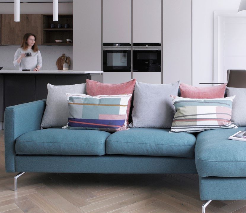
Contents

1. Introduction                        3
2. Where to start                      6
3. Do’s and Don’ts                     12
4. Neutral doesn’t have to be boring   17
5. Be Brave                            19
6. Trends                              27

Colour eBook                    2           © Optimise Design 2018
Section 1

Introduction

Colour eBook   3   © Optimise Design 2018
Introduction

Colour is an essential part of design, and it can have a powerful effect
on how our home makes us feel. But choosing colour is something with
which many people struggle – there’s so much choice, it’s easy to get
bamboozled. Often, the images we use for inspiration are from places
with entirely different climates to our own and, while bright and vibrant
shades look fantastic in sunny locations, they’re not so good in areas that
have weaker light.

Colour eBook                         4                          © Optimise Design 2018
Introduction

Ireland gets a large number of cloudy days           This guide will help you to understand why
throughout the year, which makes the light           specific colours work and others don’t and
soft and diffused. Many homes have darker,           will provide you with the tools to help you to
north-facing rooms or are light-starved at           select the perfect shade for any room in your
certain times of the year. Some colours work         home.
every time in this context, but others just
don’t, and it’s not always obvious why.
Having created my own paint collection for
Dulux, I’ve spent a lot of time analysing why
                                                     Denise O’Connor,
some colours always look fantastic and others
                                                     Principle,
never do, and I’ve discovered that there are
                                                     Optimise Design
specific rules that you can follow to help you
to choose more wisely.

Colour eBook                                     5                                   © Optimise Design 2018
Section 2

Where to Start

Colour eBook   6   © Optimise Design 2018
Where to Start

There is a quote from Claude Monet ‘Colour is my day-long obsession,
joy and torment’. It completely sums up the fact that there is a certain
amount of trial and error when it comes to choosing the right colours,
even for the colour masters. So don’t be afraid to experiment and test
things out - through mistakes we learn.

Think about how you                     Before you start thinking about colours, ask
will use the space                      yourself how you plan to use the space.
                                        You will want to create an entirely different
                                        atmosphere in your kitchen than you will in
                                        your bedroom. Your kitchen should feel fresh
                                        vibrant and inviting so you will want to go for
                                        brighter colours. Your bedroom, however, will
                                        want to feel calm and restful. So softer colours
                                        that create a tranquil feeling are an excellent
                                        choice, or you could even consider a dark,
                                        moody tone to create a cocoon-like effect.

Colour eBook                        7                                   © Optimise Design 2018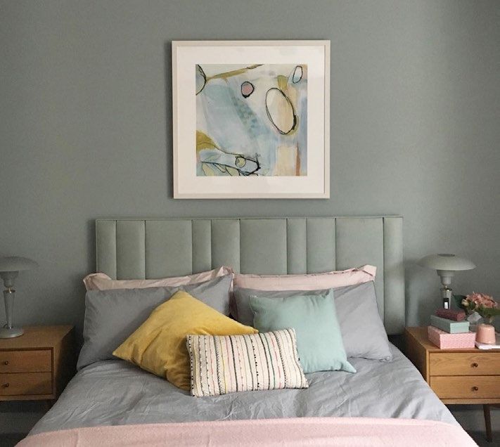
Where to Start
Take the orientation into
account
Think about the orientation of the room, is it
north or south facing? A common mistake
with dark rooms is to paint them white to
brighten them, but this will make them feel
clinical instead. With north facing rooms you
should try to make them feel cosy so warm
earthy shades work best, in sunnier rooms
you have more options and can play with
both dark and light tones.
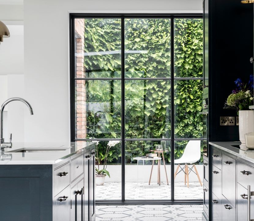
Use what you have as a source
of inspiration
Inspiration can come from anywhere,
fashion, film, art galleries or nature. I had
a client who had a very neutral kitchen
and living space which opened onto her
garden. We selected a mix of plain coloured
cushions to pick up the colours of the flowers
outside – the effect was beautiful and
A common mistake with dark connected the living space with the garden.
rooms is to paint them white to If you’ve got patterned upholstery, an
brighten them Oriental rug or large piece of artwork, pluck
colours you like from the pattern. Art is a
fantastic place to start if you are looking for
inspiration. Pulling shades for your colour
scheme from a painting that you plan to
hang in the room will create a cohesive look.
Colour eBook 8 © Optimise Design 2018
Where to Start

Test before Commiting
To help you select the perfect colour first
collect some swatch cards in the shade that            “invest in some sample pots of
you want to use. Once you’ve narrowed it               your preferred shade”
down invest in some sample pots of your
preferred shades. Instead of painting directly
onto the wall paint onto a large piece of board
or card. This way you can carry it around
the room testing the colour in different light
conditions.
An important tip here is to buy your tester
paint in the finish that you intend to paint the
wall in. For example, if you want to paint your
wall in a gloss finish this will affect how the
colour is perceived as its far more reflective
than a Matt finish.

Colour eBook                                       9                        © Optimise Design 2018
Where to Start

                      Work with what you have
                      Knowing the colour that you would like
                      to paint your room is a great first step but
                      picking the exact shade should be one of
                      the last things you do. If it’s an existing room
                      take some time to do an inventory of all of the
                      permanent features like the colour of the floor
                      or curtains. Think about the upholstery fabrics
                      and any artworks. Your wall colour will need
                      to work with these items otherwise you end
                      up with a room where everything feels out of
                      place.
                      What are the elements in the room that you
                      have to keep, curtains, a sofa, the flooring?
                      These are all very costly items to replace
                      and will often have to stay, so make sure
                      your choice of colour works with these other
                      elements.
                      Whether or not a colour will work in a
                      particular room depends on many factors -
                      the orientation, the flooring, the furnishings
                      and the lighting. For example, if your
                      woodwork and windows are white or off-
                      white, you will be able to choose from a vast
                      range of colours as opposed to someone
                      who has teak windows where the options will
                      be much more restricted.

                      “make sure your choice of
                      colour works with other
                      elements.”

Colour eBook     10                                    © Optimise Design 2018
Where to Start
Layering
You’ve found your perfect shade, how do you
pull the whole room together? The secret to “You should start with a
getting it right is in layering. You should start
with a neutral backdrop and build colour
neutral backdrop and build
carefully by adding bolder colours through colour carefully by adding
accessories and art. Your wall colours should bolder colours through
form your backdrop, but keeping these accessories and art.
neutral doesn’t mean painting them a bland
and boring shade. You can create a neutral
version of practically any colour and can go
either very light or very dark. Think greys,
caramels and sandy tones, all of these work
in any version from light to dark as a neutral
backdrop that you can combine with any
other accent colour.
Colour eBook 11 © Optimise Design 2018Section 2 Do’s and Don’ts Colour eBook 12 © Optimise Design 2018
Do’s & Don’ts

Don’t: Choose pink or peach                              Do: Choose neutrals with a hint
vases neutrals                                           of green
Steer clear of any shade with a hint of pink             Instead choose a shade with a slight hint of
or peach in it. These tones appear to be                 green in it, as this has a neutralising effect,
warm, which can be tempting in colder                    meaning that most colours will combine well
climes, but, in fact, they’re tough to live with.        with it. The green also means it will react well
This is particularly true with neutral shades            in the light that comes with the Irish climate,
– magnolia is a classic example – as their               which tends to be very soft, as well as in other
warmer tones tend to clash with everything.              rooms with limited natural light.

Colour eBook                                        13                                    © Optimise Design 2018
Do’s & Don’ts

Don’t: Paint a dark room yellow Do: Choose warmer earthier
Another common mistake that I see is tones:
painting a room yellow to brighten it. Yellows            Instead, opting for a more neutral shade
are tricky as they often react poorly in the light        with a little hint of green or earthy tone to it
that comes with the Irish climate and can look            will make the room feel much warmer and
cold.                                                     inviting.

Colour eBook                                         14                                      © Optimise Design 2018
Do’s & Don’ts

Don’t: Paint a north facing                          Do: Choose a dark shade
room white.                                          Instead, go darker but warm on the walls and
A widespread mistake for a north-facing or           improving artificial lighting, a north-facing
dark room is to paint it white to try to make        room can be a very snug, pleasant place
it feel brighter. This doesn’t work and can          to spend time, regardless of the climate
make the room seem cold. Instead, what you           conditions outside.
should try to do is make the room feel cosy.

Colour eBook                                    15                                  © Optimise Design 2018
Do’s & Don’ts

Don’t: Treat every room in                    Do: Think of your home as a
isolation                                     flow
One of the biggest mistakes people            The colours in your home should have a
make when painting their homes is not         cohesive palette and should complement
considering adjacent rooms and how the        each other. Pull together swatches for each
room works as a whole.                        room and ensure that they all complement
                                              each other.

Colour eBook                             16                                  © Optimise Design 2018
Section 4 Neutral doesn’t have to be boring Colour eBook 17 © Optimise Design 2018
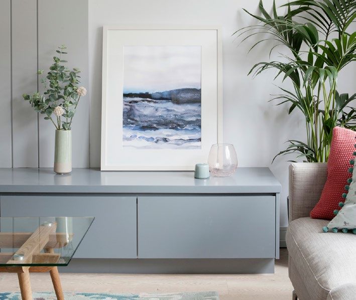
Neutral doesn’t have to be boring

The trick with creating an attractive and inviting neutral scheme is to use
a variety of neutral shades together to create depth. When it comes to
choosing your colour palette, try to keep it to 3 – 4 colours for your base
tones, then you can build on this with accent colours.
I often recommend painting the ceilings and woodwork, such as door
skirtings etc., in the same colour - usually the lightest shade - then the
main walls in the mid-tone and any feature areas in the darkest shade. This
can, of course, be reversed. But using more than 3 or 4 base colours will
look cluttered and confused.

Colour eBook                         18                         © Optimise Design 2018
Section 5

Be Brave

Colour eBook   19   © Optimise Design 2018
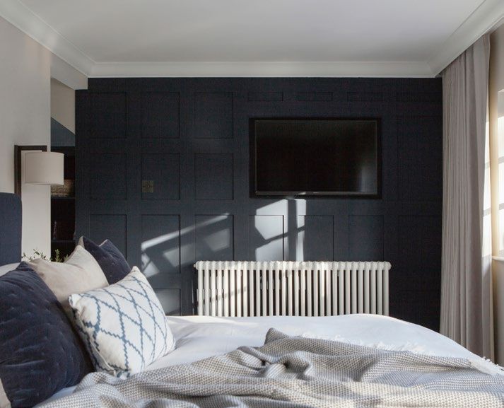
Be Brave

                              Move outside your comfort zone
                              Don’t be afraid to use dark colours. There is
                              a misconception that painting a room dark
                              will make, it feel small but it actually can have
                              the opposite effect. The trick when choosing
                              a dark colour is your choice of shade. Go for
“The trick when choosing a    the slightly chalky version of your preferred
                              colour. Really dark tones can fall into the
dark colour is your choice    category of neutral, and they also form the
of shade.”                    perfect backdrop for hanging art.

Colour eBook                 20                                 © Optimise Design 2018
Be Brave Add Value The colour you paint your walls can have What interested me most about the report a dramatic effect on the value of your was that it actually encouraged the use of home. This is according to a recent report colour. Homes where the owners ‘played it carried out by Market Watch. Now I’m not safe’ and painted everywhere white were advocating we return to times when people perceived as clinical and achieved a lower made design choices based on what a sale price than homes where colour was potential purchaser would prefer. I sincerely used. hope the days of painting everything magnolia are firmly in the past. Colour eBook 21 © Optimise Design 2018
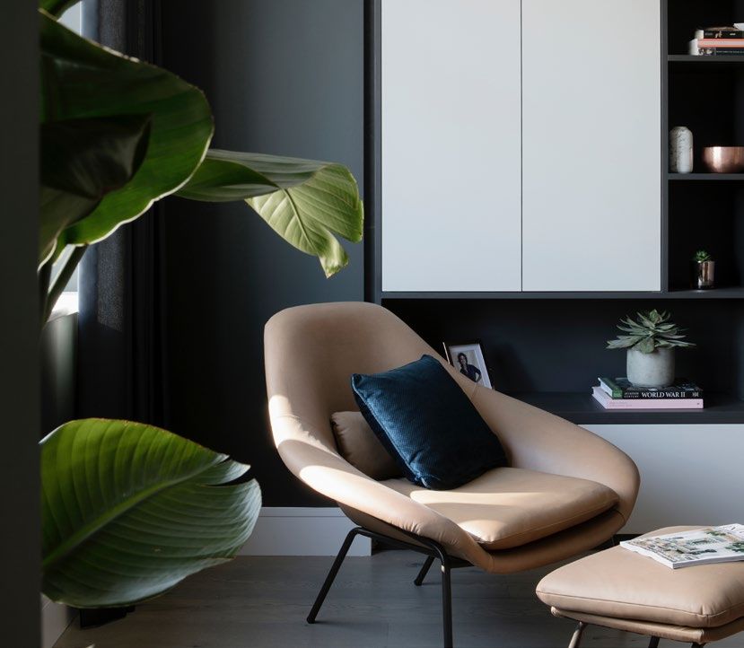
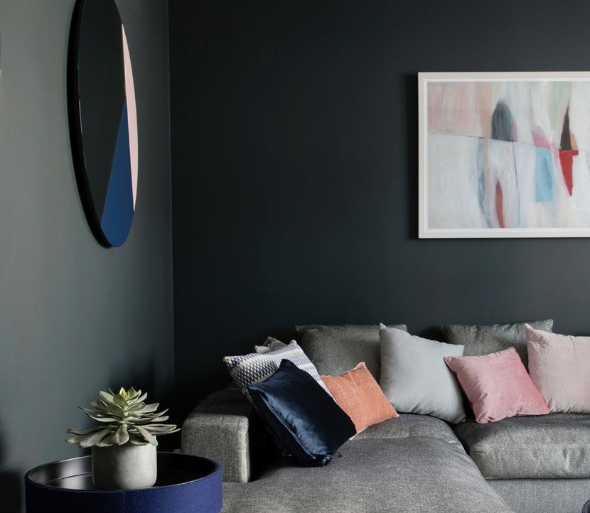
Be Brave

Create a focal point
Using a bold colour is a great way to create
a point of focus in a room with changeable            “Using a bold colour is a great
light, plus it helps to define different zones
                                                      way to create a point of focus in
within an open-plan space. Really dark
shades, like the grey in this living room,            a room with changeable light”
actually work as a neutral tone, contrasting
beautifully with the brighter shades and
providing a fantastic backdrop for artwork.

Colour eBook                                     22                         © Optimise Design 2018
Be Brave
Be careful in your choice of colour.
When painting a wall in a bold shade keep the
rest of the palette simple to create clean contrast.
What you don’t want is too many strong colours
in a room as they will start to compete. You want
something that is going to tone in with the rest of
the room and isn’t going to dominate.
Opt for the more earthy end of the spectrum.
For example, this is a warm grey with sandy
undertones, which is much softer and
warmer than a cooler grey with blue or purple
undertones.
When choosing a more definite colour, opt for
“Opt for the more earthy more muted or chalky versions of a particular
colour rather than a version that has too much of
end of the spectrum.” the primary tone in it.
Colour eBook 23 © Optimise Design 2018Be Brave
Keep your palette simple
While rooms in sunnier climes with more
direct sunlight can handle a rainbow of
shades, in climates where there’s frequent
cloud cover, a simple colour palette works
best. So if you’re planning to paint a dark or
“in climates where there’s north-facing space in a bold shade, keep the
frequent cloud cover, a simple rest of the scheme simple for a clean contrast.
colour palette works best.” In this kind of space a monochrome palette
will create a relaxed and elegant atmosphere.
Colour eBook 24 © Optimise Design 2018Be Brave Paint a dark window wall Where you have large windows, a deep shade can be very dramatic. The wall with the windows is actually the darkest in the room, as it gets no direct light, so it’s the ideal surface to paint a dark colour. Colour eBook 25 © Optimise Design 2018
Be Brave

                    Start small
                    I read recently that a nail polish company did
                    a survey to see how their bolder nail colours
                    were selling and they found that ladies were
                    buying them but were wearing them on their
                    toes and playing it safer on their hands. It
                    reminded me of a friend’s house where the
                    whole house is very neutral but the tiny guest
                    toilet is painted in a dark burgundy. And it’s
                    everyone’s favourite room in the house! So
                    if you are nervous start somewhere small to
                    build up confidence.

                    “if you are nervous start
                    somewhere small to build up
                    confidence.”

Colour eBook   26                                 © Optimise Design 2018
Section 6 Trends Good design should be timeless. Trends can be fun, but you should add them in such a way that can be rotated out pretty quickly. For instance, brass is very fashionable now and it’s being overused. It can go too far when you see it on light switches and taps and everywhere. There are lovely ways to introduce brass, but go easy. The same is valid for colour. Colour eBook 27 © Optimise Design 2018
Trends

Never select a colour based on a trend or
fad. That is a guaranteed way to end up with        “Never select a colour based
a room that soon feels dated. Social Media          on a trend or fad. That is a
is a wonderful source of inspiration but it is
very trend-led so be careful when using it
                                                    guaranteed way to end up with
to choose colours. If you’re seeing green           a room that soon feels dated.”
everywhere, for example, it’s a pretty good
indication it’s very “in” at the moment and is
therefore likely to soon be on the way “out”.
Even though it’s relatively easy to repaint your
walls, it’s not something you’ll want to do
every year. So if you have your heart set on an
on-trend color, introduce it with accessories
and items that can be easily replaced and
choose a complementary wall paint that’s
more timeless.

Colour eBook                                       28                    © Optimise Design 2018
Thank You Thank you for reading. If you enjoyed the book why not keep intouch by signing up to our newsletter and be the first to hear about our events, latest projects, newest articles and upcoming ebooks. Simply go to our home page at http://optimise-design.com and sign up in the footer Follow us on Social Media Colour eBook 29 © Optimise Design 2018
Colour eBook 30 © Optimise Design 2018
You can also read