Applications and innovations in typeface design for North American Indigenous languages - Mark Turin
←
→
Page content transcription
If your browser does not render page correctly, please read the page content below
btwo 10 (1) pp. 71–98 Intellect Limited 2020

Book 2.0
Volume 10 Number 1
© 2020 Intellect Ltd Article. English language. https://doi.org/10.1386/btwo_00021_1
Received 15 September 2019; Accepted 7 February 2020

JULIA SCHILLO AND MARK TURIN
University of British Columbia

Applications and
innovations in typeface
design for North American
Indigenous languages

ABSTRACT                                                                                   KEYWORDS
In this contribution, we draw attention to prevailing issues that many speakers            orthography
of Indigenous North American languages face when typing their languages, and               typeface design
identify examples of typefaces that have been developed and harnessed by histor-           Indigenous
ically marginalized language communities. We offer an overview of the field of             language revitalization
typeface design as it serves endangered and Indigenous languages in North                  typography
America, and we identify a clear role for typeface designers in creating typefaces         Unicode
tailored to the needs of Indigenous languages and the communities who use them.            endangered languages
While cross-platform consistency and reliability are basic requirements that read-
ers and writers of dominant world languages rightly take for granted, they are
still only sporadically implemented for Indigenous languages whose speakers and
writing systems have been subjected to sustained oppression and marginalization.
We see considerable innovation and promise in this field, and are encouraged by
collaborations between type designers and members of Indigenous communities.
Our goal is to identify enduring challenges and draw attention to positive innova-
tions, applications and grounds for hope in the development of typefaces by and
with speakers and writers of Indigenous languages in North America.

                                                                                       www.intellectbooks.com  71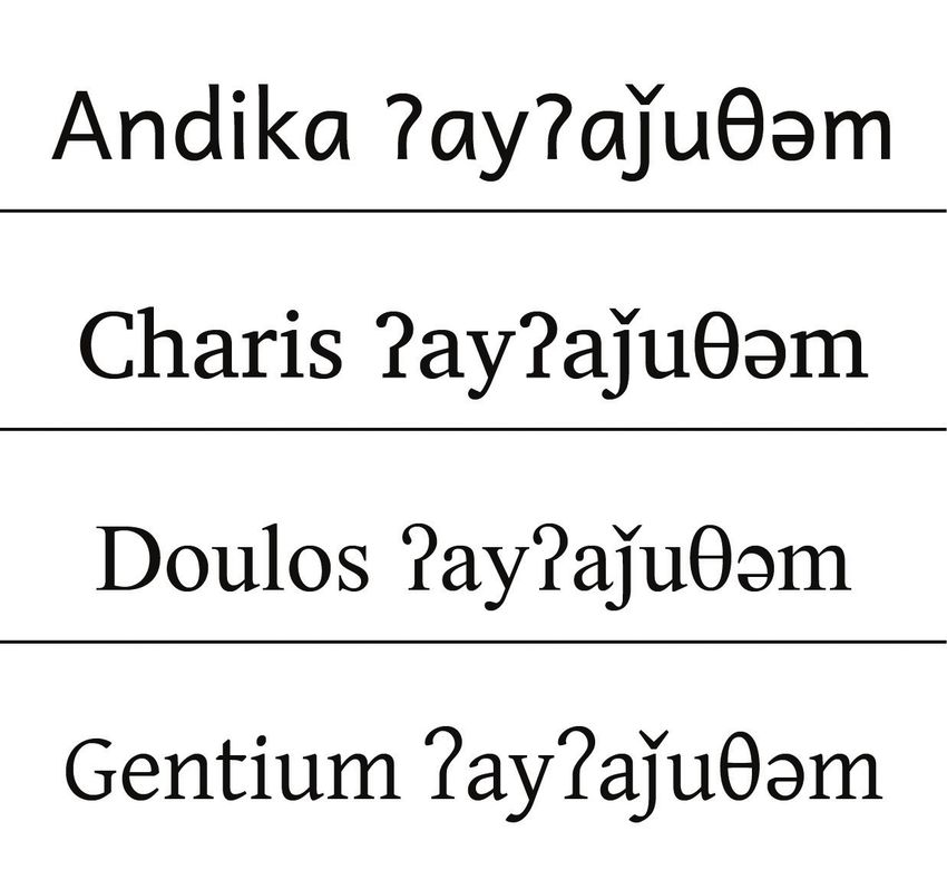
Julia Schillo | Mark Turin

  1. The term ‘cultural         INTRODUCTION
     genocide’ has been
     used by the Canadian       Indigenous communities across the world are actively engaged in language
     government since 2015      reclamation and revitalization projects that provide urgently needed support
     to describe this violent
     history (Schwartz 2015).   to restore fluency and transmission of their ancestral and heritage languages.
     For more discussion        The writing systems (orthographies) used to represent these languages are as
     on this term in an
     Indigenous Canadian
                                diverse as the languages themselves, and range from Latin-based alphabets,
     context, see Wildcat       with distinct letters to express individual sounds, to syllabic writing systems
     (2015).                    such as those used for Cherokee and Cree.
  2. Indian residential             As a direct consequence of colonization and the ensuing cultural geno-
     schools and Indian         cide1 enacted through the residential school system of the nineteenth and
     boarding schools,
     as they are called in      twentieth centuries in the United States and Canada,2 all of the Indigenous3
     Canada and the United      languages spoken in North America are now endangered, and numerous
     States, respectively,      revitalization projects are currently underway to generate new speakers and
     were state-endorsed
     and often church-run       restore intergenerational language transmission (Pine and Turin 2017). As
     schools whose primary      language revitalization projects engage ever more with digital tools, commu-
     purpose was the
     abolition of Indigenous
                                nities, activists and scholars are paying increased attention to how technology
     culture and language       can support their strategic goals of breathing life into Indigenous languages
     (Pine and Turin 2017).     again (Baldwin et al. 2016; Pine and Turin 2019).
     Many Indigenous
     children were                  An element of this process that remains regularly overlooked is the crea-
     separated from their       tion of typefaces and keyboards that accommodate the specialized glyphs and
     families in order to be    specific orthographic needs of Indigenous languages. Cross-platform type-
     sent to these schools,
     where they were often      faces and keyboards are foundational for language revitalization projects:
     physically, sexually and   they allow for everyday actions to take place in Indigenous languages, such
     emotionally abused,
     and regularly subjected
                                as writing e-mails, searching and naming digital files, texting and social media
     to vicious forms of        activity, and they facilitate the creation, sharing and mobilization of language
     physical punishment        learning materials. For these reasons, we see a clear role for typeface design-
     for speaking
     their ancestral            ers in creating fonts tailored to the needs of Indigenous languages and the
     languages (Truth           communities who use them. While this article offers only an overview of the
     and Reconciliation         field of typeface design as it serves endangered and Indigenous languages in
     Commission of Canada
     2015–16).                  North America, with occasional relevant illustrations from further afield, the
                                issues and challenges that we outline here also have relevance for minority
  3. ‘Indigenous’ is
     intentionally written      speech communities in Asia, Africa, South America and beyond. In this contri-
     with a capital letter.     bution, our goal is to draw attention to prevailing issues that many speakers of
     For further context and
     rationale, see Campbell
                                Indigenous North American languages face when typing their languages, and
     (2020) and Vowel (2016).   to identify examples of typefaces that have been developed and harnessed by
                                historically marginalized language communities.

                                TERMINOLOGICAL CLARITY
                                At the outset, it is necessary to identify and describe the principal terms used
                                in this article and to disambiguate between a script, an orthography and the
                                discipline of typeface design. A script, or writing system, refers to the means
                                used to express a language visually. A script can be an alphabet (characters
                                expressing individual sounds, as used for English), a syllabic system (charac-
                                ters that express individual syllables, as used in the Japanese Kana script), as
                                well as other representational systems. Orthography refers to writing conven-
                                tions that are implemented when using a script, such as capitalization, or the
                                set of letters from a script used by a particular language. In contrast, typeface
                                design speaks to the means of representing and rendering an orthography
                                through the design of glyphs. A glyph is a specific representation of a charac-
                                ter, while a character is the symbol that represents a letter in an alphabet or
                                a syllable in a syllabic writing system. For example, the lowercase letter ‘a’ is a

72  Book 2.0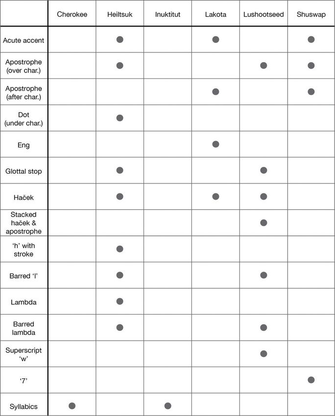
Applications and innovations in typeface design…

character, while the representations of it in Times New Roman ‘a’ (Morison and
Lardent 1932) and Helvetica ‘a’ (Miedinger 1957) demonstrate two different
glyphs.
    The orthography of English, which uses a Latin-based script, includes
26 characters/letters (including their allographs, or alternate representations,
such as upper and lowercase versions), along with graphemes, or meaning-
ful units, such as digits and punctuation. Other languages that are based on
the same underlying Latin system, for example, German, include additional
diacritics (accents and similar additional marks), such as the umlaut (the two
dots that appear above letters). To illustrate these terms in context, we note
that the German orthography determines that the umlaut can only be placed
above the letters ‘a’, ‘o’ and ‘u’, while elements of typeface design motivate the
decision to align the outer edges of the two dots of the umlaut with the inner
edges of vertical strokes above the character which it modifies, as demon-
strated in Figure 1. In short, while orthography determines where the diacritic
must be placed in order for the glyph to be phonologically and semanti-
cally meaningful, typeface design determines design elements that focus on
aesthetics and legibility.

Figure 1: Alignment (indicated using dashed red lines) of the outer edges of the
umlaut with the inner edges of the vertical strokes of the ‘u’ glyph. The example
is demonstrated using Helvetica (Miedinger 1957).

      In addition, for the purpose of this survey article and in the interest of clar-
ity, ‘typeface’ is used to refer to the overall visual design of a set of characters
(an example of a typeface would be Times New Roman), while ‘font’ is used to
refer to the computer file for a typeface.
      While typefaces covering a wide range of aesthetic sensibilities with flaw-
less formatting of diacritics and other key orthographical features are easy to
come by for many of the world’s most widely spoken majority languages, the
same palette of choices is not available for all languages, particularly minority
and endangered languages, many of whose orthographies include less widely
used characters and diacritics, or a combination of the two. An example of this
combination is a diacritic placed above a character with an ascender, such as
an apostrophe above a ‘k’, displayed in Figure 2; an uncommon feature in the
orthographies of dominant languages. This particular combination is one that
fewer standard and freely available typefaces support.

                                                                                    www.intellectbooks.com  73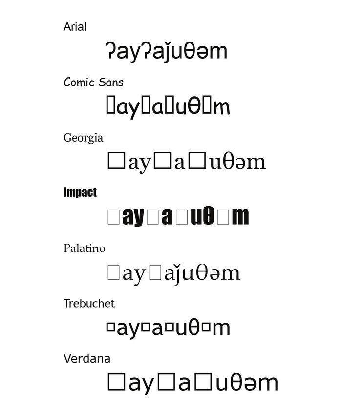
Julia Schillo | Mark Turin

                             Figure 2: ‘k’ with an apostrophe, used in the orthographies of various Indigenous
                             North American languages to represent a glottalized voiceless velar stop.
                             Displayed in the First Nations Unicode typeface (University of British Columbia
                             First Nations and Endangered Languages Program n.d.).

                             TYPEFACES FOR ENDANGERED LANGUAGES COMPARED WITH
                             THOSE FOR MAJORITY LANGUAGES
                             Many aspects of digital typography, such as consistent formatting and the
                             seamless integration of Unicode across operating systems (a key feature
                             outlined and discussed later in the article), are taken for granted by speakers
                             of many of the world’s dominant languages. Of the more than 7000 languages
                             spoken and signed by humans, twelve global languages together account
                             for two-thirds of the world’s population (Noack and Gamio 2015). Many of
                             these majority languages, such as English, are well supported by hundreds or
                             thousands of typefaces. In addition, Unicode compliance and interoperability
                             are increasingly taken for granted by users. Speakers of minority languages
                             served by minority scripts and orthographies are not afforded the same ease
                             of use. This typographical abundance leaves users free to focus their atten-
                             tion on typeface aesthetics, with choices motivated more by visual appeal and
                             less by whether the typeface actually supports the characters and diacritics
                             of a given orthography. Aesthetic considerations remain a luxury that most
                             speakers of the Indigenous languages spoken in North America regrettably
                             still cannot afford, as many of these languages struggle to identify a hand-
                             ful of typefaces that accommodate the core needs of their orthographies. For
                             speakers of such languages, visual ‘look and feel’ unfortunately often remains
                             a secondary consideration, outweighed by the central importance of correct
                             formatting and Unicode compliance.
                                  This article outlines central features of a number of orthographies of
                             Indigenous North American languages, with sections covering the impor-
                             tance of reliable typefaces for endangered languages, the process of adapting
                             orthographies for digital use, common challenges in developing typefaces for
                             Indigenous languages, and finally, a concluding section that reviews typefaces
                             currently in use along with a few relevant case studies on a subset of these.

                             INDIGENOUS ORTHOGRAPHIES
                             A wide range of orthographies are used to represent the Indigenous languages
                             spoken in what are now the United States and Canada, including visually
                             striking alphabets and beautifully designed syllabaries.

74  Book 2.0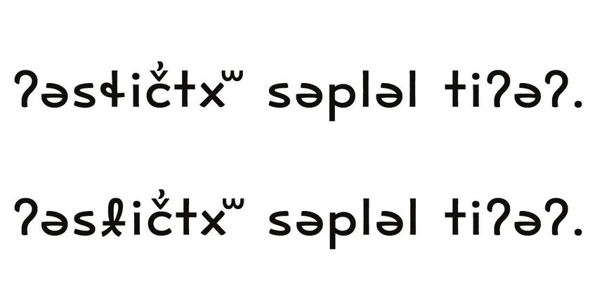
Applications and innovations in typeface design…

     The aesthetics of an orthography are strongly influenced by the visual             4. Cherokee is an
                                                                                           Iroquoian language
sensibilities and intellectual lineage of their creators as well as the norms              spoken in the
and tools available at the time of creation. Most orthographies of Indigenous              southeastern United
North American languages were created by Indigenous community members,                     States, as well as
                                                                                           in what is now
linguists or missionaries, or through a collaboration between these groups.                Oklahoma as a direct
     Two examples of orthographies developed by members of Indigenous                      consequence of the
communities are the Cherokee syllabary and the Saanich alphabet. The                       shameful history of
                                                                                           forced relocation of
Cherokee4 syllabary, or Tsalagi Gawonihisdi, the Cherokee name for the                     Cherokee citizens
language, was created in the early 1800s and disseminated in 1821 by the                   by the United States
                                                                                           government between
Cherokee scholar, Sequoya. The syllabary was quick to catch on and within                  1830 and 1850, known
two years, almost every member of the Cherokee Nation was literate (Isaacs                 as the Trail of Tears
2019: 16). The syllabary is read left to right and contains 85 characters, each of         (Justice 2006: 55).
which represent a syllable worth of sound (Gillam 2002: 414).                           5. Saanich is a Salishan
     The Saanich,5 or SENĆOŦEN, alphabet was created by Dave Elliot in 1978                language spoken in
                                                                                           southern Vancouver
and was heavily influenced by the typewriters available to Elliot at the time. As          Island, British
the Saanich language became progressively more endangered, Elliot designed                 Columbia, Canada,
an alphabet to create written records, document the language and protect                   whose traditional area
                                                                                           covers much of the
its future vitality (W̱SÁNEĆ School Board n.d.). Elliot initially experimented             surrounding Salish Sea
with the English alphabet to represent his native language, as well as the                 (First Peoples’ Map of
                                                                                           B.C. 2020).
International Phonetic Alphabet, or IPA (International Phonetic Association
1999), but found that these caused confusion and required too many charac-              6. Heiltsuk is a Wakashan
                                                                                           language spoken on
ters to convey a single Saanich sound. Instead, he developed his own unique                the central coast of
alphabet in which a single character represented a single sound (W̱SÁNEĆ                   British Columbia (First
School Board n.d.). The characters were designed with an English typewriter,               Peoples’ Map of B.C.
                                                                                           2020).
and Elliot used slashes and dashes to amend English characters, and in the
process, create new ones (Jackson n.d.). All Saanich characters are uppercase,          7. The Cree languages
                                                                                           form a dialect
and derived from English characters (such as the letters ‘S’ or ‘T’) which are             continuum that spans
then modified with dashes running through the letter, thus forming a set of                much of central Canada
uniquely Saanich characters to express sounds that are not found in English                (Canadian Heritage
                                                                                           n.d.; Education, Culture
(Jackson n.d.).                                                                            and Employment n.d.;
     As these creative interventions and adaptations show, orthographies                   Statistics Canada 2017)
                                                                                           with the syllabics
created by members of Indigenous communities vary greatly in aesthetics                    originally being used in
and are the result of dexterous problem-solving on the part of the creators                the East (Saskatchewan
to design and then deliver an orthography that fits the unique needs of their              Indigenous Cultural
                                                                                           Centre n.d.).
language. Sample text of both languages can be found in Figure 3.
     In contrast, orthographies created by non-Indigenous linguists tend to
resemble one another and many privilege uniformity. Most are somewhat or
entirely phonetic, and are derived from either the North American Phonetic
Alphabet (NAPA) (Pullum and Ladusaw 1996) or the IPA. These represen-
tational systems are often characterized by a rich set of diacritics and the
inclusion of Greek-based characters. For example, the Heiltsuk language,6
or Haíɫzaqvḷa, includes a number of characters based on NAPA. Its alpha-
bet includes Latin-based consonants and vowels, as well as lambdas, a glottal
stop symbol (ʔ) and diacritics such as hačeks (v-shaped diacritics placed above
characters), dots placed below consonants, acute accents and apostrophes
placed above consonants to indicate glottalization (Rath 1986). Sample text of
Heiltsuk is displayed in Figure 4.
     Many of the orthographies created by missionaries across the Canadian
North are syllabic, and based on the Cree7 syllabics. Cree syllabics were devel-
oped by James Evans, a Methodist missionary working in what is now known
as Manitoba, with input from community members and other missionaries;

                                                                                www.intellectbooks.com  75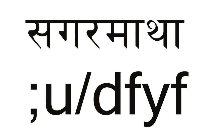
Julia Schillo | Mark Turin
8. Inuktitut is an Inuit
language spoken in
northeastern Canada
(Inuktut Tusaalanga
n.d.c).
9. Spoken primarily in
northern Canada (Leer
2006: 428).
10. Blackfoot is spoken
in part of Montana,
Alberta and
surrounding regions
(Campbell 2013: 66).
11. Plains Cree is spoken
across a large territory
spanning parts of
Saskatchewan, Alberta
and British Columbia in
Canada (Language Map
of British Columbia
n.d.; Saskatchewan
Indigenous Cultural
Centre n.d.).
Figure 3: Example text of Cherokee and Saanich words, both meaning
‘raspberries’ (‘ᏒᏗᏩᎵ ’ n.d.; ‘ȾOMO’ n.d.), using the Aboriginal Serif typeface
(Harvey 2007).
Figure 4: Example text of a Heiltsuk word meaning ‘door frame’ (‘bác̓i’ n.d.).
Displayed using the Aboriginal Serif typeface (Harvey 2007).
and the system gained popularity beginning in the 1840s (Lewis and Dorais
2003: 280–85). Syllabics that are similar in form and function are now used
across the Canadian North, both for the various Cree languages, Inuktitut,8 for
some Na-Dene languages9 and for Blackfoot10 or Siksiká (Campbell 2013: 233;
Indigenous Languages of Manitoba Inc. 2018, Yinka Déné Language Institute
n.d.). These syllabics are read left to right, with the shape of the character indi-
cating the consonant at the beginning of the syllable, and the direction of the
rotation of the character (namely: facing upwards, downwards, left or right)
indicating the vowel that follows (Inuktut Tusaalanga n.d.a). Sample text from
the Plains Cree,11 or nēhiyawēwin, dialect is displayed in Figure 5.
76 Book 2.0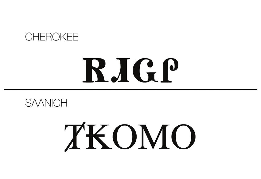
Applications and innovations in typeface design…

Figure 5: Example text of a Plains Cree word meaning ‘huckleberry’ (‘ᒥᐢᑕᐦᐃᔨᓂᒥᓇ’
n.d.). Displayed using the Aboriginal Serif typeface (Harvey 2007).

TYPEFACES FOR ENDANGERED LANGUAGES
It is essential that the orthographies of Indigenous languages be accurately
and consistently represented by typefaces/fonts. Many North American
Indigenous languages have unique sounds that are not found in majority,
colonial languages and for which no regular character used by the domi-
nant language – whether it be English, French or Spanish – would fit. In the
orthographies of most North American Indigenous languages, characters that
do not appear in European Latin-based writing systems, or amendments to
those characters by way of diacritics, are needed in order to represent the full
phonological inventory of the languages. It can be difficult for users to locate
existing typefaces that include the complete range of necessary characters.
     Needless to say, despite these challenges, it is crucial that typefaces with
the necessary characters and diacritics are used. On account of the endangered
status of many Indigenous languages, the majority of speakers and writers
may themselves be second language learners, leading to a heightened risk of
elements of the traditional language being lost if words are not properly repre-
sented in written form, as learners may not be in a position to quickly identify
misspellings. For example, the letters ‘l’ and ‘ɬ’, sometimes called a barred ‘l’ or
slurpy ‘l’, are used in a number of languages such as Lushootseed and Heiltsuk,
both discussed in greater detail later in this article. Although ‘l’ and ‘ɬ’ look simi-
lar at first glance (displayed in larger format in Figure 6), they represent very
different sounds (a voiced lateral approximate versus a voiceless lateral frica-
tive, respectively). A speaker typing in the language who does not have access
to a typeface or keyboard input system required to type ‘ɬ’, may instead opt to
use the English letter ‘l’ on account of its visual similarity. If most of the readers
are also not fully fluent in the language, there is a chance that they will mispro-
nounce the word based on this seemingly trivial mistyping, and not notice the
intentional substitution. From such shortcuts, errors can compound, gaining
traction and momentum, making them harder to correct later.
     Such issues are particularly hazardous when producing pedagogi-
cal materials designed to support the creation of new speakers. If learning
materials do not accurately represent the language on account of the tech-
nical or input limitations of available typefaces, new speakers have a much
higher chance of mispronouncing words in their speech and learning incor-
rect or ‘Anglicized’ forms (substituting Latin-based characters not found in

                                                                                     www.intellectbooks.com  77
Julia Schillo | Mark Turin

 12. Ojibwe is spoken in
     regions surrounding
     the Great Lakes
     (Hermes and King 2013).

                               Figure 6: ‘l’ vs. barred ‘l’ characters displayed in Times New Roman (Morison
                               and Lardent 1932).

                               English with apparently similar English characters), thus endangering specific
                               phonological elements of languages that are already critically endangered.
                               Speakers of Indigenous languages have indicated the importance of maintain-
                               ing the phonology of their language, and not letting their speech and writing
                               become Latinized or Anglicized. Jennifer Wemigwans, assistant professor at
                               the University of Toronto, articulated this very challenge when discussing her
                               own experiences raising her son in Ojibwe,12 or Anishinaabemowin, ‘I killed the
                               language because I was using English pronunciations to make out the sounds
                               of the word’ (Moran 2019).
                                    In order to use a language in everyday and increasingly digital life, speak-
                               ers and writers must be able to e-mail, text and communicate on social media
                               in their language. Typefaces/fonts and keyboards need to support these activi-
                               ties, not only on desktop computers but also on mobile operating systems,
                               and characters must render consistently for all users through consistent
                               encoding, a topic we discuss in the following section. Supporting and provi-
                               sioning languages to be integrated into all aspects of social and professional
                               life results in well-rounded language health (Walsh 2018), and typeface design
                               should help – and certainly not hinder – this goal.

                               ADAPTING ORTHOGRAPHIES FOR DIGITAL USE
                               In addition to addressing the visual identity of a typeface, there are two crucial
                               components of designing a functioning font for the digital age: Unicode compli-
                               ance and a keyboard system to support input in different operating systems.
                               Unicode is a standard followed by many underlying font encodings, including
                               UTF-8, UTF-16 and UTF-32. These encodings allow characters of global writing
                               systems to be reliably displayed across platforms and allow for non-disruptive
                               font changes, as the unique identity of each character is consistently commu-
                               nicated (Gillam 2002; Unicode 2019). Keyboards are an essential component
                               of digital language use as they help users to type in their chosen language.
                               By keyboards, we do not refer to the physical object attached or connected to a
                               screen and processor, but rather the software that encodes and communicates
                               how physical keys map on to digital characters. By activating different freely
                               downloadable keyboards, a single keystroke generates different characters. In
                               addition, users can produce a range of characters within a single keyboard by
                               combining keystrokes, most commonly involving the ‘SHIFT’, ‘CONTROL’,
                               ‘OPTION’ or ‘COMMAND’ keys. The easy inputting of characters is dependent

78  Book 2.0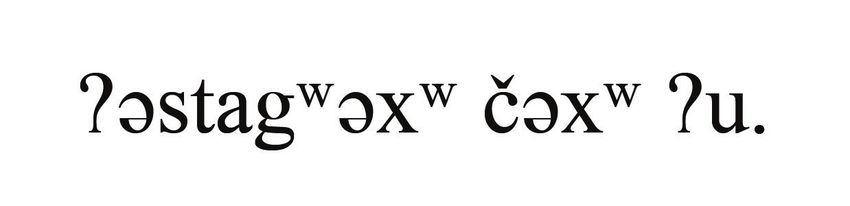
Applications and innovations in typeface design…

on the development of a keyboard, and each orthography has specific needs.            13. Nepali is the official
                                                                                          language of Nepal
Depending on how many characters and diacritics there are in total, as well               with around 24.5
as punctuation rules and capitalization standards in a language (some have                million speakers in
only capital letters, such as Saanich, while others have only lowercase letters,          Nepal, surrounding
                                                                                          regions and diaspora
as in the Lushootseed language discussed later in the article, while others have          populations
both), more character options can become available by using combining keys.               (Ethnologue:
    Unicode is fundamental for the accessibility of typed material, as Gillam             Languages of the
                                                                                          World 2019).
explains:

   As computer use became more widespread in various parts of the world,
   alternative methods of representing characters in computers arose for
   representing other languages. This proliferation led to the situation we
   have today, where generally three or four different encoding schemes
   are available for every language and writing system in use today. […]
   Unicode does away with this chaos. It allows all of the same languages
   and characters to be represented using only one encoding scheme.
   Every character has its own unique, unambiguous value.
                                                                   (2002: 8–9)

When fonts are not programmed with a Unicode-compliant encoding, they
become less adaptive to moves between platforms (e.g. between an Apple
Mac and a Windows PC) and risk breaking down when a user chooses to
switch fonts for stylistic reasons or shares a document with another user
who does not have the same font installed on their computer. While Unicode
compliant fonts are, and have for some time been, the standard and most
widely available fonts for many majority languages such as English, this is
not the case for many endangered Indigenous languages in North America,
and for non-majority languages in other world regions. While non-Unicode
compliant fonts were often created before the mass introduction of Unicode-
compliant encodings as an inventive and necessary way to make typing
possible in minority languages, their continued use makes inter-operability
more difficult. An extreme example of these difficulties is provided in Figure
7, which displays the Nepali13 word for ‘Mount Everest’, typed in the non-
Unicode font Preeti, a common typeface used for the Devanagari script in
Nepal. We then offer the same text, copied and converted to the Unicode-
compliant font Mangal, a Devanagari typeface that also includes Latin-based
characters. As the example shows, the characters render incorrectly in the
Unicode font, as no underlying code agreement exists that consistently iden-
tifies each character from the Preeti source. A font-specific encoding, such
as Preeti, only indicates which keys on the keyboard are used to type the
characters. The result is that users cannot easily switch between fonts – in
the way that we all expect to, for example, from Palatino to Helvetica – with-
out engaging in a series of complex substitutions, conversions and technical
operations. Pine and Turin further demonstrate these challenges using the
example of the Heiltsuk Doulos font, used to type in Heiltsuk, which is not
Unicode compliant:

   The Heiltsuk Doulos font was created to deliberately disregard 8-bit
   encoding ISO 8859 – 1’s stipulation that 10101001 should render as ©,
   and instead render this sequence as ǧ […] Without the required font
   installed, 10101001 will appear as © and be illegible to users.
                                                                   (2018: 28)

                                                                               www.intellectbooks.com  79
Julia Schillo | Mark Turin

 14. The Squamish language
     is spoken in the
     region surrounding
     Howe Sound, British
     Columbia, Canada (First
     Peoples’ Map of B.C.
     2020).

                               Figure 7: The Nepali word for ‘Mount Everest’ displayed in the non-Unicode
                               font Preeti (Mishra n.d.) above, with the same text copied and rendered in
                               Mangal (Joshi 2001) below. This illustrates how non-Unicode fonts are unable to
                               render characters consistently when switching between different fonts, even fonts
                               that have been designed for the same language.

                                    Next, we present another example that involves different negative conse-
                               quences for not utilizing Unicode fonts. A number of languages have char-
                               acters comprising a diacritic underlining a letter, such as ‘ḵ’, which is used,
                               among other languages, in the Squamish,14 or Sḵwx̱wú7mesh, language to
                               indicate a voiceless uvular stop (Kwi Awt Stelmexw 2016). When typing, and
                               for ease of function, users may opt to make use of the underline function in
                               their word-processing software instead of using a typeface that includes a
                               (Unicode-compliant) underline diacritic, as the latter can be more difficult to
                               locate and input. To the viewer’s eye, the result looks the same, irrespective of
                               the path taken to get there. The difference becomes apparent, however, when
                               one copies and pastes a word with a letter that has been underlined using
                               word-processing formatting into a different system, such as an online search
                               engine, as the underlining is immediately lost. In contrast, a properly encoded
                               ‘ḵ’ can be copied, pasted, searched for and moved across different operating
                               systems, all the while retaining its visual distinctiveness and unique ortho-
                               graphic meaning.
                                    The ability to correctly represent the orthography of an Indigenous
                               language across platforms is particularly salient for digital documentation and
                               archiving. As Pine and Turin note, ‘making documentation available via the
                               Internet ensures that living speakers are afforded a way of engaging with the
                               material that contributes to the goals of language revitalization’ (2017). This is
                               reflective of an important trend in the field of language documentation and
                               revitalization towards the creation of digital dictionaries, archives and learning
                               materials, see Baldwin et al. (2016), Davis (2017), Hermes and King (2013) and
                               Burge et al. (2020). Given that online dictionaries and word lists of Indigenous
                               languages in North America are some of the resources most used by speakers
                               and learners, it is crucial that orthographies render correctly in online spaces
                               through Unicode compliant fonts.

80  Book 2.0
Applications and innovations in typeface design…
COMMON TYPOGRAPHIC CHALLENGES FOR INDIGENOUS
LANGUAGES IN NORTH AMERICA
Users typing in Indigenous North American languages can face a number
of challenges, including finding typefaces/fonts that contain all of the neces-
sary characters, kern correctly and format diacritics consistently and properly.
The primary challenge, and certainly the most important for one’s ability to
type, is finding a typeface that includes all of the necessary characters and
diacritics needed to represent the orthography, preferably without also includ-
ing unnecessary characters, and that then renders these characters consist-
ently across different software applications and operating systems. As we
have outlined above, because many of the Indigenous orthographies used by
languages spoken and written in North America include specialized charac-
ters and diacritics, it can be difficult for users to identify typefaces that have
all of the necessary glyphs. Oftentimes, a typeface will have some, perhaps
even most, of the necessary glyphs, but will be missing a few. This can cause
users to substitute characters, which can result in a sub-optimal solution, as
outlined in Figure 6 previously.
Figure 8 demonstrates the difficulty that users may face identifying type-
faces that accommodate language-specific needs. The figure shows the name
of a Salishan language spoken in British Columbia, Canada, ʔayʔaǰuθəm,
typed using a number of fonts that come pre-installed with Microsoft Office
2013 (Microsoft Support 2017). As the figure shows, many of the typefaces
are missing some – but not all – of the glyphs needed to type the name of
this language. For syllabic languages, the selection of typefaces is even more
limited, as their orthographic roots are not as widespread as Latin-based
orthographies and the possible inventory of compliant typefaces is thus even
more constrained. An additional challenge for typeface selection is that many
of the older fonts that were specifically designed to include all the necessary
glyphs for a specific language are not Unicode compliant, and, therefore, not
well-suited to wider use in the increasingly digital age. Based on our own
long-term fieldwork and research partnerships, non-Unicode font-specific
encodings are still quite widely used in Indigenous communities across North
America and Asia.
Many Indigenous languages use diacritics to indicate anything from vowel
length to consonant glottalization. Regularly occurring diacritics include, but
are not limited to, macrons (a horizontal line above a character), acute accents,
apostrophes either above or following consonants and hačeks (pronounced
‘haa-check’). Some characters may have multiple diacritics that are stacked or
co-located beside one another. The primary challenge for orthographies that
make use of diacritics is locating typefaces that first include all of the neces-
sary glyphs and then format them correctly in different software packages.
Even with a typeface that includes all of the necessary diacritics, common
formatting issues include diacritics colliding with one another or with the
main character, as well as errors in the positioning and placement of diacritics.
For example, the alphabets of some Indigenous languages include a character
comprised of a ‘c’ with a stacked haček and apostrophe. Although the typeface
Helvetica includes all of the necessary components for this character, when
typed, the diacritics render incorrectly, creating an unsightly overlap as shown
in Figure 9.
Kerning issues (spacing between pairs of characters) are a recurring typo-
graphic challenge. Issues primarily arise for orthographies with superscript
www.intellectbooks.com 81Julia Schillo | Mark Turin
Figure 8: Users are often constrained in their typeface choices for North
American Indigenous languages because most typefaces do not include all of the
necessary glyphs to represent their orthography. This figure shows a selection of
pre-downloaded fonts on Microsoft Office 2013 (Microsoft Support 2017). Empty
squares/rectangles – often referred to as tofu by frustrated users – represent
missing glyphs. Each of the typefaces used are listed above the sample text
(Carter 1993, 1996; Connare 1994, 1996; Lee 1965; Nicholas and Saunders 1982;
Zapf 1949).
characters, as kerning for such orthographies appears to be a somewhat
neglected feature. Some superscript characters, such as the superscript ‘w’
common in many orthographies in the Pacific Northwest of North America,
can be rather wide and occupy a great deal of visual space, as shown in Figure
10. Kerning issues can, at times, be so severe that word boundaries become
difficult to locate, particularly in text with a small point size. This becomes
even more problematic when we remember that members of an Indigenous
language community may be second language learners/speakers, and that
ambiguous word boundaries pose genuine visual obstacles to effective
82 Book 2.0Applications and innovations in typeface design…
Figure 9: ‘c’ with a stacked haček and apostrophe, displayed with correct
formatting on the left in Aboriginal Sans and incorrectly on the right in
Helvetica, showing a diacritic overlapping another diacritic and the main
character (Harvey 2007; Miedinger 1957).
Figure 10: Kerning issues as a result of the superscript ‘w’. Substantial negative
space, or unoccupied space around a subject, surrounds the superscript ‘w’,
leading to much unused space within a word, as seen in ‘ʔəstagʷəxʷ’ in the above
figure. This word-internal unused space makes it more difficult to locate word
boundaries, especially during fast reading or when reading text with a small
point size, as a single word appears to be divided into multiple parts, potentially
manifesting as separate words. The sample text is a Lushootseed phrase meaning
‘are you hungry?’ (‘ʔəstagʷəxʷ čəxʷ ʔu.’ n.d.). Displayed in Aboriginal Serif
(Harvey 2007).
language learning. Readability challenges, or challenges relating to the ease
of reading a block of text, on account of unsuitable typefaces are all too
common for North American Indigenous languages, and these issues serve
as a troubling reminder of how typefaces inadequately designed for particular
languages can inadvertently hinder language revitalization and mobilization.
Canada 150 is an example of a typeface that suffers from many of the
issues outlined above. The release of this government-sponsored sans-serif
typeface – celebrated at the time by many newspapers and followers of typog-
raphy (CBC News 2015; Stinson 2015) – commemorated the 150th ‘anniver-
sary’ of Canada, although this period of national celebration was perceived
very differently by Indigenous communities who have long lived in what
became Canada (Kassam 2017). Canada 150 was publicly lauded as contain-
ing the necessary characters and diacritics to type in English, French and all
of Canada’s Indigenous languages. Unfortunately, the typeface fell short and
a convoluted downloading process made it less accessible for interested users
than many commercial fonts.
To begin, gaining access to Canada 150 involved filling out an online appli-
cation in which the applicant had to specify what the typeface would be used
www.intellectbooks.com 83Julia Schillo | Mark Turin
15. Lakota is spoken in for. Once an application had been received and subsequently approved, the
the Plains region of
the United States and
Government of Canada sent the applicant a link to download the font. For any
Canada (Campbell 2013: additional uses of the typeface, other than the use specifically identified in the
924). original application, a new application would have to be submitted. Co-author
16. Lushootseed is Schillo initially completed the application in autumn of 2017 to use the type-
spoken in the Puget face for a university course in which she was enrolled. In her application, she
Sound region of
Washington State stated that she would use the typeface in a presentation about typography for
in the United States endangered languages, and within a few days was sent a link to download the
(Lushootseed Language font. On using the typeface, she noticed that multiple characters were missing
Department n.d.a).
and that numerous diacritics did not render correctly. Upon discovering this,
17. Shuswap is spoken in Schillo planned to write a blog post, including relevant graphics, discussing
the Interior of British
Columbia, Canada (First these shortcomings, to which end she submitted another application outlin-
Peoples’ Map of B.C. ing the planned use. It has now been approximately eighteen months since
2020).
she submitted the second application and, as of writing, the Government of
Canada has not responded to the application. Additional issues have been
flagged by various designers including aspects of the production and rollout of
Canada 150, see Daubs (2016).
Canada 150 serves as a high-profile let-down: much promise, significant
media attention, and yet a poorly designed and arguably colonial product.
With missing characters and non-functional diacritics, the typeface is ill-suited
to the needs of some First Nations languages – languages, we should add,
that have been spoken on the lands that would become Canada for thousands
of years before English and French were brought to the region by settlers –
despite its promised use for all First Nations languages. The typeface offered
by the Government of Canada did not deliver, and the cumbersome appli-
cation process to use the typeface did not help, creating unnecessary access
barriers for rural Indigenous communities in Canada, who in many cases still
have limited and expensive internet access (Hyslop 2019). It is revealing that
in our informal environmental scan of the typefaces currently used by First
Nations communities in western Canada to mobilize their languages, not a
single community member has identified Canada 150.
NOTABLE TYPEFACES FOR INDIGENOUS LANGUAGES IN NORTH
AMERICA
One of our goals for this article has been to identify typefaces being used
by various language communities, and to learn more about the creation of
said typefaces. As established earlier, identifying typefaces that accommodate
the orthographies of Indigenous languages can be a daunting task involv-
ing a great deal of trial and error. To that end, we reviewed typefaces recom-
mended by the language departments of six different nations/tribes, territorial
governments and language schools. The languages we chose are significant
for their range of orthographic styles, diacritics and unique characters. Most of
the orthographies are Latin-based, while two – Cherokee and Inuktitut – are
syllabic and share no characters with Latin-based alphabets. Example text of
each language can be found in Figure 11 for reference. Additionally, a chart is
provided to show which diacritics/characters appear in the orthographies that
do not appear in English, displayed in Figure 12.
The languages reviewed are Cherokee, Heiltsuk, Inuktitut, Lakota15 (or
Lakótiyapi), Lushootseed16 (or dxʷləšucid in the Tulalip dialect) and Shuswap17
(or Secwepemctsin). The typefaces recommended for Heiltsuk, Inuktitut, Lakota,
Lushootseed and Shuswap are all free.
84 Book 2.0Applications and innovations in typeface design…
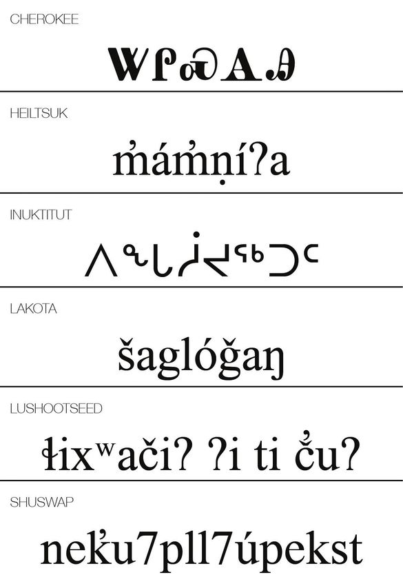
Figure 11: Sample text from the languages surveyed. The words displayed are all
numbers, with the following translations: Cherokee ‘20’, Heiltsuk ‘9’, Inuktitut
‘6’, Lakota ‘8’, Lushootseed ‘31’ and Shuswap ‘80’ (‘ᏔᎵᏍᎪᎯ’ n.d.; ‘áṇíʔa’
n.d.; Inuktut Tusaalanga n.d.b; ‘šaglóǧaŋ’ n.d.; ‘ɬixʷačiʔ ʔi ti uʔ’ n.d.;
‘neu7pll7úpekst’ 2016). All are displayed in Aboriginal Serif (Harvey 2007).
Information about typefaces recommended for Cherokee was found
on the language webpage of the Cherokee Nation, which provides down-
load links for suggested fonts. These include: Noto Sans Cherokee, Aboriginal
Sans, Aboriginal Serif, Digohweli, Plantagenet Cherokee, Everson Mono, Fonts by
Chung-deh Tien, Code 2000, Marin, MPH 2B Damase, Explora, Tsali Tsalagi,
www.intellectbooks.com 85Julia Schillo | Mark Turin
Figure 12: Chart displaying the various diacritics, characters and orthographic
styles used by each language that do not appear in the English alphabet, and
are thus not supported by all typefaces that support English (Lakota Language
Consortium n.d.; Lushootseed Language Department n.d.b; Rath 1986; Simpcw
First Nation n.d.; Inuktut Tusaalanga n.d.a; Cherokee Nation n.d.b). It is
important to point out that there are multiple Unicode characters or character
combinations that can achieve the characters outlined above. While our analysis
does not cover this aspect, different language communities can and do opt for
different approaches to typing the same character.
Anowelisgv, Donisiladv and Tsulehisanvhi (Cherokee Nation n.d.a). Most, but
not all, of the typefaces listed are free of cost. Plantagenet Cherokee, produced
by the type foundry Tiro Typeworks, is free for those involved with Cherokee
language projects (Tiro Typeworks n.d.). The link for the site is: https://
language.cherokee.org/fonts-and-keyboards/cherokee-fonts/.
Recommended typefaces for Heiltsuk are discussed on a website hosted
by the University of British Columbia (UBC) as part of a collaborative
86 Book 2.0Applications and innovations in typeface design…
partnership between the Heiltsuk Cultural Education Centre, the Bella Bella
Community School and UBC’s First Nations and Endangered Languages
Program in which co-author Turin is involved. This site recommends Times
New Roman as the most reliable Unicode typeface, while acknowledging that
non-Unicode, language-specific typefaces (such as Heiltsuk Doulos) are still in
circulation. Working from the assumption that all users already have access to
Times New Roman, download links for typefaces are not made available on the
site, although keyboard input files and help videos for Mac, PC and Chrome
are provided (Heiltsuk Language & Culture Mobilization n.d.). The link for the
site is: https://heiltsuk.arts.ubc.ca/keyboard/.
Recommended Inuktitut typefaces were found on the ‘Computer Tools’
page of the Government of Nunavut website, which includes a variety of
resources for using Inuktitut digitally. The webpage recommends one type-
face: Pigiarniq. The font is available for download on another Government of
Nunavut webpage (Culture and Heritage Department n.d.). The link for the site
is: https://www.gov.nu.ca/culture-and-heritage/information/computer-tools.
Recommended Lakota typefaces were found on the website for Red Cloud
Indian School, a group of Catholic schools located on Pine Ridge Reservation
in South Dakota which host Lakota language classes. The recommended type-
faces are Charis, Gentium and Andika, all of which can be directly downloaded
from the site (Red Cloud Indian School n.d.). The link for the site is: https://
www.redcloudschool.org/page.aspx?pid=629.
Suggested Lushootseed typefaces were found on the website of the Tulalip
Tribes, where LushootseedSchool, LushootseedSulad and Andika are listed as
recommended typefaces. LushootseedSchool/Sulad can be directly downloaded
from the website, while a link is provided to the SIL website to download
Andika (Lushootseed Language Department n.d.c). The link for the site is:
https://tulaliplushootseed.com/software-and-fonts/.
Recommended Shuswap typefaces were found on the website of Chief
Atahm School, a Shuswap language immersion school, located in British
Columbia, Canada. The website recommends a single typeface: Aboriginal
Sans. A link to download the font directly is not provided (Chief Atahm School
n.d.). The web link is: http://www.chiefatahm.com/ with typeface information
provided on the homepage.
Despite substantial differences between the orthographies of the languages
reviewed, some commonalities have been identified between the typefaces
recommended by these various Indigenous nations and departments. A few
typefaces were recommended by multiple groups, such as Aboriginal Sans
and Aboriginal Serif, which were endorsed by the Cherokee Nation and by
Chief Atahm School. Similarly, Andika was recommended by both Red Cloud
Indian School and the Tulalip Tribes. All of these typefaces are examples of
what graphic designer Juliet Shen describes as ‘pan-Indigenous fonts’, that is,
typefaces developed to include characters to accommodate as many languages
as possible (Shen 2010: 22).
Developed to represent Indigenous North American orthographies,
Aboriginal Sans and Aboriginal Serif were released by the First Peoples’ Cultural
Council, ‘a First Nations-run Crown Corporation with a mandate to support
the revitalization of Indigenous languages, arts, culture and heritage in British
Columbia, Canada’ (First Peoples’ Cultural Council n.d.).
Along with a few of the other typefaces that appear on these lists – such
as Doulos, Charis and Gentium – Andika was developed by SIL International
(formerly the Summer Institute of Linguistics) to accommodate a wide range
www.intellectbooks.com 87Julia Schillo | Mark Turin
of Indigenous languages spoken across the world. SIL International is a
Christian-faith, US-based organization geared towards language develop-
ment. While SIL has rebranded significantly in recent years, it was launched
in 1934 as a missionary organization and one of its primary goals is still the
translation of Christian scripture into the languages of the world (Svelmoe
2009), making some secular scholars uncomfortable or unwilling to use SIL
tools and technologies. In contrast to the typefaces with missing characters,
discussed earlier in the article, typefaces such as Aboriginal Sans/Serif and the
various SIL typefaces are designed specifically to provide as many characters
and diacritics as possible.
A number of the typefaces listed above were designed specifically for the
Indigenous languages they accommodate, such as Pigiarniq, LushootseedSchool/
Sulad and many of the typefaces recommended by the Cherokee Nation.
Pigiarniq – designed for Inuktitut – and Plantagenet Cherokee – designed for
Cherokee – were both produced by Tiro Typeworks.
In the following section, we review the aesthetics of a few of the type-
faces and identify information about their creators. The typefaces we inves-
tigate include those made and distributed by SIL International, representing
comprehensive pan-Indigenous typefaces, and LushootseedSchool/Sulad, an
example of a typeface tailored to a specific language.
COMPARING TYPEFACES AND PURPOSES
We begin our review with the typefaces released by SIL International –
Andika, Charis, Doulos and Gentium – used by communities with a range of
orthographic needs. Andika is a sans-serif typeface with regular, bold, italic
and bold-italic fonts which provides all characters and diacritics necessary
to type in extended Latin characters (SIL International n.d.a). Charis is a
serif typeface with regular, bold, italic and bold-italic fonts able to accommo-
date characters in Latin- and Cyrillic-based orthographies (SIL International
n.d.b). Doulos is a serif typeface with glyphs for typing Latin- and Cyrillic-
based orthographies as well as IPA, and only includes a regular weight font
(SIL International n.d.c). Gentium is a serif typeface accommodating Latin-,
Cyrillic- and Greek-based orthographies and has regular and italic fonts
(SIL International n.d.d). This information is displayed in the chart in Figure
13. All of these fonts are Unicode compliant and are released with an SIL
Open Font License, allowing the use, modification and further distribution
of the fonts (Spalinger and Gaultney 2007). This licence permits commu-
nities to use glyphs from the typefaces to construct a font tailored to the
specific needs of their orthography, and at the same time exclude glyphs that
are not needed, offering a streamlined and simplified pathway to deploy-
ment and use.
The typefaces distributed by SIL International offer a variety of aesthetic
choices, shown in Figure 14, particularly for serif fonts. Contrasting stroke
weights are evident in Doulos, while Charis, a transitional serif, has heavier
strokes overall, contributing to a darker appearance on the page and screen.
In contrast, Gentium is an old-style serif which provides a lighter option, with
soft curves in its characters. Andika is the only sans-serif typeface of the four.
As shown in the overview of typefaces used by various language communities,
the SIL typefaces remain popular throughout North America. Example text is
offered in Figure 14, which displays the name of the typeface alongside the
word ‘ʔayʔaǰuθəm’, as a comparison to the typefaces shown in Figure 8.
88 Book 2.0Applications and innovations in typeface design…
Figure 13: The weights and styles available for each of the SIL International
typefaces.
Victory Gaultney, the designer of Gentium, and co-designer of Andika, has
outlined various aspects of his design process for Gentium. Gentium was an
early typeface (released in 2001) explicitly designed for the purpose of correctly
formatting a variety of languages with different orthographies based on differ-
ent scripts. Gentium was created to capture elements of cursive design while
at the same time maintaining legibility, or the ability to distinguish between
different glyphs, through strokes of medium thickness with minimal weight
contrast (Gaultney 2002: 4–5). The distinctiveness of characters was empha-
sized in the design process, with aspects such as bowl width (the closed
circular parts of glyphs found on characters such as ‘b’) customized for each
glyph to help make them more recognizable (Gaultney 2002: 10). Multiple
versions of some diacritics are provided, allowing them to function at differ-
ent heights, thus taking away the risk of glyphs colliding (as seen in Figure 9)
and supporting combinations of diacritics to be stacked. Gentium also includes
kerned pairs of characters, thereby increasing readability (in contrast to the
issue outlined in Figure 10) (Gaultney 2002: 9). Simultaneously, Gaultney
stressed the importance of uniformity in the visual identity of the typeface
across scripts (2002: 11–18).
Gaultney has discussed the power of an elegantly designed typeface.
Describing responses to poorly formatted fonts, Gaunltney said, ‘publishers
would hesitate to do work in unusual languages because the available fonts
were so poor. Academics had to do their own thing because the industry did
not support their needs’ (Gaultney 2003). Gentium provides an option that is
not only functional but aesthetically pleasing, encouraging publishers and
others to extend their services to languages with minority scripts and orthogra-
phies. With this, Gaultney also noted that the uniform design of Gentium makes
publishers more open to publishing multilingual content (Gaultney 2003).
Finally, Gaultney outlines his reasons for permitting SIL to freely distrib-
ute the font rather than disseminating it commercially. A principal goal of the
typeface was to provide an option for speakers of languages poorly served by
the commercial market who have limited options when selecting typefaces.
www.intellectbooks.com 89Julia Schillo | Mark Turin
Figure 14: Sample text from each of the four typefaces produced by SIL
International displayed in the regular weight (SIL International 1997, 1992;
Gaultney 2001, Gaultney and Olsen n.d.).
To combat this deficiency, Gaultney chose to provide Gentium free of charge
through SIL’s established digital networks (Gaultney 2003).
In contrast, both LushootseedSchool and LushootseedSulad were commis-
sioned by the Tulalip Tribes located in Washington State and were designed
by Juliet Shen, a Seattle-based graphic designer. The typefaces were custom-
built for teaching children how to write, and are, therefore, sans-serif, as serifs
can confuse learners about which aspects are elements of the letter versus
features of the design (Shen 2010: 22). The typefaces differ in only one letter,
the barred ‘l’. The barred ‘l’ in LushootseedSchool is styled to look like the hand-
written version, in order for it to be used for writing instruction, while the
barred ‘l’ in LushootseedSulad portrays the typed form (Shen 2010: 26). Both
typefaces only contain the necessary glyphs for typing in Lushootseed, mean-
ing that they cannot be used to type in English.
Shen incorporated elements of the formline wood-carving art style of the
Pacific Northwest in the width, x-height (height of the lowercase ‘x’, which, in
turn, is reflective of the relative heights of all lowercase glyphs) of the glyphs
and curves of the strokes so that the typeface can be effortlessly incorporated
into the visual identity of the Tulalip Tribes (Shen 2010: 23–25). When repre-
sentatives from the Tulalip Tribes expressed their desire for the typeface to be
visually similar to their handwritten orthography, Shen designed the super-
script ‘w’ to look this way. The result is a larger aperture, or enclosed part of
90 Book 2.0Applications and innovations in typeface design…
Figure 15: LushootseedSulad (top) and LushootseedSchool (bottom) (Shen
2009) displaying characters from a Lushootseed phrase meaning ‘this is a slice of
bread’ (‘ʔəsɬitxʷ səpləl tiʔəʔ.’ n.d.).
the glyph, meaning that more negative space is contained within the glyph, as
opposed to it spilling out around the sides (Shen 2010: 26). This customiza-
tion, paired with a number of other adjustments and modifications that help
to increase readability and legibility, make for a typeface with notably better
visual weight than many other typefaces that accommodate Lushootseed.
Shen also designed the two typefaces on a six-line grid so as to accom-
modate the stacked apostrophe and hac ̌ek over the ‘c’ (Shen 2010: 27). These
design innovations help the language and the typefaces to function seam-
lessly and work in tandem. The overall result is that the orthography and
typeface appear to have been designed in a coordinated manner. This is in
contrast to the more forced visual impression of a language that is displayed
using a typeface containing all of the necessary characters, but which does
not format elegantly and feels aesthetically disconnected. Sample text typed in
LushootseedSulad and LushootseedSchool are offered in Figure 15.
In outlining her design process, Shen stressed the role of collaboration,
particularly in the case of the superscript ‘w’ in which the design concept
was the result of effective communication with speakers and educators who
requested that glyphs be made to look like the handwritten versions of char-
acters (Shen 2010: 22–28). This kind of reciprocal partnership is indicative
of a wider movement in the field of language revitalization towards build-
ing collaborative projects between community members and outsiders with
specific skills, knowledge or networks that can be harnessed towards commu-
nity goals, see Davis (2017), Harrison et al. (2019), Leonard and Hayes (2010)
and Pine and Turin (2017).
CONCLUSION
Typeface designers have an opportunity – and we would tentatively argue
a responsibility – to engage in respectful and supportive partnerships with
historically under-represented and marginalized communities. We acknowl-
edge that typeface design is difficult work, subject to complex market demands
and sustained economic pressures. Under any conditions, a well-functioning
and visually pleasing typeface is a considerable achievement. The stakes are
higher still when the anticipated users are members of historically marginalized
www.intellectbooks.com 91You can also read