Audience Analysis for Competing Memes in Social Media
←
→
Page content transcription
If your browser does not render page correctly, please read the page content below
Proceedings of the Ninth International AAAI Conference on Web and Social Media

 Audience Analysis for Competing Memes in Social Media
 Samuel Carton Souneil Park Nicole Zeffer
 University of Michigan Telefonica Research University of Michigan
 scarton@umich.edu souneil.park@telefonica.com nzeffer@umich.edu

 Eytan Adar Qiaozhu Mei Paul Resnick
 University of Michigan University of Michigan University of Michigan
 eadar@umich.edu qmei@umich.edu presnick@umich.edu

 Abstract Existing tools for exploratory analysis of meme diffu-
 Existing tools for exploratory analysis of information diffu- sion focus only on the message senders who actively dif-
 sion in social media focus on the message senders who ac- fuse the meme. The people who were potentially exposed
 tively diffuse the meme. We develop a tool for audience but did not propagate the meme are not directly represent-
 analysis, focusing on the people who are passively exposed
 ed. This perspective makes certain basic questions hard to
 to the messages, with a special emphasis on competing
 memes such as propagations and corrections of a rumor. In answer, such as “how many people were reached by this
 such competing meme diffusions, important questions in- meme?” It also fails to support inferences about more so-
 clude which meme reached a bigger total audience, the phisticated questions such as the overlap in audiences of
 overlap in audiences of the two, and whether exposure to the two or whether exposure to one inhibited propagation
 one meme inhibited propagation of the other.
 of the other. Throughout this paper we refer to this type of
 We track audience members’ states of interaction, such
 as having been exposed to one meme or another or both. We analysis, which requires tracking the people who were po-
 analyze the marginal impact of each message in terms of the tentially exposed to the memes, as audience analysis. We
 number of people who transition between states as a result contrast this with propagator analysis, the conventional
 of that message. These marginal impacts can be computed sender-focused perspective.
 efficiently, even for diffusions involving thousands of send-
 Audience analysis is difficult. The data is much larger in
 ers and millions of receivers. The marginal impacts provide
 the raw material for an interactive tool, RumorLens, that in- scale than for propagator analysis because for each person
 cludes a Sankey diagram and a network diagram. We vali- propagating a meme, many more are passively exposed to
 date the utility of the tool through a case study of nine ru- it. It also requires knowing who follows the users who
 mor diffusions. We validate the usability of the tool through propagated the meme, which in turn requires significantly
 a user study, showing that nonexperts are able to use it to
 more effort to retrieve data through rate-limited search
 answer audience analysis questions.
 APIs. Even when the data has been assembled, there re-
 mains the question of how to analyze and visualize it.
 Introduction Our solution to the last problem is to represent the diffu-
 sion of a meme as the mass movement of individuals be-
Analyzing the diffusion of competing memes through so- tween states of interaction with that meme. Every post of a
cial media is an important task. A marketing analyst track- meme causes some number of people to make transitions
ing discussion of their product and a competitor’s, a jour- between states, depending on who is a follower of the
nalist tracking positive and negative reactions to an event, tweet’s author and what state they were in when they saw
and a political analyst tracking the relative popularity of it. These marginal impacts are calculated in a precomputa-
candidates all have reason to do this type of analysis. In tion step, and then displayed in an interactive visualization.
this paper we focus on the case of social media rumors, in The main contribution of the paper is to demonstrate the
which the two competing memes are posts that propagate a feasibility of tools for exploratory recipient-based audience
given rumor and posts that debunk or correct it. analysis, especially competitive meme diffusions. Subsidi-
 ary contributions include:
Copyright © 2015, Association for the Advancement of Artificial Intelli-
gence (www.aaai.org). All rights reserved.

 41
• Showing that it is possible to efficiently precompute the RumorLens is most closely related to other systems that
 marginal impact of each propagation in terms of use flow diagrams, often in the form of Sankey diagrams,
 counts of user state transitions. to represent temporal events. Wongsuphasawat and Gotz
• Developing an interactive visualization that is easier for (2012) introduce the Outflow visualization, which visual-
 people to use for audience analysis than a tabular view izes collections of event sequences as flows between com-
 of the state transition counts. mon subsequences whose width are determined by their
 Audience analysis of rumors and their corrections is the frequency. Frequence (Perer and Wang 2014) is quite simi-
use case that motivated our development of the tool and lar, incorporating a frequent event mining stage that allows
hence our name for it, RumorLens. We use this domain to the technique to be used to explore arbitrary collections of
provide concrete examples throughout the paper, though event sequences. von Landesberger, Bremm et al. (2012)
the techniques we discuss are general and could be applied combine Sankey diagrams with geographic maps to repre-
to any set of competing memes. sent sequences of spatiotemporal events. Ogawa, Ma et al.
 (2007) and Vehlow, Beck et al. (2014) both use the related
 parallel sets technique to visualize the evolution of com-
 Related Work munities, Ogawa in open source software projects, Vehlow
Many visualizations of diffusion use variations of a net- in generic social networks. The innovation in RumorLens
work diagram, with nodes representing either senders or is to formulate information diffusion as a sequence of tem-
messages and edges representing follower or reshare rela- poral exposure events that can be visualized this way. Ru-
tionships. Various techniques are used to simplify the dis- morLens also introduces a temporal component that previ-
play, including balloon treemaps (Viégas, Wattenberg et al. ous systems of this type have not explored.
2013), node collapsing (Taxidou and Fischer 2014), and
adroit use of circular layouts, node sizing and color
 RumorLens System
(Ratkiewicz, Conover et al. 2011, Ren, Zhang et al. 2014).
 It is difficult to represent temporal dynamics in network RumorLens consists of two stages: a precomputation stage
diagrams. Stacked graphs solve this problem by collapsing and a visualization stage. The first stage takes a dataset of
the activity in each time period into quantities for different tweets that have been tagged as propagating or correcting a
categories and showing changes with a horizontal time rumor, as well as the social network of the propagating
component. ThemeRiver (Havre, Hetzler et al. 2000) is the users, and calculates the marginal impact of each tweet.
earliest approach to apply this technique to large text cor- The second stage visualizes the result of the first.
pora, and has inspired much subsequent work. Dork, Gruen
et al. (2010) are among the first to apply this technique to Precomputation
social media posts, showing the evolution of topics in- The precomputation stage performs a one-pass calculation
volved in an event on Twitter over time. Later papers add of the marginal impact of each tweet. It can be applied to
new features or models to this basic approach, such as top- any set of social media posts that have been labeled into
ic models (Cui, Liu et al. 2011), topic competition and two (or more) classes, and for which the follower list of
“opinion leaders” (Xu, Wu et al. 2013), sentiment analysis each author is available. For concreteness, we describe the
(Wu, Liu et al. 2014), anomaly detection (Zhao, Cao et al. system in terms of our motivating use case, where the posts
2014) and topic cooperation (Sun, Wu et al. 2014). are tweets and the two classes of tweets are those that are
 Other approaches have found success as well. Whisper spreading a given rumor and those that are correcting it.
(Cao, Lin et al. 2012) uses radial “floret” diagrams in com- This stage begins with the set of labeled tweets and a list
bination with other elements to surface temporal, geo- of follower IDs of each distinct author in that set. From
graphical and community features of the diffusion of a publicly available data, we do not know who actually saw
topic over Twitter in real-time. Vox Civitas (Diakopoulos, each tweet. In this paper we treat following the author of a
Naaman et al. 2010) and TwitInfo (Marcus, Bernstein et al. tweet as an indicator of potential exposure. Should a more
2011) both offer dashboards of conventional visualizations direct measure of exposure become available, the broad
of an evolving topic, enhanced in the latter case by an algo- procedure we outline would be able to accommodate it.
rithm identifies important sub-events. SocialHelix (Cao, Lu Maintaining a map of what state each follower is in at
et al. 2014) uses a novel helix visualization to show the any given time, the algorithm iterates through the tweets in
divergence of sentiment about a topic on Twitter over time. chronological order. For each tweet, it determines which, if
 These diffusion visualizations have in common that they any, followers of the author of that tweet are prompted to
focus on message senders, showing either individual items make a state transition by the contents of that tweet. The
or frequencies of categories, topics, or sentiments. Our algorithm has both time and space complexity ( )
approach focuses on the experience of message recipients.

 42
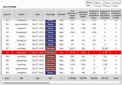
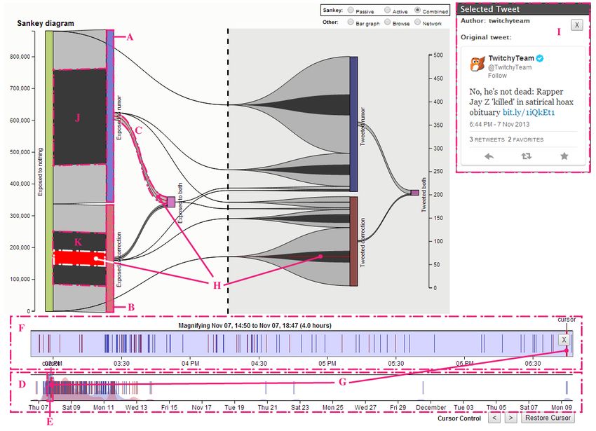
where n is the number of tweets and dAVG is the average user has propagated a meme on the basis that since they
follower count of propagating users. have already endorsed a position, so further passive expo-
 For example, if user A has observed only a tweet or sure is not relevant. This is by no means the only possible
tweets of the rumor, then they are in state “Exposed to set of exposure states to track—we address this topic fur-
Rumor”. If A then observes a correction tweet from anoth- ther in the discussion section.
er user they are following, A’s state changes to “Exposed The precomputation process yields a temporal database
to Both”. This indicates that A now potentially knows with one row for each tweet and one column for each pos-
about both types of information, and that any future actions sible state transition (in our case, 14). Each tweet induces a
A takes, such as propagating the correction, should be in- state transition for some of the followers of its author. Each
terpreted in this light. As each tweet is processed, the count column in a tweet’s row contains the number of people that
of each type of transition caused by that tweet is recorded tweet caused to move along that state transition. With a
to a database. It is these snapshots of tweets’ marginal im- small number of states and thousands of tweets, the total
pact that are visualized by the RumorLens tool. amount of data transferred to the browser is manageable.
 RumorLens uses a set of exposure states that can answer Figure 2 shows a raw table view of the information sent
basic questions about audience and propagator pool size to the browser. Each row represents one tweet. The bottom
and overlap. It consists of just 7 states: an initial “No expo- row, for example, represents the 163rd tweet in the dataset;
sure” state, and an “Exposed to _____” and “Tweeted it propagated the rumor and caused 781 people to transition
______” state for the rumor, the correction, and for both. from the “Not exposed” state to the “Exposed to rumor”
We ignore multiple exposures to or propagation of the state and 8 people to transition from the “Exposed to cor-
same meme. We also do not track further exposure after a rection” state to the “Exposed to both” state.

 Figure 1: RumorLens interface displaying Sankey diagram

 43
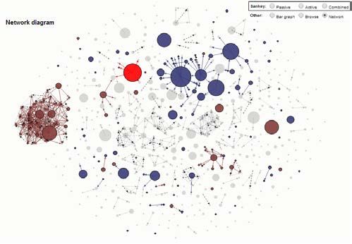
Visual Elements Marginal impact visualization
The RumorLens interface (Figure 1) consists of three coor- The most information-rich display-option is the raw table
dinated panes, one displaying a timeline of all the tweets shown in Figure 2. Column footers display the sums of all
(D and F in Figure 1), one for displaying information about rows currently contained in the list. Column headers can be
a single selected tweet (I in Figure 1), and a central dia- used to sort the list by respective columns, allowing easy
gram showing information about the aggregate marginal navigation to extremes of impact and other metrics. When
impacts of tweets (the central section of Figure 1). Current- a timespan is highlighted on the timeline, those tweets out-
ly, three alternative visualizations have been implemented side the timespan are removed from the table and the col-
for this central piece: a Sankey diagram (Figure 1), a raw umn sums update accordingly. When a tweet is selected
table view (Figure 2), and a network diagram (Figure 3). from the timeline, its row is highlighted in a bright color.
 A more visually accessible option is the Sankey dia-
Tweet timeline
 gram, which represents the aggregate state transitions that
The tweet timeline (D in Figure 1) shows all the tweets as
 occur as a result of the set of tweets that made up the ru-
vertical line items spaced out along a labeled timespan,
 mor in question. The layout of the nodes conveys infor-
color-coded blue or red for the two competing memes (ru-
 mation about which transitions are possible (only left-to-
mor and correction in our motivating use case).
 right). The size of each node and flow is proportional to the
 The analyst can select a window of the timeline (E in
 number of tweets it represents, and each flow represents
Figure 1), shown in a magnified timeline directly above the
 one column sum from the table view. When a timespan is
complete timeline (F). Information about the accumulated
 highlighted on the timeline, black sub-flows appear which
marginal impacts of tweets in the selected time-span is
 encode the total transition within that timespan. The visual
displayed on the central diagram, with each diagram dis-
 representation enables comparisons between quantities at a
playing this time sub-span information in a different way.
 single time or across time as the time slider is moved.
The black flows shown on the Sankey diagram are one
 When a single tweet is selected, its impact is shown as a
example of a visual representation of this information.
 set of brightly colored sub-flows overlaid on top of the
 By dragging the selected time window across the full
 black sub-flows (e.g., H on top of K in the figure).
timeline, the effects shown in the marginal impacts area
 The central marginal impacts pane can be switched to a
smoothly and instantly adjust to reflect the newly selected
 more common representation, a force-directed network
window. This allows the analyst to quickly find periods of
 layout (Figure 3). Each tweet is represented as a node.
time with unusual activity, and to explore the time dynam-
 Links represent followership: a link exists when the author
ics of the diffusion process.
 of a later tweet is a follower of the author of an earlier
 On the right side of the tool, there is a panel that presents
 tweet. Dashed arrows connect tweets by the same author.
information related to a single tweet, which can be selected
 Nodes are color-coded blue and red, as in the timeline.
by clicking on a timeline item. Each of the views that can
 As in the London riots rumor visualizations (Proctor, Vis et
be shown in the marginal impacts pane also has a way of
 al. 2011), the size of a node represents the impact of the
showing the effect of the currently selected tweet. The red
 individual who made the tweet. We use the marginal im-
flows on the Sankey diagram in Figure 1 are one example
 pacts rather than the raw follower counts: in some cases
of how this information is represented visually.
 users with many followers who tweet late may have small
 impact due to overlapping audiences. (see Table 1).

 Figure 2: Raw table Figure 3: Network diagram

 44
When a timespan is highlighted on the timeline, tweets rather than to vocally change their minds on the issue.
not in the highlighted span are faded to grey. Because the Comparing the size of the “Exposed to both” to “Tweeted
diagram is force directed, dragging a time window box rumor” flow and the “Exposed to both” to “Tweeted cor-
across the tweet timeline can be used to see the progress of rection” flow shows that while 8 people tweeted the rumor
the rumor through the community structure of Twitter. If a with knowledge of both types of information, only 4 tweet-
single tweet is selected, it is highlighted in a brighter color. ed the correction under those circumstances, indicating that
 the correction was not found compelling by participants in
A sample rumor diffusion this rumor’s diffusion.
To provide a more concrete illustration, we give an exam-
ple of the type of audience analysis a user could perform Case Study
with the system 1. The rumor that we use for demonstration
is a 2013 rumor that the rapper Jay-Z had died, first started We present a case study of the utility of the tool by using it
by a satirical article in a music magazine. to analyze nine rumors for which we collected both spread-
 The leftmost rectangles represent states of exposure. ing and correcting tweets. We show that the tool can be
From the “Exposed to rumor” rectangle (A in Figure 1), we used to generate interesting conclusions about the spread of
can see that roughly 550,000 people were exposed to the rumors on Twitter. We also provide some evidence that
rumor with no previous exposure to the correction, and authors’ follower counts are not always a good proxy for
roughly 350,000 were exposed to the correction without the impact that they have in a diffusion.
having first seen the rumor. Hovering over the “Exposed to
rumor” (A) and “Exposed to correction” (B) state rectan- Data collection
gles would give us the exact numbers associated with these Since we are interested in the interplay between the rumor
state movements. From the relative size of the “Exposed and its corrections, we selected rumors that ultimately
to rumor” to “Exposed to both” flow (C), we can see that turned out to be false. Some were selected opportunistical-
very few people exposed to the rumor were subsequently ly, based on stories that came to our attention. Others were
exposed to the correction, as few people made the transi- selected from the rumors surrounding the Boston Marathon
tion that would have been induced by a correction tweet. bombing that were written up on Snopes.com and for
 The black flows overlaying the diagram (e.g. J and K) which we found large numbers of tweets.
show the cumulative impact of the subset of tweets in the For the first rumor, a hoax about Fox news and a Rus-
currently-highlighted timespan of the timeline. These fea- sian meteor, we searched for the keywords “Russia,” “me-
tures demonstrate that the 4-hour highlighted timespan teor,” “Fox” and “Obama” on the Topsy Twitter search
accounted for roughly 1/2 of new exposures to the correc- API. All the retrieved tweets were manually labeled. For
tion (K) and 1/2 of new exposures to the rumor (J). Again, the other eight rumors we employed the Rec-Req system
a user could hover over those sub-flows to see the exact (Li, Wang et al. 2014) to collect and classify the tweets
numbers associated with that timespan. while requiring fewer human judgments.
 The bright red flows (H) represent the impact of a par- We summarize the selected rumors below:
ticularly influential correction tweet. The set of transitions 1. Fox News on the Russian meteor: This rumor states
spanned by red flows on the diagram indicate that the ac- that Fox News accused President Obama of causing a large
count had been exposed to the correction before tweeting, meteor to strike Russia in order to spread concern about
but not the rumor, and that it exposed a large number of global warming. 1,210 tweets: 920 rumor; 290 correction.
new people to it. Hovering over that flow would reveal the 2. HIV in Greece: The World Health Organization
number of people newly exposed: roughly 45,000. (WHO) released a report in September of 2013 that in-
 The state rectangles to the right represent states of prop- cludes a chapter saying that half of new HIV infections in
agation activity. The large flow from “No interaction” to Greece are self-inflicted for the purpose of claiming
“Tweeted rumor” demonstrates that a majority of propaga- monthly benefits from the government. 6,939 tweets: 3,941
tors of this rumor were exposed to it outside Twitter or at rumor; 2,996 correction.
least outside of the feed of tweets from people they follow. 3. JayZ is dead (inside): The Rap Insider, a music news
 Finally, with some careful comparisons of particular publication, ran a story with the title ‘Rapper Jay-Z found
flows, we can begin to understand user behavior with re- dead inside at 43’, a satirical piece about his attitude and
spect to this rumor. For instance, the very small size of the his music. 622 tweets: 349 rumor; 265 correction.
“Tweeted both” state and its corresponding flows indicates Boston Marathon Bombing: A number of rumors spread
that users tended to express one opinion and stick with it through social media in the wake of the bombings.
 4. 8-year old girl: One rumor claimed that one of the
1
 A video demonstration of this sample rumor diffusion analysis is availa- victims of the bombing was an 8-year-old girl, often claim-
ble at http://www.youtube.com/embed/HuvpiNGmFYE

 45
ing that she was a survivor of the Sandy Hook Elementary ming follower counts results, on our examples, in overes-
School shooting who was running in honor of her class- timating total exposure by between 6% and nearly 400%.
mates. 12,010 tweets: 9,426 rumor; 2,584 correction.
 Table 1:Comparison of exposure estimates made by summing
 5. Finish line proposal: This rumor claimed that one vic-
 marginal exposure vs. follower counts
tim of the bombing was a woman whose boyfriend was
planning to propose to her on the finish line but instead Marginal Follower
knelt over her as she died. 10,055 tweets: 9,426 rumor; 640 Rumor Ratio
 exposure counts
correction. 8-year old girl 4,026,105 6,329,859 157%
 6. False victims: This rumor claimed that some or all of
 Facebook early creation 7,765,743 14,588,797 188%
the victims of the bombing were crisis actors sporting fake
 Finish line proposal 4,967,139 7,668,395 154%
injuries, implying that the US Government planned the
 False victims 1,280,002 2,530,857 198%
bombing as a “false flag” operation. 1,924 tweets: 1,740
 Sandy Hook Principal 5,135,771 9,423,956 184%
rumor; 184 correction.
 Man on the roof 7,363,057 22,599,367 307%
 7. Sandy Hook principal: Another “false flag” rumor
states that the late principal of Sandy Hook Elementary H.I.V in Greece 3,971,845 15,157,016 382%
School, who died in the shootings there, was present at the JayZ is dead (inside) 562,263 788,552 140%
Boston Marathon Bombing. 9,109 tweets: 8,452 rumor; Russian meteor 1,661,729 1,772,952 107%
657 correction. White House explosion 1,141,498 1,403,032 123%
 8. Man on the roof: An image of a man standing on a
rooftop overlooking the marathon route as the bombs were Speed of diffusion
going off sparked rumors that the pictured man was either By leaving the left edge of the sliding window on the far
involved in the attack or under investigation by the Boston left and dragging its right edge to the right (gradually high-
Police. 9,523 tweets: 8,611 rumors; 912 corrections. lighting the entire timeline) an analyst can study the behav-
 9. Facebook early creation: Some Facebook memorial ior of a rumor over time. From the data we can see that
pages for victims were converted from unrelated pages that rumors often spread quite quickly.
had existed prior to the bombing. The creation dates for For the eight rumors that reached at least one million
these pages sparked a rumor that some agency had fore- users, the time it took to do so ranged from 1.2 hours for
knowledge of the attacks and posted the memorial early. the Facebook rumor to 10.75 days for the (much smaller)
12,583 tweets: 12,041 rumor; 542 correction rumor about false victims at the marathon. The time it took
 to reach 50% of full exposure varied from 3 hours for the
Reach of rumors and corrections Facebook rumor to nearly 8 days for the false victims ru-
In our datasets, total exposure to the rumor ranges from a mor. The false victims rumor seems to be an outlier in how
minimum of approximately 550,000 for the rumor about wide its distribution was over time; no other rumor had a
Jay-Z’s death to a maximum of 7.7 million for that about “half-life” of more than a day and a half.
early Facebook pages. Because corrections appear in response to rumors, one
 The Sankey diagram lets us visually compare exposure might expect them to lag behind rumors in the speed at
to the rumor against exposure to the correction. The rumor which they gain exposure. The data supports this expecta-
about the Sandy Hook principal showed the greatest dis- tion in most cases, but for two rumors it is actually invert-
parity, with a ratio of more than 30 rumor exposures per ed: corrections about the man on the roof peaked 2 hours
correction exposure. The HIV rumor had the least disparity before the rumor did, while those about the false victims
between rumor and correction exposure with a ratio of peaked a full 3 days earlier.
roughly 1.5 rumor exposures per correction exposure, re-
flecting the fact that the original source of the incorrect Overlap of audiences
information (the WHO) participated in trying to correct it. By comparing the “No interaction to rumor exposure” flow
 Table 1 compares our state-based method of exposure with the “Rumor exposure to both exposure” flow, we can
estimation against a naïve technique for estimating the total use RumorLens to examine how well the correction spread
exposure to each rumor. The “Marginal exposure” column to users who had been exposed to the rumor. Conversely,
shows our estimate, made by tracking the state transitions by examining the “Correction exposure to both exposure”
of each individual involved in the spread of the rumor. The flow, we can see how many people had already been “in-
“Follower counts” column shows the estimate that could be oculated” with the correction by the time they were ex-
made by simply summing the follower counts of the prop- posed to the rumor.
agators of the rumor. The table shows that naively sum- Of people exposed to the rumor, the percentage of peo-
 ple who were later exposed to the correction, or who had

 46
already been exposed, ranges from 3% for the finish-line did so in the case of the Facebook rumor.
proposal rumor to 39% for the HIV in Greece rumor. HIV
is an outlier in this, as the next highest level of such “con- How endogenous are rumors to the social graph?
tested” exposure is 10% for the Sandy Hook student rumor. By comparing the flows between the “Start”, “Exposed to
This relative success may be because the HIV in Greece Rumor”, and “Tweeted Rumor” states on the active user
correction was spread by the same vector that originally diagram, we can study what proportion of people who
spread the rumor, the WHO. Even for that rumor, however, spread the rumor or correction draw their knowledge from
a majority of the people exposed to the rumor were never sources other than person-to-person hearsay on Twitter,
exposed to a correction tweet. either through other media or through other features of
 We can also see what percentage of exposure to the cor- Twitter such as search or following hashtags.
rection was received by users who had been exposed to the For propagators of the rumor, this percentage varied
rumor: from about 1 in 10 for the rumor about Jay-Z’s widely, from more than 4 in 5 for Jay-Z’s death to about 1
death to 1 in 2 for the Facebook rumor. in 4 for Russian meteor. The disparity suggests that differ-
 ent rumors will be more or less responsive to interventions
Effectiveness of corrections that take place solely on the Twitter social graph.
By focusing on the active tweeting states on the right of the
diagram, we can explore some of the factors that affect
how people spread the rumor and correction, and in partic- User Study
ular explore how corrections impact the spread of rumors. A small-scale user study was performed to evaluate the
 From the “Tweet Rumor” and “Tweet Both” flows we usability of the RumorLens system by nonexperts.
can determine the percentage of users who spread the ru-
mor at least once, and who then change their mind and start Subjects
spreading the correction: a maximum of about 1 out of 8
people who tweeted the HIV in Greece rumor subsequently 31 subjects were recruited from a 100-level undergraduate
tweeted a correction, while fewer than 1 in 1000 did so for introduction to information studies course. Subjects ranged
the finish-line proposal rumor. from freshman- to junior-year students and represented a
 Exposure to the correction may be more or less compel- broad spectrum of majors, including Computer Science and
ling from rumor to rumor. Among users who are exposed Economics. 20 males subjects participated; 11 female.
to both rumor and correction and subsequently tweet, a
little more than half tweeted the correction in the case of Experiment
the HIV in Greece rumor. By contrast, fewer than 1 in 10 We test the usability of the tool by testing the ability of

 Table 2: User study questions
 Question
 Q1 Identify the user who first tweeted the rumor
 Individual-related

 Q2 Identify the user who exposed the most people to the correction with a single tweet
 Q3 Identify the user who inspired the greatest number of subsequent tweets
 Q4 Identify the user who tweeted the correction the largest number of times
 Q5 Identify the user who exposed the greatest number of people to the correction who had previously been exposed only to the rumor
 Q6 Identify the first user to tweet the rumor who had more than 75,000 followers
 Q7 How many people did this user expose to the rumor?
 Q8 Were more people exposed to the rumor or the correction?
 Q9 Roughly speaking, how many people were exposed to the correction?
 Q10 How many people were exposed to the rumor?
 Audience-related

 Q11 What was the distribution of tweet impacts in spreading the rumor and correction?
 Q12 How many people were exposed to both the rumor and the correction?
 Q13 How many people tweeted the correction?
 Q14 How many people first tweeted the rumor, then changed their minds and tweeted the correction?
 Q15 How long did it take for 400,000 people to be exposed to the rumor?
 Q16 How long did it take for half of all people to be exposed to the correction, who would ever be exposed to it?
 Q17 Were people who had been exposed to both the rumor and the correction more likely to tweet the rumor, or the correction?
 Q18 How many people were exposed to both the rumor and the correction?

 47
subjects, with a small amount of training, to effectively use collective mean accuracy of 85%. The raw table view,
it to analyze the spread of a rumor. To understand the rela- though it contains all the same information as the Sankey
tive strengths of the three visualizations currently offered diagram, was harder to use, with fewer questions answered
by RumorLens (Sankey, table and network), each subject and more time taken per question. Two time-related ques-
was limited to the use of one visualization only. tions required subjects to resize or drag the time window in
 Each subject session proceeded as follows: order to find the times when audiences reached certain
 1. The subject was randomly assigned to one of the sizes. Even on these questions, subjects did well with the
 three visualizations: the Sankey diagram, the net- Sankey diagram: nine of ten subjects answered Q15, all
 work diagram or the raw information table. getting it right, and all ten answered Q16, eight getting it
 2. The subject was lead through a 15-minute tutorial right. Using the table, only six of 10 answered Q15, 4 get-
 covering the definition of a rumor, the concept of ting it right, and 3 of 10 answered Q16, 2 getting it right.
 transitioning between states of exposure, and the On questions pertaining to significant individuals, few
 features of the visualization they were working with. subjects were able to use the Sankey diagram. Subjects had
 3. The subject was asked to answer a set of 18 multi- some success using the raw table, answering 60% of ques-
 ple-choice questions (Table 2) about a rumor (“Jay- tions at 61% accuracy. Surprisingly, the network diagram
 Z is dead”) using the tool, 6 about important indi-
 was not better than the raw table for these questions.
 viduals in the spread of the rumor, and 11 about the
 rumor’s audience size.
 The questions were selected heuristically to represent a Discussion
range of plausibly interesting questions an analyst might
ask about the spread of a rumor, including questions about The precomputation process yields a summary of the mar-
both audience sizes and notable individuals, questions that ginal impact of each tweet as a set of counts of people tran-
required more or less inference, and both precise and ap- sitioning between states of interaction with the rumor.
proximate questions. All were presented as multiple-choice Summing counts over a sequence of tweets aggregates
questions, so that we could easily assess correctness. those impacts, which can be displayed as column sums in
 Each question came with an option stating: “this ques- the table view or visually in the Sankey diagram. The case
tion is difficult or impossible to answer with the tool”. study shows that an analyst who is very familiar with the
Subjects were informed that part of their task was to de- tools can find interesting insights by visually noticing
cide, for a given question, whether the visualization was anomalies. The user study shows that college students with
appropriate for that question. minimal training can quickly answer a variety of specific
 audience analysis questions.
Results Table 1 suggests that this type of analysis may be neces-
 sary to answer even very simple questions such as how
In Table 3 we report the speed and accuracy of subjects in
 widely a meme spread. Simply counting the size of follow-
answering questions using the three different visualiza-
 er lists may grossly overestimate the total audience reached
tions. For each visualization, we report the average across
 by a set of tweets: in order to accurately assess the poten-
subjects of the percentage of questions they felt they were
 tial reach of a rumor, it is necessary to download the actual
able to answer, their accuracy when they did so, and their
 follower lists and remove duplicates. Some analyses may
speed in answering questions. We report these statistics for
 be difficult even to estimate without collecting follower
both types of questions, individual and audience-related.
 lists. Once the follower lists are available, de-duplication
To check for statistical significance, we conducted pair-
 and marginal impact calculation can be done in linear time.
wise t-tests comparing each of the other conditions to the
 Users were less successful at identifying significant in-
Table condition, using an alpha value of 0.025 to adjust for
 dividuals in the spread of a meme than in answering ques-
the multiple comparisons.
 tions about audience size, overlap and behavior. This defi-
 The results demonstrate that the Sankey diagram is high-
 ciency could be addressed in several ways. The network
ly effective for the audience-related questions, with all
 diagram could include a panel for sizing nodes by any
subjects able to answer almost all such questions, with a

 Table 3: Mean accuracy, percentage of questions answered, and elapsed time per question for each visualization and question type
 *
 significant at p
available metric of tweet impact. The table view could in- takes before a correction reaches half its eventual audience
clude a search/filtering interface to allow easier navigation or whether there was ever an n-hour period where the cor-
to individual records. On a large screen, all three visualiza- rection reached more new people than the rumor did.
tions could be displayed simultaneously, yoked so that That said, repeated use of the exploratory tool may lead
action in any of the three would be reflected in the others. to identification of certain questions that should be an-
 The precomputed marginal impacts are compact enough swered automatically for each new meme diffusion, rather
to be sent to a browser and cached. They enable display of than requiring interaction from the analyst. For example,
net impacts in the Sankey diagram, for any time period, for any journalist examining the diffusion of a rumor, it
and instantaneous update as the time window slider is may be helpful, prior to engaging in any interactive analy-
dragged across the screen. There are tradeoffs involved, sis, to see counts of the number of people exposed to the
however, in providing only the compact precomputed val- rumor tweets, to correction tweets, and the percentage of
ues. They do not enable all possible analyses. For example, each who were also exposed to the other. However, to
if an analyst wants to find out the number of people who identify such emergent needs, it helps for there to be exist-
were exposed to both competing memes during particular ing available tool, a role which RumorLens fills.
time periods, the marginal impacts are not sufficient. The
aggregated marginal impacts provide a count of how many State choice
people reached the state “Exposure to both” during any The essence of our approach is to define a set of states of
time period, but does not indicate how many of those peo- exposure, compute marginal impacts of each tweet in terms
ple started the time period without any exposure. of transitions between those states, and then visualize ag-
 We imagine several possible real-world uses for audi- gregated marginal impacts across sets of tweets. The utility
ence analysis tools such as RumorLens. One is for journal- depends on a designer making a suitable choice for the set
ists covering specific rumors. They would need to use oth- of states and creating a good visual for the states and flows.
er tools to retrieve and classify the set of tweets propagat- In principle, every distinct sequence of exposures could
ing or correcting the story, such as the Rec-Req system we define a different sate. That is, exposure to A, then, A
used for the case study in this paper (Li, Wang et al. 2014). again, then B, could be one state and A-B-A a separate
Given those tweets, they might check the audience size and state. That would provide the most detailed information to
whether most of the tweets about the rumor were already the analyst, but the extra detail would make it harder to
corrections, as a way to determine the newsworthiness of notice more general patterns. The designer’s choice of
the story. They might include audience-analysis statistics states to track and display leads to collapsing some of these
in stories they write, and might use the individual analysis exposure sequences and treating them as equivalent. For
tools to identify tweet authors worth interviewing. They example, in the RumorLens system described in this paper,
might also make the exploratory visualization tools availa- we collapse all sequences that include at least one exposure
ble to readers who wanted to dive in for themselves. An- to both a rumor and its correction (and no action of tweet-
other possible use-case is a brand manager who monitors ing either one) into the single state “Exposed to both.” This
social media for mentions of the brand or particular prod- makes it easy to notice what fraction of the audience is
ucts. In that case, the analyst might divide mentions into ever exposed to both, but hides whether audiences for the
those that express positive vs. negative sentiments, or track rumor or correction tended to get multiple exposures.
tweets that mention two competing products. Consider a couple of alternatives that would afford dif-
 As with any exploratory analysis tool, the value comes ferent analyses. One may define states in terms of propor-
not from answering a single question or set of questions. tion of exposures to A or B (e.g., “More B”, “Equal”, and
For that, calculation of a single statistic or a tailored visual “More A”). All sequences with more A than B exposures
chart will be better. For each of the 18 questions posed in would be treated as equivalent. This would make it easy to
our experiment, we could have used the precomputed mar- see whether, among people who were exposed to both, the
ginal impacts to provide the users with direct answers. Ex- amount of exposure tended to favor one or the other.
ploratory analysis tools are most useful when the number Another possibility is to define states based on the last
of possible questions an analyst might ask is large, or when exposure. For example, there could be one state if the last
the data themselves may direct the analyst’s attention. exposure was to A and that was the first exposure to A,
 That audience analysis benefits from an exploratory tool. another state if the last exposure was to A and it was not
The number of states and flows in the Sankey diagram, and the first exposure to A. Then, the Sankey diagram would
thus the number of possible visual comparisons, is limited. make it easy to see whether, in any given time period, most
It is large enough, however, that the visual layout helps of the exposures were repeat exposures.
make sense of the many possible comparisons. Moreover, Ultimately, the choice of states to model depends on
the number of possible analyses grows very large once we one’s research questions and assumptions about user be-
introduce time-window questions, such as how long it

 49
havior. The underlying principle of morphing the diffusion Li, C., Y. Wang, P. Resnick and Q. Mei. 2014. ReQ-ReC: High
into a transition diagram between states of exposure or Recall Retrieval with Query Pooling and Interactive
interaction, however, would remain the same, as would the Classification. ACM SIGIR.
processes of computing and aggregating marginal impacts. Marcus, A., M. S. Bernstein, O. Badar, D. R. Karger, S. Madden
 and R. C. Miller. 2011. Twitinfo: aggregating and visualizing
 microblogs for event exploration. SIGCHI, ACM.
 Conclusion Ogawa, M., K.-L. Ma, C. Bird, P. Devanbu and A. Gourley.
This paper describes the need for exploratory data analysis 2007. Visualizing social interaction in open source software
tools for information diffusions on social media that focus projects. APVIS, IEEE.
on the passive audiences rather than just the propagators. Perer, A. and F. Wang. 2014. Frequence: interactive mining and
We describe such an analysis tool, RumorLens, which visualization of temporal frequent event sequences. 19th
solves the data complexity problem by summarizing a dif- international conference on Intelligent User Interfaces, ACM.
fusion event as the movement of participants between Proctor, R., F. Vis and A. Voss. 2011. How riot rumours spread
states of interaction with the information being diffused. on Twitter. The Guardian.
 Using rumors as a motivating use case, we demonstrate Ratkiewicz, J., M. Conover, M. Meiss, B. Gonçalves, S. Patil, A.
that the precomputation required for audience analysis can Flammini and F. Menczer. 2011. Truthy: mapping the spread of
be performed efficiently. Through a case study, we show astroturf in microblog streams. WWW, ACM.
that the RumorLens implementation of audience analysis Ren, D., X. Zhang, Z. Wang, J. Li and X. Yuan. 2014.
can be used to pull out interesting facts about particular WeiboEvents: A Crowd Sourcing Weibo Visual Analytic System.
rumor diffusions. Through a user study, we show that col- Pacific Visualization Symposium (PacificVis), IEEE.
lege students without special training can understand the Sun, G., Y. Wu, S. Liu, T.-Q. Peng, J. J. Zhu and R. Liang. 2014.
tool and use it to answer audience analysis questions. EvoRiver: Visual analysis of topic coopetition on social media.
 Taxidou, I. and P. M. Fischer. 2014. RApID: A System for Real-
 time Analysis of Information Diffusion in Twitter. CIKM, ACM.
 Acknowledgments Vehlow, C., F. Beck, P. Auwärter and D. Weiskopf. 2014.
 Visualizing the Evolution of Communities in Dynamic Graphs.
This work is partially supported by the National Science
 Computer Graphics Forum.
Foundation under grant numbers IIS-0968489 and SES-
 Viégas, F., M. Wattenberg, J. Hebert, G. Borggaard, A.
1131500. This work is also partially supported by Google.
 Cichowlas, J. Feinberg, J. Orwant and C. Wren. 2013. Google+
 We thank Yuncheng Shen, Jessica Hullman David
 ripples: A native visualization of information flow. WWW,
Askins, Renee Gross, Michael Betzold, and Ron Dzwon-
 International World Wide Web Conferences Steering Committee.
kowski for their helpful critiques of the design of the tool.
 von Landesberger, T., S. Bremm, N. Andrienko, G. Andrienko
 and M. Tekusova. 2012. Visual analytics methods for categoric
 References spatio-temporal data. VAST, IEEE.
 Wongsuphasawat, K. and D. Gotz. 2012. Exploring flow, factors,
Cao, N., Y.-R. Lin, X. Sun, D. Lazer, S. Liu and H. Qu. 2012. and outcomes of temporal event sequences with the outflow
Whisper: Tracing the spatiotemporal process of information visualization. IEEE Transactions on Visualization and Computer
diffusion in real time. IEEE Transactions on Visualization and Graphics 18(12): 2659-2668.
Computer Graphics 18(12): 2649-2658. Wu, Y., S. Liu, K. Yan, M. Liu and F. Wu. 2014. OpinionFlow:
Cao, N., L. Lu, Y.-R. Lin, F. Wang and Z. Wen. 2014. Visual analysis of opinion diffusion on social media. IEEE
SocialHelix: visual analysis of sentiment divergence in social Transactions on Visualization and Computer Graphics.
media. Journal of Visualization. Xu, P., Y. Wu, E. Wei, T.-Q. Peng, S. Liu, J. J. Zhu and H. Qu.
Cui, W., S. Liu, L. Tan, C. Shi, Y. Song, Z. Gao, H. Qu and X. 2013. Visual analysis of topic competition on social media. IEEE
Tong. 2011. Textflow: Towards better understanding of evolving Transactions on Visualization and Computer Graphics 19: 2012–
topics in text. IEEE Transactions on Visualization and Computer 2021.
Graphics 17: 2412–2421. Zhao, J., N. Cao, Z. Wen, Y. Song, Y.-R. Lin and C. Collins.
Diakopoulos, N., M. Naaman and F. Kivran-Swaine. 2010. 2014. # FluxFlow: Visual Analysis of Anomalous Information
Diamonds in the rough: Social media visual analytics for Spreading on Social Media. IEEE Transactions on Visualization
journalistic inquiry. VAST, IEEE. and Computer Graphics.
Dork, M., D. Gruen, C. Williamson and S. Carpendale. 2010. A
visual backchannel for large-scale events. IEEE Transactions on
Visualization and Computer Graphics 16: 1129–1138.
Havre, S., B. Hetzler and L. Nowell. 2000. ThemeRiver:
Visualizing theme changes over time. InfoVis, IEEE.

 50
You can also read