BRAND GUIDELINESUPDATED JULY 2019 - SQUARESPACE
←
→
Page content transcription
If your browser does not render page correctly, please read the page content below
Brand Guidelines
             Updated July 2019

             ALASKA AIRLINES BRAND GUIDELINES   1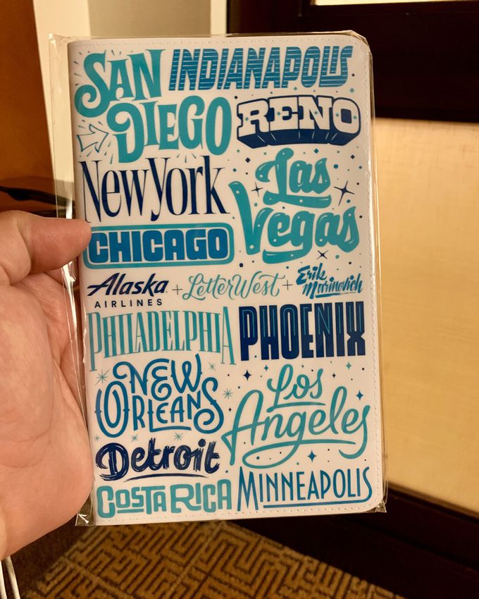
Welcome to the Alaska Airlines Brand Guidelines.
This is where you’ll find the best practices for the Alaska brand.
Use it as your guide when creating remarkable content.

Throughout these pages, you’ll find links to external resources that are
living documents containing our most up-to-date information.

Need more? Visit alaskabrandstudio.com to request a project, find links
to our most used creative assets or for assistance using this guide.

                                                                      ALASKA AIRLINES BRAND GUIDELINES   2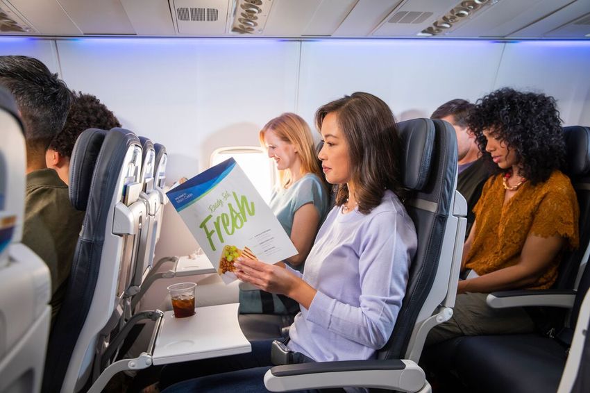
Table of Contents
4    Wordmark / Logo Use
10   Color
12   Aura
13   Typography
17   Photography
18   Iconography
20   Route Map
21   Voice & Tone
22   Campaign Guidelines
23   Resources

                           ALASKA AIRLINES BRAND GUIDELINES   3
The Alaska Wordmark

MAKE YOUR
(WORD)MARK.                                                 Contextual

The Contextual Wordmark: use it in airport
environments, in aircraft, on aircraft and on our digital
channels. These are all arenas where it’s pretty easy to
figure out we’re an airline, so we don’t need to say it.

The Official Wordmark: use it everywhere else.

Use the Midnight or White logo for core branded creative.

The logo can be shown in Atlas or Breeze when used in
the context of the “Fly Smart. Land Happy.” campaign,
only when it makes sense to match the logo color to the
type color.

Follow clear space guidance.
                                                            Official
Don’t:
• Alter, rotate or modify it.
• Animate it.
• Surround it with other designs.
• Accessorize it with extra elements
  like speech bubbles.
• Anthropomorphize it.
• Overemphasize it.
• Use previous versions of it.

                                                                         ALASKA AIRLINES BRAND GUIDELINES   4
The Alaska Wordmark

GIVE ME
SOME SPACE.
Our wordmark works best when it has some
breathing room, so surround it with wide open
spaces.

The amount of unobstructed clear space that must
                                                           x
surround the wordmark is at least 1X, where X equals
the ascender of the “k” in the wordmark.                               x      Wordmark: .75 inch / 19 mm / 54 px
                                                       x
The clear space should always be away from all                 x
elements of the wordmark, except for the ®.
                                                           x
Don’t go smaller than 54 pixels wide so we can
maintain visual impact.

                                                           x
                                                                       x

                                                       x           x        Wordmark: .75 inch / 19 mm / 54 px

                                                           x

                                                                           ALASKA AIRLINES BRAND GUIDELINES        5
The Alaska Wordmark

THIS SIZE FLIES.
To get the ® the right size, use a size-appropriate
version of the Alaska wordmark.

We’re showing the contextual wordmark
only as the example.                                  Large

But sizing and basic naming structure are the same
for both our contextual and official wordmarks.

                                                      Medium

                                                      Small

                                                      Very small

                                                                   ALASKA AIRLINES BRAND GUIDELINES   6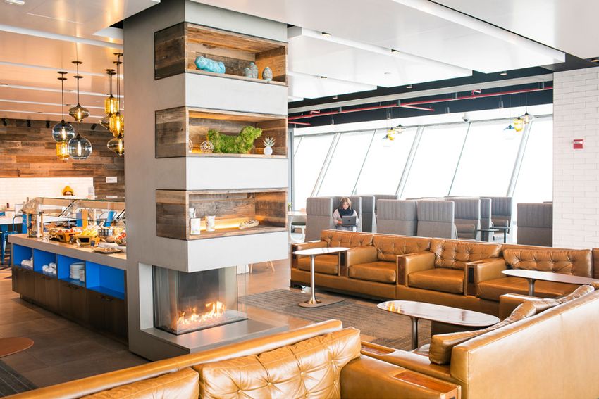
The Alaska Wordmark

IN GOOD
COMPANY
The Alaska wordmark is sometimes used to identify
internal groups or showcase a partnership with
third parties.

With internal efforts and branded product
offerings, Alaska remains the hero while the
qualifier supports below.

With third-party partnerships, Alaska remains left
and a line / pipe separates the two logos.

                                                           Inflight

                                                     Enterprise Project
                                                     Management Office

                                                                          ALASKA AIRLINES BRAND GUIDELINES   7
The Brand Ambassador

GO THE                                                                      Full-color                                                                Watermark                     Crop

EXTRA SMILE.
                                                                                                                 Crop                                                               guidelines
                                                        Breeze Blue                                              guidelines

                                                        Midnight Blue                                                          75% of White
We go full color with our Brand Ambassador
when we need a bold brand impact.
                                                        Calm Blue                                                              75% of White
Touchpoints include:
• Business cards                                                                                                               82% of White
• Liveries                                              100% Opaque White
• Executive presentations

                                                        Tropical Green                                                         51% of White
We go with our watermark Brand Ambassador when
we want an emotional backdrop for the brand and
we’re trying to drum up some inspiration.               Atlas Blue

                                                                                         Remove if                                                                  Remove if
Clear space
                                                                                         right side is                                                              right side is
The minimum amount of unobstructed clear space                                                                                                                      cropped
                                                                                         cropped
that must always surround the ruff should be at least
1X, where X equals the width of the smile.

Don’t go smaller than 59 pixels wide
so we can maintain visual impact.
                                                                                              x
                                                                                                             Crop
                                                                                                             guidelines
The face must always face to the left.
(The livery tail is the only exception.)
                                                                                                                              .64 inch / 16.25 mm / 59 px
The face must always be cropped                                                     x                    x                    .64" / 16.25mm / 59px
and anchored as shown, never floating.

                                                                                          x

                                                                                                                                                            ALASKA AIRLINES BRAND GUIDELINES     8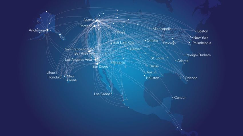
The Tail

LIVE(RY) TO
TELL THE TAIL.

The Alaska livery is our largest and most
recognizable element. It’s a piece of art that         Photograph   Vector Art
represents all of Alaska Air Group. We have a
photo version and a vector image version.

Use the photo version, supported by a
clear blue sky, whenever possible.

Use the vector image version when you can’t use the
photo, such as on a screen printing, large graphics,
apparel and merch.

The tail should always be facing left.
Cropping is acceptable, using the guidelines
found on page 8.

                                                                                 ALASKA AIRLINES BRAND GUIDELINES   9
Colors
                                                      Midnight Blue                       White                                Proportions

PASS WITH                                             PANTONE
                                                      7694 C / 2187 U
                                                                                          PANTONE
                                                                                          (N/A)
FLYING COLORS.                                        HEX: 01426A                         HEX: FFFFF
                                                      CMYK: 100.57.9.52                   CMYK: 0.0.0.0.
                                                      RGB: 1.66.106                       RGB: 255.255.255
The Primary Palette is Midnight Blue and White.
Midnight Blue was inspired by the night sky. It’s a
strong neutral that represents performance.
                                                                                                                               Brand colors as gradients
The Secondary Palette is Atlas Blue, Breeze Blue
and Tropical Green. These come from the mid-
                                                      Atlas Blue           Breeze Blue            Palm Green
tones of the aurora borealis.
                                                      PANTONE              PANTONE                   PANTONE
The Tertiary Palette is Calm Blue, Mist Gray and      2383 C / 7461 U      7702 C / 2200 U           Cool Gray 9 C / U
Palm Green. These core supporting colors are not
replacements for white.                               HEX: 2774AE          HEX: 48A9C5               HEX: B3D57D
                                                      CMYK: 83.40.3.6      CMYK: 68.1.8.8            CMKY: 33. 0. 60. 0
Never:
                                                      RGB: 39.116.174      RGB: 72.169.197           RGB: 179. 213. 125
• Use color just for decoration.
• Use secondary palette without the core colors.
• Use secondary or tertiary palette in exchange
  for White.
                                                      Calm Blue             Mist Gray                Tropical Green
The Soft Palette is Type Gray.
                                                      PANTONE               PANTONE                  PANTONE
                                                      2156 C / 2155 U       Cool Gray 3 C / U        2284 C/ 366 U

                                                      HEX: 8BA6C1           HEX: C8C9C7              HEX: B3D57D
                                                      CMYK: 51.23.11.0      CMYK: 8.5.7.16           CMYK: 33.0.60.0
                                                      RGB: 139.166.193      RGB: 200.201.199         RGB: 179.213.125

                                                      Type Gray
                                                                          Type Gray supports our approachable brand
                                                      PANTONE
                                                      Cool Gray 9 C / U   voice, softening our expression of type that would
                                                                          otherwise be black in color.
                                                      HEX: 656565         Use for headlines and body copy.
                                                      CMYK:30.22.17.57
                                                                           lso for cases in which typography cannot be
                                                                          A
                                                      RGB: 117.120.123
                                                                          reversed to White or set in a Core palette color.
                                                                                                                                                           ALASKA AIRLINES BRAND GUIDELINES 10
Colors
LET’S GET User Interface
Digital version of brand colors
Digital Midnight Blue Digital Atlas Blue Digital Breeze Blue Digital Tropical Green
DIGITAL. modified for greater vibrancy
on-screen and digital usage
The Digital Color Palette ncludes variations on
the Brand colors for use specifically and only in HEX: 01426A HEX: 0074C8 HEX: 00C7E6 HEX: C0E585
digital spaces.
Colors for user interface elements including
Buttons, Icons, Links, Headings and Type.
This palette is currently being refined to include Typography Orca White Shark Manatee Fog Galapagos
continuous user interface needs. The HEX values For all live type: headlines,
shown are for general reference and subject to labels, headers, body copy, and
change; please email Digital-Experience-Guide@ legal
alaskaair.com for the latest version. HEX: 222222 HEX: 01426A HEX: 6E7783 HEX: 9FABBB HEX: C8C9C7 HEX: 008568
q
Background Digital Midnight Blue White Cloud Mist Dusk Digital Palm Green
Colors for backgrounds and
dividing lines
HEX: 01426A HEX: FFFFFF HEX: F7F7F7 HEX: E8E8E8 HEX: 336787 HEX: 53B390
ALASKA AIRLINES BRAND GUIDELINES 11The Aura
SPIRIT OF
THE NORTH
We use four types of Aura to give
us a range of expression. The twist
They all follow these principles:
• The order of the core colors is
Midnight Blue>Atlas Blue>Breeze Blue>Tropical White Aura Midnight Aura
Green on the outer edge. Never change this. Made up of all the colors of the primary Made up of solid colors of Midnight Blue
and secondary palettes including core White. and the secondary palette. A twist is always
• No straight or parallel lines in the Aura; it’s organic. The construct Color bleeds on two or three sides of the present in the Atlas Blue. Color bleeds off all
canvas. The twist is always present in the four sides of the canvas with no visible White.
• No evenly-spaced sections of color; less static, of the Aura Atlas Blue.
more motion.
• There’s always one twist – one part of the Aura
that crosses, making an “x” shape.
Blended Aura Line Aura
Available in both Midnight and White The line aura is primarily used in Lounges
versions, Blended Auras are made with and First Class. It can also be used when the
primary and secondary palettes. Colors deliverable is something that needs to feel
fade between shapes for a softer look. classy or upscale.
ALASKA AIRLINES BRAND GUIDELINES 12Typeface
BOLD MOVES
AS Circular is used for headlines and body copy in
core brand communications. It has five distinct
weights. Use these weights to create an easy-to-read
typographic hierarchy.
Please make sure that the settings for
AS Circular Black
AS Circular Bold
“ligatures” is set to “off.” Ligatures are when specific
characters have a designed connection to another
character. fl is the most common occurance.
Weights
Light, Book, Medium are body copy.
AS Circular Medium
Bold is for headlines & subheads.
Black is for special occasions, like short headers,
small subheads or when we need to differentiate
content hierarchy.
Color
AS Circular Book
Primary Colors are Midnight Blue, Atlas Blue,
White, Type Gray.
Breeze Blue is a secondary color and is to be
used sparingly as an accent color.
Hierarchy
AS Circular Light
AS Circular Bold appears first in the typographic
hierarchy, as heads & subheads.
AS Circular Light, Book or Medium are body copy.
To get AS Circular typeface,
contact alaskabrand@alaskaair.com.
ALASKA AIRLINES BRAND GUIDELINES 13Additional Typefaces
Highest Praise
FLYEST PRAISE
You may notice a new typeface being used in the
aircraft experience. It’s called Highest Praise and is
strictly reserved for application on materials used on
board.
Cups, napkins, headphone packaging and the
seatback cards are all areas where this typeface is
used.
FREIGHT MICRO
Freight Micro is an Adobe TypeKit font that is used for
body copy in publications like the Beyond Magazine,
Uniform Lookbook, etc.
This typeface should only be used for
body copy 12pt or below.
Freight Micro
Freight Micro
Freight Micro
Freight Micro
Freight Micro
ALASKA AIRLINES BRAND GUIDELINES 14Expressive Type
EXPRESSING
OURSELVES
Our brand phrases are custom, hand-lettered pieces
of art that are used throughout employee spaces and
printed materials to add personality and energy.
This is not a typography. These should not be broken
up or added to one another to create new phrases.
These should only be combined or used in groups
when showcasing the brand values.
These should only be used with solid colors and
should not have a gradient applied.
Contact the Alaska Brand Studio for usage and to
review the full library of phrases.
by Jessica Hische
Jessica created our brand phrases and values in
a fluid, hand-drawn style that shows movement,
playfulness and a West Coast vibe.
ALASKA AIRLINES BRAND GUIDELINES 15Expressive Type
DESTINATION
ILLUSTRATIONS
These custom illustrations tell the story of where we
fly through typography. This evolving collection is
available through the Brand Studio and can be used
in employee spaces to represent a location and on
materials when showcasing a destination.
They should be used as a solid color within our
palette and should not have a gradient applied.
Contact Alaska’s Brand Studio for usage.
by Erik Marinovich
Erik designed all of our destination typography.
Each destination has been given its own treatment
that expresses its vibe, culture and feel.
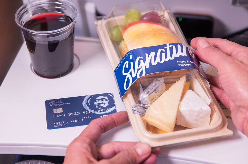
ALASKA AIRLINES BRAND GUIDELINES 16Photography
PICTURE THIS. People Product Places
Our world is positive and bright. It’s honest but finds
the colorful and modern elements of the real world.
We would like to freeze-frame happiness all over in
the most local, authentic way possible.
Our photography should reach beyond our brand
colors, adding brightness, vibrancy and overall
happiness to the layouts.
Our world is not plastic, overly stylized, dark or
surreal. It doesn’t have posed models. It isn’t busy
or complex.
We show people exploring places. We show our
product in natural use. We show our places in unique
context. We leave a little to the imagination, inviting
the viewer to explore more.
Contact the Alaska Brand Studio for any photography
requests. (Link to photo request brief)
• Contextual imagery should be 80% visually resting,
with no interference in that area.
• Accents in the imagery should be anchored to the
bottom of the image and take up 25% of real estate.
• All images should use cool colors.
• Logos should live above the 25% mark.
ALASKA AIRLINES BRAND GUIDELINES 17Icons
Digital Print
ICON. YOU CAN.
WE ALL CAN.
Our icons are friendly, modern & confident. They’ve been
designed for the digital space, as well as printed assets. We
only show a few samples here, but many more have been Digital Atlas Blue Atlas Blue
developed and are available in our icon library. You can find
access to that library through our full icon guidelines.
Digital Sizes
Icons can be scaled to provide 3 sizes: small (16px),
medium (24px), and large (32px). Rare cases allow for larger
sizes; start with the large size first as it has more details and
use the guidelines to create the illustration.
Color
Use the color palette that’s directly related to where the
icons will be used/displayed – print icons can use our core
brand colors. For digital, use the digital color palette. Color
should be used strategically; for example, use black or Orca
when aligning an icon with static text, or use an actionable
color like Digital Atlas Blue when the icon is included as part
of a link.
Creating new icons
We recommend Adobe Illustrator (or, secondarily, Sketch
App) for icon creation. Our Alaska Icon Guidelines
document has a number of rules to follow to help your icon
fit in with the set, including overall size, line weight, corner
radius, color, and pointers on how to make your icon pixel
perfect (important for a crisp and readable icon in digital
spaces).
For a copy of the most recent icon files and usage
guidelines, contact Digital-Experience-Guide@
alaskaair.com
Email marketing
ALASKA AIRLINES BRAND GUIDELINES 18Mini Plane
JUSTBRAND
PLANE CUTE.
PLANE New Icon New Icon (white)
ICON:
USAGE
The airplane icon is a simplified visual representation
of Alaska’s overall fleet of aircraft. We took inspiration
from various airplane types to land on the
newest version of the icon.
The airplane icon is a
simplified visual
representation
• Airplane icon of color
should always be the Alaska’s
of the
typographyoverall
used. fleet of aircraft. Use of Icon
• Icon width should be the letterform width.
We took
• If space permits, inspiration
airplane from
icon should have 2x the
● Airplane icon should always be the color of the
space from various airplane types to
the top compared to the headline.
typography used.
landairport
• When between on the newest
codes, version
the airplane should
be the sameof ● Icon width should be the letterform width.
the plane icon.
height as the font.
● If space permits, airplane icon should have 2x the
space from the top compared to the headline.
● When between airport codes, the airplane should
be the same height as the font.
OOH
LENGTH OF
1 LETTERFORM
AIRPLANE IS THE SAME
HEIGHT AS THE CODE
PRINT
HEADL
LENGTH OF
2 LETTERFORMS
31
ALASKA AIRLINES BRAND GUIDELINES 19Route Maps
ROUTE, ROUTE,
ROUTE FOR THE
HOME TEAM.
Alaska’s main route map (used mostly for print) is dark
and clean with vibrant white route lines that glow as
they stack on top of each other.
The Global Partners route map shows how we can
get guests from the West Coast to the world. The
dark version shows all of our partner destinations. The
light and bright version is Asia specific and is used
only in the digital space. It was created for better
visibility/legibility, simplicity and alignment with our
digital interactive route map and experiences that are
meant to be viewed on a wide range of screen sizes.
Contact Alaska’s Brand Studio for usage.
ALASKA AIRLINES BRAND GUIDELINES 20Copy
YOU’VE COME TO
THE WRITE PLACE.
Click here for our comprehensive CODE OF WRITING OUR WRITING STYLE IS...
Copy Style Guide. Keep it real and keep it Alaska.
Conversational - Relatable - Smart
Friends? Friends.
Tone down for what? Conversational:
Be conversational. Be clear. Have fun.
Click here for our guide For the most part, copy should feel
to voice and tone. conversational, natural to how a person would
Speak freely. Use manners.
speak, with a dash of clever. We want to be polished
Hospitality is the key to our relationships with our Engage in a way that’s unconventional, while remembering
we’re trusted to fly airplanes. and smart, but we also want to speak with the
guests and each other. Putting guests first requires
that we understand our relationship status. audience, rather than at them.
Openness E.g: Having it all shouldn’t mean paying it all.
Invite guests in, but don’t tell them where to go.
Relatable:
Whenever appropriate, we can reference
Travelers, not tourists
something that a viewer of a specific placement
Go beyond the obvious to find the worthwhile experience.
would get almost as an inside joke, but not so inside
that it becomes too niche. It should feel like a
Tell it like it is.
knowing wink that our audience appreciates, and
If regulations require us to say it, then say it. Transparency is
the best policy. not like we’re pandering.
E.g: $59 Flights from SFO - Go above and Bayond!
Empathy is invaluable. Smart:
Approach irregular operations from the guests’ perspective. We like wordplay, but used sparingly. It
Take personal responsibility. should be smart, never corny or eye roll-inducing.
Do all we can to make things right.
Think plays on phonetic similarities over outright
puns.
Enthusiasm is contagious.
E.g: $159 to Hawaii. And no leiovers.
Get excited to write and they’ll be excited to read.
ALASKA AIRLINES BRAND GUIDELINES 21TM
The campaign is brought to life through
smile-inducing moments and paid off
with Alaska benefits that remind guests
they don’t have to settle for less.
Click here for the
brand campaign guidlines
ALASKA AIRLINES BRAND GUIDELINES 22Quick links for you!
For more detailed information, contact
Jen Sinconis, Studio Operations Manager
jen.sinconis@alaskaair.com
Katie D’Amato, Director of Brand
kathleen.damato@alaskaair.com
Alaska Brand Studio Website
Alaska Brand Hub
Alaska Writing Style Guide
Fly smart. Land happy. Style Guide
ALASKA AIRLINES BRAND GUIDELINES 23Do you feel so
ON BRAND?
We thought so!
ALASKA AIRLINES BRAND GUIDELINES 24You can also read