Data visualisation platform for individuals: opus4.kobv.de
←
→
Page content transcription
If your browser does not render page correctly, please read the page content below
Data visualisation platform for individuals:
Travel into your data world, be aware of data collection and take back your
autonomy through data donation

Digital Media Master Thesis
by Harim Jang

Rhine-Waal University of Applied Sciences
Faculty of Communication and Environment
Data visualisation platform for individuals:
Travel into your data world, be aware of data collection and take back your
autonomy through data donation.

Digital Media Master Thesis
by Harim Jang
24835

Rhine-Waal University of Applied Sciences
Faculty of Communication and Environment
1st Supervisor: Prof. Dr.-Ing. Ido Iurgel
2nd Supervisor: Prof. Christoph Zielke

Submission date: 19th March 2021
Abstract
Various companies have been collecting people's digital footprint by offering free digital services to them. People are aware of it vaguely, it
is difficult for them to see what actually the companies have or its value. According to the General Data Protection Regulation, finally,
individuals can request their collected data from the companies. Nevertheless, the data has been offered as machine-readable files mostly
that individuals cannot understand. Thus, a data visualisation application for individuals was designed to improve these problems in this
project. The application was built as low fidelity and high fidelity prototypes and tested with 10 participants through remote usability tests
to explore its possibility. In the tests, the target users showed their positive interest in the concept and visual design. Consequently, it
clearly showed its potential to improve the situation. However, some participants seemed to worry about sharing their data for donating, or
unsatisfied with the basic level of data visualisation. To cope with these issues and to have a better effect, some improvement of interface
design, additional introduction screens and advanced data visualisation was suggested as a further improvement for the future.

Data Collection, Personal Data Visualisation, Data Donation, Data Awareness, Data Autonomy
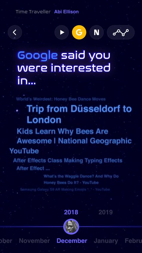
Table of Contents
1. Introduction                         1

2. Research                             3
    2.1 Data Collection                 3
    2.2 Personal Data Law: GDPR         4
    2.3 Data Visualisation Platforms    6
    2.4 Target Users: Millennials       7

3. Design                                8
    3.1 Data Design                     11
    3.2 Visual Design                   16
    3.3 Prototypes                      23
        3.3.1 Low Fidelity Prototype    23
        3.3.2 Interim Usability Test    27
        3.3.3 High Fidelity Prototype   37
        3.3.4 Final Usability Test      47

4. Conclusion                           53

5. References                           55

Declaration of Authenticity             60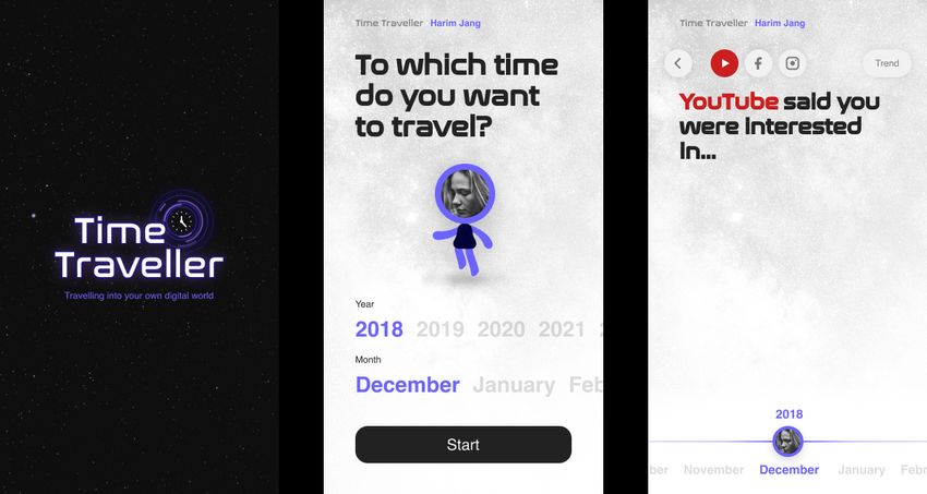
1. Introduction
People are living in a world that even daily activities have been digitalising. They do most of the activities through digital devices which
used to be done offline such as doing shopping on Amazon, studying in Khan Academy, making a social connection on Facebook and so
on. Thus, individuals are generating tons of data everyday whether consciously and unconsciously (Marr, 2018). The data knows all about
people such as what they like, what they look for and even if someone is pregnant or not (Marr, 2016). This makes the data extremely
attractive to organisations or companies. Because when they know better about their target customers, they have more possibility to
attract them and finally achieve their goals. Therefore, they have been utilising it for the purpose of marketing or research eagerly. On the
contrary to this, individuals have been in a passive position for their data even though it belongs to them originally (Melendez and
Pasternack, 2020). People are still not aware enough of how and when it is being collected, used and how much value it has possessed.
The main reasons for this problem are that everything happens behind screens where people cannot really see. Though digital platforms
should ask for consent from people to collect their data, there are not many people who actually agree on this after reading all the policy
information. Because, anyway if people do not agree, they cannot use the service and it means that they could be excluded from the
digital world which is an important part of people's life in this era. Additionally, the platforms ask for consent with a design that makes
people accept it easily and it even includes additional data collection than required. After all, people think they are using the platforms as
free, however, it is time to think about this quote deeply.

"If you are not paying for the product, then you are the product"
(The Social Dilemma, 2020)

As Yuval Harari said at the World Economic Forum Annual Meeting in Davos, Switzerland, the importance of data as an asset has been
growing fast. According to his claim, people who own the data will have the power to control people's future life (World Economic Forum
Annual Meeting, 2018). This is a reason for companies' passion to collect more data from people. Thus, it is significant for individuals to
understand and be aware better of the data to empower themselves to take back their own rights (Broda, 2019).

                                                                                                                                                 1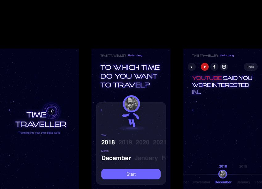
Because of this current situation that presents the growing importance of the data, some attempts to empower individuals for the data
have been occurring. The first example is UBDI(Universal Basic Data Income, 2020). It is a digital platform that people can check their
footprint in the digital world and catch some insights from it. Also, users can offer their data to companies for market research purposes to
earn cash or points. The second one is Santory Banding Machine that offers personalised health information and related coupons
according to the data that people submitted to the machine (Tech Plus, 2020). The last one is a Chrome extension for donating data by
WAOO (Donate Your Data, 2016). This extension tracks users activity on the Chrome browser. Users can choose where to donate and
while they are surfing on the internet, all the generated data will be donated to the organisation. All these attempts are meaningful, yet,
there are some missing points. The actual benefit for people is way low and it is more about checking than utilising which means still
individuals do not have enough autonomy on their own data. Moreover, most of the benefits for users relied on surveys, not unconsciously
generated data collected by companies. In the case of the extension, users have a certain amount of autonomy on their data, however,
there is no transparency that users can see how all this will progress or what has been collected. Thus, it seemed some donators doubt
the system.

Based on these references, this project will aim to improve individuals‘ awareness regarding their data which is collected every moment of
our daily life and taking back our autonomy on it. Particularly the fact that individuals have the right to request their data from companies
according to the personal data right of GDPR (General Data Protection Regulation) will be focused on (Can I ask a company/organisation
to send me my personal data so that I can use it somewhere else?, n.d.). Most of the requested data is being offered in a form that is
difficult to understand for humans such as CSV, JSON and so on. Hence, the main challenge of this project will be finding an empathic
and understandable way to experience data for individuals in the aspects of the user interface and user experience. As a part of improving
the awareness, individuals can see the data that companies have been collected by visualisation and for the part of empowering them on
the data, will be examined with the donation feature. As a source of data for this project, my personal data will be used which is collected
from various companies including Netflix, Google, Facebook, Instagram and so on. Considered the frequency of data producing,
millennials are the best target users. This project will be tested by an unmoderated method. The goal of the test is figuring out the
possibility of the design concept and quality of usability by Lo-Fi and Hi-Fi prototypes. The method will be conducted remotely with

                                                                                                                                                2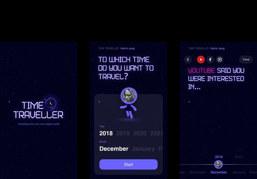
clickable prototypes which are appropriate to show how people actually interact with it. After conducting the first Lo-Fi prototype test, a
Hi-Fi prototype test will be conducted which reflects problems and matters of improvement from the previous test.

2. Research

2.1 Data Collection

The power of large IT(information technology) companies including Amazon, Google, Facebook is getting stronger and they are growing
by acquiring a lot of data from people. These companies collect most of our life footprints, especially in the digital world. For example,
Google maps know where people have searched, where they have been, which place and when they have made reservations, and so on.
If you see its timeline, it presents every move of users including the means of transport and even the duration of staying time could be
calculated by that (Meineck, 2020). Facebook also knows where users have been by tracking logged in location, who they have been
communicated with, what they have talked about, which applications they have been used if it is connected through their Facebook
account (Curran, 2018). Data collection does not only happen with touch screens but through sound with their mobile or IoT (Internet of
Things) devices, even when people think the devices are in the off status (Harding, 2019). All this data tells about users a lot. Their
income status, shopping habits, interests, political orientation, mental health, daily routine and so on. This is the reason which makes the
data extremely attractive to organisations. It is difficult to figure out all about how much they actually have known about people through
this data, however, it is clear that the companies are trying to get more data from users eagerly. The companies have some strategy to
earn more data from people. One of the ways to do it is limiting features or in an extreme case, users are urged to delete their account.
For example, a mobile messaging application "Whatsapp" with over 1 billion monthly active users recently announced that it will no longer
be able to use the service if users do not share additional personal payment information including transactions with its parent company
Facebook (Stolyar, 2021). The company has been collecting and sharing users personal data including contacts and profile pictures
(Newman, 2021). As an addition to this, they are trying to extend it to payment-related data which can allow Facebook to do more

                                                                                                                                               3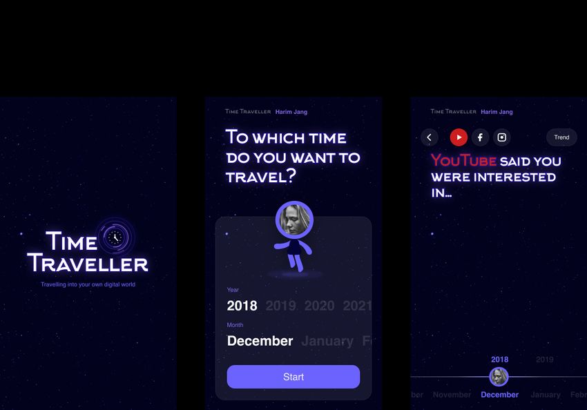
sophisticated targeted advertising that can lead to higher revenues while speaking to users that it is for helping improve infrastructure and
provision systems, understanding users to offer a better experience and strengthen its security system. If users consent to this, their data
will be shared and utilised by Facebook affiliates also such as Onavo, Cloud Tangle, Facebook Technologies etc. People seem that they
do not have a meaningful option for this kind of issue because this is related deeply to our interaction with others. They will choose
services over their data rights with optimistic thoughts that this will have no negative effect on us. As a result, this allows companies to
make tremendous profits by selling more personalised advertisements that utilised our data. More seriously, this has maintained even
after occurring some personal data breaches such as the Cambridge Analytica scandal that utilised Facebook users' personal data for
political advertising without any consent (Meredith, 2018).

2.2 Personal Data Law: GDPR

General Data Protection Regulation (GDPR) has been made to protect the personal data of residents of Europe and has started in 2018.
This regulation applies to companies operating within Europe that deal with personal information, companies providing goods or services
to Europe residents from outside of Europe, and companies monitoring the behaviour of Europe residents in Europe. In other words, it
means that any collection and processing of personal data for EU residents are obligated to GDPR. Along with this law, the right of
individuals for their data has been expanded. Representatively, organizations are required to obtain consent from individuals by concisely
explaining their use of personal data. Individuals have been given the right to be forgotten in the digital world and to request copies of
stored personal data. Additionally, individuals are allowed to utilise this requested data as they desire even on other platforms (General
Data Protection Regulation Compliance Guidelines, 2021).

                                                                                                                                               4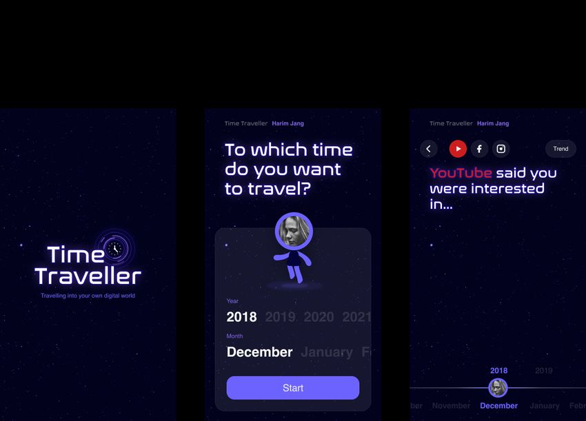
Figure 1. GDPR guideline

As a way to utilise personal data, there is a special approach to have a different perspective on personal data named BobAPI. The owner
of this personal data API is Bob Troia. He has started this project to have some insight about himself through his data and utilising it for
health and wellness (Troia, 2021). Inspired by this new approach utilising personal data for him or herself, I decided to utilise my personal
data for this project. 8 representative online platform companies were selected and requested to send the data such as Google,
Facebook, N26, Linkedin, Instagram, Netflix, Whatsapp, Amazon. According to GDPR as mentioned in the previous paragraph, it
specified companies to respond in a month at the latest. Also, each company has its own estimated time for this and it was from as soon
as possible to 30 days. However, most of the companies responded quicker than these estimated times. N26 offers an immediate
download feature for the data and Whatsapp and Amazon took 3 to 8days to send the data. Lastly, the rest of the companies responded in
a day with some minutes or hours. The taking time for requesting data would be different according to the amount of collected data.

                                                                                                                                               5
Company name Company’s regulation Duration of taken time
Google As soon as possible 7 minutes
Facebook As soon as possible 3 minutes
N26 Immediately Immediately
Linkedin 24 hours 10 minutes
Instagram 48 hours 2 minutes
Netflix Up to 30 days 8 hours
Whatsapp 3 days 3 days
Amazon 30 days 8 days
Table 1. Duration of taken time to request data per company
2.3 Data Visualisation Platforms
Since data has become in the middle of all decisions these days, there are many platforms that offer visualisation features for it. These
platforms are generally for organisations and companies to have insights for better business decision making. For instance, Tableau,
Microsoft Power BI (Business Intelligence), Plecto offer the visualisation with various kinds of data files including JSON, CSV, Excel etc.
Also, there are specialised platforms like Kumu that is a web application focused on visualising relations. However, there was no platform
that was designed for individuals.
62.4 Target Users: Millennials
If there is a platform for individuals, here comes a question, to whom it would be useful the most? The answer would be millennials without
any hesitation. Millennials are defined as people who were born around from 1981 to 1996 and also occupy the largest population
(DIMOCK, 2019). It includes the generation of digital natives who were born from the year 1983 and using online platforms is a part of
their life (Prensky, 2001). There is another trait of millennials that they have an open attitude regarding sharing their data. They even
share their life in real-time online. Thus, it is not a surprise that they are the ones that generate data the most among all generations
(Landrum, 2017). Still, they are also a part of people who do not know about data collection considerably. According to a survey by
Publicis Sapient for reviewing the level of knowledge of what companies do with people's data through 5 countries with 5000 surveyees, 4
of 5 people almost were not aware of how their data would be used by companies (Dooley, 2021). For the last, millennials show a
tendency to value experience, community, social responsibility including sustainability (Cheng, 2019). When they purchase a product, they
choose companies or brands that have the same thought for values. This has become possible due to their ability to share information
and participate online, the evaluation of the companies or brands has become easy. As a result of this phenomena, the companies'
business decisions that have been made with considering their reputations were observed alongside as well. Intel decided not to use
minerals (Conflict Minerals) produced in conflict zones that are stationed by armed forces that are becoming a social issue for its chip
manufacturing (Shotts and Melvin, 2015). Similarly, The Bodyshop stopped animal testing (Forever Against Animal Testing | Cruelty Free |
The Body Shop®, 2021) and Fashion brands stopped producing fur products including Chanel (Petter, 2019).
73. Design
Through the research above, the aim of design for this project was defined to make a data visualisation platform for individuals especially
millennials that can improve their awareness regarding the value of their data and empower them on it. The platform was designed as a
native application which is faster to process things compared to a web application considering the amount of data that would be
tremendous. Also, the native application offers a better option for interaction. Before beginning to jump to the ideation phase a brief
scenario was also defined. As a first step, individuals request their data to companies that they are using and download it after receiving
an answer. As a next step, the individuals upload the files to this application and check their data that is visualised in an understandable
way. As the final step, users can utilise their data for donating after choosing organisations.
Figure 2. Scenario
8In consideration of the fact that millennials explore their collected data through this application, the design concept of this application was
specified as "Time Traveller". It implies the action of exploring and gives off an interesting atmosphere. In the time millennials travel in this
application, they become aware of how much data is being collected by companies for a long time with easily understandable visualised
data. As well as, they can collect points as souvenirs and this can be used for donation later. This is connected with the mentioning above
in the research about millennials that they have a tendency to value meanings and social impacts more than money (Nawalkha, 2020).
Thus, they will be able to donate their data to a non-profit organisation to which they would like to contribute as a means to take back their
autonomy on their data. At this moment, they will experience the power and value of their data closely through the visualised process and
result. However, it is difficult to offer useful data directly to the organisations as individuals, because they are needed more in open data
like geographical or environmental ones. So donation flow will work in this way. Users share their data with third-parties including small
business units which have difficulty gaining proper data for their business, and then the third parties that received the data will fund
non-profit organisations under the users' choice. As a small business unit, it is difficult to collect data for their marketing use. Thus, there
are many data specialised companies that sell this kind of data to them. Even though they are spending a lot of money on this, there is no
transparency for the data that they bought including the origin of the resources (Tucker and Neumann, 2020). Since the small business
units need this data anyway, this application can offer more trustful data from the actual origin of the data as a return of their funding to
non-profit organisations. Above this, since this platform should be specialised for individuals' use, there were some points that had to be
considered additionally. The first point was containing an emotional aspect to let individuals feel more engaged with their data. To fulfil this
point, an avatar that can reflect users themselves into this application was included in visual design. The second one was offering
interesting results from their data to encourage them to use this application. Therefore some interesting trends from their past about their
interest, location, connection were presented.
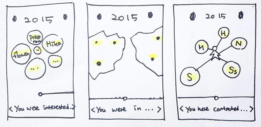
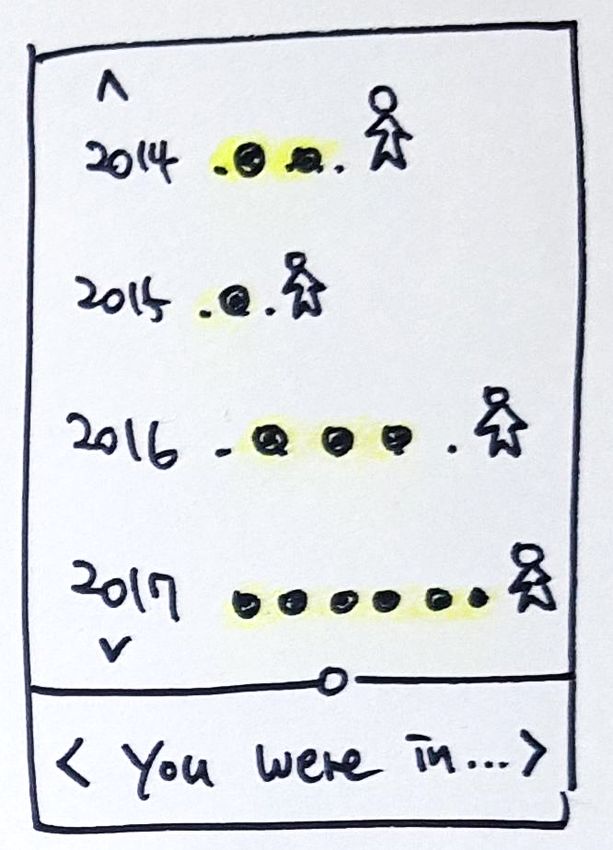
9Figure 3. Idea sketch of the concept
103.1 Data Design
The possibility of this project including the interesting data set was explored through "Tableau". It is a data visualisation software that
focuses on the business field and it allows visualising data without complex code. Thus, it was the proper tool for checking the possibility
of the concept quickly without deep knowledge of programming. For finding the interesting data sets, there was a need to examine what
data says about ourselves first. The data showed desire, pattern and change of our life from our activities in the digital world such as
subscription, likes, visiting, searching and so on. These activities were sorted into 3 categories as interest, location, connection and each
categories' related files were combined to present trends that will intrigue users. These categories are close to people's daily life and it is
not common to see it visually like this. Especially it will interest people to see something they might have already forgotten. This can also
present the collected data will last forever even after the owners have forgotten about it. To see the trends from various companies' data
collection in one place is likewise not common and this could give users some additional interesting insights.
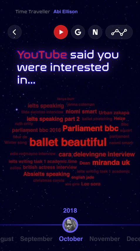
The interest category contained data files related to the activities such as searching, subscribing, checking, saving, liking from 3 different
companies (Netflix, Youtube, Google). These files show what users were interested in at a certain moment. This was visualised with
keyword clouds to show the popularity of a keyword instantly with size. As an example, April in 2018, "A series of Unfortunate Events" was
the most popular one according to Netflix, "아침 스트레칭 (Morning stretching)" was popular at Youtube and "현대차(Hyundai car)" was at
google. Different moments can be checked freely by selecting another year and month at the bottom.
Netflix Youtube Google
● MyList.csv ● likes.xlsx ● news.xlsx
● SearchHistory.csv ● search-history.xlsx ● search_video.xlsx
● ViewingActivity.csv ● subscriptions.xlsx ● trips.xlsx
Table 2. Data files used for interest category
11Figure 4. Interest data result on Tableau
12The location category contained data files related to the activities such as saving, login from 3 companies (Netflix, Google, Facebook) that
show where users were in. The location was visualised as dots on the map, the size and the strongness of colour shows the frequency of
the location. For instance, in 2018, the user stayed in North Rhine-Westphalia in Germany for a long time according to Netflix, Google also
indicates Germany, however, Facebook shows the user was in Suwon, Gyeonggi-do in South Korea quite often as well.
Netflix Google Facebook
● IpAddresses.csv ● saved places.json ● location_history.json
Table 3. Data files used for location category
The connection category contained data files that related to the activities such as contacting, messaging, liking, commenting from 2
companies (Linkedin, Instagram) that show who users were connected with. It was visualised as bubbles with connected people's names
inside. By the size and colour, it also presents who was more frequently connected with, and it has measured by messages, likes and
comments data. In 2016, the user had various new connections from both Linkedin and Instagram, however, Saeedeh and 은지 (Eunji)
was the most connected people according to Linkedin and chu__stagram was the one on Instagram.
LinkedIn Instagram
● contacts.xlsx ● likes.xlsx
● messages.xlsx ● comments.xlsx
● connections.xlsx
Table 4. Data files used for connection category
13Figure 5. Location data result on Tableau
14Figure 6. Connection data result on Tableau
15Among these results, the interest category was built as a prototype to have some opinion from prospective users about the concept and
design through testing.
3.2 Visual Design
The overall direction of the visual design of Time Traveller was the cosmic style and a futuristic vibe which suits well with the concept of
this project. The additional main consideration for this direction was simplicity. Because every element should be able to harmonise with
data related ones which can be complex. In line with these considerations, the primary colours were defined as dark navy, purple, white
after creating a mood board with some research. To design all elements with limited colours and show different depths, various yet
consistent transparency levels were adapted.
Figure 7. Colours and transparency palette
16Many typographies have tried to find the one which can present the Time Traveller concept better. Marske, Arkhip, Nasalisation, Helvetica,
Good times, Elevon competed with their characteristic shapes that imply cosmo, time and futuristic mood. At the last moment of choice,
Nasalisation was selected between Nasalisation and Elevon. Both of these two typographies were designed based on the logo of Nasa
(National Aeronautics and Space Administration) which clearly presents the atmosphere of the universe and it is also well known as it is to
most people in the world. The one difference between them was the type of shape. Nasalisation is rounded shape while Elevon is
angulated, so Nasalisation which can give friendly expression was chosen. This is a way to keep consistency with other rounded elements
like buttons and boxes as well. Sans-serif typography was considered also, however, it was not applied because it could crush with
Keywords cloud of data view. Instead of that, sans-serif typography "Helvetica'' was used to all content text for delivering content clearly
and for making harmony with the characteristic display font.
Figure 8. Exploration of Marske and Arkhip
17Figure 9. Exploration of Nasalisation, Helvetica, Good times and Elevon
18Avatar was designed to be able to add a face photo of users to stimulate the intention of emotional engagement. The design had to be
simple for harmonising with all other elements especially with the users' face picture, and overall rounded edges were used to keep the
friendly atmosphere. On account of the concept of TimeTraveller, the avatar‘s poses are all floating. Because the avatar will travel to a
certain time by flying, not by walking.
Figure 10. Idea sketch of avatar design
19Figure 11. Final avatar design with various poses
20Nasalisation typography was used for the identity design of this application to give the same characteristic mood as other visual design
elements. Additionally, a clock and rounded neon line effect that implies time travel directly were combined around the title. For colours,
the same approach to use limited colours were applied as the combination of dark navy, purple and white.
Figure 12. Logo design in dark and light mode
21The interface design was tried in 3 types as dark, light and mixed-mode. The dark mode presented the design concept intuitively with the
feeling of cosmo. The other advantages were the availability of neon effects and the possibility to give a feeling of space which can be
important to the data view. For the background, an image of a night sky with small stars was edited over dark navy colour. The light mode
was a bit less intuitive compared to the dark mode, however, the companies‘ icon colours and data looked more prominent. Also, the
background texture of the surface of the moon likewise presents some of the cosmic moods. Mixed-mode was tried as the last one and it
was good to allow users to feel a transition naturally after moving to the main phase. Each mode had different advantages, however, the
dark mode had the most important advantages which makes it suit better to the concept than other modes. Thus, the final direction was
decided as the dark mode.
Figure 13. Dark mode interface Figure 14 Light mode interface
22Figure 15. Mixed mode interface
3.3 Prototypes
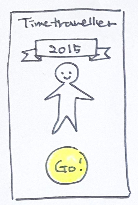
3.3.1 Low Fidelity Prototype
Lo-Fi (Low Fidelity) prototype was made on the programme named “Figma” without elaborated visual design. This prototype was focused
on building flow, interaction and structure of information. Following the defined concept that mentioned before, this application mainly
consists of 2 parts such as the data view for checking individuals visualised data and the donation that allows them to have power over it.
The goal of the data view was to be simple and easy to understand not to lose users‘ interest by the complexity of data while being aware
of the relation between the collected data and companies. So the screen was designed to have the keyword cloud in the middle of the
screen to catch users eyes directly and added a timeline on the bottom that users can move to check data from another time fluidly.
Additionally, it offers a separated trends view that allows users to compare and check the amount of data collection per each company.
For the donation part, the main consideration was offering a certain interaction for the donation that users can perceive they are
23controlling over their data. To offer this impression of giving or moving the data themselves, drag interaction was applied instead of just a
click. Also, users can see detailed information about donation including progress.
Figure 16. Lo-Fi Prototype screens with Figma
24Figure 17. Lo-Fi Prototype screens with Figma
25Figure 18. Lo-Fi Prototype screens with Figma
26Figure 19. Lo-Fi Prototype screens with Figma
3.3.2 Interim Usability Test
An interim usability test conducted on 22nd January 2021 for around 20 minutes per session. Because of the coronavirus situation, it had
to be planned with a specialized remote testing platform "Maze". Maze is helpful to plan a test easily and allow conducting it simply by
sharing a link with anyone. Moreover, it offers an insightful report after the test which shows the average success rate, duration time,
errors and so on. The process was planned as 5 steps:
271. Introduction
2. Pre-question
3. Main tasks
4. After-question
5. Thank you & Bye
Figure 20. Test planning screen at Miro
28The goal of this test was defined from the question "Which points need to receive feedback?". As the answer to this question, the concept
of this project, general flow of interface, interaction, these three aspects came up as the most important part of this project. Each of these
aspects had questions to make the goal clearer:
● Concept: Is the concept understandable? / What do users think about it?
● General flow: Is it smooth enough that users can experience the app as it has intended?
● Interaction: Does it help users experience the concept better?
After defining the goal, the next question followed up as “What should users be able to achieve in this application?”. Testing tasks for
participants were designed according to the answer to this question. To avoid overwhelming participants with the tasks including pre and
after questions, the number of tasks was limited to a maximum of 8. The flow of the test starts with a brief context to help participants'
understanding at the beginning as follows (Luchita, 2019):
● Context
You are Abi Ellison.
You recently read an article about companies' personal data collection. So you requested your personal data to several companies
with curiosity. However, the personal data files you received were difficult to understand what it means. Because it has offered as a
form that a machine can understand, not a human. Thus, you uploaded them to Time Traveller application which you found at the
app store. It said it will help you to understand your personal data files, so you would like to try it.
● Pre-question
Please look at this screen and tell us what strikes you.
(What you think you can do here, what this would be about etc. It can be anything!)
29● Be aware of data collection by companies.
○ Explore to your interest in October 2018
○ Find out what was your best interest in December 2018 according to Google.
○ Find out which company knows the most about your interest in May 2019.
● Donate data to take back autonomy on it.
○ Find out how many times you have travelled into your data.
○ Donate more than ★400 to an animal support organisation.
○ Raise your contribution to more than ★600
● After-question
○ What is your overall impression about this application?
○ For the last, tell us your additional thoughts, feelings, anything about the application! (Optional)
Participants were chosen by considering some requirements to have feedback from diverse types of people. Firstly, they should be born
between 1981 to 1995 as the millennial generation. Secondly, each of them should have different competence in technology. Thus, there
are both tech-savvy and non-savvy in the group. Lastly, diversity for professions was considered as well. The facilitator of this test was
hidden to have an unbiased opinion and not to make participants feel obligated to be positive about this application.
Name Year of birth Profession
Alina Jang 1983 Flight attendant
Ajit Kang 1986 Office employee
Benjamin Bayet 1991 Project manager
30Nayeon Park 1988 Student
Salman Javed 1992 Student
Table 5. Participant list of interim usability test
Through this test, it was possible to learn how prospective users think about this application overall. According to participants' comments
from the pre and after questions, they have positive feelings concerning the aspect of the concept. For instance, the participants of 4 gave
an average rate of 8 regarding the question asking their overall impression of this application. They also seemed to understand about the
design concept "Time Traveller" in their comments like "I think I can book a flight or plan a trip here", "Maybe Abi could see her personal
data that collected during the specific time period she taps on the screen", "Character is walking backwards in time". Nevertheless, there
were some negative opinions too such as concerning sharing data to companies, the level of visualisation. For example, one participant
said "However, I could not find a concrete purpose of using this application on a regular basis." Also, there was another participant who
mentioned something like "I am not sure if they would be willing to donate to a company simply because that company promises to give to
a charity. It does not mean that the company itself is reliable.
31Figure 21. Result of participants' impression about this application
Figure 22. Comments from participants about interface design
32Figure 23. Comments from participants about this application
33For the aspect of general flow of interface and interaction, some usability issues were revealed. Even though the participants commented
the flow of interface is smooth and clear, they struggled finding where to click with some missions because of some icons and content
which were not intuitive. Considering all these results of this test, the problems defined as following:
● Task 1: Error selecting the interest category.
It seemed the participants tried to click both the interest category and the location category similarly on the test result screen. This
means the participants did not read the text and just tried to click.
● Task 3: Participants failed to find the trend button.
Participants totally had no idea where to click to see the trend to complete this task. On the test result screen, most of the
participants tried to click the back button or profile picture on the timeline. Only one participant completed this task.
● Task 4: Confusing where to click to see profile between name and avatar.
It is observed that many participants tried to click on the name beside the Time Traveller logo on the top to complete this task.
● Task 4: Some Participants were confused between travelled times and collected souvenirs.
It seemed participants clicked on the number of souvenirs similarly, not only the number of travelled times.
● Task 5: Participants did not read how to donate (drag and drop).
Participants did not read the instruction about donation though it was put on the top with point colour. On the result screen, it is
observed that the participants kept trying to click on the organisation card.
● Concept 1: Worrying for donating their data to companies.
● Concept 2: Basic level of data visualisation that is not enough to intrigue users.
34Figure 24. Test result screen for the problem of task 1 Figure 25. Test result screen for the problem of task 3 Figure 26. Test result screen for the problem of task 4
35Figure 27. Test result screen for the problem of task 4 Figure 28. Test result screen for the problem of task 5
363.3.3 High Fidelity Prototype
Hi-Fi (High Fidelity) prototype was built based on Lo-Fi prototype and the same design programme (Figma) was used for visual design.
Unlike the Lo-Fi prototype, this one was applied visual design totally and the direction of improvement was focused on the defined
problems from the interim test. Furthermore, "Protopie" was used this time to improve the interaction to be smoother. Protopie allows
making a realistic prototype through its trigger and response system. Moreover, mp4 video files created by After Effects can be added and
controlled on prototypes, therefore these will help to offer a better experience to participants at the final testing.
Figure 29. Hi-Fi Prototype screens with Figma, Protopie and After Effects
37Figure 30. Hi-Fi Prototype screens with Figma, Protopie and After Effects
38Figure 31. Hi-Fi Prototype screens with Figma, Protopie and After Effects
39Figure 32. Hi-Fi Prototype screens with Figma, Protopie and After Effects
40Figure 33. Hi-Fi Prototype screens with Figma, Protopie and After Effects
41Figure 34. Work screen of Protopie for adding interactions
42Figure 35. Work screen of After Effects for making animations
43There were two parts to the animation as transition animation which can give the feeling of travelling to users, and data animation that
makes users feel that they are going into their data.
For the transition animation, the same neon effect lines as in the logo were used. It starts from a small size in the middle and it scales up
while rotating to give the feeling of moving into a different time zone. In the middle of the line animation, users can see themselves with an
avatar that has their face picture on it.
Figure 36. The transition animation
44For the data animation, it starts as small dots and spreads out to keywords to make the feeling of fall into the data from the users'
perspective. The colour will change per company to make it more intuitive. For example, a red colour used for Youtube, blue colour for
Google and a combination of red and black for Netflix.
Figure 37. The data animation
45The direction of improvement for this prototype was focused on the defined problems from the interim test:
● Task 1
Participants took some time to find where to click to select the interest category. From the observation of the interim test that users
do not read text on the interface, the sentence inside of the button was changed to a shorter but direct one intuitively.
● Task 3
Participants failed to find the trend button on the top. For this problem, the strategy that adds emoji on newsletters' title to catch
users eyes and raise the possibility to be opened more has experimented with. As a way to conduct the experiment, the text
(trend) on the button was changed to a visual element (analytic icon).
● Task 4
There were 2 problems for this task 4. The first one was that participants were confused about where to click to see the profile
screen between the name (Abi Ellison) on the top and the user's picture on the timeline section on the bottom. In the interim
prototype, it was possible with clicking the picture only. So clicking the name was added as an additional path to go to the profile
screen in this prototype.
The second problem was that participants were confused about the concept of travelled times and souvenirs. By this observation,
there was a chance to reconsider the concept and reached the thought that asking users to travel to receive souvenirs (stars)
would be inappropriate since it is theirs. Also, it would be a way to lower users' autonomy on their data which is a totally opposite
direction with the concept of this application. To avoid this, the concept has simplified. Counting travelled times and collecting
souvenirs were deleted and stars will be collected with uploaded files.
● Task 5
46Participants did not notice the instruction sentence for how to donate (drag & donate) on the top. This problem was modified in the
same method as task 1 and 3. The sentence was changed as a short form and an icon was added also.
● Concept 1
There was a participant who was worried about sharing their data with companies even though it is for donation. In the interim
prototype, there was only limited information about the donation such as how it works, how much the user is contributing, where it
is going to be used. These might not be enough to inform users about how things are going on. Thus, some screens were added
to have more transparency for the donating system while presenting clearer information including the status and steps of donation.
● Concept 2
There was an opinion from a participant that the application offers a basic level of data visualisation which is not enough to intrigue
users for regular base use. Thus, these screens which show the frequency of checking keywords or monthly trends were improved
to show more visualised data specifically, still related to data collection of companies. Now users can be aware when they offer
their data more between daytime and nighttime even.
3.3.4 Final Usability Test
This final test was conducted between 20th to 21st February 2021 with the same time plan, process and goal as the interim test. However,
to use the Hi-Fi prototype built with Protopie, another remote testing tool "Lookback" was utilised. Lookback is a useful usability testing
tool that allows organising remote tests like Maze. Yet Lookback works in a different method, for example, the facilitator can see the
recorded screen, voice and even camera to observe participants. However, there will not be a report as a result, unlike Maze. Because of
this reason, a combination of Maze and another way of inserting animation in a prototype was also considered. But the combination works
only for browsers, not in a native prototype of Figma. Also, utilising GIF was not fit as another option because of the limitation of
animation's quality. Therefore the combination of Lookback and Protopie was chosen as the final decision.
47Figure 38. Recorded test list on Lookback
Figure 39. Test plan screen of Lookback
48Figure 40. Test result screen
Most of the things in this test was conducted in the same way as the interim test to receive feedback in a similar condition. Still, there were
some updates for the missions according to the improvement for the Hi-Fi prototype. New participants were selected with the same criteria
as the interim ones, yet with the same number of people:
49Name Year of birth Profession
Michael Gibran 1995 Student
Sophia Choi 1989 Public officer
Ahmad Almekkawy 1980 UX designer
Seongpil Park 1989 Student
Jinsuk Hong 1985 Translator
Table 6. Participant list of final usability test
The result of this final usability testing shows that the prototype's interface design has slightly improved compared to the previous test. In
this test, there was no task in which more than 2 participants gave up, and the average duration time was fast as around a minute per
task. When considering the misunderstanding of using the testing tool this rate is clearly higher than in the interim test. As a specific
example, the Task 1 took 3.8 second in the interim test but took 0.58 second in this final test. For the question of how much it is
interesting, the participants thought the concept is interesting with an average rate of 7.4 which is slightly lower than the previous test.
Furthermore, the comments from participants show that they were positive regarding the interface and interaction, the concept of
contribution to the social activities through the data and the way of presenting it according to each company. On the contrary to this, there
were some negative comments such as sharing the data to companies even if it is for donation, difficulty to understand the context at
once, counterintuitive icons. Quite a wide part of these present similar opinions from the interim test‘s result.
50AVG. AVG. Note
Success Duration
Task 1. 80 % 1 min ! 2 participants did not read this task
Explore your interest in 10 sec
October 2018
Task 2. - Participants understood the interface and data well.
Please look at this screen and - The trend button was not intuitive.
tell us what strikes you. (What
you think you can do here, ! 2 participants did not read this task
what this would be about etc.
It can be anything!)
Task 3. 60 % 42 sec - The Data section caught participants' eyes.
Find out what was your best - Some participants did not understand the icons for each company on
interest in December 2018 buttons.
according to Google.
! 2 participants did not read this task
Task 4. 80 % 55 sec - There should be an introduction screen
Find out which company
knows the most about your ! 1 participants did not read this task
interest in May 2019.
Task 5. 60% 59 min - Some participants could not find a connection between the task and the
Check your uploaded data profile page.
history and tell us which file
gained the highest ★star ! 1 participants did not read this task
points.
Task 6. 80% 1 min ! 1 participants did not read this task
51Donate ★1667 to an animal 2 sec
support organisation.
Task 7. 80% 57 sec ! 1 participants did not read this task
Raise your contribution to the
animal support organisation
with ★239
Task 8. AVG. 7.4
What is your overall
impression of this application?
(Not interested 1 - 10 Very
interested)
Task 9. Positive
For the last, tell us your Nice interface & interaction design / Good to see the data according to
thoughts, feelings, anything companies by timeline / Future prediction will be interesting / Nice contribution
about the application! concept to the social activities through our data / Innovative concept
(About the concept, flow,
interaction etc.) Negative
Difficult to know how to proceed with the testing tool / Negative feeling to send
data to companies even if it is for donation / Worry about ownership and rights
of the data in the application / It is not informative enough / Difficult to
understand all at once including icons and context
Table 7. Result of final usability test
524. Conclusion
By researching, designing, testing, and improving this application for individuals' right on their data, this thesis has shown a possible
direction in the future through some findings. Overall people who joined the interim and final test showed their positive interest in the
concept of this project that helps individuals to understand their collected data by major IT companies with data visualisation and
furthermore, have more autonomy on it with the donation feature. For the aspect of interface design including visual design, people
understood well without any further instructions like how they can proceed to check their data, what the visualised data means, why this
application is designed in this way visually. Though there were small misunderstandable elements like buttons, with the improvement after
the interim test, these problems were solved and the prototype worked well at the end. However, there were further observations that
people are worried about sharing their data even though they are positive about the donation concept. This is a reasonable reaction when
they actually feel that they are sending their data to companies with certain interaction. Thus, in the final test, this issue was tried to be
solved with more specific information on the donation process. Also, for the opinion from some participants that the visualised personal
data is too basic for intriguing users, more specific trends screens are added. Yet, those were not good enough to solve the issues
completely. According to the observation of the final test, a way to conduct remote tests affected those issues as well. A remote test is a
limited tool which is difficult to make participants understand the context properly. Even though there was an explanation about context
before starting the tasks, because of the tendency that users do not like to read, there were some participants who just skipped this
explanation. This would happen more often when the facilitator is not there with them. This application has a simple flow, however, it has a
complicated background of data collection issues. So to conduct tasks properly, the participants need background knowledge about this
application. Additionally, through the tasks, users cannot check all the possible screens so some participants could not reach the
additional trends view. Hence, all these matters could lead participants to worry about their data more or gave an impression that the
visualisation was not advanced enough.
Through all these findings, here are some suggestions as to the future improvements which could solve the important matters. Firstly, to
make the trend button more clear, its icon should be improved with an additional graph image. The current one is using an analytics icon,
53however, it has the possibility to occur a misunderstanding as a sharing button because usually analytics and sharing icons use dots and
connected lines commonly. Secondly, how much money will be funded to the selected non-profit organisation through this data donation
should be stated. For this, the actual amount of money should be added as numbers with donated stars on donation related screens.
Thirdly, Pre-introduction for the interface and background knowledge should be offered. For the interface, one dimmed screen with simple
indication text would be enough such as "Tap to see trends", "Tap to see your uploaded data files" over the main screen. For background
knowledge, there are two ways to do it. One way is having an "About Us" section additionally which describes what this application is for
and how everything will work including the information about their rights after uploading their data or donating. Another way is that the
same content could be offered as separated instruction screens at the start of the application. Lastly, as the most futuristic improvement,
the application could offer analysed data that is advanced such as future prediction beyond just trends. To make the predictions, a pattern
should be found from data and the pattern can be utilised to measure the possibility of which event would happen for the next (Nyce and
Cpcu, 2007). The most prominent pattern that has been found in this project was users' habit of uploading data files and donating. As a
specific example, a user could have a pattern to upload the data files every 6months and donate it once a month. This user has a high
possibility to behave in the same way which means the user would upload or update some data files twice a year and would donate twelve
times a year. Through this pattern, how much data will be uploaded and donated in the future and how much contribution users will be
able to do for society with these can be predicted and shown in this application. This will encourage users to utilise this application on a
regular basis with perceiving their contribution clearly. Also, it is possible to show how much value the future collected data will have
through the amount of funded money by their donation. As the final result of this improvement, this application will be able to increase
individuals' awareness about their data step by step. As the first step, individuals see what companies exactly have or collect from them
through visualised data in an easy way. There were some people who knew something had been collected by the companies, still, it was
vague knowledge before this. As the second step, individuals go into the trends view and check or compare the collected data all in more
detail with discovered trends including its amount per company. As the last step, it shows how this data collection would be progressing in
the future and how they could have more control over it by donation as a way to take back their rights.
545. References
Broda, E., 2019. Our Personal Data Is A Lot More Valuable Than We Can Imagine. [online] Medium. Available at:
[Accessed 24 May 2020].
Cheng, M., 2019. 8 Characteristics Of Millennials That Support Sustainable Development Goals (SDGs). [online] Forbes. Available at:
[Accessed 11 February 2021].
Chrome.google.com. 2016. Donate Your Data. [online] Available at:
[Accessed 18 February
2021].
Curran, D., 2018. Are you ready? This is all the data Facebook and Google have on you | Dylan Curran. [online] the Guardian. Available
at: [Accessed 14 February
2021].
DIMOCK, M., 2019. Defining generations: Where Millennials end and Generation Z begins. [online] Pew Research Center. Available at:
[Accessed 11 February 2021].
Dooley, J., 2021. The problem of data collection: One in 10 consumers know almost nothing about what’s happening with their data -
ClickZ. [online] ClickZ. Available at:
[Accessed 11 February 2021].
55European Commission - European Commission. n.d. Can I Ask A Company/Organisation To Send Me My Personal Data So That I Can
Use It Somewhere Else?. [online] Available at:
[Accessed 16 December 2020].
GDPR.eu. 2021. General Data Protection Regulation Compliance Guidelines. [online] Available at: [Accessed 11
February 2021].
HARDING, X., 2019. Google Home Records Far More Than Users Realize, Report Says. [online] Fortune. Available at:
[Accessed 14 February 2021].
Landrum, S., 2017. Here's Why Millennials Are The Most Data-driven Generation. [online] Forbes. Available at:
[Accessed 11
February 2021].
Luchita, E., 2019. 8 tips for writing great usability tasks. [online] Maze.co. Available at:
[Accessed 27 February 2021].
Marr, B., 2016. 21 Scary Things Big Data Knows About You. [online] Forbes. Available at:
[Accessed 3
December 2020].
56Marr, B., 2018. How Much Data Do We Create Every Day? The Mind-Blowing Stats Everyone Should Read. [online] Forbes. Available at:
[Accessed 24 May 2020].
Meineck, S., 2020. Six Reasons Why Google Maps Is the Creepiest App On Your Phone - VICE. [online] Vice.com. Available at:
[Accessed 11 February
2021].
Melendez, S. and Pasternack, A., 2020. Here Are The Data Brokers Quietly Buying And Selling Your Personal Information. [online] Fast
Company. Available at:
[Accessed 24
May 2020].
Meredith, S., 2018. Facebook-Cambridge Analytica: A timeline of the data hijacking scandal. [online] cnbc.com. Available at:
[Accessed 18 February
2021].
Naver Blog | Tech Plus. 2020. Vending Machine Coupons Provided By Entering My Data "The Evolution Of The Vending Machine
Kingdom". [online] Available at: [Accessed 16 December 2020].
Nawalkha, A., 2020. Council Post: The Rise Of The Millennial, And Why They're Changing Work For The Better. [online] Forbes. Available
at:
[Accessed 1 June 2020].
57Newman, L., 2021. WhatsApp Has Shared Your Data With Facebook for Years, Actually. [online] Wired. Available at:
[Accessed 13 February 2021].
Nyce, C. and Cpcu, A., 2007. Predictive analytics white paper. American Institute for CPCU. Insurance Institute of America, pp.1.
Prensky, M., 2001. Digital Natives, Digital Immigrants Part 1. On the Horizon, 9(5), p.7.
Shotts, K. and Melvin, S., 2015. Looking Inside: Intel and Conflict Minerals. [online] Stanford Graduate School of Business. Available at:
[Accessed 11 February 2021].
Stolyar, B., 2021. WhatsApp will basically stop working if you don't accept the new privacy policy. [online] Mashable. Available at:
[Accessed 13 February 2021].
Thebodyshop.com. 2021. Forever Against Animal Testing | Cruelty Free | The Body Shop®. [online] Available at:
[Accessed 11 February 2021].
The Social Dilemma. 2020. [film] Directed by J. Orlowski. Netflix.
Troia, B., 2021. Quantified Bob - Data-driven Personal Optimization. [online] Quantified Bob. Available at:
[Accessed 11 February 2021].
Tucker, C. and Neumann, N., 2020. Buying Consumer Data? Tread Carefully.. [online] Harvard Business Review. Available at:
[Accessed 18 February 2021].
Ubdi.com. 2020. UBDI - Universal Basic Data Income. [online] Available at: [Accessed 16 December 2020].
58World Economic Forum Annual Meeting, 2018. Will The Future Be Human?. [video] Available at:
[Accessed 16
December 2020].
59Declaration of Authenticity
I, Harim Jang, hereby declare that the work presented herein is my own work completed without the use of any aids other than those
listed. Any material from other sources or works done by others has been given due acknowledgement and listed in the reference section.
Sentences or parts of sentences quoted literally are marked as quotations; identification of other references with regard to the statement
and scope of the work is quoted. The work presented herein has not been published or submitted elsewhere for assessment in the same
or a similar form. I will retain a copy of this assignment until after the Board of Examiners has published the results, which I will make
available on request.
60You can also read