Data Visualization of the Brazilian National High School Exam: VisDadosEnem
←
→
Page content transcription
If your browser does not render page correctly, please read the page content below
ARTIGO           Encontros Bibli: revista eletrônica de biblioteconomia e ciência da informação, v. 23, n. 53,
                      p.124-136, set./dez., 2018. ISSN 1518-2924. DOI: 10.5007/1518-2924.2018v23n53p124
  Recebido em:
  11/12/2017

   Aceito em:
  08/05/2018               Data Visualization of the Brazilian National High
                                    School Exam: VisDadosEnem
                          Visualização de Dados do Exame Nacional Brasileiro do Ensino
                                             Médio: VisDadosEnem

                                         Robson Rodrigues LEMOS (robson.lemos@ufsc.br)*
                                      Alexandre Leopoldo GONÇALVES (a.l.goncalves@ufsc.br)**
                                  César Henrique Cardoso dos SANTOS (cesar.006.18@gmail.com)***
                                      Maykon Carlos de FREITAS (maykon_jw@hotmail.com)***
                      * Professor da Universidade Federal de Santa Catarina do Programa de Pós-graduação em Tecnologias
                                                     da Informação e Comunicação - PPGTIC.
                            ** Professor da Universidade Federal de Santa Catarina do Programa de Pós-graduação em
                       Tecnologias da Informação e Comunicação – PPGTIC e do Programa de Pós-graduação em Engenharia
                                                      e Gestão do Conhecimento - PPGEGC.
                      *** Bacharel em Tecnologias da Informação e Comunicação da Universidade Federal de Santa Catarina.

                      Resumo
                      Hoje em dia, a partir da quantidade de dados disponíveis surgem situações em que a visualização da
                      informação torna-se fundamental para o entendimento e interpretação dos dados. Dentro deste
                      contexto, este estudo tem como objetivo relacionar e explorar, através de técnicas de visualização,
                      dados abertos educacionais em um contexto multidisciplinar. Para tal, foi desenvolvida uma aplicação
                      web para visualização de dados do exame nacional Brasileiro do ensino médio (ENEM). Neste estudo
                      foram utilizados os microdados do ENEM, a partir do portal Brasileiro de dados abertos. Como
                      resultado das análises comparativas realizadas sobre os dados, por estados, regiões e tipos de escolas,
                      foram observados quais estados obtiveram as maiores e menores médias do ENEM em relação às
                      médias nacionais. Por exemplo, no estado de Santa Catarina os alunos oriundos de escolas particulares
                      obtiveram 12.70% acima da média nacional para este tipo de escola e a menor média de idade dos
                      alunos inscritos correspondendo a 21,6 anos de idade. A aplicação web de visualização possibilitou
                      uma análise comparativa sobre o conjunto de dados do ENEM e a exploração de possibilidades de
                      visualização que seriam dificilmente possíveis de realizar por meio de representações tradicionais.
                      Palavras-chave: Visualização da Informação, Ciência dos Dados, Dados Abertos, Educação.

                      Abstract
                      Nowadays, based on the amount of available data, there are situations in which the information
                      visualization becomes fundamental for the understanding and interpretation of the data. In this
                      context, the study aims to relate and explore, through visualization techniques, open educational data
                      in a multidisciplinary context. For that, a web application was developed for data visualization of the
                      Brazilian national high school exam (ENEM). In this study, the ENEM microdata was obtained from the
                      Brazilian open data portal. As a result of the comparative analyzes performed on the data, by states,
                      regions and types of schools, it was observed which states obtained the highest and lowest averages of
                      ENEM in relation to national averages. For example, in the state of Santa Catarina, students from
                      private schools obtained 12.70% above the national average for that type of school and the lowest
                      average age of enrolled students corresponding to 21.6 years old. The visualization web application
v. 23, n. 53, 2018.   made possible a comparative analysis on the large dataset and the exploration of visual representations
    p. 124-136        that would be difficult to perform through traditional approaches.
ISSN 1518-2924        Keywords: Information Visualization, Data Science, Open Data, Education.

                                       Esta obra está licenciada sob uma Licença Creative Commons.

                                                                                                                        124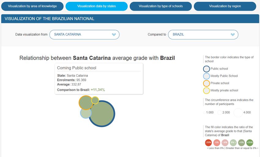
1 INTRODUCTION
         Based on the technological advances in data storage and retrieval there is a massive
increase in the information available to any type of user through a web browser. There is a
large volume of information available on the internet, but the data are irrelevant when there
is no meaning. In order to get the information, the data must be interpreted and related so
that they are presented within a context and allow the generation of knowledge. In this way,
developers have been paying special attention to data visualization. According to Freitas et
al. (2001), combining aspects of computer graphics, human-computer interaction and data
mining, the information visualization allows the presentation of data in a graphics form. In
that way, the users can apply their visual perception to better analyze and understand the
information.
         In general, the data do not have a direct, obvious and natural representation, which
contributes to the need of a good visual analysis technique. Such a technique in turn can use
visual representations to present the data in a graphics form (LUZZARDI, 2003). In addition,
according to Card et al. (1999) the use of visual representations of interactive data with the
support of the computer allows to increase the knowledge.
         The information visualization is ideal for exploratory data analysis. Human eyes are
naturally attracted to trends, patterns and exceptions that would be difficult to find using
traditional approaches such as tables or text (FEW, 2009). The information visualization
corresponds to the visual representation of abstract data to increase knowledge (SHIXIA et
al., 2014). For example, representation of temporal statistics on the numbers of healthy
children births, higher education entrance qualifications and exams, stock market trends,
and information associated with the use of social networks. In general, interactive visual
interfaces facilitate the process of expanding knowledge and assist in the strategy of
identifying patterns that are usually difficult to perceive.
         Nowadays there is an increase in the data volume from the most different sources, as
well as an increase in the open data made available by the Brazilian government (DADOS
ABERTOS, 2016) and other governments (MÁCHOVÁ, LNENICKA, 2017). Open data from
several areas can be found, such as Education, Health, Technology, Defense, Security,
Transportation, Traffic, Social Security, and Labor. With the data available in the
administrative, technical and financial sectors of business and government organizations,
there is a need for systems that allow performing data analysis. Further, the analysis results
make it possible to assist users in extracting the information needed for decision-making
process.
         The open data portals are in general responsible for making available open datasets
from the government. They also have to provide some type of support for the data life cycle
such as data discovery, cleaning, integration, processing and visualization. That technical
support is important because it will allow the publishers and the users to get involved in
activities to better use the data in a meaningful way. According to Máchová and Lnenicka
(2017), the functionality of the existing open data portals can be improved by providing
more advanced tools for data discovery, data visualization and user´s feedback. In the case of
data visualization, several types of visualization algorithms can be used to obtain simple
representations of the data using, for example, hierarchical maps, networks or charts to
provide a visual representation and an understanding to potential users about the dataset.
Therefore, based on an initial analysis of the visual representation the users can decide if the
dataset has the information they are looking for and from that point they decide if a more
detailed analysis is needed or not.
         This study aims to relate and explore a large educational open dataset through
information visualization techniques. For that, the database chosen was the microdata of the
Brazilian national high school exam (ENEM), which has more than 7 million lines. In order to
investigate the relevance of information visualization tools, the Web application entitled
VisDadosEnem has been developed so that the following research question can be answered:
interactive information visualization tools are relevant in relating and exploring educational
open data in a multidisciplinary context?
         The remainder of this paper is structured as follows. Section 2 describes the
methods used in this study, such as the data modeling based on the open data of the ENEM
exam and the techniques adopted for the visualization web application project. The
description of the data visualization Web application is presented in Section 3. Results are

                                                                                           125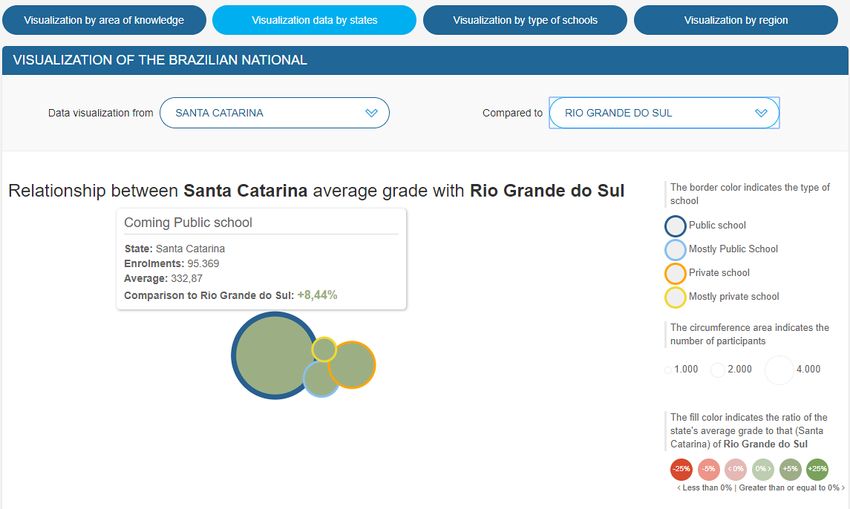
presented in Section 4. A discussion is presented in Section 5. And, Section 6 concludes the
paper and provides an overview of possible future work.
2 METHODS
         In the elaboration of this study an applied and technological research was adopted.
In order to obtain the data, the Brazilian Federal Government data portal was used, where
open data is available from the most diverse public areas. And, for the web application
project, were adopted technologies more adequate to the process of treatment and
visualization of the ENEM educational data.
         For the web application project, it was carried out the data modeling and the
interface design. For data modeling, the conceptual model (Figure 1) was first elaborated
based on entity-relationship diagrams. In order to do that, only one table was needed to
represent the candidates with their attributes for the ENEM exam. For that, it was included
the enrollment number of the candidate, the type of school attended, the state that resides,
the marks in the knowledge areas, and the candidate’s age based on the 2014 ENEM
microdata (INEP, 2014). In addition, the logical model for the identification of the primary
key, as well as the types and size of each attribute was elaborated. And, finally, for the
description of the physical model, the table containing its attributes was created. Regarding
the database, we chose MySQL© and for the Web application to be able to query the
database, the PHP© language was adopted.

Figure 1: Conceptual Data Model.
Source: Prepared by the authors.
         For the interface design, the conceptual design model, the prototype of the
conceptual model and the detailed design of the user interface were developed. For that, it
was taken into account functionalities associated to the data visualization methods to
explore an adequate visual analysis. In this way, technologies for developing web
applications such as HTML©, CSS© and Javascript© for the interface development were
adopted. For the data visualization, the D3© (Data Driven Documents) library (D3, 2017)
was used, which seeks to facilitate the understanding of the data by combining the
interaction with the information visualization techniques. Finally, we used the NVD3©
library (NVD3, 2017) that provides ready-made reusable graphics and graphic components
for D3© (BOSTOCK, OGIEVETSKY, HEER, 2011).
         Regarding the information visualization techniques, they can be based on graphics,
quantitative, hierarchical information, and number exploration. In addition, information
visualization techniques can be classified according to a given set of data (WARD,
GRINSTEIN, KEIN, 2015), such as: Multivariate data which do not usually have an explicit
spatial attribute (CAO et al., 2011, GENG et al., 2011); Hierarchies and Trees that contain
hierarchical characteristics and are considered a repository of data where there is a
relationship with data subitems (AFZAL et al., 2012, JENNY, 2012); Graphs and Networks
which are defined by their relationship characteristics based on graphs (ARCHAMBAULT et
al., 2011, BAUDEL et al., 2012); And, Text and Documents that are considered as being literal,
as a string, and defined by the set of objects as words, sentences, paragraphs, and documents
(ALSAKRAN et al., 2012, CUI et al., 2012).
         Based on the internal organization of the educational set of data, the information
visualization technique was chosen for visual representation of multivariate data. The

                                                                                          126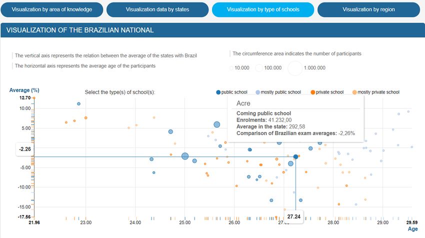
adopted technique is based on a combination of elements where we can make use, for
example, of circles, points, lines, and regions.
        From the definition of data modeling and visualization techniques one can begin to
incorporate the visualization pipeline into the application design. The visualization pipeline
steps are responsible for mapping the data to graphical elements which are displayed on the
output device (Figure 2).

Figure 2: Visualization pipeline for VisDadosEnem.
Source: Prepared by the authors.
         In the design of the visualization Web application, the data modeling assisted in the
transformation of data, that is, in the steps of identifying the raw data and the creation of the
table of data. Based on the organization of the data, the visualization techniques were
chosen. From that, the visualization technique assisted in the visual mapping and in the step
of representation the visual structures. And, finally, the visualization technique based on the
D3 library allowed performing the transformation of the visualization. Since information
visualization has features of presenting multiple views of the same dataset in an interactive
way, the visualization pipeline is also repeated in order to obtain multiple views of the
dataset. Those multiple views will be shown in the data visualization web application
section.
3 DATA VISUALIZATION WEB APPLICATION
         We chose to develop a simple visualization with an easy understanding, and based
on that, we decided to use bubbles (circles) for the visual representation. That type of
visualization technique is known as bubble maps. The circle is a popularly known flat
geometric figure, and, according to the variables to be displayed, the following properties
have been added: area, color, and border color.
         The circle area property is directly associated with the numeric value of the variable.
The circle size is proportional to the value associated with the variable, as shown in Figure 3.
In the case of VisDadosEnem, it indicates the number of candidates enrolled in the exam.

Figure 3: Circle area property.
Source: Prepared by the authors.
        The circle color property serves to classify the variable by intervals (Figure 4). The
color property can assume two characteristic colors, where one color represents the lowest
value and the other, the highest one. The interval between those values is represented by the
variation of the intensity of each color. Higher values (positives or negatives) will have a
more intense color tone. In the case of VisDadosEnem, it represents the comparison of the
percentage of the average grade of a particular school type within a state or in whole Brazil.

                                                                                            127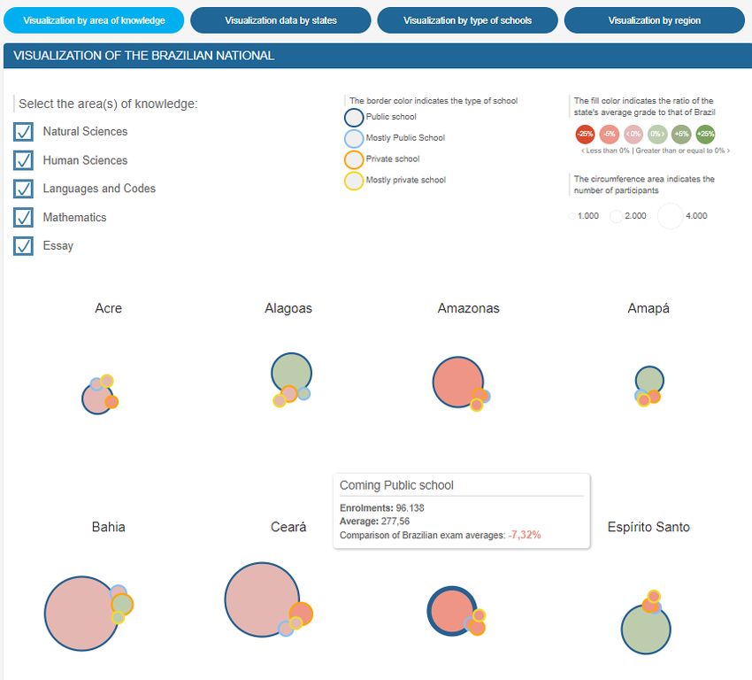
Figure 4: Circle color property.
Source: Prepared by the authors.
         And, the border color property classifies the type that the variable can assume
(Figure 5). Its color can vary according to the existing type, but it cannot be repeated in the
same set, due to its unicity. In the case of VisDadosEnem, it represents the type of school
(e.g., public, mostly public, private, and mostly private).

Figure 5: Border color property.
Source: Prepared by the authors.
         VisDadosEnem allows the visualization of the number of enrolments, the average
grades by state or region, and the average age of the candidates. It also allows a comparative
analysis of the averages obtained for each state or region by each type of school or area of
knowledge through interactive visualization techniques. The web application has the
following main functionalities: Visualization by area of knowledge, by data between states,
by types of schools, and by regions1.
         The visualization by area of knowledge1 allows visualizing the grades average
obtained in all the states for different types of school by area of knowledge. As shown in
Figure 6, the interface allows the user interactively select areas of knowledge for
visualization through a check box menu. Also, when mouse user moves the pointer over a
bubble of a particular state additional text information will be shown for the candidates of
the area of knowledge.

                                                                                           128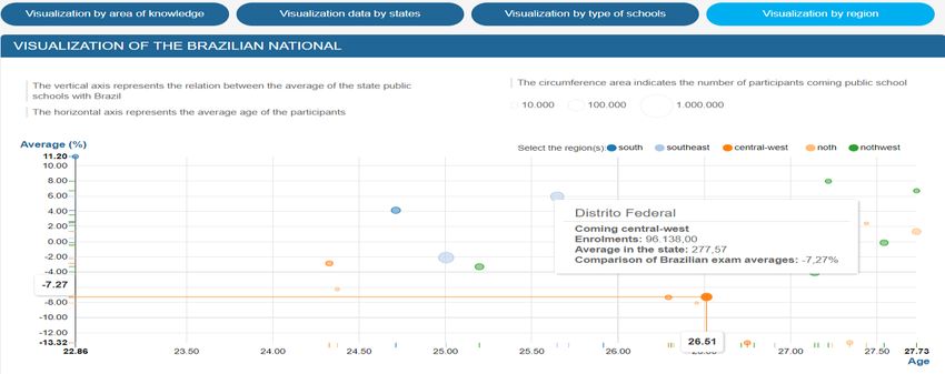
Figure 6: Visualization by area of knowledge. The states are shown in alphabetic order. In this case not
all the states are shown.
Source: Prepared by the authors.
        The visualization of data between states1 allows the comparison of grade averages
obtained from one state compared to another state or to Brazil. As shown in Figure 7, the
user can select which states wishes to compare from a list of states or if wants to compare a
particular state with the grade averages obtained in Brazil.

Figure 7: Visualization of data between states.
Source: Prepared by the authors.

1
    VisDadosEnem is available at: http://labdata.sites.ufsc.br/visdadosenem/en

                                                                                                   129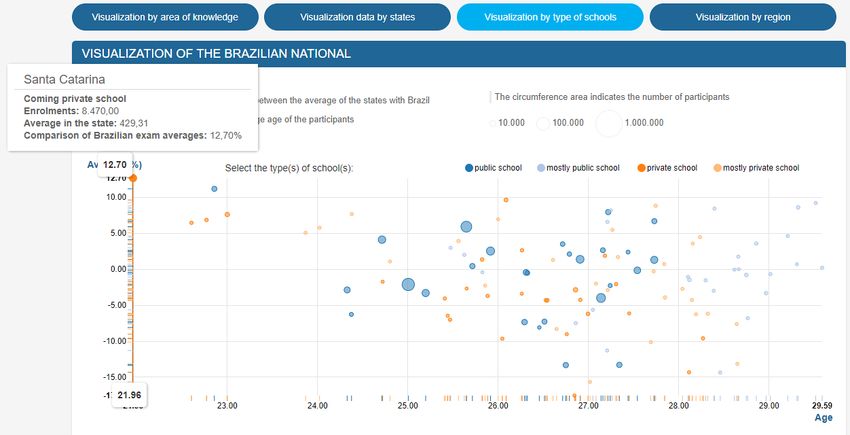
The visualization by type of schools1 allows to analyze comparatively the
performance of the types of school present in the states in function of the percentage of the
grades average with respect to Brazil and the average age of the candidates. The
visualization occurs through bubble maps organized in a 2D chart (Figure 8) where the
vertical axis represents the percentage of grades average for the different types of school and
the horizontal axis represents the average age of the candidates. Each state has a
representation for each of the four types of schools (i.e., blue circle - public school, blue light
- mostly public school, orange - private school, and light orange - mostly private school). The
circles for each type of school can be enabled or disabled. Also, when user moves the mouse
pointer over a bubble of a particular school additional text information will be shown for the
candidates of the state.

Figure 8: Visualization by type of schools.
Source: Prepared by the authors.
     And finally, the visualization by regions1 allows to analyze the performance of schools
by region. The visualization also occurs through bubble maps organized in a 2D chart (Figure
9) where the vertical axis represents the percentage of grades average for the regions of
Brazil and the horizontal axis represents the average age of the candidates. The states are
represented in the five regions in Brazil (i.e., blue circle - south, blue light – southeast, orange
– central-west, light orange – north and green – northeast). The circles for each type of
region can be enabled or disabled. Also, when user moves the mouse pointer over a bubble of
a state additional text information will be shown for the candidates of the state for the
particular region.

Figure 9: Visualization by regions.
Source: Prepared by the authors.

                                                                                               130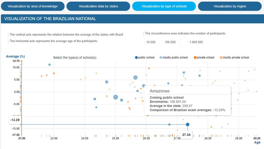
4 RESULTS
Through the performed analysis with the information visualization techniques, it was
possible to relate and explore the information available in VisDadosEnem.
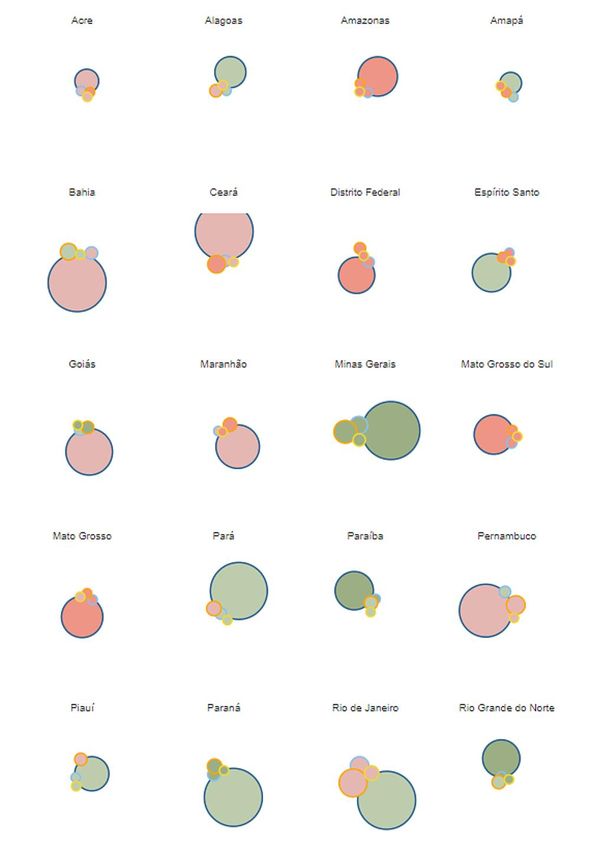
In the visualization feature by area of knowledge, it is possible to observe which states
in Brazil, with students coming from public or mostly public schools, obtained an average
grade higher than the national average compared to other states, as shown in Figure 10. That
is, according to the bubble maps visualization the states that are above average in the results
for public schools have circles, with the inner color in the green color variation and,
respectively, present the border color in the blue color variation. It means that students are
either in public schools (dark blue) or have attended mostly of the time in public schools
(light blue). In that case, the following states have presented an average grade higher than
the national average (Figure 10): Alagoas, Amapá, Espírito Santo, Goiás, Minas Gerais, Pará,
Paraíba, Piauí, Paraná, Rio de Janeiro, Rio Grande do Norte, Rio Grande do Sul (not shown),
Santa Catarina (not shown) and Sergipe (not shown).
Figure 10: Visualization by area of knowledge in Brazil.
Source: Prepared by the authors.
131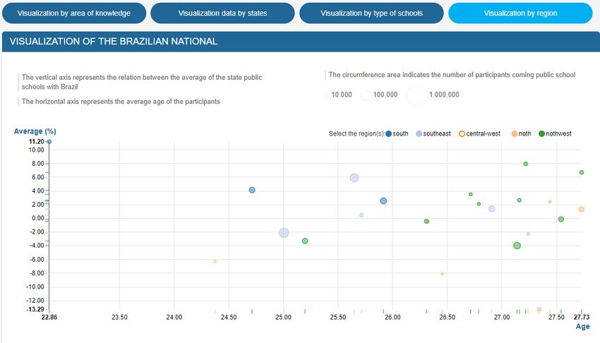
In the visualization of data between states it is possible an exploratory analysis of the
comparison of grade averages obtained from one state compared to another state or to
Brazil. For example, if the user wants to compare the state of Santa Catarina with the state of
Rio Grande do Sul it is possible to observe that the state of Santa Catarina (SC) has grade
averages higher for all the four types of schools compared to Rio Grande do Sul (RS). The
grade averages for the ENEM exam in 2014 for the public school in SC was 8. 44% above RS,
for the mostly public school in SC it was 6.52% above RS, for the private school in SC it was
17.76% above RS, and for the mostly private school in SC it was 12.74% above RS (Figure
11).

Figure 11: Visualization of the comparison of data between states.
Source: Prepared by the authors.
     In the visualization feature by type of schools (Figure 12), it is possible to observe, that
the state of Santa Catarina had the highest grade average regarding students from private
schools with 12.70% above the national average with the lowest average age of students
enrolled corresponding to 21.6 years old. And, also, for students from public schools with
11.20% above national grade averages with the average age corresponding to 22.8 years old.
On top of that, the lowest grade average regarding students from private schools was in the
state of Amazonas with 17.56% below national grade averages with the average age
corresponding to 26.8 years old (Figure 13). Also, for students from public schools, the state
of Mato Grosso do Sul obtained the lowest grade average with 13.32% below the national
average with the average age corresponding to 26.7 years old (not shown).

Figure 12: Exploratory analysis of the information of the highest grade average through visualization
by type of school.
Source: Prepared by the authors.

                                                                                                132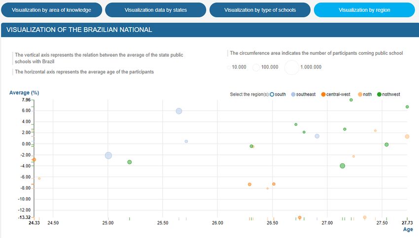
Figure 13: Exploratory analysis of the information of the lowest grade average through visualization
by type of school.
Source: Prepared by the authors.
      In the visualization feature by regions (Figure 14), it is possible to observe, that all the
states in the south of Brazil have grade average above the national average. Regarding the
other regions of Brazil, all the states of the southeast region have grade average above the
national average with the exception of the state of São Paulo. And, the states for the north
and northeast regions that have grade average above the national average are as follows: In
the north, the state of Amapá and Pará, and, in the northeast, the states of Alagoas, Rio
Grande do Norte, Sergipe, Paraíba, and Piauí. Also, it is possible to identify (Figure 15), that
all the states in the central-west region of Brazil have grade average below the national
average. And, the states for the north and northeast regions that have grade average below
the national average are as follows: In the north, the state of Acre, Amazonas, Rondônia,
Roraima and Tocantins, and, in the northeast, the states of Ceará, Bahia, Maranhão, and
Pernambuco.

Figure 14: Exploratory analysis of the information of the states that have average grades above the
national average by type of region.
Source: Prepared by the authors.

                                                                                               133
Figure 15: Exploratory analysis of the information of the states that have average grades below the
national average by type of region.
Source: Prepared by the authors.
5 DISCUSSION
It was shown how VisDadosEnem can be used to explore interactively multiple views of
the educational dataset, as described in Section 4. That functionality was possible through
the combination of information visualization techniques with appropriate graphical user
interface (GUI) controls to allow the end user to explore the educational open data in a
multidisciplinary context.
By using the GUI controls, in the visualization feature by area of knowledge different
areas can be set to interactively adjust the displayed bubble maps by state to only show
comparison of the Brazilian exam averages whose areas of knowledge are within the
selected group (Figure 10). Also, based on the inner color of each bubble map is possible to
identify which types of school of a given state are above or below the national grade average.
In the visualization feature by state, the GUI controls can be used to interactively select the
states that will be part of the comparison of average grades for the different type of schools
(Figure 11). In the visualization feature by type of schools, the GUI controls can be set to
interactively select the type of school for the target data exploration and to investigate in an
intuitive way which states associated with the types of schools are above or below of the
grades average with respect to Brazil (Figures 12 and 13). And, finally, in the visualization
feature by type of regions, the GUI controls can be selected to interactively adjust the region
of interest to visually identify which regions are above or below of the grades average with
respect to Brazil (Figures 14 and 15). In this way, it is possible to identify, considering the
grade average for all different types of school, the performance of the candidates of a
particular region of Brazil in the ENEM exam.
In that sense, VisDadosEnem was able to improve the existing functionality available in
open data portals by providing a tool for data discovering that facilitates the process of
expanding knowledge and to assist in the strategy to identify patterns in the open
educational data.
6 CONCLUSION
Although VisDadosEnem presents a set of basic functionalities for information
visualization, the use of the visualization features made possible comparative analysis in the
ENEM open dataset in order to relate and explore educational information. That type of
exploratory analysis of information would be difficult to perform through tables or
traditional graphics. In this way, with a simple information visualization environment, one
can see the relevance of a visualization tool for visual data exploration in a large volume of
data.
134All the four ways to explore the data visualization presented in this paper (i.e.,
visualization by area of knowledge, visualization of data between states, visualization by
type of schools, and visualization by regions) of the ENEM microdata (INEP, 2014) are
related and through the interaction process they complement each other. That shows the
importance to take into account the visualization pipeline during the design of the interface
in order to obtain multiple visions that have meaning during the visual exploratory analysis
of the information.
In addition, the study provided an online tool of public utility, which can be easily
accessed and used for different types of visual analysis. It may be of interest to educational
bodies, which can analyze results related to different types of schools, states, and regions. In
this way, it can contribute to decision making process based on the information identified
through the information visualization techniques.
In terms of future work, the educational open data used for the information
visualization can be adapted in different scenarios. For example, it can be used to perform
statistical studies, and to evaluate the quality of the public school in comparison to the
private school in relation to the average grades obtained. Besides that, it is possible to
identify which Brazilian states have a better or worse performance in the ENEM. Finally, as
future work it would be interesting to extend the functionality of VisDadosEnem to allow the
automatic insertion of updated ENEM data. In this way, as the data become available in the
open data portal, it would be possible to perform temporal analysis as well a performance
comparison between schools or states over time.
It would be also interesting to investigate the user experience when using the data
visualization web application. In order to measure the quality of the user interaction with the
interface, usability tests could be performed through satisfaction questionnaires.
REFERENCES
AFZAL, S. et al. Spatial text visualization using automatic typographic maps. IEEE Transactions on
Visualization and Computer Graphics, v. 18, n. 12, p. 2556–2564, 2012. Available at: <
https://ieeexplore.ieee.org/document/6327261/>. Accessed: 17 May. 2018.
ALSAKRAN, J. et al. Real-time visualization of streaming text with a force-based dynamic system. IEEE
Computer Graphics Applications, v. 32, n. 1, p. 34–45, 2012. Available at: <
https://ieeexplore.ieee.org/abstract/document/6051408/>. Accessed: 17 May. 2018.
ARCHAMBAULT, D., PURCHASE, H. C., PINAUD, B. Animation, small multiples, and the effect of mental
map preservation in dynamic graphs. IEEE Transactions on Visualization and Computer Graphics,
v. 17, n. 4, p. 539–552, 2011. Available at:
. Accessed: 17 May. 2018.
BAUDEL, T., BROEKSEMA, B. Capturing the design space of sequential space-filling layouts. IEEE
Transactions on Visualization and Computer Graphics, v. 18, n. 12, p. 2593–2602, 2012. Available
at: . Accessed: 17 May. 2018.
BOSTOCK, M., OGIEVETSKY, V., HEER, J. D3 data-driven documents. IEEE Transactions on
Visualization and Computer Graphics, v. 17, n. 12, p. 2301–2309, 2011. Available at:
. Accessed: 17 May. 2018.
CAO, N. et al. DICON: Interactive visual analysis of multidimensional clusters. IEEE Transactions on
Visualization and Computer Graphics, v. 17, n. 12, p. 2581-2590, 2011. Available at: <
https://ieeexplore.ieee.org/abstract/document/6065026/>. Accessed: 17 May. 2018.
CARD, S. K., MACKINLAY, J. D., SHNEIDERMAN, B. Readings in Information Visualization, using
vision to think. San Francisco (USA): Morgan Kaufmann, 1999. Available at:
. Accessed: 17 May. 2018.
CUI, W. et al. Textflow: towards better understanding of evolving topics in text. IEEE Transactions on
Visualization and Computer Graphics, v. 17, n. 12, p. 2412–2421, 2011. Available at: <
https://ieeexplore.ieee.org/abstract/document/6065008/>. Accessed: 17 May. 2018.
DADOS ABERTOS. Portal Brasileiro de Dados Abertos. Available at: .
Accessed: 22 Jul. 2017.
D3. Data-Driven Documents. Available at: . Accessed: 22 Jul. 2017.
135FEW, S. Now you see it: simple visualization techniques for quantitative analysis. El Dorado
(USA): Analytics Press, 2009. Available at: . Accessed:
17 May. 2018.
FREITAS, C. M. D. S. et al. Suporte às tarefas da análise exploratória visual. Revista de Informática
Teórica e Aplicada, v. 8, n.2, p. 143-158, 2001. Available at:
. Accessed: 17 May. 2018.
GENG, Z. et al. Angular histograms: frequency-based visualizations for large, high dimensional data.
IEEE Transactions on Visualization and Computer Graphics, v. 17, n. 12, p. 2572–2580, 2011.
Available at: . Accessed: 17 May. 2018.
INSTITUTO NACIONAL DE ESTUDOS E PESQUISAS EDUCACIONAIS ANÍSIO TEIXEIRA. Microdados do
Enem 2014. Available at: . Accessed: 10 Dec. 2017.
JENNY, B. Adaptive composite map projections. IEEE Transactions on Visualization and Computer
Graphics, v. 18, n. 12, p. 2575–2582, 2012. Available at: <
https://ieeexplore.ieee.org/abstract/document/6327263/>. Accessed: 17 May. 2018.
LUZZARDI, P. R. G. Critérios de Avaliação de Técnicas de Visualização de Informações
Hierárquicas. Tese (Doutorado em Ciência da Computação) - Programa de Pós-Graduação em
Computação, Universidade Federal do Rio Grande do Sul, Porto Alegre, 2003. Available at: <
http://www.lume.ufrgs.br/handle/10183/4764>. Accessed: 17 May. 2018.
MÁCHOVÁ, R., LNENICKA, M. Evaluating the Quality of Open Data Portals on the National Level. Journal
of Theoretical and Applied Electronic Commerce Research, v. 12, n. 1, p. 21-41, 2017. Available at:
. Accessed:
17 May. 2018.
NVD3. Re-usable Charts for D3. Available at: . Accessed: 22 Jul. 2017.
SHIXIA, L. et al. A survey on information visualization: recent advances and challenges. The Visual
Computer, v. 30, n. 12, p. 1373-1393, 2014. Available at: <
https://link.springer.com/article/10.1007/s00371-013-0892-3 >. Accessed: 17 May. 2018.
WARD, M., GRINSTEIN, G., KEIN, D. Interactive data visualization: foundations, techniques, and
applications. Natick (USA): CRC Press, 2015. Available at:
. Accessed: 17 May. 2018.
Editores do artigo: Enrique Muriel-Torrado, Edgar Bisset Alvarez, Camila Barros.
136You can also read