DEPARTMENT OF INFORMATICS - 3D Dataflow Visualization for web-based Graph Editors Paul Pillau - TUM Wiki
←
→
Page content transcription
If your browser does not render page correctly, please read the page content below
DEPARTMENT OF INFORMATICS
          TECHNISCHE UNIVERSITÄT MÜNCHEN

  Bachelor’s Thesis in Informatics: Games Engineering

3D Dataflow Visualization for web-based
            Graph Editors

                     Paul Pillau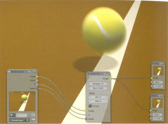
DEPARTMENT OF INFORMATICS
          TECHNISCHE UNIVERSITÄT MÜNCHEN

  Bachelor’s Thesis in Informatics: Games Engineering

3D Dataflow Visualization for web-based
            Graph Editors

   3D Datenfluss Visualisierung für
     webbasierte Graph Editoren

         Author:            Paul Pillau
         Supervisor:        Prof. Gudrun Klinker, Ph.D.
         Advisor:           Sandro Weber, M.Sc.
         Submission Date:   April 15, 2020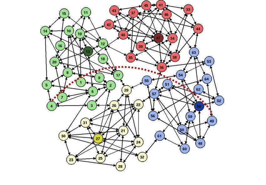
I confirm that this bachelor’s thesis in informatics: games engineering is my own work
and I have documented all sources and material used.

Munich, April 15, 2020                               Paul Pillau
Acknowledgments

At first, I would like to thank my supervisor Prof. Gudrun Klinker for providing me
the possibility to write my bachelor’s thesis at the Chair for Computer Aided Medical
Procedures & Augmented Reality.
Special thanks go to my advisor Sandro Weber for supporting me constantly during
my work and always giving me sincere and helpful feedback.
He also helped out by giving me expert feedback to replace the projected user study,
which was not realizable in times of social distancing and closed universities during
the Corona crisis.
At last I want to thank my parents for having endured and fed me through these
challenging times.
Abstract

With rapid speed the internet is becoming increasingly more complex in recent years,
as is the data created, shared, moved and accumulated within it. Analyzing and
understanding the flow of data in various scenarios is already a vital part of devel-
opment in many areas of IT. This thesis explores the usability principles of designing
and displaying a 3D data flow graph by developing a respective three-dimensional
visualizer. The goal is to use the third dimension to improve otherwise mostly flat flow
charts, thus enhancing the understanding of underlying processes.

                                          iv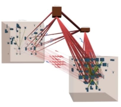
Contents

Acknowledgments                                                                                                                                  iii

Abstract                                                                                                                                         iv

1   Introduction                                                                                                                                  1
    1.1 Overview . . . . . . . . . . . . . . . . . . . . . . . . . . . . . . . . . . . . .                                                        1
    1.2 Problem Statement . . . . . . . . . . . . . . . . . . . . . . . . . . . . . . .                                                           2
    1.3 Goal . . . . . . . . . . . . . . . . . . . . . . . . . . . . . . . . . . . . . . . .                                                      3

2   Related Work                                                                                                                                  4
    2.1 Blender Compositor . . . . . . .             .   .   .   .   .   .   .   .   .   .   .   .   .   .   .   .   .   .   .   .   .   .   .    4
    2.2 Graphviz . . . . . . . . . . . . . .         .   .   .   .   .   .   .   .   .   .   .   .   .   .   .   .   .   .   .   .   .   .   .    5
    2.3 force-graph and three-forcegraph             .   .   .   .   .   .   .   .   .   .   .   .   .   .   .   .   .   .   .   .   .   .   .    6
    2.4 NV3D . . . . . . . . . . . . . . . .         .   .   .   .   .   .   .   .   .   .   .   .   .   .   .   .   .   .   .   .   .   .   .    7
    2.5 D3.js . . . . . . . . . . . . . . . . .      .   .   .   .   .   .   .   .   .   .   .   .   .   .   .   .   .   .   .   .   .   .   .    8
    2.6 RAWGraphs . . . . . . . . . . . .            .   .   .   .   .   .   .   .   .   .   .   .   .   .   .   .   .   .   .   .   .   .   .    8

3   Implementation                                                                                                                               10
    3.1 The Visualizer . . . . . . . . .     .   .   .   .   .   .   .   .   .   .   .   .   .   .   .   .   .   .   .   .   .   .   .   .   .   10
    3.2 Integration with Ubi-Interact        .   .   .   .   .   .   .   .   .   .   .   .   .   .   .   .   .   .   .   .   .   .   .   .   .   13
    3.3 Technology . . . . . . . . . . .     .   .   .   .   .   .   .   .   .   .   .   .   .   .   .   .   .   .   .   .   .   .   .   .   .   15
    3.4 Abstract design approach . .         .   .   .   .   .   .   .   .   .   .   .   .   .   .   .   .   .   .   .   .   .   .   .   .   .   15

4   Visualization                                                                                                                                17
    4.1 What is dataflow? . . . . . . . . . . . . . . . . . . . . . . . . . . . . . . . .                                                        17
    4.2 Moving from 2D to 3D . . . . . . . . . . . . . . . . . . . . . . . . . . . . .                                                           20
    4.3 Interaction design . . . . . . . . . . . . . . . . . . . . . . . . . . . . . . . .                                                       21

                                                     v
Contents
4.4 Spatial visualization ability . . . . . . . . . . . . . . . . . . . . . . . . . . 24
4.5 Structured graph drawing . . . . . . . . . . . . . . . . . . . . . . . . . . . 25
4.6 Navigating and zooming in 3D . . . . . . . . . . . . . . . . . . . . . . . . 28
4.7 Force directed graphs . . . . . . . . . . . . . . . . . . . . . . . . . . . . . . 30
5 Expert Feedback 32
5.1 Current circumstances . . . . . . . . . . . . . . . . . . . . . . . . . . . . . 32
5.2 Feedback . . . . . . . . . . . . . . . . . . . . . . . . . . . . . . . . . . . . . 32
5.3 Reflection . . . . . . . . . . . . . . . . . . . . . . . . . . . . . . . . . . . . . 33
6 Future Work 34
6.1 Adding new functionality . . . . . . . . . . . . . . . . . . . . . . . . . . . 34
6.2 Fine tuning and extending features . . . . . . . . . . . . . . . . . . . . . . 34
6.3 Moving from a visualizer to an editor . . . . . . . . . . . . . . . . . . . . 35
7 Conclusion 36
List of Figures 37
Bibliography 38
vi1 Introduction
1.1 Overview
The amount of annually generated digital data is expected to reach an all-time high of
175 Zettabyte in 2025, which is equivalent to 175 billion one Terabyte hard drives. [1]
With these amounts of data there is not only a general focus on how to generate more
of it, but above all on understanding it. Only by analyzing and drawing conclusions
out of it, information gets value. The process of understanding often is accompanied
by visually shaping the data in a form that makes it more expressive. This can be a
table, a curve of a mathematical function, any kind of chart or a so-called graph, which
in discrete mathematics is a visual collection of points and lines, also called vertices
and edges or arcs. The graph, because of its versatility, is a suitable representation for
many real-world applications.
Graphs can be modeled onto a wide variety of problems in different scientific areas,
for example in chemistry, where they can represent chemical structures e.g. the
atoms and atomic bonds in between them as points and lines. [2] They can be used
to show electrical circuitry e.g. a connection of resistors. [3, p. 42] Graphs can
represent hierarchical structures or wide-spreading networks of any type. There is also
a particular form of a graph, one that is completely connected and does not have cycles
in it, called a tree. A tree is of special interest in the field of computer science, where
it can be used for example to model sorting mechanisms or traversing algorithms in
general and to depict data structures like a decision tree. [4, p. 63]
All these aforementioned examples provide a good impression of the importance that a
graph has and how many possible use cases there are. But the question arises if there
may be a way to improve upon the concept of a flat, two-dimensional graph drawing.
11 Introduction
1.2 Problem Statement
With regard to large amounts of data, a graph depiction can quickly lead to confusing
and cluttered visualizations. This makes it hard to analyze and draw meaning out of
the underlying information. Of special interest is the so-called directed graph, which
means edges have a direction that forbids travelling along the opposite way. This
opens a new set of problems. A person analyzing the graph now has to not only get
an overview of the structure itself but has to understand the paths in the graph via
traversing along the directed edges. Harel [5, p. 233] describes this as the "exponential
blow up problem" because after a certain order of magnitude a graph basically gets
unmanageable and chaotic if not handled by a well-structured visualization.
Figure 1.1: A directed graph with a lot of nodes. Even though it is grouped by color
coding and clustering, it is still difficult to follow individual paths. Source: [6, p. 7]
21 Introduction
1.3 Goal
The main goal of this thesis is to research how to tackle the above-mentioned problem
statement which a space restricted ordinary graph drawing inherently faces with large
sets of data. Simultaneously these findings will be incorporated into a web-based
visualizer to evaluate them and lay the foundation for what could be a full-fledged
data flow analyzing tool and graph editor that can manipulate the underlying datasets.
32 Related Work
2.1 Blender Compositor
The Compositor is at tool inside the free open-source 3D modelling and rendering
software Blender. It is used to describe and manipulate the processing pipeline of
the calculated 3D image before the actual render. Typical operations could be color
correction, distorting images or applying different filters like blurring or sharpening.
In the Compositor these operations are depicted as nodes, which are 2D Boxes that can
have small dots on either side, which symbolize the inputs and outputs of an operation.
By connecting several of these, a chain of operations can be formed, where the output of
one may be used as the input of another process, therefore transforming the unpolished
image information from the 3D scene into the finished render. [7, p. 284]
Figure 2.1: A collection of nodes in the Compositor that add a motion blur effect to the
image, which is displayed in the background. Source: [7, p. 290]
42 Related Work
Basically the Compositor is an editor that generally visualizes a unidirectional flow,
meaning although a path can split up and rejoin later on, it does not return to an
already visited node. [8, p. 467] This paired with the fact that the input connec-
tors are located on the left and the output connectors on the right edge of a box
node gives the visualization an internal structure because it has an overarching
reading direction from left to right. It can be seen
as a form of loosely ordered timeline where a
reader can easily step through the different stages
of the flow of image data during processing.
What gives the Compositor adjustability is the fact
that nodes can be moved around freely without
restrictions and can be adjusted in size or fully
collapsed. All these are merely aesthetic actions
and have no influence on the data flow itself. [7,
p. 284] They give the user the ability to person-
ally structure the graph without automatic layout
restrictions by the program.
2.2 Graphviz
Figure 2.2: A node with various
Graphviz is an open source 2D graph and network
interactive elements for changing
visualization software that focuses on automati-
the outcome of the operation, in
cally generating a layout. It encompasses hierar-
this case blurring. Source: [9]
chical drawings called "dot", force directed node
placement methods called "neato" and "fdp" and
also the possibility of arranging a graph radially and as multiple circles. [10] The "dot"
layout is of special interest to this thesis because it was designed with the "natural
’flow’" [11, p. 1] of directed graphs in mind. This means the drawing algorithm is given
a direction in which the edges should always point to, therefore aligning the whole
graph that way. [12, p. 17]
The software itself is designed with an automation approach in mind, meaning it
52 Related Work
is not intended to be used as an interactive tool e.g. giving the user the ability to
manually manipulate the outputted graph. That becomes apparent when looking
at the workflow of Graphviz. It uses a descriptive text structure called the "DOT
language", which describes all of the input data, all the surface drawing features
and all the settings for the layout algorithms. [12,
pp. 3–32] It is therefore meant as a one-way func-
tioning visualizer and not as an editor that lets the
user make changes to the displayed information.
Instead Graphviz has a lot of aesthetic customiz-
ability options that work separately from the se-
mantic layouting. The displayed shape of the
vertices can be changed, as well as their color,
width and height, the hover tooltip an much more.
Same goes for the edges, which for example can
be drawn as spline curves as well as direct lines.
[11, pp. 4–5] All this makes the output of the visu-
alization as personalized as possible while simul-
taneously maintaining the internal data flow by
applying structured layouts.
Figure 2.3: A directed Graph
2.3 force-graph drawn via Graphviz with various
node shapes and grouping boxes
and three-forcegraph
called clusters. Source: [13]
The force-graph [14] package is an open source
JavaScript library initially developed by Vasco Asturiano. It can be used to display data
structured as nodes and links to describe the vertices and their relations. It utilises
the HTML5 canvas element for drawing. Its three-dimensional variant called three-
forcegraph [15] by the same author additionally takes advantage of the 3D rendering
engine three.js, which in turn is the technology the visualizer of this thesis is using as
described in Section 3.3.
The approach for node placement that both the two-dimensional and three-dimensional
62 Related Work
variant are using is a force-directed or often also called spring-loaded layout. It works
by treating the nodes as physical objects that are linked by acting forces. [16, p. 1] This
concept is further explored in Section 4.7.
What makes these two github1 hosted packages for graph drawing stand out is the fact
that although they provide automatic layouting via force-direction, the layout can still
be influenced dynamically by the user. Dragging and dropping a node does not only
changes its placement, but also continuously reevaluates the force layout so that the
rest of the graph gets appropriately influenced by the acting forces of the dragging
motion.
2.4 NV3D
NV3D is a system for visualizing graphs in three dimensions, with the underlying data
being the code of large computer programs. The focus here lies on nested structures
where nodes themselves can also represent smaller three-dimensional subgraphs. The
idea behind NV3D is to maximize screen space by incorporating small-scale and large-
scale structures into a single visualization effectively. For that is has to be designed with
dynamic navigation and flexible controls in mind, as is further explained in Section 4.6.
An important feature of NV3D is the approach to "Semiotics", which signifies how
information is represented through symbols. NV3D goes well beyond giving every
node a single homogeneous appearance. Instead, it treats them as distinct physical
objects that can vary in form, size, scale and color. In this case, that means representing
blocks of codes individually. [17]
1 GitHubis a software development and hosting platform that integrates with the version-control system
Git. Website: www.github.com
72 Related Work
Figure 2.4: A visualization with NV3D of six million lines of code. The outer-most
boxes are grouping sections. The inner boxes represent code passages. Source: [17]
2.5 D3.js
D3.js is a JavaScript visualization library that works on the Document Object Model
(DOM), which is the internal structure of a web page. It does not use the HTML’s
canvas element like three.js does to allow for external styling of the visualizations,
but rather uses the open structure of the DOM for that purpose. D3.js has a very
generalized and personalizable structure that makes it possible to depict almost any
kind of data. D3.js is one of the go-to standards for web-based visualizations. [18]
2.6 RAWGraphs
RAWGraphs is an open source web application that allows for an easy and streamlined
process to design and visualize many kinds of charts and diagrams. The motivation
is to make graph visualization possible without the need for technical skills, which
82 Related Work
is a huge problem for many specialized tools that have a steep learning curve. The
actual visualization is done via the previously mentioned D3.js, but with another
abstraction layer in between. This makes it possible to design any type of graph that
can be encapsulated for later reuse. Instead of having to implement directly with D3.js,
RAWGraphs offers a completely dynamic UI that enables a user to create charts and
diagrams indirectly. [19]
93 Implementation
3.1 The Visualizer
The visualizer that is built with this thesis is split into three components.
• The Sidebar on the left of the window manages all content related functionality.
It shows all available datasets. These can either be imported ones or in the case of
the Ubi-Interact integration, active sessions. The Sidebar also shows a list of all
nodes which the active dataset contains. There is also a Node Inspector section
which shows all available data of a selected node, which includes the name, a list
of all tags, a list of all associated hyperlinks and all the custom data than can be
added in a node‘s data property in the visualizer’s internal JSON Format.
• The Settings Container manages all the control elements that change and modify
the graph and all of its aesthetic properties that can be personalized by the user.
Aesthetic features in the Layered Graph include the option to show all layers
permanently instead of only when hovering over a node on that layer. A user can
also restrict the area of a layer to the space that its nodes actually take up to free
some space in the scene if it becomes too cluttered. There is also the possibility
to move a node freely on a layer instead of a grid. Both the Layered Graph and
the Grouped Graph have an optional marker that shows the zero point of the
coordinate system for reference. The Settings Container also contains the control
element to switch between the different...
– graphs, for example the Layered Graph.
– variants of a graph, like the Steps mode of the Layered Graph.
103 Implementation
– version of one variant, like the starting node selection of the Steps Mode.
These will be explained in full detail later on.
• The Graph View which contains the actual graphical representation of the dataset.
The visualizer at the time of this thesis comprises four types of graphs. The Layered
Graph in turn has four variants to choose from. Both of the Force-Graphs have been
added to incorporate two common and widespread methods for graph drawing and
are meant to work as a comparison to the two experimental layouts of the Layered and
the Grouped Graph.
• The 2D Force-Graph is a two-dimensional force directed graph. It uses the 2D
variant of the force-graph JavaScript library that is described in Section 2.3.
• The 3D Force-Graph is a three-dimensional force directed graph. It uses the 3D
variant of the three-forcegraph JavaScript library that is described in Section 2.3
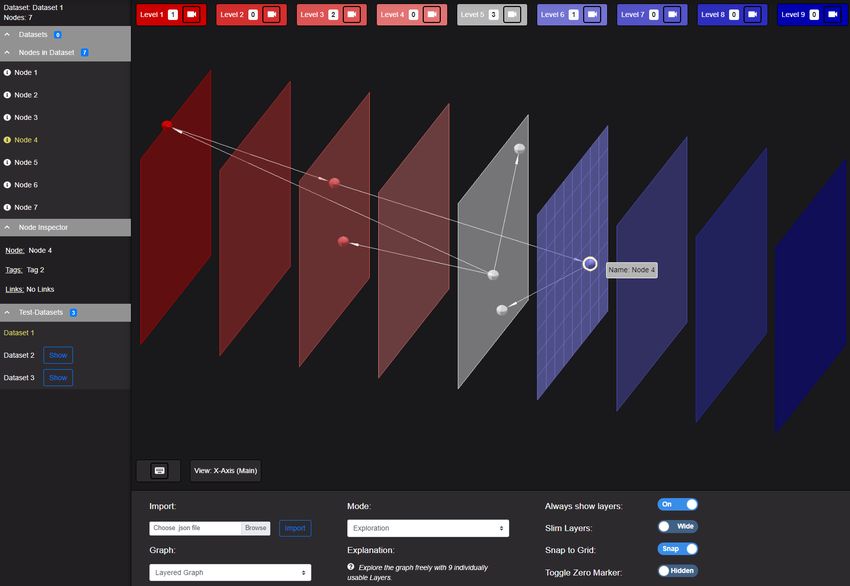
• The concept behind the Layered Graph is that dimensional planes, in this context
called layers, which span on the x and y axes, are being placed next to each other
along the z axis. The concept is similar to the one described by Reiss in Section
4.2. There are currently four versions that use these layers in different ways:
– The Exploration Mode provides 9 layers that the user can manually and
individually fill with nodes. He can therefore create his own personalized
arrangement of the graph. It is meant to give the user the possibility to
explore the graph and get an overview before analyzing in detail via different
visualizations.
– The Tags Mode can be used to sort all the nodes on different layers by
their previously assigned tags, which are just words that can be used for
classifying nodes. The idea is to enable the user to import a categorization
of the dataset that has already been done beforehand.
– The Degree Mode describes the degree of a node, meaning how many edges
connect to it. This can be helpful if a user wants to analyze the inputs
and outputs of a node. The visualization can be sorted by the number of
113 Implementation
incoming or outgoing edges as well as a combination of both.
– The Steps Mode makes it possible to structure the graph, beginning at
some starting node, by how far away all the other nodes are from it. Every
transition from one node to the next is counted as one step and gets assigned
a separate layer depending on how many steps have been done from the
beginning on. This mode is meant to give a sense of the reachability of nodes
in relation to a fixed point.
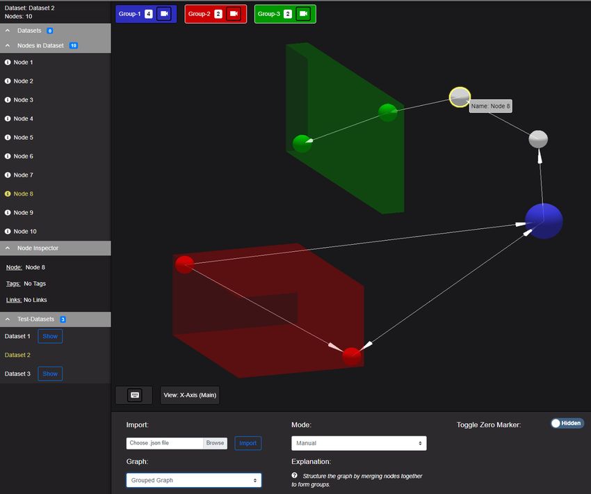
• The Grouped Graph can be used to merge multiple nodes into a singular one,
effectively creating a group around them.
As the title of this thesis suggests, this visualizer is designed to be part of a fully
functioning data flow visualization tool and graph editor in the future. This thesis is
limited to the visualization itself, meaning the visualizer will not yet feature the ability
to actually modify the structure of the graph, but rather only the layout and aesthetics
of it. It is meant to be a research tool that can also help to understand how to maximize
the potential of 3D visualizations in general.
Figure 3.1: The Layered Graph. Layers are positioned along the z axis. Labels on the
top list all 9 layers of the Exploration Mode.
123 Implementation
Figure 3.2: The Grouped Graph. Three groups have been created. Group-2 and Group-3
are currently open, Group-1 is closed.
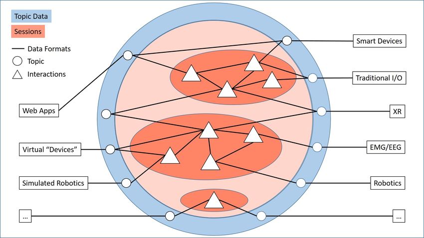
3.2 Integration with Ubi-Interact
Ubi-Interact is a flexible networking framework for creating real-time applications. Its
design philosophy comprises the ability to connect clients of whatever manifestation
together under the context of reactive shared-environment applications. These clients
can be any hardware devices like smartphones, virtual reality headsets, input/output
peripherals, sensors, robotics parts and any software, web app, platform or operating
system. The server-side is built on the foundation of "sessions" which are groups of
133 Implementation
processes, so-called "interactions". An interaction can be any kind of atomic process
or function that receives and outputs data inside the network. The exchange of
information works via so called "data topics", which are individual storage pools for
data that "interactions" and clients can use to concurrently deposit and gather data
depending on predefined formats. This makes for a very scalable system with a high
degree of reusability in regard to "interactions" and a high degree of exchangability in
regard to clients of any kind. [20]
As can be seen in Figure 3.3, the underlying graph-like structure of the network behind
Ubi-Interact is quite apparent. The system of interconnected "interactions" can be
implicitly translated into a directed graph, which in turn is how the visualizer of this
thesis is going to integrate with Ubi-Interact. While the visualizer internally uses a
JSON format to describe a graph where an array of link objects connects nodes by their
id, Ubi-Interact maps an "interaction’s" inputs and outputs in specified data formats to
"topics". Therefore, an implicit link is formed by outputting onto a "topic" in a format
that matches another "interaction’s" or device’s input.
Figure 3.3: An overview of Ubi-Interact.
143 Implementation
3.3 Technology
The visualizer that accompanies this thesis is written and developed in JavaScript,
which is a client-side scripting language that enhances the functionality of HTML on
a web page. [21, p. 21] It is object-oriented [22, p. 4] and utilizes classes as well as
prototypes, which is just a different approach to the inheritance and attribute sharing
behavior of classes. [22, pp. 6–7]
This applications uses Vue.js, which is a JavaScript framework specifically designed
for creating user interfaces. It takes advantage of the concept of abstraction with the
introduction of components, which are reusable containers that merge HTML and
JavaScript functionality together to enforce a well-constructed software architecture
and reduce overhead in large applications. [23] In the case of this project that means
there is a dedicated visualization component located on the right that is split from
the sidebar. The sidebar is comprised of collapsible containers which in turn contain
listing elements. Vue.js also provides functionality to have the sidebar and graphics
components communicate with each other, for example in the event of a settings-change
user input.
The visualization itself is done via three.js, a JavaScript library for three-dimensional
rendering. [24] The library uses the WebGL API for creating 3D graphics, which can
access the dedicated graphics processor on a computer. [25] The rendering integrates
into the HTML document with the Element, which in turn is part of the
previously mentioned Vue.js structure. [26]
3.4 Abstract design approach
The visualizer is implemented and designed in a way that allows for easy addition of
new graph types and modes. The generalized structured makes it possible for example
to expand the Layered Graph with a new kind of sorting by extending from the
Layered Graph scene class. The basic functionality of the instantiation of any Layered
or Grouped Graph is always the same. The developer can decide how to use that
functionality during the implementation. The Visualization Manager is the overarching
153 Implementation
structure that manages all scenes of all different graph types and variations. Expanding
visualization features is therefore possible by accessing one central, generalized point
in the code base. The visualizer as such is designed as a npm1 package, this way it can
be easily transferred to a totally different environment and serve other use cases.
1 npmstands for "Node Package Manager". It is a code repository that enables developers to share open
source code packages and libraries with anyone. Website: www.docs.npmjs.com/about-npm/
164 Visualization
Figure 4.1: The three.js coordinate system with the camera’s/screen’s point of view at
the initial position on the z axis. Source: [27]
For any description with a spatial context, this thesis will refer to the coordinate system
that three.js uses, with the z axis being orthogonal to the screen and the x and y axes
representing horizontal and vertical direction from the initial camera’s point of view.
4.1 What is dataflow?
Dataflow is a very broad term. It is often related to "system design" [28, p. 1] and
applicative programming. This means that the software is designed as data being
passed from one individual process or function to another, effectively creating a flow in
between them. This is can be directly transferred onto the already mentioned concept
of a directed graph where the functions are represented by nodes and the input-output
174 Visualization
data connection is modeled by the directed arcs connecting them. A programming
language that is explicitly designed and described as a graph falls under the category of
"graphical dataflow programming" [29, p. 2]. These models have to be understood in the
context of concurrency, which means nodes that are not linked can work independently
from each other. In a graph this can be seen as a path that splits in two, with both
functioning separately. If on the other hand for example node A has a direct edge
to node B, that means node B is dependent on A and cannot work without it. [30,
pp. 26–27].
Another way to use directed graphs is as state charts. UML (Unified Modelling
Language) is a widespread notation for many kinds of models. It describes a state chart
as a representation of a system while the nodes substitute for different states inside
it. A directed edge between two nodes thus becomes a state transition, making the
diagram a model of the dynamic flow inside the system. A label on an edge could
describe, in its most basic form, an event that triggers the transition from one state into
another. [31, pp. 293–295]
Graphical programming can be understood on an even deeper level. A graph can
be seen as a hierarchy, a so-called "graph-valued" node therefore may serve as a
representation of another directed graph entirely. This can be a subroutine that is
generalized as one node for simplicity purposes. If the program shall be displayed in its
entirety, the placeholder objects can be replaced by their respective subgraphs, which
is often called a "macroexpansion". This also means that ingoing and outgoing edges
of a node can be seen as entering and leaving the encapsulated subgraph it depicts.
This way a graph can be built iteratively from top to bottom. The technique also works
bottom-up, meaning that a function can be added to another node as a value. This
so-called "apply node" is replaced by the graph of the function, it’s original ingoing
and outgoing edges added respectively. [30, pp. 31, 33].
To relate these techniques to a state model, "Statemate" is a design proposition by
Harel [5] which functions as a modification of a typical state chart. He describes
the previously mentioned techniques for top-down and bottom-up graph building,
"macroexpansion" and graph applying, as refinement and clustering. In essence, his
notation is about visually arranging nodes into an encompassing group area, inherently
forming a bigger node itself and therefore a new layer of abstraction.
184 Visualization
Davis and Keller [30] distinguish between two basic models of dataflow programming,
a token based and a structure based model.
• In a token model an arc from one node to another is seen as a flow of tokens, a
so-called "token-stream". Tokens are data transportation objects that translate to a
finite encoding, meaning they cannot be indefinitely large. A node operates on a
procedural basis, meaning as a token arrives it is processed and an output token
is sent on an outgoing arc. [30, pp. 27–29]
• In the structure model an arc transports a single data structure. Upon processing
a new complete structure is created that is then sent via an outgoing edge to the
next node. This means a function does not operate on a continuous stream of
new data, but rather a single data structure. [30, pp. 33–35]
A demonstrative example to differentiate between these models could be a file. Reading
a simple text file can be seen as a stream of the file’s characters or lines that are being
traversed from beginning to end, which generally is an application for a token model.
[30, p. 32] On the other side doing operations on an image file could be realized
as a structure model. In this case that means every operation has to have access to
all the pixel data as a whole, because in order to transform an image a certain way,
multiple pixels in a general area have to be transformed and used for calculations. [32]
This would not be directly possible in a token model, because every pixel would flow
through the graph program individually on a token by token basis.
Harel and Naamad [33] suggest two different ways of how to view time in a flow chart,
in their case referring to a state diagram.
• In the synchronous model the system reacts, once per time step, to all external
influences and events that have happened since the last elapsed step. [33, p. 316]
• In the asynchronous model the system reacts directly whenever an external
influence or event happens. [33, pp. 316–317]
These fundamentally different models can have a big difference on how to design and
understand a flow chart. A state flow diagram is usually reactive, which means it
changes based on external circumstances. In comparison, a typical flow chart has a
194 Visualization
dedicated direction from entry to exit points.
(a) Macroexpansion. Top-bottom approach. (b) Applying. Bottom-up approach
Figure 4.2: The two graph building approaches by Davis and Keller side by side. Source:
[30]
4.2 Moving from 2D to 3D
Reiss [34] talks about several methods for transforming an initial two-dimensional
graph into a three-dimensional one. Using the third dimension to...
1. ...display any other additional property of the data that has not been assigned
204 Visualization
to the x or y axis yet, for example by laying out a graph hierarchically on two
dimensions, then moving nodes along the z axis depending on a predefined
category or a tag.
2. ...rearrange and organize the already existing layout, for example every time an
edge crossing happens, one of the nodes that the edge belongs to is moved along
the z axis.
3. ...visualize a timeline.
4. ...represent multiple different 2D visualizations at the same time for efficient use
of space. For example by stacking multiple different layouts of the same graph
along the third axis.
What differentiates the fourth and to some extent the third point from the first two is
that they do not intend to preserve a two-dimensional perspective of the graph. That
means methods in point one and two can be viewed as a 2D graph without losing
information other than additional structuring and layout. [34, p. 13]
This is also the reason why the visualizer of this thesis has a dedicated front view,
which makes it possible to still experience the 3D visualization as a 2D version.
The concept behind the fourth point is the inspiration for what the visualizer of this
thesis implements by the name of Layered Graph. It works by spreading out the nodes
of a graph on the z axis by some layout algorithm. The created two-dimensional layers
of nodes can afterwards be structured again by another layout algorithm. This concept
therefore creates a 3D graph that is arranged in basic layers of flat 2D graphs. [34, p. 16]
4.3 Interaction design
The term Hypermedia System is used by Herczeg [35] to describe a structured data
network, which he calls an information domain. Herczeg expresses the components of
these network graphs as "information nodes" and "associations" between them. When
it comes to understanding a Hypermedia System, what is especially important is how
to navigate it and search in it. Herczeg describes multiple basic strategies:
214 Visualization
• Browsing means moving around in the network without a clear target. Decisions
of where to shift the focus next are made spontaneously and randomly. [35, p. 81]
• Exploration happens with the intent of understanding and finding orientation
inside the network. The difference to browsing is that while traversing through
the network, the progress is being saved. This can be done automatically for
example via an overview map that is generated based on which parts of the
networks the user has already visited. The visualizer of this thesis achieves this
by giving the user the possibility to create an overview manually in the form
of 9 separate visual layers for structuring the network into separate parts. [35,
pp. 81–82]
• Navigation is the step after Exploration. The user already has knowledge of the
networks as a whole, either with a global graphical overview map or with an
index-based list of contents which maps to the network itself. While the index-
based search can be directly transferred onto a three-dimensional network model,
the overview map needs to be expanded to keep the same amount efficiency. [35,
pp. 82–83]
• Input-based searching requires the user to declare what and how he wants to
search the information domain. Typically this is done either in the form of a
pattern like the commonly used regular expressions or in the form of a query
language which many database systems are using. Queries enable far more
detailed searches because of built-in control structures and filter operations. [35,
pp. 83–84]
A common problem that should always be kept in mind when designing a Hypermedia
System or a network graph in general is the possibility of the user losing orientation.
Some features that are mentioned above like a small graphical overview that shows
the section where the camera is positioned in relation to the whole graph or a textural
indexation of all nodes in the network can potentially assist the user in navigating
through the network without losing track of where he was going. [35, p. 86]
Sebrechts, Vasilakis, Miller et al. acknowledge the option for different physical input
224 Visualization
devices that may affect user 3D interactions. They mention the spaceball1 , an input
controller with a physical sphere that translates movement and presses into virtual
inputs. Using such devices for the rather hard to grasp task of navigation in 3D space
can be complementary to the mouse as a primary input mechanism. [36, p. 7]
In addition to using extension devices in relation to 3D visualization, Parker, Franck
and Ware tried to enhance their visualization software NV3D with a Fish Tank Virtual
Reality system with stereoscopic viewing glasses and head tracking. Even though
they realized a way to make it work, in their situation the positive effects were mostly
negligible. Some effects like an increased viewing area of up to 60% were mitigated by
the hardware limitations of the virtual reality system itself. They do acknowledge that
this might change in the future. [17, pp. 18–19]
Zhang and Salvendy were studying the efficiency of retrieving information from a web
information search task. The considered website was structured in what they call a
"structure preview design". It is a flat menu design that groups items on different levels,
all linking to different web pages. Hovering over one item produces an additional
menu with all subordinate items and so on until the bottom-level is reached, effectively
constituting a hierarchy that reveals itself further the more a user travels down a certain
path. [37, pp. 75–77, 79–81]
The authors of the aforementioned design reveal that users with a high visualization
ability did much better at searching items on a test website than those with low
visualization ability. This might restrict the usage of such structure design, even more so
when translated into a three-dimensional context, but Zhan and Salvendy also found out
that their "structure preview design" helps to train and improve people’s visualization
ability in general, therefore increasing performance nonetheless. So even though this
was a flat menu design the idea behind it can still be applied to a 3D visualization
that mainly focuses on designing hierarchically and using peek/previewing features
instead of showing the whole network or dataset. [37, p. 90]
1A 3D controller by Virtual Realities, LLC. Website: https://www.vrealities.com/products/3d-
controllers/spaceball-5000
234 Visualization
4.4 Spatial visualization ability
The general purpose of any visualization is to aid where the general retentiveness of
the average user comes to an end. The human brain is simply not designed to process
and memorize a complex visual model for a long time. This is backed by the fact that
humans have a very focused center of attention and everything outside of the direct
visual field cannot be processed and kept in memory with the same amount of detail.
"Inattentional blindness" means a user who focuses on a task is often times negligent of
visual details and cues outside of his point of focus. [38, p. 28]
A visualization enables a user to work with far more sophisticated data structures
than could ever be fully memorized visually or verbally. It provides the link between
computer-based information and human cognitive and visual thinking. Ware [38, p. 29]
explains visual thinking as a three-step process of
1. finding features in sight that are picked up by the eye,
2. connecting these features and discovering patterns in them with the help the
visual memory,
3. focusing and shifting attention to certain features with eye movement, basically
querying the available visual information.
The above-mentioned process has to be viewed in a three-dimensional context. The
term spatial ability "is generally accepted to be related to skills involving the retrieval,
retention and transformation of visual information in a spatial context" [39, p. 2] citing
[40]. Velez, Silver and Tremaine [39, p. 7] have been conducting a study on testing
people’s spatial ability and measuring visualization skills to draw conclusions which
implicate that there may not be one perfect visualization for every purpose. There are
big differences concerning spatial ability in the general population. This coupled with
the fact that visual understanding is not dependent on the amount of time a person
spends with the visualization suggests that for depicting data a customization approach
might be more effective than a one-size-fits-all approach.
Going even farther, Downing, Moore and Brown [41] had participants use a simple
244 Visualization
text-based search tool to find articles for a certain topic. They found out that people
with a high spatial visualization ability generally found a target in a dataset faster than
those with low spatial visualization ability, without the data even being presented in a
three-dimensional context. The authors cite Stanney and Salvendy [42] as an example
for addressing users with less spatial visualization ability by designing a separate,
compensatory user interface. Downing, Moore and Brown also cite Borgman [43] who
figured that high spatial abilities are advantageous when it comes to graphical user
interfaces and ones with spatial context integrated.
Sebrechts, Vasilakis, Miller et al. [36, pp. 6–7] describe a big disadvantage in relation to
working with 3D virtual spaces: Expensive renders may slow down interaction response
time and introduce lag into the system. This can lead to users getting disoriented
or losing spatial orientation. Movement in the form of zooming or maneuvering the
camera that is not smooth and fluid can irritate users. They can experience difficulties
when trying to comprehend imperfect and jerky animations. A good visualization
therefore has to be robust and fine-tuned to maximize user experience.
4.5 Structured graph drawing
A flat two-dimensional graph that is laid out and therefore structured in some way can
evidently be segmented again by either the same or any algorithm to benefit from the
third dimension. So it makes sense to take a look at how certain already established
layout algorithms work, because similar behavior and paradigms can logically be
translated to 3D without big complications, for example by shifting the axes on which
layout methods are used.
Battista, Eades, Tammassia et al. [44] talk about general strategies when it comes to
drawing graphs. These can be kept in mind when designing a graph visualization
regardless of a two- or three-dimensional context. The following paragraphs will be
focusing on three of them which are most important to the overall topic of this thesis.
One important definition in regard to graphs is "Topology". It describes the internal
structure of a graph and the relationships between the vertices, not the actual drawing
254 Visualization
of it. [44, p. 19]
• The Hierarchical Approach is used to draw a directed graph and lay the vertices
out in layers to represent an underlying hierarchy. A directed graph is commonly
drawn as upward or downward facing, which refers to the general direction of
all the involved edges. The algorithm starts with "layer assignment" to distribute
all vertices to layers depending on how many steps it takes in a direct path to
reach them. Every vertex’s position is unique because the algorithm works only
on acyclic graphs that do not loop back. The Steps Mode of the Visualizer of this
thesis is similar to this part of the algorithm. The algorithm can also be used on
cyclic graphs, but that negates the principle of complete down-/upwardness in
certain areas. The assigned vertices are then positioned vertically depending on
their level, with dummy vertices to bridge multiple levels. Next, the order of
vertices on each layer horizontally is shifted in a way to minimize the amount of
edge crossings, called "crossing reduction". In the last step, called "x-coordinate
assignment", the final x-coordinate for every vertex is set by using whatever
aesthetic paradigm is required. This step replaces the temporary vertices with
edges. [44, pp. 22–25]
• The Visibility Approach first resolves a topology that maximizes planarity in
a step called "planarization". In the "visibility" step all vertices are assigned to
horizontal vertical segments and all edges to vertical line segments to lay out
a basic sketch of the final layout. Ultimately in the "replacement" step all the
temporary line segments are replaced by their actual edge or vertex counterpart in
a controlled manner. This can be implemented in various ways to fit the aesthetic
requirements. [44, pp. 25–27]
• The Divide and Conquer Approach works similarly to the Hierarchical approach
in that the "layer assignment" step is applied at first, in a way that the vertices in
the resulting tree have minimal distance to the root. After that, the "divide and
conquer" step recursively traverses two adjoined subtrees and draws the resulting
drawings next to each other with the root positioned in the centered above them.
This steps at the top root and continuously works its way down. [44, p. 30]
264 Visualization
(a) Hierarchical approach (b) Visibility approach
Figure 4.3: Two of the aforementioned approaches to layered drawing of graphs. Source:
[44]
Harel [5], whose state chart notation was previously introduced in Section 4.1 in relation
to state charts, adopts some simple but well formulated visual structuring techniques
which can be generalized for universal use. He emphasizes the importance of the
utilized area of a graph by grouping via large, encompassing rectangles. His model
is set on the concept of logical operations, with separated groups representing an
exclusive or (XOR), meaning a decomposition of states. The combination of states
(AND) is described as a rectangle with dashed lines to formulate the combination of
multiple state machines. While decomposed states can be seen as running concurrently,
joined states via the AND operation are dependent on each other in that they represent
a combination of multiple states at the same time. Harel calls two dependent state
machines an "orthogonal product".
Harel thinks about "unclustering" as a notation similar to a magnifier, that enables
274 Visualization
to "peek" into a smaller structure while maintaining an overview of the larger one.
The labels on an edge are events. An event is an external influence that can change
the internal state composition of a system by triggering state changes, like a button
press or a timer. Harels model also allows for separate activities while a state change
is happening or inside of a group or a singular state where they can be triggered
whenever a state is entered. This offers many more possibilities when designing an
actual real world application. These are just the most important features, but Harel
uses many of these small-scale notations to allow for as much freedom as possible to
design a complex system. [5, pp. 234–236, 242–243, 253–258]
Figure 4.4: An Example of Harels notation for a state chart with nested groups of nodes.
Source: [5, p. 240]
4.6 Navigating and zooming in 3D
Parker, Franck and Ware [17] talk about various strategies for maneuvering in 3D space
that have been used in connection with the NV3D software and can be generalized for
visualizing in any three-dimensional context.
284 Visualization
• Elison means deliberately hiding information. This can be done to not overwhelm
the system’s rendering capabilities or flood the user with too much information at
the same time. The way this can work is for huge amounts of hierarchical data in
a graphical network to identify subgraphs and group them into singular sections
that are only shown in detail on certain occasions. [17, pp. 11–12]
This is the same approach that the Grouped Graph in the visualizer of this thesis
takes by introducing groups to generalize multiple nodes into one.
• 3D Widgets refers to controls mechanism that are embedded as three-dimensional
objects into the virtual scene themselves. An example for these are the so-called
"gizmos" in Blender, which are objects integrated into the scene that enable mouse
control for certain actions. The most notable of these in Blender and many
other 3D editors is the axes orientation preview, which dynamically shows the
orientation of the viewport in the virtual scene in relation to the point of origin.
It also enables the user to change the orientation of the viewport via the gizmo
itself with relative mouse movement. [17, pp. 13–14]
Figure 4.5: Blender navigation gizmo. Source: Blender Scene Editor
• Rapid Zooming is an approach to enlarging certain objects in a scene combined
with absolute movement. This works by zooming into a selected object while
simultaneously moving it to the center of the scene to maintain a sense of con-
sistency. For that all translations and scaling operations are being carried out in
relation to the origin point and the vertical axis of rotation in the center of the
scene. [17, pp. 14–15]
• Non-Spatial Navigation describes methods of moving through the dataset by
means other than spatially navigating. This could mean applying a layout to a
graph network for better comprehension and to make finding relevant information
easier and more efficient. Another example might be input-based searching like
294 Visualization
as is described in Section 4.3. [17, pp. 15–17]
4.7 Force directed graphs
Laying out a graph based on physical forces that are acting on node objects can be done
with a variety of different algorithms. In general, they all work by iteratively trying
to minimize the energy that is present in the system by placing the physical bodies
accordingly. [45, p. 1]
• The algorithm from Eades [46] was one of the first to consider force direction in
relation to graphs. He proposes to view the edges between the vertices as springs,
put the graph in an initial layout and release it to let the spring forces carry
the system to a more stable outcome. The algorithm also includes a repelling
force between all vertices that are not adjacent to each other. Concerning general
aesthetic criteria, the end result should be as symmetrical as possible and should
have uniform edge lengths. Eades acknowledges that his algorithm performs
poorly on dense graphs. It works quite fast on up to 50 vertices at once, but
further than that the system should be divided into smaller subgraphs for better
performance.
• Kamada and Kawai [47] on the other hand defined an algorithm that works not
by explicitly attracting connected vertices and repelling non-adjacent ones, but
rather by implicitly simulating the forces of all pairs of vertices depending on
their graph theoretic distance in comparison to their actual geometrical distance.
[45, p. 6]
• Fruchtermann and Reingold [48] built on top of Eades with an additional con-
straint of distributing all vertices evenly. They introduce a so-called "temperature"
that models the displacement of vertices and decreases over time, which analogi-
cally means the system "cools down" and stabilizes itself as the vertex layout is
finalized more.
• Hadany and Harel [49] designed an algorithm that is specifically made to work
with large graphs in mind. It does not operate on the graph as a whole, but
304 Visualization
rather on a multi-level approach. Firstly rough estimates for representations of
the graph are considered to lay out the overall structure. On a coarse-scale the
algorithm proceeds like the one proposed by Kamada and Kawai via geometric
and graph theoretic distances, while the finer vertex relocations are being done as
has been stated by Eades.
Force-based layouts in general are a very intuitive and natural method of drawing a
graph. A study conducted by van Ham and E. Rogowitz [50] found out that if users laid
out nodes of a graph manually according to their own preference, oftentimes human
behavior would match the results of a force directed layout quite well. They derived
three aesthetical features that have special importance in force-based methods, the
number of edge crossings, the edge lengths and the orientation of clusters of nodes
next to each other. While many force directed algorithms work with uniform edge
lengths to simulate consistent forces in the system, some users tend to ignore them in
place of grouping related nodes together in clusters. In their study users placed special
value in forming clusters of nodes for grouping, which is also a natural behavior of
many force-based algorithms that pull related nodes together.
315 Expert Feedback
5.1 Current circumstances
Because of the ongoing Coronavirus pandemic during the time of the writing of this
thesis in March 2020, it was not possible to conduct a user study on the efficiency and
usability of the visualizer that accompanies this thesis. In order to compensate for that,
the advisor of this thesis, Weber, had the idea to present himself as an independent
expert to give feedback on the current state of the visualizer and how to improve on it.
This chapter will outline that feedback and reflect upon it.
5.2 Feedback
• The camera in the layered graph can be improved. Starting with a direct z axis
view on the layers from the front can be problematic because it does not present
the user with a three-dimensional picture, but just the outermost layer. A user
may not realize that he has an actual 3D scene to work with but just a 2D graph.
Positioning the camera at a tilted angle to give a direct overview of all layers next
to each other from the beginning on provides a sense for the 3D space. Restricting
the rotation around the y axis could help to prevent confusion, in the case that an
opposing viewpoint in 3D changes the perceived order of the layers, because the
order in the overlaying labels stays the same. Another suggestion is the ability
to select a singular node so that the camera focuses on it directly. This can help
regaining control after a user has scrolled out or navigated away too far.
• Weber also mentioned some room for UI improvements. He suggests separating
325 Expert Feedback
the Node Inspector by moving it into a different container entirely, which relieves
the Side Bar in cases of huge amounts of data. Enabling to hide both the Settings
Container and the Side Bar could clear up space to show the graph view on full
screen size. He also talked about moving the import menu into the datasets-list
section of the Side Bar because thematically it could make more sense to be
located there. This could enhance the separation between data-related content
in the Side Bar and functionality-related content in the Settings Container and
therefore help improve the user experience.
• Using a bounding sphere instead of a bounding box to mark a group in the
grouped graph to be more in line with the spherical appearance of all the nodes.
• Visually separating the Unreachable State more clearly in the Steps Mode of
the Layered Graph, because semantically it differs from all the other layers that
symbolize a certain amount of steps from the starting node.
5.3 Reflection
Many of the addressed points and suggestions concern fine tuning and improving the
already integrated features. The implementation process, while having been closely
tied to the existing literature in the area of UI design and visualization, can evidently
be only effective to a certain extent in maximizing user experience without direct
user performance studying. Nonetheless the Layered and the Grouped Graph try to
represent some of the major perspectives of visualization of data flow as directed graphs
and networks in general, especially in a 3D context. The visualizer is obviously only a
first approach to these perspectives and still offers many opportunities for improving
existing features and adding new ones.
336 Future Work
6.1 Adding new functionality
The visualizer is built to be as open and expandable as possible. So an obvious next
step would be to research and implement more methods of visualization to integrate
into the existing system. For example this could mean new ways to arrange a graph in
different layers in the Layered Graph, based on any kind of algorithm or graph theory
metric that is needed to be analyzed. Also right now the Grouped Graph only supports
manual grouping but leaves room for automatic grouping after graph specific criteria
later on. Similar to how the software NV3D from Section 2.4 describes encapsulating
structures of different dimensions, the Grouped Graph in the future should be able to
represent nested structures e.g. groups within groups. The current state of the Grouped
Graph can be seen as the foundation to a more refined version where focused zooming
allows to look into subgraphs dynamically. It should make a hierarchy of structures of
different orders of magnitude accessible by allowing for a natural flow between them.
This can be described as "peeking into" a group.
6.2 Fine tuning and extending features
The already existing functionality can be fleshed out further. This includes showing
labels on edges between nodes and improving label handling in general. Right now,
labels are realized as 2D containers on top of the 3D visualization, but in the future
should be integrated into the 3D scene themselves. Potential also lies in making existing
interactions more fluid and dynamic, like nodes snapping on the grid, which right now
only happens after the node got released from dragging. A node should be updated as
346 Future Work
it is getting dragged along the grid. Also adjoining edges only get updated after the
node has been dragged to its new position. The Grouped Graph could be enhanced by
the ability to rename groups. What also needs to be mentioned, the position of nodes
in the Layered and Grouped Graph is set randomly, as is the color that a group or
an automatically generated layer gets. This can be refined by using layout algorithms
instead and defining color schemes to pick from.
6.3 Moving from a visualizer to an editor
As has been specified in Section 3.1., the current state of the visualizer is basically the
proof of concept for what could be full-fledged dataflow analyzing tool and dynamic
graph editor later on. Right now, it handles the import of data into the visualization
and surface level aesthetic editing on the graph like changing the arrangement of
nodes and ordering them in layers, either automatically or manually for example in
the Exploration Mode of the Layered Graph. Prospectively this could be expanded to
allow for topological editing on the graph to permanently change its structure and
export these changes into the respective JSON format of the visualizer. Furthermore,
aesthetical modifications themselves could be saved in the graph’s data format like the
position of nodes in 3D space after having been determined by a layout algorithm, or
their arrangement in layers.
35You can also read