DESIGN RECOMMENDATIONS FOR ONLINE NEWSPAPERS: A GENRE PERSPECTIVE
←
→
Page content transcription
If your browser does not render page correctly, please read the page content below
Journal of Web Engineering, Vol. X, No.X (2004) 000-000
© Rinton Press

                DESIGN RECOMMENDATIONS FOR ONLINE NEWSPAPERS:
                             A GENRE PERSPECTIVE

                                            CARINA IHLSTRÖM
                                        Halmstad University, Sweden
                                         carina.ihlstrom@ide.hh.se

                                            JONAS LUNDBERG
                                        Linköping University, Sweden
                                              jonlu@ida.liu.se

                                  Received (to be filled by the JWE editorial)
                                  Revised (to be filled by the JWE editorial)

         Taking a genre perspective on design, this article proposes eight design recommendations for
         online newspapers. These recommendations are based on features that mediate a specific
         purpose and use between publisher and audience, which we describe as genre rules in terms of
         purpose, form, and positioning. They are also based on genre change regarding design, and the
         heritage from print regarding form and shared content elements. We have a) studied genre
         change through a web pa ge analysis of nine Swedish online newspapers in 2001 and 2003,
         using the genre concepts content, form, functionality and positioning, and b) derived genre
         rules by analysing publishers design purpose, and audience recognition and use, through
         qualitative interviews and usability tests. We have interviewed managers, designers and
         editors-in-chief at the nine newspapers as well as 153 members of their audience. Some
         examples of the design recommendations are: "Use the length of the front page to give an
         overview of the whole site.", "Use the broadsheet metaphor for layout." and "Provide news
         valuation through positioning and markers."

         Key words: Online newspapers, genre, genre change, genre rules, genre awareness,
         genre characteristics, design recommendations
         Communicated by: (to be filled by the JWE editorial)

1. Introduction
Newspapers as a phenomenon has a long history. Following the first daily publication in Germany,
daily newspapers were established in most Western countries throughout the 1700s and 1800s [38].
Given the long history of daily news, the wide recognition of today’s formats and layouts is no
surprise. As an example, t he broadsheet format is recognized by audiences all over the world.
    Recently, publishers have started to publish online versions of their newspapers. Despite early
attempts of electronic dissemination of text and graphics (e.g. Teletext), the first fully web based
newspaper, The Palo Alto Weekly, appeared as late as in 1994 [10]. Since then, the number of online
newspapers has exploded. In the US, for instance, there were already as many as 1.296 online editions
2 A genre perspective on online newspaper front page design
in 2002 [46]. In the process of designing online newspapers, publishers seek to identify good ways to
use web technology for establishing their online editions. Today, there is a demand from both
academics and practitioners for more knowledge about how to design the online newspapers to become
as recognizable and familiar as the printed ones [6; 18].
To address the perceived need of knowledge about design, this article uses genre theory [50; 35]
for developing empirically based design recommendations for online newspapers. Newspapers and TV
news broadcasts can be perceived as sub genres of the news genre [4] and the integration of the web
medium and the traditional news paper genre defines a genre for online newspapers.
Genres are produced, reproduced and changed over time [50]. A genre can be characterized by the
concepts; content, form, functionality [35] and positioning [21], and a specific genre consists of a set
of genre rules that are recognized and enacted by human actors in their use of the genre [50]. The
genre rules of online newspapers, for instance, are enacted by both publishers and audience in the daily
production and consumption of news. Genre awareness is a notion of how users and designers reduce
the complexity of the web [15]. When establishing a new site with a purpose similar to existing sites,
the genre characteristics may be copied and refined to reflect resemblance to an existing genre, i.e.
designers may want to draw on already accepted genres that correspond to their design purpose [12]. It
is also essential to be aware of the users’ expectations of the genre [12].
Earlier research on design or use of online newspapers has so far mostly relied on experimental
design and surveys [6]. Research on design of online newspapers concerns e.g. location of information
[44; 45], content features [42; 17] and interactive functions [42; 22; 17]. Several studies of the use of
online newspapers have also been conducted [e.g. 25; 11; 19; 2; 41].
In order to obtain a comprehensive understanding of online newspaper design we have conducted
a qualitative study. We have conducted web page analysis in 2001 and 2003, using the genre concepts
content, form, functionality and positioning to identify genre characteristics and to study design
changes of the genre. We have also derived genre rules by analysing publishers design purpose, and
audience recognition and use, through qualitative interviews and usability tests.
A genre perspective on online newspaper design is presented in the following section. The
methods used in this study is described in section 3 followed by a presentation of the empirical results
in section 4. In section 5 we discuss the findings and present the design recommendations. Section 6
concludes the paper.
2. A genre perspective on online newspaper design
Aristotle's original concept of genre was adopted as a tool to help with the analysis of popular texts
[23]. According to the online version of Encyclopedia Britannica [14], genre is defined as “a
distinctive type or category of literary composition, such as the epic, tragedy, comedy, novel and short
story”. Genre theory has been used within the field of discourse analysis of textual units [40; 5; 29] but
was introduced to the Information Systems (IS) field in 1992 by Yates and Orlikowski [50]. The
concept of genre has proven its value as an analytical tool in IS research on topics spanning from
organizational communication to web enabled communication [50; 52; 47; 48; 31; 35]. Furthermore
the concept of genre has been advocated as a potential tool for structuring design of new IT appliances
[9].C. Ihlström and J. Lundberg 3
Genre concepts
There are different views of what characterizes a genre. A genre could be characterized by having
similarities in substance (i.e. the semantic meaning) and form [24; 50], or it may be characterized by
its purpose and form [40; 28; 12; 51]. Swales [40] argues that the communicative rationale of a genre
will constrain content, positioning and form. In addition to content and form, purpose and function
have become most relevant to modern genre analysis [8].
Digital genres are often characterized by its content, form and functionality as the medium have
functional capabilities [35; 32]. Content refers to themes and topics [35], whereas form refers to
observable physical and linguistic features [50]. Functionality refers to capabilities available through
the new media [35; 36]. According to Shepherd and Watters [35], functionality cannot be discussed
without reference to the goal or purpose of the genre. The purpose must be viewed from the
perspective of the author of the site and thus, the functionality incorporated into the site is driven by
this purpose.
It is the content that gives a genre its uniqueness and this is important when discussing genres like
online newspapers [3]. When looking at a web page from a genre perspective , all page elements can be
seen as content items. Each content element is presented in one or several forms, is sometimes
requiring functionality and is positioned on the web page [21]. Genre specific content elements for the
online newspaper genre have been identified by Eriksen and Ihlström [15], e.g. the news stream, the
archives and the headlines. The news stream presents recent stories ordered by publishing time. The
main criterion for arranging articles is the time stamp of the article. Neither broadcast nor print media
applies this form of organization. The archive has also become a part of the online newspapers. This
construct allows users to search or browse historical content. Headlines are the presentation of stories
that are valued as most interesting, these are presented at the front page of the online newspapers.
Genre rules
A specific genre consists of a set of genre rules that are recognized and enacted by human actors in
their use of the genre [50]. Yates and Orlikowski describe genre rules as social rules that “…associate
appropriate elements of form and substance with certain recurrent situations” [50, p. 302]. Genre rules
“may operate tacitly, through socialized or habitual use of the communicative form and substance, or
they may be codified by an individual or body into specific standards designed to regulate the form
and substance of communication…genre rules may also be standardized by being embedded in a
medium…” [50, p. 303]. The genre rules of online newspapers are enacted by both publishers and
audience in the daily production and consumption of news.
Genre change
Genres are produced, reproduced and changed over time [50]. They are altered both deliberately
and in response to conditions in the situation and community using the genre [5]. When changes to
established genres become widely shared among members of a community, genre variants or even new
genres may emerge. Such changes may be triggered by the introduction of a new communication
medium [50; 51]. Yates and Sumner [52] describe how technology first has a disruptive force on
genre, but that in use, the documents changed in response to social needs and technological
opportunity, towards a generic form. According to Erickson [16] change of media may even speed up
the evolution of a genre. One example of a genre enabled by new media is the online newspaper genre.4 A genre perspective on online newspaper front page design
Genre awareness
Genre awareness is a no tion of how users and designers reduce the complexity of the web [15].
Rather than learning and recognizing each and every site, users categorize sites as belonging to
distinctive genres. For designers, genre awareness is a tool to target audiences. When establishing a
new site with a purpose similar to existing sites, the genre characteristics may be copied and refined to
reflect resemblance to an existing genre, i.e. designers may want to draw on already accepted genres
that correspond to their design purpose [12]. It is imperative for designers of new media to have a good
understanding of who are using the media and how they are using it [1]. It is also essential to be aware
of the users’ expectations of the genre [12].
The idea of genre as an interface metaphor was discussed by Toms and Cambell [43], who means
that a document provides various cues that enable users to quickly grasp its form, purpose and
functionality. They argue that a user can recognize, even before reading the content, e.g. a newspaper
through the appearance of headlines and columns. Watters, et al., [49] discussed the newspaper
metaphor for electronic use, which was preferred by the users according to their results. This so called
broadsheet metaphor is also described as “a newspaper layout of text and photographs…integrated into
a coherent presentation (p.151)” by Shepherd, et al. [37].
To gain good quality in design different approaches could be taken, e.g. the use of guidelines.
Guidelines could be used as checklists against a design [39; 27; 33; 26]. Genre theory helps to look at
the design problems from a different perspective than prevailing usability engineering strategies [8].
3. Research Approach
In order to obtain a comprehensive understanding of online newspaper design, we have conducted a
qualitative study. We have conducted interviews with management, designers and editors -in chief at
the nine Swedish newspapers with online editions and interviewed and usability tested 153 of their
users, in order to derive genre rules based on publishers design purpose and audience recognition and
use. We have also analysed the front pages of the nine online newspapers in 2001 and again in 2003 to
identify genre characteristics and to study design changes of the genre. The analysis of 2001 was also
used to interpret the statements of the respondents, whereas the 2003 analysis showed what features
had gained dominance two years later .
There are three reasons for why it is relevant to study the publishers, the online newspapers and
their audience in Sweden, to gain more knowledge of the design and use of online newspapers. First,
Sweden had the fourth largest newspaper consumption per capita in the world in 2002, only Norway,
Japan and Finland had larger consumption [46]. Second , most Swedish daily newspapers have online
editions today [18]. Third, reading newspapers online was the forth activity (after e-mail, surfing and
banking) regarding time spent on the net in Sweden in 2002 [53].
We define online newspapers, as the online editions of daily newspapers, not branch specific or
other newspapers. To get a good representation of Swedish newspapers we contacted Citygate, which
is an association of newspapers located from Halmstad in the south of Sweden to Umeå in the north.
Nine of their ten newspaper members agreed to participate, giving us access to their audience as well,
resulting in a sample that is representative for Sweden. The URL:s, the daily average circulation of theC. Ihlström and J. Lundberg 5
printed newspaper, unique visitors online per day and the number of staff at their Internet divisions
from 2001 are presented in table 1. In the remainder of the paper we refer to the newspapers by their
numbers in table 1.
Table 1 The online newspapers in the study
Nr Online newspaper Average circ. Unique visitors Staff
1 www.ekuriren.se 33.000 3500 6
2 www.hallandsposten.se 32.500 2400 4-5
3 www.nerikes.se 69.000 8000 5
4 www.nt.se 49.900 4000 3-4
5 www.stonline.se 38.600 1100 2-3
6 www.unt.se 62.100 9000 6-7
7 www.vlt.se 47.600 7000 4-5
8 www.vk.se 45.000 10000 6
9 www.corren.se 67.300 5000 8
3.1. Web Page Analysis
We have conducted a web page analysis in 2001 and again in 2003 in order to identify genre
characteristics and to study design changes of the online newspaper genre. To study design change we
have used a repertoire of page elements consisting of elements from general web design, i.e.
navigation and search elements and genre specific elements, i.e. the news stream, the headlines and
the archives. Advertisements, finally, were included in this analysis, since they cover a lot of space in
the printed edition, and to a great extent is what currently brings revenue to the online edition [20; 7].
All page elements in the repertoire can be seen as content elements, which are presented in one or
several forms and are sometimes requiring functionality and are positioned on the web page. All page
elements were analysed according to this view. The focus of our web page analysis was on the front
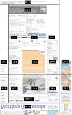
pages since it is the most complex page, containing all page elements. We used a column and section
grid to position the elements on the front page (see figure 1), and we have applied this grid on paper 3
to further clarify this system (see figure 2).
The results from the first web page analysis and the audience response was reported back to the
newspapers at the end of 2001. The forms and position of all page elements of the front pages from
2001 and 2003 are presented in appendix A.6 A genre perspective on online newspaper front page design
Figure 1 The column and section grid [21] Figure 2 The column and section grid
applied on paper 3
3.2. Interviews with the publishers
To obtain knowledge about the publishers’ design purpose, we have conducted semi-structured
interviews with management, designers and editors-in-chief at the nine newspapers. The interviews
were all based on an interview guide approach [30]. The interview guide was used to ensure that the
information needed was obtained in the interviews, but it did not determine the sequence or structure
of the interview. The purpose was to allow new topics of interest to emerge as the interviews went on.
Questions regarding design and the page elements were asked together with a wide range of themes
covering prerequisites, current status and the future expectations and so on. These respondents of the
newspapers were chosen because they were the most suitable to answer these kinds of questions. These
interviews lasted between 60-90 minutes. The interviews where recorded and then transcribed. In order
to analyse the collected data, patterns were identified in the transcribed material [13]. The patterns
include issues raised repeatedly during the interviews or opinions that kept re -appearing and can be
described as commonly found views. We both analysed the material of our own before making a joint
effort in order to make the analysis more trustworthy. We discussed our different analysis and made
joint decisions where we differed.C. Ihlström and J. Lundberg 7
3.3. Interviews and usability tests with the audience
The plan was to interview 21 users at each newspaper in order to obtain knowledge about the audience
recognition and use of the online newspapers. To get a good sample of respondents we asked the
newspapers to automatically present a questionnaire (as a pop-up window) when an individual visited
the news site, as well as to have two advertisements in the printed edition of the paper. The pop-up
window was shown from 3-7 days and we had 60-240 answers from users at each newspaper. The
selection was made out of four different criteria; 1) gender, 2) age, 3) education and 4) Internet usage.
There was a decline of 3-4 respondents that did not show up for the interview at each newspaper,
giving us a total of 153 respondents.
The final sample consisted of 78 women and 75 men. There were 12 respondents who were born
in the 1920:s, 20 in the 1930:s, 25 in the 1940:s, 27 in the 1950:s, 28 in the 1960:s, 31 in the 1970:s
and 10 in the 1980:s. 21 had compulsory school as their most advanced education, 53 had
comprehensive school and 79 had a university education. 4 respondents had never used the Internet, 11
used it on a monthly basis, 25 some times a week and 113 on a daily basis.
Each interview session started with a standard usability test using the think-aloud technique [34]
for about 10-15 minutes in order to analyse their interaction (use) with the online newspaper. The
interviews were carried out using a structured interview guide [30] in order to get answers to the same
questions from all respondents. Parts of the interview guide were constructed to match the repertoire of
page elements. The interviews took place in front of the computer in order for the user to show us how
they performed tasks in the news site and for the users to relate to when answering our questions. We
asked 53 interview questions grouped into 5 different themes; (1) Navigation and structure, (2)
Reading preferences, (3) Format, (4) Trademark and trustworthiness and (5) Others. In this paper we
mainly report from the first three themes. Each interview lasted about 45-50 minutes. The interviews
were recorded, transcribed and stored in a database. The analysis was done in a similar way as with the
interviews from the publishers described above.
4. Empirical results
We first present the analysis of each content element from the repertoire (navigation, news stream,
headlines, search/ar chive and advertisements). We thereafter present some general reflections from
both the publishers and the audience. The parenthesis after the quotations indicates the numbers of the
online newspapers presented in table 1. Where position is mentioned, we refer to the column and
section grid (see figure 3) and the results in appendix A.
4.1 Content elements
For each content element, we present a) its form and position (see appendix A) and functionality, b)
the design change since 2001, c) the publishers design purpose and d) the audience recognition and
use.
The content elements of two front pages from 2001 are illustrated below, where paper 2 (figure 3)
has tried to retain the newspaper form (i.e. the broadsheet metaphor) for the headlines and newspaper
part labels from the printed edition, whereas the web layout of paper 6 (figure 4) most markedly differs
from the printed newspaper genre.8 A genre perspective on online newspaper front page design
Figure 3 Front page of paper 2, February 22nd 2001 Figure 4 Front page of paper 6, March 14th 2001
4.1.1. Navigation
We have identified five main different navigation element forms on the nine web sites; menus, bars,
tabs, banners, and dropdown lists. Menus are composed of a column of headings, a variant was the
small menu that merely consists of a few headings. Bars are composed of a row of headings,
sometimes shown as tabs, one variant was the small bar, merely consisting of a few items. The vertical
tabs, used at paper 4 in 2001, where the text was written vertically was a technically advanced and
unusual solution. The content of the tabs was shown when moving the pointer over them. When
showing the content under the tabs, the news stream was hidden. Another unusual solution was a bar
attached to a frame, i.e. it stayed in position when the user scrolled the screen. In this case, it was
placed at the bottom of the page at paper 6. Another navigational aid was the banner, which used a
form resembling that of an advertisement. Finally, there were dropdown lists, which when clicked
dropped down a list of items over the contents of the page. Common elements in 2001 were the menu
presented as a table of contents (TOC), preferably in the B1 position, and the tabs or bar, presented in
the top A position. The TOC also provided overview of site contents, by its content headings. Banners
in different positions were also frequently used (see table A, appendix A). The functionality of
navigation elements was related to the built in functionality of the browser, i.e. going to another page
or section.
Design change
In 2001, there were two unusual navigational solutions; the on-mouse-over expanding vertical tabs
at paper 4, and the bottom navigation frame at paper 6. These unusual solutions from 2001 were notC. Ihlström and J. Lundberg 9
present on the sites in 2003. The use of banners as navigation elements had increased. The most
common solution was still the left navigation menu at B1 and the navigation bar or tabs at A1 -4.
Publisher design purpose
The publishers had discussions regarding the organization of the navigation elements. These
discussions partly resulted from the online edition having contents that were not present in their
printed editions as illustrated: "... but here we have additional contents such as services, which are
neither bird nor fish. There are several different perspectives that should share too few dimensions."
(7). Another issue of discussion was to separate the editorial from the commercial material, since many
papers in addition to news and web services had commercial material of the same kind as in their
printed editions. This was achieved in different ways, for instance by using color markup, and
additional menus. Some publishers wanted to avoid an overloaded navigation, and they achieved this
by dividing their navigation into categories.
Most of the newspapers were following the categories from the printed newspaper to some extent
when designing their navigation. The depth of the sites was also discussed. To find things quickly, a
maximum of three levels was used by e.g. paper 5 and one respondent stated that: "There is never
more than two clicks to anything else." A respondent at paper 8 stated that news had to be categorized
according to actuality. No one provided a site map but some of the newspapers offered alternative
navigation via drop-down menus or a table of content organized in alphabetic order showing all
contents of the site. This was a time consuming effort, as illustrated by the respondent at paper 3: "We
were trying to make it easier for our readers to get an overview of all contents. Sometimes one
wonders whether it is useful at all."
Audience recognition and use
Most users returned to the first page to start from “the beginning” to browse the newspaper
contents or to search for something else. "Either I click my way back, or I go to the start page and
restart from there" a respondent from paper 9 stated.
More than half of the respondents thought that they got an overview of the contents of the online
paper. In general, respondents found that they got overview from navigation elements and news
elements such as headlines and captions. Some comments from the respondents were: “Yes, it is this
list of different groups of contents, and that you can get further from these different stories" (1), and "I
think I get a good overview on what is at the site, because of the tabs which are in an eye-catching
position" (2).
However, the form of the pages, the position of the elements at some news sites made them less
effective. At paper 6, which had the navigation bar placed at the bottom of the page, only one third of
the respondents felt that they got an overview. As a respondent stated: "I never discovered this
navigation at the bottom of the page. Never. I arrived in Uppsala in september-98 and each time I
have had to think about on how I did the last time" At paper 4, many of the respondents stated that
they did not get a proper overview. The navigation element at paper 4 was vertical tabs, which didn't
show content before moving the pointer over them. Some respondents at paper 4 did not recognize the
vertical navigation tabs at all and were surprised when they did encounter them by accident. At the
papers 2, 7 and 8 most people felt that the paper gave a satisfying overview.
As a respondent of paper 2, and several others, stated, it might take some experience with the
paper to get the overview: “I think that if one uses the web site often, one surely gets a good overview.
If one learn what is under the tabs" (2). It was not always the case that having read the printed edition10 A genre perspective on online newspaper front page design
helped when trying to get an overview of the online edition as another respondent from paper two
stated: "It is like when it comes to reading the newspaper, one has read the printed edition during most
of ones life, and this is a new way of reading" and "... I recognize the paper, but I am not so used to the
web" (9) whereas another respondent of paper 9 thought that the resemblance between the printed and
online edition was helpful: "... I think so because you recognize it from the printed edition".
Many respondents found it more difficult to find items when navigating in the online edition, than
in the printed edition, as one respondent from paper 9 expressed “It is more difficult. Since I recognise
the newspaper but I am not so used to the web”. As a respondent from paper 2 said, it could be due to
different ways of thinking “… because here one must consider under what tab something could be. In
a printed paper one searches pages. It is easier to find on the web because here I can go directly to the
specific question.” But many respondents also found it rather easy to find things on the online edition,
some found it even easier.
During navigation of the site, only one third of the respondents could tell their position on the web
site but as much as about one fourth of the respondents found it important to kno w their position. Most
respondents that knew their position in the web sites were from papers 2, 3, 6, 7 and 8 and most that
did not know were from paper 4. The most common elements used for this purpose were the URL in
the address field of the browser, or headings. One of the respondents stated, “I look at the captions to
see where I am" (3). Also, dedicated landmarks in the navigation, for instance a red dot in the B1 menu
at paper 9, or marks in the tabs in the A1 -4 position of paper 2 were used, e.g. "I look at the tabs, one
can see on the marking what thing one has done last" (2).
Over 50% of the respondents considered it easy to find previously visited pages, and very few
found it difficult as illustrated by a respondent from paper 3: "It is easy to go back, I just use the back
button". Almost all of the respondents used the back button of the browser for this purpose. But very
few of the respondents could see which way they have taken through the structure of the web site when
moving from one page to another. Most of them looked in the URL trying to get this information. Also
captions, different colours etc were used. Many respondents at paper 2 recognized the path taken by
using a breadcrumb navigation element present at each page. The use of colour was also mentioned.
Some comments from the respondents of paper 2 were "The colour marks show me what path I have
taken" and "I look at the breadcrumb navigation aid". Moreover, some respondents were looking in
the browser history menu.
4.1.2. News Stream
All of the newspapers had a special news stream element for the most recent news. It had the form of a
list of article headings, each marked with a timestamp. All papers updated their news stream during the
day. Some variations to the form of the news stream were found. First, the position on the front page
varied, but not much. Most papers placed their news stream in one column in the Bt position in 2001
(see table B in appendix A), but the papers differed regarding what column it was placed in. The
exception was paper 9, with a news stream in the C2 position. They also differed in length, from
containing a few news items to stretching down into the C area. Second, some (e.g. paper 5, 6 and 9)
had divided their news stream according to different categories, e.g. domestic, international, sports,
economics etc. Third, there were also streams containing headlines, but without time stamps, these also
existed with headlines dedicating them to particular categories, such as sports. We denote these just as
streams, since they were not as time sensitive as the news streams regarding the absolute latest news.C. Ihlström and J. Lundberg 11
The functionality of the news stream is based on continuous updates during the day, where some
of the news is automatically presented by the Swedish Telegram Bureau. Moreover, when the news
stream was categorised into a table of contents, it sometimes got additional functionality. If there was a
corresponding newspaper part containing all the articles of the category, then the news stream also was
a navigational element. That was the case when the user could use any element in the news stream, or
the contents heading, to navigate to different parts of the site.
Design change
The three papers with a division into categories in 2001 had changed to a non-categorized news
stream in 2003. Only paper 7 instead changed to a divided news stream. At all papers, the news stream,
with timestamps, was in a top position in 2003. There were also non-time stamped streams in the 2003
sample. At paper 7, there was a stream divided into several categories. In addition, at seven of the
papers, there were streams for just one category in different positions, not just the top position, on the
front page. A particular category found in 2003, but not in 2001, was “the most-read stream”, which
did not categorize items according to content, but according to how many times they have been read.
Moreover, in 2003, there were several cases where a news stream or stream was presented together
with a headlines element presenting articles in the same category.
Publisher design purpose
All newspapers updated their news stream continuously during working hours using news from
the Swedish telegram bureau (TT). In 2001 some of the newspapers had started to update their news
stream 24/7 and most of them had started to feed the news stream with in-house produced local news ,
which was provided by all newspapers in 2003. At paper 5 there had been a discussion whether or not
to provide time stamps, and a respondent said. "We are going towards not time stamping, since it's
really unimportant information. 03.00 really tell you nothing. It's mostly for our own use. We have
removed it from the in-pages." A few of the papers had chosen to divide the news stream into different
categories and this had also been discussed by others, e.g. at paper 8: "We are discussing whether we
should divide it into local, domestic, foreign, but for now we keep it like this. We think it is
advantageous to have it all together. We do news valuation and insert it in order."
Audience recognition and use
Most respondents (approximately 80 %) recognized the news stream. They used the label ‘latest
news’, used by some papers, and the timestamp for this, as illustrated by a respondent at paper 2: "It is
the latest that has been published, there are no timestamps on the ordinary articles" (2) But they also
recognized new articles due to form, when they were positioned in a top position; at the top of the
page, at the top of a news stream or at the top of the headlines, e.g. "It has something to do with the
latest being on the top of the page. The most important things are on the top" (9) and "The latest news
is very brief, the most important and very compressed" (6).
When timestamps were used, some readers used those to differentiate new articles from older
articles. Paper 3 presented an “L” below the timestamp in their news stream to indicate that it was
local news from the newspaper. The readers of paper 8, which had a sizeable time stamped news
stream in the B3 position, all found it easy to recognise the latest news, e.g. "I know what items are the
latest news. There are timestamps on the headlines." and "I can see it in the field on the right. It
catches the eye." However, not all respondents could see what items were the latest, as one respondent
of paper 4, with a small time stamped news stream at position Bb2-3, stated "It's not that easy to see.
Of course, one knows that the main news always is placed on the front page".12 A genre perspective on online newspaper front page design
4.1.3. Headlines
The main form of the headlines element was one or more puff element, which consisted of a headline
and a lead paragraph, and sometimes had an image. It could also have other content such as a linked
discussion. Sometimes the headlines were categorized, containing headlines from a particular section.
At paper 9, there was also time stamped headlines, making them a hybrid element, taking the
characteristic of the news stream of showing the time of publishing. In 2001, all of the newspapers
published headlines in the top B position, and several papers also in the C position.
Some papers positioned news articles due to importance (e.g. paper 2, 4 and 8), whereas other
papers used the size of headlines, amount of text or pictures to indicate importance (e.g. paper 3 and
6). Paper 9 added content during the day to the headlines section in temporal order, rather than
ordering by importance. Sometimes, the category headings also functioned as navigation items.
The functionality connected to the headlines was also related to the browser functions, such as
going to a new page with the full article text. When the article was categorised, if there was a
corresponding newspaper part containing all the articles of the category, the headline also functioned
as a link to that part.
Design change
Most papers in 2003 had a time stamped headlines section, although some papers as before had
more than one headlines section. Only paper 9 went against the trend, removing the time stamps
altogether from the section. Moreover, in 2003, paper 4 presented headlines together with a stream
presenting articles in the same category.
Publisher design purpose
All newspapers were in 2001 to some degree positioning the news that was considered as the
highest valued at the moment in a top position. Many of them were using pictures as well, and
sometimes the news article for the top position was even selected due to there being a good picture to
go with it, as illustrated in the comment from the respondent from paper 1: "Firstly, one tries to find a
good image that fits the page. And we'd rather have a broad image, since that looks best. Therefore
sometimes the top headline won't be the same as in the printed edition. To make the page look nicer."
In the morning the top story from the printed edition was usually placed in the top position, but
most of the papers were changing their top story during the day. "... preferably about three times a day.
When something happens, you change. An accident or something else.” was a comment from a
respondent at paper 3. Sometimes time was considered to be more important than news value for the
top position news as illustrated by a respondent at paper 8: "Sometimes an important news item is
placed in the bottom position, since we freshness is also considered when we prioritize. A smaller
news item that is less important but more fresh can end up in the top anyway." Paper 9 had technical
problems which made it hard to administrate the site. They were waiting for a new publishing system
that they have been working with for four years. They found it problematic that all articles on the font
page had the same heading size regardless the news value. “We can not prioritize at the moment, the
latest one is placed at the top”.C. Ihlström and J. Lundberg 13
Audience recognition and use
Many respondents mentioned the size of headlines and the amount of text as the main tool for the
newspapers to indicate the importance of the article together with the position on the page. The general
opinion was that the layout was different online than in the printed edition, as illustrated by this
comment from one respondent at paper 2: "On the net, I feel that there are few big news items, and
many small".
The absence of pictures contributed to the general feeling that all articles had the same value.
When a picture was present, the article was considered to be more important. Some respondents
considered that the article placed on top of the page was the most important one, even if it had a
timestamp. Thus, the news valuation was not seen as evident, as illustrated by the following citations:
"All news here has the same size, regardless if there is a kitten in a tree or a severe accident has
occurred" (7) and "One has to decide for oneself, what’s is important" (1).
However, there were different opinions regarding whether this was good or bad, e.g. “One doesn't
have to get irritated when unimportant stuff cover half the first page as they sometimes do in the
printed edition" (2), and "They select at the paper what they think one is interested in and publish it
prominently. It can happen that the little article says more than the big one" (5), but most users missed
the news valuation from the printed newspaper.
4.1.4. Search/Archives
The search/ archives were presented on the first page by a link to a search page (1, 2, 4, 9), as a search
function consisting of at least a text entry field (8), or both (3, 5, 6). Only paper 7 lacked a search/
archive function completely. The links were presented as items in a menu, bar or tab, in the A or B
positions. The search function had different positions in the papers (see table D, appendix A). The
amount of time that the news articles were available for search by the users varied from one to three
months. The functionality of the search fields made it possible to conduct a search leading to a new
page showing the results, mostly 20 at the time. The difference in functionality between the search
function and the archive was that the search function only searched the current site, whereas the
archive searched previous editions, sometimes including the current site, sometimes not.
Design change
All papers had at least a link to the search/archives in 2003. Some papers (2, 4, 7, 9) had added
search fields to their front page, whereas papers 5 and 8 removed their search fields, which result in a
total of six papers with search fields on the front pages in 2003. The search/ archive functions in 2003
were always in the top position, either A or B, whereas in 2001 there were search functions also in the
C position.
Publisher design purpose
Seven of the newspapers had, in 2001, archives with different limits for searching, e.g. available
data from one week (1), four weeks (6), and three months (9), while one (paper 3) has an archive with
material from several years. They were concerned that their users did not find and used their archive.
Some of the papers allowed searching directly after publishing, e.g. paper 5: "Here it is possible to
search immediately. If it is in the database, then it is searchable. If it is published, then it is
searchable. They can even search for more than they are allowed to view. ... Then they get an error
message." while others didn't allow it until the day after. At some papers, there were different search
functions for the news archive, and for the current online pages. All but two papers (6, 8) had in-house14 A genre perspective on online newspaper front page design
made search engines. There was a discussion going on at the newspapers whether or not to let users
have access to the newspaper archives of text and pictures. They all thought that these archives could
generate revenues if they were accessible online. They are waiting until it will be possible to charge
the users as illustrated by the respondent at paper 8: "We do have a text and picture archive at the
editorial office. We do not put it online. It is a goldmine for us newspapers. Perhaps on the day when it
becomes possible to charge for small transactions."
Audience recognition and use
More than half of the respondents stated that is were easy to find what they search for on the web
sites. Some users expressed that they liked to use the search function, e.g. one respondent from paper 2
said that "I use the search function as much as possible". One respondent from paper 4 said that "It is
much more difficult to find things on the web. I think that they have complicated things with advanced
technology." Most respondents that found it difficult were from papers 3 and 6 and most ones that
found it easy were from papers 2, 7 and 8. Almost one fifth found it easier on to search on the web
where twice as many found it easier in the printed edition since many users navigated when searching.
"If one has read the paper for years, then one finds, it's not like that on the net" (6).
4.1.5. Advertisements
There were two variations of advertisements; banners, and links in menus. A banner normally was an
illustration, which could have both text and images. They could also be animated, and have sound,
although in our sample, there were no sound banners. We differentiated one particular kind of
advertisements in the menus, which had the form of text links, leading to the classifieds. The
functionality of an advertisement was to sometimes provide a link to a site, often outside the online
newspaper, as decided by the owner of the advertisement.
Design change
In 2001, there was often at least one top banner in the A position, and usually to the right, in
column 4, 5, 6 or a combination (see Appendix A, table E). The classifieds were only presented as
links in a menu. At most papers, there was still a top banner, and banners to the right in 2003. In
addition, at two papers (3, 4), mid-page banners were added. With the exception of paper 9, there were
generally more banners at the sites in 2003 than in 2001. Moreover, advertisement supplements
appeared at paper 1 in 2003, as links.
Publisher design purpose
Since all nine newspapers were belonging to the same association, Citygate, they had developed a
concept for advertisements together. They had special personnel who were selling banners on a
national basis, while it was the newspapers own responsibility to sell local banners. The banners we re
positioned in the same top and right position at all online newspapers. Most papers stated that they
made some revenue from advertisements but they agreed that was hard work, e.g. as a respondent at
paper 3 said: "It is difficult to sell banners. We haven't succeeded so well with that." The national
banners were made by Citygate while most of the local banners were made in-house at the newspapers.
They were mostly restrictive regarding sound, but animations were common, however as a
respondent at paper 5 said: "I believe we are quite happy for the advertisements we get." At paper 7
they had an incident with a banner including sound: "You should have heard the racket when ourC. Ihlström and J. Lundberg 15
advertisement editor sold a sound banner. First and foremost it was a very long sound clip for on-
load. As soon as we loaded the page, the computer started screaming ‘Here is cheap Nisse's!!’ And it
was impossible to shut the sound off too. There was a damn racket."
Audience recognition and use
Most respondents thought that they could clearly differentiate between advertisement and editorial
material, e.g. "It is very clear what are advertisements, but at the same time one is a bit cowardly
about clicking on these things" (8). Some respondents noticed that there were fewer advertisements in
the online paper.
However, many respondents expressed a clear lack of interest in the advertisements as illustrated
in the following quotations; "One doesn't notice the advertisements, they are there but one doesn't look
at them" (9) and "One has almost learned not to notice the advertisements" (2). One respondent at
paper 9, however, had discovered that some ad-like banners were not advertisements: “I have been
clicking on these here at the edge, and they have turned out to be something else than ads”. Another
respondent expressed that the form was the distinguishing factor to recognise advertisements: “On the
ads, there are clickable images, and it is not like that in the editorial part. There it is text.”
4.2 General reflections from the publishers
All but one of the papers had made the design in-house, and two of them had tested their sites with
users. Some of the papers were also providing web design services for companies in the region. This
was sometimes considered problematic since they had to prioritize the customers before the in-house
development of their online newspaper, as the respondent from paper 4 said: "We have been working
under heavy time pressure. When we work as a web bureau and editorial office we have double
responsibilities. It is an internal question that shouldn't affect our readers, but which regrettably affect
them anyway." The publishers also look at other sources when designing their web sites. Some of the
newspapers mentioned for example that they scanned other news sites both in Sweden and abroad for
inspiration for design.
Most of the newspapers considered themselves as media organizations instead of newspaper
organizations. Seven of them owned their own radio stations and two has video production companies
in their organization as well. They all vision a future of multimedia, using print, audio and video over
different media terminals in a broadband context. Some comments were: “It is a total media” (4) and
“It will be about presenting editorial and commercial information in different ways for the readers
own choice” (7).The rapid media was also discussed at paper 3: " It is a new culture that provides the
rapidity. Now we can be faster than the local radio, and shortly we have moving images as well."
Regarding functionality provided by new technology, there were several issues. First, designing
for new versions of browsers were discussed, and most respondents wanted to keep the sites accessible
to audience members with older browsers. However, they also wanted to have sound and moving
images, which demands newer technology. Second, the respondents at paper 9 discussed the problems
with the front page not being rapid enough. They were experimenting with different browsers with
different modems and broadband connections. “The problem is that at the same time one wants the
broadband to be quick as lightning one also wants very good design. It is not possible to have the both
things at the same time.” Third, several of the newspapers have encountered technical problems and
were about to change publishing systems which allowed more flexibility and functionality.16 A genre perspective on online newspaper front page design
4.3. General reflections from the audience
Half of the respondents perceived the sites as newspapers while the other half did not. The result was
evenly spread among the newspapers. To a large extent, the differences were experienced as emerging
from the physical characteristics of the printed newspaper, e.g. “I would not like to take the computer
into bed with me” (2), “It does not smell newspaper” (2) and "The paper is too big, it is even difficult
to read at the breakfast table. If I had had the computer at the table, I am sure I would have read it
there" (8).
The structure of the newspaper was perceived as mirroring the printed newspaper’s structure by
almost half of the respondents. One third did not think so whereas the rest did not answer the question
or expressed no opinion. Most respondents of paper 2 and 5 agreed that the structure was similar while
most of the respondents of paper 3 and 4 were of the opposite opinion.
The respondents had one or more reasons for reading the online edition. One third of the
respondents stated that the reason for reading the online newspaper were to be updated, on fifth used it
as a replacement for the printed edition whereas one sixth saw it as a complement. Other reasons for
reading the online edition were searching (10%) and leisure (10%), as illustrated in the following
quotations: "I am not interested in a subscription of the printed edition. It's of convenience I read the
online edition. It's less expensive and there are news updates" (4) and "When I read the online edition,
it because it is convenient. It's too cumbersome to go several hundred meters to fetch the paper" (5).
5. Discussion
Addressing the perceived need for knowledge about the design of online newspapers we propose eight
design recommendations for online newspapers. Using common web guidelines for this purpose would
not have been enough. For example, guidelines would have little to say about genre specific elements,
e.g. news stream and timestamps, or the problems with news valuation. We have therefore instead
taken a genre perspective on design by using genre theory to: a) identify genre characteristics and
study design change through web page analysis, using the genre concepts content, form, functionality
and positioning, and b) derive genre rules by analyzing publishers design purpose, and audience
recognition and use, through qualitative interviews and usability tests.
The eight design recommendations are thus based on identified features that mediate a specific
purpose and use between publisher and audience, which we describe as genre rules in terms of
purpose, form, and positioning. But they are also based on the genre change regarding design, i.e.
which solutions that have gained importance or which solutions that have been rejected, and the
heritage from print regarding form and shared content elements.
(1) Use the length of the front page to give an overview of the whole site. Several things in the
study indicate the importance of the front page of the news sites, e.g. most respondents returned to the
front page to ‘start over’, when looking for something else, instead of using the navigation elements of
the site. The publishers have also made the front pages longer containing much more content than
before, e.g. navigation banners, most-read stream, more headlines. Furthermore, the time stamped
news streams and headlines on the front pages provide an overview of the latest news, which
corresponds to the most important reason for reading the online newspaper, which was to stay updated.C. Ihlström and J. Lundberg 17
The use and importance of the front pages suggests that an overview of the entire site should be
provided, since scrolling the front page could be compared to browsing the printed newspaper. To
provide an overview, a prerequisite is to understand the page structure. Many respondents were relying
on their understanding of printed papers for this purpose, and the publishers also considered the use of
categories from print. This also corresponds to using the "broadsheet metaphor" for layout . Since the
pages need to be long, to give an overview of the entire site, the most important functionality is to
scroll the page. We did not discover any difficulties regarding the use of that function.
(2) Use the broadsheet metaphor for layout. From the audience view, the online newspapers to
some extent resembled the printed papers by the categorization and divisions from the printed paper,
which helped them in recognizing the genre. This is in line with the results of Watters, et al. [49],
which showed that the newspaper metaphor was preferred by the users. But as much as one third of the
respondents in our study did not perceive the sites as mirroring the printed papers structure. The
general opinion was that the layout was different online than in the printed edition.
The producers expressed uncertainty about how to present new services and separating them from
editorial material, which is not supported by the metaphor. Most of the audience, however, seemed to
have no problems differentiating editorial material from other kinds of materials on the sites. We
suggest basing the layout on the broadsheet metaphor in order to give a familiar frame of reference.
(3) Provide navigation support in different ways. Both the audience and publishers experienced
difficulties with the navigation. The increased focus on the front pages has made it necessary to
provide navigation support in many different ways besides the ordinary navigation support through
menus and bars. It was evident that dedicated navigation items were used in combination with other
elements, such as the news stream, headlines, captions and headings to navigate the site.
Content elements can be designed to support navigation, for instance by dividing the news stream
into a table of contents. Presenting news from all categories of the site on the front page can also serve
as navigation support to different sections. Providing navigation in the suggested ways also
corresponds to using the length of the front page for overview and using the broad sheet metaphor for
layout.
(4) Consider the use of navigation banners in combination with banner ads. The publishers have
made an effort to differentiate the editorial and advertisement material, and there seems to be no
problem for the respondents to differentiate between them. From the audience’s point of view, the
advertisements were relatively uninteresting, and as some respondents mentioned, they even avoid
them. The banner form has also been adopted for within-site navigation to advertise important site
contents. The positioning of regular advertisements has traditionally been around the page, with a
focus on the top and right edges. In 2003, the use of within-site banner-like navigation puffs has
increased. These navigation items are often placed together with the ads, but also at other page
positions .
We believe that the use of navigational elements such as banners, mixed with the advertisements,
might be questionable, if the users avoid clicking on, or even looking at the advertisements. If users do
not look at the banners, this is clearly a pour solution from a navigational point of view. However,
given that it causes users to look for navigational items amongst the banners, it is a good solution from
a business point of view. The increased use of navigation puffs partly solves the problems of too long
menus but there is a need to study if the users have began to use these puffs or is still looking at them
as advertisements and therefore avoids them.18 A genre perspective on online newspaper front page design
(5) Place the news stream at a top position and (6) Use timestamps to indicate latest news. As
noted in the first point, to stay updated was the major reason for visiting the online newspapers. Latest
news was recognizable by the audience from time stamps, labels and top position. In 2003, the latest
news has clearly been given even more focus, with news streams at top positions at all papers.
Emphasizing both the publisher and audience view, that news updates are both important reasons
for providing an online edition, and for reading it, there should be a news stream on the site. The news
stream should be placed in top, as it is at all papers in 2003. To emphasize that updates are made,
timestamps should be used for the news stream since many audience members relied on the existence
of timestamps to identify recent news. In 2001, there was a discussion at the newspapers about
timestamps also for other news items, and in 2003 some of the papers in this study have started to
timestamp headlines as well, which is also discussed in the following point.
(7) Provide news valuation through positioning and markers. The valuation of news on the front
pages was not as clear as of the printed front pages in 2001 according to the audience. All newspapers
to some degree position the highest valued news in a top position, but sometimes immediacy was
considered before news value for the top position, i.e. the use of timestamped headlines in temporal
order. The use of layout to mark the importance of news differed between the papers in the study,
ranging from almost no markers, to the use of headline size, images, and amount of text. However,
sometimes publishers used images to decorate the page, rather than to indicate news value. There were
different opinions regardi ng news valuation among the audience, e.g. when disagreeing with the news
valuation of the printed paper, they liked the lack of markers online, but most users missed the news
valuation from the printed newspaper.
The broadsheet metaphor includes the use of newspaper-like columns, headlines, etc. but also
indicates news value by the use of position and markers, which are essential for the audience
recognizing the genre. During 2003 it has become more common to timestamp the headlines,
indicating the immediacy rather than making a news valuation for the readers. We recommend
providing news valuation through position and markers since it are demanded from the audience and
since it supports the broadsheet metaphor.
(8) Provide one joint search facility for both the archive and today's news. Many users navigated
the online edition without using the search function when looking for something special, but many
users also tried to use the search engines with varying results. Even though more than half of the users
found it easy to find what they searching for, some found it problematic. From the interviews with the
publishers we found possible explanations for why the use of search engines could be found
problematic, a) the search facilities were mainly designed for searching the news archives and at some
news sites the articles did not end up in the archives until the day after they have been published, and
b) there sometimes exist different search functions for the news archive and for the current online
pages.
Searching the sites through the dedicated search facility was something requested and used by the
respondents. Emphasizing the importance of that function, it should be placed in a top position or in a
menu. We recommend to combine the archive and current edition in one search facility since much
confusion arouse from the newspapers that were not placing their current edition in their archive .
In table 2 (on the next page) the design recommendations are summarized, and the content
elements concerned and the underlying genre rules are presented.You can also read