District data quality assurance - a training package for monthly use of DHIS2 data quality dashboards at district and health facility levels - WHO ...
←
→
Page content transcription
If your browser does not render page correctly, please read the page content below
District data quality assurance
a training package for
monthly use of DHIS2 data quality dashboards at
district and health facility levels

WORKING DOCUMENT February 2021
District data quality assurance – a training package

                         2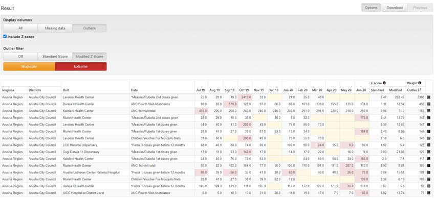
District data quality assurance – a training package

District data quality assurance
a training package for
monthly use of DHIS2 data quality dashboards at
district and health facility levels

WORKING DOCUMENT February 2021

                                         3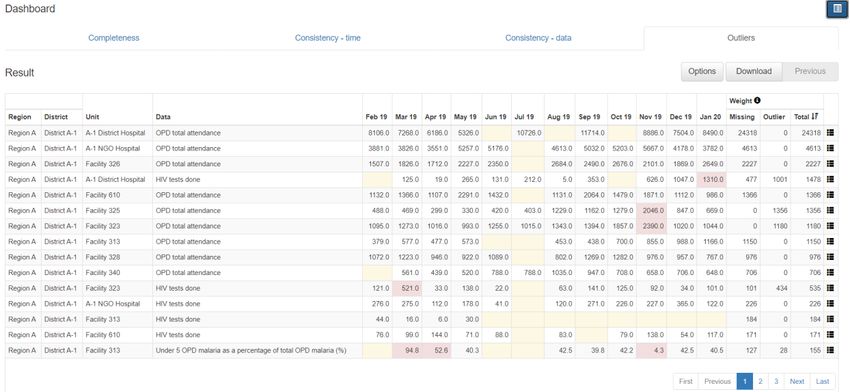
District data quality assurance – a training package

©World Health Organization 2021
All rights reserved. This is a working document and should not be quoted, reproduced, translated or
adapted, in part or in whole, in any form or by any means.

                                                   4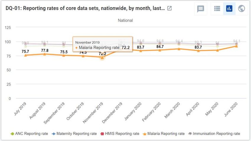
District data quality assurance – a training package

Contents
   Acknowledgements ........................................................................................................................... 6
   Abbreviations .................................................................................................................................... 7

Introduction ........................................................................................................... 8
   Rationale: data quality assurance (DQA) should be decentralized and routine ............................... 8
   Audience............................................................................................................................................ 8
   Learning objectives ........................................................................................................................... 9
   Overview of the materials and how to use them.............................................................................. 9
   Sample agenda for a three-day workshop ...................................................................................... 11

Tutorial 1: An introduction to the WHO Data Quality Tool .....................................12
   Overview ......................................................................................................................................... 12
   Use the Completeness dashboard .................................................................................................. 13
   Use the Consistency-time dashboard ............................................................................................. 15
   Use the Consistency-data dashboard.............................................................................................. 16
   Use the Outliers dashboard ............................................................................................................ 16
   Use the “Analysis-Consistency” function ........................................................................................ 18
   Use the “Analysis-Outliers and Missing Data” function .................................................................. 21

Tutorial 2: An introduction to a data quality dashboard........................................22
   Overview ......................................................................................................................................... 22
   Dimension 1 - Assess for incomplete reporting of key datasets ..................................................... 25
   Dimension 2a: Identify month-to-month inconsistencies .............................................................. 26
   Dimension 2b: Look for inconsistencies between related indicators ............................................. 29
   Dimension 3: Assess the consistency between coverage estimates based on a survey and coverage
   calculated using routine data .......................................................................................................... 30
   Dimension 4: Assess the consistency of denominator/target estimates ........................................ 31

Tutorial 3: How to train district staff in monthly use of DHIS2 data quality tools...32
   Overview ......................................................................................................................................... 32
   Review the Data Quality dashboard................................................................................................ 32
   Review the WHO Data Quality Tool ................................................................................................ 40

Exercises ...............................................................................................................45
   Tutorial 1 exercise: Use the dashboard and the analysis function of the WHO DQ Tool ............... 45
   Tutorial 2 exercise: Use a data quality dashboard .......................................................................... 52
   Tutorial 3 exercise: Monthly use of data quality tools at district level ........................................... 55
   Answers to exercise questions ........................................................................................................ 64
                                                                            5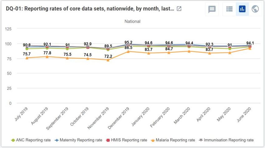
District data quality assurance – a training package

Acknowledgements
This document – District data quality assurance: a training package for monthly use of DHIS2 data
quality dashboards at district and health facility levels - was developed by the World Health
Organization (WHO), with the support of a grant from Gavi, the Vaccine Alliance.

The package was developed principally by Robert Pond with technical contributions from (in
alphabetical order) Anh Chu, Shurajit Dutta, Scott Russpatrick, Wilfred Senyoni and Engelbert Tuzo. The
project was coordinated by Wendy Venter.

The Ministry of Health, Community Development, Gender, Elderly and Children of the United Republic
of Tanzania, the WHO Country Office in Tanzania, the University of Dar es Salaam and the Health
Information Systems Program (HISP) - Tanzania are gratefully acknowledged for their support in the
development and testing of this package.

                                                   6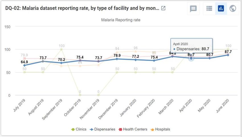
District data quality assurance – a training package

Abbreviations
ANC    antenatal care
App    application
DHS    Demographic and Health Surveys
DQ     data quality
DQA    data quality assurance
DHIS   District Health Information Software
DPT    diphtheria-tetanus-pertussis containing vaccine
HMIS   health management information system
HIV    human immunodeficiency virus
MCV    measles-containing vaccine
MICS   Multiple Indicator Cluster Survey
OPD    outpatient department
Penta Pentavalent vaccine
RHIS   routine health information system
SOP    standard operating procedure
WHO    World Health Organization

                                                  7
District data quality assurance – a training package

Introduction
This training package aims to improve the quality of routine health facility data through building
capacity in the monthly use of District Health Information Software (DHIS) 2-based data quality tools at
district level. The package includes tutorials with related exercises and uses a website (https://who-
demos.dhis2.org/dq) to demonstrate the tools.

Rationale: data quality assurance (DQA) should be decentralized
and routine
Health facilities regularly report data on their activities through the routine health information system
(RHIS). In many countries, the most common and most important routine data are reported by facilities
in aggregate each month or quarter. High quality routine data are essential for effective local
management of health services. However, while routine data are necessary for decision-making and for
assessing performance, experience shows that these processes are often compromised by problems
with data quality.

For countries that manage their data using the DHIS2, new automated tools enable rapid screening of
data to identify the most important missing data and the most suspicious values. These include:
▪ the DHIS2 version of the WHO Data Quality Tool1 (also called the “DQ App”);
▪ specially-configured data quality dashboards that are visible to users as soon as they log into the
    DHIS2 website.

Until recently, these tools have been deployed mainly at national level. National level staff, however,
often confront several significant challenges including:
▪ an unmanageably large number of suspicious or missing values may be identified, especially if desk
    review of data is conducted infrequently;
▪ suspicious values can often only be investigated and corrected at the local level where there is
    access to the primary paper records and the staff that complete and submit them;
▪ government policy often stipulates that health data belong to district authorities and thus, if a
    suspicious value is confirmed to be incorrect, it can only be edited at district level.

For these reasons, the most effective approach to data quality assurance is to decentralize data desk
review (e.g. to district/council level) and to make it routine, i.e. to do it each month following the
completion of the data entry.

Audience
The target audience for this training package includes:
▪ DHIS2 data managers at district level2 that are responsible for entry and review of the quality of
    DHIS2 data;
▪ health officials at district and national levels that are responsible for supervision of district data
    managers and for development and implementation of policies and procedures (e.g. “Standard
    Operating Procedures”) for data quality assurance.

1
    https://www.who.int/healthinfo/tools_data_analysis/dqr_desk_review/en/
2
    Where data are entered in the DHIS2 at facility level, facility data managers are also an appropriate audience.
                                                                 8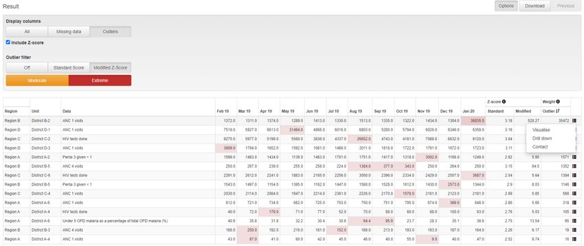
District data quality assurance – a training package

Learning objectives
▪   District data managers will have the knowledge and skills to use the two data quality tools each
    month and to follow up on the most important suspicious and missing values identified.
▪   Health officials at district and national levels will have the knowledge and skills to:
    −   instruct additional district data managers in the use of the two data quality tools; and
    −   refine policies, procedures and capacity-building interventions to support widespread adoption
        of a district data quality assurance approach.

Overview of the materials and how to use them
The training package consists of a series of three tutorials and related exercises that demonstrate and
provide hands-on practice in using the DHIS2 data quality tools. Each tutorial uses the online DQ
Trainingland website (https://who-demos.dhis2.org/dq) which contains realistic data for
demonstration of the tools. The tutorials include step-by-step instructions and screenshots to enable
first-time users to follow along easily.

▪   Tutorial 1 – An introduction to the WHO Data Quality Tool:
    This tutorial is designed to introduce users at all levels to the “WHO DQ Tool”. It briefly
    demonstrates how each of four dashboard functions and the analysis function can be used at
    national level to identify and investigate inconsistencies and important missing values.

▪   Tutorial 2 – An introduction to a data quality dashboard3:
    This dashboard is visible as soon as a user logs into the DHIS2 website. The tutorial demonstrates
    how the data quality dashboard can be used at national level.

▪   Tutorial 3 – How to train district staff in monthly use of the DHIS2 data quality tools:
    This tutorial demonstrates an approach for rapidly training staff at district level to use the data
    quality dashboard and the outlier dashboard function of the WHO Data Quality Tool.

An exercise is provided for each tutorial and may be undertaken immediately after the tutorial. The
exercises enable learners to practice use of the data quality tools demonstrated in the tutorial. Each
exercise contains a set of questions. Answers to the questions are found in Annex 4.

The initial focus on the national level (Tutorials 1 and 2) is designed to acquaint staff at higher levels
(including senior officials at district level) with data quality issues at national level. This approach can
also help to make them receptive to a decentralized approach which, in the future, should help to
prevent and address quality issues before they reach national level. It is these senior officials who
must then refine the standard operating procedures (SOPs) and develop an approach for scaling up
district data quality assurance activities. Such a roll-out of capacity-building at district level could
involve use of Tutorial 3, without the need for Tutorials 1 and 2.

The three tutorials can be used in several ways:
▪ In a generic workshop approach, the tutorials can serve as notes for presentations given by a
    facilitator. The accompanying exercises are intended for use immediately after each tutorial,
    enabling participants to practice what has been demonstrated. The exercises involve use of the DQ
    Trainingland instance of DHIS2 and include screen shots to guide first-time users through each
    step. A sample agenda for a three-day workshop is provided at the end of this section.4

3
 There are two distinct types of dashboards for review of data quality. Tutorial 1 demonstrates the dashboard function of the
WHO Data Quality Tool. Tutorial 2 demonstrates a data quality dashboard that is visible as soon as a user logs into the DQ
Trainingland website.
                                                             9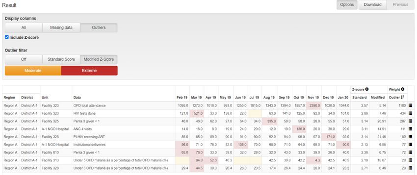
District data quality assurance – a training package

▪   A country-adapted workshop can be organized in the same way as a generic workshop. However,
    the data quality tools, tutorials and exercises should be adapted for the national DHIS2. This will
    increase the relevance of the training to the participants, which should include a selection of
    district data managers. Adaptation should involve a number of steps:
    −   A list of up to 20 core indicators are identified for review.
    −   The WHO DQ Tool and the data quality dashboard then need to be configured to assess the
        consistency and completeness of the data for these indicators.5
    −   A special “District” group of indicators should be added to the dashboard of the WHO DQ Tool.
    −   A further essential step in country adaptation is to update the data management SOPs to
        specify the ways that the data quality tools are to be used by staff at each level, as well as the
        ways in which they should further investigate the data quality problems revealed by the tools.

▪   In an online distance learning approach, users with internet access can log into the DQ
    Trainingland website at https://who-demos.dhis2.org/dq. The username and password are shown
    on the log in page. They can then use the tutorials for self-paced learning. The tutorials include
    screen shots that exactly match what users will see online.

▪   In a video instruction approach, each tutorial can serve as a detailed script for a facilitator to pre-
    record a demonstration. The tutorial can also be translated into the local language. A video can
    then be used as a supplement to a workshop or for online distance learning.

▪   The “30-minute training” approach involves use of a country-adapted version of Tutorial 3 to
    quickly train district data management staff. Tutorial 3 can be used even if participants have not
    received Tutorial 1 or Tutorial 2 or any other training related to the two data quality tools. Tutorial
    3 demonstrates each of the steps needed to introduce the tools and enable participants to gain
    confidence in using them. The proposed data quality assurance process has been streamlined to
    shorten both the time required to teach it and the time required to implement it each month. As
    such, the 30-minute training approach could be taken to scale with minimal resources, for
    example, by adding it on to a regularly scheduled district meeting or a supervisory visit. The key
    first step is to adapt the approach to the local context, i.e. to focus the data quality assessment on
    the right set of indicators: those that are of greatest interest and those for which problems with
    inconsistency and incomplete reporting are most common.

4 For a workshop, multiple participants must be able to access the DQ Trainingland instance simultaneously and with minimal
delays. It is recommended that qualified information technology experts set up, at the training venue, a local server with a
copy of the DQ Trainingland instance. Facilitators and participants can then access this instance using local wifi.
5 For documentation on how to configure these data quality tools, refer to https://www.dhis2.org/who-dq

                                                            10
District data quality assurance – a training package
Sample agenda for a three-day workshop
Workshop to introduce DHIS tools for routine data quality assurance at district level
DAY 1
9:00 – 9:30 ● Registration Facilitator
9:30 – 10:00 ● Welcome and introductions
● Workshop objectives
10:00 – 10:30 Coffee Break
10:30-11:30 ● A brief presentation on WHO’s framework for data quality review
● Discussion of current procedures for data quality assurance and
current problems with data quality
11:30 – 12:30 ● Demonstration of the dashboard of the WHO Data Quality Tool
(Tutorial 1)
12:30 – 14:00 Lunch Break
14:00-15:00 ● Demonstration of the Analysis function of the WHO Data Quality Tool
(Tutorial 1 continued)
● Explanation of the exercises
15:00 – 15:30 Coffee Break
15:30 – 16:30 ● Exercises to practice use of the dashboard and Analysis function of the
WHO Data Quality Tool
● Questions
DAY 2
09:00 - 10:00 ● Demonstration of skills acquired on day 1 Selected
● Questions participants
10:00 -- 10:30 ● Demonstration of the standard data quality dashboard (Tutorial 2)
10:30 – 11:00 Coffee Break
11:00 – 12:30 ● Exercises to practice use of the standard data quality dashboard
12:30 – 14:00 Lunch Break
14:00 – 15:00 ● Demonstration of how to quickly train district data managers in routine
use of the data quality tools (Tutorial 3)
15:00 – 15:30 Coffee Break
15:30 – 16:30 ● Exercises in use of the data quality tools at district level
DAY 3
9:00 – 10:30 ● Demonstration of skills acquired on day 2 Selected
● Questions participants
10:30 - 11:00 Coffee break
11:00 - 12:30 ● Presentation -- How are data quality tools to be incorporated into data
management procedures
● Discussion
12:30 – 13:00 Concluding remarks
11Tutorial 1: An introduction to the WHO Data Quality Tool Overview This tutorial demonstrates how to use selected components6 of the DHIS2-based WHO Data Quality Tool or “DQ Tool”. The tool is an application that enables users to quickly assess the completeness and consistency of DHIS2 data. The DQ Tool can greatly assist staff responsible for assuring the quality of data reported by health facilities, including staff at district or facility level with access to the DHIS2 as well as staff at higher levels of the health system. At national and regional levels, this may include staff working for specific health programmes and also those with cross-cutting responsibilities for data management, e.g. staff of the health management information system (HMIS) unit or monitoring and evaluation staff. This tutorial is designed for staff using the DHIS2 at national level. The screen shots show what national-level users will see if they log into https://who-demos.dhis2.org/dq. (Tutorial 3 provides guidance on use of the DQ Tool at district level.) The demonstration begins with a focus on the dashboard of the DQ Tool. The dashboard is pre- configured and ready for use by staff who may not be very familiar with the DHIS2 data elements. It can be used to review the quality of a pre-defined set of priority DHIS2 data elements/indicators. The dashboard features four pages: ▪ Completeness; ▪ Consistency-time (month-to-month consistency); ▪ Consistency-data (consistency between related indicators); and ▪ Outliers (detailed examination of month-to-month consistency and missing data). Next, the analysis function of the DQ Tool is demonstrated. The analysis function enables review of the quality of any DHIS2 data element/indicator. Thus, it is more flexible than the dashboard. However, to use the analysis function, the user must first select correctly from among the very large number of data elements/indicators. The analysis function is therefore better suited to staff of the HMIS unit or public health programmes that are familiar with the details of the DHIS2 data. If this tutorial is demonstrated by a facilitator, such as during a workshop, it is recommended that the participants practice each of the steps by following the exercises for the tutorial. 6 This brief overview does not discuss how to make use of the “Annual Report” function of the WHO DQ Tool, nor how to configure the dashboard of the application and the Annual Report. For further details on WHO’s Framework for Data Quality Assurance and the full range of functions of the DHIS2-based WHO DQ Tool, refer to the websites of WHO (https://www.who.int/data/data-collection-tools) and the University of Oslo (https://www.dhis2.org/who-dq).
District data quality assurance – a training package

1. Launch the Tool
   Log into the DHIS2 instance. URL = https://who-demos.dhis2.org/dq
   Username: demo             Password: District1#

2. Type “WHO” in the “Search apps” line in the
   upper right of the DHIS2 Home page. Click on
   WHO Data Quality Tool.

3. Quickly review the main menu of the DQ Tool. After the DQ Tool is launched, five tabs appear at
   the top of the page. These are used to select between several different functions. Note that the
   word “Dashboard” is highlighted, and that the Dashboard function is selected by default.

4. Quickly review the Dashboard menu.         The Dashboard has its own set of four tabs.        The
   Completeness tab is selected by default.

Use the Completeness dashboard
5. Review the Completeness dashboard. Scroll down and review the Completeness page of the data
   quality dashboard. The page shows completeness for each of five “core datasets”.

a. Review the charts on the left side of the page. The charts on the left show, for each dataset, the
   completeness by month for each of the last 12 months.

                                                 13
District data quality assurance – a training package
b. Review the charts on the right side of the page. The
charts on the right show, for each dataset, the
completeness by Region for the last month of the
period being analyzed.
Click on the menu icon ( ) in the upper right of the
screen. The reporting period that is charted can be
changed by clicking on a different month. After
experimenting with changing the month, reset it to
January of the current year.7
c. Change the “Organisation unit” that is being analyzed.
By default, the DQ Tool analyzes all data nationwide,
disaggregated by Region. The DQ Tool can also be used
at district level with data disaggregated by individual
health facility.
In the Organisation unit section of the menu, click on
“Other” and select “District A-1” of Region A. The
charts on the left side of the completeness page now
show the 12-month trend in reporting completeness of
District A-1. By default, the charts on the right side of
the completeness page show results disaggregated for
one level below: Facility.
After experimenting with changing the organisation unit
and the month, reset it to National with disaggregation
by District and period = January of the current year.
7
When the Period is set this way, the screen should match the screenshots shown in this guide.
14District data quality assurance – a training package
Use the Consistency-time dashboard
6. Review the Consistency-time dashboard. Click on the tab for “Consistency-time”. Scroll down and
review the page. Move the cursor around on each chart to view the pop-up details.
a. Review the charts on the left side of the page. The charts on the left show, for each core
numerator, the trend in the numerator value over the period 1 to 12 months previously (dark blue
in the chart below), the period 13 to 24 months previously (light blue in the above chart) and the
period 25 to 36 months previously (orange in the above chart). Note the sharp rise in the value of
ANC 1st in May of last year and again in January of this year. Such a dramatic rise at national level
is certainly suspicious.
b. Review the charts on the right side of the page. Each chart on the right is an example of a “scatter
plot”. When the Tool is set to disaggregate by District, each dot represents the value for a single
district. In this chart, the position of the dot on the vertical axis represents the value of the
numerator for the month selected. (Remember that the menu was re-set to show results for
Period = January of the current year.) The position of the dot on the horizontal axis is the average
value in the same district over the 11 previous months (February of last year to December of last
year). Dots that appear below the lower grey line or above the upper grey line are suspicious. (In
the example above, the number of ANC 1st visits in District B-2 was 36,835 in January of this year,
compared with an average of 1,363.4 visits per month for the preceding 11 months.)
c. Modify the period to investigate an outlier. ANC 1 has an outlier value for May of last year. To
investigate this outlier, the settings window can be used to set Period to May of last year. The
charts will then change as shown above. Place the cursor over the diamond-shaped dot above the
lines in the chart on the right. Which district does the dot represent? Before continuing, change
the period back to January 2020.
Use the Tool for a programme-specific review of data quality:
7. Review the list of “Core” data element/indicators. On the menu of the Tool, Data is now set to
“Core”. As a result, the Tool presents findings for the data elements/indicators which were
included in the “Core” grouping. Scroll down the “Completeness-time” page to review the list.
Note that only one immunization indicator is featured.
8. Change Data to “Immunization”. On the menu (click on the icon if the menu is not open), change
Data from “Core” to “Immunization”. Note what happens to the list of data elements/indicators
featured. There are now 10 immunization indicators featured on the “Completeness-time” page.
In this way, the Tool can be used for a programme-specific review of data quality – to review the
full range of programme-specific indicators.
15District data quality assurance – a training package
Before continuing to the next step, use the menu to change Data back to “Core”.
Use the Consistency-data dashboard
9. Review the Consistency-data dashboard. Click on the tab for “Consistency-data”. This page shows
whether there is a good match between the values of two indicator that are related. Review the
chart at the bottom of the page showing the Penta 1 to Penta 3 dropout rate. The chart shows
that two districts (A-2 and A-3) had a negative Penta 1 to Penta 3 dropout rate over the 12 months
up to and including January 2020 (i.e. these two districts reported a higher value of Penta 3 than
Penta 1). A negative Penta dropout rate for a district for an entire year is usually a sign of poor
data quality and should be investigated.
Use the Outliers dashboard
10. Use the “Outliers” dashboard to identify suspicious district-level values. Click on the tab for
“Outliers”. If necessary, use the menu to set Disaggregation to District. To free up space on the
page, click on the menu icon to make the menu disappear. The page shows a “Result” table with
many rows. Each row shows 12 monthly values for one indicator for a single district. Each row has
one or more values highlighted in red. How are the values highlighted in red different from the
other values in the same row? The Tool finds the values highlighted in red to be suspicious
because they are either significantly higher or significantly lower than the other values in the row.
The rows are sorted in order of “weight”. The “weight” can be considered the difference between
the suspicious value and the average of other values in the row.
There are so many rows that the table will not fit on a single page. To view the subsequent pages,
click on the controls at the bottom of the page.
16District data quality assurance – a training package
a. Use “Z-scores” to identify the most suspicious values. The WHO Data Quality Tool uses a “Z-
score” to assess how suspicious a monthly value is. The higher the Z-score, the more different the
value is from what has been reported by the same facility or district in other months. Use the
following steps to filter the Result table so that it shows only rows with a high Z-score:
▪ Click on the Options button to open the Options window.
▪ To see the Z-score for each row, click on the box “Include Z-score”. Review the Modified Z-
score values in the Result table. Note that the values range from less than 2 to more than 400.
▪ Click on the following buttons:
1) Outliers; 2) Modified Z-Score; and 3) Extreme.
b. Inspect each row. How has the Result table changed? How have the Modified Z-scores changed?
Note how the Result table reduces to only a few rows. Note that the Modified Z-score for each row
is greater than 5.0.
Are these suspicious values due to errors?
How could the data be investigated to
determine whether a highlighted value is due
to an error?
Click on the menu icon at the end of the first
row (for values of ANC 1 visits reported for
District B-2) and select “Visualize” from the
drop-down menu.
c. “Drill down” to investigate the source of the suspicious value. Click on the Close button to close
the chart, click again on the menu icon at the end of the first row and select “Drill down” from the
drop-down menu. If necessary, again use the Options feature to filter the table to Outliers,
Standard Score and Extreme. How has the Result table changed? Each row of the table shows
values for which level of the health system? Now each row shows 12 monthly values for a single
17District data quality assurance – a training package
indicator for a single health facility of District B-2. Are these suspicious values due to errors? Very
large extreme outliers such as the one in the first row are very likely to be errors.
d. Consider sending a message to the
person responsible. Click on the menu
icon at the end of the first row and
select “Contact” from the drop-down
menu. A window should appear
showing the Contact person for
notifying of the extreme outlier. Click
on “Write message”. Use the drop-
down menus to fill in the information
below Recipient, write a message and
click on “Send message”. A message
will then be sent via the DHIS2 internal
messaging service.
As this tutorial has shown, the dashboard of the DQ Tool is easy to use. A limitation of the dashboard,
however, is that it can only be used to review those data elements/indicators for which the dashboard
has been configured (see “How to configure the WHO Data Quality Tool”). The next section will show
how the Analysis function of the DQ Tool can be used to review the quality of any data element or
indicator for which DHIS2 has data.
Use the “Analysis-Consistency” function
11. Review the “Analysis–Consistency” function. In addition to the Dashboard, the Tool provides a
convenient way to customize the review of data quality.
Click on the Analysis tab at the top of the
page, then select Consistency. A window
appears for configuring a customized
assessment of consistency over time or
consistency between related numerators.
By default, the consistency analysis type
“Between Indicators” is selected and
compare organization units to “Overall
result” is selected. Leave “Consistency
analysis type” set to “Between Indicators”
but click on “Expected result” and select
“Dropout” (see figure).
18District data quality assurance – a training package
Click on Data to choose the indicators for comparison.
Configure the window as shown in the figure.
Click on Period to customize the period as shown in
the figure – set to last year.8
Click on Organisation unit and set disaggregation to District. Click on the blue Analyze button in the
lower right of the page and the results will appear. Note the following:
▪ The chart on the left side of the page is similar to the chart on the Consistency-data dashboard.
Two districts are shown to have a negative Penta 1 to Penta 3 dropout rate in 2019. To view
details, move the cursor over the red bars.
▪ The table on the right side of the page has a row for the entire country (“National”), followed
by one row for each district. The districts are sorted according to their dropout rates. The two
districts with negative dropout rate are at the top of this list. The rows continue on two more
pages, but it is less important to view these other pages because these dropout rates are all
positive.
8
The screenshot was taken in 2020 when “last year” was 2019. In 2021 and future years, select whichever year is last year.
19District data quality assurance – a training package
▪ Click on any single row; three things will happen: the colour of the row changes to pale yellow; a
one-row table appears beneath the table; and another chart appears at the bottom of the page.
This chart shows the results by month. In the example below, Penta 3 was greater than Penta 1 for
all 12 months of last year. This district appears to have a recurrent problem with over-reporting of
Penta 3. In addition, the Penta 3 value for November 2019 is suspiciously high.
▪ Click on the menu icon at the end of this single row to “drill down” and see the results
disaggregated to a level below. The chart shows that the negative dropout rate is not the result of
data reported by only a single health facility: 27 out of 31 facilities in District A-2 reported more
Penta 3 doses than Penta 1 doses in 2019. District A-2 therefore appears to have a problem with
systematic over-reporting of Penta 3. The problem is seen for multiple facilities and multiple
months. This may be due to a tendency of facilities in District A-2 to misclassify Penta 1 doses as
Penta 3 doses.
The dropout rate for facility 197 is so greatly negative that it warrants further investigation. Click
on the row for facility 197 so that it turns yellow. The chart appearing at the bottom of the page
shows that, for November 2019, facility 197 reported a value of Penta 3 that is so much greater
than the value of Penta 1 that it seems likely to be an error. This error partially explains the
negative dropout rate for District A-2. However, District A-2 has many health facilities and many
months for which the number of Penta 3 doses exceeds the number of Penta 1 doses. This may
suggest systematic over-reporting of Penta 3 doses by the facilities of this district. Such a highly
suspicious finding warrants further investigation.
20District data quality assurance – a training package
Use the “Analysis-Outliers and Missing Data” function
12. Review the “Outliers and missing data” function. Click on the Analysis tab at the top of the page,
then select “Outliers and missing data”. The Analysis-Outliers function works in the same way as
the Outliers dashboard but is much more flexible. It can be configured to assess any data element
or indicator, i.e. it is not limited to the data elements/indicators for which the dashboard of the DQ
Tool has been configured. It can be configured to simultaneously assess any combination of data
elements and indicators desired. It can even be configured to simultaneously assess all data
elements or indicators in a data set, data element group and/or indicator group.
It can be configured to assess data over
any period and for any grouping of
health facilities.
21Tutorial 2: An introduction to a data quality dashboard Overview This tutorial demonstrates how to use a data quality dashboard that is visible as soon as the user logs into https://who-demos.dhis2.org/dq. It is not necessary to launch any application to view this dashboard. The dashboard enables users to quickly assess the completeness and consistency of DHIS2 data. The data quality dashboard can be of great use to staff responsible for assuring the quality of data reported by health facilities – staff at district or facility level with access to the DHIS2 as well as staff at higher levels of the health system. At national and regional levels, this includes staff working for specific health programmes as well as those with cross-cutting responsibilities for data management, e.g. staff of the HMIS unit, or monitoring and evaluation staff. Tutorial 2 demonstrates how the data quality dashboard can be used at national level. The screen shots show what national-level users will see if they log into https://who-demos.dhis2.org/dq.9 (Tutorial 3 provides guidance on how to use the data quality dashboard at district level.) Note: as https://who-demos.dhis2.org/dq is a live DHIS2 instance, the months shown in some charts and tables update each month to include data from the current “last month”. For this reason, there will be differences between the items on the instance and some of the screen shots included in this document. The dashboard is structured according to the four dimensions of the WHO Data Quality Assurance Framework: 1) completeness; 2) internal consistency of data (Do DHIS2 data values agree with each other?); 3) external consistency of data (Do DHIS2 data agree with statistics from other sources such as a survey?); and 4) consistency of DHIS2 denominator/target estimates. Quick overview of the Data Quality dashboard Log into the DHIS2 instance: URL = https://who-demos.dhis2.org/dq Username: demo Password: District1# In the dashboard ribbon at the top of the screen, find and click on the button for Data quality. 9 Several of the charts and tables of the data quality dashboard are configured to present data for the “last 12 months”. The months included in “last 12 months” will change each month. As a result, the screenshots included in this tutorial (which were captured in July 2020), will differ somewhat from the dashboard seen on https://who.dhis2.net/dq. When preparing for a training session in a specific month, facilitators may choose to update Tutorial 2 and Tutorial 3 so that the “last 12 months” shown in the screenshots of charts and tables is current and identical to what will be seen on the DHIS2 website.
District data quality assurance – a training package

Quickly review the Data quality dashboard. Note the following:

▪ Dimension 1- Completeness:
The first three items (DQ-01, DQ-02 and DQ-03) are used to assess completeness, also known as the
reporting rate for a dataset.

▪ Dimension 2 – Internal consistency:
The next five items (DQ-04, DQ-05, DQ-05b, DQ-06 and DQ-06b) are used to visualize month-to-month
consistency or year-to-year consistency and to identify outliers. Outliers are values that are very
different from the values reported by the same district or facility for other periods.

                                                 23
District data quality assurance – a training package
DQ-07 is an example of a chart for visualizing consistency between related indictors. In this case, the
chart identifies districts that, over the last 12 months, had a negative Penta 1 to Penta 3 dropout rate.
▪ Dimension 3: External consistency:
DQ-08 assesses the consistency of Demographic
and Health Survey (DHS) estimates of coverage
(green columns) with routine estimates of
coverage, i.e. coverage that is calculated by
dividing the data reported from facilities by the
estimated target population.
▪ Dimension 4 - External comparison of population data:
DQ-09 is used to assess the consistency of estimates used by DHIS2 for various target populations for
maternal and infant health services.
24District data quality assurance – a training package
Dimension 1 - Assess for incomplete reporting of key datasets
DQ-01 shows the trend, over
the last 12 months, in the
nationwide reporting rates
for multiple datasets.
A chart such as DQ-01, with
multiple lines, is useful but
may sometimes be difficult to
read. To simplify the chart,
click on the names of some of
the data elements/indicators
in the legend at the bottom
of the chart. This will hide
the lines for those data
elements and the names in
the legend will become light
grey.
Alternately, if the cursor is
placed over a single line, the
other lines will become
lighter.
25District data quality assurance – a training package
DQ-02 shows that the Data
Visualizer app can be used to
produce a chart that
disaggregates a reporting
rate by type of facility. In this
example, reporting appears
to be especially low for
dispensaries and clinics.
Q-03 presents reporting rates
for multiple datasets for the
last three months for each
district. By clicking twice on
a column header (e.g. “ANC
reporting rate”), the rows
can be sorted from low to
high for a specific dataset.
Question: When this table is
viewed at the beginning of a
month, the numbers will be
lower than at the end of the
month. Why?10
Dimension 2a: Identify month-to-month inconsistencies
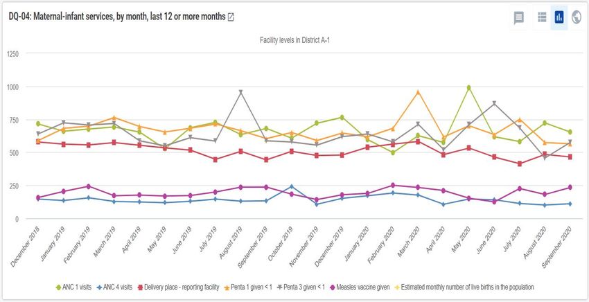
DQ-04 presents the nationwide totals, over the last 12 to 24 months, for several related maternal
health and immunization indicators.
10When DQ-03 is viewed at the beginning of a month, the data will not yet have been entered for last month. As a result, the
highest reporting rate for any health facility for the three-month period will be only 66.7%. For this reason, it is best to wait
until the data for last month have been entered for most health facilities before reviewing the data quality dashboard.
26District data quality assurance – a training package
Again, a chart with multiple lines may be difficult to read. Click on different lines to simplify the chart.
Is there anything suspicious in the data shown in the chart below?11
In a month-to-month chart like DQ-04, only the largest and most suspicious values can be identified.
As discussed later, the “Outlier” function of the WHO Data Quality Tool is much more sensitive for
detecting suspicious values than a month-to-month chart.
DQ-05 shows the month-to-
month trend in malaria cases.
Note that the values change a
lot between one season (June
to November) and another
(December to May). This
great variation in the values,
based on the season, makes it
very difficult to identify
suspicious data. A high value
may be due to a seasonal
increase or it may be due to
an error in the data. When
DQ-05 is viewed at national
level, no suspicious values are
seen. However, when this chart is viewed at district level, it may reveal suspicious values – especially
if a high value is reported during the non-malaria season (December to May).
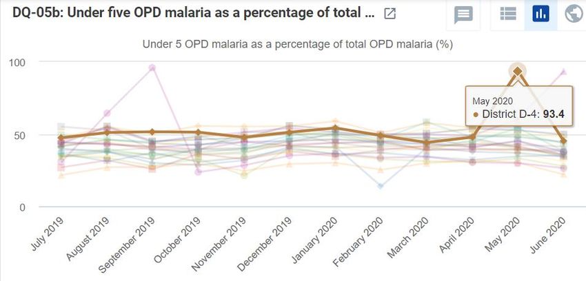
DQ-05b shows a way to identify suspicious malaria values when data are disaggregated by age group.
It presents, for each district, the trend in under-five outpatient department (OPD) malaria cases as a
percentage of total OPD malaria cases. At first glance, the chart looks like a mess of lines. However, if
the cursor is placed on the points which appear above or below all the other lines, what is seen?
For each month and for all districts, under-five malaria cases represent a roughly constant percentage
of the total malaria cases (25% to 50%). But District A-2 reported a much lower percentage than usual
for February 2020. This is quite suspicious and suggests that the malaria data for District A-2 for
February 2020 should be reviewed for a possible error.
11
The values for ANC 1 visits for May 2019 and January 2020 are suspiciously high. These are examples of extreme outliers.
27District data quality assurance – a training package
If DQ-05b is reviewed at the level of District A-2, a suspicious value is found for facility 197.
DQ-06 summarizes all the very large and extreme outliers reported for a selection of indicators. When
this table is viewed at national-level, it shows only the largest of extreme outliers found for any month
for each of the indicators listed.12 Each of these very large extreme outliers should be investigated.
12
Ignore the final column for “June 2020”. This appears to be due to a “bug”.
28District data quality assurance – a training package
DQ-06b provides a way to
begin such an investigation.
The first column (on the left)
lists individual health
facilities. There is a very
large and extreme outlier
for each of the columns
immediately following this
first column (ANC 1 outliers
> 1,000; etc.) To identify the health facility that reported the outlier, click on the cell specifying the
month beneath the name of the indicator. For example, click on the cell for May of last year beneath
ANC 1 outlier > 1,000. The rows of the table will then be sorted so that the very large outlier appears at
the top. The table then shows that the very large outlier (25,125) was reported by Facility 599 of
District D-1.
DQ-06c is configured for use at district level, to identify the specific health facility that reported each
extreme outlier, including smaller extreme outliers. This table may take a long time to appear. Do not
spend time reviewing it now. It will be reviewed as part of Tutorial 3.
Dimension 2b: Look for inconsistencies between related indicators
DQ-07 represents an example of how to compare the values of related indicators. In this case, the
chart compares, for each district, the number of Penta 1 doses to the number of Penta 3 doses. This is
done by calculating the “Penta 1 to Penta 3 dropout rate” which equals (Penta 1 doses minus Penta 3
doses) times 100 divided by (Penta 1 doses). This represents the percentage of children who receive
their first dose of Penta vaccine but who do not come back for their third dose. If the value is negative
for an entire district for a full 12 months, it means that the district reported more third doses of the
vaccine than first doses. DQ-07 ranks districts by their dropout rate from low to high; therefore, any
districts with a negative dropout rate will appear on the left of the chart.
29District data quality assurance – a training package
Dimension 3: Assess the consistency between coverage estimates
based on a survey and coverage calculated using routine data
Coverage surveys such as the DHS or the multiple indicator cluster survey (MICS) are often considered
to provide “the gold standard” for measuring coverage in childhood immunization, antenatal care and
deliveries in health facilities. Where possible, statistics from such surveys should be entered/imported
into DHIS2 so that coverage estimates based on a survey can be compared to coverage calculated using
routine data.
DQ-08 provides an example of this,
comparing the two estimates of Penta 3
coverage for each region. What can be
concluded from this chart? Are the two
coverage measurements consistent with each
other? For which region are the
measurements not consistent? If it is
assumed that the survey estimates are
reliable, what are some possible reasons why
the routine estimate for this region is not
consistent with the survey estimate?13 What
are some possible reasons why a survey
estimate may not be reliable?14
13
Some reasons why a coverage estimate based on routine data may be unreliable: 1) The number of Penta 3 doses may
have been over-reported, either accidentally (such as when completing the monthly report or when entering the data into
DHIS2) or as a result of doses of Penta 1 and Penta 2 (intentionally?) being misclassified and reported as Penta 3 doses; 2) The
denominator (estimated population under 12 months of age) may have been underestimated.
14 To provide reliable estimates, household surveys must use methods that strictly adhere to standards. Survey measures can
be less reliable for the following reasons: 1) sample size too small; 2) sample not selected randomly; 3) recall bias – reliance
on the memory of caretakers when vaccination cards are not available for a large percentage of children.
DHS and MICS surveys report the confidence intervals of survey estimates. These confidence intervals estimate the effect of
sampling error, which decreases as the sample size increases. However, surveys are also subject to non-sampling errors such
as those due to selection bias or recall bias. The direction and size of the non-sampling error of a survey can seldom be
estimated even though it may significantly exceed the sampling error.
30District data quality assurance – a training package Dimension 4: Assess the consistency of denominator/target estimates As previously discussed, if the estimate of the denominator/target is not reliable, the coverage estimates based on routine data will not be reliable. DQ-09 shows the year-to-year trend in the estimated denominators used to calculate coverage in maternal and infant health services. A simple chart such as this one can be used to quickly assess two aspects of consistency: 1) Have the estimated denominators grown consistently from year to year or has growth been significantly different in some years than in others?; 2) Is there a logical progression in the values of related denominators, i.e. “Expected pregnancies” are greater than “Expected deliveries” and “Expected live births” are greater than “Population
Tutorial 3: How to train district staff in
monthly use of DHIS2 data quality tools
Overview
The best way to assure the quality of DHIS2 data is for data managers to check it each month soon
after they have entered the data for most health facilities. DHIS2 provides two powerful tools for
quickly assessing the completeness and consistency of data:
1) a data quality dashboard which is visible as soon as the user logs into DHIS2; and
2) the WHO Data Quality Tool – a DHIS2 application.

This tutorial details the steps to follow for using these two DHIS2 tools to rapidly identify “outliers”
(suspicious data values) and important missing data values. By following the steps, it should be
possible to train district-level staff (for example, data clerks) in less than 30 minutes to use these data
quality tools.

Adapt this tutorial for the national instance of DHIS2
This document provides instructions and screenshots adapted for the “DQ Trainingland” instance of
DHIS2 (https://who-demos.dhis2.org/dq).15 To practice these steps, log in using the username and
password which appear on the login page.

When using the tutorial for training in a specific country, several of the screenshots and some of the
terms should be adapted to match the national DHIS2 instance.

Nationwide implementation of this approach to district data quality assurance will require that it is
incorporated into an update of the official standard operating procedures (SOPs) for data
management.

Review the Data Quality dashboard
Log in and review the data quality dashboard
Log into DHIS2 instance: URL: https://who-demos.dhis2.org/dq
Username: demo Password: District1#

A Data Quality dashboard is visible as soon as the user logs into DHIS2; it is not necessary to launch any
application to view the dashboard.

15
  Several of the charts and tables of the data quality dashboard are configured to present data for the “last 12 months”. The
months included in “last 12 months” will change each month. As a result, the screenshots included in this tutorial (which
were captured in July 2020, will differ somewhat from the dashboard presented on https://who.dhis2.net/dq. When
preparing for a training in a specific month, facilitators may choose to update Tutorial 2 and Tutorial 3 so that the “last 12
months” shown in the screenshots of charts and tables is current and identical to what will be seen on the DHIS2 website.
District data quality assurance – a training package

When a user
logs in at the
national level,
they see charts
and tables for
assessing the
data of the
entire country.

However, when
a district data
manager logs
on, they usually
see data only
for their specific
district.

                                             33
District data quality assurance – a training package
Filter the dashboard to see results for a single district
For supervisors and other staff monitoring data at higher levels, it is useful to “filter” the nationwide
Data Quality dashboard, to view results for only one specific district.
To do this, click on
the “Add filter”
button. A drop-down
menu appears. Click
on “Organization
Unit”
Click on “Organization Unit” and a
window appears. To view a list of
regions, click on the triangle to the
left of the checkbox for “National”.
To view a list of districts in a region,
click on the triangle to the left of
the checkbox for the region. Place
a check in the box for any district.
To view results disaggregated by
the facilities in the district, click on
the triangle to the right of “Select a
level” and choose “Facility”.
Click twice on “Confirm”: the
dashboard converts to show only
the results for the selected district,
disaggregated by facility.
34District data quality assurance – a training package
Assess the completeness of reporting
The first three items on the data quality dashboard can be used to assess the “reporting rates” (also
known as “completeness”) for key datasets. Reporting rate is defined as the number of monthly (or
quarterly) reports submitted, divided by the number of reports expected – expressed as a percentage.
DQ-01 shows the trend,
over the last 12 months,
in the district’s reporting
rates for multiple
datasets. When this chart
is viewed at the
beginning of a month,
the reporting rates for
last month (the month on
the right) will be very low
or zero. Why16?
A chart like the one
above, with multiple
lines, is useful but may be
difficult to read. To
simplify the chart, click
on the names of some of
the data elements or
indicators in the legend
at the bottom of the
chart. This will hide the
lines for those data
elements and the names
become light grey.
DQ-02 shows that DHIS2
can be used to configure
a chart that disaggregates
a reporting rate by type
of facility. For District A-
1, the reporting rate has
been 100% for each of
the last 12 months for
hospitals but not for
health centers.
16
When the chart is viewed at the beginning of a month, the monthly reports for the preceding month have not yet been
entered into DHIS2. Over the course of the month, the reporting rates for last month will increase.
35District data quality assurance – a training package
DQ-03 presents reporting rates for multiple datasets for the last three months for each of the health
facilities in the district. By clicking twice on a column header (e.g. “ANC reporting rate”), the rows can
be sorted from low to high for a specific dataset.
This feature is especially useful if there are many health facilities in the district, as more than can be
viewed at the same time on the dashboard. Question: When this table is viewed at the beginning of
a month, the numbers will be lower. Why?17
Assess the month-to-month consistency of the data
The next four items on the dashboard can be used to assess whether data are consistent from month
to month.
DQ-04 presents the district totals, over the last 12 to 24 months, for several related maternal health
and immunization indicators. The values for these indicators often do not change much from month to
month. As a result, the month-to-month trend lines for these indicators are often almost straight,
horizontal lines.
17
When DQ-03 is viewed at the beginning of a month, the data for the preceding month will not have been entered yet. As a
result, the highest reporting rate for any health facility for the three-month period will be only 66.7%. For this reason, it is
best to wait until the data for last month have been entered for most health facilities before reviewing the data quality
dashboard.
36District data quality assurance – a training package
A chart with multiple lines may be difficult to read. To simplify the chart, click on the names of some of
the data elements/indicators in the legend to hide the lines for those data elements. Is there anything
suspicious with the data shown in the chart below?
In a month-to-month chart like DQ-04, only the largest and most suspicious values can be identified,
especially when viewed at national level. However, when this chart is viewed at the level of District A-1
the value of ANC 1 visits for May of the current year18 is seen to be suspiciously high. There is also a
suspicious rise in the value of ANC 4 visits for October of last year. These are examples of “outliers”. As
demonstrated in the next section, the “Outlier” function of the WHO Data Quality Tool is even more
sensitive than district level dashboards for detecting suspicious values.
[Optional19] DQ-05 is called a
“year-on-year” chart. It shows
the trend in numbers of
confirmed cases of malaria for
multiple years. Note that each
year the reported number of
confirmed cases is much higher
during the season of June to
November, than in other
months.
During this season, a substantial
increase in the reported number
of cases may be due to the real
increase in the incidence of malaria. This makes it difficult to identify suspicious values of this
indicator. However, a sudden increase in reported malaria cases during the non-malaria season (e.g.
the value for March of last year) is suspicious and should be investigated.
18
If the dashboard is viewed during February to May it will not show results for May of the current year.
19
Year-on-year charts cannot be configured with versions of DHIS2 older than 2.31. However, similar charts can be viewed on
the Consistency-Time dashboard of the WHO Data Quality Tool.
37You can also read