Economic Geography of Contagion: A Study on COVID-19 Outbreak in India - DISCUSSION PAPER SERIES - Institute of Labor ...
←
→
Page content transcription
If your browser does not render page correctly, please read the page content below
DISCUSSION PAPER SERIES

IZA DP No. 14400

Economic Geography of Contagion:
A Study on COVID-19 Outbreak in India

Tanika Chakraborty
Anirban Mukherjee

MAY 2021
DISCUSSION PAPER SERIES

IZA DP No. 14400

Economic Geography of Contagion:
A Study on COVID-19 Outbreak in India

Tanika Chakraborty
Indian Institute of Management Calcutta and IZA
Anirban Mukherjee
University of Calcutta

MAY 2021

Any opinions expressed in this paper are those of the author(s) and not those of IZA. Research published in this series may
include views on policy, but IZA takes no institutional policy positions. The IZA research network is committed to the IZA
Guiding Principles of Research Integrity.
The IZA Institute of Labor Economics is an independent economic research institute that conducts research in labor economics
and offers evidence-based policy advice on labor market issues. Supported by the Deutsche Post Foundation, IZA runs the
world’s largest network of economists, whose research aims to provide answers to the global labor market challenges of our
time. Our key objective is to build bridges between academic research, policymakers and society.
IZA Discussion Papers often represent preliminary work and are circulated to encourage discussion. Citation of such a paper
should account for its provisional character. A revised version may be available directly from the author.

 ISSN: 2365-9793

 IZA – Institute of Labor Economics
Schaumburg-Lippe-Straße 5–9 Phone: +49-228-3894-0
53113 Bonn, Germany Email: publications@iza.org www.iza.org
IZA DP No. 14400 MAY 2021

 ABSTRACT
 Economic Geography of Contagion:
 A Study on COVID-19 Outbreak in India*
 We propose a regional inequality-based mechanism to explain the heterogeneity in the
 spread of Covid-19 and test it using data from India. We argue that a core-periphery
 economic structure is likely to increase the spread of infection because it involves
 movement of goods and people across the core and peripheral districts. Using nightlights
 data to measure regional inequality in the degree of economic activity, we find evidence in
 support of our hypothesis. Further, we find that regions with higher nightlight inequality
 also experience higher spread of Covid-19 only when lockdown measures have been
 relaxed and movement of goods and services are near normal. Our findings imply that
 policy responses to contain Covid-19 contagion needs to be heterogeneous across India,
 depending on the ex-ante economic structure of a region.

 JEL Classification: I15, I18, R1
 Keywords: COVID-19, contagion, core-periphery, nightlight, industrial-
 heterogeneity

 Corresponding author:
 Tanika Chakraborty
 Indian Institute of Technology
 FB 626
 Kanpur, UP 208016
 India
 E-mail: tanika@iitk.ac.in

 * We thank the seminar participants at the Delhi School of Economics and South Asian University for their helpful
 comments. We are particularly grateful to Robert Carl Michael Beyer for the nightlights data and helpful feedback on
 the paper. Srutakirti Mukherjee and Vishal Nagwani provided excellent research assistance. Chakraborty acknowledges
 the financial support provided by IIM Calcutta for this research.
1. Introduction
The Covid-19 epidemic that started from China in the month of November, 2019 has already
created a havoc worldwide. With 113 million confirmed cases and 2.5 million deaths as of
February 27, 2021, Covid-19 is being labelled as the worst epidemic since Spanish Flu of 1918.
One of the striking features of the Covid-19 epidemic is the cross-country variation in terms of
the number of infected and deaths; the number of confirmed cases per 1 million population is
much higher in Europe and America than in Asia and Africa. For example, while the number
of confirmed patients per 1 million population is 87,884 in the USA and 61,222 in United
Kingdom, it is only 7989 in India, 3860 in Sri Lanka and 4,178 in Zambia. Such cross-continent
comparisons, however, is not always meaningful as underdeveloped countries often do not
have enough facilities to carry out more tests and the lower number of cases could just be the
result of a smaller number of tests. But the cross-country differences are difficult to miss even
if we compare similar type of countries. For example, the number of confirmed patients per 1
million population in Canada, standing at 22,766, is almost one fourth of that in the United
States. A similar difference within a continent can also be seen among European nations; the
number of confirmed patients per 1 million population is 78,986 in Portugal, 63,172 in
Netherlands, 48,140 in Italy and 29,010 in Russia1.
There could be several factors that explain such cross-country differences; the major candidates
being population density, urbanization, available infrastructure to carry out effective quarantine
etc. While social and demographic characteristics may partly and significantly explain the
variations in the extent of the contagion, we propose a different explanation based on the
economic geography of a country. We argue that the contagion depends on certain patterns of
regional development. Our argument draws heavily on the economic-geography theory of
economic development, pioneered by Paul Krugman (see Krugman, 1991; Krugman and
Venables, 1995) which shows that the process of economic development ends up creating a
heavily industrialized, small core area, surrounded by a large non-industrial periphery. In the
absence of the core-periphery pattern, different regions within a country can operate in autarky
and in the event of any outbreak in that country, an infected region can be disconnected from
the rest of the country without seriously disrupting the supply of essentials. This becomes more
difficult in presence of core-periphery structure where remote regions are all connected with
the economic hub and therefore to each other. If any of the hubs get affected -- which is a likely
scenario as hubs are densely populated -- the contagion does not only spread within the hub,

1
 The country specific data come from https://www.worldometers.info/coronavirus/ as of 28 February, 2021

 2
but it spreads to the remote areas as well. Given the heavy dependence of peripheral areas on
the core in a core-periphery structure, any attempt to isolate the core will impose a very high
burden of economic costs on the peripheries.
In our paper, we propose the hypothesis that the extent of contagion will be higher in areas
characterized by higher regional inequality (i.e., core-periphery structure). Even though we
motivated our research by giving international examples, doing this analysis using cross
country samples hardly makes any sense as difference across countries could be the result of
institutional or cultural differences which are difficult to control. We, instead, explain variation
in infection rates across regions within India by variations in the potential degree of the core-
periphery structure across these regions.
The core-periphery structure essentially embeds regional inequality. For instance, a state
showing a stronger core-periphery structure will also have greater intra-state economic
inequality. In addition, night time luminosity is a well-established measure to compare
economic and industrial development across countries as well as regions within a country
(Henderson, Storeygard and Weil, 2012; Prakash et al., 2019). Hence, we construct a regional
inequality index based on night time luminosity data, across the districts of India, to measure
of the core-periphery structure of a region2.
The higher the luminosity level of a district, the higher is the level of industrial development
in the district. Therefore, a state will have a stronger core-periphery structure if inter-district
nightlight inequality in that state is high. We expect that the states with higher intra-state
regional inequality will show higher Covid-19 infection rate, after accounting for other factors
that vary across states and over time. We follow the growing literature on Covid 19 to identify
a range of variables to control for. Most of the hypotheses, that are tested by other researchers,
are either some ideas generated from the understanding of contagious diseases in general (e.g.
contagion spreads faster in densely populated area) or some heuristics that originated from
casual, empirical observations (e.g. COVID 19 spreads less in areas covered by BCG
vaccination). The controls we consider, fall in three broad categories: demographic, economic
and disease environment. Section 2.2 provides further details on these potential correlates.
However, even after including a long list of variables, one obvious issue with using a state level
measure of regional inequality is that we cannot account for unobserved state level correlates,
of both inequality and contagion; governance, institutions or culture, to name just a few. To
address this endogeneity issue, we construct a measure of district-neighbourhood inequality

2
 We use night time luminosity and nightlights interchangeably in this paper.

 3
which measures regional inequality among a group of neighbouring districts. We use it to
explain variations in contagion rate across districts within a state. This allows us to eliminate
state specific unobserved heterogeneity.
In addition to the core-periphery framework using nightlight inequality, we also investigate
whether the extent of contagion in a district is affected by the industrial heterogeneity of the
district. Our measure of industrial heterogeneity captures the extent to which a district’s work
force is fractionalized across industries. A district with higher heterogeneity would mean that
people in that district are employed in a greater number of industries than in a district with
lower heterogeneity. While in spirit, industrial heterogeneity of a district is related to the core-
periphery structure, this measure is expected to affect the contagion rate in a more complex
way than regional inequality. On the one hand, a district with more industries would mean that
that district can survive in autarky and therefore, has lower chance of infection. But in such a
district, a family would typically have members working in different industries. Hence, if one
member’s workplace is hit by the contagion, it will infect other members of the family and
eventually the industries other members are working in. The net effect of these two
countervailing forces is ambiguous.

The mechanism that underlies both of our measures involves movement of people – from core
to the periphery or from the household to various industrial clusters. In response to the Covid-
19 contagion, the Indian government, in March 2020, announced a lockdown resulting in
suspension of usual activities of government offices, business establishments and educational
institutions. Subsequently, over different phases of lockdown (and eventually unlocks)
different types of activities were allowed. These different phases of lockdown and unlock led
to different degree of movements of people and vehicles. Hence, for both regional inequality
and industrial heterogeneity, we expect the relative strength of their effects on the contagion to
depend on the degree of movement restrictions across different phases of lockdown and unlock.
Accordingly, we check how the relationship between Covid-19 infection rate and regional
inequality changes across different phases of lockdown and unlock.
Our findings support the hypothesis that the core-periphery economic structure leads to a higher
spread of the infection. We find that a higher degree of state level regional inequality in
nightlights leads to greater contagion. Our findings are similar when we account for state fixed
effects and state level linear time trends using the extent of nightlight inequality in a district’s
neighborhood. In both cases, the findings remain robust to a staggered inclusion of all the time
varying district and state level variables. The heterogeneity analysis by phases of nationwide
 4
lockdown and unlock, as announced by the Central government, shows that the core-periphery
structure contributes to the spread of the Covid19 infection when the economy opens up. The
results are absent or muted during the lockdown periods and early phases of unlock. Similarly,
a district with greater industrial heterogeneity also experiences a higher contagion once the
economy opens up. The results from our heterogeneity analysis underscores the channel
through which the core-periphery structure or the industrial heterogeneity affects the contagion.
Greater movement of people from the core to the peripheral districts or across industries within
a district causes greater contagion, after accounting for district level economic development.
In a similar vein, we also use unemployment rates as proxy for movement of people (or lack
thereof) and investigate its interaction with the core-periphery structure. We find that districts
with higher levels of baseline unemployment experience a lower contagion within states with
greater regional inequality in nightlights.
The findings in this paper contribute to the section of the literature which looks at the policy
response of governments in face of Covid-19. The most common strategy practiced by any
government is that of lockdown which is complemented by health policies. Chiplunkar & Das
(2020) showed that the nature and extent of such policies vary widely across countries
depending on the political system prevailing in those countries. Nevertheless, we have seen
that whenever a lockdown was imposed, more often than not it was imposed homogeneously
across all the regions of a country. Such a country wide lockdown involves huge economic
loss. In the context of India, for example, quite a few papers estimated the negative impact of
lockdown policies on economic outcomes (Beyer, Jain and Sinha, 2020; Beyer, Franco-Bedoya
and Galdo, 2021). Our paper, on the other hand, provides a road map of selective lockdown
that can minimize the economic costs. We argue that a contagion is more severe in areas
characterized by higher regional inequality and therefore, lockdown should be imposed more
stringently in these areas. The idea of selective lockdown is not completely novel. We have
seen that during the unlock phases, Indian government has followed this strategy based on the
number of confirmed cases in an area. Essentially, under this policy, the districts were
categorized in to various color-coded zones based on the severity of the contagion. The districts
with a very high number of cases were labelled as red zone and the most stringent lockdown
policy was imposed on them. The orange and green districts had moderate and low number of
cases, respectively, and the stringency of the lockdown policies were more relaxed in these
districts. But this categorization was done based on the number of confirmed cases, an ex-post
realization. The selective lockdown strategy that follows from our work is better than this
policy. Unlike the government strategy which uses the ex-post number of confirmed cases, our
 5
strategy is based on an ex-ante measure, regional nightlights inequality, that can determine the
severity of the contagion. Therefore, while government strategy only works after an area is
severely affected, our approach can be deployed before the contagion spreads and can be used
to minimize economic and human loss.
Our paper is structured in the following way: in section 2 we discuss the data and descriptive
statistics, in section 3 the empirical strategy, in section 4 the results. In section 5 we conclude.

2. Data and Descriptive Statistics
2.1 Data on Covid-19 infection: state-wise variation
In this section we outline the various sources from where we collect our data and explain the
distribution of Covid-19 infection and death rates across various states during our sample
period. One of the serious issues that we face is regarding the quality and availability of data
for different states. Since health is a state subject in India, district level information on Covid19
infections in India is provided by each state. States have followed their own templates, in
publishing the information related to Covid19 tests and infections, which has also changed over
time within each state. While the non-uniform format across all states and over time poses its
own challenges, a much bigger constraint is that some states provided district level information,
while others have only provided state level information on tests conducted and cases
confirmed, active or recovered. Even within each state, sometimes the information published
is aggregated and sometimes disaggregated. Since all states are required to pass on the detailed
information routinely to the centre, Ministry of Health and Family Welfare also provides the
data on confirmed, recovered, active and deaths aggregated at the state level for the current
day. However, there is no central database that publishes and updates either patient level
information or even district level information on tests and detections for all India on a daily
basis. Fortunately, a crowd sourced initiative, Covid19india came up in India in the early days
of the pandemic which gathered data from various publications of state governments available
online, such as twitter feeds of different state’s health department, press releases and bulletins.
They created a publicly available database of Covid19 infections in India. We obtain all
information related to Covid19 from this database available at
https://www.COVID19india.org/.
In our paper, we seek to explain inter-state heterogeneity in terms of Covid-19 infection rate.
The state governments tried to control the contagion by using the dual strategies of tracing
whereabouts of people who came in direct contact with confirmed patients and restricting
general movements of the mass through lockdown. While the former took the centre stage in
 6
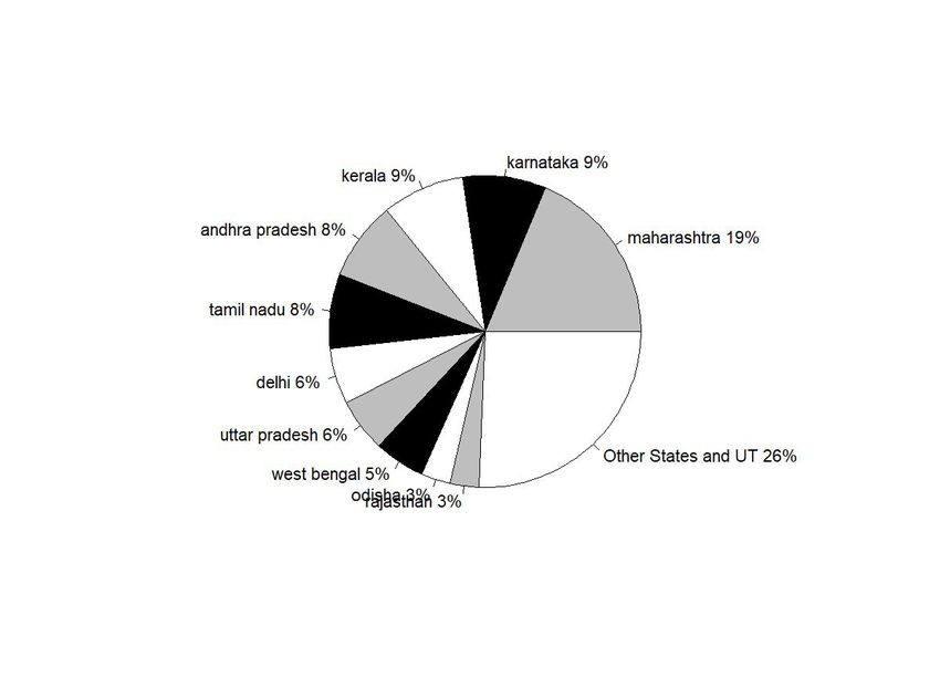
the first one or two months, eventually the strategy of shutting down economic activities
became the spearhead of government’s anti-Covid policies. In the early days of the pandemic,
the data source we are using was able to collect and create a patient level database on daily
basis. The patient level data provides information on the location, gender and age of each
patient recorded and even has information regarding the mode of infection, as a result of contact
tracing. For instance, the data records whether the infection was likely contracted from a
relative or friend, from a public gathering, while travelling by train etc. This means that it most
likely points to a possibility of community infection in cases where the source could not be
traced. Figure 1 plots the fraction of cases that could not be traced across India and how that
evolved over time.
 Fig 1: 7-Day Average India Fraction of Community Infection vs Total Confirmed
It shows that towards the beginning of the pandemic, up until March 15th, the source of almost
all cases could be traced. By March 15th, India had about 114 Covid positive patients. As time
evolved and the number of Covid infections started climbing, the extent of contact tracing went
down, and the fraction of cases that were untraced went up. The nationwide lockdown in India
started from March 22nd. From early April, the source of infection could hardly be ascertained
for any case and after the first week of April, by when there were around five thousand cases
in India, there was either no attempt to trace the source or the information stopped coming in.
With an increase in the number of infections, not only was it more challenging to find
information on the source of infection, it became difficult to get information on a case-by-case
basis and the individual level data was also discontinued after 26th April. From then, only
district level measures are available consistently on the basis of publications by the health
departments of each state. In a few cases where the specific state only published state level
aggregates, only state level measures are available. Please see appendix table 1 for the details
of data availability.
 Figure 2: Share of Covid-10 confirmed cases in 10 leading states
Figure 2 shows the distribution of Covid infections across states as of 1st February, 2021. 10
states account for more than 75% of all cases in the country. Hence, for the rest of the
descriptive statistics on Covid-19 infection in India, we report expositions based on these 10
states.
Figure 3 shows the evolution of Covid over time in the top 10 states. As has been well known,
Maharashtra led by a big margin, in total number of infections, over the entire period of time
from the onset of the pandemic in India to early February, 2021, when our data ends. It was
followed by Delhi for a short while. But Delhi was quickly surpassed by Andhra Pradesh, Tamil
 7
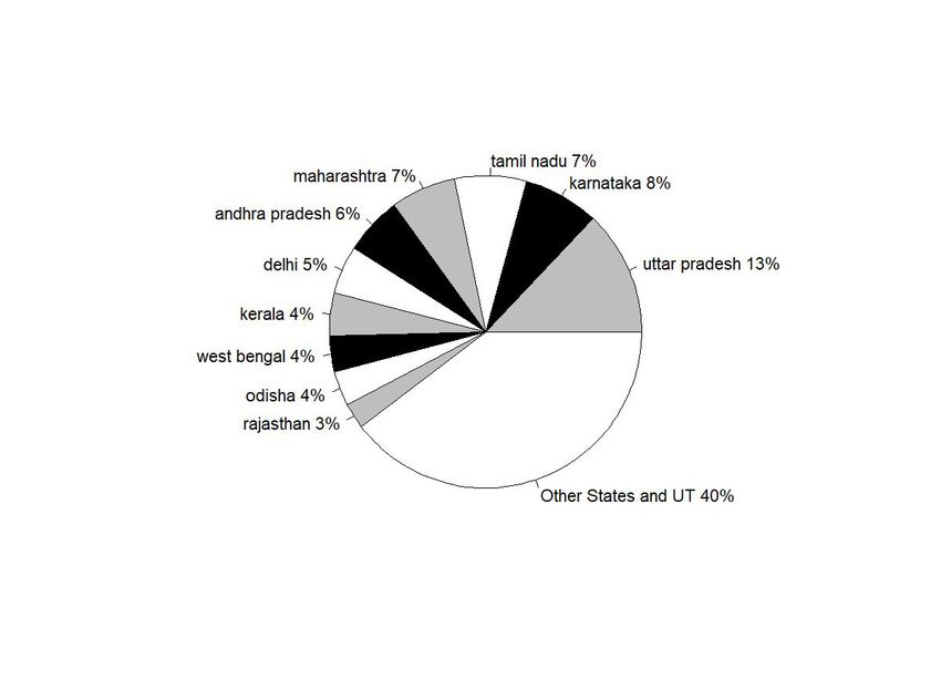
Nadu , Karnataka and UP by August. The rest of the states in the top 10, viz. West Bengal,
Bihar, Telangana and Assam remained relatively closer to each other and later.
 Figure 3 : Time series Share of Covid-19 confirmed cases in 10 leading states
While this graph gives an overall idea about the cross sectional spread of the disease across
India, it fails to account for the difference in sizes of these states. For example, comparing the
entire state of Maharashtra with Delhi may be not be very informative given the large difference
in population and land sizes.
 Figure 4: Total confirmed Covid-19 cases per 100 thousand population of the states.
Figure 4 normalizes the total numbers by population sizes of each state. States such as
Maharashtra and Tamil Nadu which dominate the Covid-19 scenario in India in terms of total
number of patients rank much lower when we consider per capita infection spread. Now, Delhi
surpasses all other states by a large margin with the gap starting to show up significantly from
early June. Andhra Pradesh, which was much lower down initially, caught up with Delhi by
September. Maharashtra and Tamil Nadu are the next in the list which remained much below
Delhi but much higher up than other states throughout the period. Like Andhra Pradesh
Karnataka too caught up, although at a lower level with Maharashtra and Tamil Nadu, around
September. Next in the order are Telangana and Assam, followed by West Bengal. Uttar
Pradesh, being the largest state was high up in the list of total infections, but towards the end
in the list of top ten, along with Bihar.
Of course, one must also keep in mind that these numbers, observed in isolation, hides more
than it reveals. States that tested more and tested more efficiently are more likely to report more
cases. While we cannot say much about effectiveness of testing samples and procedures,
Figures below present the total number of tests performed by each state over time.
 Figure 5a: Pie Chart: Total tests in 10 leading states
 Figure 5b: Time series of total tests in 10 leading states
 Figure 5c here: State-wise Per capita Tests
Figure 5a and 5b show that there is a wide disparity in the number of tests performed across
different states. For instance, while Maharashtra accounted for 21% of India’s total case load,
it only constituted 6% of all tests conducted. On the other hand, while UP accounted for 6% of
the cases, it conducted 13% of tests. However, once again, these numbers are not exactly
comparable for a) different states have conducted different shares of RTPCR and RAT tests
which are known to have significantly different accuracy (Chakrabarti, 2020)and 2) at the very
least test data, just like case load, needs to account for difference in population sizes.
Information on the first is available only for a handful of state-date combinations and therefore,
 8
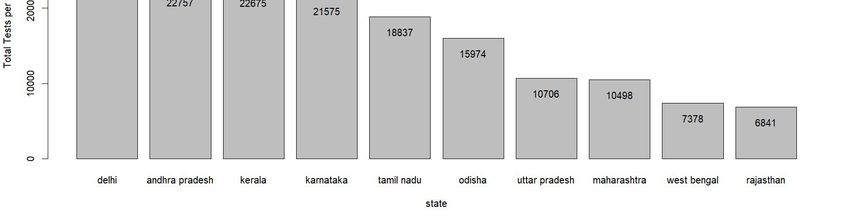
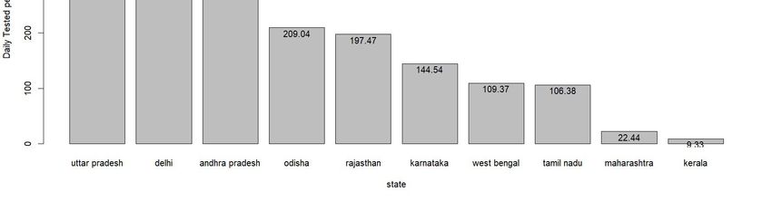
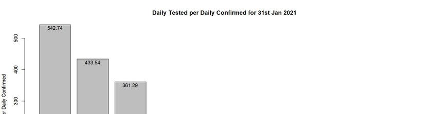
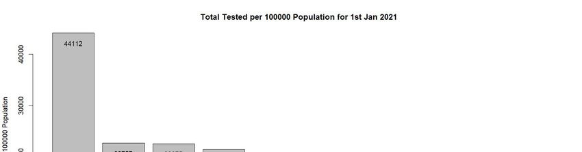
it is difficult to make the comparison. Figure 5c which represents number of tests per 100000
population addresses the second issue. We find that that when normalized by population, Delhi
becomes the front runner with 44,122 tests per 1,00,000 population. Uttar Pradesh (UP), on the
other hand, which carried out more tests than any other test, ranks low when we compare using
this metric. It has carried out 10706 tests for each 1,00,000 population. Maharashtra is very
close to UP with 10498 tests.
However, the direction of causality underlying the positive relationship between tests and
confirmed patients can run both ways. On one hand, if a state runs less tests, there will be lower
number of confirmed patients. But on the other hand, a state that is suffering from lower degree
of pandemic, may decide to run less tests and save resources. One way to check which one is
correct by looking at test per confirmed patient ratio. This tells us for each Covid positive case
how many non-Covid people have been tested.
 Figure 6a: Tests per confirmed patients: All India time series
 Figure 6b: Tests per confirmed patients: Top 10 states bar chart as of 1 Feb, 2021
Figure 6a shows the variation in this number for India over time – from 31 March, 2020 to 31
January, 2021. We find that in the month of April, 2020 this ratio hovered around 25 which
means for each positive patient tested, there were around 24 non infected persons tested.
However, beginning May, the ratio fell below 25 and remained so until October 2020. From
then the ratio picked up and towards the end of the year 2020, it came close to the 100 mark.
From figure 6b, we see wide variation in this ratio across states. In this case, the ratio has been
calculated taking the cumulative test and confirmed case figure for the entire period (January
31, 2020-January 31, 2021) into account. For Maharashtra and Kerala, this ratio is really low
(22.44 and 9.33 respectively). But it is very high for Uttar Pradesh (542.74) and Delhi (around
433.54). Among other states, Andhra Pradesh, Odisha and Rajasthan come somewhere in the
middle which tested around 200-300 non-infected people to get 1 confirmed case. On the other
hand, the ratio is around the 100 mark for states such as Karnataka, West Bengal and Tamil
Nadu.
Finally, in addition to total infections what also matters, to understand the extent of the
pandemic, is the death rate. Figure 6 plots the case fatality rate across the top 10 states.
 Figure 7: State-wise case fatality rate in 10 leading states
To be sure, the case fatality rate, although a ratio, is also not directly comparable across states
without accounting for differences in testing numbers. This is made clear when we look at the
numbers for West Bengal which stands out with an extremely high case fatality rate towards
the early part of the pandemic. However, the fatality rate fell equally sharply for West Bengal
 9
by end of June, also a time when test rates in Bengal started climbing up (see Figure 7).
However, as all states increased their testing rates by July, the case fatality rate fell and finally
we notice a convergence in fatality rates across states. However, as in the case of Covid-19
infections, there are inconsistencies in the data on deaths particularly during the early part of
the pandemic. Moreover, most states did not consistently publish death data at the district level.
Hence, we restrict our analysis to the spread of the disease from May 4, 2020, onwards, when
the third phase of nationwide lockdown started in India.
There are two reasons why we choose this date cut-off. First, the district level database of
Covid19india.org starts from this date possibly because the quality of data gets better from this
period as different state governments start reporting data in a consistent fashion. Second, our
theory is relevant when there are some movements of goods and people. In the first month of
lockdown (lockdown 1 and 2) very stringent restrictions were imposed on business and
vehicles. From 4 May 2020, the nationwide lockdown was eased for the first time with several
relaxations. Further, we include the following major states in our sample3. Andhra Pradesh,
Bihar, Chhattisgarh, Gujarat, Haryana, Himachal Pradesh, Jammu and Kashmir, Jharkhand,
Karnataka, Kerala, Madhya Pradesh, Maharashtra, Odisha, Punjab, Rajasthan, Tamil Nadu,
Uttar Pradesh, Uttarakhand, West Bengal. As of February 1, 2021, the last date for our data,
these states together account for around 84% of our data.
While our empirical specification accounts for state fixed effects, we try to account for time
invariant district level covariates and time varying state or district level covariates using
existing information on correlates of Covid-19 contagion. However, given the novelty of
COVID 19, our choice of correlates is not grounded in any theory. Most of the hypotheses, that
are tested by other researchers, are either some ideas generated from our understanding of
contagious diseases in general (e.g., contagion spreads faster in densely populated area) or
some heuristics that originated from casual, empirical observations (e.g., COVID 19 spreads
less in areas covered by BCG vaccination). For instance, the hypotheses regarding the Bacillus
Calmette-Guérin (BCG) childhood vaccination has been tested by Miller et al. ( 2020) and they
found that countries without universal BCG vaccination such as Italy, Nederland and USA had
been more severely affected by COVID 19 than the countries with universal BCG program, at
least at the time they wrote the paper. There has been quite a few papers looking at the

3
 Our estimation sample includes 19 major states. It excludes among others Delhi and other Union Territories.
Since Union Territories are not divided in to districts, we cannot calculate nightlight inequality. Also, for Delhi,
the Covid data is reported for Delhi as a whole. Consequently, there is no district level variation within Delhi.
And nightlight inequality does vary over time. Hence it will mean a single nightlight inequality measure will
explain variations in Covid over time.

 10
correlation between temperature and COVID infection which has been found to be negative
(less contagion in high temperature area) (Bannister-Tyrrell et al., 2020; Wang et al., 2020,
Sajadi et al. 2020). However, there are papers which dispute this claim of negative relationship
between temperature and COVID infection. In one such paper, Zhu & Xie ( 2020) looking at
the COVID situation 122 cities across China, did not find any consistent negative relation
between temperature and COVID infection.
Taking cue from the existing literature and ideas we use a rich set of covariates consisting of
demographic, weather, economic and disease environment related variables. Under the
demographic variables we consider population density. We control for weather variations using
temperature, rainfall, latitude and longitude. The variables that are considered under the
economic category include levels of nightlight and unemployment. The disease environment
variables include general immunization rate, BCG immunization rate and historical Malaria
index.
We combine the Covid-19 database with information on these demographic, health, social,
economic, geographic and meteorological indicators from multiple sources for our analysis.
While some of these indicators, including the information on Covid-19, are available at the
district level, a few of our measures could only be obtained at the state level. Therefore, for the
testing of our hypotheses we use the district level aggregated information where data is
available. In some cases, where we are restricted to state level data, we use state level
aggregation.
Below we provide a detailed outline of all the supplementary data sources, summarising each
variable used in our analysis in Table 1.
 Table 1: Summary Statistics here

2.2 Data on Demographic variables:
 The demographic variables that we use, include the population of the district and population
 density. However, the data come from 2011 census. In case of those districts that were created
 after 2011, we use the total population for the original district from the 2011 census and then
 distribute it in proportion to land area among the newly formed districts. The average
 population in a district is roughly 2.1 million. The average population per square km of a
 district is 601, with a standard deviation more than double the value. We use the total
 population in a district to calculate our dependent variable, per capital infection rate in a
 district.

 11
2.3 Data on Weather variables:
The temperature and rainfall variables are obtained from the Indian Meteorological
Department. Both variables are measured at the district level on a daily basis. Hence, we are
only able to use data from 2019 since updating the Covid data on a daily basis would also
require real time weather data for 2020, which is not freely available. The average temperature
remains around 34 degree Celsius. Mean rainfall is about 6.6 mm but with a very high variance.

2.4 Data on Health variables:
We have discussed earlier that there are studies trying to link between the extent of BCG
vaccination program and spread of COVID 19 outbreak, claiming that the relationship between
these two variables is negative. To allow for such variation in the spread of Covid19 across
India, we have included the extent of BCG vaccination in Indian districts measured by the
fraction of children in a district who have been given BCG vaccination, as of 2007-2008, the
earliest year for which we could find district level information on BCG vaccination. The data
comes from District Level Household Survey (DLHS)-3, a nationally representative sample
survey covering 720,000 households, that was conducted in 2007-08. There is another potential
correlate that have been discussed in popular media – malaria prevalence. It was observed that
COVID 19 infection is negatively related to malaria prevalence. Hence, we include information
on prevalence of malaria across the districts of India, from the colonial period, as one of the
independent variables in our regression framework. The data comes from Cutler et al. (2010).
This data provides a classification of districts according to its malaria intensity. There are 6
categories in total – categories 1 and 2 for non-malarious, 3 and 4 for potential epidemic, while
5 and 6 are classified as malarious.

2.5 Measures of the Core-Periphery structure:
2.5.1 Nightlight inequality – state level
Finally, we turn to our main variable of interest. We use nightlight data that measures the
luminosity of night time lights using the satellite images. Typically, nightlights data is widely
used as a proxy for economic activity. We use the district level measure of luminosity in 2019
to create a state level inequality of luminosity. Specifically, we use the ratio of the highest 90%
to the lowest 10% from the distribution of luminosity across districts within a state. We argue
that the state level dispersion captures the degree of conglomeration in a state. In addition to
the inequality measure, we also control for the level of nightlights in a district as a proxy for
overall economic development.
 12
2..5.2 Nightlight inequality – district-neighbourhood level
We use this measure to solve the problem of unobserved heterogeneity at the state level. We
call two districts neighbour if they share boundaries. This way for each district there exists a
cluster of districts which form its neighbourhood. We calculate the nightlight inequality for
this neighbourhood. The neighbourhoods typically consist of 3-4 districts and therefore, our
original measure of inequality – ratio of 90th and 10th percentile does not make much sense.
Instead, we measure nightlight inequality in the following way:
.
 (2)
 =1−

In the above expression measures the neighbourhood nightlight inequality for district d,
 measures the minimum nightlight in the neighbourhood of district d while the
maximum value in the neighbourhood. This expression essentially becomes / where
 refers to range (Max-Min) of nightlights in the neighbouring districts. Range captures the
degree of dispersion and therefore, higher the value of , higher will be the value of
neighbourhood inequality.

2.5.3 Industrial Heterogeneity Index:
We argued that states with greater inter district inequality is more likely to suffer from greater
degree of infection. We reasoned that a state characterised by greater intra-state regional
inequality is likely to experience more inter district movements of goods and services between
districts causing the disease spread at a faster rate. In this subsection we test the hypothesis in
a different way. Here, we calculate the industry mix present in a district and argue that a district
with greater industrial heterogeneity will suffer from less degree of contagion as it depends less
on other districts for supplies.
We calculate industrial heterogeneity using the following formula:

 = 1− (2)

Where is the district level heterogeneity index and is the share of labor force in industry
i and district d.

 13
2.6 Correlation between Covid-19 infection and explanatory variables
Figure 7 shows the bivariate relationship between the spread of Covid and the various factors
that we discuss above. We find a positive correlation between nightlights inequality and the
total number of infections reported in a state, with most states huddling up around the mean
relationship. However, Andhra Pradesh seems to have a much higher level of covid infection
compared to what is predicted by its level of nightlight inequality. Uttar Pradesh, on the other
hand, seems to have a much lower level of Covid 19 infection compared to what is predicted
by its level of nightlight inequality. These other factors that potentially predict the spread of
the infection are shown in the rest of the panels.
 Figure 8: Correspondence of Total Confirmed Covid19 cases per 100,000 people with
 various potential determinants of the spread of the infection.
As expected, the intensity of infection is higher in states with higher population density.
However, contrary to what has been noted based on cross country evidence, we find a positive
correlation between the spread of Covid19 and the penetration of BCG vaccination in a state.
Since poorer health infrastructure could predict both the extent of BCG vaccination and
Covid19 spread, we also used the overall level of immunization. Once again, we find a positive
relationship between the prevalence of immunization in children in 2007-08 and Covid19
spread. With respect to the intensity of malaria we find that states with higher historic
prevalence of malaria have experienced a lower spread of Covid19. Finally, we find that states
with industrial heterogeneity also experienced a higher spread of the infection. While bivariate
relationships are useful to see the comparative position of states on each factor and the resultant
spread of Covid in the state, it is important to purge the effect of each of these variables to get
closer to the true relationship between nightlights inequality and the spread of covid 19. We do
that in the next section.

3. Empirical Model
In our empirical section we perform two major exercises – estimate how the core-periphery
structure of the economy along with the demographic, economic factors, weather and disease
environment influence the COVID 19 infection. We test this with the district level information.
The specific model we estimate for this purpose is the following:
 = + + + + (1)

In the equation above, y captures the measure of contagion (number of confirmed Covid-19
cases per 1000 population) in district d, state s and time t. Time is measured as number of days.
 14
NLI represents nightlight inequality in state, s (the construction of this variable is discussed in
section 2.5), X represents district, district-time and state-time varying controls. In our
analysis we have only two variables that vary at district-time level – temperature and rainfall.
Most variables, such as latitude, population density, BCG vaccination, historical malaria
intensity, nightlights, are all recorded at the district level and does not vary with the days of
2020. We also include the extent of Covid tests conducted. It varies across states and with the
days of 2020. is our parameter of interest. The variable T measures the day of the year. We
assign a value of 1 to the 1st day of January 2020 and cumulatively calculate the number of
days for each date in the 2020 calendar.

4. Results
4.1 Baseline Results
In Table 2 we report the estimates from equation (1), our baseline specification. Our main
variable of interest is nightlight inequality and from our hypothesis, we expect that the effect
of nightlight inequality on confirmed cases to be positive – the more unequal a state, the greater
will be the movement between the core and the peripheral regions and higher will be the degree
of Covid-19 contagion. In column 1, we regress total confirmed cases per 1 million population
in a district on nightlight inequality at the state level. As expected, the coefficient for nightlight
inequality is positive and significant.
 Table 2: Baseline Regression
In column (2) we add factors that determine the number of confirmed cases mechanically. First,
since the rate of infection is likely to vary over time, we include controls for time elapsed as
days since January 1, 2020. Second, the number of Covid-19 tests performed has also varied
significantly across the states. We include daily Covid-19 tests performed. Finally, the extent
of urbanity or development of an area determines where the infection started spreading first.
Hence, we include average nightlight of a district before Covid-19 started, from 2019. In
columns 3-7 we include additional district level characteristics which are potential predictors
of the number of cases per capita. In column (3) we add population density of the district, in
column (4) we add a district’s monthly temperature and rainfall information, in column (5) we
add the extent of BCG and overall immunization, which includes tuberculosis, influenza etc.,
cover in a district, in column (6) we add malaria intensity from historical data during the
colonial period, and finally in column (7) we add controls for district’s latitude and longitude.

 15
We see that the coefficients for nightlight inequality are positive and significant across
specifications implying that a state characterized by a stronger core-periphery structure,
necessitating movement of goods and people from the core to the periphery, experience a
greater rate of Covid-19 infection per capita. The number of tests conducted seems to be
negatively correlated with the number of infections in columns 2 through 4. This could simply
reflect that states with worse health investments have more cases and conduct fewer tests.
Indeed, as a wider range of a state’s health indicators are accounted for in columns 5-7, we find
a positive correlation between Covid-19 tests and cases, as is likely to be the case mechanically
since more tests will result in more detected cases.
The negative coefficients on number of days elapsed since the beginning of the pandemic
suggests that the average number of infections per capita fell over time. One reason this could
happen is that after the initial first wave, there has been a secular decline in the Covid cases till
1st February 2021, the end date in our data, and the sub-periods of decline are dominating the
aggregate situation. This idea becomes clearer when we show phase-wise results.
As expected, the coefficients for district level nightlights are also positive and significant across
specifications implying that greater urbanization or economic development is correlated with
a higher rate of infection. One counter-intuitive finding is that the population density is
negatively related with the total confirmed cases per 1000 population. One possible reason
could be that richer areas usually attract more people and therefore, more densely populated
and richer areas could be the ones which are better managed in terms of contact tracing and
disease prevention. In line with the popular belief, we find that daily infections rise with fall in
temperature. The relationship between infection and rainfall, however, is positive. Contrary to
the popular beliefs, daily infections are higher in districts with greater level of vaccination
(BCG and overall). The correlation between infection and malaria intensity is negative initially
but after accounting for a district’s latitude and longitude, turns positive. This points to the fact
that the spread of malaria, at least during the colonial period, was limited to certain geographies.
Within similar geographic areas, in terms of latitude and longitude, the regions that are
historically more prone to malaria infection are also more prone to Covid-19 spread.
Our results show that there exists a strong correlation between state level nightlight inequality
and Covid-19 daily infection. However, identification remains a critical issue here as there are
many unobserved heterogeneities at the state level that we could not take control of as our main
variable of interest – nightlight inequality – is time invariant and also measured at the state
level. These unaccounted-for unobserved heterogeneities could also be the reason behind
variability in the coefficients of the control variables across all the 7 specifications.
 16
In order to solve the problem, we use regional inequality measured at the district-
neighbourhood level. The idea behind this measure is that a state might have multiple core
regions and the movement of goods and people to various regions depends on which core serves
which periphery. In other words, the extent of movement of people and goods might vary even
within a state depending on the relative inequality of districts with respect to their neighbouring
districts. We report the results from this estimation in Table 3.
 Table 3 Baseline regression with neighbourhood inequality
In column 1, we regress total confirmed cases per 1 million population on neighbourhood
nightlight inequality with state fixed effect. The coefficient is positive and significant. From
column 2 onwards, we keep adding controls like we did in the baseline regression. For all the
controls, the coefficients are similar to what we observed in Table 2. However, unlike in Table
2, after accounting for unobserved heterogeneity, the correlation between each of the control
variables and confirmed cases remains the same across all specifications. In column 7 we
account for state level linear time trends considering that different states experienced the first
Covid-19 wave and their peak infection rates at different times. The effect of nightlight
inequality remains unchanged with the staggered inclusion of all these covariates. We present
the rest of our results in this paper on the basis of the full specification in column 7,
4.2 Heterogeneity Analysis
In response to the COVID 19 pandemic, the government of India announced shutting down of
all business and government services except those related to the supply of essential goods and
services.4 This set of policies, popularly known as lockdown, varied in their intensity over time
– they were relaxed or tightened depending on the Covid-19 situation in India. The details of
the lockdown and unlock phases are given in Table 4.
 Table 4 Phases of lockdown
Our hypothesis, that the core-periphery structure of the economy can affect the rate of infection
transmission, rests on the premise that it involves movement of people from/to the core to/from
the periphery. Hence, the effects are likely to depend on the restrictions imposed on the
movement of goods and people in the first place.
The results for lockdown 3 and 4, when stringent initial restrictions on movements of goods
and people were beginning to be relaxed, are given in Table 6a. Subsequently, the relaxations

4
 The list of essential goods was defined at the beginning of the Lockdown in March. Appendix Table A2 and
A3 provides details on the various restrictions across lockdown and unlock phases and the essential goods,
respectively.

 17
were increases in a phased manner between unlock 1-8. The results for these unlock phases are
given in Table 6b.
 Table 5a Neighbourhood inequality and Covid infection rate across lockdown phases
 Table 5b Neighbourhood inequality and Covid infection rate across unlock phases
We find that nightlight inequality in a district’s neighborhood has no effect on the spread of
the disease during Lockdown 3 when the stringent movement restrictions were just beginning
to be relaxed. During Lockdown 3, districts were categorized in to red, orange and green zones
on the basis of the severity in the spread of infection and some relaxations were allowed in
districts that had lowest severity (i.e. green zone) at that time. During Lockdown 4, we find
that district level regional inequality has a negative effect on disease spread. Unlike in the
previous lockdown phases, during Lockdown 4, states were given a larger say in the
demarcation of districts in to red, orange and green zones. With better local information state
level administrations are likely to better identify districts that are potentially at a higher risk of
contagion. For instance, local governments are better able to identify regions that are
economically more active. Knowing that economic development of a region and infection rates
are directly proportional, it is possible that state governments grant fewer lockdown relaxations
to the more economically active districts (the core), within a state, than the less economically
active districts (the periphery). This would make movement from the core district to the
peripheral districts, within a state, more difficult. Indeed, this is evident from the negative
significant coefficient on the average nightlight in a district in column 4. A district with higher
levels of nightlights, indicating more development, also have fewer cases during lockdown.
Now consider two distinct cluster of districts within a state. For example, in the state of West
Bengal suppose cluster 1 has Kolkata as the core district and cluster 2 has Siliguri as the core
district. Now since Kolkata is economically much more active than Siliguri, the restrictions are
likely to be much higher in Kolkata than in Siliguri. In other words, lockdown stringency,
administered by the states, is likely to be higher for core districts than for peripheral districts
and for more active ‘core’ districts than for less active ‘core’ districts. This in turn means that
the disease would spread faster in cluster 2, where the economic distance between the core
(Siliguri) and the periphery is lower, than in cluster 1, where the distance between the core
(Kolkata) and the periphery is higher and lockdown restriction higher. This could potentially
explain the negative coefficient on the neighborhood inequality measure during the Lockdown
periods.
Table 5b shows the results for the Unlock phases. During Unlock 1, the central government
continued to impose lockdown restrictions but only in 'containment zones’ with severe case
 18
load, while activities were to be permitted in other zones in a phased manner. During Unlock
1, night curfews were still in effect from 9 p.m. to 5 a.m. across the country and state
governments were allowed to impose additional restrictions on all activities depending on the
local situation. Taken together, the situation was similar to Lockdown 4. With the economy
just opening up from 3 months of Lockdown activities were possibly still moving slowly.
Hence, we continue to find a negative effect of neighborhood nightlight inequality on the
spread of Covid-19. During Unlock 2, night curfews were still in place, but some more
relaxations were allowed. During Unlock 3, further relaxations were allowed and night curfews
were also stopped. However, several states, particularly the ones with metropolitan cities, like
Maharashtra, Tamil Nadu and West Bengal, continued with Lockdowns on all or a few days of
the week. Restrictions on public transportation continued in most states. Our estimates continue
to show no significant effect of regional inequality on Covid-19 spread. And simultaneously
the correlation between economic development and the contagion changes from negative to
zero to positive and then increases as economic activities open up.
From Unlock 4 onwards, with further relaxation in movement, we see a positive significant
effect of regional inequality on the spread of Covid-19. This effect remains steady and even
goes up over time until Unlock 7. Since then, overall Covid-19 cases fell consistently in India
until March 2021. It could be this reason why the size of the effect of regional inequality on
the spread of the disease also dampens during Unlock 8 although it still remains positive and
significant.

4.3 Unemployment
In understanding the effect of nightlight inequality on Covid-19 infection, we argued that the
underlying mechanism is the mobility of goods and people. If all the business establishments
and transportation are shut down, there should not be much of a difference between equal and
unequal regions in terms of the spread of the disease. To understand the mobility mechanism,
we examined the effect of nightlight inequality on the contagion over different phases of the
Lockdown and Unlock periods. In this section, we examine the same idea using a different
empirical strategy. Rather than using phases of lockdown and unlock to represent mobility, we
use state-level daily unemployment rates as a proxy for mobility.5 Higher levels of
unemployment would imply lower levels of mobility. Hence, we expect that when

5
 We interpolate the daily unemployment rate using the monthly unemployment rate published by Centre for
Monitoring Indian Economy (CMIE)

 19
unemployment rate is high, the effect of nightlight inequality on Covid infection rate will be
low. In other words, the interaction effect of nightlight inequality and unemployment rate is
expected to be negative. We present the regressions with interaction effect in Table 6.
 Table 6 Interaction between unemployment and nightlight and its effect on Covid
 infection rate.
The specification that we use is comparable to column (7) of Table 2 except that now we
introduce daily unemployment rate and the interaction of state-nightlight inequality with
unemployment rate. Column (1) presents the iteration without any state FE. We find that the
nightlight inequality has a positive effect on contagion, as before. Also, states with higher
unemployment rate have lower levels of contagion, after accounting for economic development
proxied by average levels of nightlight. The interaction between nightlight inequality and
unemployment is also negative. This means that the positive effect of the inequality on
infection is partially mitigated in states whenever the movements are less (i.e. unemployment
is high). These results remain similar across the four different specifications. In column 2 we
introduce state level linear time trends. In column (3) we account for unobserved heterogeneity
at the state level and in column (4) we introduce both state fixed effects and state level linear
time trends – the interaction effect remains unaltered.

4.3 Robustness check
In this section, we explore an alternative measure to capture the mobility of people. We use a
measure of district level industrial heterogeneity. Our measure of industrial heterogeneity uses
the share of labor force in different industries (see Section 2.5 for details). Hence, in a district
with high value of the heterogeneity index, the chances are very high that people from one
family work in different industries. In such a district, if a person gets the infection from his
workplace there is a high chance that the contagion spreads to the workers of other industries
through his family members who work there. Let us call this mechanism the network effect.
We expect that districts with greater industrial heterogeneity will experience higher degree of
contagion through the network effect. Since industrial heterogeneity is measured at the district
level, we account for state fixed effects. In addition, since the network effect due to industrial
heterogeneity will depend on whether an industry is open or under lockdown, we estimate the
effect of industrial heterogeneity on Covid-19 infection rate separately for different phases of
lockdown and unlock. The results are reported in Tables 7a and 7b.
 Table 7a: Robustness check with industrial heterogeneity index during lockdown
 Table 7b: Robustness check with industrial heterogeneity index during unlock phases
 20
The results in columns 1 and 2 of Table 7a show that industrial heterogeneity has no effect on
the contagion during the Lockdown phases when most restrictions were still active. This is
however, not very surprising as during these phases of lockdown most of the industries were
closed and the network effect is less likely to work.
The results for the Unlock phases are shown in Table 7b. As in the case of nightlight inequality,
once again we find that during the early phases of Unlock when the relaxations to the strict
lockdown rules were just beginning and night time lockdowns were still in place, the effect of
a district’s industrial heterogeneity on the spread of the contagion is negative. As discussed
before, this is possible if richer areas, that have more industries, are the ones that are better able
to track and contain the disease. However, once the industries open up in these regions, and
mobility increases, the spread is faster than the regions with fewer industries. Unlock phase 3
onwards, we find a positive effect of industrial heterogeneity on the spread of Covid-19. The
difference across the different phases of unlock can be explained by the mechanism of network
effect. Across the unlock phases, different industries were allowed to operate in a phased
manner. Consequently, the network effect grew stronger in the later phases when more
industries were open. Let us illustrate our argument with an example. Suppose, in a district
there are three industries X, Y and Z. Also suppose industry X were allowed to open up in
unlock 5, while Y and Z were allowed to operate in unlock 6. The members of a typical family
work in all three industry. Now if industry X is hit by the contagion, through the family network
it cannot spread to the workers of Y and Z during unlock 5; this will only happen in unlock 6
when these sectors are kept open.

5. Conclusion
The growing literature studying the factors that contribute to Covid-19 spread focuses on
demographic, social, weather, health related indicators. We provide an additional explanation
based on the economic organization of markets. Using data from the first wave of the Covid-
19 contagion across the various districts of India we find that Covid-19 spreads more in regions
characterized by a stronger core-periphery economic structure. We measure core-periphery
structure using inequality in the incidence of nightlights across districts. We argue that a core-
periphery economic structure is likely to increase the spread of infection because it involves
movement of goods and people across the core and peripheral districts. Indeed, when we
conduct the exercise over different phases of lockdown and unlock, imposed by the
Government of India, we find that regions with higher nightlight inequality also experience
higher spread of Covid-19 only when lockdown measures have been relaxed and movement of
 21
You can also read