GRAPHIC STANDARDS Updated 12.20 - Williams Companies
←
→
Page content transcription
If your browser does not render page correctly, please read the page content below

GRAPHIC STANDARDS Updated 12.20
Brand Integrity
Communicating our brand consistently at every point of
contact is an important part of our future success. In order
to ensure the Williams brand is used correctly, we have
created new graphic standards. This reference provides
an effective means to guard the integrity of our brand in
all its uses.

Core Brand Elements
3    Logo Usage
4    Incorrect Logo Usage
5    Tagline
6    Corporate Color Palette
7    Typography
9    Imagery Principles

Logo Usage 4
     Primary Logo                                                                                           Logo Variations
                                                                                                            Logo variations may be used whenever color does not allow for
                                                                                                            usage of the primary logo. Black and white versions are available.
                                                                       PMS 300 C

                                                                                                                                          For use on black
                                                                       PMS Black 6
                                                                                                                                          backgrounds, PMS Black 6
                                                                                                                                          should be reversed to white.

                                                                                                                                          For use on dark-colored
     Safety Zone & Minimum Size                                                                                                           backgrounds and photos.

                                    Clear space equals the height of the
                                    lowercase “s.” No written information or
                                    other logos should appear within this
                                    space with the exception of the tagline.                                                              One-color black logo for use
                                                                                                                                          on white and light-colored
                                                                                                                                          backgrounds and photos.
                                    Logo size should not be
                                    less than a width of .625”.

Logos are the most visible form of an organization’s brand        The Williams logo is made up of two elements: the Williams       When applying the Williams logo, it is vital to maintain all clear
identity and equity. They identify the values and qualities       Logotype and the Twin Rings graphic. Since the typeface          space rules, minimum size considerations, color applications
associated with Williams. Logo usage should be managed            was customized, it should not be reproduced by hand or           and proper proportions.
carefully to ensure the integrity of the overall brand.           substituted with a similar typeface. The Williams logo must be
                                                                  reproduced only from authorized logo originals.
Incorrect Logo Usage 5

                                        Williams
Do not separate the Logotype from      Do not modify the Twin Rings or         Do not substitute another name for      Do not place the two-color logo on
the Twin Rings.                        replace the Williams Logotype with      Williams or add the Twin Rings to any   colored backgrounds or patterns.
                                       an alternate typeface.                  product or project.

                                                                                                                       Da alignam rent molesti sit
                                                                                                                       aeceperibus. Ulparci
                                                                                                                       autatem et doluptae seque mor.

Do not alter the logo colors. Only     Do not dimensionalize the Williams      Do not distort the proportions of the   Do not use the Williams logo as part
those noted on the previous page are   logo (actual 3D elements are            Williams logo.                          of any sentence or slogan.
acceptable.                            acceptable for signage). Also, do not
                                       add highlights or shadows.
Tagline 6

At Williams, we don’t just make energy happen. We make clean          We tell stories that communicate how Williams makes clean         The tagline can stand alone as a signature to body copy or be
energy happen. That’s why we have changed our corporate               energy happen via three key attributes: access, reliability and   directly placed with the Williams logo. When used with the logo,
tagline with a new trademarked registration. The evolution of         enhancing value. Williams’ world-class assets provide access      there are three orientations: right, left and stacked.
our tagline is a natural fit for Williams. As one of the largest      to the best resource plays in North America. We connect those
energy infrastructure companies in the United States, we see          resources to the markets that use them.
firsthand the critical role natural gas plays today in a viable and
sustainable low-carbon future.

Corporate Color Palette 7
     Corporate Colors                       Supporting Colors
          WEB     #0079c1                      WEB    #0abaf2                   WEB    #ffd100                 WEB    #f06303                WEB    #47c775                  WEB     #53565a
          PMS     300 C                        PMS    306 C                     PMS    109 C                   PMS    3564 C                 PMS    2256 C                   PMS     Cool Gray 11 C
                  99, 50, 0, 0                        96, 23, 0, 5                     0, 18, 100, 0                  0, 59, 99, 6                  64, 0, 41, 22                    44, 34, 22, 77
                  0, 94, 184                          10, 186, 242                     255, 209, 0                    240, 99, 3                    71, 199, 117                     83, 86, 90

          WEB     #101820                      WEB    #083042                   WEB    #ffb505                 WEB    #f79e05                WEB    #389645
          PMS     Black 6 C                    PMS    547 C                     PMS    7945 C                  PMS    137 C                  PMS    7739 C                       Cool Gray 11 C
                  100, 79, 44, 93                     88, 27, 0, 74                    0, 29, 98, 0                   0, 36, 98, 3                  63, 0, 54, 41                70%
                  16, 24, 32                          8, 48, 66                        255, 181, 5                    247, 158, 5                   56, 150, 69

                                               WEB    #0096c7                   WEB    #ffd682                 WEB    #ffab4a                WEB    #a3d152
                                               PMS    639 C                     PMS    2005 C                  PMS    1365 C                 PMS    367 C                        Cool Gray 11 C
                                                      100, 25, 0, 22                   0, 16, 49, 0                   0, 33, 71, 0                  22, 0, 61, 18                40%
                                                      0, 150, 199                      255, 214, 130                  255, 171, 74                  163, 209, 82

                                                                                                                                                                                 Cool Grey 11 C
                                                                                                                                                                                 10%

Color is a vital consideration in our communication efforts. A         PMS 300 C and PMS Black 6 C are the two official corporate        for consistency and convenience. Pantone Matching System
balanced and vivid color palette has been designated for the           colors that should be used in all communication materials. When   (PMS) is used for printing when the accurate brand color is
variety of applications that must be considered. Williams colors       possible, the official colors should always be PMS colors.        neccessary. CMYK or 4-color process is used for digital printing.
consist of the corporate color palette accented by a series of                                                                           RGB is for digital/screen use (Ex. video or web design). WEB or
support colors.                                                        The 13 supporting colors are a collection of hues selected to     HEX is a short code for RGB and is used for HTML, CSS, SVG
                                                                       both complement and contrast the official Williams corporate      and other computing applications to represent colors.
                                                                       colors. PMS, CMYK, RGB and WEB values have been provided
Typography 8

                          External Use

                          HELVETICA ROMAN                                                                 HELVETICA CONDENSED
                          ABCDEFGHIJKLMNOPQRSTUVWXYZ                                                      ABCDEFGHIJKLMNOPQRSTUVWXYZ
                          abcdefghijklmnopqrstuvwxyz                                                      abcdefghijklmnopqrstuvwxyz
                          0123456789!@#$%&*                                                               0123456789!@#$%&*

                          MINION PRO REGULAR                                                              MINION PRO CONDENSED
                          ABCDEFGHIJKLMNOPQRSTUVWXYZ                                                      ABCDEFGHIJKLMNOPQRSTUVWXYZ
                          abcdefghijklmnopqrstuvwxyz                                                      abcdefghijklmnopqrstuvwxyz
                          0123456789!@#$%&*                                                               0123456789!@#$%&*

There are thousands of typefaces available to printers,            While many typefaces may be appropriate, the Helvetica font   Recognizing there are times when a sans serif
advertising agencies and design firms. To ensure consistency,      family should be used to preserve brand consistency.          is not as appropriate, the Minion Pro family of
the external typography listed here must be used for any printed                                                                 classic serif typefaces has been designated as
or electronic materials developed for external use (anything       Helvetica is preferred for text usage; however, Helvetica     the preferred selection.
created for public viewing).                                       Condensed may be more appropriate for publications with
                                                                   multi-column formats where the lines of type are shorter.
Typography 9

                                                              Universal & Internal Use

                                                              ARIAL

                                                              ABCDEFGHIJKLMNOPQRSTUVWXYZ
                                                              abcdefghijklmnopqrstuvwxyz
                                                              0123456789!@#$%&*

                                                              TIMES NEW ROMAN

                                                              ABCDEFGHIJKLMNOPQRSTUVWXYZ
                                                              abcdefghijklmnopqrstuvwxyz
                                                              0123456789!@#$%&*

The fonts for effective digital and internal use are more       Arial and Times New Roman are appropriate for                  These fonts will also be used for PowerPoints, news releases,
limited and were chosen based on fonts readily available to     general business documents and other forms of internal         electronic newsletters, email broadcasts, Microsoft Word
employees and the public.                                       communication, including email (both internal and external).   documents and the Williams website.
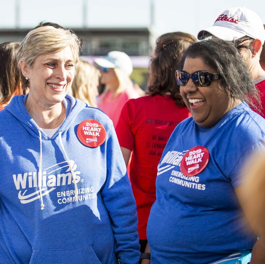
Imagery Principles 10

Consideration
• Avoid dirt and grime, but portraying hard work is OK
• Maximize the presence of sky whenever possible
• Make sure Williams logo is properly represented (signage, uniforms, badges, hats, etc.)
• Ensure all safety standards are met within the frame of the photo
• Represent diversity
• Encourage subjects to wear “brand” colors if possible or control wardrobe
• Avoid color filters that make the subject look unnatural and avoid color overlays
• Always try to secure an image weighted to the right for web and social, so copy can be used in the empty space
• Use lenses that keep the background out of sharp focus and highly blurred for portrait and community photos
• Artwork will frequently use clipped or masked subjects on white space, so ensure clean edges if possible
• When in a controlled setting such as a studio, opt for a white background and even lighting with low fall-off
• Incorporate Williams brand elements (i.e. colors and logo)
• Ensure the Williams logo is not the central focus and does not distract from the main content
• Keep graphic copy as short as possible - the post copy will add supportive details
• Graphic sizes should be appropriate for the platforms on which they will be posted
Imagery Principles 11
Portraits
                                                                                                   *

                                                                                                   *

                                                                                                   *

Natural/Action Poses                                                                               Controlled Portraits

A natural pose is any pose that the subject takes on without direction, particularly while         With portraits/posed photos, consider a mixture of squared shoulders with the subject looking
completing an action. They rarely look toward the camera, but are instead engaged in the scene.    toward the camera and a 3/4 angle with the subject looking off-camera. Keep the subject waist-
The portrait still focuses on the subject in the same way a directed pose shot would occur - the   up in the frame and weight the frame to the right. The background should also be heavily blurred.
subject is the star, not the scene.                                                                Ensure there are shots that can be clipped for use on web.
                                                                                                   *Cutouts allow for photos to be used multiple times with different backgrounds.
Imagery Principles 12
Community/Action Photography
Community photos should feel intimate and natural. Avoid pulling the subject’s attention from the
scene. Create depth by placing things or people between you and your target. Use a shallow
depth of field.Imagery Principles 13
Assets
*
For shots with multiple people where the location is important (assets, school, etc.), consider May also consider framing subjects closer in natural action shots from
lowering the angle of the shot to include a more dynamic scene converging on the subject slightly lower angle to showcase upper environment.
from head to toe. Subjects can be looking off-camera or toward camera (try to get both).
*Cutouts allow for photos to be used multiple times with different backgrounds.Application Examples 14 Print Advertising 15 Super Graphic 16 Illustrations 17 Website 18 Tradeshow Graphics 19 Wearables and Promotional Items 20 Vehicle Graphics
Print Advertising 15

A LITTLE HELP
with lots of heart.
Join us. When it comes to
helping our neighbors in need,
a little help can go a long way.
We’re proud to support our
communities, making them a
better place to live and work.

(800) WILLIAMS | www.williams.com   A LITTLE HELP with lots of heart.
                                    Join us. When it comes to helping our neighbors in need,
                                    a little help can go a long way. We’re proud to support our
                                    communities, making them a better place to live and work.

                                     (800) WILLIAMS | www.williams.com
Super Graphic 16
DO NOT use more than DO NOT overlap. DO NOT enlarge to
2 on a singe design. appear like polka dots
The super graphic may be used with any of the Williams brand colors. Do not overlap the graphic
on one or multiple graphics or use more than 2 graphics in a single instance. (Ex. PowerPoint slide,
email template, one pager). The graphic may be enlarged to use as a texture or cropped to show
only part of it. When enlarging the graphic avoid oversizing the graphic to appear like polka dots.Illustrations 17
When work calls for illustration or icons, use this monoline style. Illustration elements utilize strong Icons should be simple and easy to decipher. Icons can be used to support data or copy. Use only
line work and are frequently placed in such a way to create a pattern or texture. brand colors and maintain the same line-weight on all icons. Avoid using icons without context, and
avoid overlaying icons on photography or other icons.Website 18
Tradeshow Graphics 19
Wearables and Promotional Items 20
Vehicle Graphics 21
You can also read