Healthy Environments Health Status by Program Area - Population Health Assessment Southwestern Public Health June 2019
←
→
Page content transcription
If your browser does not render page correctly, please read the page content below
Healthy Environments
Health Status by Program Area

Population Health Assessment
Southwestern Public Health
June 2019

Authors

Melissa MacLeod, M.Sc.                            Hadia Hussain, MPH
Epidemiologist                                    Epidemiologist/Program Evaluator
Foundational Standards                            Foundational Standards
Southwestern Public Health                        Southwestern Public Health

Acknowledgements

We would like to thank the Environmental Health team for their engagement in this process as
well as our reviewers:

   •   Sarah Croteau, Data Analyst, Foundational Standards
   •   Allison McIntosh, Public Health Inspector, Environmental Health
   •   Jessica Fiddy, Public Health Inspector, Environmental Health
   •   Laura Gibbs, Program Manager, Foundational Standards
   •   Amy Pavletic, Program Manager, Environmental Health
   •   Peter Heywood, Program Director, Environmental Health
   •   Cynthia St. John, Chief Executive Officer (CEO)

 How to cite this document:
 MacLeod M, Hussain H. Healthy environments: health status by program area. Southwestern
 Public Health; 2019.

Contents
Summary ................................................................................................................................... 1

Air Quality .................................................................................................................................. 2

   Air Quality Health Index (AQHI) .............................................................................................. 2

   Pollutant Concentrations ........................................................................................................ 4

Climate Change Projections ....................................................................................................... 7

   Temperature ........................................................................................................................... 8

   Heat Waves ...........................................................................................................................13

   Extreme Cold Events .............................................................................................................14

   Precipitation...........................................................................................................................15

Emergency Department Visits and Hospitalizations from Environmental Causes ......................16

References ...............................................................................................................................20

Appendix A: Technical Notes ....................................................................................................21

   Acute Care Enhanced Surveillance System (ACES)..............................................................21

   Air Quality Information System ..............................................................................................21

   National Ambulatory Care Reporting System (NACRS) .........................................................22

   Population Estimates and Projections ...................................................................................22
Summary
This report is intended to complement the 2019 health status report titled Understanding our
Communities’ Health, which aimed to provide a high-level overview of the current health status
of people residing in the Southwestern Public Health (SWPH) region, which includes Oxford
County, Elgin County and the City of St. Thomas.1 This report includes some of the same
indicators with additional data for nearby areas (based on pre-existing locations of air quality
monitoring stations) as well as new indicators. These indicators were chosen based on
consultations with the SWPH’s Environmental Health team. The information included in this
report may assist in program planning and be used to increase community awareness of health
issues. The overarching trends are summarized below.

Air quality

Air quality in the SWPH region is typically low risk based on the Air Quality Health Index (AQHI)
and the average annual concentrations of common pollutants (fine particulate matter and
nitrogen dioxide) are below Canadian Ambient Air Quality Standards (CAAQS).

Climate change

Based on four common scenarios (representative concentration pathways) used by climate
scientists, it is predicted that the average temperature in the SWPH region will increase by at
least 1.5°C to upwards of almost 5°C by the year 2100 depending on the scenario. It is also
expected that the number of heat waves, duration of the longest heat wave and the strength of
heat waves will increase under all scenarios. The total annual amount of precipitation is
expected to increase under all scenarios while the number of extreme cold events is expected
to stay the same or decrease slightly.

Health effects from heat and cold

From 2013 to 2017, the rates of emergency department visits for heat and cold-related illnesses
was variable from year to year. The rates of hospitalizations from heat and cold-related illnesses
each year were small, but the rates of hospitalizations were consistently higher for cold-related
illnesses compared to heat-related illnesses. Illnesses that may be exacerbated by heat or cold
were not included in this report.

                                                                              Healthy Environments | 1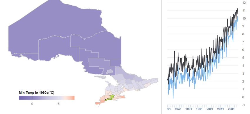
Healthy Environments

Air Quality

Air Quality Health Index (AQHI)

The Air Quality Health Index (AQHI) is a 10-point scale that provides a measure of risk to health
based on a mixture of three common air pollutants known to affect human health: ozone (O3),
fine particulate matter (PM2.5) and nitrogen dioxide (NO2).

   •   Low risk (1-3) - Ideal air quality for general population. People at higher risk of being
       affected by poor air quality (e.g., people with heart or respiratory problems) can enjoy
       usual outdoor activities.
   •   Moderate risk (4-6) - No need to modify usual outdoor activities unless experiencing
       symptoms such as coughing or throat irritation. People at higher risk should consider
       reducing or rescheduling strenuous activities if they are experiencing respiratory
       symptoms.
   •   High risk (7-10) - Consider reducing or rescheduling strenuous activities if experiencing
       symptoms. Those at higher risk should reduce or reschedule strenuous activities
       outdoors.
   •   Very high risk (10+) -The general population should reduce or reschedule strenuous
       activities outdoors. Those at higher risk should avoid strenuous activities.

Of the days with available air quality data in 2018, the Port Stanley air quality monitoring site –
the only air quality monitoring site in the Southwestern Public Health (SWPH) region – reported
low risk air quality 89.7% of the time and moderate risk 10.0% of the time (Figure 1). There was
only one high risk day in May 2018 (accounting for 0.3% of the time) in Port Stanley and there
were no high-risk days in London, Brantford or Kitchener. Over this time, the AQHI was similar
in the surrounding areas of London, Brantford and Kitchener (Figure 1).

                                                                               Healthy Environments | 2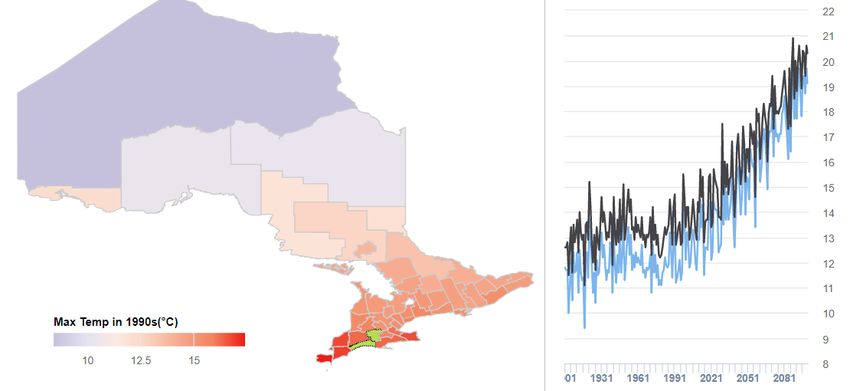
Figure 1. Proportion of days of the year by Air Quality Health Index (AQHI), Port Stanley,
London, Brantford and Kitchener air quality monitoring sites, 2016-2018

 Port Stanley                                                   London

                           Low risk
                           Moderate risk
                           High risk

 100%                                                               93.0%            93.4%            91.1%
              89.4%           88.3%           89.7%

   80%

   60%

   40%

   20%        10.3%           11.7%           10.0%                                                    8.9%
                                                                    7.0%             6.6%

    0%
               2016            2017           2018                  2016             2017              2018

   Brantford                                                  Kitchener

100%                         93.1%           90.9%                 91.1%            93.4%            92.5%
             89.6%

 80%

 60%

 40%

 20%         10.1%           6.9%            9.1%                   8.9%                              7.5%
                                                                                     6.6%

   0%
              2016            2017           2018                   2016             2017             2018

Note: on June 24, 2015, the Air Quality Index (AQI) was replaced with the Air Quality Health Index (AQHI); therefore,
yearly comparable data is not available before 2016.

Source: Ontario Ministry of the Environment, Conservations and Parks. Air Quality Information System. Toronto, ON.
Date Extracted: March 15 & April 22, 2019.

                                                                                             Healthy Environments | 3
Pollutant Concentrations
Ozone (O3)
In 2017, the annual average concentration of ozone was 33.0 ppb in Port Stanley (Figure 2).
The average annual concentration of ozone in Port Stanley was consistent between 2015 to
2017 and was slightly higher than the surrounding areas of London, Brantford and Kitchener.
Typically, ozone levels are lower in urban areas because the ozone (O3) reacts with nitric oxide
(NO) emitted by vehicles and combustion to create nitrogen dioxide (NO2) and oxygen (O2).2
Higher levels of ozone along Lake Erie have also been attributed to the long-range flow of
pollutants from the United States.2
Figure 2. Average annual concentration of O3 (ppb), Port Stanley, London, Brantford and
Kitchener air quality monitoring sites, 2015-2017
40
30
20
10
0
2015 2016 2017
Port Stanley 32.8 32.9 33.0
London 27.9 28.2 28.1
Brantford 28.9 29.5 28.3
Kitchener 27.9 28.8 28.1
Source: Ontario Ministry of the Environment, Conservations and Parks. Air Quality Information System. Toronto, ON.
Date Extracted: March 22, 2019.
There is no Canadian Ambient Air Quality Standard (CAAQS) for annual concentrations of
ozone. However, there is an Ontario one-hour Ambient Air Quality Criteria (AAQC) for ozone,
which is based on a concentration of 80 ppb for one hour (averaging time). In 2016, there were
a total of seven hours (not necessarily consecutive) with ozone levels exceeding the one-hour
AAQC in Port Stanley compared to eight hours in Brantford, two hours in London and two hours
in Kitchener.2
Healthy Environments | 4Fine particulate matter (PM2.5)
In 2017, the annual average concentration of PM2.5 was 6.3 micrograms (µg)/m3 in Port Stanley
(Figure 3). The average annual concentration of PM2.5 in Port Stanley has consistently remained
below the 2020 Canadian Ambient Air Quality Standard (CAAQS) for annual average PM2.5
concentrations (8.8 µg/m3). In 2015, the average annual concentration of PM2.5 in Kitchener met
the CAAQS. Otherwise, the average annual concentration of PM2.5 has remained below the
CAAQS in surrounding areas between 2015 to 2017.
Figure 3. Average annual concentration of PM2.5 (µg/m3), Port Stanley, London, Brantford
and Kitchener air quality monitoring sites, 2015-2017
10
8
6
4
2
0
2015 2016 2017
Port Stanley 8.0 6.5 6.3
London 8.3 7.1 7.0
Brantford 8.7 7.3 7.2
Kitchener 8.8 7.3 7.0
CAAQS 8.8 8.8 8.8
Source: Ontario Ministry of the Environment, Conservations and Parks. Air Quality Information System. Toronto, ON.
Date Extracted: March 22, 2019.
In 2016, only three air quality monitoring stations in Ontario measured concentrations above the
24-hour Ambient Air Quality Criteria (AAQC) for PM2.5 (28 µg/m3). These three stations were in
Hamilton, Cornwall and Ottawa.2
Healthy Environments | 5Nitrogen dioxide (NO2)
In 2017, the annual average concentration of NO2 was 2.7 parts per billion (ppb) in Port Stanley
(Figure 4). Similar annual average concentrations have been observed in surrounding areas
between 2015 to 2017. In all surrounding areas, the average annual NO2 concentration
readings were well below the 2020 Canadian Ambient Air Quality Standard (CAAQS) for annual
NO2 concentrations (17.0 ppb).
Figure 4. Average annual concentration of NO2 (ppb), Port Stanley, London, Brantford
and Kitchener air quality monitoring sites, 2015-2017
20
16
12
8
4
0
2015 2016 2017
Port Stanley 3.0 2.9 2.7
London 6.6 5.4 5.8
Brantford 6.7 6.2 5.8
Kitchener 5.5 4.8 4.4
CAAQS 17.0 17.0 17.0
Source: Ontario Ministry of the Environment, Conservations and Parks. Air Quality Information System. Toronto, ON.
Date Extracted: March 22, 2019.
In 2016, no air quality monitoring sites in Ontario detected exceedances of provincial one-hour
(200 ppb) and 24-hour (100 ppb) Ambient Air Quality Criteria (AAQC) for NO2.2
Healthy Environments | 6Climate Change Projections
Scientists typically project changes to the climate using four standard models, or scenarios,
called representative concentration pathways (RCPs): RCP 2.6, RCP 4.5, RCP 6.0 and RCP
8.5. These scenarios ensure that climate modelling efforts across organizations are
comparable. Each RCP projects climate changes until the year 2100, but the higher number
RCPs predict more severe changes. The RCPs are mainly informed by population growth,
income per capita, energy per unit of income (energy intensity), emissions per unit of primary
energy (carbon factor) and land use (Table 1).3 The scientific literature does not state which
scenario is most likely to occur because there is too much uncertainty; however, RCPs 2.6 to
6.0 are intended to reflect scenarios in which climate policies are in place.4
Table 1. Descriptions of representative concentration pathways (RCPs)3
Scenario RCP 2.6 RCP 4.5 RCP 6.0 RCP 8.5
Description Mitigation Stabilization Stabilization Worst case
Greenhouse Very low– global Very low baseline Medium baseline High baseline –
gas carbon dioxide with medium to with high mitigation emissions
emissions (CO2) emissions low mitigation – – CO2 continues to increase rapidly
peak by 2020 and CO2 continues to increase slightly
decline to around increase but more faster than in RCP
zero by 2080 slowly 4.5
Land use Crops increase Crops and Crops continue on Crops and
and grassland grassland areas trend and grasslands
remains constant, decline, and grasslands are increase, and
livestock farming reforestation rapidly reduced, forests decrease
increases, forests occurs reforestation
continue to decline occurs
Energy use Oil use declines Oil consumption Energy Oil use grows
but other fossil fuel constant, but consumption peaks rapidly until 2070,
use increases and nuclear power in 2060 then coal use is the
is offset by capture and renewable declines to levels largest increase
of carbon dioxide, energy use similar to RCP 2.6, in energy
biofuels use is high increases oil consumption consumption
and solar and wind remains high with a
power increases smaller role for
but remains low biofuel and nuclear
energy
Population Global population Global population Global population Global population
growth/size peaks around 9 peaks around 9 peaks around 10 peaks around 12
billion billion billion billion
Economic High Moderate Lowest Low
growth
Healthy Environments | 7The Laboratory of Mathematical Parallel Systems (LAMPS) at York University uses a reference
period from 1981 to 2005 in their climate projections and publicly share the results for regional
areas, including Oxford County and Elgin St. Thomas.a
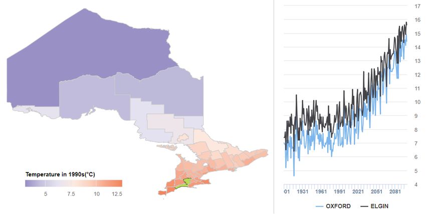
Temperature
Average temperature
Using the mitigation scenario (RCP 2.6), the average temperature is projected to increase by
1.6°C in Oxford County and 1.5°C in Elgin St. Thomas by the year 2100 (Figure 5, Figure 6). In
the stabilization scenarios, it is projected that the average temperature will increase by 3.0°C to
3.7°C in Oxford County and 2.9°C to 3.6°C in Elgin St. Thomas by the year 2100 (Figure 5,
Figure 6). Local climate change projections by decade are not available for the worst-case (RCP
8.5) scenario.
Figure 5. Projected changes in average temperature (°C) from reference period (1981-
2005) by decade, by representative concentration pathways (RCPs), Oxford County
4
Change in average temperature (°C)
3
2
1
0
-1
1990 2000 2010 2020 2030 2040 2050 2060 2070 2080 2090 2100
RCP 2.6 -0.4 0.0 0.3 0.9 1.2 1.5 1.7 1.7 1.7 1.7 1.7 1.6
RCP 4.5 -0.4 0.0 0.3 0.7 1.1 1.6 1.9 2.2 2.5 2.7 2.9 3.0
RCP 6.0 -0.4 0.0 0.4 0.7 1.1 1.3 1.7 2.0 2.4 3.0 3.3 3.7
Note: the RCP 8.5 projection is described in Figure 7 as it is not available by decade
Source: Laboratory of Mathematical Parallel Systems (LAMPS), York University, Data available from:
http://lamps.math.yorku.ca/OntarioClimate/index_app_timeseries.htm#/SubregionTmAnnualTime
a http://lamps.math.yorku.ca/OntarioClimate/
Healthy Environments | 8Figure 6. Projected changes in average temperature (°C) from reference period (1981-
2005) by decade, by representative concentration pathways (RCPs), Elgin St. Thomas
Change in average temperature (°C) 4
3
2
1
0
-1
1990 2000 2010 2020 2030 2040 2050 2060 2070 2080 2090 2100
RCP 2.6 -0.4 0.0 0.3 0.8 1.2 1.4 1.7 1.7 1.7 1.7 1.6 1.5
RCP 4.5 -0.4 0.0 0.3 0.7 1.1 1.6 1.9 2.2 2.5 2.7 2.8 2.9
RCP 6.0 -0.4 0.0 0.4 0.7 1.0 1.3 1.7 1.9 2.3 2.8 3.2 3.6
Note: the RCP 8.5 projection is described in Figure 7 as it is not available by decade
Source: Laboratory of Mathematical Parallel Systems (LAMPS), York University, Data available from:
http://lamps.math.yorku.ca/OntarioClimate/index_app_timeseries.htm#/SubregionTmAnnualTime
Using the worst-case scenario for projections (RCP 8.5), the projected average temperature in
2019 was 9.1°C in Oxford County and 10.3°C in Elgin St. Thomas. The average temperature is
projected to increase to 14.4°C in Oxford County and 15.6°C in Elgin St. Thomas by the year
2100 (Figure 7). By the 2080s (between 2070 to 2099), there is a projected increase in the
average temperature by 4.9°C in Oxford County and 4.8°C in Elgin St. Thomas.
Healthy Environments | 9Figure 7. Projected average temperature (°C) under RCP 8.5, Oxford County and Elgin St.
Thomas
Source: Laboratory of Mathematical Parallel Systems (LAMPS), York University, Data available from:
http://lamps.math.yorku.ca/WorldClimate/
Minimum temperature
Using the mitigation scenario (RCP 2.6), it is projected that the average daily low temperature
will increase by 1.8°C in Oxford County and 1.7°C in Elgin St. Thomas by the 2050s and remain
similar by the 2080s (Table 2). Using the worst-case scenario (RCP 8.5), it is projected that the
average daily low temperature will increase by 3.0°C in Oxford County and 2.9°C in Elgin St.
Thomas by the 2050s and it is projected to increase by 5.1°C in Oxford County and 5.0°C in
Elgin St. Thomas by the 2080s (Table 2).
Healthy Environments | 10Table 2. Projected changes in minimum temperature (°C) from reference period (1981-
2005) by representative concentration pathways (RCPs), Oxford County and Elgin St.
Thomas
2050s 2080s
(between 2040 to 2069) (between 2070 to 2099)
Scenario Oxford County Elgin St. Thomas Oxford County Elgin St. Thomas
RCP 2.6 1.8°C 1.7°C 1.7°C 1.7°C
RCP 4.5 2.3°C 2.3°C 2.9°C 2.9°C
RCP 6.0 2.0°C 1.9°C 3.3°C 3.2°C
RCP 8.5 3.0°C 2.9°C 5.1°C 5.0°C
Source: Laboratory of Mathematical Parallel Systems (LAMPS), York University, Data available from:
http://lamps.math.yorku.ca/OntarioClimate/index_app_documents.htm#/summaryofOXFORD and
http://lamps.math.yorku.ca/OntarioClimate/index_app_documents.htm#/summaryofELGIN
Using the worst-case scenario for projections (RCP 8.5), the projected average daily low
temperature in 2019 was 4.2°C in Oxford County and 5.3°C in Elgin St. Thomas. The average
daily low temperature is projected to increase to 9.7°C in Oxford County and 10.9°C in Elgin St.
Thomas by the year 2100 (Figure 8).
Figure 8. Projected average daily low temperature (°C) under RCP 8.5, Oxford County and
Elgin St. Thomas
Source: Laboratory of Mathematical Parallel Systems (LAMPS), York University, Data available from:
http://lamps.math.yorku.ca/WorldClimate/
Healthy Environments | 11Maximum temperature
Using the mitigation scenario (RCP 2.6), the average daily high temperature is projected to
increase by 1.8°C in Oxford County and in Elgin St. Thomas by the 2050s and remain similar by
the 2080s (Table 3). Using the worst-case scenario (RCP 8.5), the average daily high
temperature is projected to increase by 3.0°C in Oxford County and 2.9°C in Elgin St. Thomas
by the 2050s and by 5.1°C in Oxford County and 4.9°C in Elgin St. Thomas by the 2080s (Table
3).
Table 3. Projected changes in maximum temperature (°C) from reference period (1981-
2005) by representative concentration pathways (RCPs), Oxford County and Elgin St.
Thomas
2050s 2080s
(between 2040 to 2069) (between 2070 to 2099)
Scenario Oxford County Elgin St. Thomas Oxford County Elgin St. Thomas
RCP 2.6 1.8°C 1.8°C 1.7°C 1.7°C
RCP 4.5 2.4°C 2.3°C 3.0°C 2.9°C
RCP 6.0 2.1°C 2.0°C 3.4°C 3.3°C
RCP 8.5 3.0°C 2.9°C 5.1°C 4.9°C
Source: Laboratory of Mathematical Parallel Systems (LAMPS), York University, Data available from:
http://lamps.math.yorku.ca/OntarioClimate/index_app_documents.htm#/summaryofOXFORD and
http://lamps.math.yorku.ca/OntarioClimate/index_app_documents.htm#/summaryofELGIN
Using the worst-case scenario for projections (RCP 8.5), the projected average daily high
temperature in 2019 was 14.2°C in Oxford County and 15.4°C in Elgin St. Thomas. The average
daily high temperature is projected to increase to 19.1°C in Oxford County and 20.3°C in Elgin
St. Thomas by the year 2100 (Figure 9).
Healthy Environments | 12Figure 9. Projected average daily high temperature (°C) under RCP 8.5, Oxford County
and Elgin St. Thomas
Source: Laboratory of Mathematical Parallel Systems (LAMPS), York University, Data available from:
http://lamps.math.yorku.ca/WorldClimate/
Heat Waves
Heat waves are prolonged periods of extremely hot weather, which may be accompanied by
high humidity. Heat waves are measured relative to the usual weather in the area and relative to
normal temperatures for the season, so what is considered a heat wave in one geographic area
may be normal temperature in another area. For example, local heat waves occur when there
are three consecutive days with a daily maximum temperature of 32°C or higher.
Using the mitigation scenario (RCP 2.6), the projected duration of the longest heat waves each
year is projected to increase by five days in Oxford County and six days in Elgin St. Thomas by
the 2050s compared to the reference time period of 1981 to 2005 (Table 4). Using the worst-
case scenario (RCP 8.5), the duration of the longest heat waves each year is projected to
increase by 9 days in Oxford County and 10 days in Elgin St. Thomas by the 2050s, compared
to a projected increase of 23 days in Oxford County and 25 days in Elgin St. Thomas by the
2080s (Table 4).
Healthy Environments | 13The total number of days with heat waves per year and the strength of the heat waves are also
projected to increase compared to the reference period by the 2050s and 2080s under each
scenario for both Oxford County and Elgin St. Thomas (Table 4).
Table 4. Projected changes in heat wave characteristics from reference period (1981-
2005) by representative concentration pathways (RCPs), Oxford County and Elgin St.
Thomas
2050s 2080s
(between 2040 to 2069) (between 2070 to 2099)
Scenario Oxford County Elgin St. Thomas Oxford County Elgin St. Thomas
Duration (days) of longest heat wave per year
Reference 6 5 6 5
RCP 2.6 5 6 6 7
RCP 4.5 6 7 9 11
RCP 6.0 5 5 9 9
RCP 8.5 9 10 23 25
Total number of heat wave days per year (not necessarily consecutive days)
Reference 14 12 14 12
RCP 2.6 32 33 33 34
RCP 4.5 43 44 62 63
RCP 6.0 36 34 73 69
RCP 8.5 61 62 126 129
Heat wave strength (total temperature differences from the normal of the reference
climate time period of 1981 to 2005 of all heat wave days in a year)
Reference 114°C 98°C 114°C 98°C
RCP 2.6 302°C 307°C 314°C 325°C
RCP 4.5 405°C 406°C 596°C 605°C
RCP 6.0 335°C 309°C 680°C 630°C
RCP 8.5 577°C 584°C 1,297°C 1,302°C
Source: Laboratory of Mathematical Parallel Systems (LAMPS), York University, Data available from:
http://lamps.math.yorku.ca/OntarioClimate/index_app_documents.htm#/summaryofOXFORD and
http://lamps.math.yorku.ca/OntarioClimate/index_app_documents.htm#/summaryofELGIN
Extreme Cold Events
Extreme cold events in the climate change projections are called “cold spells,” which are defined
as at least five consecutive days when the daily minimum temperature is below that of the 10%
coldest days in the reference climate (1981 to 2005).
Healthy Environments | 14The total number of days per year considered to be cold spells is projected to remain the same
under the mitigation scenario (RCP 2.6) and decrease slightly under all other scenarios for
Oxford County and Elgin St. Thomas (Table 5).
Table 5. Projected changes to the total number of cold spell days per year from reference
period (1981-2005) by representative concentration pathways (RCPs), Oxford County and
Elgin St. Thomas
2050s 2080s
(between 2040 to 2069) (between 2070 to 2099)
Scenario Oxford County Elgin St. Thomas Oxford County Elgin St. Thomas
Reference 1 1 1 1
RCP 2.6 0 0 0 0
RCP 4.5 -1 -1 -1 -1
RCP 6.0 -1 -1 -2 -2
RCP 8.5 -1 -1 -1 -1
Source: Laboratory of Mathematical Parallel Systems (LAMPS), York University, Data available from:
http://lamps.math.yorku.ca/OntarioClimate/index_app_documents.htm#/summaryofOXFORD and
http://lamps.math.yorku.ca/OntarioClimate/index_app_documents.htm#/summaryofELGIN
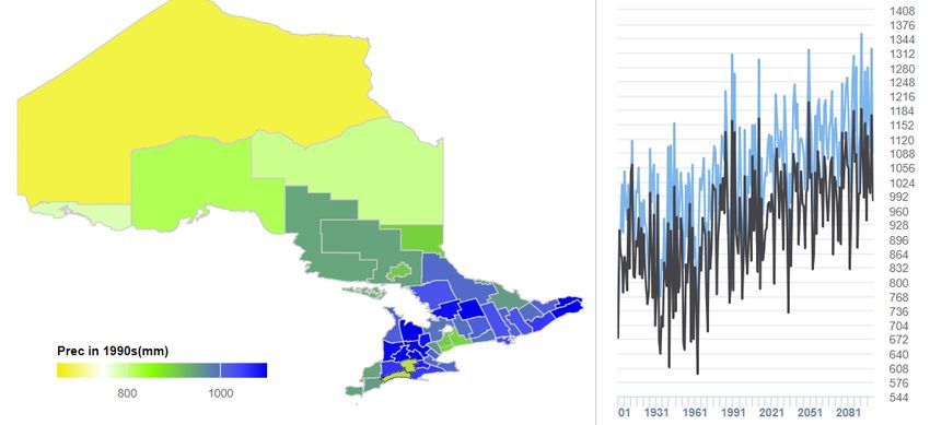
Precipitation
Compared to the reference period of 1981 to 2005, under all scenarios, the total annual
precipitation is expected to increase slightly in Oxford County and Elgin. St Thomas by the
2050s and 2080s (Table 6).
Table 6. Projected changes to the total annual precipitation (mm) from reference period
(1981-2005) by representative concentration pathways (RCPs), Oxford County and Elgin
St. Thomas
2050s 2080s
(between 2040 to 2069) (between 2070 to 2099)
Scenario Oxford County Elgin St. Thomas Oxford County Elgin St. Thomas
Reference 999 941 999 941
RCP 2.6 52 51 58 54
RCP 4.5 64 63 57 56
RCP 6.0 51 49 82 81
RCP 8.5 70 70 100 99
Source: Laboratory of Mathematical Parallel Systems (LAMPS), York University, Data available from:
http://lamps.math.yorku.ca/OntarioClimate/index_app_documents.htm#/summaryofOXFORD and
http://lamps.math.yorku.ca/OntarioClimate/index_app_documents.htm#/summaryofELGIN
Healthy Environments | 15Using the worst-case scenario for projections (RCP 8.5), the projected total annual precipitation
in 2019 was 1,129 mm in Oxford County and 978 mm in Elgin St. Thomas. The total annual
precipitation is projected to vary substantially from year to year with an overall trend of
increasing precipitation by 2100 (Figure 10).
Figure 10. Projected total annual precipitation (mm) under RCP 8.5, Oxford County and
Elgin St. Thomas
Source: Laboratory of Mathematical Parallel Systems (LAMPS), York University, Data available from:
http://lamps.math.yorku.ca/WorldClimate/
Emergency Department Visits and
Hospitalizations from Environmental Causes
In 2018, there were 43 emergency department (ED) visits and 6 hospitalizations for reasons
such as sunburns, frostbite, hypothermia, exhaustion and bites (this includes non-specific bites,
which may be from bugs, animals, etc.), with most visits occurring in the summer months
(Figure 11). This information is based on real-time triage complaints and hospital admissions
from local emergency departments, which may not reflect the final diagnosis in the hospital or
upon discharge from the hospital. These data may include people who live within the SWPH
region and people who live outside of the SWPH region.
Healthy Environments | 16Figure 11. Number of emergency department visits and hospitalizations for
environmental reasons by month, Southwestern Public Health hospitals*, 2018
Emergency department visits Hospitalizations
16
13
12
8
8
5 5
4
2 2 2 2
1 1 1 1
0
Jan Feb March April May June July Aug Sept Oct Nov Dec
*The hospitals include St. Thomas Elgin General Hospital, Woodstock General Hospital, Alexandra Hospital and
Tillsonburg District Memorial Hospital.
Source: Acute Care Enhanced Surveillance System (ACES), KFL&A Public Health, Date Extracted: March 21, 2019.
Heat-related illnesses include heatstroke and sunstroke, fainting, heat cramps, heat exhaustion,
heat fatigue and swelling from heat. Cold-related illnesses include frostbite, hypothermia and
other effects of reduced temperature such as immersion of hands and feet and chilblains
(inflammation of small blood vessels in the skin from repeated exposure to cold that causes
itching, red patches, swelling and blistering). Based on diagnosis data, the rate of ED visits for
heat- and cold-related illnesses varied from year to year. In 2016, the rate of ED visits for heat-
related illnesses (48.7 per 100,000 population) was higher than in 2014, 2015 and 2017 (Figure
12). The rate of ED visits for cold-related illnesses was higher in 2014 and 2015 compared to
2013 (Figure 12). In the SWPH region, the highest number of heat alerts were issued in 2016
and the highest number of cold alerts were issues in 2014 and 2015.1
Healthy Environments | 17Figure 12. Crude rate (per 100,000 population) of emergency department visits for heat-
and cold-related illnesses, Southwestern Public Health, 2013-2017
80
60
40
20
0
2013 2014 2015 2016 2017
Heat 26.9 11.9 24.2 48.7 18.1
Cold 6.5 28.8 21.7 14.3 13.2
Source: Ambulatory Emergency External Cause (2013-2017), Ontario Ministry of Health and Long-Term Care,
IntelliHEALTH ONTARIO, Date Extracted: March 21, 2019 & Population Estimates (2013-2016), Ontario Ministry of
Health and Long-Term Care, IntelliHEALTH ONTARIO, Date Extracted: December 21, 2018 & Population Projections
(2017), Ontario Ministry of Health and Long-Term Care, IntelliHEALTH ONTARIO, Date Extracted: January 2, 2019.
The rate of ED visits due to heat-related illnesses was similar between people living in the urban
and rural municipalities; however, the rate of ED visits for cold-related illnesses was higher
among people living in the urban municipalities compared to the rural municipalities (Figure 13).
Figure 13. Crude rate (per 100,000 population) of ED visits for heat- and cold-related
illnesses by urban or rural residence, Southwestern Public Health, 2016
In 2016, there were 55.8 (95% CI: 42.3-71.6) heat- and 22.3 (95% CI: 14.6-33.3)
cold-related ED visits per 100,000 population living in the urban municipalities of St.
Thomas, Aylmer, Ingersoll, Tillsonburg and Woodstock.
In 2016, there were 39.1 (95% CI: 28.6-53.3) heat- and 3.4 (95% CI: 1.1-8.8)
cold-related ED visits per 100,000 population living in the rural municipalities of
Bayham, Central Elgin, Southwold, Dutton/Dunwich, Malahide, West Elgin,
Blandford-Blenheim, East Zorra-Tavistock, Zorra, Norwich and South-West
Oxford.
Healthy Environments | 18The number of hospitalizations for heat-related illnesses was small each year, with only five
hospitalizations total between 2013 and 2017, which means the rates of hospitalizations for
heat-related illnesses were typically between 0 to 1 hospitalization per 100,000 population each
year. The rate of hospitalizations for cold-related illnesses were higher compared to heat-related
illnesses (Figure 14). The rates of hospitalizations for cold-related illnesses were not statistically
significant different over time (error bars not shown).
Figure 14. Crude rate (per 100,000 population) of hospitalizations for heat- and cold-
related illnesses, Southwestern Public Health, 2013-2017
Heat Cold
6
4.9
4 3.5 3.4
2.0
2
1.0 1.0
0.5
0.0 0.0
0
2013 2014 2015 2016 2017
Source: Ambulatory Emergency External Cause (2013-2017), Ontario Ministry of Health and Long-Term Care,
IntelliHEALTH ONTARIO, Date Extracted: March 21, 2019 & Population Estimates (2013-2016), Ontario Ministry of
Health and Long-Term Care, IntelliHEALTH ONTARIO, Date Extracted: December 21, 2018 & Population Projections
(2017), Ontario Ministry of Health and Long-Term Care, IntelliHEALTH ONTARIO, Date Extracted: January 2, 2019.
Healthy Environments | 19References
1. MacLeod M, Hussain H. Understanding our communities' health: current health status of
people residing in the Southwestern Public Health region. Southwestern Public Health;
2019.
2. Ministry of the Environment Conservation and Parks. Air quality in Ontario 2016 report
[Internet]. Toronto, ON: Queen's Printer for Ontario; 2019 [cited 2019 Apr 22]. Available
from: https://www.ontario.ca/document/air-quality-ontario-2016-report
3. Vuuren DP Van, Edmonds J, Kainuma M, Riahi K, Nakicenovic N, Smith SJ, et al. The
representative concentration pathways : an overview. Climate Change. 2011;109:5–31.
4. Hayhoe K, Edmonds R, Kopp A, LeGrande B, Sanderson M, Wehner, et al. Climate
models, scenarios, and projections. Climate Science Special Report: Fourth National
Climate Assessment. 2017;1:133–60.
5. KFL&A Public Health. ACES manual v01.06.01.17. Kingston, ON: KFL&A Public Health;
2017.
Healthy Environments | 20Appendix A: Technical Notes
This report summarizes information from a variety of data sources available to Public Health.
The methods used and geography presented depends on the data source. More detail about
the data sources can be found below.
Acute Care Enhanced Surveillance System (ACES)
ACES is a surveillance system that monitors real-time triage (emergency department visits) and
inpatient (hospital admissions) data from participating hospitals in Ontario. This system was
developed (with partnerships) and is maintained by Kingston, Frontenac, Lennox & Addington
(KFL&A) Public Health. Machine learning is used to classify chief complaint text entered in the
hospital into specific syndromes (e.g., environmental). The environmental syndrome was found
to have strong correlation to validated diagnosis data from the National Ambulatory Care
Reporting System (NACRS).5 However, real-time data is always more sensitive than specific;
therefore, more visits will be classified as environmental in ACES and they will be categorized
less precisely than in NACRS.
Air Quality Information System
The Ministry of the Environment, Conservation and Parks monitors air quality at 39 stations
across Ontario. Some of the air quality stations monitor pollutant levels for ozone, fine
particulate matter, nitrogen dioxide, sulphur dioxide, carbon monoxide and total reduced sulphur
compounds. However, the Port Stanley, London, Kitchener and Brantford stations only monitor
pollutant levels for ozone, fine particulate matter and nitrogen dioxide.
Healthy Environments | 21National Ambulatory Care Reporting System (NACRS)
NACRS contains information about unscheduled emergency department visits. The data
submitted by emergency departments is validated by CIHI and released to public health units on
a quarterly basis through IntelliHEALTH ONTARIO. NACRS can also be used to obtain
information about inpatients that were admitted from the emergency room to critical care
units/operating rooms, other units within a hospital or to another acute care facility. This
information was used to capture emergency department visits and hospitalizations for heat- and
cold-related illnesses (Table 7).
Table 7. Description of emergency department visits and hospitalizations for heat- and
cold-related illnesses
Condition group Condition ICD-10-CA codes
Heat-related Effects of heat and light T67
illnesses
Cold-related Frostbite T33-T35
illnesses
Hypothermia T68
Other effects of reduced temperature T69
Population Estimates and Projections
Population estimates and projections were used as the denominator to calculate rates.
Population estimates are produced by the Demography Division at Statistics Canada and were
obtained through IntelliHEALTH ONTARIO.
Healthy Environments | 22Southwestern Public Health www.swpublichealth.ca St. Thomas Site Woodstock Site 1230 Talbot Street 410 Buller Street St. Thomas, ON N5P 1G9 Woodstock, ON N4S 4N2
You can also read